July 2022
COMMUNICATION PLACE
+

Introduction
2022 Academic Task Force Members
A Message from Joell Angel-Chumbley
Chair, SEGD Academic Task Force
A Message from Cybelle Jones
CEO, SEGD
City as an Exhibition
Phenomenological Strategies for Narrative Architecture in Public Spaces
Veeksha Mehndiratta
Color Crush
Crafting multisensory digital-physical interactives in a science museum
Jungu Guo
Evolving Graphic Design
Yeohyun Ahn
Flow
The flow experience told through multi-generational voices of motorsport women
Naz Ertugrul
From the Mothers’ Movement to Cradlr
An Interaction Design for Refugee Children
Jing Zhou
#CONNECTED
Harnessing social media practices to foster meaningful connections in a hybrid world
Bhawika Mishra
Invitation To Interpret
Battleing Museum Threshold Fear
Chase Dougherty
Seldom Is Heard
Supporting the development of Historical Empathy through Adaptive Storytelling
Ciera Iveson
StoryCorps
The design of multi-sensory narrative experiences
Daphne Peters
The Society for Experiential Graphic Design (SEGD) is a multidisciplinary network of designers, industry and technology specialists, educators, and students dedicated to experiential graphic design. We work in wayfinding, placemaking and identity, digital experience design, exhibitions, public installations, branded environments, and other aspects of EGD/XGD.
SEGD exists to “educate, connect and inspire” the global, multidisciplinary community of professionals, creating experiences that connect people to place. We are committed to knowledge sharing and continually raising the standards of practice in a design discipline that has the potential to enrich the lives of people wherever they work, play, shop, learn, travel, or gather.
SEGD’s education conferences, workshops, webinars, and courses span a wide swath of design practice areas including branded environments, exhibition and experience design, technology and interactive experiences, user experience, healthcare, practice and technical topics, wayfinding, accessibility, and the business of design.
SEGD actively collaborates with and provides outreach to design programs at internationally recognized colleges and universities. Our signature academic education event is the annual SEGD Academic Summit, immediately preceding the SEGD Conference each June. Design educators from around the world are invited to submit papers for presentation at the Summit and publication in SEGD’s blind peer-reviewed Communication + Place, which is published electronically on an annual basis. The Summit and e-publication are platforms for academic researchers to disseminate their creative work, models for innovation in curriculum, and best practices for research related to experiential graphic design.
Chair: Joell Angel-Chumbley | University of Cincinnati DAAP, City of Cincinnati
Yeohyun Ahn | University of Wisconsin Madison
Aija Freimane | TU Dublin School of Creative Arts, Ireland
Angela Iarocci | Sheridan College
Michael Lee Poy | Ontario College of Design University
Christina Lyons | Fashion Institute of Technology
Tim McNeil | University of California Davis
Amy Rees | Drexel University, Exit Design
Debra Satterfield | California State University
Neeta Verma | University of Notre Dame
Willhemina Wahlin | Charles Sturt University
Michele Y. Washington | ashion Institute of Technology
For more information, please contact Cybelle Jones or Joell Angel-Chumbley.
Cover photo and journal design: Willhemina Wahlin
Chair SEGD Academic Task Force
Summit . . . has become a forum for global design academics, researchers, and students to share their research, innovative curriculum, and projects.
The SEGD Academic Task Force (ATF) is a diverse team of US-based and international design faculty, researchers, and practitioners that collectively share research and resources to advance global academic design education and professional practice.
This year the ATF committed to multiple initiatives designed to promote knowledge and awareness of experiential graphic design with a strategic focus on the advancement of design education, research, and publication; diversity, equity, accessibility, and inclusion (DEAI) education and best practices; and student outreach.
The annual SEGD Academic Summit, a signature event produced by the ATF, has become a forum for global design academics, researchers, and students to share their research, innovative curriculum, and projects. This event is also great for industry members to reconnect with new ideas emerging from researchers today. The ATF sends out a Call for Papers and conducts a blind peer review of abstracts submitted from across the globe. The selected authors are then invited to present at the Summit and publish full papers in Communication + Place to highlight research and insights for professional development and education in the field of experiential graphic design.
If you are interested in learning more about the work of the SEGD Academic Task Force, please feel free to contact me at jangelchumbleymfa@gmail.com
"Our work . . . communicates important information and fuels a dialogue between users and the spaces they inhabit.
"The Society for Experiential Graphic Design (SEGD) exists to “educate, connect and inspire” the global, multidisciplinary community of professionals creating experiences that connect people to place.
We are an association of people who create content-rich, emotionally compelling, experiential spaces for a wide range of environments, from hospitals and transit hubs to museums and personalized digital destinations.
Our work creates a sense of place, helps people find their way, communicates important information and fuels a dialogue between users and the spaces they inhabit. We research, plan, design and build a diverse range of visual communications and information systems for the built and virtual environment.
Our community of educators, designers and makers strive to create environments that improve the human experience and share knowledge that raises the standards of design excellence in practice.
We hope that you will explore more about our educational and professional resources at www.segd.org
Cybelle Jones CEO, SEGDVeeksha Mehndiratta, Spatial Experience Designer, Architect, School of Planning and Architecture, Vijayawada, India
Phenomenology in architecture involves orchestration of various physical and natural elements such as space, light and shadow, and material that ultimately craft an immersive experience. The integration of sensory perception as a function of a space informs this impression, that is abstract yet perceived by the user. Architecture is, often, ocular centric which foregrounds the hegemony of vision. Human perception is conditioned by various factors like lived experience, intellectual prowess, observational abilities etc. Therefore, every single perception is distinct.
Narrative architecture utilizes design elements to weave a storyline to communicate a message. This message can vary from a thematic environment like an exhibition to a space that communicates its function. Materiality, detail, composition, and form aid in expressing this message. It highlights the experiential dimension of a space. The design based on these lines can modify human behaviour in public spaces and contribute to the placemaking of a city.
Category: Architecture
Keywords: Experiential, Inclusive, Narrative, Phenomenology, Public Spaces, Sensory
Exhibition spaces, including galleries and museums, have a controlled artificial environment. Brian O’Doherty describes, “The outside world must not come in, so windows are usually sealed off. Walls are painted white. The art is free to take on its own life” (O’Doherty, 1986). One can investigate what the highly controlled context of the modernist gallery does to the art object and what it does to the viewing subject by analyzing the ancient exhibitions. The Egyptian tomb chambers held paintings and sculptures that were regarded as magically contiguous with eternity but the tombs itself were designed to alleviate awareness of the outside world.
The high level of narrativity exists in these spaces in an extremely condensed fashion, which makes it challenging to recreate the thematic conversation in public spaces. Since themes are the overarching concept to a gallery, these environments successfully perform their function. Likewise, when an urban space performs its function or an activity, which may include buying- selling, walking, performing, sitting etc., it will be expressive of its character. Successful urban spaces are responsive to its users. Vibrant environments support myriad activities without losing its spatial quality. In fact, these events are what contribute to its character.
There is a plethora of inspiring and dedicated research carried on exhibition spaces, its visitor behaviour, and the application of narrativity in those spaces. Likewise, one can dive into studies done for urban areas, specifying the ways in which a responsive environment can be achieved. But the intersection of the two is yet to be unearthed. Understanding how the exhibitions narrate and engage can be utilized in creating urban spaces and consequently, exhibitions can be enriched with the temporal dimension that successful urban spaces boast. Undertaking two live case studies in the capital of India, Delhi, one from a museum typology—Kiran Nadar Museum of Art, Saket and another from an urban context Kashi Ram Shah Marg, West Delhi, the author explores the narrative and phenomenological aspects in both scenarios. The author then delves into a comparative analysis as a critique to the current state of public urban areas.
Paul Ricœur and Fredric Jameson argue that narrative is a crucial way to create a
sense of self and the world. According to Paul Cobley (Cobley, 2001), two contrasting schools of thought explain the beginnings of narrative. The first delves into the phylogenetic perspective, which posits that narrative is a product of cultural evolution. Secondly, ontogenetic view indicates that our brains are hard-wired to frequently build narratives and the ability to use language reinforces this perspective (MacLeod, 2012).
Narrative environments employ space to tell the story through a series of designed layers of elements that heighten the experience of users and fully immerse in the environment.
The chemistry and assembly of various elements mould the space which is ultimately perceived. One cannot exist without the other. Views unfold sequentially offering a concept of conceal and reveal incorporating exploration as a spatial journey. Buffers are places for a pause and contemplation (Pandya, 2014).
The categorization are as follows:
5. Colour
6. Temperature
7. Sound
8. Smell
3. Perceptual Elements
1. Materials
2. Texture
3. Mass and Void
4. Planes
5. Organisation & Sequence
6. Scale and Proportion
7. Movement
There exists no separation between physical and mental spaces. The word ‘environment’ is used and not ‘space’ since space describes a measurable distance to some extent, while environment incorporates the space, architecture, organisational layouts, levels, users, objects, and a correlation between all of these. We shape our world and the physical world in turn, shapes us (MacLeod, 2012).
The model theorizes that people cannot exist without place, nor can they exist without narrative and, consequently, they cannot exist without narrative in place (Austin, 2016).
The Tripartite Network Model or TNM for narrative environments is a nexus of three nodes: narrative, environment, and people. This triangulation connects narratology, architecture with its users which otherwise are studied as distinct disciplines (Figure 1).


"Experiential Architecture unfolds through time. The temporality juxtaposed with the movement helps the user immerse in a space.
"Figure 1: TNM Figure 2: Actantial Network
Narratives prompt us that nothing exists in isolation. In fact, each activity in an environment triggers participation in events, traditions, and patterns of life. Every urban designer recognizes the significance of context. The relationship of a streetscape to a building is analogous to the link between narrative and identity. Without context, an individual building seems lost in space. Likewise, a person is deprived of identity without a spiritual, cultural, or intellectual context (Filep, 2014).
Design of an urban public realm is a spatio-temporal experience that reveals its dynamism by supporting various activities. A leisure square can incite riots and also invite street performances. Massey views this phenomenon as “a simultaneity of multiple trajectories.” Planner Gordon Cullen considers sequential flavour of the built space, fundamental to the experience of townscape. He posits that humans can sense being “outside”, crossing thresholds and being inside a spatial phenomenon. The celebrated architect, Le Corbusier, has also emphasised the sequential character of a promenade and how it influences the spatial experience. Urban Designer Mark Childs argues that “storytelling is part of urban design … stories of place can inform designers about the narrative fabric that is as much a critical part of the context of a site as the soil type” (Austin, 2016). In reference to the TNM, architecture, urban design and spatial design are part of the environmental node.
Traditionally, dramatic conflicts are a literary device that stimulates tensions that causes another event or triggers people to act. In fact, drama is conflict. Without conflict there exists no drama. Research on the context of the environment aids in creating apt conflicts that blend seamlessly and are congruous in the urban narrative. This could entail seeking spatial clues that exist as patterns in the space. Other methods include gathering information through memory mapping, sensory mapping, and behavioural mapping.
Photography documentation can ease passive observation. The designers must be cognizant of the users’ movement and the environment, in order to accurately understand the intended users. Lack of research often results in failed placemaking proposals that are indifferent to the etched drama. Through this tool, users can be immersed in newfound aspects of a place, that were almost invisible to them prior.
In the urban realm, apart from the users, the spatial environment are characters that communicate. Buildings, streets, and landscapes engage in a dialogue with the onlookers that meander through them. This movement is what heightens the
experience and builds an interaction. This is not possible with an audience with characters on stage, that lacks a spatio-temporal aspect. The overall narrative messaging and content must be consistent with all the shareholders.
This element can be used to devise a storytelling technique that connects the narrative node and the environment node in the TNM. People outside of the design industry don’t view space as a medium that communicates. Hence, it’s the in the scope of the designer to simplify those abstract symbolism that can be savoured by everyone. Depending on the context of the environment, the required dwell time for a user might differ. It can be influenced by providing social spaces, resting stops, leisure activities, etc. People enter spaces only when they are fully aware of what is offered. But the way that the information is conveyed needs to be carefully designed. This anticipation increases visitor satisfaction, once revealed and therefore, eager for more.
Non-linear storyshapes or sequences are spaces where visitors can go wherever they want and have the freedom to create their own path. Since cities don’t have a defined entry and exit point like an exhibition, they are non-linear. Lefebvre authored the word “rhythmanalysis” that describes urban spaces through the rhythms of social practices. The porous layers of cities are juxtaposed to create a meaning that the visitor unravels through various urban features. Successful placemaking not only harbours numerous meanings but also carries it forward through social practices. Therefore, the identity of the city is intertwined with the activities of the place.
Narrative environments can cater to the commercial sector and the cultural sector. The priorities and purposes of these zones vary. Cultural narrative environments, such as cultural events and exhibitions, seek to educate and inform the masses. The urban public realm has a similar purpose that is aligned to inform its users. Hence, studying exhibition precedents will allow this dissertation to draw inferences that might be traced onto a more inclusive public domain.
Most homes have informal compositions of valued belongings organized by preference that reveals the character and ideology of the resident. Similarly, in a commercial setting, retailers and merchants display their goods with careful consideration that might best appeal to their customer. Spiritual structures are designed in such a way that enhances artifacts by framing views that attract attention. The experiential quality is elevated by employing play of light and shadow, enclosure shifts etc. At the end of the eighteenth century, a number of such collections were combined and organized for public display. In many places Florence is an example—great works of art commissioned by patrons such as the Medici family merely had to be consolidated in palaces that were extended or adapted for the purpose of exhibiting them. (Hughes, 2013) The Great Exhibition of 1851 in London, housed in the revolutionary Crystal Palace, was a substantial milestone in the history of exhibitions. Designed by Joseph Paxton, it was an engineering marvel, modular components of steel and glass, that influenced architecture. Modern display techniques are essentially shaped by the art and design movements of the early twentieth century. These principles view walls and floors as “planes”, as if they were elements in an abstract sculpture. Modern Movement reinterpreted the rooms of buildings in new ways, using the language of “spatial relationships” and “volumes” to influence display environments. Museum of Modern Art (MoMA) in New York is responsible for the conception of the spare, minimal environment with white walls that Brian o’ Doherty critically analysed.
1. Context: Analogous to any architectural project, the site is a key element in influencing the exhibition. An intimate connection to the site often gives life to a successful and immersive environment. Prudent positioning of built components, especially windows, in conjunction with wind directions and the sun path, would lead to an energy efficient building and lower the need for artificial temperature control.
2. The Visitor: “Engagement” is the process of addressing people directly, rewarding their attention, stimulating them, and providing them with new perspectives. By understanding the target audience, a designer can create an inclusive environment where they don’t feel like they don’t fit in. “Displays, such as those for children, have to be extremely well researched and targeted. What appeals to a five-yearold will not necessarily appeal to a tenyear-old, and a display that is intended to address both groups could prove to be a costly mistake if it is poorly researched.” (Hughes, 2013). Layering for diverse audiences is important to cater to the four types of visitors with differing levels of knowledge: -
1. The expert: This is the expert who hopes to extend their intellect. They may have covered most of the ground before, so they are interested in some of the least trodden paths. They might need a research facility, a screen, or a database of reference material, to explore some parts of the exhibition more deeply. They may wish to sit down, especially if they have an enquiry that could be time-consuming.
2. The frequent traveller: This visitor is acquainted with the landmarks but would like to explore more. They are motivated by general curiosity rather than the need to pursue any specific information. To fulfil their needs, the designer can prepare an informed level of enquiry, through explanatory text, audiovisual displays etc.
3. The scout: The scout does not know the terrain but wants to pick up on the main landmarks. By ensuring legible signage and labelling that identifies a clearly defined path, the scout can be helped. This visitor needs a highly organized and accurate “top layer” of information.
4. The orienteer: They don’t know where to go in an exhibition. They may have been brought along by another visitor who has more understanding of what is being shown and has left them. They can be engaged with activities and options that might thrill them but also deliver a subtle message. (Hughes, 2013)
3. Internal Organization: Conventional exhibitions require the visitors to circulate through a sequence of interconnected spaces. These create natural divisions for showing the theme and content of an exhibition but, particularly in old buildings, the display surfaces are supporting walls and are permanent and unmovable. (Hughes, 2013).
4. Light: Other than illumination of objects, lighting is employed to create ambience and configure thematic spaces. The harmonious amalgamation of natural and artificial lighting influences the visitor behaviour and perception of exhibits. The various requirements include emergency lighting, lighting for maintenance staff, protection of objects, colour quality etc. Links to nearby exhibits must be created in a defined and specified manner. (Frey, 2011) Like theatre or films, exhibition lighting can generate hierarchies, channelizing the richest pools of light on the strongest exhibits. The exhibition experience should be easy on the eye, and the transitions from light to dark spaces should be carefully considered. Daylight is normally totally excluded if there are conservation considerations. The sun emits ultraviolet rays often degrades materials.
5. Materials: Each time period in history has its characteristic colours and materials associated with it. This influences the exhibition pieces and the surrounding space equally. White walls and the subtracting all additional elements from the environment claim to facilitate attention on the works. Yet ultimately the white walls tend to overshadow the mounted pieces. An ideal background is therefore a wall colour that is darker than the lightest point in the art piece. (Frey, 2011)
Since, museums hold valuable artifacts, fire performance of materials is of vital consequence. Materials that have high embodied energy are less favoured than ones that are renewable. Utilizing composite materials, such as plywood covered with laminates prevents reuse, is considered an inefficient use of resources.
Case Study: Kiran Nadar Museum of Art (KNMA)
Kiran Nadar Museum of Art (KNMA), Saket in New Delhi, was established at the initiative of the avid art collector Kiran Nadar in January 2010. The private museum of art exhibits modern and contemporary works from India and the sub-continent. The 34,000 square feet museum space offers multiple screenings of films, stimulating curatorial programs, and curated walks. Celebrated exhibitions include “Unfoldings: The Route Map of Experience, a solo by Jayashree Chakravarty” and “Zarina: A Life in Nine Lines”. (KNMA, 2020)


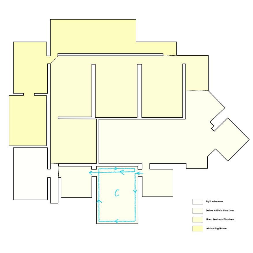


The plans show the approach from one theme to other with relation to the volumetric elements in the exhibition space.
The user circulation is also influenced by those along with the displays themselves.


The entrance to the exhibition opens to a square space that partly frames the name of the show on the wall and the arches. This diagonal orientation to the first room in the sequence, utilizes the “hide and conceal” approach that pulls the visitor in.(Figure 4) Through the plan (Figure 5), we can observe the sequential organisation between different exhibitions that are curated. Zarina’s Nine lines use the spatial element of the arches as a contextual prop. It is synonymous with the threshold of the house she remembers. (Figure 6) All the flanked rooms act as a deeper dive into her life during partition and how she reminisces it. If you choose to fully navigate through the first display, you organically enter the “Right to Laziness” AV room. (Figure 7) The double way door that gives a peek of purple light, invites the visitor before turning right to the “Line, Beats and Shadows” curation. (Figure 8) The contrast between the emotion heavy exhibit pulls the visitor into an entirely different and immersive experience. After experiencing multi-media, one navigates through a corridor that leads you to the Lines, Beats and Shadows exhibit. The hide and conceal element are employed to intrigue the visitor into entering the room. The frame gives a teaser to the curation. (Figure 8) As one moves along, they encounter a direct opening to a space for the Abstracting Nature exhibit in front and on the left. To complete the narrative of Lines, Beats, and Shadows, the visitor must realise that the demarcation in the flooring materials used and turn right again. The contrast is subtle but enough to understand. (Figure 9)
Other photographic evidence to understand how spatial elements are used to provide navigational cues to the visitor.


• Use of different colour light to segregate
Case Study Analysis
Strengths:
1. The phenomenological factors like levels, frames, mass, and voids etc. are considered in the exhibition.
2. The visitors are not confused rather immersed in the storyline conveyed.
3. The lighting is appropriate to the displays
4. The narrative is conveyed metaphorically through the spatial dimension as well.
Weaknesses
1. The sequential movement is hindered due to lack of connections between the AV room. So, if an expert visitor wants to dive deeper, a loop cannot be covered.
2. The level differences between different flooring materials could be flush which would aid accessibility and an uninterrupted circulation.
Selected Site: Kashi Ram Shah Marg, West Delhi, India
The mixed-use 16 Meters, two-way street, supports MIG and HIG residential buildings, Commercial DDA Markets, Open Spaces. Parks, Hospitals, and schools.The author has seen the Marg transform through a period of 22 years. Unaltered zoning pattern with an increase in vehicular traffic, has impacted the narrative of the area. The spill-over activities on the pedestrian paths seemed vibrant but now they exploit this extent.

Site
Various shareholders interact with the street from day through night. Once they are correctly identified, the narrative experienced by each character can be mapped. The characters are:
Residents, Passer-by’s
5. Public Transport
Auto Rickshaws, E-Rickshaws, Rickshaws
Urban Elements
Myriad elements interlaced in the street influence movement, behaviour, and the mood of the shareholders.
1. Parks vehicles
2. Stalls
3. Trees
4. Road shoulders
5. Animal droppings
6. Poles
7. Wires
8. Material Undulation
9. Construction Debris
Behavioural Activity Mapping
The legend for all the maps shown below can be referenced.


The pedestrian starts from Ambika Vihar till the Sai Baba Mandir road. In this route, they have a discontinuous journey due to parked cars, ramps, speed brakers, animal droppings, level differences due to change in paving materials and heavy traffic around DDA Markets.
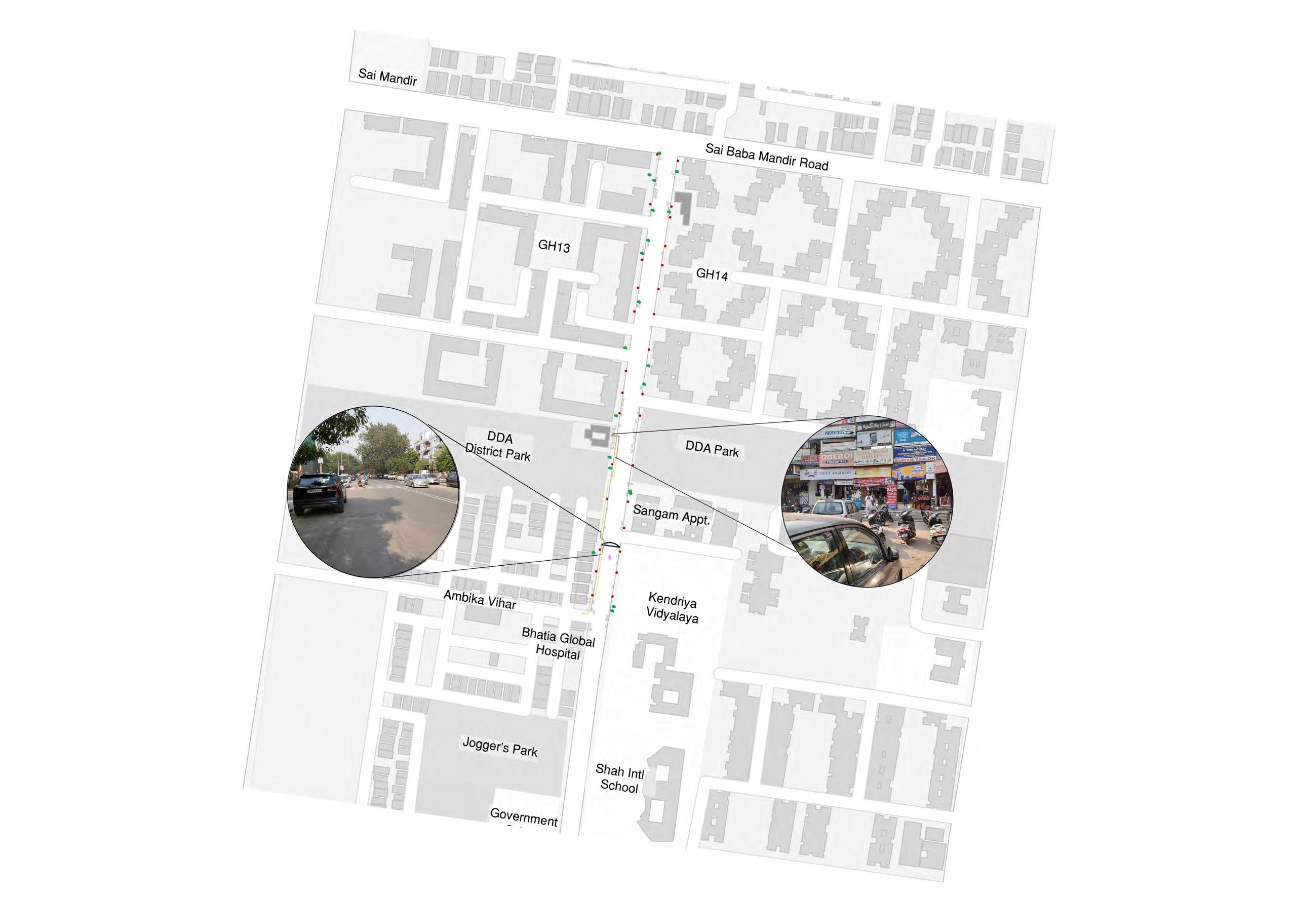

There is a single bus line that plies on Kanshi Ram Shah Marg that enters through Sai Baba Road till the end of the street. Since the bus is huge, other characters on the street have to be cautious even if they are “following the traffic rules”. We can see the influence of this ideology through the movement map. It barely stops or curves for any urban element except for a cow.

The GH13 gate that opens towards our street is an Exit only gate. This doesn’t stop the residents from bringing cars to shop for their groceries. The round about turn traced just outside the DDA Market, creates heavy traffic jams along with endless fights.

The most interesting movement among all the characters is that of the smaller public transits. They are influenced by the pedestrian movement; therefore, they need to occasionally pull over on the footpath or the side of the road to pick customers up. This slows down the traffic and make them vulnerable as well. An organic meandering path can be traced which is dynamic and temporal.

Using the analysis, one can observe 4 hotspots in the marg:
1. This is the largest extent that curbs traffic flow, pedestrian routes etc. The existence of the ‘T’ junction is probably what attracted so many users and commercial buyers into that particular GH14 DDA Market. Ironically, the ‘T’ junction is also what deteriorates the Marg further. The tree reducing the road shoulder, carts and hawkers setting up in the busy area alleviates order on the street.


2.and 3. Areas are smaller yet influenced by the landmarks that they are. One is the entrance for the GH13 colony and the other the GH13 DDA Market. The extent is smaller, but as a frequent visitor, one can surely comment that both markets are equally congested.


4. This zone is in close proximity to the Ambika Vihar Gate. But it becomes a hotspot due to cramming of so many urban elements that it becomes difficult to navigate through them (as any character).


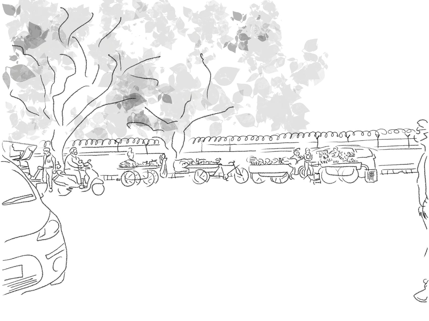
Sketches highlighting the layered narrativity through myriad activites
As discussed above, there are 5 elements of an exhibition. A deeper dive into how those elements is being employed in an urban context shall now be addressed.
1. Context: The setting is an urban environment, subject to various users and influential factors as we have filtered above. The key consideration, then, for context in an urban narrative should be of the temporal nature of the street. A dynamic process rarely yields analogous results. The only flexibility that can be tapped into, is to design spaces that support vibrant activities.
2. Visitor: The 4 types of visitors can be identified in an urban context as well. For example.
o The expert, in terms of movement and activity, can be understood as the user who uses the street most efficiently. Maybe, a resident who goes to Kendriya Vidyalaya, plays in the DDA park, eats Aloo Tikki from the stall in the market, loiters around on a scooter in the evening and goes back home.
o The frequent traveller are the public transits that have their movement influenced by other users, pedestrians. They are acquainted with the landmarks, but they interact further with a general “curiosity”.
o The scout needs a top-level layer of information to get around the environment. Buses are scouts that interact with the main landmarks i.e., the bus stops.
o The orienteer describes a passer-by who uses this street to get to another street on the morning of Raksha Bandhan. They forgot to buy Mithai and have to stop by the seasonal stalls that opens up on the footpath. They then go about their way.
3. Internal Organisation: The sequential interlacing of functional spaces determines the quality of circulation. Natural demarcations using repetition of similar functions, like vegetable vendors or repair shops, encourage seamless transitions.
4. Light: The only shading devices for pedestrians are trees. They are big old local trees like Banyan and amla trees. This influences the user behaviour.
The walkway is mostly unshaded, which drastically reduces the number of people on the street, in summers. At night, pools of light from the streetlights creates hierarchies, which catches attention. Transitions from light to dark spaces haven’t been considered, which increases the intensity of glares of the vehicles’ headlights.
5. Materials: The construction materials used are appropriate for the functions of that space but the transition from one to the other is abrupt and often illmaintained. This causes an interruption in the movement flow. This is true for both pedestrians and vehicles.
The amalgamation of the physical, natural, and perceptual elements creates experiential qualities in the spatial environment. The natural and perceptual elements have been discussed. The physical elements can be recognized as follows:
Physical Elements: The physical elements include floors, Walls, Columns, Windows, Door, Roof, and Stairs. Now, in a context of a street, these archetypes don’t apply.
o One can consider the Marg to a be a long corridor with shorter walls, open to sky setting and a paved/tar flooring treatment.
o The stairs have a single flight with a single step that, instead of providing a storey difference, changes your character role in the street narrative. Hero to Anti- Villain.
o The experiential approach to a door and window is usually to give a different perspective or frame a view. This concept is missing on the street. Even the actual windows of the houses don’t open up into the street. No spill over activity is observed. This creates an isolated narrative which seems detached from the story that unfolds in the residential communities.
As discussed earlier, dramatic conflicts stimulate tensions that causes another event or triggers people to act. These conflicts don’t actually need to be perceived. In fact, as observed, urban elements such as construction debris, animal droppings, hanging wires from the poles triggers pedestrians to act. Are these deliberately placed? Obviously not. In fact, these conflicts aren’t desirable. It is an actual conflict in the urban setting.
What do the streets communicate? The movement of the shareholders are key to understanding the dialogue.
1) Pedestrians: They need safety when they share the street with other users. Since, they are the most vulnerable and meek. They have to move if a vehicle or a cow moves up behind them. This character profile is too biased. Streets are meant to prioritise pedestrians therefore they need to fulfil the narrative of being the “hero”.
2) Vehicles: The cars and buses have the upper hand in the street. Their movement is pivotal in the changing the narrative of the environment. They almost seem like the anti-villain of the narrative. They need to be kept in check.
3) Public Transit: Buses are public transit as well, but they are huge. The electric rickshaws and auto-rickshaws are still humanised to most part. Their movement is influenced by the pedestrian’s movement. They are like the best friend of the hero. Their organic movement impacts the street character, largely influenced by their size and speed.
Conclusion
o Tripartite Network Model: The TNM is employed in the process of designing environments that hope to connect people to the narrative in the given space. While, coming to the urban spaces, the analysis of this report portrays the importance of referencing the model, in creating a holistic understanding of a narrative environment.
o City as an exhibition is not a endeavour in weaving a narrative in urban sphere which is a relatively untouched research topic globally. In the Indian context where every culture has rich heritage, tradition and therefore narrative, it is only natural to bring this topic forward for the authorities and experts to utilise in the development proposals.
o The research question dealt with were:
1. How can a phenomenological research investigation onto architectural elements provide a narrative for the city?
2. To evaluate behavioural patterns revealed through these phenomenological prompts.
The scope has been realized purely through a phenomenological bottom-up approach. Public spaces including exhibitions and streets were analysed and compared to make generalized conclusions. the structural aspect of the concerned architectural features hasn’t been detailed upon. Since the research topic outlines a qualitative analysis, the findings would be of based solely on the users’ experience. The cultural bias plays a key role in influencing the behavioural patterns.
This report investigates the current scenario of the narrative that exists. This methodology can be employed to suggest and inform new techniques for the urban realm that caters to need identified.
Resources
Austin, T. Narrative Environments and Experience Design, 2016
Cobley, P. Narrative: The New Critical Idiom. Routledge, 2001
Filep, C. V. (2014). Built Narratives, 2014
Frey, B. S. Designing Exhibitions. Birkhäuser, 2011
Hughes, P. Exhibition Design, 2013
Ian Bently, A. A. Responsive environments, 1985
KNMA. About Section. Retrieved from https://www.knma.in/knma
MacLeod, S. Museum Making: narratives, architectures, exhibitions, 2012
O’Doherty, B. Inside the White Cube, 1986
Pallasmaa, J. The Eyes of the Skin, 2012
Pandya, Y. Elements of Spacemaking, 2014
Color Crush is a digital-meets-physical interactive installation developed inhouse for a temporary gaming exhibit at the Museum of Science and Industry Chicago (MSI), spanning from fall 2019 to March 2020. It reinterprets and reimagines an ensemble of classic games: Connect Four, Arcade Basketball, and Candy Crush, allowing multiple players to throw tangible colored balls “into” a virtual gaming world — a game that blurs the boundary between the physical and digital, resulting in a whimsical and communal play experience.
This paper walks through the behind-the-science stories of developing Color Crush, reflects upon its design process and challenges encountered, and shares valuable lessons learned from designing, prototyping, and iterating a digital-physical game from the perspective of an in-house creative technologist. The effective adoption of the iterative game design methodology combined with close internal crossdepartmental collaboration led to an innovative game that not only fulfilled project experiential goals but also provided welcoming and engaging experiences for guests.
Captivating and technically demanding exhibits are not and should not be out of reach for science museums. This paper attests to the possibility of seamlessly delivering a meaningful and impactful play experience from scratch in a science museum. By embracing creative technology as an expressive interpretive medium and espousing a guest-centered design philosophy, science museums can truly lend themselves to a future of transformative possibilities.
Category: Multisensory Designed Experiences
Keywords: Game Design, Digital-Physical Interactive, Guest-Centered Design, Co-Design Additional Images: https://www.junguguo.com/color-crush
In August 2019, MSI hosted Bit Bash, a Chicago-based annual festival showcasing experimental, unique, and collaborative games from the independent game development community. Their intent was to bring video game culture into the museum space and provide guests with one-of-a-kind play experiences. In alignment with MSI’s vision to inspire the inventive genius in everyone, the weekend-long event was presented as an incredible mashup of science, art, and hands-on exploration that encouraged guests to explore how they interact with video games and to discover how game creators approach their medium.
The gaming event was such a success that MSI later decided to create its own temporary gaming exhibit to further embrace the potential of gaming in uniting people with joy and igniting curiosity. The MSI exhibit design team envisioned the interactive exhibition to be an immersive and inclusive playground where guests would play unique multisensory digital games featuring unconventional interfaces and embodied interactions (Dourish 2004), experience moments of delight as they interact with one another in new and unexpected ways, and also connect with each other through a shared sense of joy and discovery.
That meant we were not interested in traditional screen-based computer games, mobile games, or console games. Instead, we keenly reached out to the alternative controller gaming communities and indie game developers who create games that either challenge the norms or push the boundaries of what gaming is. We set the following experiential criteria for the games we were searching for: They should be fun and joyful; they should enable social interaction, especially between intergenerational groups; they should be accessible to all skill and interest levels as well as physical abilities; they should be experientially exclusive, meaning you cannot play them at home.
While we were curating games from the outside world, we were also entertaining the idea of creating our own game for the exhibit, so that part of the exhibit would display our own creative voice. Having a bespoke component of the exhibit allowed for full control, from concept to implementation, giving us the flexibility to keep it as a living and evolving exhibit element that could be customized along the way to fit our unique needs and contexts.
As the digital and interactive media specialist on the design team, the task of making a game of our own creation fell on my shoulders. I was given total carte blanche over my creative process. From the onset, I adopted a classic iterative design cycle comprised of ideation, prototype, playtest, and evaluation (Sharp and Macklin 2019). It’s important to keep in mind that, as game designers, we are essentially making a play machine that generates play, and the play only begins when the players do. Instead of designing the play experience itself, we are designing the rules and affordances that may or may not result in the desired experience we intended, and the best way to bridge that gap is to create prototypes and use player feedback to inform design decisions. This is why, even though the exhibit design process was a milestone-based waterfall model, it was crucial for me to employ an iterative and agile design process for my own local project management.
In my initial research and brainstorming, one of my inspirational sources was classic analog and digital games that offer powerful hooks for evoking communal and nostalgic fun. Building off of these time-tested positive gaming experiences could be low-hanging fruit for hitting the experiential criteria. The other advantage of referring to these established games was that they are self-explanatory and intuitive, and capitalizing on their affordances would help to lower the entry barrier to play allowing people of all ages and all skill levels to engage.
My creative response was Color Crush, a game inspired by the shared accessibility, simplicity, and playability among Connect Four, Arcade Basketball, and Candy Crush (and maybe a bit of Tetris) - each was a classic title of the gaming context it represented (party game, arcade game, and mobile game). My idea was to reimagine and recontextualize these classic games by mixing up their affordances with a whimsical and digital twist, creating a familiar yet unfamiliar experience.
The primary game mechanics were simple: players would throw colored physical balls through some hoops into a virtual gaming world. With the help of a combination of physical and digital technology, the physical balls would look like they were falling into a digital grid. Players get base points by getting balls into the hoops. When several balls line up horizontally, vertically or diagonally they get canceled and the players score more points. The game has both compete and co-op modes. Players need to work together or against each other and rack up as many points as possible before the time runs out (Figure 1).

 Figure 1: Concept sketch of Color Crush
As soon as the team decided to move forward with Color Crush, I started turning the idea into something concrete by creating prototypes. Prototyping often flushes out issues and unintended or unexpected results—which is exactly what should happen. This is also the goal of the iterative approach. We want to leverage failure early in the process to make sure the game is hitting the design goals and providing the intended play experience.
It should also be noted that prototyping should be driven by questions, enabling us to keep the game’s development on track. I made multiple prototypes in an evolving manner to answer various questions in different phases (Figure 2). My early prototypes strove to answer core experiential questions: was the game feasible? Playable? Enjoyable? Was it emotionally and intellectually impactful? Could players understand the game’s concept and its connection to the exhibit theme? Only after these critical questions were answered did I move on to focus on usability and logistic issues.
Technical prototypes explore the technical solutions of a game. Usually, it’s not best practice to start with prototyping the technicality of a game. But since the core mechanics of Color Crush were dependent upon the color sensors correctly registering the colors of the coming balls, it’s therefore imperative to first find out the capabilities and constraints of the sensors. Is it possible to achieve the illusion of the physical ball turning into a digital one? How predictable is the sensor’s color reading? How many different types of color would work stably with the sensor? These were the key aspects that make or break the core experience of the game, so I felt the need to make sure they were sorted out first.
After figuring out the fundamental technical problems, I started building the physical aspect of the game on a scale closer to my intention. I used low-cost offthe-shelves basketball toy sets that could be customized into flexible and scalable modular structures made of tubes and joints, which made them perfect for fast prototyping. With some tinkering and trial-and-error, I started to bring all the core parts together to see how the whole game felt and played. And more questions came to mind. How should the different components of the game interact? What is the optimal height of the hoops and their distance from the players? What is the ideal number of hoops/columns and rows of the game grid? Are the physical and digital aspects of the game well balanced? Both I and our internal staff playtested the prototype in order to answer some of those questions.
Once I arrived at a complete game prototype that embodied the full play experience and was able to be played through from start to finish, our team started to invite actual museum visitors for formal playtesting. Would the game successfully deliver the expected sense of whim and fun? How might types of audiences behave and react differently to the game? Would they prefer to compete or collaborate? Real player reactions and feedback brought the game to life and might raise questions that were not anticipated during internal testing.
Flexibility and fast prototyping are of the essence in early design phases. As mentioned, I used a modular toy set with building blocks of tubes and joints to create various customized structures. It allowed me to test around with different physical configurations and tweak and adjust as I saw fit. A modular structure is also easy to assemble and disassemble, which proved very helpful especially when dedicated prototyping spaces are scarce on our museum floor and the prototype needs to be transported and installed from place to place.
With a basic knowledge of digital fabrication and the easy accessibility of prototyping resources like Fab Lab which can be found in most museums, I was able to utilize 3D printing and laser-cutting to create customized parts for my physical structures. For example, the off-the-shelf modular components came with certain joint types that are limiting, but I was able to model and 3D print the customized joints I wanted, saving valuable time and project budgets.
The modular structure I used was made of plastic and assembled together through loose joints. Despite its flexibility and travel-friendliness, it was flimsy and did not offer the best usability. For instance, lightweight foam balls were used to reduce the hitting force on the structure. As we finalized our game design, we started to build a more sturdy structure out of wood and fixed it onto walls, so that we could test other more aggressive ball materials, and guests did prefer vinyl balls which are heavier than foam balls. The downsides are obvious: it was hard to make changes and it didn’t transport easily. I kept both versions to accommodate varying prototyping conditions, which proved a wise decision when later I had to bring the game to a different city for presentation.
It’s highly recommended to prioritize technological flexibility over systematic robustness so that we can make quick changes and tweak variables on the fly in order to respond to emergent behaviors and unexpected dynamics. Very often we get pleasant surprises from these spontaneous changes that later end up shaping game experiences in a compelling way.
Even though we shouldn’t get fixated on making every technical detail work early in the process, imperfect technology sometimes comes across as annoying, disruptive, and distracting. That’s where the Wizard of Oz comes to the rescue. The idea is to fake the unpolished - but essential - technological aspect of the game and make players feel like it’s working seamlessly, never knowing that it’s the game’s creator pulling the veil in front of them. This allowed you to focus on the most important experiential aspects of the game instead of getting bogged down in technical imperfections.
As soon as I had a guest-ready prototype, I reached out to our Guest Experience Department to help me facilitate playtest sessions and see how my game played out. Here is a three-step best practice I would like to share:
Step 1: Come up with a plan
Before playtesting, our team laid out a formative evaluation plan for determining the issues we would like to explore. The plan included questions about basic details like: when and where will we do the playtest, how long will the playtest session be, how do we want to set up the game, who will be on the playtest team, and what types of audience do we want to test the game with?
The plan also included playtest protocol: how do we introduce the game, how do we structure the interview and conversation around the game, how are we going to capture the feedback, who will observe and take notes, etc.? And most importantly, the team should identify what everyone wants to learn from the playtest.
Step 2: Playtest with guests
During playtesting, one of the toughest things is to sit back and pay attention to the playtest itself — and try not to intervene too much. It’s important to observe what players do and to listen to what they say while playtesting. After players finish
playing, make sure to leave time to discuss the game with them, but keep in mind not to ask leading questions like, “Do you think the game is fun?” Instead, ask openended questions like, “How did you feel while playing the game? How did you figure out your strategy in the game?” The goal here is to gain insights into the factors that resulted in the playtester’s reactions to the game; playtesters shouldn’t be guided by the organizers’ assumptions. Capturing verbal and non-verbal clues will help us gain insight into our game and inform the next design decisions we take.
After playtesting, we compared and collated our notes, synthesized insights and learnings, and developed an action plan regarding our next steps. This tells us that documentation is pivotal during playtesting: we should take notes and record videos so that we can review them later. We want to be able to cross-reference them to accurately explain what happened, and even try to uncover subtle details that went unnoticed during playtesting. To analyze feedback, the aspects we could consider are gameplay, usability and interface, technical problems and bugs, player comments, observations, ideas and next steps. In the case of our playtesting for Color Crush, here are some of the gameplay insights that came out of the playtest:
As I finalized the game through iterations, our Guest Experience team started exploring potential exhibit program options. Together we discussed the goals and possibilities for a facilitated program about game design using a modified version of Color Crush, where facilitators could change some aspects of the game to guide a structured conversation around game design with guests.
The program’s goal is to allow guests to not just play a game but also think like a game designer by allowing them to change the game elements of Color Crush. To achieve this, it is desirable to have adjustable parameters within the software that the facilitator can control to change the game in real time. To that end, I developed a mobile software that allows facilitators to remotely change different parameters of the game to create a facilitated experience.
We quickly set up another round of guest-facing prototypes to test out the feasibility of a facilitated exhibit program. In this program, guests will explore how challenges in games increase motivation. They will start by playing a collaborative connect three game by tossing colored balls into a basket above a screen. Guests will then discuss how they can make the game more interesting or increase their motivation to play by adding new challenges to the game. After playing the new level, guests will then find connections between designing appropriately
challenging games and how challenges in their daily lives increase their motivation.
The outcome was very positive. Having a handheld remote control device really helped our facilitators open up informative conversations with our guests around game design. And that’s where the benefit of creating a game of our own reality shows up. To quote our Director of Exhibit and Collection Division, “This could be an ever-evolving prototype throughout the exhibit. I really like the idea of a facilitated interaction that gets people thinking like a game designer. If we co-designed a game with our guests that could be a lot of fun.” (Figure 3)
It’s a great pity that right when we were wrapping up the exhibit design phase and about to enter fabrication and development, COVID-19 struck and the exhibit was brought to an abrupt halt. In March 2022, Color Crush was shortlisted to be one of the 15 games to be presented at alt.ctrl.GDC, the most renowned alternative controller game exhibition. Since alt.ctrl.GDC was in a very similar vein as MSI’s unrealized gaming exhibit, Color Crush in a sense managed to fulfill its purpose by being resurrected in a venue different than originally intended. (Figure 4)
In its three-day debut, Color Crush received an influx of conference attendees generating new waves of player feedback. Applying the same iterative method and mindset, I kept tweaking and polishing the game on-site by assimilating fresh and valuable insights into further iterations in order to cater to the GDC environment and context. At some point, everything finally came together, and an effective, intentional and structured game flow was established as the following:
• Set-up: Introduce the core game rules and personalize some of the gameplay parameters (e.g., timer, game mode, etc.) according to players’ configuration for an optimal experience.
• Warm-up: The countdown will start as soon as the first ball is tossed into the hoop. This serves as a warm-up exercise allowing players to get familiarized with the physical aspect of the game.
• Build-up: As players get more comfortable with the game, a ball of a new color was introduced as a bomb power-up that they could use strategically to clear up some of the clustered areas on the grid.
• Level-up: In the middle of the game, elements of randomness start to kick in. A moving block would occur and push around any balls it touches. Players hence need to take into account the timing of their throwing and adjust their strategies accordingly.

"This could be an everevolving prototype throughout the exhibit. If we co-designed a game with our guests that could be a lot of fun.
"
• Wrap-up: In the last 30 seconds, the game enters a fever mode, and whatever colors of balls players throw into the screen will become a wild card, meaning color doesn’t matter anymore and players just need to step up their physical game in the last stretch.
• Follow-up: Players take a moment to recover from the physical and emotional excitement. As lots of players from that event are also game creators, they also show great interest in learning about the development process of the game and having an informative conversation about game design.
Structuring the game flow in this manner created a progressive and coherent experience that effectively engaged players on physical, affective, and cognitive levels. Visitors left with a moderately exercised body (physical), a memorable experience with their companions or strangers (affective), and a new perspective and understanding of games as embodied interfaces and powerful social objects (cognitive) (Simon 2010) (Figure 5).
Science museums don’t always have the resources or see the need to incorporate the knowledge and capabilities of creating guest-centered digital interactives. MSI’s Color Crush demonstrated the exciting potential of including creative technologies as an internal design resource, which presents unparalleled advantages over outsourcing projects to external agencies:
• Firstly, it responds effectively to institutional needs. Being part of the core design team allowed me to work closely and synergistically with our exhibit developers, Guest Experience staff, and other critical stakeholders. With conversations constantly happening back and forth, it was much more likely to create exhibit experiences that were rooted in our exhibit vision and operational needs.
• Secondly, it can be agile and human-centered. Fast iteration and sufficient playtesting are crucial for creating not just games, but any touchpoints of interactive nature. Having easy access to museum guests on a regular basis through prototyping is therefore hugely instrumental in delivering meaningful and authentic experiences.
• Thirdly, it activates the maker community. Most science museums are equipped with abundant and accessible prototyping facilities like Fab Lab, maker spaces, and fabrication shops. Leveraging these resources allows expertise and lessons to flow organically between the front-of-house and back-

 Figure 4: GDC visitors paly against each other
• of-house, strengthening the maker/tinkerer ecosystem they are already building.
• Lastly, there are also embedded marketing opportunities. Making digital-physical games/interactives is itself a hands-on creative problemsolving process that perfectly exemplifies the spirit and mission of science museums. By practicing what they preach, they invariably tell the most inspiring and authentic stories of innovation and creativity.
Multisensory digital interactive play is one of the most powerful experiential engagements in science museums. MSI’s Color Crush intends to display that museums are capable of developing technically advanced and gripping experiences by adopting a nimble, collaborative, and guest-centric design ethos. Through championing digital literacy and endorsing the potential of design thinking, science museums can enliven and relaunch themselves as innovative and inspiring meaning-making spaces in an increasingly competitive experience economy (Pine and Gilmore 2019).
Resources
“Alt.ctrl.GDC.” Game Developers Conference, 13 May 2022, https://gdconf.com/alt-ctrl-gdc. Bit Bash. “Chicago’s Alternative Games Festival · Bit Bash Chicago.” Bit Bash, 30 Aug. 2021, https://bitbashchicago.com/
Dourish, Paul. Where the Action Is: The Foundations of Embodied Interaction. MIT Press, 2004.
Pine, B. Joseph, and James H. Gilmore. The Experience Economy: Competing for Customer Time, Attention, and Money. Harvard Business Review Press, 2019.
Sharp, John, and Colleen Macklin. Iterate: Ten Lessons in Design and Failure. The MIT Press, 2019.
Simon, Norma. The Participatory Museum. Museum 2.0, 2010.
Graphic Design has been a predominantly white and European-centric academic area deeply rooted in Bauhaus, a German art school from 1919 to 1933, combining crafts and the fine arts to approach constructive and universal design for mass production. It has dominated modern graphic design for over 100 years. Visual design education is rapidly shifting from Western and printcentric to diversifying with emerging technology and globalization. This research investigates the future of graphic design education, research, and practices, crossing boundaries among creative coding, 3D printing, Guerrilla projection, speculative design, sound, data visualization, augmented reality with activism, and cultural identity impacted by globalization. The research creates an original exhibition design that frames a newly curated exhibition. The curated collection showcases evolving graphic design, including technically diverse and culturally inclusive voices and approaches. The virtual gallery for the show, www.evgd. org, is designed and developed to embrace national and global audiences.
Category: perspectives
Keywords: creative coding, 3D printing, Guerrilla projection, speculative design, sound, data visualization, augmented reality with activism, and cultural identity impacted by globalization
Additional Images: http://www.evgd.org
It aims to create an original and impactful exhibition and research opportunities for academically underrepresented and marginal graphic design educators in the United States. Visual design education in the US is historically European-centric, and technically print design dominated mass production. Print design is a core of graphic design education, research, and practices. It is deeply rooted in Bauhaus. It was a German art school from 1919 to 1933, integrating crafts and the fine arts to approach rigorous, constructive, and universal design. Bauhaus design philosophy and design style have academically dominated modern graphic design education in the United States for over 100 years. Now visual design education in the US is hugely demanded to decolonize, extend, and diversify from Western and print-centric to cross-disciplinary and inclusive graphic design education and practices. The research aligns with new emerging technology and globalization of visual design education. It incubates the inclusive and technically diverse visual communication in the US’s academically conservative graphic design education.
Long-established Graphic Design education in the US is academically homogenous. It has been driven by print design, and it is culturally Western-centered. Conventional graphic design educators of the US strive to sustain their dated professional roles as print designers. Their invisible academic efforts are hugely collective and invisibly aggressive. They are academically exclusive to adopting new emerging technology but more welcomed to industry-standard commercial software like Adobe CC (Creative Clouds). Present-day graphic designers must pay a monthly subscription to use Adobe CC. Pioneers of visual design education in the US started integrating Creative Coding in the early 2000s at MIT Media Lab. Creative Coding is an art and design movement to create software by artists and designers for free distribution, initiated by Johan Maeda, Ben Fry, and Case Reas at MIT Media Lab. It enhances technical independence, not relying on profit-driven computer graphic software companies. Also, it enables the integration of diverse new mediums such as live sound and data input. Computational visualization has already been embedded into graphic design education by using computational design thinking. The code-driven design research has been nationally and internationally disseminated since the 2000s. Still, these are invisibly and systematically excluded and underrecognized from the US’s conservative professional graphic design communities.
Graphic Design education has traditionally seen European-oriented and whitecentered design as the standard to measure achievement. Visual design educators who explore cultural identity have been doubted, ignored, and treated as unprofessional. It is brushed off by Western-centered design perspectives in the US’s homogenous professional graphic design communities. Most of the US’s academically marginalized visual design educators are pioneers of alternative,
extended, and inclusive design, crossing boundaries among new emerging technology and cultural identity. It routinely challenges them to deal with inequitable academic opportunities and recognition. They suffer from a lack of supporting systems, connections, and resources to explore innovative graphic design education and research. They have limited opportunities to present their works in exhibitions and publications from exclusive professional graphic design communities. They destine to compete with other academic areas such as digital art and fine arts to seek alternative venues for research opportunities, which are very competitive. The invited design educators for the exhibition are highly recognized by prestigious, peer-reviewed, national, and international conferences and exhibitions in digital arts and fine arts as artists, but they have been underrated by their mother professional graphic design communities of the US. There is no data, survey, statistics, or research related to academic marginality and exclusion in the traditional graphic design education in the US. The study aims to provide essential exhibition and research opportunities for the academically marginalized but highly regarded visual design educators of the US.
The exhibition showcases evolving and inclusive graphic design, crossing boundaries among visual design education, new emerging technology, and globalization. The show will include interactive posters, non-traditional typography, generative motion graphic and brand identity, tangible typography by using 3D printing, sound and data visualization, virtual reality, extended book art and printmaking, mural project, Guerrilla projection, documentary film, and augmented reality for activism, etc. The curated exhibition will invite 18 outstanding graphic design educators of the US who are highly regarded but academically undervalued and depreciated from conservative, homogenous, and print-centric professional graphic design communities. All the exhibitors are highly selective. Their groundbreaking visual design research with new technology and globalization is recognized nationally and internationally. The author initially selected the exhibitors with 15 years of professional connections and networks in graphic design in the US to initiate this unprecedented collective effort as an exhibition without a budget. The associate curators, Prof. Moon Jung Jang at the University of Georgia and Prof. Heather Quinn at Washington University in St.Louis, invited an extended range of graphic design educators from prestigious art schools to teaching institutions and tenured professors adjunct faculty in graphic design. All of the invited exhibitors were eager to collaborate with this multi-institutional and unprecedented collaboration in the visual design education of the US.
This research creates the generative exhibition design from logo, poster, wayfinding, banner, exhibition catalog, website, and virtual gallery for the exhibition in collaboration with Prof. Takeyeom Lee, Assistant Professor at Iowa State University.

"The exhibition showcases evolving and inclusive graphic design, crossing boundaries among visual design education, new emerging technology, and globalization.
"


 Photo by Yeohyun Ahn
Generative poster design using computer vision to i nteract with the audience by using a web camera.
Photo by Yeohyun Ahn
Photo by Yeohyun Ahn
Generative poster design using computer vision to i nteract with the audience by using a web camera.
The exhibition design is modern, original, experimental, and forward-looking to deliver the exhibition theme. The design methodology, Design Thinking, is employed to design a user-friendly and inclusive interface design for the exhibition website and virtual reality gallery for the web. The virtual gallery is built for all invited works in digital formats from in-person exhibitions. The exhibition is held from May 24, 2022, to June 24, 2022, at the Art Loft Gallery and Backspace Gallery, located in the Art Loft Building, Gallery 7 at the Humanities in the Art Department at the University of Wisconsin-Madison. The website www.evgd.org is developed for global exposure and to tap into an extensive network for academically marginalized graphic design educators, diverse ranges of designers and artists, and underserved audiences. The exhibition visitors will gain new in-person and immersive virtual experiences for new evolving graphic design. It will incubate new visual design perspectives, being extended, open-minded, alternative, diverse, and inclusive graphic design education, practices, and research of the United States.
The initial project team was presented at DEL (Digitally Engaged Learning) in Between Webinar on May 14, 2022, with the panel discussion, “Trans-disciplinary graphic design, art research, and practices in higher education.” The panel, “Crossing boundaries: Alternative, extended and trans-disciplinary graphic design education and research” was hosted by AIGA DEC (Design Educators’ Community) Kick-Off on June 25, 2021. It was presented at Chicago’s 110th CAA (College Art Associations Conference) 2022: Design Incubation Colloquium. The exhibition and the symposium, Evolving Graphic Design, in partnership with the SEGD (Society of Experiential Graphic Design). It is funded by Wisconsin Alumni Foundation and the Bringtingham Fund. The Division of Diversity, Equity, and Educational Achievement, Art and Computer Science Department, and Global Engagement Office in the School of Education at the UW-Madison sponsored the exhibition. As a hybrid, the symposium will be at the UW-Madison on June 23-24, 2022. All the exhibitors’ presentations (or artist talks) at the symposium will be professionally recorded and documented. SEGD published the exhibition catalog on their website. With a YouTube channel, all the professionally edited videos will be uploaded and open to the public through www.evgd.org. University of Georgia, Illinois State University, Texas State University, and Iowa State University will consider hosting the travel exhibition or symposium contingent on their institutional funding approval.
Ball, Maddie. How to Start Creative Coding. London: University Arts London. October 2019. https://www.arts.ac.uk/study-at-ual/short-courses/stories/how-to-start-creative-coding
Chris Calori, David Vanden-Eynden, Signage and Wayfinding Design, Hoboken, New Jersey: Wiley, 2015
David Gibson, The wayfinding handbook, NYC NY: Princeton Architectural Press, 2009
Erik Bär, and Stan Boshouwer, Worlds of Wonder, Amsterdam, Netherlands: BIS Publisher, 2019
Exhibition Design, Philip Hughes, London. Lauren King Publihsing, 2015
Winton, Alexandra Griffith. The Bauhaus, 1919–1933, October 2016. https://www.metmuseum.org/toah/hd/bauh/hd_bauh.htm
Thesis Statement
Today’s audiences are often chronicle-obsessed and co-dependent on smartphones to record moments for social appearance and photo likes, which results in a lack of presence in the moment and disengagement with the intentions of the setting.
Repurposing the use of smartphones in interpretive experiences to break the barrier between the camera lens and the individual can enable audiences to chronicle experiences for the purpose of fostering a deeper awareness of and connection to themselves, and their surroundings.
The use of customized smartphone applications as tools that can enhance the activation of the designed environment will facilitate audiences to identify and chronicle their meaningful moments, codeswitch throughout their experience, and create their own journey.
Abstract
The thesis statement has put forth the alteration in the definition of utilizing mobile phone technology. This allows it to become a tool for a deeper manifestation of immersion with the content, the environment and most importantly within and among other individuals. Current designed immersive settings most often lack the quality of delivering the complex narrative to audiences through smartphone technologies: they often remain on the surface by obtaining the profile of photo backdrops and referring to the needs of chronicling of audiences on social media platforms. However, the thesis research investigates ways of applications for transforming the current descriptions of interpretive spaces by enabling technological devices to work in versatile methods to create a deeper sense of awareness within and among audiences.
Category: Experiential Design, Exhibition Design
Keywords: Flow State, Female Motorsport Racing, Reshaping Smartphone Technology
The exhibition project tackles this argument point by allowing technology to become a gateway for achieving enhanced states of immersion. Thus, this puts a framework around the initial segment exhibition subject, flow state, which sets a foundation on understanding the methods and activities that initiate the temporary unique state of absolute focus and immersion. In continuation, the second segment of the exhibition pinpoints the subject of female motorsport racing: a subject that requires high levels of concentration and immersion to the present moment to complete. The project recognizes flow as a connecting medium from designed experiences to smartphone technology applications to motorsport racing. The exhibition identifies each of the 7 concepts with the intensities of experiencing flow and translates into 7 unique multi-sensorial activities for audiences to experience. From a steering wheel to a magnifying mirror glass, the mobile device and its customized applications become an essential guide in activating the designed setting and enhancing the levels of audience immersion.
Introduction
High levels of immersion are interconnected with presence in the moment and awareness of the surrounding setting. Creating seamless, personalized integrations of smartphone technologies and flexible user interfaces initiate enhanced immersion and intimate interactions. This leads to significant experiences that target the individual as well as the collective group in designed settings.
Flow is defined as a state of total immersion while participating in an activity that creates an optimal setting for the experiencer. In light of this, the exhibition covers the subject of Csikszentmihalyi’s flow experience, and sets a stage to convey the enhanced future of female Formula One (F1) racing. Flow, the exhibition, investigates the activities that are a part of motorsport racing that trigger flow state, as well as activities that impact the mind, the body, and the soul for a wholesome immersive experience.
The exhibition targets an audience ranging from young rising female athletes to young uninitiated women from different backgrounds and interests, encouraging them to become more involved in the subject of racing and potentially pursue it as a career or a hobby. The exhibition project consists of multiple partnerships between FIA (the head organization of F1 and Series), Apple (a smartphone technology company) and Adobe (a design software company).
The exhibition project is set to travel between cities which hold significance to F1 Racing and motorsport history. These cities include Miami, Silverstone, Singapore and Abu Dhabi.
Over the past 5 years there has been an increase in engaging with art through a screen as a method of interaction. In relation to this, there has been a change in the way we engage in immersive art experiences, underscoring the shift in our attention as well. When smartphones were introduced in experiences, the engagement approach converted from “I came, I saw,” to “I was there, I selfied.” As mentioned by the speaker JiaJia Fei (JiaJia Fei, 2016), our interactions with such spaces are based on our active usage of social media. Therefore, the reasons behind and mentality with which we attend new experiences leads to engaging and interacting with the space through a camera lens, resulting in distractions. This is an outcome that is revealed when examining the relationship between the mind’s eye vs the camera’s eye, which highlights the variation in attention and memory as a result of different methods of interaction.
According to the research led by Linda Henkel at Fairfield University for the Bellarmine Art Museum, subjects who engaged in an experience through a phone had a decreased ability to recall the details that were presented to them compared to those who engaged with the objects without the phone. This is referred to in the research as the photo-taking impairment effect, which represents the idea that photo documentation becomes an obstacle to remembering past experiences vividly. Therefore, it can be concluded that the reliance on technology forces individuals to become distracted from the moment, and when they try to reflect back on the experience, they lack information about what they have encountered.
Research conducted by Ying-Tung Lin, points to the relationship between memory and self-consciousness, particularly looking at the details remembered about the memory and the acts portrayed by the individual while living the experience. Referring to this idea as the phenomenal presence of self, Lin identifies the importance of active self-consciousness without distractions throughout the experience. This has a major impact on the amount of detail remembered about the experience. Therefore, these findings can help support the claim for the importance of interaction. This can be further explained by having variables which make the experience more tangible, from the sensorial qualities of the environment to an individual’s engagement level when they participate in an experience. Showcasing the aspects which make up the substance of the experience, it can be concluded that any physical interaction plays a role in creating the significance of a moment.

"The mobile device and its customized applications become an essential guide in activating the designed setting and enhancing the levels of audience immersion.
"

 Render Image: The Limitless Phenomenon/ Experience Activity No 4
Additionally, to achieve complete presence and total engagement within the moment, there has been a visible change in reshaping the role of smartphones in highly immersive experiences rather than being more than a tool for chronicling. There have been examples of phones taking the place of a remote control, dictating the direction of how the experience might evolve, but also showcasing a lean towards digital/ computerized art experiences, in which the story that is communicated is sophisticated enough to be told through a series of images and videos.
As a synthesis of the arguments made above, the applied thesis research and design work aims to alter the existing negative notions of smartphones in interpretive experiences by designing digital mobile applications that would elevate the user experience instantly and in the long term. With the goal of amplifying the activation of the designed environment through a focal integration of these personal digital devices in interactive experiences, the thesis research investigates creating flexible interfaces that would translate to creating more personalized and significant experiences. In doing so the applied research and design work responds to creating a long-lasting impact on audiences, by supporting them to convert to a more profound state of consciousness and connection throughout their experience.
This paper is composed of two parts. The first part of the paper encapsulates the explored design theory, which is the reshaping of smartphones in designed immersive experiences to enhance the activation of the setting in order to create a deeper sense of awareness and presence. The paper is structured around understanding the current uses of the smartphone and its place in current media culture as well as looking at the labelling of it as a device of a distractive nature. Then, the paper launches a set of arguments, case studies, a prototype, and interviews to prove how this notion can be changed by embedding more meaning into the modern-day smartphone’s uses in immersive settings. It aims to enable the smartphone to become a powerful tool to help deliver content as well as facilitate it in becoming a resource to capture the visitor’s interest and attention in creating mnemonic memories.
The second part of this paper investigates the design solution accompanying the set forth design theory, which considers customized smartphone applications and up-and-coming digital interface technologies to be utilized to transform the normative uses of the smartphone. The exhibition project is built from a combination of design intensive and narrative curation through the stages of concept development to design development, including schematics, 2D graphics, drawings, renderings, and 3D digital and physical models.
Project Development
Client: FIA, Federation Internationale de l’Automobile (F1’s & W Series’ Head Organization), Apple (Smartphone Technology Company), Adobe (Design Software Company)
Venue: Superblue Miami, USA; ArtScience Museum, Singapore; Silverstone Interactive Museum, UK; Yas Marina Circuit Racing School, UAE
Audience: Young Rising Female Athletes, Uninitiated Young Females, Female E-sport Gamers & Streamers, Motorsport Racing Fans (F1, Indycar, etc.), Sport Enthusiasts
Project Goals
This exhibition will:
Reach to inspire uninitiated young women to become interested in motorsport racing as a career or a hobby.
Raise awareness about the under-chronicled female racing figures and point to multigenerational voices of women in the field of racing.
Support the mission and vision of the chosen venues by advocating for F1’s diversity campaign, “We Race as One,” and highlight the work of the W series
Highlight the themes of gender diversity, motorsport’s history, psychology, accessibility, inclusivity, and innovation
Create sophisticated, scholarly, and entertainment-driven content which fits with the rest of the content presented in the selected main and satellite venues.
Encourage the audience to form empathetical and social connections with themselves and their surroundings.
Serve audiences with deep collaboration to inspire, innovate, transform, and transcend with any given creative platform.
Project Description
The exhibition Flow investigates the complex psychological phenomena that shares the same name and curates multi-sensorial mediums and activities to deliver the content in a three-dimensional experiential setting. Flow can be considered as a concept that is non-linear and spectral which expands beyond senses, space and time. How an individual experiences flow is very subjective and self-dependent. The experience is curated with seven unique immersive activities
activities to visually describe the depths and dimensions of its own sensory transcendent journey, by creating an optimal multi-sensory setting for the audience to discover, learn, and experience the different stages of flow state.
1st Dimension: Challenge-Skill Balance
In Challenge-Skill Balance, flow is predicted to occur when the individual moves beyond average experience of challenge and skill. With a certain amount of investment of mental energy put into the task, the individual feels engaged by the challenge but not overwhelmed.
2nd Dimension: Action-Awareness
The individual feels at one with the activity being performed, which is often described as having a sense of peace in the mind and harmonious active engagement with a task. The individual is completely absorbed with the task at hand, engaging through automatic actions.
3rd Dimension: Clear Goals
Clear goals occur in flow, with the individual describing knowing exactly what to do. The individual is completely connected to the task with a clear purpose and responsive to the relevant cues of next steps.
4th Dimension: Unambiguous Feedback
When in flow, the individual feasibly receives and interprets feedback. The individual receives clear, unambiguous information to process effortlessly by keeping the performance headed in the right direction. The individual’s reactions meet current demands.
5th Dimension: Total Concentration on The Task at Hand
The individual disregards any distractions and is completely absorbed in the activity. The individual’s connectedness relies on the focus, and flow relies on being in the present moment.
6th Dimension: Paradoxical Sense of Control
The connection with the task allows an individual to perceive a sense of control and confidence in what they are doing. The individual experiences what is usually described as an empowering feeling, one that frees an individual from failure but also everything is being experienced at an autopilot format in predetermined cues.
The individual experiences a lack of awareness of bodily needs as self-consciousness disappears. The individual is too involved in the activity and can act freely.
The individual experiences a distorted sense of time. The concept of time either slows down or flies by.
The individual experiences the final stage of flow, and a combination of intensity with the previous 8 dimensions coming together. Flow is an intrinsic, rewarding activity in which the activity becomes autotelic for the person engaging with it and requires it to be completed for its own purpose.
Over the course of years research that is proceeded under the subject of flow and the 9-dimensional model allowed researchers to quantify the sophisticated theories. Susan Jackson, a prominent researcher given the subject has examined Czikszentmihalyi’s work and developed the Flow Scales: an evaluation method that is based on Likert-scale questionnaires which includes prompts driven from the descriptions of the 9 dimensions. Her research has been seen as pioneering in defining the concept of flow in a tangible manner and feasibly explicable to those experiencing it and learning about it.
The exhibition’s content is executed from the subject exploration, which is the story of the flow experience that is told through multigenerational voices of women. Flow is a mental state that is defined by absolute immersion, concentration, and active participation with a task at hand. Flow state is a holistic sensation that athletes often experience as a part of extreme sports. Interviews and talks that have been done with extreme sport professionals indicate it is a shared experience that is especially encountered by motorsport drivers as soon as they put their helmets on, get into the car, and start driving at high speeds. Considering this unique quality of the racing experience, the exhibition puts forth six female drivers from different generations as characters to share their stories and memories about racing and experiencing flow through the sport.
Tatiana Calderon, born in 1993, is a Colombian high-performance singleseater race car driver. She has participated in over 300 races around the world with podium titles for both sprint and endurance races.
An asynchronous email interview with nine questions was conducted with Tatiana Calderon, a professional race car driver, on the dates between October 5, 2021 and October 7, 2021. The questions targeted a range of subjects from experiencing flow state in extreme racing to gender equality in sports.
Some highlights of the interview include when asked to describe the allure of racing:
“The adrenaline, speed, competition and the fact that when you have your helmet on you are in control of the situation, you tell the car where it wants it to go and all those feelings, pushing yourself to the limit in every corner every lap is something I could not live without.”
Her description when asked to describe driving a machine that travels at speeds beyond imagination:
“It is so hard to describe it, but I feel a bit like in a roller coaster, you know you want to end up, you go through all the different corner straights, elevation changes and you get this rush for speed for the adrenaline that you want to do it again and again and again. To be fair once you are driving you don’t really realize how quick you’re going, you are in the ‘zone.’ Your focus is on maximizing the speed on every corner, trying to brake properly to carry the speed and exit as possible. I think [it] is also like the music because everything must be in harmony.”
Pre-Flow:
Upon entry, with the first app clip code1 the visitors will be able to scan and preview the exhibition layouts prior to coming into the exhibition spaces. Each layout of the exhibit will have a unique sequential order and a different flow. The layouts will be designed to mimic the tire marks on the race tracks and will have numerical wayfinding cues leading to each exhibit.
During Flow:
Throughout their journey the audience will learn the basics of what F1 drivers do and why they do it. There will be an indication and introduction to the topic of flow as they are describing their first hand experiences. The audience will learn the role of the engineer and get a brief understanding of driver-engineer relationship as they are preparing to race. They will also learn what takes place in a drivers’ headspace, and how their subconscious is shaped by the memories they have experiencing flow while driving. The audience will experience the unique simulated conditions of a race track from its engineering to design. They will encounter the challenges, vulnerable moments of the female drivers, in a male dominated industry. Lastly, they will taste the journey which highlights the idea, that the very first experience to the last it is about active engagement and presence, building towards a collective flow experience that creates a long lasting impact.
1 “App Clip Codes” are QR codes developed by Apple to scan and quick activate apps for smartphone screens and transform their use in different ways.
Post-Flow:
As the visitor journey comes to an end, visitors will have access to their unique chronicled journey of activities through the Flow Smartphone App and get to share it on multiple platforms as they wish.
You can access the feeling of complete immersion when the designed environment has absolute power over you. Once you focus on the moment, you lose sense of time. You start to wonder about all the things surrounding you. You feel overwhelmed and completely present. You get the urge to chronicle it to relive it. You take out your smartphone to freeze the experience in time, and you snap out of it. Why put up a barrier, when presence is all that is needed to be in control, to experience all the emotions, and to explore all the potential the designed space has to offer?
The thesis provided addresses the issue of smartphones barricading complete immersion in designed experiences. Therefore, the research continues to explore the ways to reshape audience behavior in these environments. In addition, the research expands on the relationship between individuals, smartphones, and social media apps. Synthesizing the stated information, this thesis supports the idea of shifting the audience behavior to establish significance in memory and long lasting emotional benefits. The approach of this applied thesis encourages the new vision of using smartphones as a design component for enhancing levels of audience immersion and not as a cause for distraction. The case studies validate the key points mentioned in the introduction and prove how individuals are affected by experiences differently, which causes a difference in their memory and how addiction to photo documentation developed over time. The studies also point at how the act of documenting content disrupts attention, decreases engagement, and forms a barrier in the memory. If the new vision were to be applied to designed immersive experiences, individuals’ presence would become enhanced with the emotional attributes of the environment. This would form strong social connections with other individuals as well as the setting.
To exemplify the proposed vision, the construction exhibition project aids the repurposing of smartphones in immersive experiences through customized smartphone applications, which offer multi-sensorial experiences to visitors. The flexibility of the design theory compliments the exhibition project and its adaptable nature. The story of flow that is told through multigenerational voices of motorsport women creates a compelling
Jia Jia Fei, “Art in the Age of Instagram,” filmed March 2, 2016 in Martha’s Vineyard, TEDx video, 13:23, https://www.youtube.com/watch?v=8DLNFDQt8Pc.
“No Pictures, Please: Taking Photos May Impede Memory of Museum Tour,” Association For Psychological Science, December 9, 2013, https:// www.psychologicalscience.org/news/releases/no-pictures-pleasetaking-photos-may-impede-memory-of-museum-tour.html
Story Hinkley, “Museums Woo a New Generation with ‘Instagramworthy Art,’” The Christian Science Monitor, February 8, 2018, https:// www.csmonitor.com/The-Culture/Arts/2018/0208/Museumswoo-a-new-generation-with-Instagram-worthy-art.
This essay presents the rationale, implementation, social and cultural influences, and historical background of Cradlr: An Interaction Design for Refugee Children, a human-centered digital network concept designed to keep displaced children—a vulnerable population without cell phones—connected with their families, resources, and heritage. The seed of the Cradlr project was sown in 2018 when I launched the Jiang Jian project—a research and web design initiative that sheds light upon the forgotten stories of Jiang Jian and the Mothers’ Movement in China which rescued and educated 30,000 refugee children—during the Second Sino-Japanese War. Inspired by the Mothers’ Movement and European countries during World War II, such as the Women’s Voluntary Service (WVS) and the large-scale evacuations of children in the United Kingdom, Cradlr goes beyond the realm of digital product design in an attempt to find a humanitarian solution for a complex social challenge that transcends political boundaries. It envisions a global network connecting various parties and preserving a collective memory, which might help displaced children to overcome many adversities and receive more love and brighter futures.
Category: Interaction Design, User Interface (UI), User Experience (UX)
Keywords: Refugee Children, Displaced Children, Interaction Design, User Interface (UI), User Experience (UX), Human-Centered, Mobile APP, Research, Design, History, Product Design, Digital Platform, Web Design, Social Network, Online Database
Additional Images: the PDF file on the 2020 Design Incubation’s Creative Works Award web page
The foundation of the Cradlr project was laid in 2018 when I launched the Jiang Jian project—a research and web design initiative that sheds light upon the forgotten stories of Jiang Jian (1902-1940) and the Mothers’ Movement in China during the Second Sino-Japanese War (1937-1945). Supported mainly by donations, the Mothers’ Movement rescued and educated 30,000 displaced children during the war. This inspired me to question and learn how European countries protected and rescued children in World War II, such as the large-scale evacuations of children in the United Kingdom and its Women’s Voluntary Service (WVS). Through research, I discovered that no digital platforms have hitherto been established for displaced children—a vulnerable population who doesn’t own mobile phones, while 93% of all refugees live in areas covered by mobile networks based on the 2016 UNHCR/Accenture study. Since then, the inception of Cradlr began to sprout.
On the other hand, according to the United Nations, the growing global refugee crisis in the recent decade has reached a staggering height and over half of this population are under the age of 18. Lining up incidences from different regions and eras while serving as a university representative to the United Nations Academic Impact (UNAI), I was devastated by the depth of ineffable human suffering repeated in grotesque ways throughout history. Although incapable of stopping ongoing wars and adversities, I hope to help displaced children worldwide by envisioning an unprecedented digital network system that transcends political boundaries and connects various parties to rescue and nurture young lives collectively on a global scale.
Looking back, the women who participated in the Mothers’ Movement and Women’s Volunteering Service have devoted good deeds to humanity. Not only are studying and honoring their contributions imperative to advance our common knowledge, but more importantly, transforming the lessons that we have learned from them into actions and new ideas is a necessary step. The Cradlr project is the fruit of this humble attempt.
The Argentinian writer Jorge Luis Borges once stated that one must believe that whatever happened to him or her was an instrument; everything has been given
for an end. I learned Jiang’s story in my childhood through my grandparents, who knew Jiang personally (Figure 1). Little did I know that I would later spend two years engaging in the research necessary to design the Jiang Jian website that tells the forgotten story of this extraordinary woman—the “Chinese Nightingale,” “Mother of Wounded Warriors,” and “Mother of Refugee Children” who passed away as a nonpartisan at age 38 during the Second Sino-Japanese War.
After three months of exploration in 2018—including visiting Jiang’s former home in Hangzhou city in Zhejiang province (Figure 2), Hejiang county in Sichuan Province where Jiang died in 1940 (Figure 3), and participating in the 80th Anniversary Celebration of the Chinese Wartime Refugee Children’s Relief and Education Association ( )—I realized that the information about Jiang Jian scattered in various media were not only extensive but often misleading. Without an accurate and complete story, it would be unethical to launch her website. Inspired by Jiang’s compassion and love, I undertook the challenge—researching and writing Jiang’s story in both Chinese and English. From that point on, I was both a designer and a biographer of this project, which led to unexpected adventures. After months of research and much help from family and friends, in 2019, I published Jiang Jian’s biographical article written in Chinese in Cradle—the official magazine of the Chinese Wartime Refugee Children’s Relief and Education Association (Figure 4). This article and its English translation became the core content of the Jiang Jian website—http://www. jiangjianz.com (Figure 5) and http://www.jiangjianz.com/eng (Figure 6).
While the Chinese version of this website powered by WordPress aims at achieving an effective information architecture with visual clarity to carry heavier content, the English version built in HTML, CSS, JavaScript, and an open-source web framework focuses on bringing a compelling aesthetic experience to the audience. In the English version, the body text has been shortened to one third compared with the Chinese version to reduce the noise level and make the main story more prominent, in addition to reserve enough space for graphical elements. My intention of using full-screen immersive design with slow subtle motion is to elicit emotional reactions from the viewers as if taking them back in time. The low-key lighting cinematic effect and early 20th century photographs evoke a warm nostalgia atmosphere with a gentle touch of melancholy. The flowing horizontal navigation enables an effortless interaction for the users to appreciate the storyline. Influenced by traditional Chinese window frames, a series of burgundy geometric patterns was designed as picture frames reflecting Jiang’s cultural heritage.
The English version of the Jiang Jian website was exhibited at the 2020 international juried exhibition Digital Power: Activism, Advocacy, and the Influence of Women Online organized by the ACM SIGGRAPH Digital Arts Community and received the Silver Award of IDEA Design at the 2021


 Figure 1: Jiang Jian’s portrait taken between 1938 and 1940. Photographer unknown. [© Jing Zhou]
Figure 5: The homepage of the Chinese version of the Jiang Jian website. Screenshot and design by Jing Zhou. [© Jing Zhou]
Figure 2: Jiang Jian’s former residence in Hangzhou, China, 2016. Photograph by Jing Zhou. [© Jing Zhou]
Figure 3: Hejiang county in China, 2018. Photograph by Jing Zhou. [© Jing Zhou]
Figure 1: Jiang Jian’s portrait taken between 1938 and 1940. Photographer unknown. [© Jing Zhou]
Figure 5: The homepage of the Chinese version of the Jiang Jian website. Screenshot and design by Jing Zhou. [© Jing Zhou]
Figure 2: Jiang Jian’s former residence in Hangzhou, China, 2016. Photograph by Jing Zhou. [© Jing Zhou]
Figure 3: Hejiang county in China, 2018. Photograph by Jing Zhou. [© Jing Zhou]

 Figure 6: (right) The homepage of the Chinese version of the Jiang Jian website. Screenshot and design by Jing Zhou. [© Jing Zhou]
United Design Alliance (UDA) Annual International Design Competition.
The Jiang Jian project led me to the Mothers’ Movement—a major achievement of the Chinese Women’s Movement in the first half of the 20th century—which later motivated me to explore the growing global refugee crisis today and create Cradlr: An Interaction Design for Refugee Children. From 1938 to 1946, 30,000 refugee children were rescued and educated throughout China, Hong Kong, and Southeast Asia organized by the Chinese Wartime Refugee Children’s Relief and Education Association supported mainly by donations. After World War II, unfortunately, the Mothers’ Movement has been overlooked and their voices attenuated due to the Chinese Civil War followed by decades of political turmoil and unrest. Unfortunately, no studies in English are hitherto available. Celebrating the 80th anniversary of Jiang Jian’s death, this website was launched in 2020 and dedicated one page (Figure 7d) to the Chinese Mothers’ Movement in hopes of deepening our understanding of common human experiences and stimulating social change for generations to come.
The Cradlr Project
Enlightened by Jiang Jian’s story and the Mothers’ Movement, I was curious about how European countries rescued and protected displaced children in World War II. Meanwhile, historical evidences such as the detailed student registration book of Jiang’s Fifth Sichuan Chapter Refugee School in 1938 indicated the complexity of rescuing displaced children during the war. What would people do to ameliorate catastrophic situations, if digital aids were available then? Through research and studying countries such as the United Kingdom, some social patterns gradually unveiled and the ideation of Cradlr came to fruition in mid-2020 during the COVID-19 pandemic when millions of displaced people struggled to survive. After examining digital tools produced for refugees in recent decades, I discovered that no digital platforms have been built for displaced children. Not only do they need opportunities to grow and receive education, but also have connections to their families, resources, and heritage. For this very reason, it is crucial to weave a tapestry of collective memories for displaced children by their guardians. Therefore, I believed that creating this project was a meaningful and feasible approach in search of new ways to help this vulnerable population who doesn’t own mobile devices (Figure 8).
While developing Cradlr, I served as a member of the Institute for Global Understanding (IGU) Faculty Advisory Council at Monmouth University where I teach full-time and a university representative to the United Nations Academic Impact (UNAI) in 2020-2021. My participation in IGU and UNAI broadened my perspectives on the current global humanitarian crises, which reinforced the project concept. Cradlr later became a UNAI Project at Monmouth University.
Good design starts with an understanding of psychology and technology. To achieve human-centered design (HCD), a comprehensive study is an inevitable process to understand “human needs, capabilities, and behavior” before designing. Hence, it is crucial to understand how displaced children are and have been treated in complicated social context since World War II—the largest warfare in human history when international relief organizations such as the U.N. have not been established. After research (Figure 9), I spent over two months during the pandemic lockdowns to complete the preliminary case study and the designs, from mission statement to brand illustration, from user analysis to interface design, and finally the project presentation and a three-minute video introduction (https://vimeo.com/465617976).
This case study unveils the rationale and solutions behind each step of the project. The first and most important section in this study is “Four Key Questions,” which sets the tone for Cradlr (Table 1). Although I didn’t have the access to interview current refugees and carry out user surveys in the initial stages of the project, I instead analyzed historical evidence and existing interviews of both current and past refugees from various media. This step provided direct insight into the target audiences, their needs, and ways of behaving—pain points, which my designs accommodated.
In the User Journey and Social Patterns section, the analysis and comparison of two historical events helped me to reach a breakthrough. Based on the research and collective stories of refugees from different regions and eras, this diagram unveils major social patterns hidden in both situations. This discovery shed light upon the users—target audiences—and their needs (Figure 10).
Based on the previous findings, I grouped the assumptions and hypotheses in five categories in the following order: Assumptions, Hypothesis, User Hypothesis, Problem and Task Hypothesis, and User Journey Hypothesis. Each step leads to the next, which guided me to navigate and solve problems (Figure 11). Due to page length limit, I am unable to include every aspect of this study, but would like to present the three primary users: 1) All people sending children to relief homes including ordinary families and rescue workers. 2) Relief homes, schools, and hostels. 3) Foster families.
After understanding the target audiences and their needs, the Concept Map (Figure 12) illustrates a laconic summary of what I have envisioned for the Cradlr Global Network and the relationships among various topics.
The outcomes of the research and survey suggested various types of users with diverse needs. These insights and common patterns based on historical interviews


 Figure 8: The cover image (left) and display image (right) of Cradlr: An Interaction Design for Refugee Children, 2020. Design by Jing Zhou. [© Jing Zhou]
Figure 9: Pages from the Research section of Cradlr, pp. 2-3, 2020. [© Jing Zhou]
Figure 10: The diagram from the User Journey and Social Patterns section of Cradlr, pp. 10-11, 2020. [© Jing Zhou]
Table 1: Four Key Questions. [© Jing Zhou]
Figure 8: The cover image (left) and display image (right) of Cradlr: An Interaction Design for Refugee Children, 2020. Design by Jing Zhou. [© Jing Zhou]
Figure 9: Pages from the Research section of Cradlr, pp. 2-3, 2020. [© Jing Zhou]
Figure 10: The diagram from the User Journey and Social Patterns section of Cradlr, pp. 10-11, 2020. [© Jing Zhou]
Table 1: Four Key Questions. [© Jing Zhou]


 Figure 14: The User Flow section of Cradlr, pp. 20-21, 2020. Design by Jing Zhou. [© Jing Zhou]
Figure 15: The Cradlr logo and brand illustrations from the Identity section of Cradlr, pp. 25-26, 2020. Design by Jing Zhou. [© Jing Zhou]
Figure 12: The Concept Map section of Cradlr, pp. 14-15, 2020. Design by Jing Zhou. [© Jing Zhou]
Figure 13: Two personas from the User Personas section of Cradlr, pp. 16-17, 2020. [© Jing Zhou]
Figure 14: The User Flow section of Cradlr, pp. 20-21, 2020. Design by Jing Zhou. [© Jing Zhou]
Figure 15: The Cradlr logo and brand illustrations from the Identity section of Cradlr, pp. 25-26, 2020. Design by Jing Zhou. [© Jing Zhou]
Figure 12: The Concept Map section of Cradlr, pp. 14-15, 2020. Design by Jing Zhou. [© Jing Zhou]
Figure 13: Two personas from the User Personas section of Cradlr, pp. 16-17, 2020. [© Jing Zhou]
and analysis helped me to create four personas which are the manifestation of that data in a cogent character sculpted by the current political climate. In accordance with historical evidence and real-life stories, each persona was portraited in an ongoing humanitarian crisis that impacts us today, such as the Syrian Civil War, Rohingya genocide, etc. Blending a wide range of ethnic and cultural backgrounds into a few characters, I intended to be as inclusive as possible (Figure 13).
Lastly, the User Flow section maps the flow of the Cradlr app. It helped me to inspect each step on the path that the users will take. This chart shows how the app will function (Figure 14).
After completing the user flow chart, a set of wireframe sketches was developed to outline the functionality of the app and visualize this product for the first time. The simplicity of wireframes provides a graphical framework and allows me to quickly test ideas without diving into the details. Next, I conducted visual research looking for inspirations from digital tools that have been created for children, parents, schools, and non-for-profit organizations. An inspiration board and visual iteration were carried out.
The app brand Cradlr is named after the word “cradler” meaning someone who holds children gently and protectively. The refugee children who were rescued and educated by the Chinese Wartime Refugee Children’s Relief and Education Association during the Second Sino-Japanese War established the Cradle magazine in 1990 to commemorate the Mothersʼ Movement and share their stories. The magazine title suggests the protection and care that these remarkable women devoted to wartime refugee children
The brand identity of Cradlr consists of logo, color palette, typography, and brand illustrations. The elegant and cheerful Cradlr logo is a combination of brandmark and wordmark/logotype. The brand mark is a highly simplified graphic symbol of a cradle, in which a letter C is seamlessly integrated. At the center of the cradle symbol lies a dot that signifies a child. The distinctive typeface—Alphapipe—is a simple geometric construction derived from the shape of a circle, which matches the circular brand mark (Figure 15).
Expressing a cohesive mood of hope and joy, a small collection of hand-drawn illustrations were created to complement the overall framework of the identity. Inspired by several well-known characters such as Karlsson-on-the-Roof (Sweden), Sanmao (China), and Charlie Brown (USA), Jan and Cai personify the Cradlr Global Network on the digital platform with a nod to human experience. The balloon and the kite held by Jan and Cai are anthropomorphized as displaced children (Figure 15).
The full design for the Cradlr Global Network should consist of a website and a mobile app. Because of time constraints, I decided to focus on the app prototype for the primary users—families, teachers, and foster families, which includes the initial onboarding flow and the process of registering a child shared by both primary and secondary users. The limited representation of the interface design embodies the project concept and user experience reflecting displaced children from World War II to the present. The stories and personal data of these children accumulated by adults are collected and protected by the Cradlr Network Database, which becomes a collective digital memory. Each design of this prototype closely follows the User Flow Chart. The brand illustrations are integrated into the designs, especially for the onboarding processes, as the characters bring hope and delight to the users. The interface design for the exploration map is contextual. The exploration button on the sub-dashboards leads the users to see the networked services based on a child’s geolocation, while the exploration button on the main dashboard leads the users to explore their own local networked services. Multiple programs—Adobe XD, Photoshop, Illustrator, Photoshop Sketch, InDesign—were used to render the designs and illustrations (Figure 16).
Creating Cradlr has been a challenging and rewarding journey. I was deeply honored and grateful that it received the Creative Work Award of the 2020 Design Incubation Communication Design Educators Awards (https:// designincubation.com/publications/abstracts/cradlr-a-design-project-forrefugee-children) and the UX Design Award at 2021 Peru Design Biennial (Profile: 65,980 applicants, 14 categories, 14 award winners; 1 award winner in UX Design. https://labienal.pe/peru-design-biennial-estos-son-los-ganadores2021-edicion-bicentenario). I donated the platform to multiple international humanitarian organizations including the United Nations, Save the Children, Rotary International, and the Open Society Foundations for potential future use.
The most significant learning that came out of this work was realizing how efficiently the research process has guided me to clear up obscurities and confusions. The second important lesson was using historical analysis and existing interviews of the same type of population (users) in the past and present as a channel to anticipate the problems that the users might experience today, when user surveys and interviews cannot be carried out in the initial stages of the research. To further develop this design and improve user flow, I would like to conduct usability testing, more iterations, and additional research on specific features of this digital platform in the next step.
The creative journey and design process presented in this paper were influenced
by various aspects from both the past and present. The renowned scholar Abraham Joshua Heschel pointed out that the authentic individual is neither an end nor a beginning but a link between ages, both memory and expectation. On the one hand, through the Jiang Jian project, I inquired, inherited, and examined the history, but on the other hand, learning from my findings, I questioned, explored, and envisioned a solution for an ongoing social challenge in the Cradlr project. What stands behind the first project is the unwavering passion and compassion fused by the Mothers’ Movement; what emerges from the second one is a meaningful transformation of that energy using digital means. As design and technology continuously evolve and reshape our culture, the two projects presented here were created using different digital media, yet linked by one single thread—the universal love and reverence for life shared by many.
Humanity faces increasing crises today such as warfare, global pandemic, climate change, social inequalities, totalitarianism, just to name a few. Unfortunately, there will likely be more displaced people in the world and millions of displaced children will continuously experience unimaginable hardships in the future. It is an inevitable and urgent task to rescue and nurture young lives collectively on a global scale. To realize the Cradlr Global Network concept requires a long term commitment and support. I hope that this humble project Cradlr will be established one day and bring a positive impact on vulnerable displaced children in perils.
Borges, Jorge. Seven Nights. New York, NY: New Directions, 1984.
“Figures at a Glance.” United Nations High Commissioner for Refugees (UNHCR, the UN Refugee Agency). Accessed May 30, 2022. https://www.unhcr.org/en-us/figures-at-a-glance.html
Heschel, Abraham. Who Is Man. Redwood City, CA: Stanford University Press, 1981.
Krug, Steve. Don’t Make Me Think, Revisited: A Common Sense Approach to Web Usability. Berkeley, CA: New Riders Press, 2014.
Norman, Don. The Design of Everyday Things. New York, NY: Basic Books, 2013.
“‘The phone means everything.’ Mobile phones, livelihoods and social capital among Syrian refugees in informal tented settlements in Lebanon.” Migration and Development, Volume 9, Issue 3. April 14, 2020. https://doi.org/10.1080/21632324.2020.1746029
According to recent research, most people with a mobile internet connection have a presence on social media platforms. These platforms are an extension of our real world into a virtual space. Social media platforms have been continually evolving and changing the way we communicate by creating new tools for interpersonal connection. This thesis studies the demographic, Generation Z (aka Gen Z, iGen, or centennials) which refers to the generation born between 1996-2010, following millennials. Gen Z has been living in a hybrid world created by social media, and this has changed the way that social connections are formed. This thesis explores how social media technology has influenced this generation and studies the desire to connect and harness this technology to become more conscious of our behavior in the virtual world, in order to form meaningful connections with one another in the physical world.
The exhibition “#CONNECTED” focuses on a standard feature and tool shared across social media platforms: “hashtags.” A hashtag is a label for content. It helps others who are interested in a specific topic quickly find content on that same topic. The exhibit presents the story of hashtag and takes visitors through interactive and multisensory activities that create a sense of connection using the emotions of anticipation, nostalgia, and reflection to establish a link between activities in the virtual and physical world.
Keywords: New Media, Connection, Digital Tools, Hashtags

Humans are a social species. We want to be in the company of friends or family and to share our lives with them. The urge to communicate leads us to adapt technology for communication, too. Technological advancement has led social networks to dominate modern life. It has become so much easier to connect across boundaries using social media platforms. I believe these platforms have provided the tools to fulfill our innate desire to connect.
In this thesis I will illustrate the desire to connect with my personal experience. Starting my career journey as an international student in the US, I used social media platforms to form connections with my professors and future colleagues at graduate school. This connection led me to develop a sense of familiarity while I prepared to migrate to a country unknown to me. Also, now that I am in the US, I instantly connect back home to India using social media platforms. It is a common practice for me to share pictures, narrate my new experiences, and keep track of people I care about through social media. It certainly would not have been possible to stay connected in two different time zones, miles apart, without the help of social media. I can relate with Crosier and Webster’s claim that “engaging others and monitoring what transpires between those in whom we are interested is too intriguing to ignore because we emotionally crave to be connected.” This realm of connectedness that keeps humans afloat between the virtual and physical led me to ask questions about the human desire to connect and what a person may gain from it.
This research paper dwells on the intricacies of the human desire to connect and how it can be understood and harnessed using social media practices to foster
Category: Design Framework, Exhibition and Experience Design, Pop-Up Exhibitmeaningful relationships. It looks closely at the intersection of the physical and digital spaces and how hybrid spaces emerge along with this intertwinement.
Social media has become an ingrained part of our lives. Social media practices and tools serve as an extension of the innate human desire to connect in the hybrid space where a person’s online and offline practices intertwine. With this thesis, I want to make audiences conscious of their day-to-day actions in this hybrid space and aid in better decision-making to foster meaningful human connections.
The prototype consists of an interactive activity which uses Miro board. The use of Miro board helped to create a very basic simulation of social media practices like scrolling through a feed and commenting on posts. The participants are in the same virtual space in real time even though they are located in different parts of the world. The Miro board space connects them and shares with them the same content, and the prototype aims to see how the participants interact with the content.
The prototype has thirteen Miro boards set up for each of the twelve participants, and one board for demo purpose. The participants have to interact with five images and are also provided a pool of different hashtags related to various fields and some of the most popular hashtags used by people on social media platforms.
Participants responded very enthusiastically while doing their own boards. They had moments of reflection while arranging images. A few participants were not used to using hashtags and had difficulty assigning the hashtags to the images. Some were very enthusiastic to make their own hashtags. The engagement level was the highest when participants were asked to look at other participants’ boards and leave a comment.
The methodology helped me prove my thesis that social media tools like hashtags convey insights about people and help predict their behavior and thought process.
Kayla M. Butler is the CEO and Founder of IvoryMix com. She and her team create new digital tools and resources to help small business owners increase their traffic, subscribers, and profit. As IvoryMix.com’s Designer, Artist, Photographer, Business Strategist, Marketer, and Founder, Kayla has helped businesses and business owners from all over the globe build their unique legacy. She guides her clients through meaningful projects in both digital and physical spaces.

"This framework, further applied to exhibition design, can lead to the creation of spaces that allow people to become conscious of their actions online as well as offline.
"

 It’s an Emotion – Immersive digital installation
A moment of revelation in our interview came when Kayla explained how online marketing helps clients build connections online that transcend into strong relationships in the physical world. She spoke beautifully about how her work amounts to forming connections through engaging people outside of the virtual world. She also emphasized that online marketing helps brands and people showcase their authenticity, sharing part of themselves with the use of text, images, and hashtags that attract a targeted audience with similar interests. She asserted that online marketing is about having authentic communication and connecting with her clients; this leads her to develop personalized marketing strategies using hashtags words and providing solutions that cater to a niche market. The conversation with Kayla provided interesting feedback and thoughts to ponder whilst moving forward. Kayla mentioned how having a connection with clients through honest conversation can lead to forming better relationships by making her aware of the client’s requirements. It also builds trust and makes the client aware of their own needs with regard to online marketing. These points are important to keep in mind while designing spaces intended to foster meaningful connections in a hybrid environment. The strategies used by Kayla for online marketing will be used to inspire meaningful connections and implemented through interactive activities in my exhibit design, making visitors aware of their day-to-day activities in this hybrid space.
The thesis and exhibition project analyses the use of social media technology. In order to develop a design framework, I explored the ways in which the target audience, Generation Z, interacts with social media platforms like Instagram through the use of words and images. The framework is guided by how users engage in social media. This framework, further applied to exhibition design, can lead to the creation of spaces that allow people to become conscious of their actions online as well as offline. It also attempts to allow visitors to understand that these actions in this hybrid space have the potential to affect their lives and the way they fulfill their desire to connect in the physical world.
#CONNECTED is an exterior pop-up exhibit located at Bethesda Terrace in Central Park. It is sponsored by Instagram to support its brand strategy of bringing people closer to the things and people they love and provide a safe environment for them to create content, and to share and build communities. The intention of the exhibition #CONNECTED is to help create awareness about online activities on social media using hashtags. The exhibition attempts to help Gen Z learn to make informed decisions to foster human connections on a deeper level. The exhibition structure is carefully designed, merging content with architecture and surrounding nature to seamlessly transition visitors from the natural environment into the exhibition area. The visitors will find themselves
immersed in a light and shadow display incorporated in the outer structure of the exhibit and experience immersive space through projection lighting under the arches of the Bethesda Terrace. Visits will be facilitated by the staff when visitors arrive on the site to make their experience more meaningful. The visitors will be able to engage in five different multisensory activities. Visitors learn about their own behavior on social media through activities that are based on emotions, including nostalgia, deep reflection, and excitement. With the use of multi-sensory exhibit elements and cohesive graphic details, the visitors will be taken on a journey to understand the use of hashtags and how the hashtag phenomenon got started. The visitors will learn how social media popularized the “hashtag” on social media in the ‘Hashtag is Born’ area. The visitors then transition from learning about how the concept of “hashtag” was born to learning its purpose in today’s world in ‘The Purpose’ area. Through various content graphics they learn how hashtags help people discover content and how hashtags can help in the systematic classification of social media content.
In ‘A View of River’ area, visitors learn how hashtags can help in the curation of images and content. Visitors understand how the hashtag is associated with self-identity and redefining the way people communicate with each other.
In ‘The Popular Culture’ area visitors learn about hashtag movements and how hashtags have led to political activism. People’s use of a particular hashtag can define their support for a particular cause and reflect their opinion about the ongoing issues in the world.
As the visitors transition from one area to another, the content of the exhibit focuses on giving visitors a new way of looking at hashtags and addressing how they may affect their emotional, political, and social lives. At the center of the exhibit, in the area ‘It’s an Emotion,’ the visitors are encouraged to reflect while they engage in the immersive, technologically driven installation. Here, they realize how hashtag words can define the physiological aspects of human connection.
Given the research, supporting case studies, and prototyping, this thesis concludes by providing a design framework for the creation of hybrid space to encourage engagement in meaningful human connection based on informed and conscious decisions. The considerations from the design framework are listed as below:
• Understand the ways Gen Z addresses their need to connect with one another in virtual and physical space as well as in hybrid space.
• Utilize the social media tools of collaborating, engaging, creating to engage the audience in the design experience.
• Provide visitors with a way to express themselves by sharing stories that reflect their emotions using social media tools and practices.
• Incorporate creative ways of storytelling that inform the visitors of how the activities that happen in the virtual space can have a direct impact in their physical space.
The thesis and exhibition demonstrate for me the ability to achieve consciousness within a person’s day-to-day activities by incorporating the use of social media tools and practices. Considering the fact that social media has become a huge part of our lives, it encourages the creation of a seamless hybrid environment for human interaction that fosters meaningful connection.
Resources
“37 Instagram Statistics That Matter to Marketers in 2020.” Hootsuite.com. July 28, 2020. https://blog.hootsuite.com/instagram-statistics/.
Budge, Kylie. “Social media as conduit in art: Understanding connections to communities of practice through professional learning theory.” Visual Inquiry 4 (2015): 169-179. doi: 10.1386/vi.4.3.169_1.
“Bethesda Terrace.” Centralparknyc.org. Accessed November 20, 2020 https://www.centralparknyc.org/locations/bethesda-terrace.
Francis, Tracy, and Fernanda Hoefel. “‘True Gen’: Generation Z and Its Implications for Companies,” Mckinsey.com. July 7, 2020. https://www.mckinsey.com/industries/consumerpackagedgoods/our-insights/true-gen-generation-z-and-its-implications-for-companies.
“Generation Z: Latest Gen Z News, Research, Facts & Strategies.” Business Insider. Business Insider. Accessed December 21, 2020. https://www.businessinsider.com/generation-z.
“How Many People Use Social Media in 2020? (65+ Statistics).” Backlinko, August 12, 2020. https://backlinko.com/social-media-users.
“What Is a Hashtag? And What Do You Do With Hashtags?,” December 24, 2018. https://smallbiztrends.com/2013/08/what-is-a-hashtag.html.
The museum threshold invites visitors into its institution while orienting them to the museum and its subsequent narratives. The museum threshold can also be perceived as intimidating; an unknown territory for many attending visitors. At The Delaware Contemporary, our lobby area is considered an interstitial space that can be leveraged to become an introductory experience; increasing our visitor engagement through interpretative support. We use the museum threshold, or lobby space, as an introduction to overarching interpretative elements, which are further examined within the exhibitions themselves. Each exhibition season is defined by a theme that then directs the conceptual development of the six gallery spaces. This theme acts as the central core that provides the foundation for interpretation, and supports visitors as they engage with the featured work. By clearly illuminating the interpretative themes upon immediate entry to the museum, visitor engagement has the potential to increase.
Our development process is directed by interpretative connectors, which help to organize and define major themes and elements that then inform the overall designed experience. Each transformation must strike a balance between providing information in a succinct manner, while authentically exhibiting contemporary art and incorporating multimodalities to convey information effectively. This initiative has become an iterative process, in which each threshold experience is conceptually developed according to the concepts and goals of the interpretative theme.
Each iteration of the threshold experience has been evaluated while conducting anonymous observations of participants, resulting in both qualitative and quantitative data. These observations have been analyzed within three main variables; Attention Power, Holding Power, and Behavioral Indicators. This article presents the evaluation findings on one of the completed threshold experiences, “Presentation”, that occurred in Fall 2021, while further examining the possibilities and challenges of the overall project.
Category: Expanding Perspectives: Exhibition Design
Keywords: Interpretation, Art Museum, Visitor Engagement, Multisensory
John Dewey’s early explorations in art appreciation suggests that, “theories which isolate art and its appreciation by placing them in a realm of their own, are not inherent” and that these ideas around art appreciation are embedded in the function of art museums and “operate effectively because they work so unconsciously.” In museums, art has been removed from everyday life, and placed above and beyond many viewers. Although written in 1934, Dewey’s identification of why art-viewing is considered unapproachable remains true to this day. Art institutions uphold the idea that art appreciation is accessible and available to any individual, but remain unwilling to remove the interpretative barriers that allow many to participate.
Much of an art exhibition’s interpretation is cultivated and created within the education departments, and while this is usually developed in conjunction with the exhibition, it can become an afterthought to the overall experience. Additionally, this process reinforces the “hierarchy of expertise” in which an exhibition, or space, is conceptualized and designed to favor the ideas of the curator. More so, this process creates a deep divide that results in the visitor usually accessing information outside of the initial experience in the form of special events or programming. When interpretation is not accessible within the four walls of the museum itself, it deflates the purpose of its inherent power as a space.
Utilizing the ideas behind multisensory methodology, the art museum can only benefit from recontextualizing their interpretation to become a more integrated experience. Aesthetic appreciation can merge with multisensory design, further illustrating the significance of the actual art forms themselves. The traditional approach to art-viewing does not have to conflict with layered modalities, but can be further illuminated by them. The intersection between imperative information and multisensory design can create effective interpretation, break down barriers of accessibility, and support meaningful engagement.
As part of the exhibition development process, we have created a brainstorming and organizational tool. Inspired by the traditionally held art-viewing experience, interpretative connectors are broad categories that are generally used in art theory and academic discussion. They are largely universal and relevant to any art form, exhibition type, or scale of institution. When considering the content of
an exhibition, these categories can act as guidelines to unpack the information, further establishing thoughtful support for visitor engagement and interpretation.
• Content: What was the artist’s intent? What is it showcasing?
• Process: What methods were employed to construct the work?
• Materiality: Are there unique features about the materials used?
• History: Is there any significant history associated with the work?
• Social: Does the work demonstrate social significance?
• Cultural: Is the work addressing any cultural constructs?
• Form: Are there unique formal qualities?
• Perception: Does it alter perceptions about contemporary life?
The implementation and execution of what an interpretative connector can be is entirely relative to the art at hand. The connectors are broken down into broad, yet overlapping categories, and are meant to be paired together in endless combinations. Each connector captures a specific aspect of art theoretical practice that constructs the foundation of an art-viewing experience. In teasing out these categories, the versatility of the exhibition content can be accurately expressed.
The interpretative connectors act as a tool kit that allows administrative staff, curators, and designers the ability to unpack information and make it more accessible, layered, and engaging. Art theory is already professional practice for curators and educators; many ideas are utilized in educational programs and events. The intentional delineation and construction of this toolkit provides a framework for designers to create layered, multisensory design approaches that more fluidly showcase the information and content that was so thoughtfully developed.
The connectors work to reveal understanding in a more effortless manner; removing barriers between the curatorial intent and the visitor interpretation. These interpretative bridges provide points of entry for audiences to more effectively participate in a dialogue with the art, and ultimately, the museum. By harnessing the art-viewing experience, the connectors not only reach audiences that are already engaged, but build bridges for those who find the experience intimidating or inaccessible.
The Delaware Contemporary is a non-collecting art museum located in Wilmington, Delaware. We host three exhibition seasons on an annual basis, featuring contemporary artists within a 250-mile radius. These exhibition seasons are organized in an overarching interpretative framework. Each
gallery space showcases artwork that further contextualizes aspects of the theme chosen for that season, creating a dynamic conversation throughout the spaces. Through the lens of contemporary artistic practice, the interpretative theme works to showcase the nuances of human life and provide a publicly engaged space that encourages discussion through art.
In order to effectively communicate the interpretative theme of each season, the museum lobby is activated to clearly introduce the interpretive approach. This interstitial space functions primarily as a lobby and point of entry, but additionally serves as an experience. The designed experience incorporates contemporary artwork, didactic introductory text, and an interactive. All three of which work together to create a more embodied experience for the visitor; introducing them to our content, while encouraging early curiosity and engagement.
For the purposes of this paper, we are examining our Fall 2021 museum threshold experience when the interpretative theme was “Presentation”. Much of the work featured in the galleries were abstract in nature; questioning visual optics in contemporary art and more specifically how we perceive color, form, and composition through largely unconventional artistic mediums.
Based on the various facets of “Presentation”, the curated works that were selected utilized unique materials. This formed the foundation of the design development for the museum threshold. In consideration of the artwork, each exhibition’s envisioned goals, and the invited lobby artist, the emphasis on material and practice became apparent. These factors helped determine our interpretative connectors.
Our team selected Materiality, Process, and Form as the interpretative connectors that would frame our ultimate design choices. Instead of more readily used art mediums such as oils or acrylics, the featured artists were experimenting with materials in their work; a critical aspect to highlight to visitors. Experimentation and innovation was a key feature of the presented work, furthering the unique processes that these artists were performing. And ultimately, both of these factors challenged new ideas about form within the artwork. All three of these interpretative connectors allowed us to centralize the priorities of the interpretative approach to the project.
Similar to the development of an exhibition, each threshold experience is cultivated with visitor goals and objectives in mind, however each experience is rooted in one central question, Does the design intervention increase visitor engagement? This question is the premise of the project. The evaluation methodology and practice (discussed later) seeks to understand the effectiveness of the interpretative connectors as they manifest in the physical space through the design.


The designed museum threshold needs to perform three tasks (1) provide introductory information in a clear, brief, and impactful way, (2) respectfully exhibit the invited lobby artist and their work, and (3) provide a multisensory engagement for visitors as an interpretative support. The project attempts to seamlessly incorporate these elements with one another to create an embodied experience.
The design, with the interpretative connectors as the framework, was inspired by the materials of the artwork themselves. As previously stated, these materials are generally unconventional in artistic practice. Many of which were also affordable and easy for us to obtain. As was the case with our invited lobby artist, Jae Ko, who constructed a large-scale installation made entirely of coiled paper. Some other notable examples used in the artwork include newspaper, cellophane, plastic bags, and yoga mats. Initial ideas established that these materials were to be accessible to our visitors as tactile samples, or tactile takeaways, a sample that could be brought into the galleries as a multisensory tool. The design required that these materials be inviting and readily accessible.
The ultimate design solution was inspired by commercial sample walls where materials are available in ample quantities. The tactile takeaways needed to be reasonably sized for frequent and easy use, while keeping in mind the maintenance of the multisensory wall itself. With a small staff at the museum, the upkeep of materials for four months had to be a consideration. Each material was consistently measured, cut, and placed on the wall as supplies were used throughout its four-month duration. Many of the materials were easily sourced from our classroom spaces, as well as museum staff, which made replenishing the multisensory wall cost effective.
The ideal use of the materials would inspire and invite visitors to select materials to bring into the galleries, however we questioned what visitors would do with the materials at the end of their visit. Our solution was to construct an ongoing community-based installation that could house the offered materials in an engaging way. Located towards the exit of the exhibition space, we built a framed structure on a platform using chicken wire. This cage-like structure provided spaces for the sample takeaways after visitor use. Additionally, wall prompts such as “Tear”, “Drape”, and “Braid” inspired and directed activity with the installation. It ultimately provided visitors with the opportunity to add to a community artwork, thereby extending the life of the materials, while empowering visitors to engage in a low impact creative endeavor; a unique opportunity for all ages in a contemporary art space.
Our evaluation techniques were based on anonymous observations of visitors as they entered the museum threshold. The central objective was to capture interactions between the participants and the designed elements. However, previous research and interviews with experts indicated that measuring interpretation and engagement is nearly impossible without lengthy and involved methods. In order to measure engagement, we would need to both quantify and qualify visitor interactions. Therefore, several variables needed to be collected to not only measure visitor behavior, but contextualize it.
In order to collect purely quantitative data, observations would measure Attention Power and Holding Power; frequently used methods to test individual exhibition elements within an experience. In order to provide context of these baseline observations we additionally noted physical cues that we translated into Behavioral Indicators. All three of these variables were collected for the multisensory wall and the community installation separately to better understand the designed elements alone, as well as their effectiveness as an experience. Further definitions of our methodology variables are below.
• Attention Power indicates whether or not a participant interacted with the designed experiences.
• Holding Power is the amount of time that the participant interacts with the designed experiences.
• Behavioral Indicators track physical interactions or cues via a point system. One point was allotted when a participant/group (1) read, (2) photographed, (3) discussed/had dialog, (4) physically interacted, (5) touched materials (6) took materials. Each individual/group accumulated points in order to be assigned to ranges, or levels, of engagement. These ranges were defined as (1) Low Engagement: 0 - 1 points, (2) Medium Engagement: 2 - 3 points, and (3) High Engagement: 4+ points.
Furthermore, previous research determined that observed participants should be delineated between individuals and groups due the inherently increased engagement within groups. Based on the nature of numerous individuals participating as a group, there is an automatic increase in conversation, a higher chance of documentation or photography, and therefore physical engagement within the space. Although individuals and groups may be engaging similarly mentally, observations of groups would need to be done separately because they would generally display more behavioral indicators and subsequently rank in increased engagement levels.


As visitors entered the museum, front desk staff conducted observations. With a small staff, and limited open hours, evaluation of the experience resulted in a total of 60 participants, with 13 individuals and 47 in groups.
The initial observations with the multisensory wall indicated that only 23% of 13 individuals interacted, while 77% did not. Alternatively, 59% of the 47 participants in groups did interact while 40% did not. Not surprisingly, 0% of individuals then interacted with the community installation, while only 32% of individuals in groups did interact with the installation.
Of the individuals who interacted with the multisensory wall, the average time spent was 20 seconds, while participants in groups interacted for an average of 45 seconds. There was no collected data for individuals interacting with the community installation, however participants in groups interacted for an average of 41 seconds.
Of the 13 individuals who participated in the overall designed experience, 90% of them were in the low range of engagement, while 10% of individuals scored in the high range of engagement. Alternatively, of the 47 group participants, 51% scored in the low range, 28% scored in medium engagement, and 20% scored in high engagement.
Based on the completed findings, it was apparent that groups not only interacted with the designed experiences more frequently than individuals, but also for longer periods of time. The average time of groups spent engaging with both of the designed elements indicated prolonged interest and interaction. This information is further supplemented by the Behavioral Indicators, which showcased engagement in all ranges of the measured scale. Additionally, the Behavioral Indicators most frequently observed were reading, dialog, and physical interaction. These physical cues acknowledge several forms of interaction; suggesting a more embodied experience.
Like many small nonprofits, The Delaware Contemporary has a limited staffing capacity. During open hours, there is one front desk staff member, who performs many tasks simultaneously during their shift. Although enthusiastic and willing to conduct evaluation for this project, these individuals are consigned to multitask at their job, which limits opportunity for thorough observations. Additional time and space for individuals to perform evaluation might have provided more information on how the engagement was being used.
Initial observations revealed immediate limitations to the designed experience. First and foremost, it became apparent that the multisensory wall and the physical engagement were not close enough in proximity. The objective of the tactile takeaway as a tool was not immediately clear to participants. Even with didactics that directed visitors to select a material to take with them into the galleries, many participants did not utilize the samples until after seeing the community installation; visually connecting the two experiences together. This not only indicated that the two elements needed to be better incorporated physically, but also potentially with increased didactic materials to make their connection more clear.
Although the data revealed that the participants were not using the experience as intended, other observations and anecdotes received by staff throughout the season indicated additional findings. Once the connection between the tactile takeaways and the installation opportunity became evident, participants were visually observed walking back to the multisensory wall to grab materials
to add to the installation, eager to engage. The tactile takeaways, as a product of the interpretative connectors, were effective as an interpretative approach and gave visitors agency in their art-viewing experience.
In addition to anecdotes and observations collected by staff and participants, materials on the multisensory wall were visibly reduced, and usually had to be refilled several times a month. This physical evidence was also indicated by photographs of the ongoing installation, which were taken over the four-month duration, and revealed an accumulation of materials as time went on. These physical observations of the experience indicate overall use and engagement by participants, even when not formally observed.
Previous projects, and resulting evaluation, that utilized the same methodology (Attention Power, Holding Power, and Behavioral Indicators) was conducted in a comparative analysis structure. A comparative analysis produced a foundational basis for engagement to be measured against, resulting in clearer definitions within that specific experience. Although this incurs its own constraints logistically, a comparative analysis has proven to allow for a fundamentally clearer understanding of the effectiveness of the experience.
This iteration of the threshold experience, the “Presentation” threshold, did effectively address our central question, providing critical information pertaining to our goals. It additionally provided concrete components to continue testing in the threshold space to increase its effectiveness. Since the “Presentation” threshold, we have continued prototyping the fundamental aspects of the project to better understand our central questions.
In consideration of the previously stated findings, our Spring 2022 season, “Narrative”, featured a lobby artist, Carole Loeffler, who works in interactive installations; essentially prioritizing both the contemporary artwork and the engagement synonymously within the experience. This allowed us to further test the proximity of the experiences while maintaining the interpretative approach. This iteration additionally featured increased didactics that directed participants in their interaction, and featured a digital engagement that allowed us to measure engagement in a different way.
While the project has presented new evolutions to test, we have found overall that the use of the museum threshold as an interpretative space has been successful. This iteration of the overall project provided the initial knowledge base that the museum threshold became an inviting space. Physical interactions by participants confirmed that visitors felt comfortable enough to engage with the space. The tactile takeaways, as a tool, took a circuitous route to get to the end result, but it did reach that conclusion. Visitors had the artistic
agency to contribute to an artwork as part of their experience at The Delaware Contemporary; an indication of dismantling intimidation in the space itself.
Each season delivers a new opportunity to develop a threshold experience. Although each project has manifested as a different design, the space itself has upheld its priority within our overall visitor experience. The museum threshold has the potential to not only act as a welcome invitation into the museum, but support the visitor in their journey throughout the gallery spaces. Interpretation includes the access point in which the visitor finds relevance. By creating an invitation rather than an instruction, the threshold becomes a pivotal opportunity.
The disconnect between art and life that John Dewey so aptly identified is still inherent to art institutions, and ingrained in their visitors. Art museums have the unique opportunity to reimagine the threshold’s function as more than just an interstitial space leading into an exhibition. There are limitations when working with collections, artists, and conservation needs within the exhibition; care and respect for the objects and artworks are required. However, this philosophy has also limited the interpretative structures that enable visitors to access understanding, relevance, and engagement. By leveraging the threshold space, the art museum has the opportunity to connect with visitors quickly and effectively, allowing for a more accessible experience and empowering the visitor to be more engaged.
Storytelling and interpretation in the art museum presents several challenges. Artwork, whether two or three-dimensional, is the entirety of the exhibition and is considered enough. The actual layout of an exhibition is the result of a negotiation between the curator, the artist’s intent, or the collection’s registrar. This manifests as an aesthetic experience that upholds the traditional approach to viewing art in a museum setting. It also leaves much of the interpretation up to the visitor. With little to no narrative structure, and a heavy reliance on reading, the art viewing experience can feel intimidating for many.
By acknowledging standard practice within art museums, as well as the artviewing experience, the interpretative connectors have become an essential framework for the design approach. They have been continuously easy to implement, while remaining versatile enough to pinpoint the distinctive elements of the experience. Most importantly, they utilize the curatorial narrative as a basis; creating clear connections from information to interpretation.
The interpretative connectors update the development process by leaning into the curatorial knowledge and expertise, while acknowledging its limitations, and in doing so, providing an informed interpretative approach. Exhibition design advocates for visitor experience above all else, and although curators are carefully considering their audiences, they are largely unfamiliar with

the techniques and tools that enable designers to facilitate effective visitor experience. The interpretative connectors construct those bridges between the curator, the designer, and the audience through design. By offering an individual the opportunity to access artwork through a trained eye, the artwork has the potential to become more memorable and engaging. The interpretative connectors empower not only the audience as a participant, but the curator as a creator.
Interpretation and engagement remain mysterious measurements for museums. Participation does not necessarily indicate memory-making, however cognitive science shows that embodied experiences do help construct memories. In order to facilitate effective embodied experiences, they have to be concise and clear. The implementation of tools that assist museum staff in the development process allows those essential pieces of information to rise to the top, thereby creating clear interpretative structures.
As the curator of a contemporary art museum, my formal training as an exhibition designer has informed my curiosity of creatively reconceptualizing the visitor experience in an art museum. The objectives of the project seek to empower the art museum through design. Although ample evidence backs multisensory design approaches as effective interpretative tools within the museum space, this project further validates those statements. The standardized practices of art museums do not naturally lend themselves to exhibition design disciplines, this project contributes to the ongoing conversation of how it can.
A. Casile, and L.F. Ticini, “The Role of Sensory and Motor Systems in Art Appreciation and Implications in Exhibit Design,” in The Multisensory Museum: Cross-Disciplinary Perspectives on Touch, Sound, Smell, Memory and Space, (London: Rowman & Littlefield, 2014), 131 - 48.
Beverly Serrell, “Paying Attention: The Duration and Allocation of Visitors’ Time in Museum Exhibitions,” in Curator 40 (June 1997).
Chase Dougherty, Introduction as Interface: Activating the Exhibition Threshold with Multisensory Design, (Self-published, 2021).
Elaine Heumann Gurian, “Threshold Fear,” in Civilizing the Museum: The Collected Writings of Elaine Heumann Gurian, (Oxon: Routledge, 2006).
Francessca Bacci, and Francesco Pavani, “First Hand’, Not ‘First Eye” Knowledge: Bodily Experience in Museums,” in The Multisensory Museum: Cross-Disciplinary Perspectives on Touch, Sound, Smell, Memory, and Space, (London: Rowland & Littlefield, 2014), 17 - 28.
Graham Black, The Engaging Museum: Developing Museums for Visitor Involvement, (Hoboken: Routledge, 2012).
John Dewey, Art As Experience, (New York: Penguin Group, 1934).
Jonathan Hale, Laura Hourston Hanks, and Suzanne Macleod, “Museum Making: Narratives, Architecture,” in Exhibitions: Vol. 1st ed. Museum Meanings, (London: Routledge, 2012).
Juhani Pallasmaa, “Museum As An Embodied Experience,” in The Multisensory Museum: Cross-Disciplinary Perspectives on Touch, Sound, Smell, Memory and Space, (London: Rowman & Littlefield, 2014), 239 - 49.
Kathleen McLean, Planning for People in Museum Exhibitions. 7th ed. (Washington, DC: Association of Science-Technology Centers, 2013).
Kiernan Egan, The Educated Mind: How Cognitive Tools Shape Our Understanding, (Chicago: University of Chicago Press, 1998).
Nina Simon, The Art of Relevance, (Santa Cruz: Museum 2.0, 2016).
Palmyre Pierroux, and Sten Ludvigsen, “Communication Interrupted: Textual Practices and Digital Interactives in Art Museums.” in The Connected Museum: Social Media and Museum Communication, (2013), 153-76..
Palmyre Pierroux, and Anne Qvale, “Wall Texts in Collection Exhibitions: Bastions of Enlightnment and Interfaces for Experience,” in Journal/ Nordic Museology/Nordisk Museologi, no.1 (January 2019), 39-50.
Stephen Bitgood, Attention and Value: Keys to Understanding Museum Visitors, (Walnut Creek, CA: Left Coast Press, 2013).
Adaptive storytelling (AS) in the exhibition setting is any form of storytelling that can be affected in real time by visitor decisions.1 Applications of AS range, but they are often employed as a layer on top of an existing exhibition to provide tailored content to a visitor. Studies have shown that while visitors broadly respond positively to AS, the physical exhibition and the virtual adaptive storytelling moments need stronger integration.2
As the demand for active engagement in museums grows,3 AS provides an exciting opportunity for museums to create tailored moments for each visitor that utilize their active engagement in the exhibition setting to achieve historical empathy and integration of historical knowledge. Through AS, the narrative of an exhibition can follow the visitor instead of the visitor following a preset exhibition narrative that may not suit their interests, background, or learning style. AS can address two barriers to the development of historical empathy: a lack of emotional connection or a lack of contextual understanding about the subject area.4
This theory outlines a framework for successful integration of AS by incorporating lessons from previous applications as well as new approaches rooted in social
1 Laia Pujol et al., “From Personalization to Adaptivity,” 2013 9th International Conference on Intelligent Environments (n.d.), 546.
2 Ibid.
3 Don Ball and Rebecca Sutton, eds., “U.S. Patterns of Arts Participation: A Full Report from the 2017 Survey of Public Participation in the Arts” (National Endowment for the Arts), 14. https://www.arts. gov/impact/research/publications/us-patterns-arts-participation-full-report-2017-survey-public-participation-arts
4 Geerte M. Savenije and Pieter de Bruijn, “Historical Empathy in a Museum: Uniting Contextualization and Emotional Engagement,” 833.
Category: Design Framework, Exhibition and Experience Design, History Museum
Keywords: Adaptive Storytelling, Historical Empathy, Gesture Additional Images: www.cieraiveson.com
psychology and education research. Key takeaways include both content and design strategies to support the development of historical empathy.
The applied project, SELDOM IS HEARD, demonstrates several content strategies. They include addressing the visitor’s unique entrance narrative in the presentation of content and creating a story authorship system which presents both “bonding” content (related to the visitor’s interests) and “challenge” content (designed to bring a new perspective on the subject matter to the visitor). Design strategies include holistic integration from the beginning of the design process, seamless integration between virtual and physical exhibition elements that allow the visitor to move freely through the space without additional devices, and the use of gesture to both introduce and activate technology while connecting the visitor to historical characters and developing empathy through mimicry.
Thesis Statement
Museum visitors come to historical exhibitions with preconceptions, biases, and relationships related to content that can prohibit them from empathic experience, inclusive thinking, and active learning about different perspectives. Through adaptive storytelling, visitors can receive and process content within a designed environment in a way that fosters critical thinking, relevancy, and connectivity to new information and context. Holistic integration of adaptive storytelling into an exhibition that both incorporates a visitor’s perspective and introduces them to new ones can enable history museums to be a place of active engagement and conversation where visitors integrate historical knowledge with the present and the future.
Introduction
History museums have a unique opportunity in society to hold and interpret history while guiding visitors through conversations about the future. An important tool for integrating historical knowledge is historical empathy, which includes “the reconstruction of people’s perspectives through the acquisition of knowledge and understanding of the broader historical contexts in which figures have acted and analysis of the possible motives, beliefs, and emotions that guided their actions.”1 A critical part of historical empathy is the integration of historical knowledge into the daily lives of individuals, allowing them to meaningfully engage with history.2
1 Savenije and de Bruijn, “Historical Empathy in a Museum,” 833.
2 Ibid., 840.
One barrier to that integration is the failure to achieve a pivotal balance between emotional connection and contextual learning.1 Because emotional responses are shaped in part by a person’s individual experiences, exhibitions must also accommodate the perspective of the visitor in the shaping of the story. A visitor’s entrance narrative can be defined as “the internal story line that visitors enter with,” which is made up of three parts: the fundamental way individuals see the world, the information the visitor already has on a given topic, and the visitor’s personal experiences that support their understanding.2 When sharing complex histories with a wide range of visitors, exhibition development must include strategies that account for the visitor’s entrance narrative and engage visitors emotionally while still providing the appropriate level of context for the history.
The need to address entrance narratives of visitors is amplified further when the historical subject is particularly emotionally charged for a community or steeped in nostalgia and misconceptions. In the Voices of ’68 exhibition at the Ulster Museum in Belfast, the museum presented an exhibition about the “Troubles” and the ongoing impact of the conflict in Ireland.3 They approached the exhibition through the philosophical concept of “agonism” in order to share multiple perspectives on the conflict. Agonism is a “philosophical outlook emphasizing the importance of conflict to politics.”4 In the content, there was an emphasis on creating “greater contextual grounding of the past in order to help enhance shared understandings from across divides.”5 Through this approach, the museum found that the project had direct political impact in the community and enhanced visitors’ capacity for hospitality towards alternative perspectives.
The positive outcomes of using cultural agonism in the Voices of ’68 project aligns closely to several psychological studies regarding how people relate to one another. Social psychology researchers have found that humans consistently believe they are less biased than strangers. Researchers believe this is because an individual understands their own internal reasoning for decisions, but not the internal reasoning of others.6 This can be especially true in times of conflict, and this bias can in turn fuel further conflict.7 Building on that research, social psychologist Stacey Sinclair found inspiration in Shared Reality Theory (SRT), which suggests that humans make sense of the world through creating a shared reality with others that reflects their inner states.8 Sinclair’s research
1 Savenije and de Bruijn, “Historical Empathy in a Museum,” 833.
2 Z. D. Doering and A. J. Pekarik, “Questioning the entrance narrative,” 20.
3 Black and Reynolds, “Engaging Audiences with Difficult Pasts,” 32.
4 “Agonism,” Encyclopedia Britannica Online, accessed May 30, 2021, https://www.britannica.com/ topic/agonism-philosophy.
5 Black and Reynolds, 32.
6 E. Aronson and U. Patel, “Taking a deeper look at how people relate to each other”
7 Ibid.
8 M. Rossignac-Milon and E. T. Higgins, “Epistemic companions: Shared reality development in close relationships,” Current Opinion in Psychology, 23 (2018): 66. https://doi.org/10.1016/j.copsyc.2018.01.001
"The need to address entrance narratives of visitors is amplified further when the historical subject is particularly emotionally charged for a community.
"
indicates that “people’s attitudes are influenced by the people they encounter, even briefly.” According to Sinclair, “wearing one’s heart on one’s sleeve” is critical to bonding with others and creating the opportunity for shared reality,1 which in turn can create empathy and understanding between humans.
Creating an environment for visitors to engage with multiple perspectives on history while accounting for the visitors’ entrance narratives could entail a significant amount of content for an exhibition. Technology tools like adaptive storytelling provide viable solutions.
Adaptive storytelling (AS) in the exhibition setting is any form of storytelling that can be affected in real time by visitor decisions. While there are similarities to the popular Choose Your Own Adventure Books, which invite readers to make choices and find different endings to a story, adaptive storytelling can make suggestions for a visitor (or make decisions for a visitor) according to visitor actions, attitudes, and personality traits.2
Within a museum context, the value of adaptive storytelling is clear. Large collections or exhibitions with significant content can be shown in full, and adaptive storytelling can provide curated moments for individual visitors based on their interests and entrance narratives. According to a National Endowment for the Arts 2017 survey, more audiences are seeking personally meaningful and relevant interactions.3 Further, audiences aged 16–25 are looking for more forms of active entertainment in the museum setting according to the Center for the Future of Museums.4 This movement towards participatory culture in art institutions can be addressed through the inclusion of adaptive storytelling techniques where visitors can be a more active part of the story being shared.
Through my research, I developed a framework for a new story authorship system that takes the recommendations of previous work and incorporates the principles of Shared Reality Theory to increase the opportunity for historical empathy through an adaptive storytelling system. This system would consider:
• The goals of the visitor in visiting the exhibition
• The learning style of the visitor
1 Aronson and Patel, “Taking a deeper look at how people relate to each other.”
2 Pujol et al., “From Personalization to Adaptivity,” 546.
3 Ball and Sutton, “U.S. Patterns of Arts Participation,” 14.
4 B. Farrell and M. Medvedeva, “Demographic Transformation and the Future of Museums,” (n.d.), 23.
• Moments of bonding in which the visitor sees themselves and their unique entrance narrative expressed in the story
• The inclusion of multiple perspectives for the visitor, creating moments that challenge them to think critically about the content of the exhibition
The proposed system for my applied project will collect data on the visitor in three ways. Upon check in, visitors will select language and accessibility preferences, as well as noting any areas of interest they have about the subject. These selections will be focused on “bonding” content, which is directly relevant to the visitor’s cultural background and personal interests. From there, proximity RFID will track their location in the exhibition, indicating for the system what content the visitor may have interacted with as well as the time spent in primary content areas. The input related to the time spent in primary content areas will set the visitor’s learning style for the adaptive system, structured around streaker, stroller, and studier profiles.
Using those inputs, the system will deliver custom content for each visitor every time they interact with an adaptive station. Content will be bucketed into two types: bonding content and challenge content. Bonding content will either be keyword-linked to the areas of interest the visitor noted in their onboarding or keyword-linked to areas of the exhibit the visitor has seen already, providing expanded details. Challenge content will be programmed to provide a new perspective on content the visitor has already experienced. When the visitor first approaches an adaptive station, they will receive custom bonding content. The second adaptive station will present challenge content. From there, the content will alternate for the visitor. The data on the visitor will be updated in real time whenever they access an adaptive station. A diagram for the proposed AS system can be seen in figure 2.
Approach: Holistic Design
From previous AS implementations, I have identified several areas of improvement for the physical integration of adaptive storytelling in exhibitions with a goal of engaging visitors both emotionally and contextually in order to achieve historical empathy. These areas include:
• Strong story integration between physical and virtual moments
• Planning for natural movement through the space for visitors
• The incorporation of accessible and immersive technology moments
• Use of interaction metaphors for additional opportunities to develop empathy through physical design
My proposal to holistically integrate AS into the exhibition setting focuses on two areas: (1) the use of multisensory contextual cues built into the physical exhibition to clearly define adaptive storytelling moments for the visitor and (2) consideration of the physical engagement of the visitor with the technology as an opportunity for story metaphor and empathy.
When considering immersive technology integration in exhibitions, an opportunity can be found in gesture-activated technology using mimicry. Role play can be used to develop empathy in a wide range of scenarios, including therapeutic practices and nonviolent communication training.1 The physical action of putting yourself in another person’s shoes can create the flexibility to understand another person’s perspective. Mimicry, defined as the “action or art of imitating someone or something,”2 can be an element of role-playing. It has been found that mimicry can “help people empathize with another person, thus understanding their emotional states.”3
1 Susan Lanzoni, “How Role-Playing Can Enhance Empathy,” Psychology Today (Sussex Publishers, April 8, 2021), https://www.psychologytoday.com/us/blog/empathy-emotion-and-experience/202104/ how-role-playing-can-enhance-empathy.
2 “Oxford Languages and Google - English,” Oxford Languages, accessed November 22, 2021, https:// languages.oup.com/google-dictionary-en/.
3 Ya-Bin Sun et al., “Emotional Mimicry Signals Pain Empathy as Evidenced by Facial Electromyography,” Scientific Reports 5, no. 1 (December 9, 2019), https://doi.org/10.1038/srep16988.

In the theater field, Michael Chekhov’s popular and established acting technique is rooted in the psychological gesture.1 The psychological gesture is a gesture the actor selects to represent the deepest inner motivations of their character and is then folded into the actor’s technique and performance. This gesture acts as a physical metaphor and can create a deep connection between the actor and the character, revealing facets of the character’s inner world that may be hard to access without the physicality. In many ways, this is an acting technique designed to build empathy with a fictional character. From the perspective of SRT and the idea of “wearing one’s heart on one’s sleeve,” embodying a gesture is another opportunity to understand the inner state of another person.
The use of a psychological gesture in an exhibition setting provides an opportunity to use gesture to develop empathy for a historical character, reinforce themes of the content, and cue visitors how to move from physical to virtual exhibition elements. In the article “Supporting Empathy Through Embodiment in the Design of Interactive Systems,” the authors outline concepts like this as “designing for empathy,” defined as the effort “to design systems in such a way as to afford empathetic feelings and behavior within a community.”2 This is distinctively different from the field of “empathic design,” which is focused more on empathy for the intended user group.
Applied Project
SELDOM IS HEARD: Voices of the Cowgirl will be a six-month-long temporary exhibition at the Autry Museum of the American West in Los Angeles, California. The goals of the exhibition are in line with the mission of the Autry Museum to “bring together the stories of all peoples of the American West, connecting the past to the present to inspire our shared future.”3 The exhibition will be exploring the spirit of the cowgirl through multiple perspectives to teach visitors about their central role in creating the identity of the modern American woman. The exhibition also confronts the differences between the cultural depictions of the cowgirl and the lives of individual women who live this career and lifestyle. The exhibition is designed primarily for adults and young adults in the Los Angeles area with an emphasis on inclusivity for the large Hispanic population of Los Angeles, including evenly weighted bilingual translations in English and Spanish throughout the exhibition.
1 “Michael Chekhov’s Technique,” Cours Florent, August 20, 2018, https://www.coursflorent.education/news/chekhov-technique.
2 Jonny Huck et al., “Supporting Empathy through Embodiment in the Design of Interactive Systems,” Proceedings of the Ninth International Conference on Tangible, Embedded, and Embodied Interaction, January 15, 2015, https://doi.org/10.1145/2677199.2687892.
3 “Autry Museum of the American West,” Autry Museum of the American West, accessed November 22, 2021, https://theautry.org/.
Content will be delivered in the exhibition through an adaptive storytelling tool that begins at visitor check-in. Upon entering the Autry Museum, visitors will check in at the desk and receive their RFID card for the SELDOM IS HEARD exhibition. As visitors enter the George Montgomery gallery, they will be presented with three paths representing the forces that shape the cowgirl: Social Forces, Survival Forces, and Personal Forces. Once visitors select their path, RFID will track their journey through the exhibition as a source of data for the adaptive story.
Adaptive storytelling areas are placed in each path to deliver custom content to each visitor. Within each path, adaptive screens are activated by a small gesture taught to the visitor by a video of an actor playing the anchor cowgirl. Each time the adaptive story sections are activated by a visitor, the system will account for where the visitor has been in the exhibit, the psychological learning style of the visitor, and the visitor’s personal interests. The system will then alternate between “bonding” content and “challenge” content, creating a balance between emotional connection and contextual history in content delivery.
Each gesture activation was selected with a cowgirl’s story and perceived desires centered in the movement. Annie Oakley’s gesture is a tip of a hat, representing her balance between being culturally acceptable and challenging what the world thought women could do. For Mary Fields, it is the lifting of her hand to her chest, representing both the things she carried in her life and her heartfelt care for her community that reached beyond her tough demeanor. For Calamity Jane, the gesture is putting her hands on her hips with feet wide, embodying her need to live with a more masculine identity to survive in the West.

Using adaptive storytelling to incorporate visitor entrance narratives while introducing them to multiple perspectives in exhibition settings allows for deeply personal visitor participation, engagement, and reflection. Sharing multiple perspectives on an issue is one important way to give more complete context to our histories, while engaging visitors emotionally. This combination is central to developing historical empathy, which in turn can help visitors integrate the lessons of history into their lives and communities. Keeping visitors engaged and participating with these stories is a way to make history a powerful tool that can direct our future.
Through exploring adaptive storytelling and balancing emotional engagement and contextual learning, I arrived at several core findings, which will form the basis of how this thesis is applied to an exhibition.
First, a visitor’s participation in an exhibition can be impacted by a visitor’s entrance narrative. Both the physical design of the exhibition and the design of an AS system should account for the backgrounds, personalities, and perspectives of the visitor. When these considerations are incorporated, visitors can then take in the perspectives of others, providing a context for history that supports historical empathy.
Second, participatory storytelling creates a space for visitors to feel personally connected to content and increases emotional engagement. Additionally, audiences are increasingly looking for active and immersive forms of entertainment. One effective participation tool is adaptive storytelling, which can be tailored to a visitor and made responsive to their actions in real time.
Finally, keeping visitors immersed and engaged in an AS experience requires close attention to the shift between physical and virtual moments. Evocative integration through design cues, metaphor, and gesture can enhance the integration of the narrative experience. Further, gesture as a tool for technology activation can do double duty as an effective tool for creating an emotional connection between a visitor and a historical figure.
“Autry Museum of the American West.” Autry Museum of the American West. Accessed November 22, 2021. https://theautry.org/.
Aronson, E., and U. Patel. “Taking a deeper look at how people relate to each other.” Princeton University, June 7, 2009. Accessed November 22, 2021. https://www.princeton. edu/news/2009/06/07/taking-deeper-look-how-people-relate-each-other.
Ball, Don, and Rebecca Sutton, eds., “U.S. Patterns of Arts Participation: A Full Report from the 2017 Survey of Public Participation in the Arts.” National Endowment for the Arts. Accessed May 28, 2021. https://www.arts.gov/impact/research/publications/ us-patterns-arts-participation-full-report-2017-survey-public-participation-arts.
Black, Graham, and Chris Reynolds. “Engaging Audiences with Difficult Pasts: The Voices of ’68 Project at the Ulster Museum, Belfast.” Curator 63, no. 1 (2020): 21–38.
Cours Florent. “Michael Chekhov’s Technique.” August 20, 2018. https:// www.coursflorent.education/news/chekhov-technique.
Doering, Z. D., and A. J. Pekarik. “Questioning the entrance narrative.” Journal of Museum Education, 21(3) (1996): 20–23. https://doi.org/10.1080/10598650.1996.11510333
Encyclopedia Britannica Online. “Agonism.” Accessed May 30, 2021. https://www.britannica.com/topic/agonism-philosophy.
Farrell, B., & Medvedeva, M. (2010). (rep.). Demographic Transformation and the Future of Museums (pp. 1–42). Washington, DC, District of Columbia: The AAM Press.
Huck, Jonny, Paul Coulton, David Gullick, Philip Powell, Jennifer Roberts, Andrew Hudson-Smith, Martin De-Jode, and Panagiotis Mavros. “Supporting Empathy through Embodiment in the Design of Interactive Systems.” Proceedings of the Ninth International Conference on Tangible, Embedded, and Embodied Interaction, January 15, 2015. https://doi.org/10.1145/2677199.2687892.
Lanzoni, Susan. “How Role-Playing Can Enhance Empathy.” Psychology Today. Sussex Publishers, April 8, 2021. https://www.psychologytoday.com/us/blog/empathyemotion-and-experience/202104/how-role-playing-can-enhance-empathy.
Oxford University Press. “Oxford Languages and Google - English.” Oxford Languages. Accessed November 22, 2021. https://languages.oup.com/google-dictionary-en/.
Pujol, Laia, Akrivi Katifori, Maria Vayanou, Manos Karvounis, Marialena Kyriakidi, Stamitia Eleftheratou, and Yannis Ioannidis. “From Personalization to Adaptivity: Creating Immersive Visits through Interactive Digital Storytelling at the Acropolis Museum.” In 2013 9th International Conference on Intelligent Environments, 541–544. Athens: Creative Commons License, n.d.
Rossignac-Milon, M., and E. T. Higgins. “Epistemic companions: Shared reality development in close relationships.” Current Opinion in Psychology, 23 (2018): 66–71. https://doi.org/10.1016/j.copsyc.2018.01.001
Savenije, Geerte M., and Pieter de Bruijn. “Historical Empathy in a Museum: Uniting Contextualization and Emotional Engagement.” International Journal of Heritage Studies 23, no. 9 (June 15, 2017): 832–45. https://doi.org/DOI: 10.1080/13527258.2017.1339108.
Schmalbach, B., L. Hennemuth, and G. Echterhoff. “A Tool for Assessing the Experience of Shared Reality Theory: Validation of the German SR-T.” Frontiers in Psychology. (April 16, 2019). Accessed November 15, 2021. https://www.frontiersin.org/journals/psychology.
Sun, Ya-Bin, Yu-Zheng Wang, Jin-Yan Wang, and Fei Luo. “Emotional Mimicry Signals Pain Empathy as Evidenced by Facial Electromyography.” Scientific Reports 5, no. 1 (December 9, 2019). https://doi.org/10.1038/srep16988.
Great storytellers have the power to transport listeners outside of themselves, to other places, times, contexts, etc. Stories that societies celebrate are often shaped by those in power, underrepresented stories often reflect societies’ injustices, and the stories we tell about ourselves shape our identity. At the same time, the environment around us is a powerful tool for delivering experiences and the methods that designers use in their craft are varied. From evocative scents to responsive projected visuals, material choices to the use of spatial sound, designers of physical spaces have the full range of human senses at their disposal to communicate. This paper demonstrates a method for teaching storytelling in space, experience design, and multi-sensory design and is illustrated with student project outcomes.
Category: Multi-Sensory Designed Experiences, Exhibition Design
Keywords: Multi-Sensory Design, Experience Design, Student Work
As Shifferstein and Desmet note, “...many design activities thus far have focused predominantly on the visual modality” (Shifferstein and Desmet, 2008). Students are taught grids, typography, readability, legibility, poster design, digital user experience, user interface design, motion graphics, etc. These are a mix of foundational and advanced skills that will be relevant professionally, however they are skewed to our sense of vision. How do we equip design students with the tools and confidence to design for all our senses?
In 2018, the Cooper-Hewitt Smithsonian Design Museum held an exhibition titled The Senses: Design Beyond Vision and published a book of the same name by Ellen Lupton and Andrea Lipps. It was a showcase of the power of multisensory design to move designers beyond designing primarily for the sense of sight, allowing for an inclusive approach to experience design. “Sensory design activates touch, sound, smell, taste, and the wisdom of the body. Sensory design supports everyone’s opportunity to receive information, explore the world, experience joy, wonder, and social connections, regardless of our sensory abilities.” Those of us that work in the built environment have always needed to consider the senses more broadly, since our work is experienced over time and space. In my experience, this knowledge and awareness is learned on the job through mentorship and professional experience. And I realized, as an educator, I have the capability and forum to develop the building blocks for sensitizing young designers to the experiential power of our senses.
The objective of this paper is to explain how two cohorts of third year Carnegie Mellon University School of Design students in a studio course titled Environments III were encouraged to consider multi-sensory design. It elaborates on an introductory 1.5 week exercise, The Augmented Body, and a 3.5 week experience design project, Narrative Experience, defining the goals and outcomes of each. The hope is for other educators to take this approach under consideration, and improve upon it, when planning future curricula.
Having designed physical spaces before, the students in the Environments III studio course had experience with the core ideas of time, space, and scale. In their earlier projects, however, they were only challenged to consider spatial design, narrative, and interaction. As a preface to the more complex experience
design project, they were challenged to dive deeper into perception and sensations. “...Perception as acquiring awareness of objects and sensations as the consequence of specific sensory stimulation” (Haverkamp, 2012).
The exercise Augmented Body developed out of a project first introduced by Associate Professor Mark Baskinger (Carnegie Mellon University) and Professor of Convergence Design Kyuha Shim (Korea National University of the Arts). Students were challenged to experiment with ways that designers can change a person’s relationship to their (natural) physical environment. These wearable, physical artifacts are meant to alter at least two of the wearer’s senses through amplification, dampening, distortion, isolation, etc. in order to have an impact on the wearer’s perception of the world around them. Students needed to demonstrate their ideas through physical prototyping of the wearable, a video documenting the experience of wearing it outside in the environment, and a live demonstration of the object with others in the class.
Due to the short duration of the exercise and the need for multiple iterations, students primarily developed low-fidelity prototypes. And since they were not trained in fashion design, there was some trial and error to make their ideas both functional and wearable. Foamcore was the material most often used, however one student was able to make well-fitting gloves out of a leaf “textile” and another developed a project around a latex glove.
Over the course of two cohorts (semesters Fall 2020 and Fall 2021), the student-identified learning outcomes from the exercise included:
• Prototyping in context is necessary to understand how our senses interpret our environment.
• It is impossible to isolate a single sense.
• You can use some senses to infer others.
• Different senses have a greater impact on our perception than others.
• Experiences involve multiple senses at varying levels. Not all senses can be dominant at any one time.
• Minor changes to someone’s typical sensory stimuli can be abrasive/distracting.
• We have unique, personal associations with certain sensory stimuli (e.g. the smell of places linked to memory) that changes the experience from person to person.
• Inputs such as pressure, weight, humidity, direction, and balance are not traditional “senses”, however they impact perception.
The last point has been explained by cross-sensory design and acoustics


"Prototyping in context is necessary to understand how our senses interpret our environment.
"

expert Dr. Michael Haverkamp, who in fact notes 10 senses: visual, auditory, olfactory, gustatory, vestibular, tactile, thermoreceptive, proprioceptive, introceptive, and nociceptive (Haverkamp, 2012). With this revelatory power to make an impact on how people move through, and understand, the world, students moved to the next project.
While skeptical at first, students did come away with the intended learning goals of The Augmented Body exercise. So with that experience fresh in their minds, I wanted to add storytelling and move from wearables to spatial experiences. However with the limited time frame of approximately 3.5 weeks (our semesters are now 14 weeks and there is a separate 9-week, 3-part branded environments project in the course), it was important that students work with existing content, rather than spend time developing a narrative. It was also my goal to not make this into an exhibition design project, but to allow the students to take a more experimental approach. This desired balance of content and freedom led me to investigate existing stories that were easily accessible. It also led me to consider how our ongoing conversations about diversity and inclusion could be woven into this project.
My search for stories led me to the organization StoryCorps. I was familiar with it personally through their segments on National Public Radio, however as I
investigated further, I found it to offer just what this project needed. For those unfamiliar with it, “StoryCorps’ mission is to preserve and share humanity’s stories in order to build connections between people and create a more just and compassionate world. We do this to remind one another of our shared humanity, to strengthen and build the connections between people, to teach the value of listening, and to weave into the fabric of our culture the understanding that everyone’s story matters” (StoryCorps). Many of the stories relate to memory, love, personal challenges, and immigration, and each story is a 2-3 minute audio recording (often a conversation between two people who care for one another), which is also transcripted online and illustrated with 1-2 accompanying images.
As I considered stories to assign, I listened for those that evoke sensory experiences, such as scents, tastes, and specific places, as well as those that were of often marginalized voices. I thought it would be important for students to grapple with questions such as 1) How might we use space to trigger memory and imagination? 2) How might an experience be a catalyst for empathy and compassion? 3) How might sound, sight, smell, taste, touch, and space interact? 4) How might we design an experience that is inclusive?
At the outset of the project the students set out to determine where the heart of their assigned story is. They realized that there are many embedded narratives, cultural touchpoints, and universal truths within these relatively short stories. So while they considered the complexity of moving beyond the visual sense when designing experiences, they also questioned their value system and how it could be reflected in their work. Students were assigned stories, though they were offered the opportunity to select another story if the original did not resonate with them. To date, all 19 students have chosen to work with their assigned story. This is partly due to there being no boundaries on their interpretation of the story.
As this was a relatively short time to develop these experiences, parameters were provided to help focus the students’ work. First, they were asked to design within a 20ft x 20ft x 10ft (high) interior space. They could add entrances/exits at will, however they were required to consider an interior space where they would have full control over variables such as lighting, temperature, smell, and materiality. Second, they could choose to design an experience meant for any set number of people, which proved to be an important variable in many projects. A number of students chose to design for a single visitor, where the solitary aspect of the experience added to the intended feelings of isolation, sadness, fear, or nostalgia. There were multi-sensory experiences designed for two people. These were sometimes people who knew one another and could reflect on the experience together, or for strangers to make a personal connection with someone they didn’t already know. And finally, there were a number of projects that relied on larger group interactions. These often had collective action and
discussion as central themes for the work. Finally, they had to design within the constraints of existing technology. There were no requirements for using specific technology, however it was important that if any was needed to deliver the intended experience, the students had to demonstrate an understanding of how this technology currently works and how the project could be executed with the help of outside experts (e.g. programmers, animators, etc.).
As students developed their concepts, they considered what assets (images, audio, artifacts, etc.) they wanted to include in the experience. They had the freedom to use the images and audio provided by StoryCorps exclusively, augment it with additional assets, or to not use it at all. They also chose whether to reference or include the original story, or to have the experience stand alone without additional context. All the students that chose to include the full audio included it in a linear fashion, with visitors triggering successive sections of the audio as they moved through a space. A number of students chose to include a description of the story, rather than the transcript, at the end of the experience, to give visitors context after the experience. They worried that providing the story in advance would too literally frame the experience, not allowing it to be open for interpretation.
Students were required to develop a physical model of their space during the design process. The final deliverable, however, was a presentation that outlined the key ideas they took from their assigned story, their overall concept, and a walkthrough of the intended experience, including the aspects of multi-sensory design. The design of the space was primarily conveyed through floorplans, parti diagrams, and renderings.
As with any academic project, there were some students that were able to successfully navigate the complexity and ambiguity, while others had more difficulty translating their assigned story into a concept and then into an experience. There were also some senses that more people gravitated to than others. Taste, for example, was considered by some in the Augmented Body exercise, however most avoided it when designing for a public experience. Smell was used by some, however there were technical aspects of creating and then quickly dissipating smell that were not resolved. I have chosen five student projects to share that each represents a successful design, however the degree to which they approached multi-sensory design varies. One common thread through all the projects is the integration of sound.
Chimes: Franklin Guttman
Franklin was assigned the conversation between a woman named Sarah and her daughter Yomi, who was born with a rare condition that causes her bones


to break under the slightest pressure. The two discussed Sarah’s fear, a few memories from Yomi’s childhood, and Yomi’s perseverance. What resonated with Franklin was Yomi’s need to move carefully and deliberately through the world, and their discussion of being able to hear Yomi’s bones break and the visceral reaction her mom feels at the sound. He landed early on the idea of a mousetrap and how the sound of it snapping shut causes people to flinch.
With snapping as a device to elicit an emotional response, Franklin then worked to design a spatial experience with a beginning, middle, and end. Key decisions he made along the way include organizing the space with an entrance and an exit with a circuitous path between, lowering the lighting to add to the feeling of uncertainty, and having multiple people in the experience at the same time. A visitor’s experience of Chimes begins when they walk into the dark space, which looks beautiful with many strands of “butterflies” hanging from the ceiling. They are arranged throughout the space, however there is a small path that can be followed to avoid them. If at any time they are disturbed, they set off a chain reaction of snapping. The sound will echo off the hard, reflective surfaces within the space. The intent is that once visitors experience the snapping, they will begin to be very careful with their movements, fearing the next snap. And wanting the experience to be unexpected and about the emotions evoked in the visitors, people are not primed in advance - Yomi’s story is shared after the experience.
This project successfully moves the emphasis of the experience away from the visual to the auditory. It also led Franklin and I to have interesting conversations about not always having to design with the intent of evoking positive emotions.


Magda and Walid are part of a Syrian family that left their home to escape the civil war that erupted in 2011. In the conversation assigned to Se A, Walid reminisces about the life he used to live before the war and his memories of his family. He often has dreams about those precious moments and longs for the home he once knew. There are many themes in this conversation that are universal to many refugees, and they certainly continue to resonate as we see the war in Ukraine unfold.
Se A identified yearning, grief, and nostalgia as the three key concepts she wanted to evoke, ultimately deciding on using a home as a vehicle to express the stark before and after that people experience once a war starts. And with the limited space available, she decided that visitors would walk through a sequence of spaces that suggest certain rooms within a house, and then retrace their steps. In the first trip through the house, visitors are greeted by an animated silhouette that welcomes them into the home and silently guides them through the space. The use of multiple projectors and spatial audio allows the space to come to life; the sights and sounds of city life filtering through the “windows”, music and dancing when the record player is turned on, etc. Ultimately the visitor is encouraged to pour themselves a cup of tea and sit at the kitchen table with the silhouette. This glimpse of peaceful Syrian life is interrupted by the sound of a warplane flying very close overhead.
The After sequence begins when the visitor follows the silhouette who runs out of view. The use of projections allows the views out of the windows to have
changed, the lights to dim and cracks to appear on the walls, the music has stopped, etc. The architecture of the house has remained the same, however the warmth and life that it once exuded is gone. The success of this project lies in situating it within a home, an environment that we are all familiar with. It personalizes a war that is taking place thousands of miles away. And while the visuals make the story richer, someone who is visually impaired could go through it and have a similar experience with the sound alone.
Also in the theme of immigration is Alison’s assigned conversation between Martha and Marina, who remember their grandfather, Papu. He came to America as part of the Bracero Program from Mexico, and although he bore many hardships, he always stayed optimistic about staying in America. The theme of parents immigrating and sacrificing for their children resonated with Alison. And she didn’t want to lose sight of Papu’s optimism in the face of racism and hard labor.
Alison decided to first educate visitors on elements of the immigrant experience and then offer them an opportunity to reflect on the parallels in their own lives, similar to how she personally experienced the story. And while the assignment was presented as the design of a participatory experience rather than a museum exhibition, she did take a rather traditional approach to exhibit design. At the entrance, visitors pick up an internally lit cube that they use as a “guide” through the dark, foreign space. They are then provided context through an introduction to the Bracero Program (1942-1964), a diplomatic agreement between the US and Mexico to grant short-term labor contracts to Mexicans to ease the US agricultural labor shortage. The original StoryCorps audio is then played as visitors use their “guide” to walk through a gallery of images of Papu and his family. This would include the images provided by StoryCorps as well as supplemental images. Finally, visitors would have the opportunity to read archived letters from other Bracero workers. This layering of audio, visuals, and text are meant, in Alison’s words, “to immerse the viewer in the context, emotion, and circumstances of others.” Knowing that most visitors would not have a personal connection to the Bracero Program, Alison wanted to encourage visitors to expand the conversation to include visitor-provided stories. With the prompt “Who guides you through your own life?” visitors write a story directly onto their cube and include it in the wall of stories.
While not engaging the senses in unexpected ways, Life & Labor is a loving tribute to family and includes sight, touch, and sound. It is also an example of the use of the full StoryCorps audio in the experience.
Bookscape: Eric Zhao
Eric was assigned the conversation between Abigail, a young school girl, Rich, her father, and Hasina, a Brooklyn public librarian. Abigail was new to reading, but thanks to Hasina’s book recommendations and constant support, she was able to read complex stories and have fun while doing so. On the surface, the story is about teachers inspiring young students. At a deeper level, it reveals the lasting impact that a single person can have on another. The story has ties to memory (learning to read, great childhood books), place (libraries), and growing up (changes over time).
Eric spent time circling these themes as he developed his concept. He was drawn to designing an experience that related to reading, however he recognized that adult books normally require long periods of time to read and the place


where we read is secondary to the book itself. As he shifted his audience to children and families, he considered how to embrace childrens’ innate creativity and how to make it more interactive than a traditional children’s library. The result is Bookscape, an experience that offers opportunities for parents and children to play and bond through drawing and children’s books.
The space is organized into two main sections. The vestibule is the small “library” with a selection of children’s books. The materials and scale seek to make it a warm, inviting place for families to read together. Once it’s their turn, two families scan a particular book they chose from the library and enter the second space, where they are separated into individual “pods”. In these pods the children and parents are prompted to draw freehand or color in characters on a digital interactive wall. Once they have completed all the drawings, they are treated to an audio reading of their selected story, with large scale immersive illustrations on the walls. Their drawings are integrated into the story, encouraging the children’s love of reading
and increasing their confidence in drawing. Once their story is complete, they are able to switch pods with the other family, and experience the second story.
Bookscape is intended to merge immersive storytelling and interactive projection, which can be seen in projects such as “Connected Worlds” at the New York Hall of Science. This project did not end up embracing the integration of senses in novel ways, however the concept is nicely tailored to the intended audience and would be experienced through sight, touch, and sound.
As I compiled StoryCorps stories to assign, I avoided stories relating directly to the COVID-19 pandemic. In both the Fall 2020 and Fall 2021 semesters, it felt too soon to ask students to unpack the pain and worry inherent in those stories, since we were all still reeling from personal losses. That said, I did make an exception for a conversation between father and son DJs Jo and Chad, whose shared love of music brought their Brooklyn neighborhood together as the pandemic was ripping families apart in 2020. The direct link to auditory stimuli, both the sounds of ambulances racing down the street and music played by the DJs, seemed rich territory for this project brief.
When Jiaqi first listened to the conversation, she was immediately drawn to the idea of music as a way of bringing people together. She soon realized, however, that while a love of music is near universal, it is difficult to account for personal taste, and forcing a dance party between strangers in the middle of the day is likely to fail. This led her down a path of asking difficult questions such as, what spatial design elements promote dancing? How much control should people have over the particular music being played? Why would people come to this place at all?
Jiaqi’s concept finally took shape when she discovered GeoMusica by sound artist Rui Gato, a tool/software that generates music through geometric inputs. It allows people who are not trained as musicians to generate compelling audio and visuals simultaneously. Jiaqi’s idea to transform this into a collaborative experience, with strangers layering their own visuals to create a unique song, resonated with her desire to replicate the joy found in the DJs’ impromptu concerts. To enhance this experience, Jiaqi designed the experience to begin with each of the four participants entering the space from different entrances and walking down dark, sound-dampening hallways before emerging into a central space. The individuals would then transition from being passive observers to active participants, engaging their bodies in the creation of music.
When teaching the design of physical experiences, I often ask students what they hope people feel when leaving and what actions they hope visitors take as a result of the experience. During the project, Jiaqi came across Professor Elkjaer’s research


(Elkjær et al.) on power poses and the impact of body posture on behavior. This made her more confident that the actions she was encouraging participants to take would leave them feeling connected and empowered as they exited the experience.
This approach to teaching multi-sensory design presented students with quite a challenge. There was the analytical challenge of dissecting the story into themes, actors, and narratives. There was the physical challenge of working within a 20ft x 20ft space and with only existing technology. And there were the countless design challenges of time, materiality, interaction, participation, storytelling, and sensory stimuli, to name a few. The sequence of projects, from The Augmented Body exercise to the Narrative Experience, did expand the students’ thinking beyond the visual. And the impact of framing the project as a participatory experience rather than an exhibition proved to be the catalyst for interesting approaches to spatial interaction design. However, many did fall back on exhibition design approaches to storytelling.
I am now considering the next evolution of teaching multi-sensory experiences. The StoryCorps conversations continue to offer dynamic content that is rich in themes, but not so proscriptive in the outcome. In the future, I may provide students with more freedom in the outcome, no longer dictating the spatial parameters. I worry some may spin their wheels, however it will allow more ambitious students to be more experiential in their approach. I also hope to inspire other educators and hear about ways they have expanded upon and innovated on what I have started.
Shifferstein, H.N.J. and Desmet .P.M.A. (2008) Tools Facilitating Multi Sensory Product Design. The Design Journal, V.11 Iss. 2, pp. 137-158.
Haverkamp, Michael. Synesthetic Design: Handbook for a Multi-Sensory Approach, Berlin, Boston: Birkhäuser, 2012, pp. 55.
Elkjær, Emma et al. “Expansive and Contractive Postures and Movement: A Systematic Review and Meta-Analysis of the Effect of Motor Displays on Affective and Behavioral Responses.” Perspectives on psychological science 17.1 (2022): 276–304. Web.
StoryCorps. Accessed May 31, 2022. http://www.storycorps.org/.
Gato, Rui. “geoMusica.” Accessed May 31, 2022. http://www.ruigato.info/blog/geomusica/.