

September 20 - November 16, 2024
Marshall Brown
Teddy Cruz
Rachel Duckhouse
Jeanne Gang
Jason Lazarus Luftwerk
Amanda Martínez
Dean Smith
Ana Tiscornia


MANIFEST was presented in conjunction with the solo exhibition
Of all colors by Anne Lindberg from September 20 - November 16, 2024
SECRIST | BEACH is pleased to present salon invitational exhibition
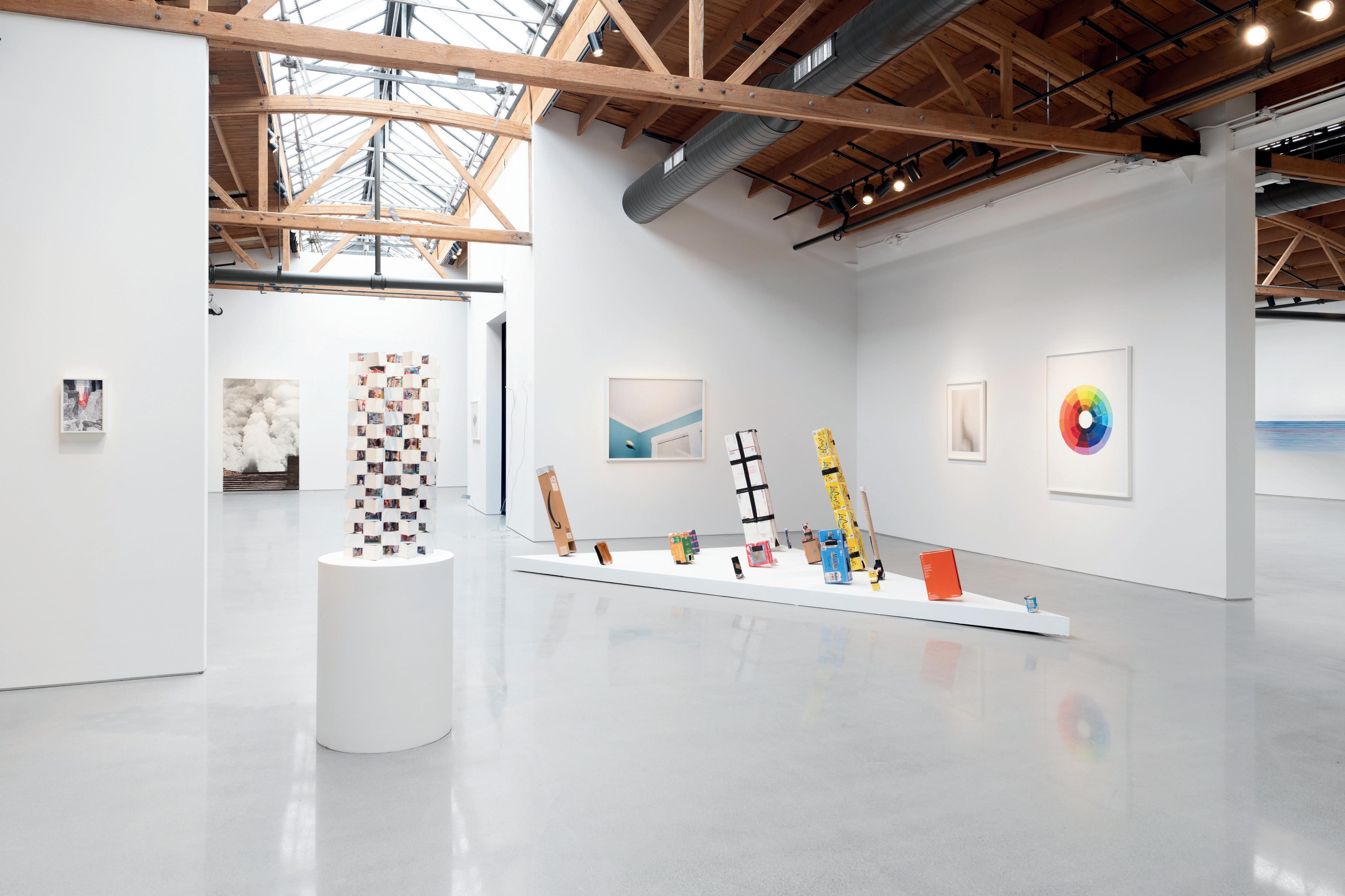
MANIFEST, a survey of artworks and studies by artists and architects exploring themes of light, color and space. This exhibition includes an international roster of artists and was curated with the assistance of Anne Lindberg. In the Salon space, Chicago artistic duo Luftwerk created an immersive in situ light installation that explored the interaction of light and color.
The manifestation of an idea is a universal experience that can occur at both micro and macro levels, consciously and subconsciously and oscillate between different levels of publicness and privacy. To manifest, or to evidence an idea, implies that the idea has completed its journey and come to fruition. Ultimately, the how, if, and why of that idea often leads to more ideas. For artists and architects, this self-perpetuating process of ideation represents a creative venture of its own. Often the remnants, or evidence of some of these ideas distill, scatter, or emerge as a physical form, a glimpse into the manifestation of the final state.
MANIFEST builds a framework for understanding the life of ideas through the intertwined elements of light, color and space. Each artist and architect on view utilizes one or more of these components to develop a visual language, uniquely correlating, arranging, and negotiating these elements to develop their ideas in a variety of material formats. The conceptual components of each aspect find common ground in nature: light (luminosity & illumination), color (emotion & symbolism) and space (motion & volume). Cumulatively, the representation of ideas on their respective journeys make up the building blocks of the world around us and offer an opportunity for examining, ruminating, and discovering the process from imagination to reality.
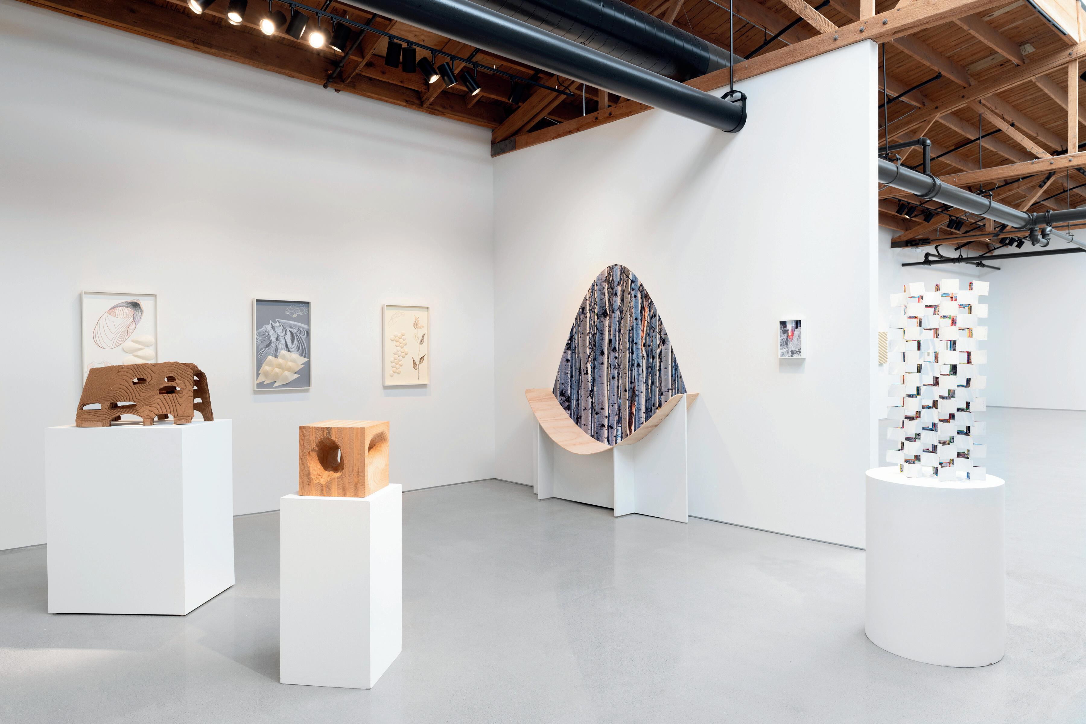

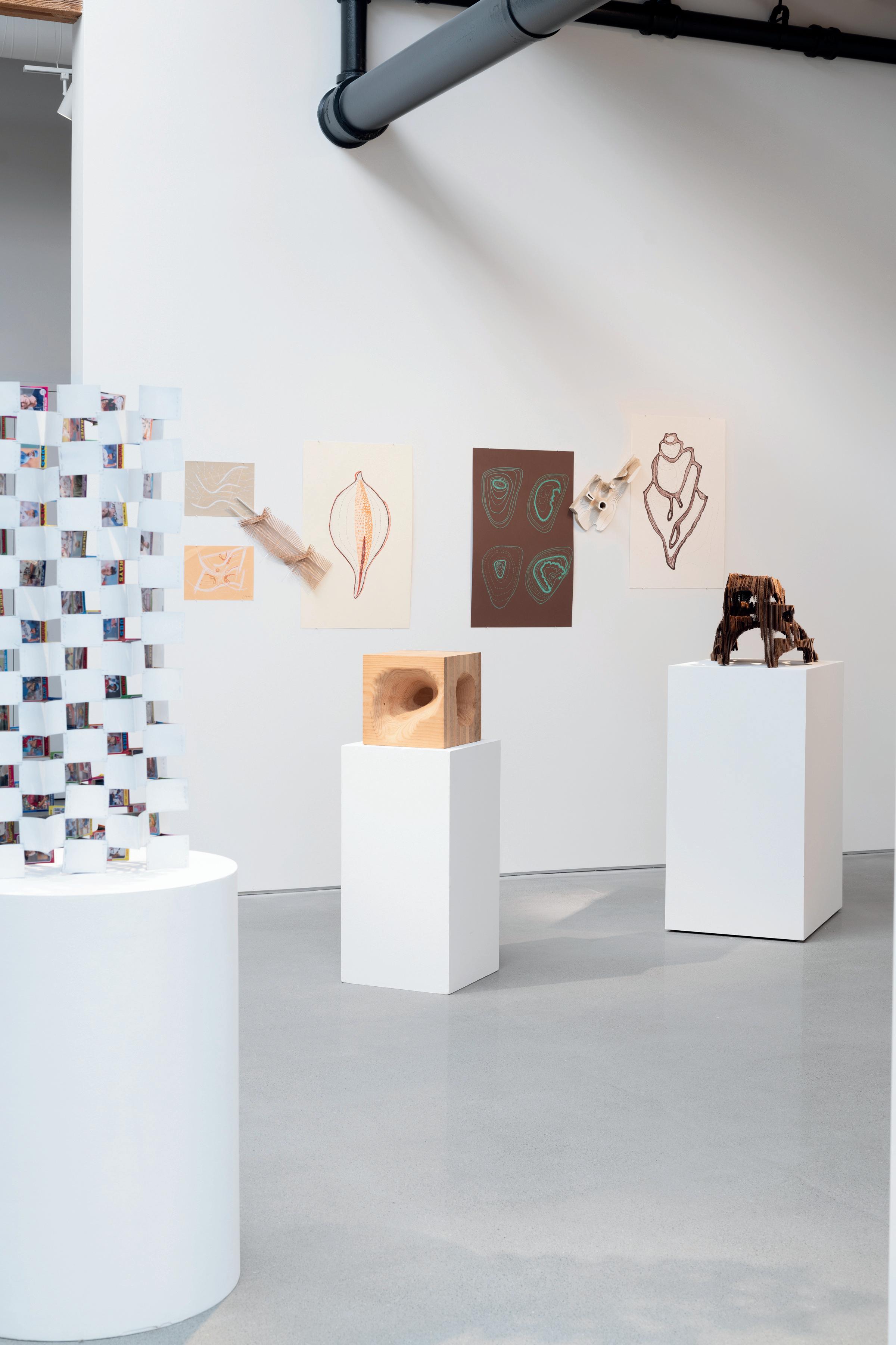
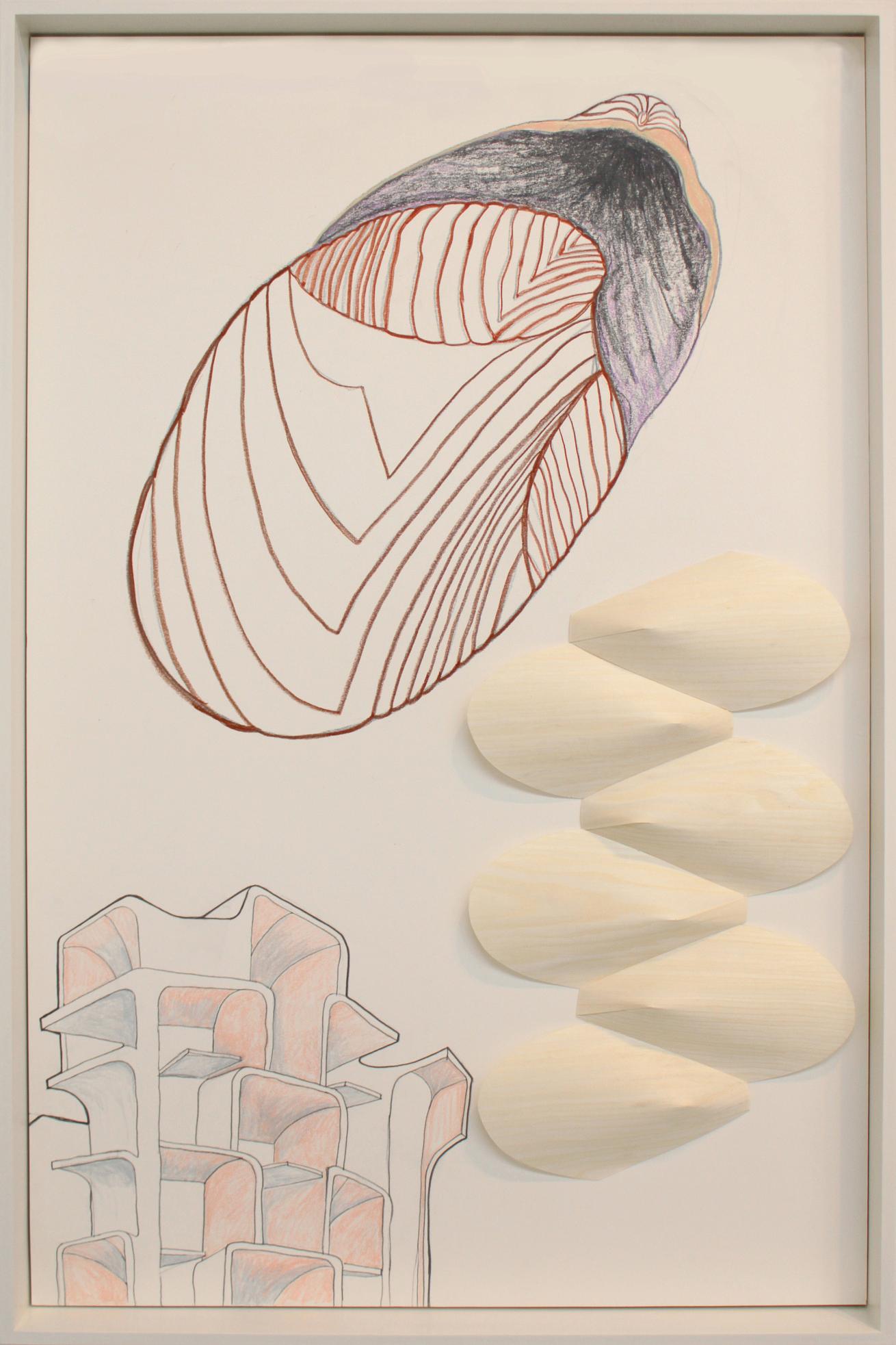
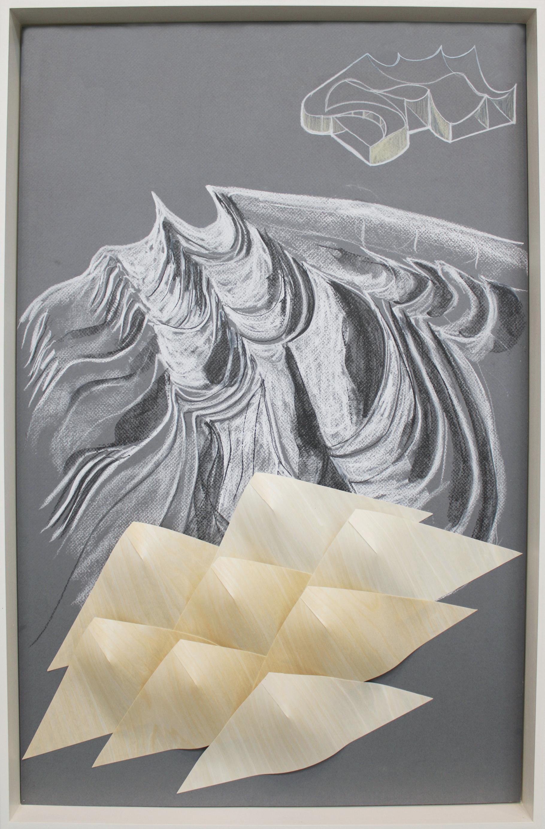
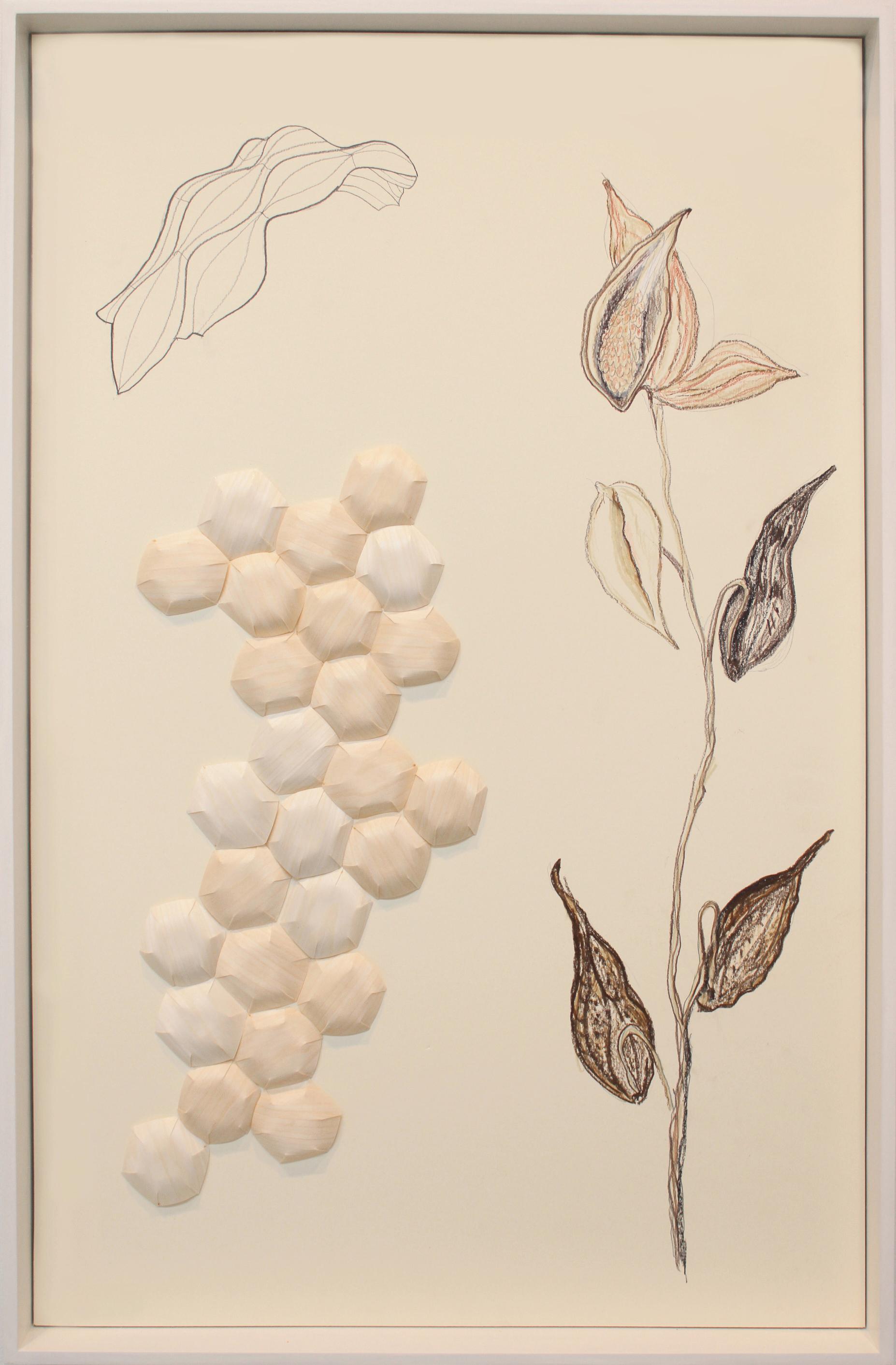
Architect Jeanne Gang is the founding partner of Studio Gang. Drawing insight from ecological systems, her practice merges art and science to create places that strengthen relationships among people, their communities, and the environment. Spanning scales and typologies, her projects range from museums and civic buildings to public parks and materially-driven installations. Her work has been exhibited widely and is in the permanent collection of the Art Institute of Chicago, Centre Pompidou, Museo nazionale delle arti del XXI secolo (MAXXI), Canadian Centre for Architecture, and Cooper Hewitt Smithsonian Design Museum.
Gang’s ideas evolve from nature’s influence on humanity, but equally aspire to conjure empathy for the natural world around us.
Nature has been a major influence on me for as long as I can remember. How plants grow and change, how animals move and behave, how rivers wear through rock over time to carve smooth canyons—this is the content I learn from. I make drawings and models to record these phenomena and deepen my understanding of how nature responds to different situations. This kind of close observation of processes can inform architecture and design in so many ways—not just to copy the appearance of organic forms (though they’re often striking), but to apply lessons in why these forms are what they are: elegant structures suited to their particular place. This “earthly” way of thinking and working is often where my ideas originate. It leads me to create projects that connect people with their environment both physically and intellectually, from heightening our attention and experience of natural phenomena to helping us discover more about the ecology around us. In this way, architecture can build empathy, understanding, care, and enjoyment of the living world.
- Jeanne Gang

Manhattanhenge, 2013
Laser print and glue on paper
11.75 x 8 inches, framed
All works courtesy the artist


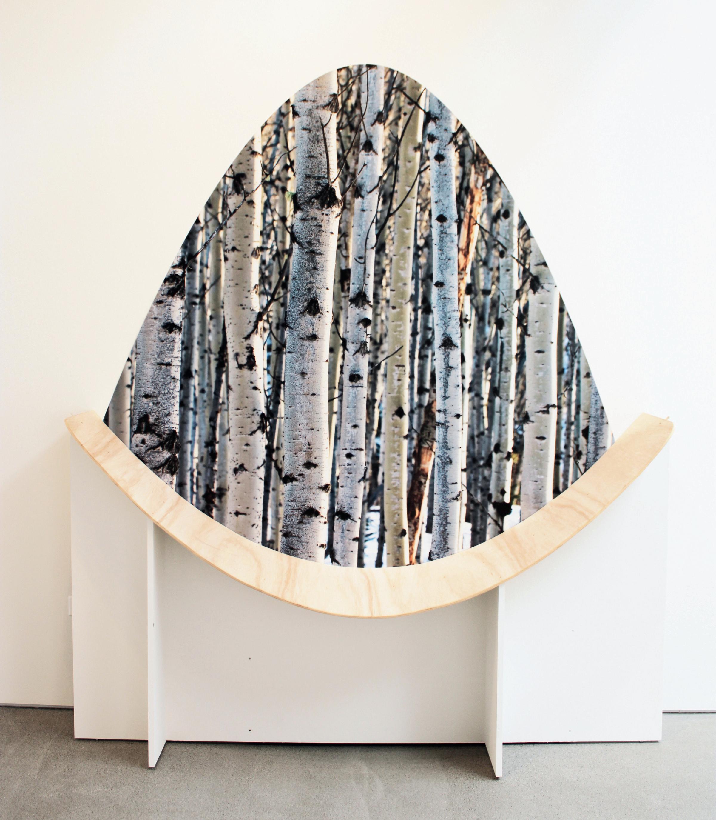

Landform Study, 2015
Museum board
2.75 x 17 x 8 inches
Oar Motion Study, 2012
3 x 20.25 x 7.25 inches
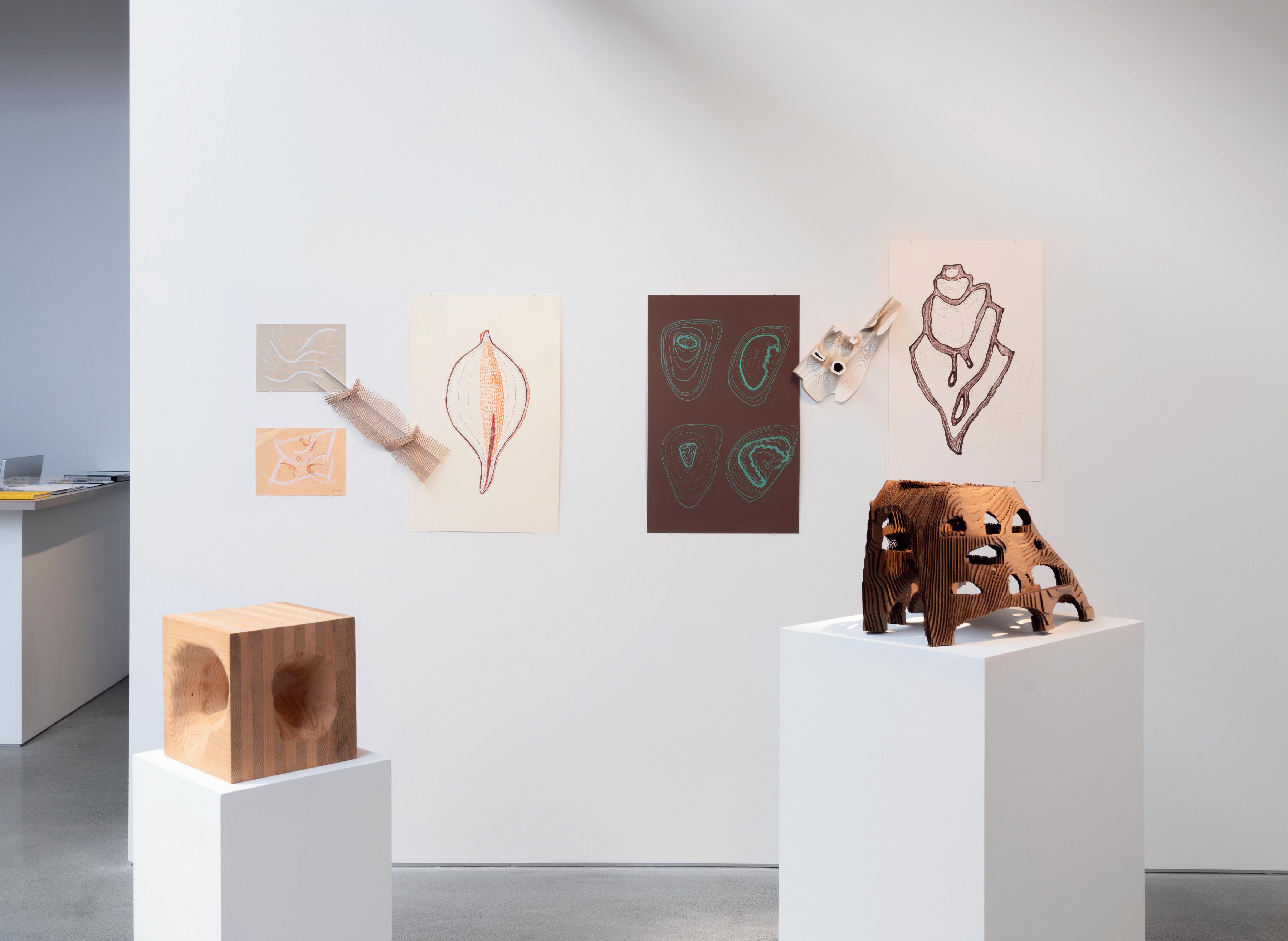

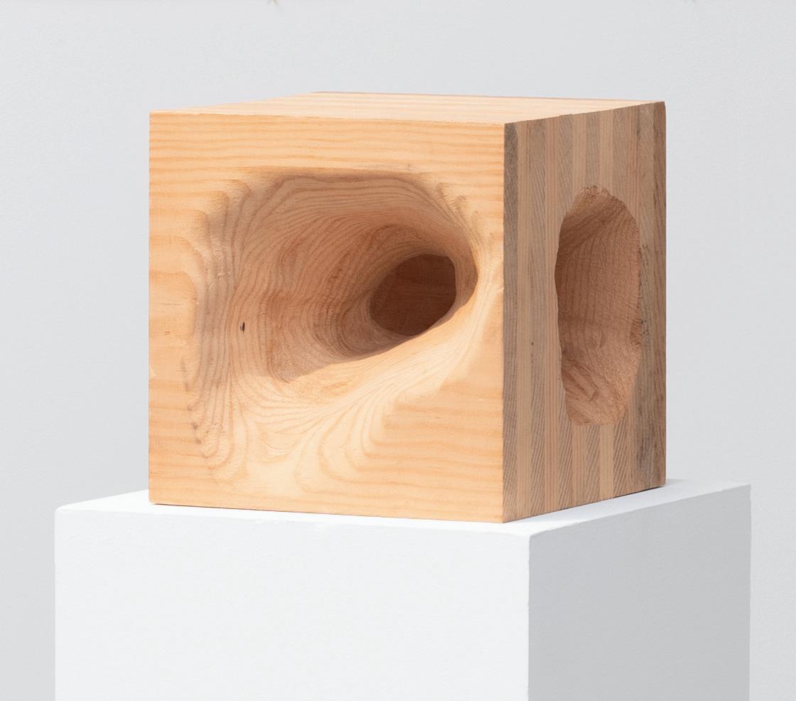
Erosion Study, 2015 Wood
12
12 x 12 inches
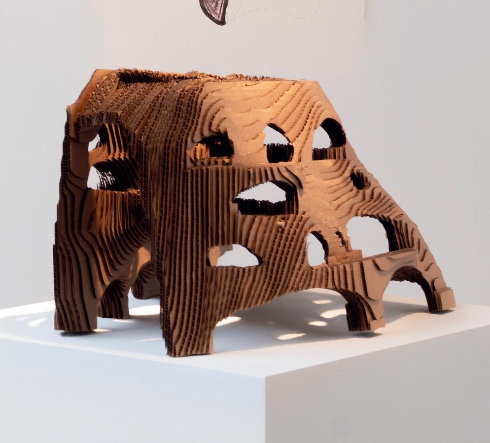
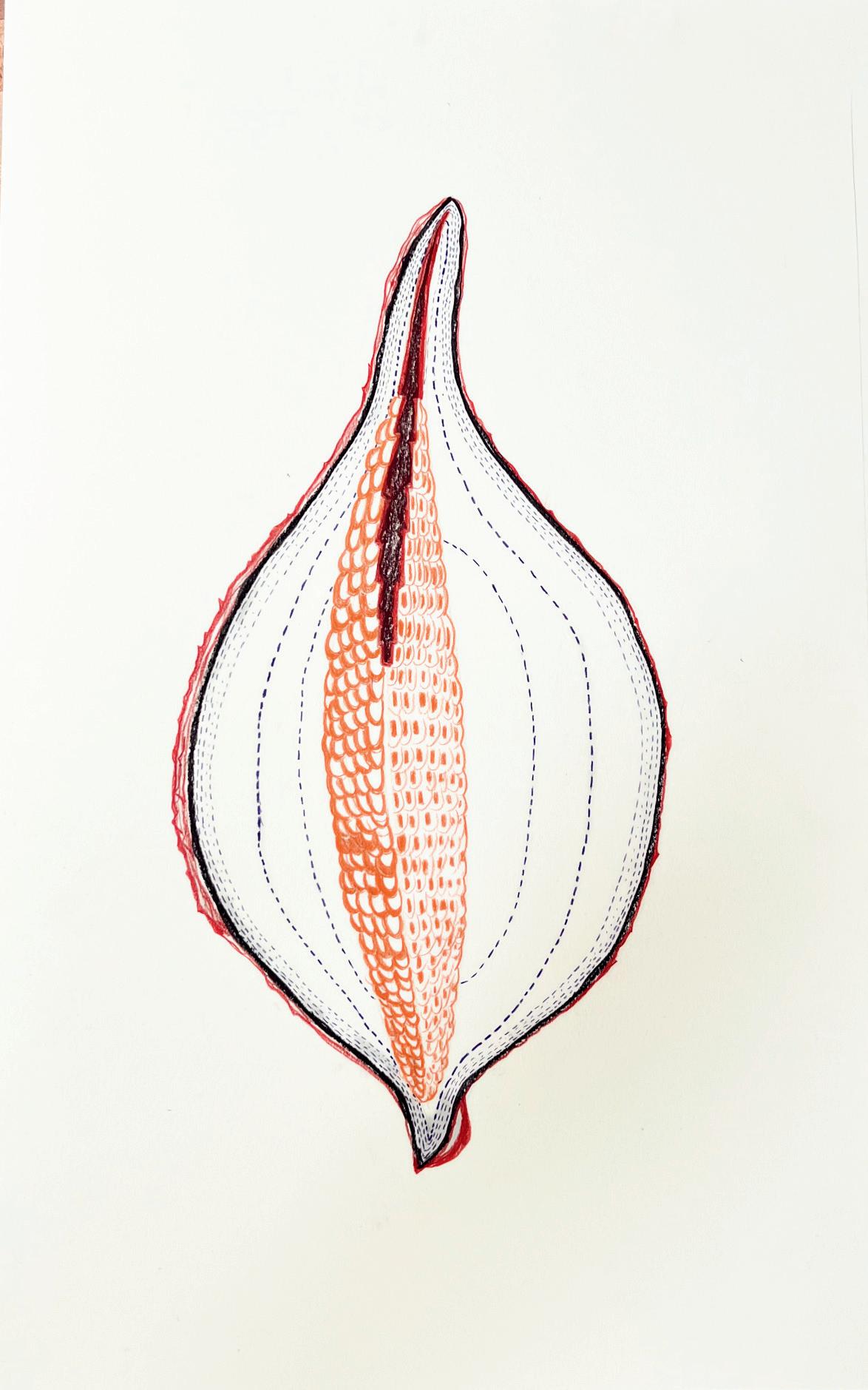
Topography 3, 2024
Chalk, charcoal, and graphite on illustration board
31.5 x 20 inches
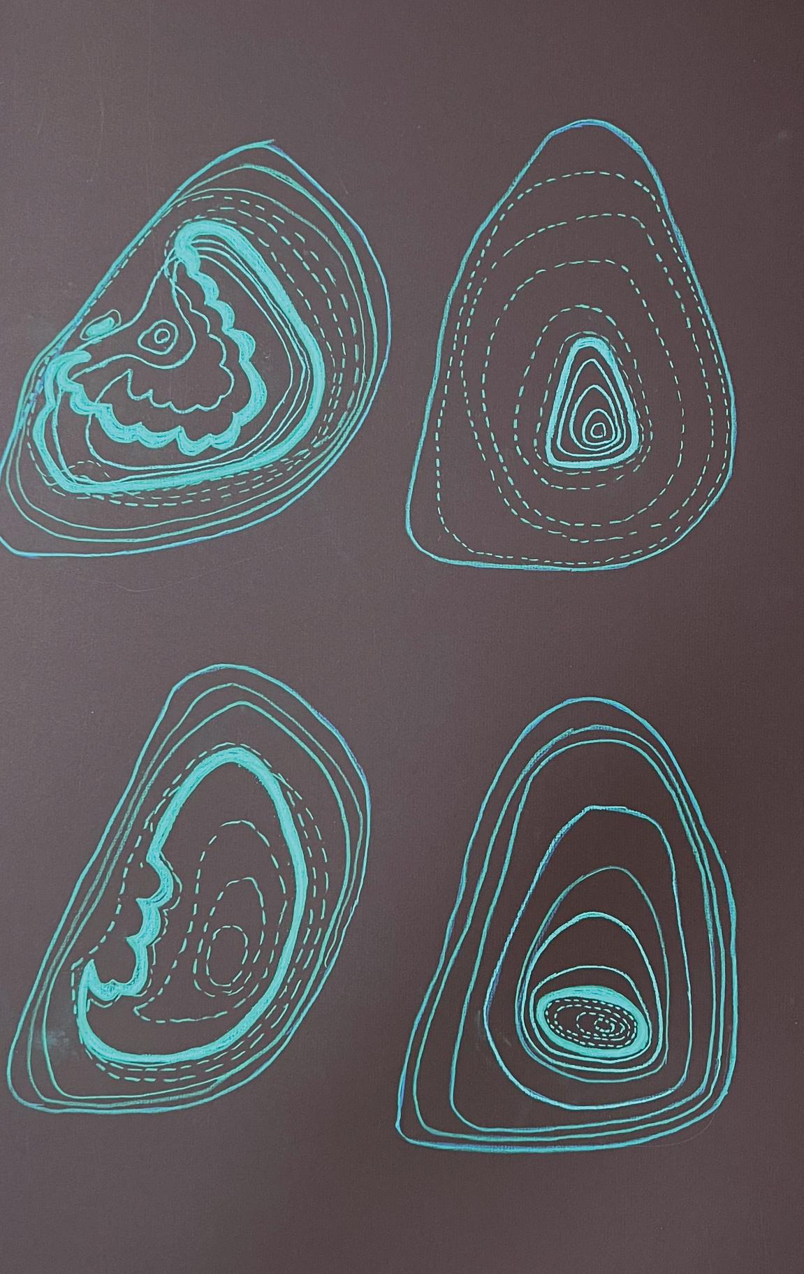
Topography 1, 2024
Chalk, charcoal, and graphite on illustration board
31.5 x 20 inches
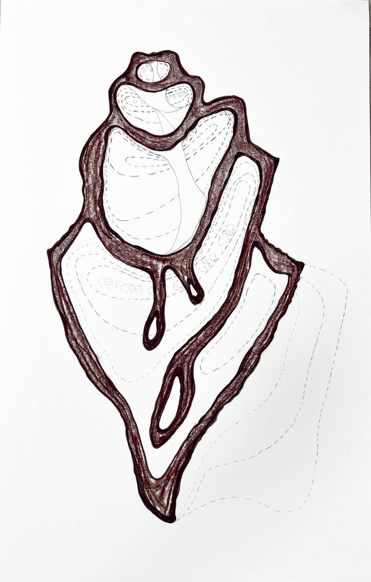
Topography 2, 2024
Chalk, charcoal, and graphite on illustration board
31.5 x 20 inches

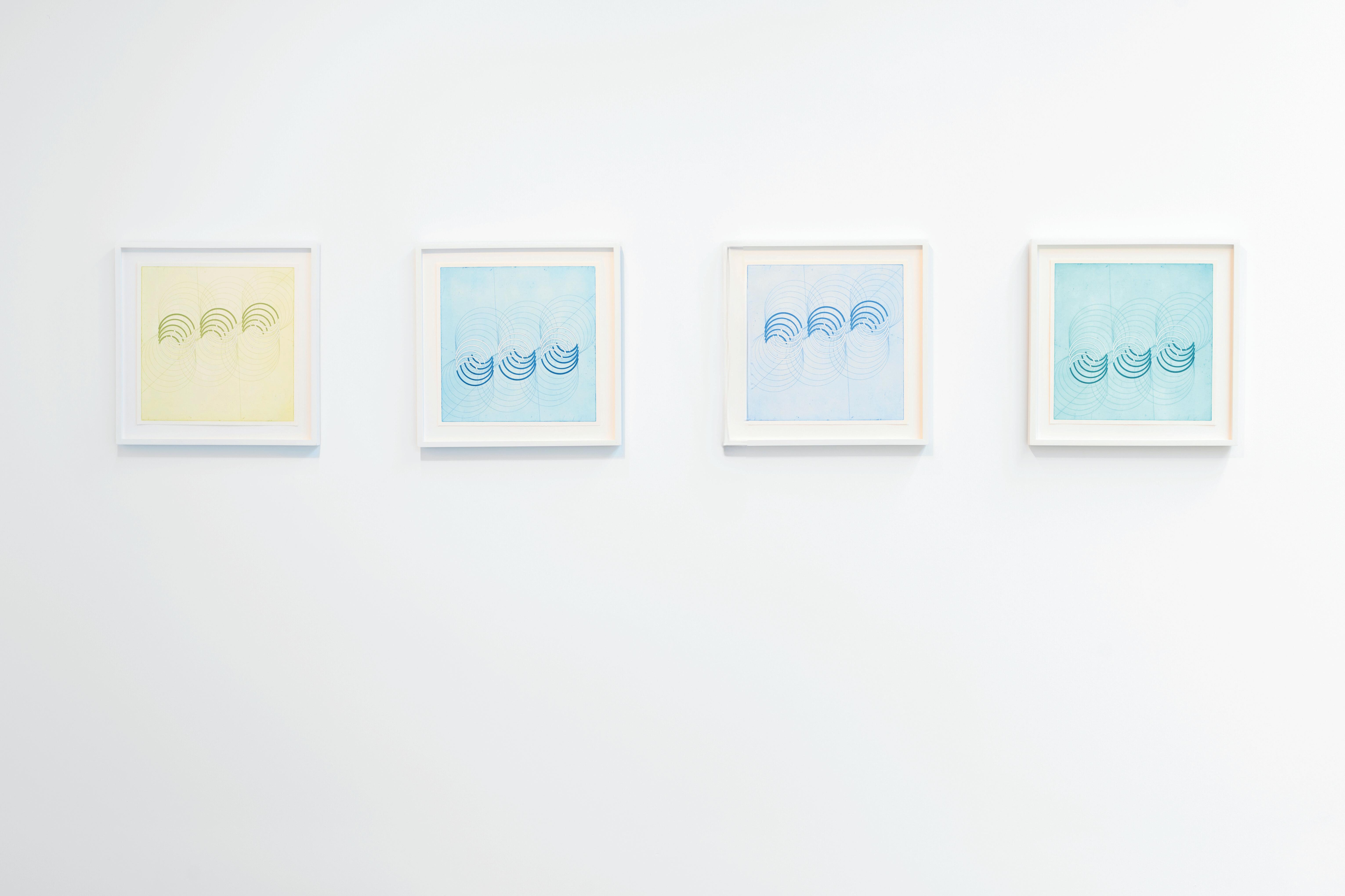
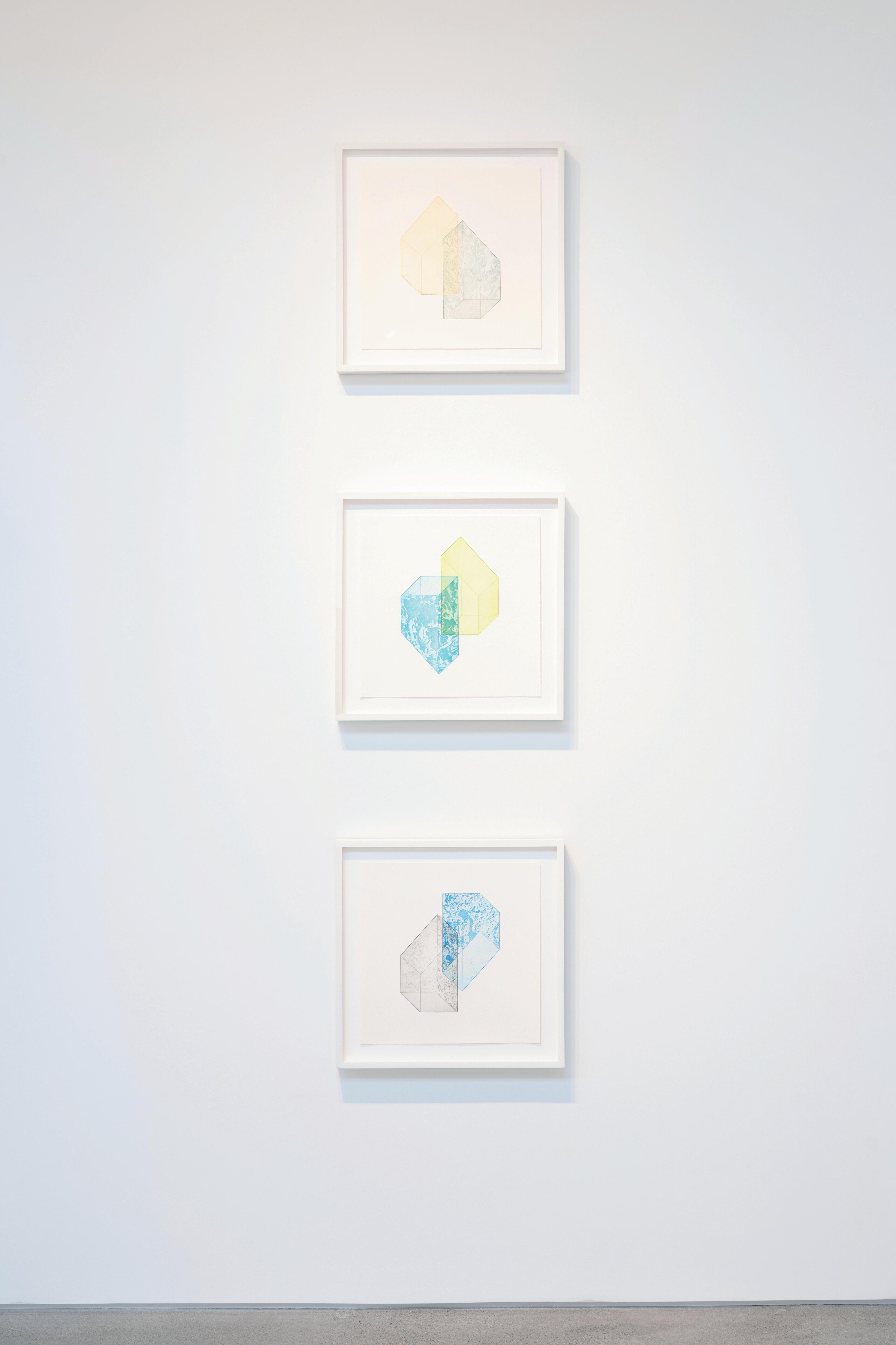
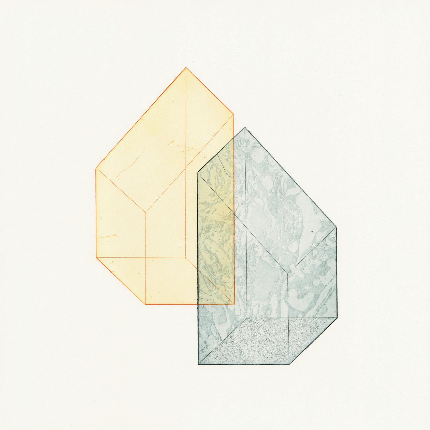
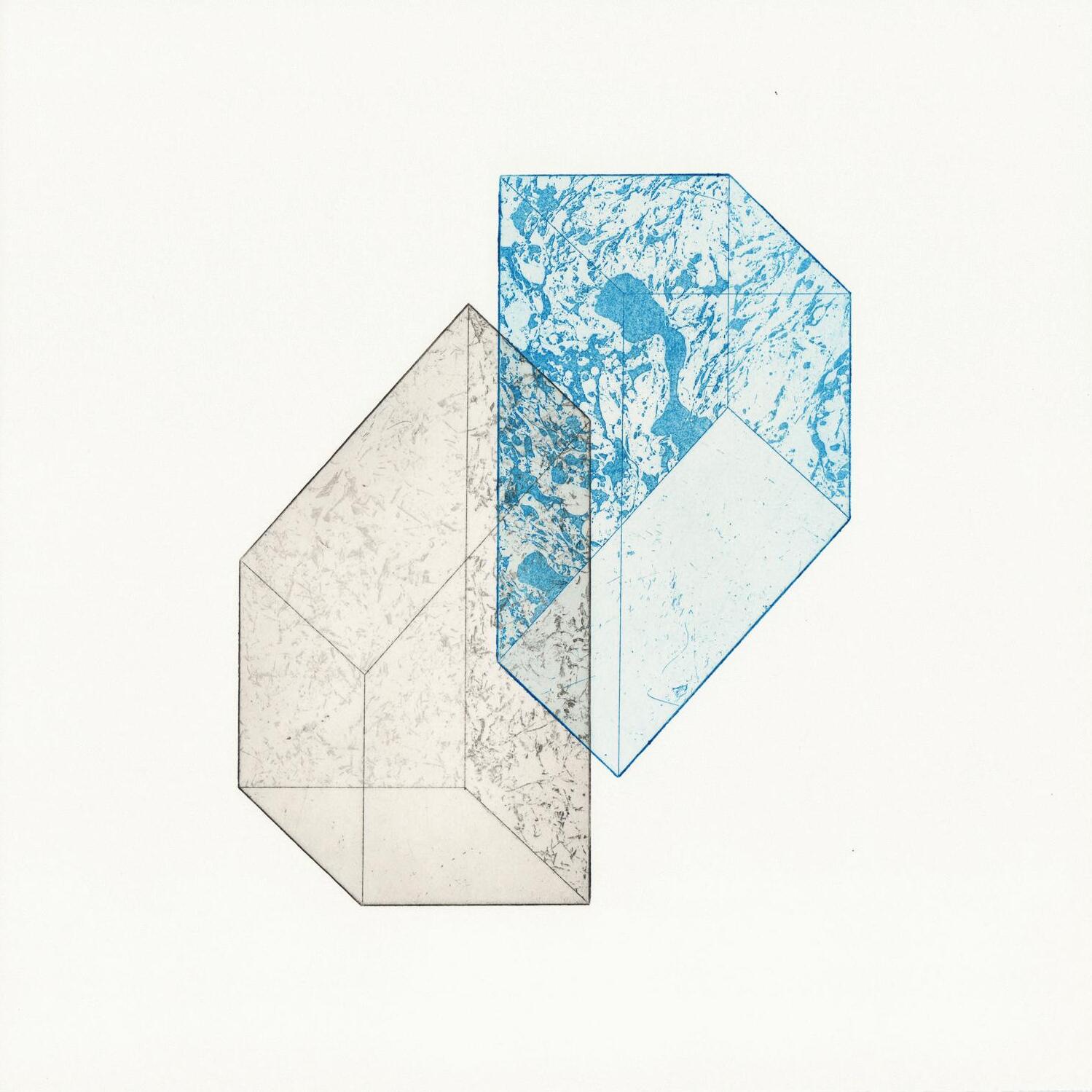
Rachel Duckhouse’s prints use abstract forms to express the dynamic relationships between elements—particularly architecture and light. Using the experiences of walking, observing, and drawing as intake, and by expressing them through inspired geometries and patterns, Duckhouse creates works that evoke—rather than represent— the connection between inner and outer worlds.
Duckhouse’s prints explore structures, patterns, and flows within specific landscapes and the dynamic relationships between elements of architecture, water, light, and memory.
Duckhouse’s Canberra series came out of a residency at Megalo Print Studio in Canberra, responding to the architecture in the area. Series Through to the Citz emerged through the artist’s observation of the Laurieston Arches, an architectural project in Glasgow. The work draws on the arch shape, using compasses and patterns to explore this simplistic form through color, line weight, and texture.
“My process usually begins with walking, or talking with others – to draw out which aspects of a physical space resonate with me. Then through line drawing I try to sketch out a version of the memory that has its own resonance, by isolating and focussing on certain forms or flows, by repeating, extruding and reflecting them. Sometimes it’s a particular shape, or the feeling of a shape, or a flow of energy.
These motifs are transformed again when I draw them onto copper. The sculptural quality of etching, and the character of line and tone create a unique texture and atmosphere. When the plate is etched, printing with color can begin. I can’t predict which colors will work until I start to experiment with different inks. On a multi-plate etching, when colors are printed in layers (as with Canberra series) or when they sit next to each other in a series (as with Through to the Citz series) the relationship of one color to another is a

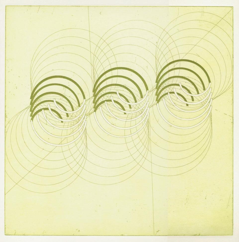
Through to the Citz (G), 2024
Copperplate hardground and aquatint etching on Arches Blanc paper
16.25 x 16.25 inches
All work courtesy the artist
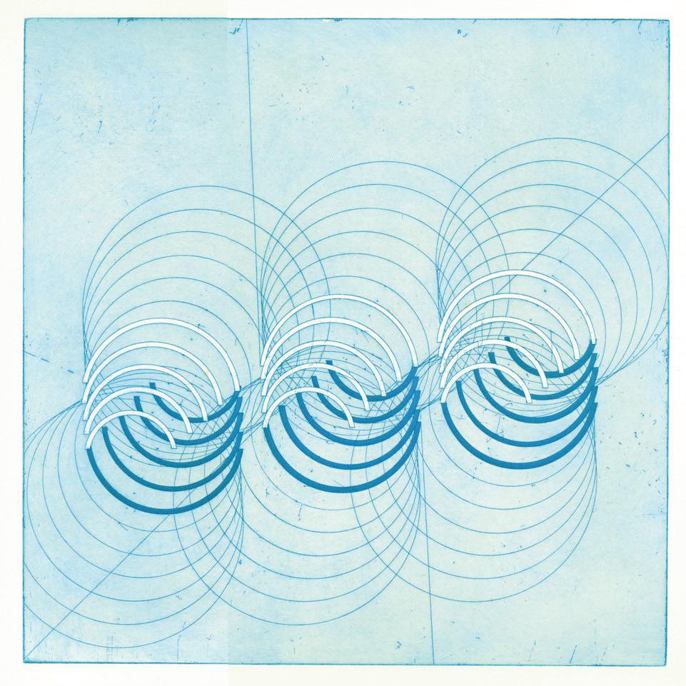
Through to the Citz (O), 2024 opperplate hardground and aquatint etching on Arches Blanc paper 16.25 x 16.25 inches
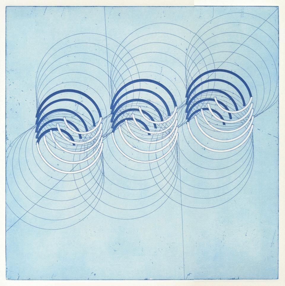
Through to the Citz (C), 2024
Copperplate hardground and aquatint etching on Arches Blanc paper 16.25 x 16.25 inches
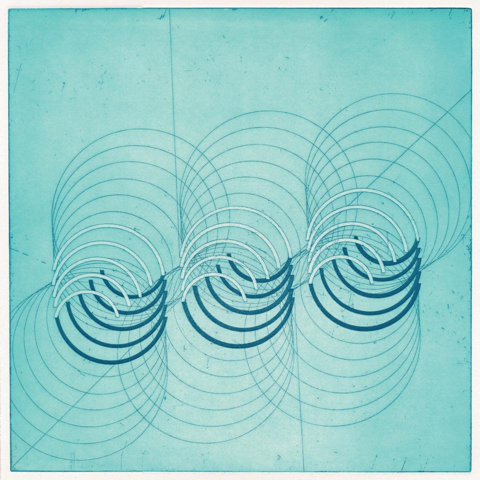
Through to the Citz (T), 2024
Copperplate hardground and aquatint etching on Arches Blanc paper 16.25 x 16.25 inches

Canberra iii, 2019
Jason Lazarus is an artist exploring vision and visibility. His work includes a range of fluid methodologies: original, found and appropriated images, textas-image, photo-derived sculptures made collaboratively with the public, live archives, and public submission repositories, among others.
Lazarus incorporates the spectator, placing them in a unique position between knowing and not-knowing. Through simple photographs and almost-amateur constructions, Lazarus engages the viewer’s critical center to both contextualize the work within the tools of light and shadow, (punctuated by shape and color) and to situate themselves against the mystery of “what happened there/here?”
Abandoned Painting (Tampa, FL) is a photograph of an unknown art student’s abandoned color wheel exercise—Lazarus only one step closer to the mystery than the viewer. Lazarus’s self portrait from 2008 employs a ghostly image of his own shadow to delineate his absent body. In contrast, his photograph of a canary captures both the bird and its shadow. The curious composition renders its flight path unknowable to the viewer, thus inviting an imagined narrative.
I have to be a dreamer and a believer – a living barometer to the unspeakable power, expression, and implication in the marginal and the everyday. My role is to affirm to participant-collaborators that their contributions have sophisticated and generational value that singularly bear witness, provide longitudinal care, and mount public installations that encourage expansive readings.
Thanks to Carolina Shin (St. Petersburg, FL), Laura Meckling (Tampa, FL), Sue Havens (Tampa, FL), Wesley Donmez (Tampa, FL) and a handful of anonymous submissions for their contributions to this archive iteration at SECRIST | BEACH.
- Jason Lazarus

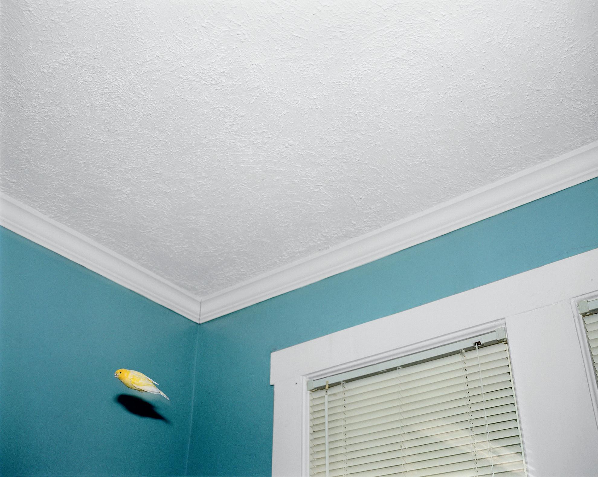
40 x 50 inches, framed Courtesy private collection

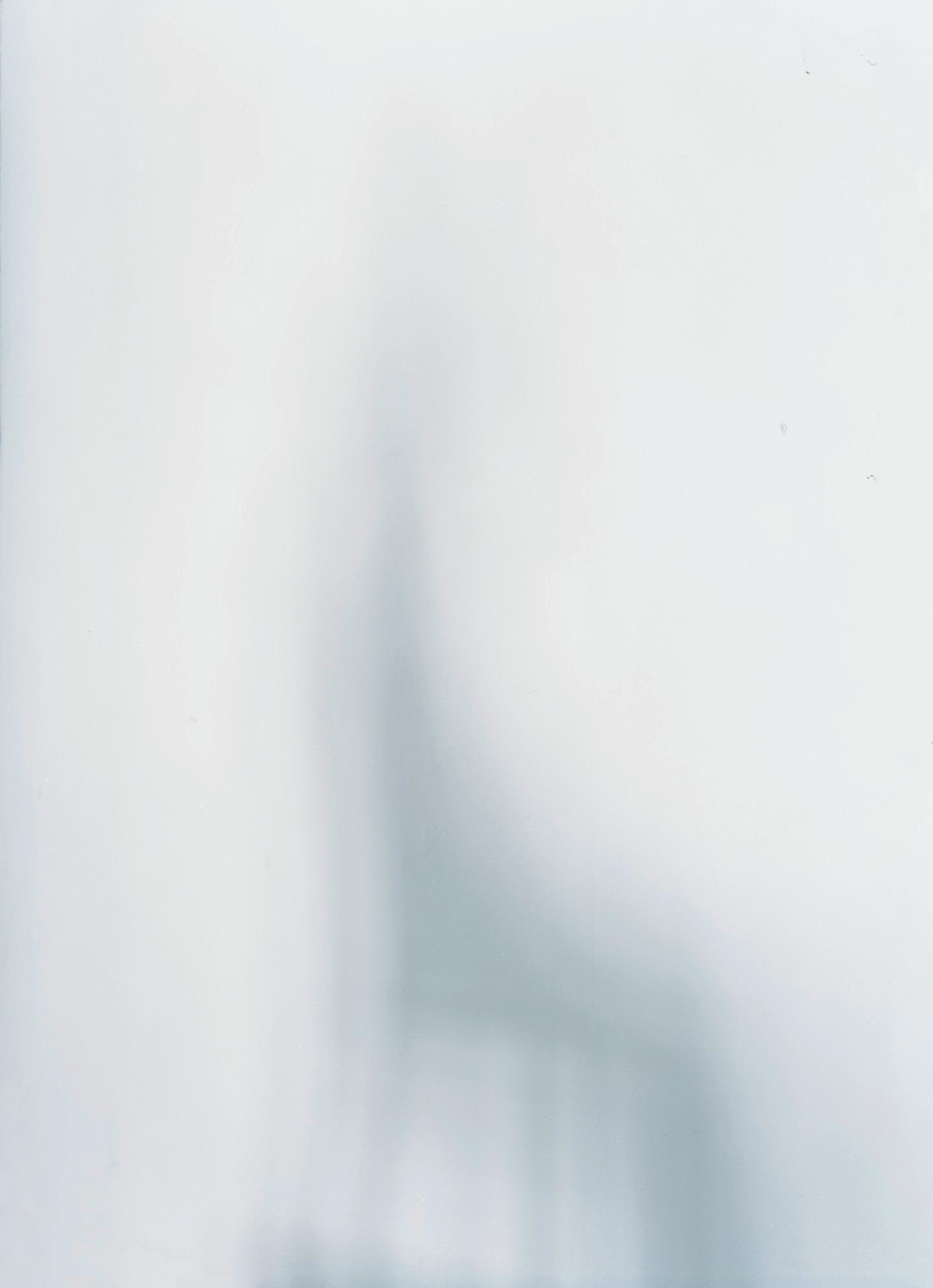
, 2008
Archival pigment print
36 x 27 inches, framed
Courtesy private collection
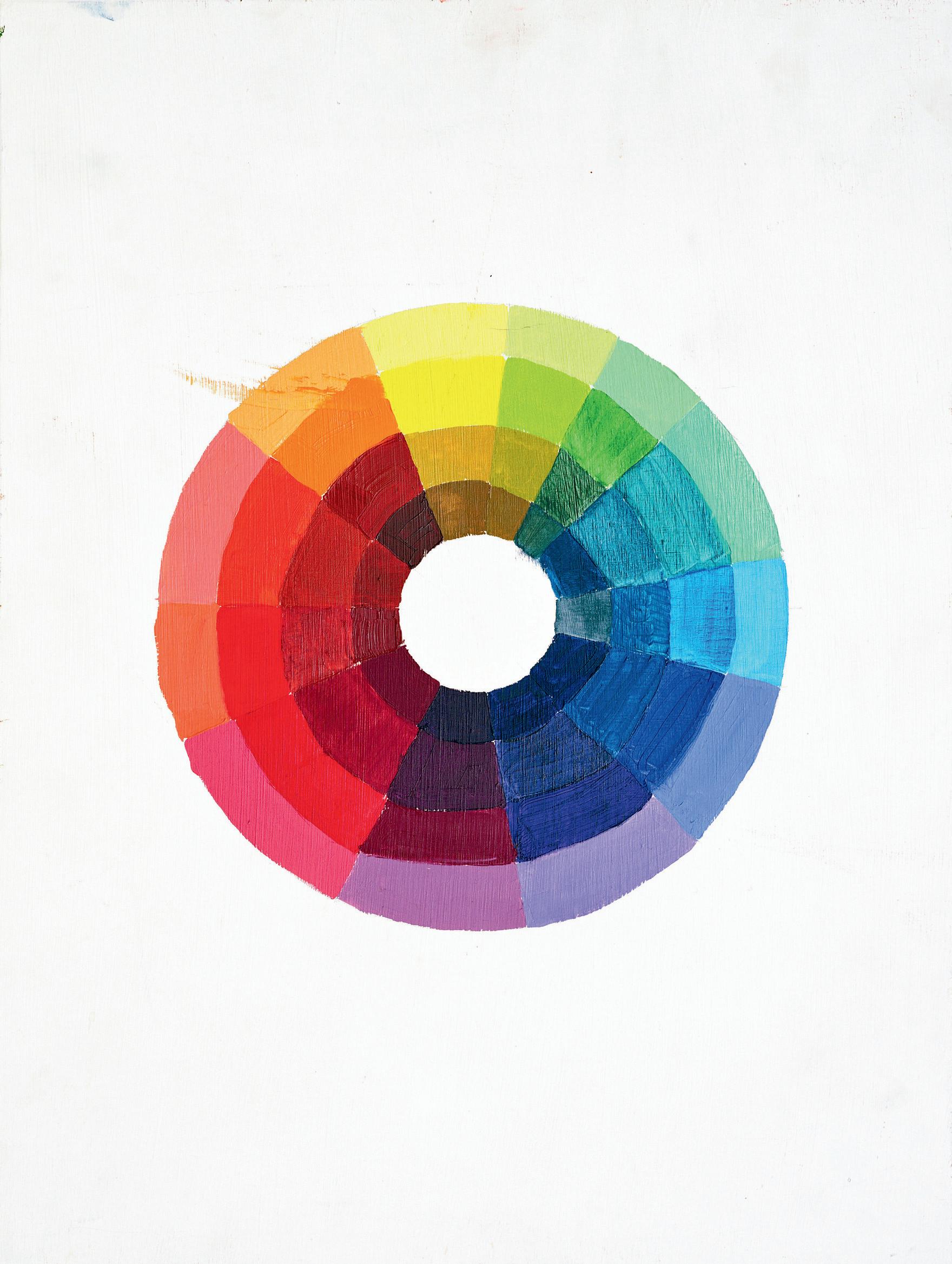
Abandoned Painting (Tampa, FL), 2013
Archival pigment print
52 x 40 inches, framed Courtesy private collection
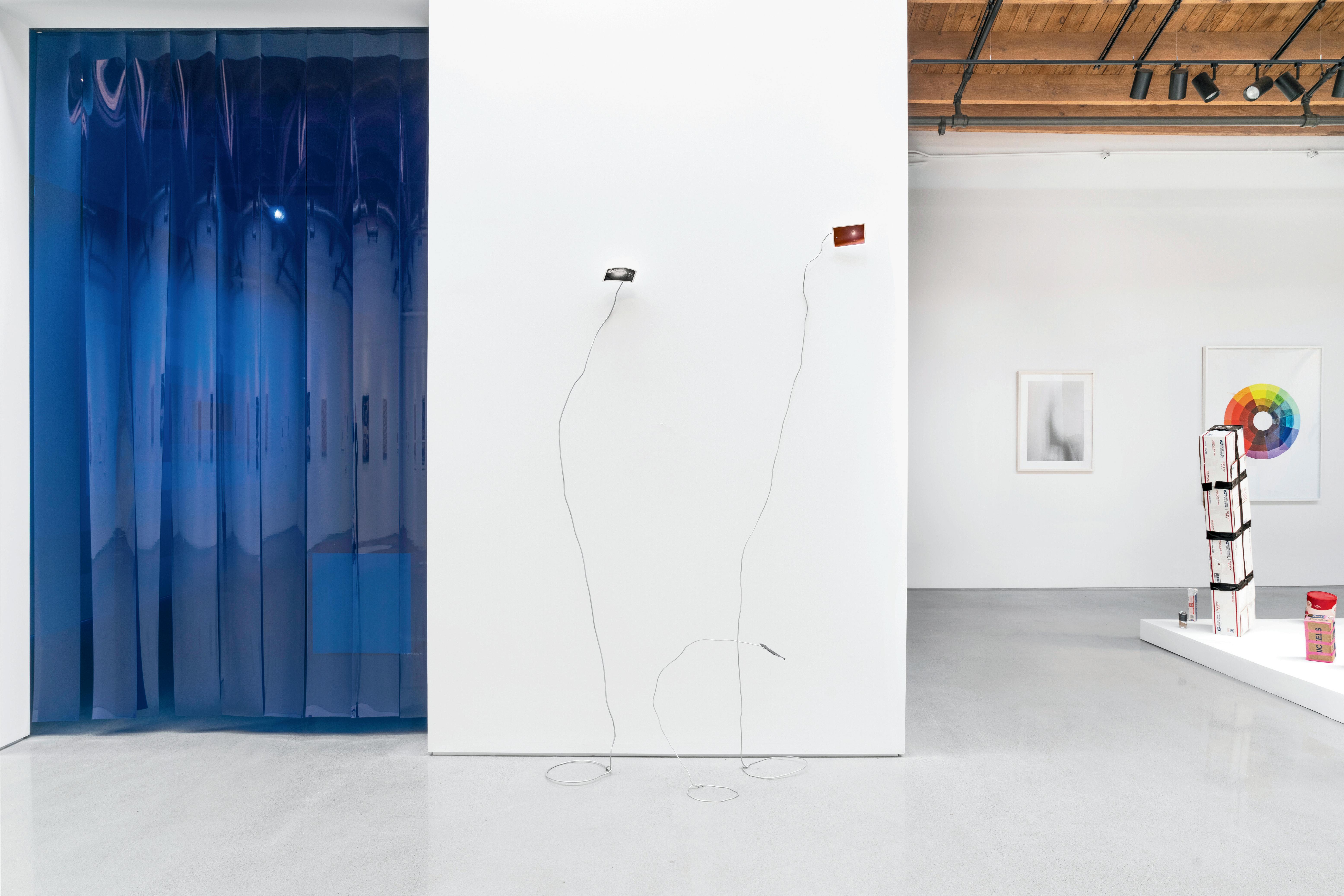
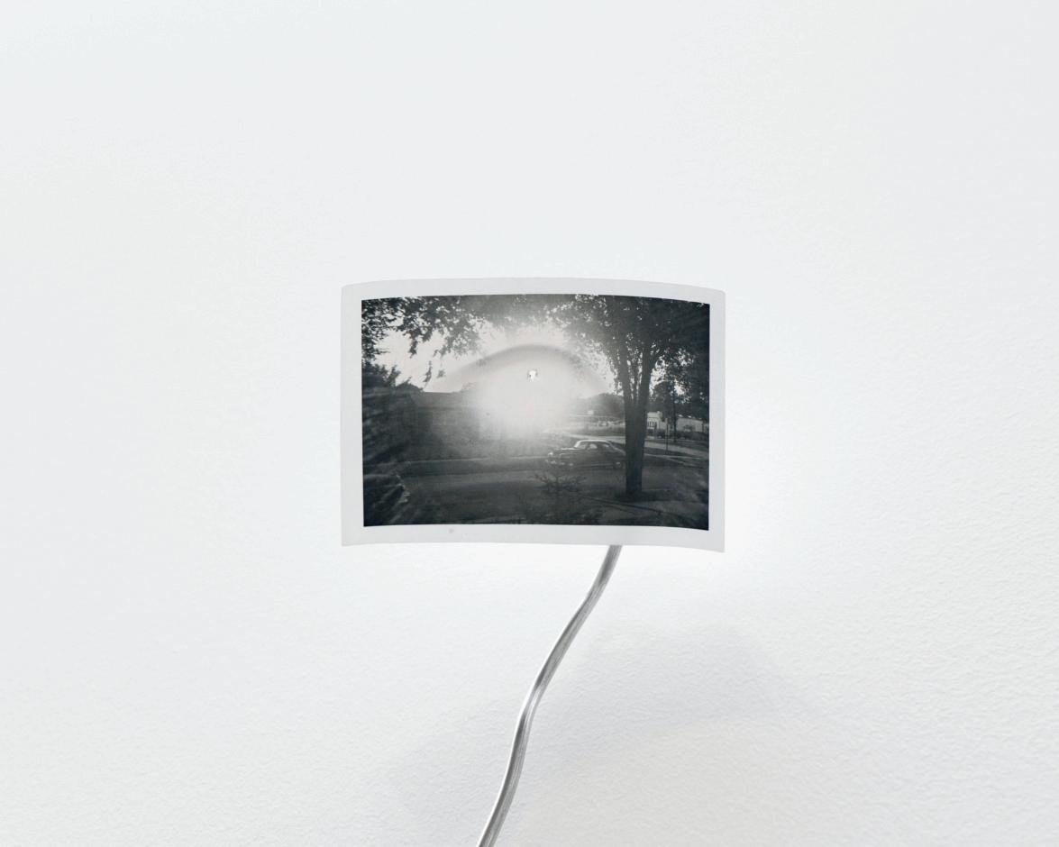
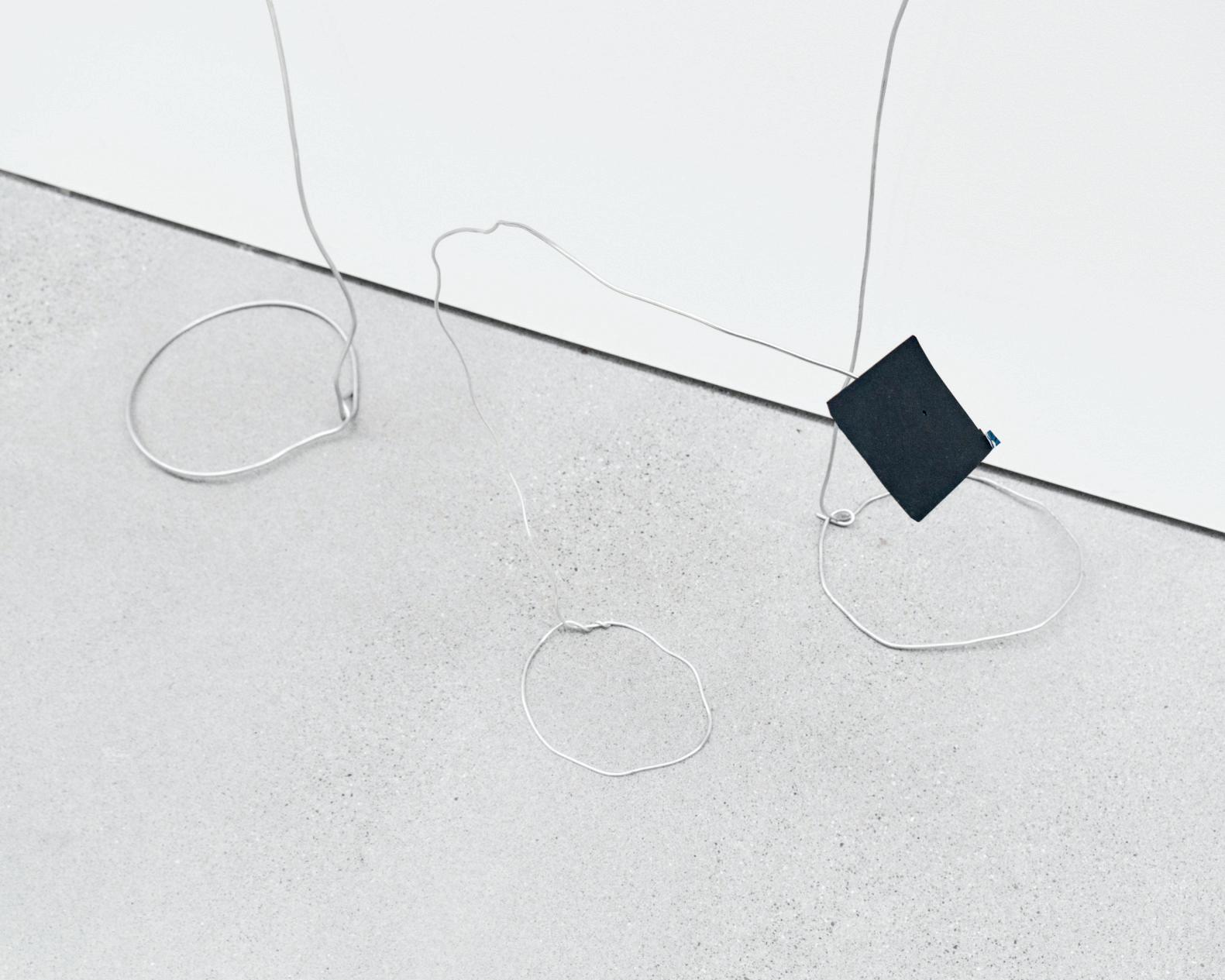
Eclipse Drawing II, 2024
Sculpture wire and vintage original photograph
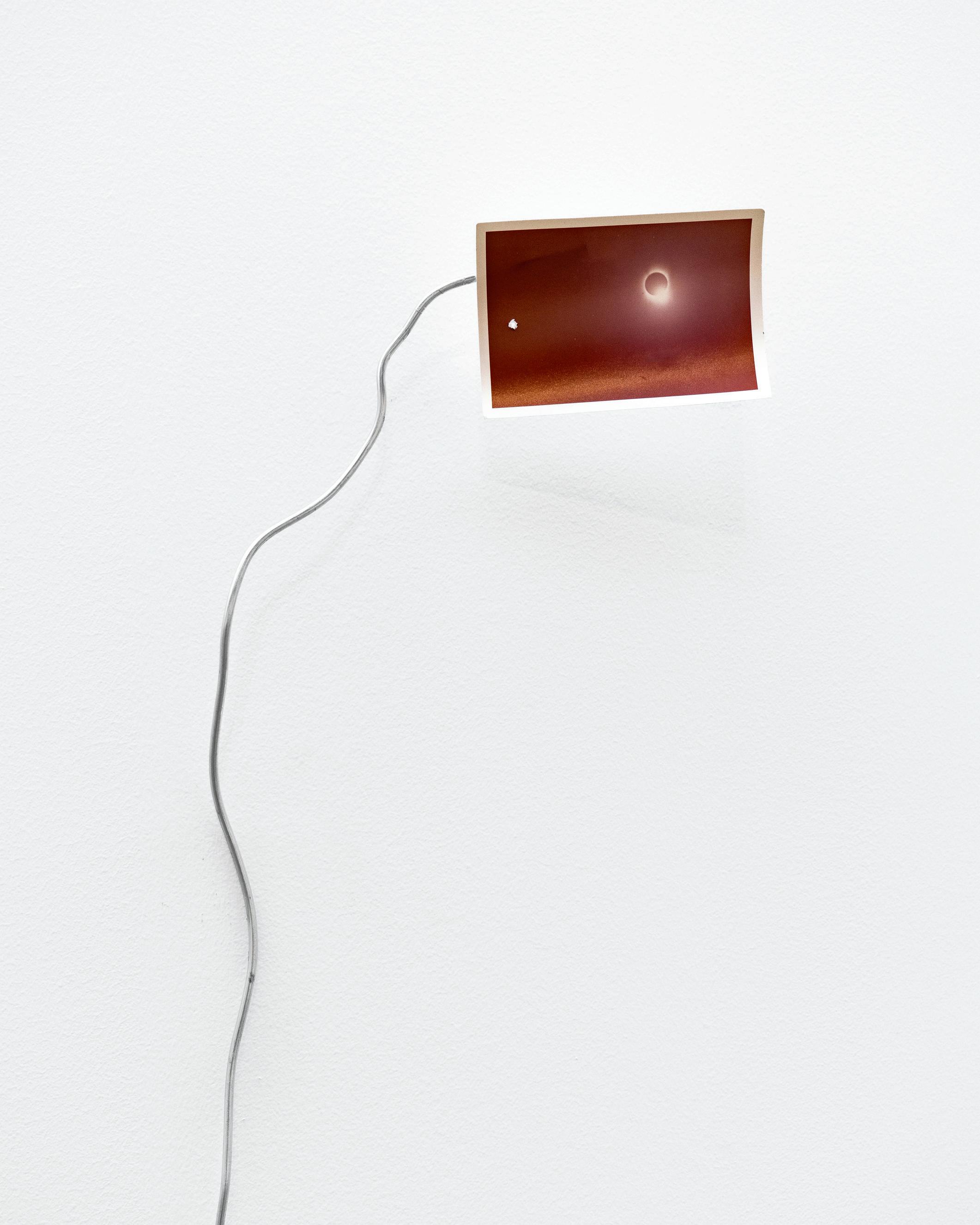
Eclipse Drawing I, 2024
Sculpture wire and polaroid dark slide
Eclipse Drawing III, 2024
Sculpture wire and vintage original photograph

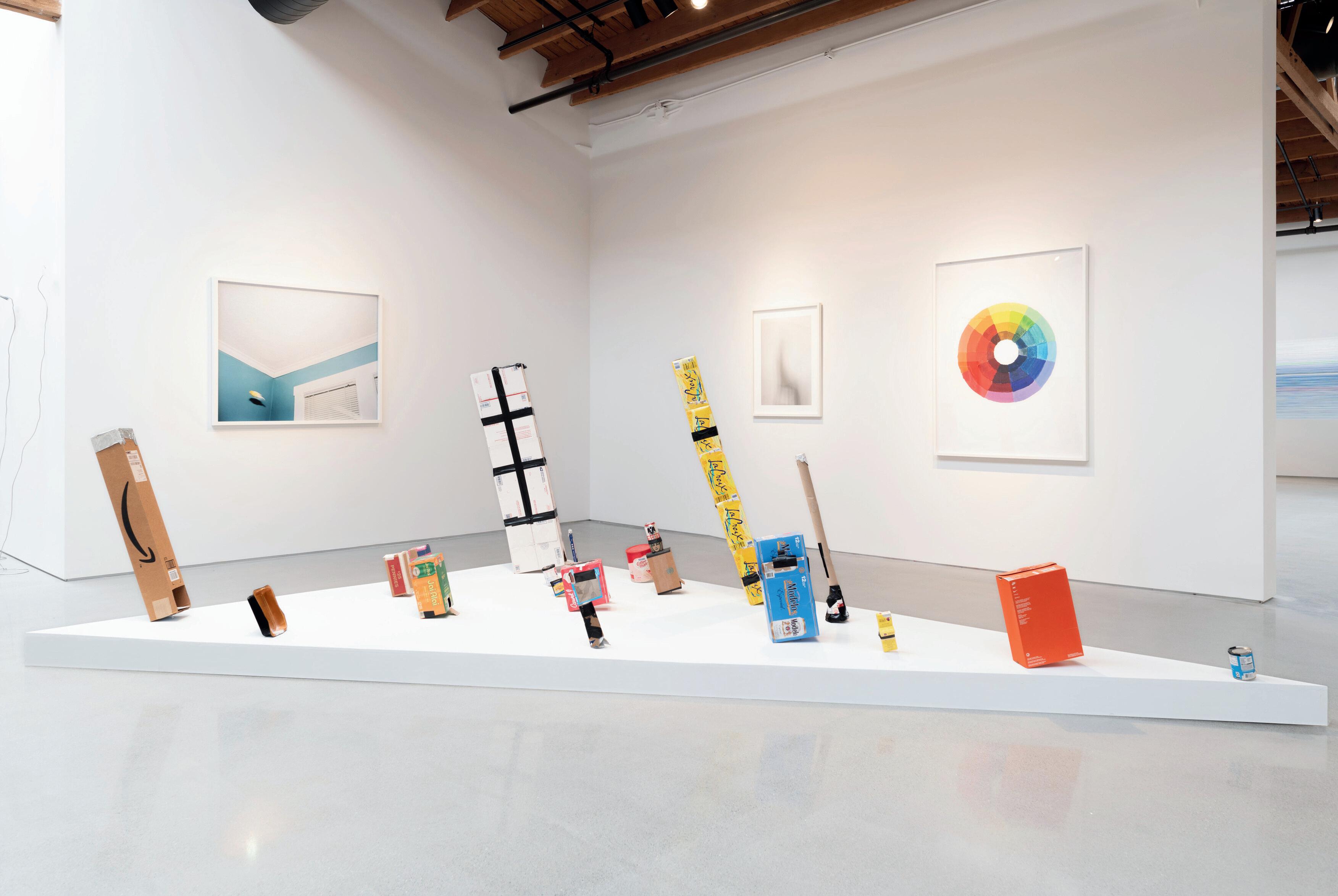
A Symphony and a Score (2017/2024) is a growing archive of used, handmade solar eclipse viewers made by both the general public and the artist.

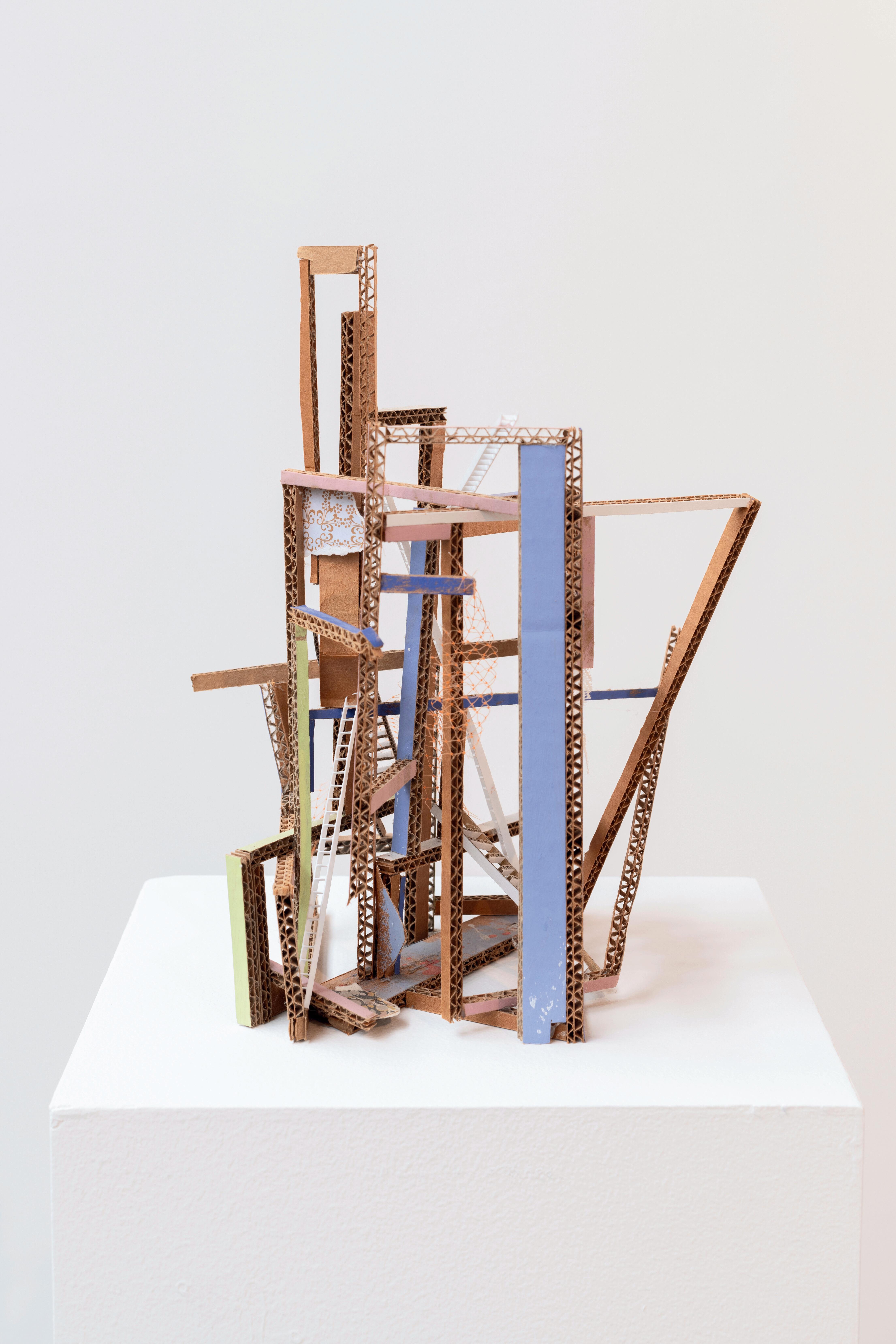
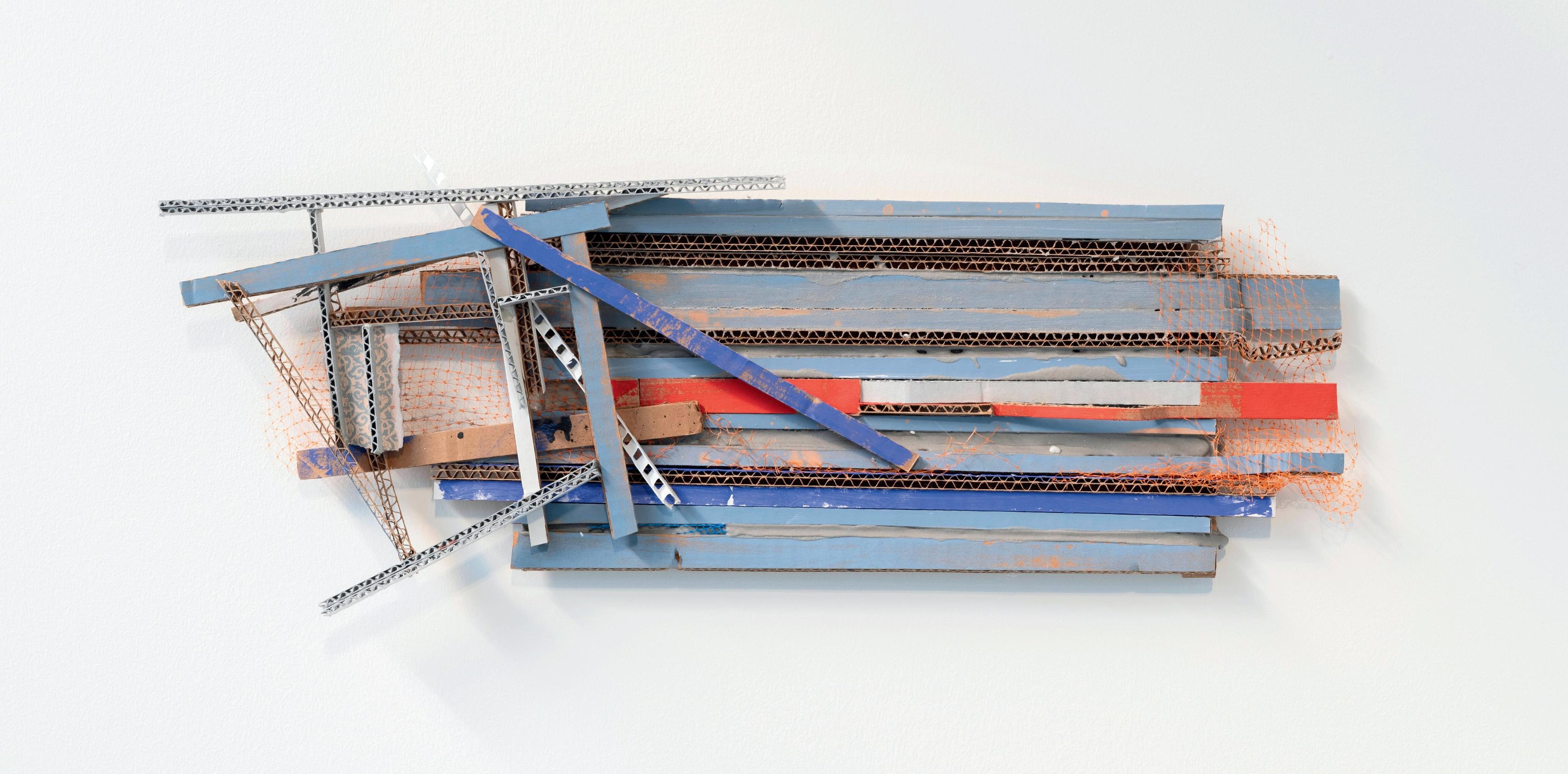
Throughout Ana Tiscornia’s wall works, collages, assemblages of fragmented furniture and common tools, there exists a tension between order and disorder. In the artist’s words: “In rearranging the various materials I seek a potential poetics—a kind of cartography of social oblivion—that is simultaneously exposing but also recovering scattered fragments of the utopian project.”
Sculpture #1 and Blue Wall demonstrate this struggle between order and disorder explicitly. Blue Wall, when read from right to left, contains elements neatly arranged in a horizontal formation that collide into discordant angles and textures on the left side of the wall sculpture.
While Sculpture #1 lacks any pattern in its structure, Tiscornia has signified a locus of architecture by placing a ladder into its center, as if a home with walls, a roof, and levels.
My work draws upon a paradoxical bond between architecture—a language of construction par excellence—with that of destruction and dislocation. It is an act of despair as well as one of hope. Displacement, fissure, uncertainty and repetition are constants of the work, seeking to unite the apparently fortuitous and the precise calculation in a fragment of a structure—that of a house with modernist echoes—that activates perceptions of physical fragility and ideological failure. Trying not to undermine certain elegance, those pieces point as much to a poetic rescue in the middle of the debacle, as to a perversity in the friction between representation and content. Addressing the devastated space with the semantic of the construction is an attempt to create a presence that designates the desolation of the loss, a sort of cartography of the oblivion.
- Ana Tiscornia

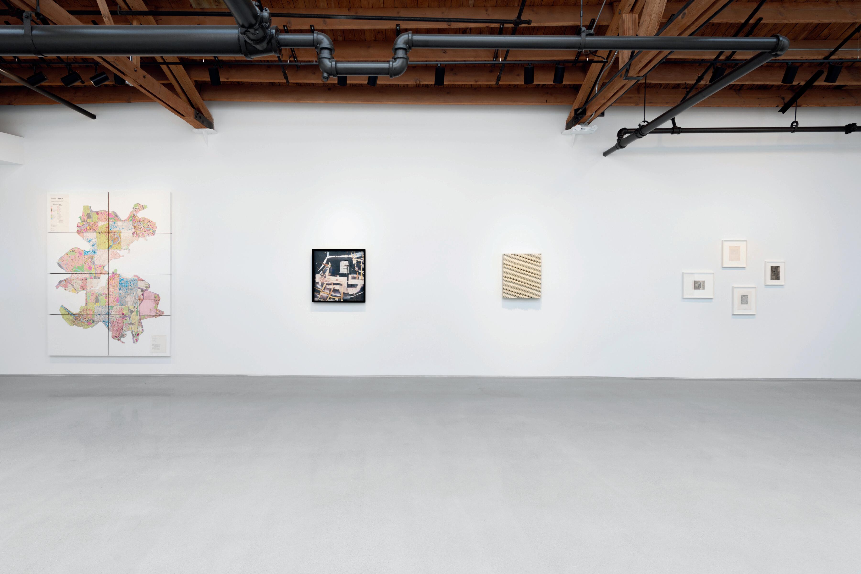
As an interdisciplinary artist, architect, urbanist, and futurist, Marshall Brown’s work embodies his conviction that an architect’s duty is to test and expand the boundaries of reality. Brown imagines that which is yet to come in the urban and man-made landscape in a very tangible sense, with work made using disconnected remnants from modern and contemporary architectural materials.
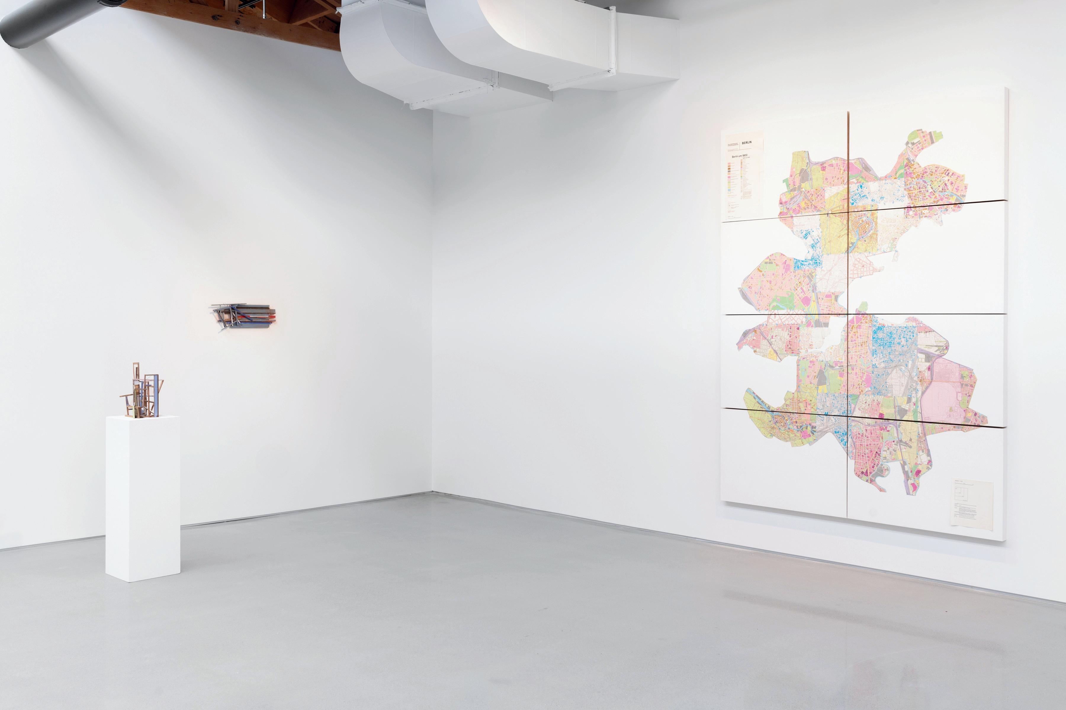
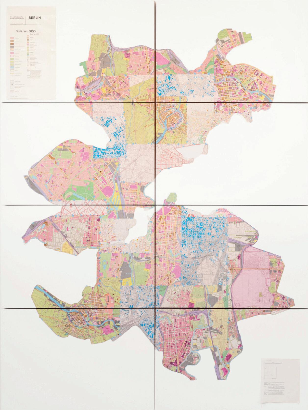
Piranesian Map of Berlin functions as Brown’s exposé, or study, of the utility of maps juxtaposed against the lived environment.
The Piranesian Maps of Berlin are intentionally useless, trapped in a web of double fiction that layers one narrative atop another. These artworks consist of map fragments that span Berlin’s history, from its origins until 1986, just before Germany’s reunification. This intricate cartographic collage creates a sense of frustration regarding the maps’ practical utility. However, it simultaneously offers us a compelling invitation to envision the myriad possibilities of past, present, and, most crucially, future cities. While maps are traditionally seen as practical tools, they are also fictional drawings, offering a simplified and static representation of a constantly evolving world. During my visit to a Berlin map store in the spring of 2021, I was introduced to a set of large, carefully folded sheets, each a record of one period in the city’s fraught history. In these representations, the complexity of architecture, landscape, industry, and human activity is distilled into a technocratic tapestry of lines, patterns, and color codes — a visual language that is both seductive and reductive. These qualities—both the allure and the limitations—inspired me to dismember the original maps. I envisioned reassembling their pieces into something entirely new, a creation that is open-ended and monumental, inviting viewers to grapple with the idea of possibility itself.
- Marshall Brown
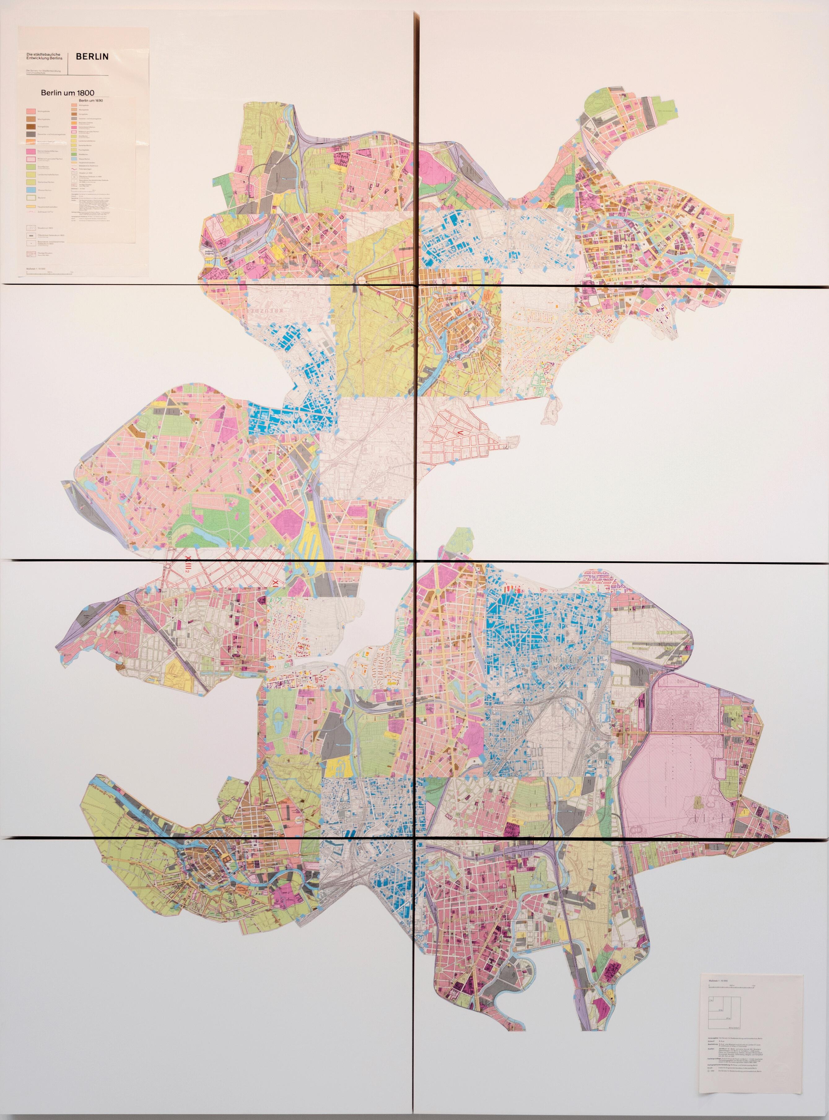
Map of Berlin, 2022, ca. 1800–1960
96 x 72 inches
Courtesy the artist and Western Exhibitions

Teddy Cruz is a scholar known internationally for his urban research of the Tijuana-San Diego bio-region. This body of work elaborates on the landscape and critical issues of density, urban sprawl, and waste.
In Border Postcard, Cruz collages photographs of the land between San Diego and Tijuana into abstraction. In the collapse of space hide slits, breaks, and slippages, opening into Cruz’s study of urban policies and public space. To follow the cyclical patterning becomes a practice of politically-engaged circumambulation.
In our research-based practice, Estudio Teddy Cruz + Fonna Forman, we believe that the future of the contemporary city can be re-imagined from its own periphery, across many geographies of conflict, spaces and communities in the margins. Our work visualizes conflict as a creative tool, intervening into urban borders, as generative sites from which to transform urban policy, and layer our conceptions of public space with the messiness and unpredictability of social and ecological relations. Often, this visual research includes producing images, where many participating actors collect photos of vacant and abandoned sites across the border region, seeing them as mirrors of our estrangement across a violently divided and fragmented territory. We construct fictional landscapes that organize conversations about the city, operationalizing the image’s construction as an excuse for a dialogical process, where anecdotes are shared, filling those sites with social agency. Ultimately, these photo-constructions are a tool for researching the changing boundaries and trans-border urban flows that define the San DiegoTijuana region. These images inspire tactical procedures of intervention in the contemporary city: a migrant urbanism made of adaptation, the re-organization of resources and negotiation of jurisdictional boundaries.
- Teddy Cruz
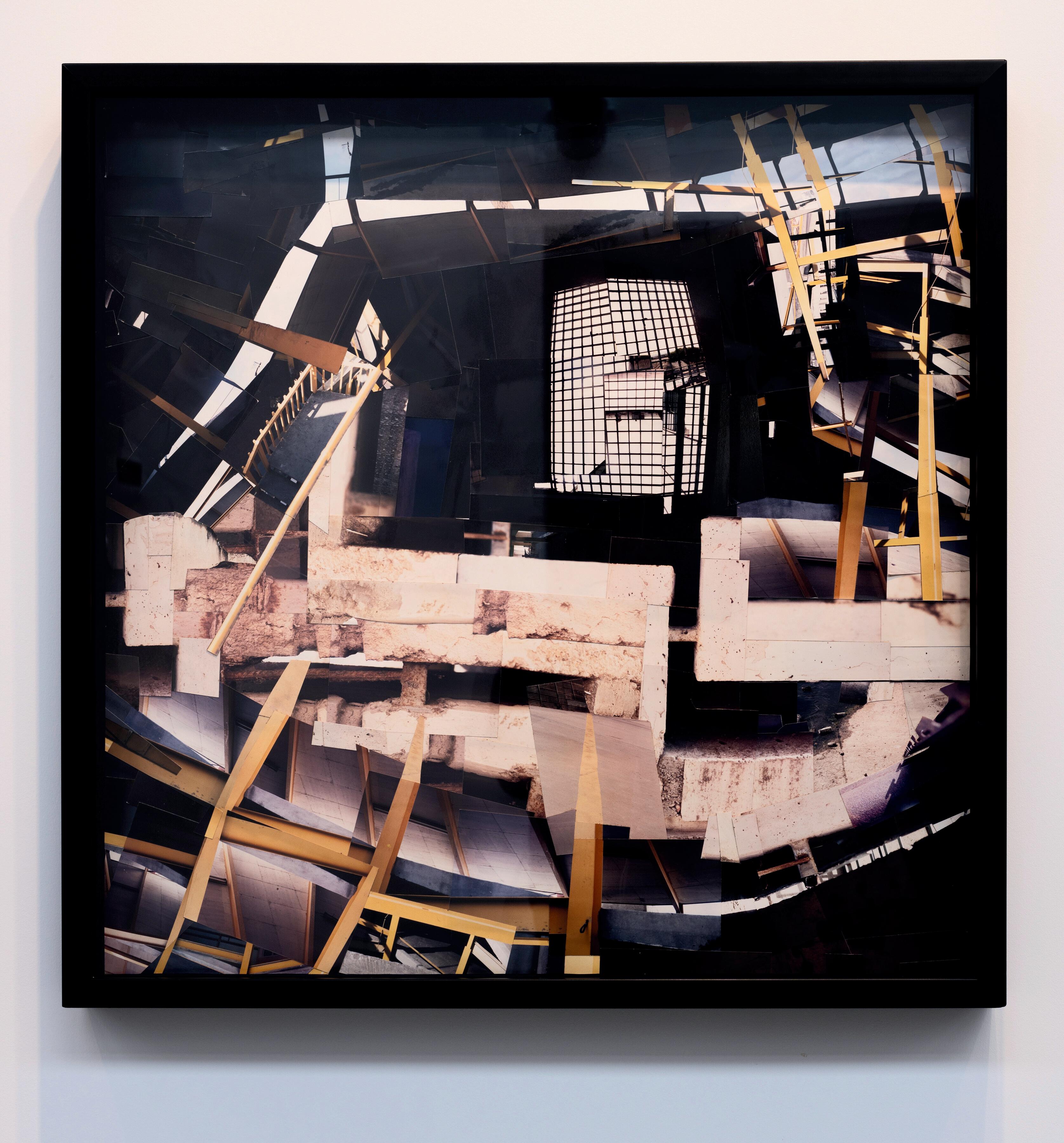
Border Postcard, 2000
Photo-construction
x 31.5 inches, framed
the artist
Amanda Martínez New York
New York artist Amanda Martínez creates forms that rely on a visually and emotionally evocative code to access the histories and ancestries of place. Martínez’s work reinforces the belief that it is impossible to divorce form and design from structure and affect. Taking influence from construction and craft, Martínez imbues those traditional patterns with contemporaneity. When observed closely, Martínez’s emotive hand removes the veneer of singularity and opens the object up into a beautiful and fruitful negotiation between then and now, and here and there.
Martínez’s sculptural wall relief, Deletion, inversion, is an interpretive reference to adobe constructions in New Mexico. The pattern’s physical prominence becomes adaptive to changing shadow, position, and lighting, echoing her dynamic embrace of ancestry, memory, and emotional inheritance.

The adverb “by design” is something I use not just in the sense of aesthetics, but also in regard to systemic and political intention. My conscious decision as an artist to make work that references and builds upon the craft traditions (such as carving, basketry and embroidery) as well as the vernacular architecture (such as adobe) of my ancestors is for me an act of creative rematriation; of re-learning lifeways as resistance. The more I have grown to understand myself in terms of identity, the less I believe that compartmentalization is possible. My work is directly informed by my lived experience of being an Autistic woman of mixed Latinx, Indigenous and Appalachian heritage. In this way, the methods of abstraction I employ do not stem from a place of academic study but rather the innate qualities and unique aesthetic and cultural traditions of navigating the world as a person of color.
- Amanda Martínez
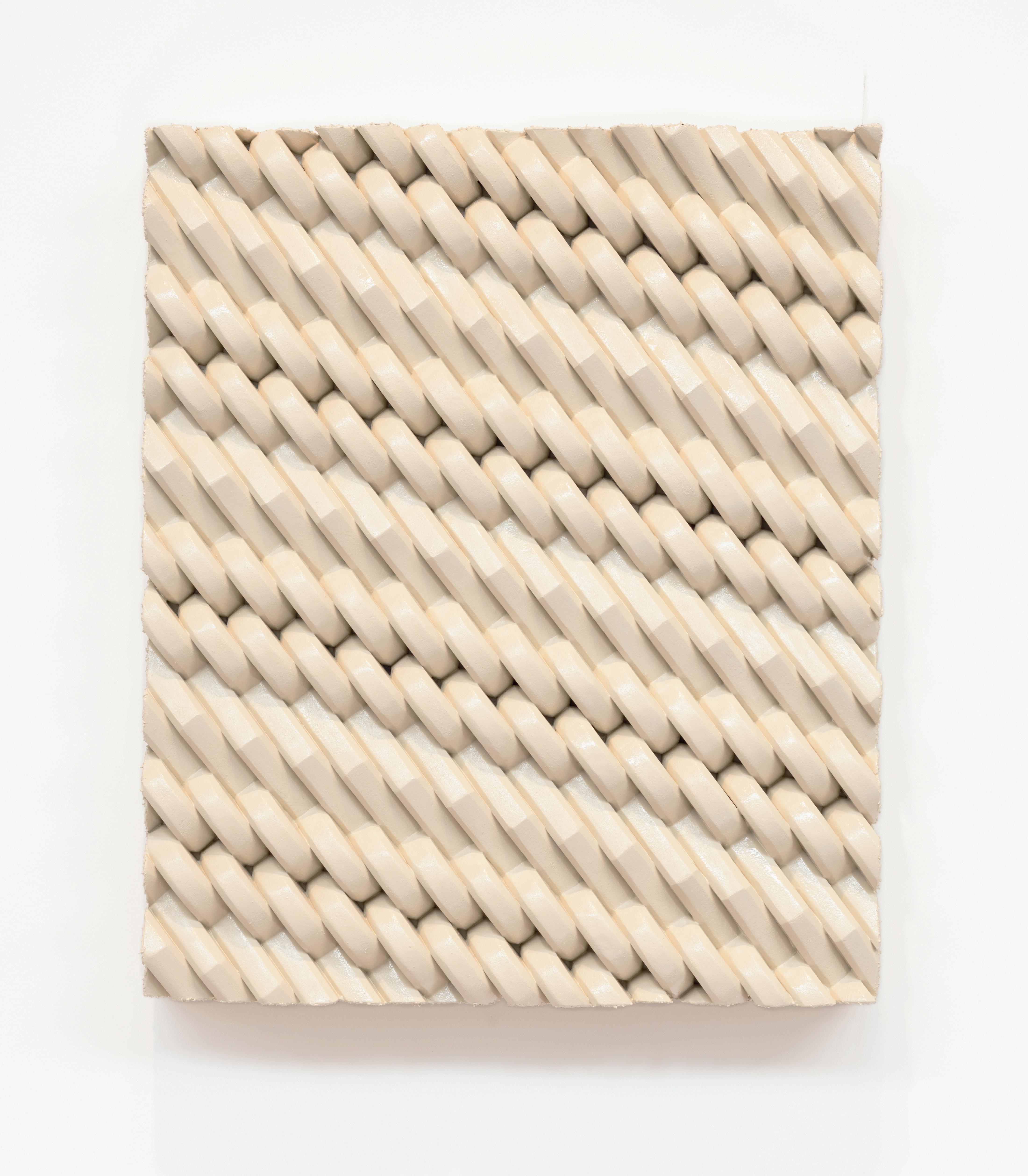
26
Courtesy the artist and HESSE FLATOW

Dean Smith Oakland
Dean Smith explores the measure of time as it interacts with space and visibility, and ultimately, these elements’ engagement in experiencing time.
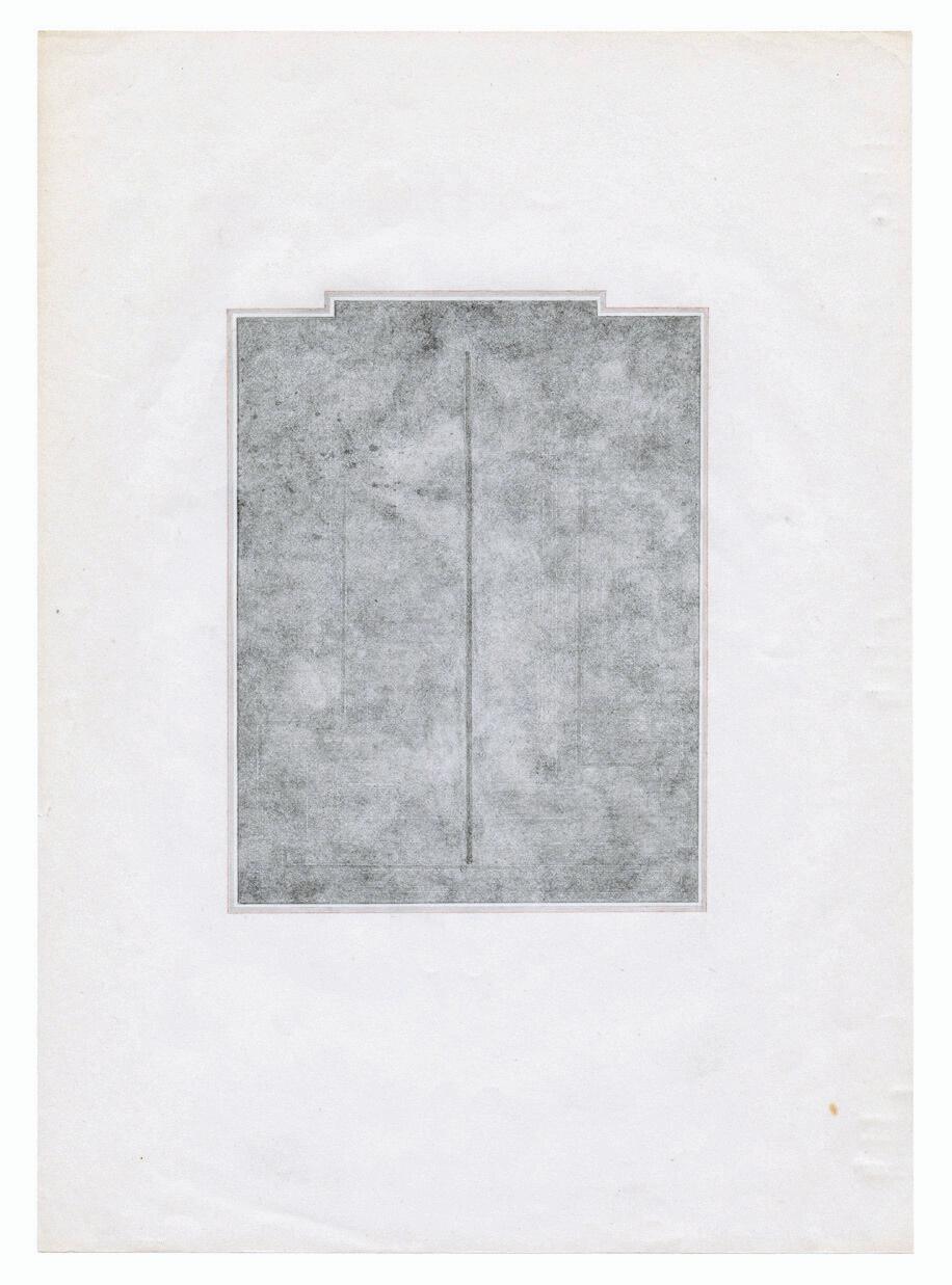
Smith’s large prints reach up from the floor to give the illusion of an entry point to imagined space. Making the sublime of the landscape into a grainy, dark abstraction, he suspends time.
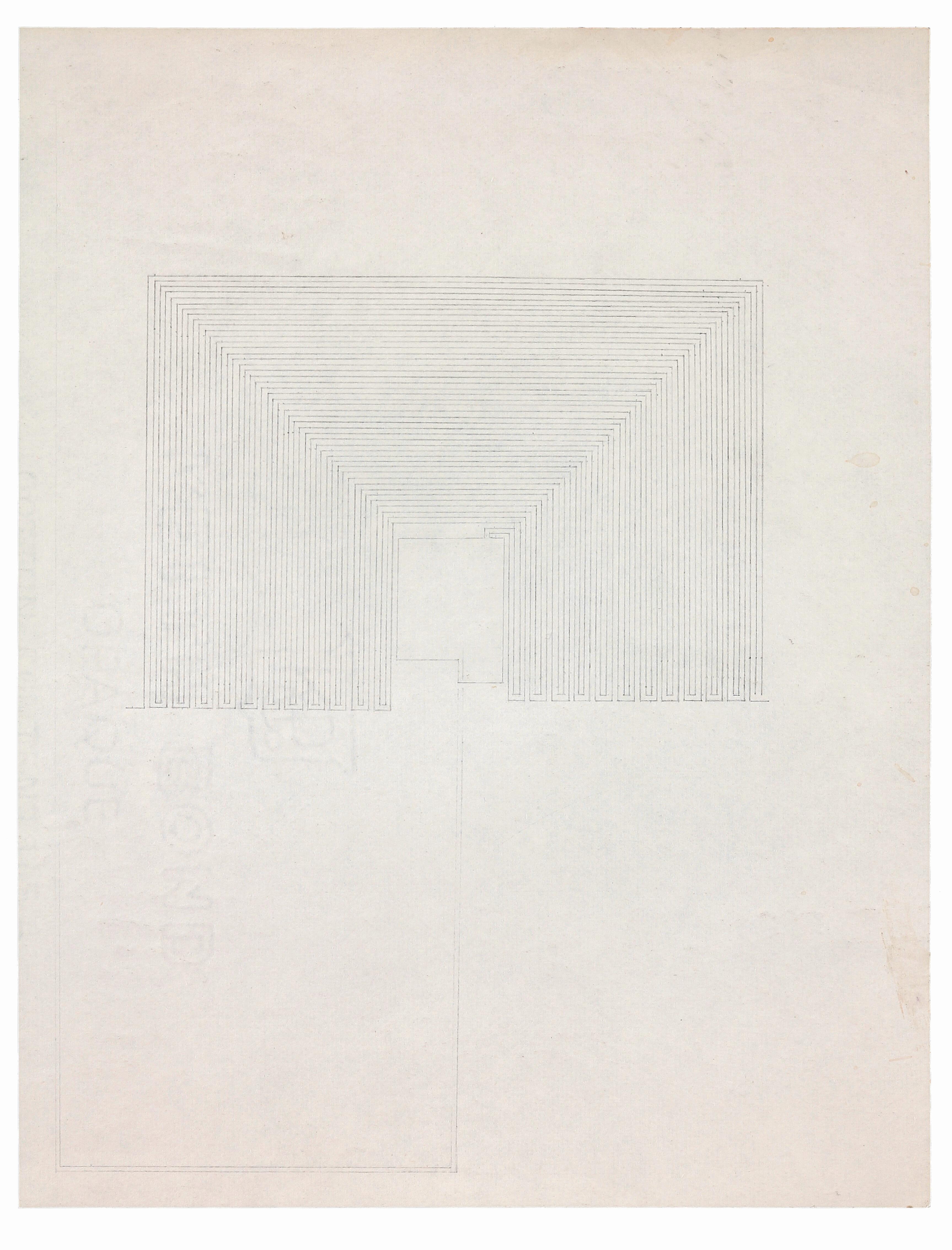
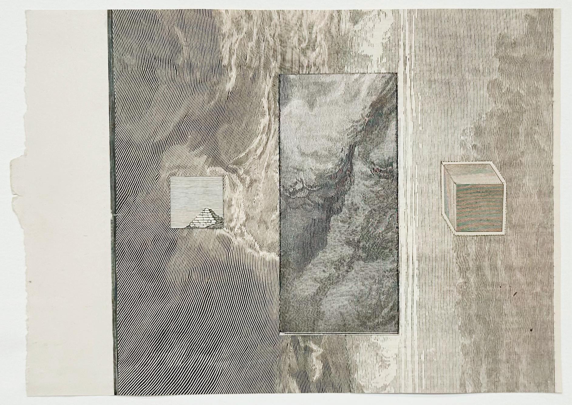
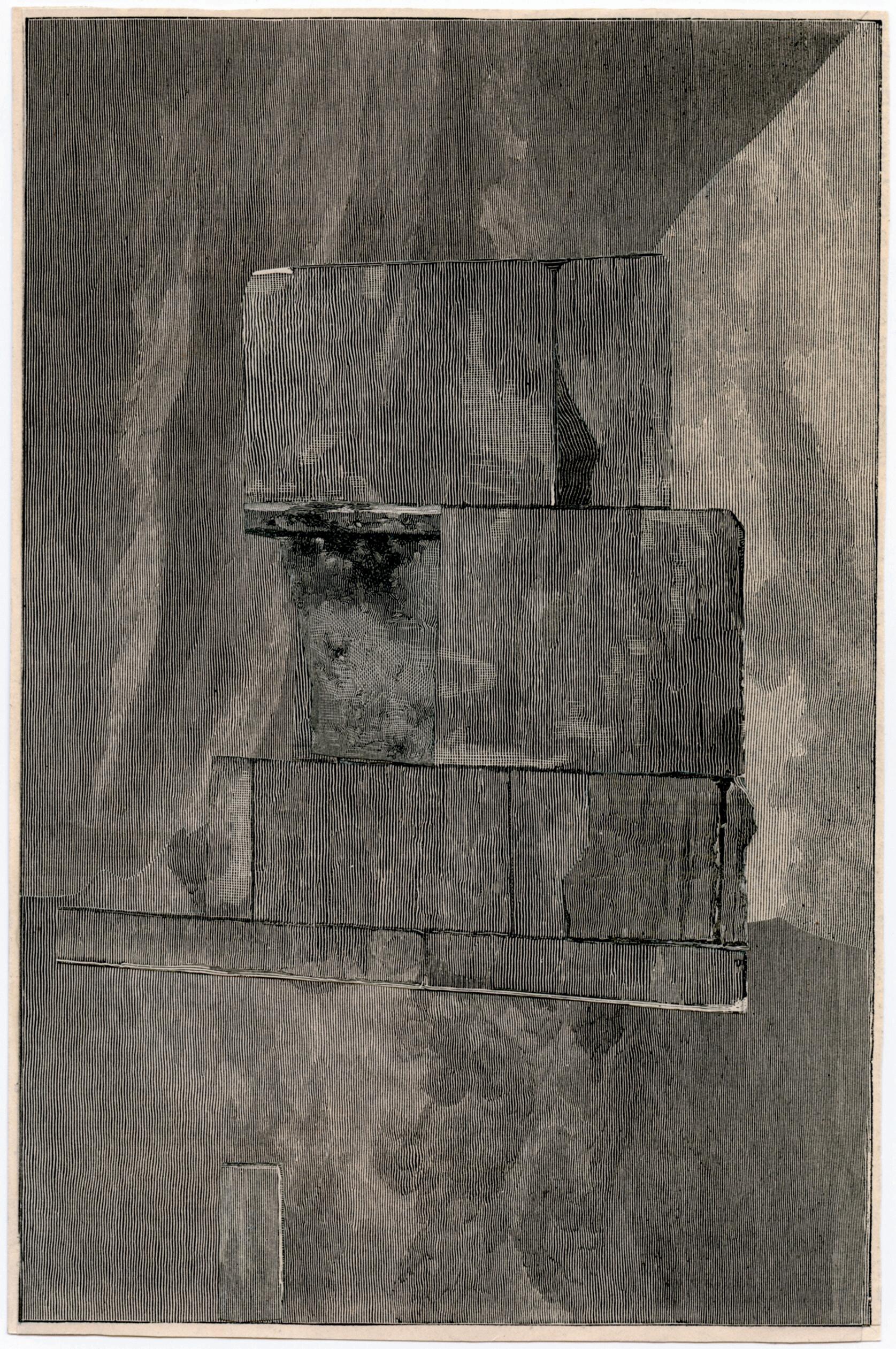
For collages in the environment series, Smith sourced fragments from 19th century printed illustrations. The layering of source material not only absolves them of their representational responsibility, but also dislocates them in temporality, floating in relation to one another opaquely. The listlessness produced is deeply oneiric.
In drawing, Smith’s mark-making abstractly traces the experiences of nonlinear and disrupted, or arrested, time in his symbolic work.
The modern Western mind views time as linear, with a definite beginning and end. However, I create the labyrinth drawings and the environment collages with an inherent refusal to be specific in their representation of time. They speak simultaneously to past, present, and future forms. So, in this sense, I approach time as an ahistorical spiraling structure—there is no progression, just a continual looping. No longer is the beginning the beginning and the end the end, but an ongoing cycle of beginnings and endings at any point along the spiral. Untethered from any connection to linearity, my work expresses a deeply oneiric space. To unravel time as a continuity is to explore the condition of reverie, and as Gaston Bachelard states, “Reverie is not a mind vacuum. It is rather the gift of an hour which knows the plenitude of the soul.”
- Dean Smith
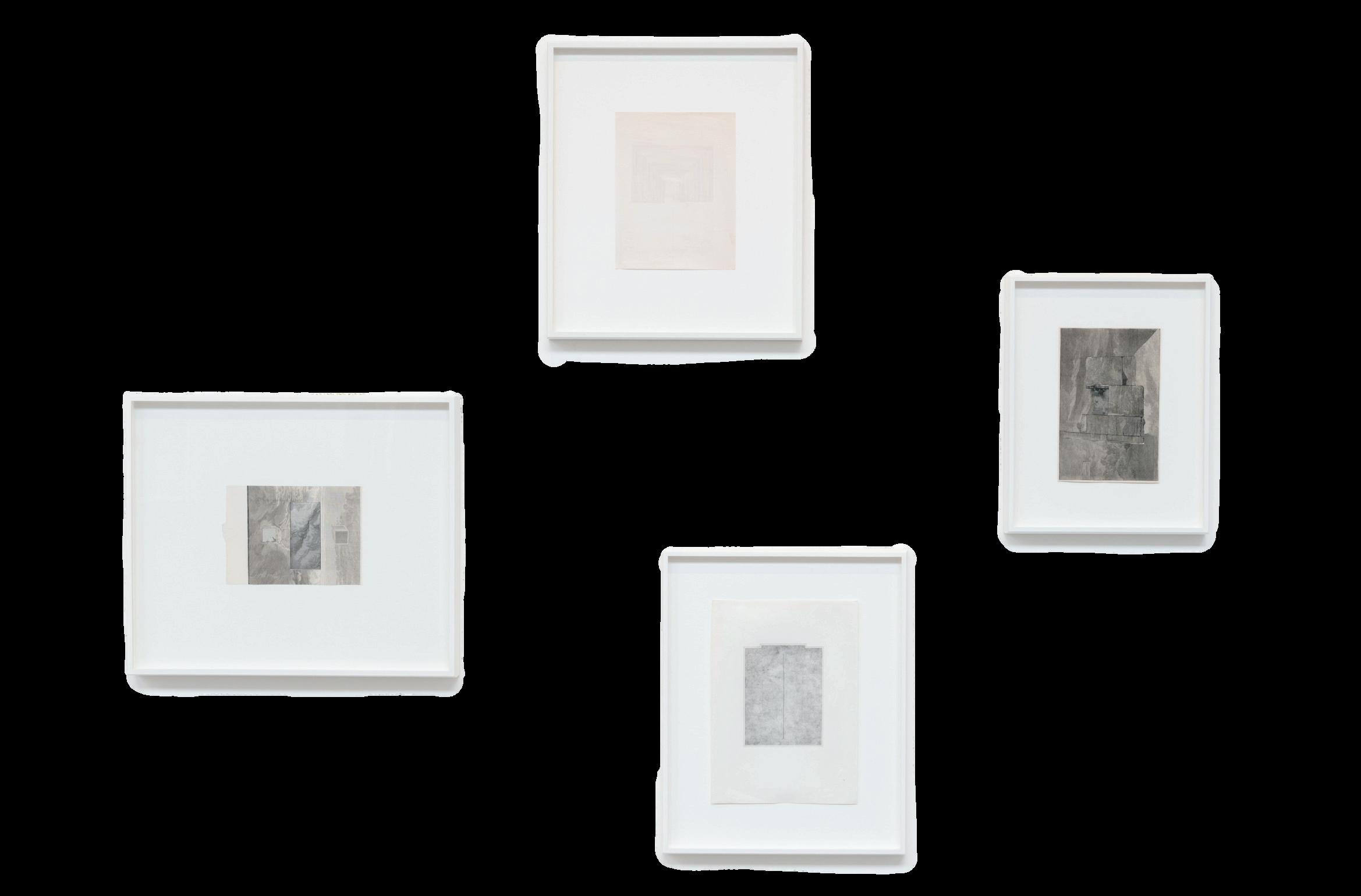

All works courtesy the artist and Eli Ridgway Gallery

[dsl_14], 2015
on found vintage paper
8.5 x 6.5 inches, paper size
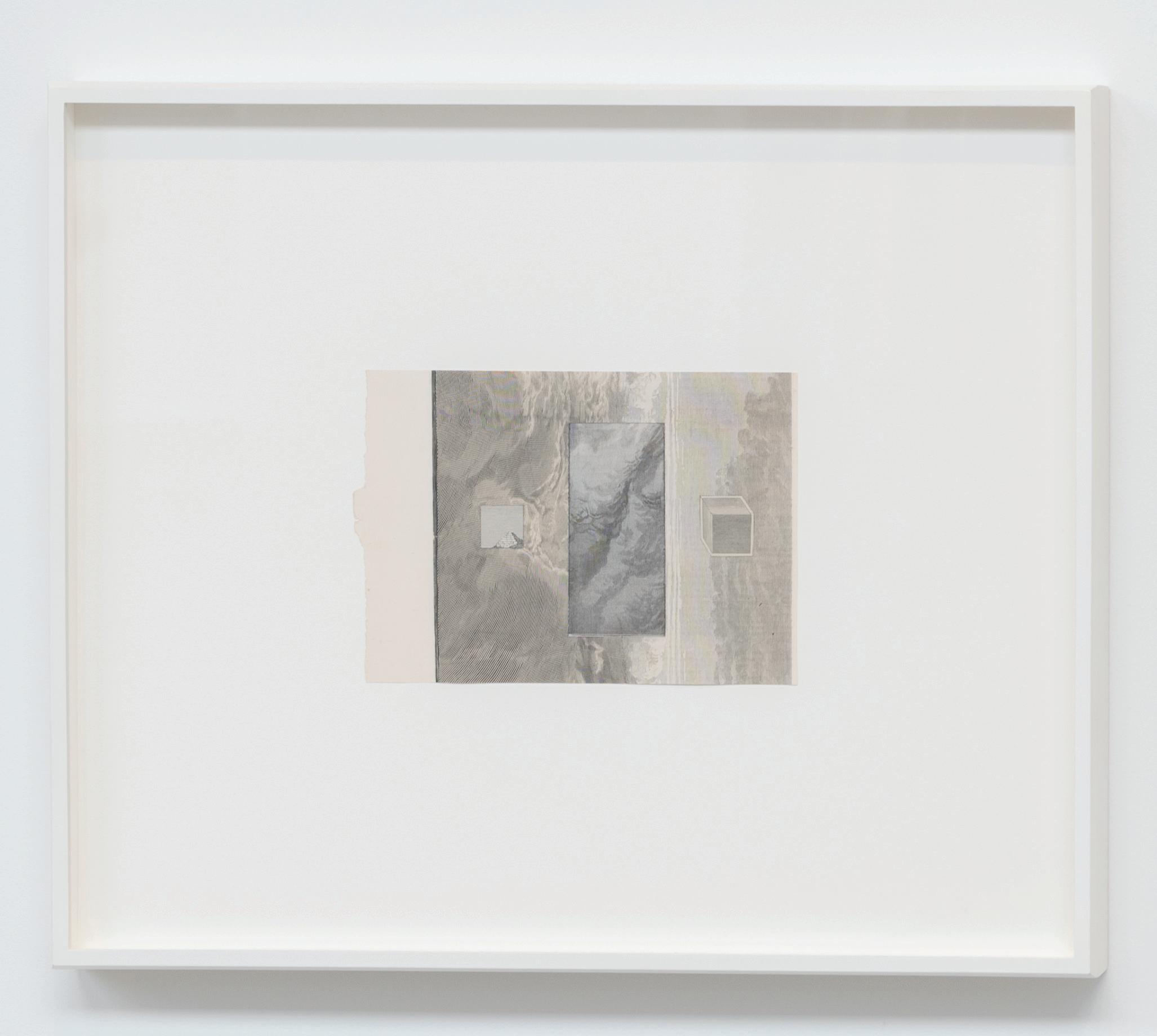
environment #2, 2014
Collage of found illustrations
5.25 x 7.5 inches, paper size
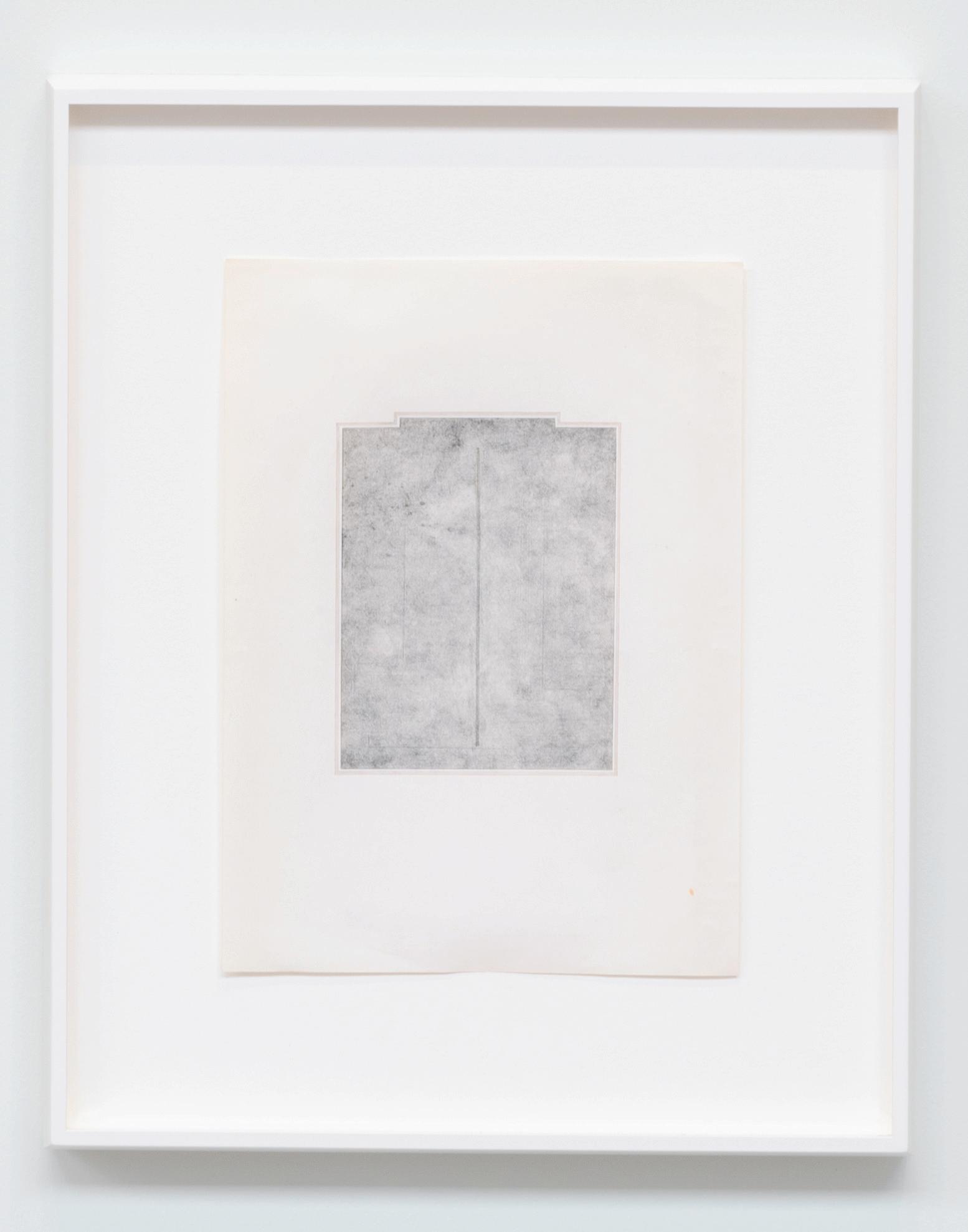
on found vintage paper 11 x 8 inches, paper size
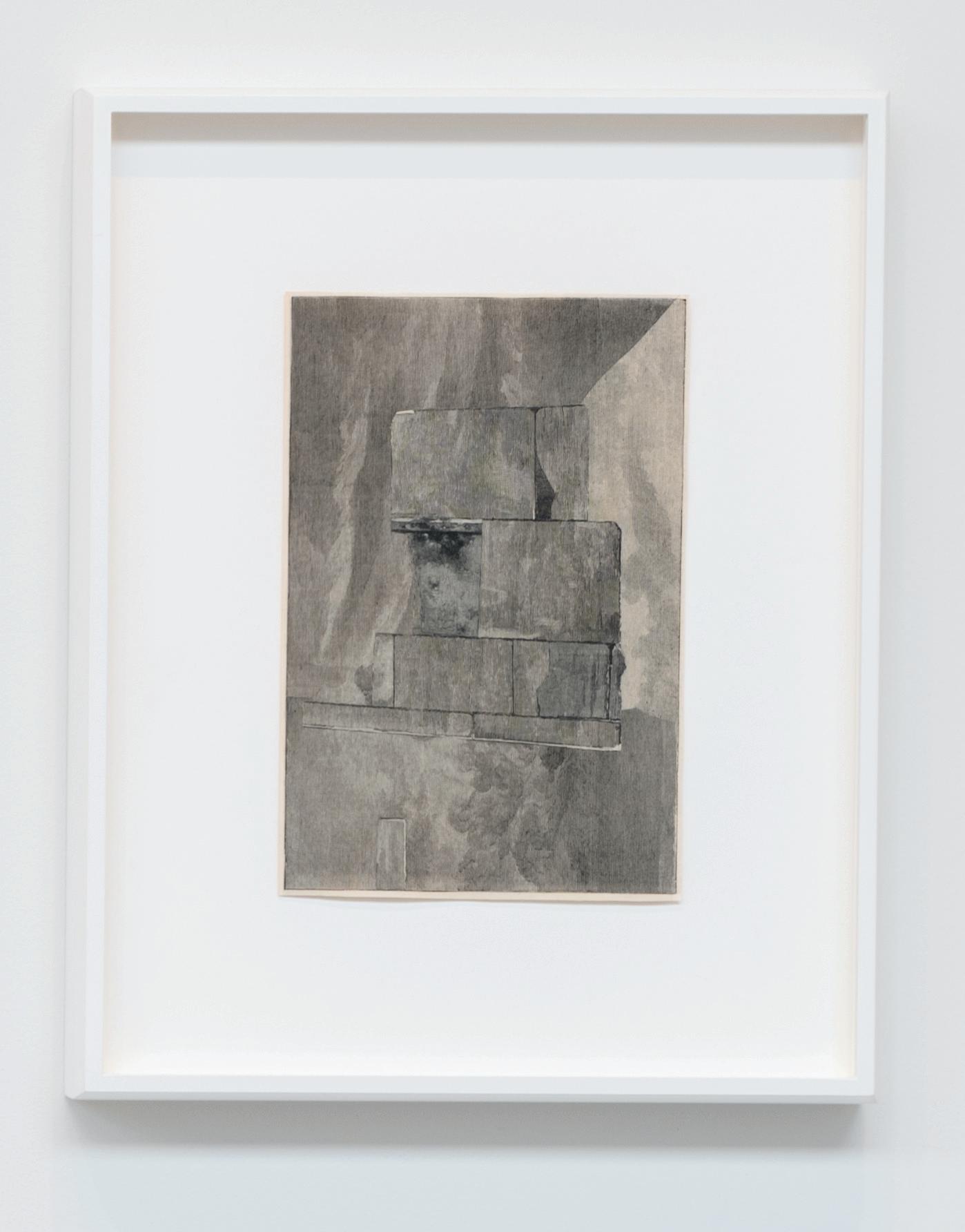
environment #33, 2020
Collage of found illustrations
8.25 x 5.5 inches, paper size
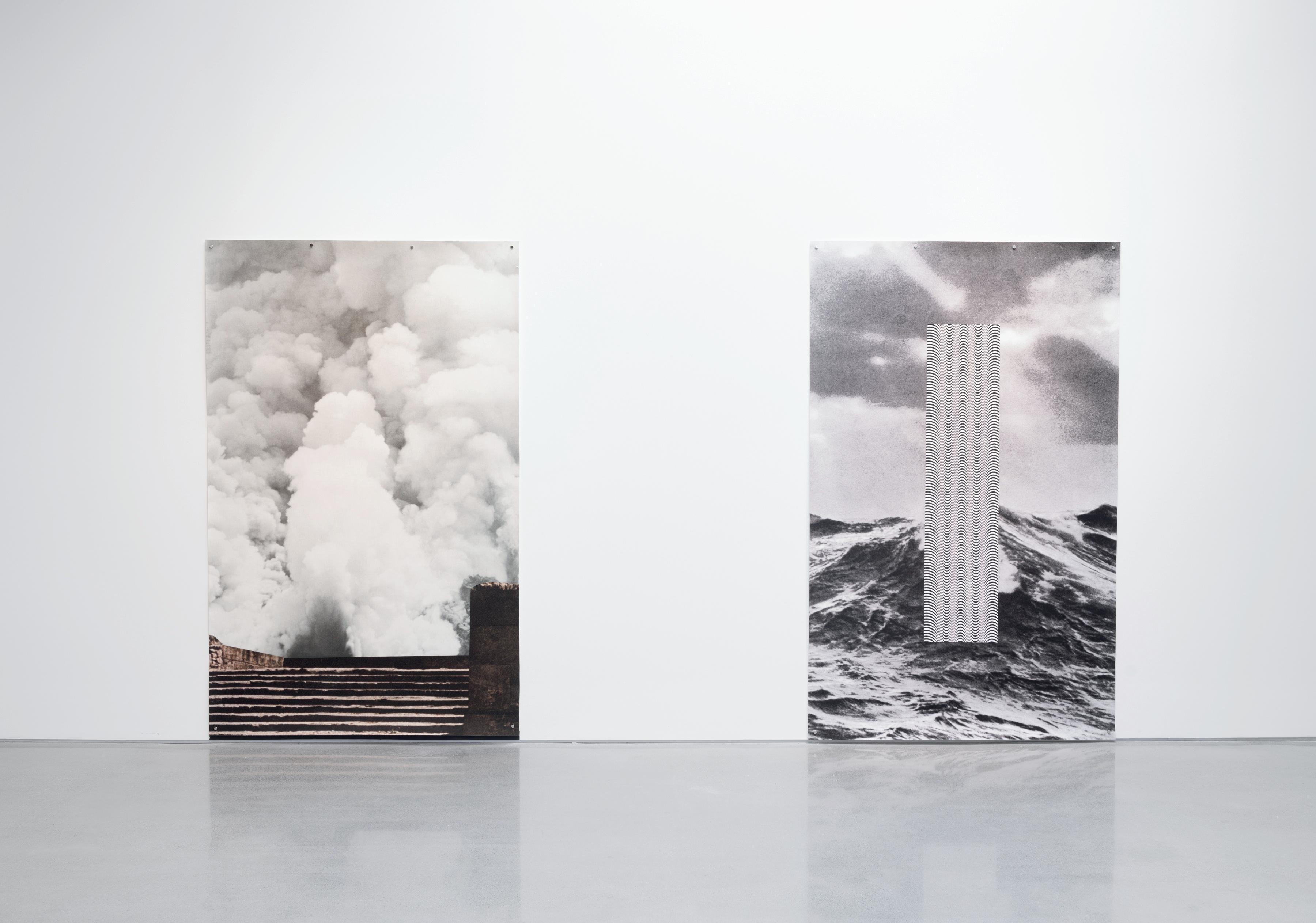
advent #3, 2022
Archival inkjet on Hahnemühle photo paper
95.25 x 59.5 inches

advent #2, 2022
Archival inkjet on Hahnemühle photo paper
95.25 x 59.5 inches
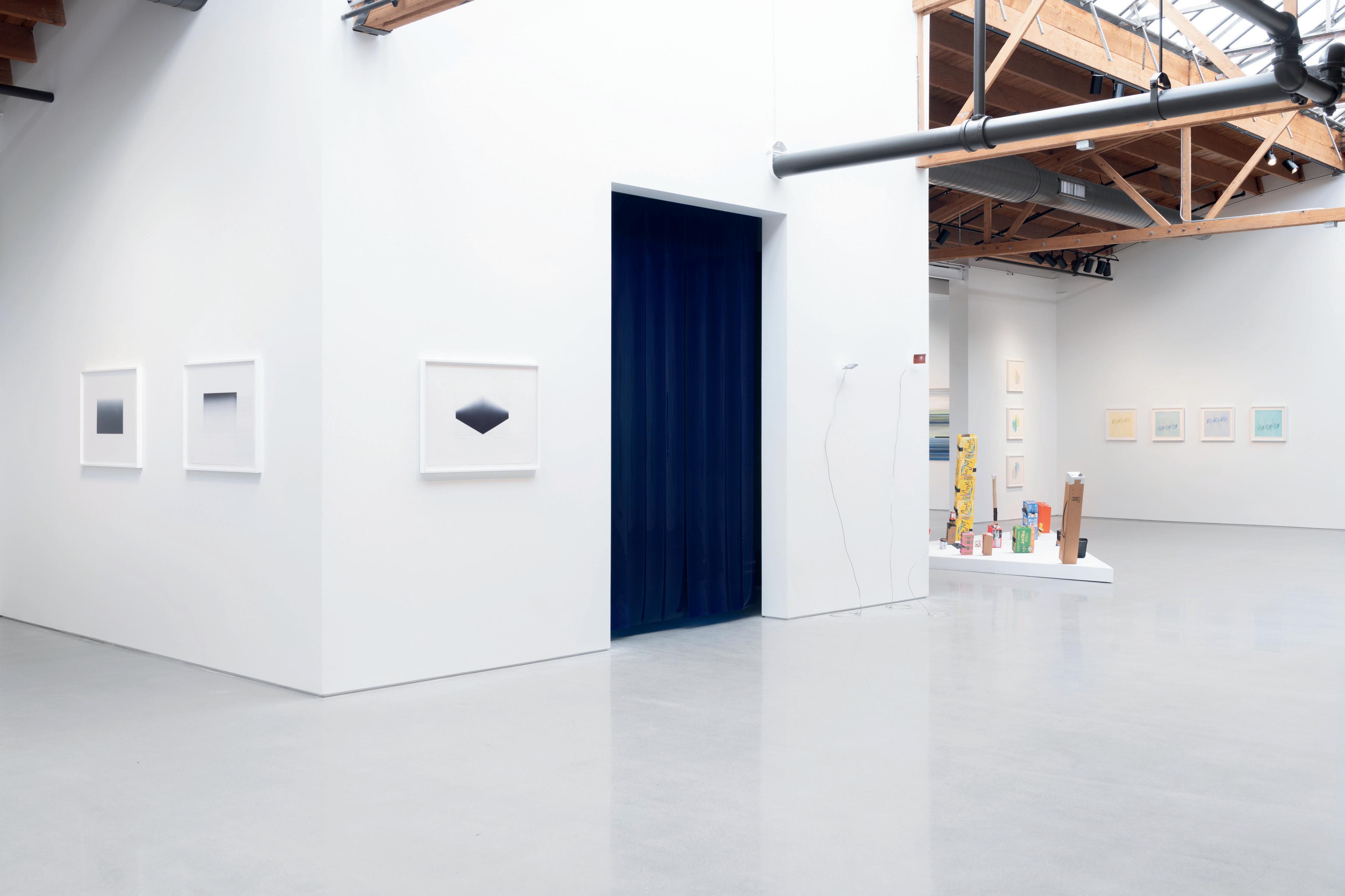
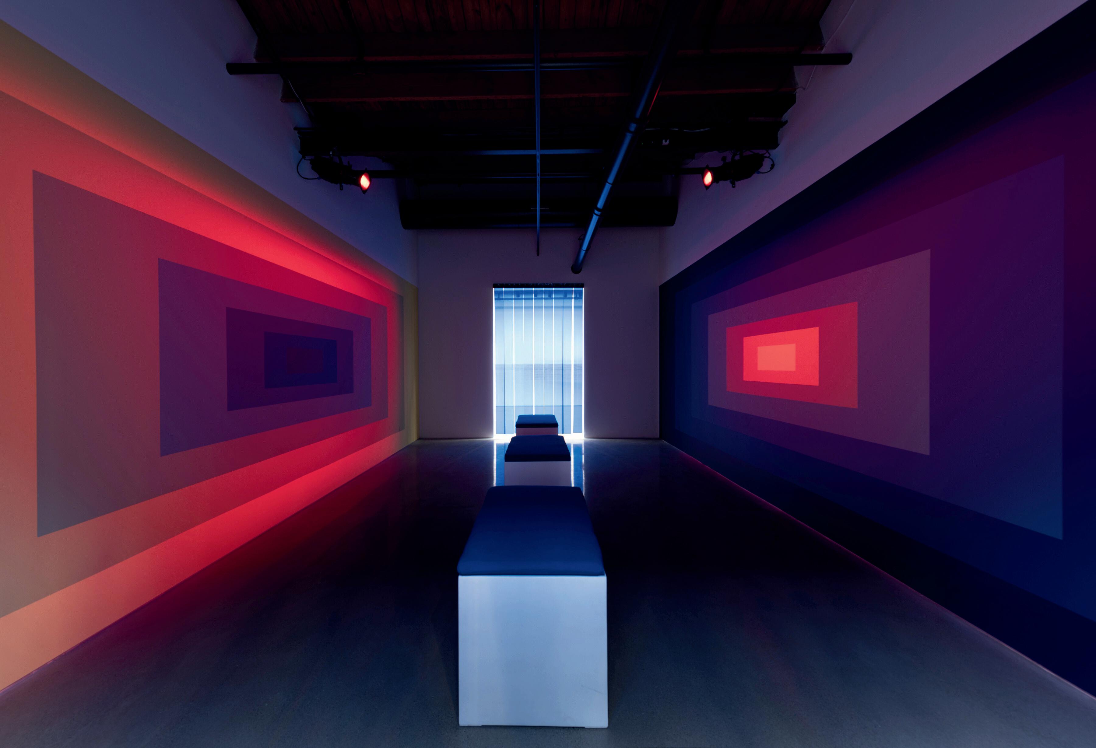
Luftwerk, the artistic duo of Petra Bachmaier and Sean Gallero, develops spatial experiences mined from the creative possibilities of nature, data, and the built environment. Each of their projects further explores the relationship between material and context, which shapes the experience of space, architecture, and landscape.
What fascinates us is the combination of color and light, to expand our understanding of color. Our interest in spatial compositions takes this phenomenon of color and light interactions into a realm where perspectives seem to shift and a space transforms into an immersive canvas, inviting a viewer to breathe, look, and experience.
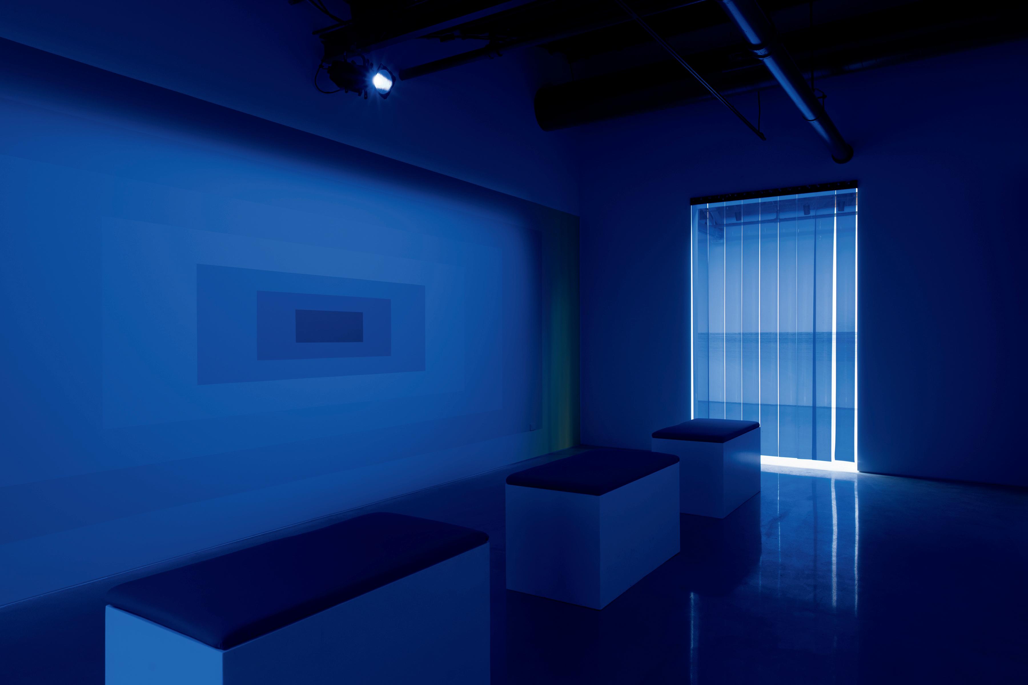
Landscape is a Composition is an immersive installation that invites the viewer to experience the interaction of color and light. Based on classical, Renaissance colors and one-point perspective, this installation appears to breathe; it ebbs and flows and seemingly expands the space. The salon space in SECRIST | BEACH envelopes the viewer with its two parallel wall surfaces. This “place” is illuminated by two theatrical lights of slow-fading colors on two large-scale wall paintings of concentric rectangular colors. Seven hues of Naples Yellow mixing into Prussian Blue emulate the expanse of space through geometry. The space is in constant flux as the colorchanging light interacts with the wall paintings, with the hues of yellows seemingly transforming into a whole different spectrum of colors, while the hues of blue absorb and strengthen into darkness.
The experience of light interacting with color appears like the opening and closing of an iris, at times our perception of color appears to meld, blur, compress and expand, casting an after image that raises the question, what am I seeing?
- Luftwerk
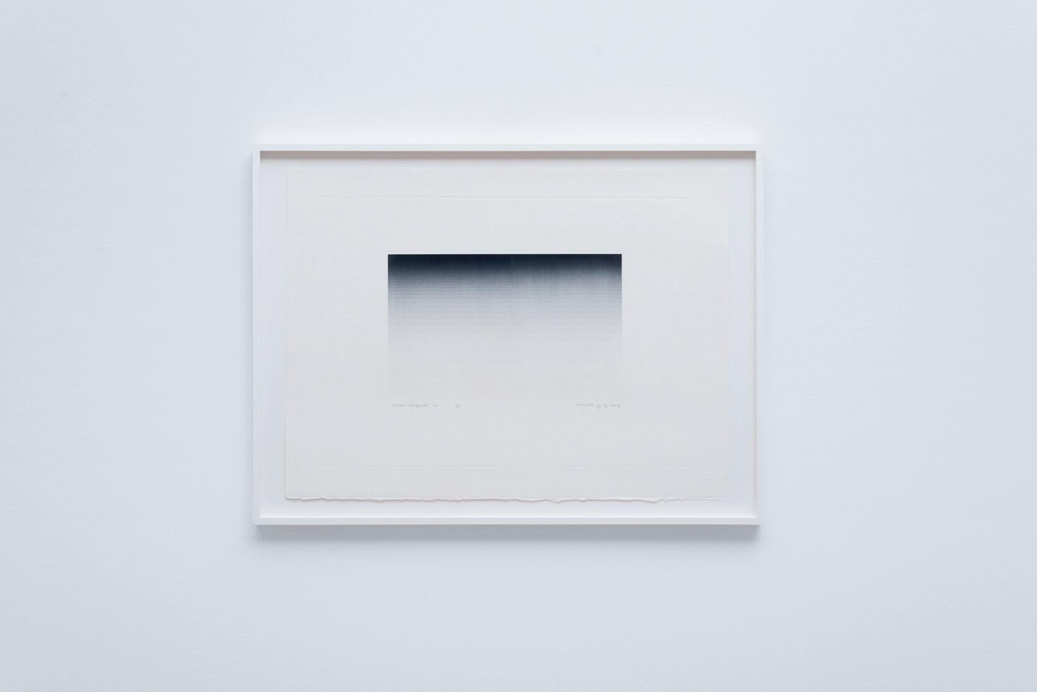
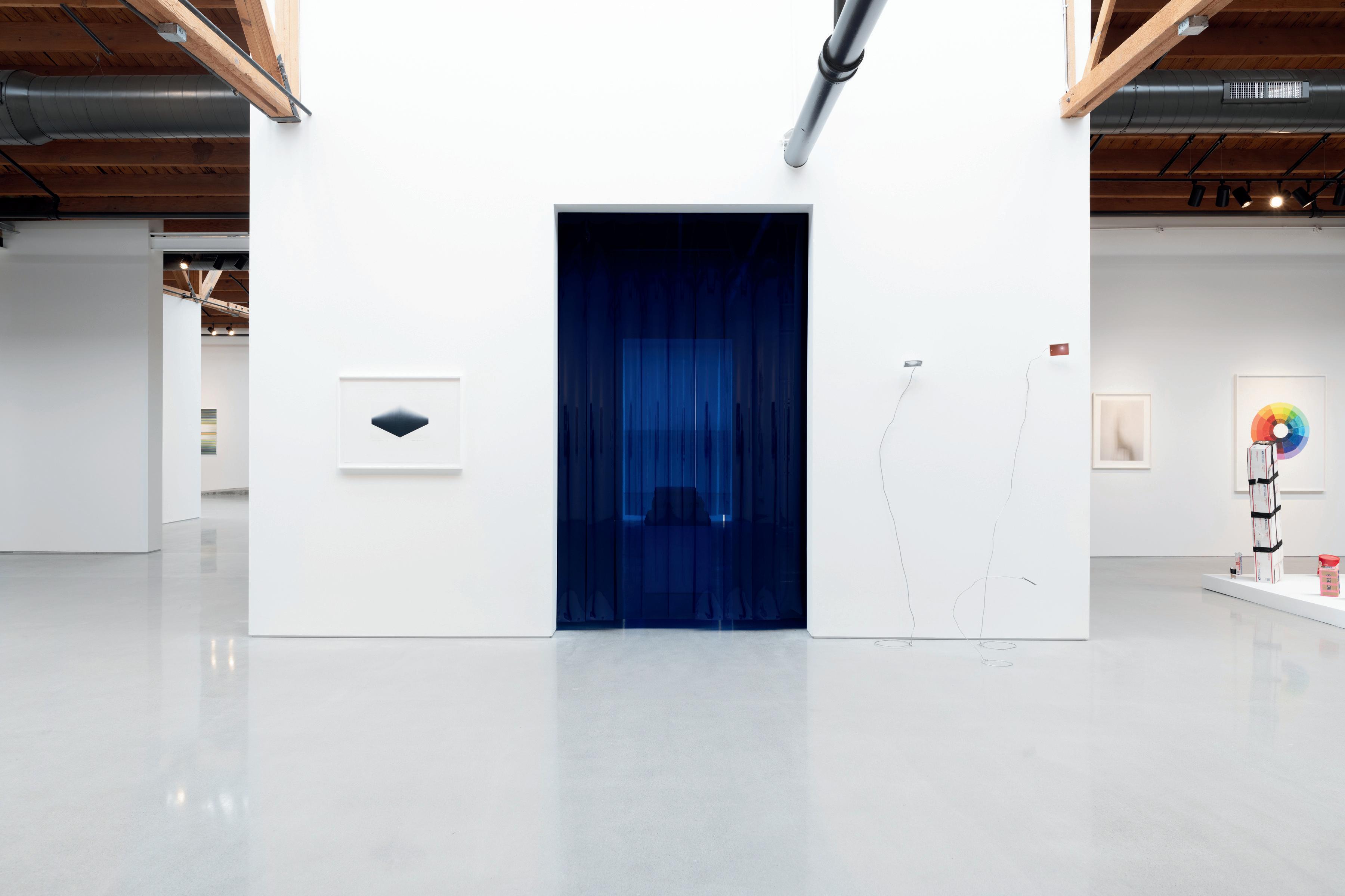
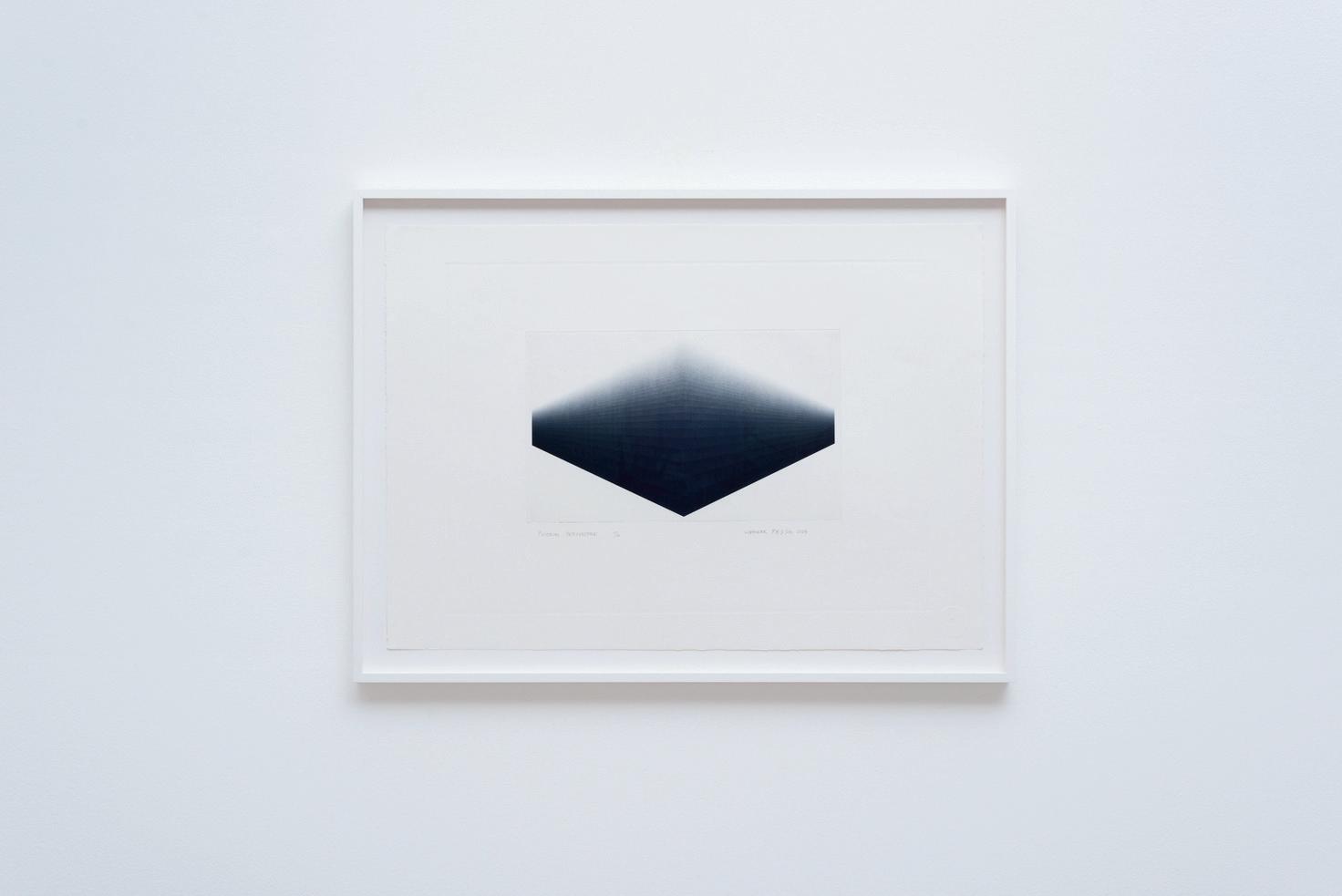
Linear Perspective 1, 2023
20 x 30 inches
All works courtesy the artists and Volume Gallery
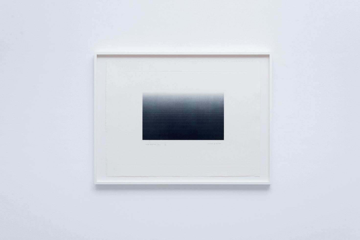
Perspective 3, 2023


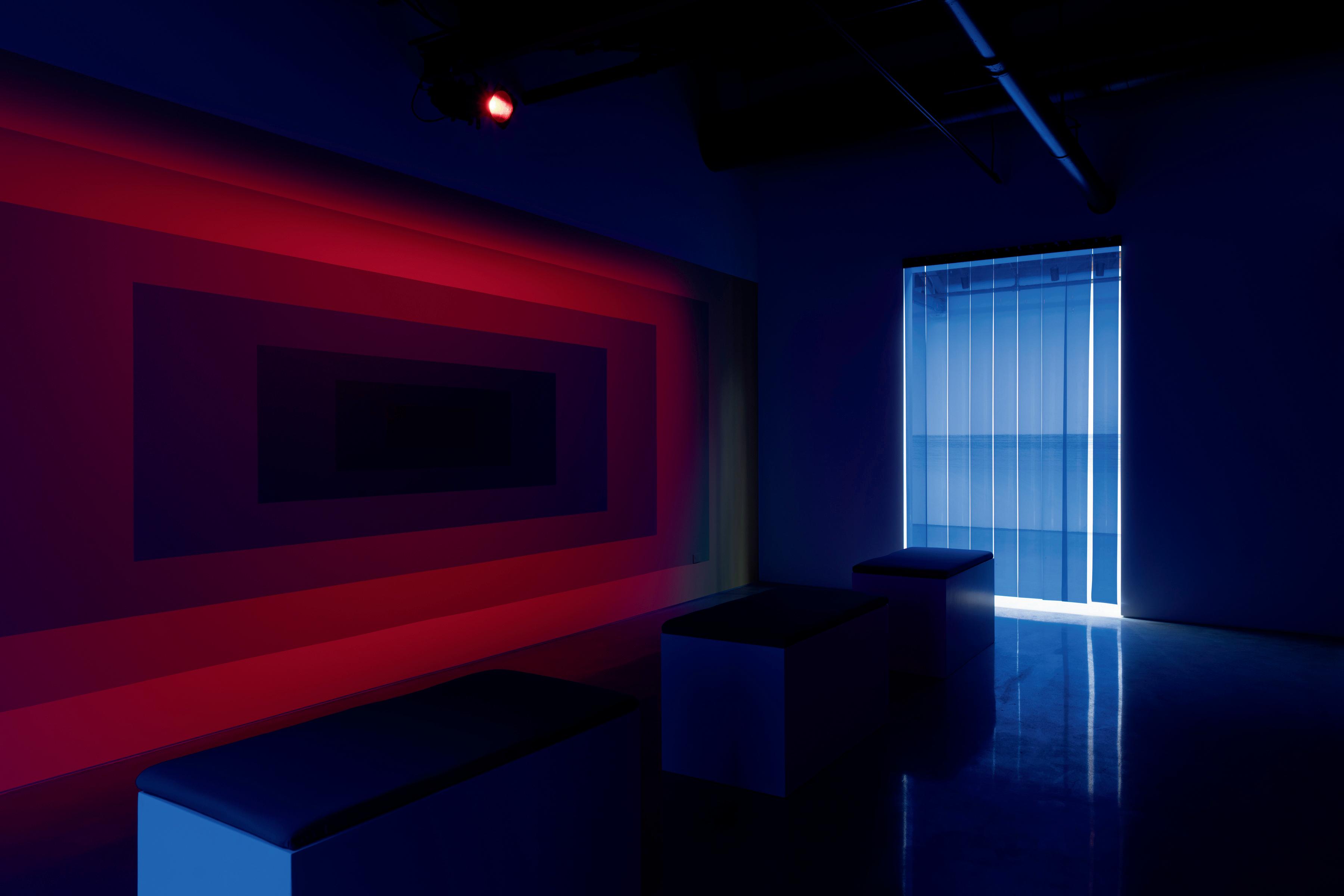


Back Cover Image: Luftwerk, Landscape is a Composition (Dark to Light), 2024

