Modern Masters XIX
MODERN MASTERS XIX
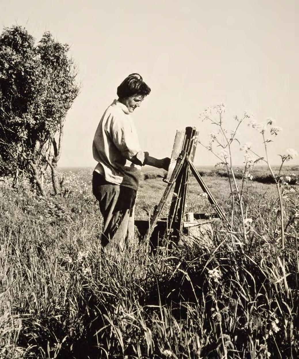
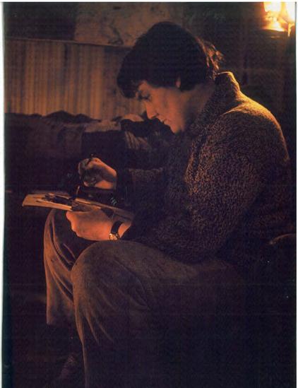
Joan Eardley in Catterline, summer 1961. Photograph by Audrey Walker
FOREWORD
The Scottish Gallery presents our latest Modern Masters edition at the British Art Fair, London this autumn, as we continue to explore the influential figures of post-war Scottish art. As Scotland’s oldest private gallery, established in 1842, we have remained at the heart of the nation’s cultural life for over 180 years, offering a platform for artists to flourish not only at moments of success, but across the full arc of their careers.
Our series draws upon our long-standing relationships with artists who studied, taught, and emerged from Scotland’s great art schools, figures whose work reflects the evolution of British modernism and continues to resonate today. Our presentation features a magnificent group of paintings by Joan Eardley from Catterline, capturing the elemental energy of the northeast coast; an exceptional and rare tapestry by Sax Shaw; and a haunting late landscape by William Burns, offering a poignant glimpse of what might have been, had his life not been cut short.
As ever, we honour both male and female voices, from Penelope Beaton and Anne Redpath to the abstract expressiveness of Mardi Barrie; the grotesque figuration of Pat Douthwaite; the joyfully rigorous compositions of David Michie; the sublime landscapes of James Morrison; the lyrical, observational brilliance of Ron Sandford; and the enigmatic, visionary paintings of James Cumming.
A key figure in Scottish post-war art, James Cumming developed a unique visual language, fusing modernist abstraction with symbolic figuration. We bring together a significant and representative group of works by Cumming, paintings which are rich in geometry, colour, and mythic resonance, reveal a poetic mind at work. This special selection has been consigned from the family, and is further enriched by text from his daughter, the acclaimed author and art critic Laura Cumming.
Printmaking also features as a bold medium of expression. A rare monotype by Robert Colquhoun, rich in psychological weight and gestural strength, sits alongside the exquisite precision and lyricism found in prints by Elizabeth Blackadder and the elemental etchings of Frances Walker. These works demonstrate how Scottish artists of the postwar period embraced the print medium not simply as a reproductive tool, but as a field for experimentation, nuance, and personal imagery.
Our presentation at the British Art Fair will feature a curated selection of works from the publication, with a further dedicated exhibition to follow at The Scottish Gallery in December. Modern Masters offers a window into the many artists we have represented over the years. It is a tribute to their enduring contribution to British art, and to The Scottish Gallery’s continued mission to provide space, support, and celebration for Scotland’s most vital creative voices.
CHRISTINA JANSEN
Modern Masters XIX
Mary Armour (1902-2000)
Mardi Barrie (1930-2004)
Penelope Beaton (1886-1963)
Elizabeth Blackadder (1931-2021)
Robert Henderson Blyth (1919-1970)
Wi lliam Burns (1921-1972)
Donald Morison Buyers (1930-2003)
F.C.B. Cadell (1883-1937)
Robert Colquhoun (1914-1962)
Oliver Cook (b.1992)
Victoria Crowe (b.1945)
Ja mes Cumming (1922-1991)
Pat Douthwaite (1934-2002)
Joan Eardley (1921-1963)
J.D. Fergusson (1874-1961)
Ia n Fleming (1906-1994)
William Gillies (1898-1973)
G.L. Hunter (1877-1931)
Ad rian McCurdy (b.1953)
David Michie (1928-2015)
Ja mes Morrison (1932-2020)
Leon Morrocco (b.1942)
Li lian Neilson (1938-1998)
S. J. Peploe (1871-1935)
An ne Redpath (1895-1965)
Joan Renton (1935-2025)
Ja mes Robertson (1931-2010)
Ron Sandford (b.1937)
Sa x Shaw (1916-2000)
Frances Walker (b.1930)
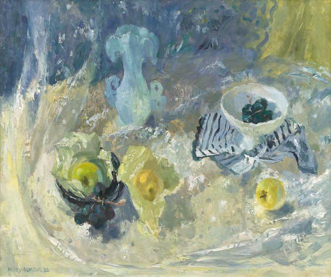
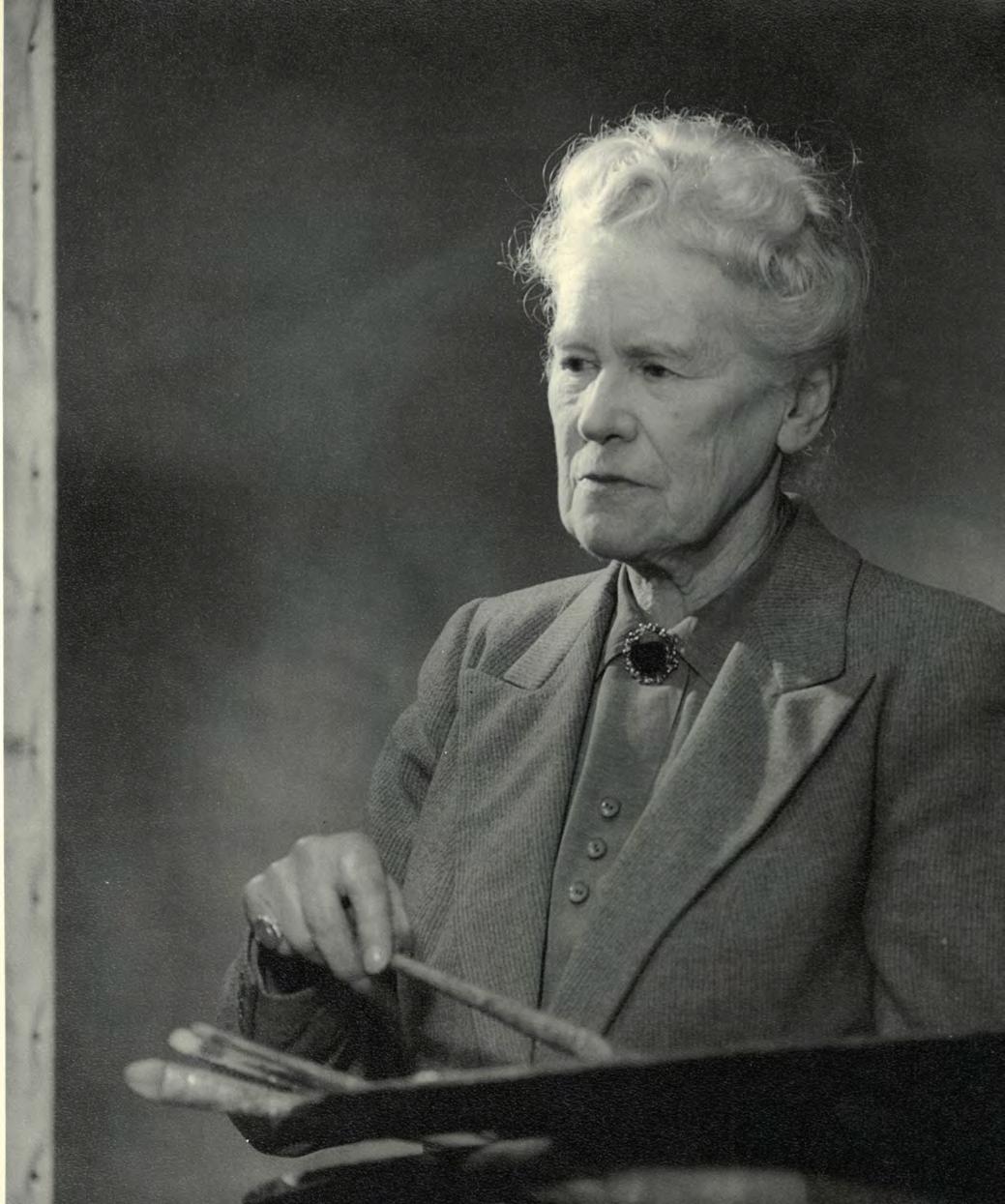
Mary Armour (1902-2000)
Mary Nicol Neill Armour (née Steel) was born on 27 March 1902 in Blantyre, South Lanarkshire. She initially aspired to become a schoolteacher, but her artistic potential was recognised and nurtured by the artist and educator Penelope Beaton (1886–1963), who taught at her school in Hamilton before she became Head of the Junior Department at Edinburgh College of Art. Beaton's encouragement was pivotal, she successfully persuaded Armour’s father to support her daughter's artistic ambitions.
Following this, Armour enrolled at Glasgow School of Art in 1920, where she studied Drawing and Painting until 1925. Her early artistic education was deeply shaped by Beaton’s mentorship, which instilled a commitment to strong composition and observation, values that remained throughout her career. After a post-diploma year and teacher training at Jordanhill College, Armour began working as an art teacher. However, in 1927 she married fellow artist William Armour, and due to the Education Authority’s Marriage Bar, legislation that prohibited married women from holding full-time teaching posts, she had to resign. Despite this setback, Armour dedicated herself to painting and continued exhibiting widely across Scotland and beyond.
Armour returned to teaching in 1951, after the repeal of the Marriage Bar, serving as a lecturer in still life at Glasgow School of Art until 1962. This period saw her style evolve further, influenced by her students' exposure to modern European trends, which brought greater colour and dynamism to her work. In line with the tradition established by many Scottish artists, Armour regularly exhibited with The Scottish Gallery which culminated in a solo exhibition in 1960, marking an important milestone in her career.
Throughout her long and prolific career, Armour exhibited with the Royal Scottish Academy, the Royal Glasgow Institute of the Fine Arts, and the Royal Scottish Society of Painters in Watercolour. Her accolades included the Guthrie Prize (1937), full membership of the RSA (1958), and an Honorary Doctorate from the University of Glasgow (1982). She was also elected Honorary President of both Glasgow School of Art and the Royal Glasgow Institute.
Mary Armour continued painting into her late 80s and is remembered for her richly coloured, compositionally rigorous still life and landscapes.
The Scottish Gallery exhibitions: 1960
Mary Armour (1902-2000)
1. Still Life with Apples, 1966 oil on canvas, 63 x 76 cm signed and dated lower left
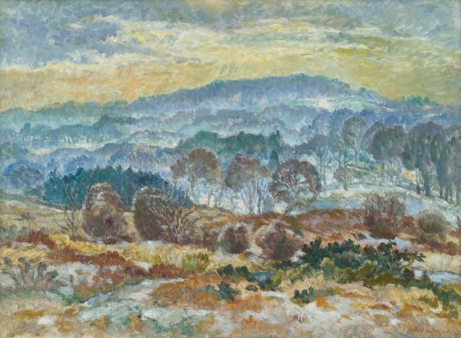
Tam Bowie, from Milngavie offers a lyrical meditation on the Scottish winter landscape. Painted in 1952, the composition depicts the view from Tam Bowie Farm, located north of Glasgow, looking northwest towards the distant rise of Duncolm Hill.
In the foreground, winter-bleached grasses tuft across gentle slopes, rendered with painterly restraint and delicacy. A misted band of blue-toned woodland follows, its softness suggesting the hush of a cold morning. Above, the distant hills lift into a pale sky touched by first light, a quiet optimism woven into the landscape’s subdued palette. The finely judged brushwork evokes the fragility of winter, and the enduring presence of the natural world in repose.
Mary Armour (1902-2000)
2. Tam Bowie, from Milngavie, 1952 oil on board, 45 x 61 cm signed and dated lower right
PROVENANCE
Kelvin Gallery, Glasgow
Mardi Barrie (1930-2004)
Born in Kirkcaldy in 1930, Barrie studied Philosophy and English before completing her diploma in Drawing and Painting at Edinburgh College of Art in 1953 under William Gillies. Closely aligned with the Edinburgh School, she developed a style that was at once experimental and grounded in careful observation. While known primarily for her evocative landscapes and seascapes, Barrie’s still lifes, such as Après Fête, demonstrate her remarkable sensitivity to light and mood.
Throughout her career, Barrie balanced her professional painting practice with a respected teaching role as Head of Art at Broughton High School in Edinburgh. She exhibited widely across the UK from the 1960s onward and was a regular figure in The Gallery’s exhibition programme.
In Après Fête, Mardi Barrie turns her attention inward, crafting a still life that is as much about atmosphere and memory as it is about objects. The scene unfolds in a dreamlike composition, where forms are suggested more than stated, and space is gently unsettled by shifts in perspective. The influence of her contemporary Robin Philipson is subtly present in the structured placement and painterly handling, yet Barrie’s approach is entirely her own: soft, tonal, and emotionally attuned. The items on the table are not sharply delineated but emerge and dissolve within the composition, as though fading into memory.
The Scottish Gallery exhibitions: 1968, 1972, 1979, 1983, 1988
Mardi Barrie (1930-2004)
3. Après Fête, c.1983 oil on board, 44 x 36.5 cm signed lower right
EXHIBITED
Mardi Barrie, The Scottish Gallery, Edinburgh, 1983
Penelope Beaton (1886-1963)
Penelope Beaton was a formidable and muchadmired figure in 20th century Scottish art, and a central figure in the Edinburgh School. She enjoyed an influential teaching career at Edinburgh College of Art, where she helped shape the direction of modern Scottish painting. After enrolling at Edinburgh College of Art, she graduated in 1917 and went on to become a senior lecturer and Head of the Junior Department, teaching a generation of students which included Mary Armour and John Maxwell.
Beaton’s approach to painting was marked by a forceful clarity of composition, expressive handling of colour, and a sharp sensitivity to the rhythms of landscape and still life. A close contemporary of William Gillies, with whom she shared both stylistic traits and teaching responsibilities, Beaton developed a strong personal voice that combined modernism with direct observation.
Though known for her no-nonsense manner, Beaton was a beloved and generous teacher, remembered for her deep affection and fierce advocacy for young artists. Elected an Associate of the Royal Scottish Academy in 1957, she remained active in exhibiting throughout her life, contributing over a hundred works to RSA exhibitions alone. Her watercolours of Iona are known for their lyrical insight and compositional restraint.
After her death in 1963, Beaton was remembered as a teacher of immense dedication and a painter of distinction. Her legacy continues in both the aesthetic lineage of the Edinburgh School and the lives of the many students and artists she passionately supported.
The Scottish Gallery exhibitions: 1952, 1963 (Memorial), 1982
Penelope Beaton, c.1951
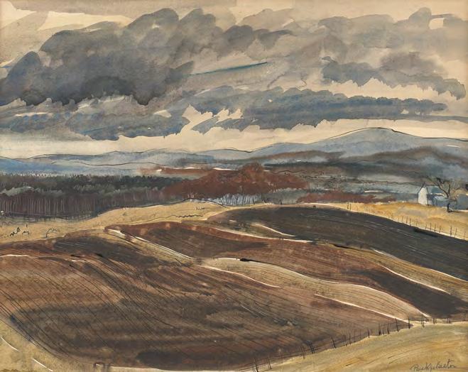
In Ploughed Fields, Borders Moorland, Beaton captures the dynamic energy of the Scottish Borders landscape, where farmland meets open moor. The viewpoint appears to be painted from an elevated position, which suggests an artist who walked the land, climbing high to observe the sweep of field and sky below.
Beaton’s use of ink and watercolour is expressive yet restrained, balancing fluid brushwork with keen graphic structure. The sky is light and fast-moving, rendered with a vibrancy that mirrors unpredictable Scottish weather. This painting is likely the result of one of Beaton’s habitual outdoor sketching excursions, possibly alongside her close colleague and fellow Edinburgh School artist, William Gillies. Both shared a dedication to drawing and painting from life, which was part of a daily discipline. The Borders landscape, with its subtle drama and rich agricultural patterns, offered endless inspiration.
4. Ploughed Fields, Borders Moorland, c.1940s ink and watercolour on paper, 36 x 45 cm signed lower right
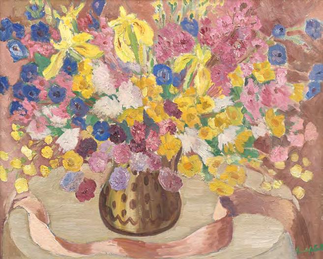
Penelope Beaton (1886-1963)
Summer Bouquet is a confident and expressive still life. Likely painted for the Royal Scottish Academy’s Annual Exhibition. This work is a symphony of mauve, yellow, and blue, where yellow bearded irises, phlox, and summer blooms overflow from a central vase, cascading across a patterned white tablecloth. The canvas is filled to its edges with floral exuberance.
The decorated vase, heavily outlined, serves as the visual anchor, rooting the loose, lyrical arrangement and drawing the viewer’s gaze back through the movement of petals and stems. The ribbon, almost theatrical in its flow, adds structure. Beaton’s bright green signature, tucked in the lower right, becomes more than a name, it is a final flourish, the confident mark of a painter satisfied with her design. This is an artist in full command of her palette, her vision, and her craft.
5. Summer Bouquet with Pink Ribbon c.1949 oil on canvas, 51 x 64 cm signed lower right
Penelope Beaton (1886-1963)
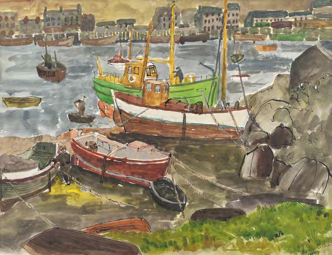
In this vibrant and joyful watercolour, Beaton captures the energy of daily life in a coastal village: fishermen at work, boats moored in the foreground, and a cluster of buildings across the harbour. A bright green tussocky hill in the foreground echoes the colour of a painted boat midscene, cleverly defining the perspective and adds to the visual rhythm. Though the exact location is unknown, the painting evokes the spirit of Scotland’s coastal harbours such as Tarbert. Beaton combines keen observation with compositional flair, using her palette not just descriptively, but expressively, creating a work that is part picture, part social document, and wholly alive.
6. Harbour Scene, c.1940s watercolour and ink on paper, 44 x 57 cm signed lower right
Penelope Beaton (1886-1963)
Elizabeth Blackadder (1931-2021)
Dame Elizabeth Blackadder was one of Scotland’s most distinguished and cherished artists, working with equal brilliance in oil, watercolour, and printmaking. Blackadder was the first woman elected to both the Royal Scottish Academy and the Royal Academy, and in 2001 became the first female artist appointed as Her Majesty’s Painter and Limner in Scotland. The Scottish Gallery has proudly represented Blackadder since the 1950s, holding numerous exhibitions and placing her work in both private and public collections. We continue to honour and champion her extraordinary legacy and enduring influence on contemporary Scottish art.
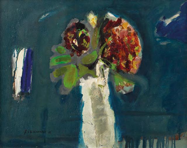
In Still Life with Flowers, painted in 1965, Blackadder takes a time-honoured subject, the still life, and turns it into a composition that is both bold and subtly subversive. At first glance, the white vase of flowers occupies the centre of the canvas, but around it, Blackadder constructs a world of unexpected colour and painterly tension.
The background is a rich, electric petrol teal, punctuated by a secondary vase in white and cobalt, which both echoes and offsets the
Elizabeth Blackadder (1931-2021)
7. Still Life with Flowers, 1965 oil on canvas, 40.5 x 51 cm signed and dated lower left
PROVENANCE
Portland Gallery, London, 1988
central form. The flower heads themselves are built in impasto, their thick application contrasting with the thinned washes of paint elsewhere, particularly the lime green leaves, loosely swept over a grey ground. Blackadder has employed turpentine to dilute the oil, creating translucent veils of pigment that give the work a lightness and fluidity, while retaining structure.
This dynamic contrast between thick and thin, control and freedom, gives the painting a carefree confidence, a touch of punk attitude, even. It is both exquisitely judged and intentionally offbeat, revealing the artist’s willingness to take risks with composition and material. As ever, Blackadder lets the painting speak for itself. In Still Life with Flowers, Blackadder’s voice is clear, measured, daring, and entirely her own. What begins as a classic still life unfolds into something richly contemporary, infused with instinct, intellect, and an unmistakable painter’s touch.
The Scottish Gallery exhibitions: 1961, 1966, 1972, 1974 (Festival), 1994 (Festival), 1998, 2003, 2004, 2008 (Festival), 2011, 2013, 2015, 2016 (Festival), 2020, 2023 (Memorial)
A MASTER PRINTMAKER
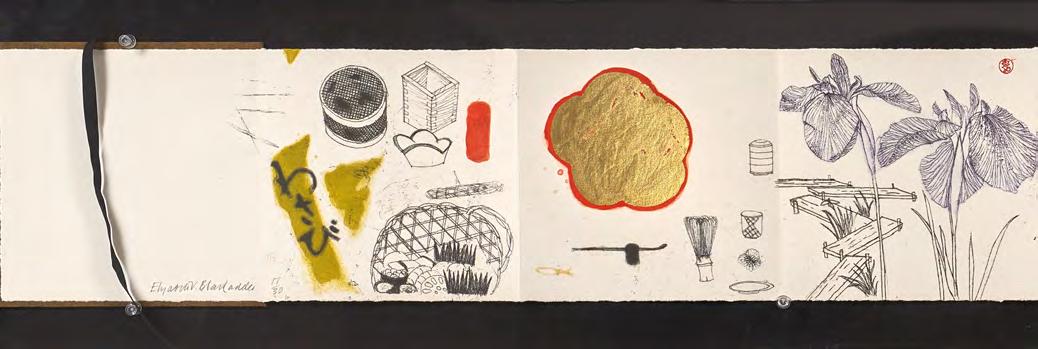
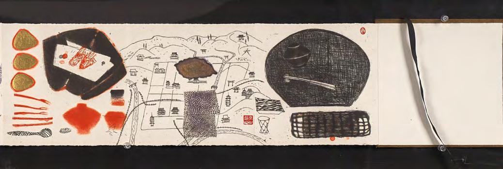
Elizabeth Blackadder remains an extremely influential figure in Scottish art, widely celebrated for her synthesis of observation, composition, and technique. Born in Falkirk and educated at Edinburgh College of Art, where she studied under William Gillies, Blackadder developed a uniquely refined visual language that bridged Western and Eastern sensibilities, and a practice that spanned painting, drawing, and printmaking.
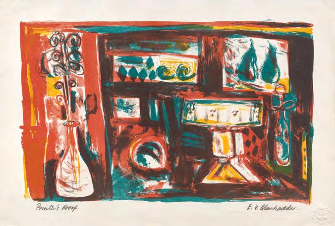
Printmaking, with its capacity for nuance and repetition, was a vital thread in her work. The three prints featured here, Harlequin (1958), an early lithograph still life emboldened with playful colour and form; Fifeshire Farm (1960), and Autumn, Kyoto Notebook (1996), an etching with aquatint capturing the quiet
grace of a Japanese scene – all of these prints offer a window into Blackadder’s evolving aesthetic. Her repeated travels to Japan from the 1980s onwards had a profound impact on her art, deepening her sensitivity to negative space, refined detail, and contemplative stillness.
A hallmark of Blackadder’s practice is her distinctive arrangement of objects, which are carefully placed with equal reverence and attention. These elements become visual poems, balancing precision with serenity. Whether through the vibrant geometry of a harlequin’s costume or the minimalism of a Kyoto composition, Blackadder’s prints resonate with clarity, elegance, and a lifelong devotion to the beauty of things seen and remembered.
Elizabeth Blackadder (1931-2021)
8. Harlequin, 1958 lithograph, 28 x 45 cm signed lower right; inscribed ‘Printer's Proof’ lower left edition of 75 printed by Harley Brothers
ILLUSTRATED
Christopher Allen, Elizabeth Blackadder Prints, Lund Humphries, 2003, pl.24
Elizabeth Blackadder (1931-2021)
lithograph, 51 x 68 cm signed lower left edition 63 of 70 printed by Curwen Studio
PROVENANCE Manor House Fine Arts, Cardiff
ILLUSTRATED
Christopher Allen, Elizabeth Blackadder Prints, Lund Humphries, 2003, pl.3
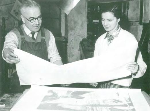
9. Fifeshire Farm, 1960
Elizabeth Blackadder at Harley Brothers Printmakers, 1960
Elizabeth Blackadder (1931-2021)
10. Autumn Kyoto, 1996 etching with aquatint, 18 x 152 cm signed lower left edition 17 of 30 printed by Glasgow Print studio
PROVENANCE
Mercury Gallery, London, 1998
ILLUSTRATED
Christopher Allen, Elizabeth Blackadder Prints, Lund Humphries, 2003, pl.43
Robert Henderson Blyth (1919-1970)
Robert Henderson Blyth was a distinctive voice in post-war Scottish painting, known for his expressive treatment of the landscape and his subtle shift towards abstraction. Born in Glasgow, Blyth studied at the Glasgow School of Art from 1934-1939. A painter of considerable sensitivity, he served during the Second World War, an experience that left a lasting impression on the emotional undercurrents of his work.
After The War, Blyth quickly gained recognition, receiving the Guthrie Award from the Royal Scottish Academy in 1945. He began teaching at Edinburgh College of Art from 1946 and later became artist-in-residence at Hospitalfield House, Arbroath a centre known for its vital role in developing post-war Scottish modernism. In 1954, Blyth moved north to take up a post at Gray’s School of Art
in Aberdeen, becoming Head of Drawing in 1960, a role he held until his untimely death in 1970.
Blyth’s influence as both an artist and educator was significant, particularly in Aberdeen where he mentored a new generation of artists. A posthumous memorial exhibition organised by the Scottish Arts Council in 1972 confirmed his status as a major figure in mid20th century Scottish painting.
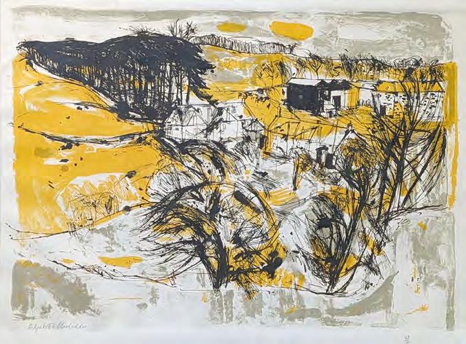
Green Landscape reflects Blyth’s mature style, where the natural world is not meticulously rendered but rather used as a structural and emotional starting point. His compositions often use the landscape as an emotional vehicle, with forms pared down and atmosphere heightened to evoke mood and memory rather than topographic accuracy.
Robert Henderson Blyth (1919-1970)
11. Green Landscape, c.1960 oil on board, 70 x 90 cm signed lower right
EXHIBITED
Scottish Society of Artists; Robert Henderson Blyth Retrospective Exhibition, The Scottish Gallery, 1987, cat.59
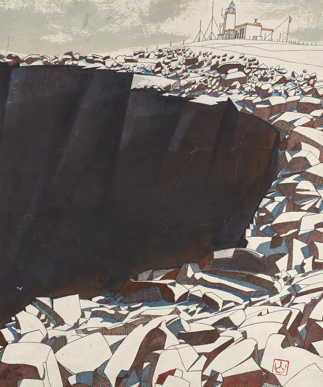
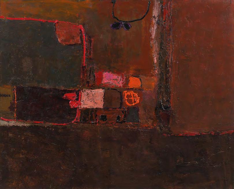
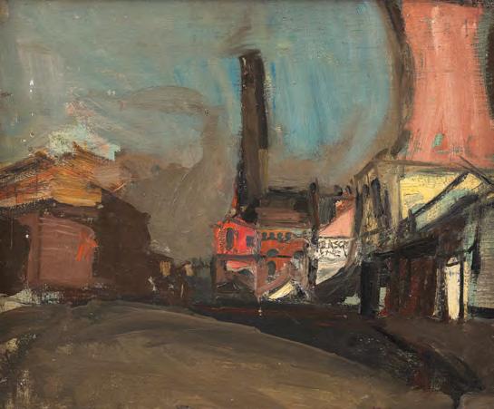
William Burns (1921-1972)
William Burns is best known for his poised and thoughtful post-war modernist work, depicting Scottish life and landscape.
Sea Town, is a powerful late painting by Burns. It is an exploration of memory, abstraction, and the unique aerial perspective shaped by his experience as a wartime pilot. Burns served in the RAF during the Second World War, and the experience of viewing the world from above would shift his entire practice. Sea Town possibly references Arbroath, translating the coastline into a structured aerial landscape, using impasto and a bold, earthy palette of reds and browns.
The painting is anchored by a broad, dark horizontal band, a compositional device that separates sea from land and heightens the tension between flatness and depth, between observed detail and remembered form. Rather than describing a scene in representational terms, Burns constructs the landmass and coastline into a dynamic, composition, evoking
a sense of the terrain as seen from altitude; distilled, abstracted, and emotionally charged.
Born in Newton Mearns, Renfrewshire, Burns studied at Glasgow School of Art from 1944 to 1948, under the guidance of Ian Fleming and David Donaldson, later continuing at Hospitalfield when Fleming became Warden. After a formative period working in Glasgow, he relocated to Aberdeen in 1954 to teach at the Aberdeen College of Education, where he eventually became Principal Lecturer and Head of Department in Art Education. His passion for flying remained undiminished throughout his life and deeply informed his visual language. Tragically, his life was cut short in 1972 during a flying excursion over northeast Scotland, leaving behind a compelling body of work that hints at even greater abstraction and expressive depth.
The Scottish Gallery exhibitions: 1964, 1966, 1968 (Festival)
William Burns (1921-1972)
12. Sea Town, c.1965 oil on board, 59 x 74 cm signed left centre
EXHIBITED
The Scottish Gallery, Edinburgh
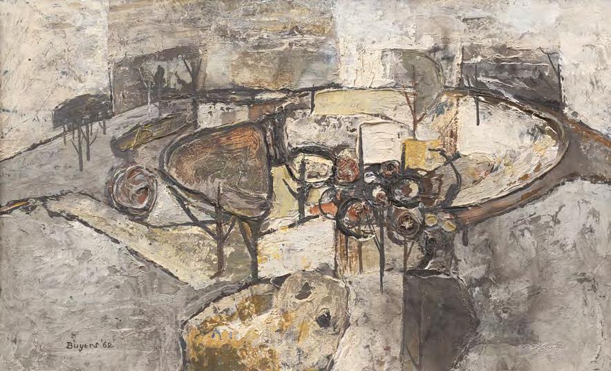
Donald Morrison Buyers (1930-2003)
Donald Morison Buyers was part of a generation of Scottish artists who emerged in the post-war period with a keen sensitivity to both the abstract possibilities of landscape and the expressive qualities of paint itself. A graduate of Gray’s School of Art in Aberdeen, Buyers developed a distinctive visual language marked by subtle tonal shifts, formal restraint, and a lyrical connection to place. White Hill exemplifies this mature sensibility: trees, hillside, and sky are distilled into a soft, harmonious arrangement. Typical of the era, Buyers uses pigment with quiet tactility, softly pushed across the board in delicate layers, while slender black lines lend a gentle vertical rhythm. Horizontal bands float through the composition, less rigid than drawn, evoking a landscape remembered more than observed.
Donald Buyers was born in 1930 in Aberdeen where he attended the Grammar School and then Gray’s School of Art after which he assisted his tutor Robert Sivell in the murals at the University Union in Schoolhill. His was a quiet life, well lived, throughout which family and painting were his twin loves. A honeymoon in Paris turned into an extended stay and the School of Paris was always present in his work. Back in Aberdeen he began to teach in schools: Robert Gordon’s and eventually as a visiting lecturer at Gray’s, but he never stopped working and exhibiting.
Donald Morison Buyers (1930-2003)
13. White Hill, 1962 oil on board, 30 x 50 cm signed and dated lower left
THE SCOTTISH COLOURISTS
Drawn to Light | The Colourists on Paper
F.C.B. CADELL
J.D. FERGUSSON
G.L. HUNTER
S.J. PEPLOE

F.C.B. Cadell (1883-1937)
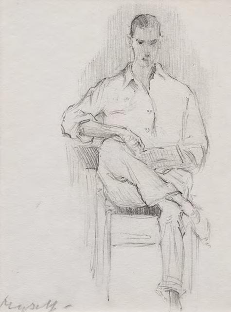
This delicately rendered self-portrait offers a rare and intimate glimpse of Cadell as a young prodigy, likely drawn in the late 1890s when he was still a teenager. Seated in what appears to be sporting attire, the young Cadell sits with his right leg casually crossed over his left, absorbed in a book. There is a subtle, lifelike energy to the composition, even the position of his foot hints at movement, as though gently swinging.
The title Myself is both direct and endearing, and entirely typical of Cadell, who was affectionately known as 'Bunty' to his family. It captures something of the self-awareness and charisma that would come to define his personality and artistic confidence in later years, the title placed in lieu of signature. Despite its modest scale, this drawing glows with the vitality of youth and early talent, offering a quietly compelling insight into the formation of one of the most flamboyant and distinctive Scottish Colourists.
The Scottish Gallery exhibitions: 1909, 1910, 1932, 2011
14. Myself, c.1898 Conté on paper, 12 x 9 cm titled lower left
PROVENANCE
John Cadell, the artist's nephew; Bourne Fine Art, Edinburgh, 1988, the collection of the Hon James Bruce, CBE, JP
F.C.B. Cadell (1883-1937)
J.D. Fergusson (1874-1961)
J.D. Fergusson first exhibited with The Scottish Gallery in 1923. The exhibition included both small-scale sculpture he had produced over the preceding few years and his Highland series of oil paintings, which represented the artist’s engagement with his native landscape and culture. Twenty years before, he had been one of the purchasers of work from his friend S.J. Peploe’s first exhibition with The Gallery, but in the intervening years he had looked to London and then Paris for his commercial and spiritual existence. It would only be after his second flight from the continent, in the face of WWII, that Scotland would take the central place in his work and thoughts. Fergusson was a paragon of the bohemian life and one of the major contributors to British modernism –uncompromising, modernist and brilliant. A Memorial exhibition was held for Fergusson at The Scottish Gallery in 1961, and numerous exhibitions have been held since.
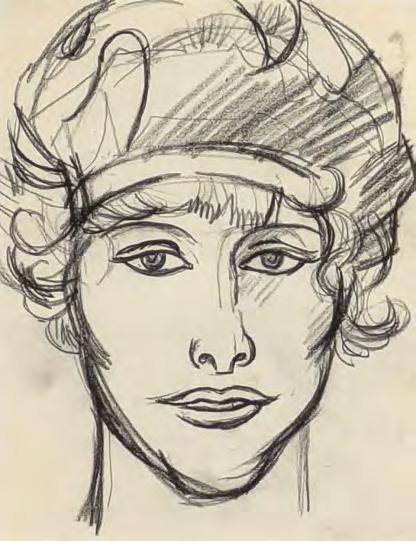
In this intimate drawing, J.D. Fergusson captures the elegant profile of the dancer with a few confidently drawn lines. Her face is exquisitely outlined, her hair swept back with a bandeau, cascading in soft curls, at once sensual, poised, and direct. Fergusson’s use of Conté crayon gives the image warmth and immediacy, evoking the intimacy of a fleeting, observed moment.
Fergusson believed passionately in the importance of drawing every day, as a means of sharpening observation and deepening expression. Drawings like this reflect that discipline; deceptively simple, yet full of life, rhythm, and character. Joan in a Headdress stands as a bold example of Fergusson’s lifelong commitment to capturing beauty, personality, and presence in line alone.
The Scottish Gallery exhibitions: 1923, 1961, 2011, 2013, 2018, 2020, 2024
J.D. Fergusson (1874-1961)
15. Joan in a Headdress, c.1916 Conté on paper, 21.5 x 16.5 cm
EXHIBITED
Fergusson's Women, The Scottish Gallery, Edinburgh, 2011, ex.cat.
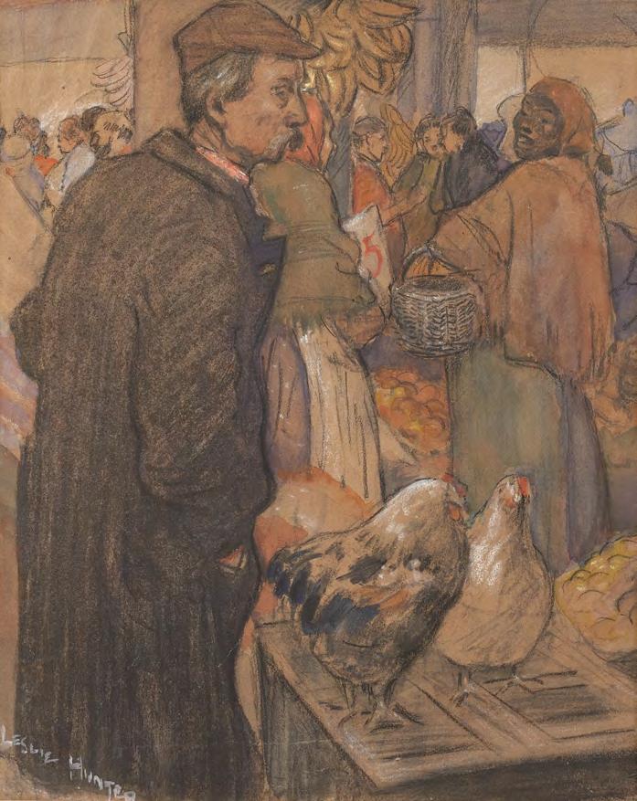
G.L. Hunter (1877-1931)
George Leslie Hunter stayed in California when his family returned to Scotland in 1898. He was already determined to be an artist and moved to San Francisco, the town Robert Louis Stephenson called the Smelting pot of the races. Someone else described it as Montparnasse with six-shooters. Hunter found studio digs in one of the terraces overlooking the panorama of the bay. Years later, Hunter recalled his time with great affection, getting a square meal at the Hotel de France or Lola’s for fifteen cents, drawing constantly, finding his subjects in the music halls, street markets and theatres of China Town. He worked hard, joining the Californian Society of Artists –what Hunter’s biographer T.J. Honeyman called the Salon des Refusés of San Francisco, though it is not recorded that he ever sold a painting. He did derive an irregular income from commissions from newspapers and magazines and befriended the writers Bret Harte and Jack London for whom he also made illustrations.
Hunter made a trip to Paris in 1904, returning via New York where he briefly kept a studio. He came back to hard work and the prospect
G.L. Hunter (1877-1931)
of an exhibition. All hopes were dashed when his studio was destroyed in an earthquake on the 18th of April 1906. Hunter was out of town, but was left with no more than the clothes he wore and the contents of his weekend bag.
Our drawing may well be one of those acquired from S.S. White of Philadelphia by Honeyman after the artist’s death. S.S. White had met Hunter in Paris in 1904 and acquired the sketches. The title may well be original although it is now recorded that Hunter visited New Orleans. Instead, the subject may represent a commission most likely for a book illustration. The dominant male figure is strikingly similar to the illustration which is plate 4 in Honeyman’s Introducing Leslie Hunter entitled The Luck of Roaring Camp from Bret Harte’s story of 1868. The drawing has a strong narrative element and is typical of Hunter’s best early work; strong, direct, dramatic and highly skilfully handled medium.
The Scottish Gallery exhibitions: 1924
16. The Flower Market, New Orleans, 1900-1904 watercolour, white chalk and Conté on paper, 29 x 23 cm signed lower left
EXHIBITED
The Scottish Colourists: Radical Perspectives, The Fleming Collection, Dovecot Studio, Edinburgh, 2025
PROVENANCE
Tillywhalley Gallery, Milnathort
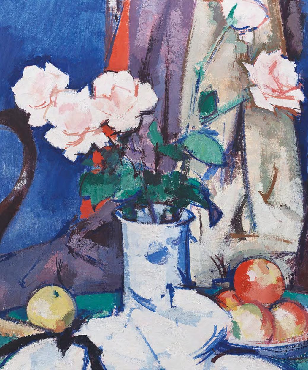
S.J. Peploe (1871-1935)
Harbour, Cassis comes from a sketchbook made by the artist on his first visit to Cassis, in 1913. The trip came about on the urging of J.D. Fergusson, who accompanied Peploe, his wife Margaret and their first child Willy, whose third birthday was celebrated on August 29th.
This was the artist’s first trip to the Mediterranean and he responded with some of the most brilliantly coloured works of his Fauvist period. He was very productive and more than twenty Cassis subjects were exhibited the following March in the Baillie Gallery in London. But the work began with drawing.
Executed in Conté, Harbour, Cassis is not a casual sketch but a fully resolved visual study. He captures the distinctive architecture of the harbour town, its boats, buildings and quayside clearly articulated. Many other drawings were used for paintings also, full
of accurate information, but also beautifully considered for composition.
A decade later when Peploe next returned, he found new subjects and used larger format canvasses. His friend Bunty Cadell accompanied the Peploe family this time and made a painting from the near identical viewing point in Harbour, Cassis.
This example, in perfect condition, represents a key moment in the artist’s development as well as exemplifying the complex but direct relationship between drawing and painting in his practice.
Guy Peploe
The Scottish Gallery exhibitions: 1903, 1909, 1922, 1923, 1924, 1927, 1934, 1936 (Memorial), 1947, 1985, 1990 (Edinburgh & London), 2012, 2021 (Bicentenary)
S.J. Peploe (1871-1935)
17. Harbour, Cassis, 1913 Conté on paper, 15 x 22 cm signed lower right
EXHIBITED
S.J. Peploe & his Contemporaries, The Scottish Gallery, Edinburgh, 1985, cat 23
PROVENANCE
From the collection of the Hon James Bruce, CBE, JP
S.J. Peploe (1871-1935)
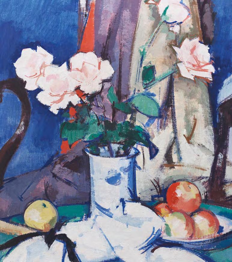
Peploe had painted roses throughout his life, notably in the Raeburn Studio before his move to Paris in 1910 when at the apogée of his Impressionist style, the petals were rendered in a flurry of broad brushstrokes. When he returned to the subject after the Great War it was in paintings of great poise and stylishness, when the demands of significant form balanced his continuing mastery of his medium, when colour, primary and glorious, was the first impression on meeting his new work.
In the early twenties, settled into his new studio on Shandwick Place, he considered the composition of his still life in setting up the subject, balancing diagonals of drapery with the round forms of apples or oranges, creating a taut rhythm between solidity and lightness. Familiar props can be identified, including fruit, often placed on a plate with a red rim, or a French compotier; blue and white vases, a fan with a black ribbon, French paperbacks, bought from the Bouquinists on the left bank all recur.
In Still life, Apples and Pink Roses, the elements are placed on a round tabletop, the back of which is seen set against a mahogany chair. Its back is draped with a rich fabric
and the chair set at a sufficient angle for the serpentine right arm to add to the compositional complexity. The chair, known to the family as the Raeburn Chair had travelled to the new studio.
This is a supremely coloured example; a blue and white vase anchors a choreography of colour, with cobalt and ultramarine set against flashes of orange and clean greens, and pink petals modelled in confident, economical strokes. The format of the canvas: 22 x 20 inches, as opposed to his more usual 20 x 16 or 24 x 20, and the choice of the square vase lends the work a grandeur, enhanced by the rose blooms on their long stems springing from the solid vase.
By this time Peploe had begun his contract with The Scottish Gallery and Reid & Lefevre, who bought work regularly. It was this subject, alongside his plein air work on Iona, that perhaps consolidated his reputation; bringing new clients like Jack Blyth, Robert Wemyss Honeyman and Ion Harrison. He would move on towards more tonal and textural pictures, but for many his Rosepieces are the highpoint of his remarkable creativity.
Guy Peploe
S.J. Peploe (1871-1935)
18. Still Life, Apples and Pink Roses, c.1924 oil on canvas, 56 x 51 cm signed lower left
EXHIBITED
Cadell to Eardley: Fifty Years of Scottish Painting, Bourne Fine Art, Edinburgh, 1989, cat. 7
PROVENANCE
From the collection of Sir John Beckwith
THE SCOTTISH COLOURISTS
Four Artists. One Gallery. An Enduring Legacy.
This year, The Scottish Gallery Press launched a new hardback book, offering fresh perspectives on The Scottish Colourists. This beautifully illustrated edition is available for £14.95.
scottish-gallery.co.uk
Robert Colquhoun (1914-1962)
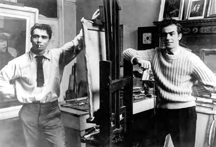
Robert Colquhoun was a painter, printmaker, and theatre designer, celebrated for his emotionally charged figurative works and distinctive post-war style. Born in Kilmarnock, Ayrshire, he studied at the Glasgow School of Art where he met lifelong partner and fellow artist Robert MacBryde. The pair became central figures in the London art scene of the 1940s, often referred to as the Two Roberts.
Colquhoun’s work is known for his powerful depiction of solitary, often monumental figures, influenced by European modernism, religious iconography, and the hardship of wartime Britain. His paintings and prints, particularly in the mid to late 1940s, display a unique fusion of expressionist line, classical subject matter, and psychological depth. Despite early acclaim, his later career was marked by personal struggles, and he died in relative obscurity in 1962, but his legacy endures as a key voice in British post-war art.
On its first appearance in the mid-forties, Colquhoun and MacBryde’s painting was what people had been waiting for. Its emphatic imagery, direct emotional appeal and legible modernity all contributed to its public success. Between the dubious hysterics of Minton and Ayrton’s romanticism, Sutherland’s unpeopled landscapes and the pacifism of Euston Road and its followers, Colquhoun, in particular, struck a blow for a Celticism which was undecorative and unilaterally, a lyrical humanism which was unassailably compassionate. Richard Shone, Robert Colquhoun and Robert MacBryde, Mayor Gallery, London, 1977
The Scottish Gallery exhibitions: 1944, 2010, 2014, 2017
Robert MacBryde and Robert Colquhoun, 1949
Photograph by Felix Man, Hulton Archive/Getty Images
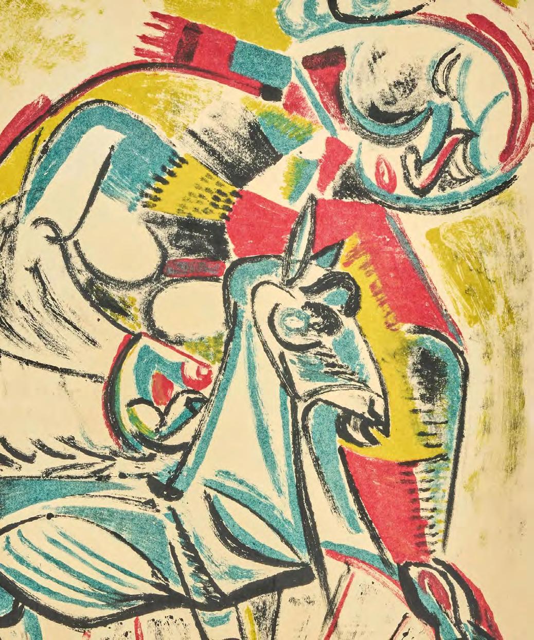
Woman with Goat is part of a significant body of work that Robert Colquhoun began in 1948, exploring the recurring motif of women and goats. These images trace their origins to the summer of 1944, when Colquhoun and his partner Robert MacBryde visited the poet Sydney Graham and his wife Nessie in Cornwall. Nessie’s pet goats provided a vivid subject, and Colquhoun’s studies from life formed the basis for a sustained exploration of the feminine archetype, isolation, and the symbolic bond between woman and animal.
Executed as a monotype, Woman with Goat is a unique print made by transferring ink or paint from a smooth, hard surface to paper, and blends painterly immediacy with Colquhoun’s graphic strength. The figure and goat are rendered in bold, black line and
a palette of sky blue, soft pink and yellows, creating a flattened, icon-like composition.
This monotype was likely produced at the same time he was producing a series of lithographs for Miller’s Press, a collaboration that coincided with a pivotal moment in Colquhoun’s career. In 1949, he travelled through Italy, visiting Brescia, Modena, Verona, Venice, Florence, Siena, and Rome; absorbing Renaissance art, puppet theatre, and traditional festivities such as the Palio in Siena. Although a planned book with writer George Barker featuring Colquhoun’s illustrations was never realised, the drawings and prints made during this time, including Woman with Goat, remain as lasting evidence of his visual and emotional engagement with myth, ritual, and human vulnerability.
Robert Colquhoun (1914-1962)
19. Woman with Goat, 1949 monotype, 52.8 x 41.7 cm signed and dated lower left
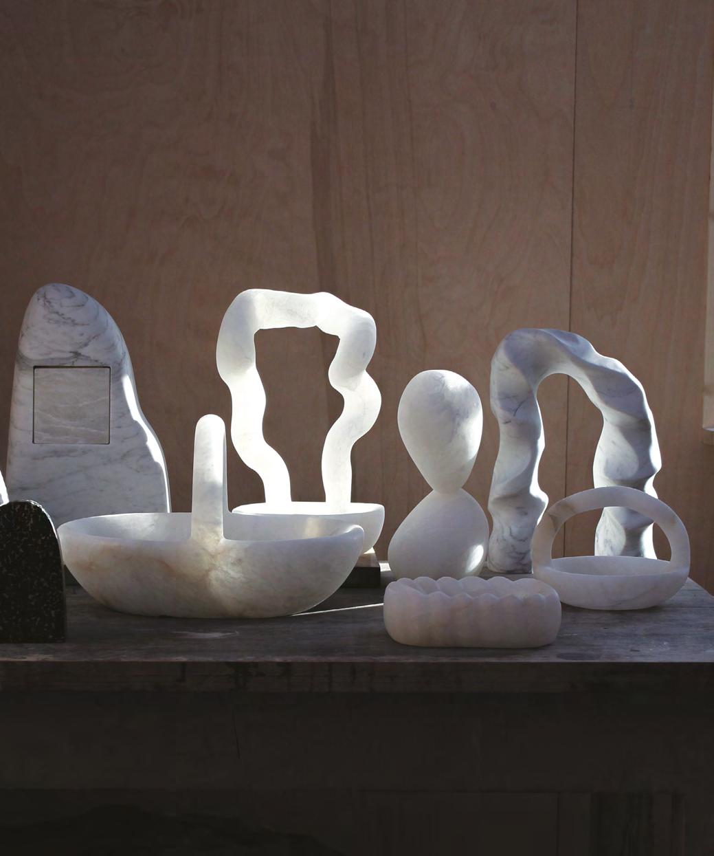
Oliver Cook (b.1992)
Oliver Cook's sculptural practice captures the tension between stillness and movement, light and form. Originally trained in ceramics and woodwork, Cook has quickly made his mark in the wider art world, drawing early attention in 2020. Cook's sculpture is at once sensual, restrained, and deeply intuitive.
His debut exhibition Form & Light with The Scottish Gallery in 2021 introduced his evolving mastery of carved alabaster, a medium whose translucent qualities he continues to explore with profound sensitivity. Since then, Cook’s practice is expanding, both materially and conceptually.
Drawing inspiration from familiar domestic forms, Cook creates sculptures that investigate the interplay between light, shadow, and mass. His surfaces are honed to reveal not only the inherent texture of the stone but its ability to capture a fleeting sense of time. Often, a particular sculpture is imagined in response
to a very specific moment: a corner of a room that catches the late sun, or a windowsill bathed in first light. These quiet interactions with environment and memory become part of the work itself.
His sculptural language is shaped by traditional carving techniques, but there is nothing traditional about the results. Cook’s process is deeply responsive and physical, led by the unique properties of each stone. The work moves organically, as much carved as revealed, informed by an instinctive understanding of rhythm, negative space, and the possibilities held within each block.
Cook’s sculpture resonates with the central concerns of Modern Masters, the timeless dialogue between material and maker, and the expressive potential of form when guided by a singular, contemporary vision.
The Scottish Gallery exhibitions: 2021, 2023
Photograph by Fernando Lobina
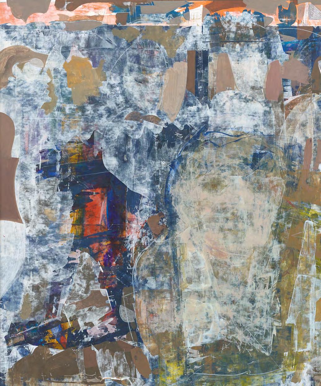
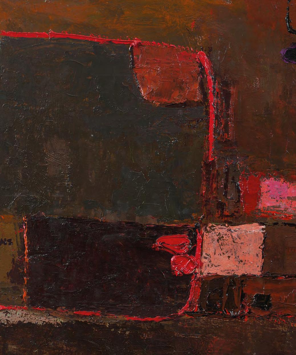
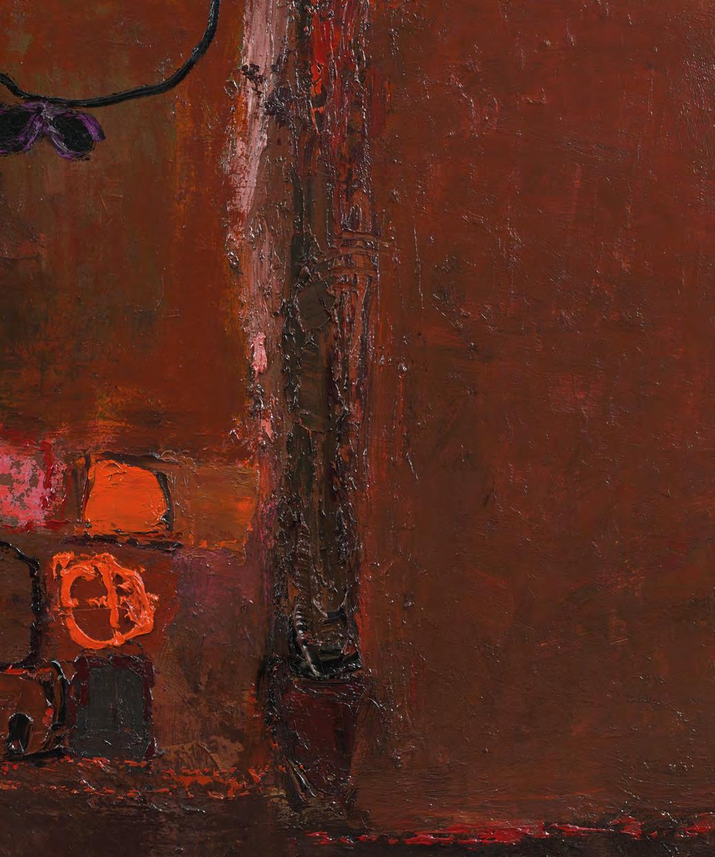
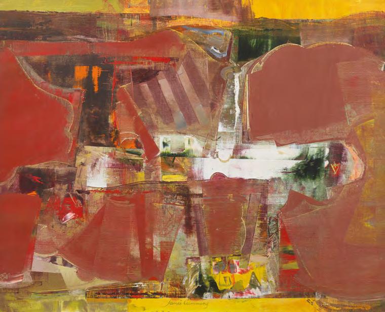
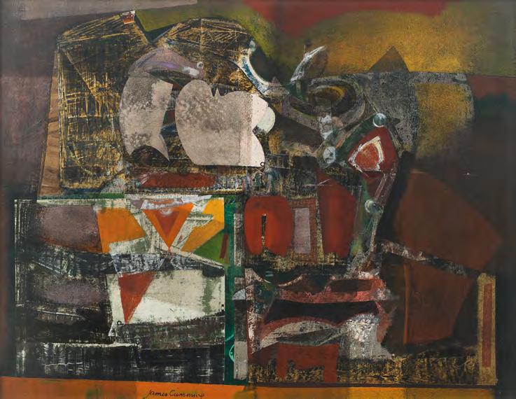
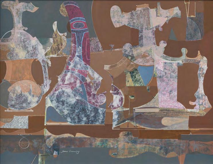
James Cumming (1922-1991)
Cumming was born in Dunfermline in 1922 and began his studies at Edinburgh College of Art before his education was interrupted by five years of service in the Royal Air Force during the Second World War. He trained as a pilot in Texas and later served in India and Burma, experiences that would leave a lasting impression on his understanding of space and aerial perspective. After The War, he returned to the College and completed a postgraduate year, followed by a travelling scholarship to the Isle of Lewis, where he lived with a crofting family in Callanish. The stark forms and rugged landscape of the Hebrides informed much of his early work and remained a touchstone for years to come.
Cumming was an independent thinker, and his work evolved apart from the expressive colourist tradition that shaped much of Scottish art during the mid-20th century. In the late 1950s and 1960s, he became increasingly interested in scientific imagery, ancient scripts, and symbolic structures, leading to a more abstract, hard-edged visual
language. Subjects such as puppets, still life, and flight remained central, but were approached through complex spatial design and a finely tuned colour sensibility. His investigations into the chemistry of pigments and painting surfaces also contributed to the impeccable craftsmanship seen throughout his career.
He was a dedicated art educator and a widely respected figure in the Scottish art world. From 1958 to 1961, he served as President of the Society of Scottish Artists, and was later elected Treasurer, Secretary, and eventually Custodian of the Collections of the Royal Scottish Academy. He lectured widely for the Arts Council and Edinburgh University, contributed to BBC arts programmes, and held a Humanities Scholarship to Harvard. Cumming retired from teaching in 1982 and spent his later years painting in the Borders village of Lennel, near Coldstream.
The Scottish Gallery exhibitions: 1962, 1971, 1972 (Festival), 1985 (Festival), 1995 (Memorial)
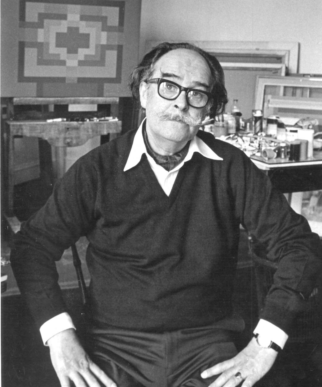
James Cumming, Edinburgh c.1980. Photograph by Jessie Ann Matthew
In this painting, James Cumming transforms a fleeting moment into an abstract and poetic visual statement. Far from a literal depiction, the painting captures the sensation of birds in motion, rendered in a kaleidoscope of mauves, yellows, golds, and pinks, where form dissolves into colour and structure gives way to rhythm. A composition of exceptional clarity and invention, the work is both intellectually constructed and instinctively felt, qualities that define Cumming’s distinctive approach to modern painting.
Ducks in Flight reflects his enduring interest in movement, structure, and visual poetry. It is a painting of balance and imagination, constructed with care, discipline, and a subtle emotional resonance. Cumming’s contribution to Scottish art is marked by innovation, intellect, and integrity, and his legacy continues through the many students, colleagues, and admirers he inspired throughout his life.
20. Ducks in Flight, c.1965 oil on canvas, 55 x 65 cm signed lower centre
PROVENANCE
The Scottish Gallery, Edinburgh
James Cumming (1922-1991)
Market Day is a daring composition in which forms gradually resolve into the suggestion of figures, echoing the urban and the rhythms of the natural world. Painted in Lennel, where James Cumming settled after retiring from Edinburgh College of Art, this painting captures a sense of community, a gathering of people brought together in a shared moment. The imagery recalls elements from his celebrated Hebridean paintings yet is likely connected to his final major project, the monumental mural The Community: A Festival of Time, installed in the Low Port Centre, Linlithgow. The mural measured an impressive six by nine metres, and captured a timeless vision of society through 39 figures, each symbolising an aspect of communal life. In Market Day, that same spirit of connection is distilled into a single, layered scene, where place, people, and atmosphere merge.
21. Market Day, c.1985 acrylic on board, 47 x 36 cm signed lower left
EXHIBITED
Edinburgh Festival Exhibition, The Scottish Gallery, 1985
James Cumming (1922-1991)
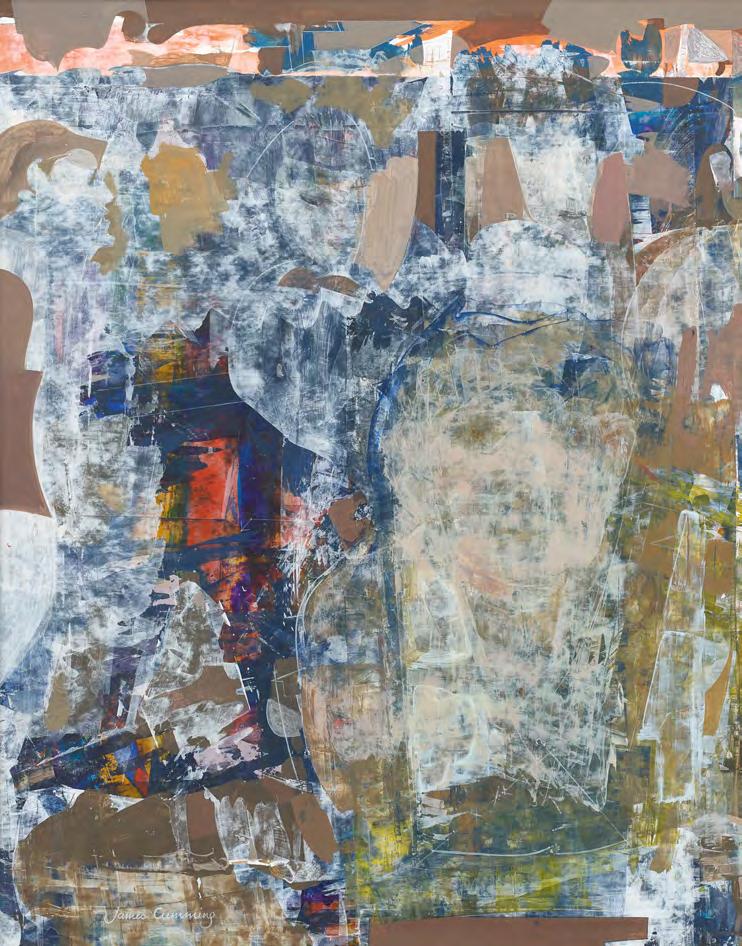
James Cumming won a travelling scholarship in the late 1940s. Rather than following his peers to continental Europe, he chose to journey to the western edge of the Isle of Lewis, which became his home for the next two years. His accommodation was rudimentary: mice shared his living and studio space, and rain pooled on the floor beneath his bed frame. Cumming was based in Callanish, close to the famous circle of ancient standing stones. The landscape’s timeless quality, steeped in myth and legend, was a constant presence, infusing his paintings with rich layers of narrative. His years on Lewis were formative, inspiring a series of paintings which were developed over nearly two decades. Studio Table at Midnight, which remained in the artist’s family collection, is a significant painting from his Lewis period. It
references the humble croft he called home, reducing pictorial elements into abstract forms of colour and varying surface texture. It evokes the raw experience of island life: the elemental forces of nature, the isolation, and above all, the ever-encroaching dark that filled his imagination. He once recounted some of his experiences to a Scottish journalist:
I went to an island I’d never seen, and a people I'd never known. It seemed to offer unending material and a challenge to translate into paint the character of the Lewis islanders living and working in a land of gneiss rock, flat, wind-exposed, desolate… I had visions of curtains opened at 4:30 to let in the cold earlymorning sunlight, the gun and last night’s bouquet of field flowers lying on kitchen table... James Cumming
James Cumming (1922-1991)
22. Studio Table at Midnight, 1950-55 acrylic on canvas, 102 x 127 cm signed lower centre
Hogmanay recalls a family celebration at Lennel in the 1970s, where reels were danced in the winter darkness, the only light coming from the sweep of car headlights across the night.
James Cumming (1922-1991)
23. Hogmanay, c.1985 oil on board, 20 x 20 cm
James Cumming (1922-1991)
24. Cottage China, 1984 acrylic on board, 36 x 47 cm signed lower centre
Victoria Crowe (b.1945)
Victoria Crowe is one of Scotland’s most respected and accomplished painters, known for her reflections on landscape, memory, and the passage of time. Her relationship with The Scottish Gallery spans over five decades, beginning with her first solo exhibition in 1970 and culminating most recently in Decades, a major exhibition and retrospective marking her 80th year. Footfall exemplifies the artist’s exploration of place and perception juxtaposing symbolic objects within the landscape, offering a powerful meditation, drawn from a lifetime of observation and artistic enquiry.
The Scottish Gallery exhibitions: 1970, 1973, 1977, 1982, 1995, 1998, 2001 (Festival), 2004, 2006, 2008, 2010 (Festival), 2012, 2014 (Festival), 2016, 2018 (Festival), 2019, 2021, 2023, 2025 (Festival, 80th)
It is the still intensity, the sense of the artist’s own meditative attention, which arrests us. Her paintings require our contemplation. Lyrical incantations, they whisper their secrets, hint at hidden meanings, offer glimpse of their past.
Lynn Green, Victoria Crowe, The Scottish Gallery, 2004
Victoria’s paintings pull against the downward spiral. Her winter images are illuminated: silvery hoar frost, snow-melt blue, late afternoon lilac clouds or a sudden burst of yellow light. Faces from memory surface, melancholy but lovely. Even as the protagonist laments the dying of his last hope with the fall of the last leaf, Victoria shows us the beauty of the sky through bare branches.
Susan Mansfield, Victoria Crowe: 50 Years of Painting, 2019
Victoria Crowe (b.1945)
25. Footfall, 2001 oil on board, 20 x 16 cm
EXHIBITED
Victoria Crowe, Festival Exhibition, The Scottish Gallery, Edinburgh, 2001, cat.24
Pat Douthwaite (1934-2002)
Pat Douthwaite (1934-2002) was a singular figure in Scottish art, whose work defies easy categorisation. Born in Glasgow, she demonstrated from an early age an affinity for fantasy and theatre, preferring imaginative play to conventional childhood pursuits. She studied mime and modern dance with Margaret Morris, and it was Morris’s husband, the Scottish Colourist J.D. Fergusson, who encouraged Douthwaite to paint. Aside from this crucial early guidance, she remained essentially self-taught, developing a highly distinctive visual language, marked by nervously vital line, emotionally charged colour, and a flair for expressive distortion.
Her subjects were often women from history and myth, such as Theda Bara, Belle Starr, and Amy Johnson, whom she approached not with detachment but with something closer to psychic inhabitation. Douthwaite, as critic Cordelia Oliver noted, painted like a method actor performs - from the inside out.
Her output ranged from tragicomic to anguished, grotesque to elegant, but always retained a sense of theatrical immediacy. Her work is direct, unflinching, and filled with symbolic power. Whether depicting a vulnerable animal, a dislocated palm tree, or a haunted human form, she brought a heightened intensity to every image she created.
The Scottish Gallery has long championed her work, staging key retrospectives and memorial exhibitions. Guy Peploe, who knew her personally, published a major monograph on her life and work in 2016. This small selection - an oil painting and two charcoals on paper - offers a glimpse into the breadth of Douthwaite’s unique vision.
The Scottish Gallery exhibitions: 1977, 1993, 1995, 1998, 2000 (Retrospective), 2005 (Memorial), 2011 (Retrospective), 2014, 2016, 2020 (London), 2021
Pat Douthwaite, c.1977
Pat Douthwaite was fascinated by the female figure, often exploring its expressive and symbolic potential through bold, unsettling imagery. In Woman in a Red Gown, a semi-clothed female figure stands against a stark white background, her body wrapped in a vivid costume of orange and red. Her bared teeth and stylised black hair, evoking the likeness of an Egyptian queen, lend the figure a confrontational presence. Yet she stands in tiny shoes which suggest a vulnerability despite best efforts to appear fierce. A reptilian creature enters the scene from the left, gazing up at the woman, adding a surreal, totemic dimension. Douthwaite’s distinctive signature appears lower right, not merely as a mark of authorship but as a statement of defiance; a declaration of the artist’s uncompromising vision.
26. Woman in a Red Gown, 1966 oil on board, 120 x 90 cm signed lower right
Pat Douthwaite (1934-2002)
Pat Douthwaite (1934-2002)
27. Dog Laying Down, 1989 charcoal and pastel on paper, 54 x 41 cm signed and dated upper right
Pat Douthwaite (1934-2002)
28. Barra Man with Cat, c.1987 charcoal on paper, 81 x 56 cm
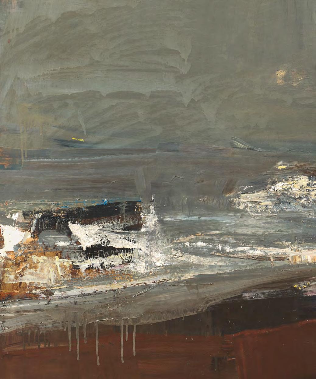
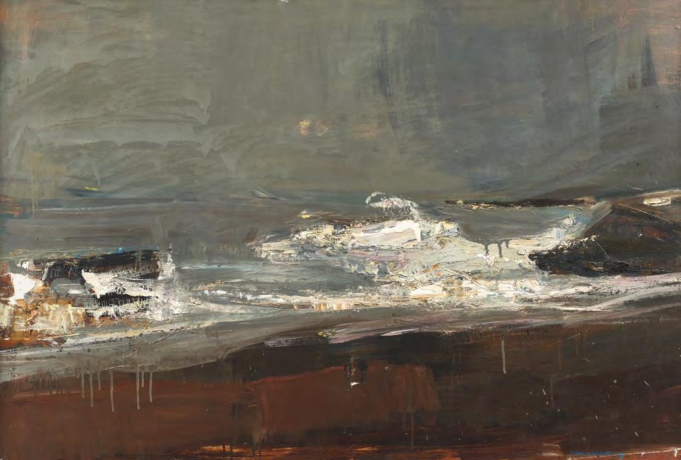
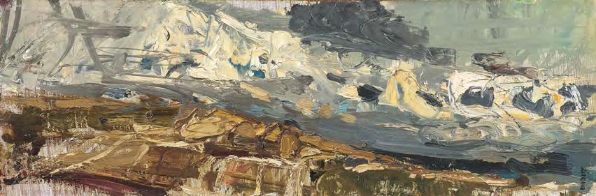
Joan Eardley (1921-1963)
Breaking Wave is one of Joan Eardley’s monumental seascapes, a painting that delivers the raw, physical force of the northeast winter coast with an intensity few artists have matched. A towering wave, charged with movement and foam, hurls itself toward the shore, the energy of its crash held in suspended motion. The eye is drawn to the long sweep of deep red shoreline, vivid against the steel-toned sea. Above, a thick band of grey sky hangs heavy, full of weather and foreboding, yet within it glimmers the faint presence of a low winter sun. Its light is diffused but perceptible, adding a quiet, haunting tension to the storm-driven scene.
Though Eardley moved to Catterline in the early 1950s, she did not begin painting the sea until several years later. She needed to
feel ready to paint the sea, to meet the power of it head on. When she did, the results were extraordinary.
Eardley, who trained at Glasgow School of Art, forged a uniquely Scottish expressionism, whether it was her Glasgow subject or in these late, seascape paintings. She distilled something timeless and deeply human: our confrontation with the power of the natural world. In Breaking Wave, we don’t just witness a moment - we stand at the edge of it, in awe of sea, sky, and the storm’s pulse.
Breaking Wave was first acquired by Mr and Mrs Proudfoot, former Directors of The Scottish Gallery, further reinforcing the significance of Breaking Wave within the artist’s body of work.
Joan Eardley (1921-1963)
29. Breaking Wave, 1959 oil on board, 88.3 x 122 cm signed lower right; signed and titled verso
EXHIBITED
Scottish Paintings for Canada, The Auditorium Foyer, Toronto, Canada, 1961; Joan Eardley, RSA (19211963): A Memorial Exhibition, Arts Council of Great Britain, Scottish Committee, Kelvingrove Art Gallery and Museum, Glasgow, 1964, cat.99, as 'Breaking Wave, Kincardineshire'; Joan Eardley, The Scottish Gallery, Edinburgh, 2003.
PROVENANCE
The Scottish Gallery, Edinburgh, 1962; Mr and Mrs G.R. Proudfoot, Durham, by 1964; Fine Art Society, London, 2003; Collection of Peregrine Pollen.
ILLUSTRATED
Christopher Andreae, Joan Eardley, Lund Humphries, 2013, p.184, no.175, illustrated, as 'Seascape', dated circa 1959-63
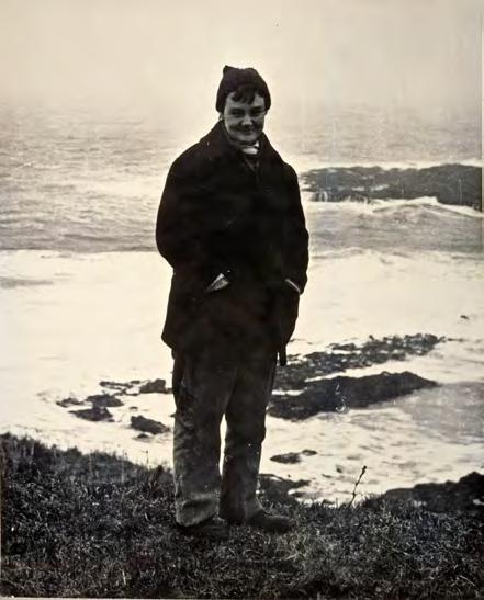
JOAN EARDLEY CATTERLINE
Three large canvases all worked throughout the day from my front door or thereabouts. It has been a perfect painting day – Not as regards climate! (I wore a fur coat for the first time). But for beauty quite perfect – A big sea – with lovely light – greyness and blowing swirling mists – and latterly a strong wind blowing from the south, blowing up great froths of whiteness off the sea, like soap suds onto the field behind our wee house – And towards evening the sun appeared shrouded in heavy mist – and turned yellow and orange and red, with great swirls of mist obscuring her every now and again – I wanted so much to paint the sun but it meant turning round and leaving my sea – or else running round paints and all to the other side of the bay. And I just hadn’t time or energy to do this – Tomorrow perhaps there will be the possibility of this sun again and I can take up my position, the other side, by the minister’s house. I think it could be good there.
Letter from Joan Eardley to Andrea Walker, November 1958. Christopher Andreae, Joan Eardley, Lund Humphries, 2013
The Scottish Gallery exhibitions: 1955 (Festival), 1958 (Festival), 1961, 1964 (Festival and Memorial), 1981, 1983, 1984, 1988, 1990, 1992, 1996, 2007, 2013, 2015, 2017, 2021 (Centenary)
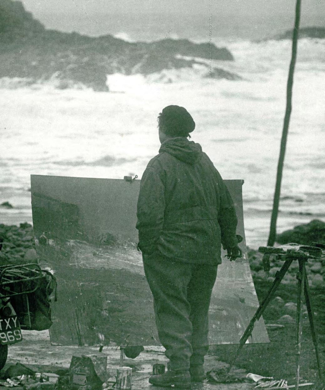
Joan Eardley in Catterline 1961. Photograph by Audrey Walker
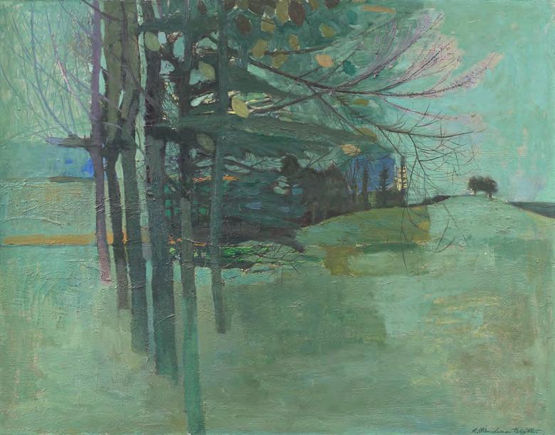
This small yet powerful oil painting captures the essence of Catterline’s coastal landscape with remarkable immediacy. A fast-moving autumn sky surges above the open fields, drawing the viewer toward the unseen shoreline beyond. Eardley’s confident handling of paint, thick with pigment and energy, brims with vitality. You can almost feel the wind rushing past and the joy she has found in the elements and in her subject. In this modest format, she achieves something monumental, distilled into a single, lyrical composition. It’s painting magic.
PROVENANCE
The artist's studio inventory no. EE367; Cyril Gerber Fine Art, Glasgow 1992
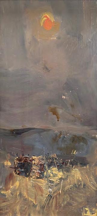
Joan Eardley (1921-1963)
30. Autumn Sky, Catterline, c.1958 oil on board, 13 x 41.5 cm signed lower right
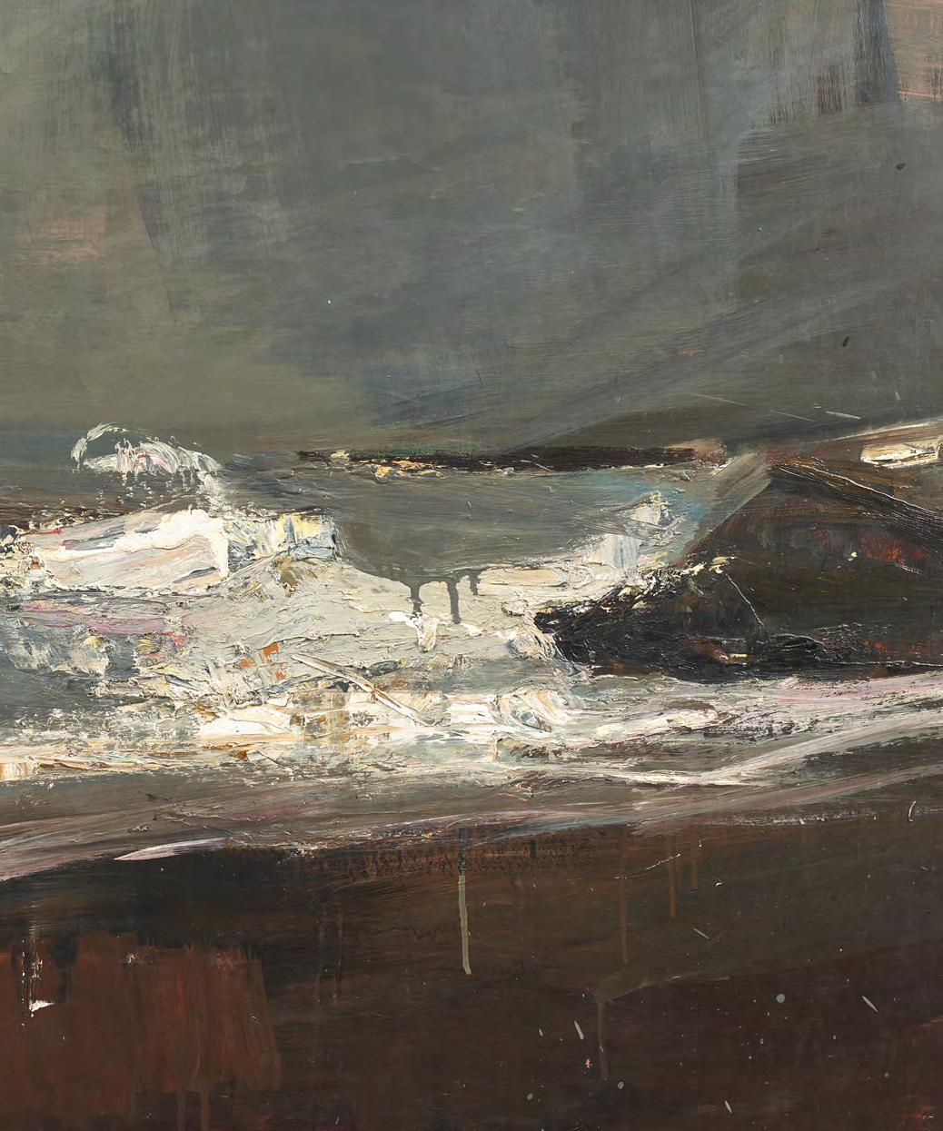
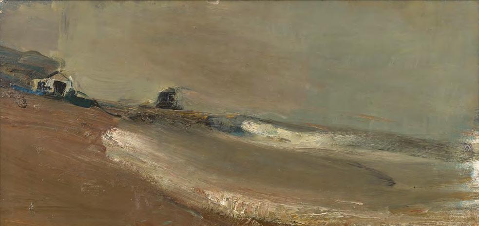
Grey Beach and Sky was painted at the water’s edge of Catterline Bay. Eardley frames the left side of the composition with the high cliff bank above the boat shed, while to the right, we see the distinctive kale tap, a large rock formation anchoring many of her Catterline paintings. In front of the boat shed, two boats are depicted: the blue Linfall and the green Mascot, owned by local fishermen who, like Eardley, lived in cottages overlooking the bay. This tonal painting captures the drama of a winter storm, with the sky and sea mirroring each other in foreboding grey. The surf crashes against the beach with the pier engulfed by the energy of the North Sea swell.
Joan Eardley (1921-1963)
31. Grey Beach and Sky, 1962 oil on board, 56 x 107.5 cm signed and dated verso
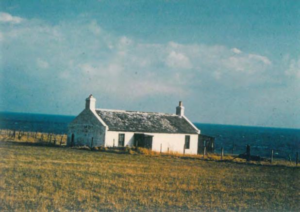
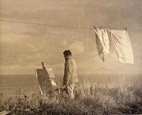
Further images: Joan Eardley in Catterline, c.1954 - 1959
Left: The Watch House, Catterline
Photography by Audrey Walker
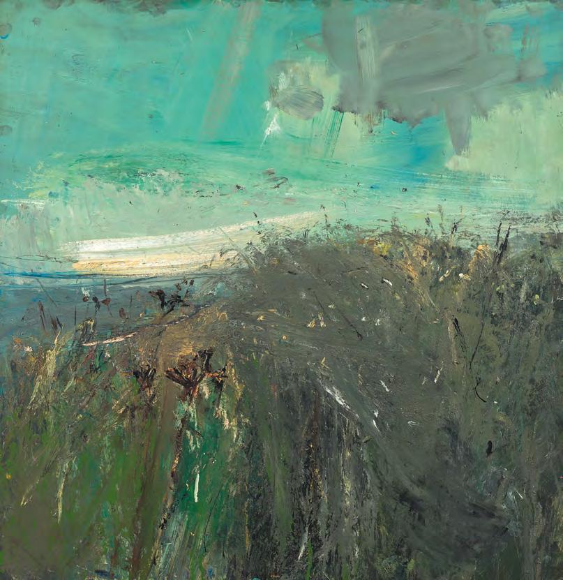
Painted in the final years of Joan Eardley’s life, Summer Fields captures not just the appearance of the Scottish countryside, but its transcience, spirit, and eternal turning. Set behind the fishing village of Catterline, where Eardley lived and worked from the early 1950s, this upright composition radiates warmth, the golden light of a late September evening saturating the fields, while the foreground is filled with dense, textured detail - the fruits of long days, ripening seed heads, tangled grasses, and the promise of a season fulfilled.
Eardley’s relationship with this landscape was intensely personal. She knew every field, tree, bush, and hedgerow, and was acutely in tune with the farmer’s year, its plantings, harvest and cycles of labour. The layers of pigment and texture, the way oil paint has been worked into the board with physical vigour, echo the richness of the land itself. Summer Fields is suffused with poignant awareness, a celebration of summer’s fullness, and a farewell whispered through field and sun.
Joan Eardley (1921-1963)
32. Summer Fields, c.1961 oil on board, 44.5 x 20.5 cm
EXHIBITED
The Scottish Gallery, Edinburgh, 1961
Painted in the days between summer and autumn of 1962, A Field by the Sea No. 1 captures a moment of quiet transition in Eardley’s Catterline landscape. The harvest is underway, hedgerows still abundant but beginning to retreat under the first bluster of autumn storms. Expanses of vibrant green and luminous turquoise dominate the composition, evoking a raw intensity and clarity of light. These colours pulse with energy, suggesting both the physical vitality of the land and the emotional urgency with which the artist worked.
In the following summer of 1963, the artist, facing the final months of her life, continued
to paint from her cottage studio, supported by friends who brought her wildflowers as subjects. Cancer, which had shadowed her for two years, was nearing its toll, yet her creativity remained undiminished. There was a blazing urgency in her final paintings and A Field by the Sea is among them, revealing a light that burned intensely, with absolute conviction and purpose.
This painting was acquired from Roland, Browse & Delbanco and featured in the Arts Council Memorial Exhibition of 1964, held in recognition Joan Eardley’s extraordinary contribution to 20th century art.
Joan Eardley (1921-1963)
33. A Field by the Sea No. 1, c.1962 oil on board, 90 x 89 cm signed verso
EXHIBITED
Roland, Browse & Delbanco, London; Joan Eardley Memorial Exhibition, The Arts Council of Great Britain, Scottish Committee, 1964
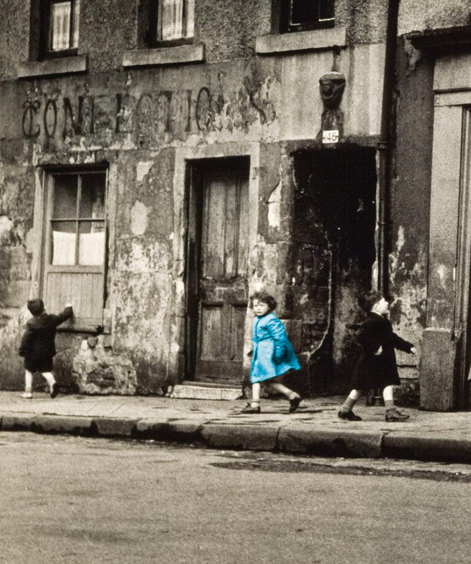
Children on Rottenrow, Townhead, Glasgow. Photograph by Audrey Walker
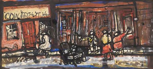
Joan Eardley (1921-1963)
34. Glasgow Street, Rottenrow, c.1956 mixed media on paper, 6 x 14 cm
Joan Eardley (1921-1963)
35. Port Dundas, Glasgow, c.1950 oil on board, 28 x 34 cm
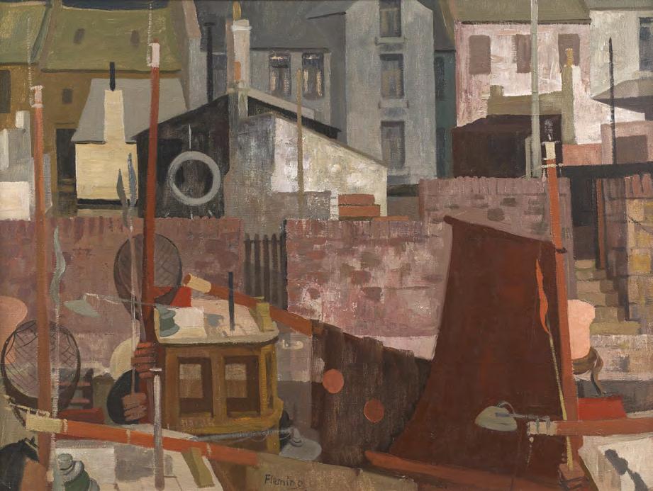
Ian Fleming (1906-1994)
The Brown Sail was painted during Ian Fleming’s tenure as Warden at Hospitalfield in Arbroath (1948 to 1954), and is a powerful example of the artist’s deep engagement with the coastal environment of Angus. After serving in the Army during the Second World War, Fleming returned to Scotland with renewed vigour, immersing himself in the working harbours of Arbroath and its surroundings. The fishing communities, their daily rituals, and the vibrant geometry of their built environment became central to his practice.
In this composition, Fleming reduces architectural and structural forms to their essential geometric elements. The familiar details of the harbour are distilled into simplified blocks of colour and shape, producing a dynamic, near-abstract vision of the townscape. The perspective is deliberately ambiguous: the sharply tilted pier in the
foreground contradicts the spatial logic of the mid-ground, challenging the viewer’s sense of depth. The vertical presence of the lifebelt stand anchors the composition, simultaneously emphasising the surface and reinforcing the painting’s inherent flatness. What emerges is a rhythmic interplay of shape and colour that celebrates the character and vitality of place.
Fleming’s approach reflects his evolving interest in formal experimentation, and this work is representative of a broader movement within mid-20th century Scottish painting in which artists sought to reinterpret landscape through the lens of modernist abstraction. His years in Arbroath were among the most fruitful of his career, and The Brown Sail stands as a confident synthesis of observation, memory, and constructed form.
The Scottish Gallery exhibitions: 1947, 1987
Ian Fleming (1906-1994)
36. The Brown Sail, Arbroath, 1952 oil on canvas, 76 x 101 cm signed lower centre
EXHIBITED
Annual Exhibition, Royal Scottish Academy, Edinburgh, 1953, cat. 280
PROVENANCE
Fine Art Society, Edinburgh
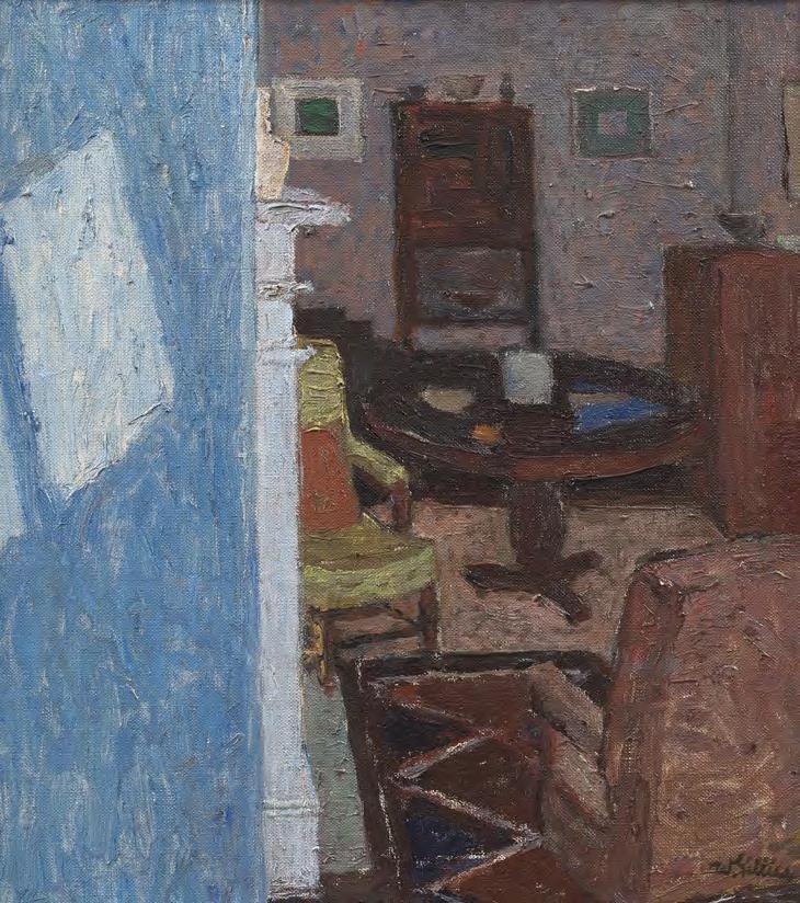
William Gillies (1898-1973)
Interior Temple stands as a magnificent example of post-war Scottish painting, and a pivotal moment in the career of William Gillies, one of the most influential figures in 20th century Scottish art. Painted shortly after moving to the village of Temple in Midlothian, at the time of being fully elected to the Royal Scottish Academy, this work marks Gillies's embrace of the domestic interior not just as subject, but as a space for compositional invention and introspection.
The painting transforms the modest, familiar surroundings of his home into a finely tuned modernist composition. Vertical elements, such as the edge of a fireplace, the shadow cast by light against the wall, and the upright lines of furniture, create a strong structural rhythm, while a rich array of objects offers a counterpoint of curves and pattern: an armchair, a circular table, a chest of drawers, the pattern of a rug, a hearth, and a densely packed bookcase. These are not incidental details, they are personal, intimately known, and tenderly observed.
Gillies’s palette hums with subtle energy, muted but electric, reflecting his ability to extract emotional weight from the everyday. There is an almost theatrical awareness of
light and space, yet nothing feels staged. Instead, the painting invites the viewer to quietly inhabit the artist’s world. Interior, Temple is more than a depiction of a room, it is a masterclass in visual thinking, where the ordinary becomes the foundation for modernist exploration.
William Gillies (1898–1973) was one of the most influential figures in 20th century Scottish art. Born in Haddington, East Lothian, he studied and later taught at Edinburgh College of Art, where he became Head of Painting and eventually Principal. A founding figure of the Edinburgh School, Gillies developed a distinctive modernist approach rooted in the Scottish landscape, domestic interiors, and still life. His quiet but radical style combined structure, subtle colour, and emotional depth. Through his teaching, leadership, and artistic practice, Gillies shaped generations of artists and left a profound legacy on post-war Scottish painting. William Gillies was a lifelong exhibiting artist and supporter of The Scottish Gallery.
The Scottish Gallery exhibitions: 1945, 1949, 1952, 1958 (Festival), 1963 (Festival), 1968, 1971, 1986, 1989, 1991 (Festival), 2011, 2012, 2013, 2016, 2017, 2020, 2023 (Anniversary)
William Gillies (1898-1973)
37. Interior Temple, 1947 oil on canvas, 49.5 x 43 cm signed lower right
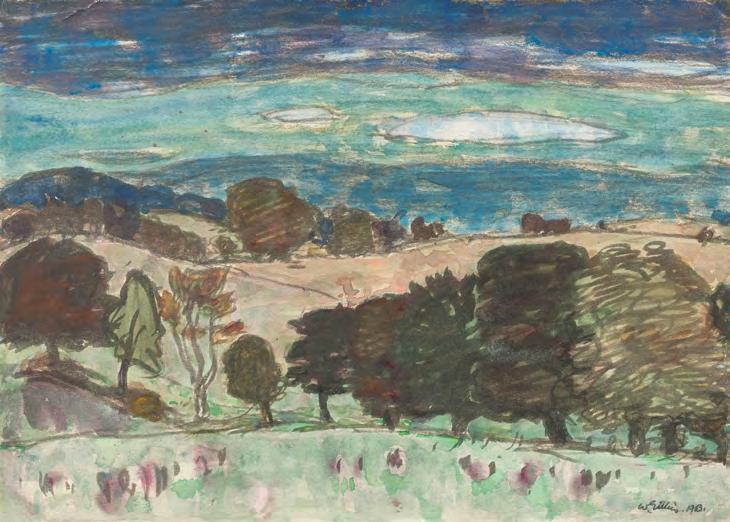
Here, Gillies captures a Borders landscape distilled to its essential forms, rendered with quiet confidence. Clear pencil lines structure the composition where even the clouds are outlined, introducing a graphic clarity that holds the translucent washes in place. The sky forms a gentle pattern that echoes the undulating hills, while a rhythmic band of trees marks the threshold of the scene. The colour palette hints at the arrival of autumn: muted ochres, softened greens, and rust tones.
Gillies was never more at ease than when painting en plein air in this part of the world. He would set out on his motorbike or in his car, often with artist friends in tow, to roam the countryside he loved. Here, far from the constraints of the studio, he found pure pleasure in painting and drawing, and the joy of being in the landscape.
William Gillies (1898-1973)
38. Dark Woods, 1963 watercolour on paper, 25.5 x 35.5 cm signed and dated lower right
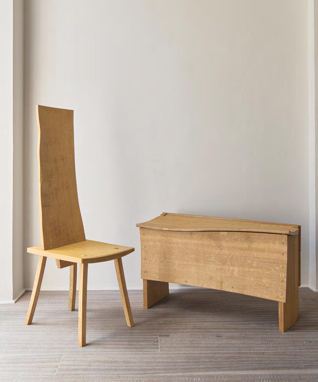
Adrian McCurdy (b.1953)
Adrian McCurdy's relationship with wood runs through every facet of his creative life. Originally trained as a painter, McCurdy studied Fine Art at Trent Polytechnic in Nottingham. But the call of wood, its textures, grain, and potential, proved too strong to resist. My roots in traditional crafts go back to childhood, he explains. I took a somewhat contrary direction by choosing art college and painting, but perhaps unsurprisingly found earning an income easier using what felt like natural wood-skills.
McCurdy has lived and worked in the Scottish Borders since 1977, where his studio is filled with carefully stored oak, some of which has been drying for decades. He works almost exclusively with riven oak; wood that has been split along the grain rather than sawn. This traditional approach allows him to stay true to the material, following its natural strengths and rhythms. You wouldn't do this if you didn't love the whole process, he says. It demands patience and a mindful focus.
His work ranges from furniture to carved panels, each piece shaped slowly and with great attention to form and material. His furniture often appears timeless, honest structures held together with wedges and
pegs, echoing ancient methods. He describes his philosophy simply: I approached the concept of what furniture I could make using the simplest of tools upon a log of oak. There’s a quiet strength in his work, a directness that celebrates the nature of the wood without over-complication.
Adrian McCurdy’s work has been widely collected, and he has pieces in public and private collections including the National Museums Scotland, Perth Art Gallery, and the Globe Theatre in London.
Most recently, his solo exhibition at The Gallery explored the idea of natural movement within the structure of wood itself. Whether carving a chest, a chair, or a panel, Adrian’s work is always rooted in a profound respect for material, a knowledge of traditional methods, and an artist’s eye for detail. He invites us to slow down, to notice the quiet beauty of oak, and to experience the meditative strength of making.
Each piece starts with the tree. I don’t impose; I follow. Adrian McCurdy
The Scottish Gallery exhibitions: 2023, 2025
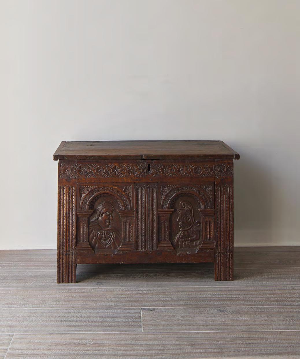
39. Elizabethan Marriage Chest, c.1580
English carved oak
H61.5 × W90 × D61 cm
ELIZABETHAN MARRIAGE CHEST
c.1580
A rare late survival of the Romayne chest tradition, the marriage chest opposite reflects a design style more typically associated with the early 16th century, particularly the reign of Henry VIII. The term Romayne refers to the carved profile heads derived from Italian Renaissance imagery, which became popular throughout Northern Europe and Britain via France and the Low Countries. These chests were traditionally presented as dowry gifts, a custom that endured from medieval times through to the 19th century.
This chest, of joined frame-and-panel construction, features two arched front panels enclosing boldly carved portrait busts in profile. The surrounding rails and stiles are intricately decorated with floral motifs, including stylised roses, acanthus leaves, and interlocking Flemish scrollwork. These elements are classic features of Elizabethan ornamentation and continued to influence Scottish design well into the 17th century.
It is likely that the chest was produced in an urban workshop, following a broadly recognisable form, with the front panels intentionally left blank for later personalisation. The expressive figures, distinct in style and carved with a more primitive hand, appear to have been added at a later stage. They were likely created by a rural artisan, commissioned to commemorate a marriage. This type of collaborative production was common in the 16th and 17th
centuries, with different parts of the piece crafted by various specialists or workshops. The figures include notable symbolic detail. The female bust features a prominent Green Man carved on her breast, a fertility symbol popular at the time. The male figure wears a dramatic hat adorned with a smaller Green Man motif. Their stylisation is naïve, yet vigorous and animated, and they may represent a specific couple or serve as more fanciful, emblematic representations. The iconography closely parallels late Jacobean ecclesiastical woodwork, such as the pulpit at Shebbear Church in Devon, which dates from the early 1600s. That piece also features figures within Romanesque-style arcading, rendered with similarly idiosyncratic and caricatured expression.
Restoration Details:
• The front feet have been scarfed approximately 3 inches from the base, with the original material retained behind. This likely dates to the Victorian period and was intended to stabilise worm-damaged sections.
• Period timber cleats have been added to the lid’s interior to reinforce its structural integrity.
• The chest features later 18th century iron hinges, which replaced the original wire hinges. Traces of the original fittings remain visible on the lid and rear rail.
This chest is a compelling example of Elizabethan design. Its expressive, folkloric embellishments and layered history make it an exceptional and evocative piece.
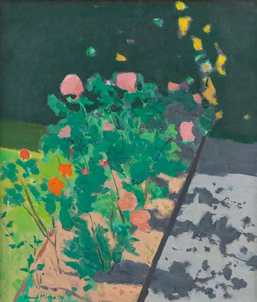
David Michie (1928-2015)
David Michie was one of Scotland’s most distinctive and imaginative painters, celebrated for his vibrant use of colour, wry humour, and masterful control of composition. Born in Saint-Raphaël, France, he was the son of the renowned Scottish artist Anne Redpath (1895-1965) and grew up in the Borders town of Hawick. After studying at Edinburgh College of Art, where he later taught for many years and eventually became Head of Drawing and Painting, Michie forged a career that combined observational sharpness with boundless creativity. His extensive travels worldwide, infused his palette and subject matter with a luminous, sunlit vitality. Michie’s practice is one of joyful experimentation, compositional sophistication, and a lifelong curiosity about the visual world, firmly rooted in the Scottish modernist tradition, but never bound by it.
In Row of Flowers (cat. 40), Michie captures a vibrant array of poppies dancing in sunlight, their salmon pink petals and vivid greens vibrating against a darkened backdrop. Their shadows, elongated and lyrical, create a secondary choreography across the surface, while a vertical off-centre axis anchors the composition and leads the viewer into a mysterious dark pool of pigment at the base.
The result is a painting that feels spontaneous but is highly orchestrated, balancing levity with painterly control.
By contrast, Man on Deckchair (cat. 41) takes us to a sun-drenched seaside setting, where a solitary figure reclines in a patterned shirt beneath a canopy of sun umbrellas and beach paraphernalia. We do not know this man, he is observed but anonymous, but his striped world is transformed into a kaleidoscope of colour and structure, rendered with architectural clarity and humour. Once again, Michie uses the dark background as a grounding device, allowing the saturated colours and animated forms to shine with even greater intensity.
Together, these paintings are a homage to Michie’s extraordinary visual intelligence, works that brim with joy and invention, yet are built upon challenging, disciplined picture structures. Whether depicting flowers or an unknown holidaymaker, Michie invites the viewer into a world where observation meets imagination, and where colour, shadow, and pattern are tools for storytelling.
The Scottish Gallery exhibitions: 1980, 1994, 2003, 2008, 2012, 2017 (Memorial)
David Michie in his studio, 1995. Photography by Eric Thorburn
PROVENANCE Mercury Gallery, London
David Michie (1928-2015)
40. Row of Flowers, 1974 oil on canvas, 39 x 34 cm signed and dated lower left
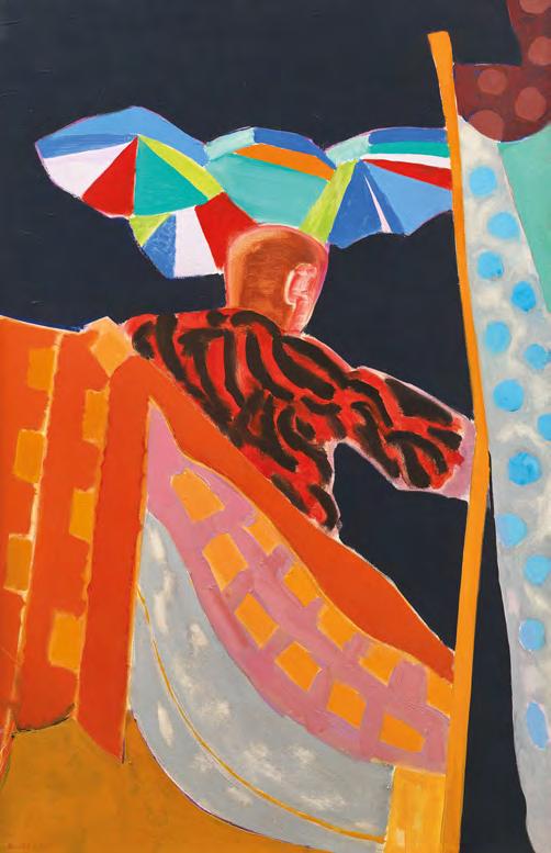
41. Man on Deckchair, 1977 oil on canvas, 105 x 70 cm signed and dated lower left
David Michie (1928-2015)
James Morrison (1932-2020)
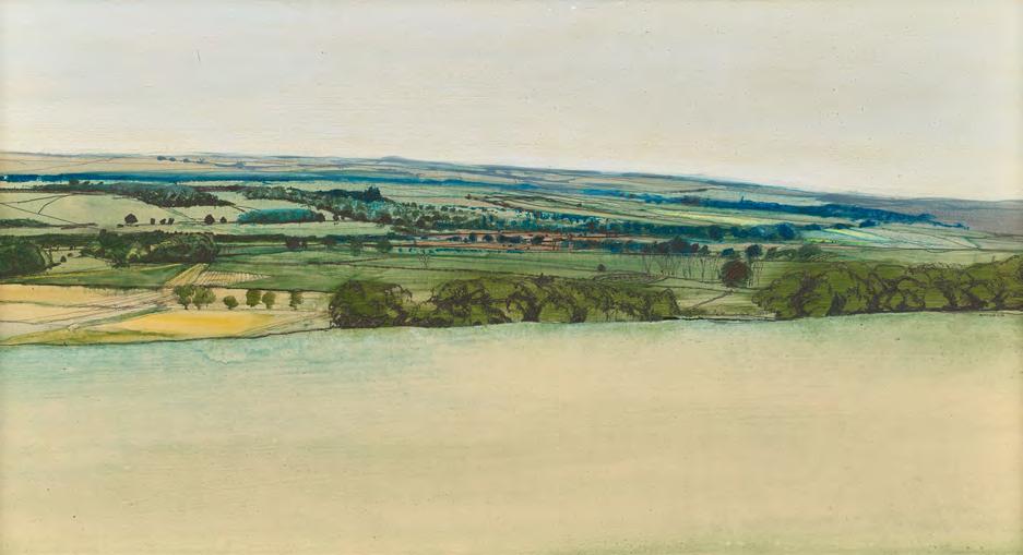
This early landscape dates from a period when James Morrison was firmly settled in the northeast of Scotland, having moved to Angus in 1965. Deeply immersed in the surrounding environment, Morrison developed a profound connection to the region’s open skies and cultivated fields. Here, he captures a typically Scottish, cloudless day with a pale foreground field giving way to the gentle curve of a richly textured horizon. The composition suggests more than it describes, a hallmark of Morrison’s subtle handling of form and atmosphere. Despite its modest scale, the painting conveys the vastness and quiet grandeur of the Angus farming landscape, affirming Morrison’s deep affinity with place.
The Scottish Gallery exhibitions: 1959, 1964, 1967, 1975, 1978 (Festival), 1981, 1984 (Festival), 1987, 1988 (Festival), 1989, 1990, 1991, 1992, 1994, 1997, 1999 (Festival), 2000, 2001, 2002, 2005, 2007, 2009 (Festival), 2012, 2013, 2015, 2017, 2020, 2022 (Memorial), 2024
James Morrison (1932-2020)
42. Angus Landscape, 1976 oil on board, 40 x 75 cm signed and dated centre right
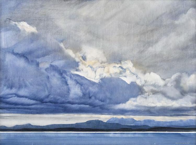
Cloud over Torridon positions the viewer between earth and sky, with the Torridon hills anchored beneath an immense, rolling cloud mass. Painted in 1995, this smallscale oil on board pulses with scale and grandeur. The palette is cool, layered, and restrained, evokes not just the look but the feeling of the Highlands: the shifting air, the weight of moisture, the hush before a coming squall. The clouds are masterfully rendered, full of kinetic energy, as if moving toward us and overhead. Morrison returned often to this landscape, drawn by its changing light and towering geology, a place where land, sea, and sky seem in constant negotiation.
Morrison, who lived and worked for much of his life in Montrose, was deeply committed to observational painting, yet his landscapes always reach beyond representation. In Cloud over Torridon, he captures something essential and eternal: the grandeur of the Scottish wilderness, the solitude of place, and the sublime tension between transience and permanence.
James Morrison (1932-2020)
43. Cloud over Torridon, 14.viii.1995 oil on board, 30 × 40.5 cm signed and dated lower right
PROVENANCE
Thackeray Gallery, London, 1995
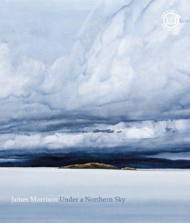
James Morrison Under a Northern Sky
This winter, The Scottish Gallery Press will launch a new small-format hardback book on James Morrison (1932–2020), one of Scotland’s great landscape painters. Fully illustrated, and drawing on The Scottish Gallery’s extensive archive, the book will be available for £14.95.
Pre-order now by emailing: mail@scottish-gallery.co.uk
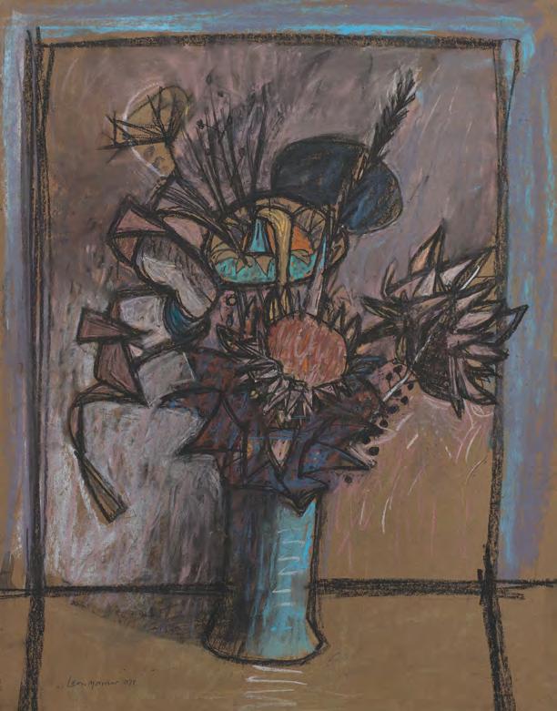
Leon Morrocco (b.1942)
Leon Morrocco, born in Edinburgh, is the eldest son of renowned Scottish painter Alberto Morrocco. He pursued his formal art education at Duncan of Jordanstone College of Art, followed by studies at The Slade School in London, and later at Edinburgh College of Art under the mentorship of William Gillies. His early career was rooted in teaching, with lecturing roles at Edinburgh College of Art (1965 to 1968) and the Glasgow School of Art (1969 to 1979).
In 1979, Morrocco relocated to Australia to become Head of Fine Art at the Chisholm Institute in Melbourne for twelve years. Since
1984, he has devoted himself fully to painting. Morrocco’s relationship with The Scottish Gallery began with his first solo presentation in 1971.
Morrocco’s work is celebrated for its vivid colour, dynamic composition, and the influence of European life and landscapes, particularly from his years in Rome (20002009). His distinctive use of pastel, a medium he shares a passion for with his father, enables him to achieve remarkable clarity and immediacy in his drawing.
The Scottish Gallery exhibitions: 1971
Leon Morrocco (b.1942)
44. Dried Artichokes, 1977 pastel on brown coloured paper, 66.5 x 51.5 cm signed and dated lower left; signed and title inscribed on label verso
Lilian Neilson (1938-1998)
Born in Kirkcaldy, Scotland, in 1938, Lilian Strang Neilson was a deeply expressive Scottish painter and printmaker whose life and work were closely intertwined with the dramatic coastline of northeast Scotland. She studied at Duncan of Jordanstone College of Art in Dundee from 1955 to 1960, followed by a brief period at Hospitalfield House in Arbroath, where she became friends with Joan Eardley RSA (1921–1963). She completed a post-diploma year under Hugh Crawford and Alberto Morrocco in 1960–61 and was awarded a travelling scholarship that took her to France and Italy from 1961 to 1962.
After this formative period in Europe, Neilson joined Eardley in the cliff-top village of Catterline. There, she began to respond powerfully to the raw, elemental landscape, creating atmospheric paintings filled with brooding energy. In 1962, she returned to help care for Eardley following her cancer diagnosis. Neilson soon purchased one of the village’s small fishing cottages, No. 2
South Side, with her home on one side and her studio on the other, choosing a modest, secluded life much like Eardley’s.
In 1986, she moved to the village permanently, carrying out monthly surveys of the coast and studying printmaking at Dundee. Her work in this medium, showcased in a 1986 exhibition organised by Dundee Printmakers Workshop, Seagate Gallery, and Aberdeen Art Gallery, featured inventive and expressive screenprints marked by spontaneity and a refusal of perfectionism.
Her final exhibition, Certain Days and Other Seasons, held at the Seagate Gallery in Dundee and Aberdeen Art Gallery, was a powerful testament to her mature style and artistic legacy. Though private and often overlooked in her lifetime, Neilson’s art stands as a vital continuation of the Catterline tradition, richly personal, emotionally resonant, and uniquely her own.
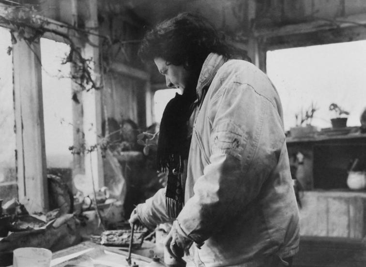
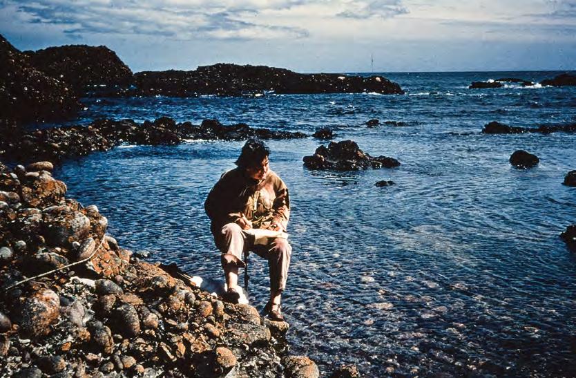
Lilian Neilson painting in Catterline, c.1990. Photograph by Jenny Rutlidge
Still Life with Oil Lamp and Grater offers an intimate glimpse into the domestic realities and artistic integrity of life at Catterline, the remote fishing village on the northeast coast of Scotland. Neilson lived and worked in one of the village’s small stone cottages, perched above the cliffs, spartan dwellings which had no electricity or running water for years, and where the rhythms of daily life were inseparable from the act of painting.
In this painting, Neilson captures this pared-back existence with quiet precision. A carefully arranged set of utilitarian objects, an oil lamp, a grater, and other modest kitchen
items, are bathed in the subdued natural light of the cottage interior. The elongated board enhances the horizontal balance of form, while her subtle palette and textured brushwork evoke both material presence and emotional stillness. These are her objects of survival and witness to a life where art and living were one and the same.
Like the other artists who worked in Catterline, she transformed the ordinary into something quietly profound. In this painting, we sense not just what was seen, but how it was lived.
Lilian Neilson (1938-1998)
45. Still Life with Oil Lamp and Grater, 1969 oil on board, 29 x 59 cm signed and dated lower left
Anne Redpath in her London Street drawing room, Edinburgh, 1960
Anne Redpath (1895-1965)
Anne Redpath is a pivotal figure in the group of painters referred to as The Edinburgh School. She attended the College of Art, receiving her diploma in 1917. After a lengthy spell in the south of France, Redpath returned to Hawick in the mid-1930s. Her brilliant manipulation of paint is characteristic of the varied responses to different subjects at different times. In the last years of her output she often favoured a limited palette; perhaps a few brilliant, jewel-like notes enlivening a dark or white composition.
Redpath was an inspirational artist and formed many enduring friendships. Her flat in London Street, Edinburgh became an artistic salon, celebrated by Robin Philipson’s famous, affectionate group portrait in The Scottish National Portrait Gallery. She had considerable commercial success in her lifetime, enjoying a fruitful, consistent relationship with The Scottish Gallery and then with Reid & Lefevre in London. Since her passing, her reputation has been further enhanced with retrospective and centenary exhibitions resulting in her being established as one of the great figures in 20th century Scottish painting.
The Scottish Gallery exhibitions: 1950, 1957, 1960, 1963, 1965 (Memorial), 1975, 1986, 1995, 2003, 2012, 2015
From a Room in Úbeda was painted during Redpath’s travels in Andalucía in 1953, exemplifying Redpath’s brilliant ability to fuse intimacy with structure, capturing the interior while playing with pattern, perspective, and light.
We look from the shadowed interior of a Spanish room outward, through parted, ornamented curtains gathered with silk tiebacks, to a sunlit street scene in the town of Úbeda. She replicated these drapes in her own home in Edinburgh (p114). The viewer’s eye is drawn across terrazzo floor tiles, subtly coloured with warm pinks and mauves, where the reflected blue of the sky dances across their polished surface. A slender iron balcony leads us into the space beyond, where we glimpse a pantile rooftop and pale blue sky, framed by the verticals of architecture and curtains alike.
Through her expressive handling of gouache and characteristic use of colour and texture, Redpath creates not just a view, but a moment, a luminous meeting of interior and exterior worlds, filled with warmth, elegance, and visual intelligence. Redpath often painted interiors as a means of reflecting on place and perception, and From a Room in Úbeda is a perfect example of her knack for transforming the ordinary into something richly evocative.
Anne Redpath trained at Edinburgh College of Art and travelled widely in Europe throughout her life. By the early 1950s, she was an established figure in Scottish art, central to the Edinburgh School, and her travels, particularly to Italy and Spain, invigorated her palette and compositional daring.
46. From a Room in Úbeda, 1953 gouache on paper, 42.5 x 30 cm signed lower right
EXHIBITED
The Scottish Gallery, Edinburgh, 1965
Anne Redpath (1895-1965)
Irises is a luminous and poised late still life by Anne Redpath. Rendered in delicate yet decisive watercolour, the composition captures some striking white irises, their sculptural forms rising with elegance from a white, decorated china teapot. The teapot sits upon a subtly patterned blue tray or tabletop, anchoring the scene in a flattened but carefully balanced space, where colour, line, and light are orchestrated with supreme confidence. Irises feels both spontaneous and deeply considered. Though modest in scale, this painting is anything but slight. It reflects
Redpath’s lifelong devotion to composition, her instinctive ability to arrange and rearrange elements until they sang in harmony. Redpath always returned to the domestic: the table, the flower, the jug. In this late work, there is a palpable lyricism and the unmistakable energy of an artist who never stopped experimenting, even in her final years.
Irises is not only a beautifully made image, it is a reflection of a life spent looking, learning, and refining.
47. Irises, c.1960 watercolour on paper, 48 x 54 cm signed lower right
PROVENANCE
The Scottish Gallery, Edinburgh
Anne Redpath (1895-1965)
Dark Tulips in a Jug is a masterful example of Anne Redpath’s late work: bold, expressive, and rich with texture. Painted in 1962, during the final and highly productive phase of her career, the composition demonstrates Redpath’s complete confidence with the still life genre, and her shift away from conventional spatial order in favour of rhythmic abstraction.
A decorated jug brimming with dark tulips dominates the scene, placed on an upturned table cloaked in a blue cover. Nearby, a bowl of plums anchors the arrangement, their rounded forms and rich colour balancing the vertical thrust of the blooms. The palette is at once moody and luminous: deep blues and inky purples offset by flashes of white and pale light, creating the kind of tonal drama Redpath valued so highly.
Executed in impasto, the surface is alive with painterly energy. The flowers and fabric are not meticulously rendered but rather suggested, painted loosely, even instinctively, with thick swirls and tactile flourishes. Redpath often worked with palette knife, the end of her brush, to activate the surface. That physical engagement with the medium is keenly felt here.
By this time in her career, Redpath had fully embraced a more abstract language. The background is not a quiet void but a dynamic field, swirling, textured, and deliberately ambiguous. Though Dark Tulips in a Jug is robust in its execution, it retains a remarkable delicacy. It reveals Redpath's rare ability to balance decorative beauty with emotional depth, giving impact and radiance to the beauty of the ordinary.
Anne Redpath (1895-1965)
48. Dark Tulips in a Jug, 1962 oil on board, 39 x 59 cm signed lower left
Joan Renton (1935-2025)
Painter | Educator | Advocate for Women in the Arts
Joan Renton was a distinguished Scottish painter known for her evocative still life, botanical studies, and landscapes. Born in Sunderland, County Durham in 1935, she entered the Edinburgh College of Art at the age of 17. There, she studied under William Gillies, John Maxwell, and William MacTaggart, prominent artists central to the Edinburgh School, who would influence her lifelong artistic vocabulary.
After completing her diploma in 1958, Renton was awarded a post-diploma scholarship and, in 1959, a travelling scholarship that took her to Spain. These early accolades set the stage for a career marked by subtle technical finesse and deep personal expression. In 1960, she returned to Edinburgh to undertake a teaching diploma at Moray House and went on to teach art in the city’s schools until 1980. Renton’s work was represented by The Scottish Gallery during the 1970s and 1980s with one notable solo presentation in 1984.
Renton's painting practice is notable for its refined composition and sensitive use of colour. Over the course of her life, Renton was elected to several prominent art societies: the Society of Scottish Artists (SSA) in 1960, the Scottish Society of Women Artists (SSWA) in 1972 and the Royal Scottish Society of Painters in Watercolour (RSW) in 1974. She served as President of the SSWA in 1990, where she led a transformative period of expansion and modernisation. Her tenure saw the rebranding
of the SSWA into the Scottish Artists and Artist Craftsmen, marking a progressive shift that embraced high-quality experimental craft and opened its doors to male artists for the first time.
By the 1980s, representation of women within the arts had greatly increased, however the term contemporary art was still a contentious issue. In 1990, Joan Renton - the SSWA president - advocated that the organisation was a place for high-quality experimental craft and to reflect this, the organisation's name was changed to Scottish Artists and Artist Craftsman (SAAC). Men were also allowed to join at this point. Ten years later, as the organisation celebrated its 75th anniversary, it was decided that a more succinct name was needed and so Visual Arts Scotland (VAS) was created.
VAS Scotland
Renton spent over 30 years in Gifford, East Lothian, where she continued to paint and taught art within the local community. Her work was both introspective and universal, often drawing inspiration from the natural world, especially her garden, which she cherished deeply. Her contributions were celebrated in numerous exhibitions, and her art is held in public and private collections.
Joan Renton passed away in 2025 at the age of 89, leaving behind a profound artistic legacy and a lifetime of advocacy for creative expression and inclusivity in the arts.
The Scottish Gallery exhibitions: 1984
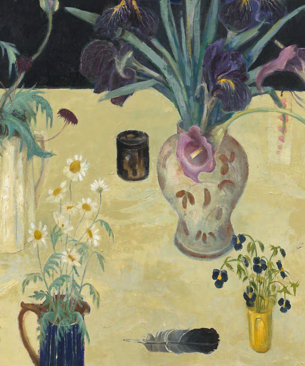
Still Life with Five Vases is a refined composition that reflects the visual clarity and sensitivity characteristic of the Edinburgh School. A subtly tilted tabletop in warm cream tones provides the foundation for five carefully arranged vases, each containing a distinctive flower: daisies, pansies, a calla lily, a bearded purple iris, and dusky poppies. The grouping feels both intentional and effortless, revealing Renton's intuitive sense of balance and placement.
A dark background sets the scene in quiet contrast, allowing the floral forms to emerge with clarity and grace. A single black feather placed horizontally, and a pair of small
boxes introduce subtle structural elements, contributing to the compositional rhythm and sense of harmony.
Much like her contemporary Elizabeth Blackadder, Renton cultivated her garden as both a source of visual inspiration and personal delight. Her connection to the natural world is evident in this rare painting, where the beauty of ordinary things is elevated through careful observation. The space between objects, the interplay of surface and texture, and the calm presence of the arrangement all come together to create a painting filled with vitality, intimacy, and quiet joy.
Joan Renton (1935-2025)
49. Still Life with Five Vases, c.1980 oil on canvas, 76 x 102 cm signed lower right; title inscribed on label verso
PROVENANCE
Glasgow School of Art
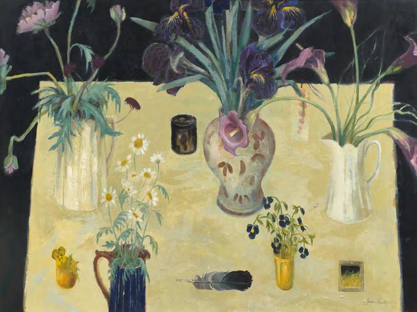
James Downie Robertson (1931-2010)
In this painting, James Robertson delivers a wild and uninhibited vision of one of Scotland’s most storied landscapes. Painted in gouache with sweeping gesture and bold intent, Glencoe breaks free from romanticised traditions to embrace an expressive, modern language of mark and mood. Robertson’s Glencoe is a place in motion, filled with the turbulence of weather, land, and memory, captured in slashes of pigment and surging forms.
While the grandeur of the subject evokes the legacy of Scotland’s great landscape painters, from Horatio McCulloch and Alexander Nasmyth to the theatrical expanses of William McTaggart, Robertson’s approach is wholly
contemporary. His palette is earthy and urgent; his brushwork charged with emotion and abstraction.
Born in 1931, James Robertson is part of a vital post-war generation of Scottish painters who brought modernism and expressionism to the fore. His long tenure as a teacher at the Glasgow School of Art cemented his influence, and he became a pivotal figure in shaping the visual language of younger Scottish artists. Known for his rigour, intellect, and unflinching commitment to the act of painting, Robertson encouraged his students to approach landscape not as motif, but as subjective terrain, something to be wrestled with, responded to, and reinterpreted.
James Downie Robertson (1931-2010)
50. Glencoe, 1985 gouache on board, 81.5 x 68.5 cm signed lower right; title inscribed on label verso
PROVENANCE
Glasgow School of Art; Private collection, Edinburgh
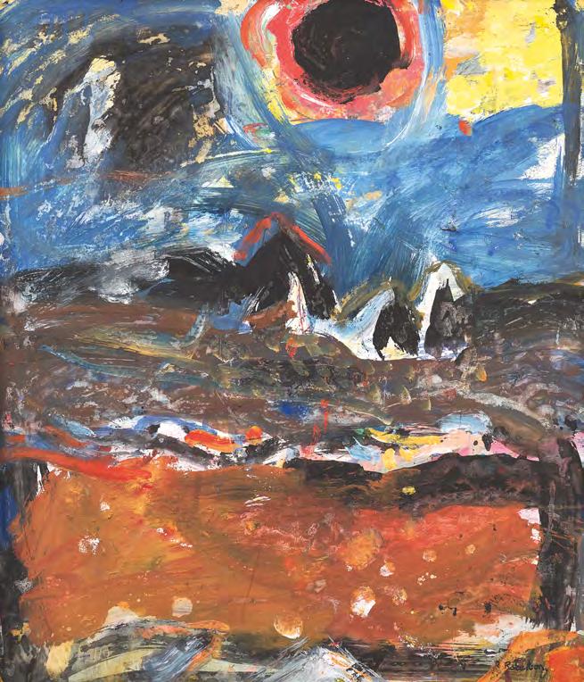
Sax Shaw (1916-2000)
A maverick talent of exuberant gifts, Sax Shaw was one of the most dynamic forces in post-war Scottish art and design. The Little Foxes, created around 1955, stands among his most dazzling and inventive achievements, a tapestry alive with movement, colour, and metaphor. At its centre, lithe, dancing foxes twist and turn in rhythmic formation, their elongated forms and swishing tails creating a sense of balletic motion, flickering like flames. Shaw surrounds them with decorative flame motifs and a structured border of birds woven in a palette of red, orange, grey, and black. The entire composition sings with theatricality and formal precision, a woven ballet of folklore and abstraction.
Shaw was born in Berry Brow, Yorkshire, in 1916 and trained at Huddersfield School of Art before choosing to study at Edinburgh College of Art, where he found a thriving stained-glass department. Though offered a place at the Royal College of Art, London, Shaw was drawn to Edinburgh’s commitment to architectural design and contextual craftsmanship. Following wartime service as a conscientious objector, he returned to Edinburgh College of Art and began working in theatre design, tapestry, and stained glass, often in collaboration with his wife, Maisie Mallinson.
In 1947–48, Shaw visited Paris on a scholarship and was welcomed into the Gobelins tapestry studios, experiences that would shape his approach to weaving and solidify his belief in the artistic role of the designer-weaver. His subsequent appointment in 1953 as Director of Weaving at The Edinburgh Tapestry Company (now Dovecot Studios) marked the beginning of a radical shift in British tapestry, as Shaw championed a modern, expressive use of texture, narrative, and abstraction. The Little Foxes, with its layered symbolism, rich colour, and fluid design, is a landmark work of this period.
As a teacher at Edinburgh College of Art from 1948 to 1981, and as a visiting lecturer across Scotland, Shaw shaped generations of designers and stained-glass artists. Shaw’s work ranged across disciplines - tapestry, stained glass, mural painting, mosaics, church furnishings, watercolour, and costume design, yet his voice remained unmistakable; playful, rigorous, spiritual, and deeply embedded in the life of buildings and spaces.
The Little Foxes captures the essence of his mid-century vision, modern yet mythical, formal yet free. It remains a triumph of narrative design, where flame, fur, and folklore are transformed into woven movement and enduring light.
Sax Shaw (1916-2000)
51. The Little Foxes, c.1955 wool tapestry, 153 x 120 cm signed in the weave lower right
PROVENANCE
Edinburgh Tapestry Company (Dovecot Studios, Edinburgh)
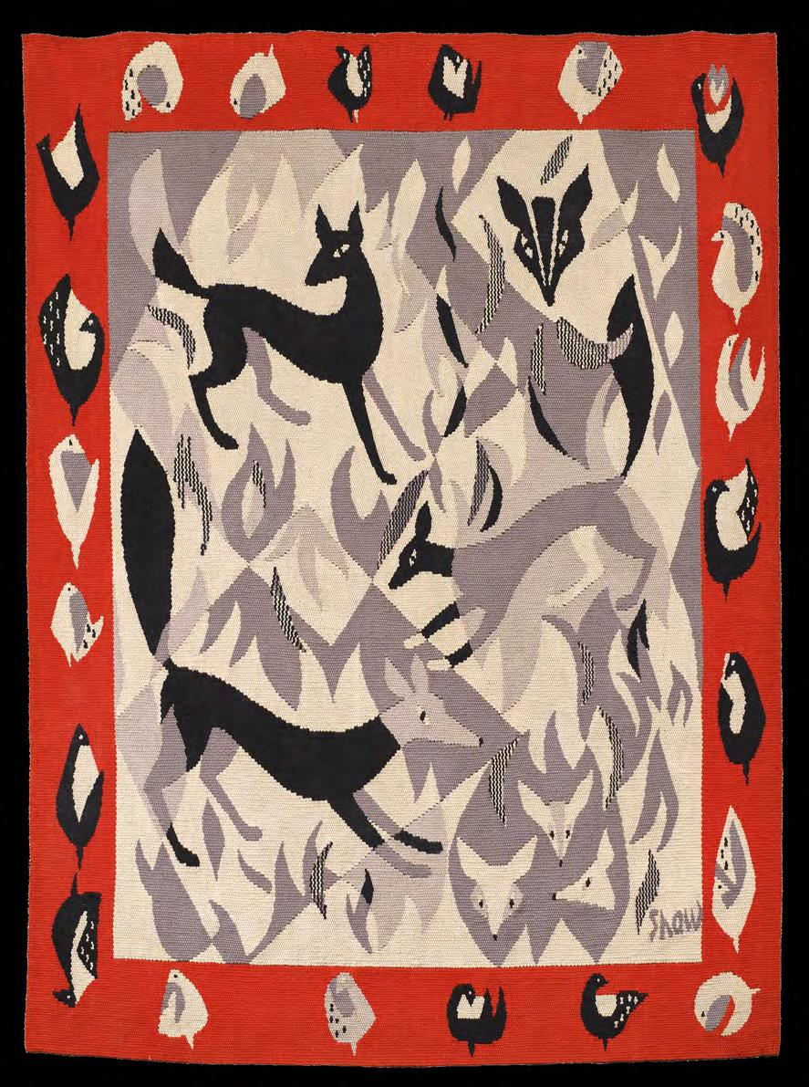
Likely conceived as a design for stained glass, mural or tapestry, Dancing Figures features four dancers encircling a seated musician, all bound within a swirling yellow ribbon which animates the composition with rhythm and movement. Created during Shaw’s tenure as Director of the Edinburgh Tapestry Company (now Dovecot Studios), the painting reflects his deep engagement with art and design. Painted in the 1950s and reflecting aesthetic influences from Jankel Adler and other Polish émigré artists, this work belongs to a moment when large-scale murals and architectural centrepieces played a central role in public art and cultural regeneration. This intimate study captures the spirit of celebration and artistic ambition that defined a generation determined to move forward into a new era.
Sax Shaw (1916-2000)
52. Dancing Figures, 1958 mixed media on paper, 21 x 29.5 cm signed lower right
EXHIBITED
Sax Shaw Memorial Exhibition, Whitespace Gallery, Edinburgh, 2012, cat.19
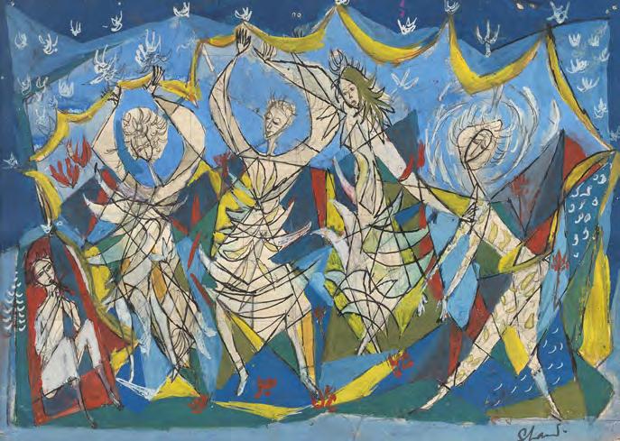
Ron Sandford (b.1937)
Ron Sandford draws with unwavering discipline - every single day - as he has done for most of his life. It's not just a routine, but a way of seeing, of being present, of understanding and honouring the world around him. His presence in Shetland - like his practice - is generous, thoughtful, and quietly profound. This is a celebration of a lifetime of drawing, of looking, of giving shape to the spirit of places we might otherwise never have seen.
Ron Sandford, born in 1937 in Greenock, is a distinguished British artist, celebrated for his architectural drawings and distinctive style. He studied at the Glasgow School of Art in the etching and engraving department under Philip Reeves and later at the Royal College of Art in London in the graphic design department with Edward Bawden. Over the course of his career, Sandford taught at St Martin's School of Art, the Central School of Art and Design, Brighton Art College, and the Royal College of Art. His mastery of architectural detail led to collaborations with leading graphic designers and cultural institutions, including the Victoria & Albert Museum, London. His time living and working in Hong Kong further shaped his
artistic approach, blending architectural precision with Chinese and Japanese aesthetics.
In 2002, after a visit to Shetland, Sandford relocated his family to Cullivoe in Yell, where he experienced a profound sense of personal and artistic freedom. Immersed in the local landscape and culture, he began capturing his surroundings with his signature combination of meticulous observation and creative expression.
Drawing is at the centre of Sandford's world, everything is created by hand, from direct observation, using simple tools; pen, ink and watercolour, with the occasional linocut print. A visit to his studio and home in Cullivoe is testament to this, his art and life are inextricably bound by this fundamental approach to his practice. He continues to draw with daily discipline and unwavering intent.
Ron Sandford has been the subject of a solo exhibition Spirit of Places at Shetland Museum and Archive, 2025.
Texts from Mike McDonnell and the publication to accompany Ron Sandford, Spirit of Places, Shetland Museum and Archives, 2025.
The cliffs at Eshaness, on the wild northwest coast of Shetland’s mainland, are among the most awe-inspiring in Britain, shaped by ancient volcanic activity and carved by centuries of relentless Atlantic weather. Towering sea stacks, blowholes, and jagged outcrops form a landscape that is both elemental and sublime.
In this work, Ron Sandford, who has walked the length and breadth of Shetland, captures the magnificence of Eshaness with the insight and sensitivity that only someone deeply embedded in the place could achieve. His familiarity with the terrain, weather, and light imbues the scene with quiet authority and lived experience. The Eshaness Lighthouse, poised on the edge of this raw landscape, stands as a symbol of endurance, yet not diminished by nature's grandeur.
Ron Sandford (b.1937)
53. Cliffs at Eshaness, c.2000 pen, ink and watercolour wash on paper, 56.5 x 66 cm artist's stamp lower right
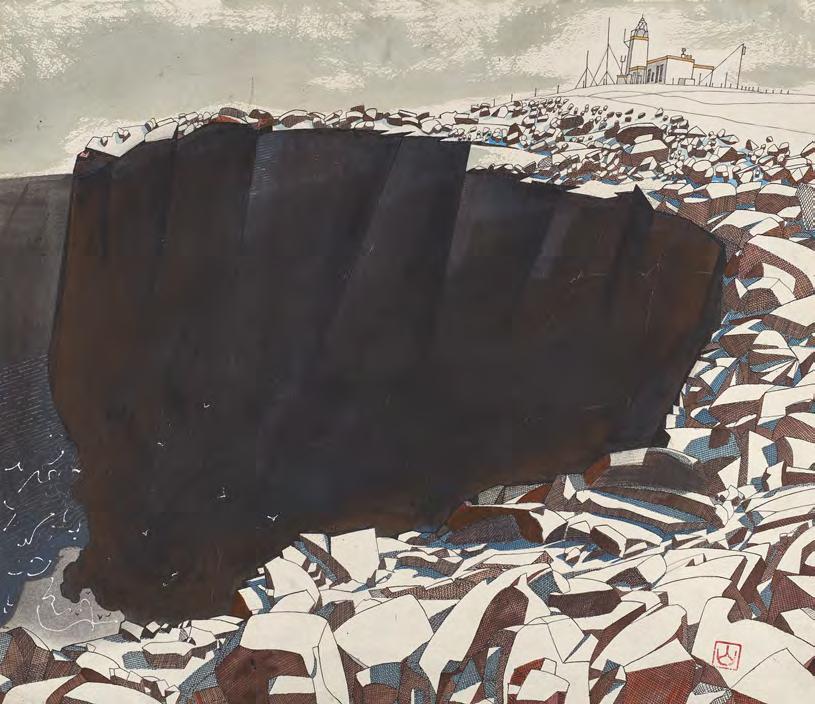
During the 1980s and 90s, Sandford lived and worked on Lamma Island, just off the coast of Hong Kong, a place known for its absence of roads, boat-only transport, and a distinctly magical, bohemian atmosphere. It was here, surrounded by tropical flora and immersed in a slower rhythm of life, that Sandford's practice evolved into a vibrant visual language inspired by his surroundings.
In this still life, composed in a restrained yet lush palette of yellow, green, and red, he brings together three plants native to the island's gardens and hillsides: coral tree flower, croton, and Indian shot. The simplicity of the colour scheme belies the richness of the composition, evoking heat, foliage, and light with clarity and poise. Sandford's signature seal, created during his time in Hong Kong, appears in the left corner, a personal and cultural imprint that marks the work with both authorship and memory.
Ron Sandford (b.1937)
54. Coral Tree Flower, Croton, and Indian Shot, Lamma Island, 1995 pen, ink and watercolour on paper, 96 x 65.5 cm artist's stamp lower left
Frances Walker (b.1930)
In Approaching Squall over Fraserburgh, Frances Walker conjures a brooding, elemental vision of the northeast Scottish coast, captured in her hallmark medium of etching. The work is both monochromatic and restrained, with one bold gesture of colour, the sea rendered in a deep, expressive blue, punctuating the otherwise tonal drama of the landscape. The elongated format heightens the sweep of space and sky, as a looming squall presses in from above, shifting light and wind in its wake. Fraserburgh lies in its path, exposed, coastal, and enduring. Technically, Walker’s mastery of etching allows her to layer texture, line, and tone with extraordinary sensitivity. In this etching, delicate hatching builds the clouds’ weight, while the etched lines of the shore hold a quiet, tensile energy.
Walker is one of Scotland’s most revered and respected artists, known for her lifelong commitment and personal engagement with remote and rugged landscapes. Born in Kirkcaldy in 1930, she studied at Edinburgh College of Art and later taught for many years at Gray’s School of Art in Aberdeen. Her long-standing connection to the Outer Hebrides, the Western Isles, and the Moray and Aberdeenshire coasts is evident in her deeply felt prints, which reflect both topography and time, landscapes shaped by weather, light, and silence.
The Scottish Gallery exhibitions: 2010
Frances Walker (b.1930)
55. Approaching Squall over Fraserburgh, 2006/07 etching and silver crayon, 20 x 69.5 cm signed lower right; titled and numbered in pencil to margin edition 5 of 10
PROVENANCE
Edition held in the collection of National Galleries of Scotland
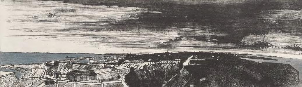
Published by The Scottish Gallery to coincide with the exhibitions:
Modern Masters XIX
Autumn - Winter 2025
Exhibition can be viewed online at: scottish-gallery.co.uk/modernmasters
ISBN: 978-1-917803-06-9
Designed and Produced by The Scottish Gallery
Photography by John McKenzie
Front cover: Ron Sandford, Cliffs at Eshaness, c.2000 pen, ink and watercolour wash on paper, 56.5 x 66 cm (cat. 53)
Inside front cover: S.J. Peploe, Still Life, Apples and Pink Roses, c.1924 oil on canvas, 56 x 51 cm (cat. 18)
Inside back cover: James Cumming, Market Day, c.1987 acrylic on board, 47 x 36 cm (cat. 51)
All rights reserved. No part of this catalogue may be reproduced in any form by print, photocopy or by any other means, without the permission of the copyright holders and of the publishers.