Crafting identity TEXT: PIERRE ANTOINE ZAHND | PHOTOS: FEELINK
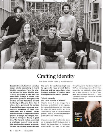
Based in Brussels, Feelink is a creative design studio specialising in brand identity conception. From the original concept to brand identity, logocrafting, typography, edition and communication strategy, it offers comprehensive guidance throughout the creative process that allows a brand to identify its DNA and define how it wishes to be perceived. Its founder, François Houtmans, combines a career-long knowledge of visual communication with a modern, futureforward attitude to the philosophy and practice of design. To François, “creativity is intelligence having a good time.” To that end, he has assembled a small-scale team of young specialists who together provide a comprehensive, step-by step accompaniment 56 | Issue 74 | February 2020
that paves the way from a simple idea to a powerful visual product. Below, François and his team share a few thoughts on the art of creating brand identity out of shapes and symbols.
What is meant by the ‘visual identity’ of a brand? Creative team: It is the image that a business, an institution or an organisation presents to its audience. It contains its values, its energy and its ambitions. Visual identity is the whole of its different graphic, auditory, and sensory elements, put together in a cohesive way. François: A brand’s visual identity allows us to recognise it at first glance, thus to identify it and assimilate it to the environment in which it appears. It is articulated
through keywords that define the brand’s DNA as well as its purpose. From these keywords, we elaborate colour codes and shapes to match the clients’ purpose. We use these elements to ‘dress’ the brand, making it identifiable with the target audience.