Rosendin Electric, Inc. is the company’s legal name and Rosendin is how the company is referred to during day-to-day business and marketing activities.
OUR LOGO
The Rosendin logo must be considered an inviolable piece of artwork. No alterations should ever be made. This includes any manipulation of the style, proportions, or spacing of the letter forms or design. Always use authorized artwork. Only approved reproductions should be used.
Please see the “Logo System” section of the Brand Guidelines for specific information about the Rosendin logo and use requirements.
TERMS OF USE
The Rosendin Brand Guidelines is a living document and subject to change. Please visit rosendin.com (external) or the Rosendin Intranet (internal) to view and download the most current copy of the brand guidelines and logo files.
THE BASICS
ABOUT US
MISSION STATEMENT
A Mission Statement is meant to describe why a company is in business; why it exists. It is for this reason that we feel that “Building Quality | Building Value | Building People®” is best suited as our Mission Statement. It truly reflects what we are and what we do.
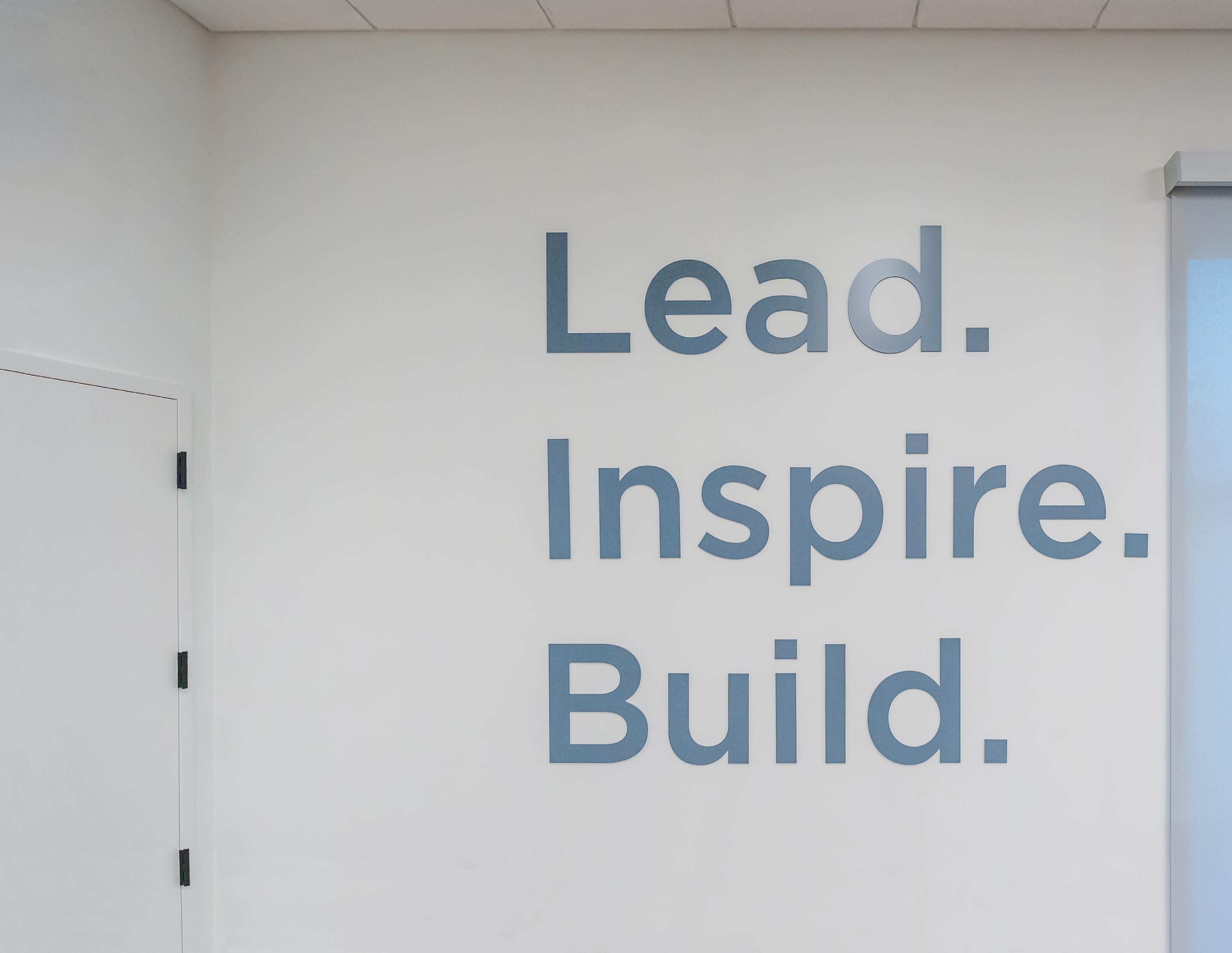
VISION/PURPOSE
A company’s Vision/Purpose provides direction for the future; it identifies what a company needs to be like to be successful in the future. “Lead. Inspire. Build.” is Rosendin’s Vision/Purpose.
CORE VALUES
Core Values are principles meant to provide guidance for behavior and actions. They represent a company’s culture. We believe the following truly reflects our core values:
• We are an organization built on integrity. We create an environment that empowers people to work safely to be at their best and to respect one another. We Care.
• Our success is based on hearing and understanding the objectives of our customers and employees We build relationships. We Listen.
• We collaborate, we inspire we challenge one another. We Share.
• People will remember us for the solutions we provide. Entrepreneurial ideas are encouraged and promoted, continuously raising industry standards. We Innovate.
• The quality of our work will represent us for years to come. We take pride in what we build. It is our legacy. We Excel.
ABOUT US
EMPLOYEE OWNERSHIP
Rosendin is proud to be employee-owned. Employees have a sense of accountability and pride in the successes we have experienced. This type of family atmosphere starts at the top. Our employee-owners see their personal value in the company and understand their responsibility. We have a stake in the future of the company and take a long-term view of our customer’s welfare. At Rosendin, we are motivated and empowered to provide the best value and service, as we are focused on keeping customers for life.
BRAND NARRATIVE
Standard/Complete Company Description (123 words/686 Characters w/o spaces)
Rosendin, headquartered in San Jose, is employee-owned and one of the largest electrical contractors in the United States, employing over 10,000 people, with revenues averaging $3.7 billion. Established in 1919, Rosendin remains proud of our more than 100 years of building quality electrical and communications installations and value for our clients but, most importantly, for building people within our company and our communities. Our customers lead some of the most complex construction projects in history, and rely on us for our knowledge, our ability to scale, and our dedication to quality. At Rosendin, we work to ensure that everyone has the opportunity to reach their full potential by building a culture that is diverse, safe, welcoming and inclusive. For more information, visit rosendin.com
Reduced Company Description (95 Words/549 Characters w/o spaces)
Rosendin, headquartered in San Jose, is employee-owned and one of the largest electrical contractors in the United States, employing over 10,000 people, with revenues averaging $3.7 billion. Established in 1919, Rosendin remains proud of our more than 100 years of building quality electrical and communications installations and value for our clients but, most importantly, for building people within our company and our communities. At Rosendin, we work to ensure that everyone has the opportunity to reach their full potential by building a culture that is diverse, safe, welcoming and inclusive. For more information, visit rosendin.com
BRAND NARRATIVE CONTINUED
Reduced Company Description (74 Words/406 Characters w/o spaces)
Since 1919, Rosendin has created a reputation for building quality electrical and communications installations, building value for clients, and building people. Our customers lead some of the most complex construction projects, and rely on us for our knowledge, our ability to scale, and our dedication to quality. At Rosendin, we work to ensure that everyone has the opportunity to reach their full potential by building a culture that is diverse, safe, welcoming and inclusive.
Reduced Company Description (47 Words/268 Characters w/o spaces)
Since 1919, Rosendin has created a reputation for building quality electrical and communications installations, building value for clients, and building people. Our customers lead some of the most complex construction projects, and rely on us for our knowledge, our ability to scale, and our dedication to quality.
Reduced Company Description (42 Words/250 Characters w/o spaces)
Since 1919, Rosendin has created a reputation for building quality electrical and communications installations, building value for clients, and building people in a diverse, safe, and inclusive environment. Our customers rely on us for knowledge, ability to scale, and dedication to quality.
Reduced Company Description (28 Words/174 Characters w/o spaces)
Since 1919, Rosendin, one of the largest employee-owned company in our industry, has created a reputation for building quality electrical installations, building value for clients, and building people.
The Standard/Complete Company Description text should be used unless words counts are limited. For brand narrative or company description requests with other word count requirements, please contact marketing@rosendin.com and a custom description will be provided.
LOGO SYSTEM
THE ROSENDIN LOGO
The Rosendin logo must be considered an inviolable piece of artwork. No alterations should ever be made. This includes any manipulation of the style, proportions, or spacing of the letter forms or design. Always use authorized artwork. Only approved reproductions should be used.
LOGO LAYOUT & COLOR OPTIONS
APPROVED VERSIONS
Two logo layouts are available, horizontal/standard and vertical/stacked. The Rosendin logo should be displayed in the horizontal/standard layout unless otherwise specified, or as needed to fill available space.
The logo can be used in color (blue and gray, as provided), white, black and Rosendin blue as shown here. No other color options are available and no changes can be made.
1 Color: Black
Color: Black
Color: White
Color: White 1 Color: Rosendin Blue
Color: Rosendin Blue
LOGO SIZE & CLEAR SPACE
LOGO CLEAR SPACE
The clear space around all sides of the Rosendin logo must be, at minimum, equal to the height of the ‘O’ letter graphic x2 (as shown below). This clear space applies to all other graphics, text and the edge of any document or promotional item it is applied to. No unapproved text or graphics should fall within this area.
MINIMUM SIZE
To ensure that the Rosendin logo is legible, the suggested minimum size for print or imprint is 1.5 inches (width). For digital application, a minimum size of 150 pixels (width) is recommended. There is no maximum size.
Horizontal/Standard
Vertical/Stacked Logo
Print/Imprint: 1.5 inch wide Digital: 145px wide
Print/Imprint: 0.8 inch wide Digital: 77px wide
LIMITED USE OF THE RE DESIGN ELEMENT
The RE portion of the Rosendin logo may only be used with review and approval from Marketing. Please contact Samantha Peck at speck@rosendin.com for all requests.
INCORRECT LOGO USE & EXAMPLES
1. Do not alter color. The logo can be used in color (blue and gray, as provided), all black, or all white. No other color options are available and no changes can be made.
3. Do not invade clear space or crop. Please see Logo Construction & Clear space section for details.
5. Do not blur or pixelate. Logo should always be clear and legible.
2. Do not use retired or outdated logos, graphics, or taglines. Examples include 25th Employee Ownership Anniversary logo, 100th Anniversary logo & graphics, Rosendin logo grouped with divisional/group names, Ahead of the Current TM tagline, 100% Employee Owned text, etc.
4. Do not alter layout or create alternate logo versions. The Rosendin logo should not be incorporated with any other Company’s logo(s) or used in conjunction with other graphics or text.
OSENDIN
7. Avoid use on like-colored or busy backgrounds. The white logo is recommended for use on very dark backgrounds and the black logo on lighter backgrounds. The color logo can be used in either situation, as long as the logo is clearly visible and colors are not altered in any way. Logo should be easy to read and identify.
MARKETING
8. Do not add text, taglines, or other elements to create a personalized logo or signature. The Rosendin logo has a clear space that must be maintained. No text (including divisional/group names), lines, or graphics can be added.
9. Do not attempt to recreate the logo using typefaces. Only official artwork files may be used.
10. Do not bend, twist, or rotate the logo. Use logo as provided and do not display at other angles.
6. Do not use grayscale versions, tint, or change the opacity. Use logo as provided in color, black, or white.
11. Do not apply drop shadows, gradients, or other effects. The logo has been designed to stand alone without enhancements of any kind.
12. Logo proportions must be maintained - do not stretch or skew.
If the logo is needed in a specific size or format, please contact marketing@rosendin.com for assistance.
LOGO USE & SECONDARY TEXT
APPLICATION GUIDELINES
All logo and secondary text use must align with current brand guidelines. Approved text can be included on promotional/branded items when the following guidelines are observed.
1. Placement in a secondary location is required and an approved text graphic must be used. Please see examples of correct placement on the following page.
2. Text cannot be used in direct conjunction with the Rosendin logo and may not be combined with or positioned directly above, below, or beside the logo. Logo clear space and minimum size guidelines must be observed.
Please contact marketing@rosendin.com for text approval, artwork files, and additional details.
APPROVED EXAMPLES
Special Systems | Transportation
PREFERRED SECONDARY LOCKUP
ELECTRICAL CONTRACTOR SINCE 1919
The use of our “1919“ Secondary Lockup has specific formating and is the preferred choice for most marketing materials. When using this lock up, please adhere to approved format.
Clear Space Formating
1. Standard double “O” clearspace should be maintained around the full lock up.
2. Double “O“ space should be maintained between the logo and text.
3. At minimum, single “O” margins should be maintained for the text. (Horizontal Only)
COLOR
PRIMARY COLOR INFORMATION
Our primary colors are the Rosendin Blue and Rosendin Gray below. These are also our colors in our primary full color logo layouts and can be used in the color tints included below. There is no limitaion on the amount that these colors can be used in layouts.
ROSENDIN BLUE
Pantone 293C
C 100% R 0
M 76% G 62
Y 0% B 171
K 9%
HEX #003EAB
ROSENDIN GRAY
Pantone 431C
C 63% R 90
M 45% G 102
Y 34% B 117
K 25%
HEX #5A6675
SECONDARY COLORS
TERTIARY COLORS
Our secondary colors include a green and orange to accent our primary colors. Our secondary colors should not consume more than 40% of the color(s) used in any layout or space.
• Our gold is meant to be used as an accent color and should not consume more than 10% of the color used in any layout or space.
• This color is NOT to be used for text unless it’s being used in a larger font size and heavier weight.
• Do NOT use white text over this color, it cannot be read easily.
• This blue is intended to be used for smaller headlines or accent colors only.
• Do NOT use this blue in floods of color for backgrounds, icons, or larger design elements. The Rosendin primary blue should always be used in those cases.
TERTIARY
TYPOGRAPHY
PRIMARY FONT
The typeface used for all Rosendin materials is Gotham. Within this type family, there are several variations. It is recommended to stay within the light, book and medium weights to maintain visual consistency within all executions and distinguish the various levels of information. The narrow version may be used for any instances where it is needed due to lack of space such as long form body copy.
The alternate typeface is Calibri and can be used anytime Gotham is unavailable or for digital use when Gotham is unavailable. Common applications for Calibri are Microsoft Word documents, PowerPoint presentations and email signatures.
ABCDEFGHIJKLMNOPQRSTUVWXYZ
abcdefghijklmnopqrstuvwxyz 0123456789!@#$%^&*(
ABCDEFGHIJKLMNOPQRSTUVWXYZ
abcdefghijklmnopqrstuvwxyz 0123456789!@#$%^&*()
ABCDEFGHIJKLMNOPQRSTUVWXYZ
abcdefghijklmnopqrstuvwxyz 0123456789!@#$%^&*(
ABCDEFGHIJKLMNOPQRSTUVWXYZ
abcdefghijklmnopqrstuvwxyz 0123456789!@#$%^&*()
ABCDEFGHIJKLMNOPQRSTUVWXYZ
abcdefghijklmnopqrstuvwxyz 0123456789!@#$%^&*()
ADDITIONAL FONTS
SPECIAL OCCASIONS
Relation can be used for holiday cards, thank you cards, sentiment cards, greetings, or any time you would like to convey heartfelt emotion through text. This font family should never be typed in all-caps, and should only be used during special occasions that are not official award documents. This is an Adobe font and not available company wide for use.
AWARDS & FORMAL USE
Times can be used for awards certificates and formal letters. It is a system font, therefore it is available on all computer systems.
ABCDEFGHIJKLMNOPQRSTUVWXYZ
abcdefghijklmnopqrstuvwxyz 0123456789!@#$%^&*()
ABCDEFGHIJKLMNOPQRSTUVWXYZ
abcdefghijklmnopqrstuvwxyz
0123456789!@#$%^&*()
ABCDEFGHIJKLMNOPQRSTUVWXYZ
abcdefghijklmnopqrstuvwxyz 0123456789!@#$%^&*()
ABCDEFGHIJKLMNOPQRSTUVWXYZ
abcdefghijklmnopqrstuvwxyz 0123456789!@#$%^&*()
ABCDEFGHIJKLMNOPQRSTUVWXYZ
abcdefghijklmnopqrstuvwxyz 0123456789!@#$%^&*()
ABCDEFGHIJKLMNOPQRSTUVWXYZ
abcdefghijklmnopqrstuvwxyz 0123456789!@#$%^&*()
ABCDEFGHIJKLMNOPQRSTUVWXYZ
abcdefghijklmnopqrstuvwxyz 0123456789!@#$%^&*()
ABCDEFGHIJKLMNOPQRSTUVWXYZ
abcdefghijklmnopqrstuvwxyz 0123456789!@#$%^&*()
TEMPLATES
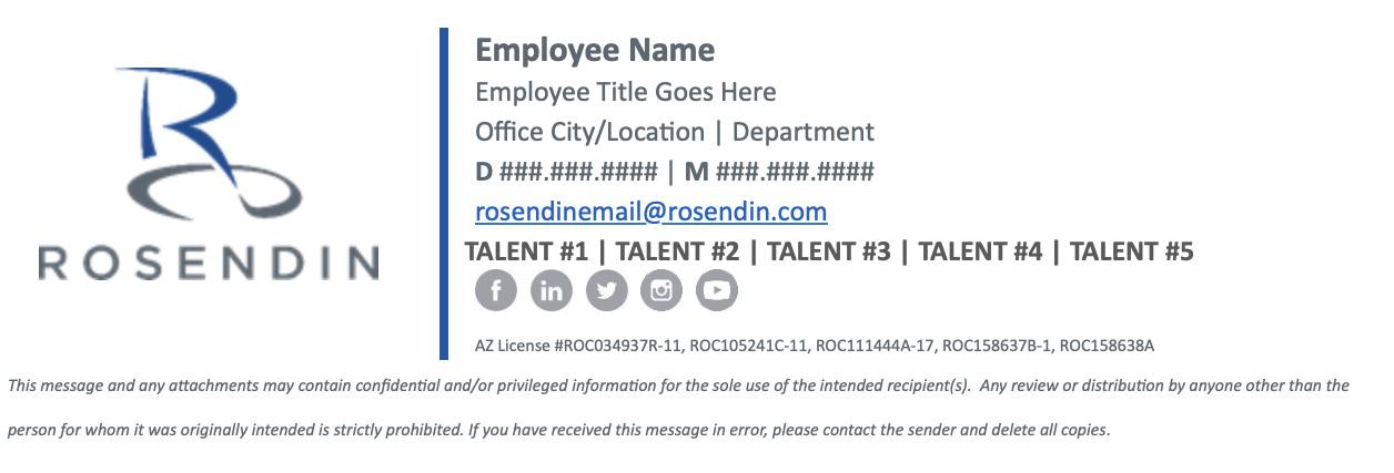
EMAIL & MOBILE SIGNATURES
Below are samples of our approved desktop and mobile email signatures. IT has the desktop templates loaded for each state to be populated with your information.
Desktop Device Example
Mobile Device Example
Employee Name
Employee Title Goes Here
Office City/Location | Department
M XXX.XXX.XXXX
rosendinemail@rosendin.com
State License#(s)
EMAIL SIGNATURES CONTINUED
ADDITIONAL GUIDELINES
1. Do not use colored stationary, photos, or graphics as a background in digital communications. Use a plain white background with black or grey text to assist with legibility across all devices and platforms.
2. Company signature blocks should include only the IT supplied logo and text layout with an alternate option of using plain text (no logo) for. Please see examples of approved layouts below.
3. Limit the length of your signature and what is included. Do not add clip art, inspirational sayings, award listings, animated gifs, or other graphics or images unless they have been reviewed and approved by Marketing.
SETTING UP YOUR EMAIL SIGNATURE:
1: Select the appropriate signature provided by IT based on your state location for proper licensing to be displayed.
2: Fill in your name, title, office, department and contact information
3: Optional Fill in your Core Clarity Talents that align with the colors and talents listed on the following pages.
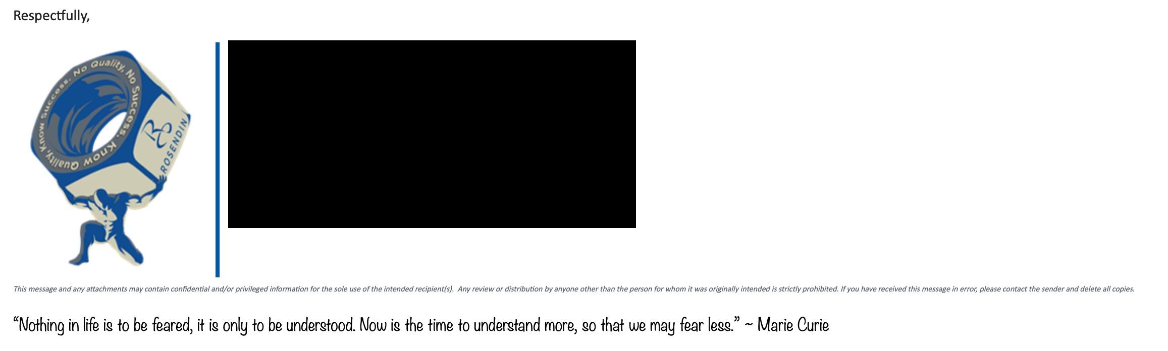
INCORRECT EMAIL SIGNATURES
The following examples are not approved Rosendin email signatures.
CORE CLARITY & TALENTS
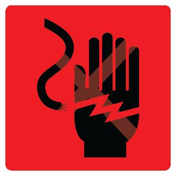
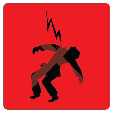
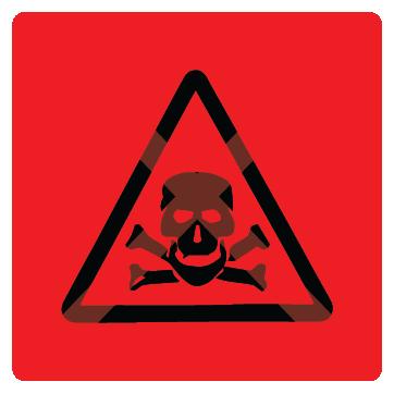
VISUAL DONT’S
Representing potentially hazardous elements on the jobsite, such as sparks, arc flares, lightning bolts, thunderbolts, and plasma flares, is strictly prohibited. If you’re unsure if your icon aligns with Rosendin’s brand standards, please contact marketing@rosendin.com for more information.
APPAREL
&
APPAREL & PROMO ITEM GUIDELINES
• The logo must be produced using the format that will translate best on the item, using the appropriate application method (ex: embroidery, screen printed, a patch applied, etc.).
• Proper clear space and approved logo color formats must be maintained. Backpacks are an exception for color, see below.
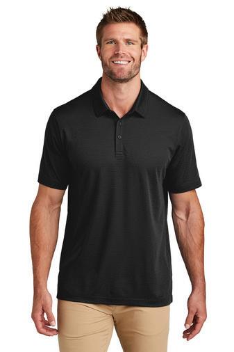
SHIRTS
The logo should always be placed on the left chest at no more than 2.5 inches in height.
If there is existing branding for the brand of shirt in that placement, the logo may be moved to the right chest.
OGIO Crush Henley
IMPRINT COLOR: EMB White 1001
IMPRINT LOCATION: Left Chest Page: 1 o 1
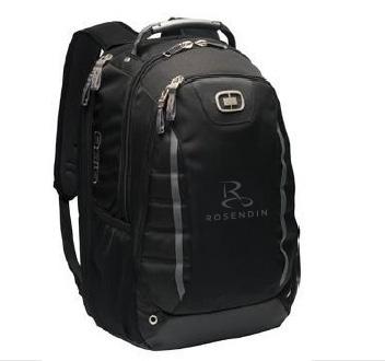
BACKPACKS
Logo applications on backpacks must be more muted due to safety and security reasons. The logo may be applied using a debossed patch applied to the bag OR using a two-tone method with the logo a few shades lighter than the item itself when embroidered.
File Name: 107725 Rosendin
Stacked 2.25 in 1954 stitches.DST
DIMENSIONS: w: 2.25” x h: 1.14”
Stitch Count: 1,951
Shown Here at: 100%
Two-tone
Example
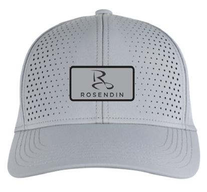
COBRANDING & SECONDARY TEXT
COBRANDING
Cobranding guidelines apply when we are introducing another brand or project logo onto any apparel and promotional items.
Ex: A general contractor logo.
Primary Imprint
The Rosendin logo must be applied to the front left chest on shirts and the front left panel on hats.
Secondary Imprint(s)
Additional partner or project logos may be applied to the following locations:
Shirts & Jackets:
• Either sleeve
• Below the collar on the back of the shirt/jacket
Hats:
• Either side panel
• On the back of the hat
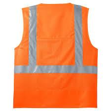
SECONDARY TEXT ON APPAREL
On apparel secondary text must be applied to a secondary imprint area away from the Rosendin logo. Please reference the secondary imprint(s) areas above.
Secondary text is not allowed in the same imprint area as the Rosendin logo for apparel, safety vests are an exception.
OFFICIAL ROSENDIN SOCIAL MEDIA PLATFORMS
The following list includes all of our official social media platforms. If you come across any profiles that are not on the list below, please notify marketing@rosendin.com.
Facebook: @RosendinInc
X: @RosendinInc
Instagram: @RosendinInc
LinkedIn: @RosendinInc
YouTube: @RosendinInc
SOCIAL MEDIA
TikTok: @RosendinInc
HASHTAGS
OFFICIAL HASHTAGS
#LeadInspireBuild
To be used as an overall brand association around an accomplishment, project, or person.
ROSENDIN HASHTAG
#Rosendin
To be used by employees and partners, especially as a backup when we aren’t tagged by handle. We also use this on Instagram for SEO purposes.
#BuildingQuality
#BuildingValue
#BuildingPeople
PHOTO & VIDEO ESSENTIALS
The following details must be cared for when capturing both photography and videography.
WHITE BALANCE
Check your camera settings. A bright day should NOT have colors on the warm side. Outdoor light is much more blue light, therefore the color temps will be higher. Generally, the average daylight temp is around 5600k. Shady and overcast skies will give you a higher color temp. Make sure your white balance is accurate to the situation you are shooting in.
Example of Bad White Balance
The colors are not appearing accurate to the environment and very blue/cool.
Example of Proper White Balance
The colors are accurate to true coloring of foliage, building materials, concrete, sky, etc.
PHOTO & VIDEO
RULE OF THIRDS LIGHTING
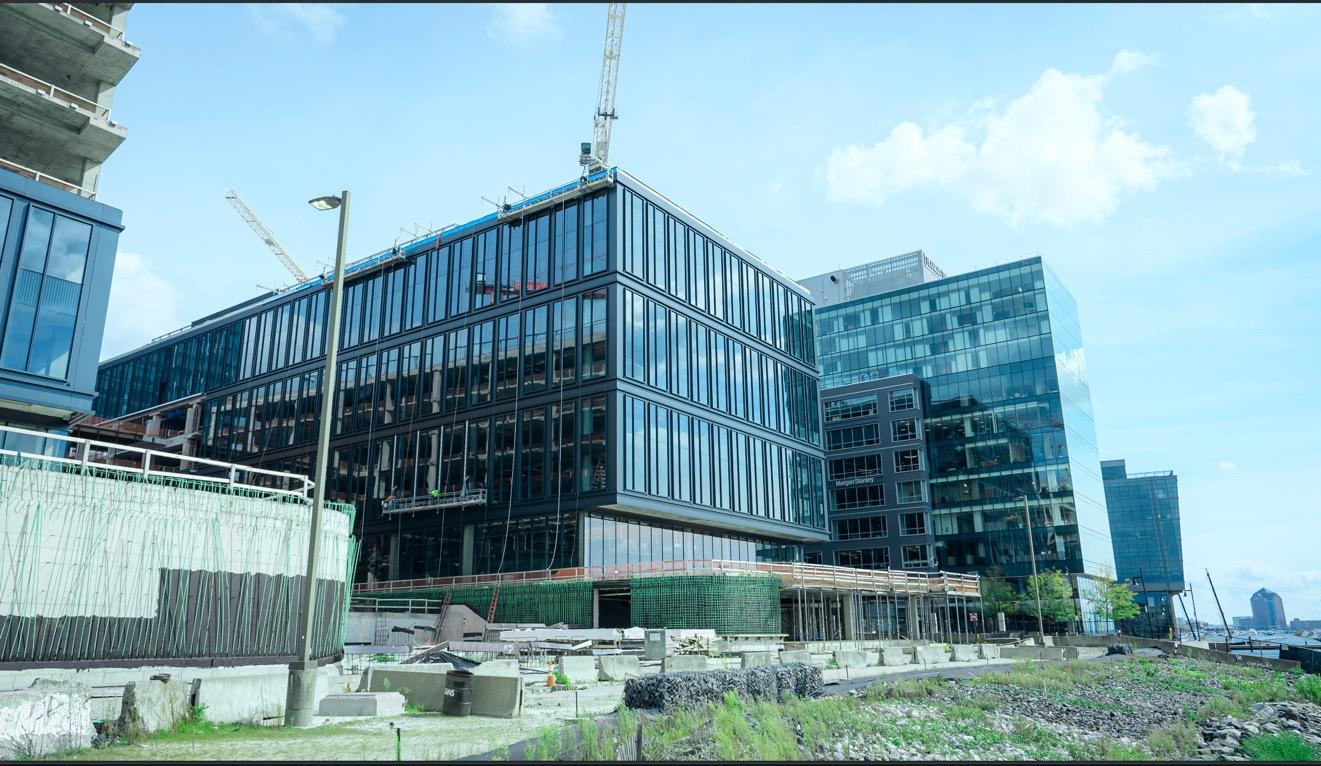
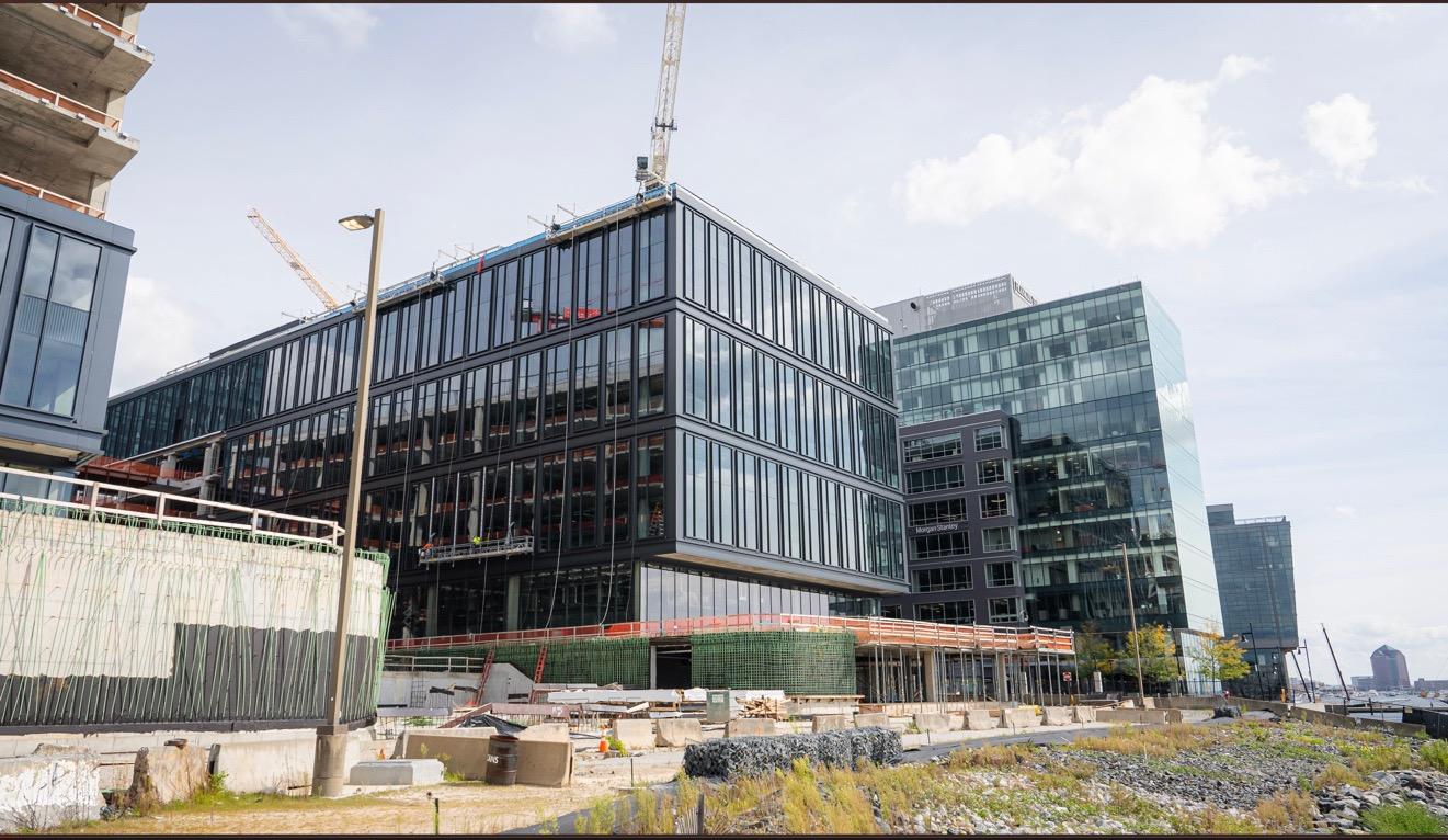
The rule of thirds is a composition guideline that places your subject in the left or right third of an image, leaving the other two thirds more open. While there are other forms of composition, the rule of thirds generally leads to compelling and well-composed shots.
LIGHTING SUBJECTS & ENVIRONMENTS
Make sure you are capturing content in well-lit environments. However, if you cannot change the situation to improve lighting or you are unable to adjust your setup to make up for the inbalance, inform the appropriate stakeholders as soon as possible so a decision about how to move forward can be made.
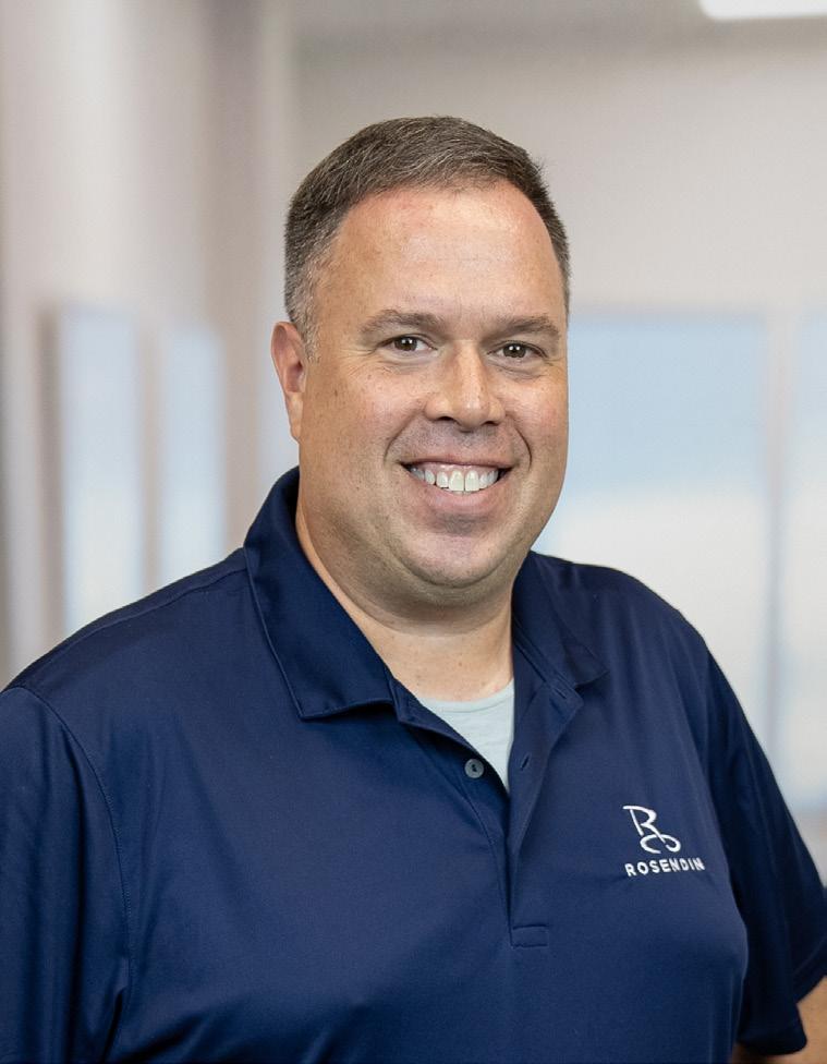
Example of Bad Lighting
One side of the face is lit but the other side is hard to see. The background is also not properly lit.
Example of Proper Lighting
The face is evenly lit on both sides and you can clearly see the background.
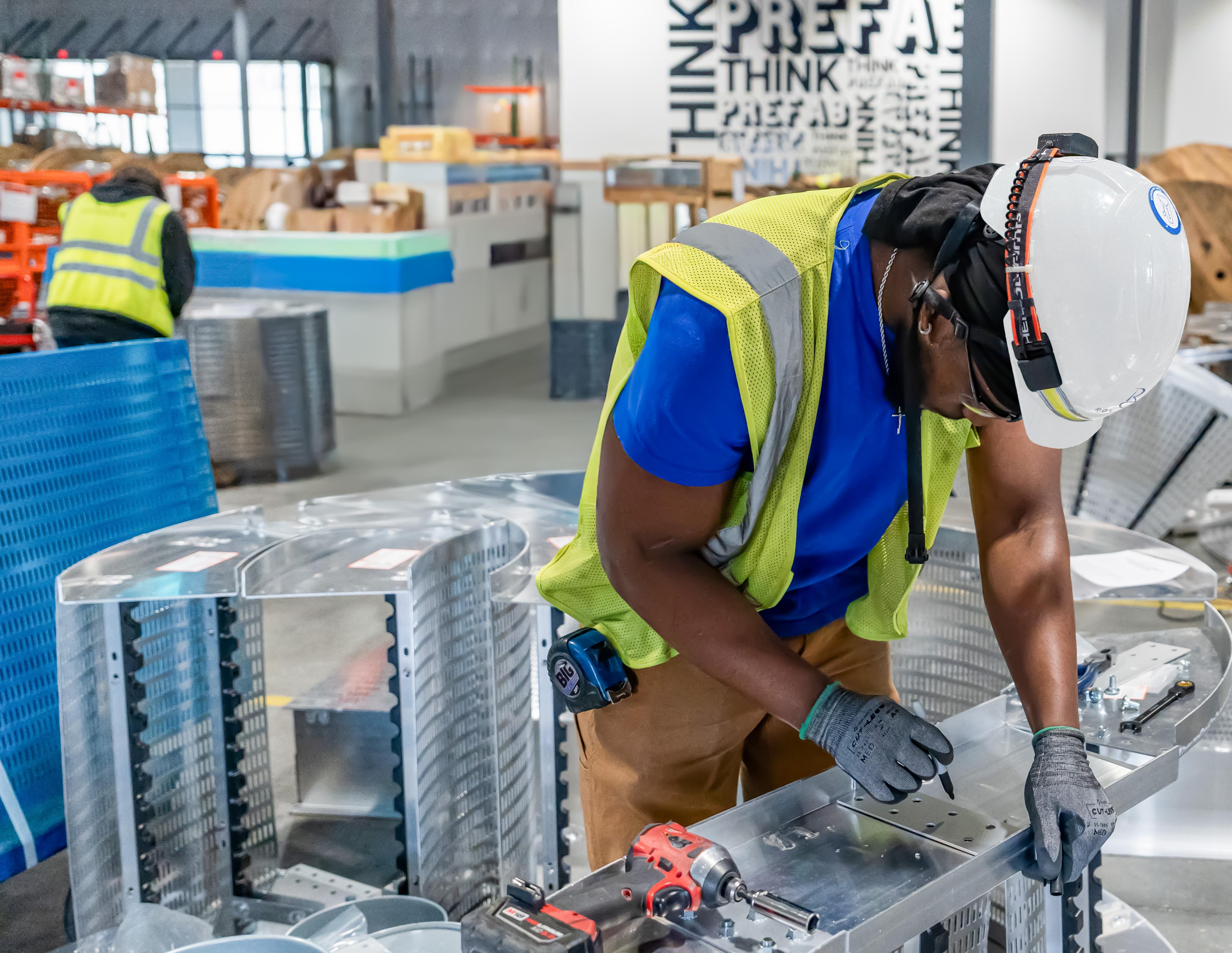
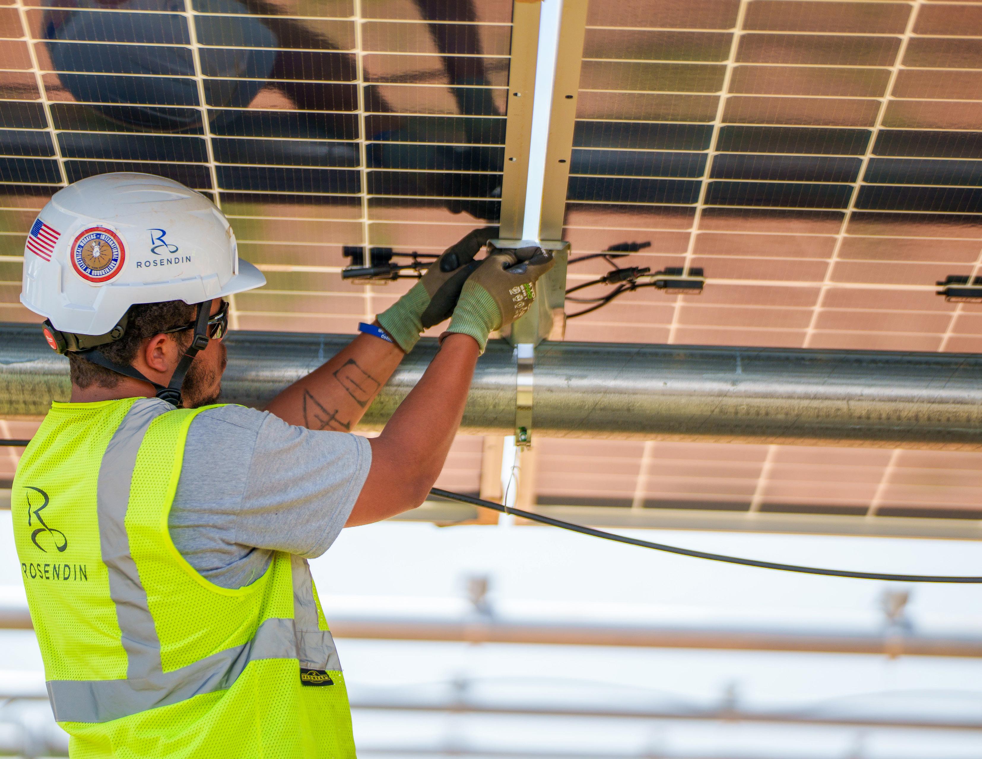
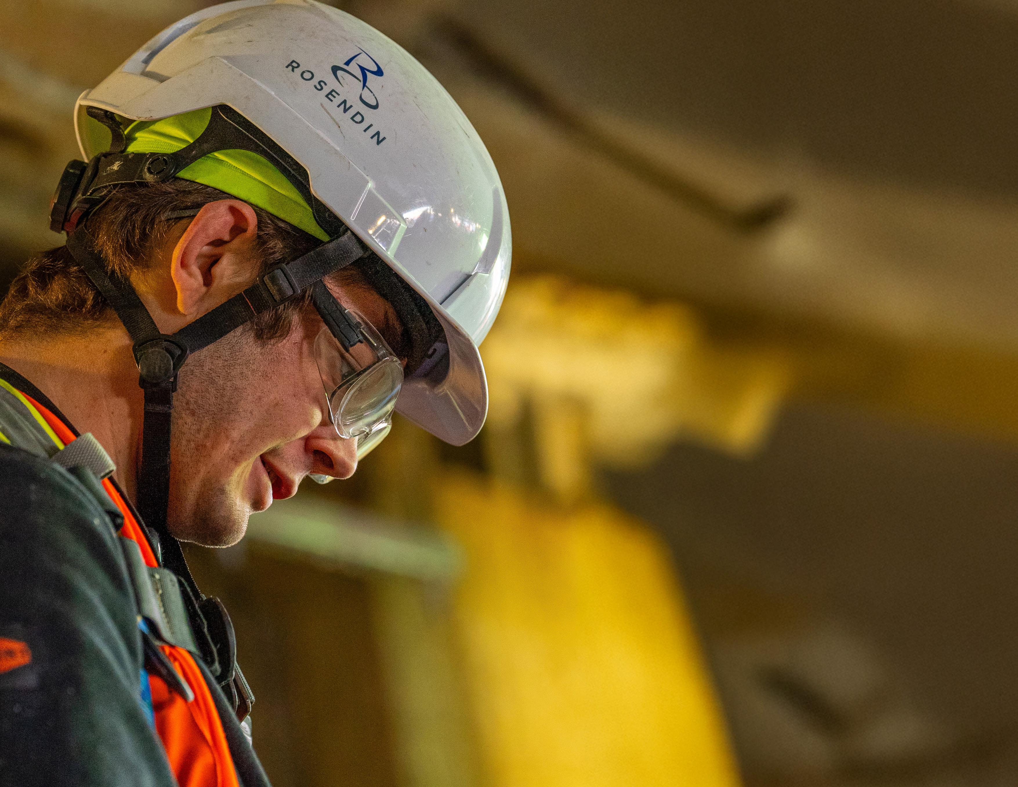
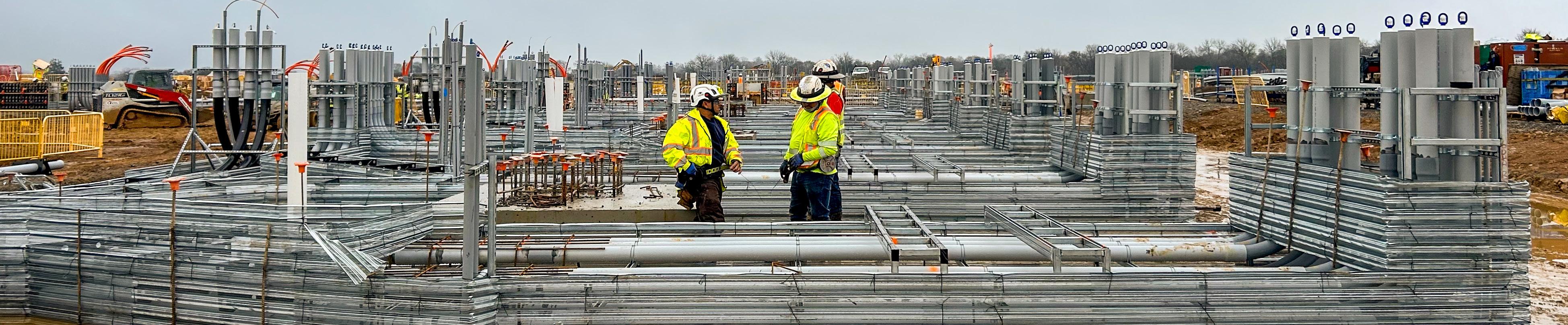
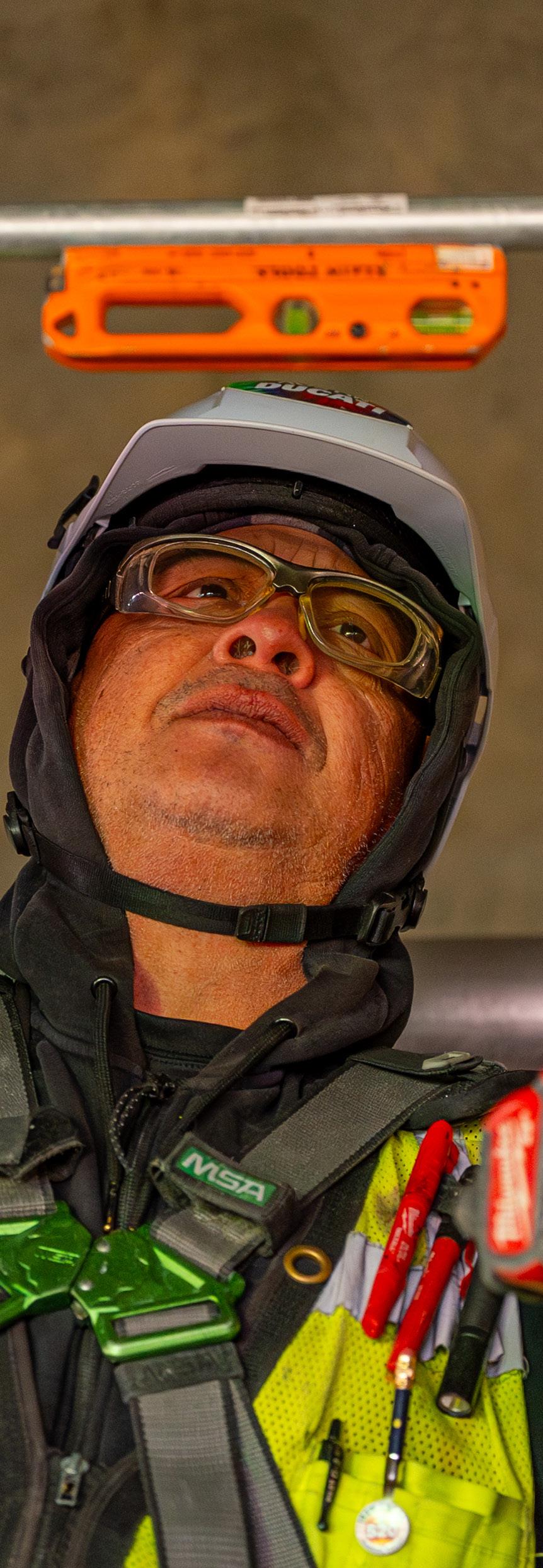
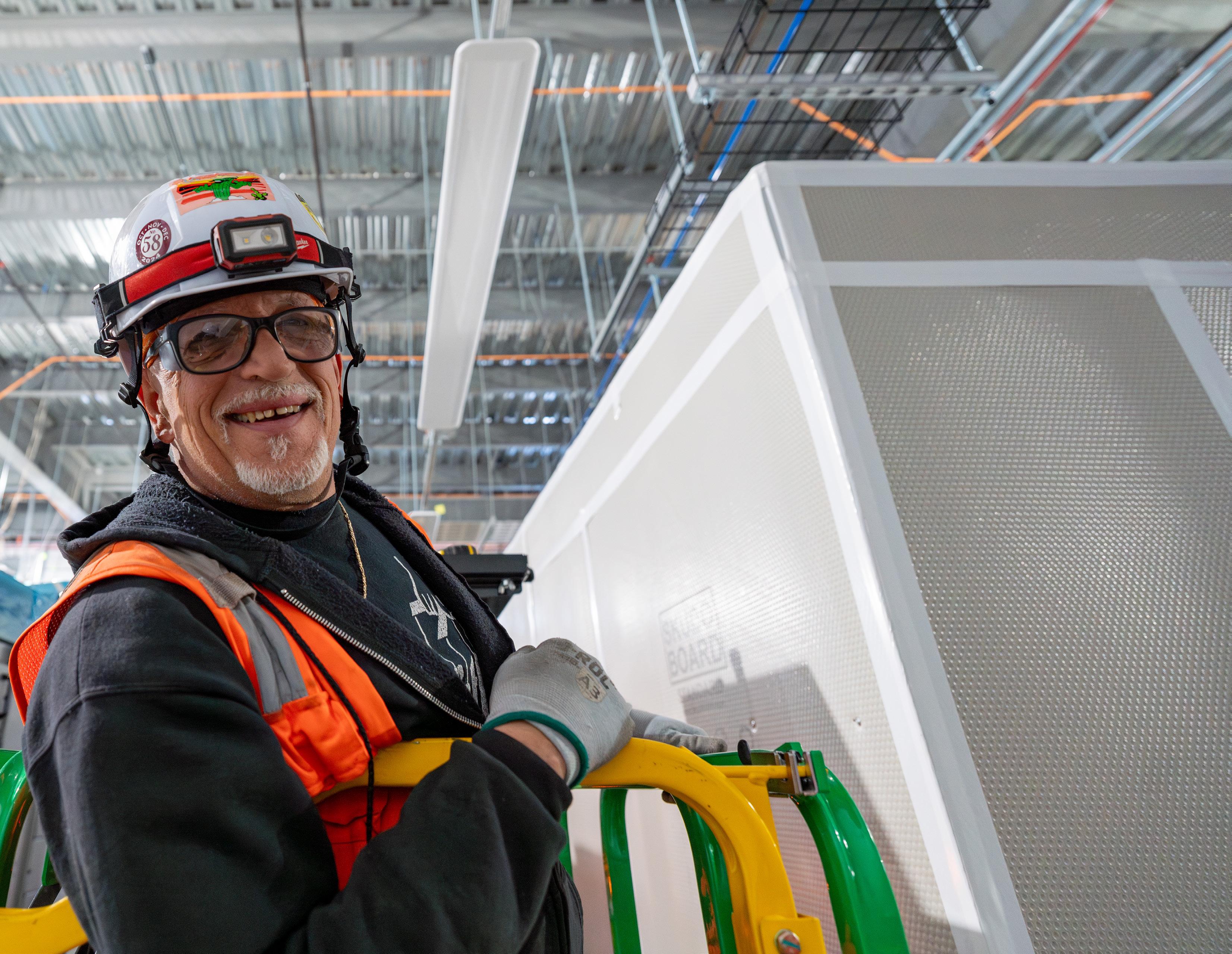
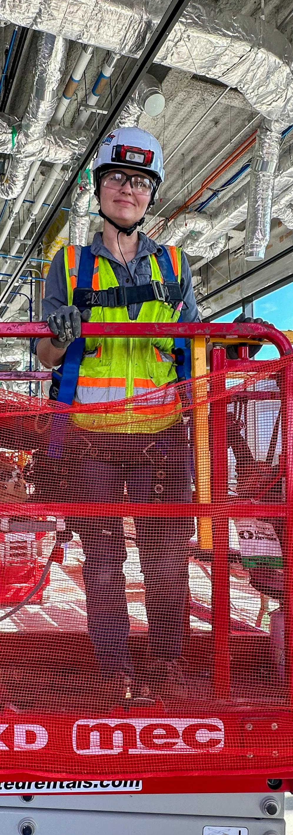
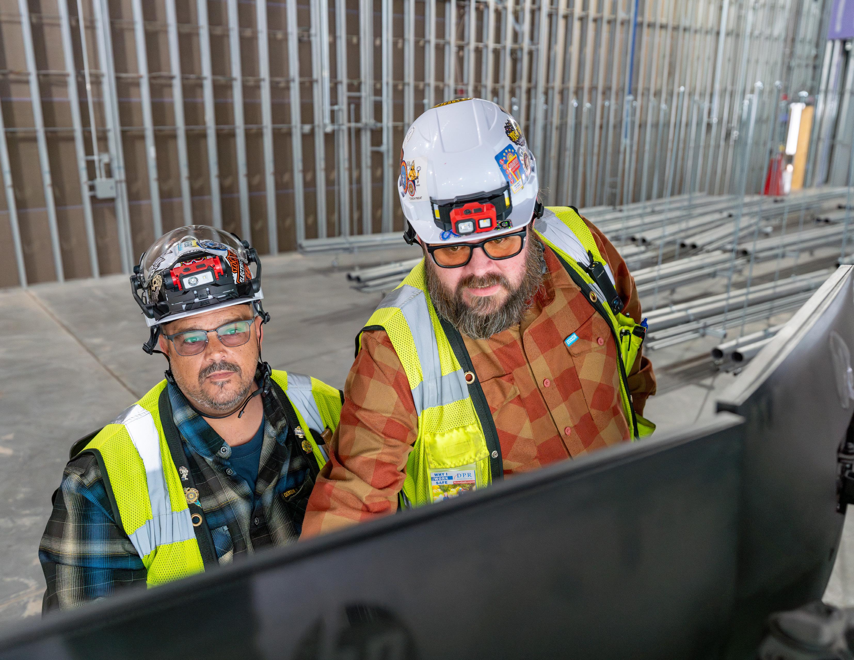
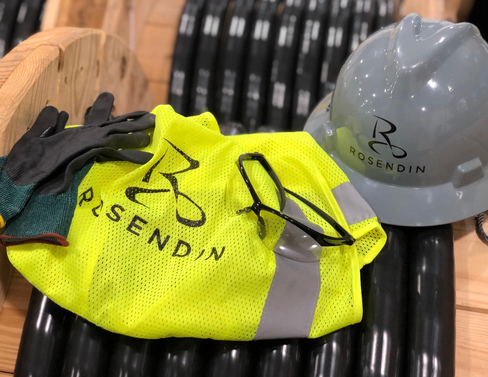
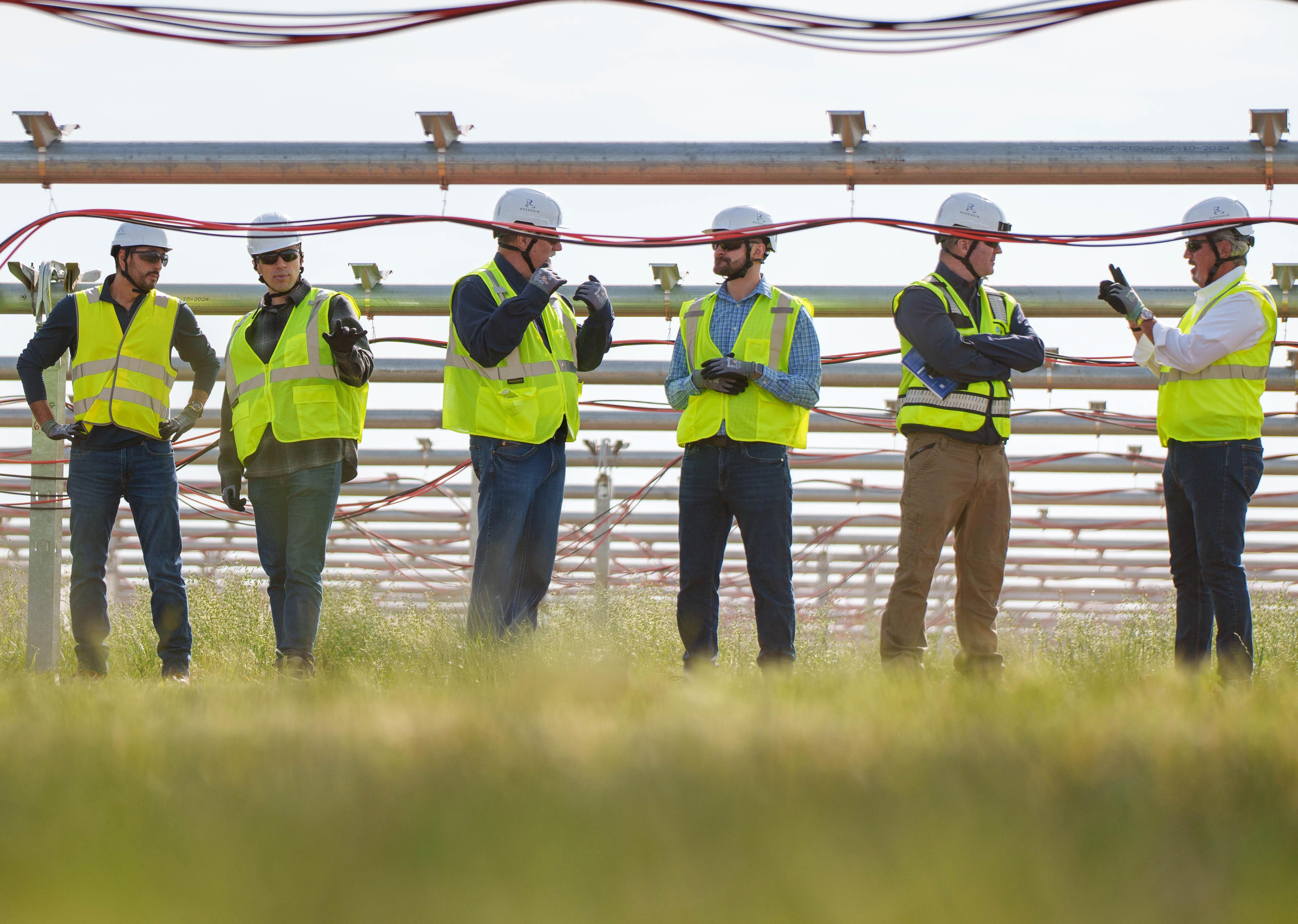
PERSONAL PROTECTIVE EQUIPMENT (PPE)
PPE REQUIREMENTS FOR PHOTOGRAPHY
Make sure that all PPE is on in pictures depicting someone working on job sites, in prefab, or doing electrical installations.
What to look for:
• Helmet (This may not be required in some prefab facilities)
• Gloves (No fingers cut off)
• Safety glasses
• Closed toed boots
• Safety vest
If you have questions or unsure if a photo can be shared due to PPE concerns, please reach out to your local or regional safety team member.
Safety Helmet
Safety Vest
Closed Toe Boots
Safety Eye Protection: Glasses or Goggles
Gloves
IPHONE PHOTO GUIDE
IPHONE CAMERA SETTINGS
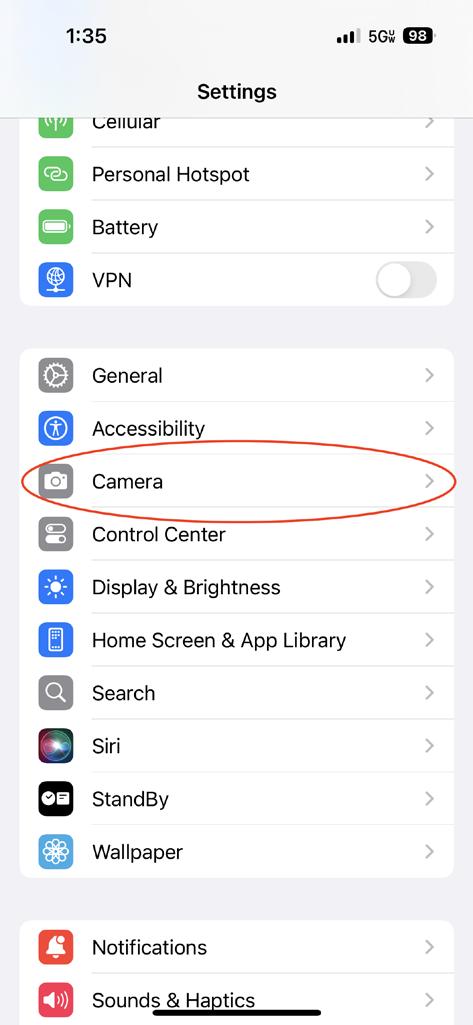
1. Go to Settings and find the Camera app settings.
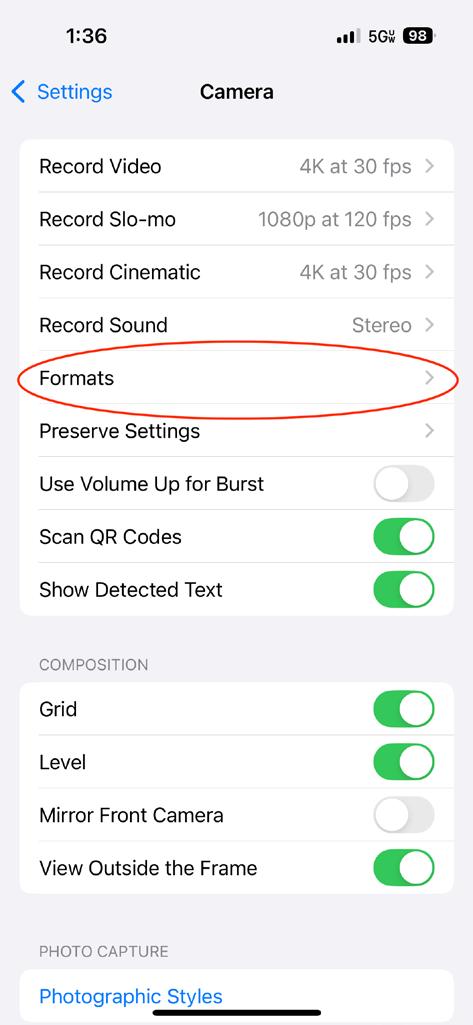
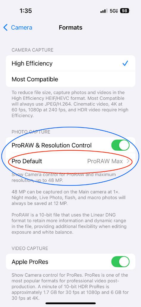
2. Select Formats If the option is available, toggle the ProRAW & Resolution Control option on and select ProRAW Max as the Pro Defualt. This option is available on iPhone Pro models only.
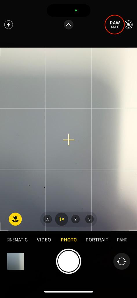
3. In your camera app, verify that RAW or RAW MAX is enabled.
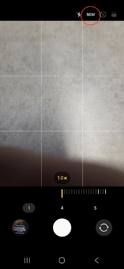
Note: When taking photos, refrain from using zoom on the camera unless needed. If space allows, it is better to move closer or further away from the subject instead of zooming.
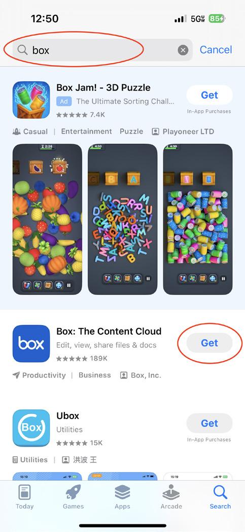
IPHONE BOX APP TO SHARE PHOTOS
Sharing photos through Box is the prefered method. This will retain the size and quality. Please do not email or text photos. These methods reduce the size and quality of photos. Low quality photos may not be able to be used.
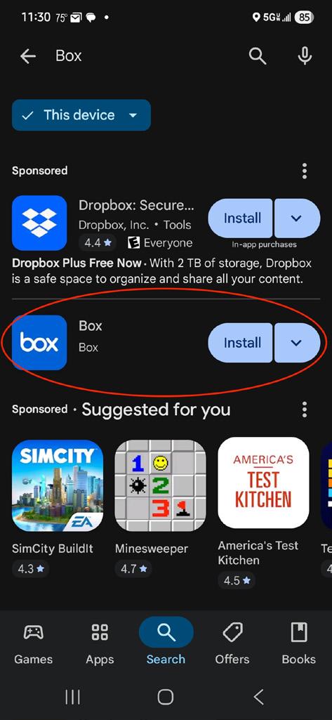
1. Search and download the official Box app from the App Store Then, sign into the app using your Rosendin login.
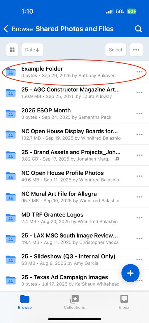
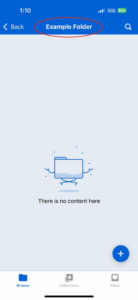
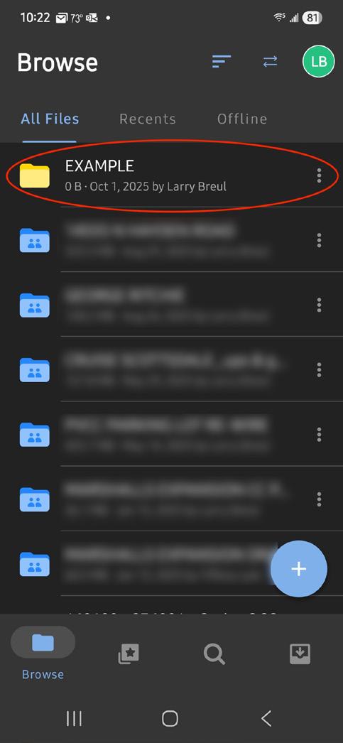
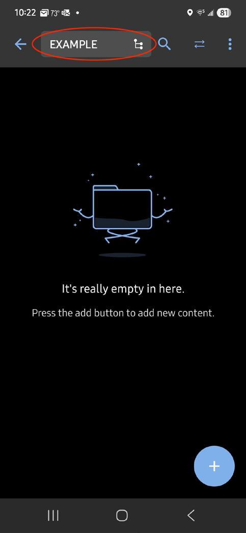
2. Select the appropriate folder to upload your photos. If a specific folder is shared to upload to, please use that.
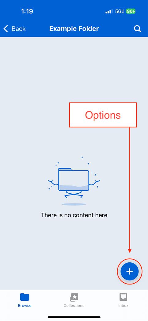
3. Tap the ‘plus’ sign in the lower right corner. You will see options to create a new folder, upload a file, take a photo that will upload automatically, or upload a photo from your Photo Library.
ANDROID PHOTO GUIDE
ANDROID CAMERA SETTINGS
1. Open your camera app.
2. In the top options menu, make sure the highest setting is selected. Generally, the highest number is the best option.
Note: When taking photos, refrain from using zoom on the camera unless needed. If space allows, it is better to move closer or further away from the subject instead of zooming.
ANDROID BOX APP TO SHARE PHOTOS
Sharing photos through Box is the prefered method. This will retain the size and quality. Please do not email or text photos. These methods reduce the size and quality of photos. Low quality photos may not be able to be used.
1. Search and download the official Box app from the Play Store Then, sign into the app using your Rosendin login.
2. Select the appropriate folder to upload your photos. If a specific folder is shared to upload to, please use that.
3. Tap the ‘plus’ sign in the lower right corner. You will see options to create a new folder, upload a file, take a photo that will upload automatically, or upload a photo from your Photo Library.
DATA & ANALYTICS REPORTING
DISPLAYING DATA & ANALYTICS
Use the following guidelines when displaying data and analytics for reporting purposes. There are several types of graphs that can used based on the data you have to present, choose the most appropriate type for your data.
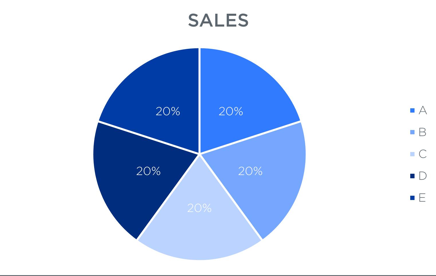
PIE CHARTS
Titles should be all caps (capitalized) Gotham Medium font using the primary Rosendin blue or Rosendin grey colors.
Legend’s text should be Gotham Light font in the primary Rosendin blue or grey color, preferably matching the color used in the title.
If used, data labels should be white,
Pie section colors should be a solid fill of any Rosendin branded colors. Can be a gradient of a branded color, or a mix of branded colors. Use discretion on lighter colors if using white data labels.
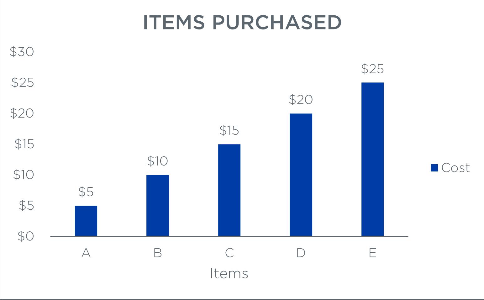
BAR GRAPHS
Titles should be all caps (capitalized) Gotham Medium font using the primary Rosendin blue or Rosendin grey colors.
Axes, axis titles, data labels (if used), and legend’s text should be Gotham Light font in the primary Rosendin blue or grey color, preferably matching the color used in the title.
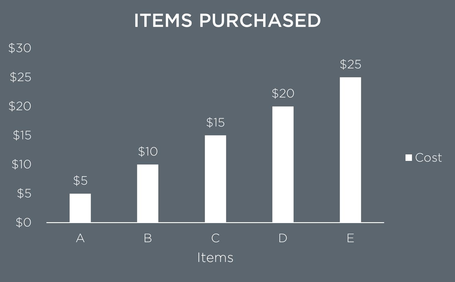
Titles should be all caps (capitalized) Gotham Medium font in white.
Axes, axis titles, data labels (if used), and legend’s text should be Gotham Light font in white.
Data bars should be a solid fill of any Rosendin branded colors but should not be the same color as the axis, legend and data label text.
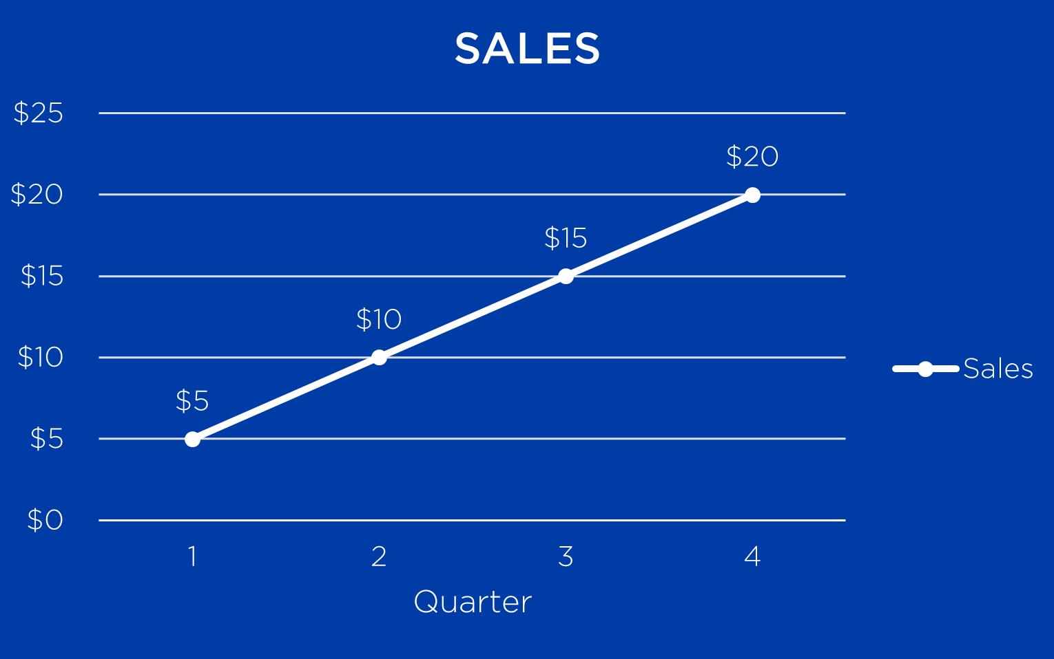
LINE GRAPHS
Titles should be all caps (capitalized) Gotham Medium font using the primary Rosendin blue or Rosendin grey colors.
Axes, axis titles, data labels (if used), and legend’s text should be Gotham Light font in the primary Rosendin blue or grey color, preferably matching the color used in the title.
Titles should be all caps (capitalized) Gotham Medium font in white.
Data bars should be a solid fill of white.
Axes, axis titles, grid lines, data labels (if used), and legend’s text should be Gotham Light font in white.
Background color should be a solid fill of any primary or secondary Rosendin brand color.
Data line should be a
of any Rosendin brand color, but should not be the same color as the axis, legend and data label text.
Background color should be a solid fill of any primary or secondary Rosendin brand color.
Grid lines should be Rosendin grey at 80%.
Grid lines should be white.
solid fill
Data line should be a solid fill of white.
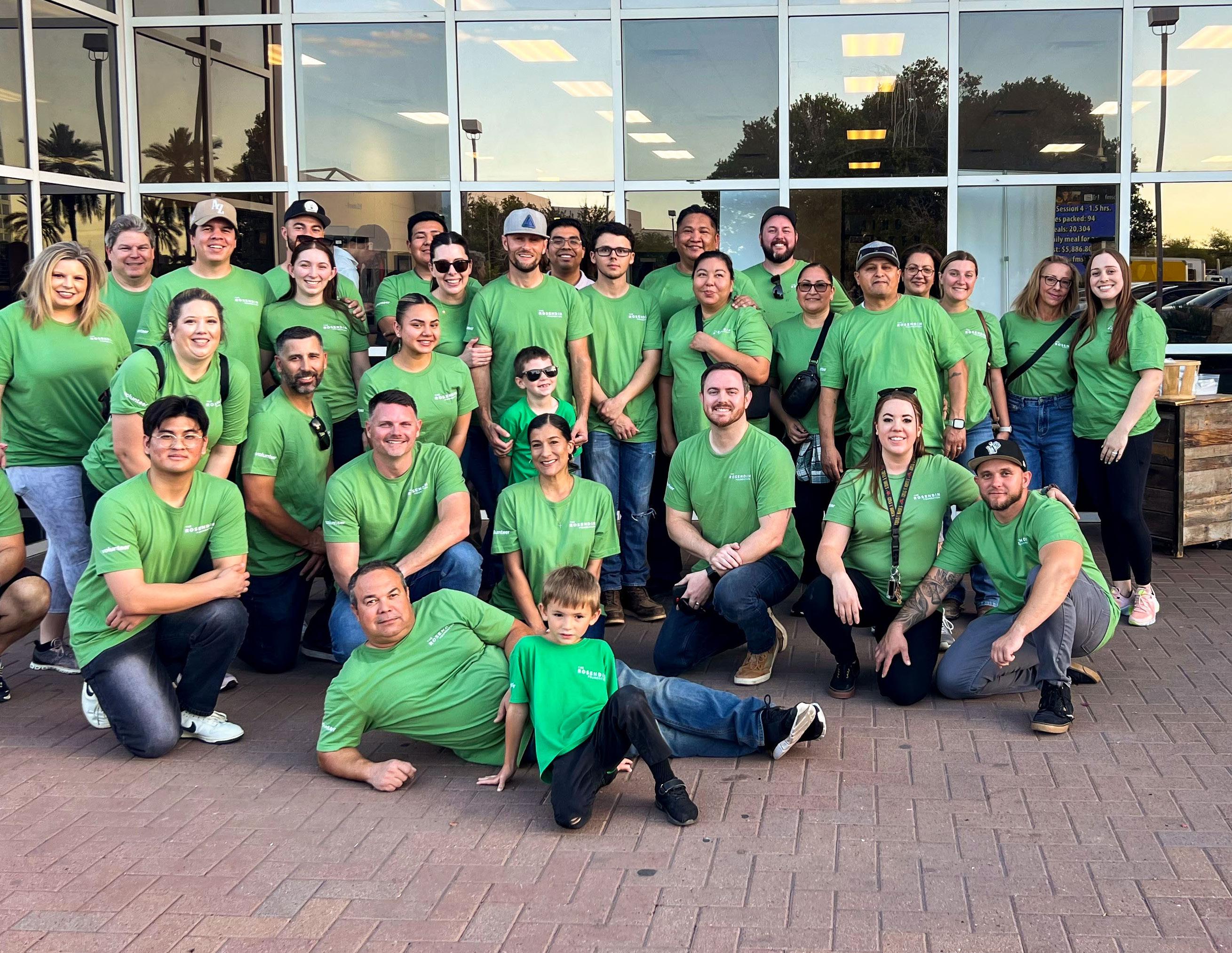
About The Rosendin Foundation
The Rosendin Foundation was formed in 2020 as a 501 (c)(3) charitable corporation to act as the charitable arm of Rosendin Holdings for which all charitable giving would be centralized or guided through. This includes Rosendin Electric, Inc. (Rosendin) and Modular Power Solutions (MPS). Although the corporation is based in San Jose, California, the Foundation provides funding to non-profit organizations across the United States.
The Rosendin Foundation serves as a catalyst to encourage and expand the philanthropic endeavors of Rosendin Holdings and its affiliates’ employees.
Mission
Our mission is to positively impact communities, build and empower people, and inspire innovation.
Grants
All financial grants are made to community-focused non-profit organizations located in the states where Rosendin and MPS currently conducts business. Grants are awarded in support of the foundation’s current focus areas that align with the mission.
Brand Guidelines
The Rosendin Foundation Brand Guidelines is a living document and subject to change. Please visit therosendinfoundation.org to view and download the most current copy of the brand guidelines and logo files.
BRANDING PROOF REVIEWS
For branding standardization and proper utilization, all proofs must go through Marketing approval. This includes apparel, give-aways, promotional items, advertisements, or other use cases.
CONTACT INFORMATION
For any additional branding questions and proof approvals please reach out to: