

Visual Arts Exhibition
2023-2024


RIVERSTONE INTERNATIONAL SCHOOL

2023-2024
Welcome to the 2024 Senior IB Visual Arts Exhibition. The Art Exhibition is an exciting culmination of hours of creating, planning, and executing a wide range of artistic pursuits; each of the students should be immensely proud of what they achieved. Over the past four semesters students worked extensively on building an Arts Exhibition that reflects their individual journey as a working artist. The IB Visual Arts curriculum is a challenging and rigorous endeavor that requires self-reflection, skill development, and learning what it means to be an independent and successful artist.
The IB requires three components for their final IB grade and the Art Exhibition makes up 40% of their overall grade, so the time, energy, and focus on building an exhibition is a major focus of their senior year. Students at SL and HL levels submit for assessment a selection of resolved artworks for their Art Exhibition. The selected pieces must show evidence of their technical accomplishment during the visual arts course and an understanding of the use of materials, ideas, and practices to realize their intentions. Students must also show evidence of the decision-making process that underpins the selection of this connected and cohesive body of work for an audience in the form of a curatorial rationale.
In addition to the Art Exhibition work displayed, please take a moment to investigate the QR codes to see the other two components of their overall IB grade. The links will take you to either their individual Process Portfolio or Comparative Study. The Process Portfolio makes up 40% of their total grade and documents the journey of art-making each student takes over the two years they are in IB Visual Arts. The key to the portfolio is it shows engagement with different media and techniques they experimented with. It also documents the process of creation, includes reflections on other artists & artworks, along with revisions of their work, and gives an indication of their development of ideas
The Comparative Study makes up 20% of their grade and students are required to analyze and compare artworks, objects, or artifacts by different artists. This independent critical and contextual investigation explores artworks, objects, and artifacts from differing cultural contexts. Students use research and inquiry skills to investigate and interpret the selected pieces, applying aspects of critical theory and methodologies to the works examined and presenting their findings as a personal and critically reflective analysis, using both visual and written forms of notation.
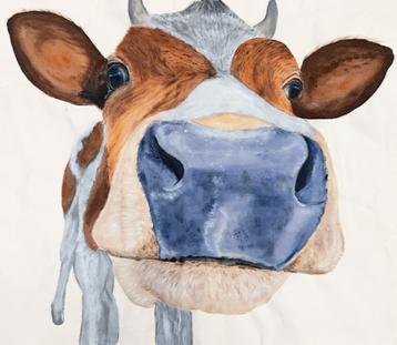
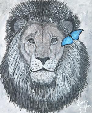
Now, more than ever, it is important to bring attention to the climate crisis that human activity has caused the natural environment to spiral into. While conservation and protection efforts, specifically of certain ecosystems and organisms, are consequential, I have noticed the power in simply educating and exposing the beauty of animals to others. Not only does it encourage one to reflect upon their ecological footprint, but also realizes the unique subjects Earth’s natural world possesses. In my exhibition titled “Untouched,” I explore the idea of a pristine natural environment, unbeknownst to negative human activity. By simply depicting animal subjects, my pieces bring awareness to their peacefulness and mystique, showing the importance of making efforts to reduce climate change. Additionally, much of the work exhibited is “snapshots” of an animal or landscape that cannot necessarily be captured in a picture and are a representation of a memory. With this in mind, the notion that nature cannot be replicated or created by humans is communicated, emphasizing the safeguarding and sustainment of current ecological communities. Based on these concepts, I hope to convey to my audience the value of the natural environment and promote the conservation of it.

Another piece that exemplifies the concept of “Untouched” is Peaked Peace. Growing up, I have fond memories of spending time at my grandpa’s ranch in the Sawtooth Valley. There is a distinct image in my head of these peaks bathed in the light of a sunrise, hence what is depicted in the painting. This memory cannot be altered and consists of only untouched nature. Furthermore, the pottery mug collection Sea Summit continues similar concepts. I used clay for my pottery which is a material sourced from the ground and is a direct representation of involving the environment in my work. This media’s significance shows peoples’ reliance on resources from the earth and that without materials like clay, humans would not even be able to create simple things such as dishes. In extension, the varying diagonal blue hues on the mugs display giant waves, or “sea summits.” This design symbolizes my experience on a service trip in Costa Rica, performing tasks such as beach clean-up to protect the ocean
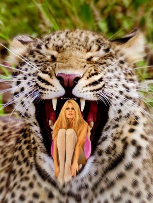
Alternatively, the title “Untouched” interprets my exploration of new media. Initially, I was set on only creating drawing exhibition pieces as this was the medium I was most comfortable with. However, as I was determined to work out of my comfort zone, I experimented with mediums such as painting, pottery, and etching. My Art Exhibition resulted in including many of these new mediums that were “untouched” before I took Visual Arts. One piece that relays the theme of my Art Exhibition is Panthera. This watercolor and pen piece depicts an up-close profile of a leopard with striking green eyes. Not only does it show the beauty of the animal but portrays an unlikely interaction with one. The composition of this piece represents how I think I would remember the animal if I were to encounter it, a specific moment from a fabricated memory. By creating this snapshot, I exhibit the intensity and wildness of a leopard, portraying a perspective many may never see in real life.
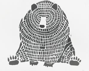
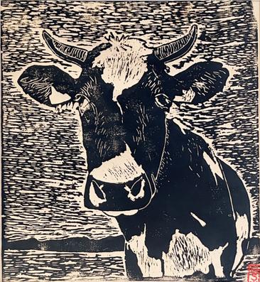
For the set up of my Art Exhibition, I was allotted three panels and a table to display my pottery. As the mugs and plates are 3D, I chose to display them on a table so viewers have the opportunity to observe each piece from various angles. This allows one to truly appreciate the process of turning a block of clay into a recognizable and usable object and a piece of art. For my other pieces, each will be hung on a panel with a specific intention. The first panel will exhibit two pieces that are created with scratch-off paper that resulted in a monochromatic look. These pieces exemplify the details of each subject, zebras and a tiger, through the use of negative space. The second panel displays pieces that have a tie to my local natural environment in Idaho that I have been exposed to since I was young. Lastly, the third panel possesses two big cat pieces that have the same close profile composition of the subject’s faces.
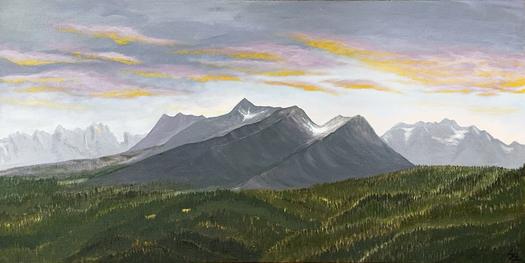 Edwin Lewis Peaked Peace
Through this Art Exhibition, I wanted to show how art can be very unserious and at times have no particular meaning. Art is in the eye of the beholder. A lot of the time creating art can be very intimidating and finishing a piece can be the hardest task in the world With this Art Exhibition, I wanted to show the fun and sometimes random parts of art. The title “Weird but Cute” stems from the bizarre array of artwork and how it's random but still cute The art pieces I chose for this exhibition are all over the place; there's lino-cut work, watercolor and ink, and digital collages. With watercolor and ink, I was able to manipulate colors and try out different brushstroke techniques. Digital collaging helped me to see things in a different way, and I was able to get creative with it Lino-cut was one of the very first things I was taught in my Visual Arts class and it taught me to make very precise decisions. Working with different art mediums has helped me grow and form as an artist
collaging allows is endless, you can take one thing and make it another with just a few edits. Maisie Kane is my biggest inspiration not only when it comes to collaging but also when it comes to being creative Her work pushed me to try new things artistically and to not get too much in my head about certain decisions. Without the help of these two artists this Art Exhibition would not be what it is.
I think what's cool about this Art Exhibition is that there are not many similarities when it comes to each piece Each piece just highlights the things I was going through at the time of making the piece. My overall vision when it comes to displaying these pieces is to make sure to give enough space between each piece so that one doesn't distract from another
Every piece shows a small part of my learning journey through the years. The bright yellow house was one of the first pieces I was genuinely proud of. It’s one of the first pieces that I've ever finished. The inspiration for that piece allowed me creative freedom with the coloring and placement of all the little details. One of my biggest inspirations when it comes to watercolor and ink is Matt Russel. Matt makes realistic pieces while still adding his own unique flare. Digital collaging was by far my favorite of all the mediums that I tried It allowed me to take a copious amount of pictures and make them one. The creativity
 Process Portfolio Comparative Study
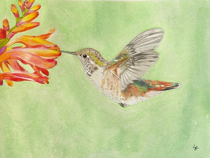
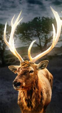
Glowing Elk
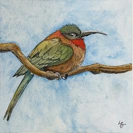
Serene
Process Portfolio Comparative Study
Glowing Elk
Serene
Artist Statement
My Art Exhibition relates to the artistic idea of creative perception and interpretation, also known as “Artistic Insight”. Throughout this Art Exhibition, I invite viewers to explore the diverse ways artists such as myself see and understand the world, and how the artwork reflects my journey with art for the past 2 years that I have been pursuing it; discovering new ideas and perspectives throughout the journey. My inspiration comes from a variety of sources, from realworld occurrences to major contributors such as social media and the internet. All these various sources of information contribute to who I am as a person and what I do daily. Consequently, I invite the viewer to recall or realize the effect and impact such external forces can have on a person and to rethink how complex a singular person's thoughts can become all through viewing the various range of artworks that I have created. A genre of art I enjoyed working with was the stencil and spray paint genre in which I created two pieces. The first piece was influenced by its overall impact and my longterm relationship with the music and artist’s album. Since it is such a large part of what I represent I wanted to include it in my Art Exhibition, With that in mind my second stencil was a continuation and personal spin on the first stencil. I changed the stencil to include a version of myself to express the importance and impact that this music and artist has had on who I am as a person. Moving forward to another personal favorite and meaningful art piece is the beaded shoe that I have completed. This beaded shoe is
significant to me because it represents my background which is of Hispanic origin and this technique that is used on the shoe represents the traditional Mexican Huichol method of beading
Since I plan to make this Art Exhibition to represent myself I will be using my creative vision to help me place art in which looks good to me. This unorthodox method of artistic placement can attract more viewers but hopefully, also give a hint to the audience that there is more here than presented and requires a deeper dive and analysis.
 Process Portfolio Comparative Study
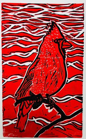
Red Cardinal Me
Process Portfolio Comparative Study
Red Cardinal Me
Artist Statement
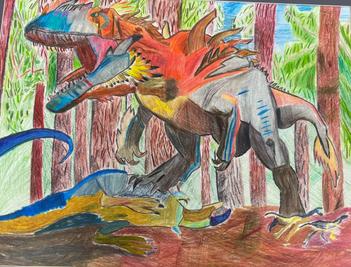
My Art Exhibition is called Monsters in Media, and it focuses on monsters in various forms across media and folklore.
Monsters appear in a wide array of media and appear in a wide variety of forms and can be used to convey a ton of different emotions and meanings. I enjoy various media with monsters, and I enjoy reading myths and folklore on monsters so I figured doing my Art Exhibition on this would be a good idea. The main artists whom I drew inspiration from were Neytrix and Robert Swanland. These two artists do a lot of art that has a lot to do with monsters as Neytirix is a popular online creator and Robert Swanland has made a lot of art for the game Magic the Gathering.
I used a wide array of materials for my art pieces and created art in a lot of different mediums ranging from colored pencil, digital art, ink, normal paintings, and miniature paintings, to clay sculptures. The reason why I did this was because I wanted to learn a bunch of different types of mediums to work with to challenge myself to learn more and to find the type of art that fits me the most. Each piece is important to me because I put in a lot of time and effort to learn a new medium despite my disabilities like my dysgraphia.
I have a vision for how I want to display my artwork, I want it to be a little chaotic and almost scattered but for it to be

organized as well. The reason why I want this organized chaos is because it fits not only the wide variety of art that is up on display but also the art itself as it represents what monsters are, chaos and chaotic nature. Monsters as a whole represent the darker aspects of Humanity and what humans are, monsters are born of our greatest fears and insecurities. So, it makes sense that the organization of my art is chaotic in nature to represent this.
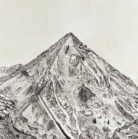
My Art Exhibition is representative of my creative perception of the world. It shows how I perceive and then creatively change a concept or idea into something that fulfills my creative vision My process and inspiration often come from the outdoors Once I find something intriguing or interesting within the places I visit or things I see on a day-to-day basis involving the outdoors I come up with an idea on how I can express this intriguing “thing” Hence the name “Perceptive Abstraction” I perceive and then abstractly create a piece centered around the said thing within that environment I aim to always push past the boundaries of myself and others trying to broaden how we see the world Most of my pieces are mountains and trees, the abstract nature of my work allows me to see and appreciate them differently than if I were just “seeing them”.Through drawing or editing pictures of these landscapes I focus on all the details giving me a further appreciation. In presenting this body I hope to show others how I interpret and further appreciate the places I value and spend my time in.
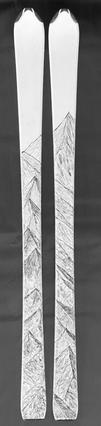
All my pieces are centered around the outdoors and my interactions within them. Most of my artwork is inspired by mountains. My most pivotal piece which was created at the start of my 11th-grade year, MorningSide Reflections, was one of the first largescale abstract landscape pieces This was the start of my obsession with drawing mountain landscapes My later mountain drawings included more realism and depth each time focusing on going bigger and better than any project before This eventually led to other mediums and techniques as seen in Carved Peaks and Rippled Perspective My three collections of photographs aim to convey the emotions and perceptions I experience associated with the things/places/objects within the photos Photography was my initial forte giving me a good basis of understanding artistic elements/fundamentals. These understandings helped me later on in my drawings and landscapes.
The arrangement of my Art Exhibition shows my progression and my interests as they morphed and changed along with my creativity. Starting on the left my 3 collections of photos show my initial fascination and obsession with photography. I chose 3 collections of photos using a wide range of techniques and styles
showing the different types of photography I explored. In the middle, I showcase my landscape mountain drawings and a large-scale canvas drawing. This was my next obsession and I wanted to put it in the middle as these are the ones I'm most proud of. These arguably took the most time and effort due to the amount of fine detail and pen work. Choosing to put my most timeconsuming pieces at the top and the least at the bottom I wanted to encourage viewers to spend more time looking at the higher-effort pieces Generally, these pieces on the top were the ones I was most proud of and therefore wanted at eye level On the right, I showcase my more abstract mediums including 3d metalwork and my drawings on skis I chose to put these on the right as they were more recent and more out of my comfort zone This order left to right also shows my development and timeline for my artwork It follows the succession in which I created and was interested in each different type of art style This allows the viewer to follow my progress and journey showing how my creativity, understanding, and ideas built upon each other.
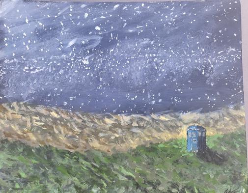
Within my life and the gallery space of this Art Exhibition, my identity intertwines seamlessly with the vibrant tapestry of visual arts. Each stroke of the brush, each sculpted form, and every curated composition serves as a reflection of the symbiotic relationship between my innermost self and the visual media that fuels my creative spirit. Visual arts have been my compass, guiding me through the labyrinth of personal expression and artistic exploration. From the dynamic panels of comic books to the expansive landscapes of science fiction cinema, visual media has been the fertile ground upon which I cultivate my artistic vision. Through beloved franchises such as SpiderMan, Dune, and Doctor Who, I've discovered not only captivating narratives but also profound mirrors reflecting my own identity and experiences. These visual narratives serve as catalysts for introspection, igniting sparks of inspiration that manifest in the strokes of my brush and the forms of my sculptures.


diagnosed with ADHD-PI (Primarily Inattentive). This not only explained my struggle with attentiveness but also revealed why for all of my life I would have extremely strong connections with a topic for amounts of time. My art follows this path of hyper-fixation, each piece represents not only my biggest interest at the time but also my mental state. Some pieces contain the same inspirations representing my biggest hyper-fixations, and also my most common mental states. Many of my pieces feature Dune or Doctor Who, things which define not only me as a person but on my outlook on life at that direct time.
Embedded within each artwork in this Art Exhibition is a mosaic of influences, seamlessly woven into the fabric of my artistic expression. Whether through the vibrant hues of a painted canvas or the intricate details of a sculpted figure, I channel the essence of my favorite visual media into every creation. The vibrant colors of comic book panels dance across my canvases, while the otherworldly landscapes of science fiction films inspire sculptures that transcend the bounds of reality. Each piece is a testament to the fusion of personal passion and creative vision, inviting viewers to embark on a journey through shared cultural touchstones and personal narratives.
One of the things in my life which defines not only the way experience but also how I live is my ADHD diagnosis. I had always struggled with paying attention, it wouldn't matter what the situation was if it didn't directly interest me I could not for the life of me keep focused on it for long amounts of time. For years this went on with no explanation, and I had tried everything to combat it. But in my freshman year, I was
Throughout my arrangements, I don't attempt to convey a pattern of display but rather I display them as I feel like they would look best. While it might not seem organized to an outside viewer, to my brain the organization makes sense and not only reflects how I feel these pieces would be displayed best but also how my mind organizes itself.
In the culmination of this Art Exhibition, I hope to not only inspire but also provoke introspection and dialogue. Through the visual arts, I've found a language through which to communicate just how my mind experiences life and how ADHD not only sculpts my interests but also my experiences. As viewers engage with each piece, I invite them to embark on their journey of discovery, where art becomes not merely a reflection but a catalyst for personal growth and understanding. In this shared space of creation and expression, may we find connection, inspiration, and a renewed appreciation for the transformative power of visual storytelling.
Throughout my DP Art experience, I have struggled to battle my perfectionist ideology. When I first began my art journey, I initially wanted to create pieces, focusing on hyper-realistic wildlife art.
During this time, I thought and felt that art needed to be perfect, but I learned that this was harmful to my creative process. Perfectionism is inherently subjective and intangible. What others may perceive as flawless may not meet my standards and vice versa. It's a concept influenced by an individual's expectations. Furthermore, the pursuit of perfection often leads to an endless cycle of dissatisfaction, as the idealized standard remains elusive and ever-changing. Its intangibility lies in the fact that there's no concrete definition of perfection that applies to all aspects of life. Instead, it morphs and shifts to comply with personal biases and societal pressures, making it a subjective pursuit. I learned that this perfectionist ideology resulted in creative block, anxiety, procrastination, and the feeling of never being satisfied with my work. It was not until I broke out of this mindset that I was able to expand my artistic abilities and skills. This Art Exhibition is titled ‘Breaking Boundaries’ as it embodies my journey of branching out of my comfort zone and combating a limited work mindset. I learned that fighting perfectionism means embracing imperfection as an essential part of the creative process. Therefore, I had to shift my mindset, to recognize that art is a journey of exploration and growth rather than a quest for flawlessness. By embracing mistakes as valuable learning opportunities, I was able to open a door to experimentation and spontaneity, by focusing on styles that were not limited to realism. In letting go of rigid expectations and embracing the beauty of imperfection, I embraced my true creative potential and found joy in the process of making art.
pyrography, caulking, and digital art. This unique aspect of my Art Exhibition is significant because it displays who I am as an artist, meaning that I want to push my boundaries, challenge myself, and break away from the restrictions of perfectionism. It also shows my journey as I transitioned from hyper-realism to abstract media where I began to experiment and try different mediums and techniques. This experience allowed me to push myself and continue to develop different skills as an artist.
While all of my pieces are similar in that they display wildlife, they differ stylistically as all of the pieces are made with different media. Pieces such as ‘Sher,’ ‘Blueface Baby,’ and ‘Whatcha Mooin’ are straightforward in that they were made with acrylic paint, watercolor, and colored pencils. However, pieces such as ‘The Golden State,’ ‘Under the Sea,’ and ‘Connected’ are all made with unique media including
The arrangement of the Art Exhibition serves as a communicator of my intent, which is to display my art journey and personal development. Each placement and spacing is to guide the audience through an immersive experience. The title is boldly emphasized front and center on the middle panel. I then arranged each piece meticulously to showcase the various mediums and media. Therefore, I intentionally chose to separate the pieces so that similar mediums were not placed to one another. For example, the left panel displays an acrylic painting, a digital art print, and a pyrography piece, whereas the right panel displays a caulking piece, an acrylic painting, and a linocut. In the center panel, the top piece is an inkwork, the centerpieces are watercolor and the bottom is scratch art. This spatial relationship is to invite viewers to explore the different and wide range of skills that I have developed, as a result of me releasing myself from my perfectionist mindset. It also allows the viewers to get a glimpse of my creative thought process, and how I can never use the same medium in a row, meaning I like to do something different every time. Ultimately, the arrangement of the Art Exhibition pieces acts as a silent curator, guiding the audience to engage with the art on a deeper level and understand and visualize my growth and maturation not only as an artist but as a person as well.
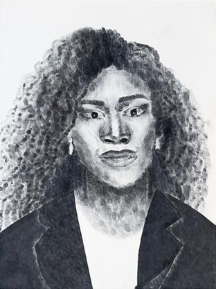
Junior year I knew I did not have the skills nor the interest in painting and drawing which I saw as “basic” art media. I pushed myself trying as many different art forms as I could. While many classmates were focused on painting and drawing I was constantly pushing experimentation, I had fun trying new things even if I did not know what I was doing. The Art Exhibition Comfortable Being Uncomfortable is about exploring a wide range of art media while being able to feel comfortable during the process even tho I had never experimented with almost all of the media used. This is how I found Chuck Close who has been one of my biggest inspirations during this process. He is an artist who is differentiated from other artists because he focuses on multiple different media and develops different skills using these media. Which inspired me to become an artist that also explores different media. One of the unique pieces that Close creates portraits using his fingerprint, which is how I was inspired to create Serena. Creating this made me realize that art is not only about the end result or the opinion of the viewer, is more about the development of artistic skills, and the process it took for the artist to create the piece. This has resulted in me being able to have been able to have the confidence of being comfortable while creating art pieces with fingerprints, linocuts, wood bruins, plaster, scratchpad, and acrylic, showing that there is no limit to mediums and media you can use during the creation of art and that my creations that might be different but also can be seen as “good” art. Building up my comfort level, now four semesters my Art Exhibition shows the depth of my willingness to try new artistic films.
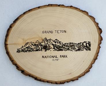
s acrylic paint, scratchpad, etc. I have been introduced to and learned a lot across the board about art materials and developed multiple new skills. Grand Teton National Park and Mount Everest are intentionally chosen to be created on a real sheet of the wood trunk. Using natural materials were able to visualize, feel, and smell nature. All my works are influenced by personal experiences, inspirations, or goals. Turtle which I created after my experience of being able to observe a sea turtle in the wild. Fun Parks in Zillertal and Skifaren in Zillertal were inspired by my going skiing in Zillertal, Austria since I was 5 years old. Serena which I created a portrait of Serena Williams because she is my biggest tennis player inspiration. And Mount Everest which is my goal to visit this natural wonder of the world. Within this Art Exhibition, the viewer can tell who I am as a person, my personality of loving the outdoors, playing tennis, and love for animals, this while expressing my willingness I have to push myself.
Every piece in the Art Exhibition exemplifies the fact of my journey as an artist and my willingness to explore the challenges of new media. Serena is pivotal to the rest of the piece because it shows the start of the media exploration. Even though there might not directly be seen in one progress there is because with each piece I get more and more comfortable being uncomfortable. Having used ink to tamp fingerprints, lino cut tools, a wood burner, plaster,
At first glance, the viewer may not recognize the connection between the pieces, but understanding my goal of trying new media, the variety of art shown should give the viewer an understanding of who I am and my willingness to explore and push myself. Although the viewer may not know me as an individual - my artwork shows my passions and interests. The arrangement and the viewer's relationship of the Art Exhibition has been with main focus on Serena which showed me that I can create something different that I like the result of and the process, when compared to trying drawing and painting. My overall vision for presenting this body of work is that I have a space for every person who visits the exhibition to stop by because there is such a wide variety.
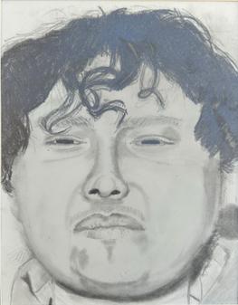
 Hailey
Serena
Hailey
Serena