


What do we know about urbanisation and its effects on mental health?
Cities are associated with higher rates of most mental health problems compared to rural areas: an almost 40% higher risk of depression, over 20% more anxiety, and double the risk of schizophrenia, in addition to more loneliness, isolation and stress (UBMH, 2022).
The reasons can be attributed to a range of reasons, from preexisting risk factors from a change of environment, social factors such as lack of social cohesion and prejudice, and environmental factors such as overload (Milgram, 1970).
In the past ten years, research has shown that there are biological factors that contribute to the increased risk of mental struggles when growing up in the city. More predominantly, there is an increased size of amygdala and pregenual anterior cingulate cortex (pACC) which help identify threats and regulate stress respectively (Haddad et. al, 2015).
Yet the relationship between the two parts of the brain is weaker, which implied that individuals who grew up in the cities have a weaker ability to process and control emotions (Benedictus, 2014).


Reliance on pets to improve mental health (Gary) Physical activity such as hiking, going to the beach or park (Riley) Social media and online content

the problem lens - individual problem statements (Appendix A)
"Commuting & Mental Health" by Sarah Jeremiah

Commuting has been ranked as 'the most miserable part of our day' (Useem, 2021). It can be stressful because of how it disruptive it can be to our daily routines and state of mind - whether it is because of the 1. crowds and noise, 2. delays, or 3. additional time needed to travel between places.
Because using one's devices is already a common behaviour, there is opportunity to explore how devices can be used to promote a sense of productivity and create positive experiences for individuals who feel that commuting is a troublesome part of their day.
"The Impact of Sound Input on Mental Wellness in an Urban Landscape" by Riley Leong
Living in the city can be an overwhelming experience. Cities cause an increase in stimulus levels because of their density, pollution, crowding and noises, which can lead to a psychological effect known as 'overload' (Milgram, 1970). Overload then leads to heightened levels of arousal, stress, preparedness and anxiety, which can be reflected in symptoms such as social withdrawal and general unhappiness.
Current interventions include the use of headphones to tune out urban sounds, or to travel in quieter and more peaceful environments in nature.
Hence, there can be further exploration into making peaceful environments portable in one's devices, and to encourage grounding practices to recentre an individual's mind in a stressful urban environment.
Looking through the problem lens, we were able to draw two major insights that helped converge our research. This is a convergence of two of our initial projects (Sarah and Riley) (Appendix A).

Urbanisation Crowds
1.
Crowds are a source of stress while commuting within an urban environment. Stress is perpetuated through: Sounds
"Alone" time taken away because of physical proximity to others A lack of sense of control over commute issues
Headphones and sound interventions Avoidance of crowds
Lack of sense of control over external factors and stimuli
Crowds (Sarah)
Noises & Sounds (Riley)
2. Sounds of the city causes overload, which leads to psychological symptoms. Two of the top sounds of annoyance are:
People related sounds, such as people chatting Vehicle sounds, such as ambulances and engines of buses and wheels on train tracks
Headphones and sound interventions
Moving away from sounds of annoyance
Gaining knowledge of external factors that may impact internal state of mind Using and controlling self-regulation and intervention methods Resolutions
Noticing and noting crowded times and avoiding Planning ahead Headphones
Avoiding and escaping situation altogether


In order to mitigate the stresses of the urban environment, individuals often either 1. turn to immersing themselves in a natural physical environment such as the park or the beach and ocean or 2. make use of digital interventions such as social media and music to distract themselves.
While specific choices to relax are personal, there is a common pattern in the general approach to feeling less stressed. In a busy schedule of an urban dweller, it is most common for one to turn to portable and convenient sources - which is to pull out their headphones to listen to music or to scroll mindlessly on social media. Hence, there is opportunity in encouraging people to fit in mindfulness activities within their day as a possible alternative, rather than to use behaviour that encourages dopamine imbalance.
Animals play an important role in ameliorating the effects of potentially stressful life events, reduce anxiety, loneliness and depression (Healthdirect Australia, 2021). Within the urban environment, many individuals house pets that bring them comfort. Particularly during the pandemic, lockdowns have resulted in owners relying on their pets to bring them joy.
The physical presence of pets - the sounds of a happy dog, or the vibrations of a purring cat have contributed to an elevated positive emotion. Therefore, we hope to translate the physical vibrations of animals - cats in particular - into a minor part of our final solution.

Reliance on pets to improve mental health (Gary)
Physical activity such as hiking, going to the beach or park (Riley)
Digital interventions
Social media and online content Music
- consolidated
Looking through the solutions lens, we were able to draw two major insights that helped conv our research. This is a convergence of two of our initial projects (Gary and Riley) (Appendix A).
1.
Shifting state from stressed to relaxed
Future solution should be accessible
Future solution should be integral to everyday interactions and convenience Future solution should not feed on social interactions that fuel dopamine spikes
Recreating sensory experience that helps restore peace
Grounding practice through: Focusing attention
Encouraging self-regulation strategy Nurturing immersion and reflection
Inaccessibility to these pets or venues that bring peace Burden of responsibility of caring for an animal Time-consuming and inconvenient
Physical interventions help reli stress. Physical interventions re to both physical assets and physical activity. Both require a change in more than 2 sensory experiences (such as sight, soun and touch). They include: Interactions with domestica animals in a urban setting Physical activity such as hik and walking that engages w the outside

Reliance on pets to improve mental health (Gary)
Physical activity such as hiking, going to the beach or park (Riley)
Digital interventions
Social media and online content Music
Distractions, rather than long-term solutions
2. Many individuals rely on digita interventions to relieve stress. Un physical ones, digital intervention focus on two main senses: sight and sound. The most common forms include:
Scrolling through social media content or viewing YouTube videos Listening to music or watching music videos
Reliance on pets to improve mental health (Gary) Physical activity such as hiking, going to the beach or park (Riley) Social media and online content


Lack of sense of control over external factors and stimuli
Disarray
Gaining knowledge of external factors that may impact internal state of mind
Using and controlling self-regulation and intervention methods
Crowds
Noise
Noticing and noting crowded times and avoiding Planning ahead Headphones
Avoiding and escaping situation altogether
Shifting state from stressed to relaxed
Future solution should be accessible
Future solution should be integral to everyday interactions and convenience
Future solution should not feed on social interactions that fuel dopamine spikes
Recreating sensory experience that helps restore peace Grounding practice through: Focusing attention Encouraging self-regulation strategy Nurturing immersion and reflection
1. 2. 3.
Since our modern urbanised environment fuels dopamine addiction, how might we use emerging technology to restore dopamine balance through mindfulness practice?
How might we empower individuals with a sense of control through knowledge, of both external factors in the environment, and how that impacts their internal state of mind?
How might we integrate current physical and digital systems for individuals, such that we can recreate a sensory experience conveniently (portability) to restore peace in a stressful situation?
Since
Phase 1: Data Collection User's preferences for commute Physiological data Integration with other systems (apps and smart devices)
We aim to develop an app, available on a smartphone, that integrates current and emerging smart devices - specifically EEG headphones and a smartwatch, to aid users between 15 and 57 (Gen Z, Millennials, Gen X and Baby Boomers, making up the majority of the population today, and observed to be using headphones the most) practice mindfulness in a overly-stimulating urban environment, specifically while commuting.
Mindfulness practice would be encouraged via the interplay of soundscapes and vibrations. We also aim to empower users with sense of control and knowledge by providing them with data on their physiological responses to their environment while commuting, and offer them alternative routes of commute to ease their emotional distress in the urban environment.
Phase 2: Digital Interventions (Soundscape)


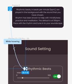
Choice of peaceful sounds or music Adjustment of background rhythmic beats that help regulate anxiety
Phase 3: Physical Interventions (Vibrations)

Use of vibrations in smart devices and headphones Customisation of vibrations Change of routes on commute
Phas Chec
After on m Gathe for fu interv
After identifying the key phases of product development, we mapped out a user flow diagram for a potential persona (from one of our previous A1) who could be using our app. We do this by combining two of our user flow diagrams - one looking at accessing crowd data and choice of commuting route, and the other at choice and creation of soundscapes and the customisation of sounds. Vibrations was the additional feature.
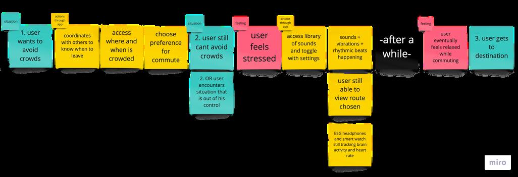

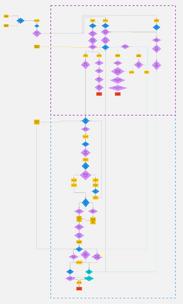
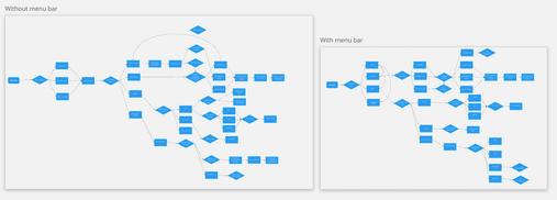
https://miro com/app/board/uXjVPanCeuU=/?share link id=526510196982
SarahJeremah 2022(bottom) RileyLeong,2022(right)
With a clear intention for our user flow diagram, we set out to draw sketches for our prototype. Sketches were important for us to communicate with one another and tie in our ideas, and also gather feedback from one another and other users.
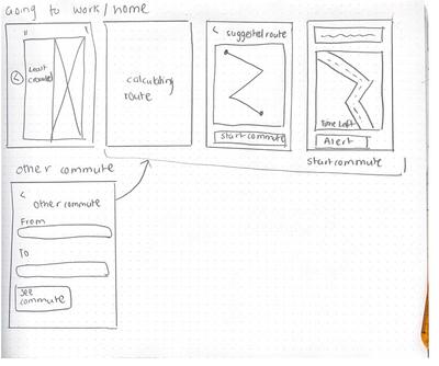
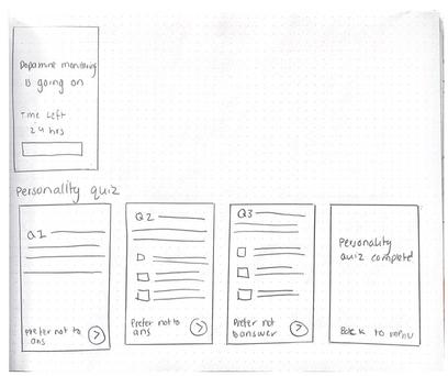
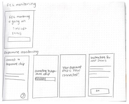
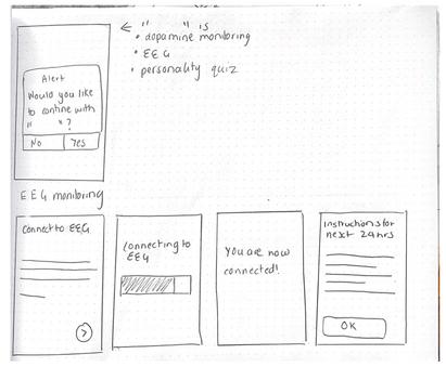
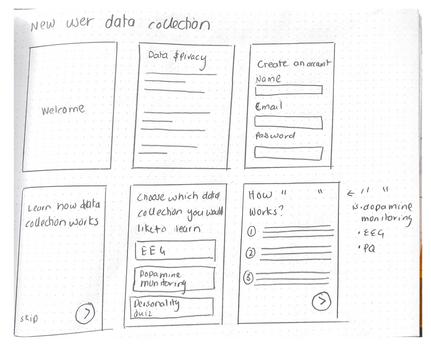
At this stage, while we are ideating for novelty, we knew that it was also important to follow the principle of familiarity - that is, not to veer too far away from the interface of current applications. For example, we drew inspiration for our route-mapping portion from Google Maps, and our soundscape portion from Sensate and Calm (meditation apps).
SketchesbySarahJeremiah, focusedondatacollectonandwayfinding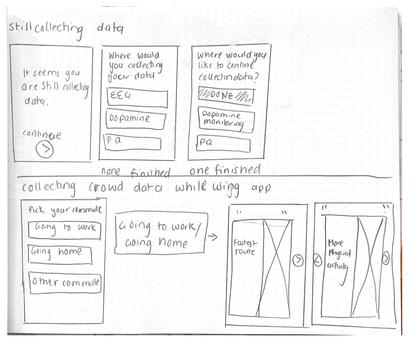
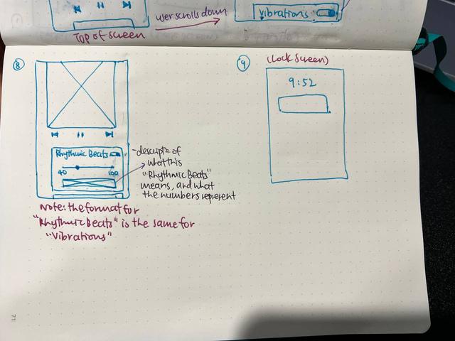
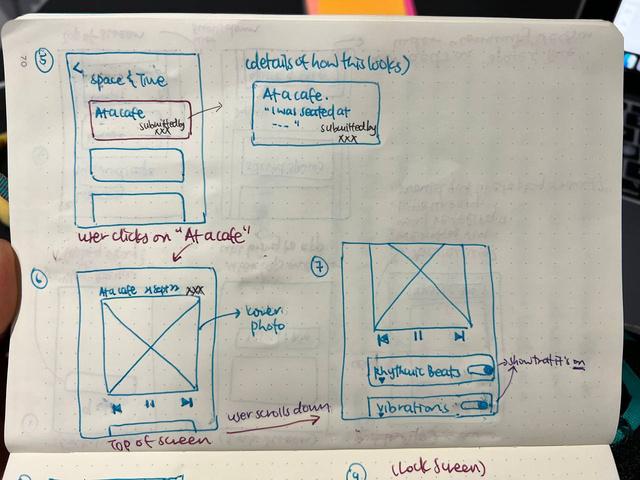
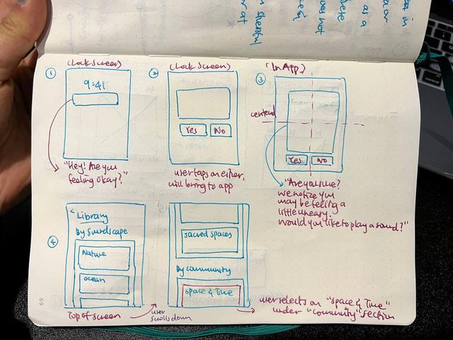
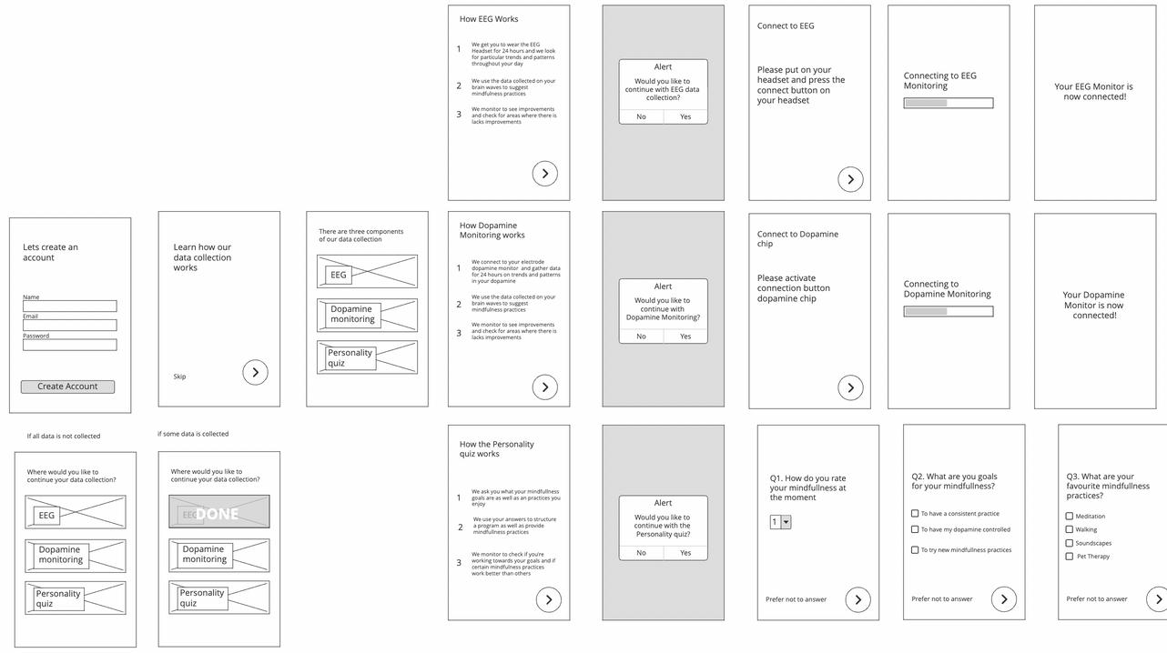
https://balsamiq.cloud/sf1h565/pkws93n
After sketching, we gave one another feedback on our initial sketches, before converting them into wireframes. At this stage, our learnings from the feedback circled around two of the ten Usability Heuristics: 1. visibility of system status and 2. aesthetic and minimalist design.
1. Improvement to visibility of system status
After the user has completed the Data Collection phase, it will be indicated on screen so that it is clear to the user.
2. Aesthetic and minimalist design Intention of information to be centered on the screen and maintained throughout (view next page)
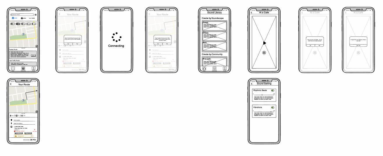
high-fidelity prototype for A2 (Appendix E)
Still keeping those three key features of our interface design, we moved on to developing our final 'High-Fidelity Prototype (V1)'. Through references to other current applications and casual feedback from our peers, we wanted to implement these visual aesthetics on our interface: 1. 2. 3.
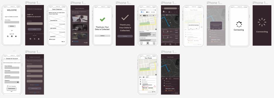

Darkened colour theme - to create a a sense of minimalism and trust, and to reduce the glare and jarring interface (purple is largely associated with audio-related software, and is synonymous with royalty and wisdom).
Sans serif typography - to show a sense of friendliness and reducing formality of the interface Photography - to bridge a sense of familiarity by allowing users to imagine, instead of purely relying on words
https://www.figma.com/file/4dugi7obtxZUGnuyG469uV/soundscape-(group)?node-id=0%3A1 High-fidelityPrototypebyGaryZhang, focusedonwayfindingandsoundscaping


https://www.figma.com/file/4dugi7obtxZUGnuyG469uV/soundscape-(group)?node-id=0%3A1
Given the feedback from A2, we added and modified our 'High-Fidelity Prototype V1' to arrive at our 'Refined Prototype 1', before our Heuristic Evaluation from experts.
We split our modifications into three parts: Miscellaneous; Phase 1: Data Collection; Phase 2 and 3: Digital and Physical Interventions.
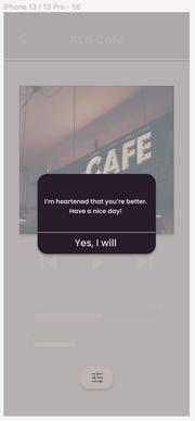
Comments were given on how feedback is given to the user.
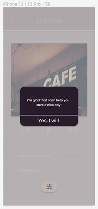
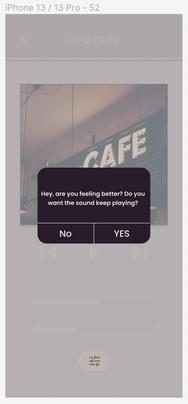
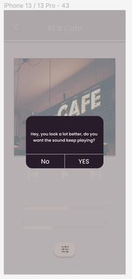
For example, in the first version of our prototype, words like 'Your data is collected.' sounded ominous, and 'You look better.' sounded prescriptive. This could disrupt the trust the user has with the system.
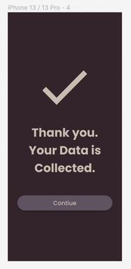
Hence, we made changes to the way these things were phrased, and focused on initiating reflection and a check-in with the user, and to use vocabulary that are more humbling.
before after before after before after

https://www.figma.com/file/4dugi7obtxZUGnuyG469uV/soundscape-(group)?node-id=0%3A1
We felt that there could have been more explicit data collection and privacy standards for our app. Hence, we added and modified an additional page for users to better understand how their data is used and protected.
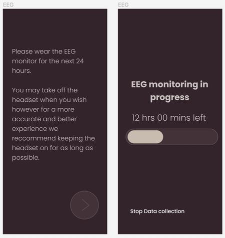
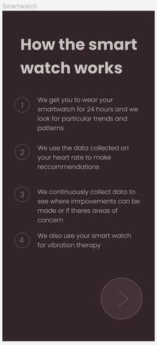
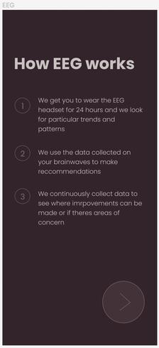

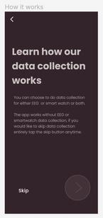
Because we are also having other smart systems integrated together with the app, education and sharing knowledge on how these systems work collaboratively could help users gain confidence in navigating through the app.
Particularly when other systems are involved, it may not be intuitive for users to know how to integrate all of them together. Hence, we created explicit instructions for users, so that there is less room for doubt for how the app works.
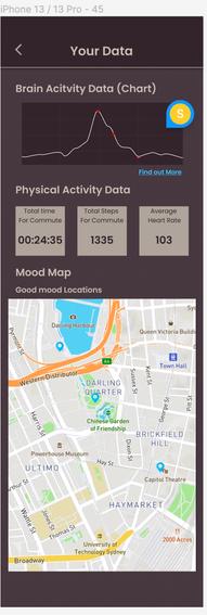
https://www.figma.com/file/4dugi7obtxZUGnuyG469uV/soundscape-(group)?node-id=0%3A1
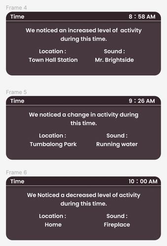
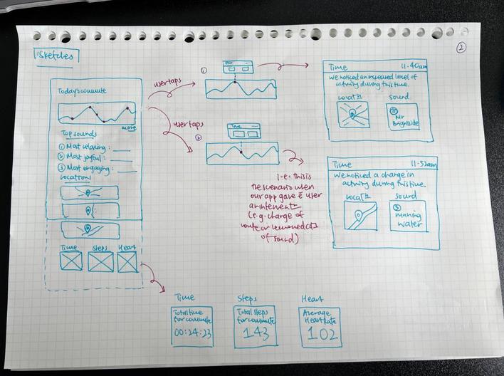
One of our HMWs focuses on empowering individuals with a sense of control through knowledge, of both external factors while commuting, and how that would impact their internal state of mind. Besides that, it is also about being aware of how changes - whether digital or physical interventionscould ease their distress during commute, and that they could eventually habituate these practises.
Hence, we drew up sketches for these data visualisations, and converted them to high-fidelity prototypes that we would want to test for our Heuristic Evaluations.
https://www.figma.com/file/4dugi7obtxZUGnuyG469uV/soundscape-(group)?node-id=0%3A1
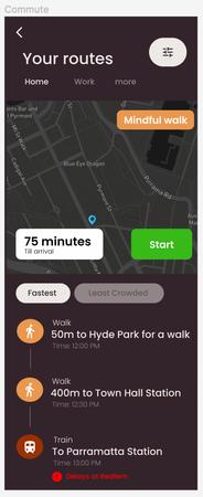
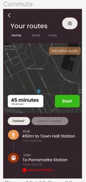
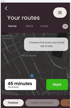
One of our key features include users' preference for the route for commuting. From our previous version, it wasn't as clear how user could input that choice, and how they could go on a mindful walk that encourages a grounding practice. Hence we added and modified the commuting screen such that users can toggle on and off, and make changes to their routes if they want to.
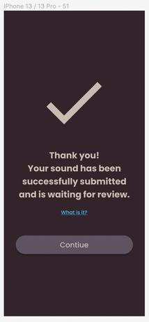
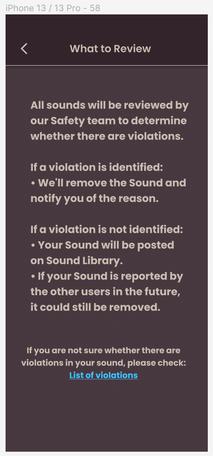
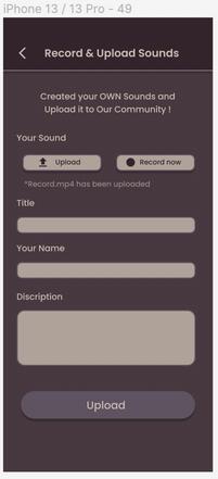
We were experimenting with the social interaction aspect of our app. The feature that we wanted to create was the possibility for users to upload their own sounds that brought them peace and had grounded them. Hence, from one of our ideas from A1 (Riley), we incorporated this element in more explicitly. The ethics and security of uploading were also considered, and the safety net of reviewing these sounds was added.
choice of 'fastest' and 'least crowded' routes toggle on and off 'mindful walk'


Heuristic evaluation was useful in helping us identify usability issues from a broader perspective - it covered breadth.
By taking our design experts through the main flows of our system, we could identify the minor issues.
Based on the feedback we gathered, we then went through data analysis, categorising issues based on the three lenses - first-timer user, direct interactions, and intervention of technological system. This was useful in helping us refine our product in stages.
Through the seriousness of usability violation indicated by our experts, this also helped guide us to sort them out in levels of importance. We also prioritised refinement based on several criteria - how quickly the modifications can be made, how big of an issue the violation was, and how important the issue was in aiding a new user interact with the system.
https://miro.com/app/board/uXjVPanCeuU=/?moveToWidget=3458764535811275460&cot=14
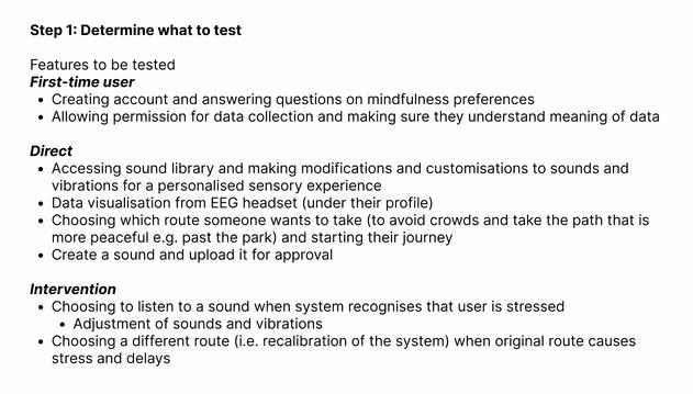
The first step for heuristic evaluation was to develop the features to be tested for the design experts.
Tasks of a first-timer user
Singular and direct interactions of a user with the system (user as first initiation of interaction)
By referring back to the the user flow diagram we have developed before, we split up our features into three main parts: 1. 2. 3.
Automatous intervention of the system based on user data (system as first initiation of interaction)
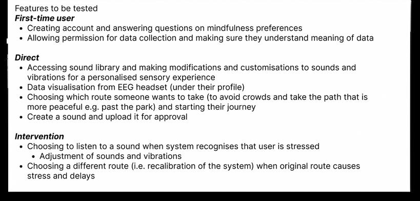
From these umbrella parts, we then generated the more specific user tasks in each of these categories. Ideally, we ensured that all the user tasks covered all parts of our app and its afforded interactions.
The final user tasks are indicated here:
https://miro.com/app/board/uXjVPanCeuU=/?moveToWidget=3458764535811275460&cot=14
During the heuristic evaluation itself, we had our design experts run through all the interactions, and input their score for usability violations on a PDF file on Figma.
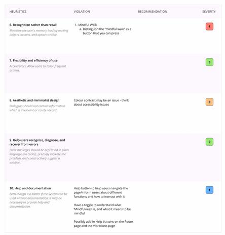
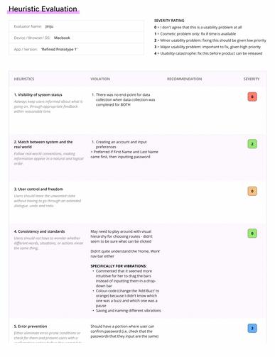
However, we realised that having them break their train of thought to fill in the form, while interacting with the system AND talking to us at the same time, seemed inefficient. Hence, we adapted by having them run through the interactions while also thinking aloud and vocalising feedback along the way.
On our end, we wrote down these comments and helped fill in the heuristic evaluation form together with them after. We made sure that their focus was giving a score on violations, and recapped the comments they had made along the way, so as to ensure that data was accurate.
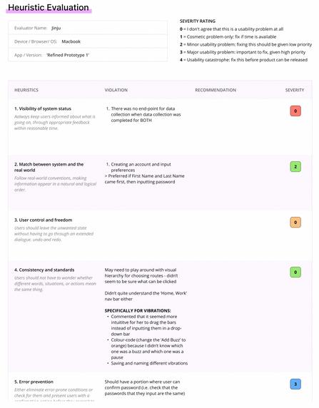
Screenshot of Heuristic Evaluation done together with one expert
https://miro.com/app/board/uXjVPanCeuU=/?moveToWidget=3458764535811275460&cot=14
We gathered five design experts to conduct our heuristic evaluations.

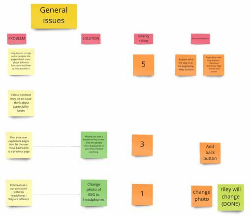
There were some solutions suggested by our experts, but the bulk of the comments indicated problems, rather than solutions. Nonetheless, we brought all comments onto a Miro board where we analysed data by this process:
We had four main categories which helped us group similar issues together.
These four categories were our 'umbrella' Features that were used to create user tasks for our testing - 1. for first-timer users; 2. direct interactions from users; 3. system intervention and 4. general issues.
The severity rating was decided together as a group.
Based on our experience as designers, we decided based on how much it impacted a user experience while using our app. Our key focus was ensuring that the app was understandable and easy to use at this point, above minor changes such as its aesthetics.
After looking at solutions suggested by our experts and looking into secondary sources that have similar concepts to our app, we created 'recommendations' - changes that we can make to refine our app.
Moving forward, based on 1. ease of implementation of changes and 2. severity of the issue, we found a balance to start making refinements, and allocated the responsibilities to each group member.
grouping issues putting a severity rating generating recommendations
iteration 2: expert-based testing (heuristic evaluation) - data analysis (Appendix H)
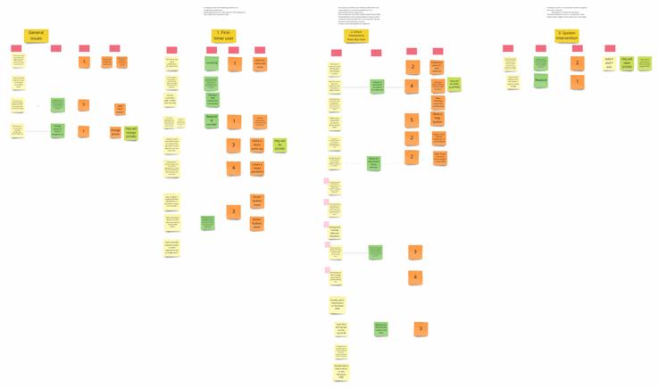

https://miro.com/app/board/uXjVPanCeuU=/?moveToWidget=3458764535811275460&cot=14
Several comments made circled back to the lack of clarity on how the user understands and should use the system (e.g. how to create your own vibrations, meaning of routes in way finding page)
Hence, it was crucial for us to further develop help buttons, definitions, tutorials and guides that indicate to the user how they can use the system.
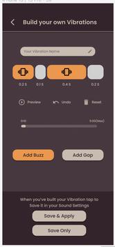
Example 1: symbols and colour-coding to indicate affordances for users
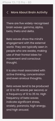
Example 2: definitions of brain wave activity to understand what the data means
Example 3: hidden definitions rhythmic beats for users to understand significance of rhythms to mindfulness.
 Screenshots of Miro Board for Data Analysis
https://miro.com/app/board/uXjVPanCeuU=/?moveToWidget=3458764535811275460&cot=14
There were points where the system status did not accurately depict the completion of a user task (e.g. completing data collection). Hence, it reminded us to be meticulous in catering to all possible user tasks and actions. We had to delve deeper into developing our logic tree.
Back buttons and the retyping of password were two issues that were recognised by our experts. Without these, they felt insecure going forth with using the app. Hence, the creation of interactions for users to go back, make changes and not fault them for mistakes was also done.
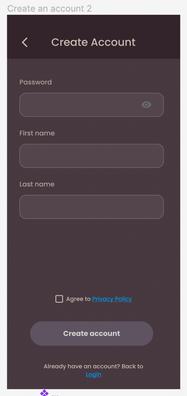
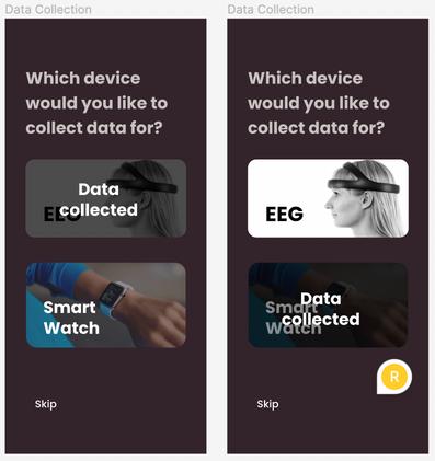
Example (before): despite collecting both data, the users only see only one OR the either collected - and not both

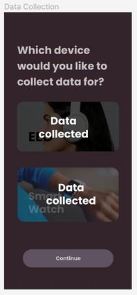
Example (after): worked out the logic tree and mapped an extra screen that showcases both data collected.
Example 1: (before and after) addition of back buttons and explanation of how the system will work
Example 2: (before and after) requesting users to confirm password to reduce errors
https://miro.com/app/board/uXjVPanCeuU=/?moveToWidget=3458764535811275460&cot=14
There were certain inconsistencies with how our app was laid out and the apps that already exist in real life. Therefore, we took more references from already existing universal principles and reordered information. Other changes included changing colours and adding images.
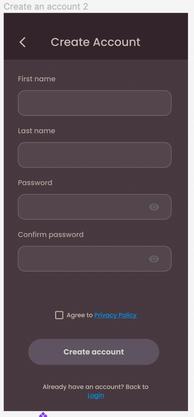
For example, we had users key in their password first, before their first and last name, when they're filling up their information. Experts indicated that it felt strange.
Example (before): users tasked to key in password, then first name and last name
Example (after): reordering of user input to mimic other existing appsfirst name, last name then passwords


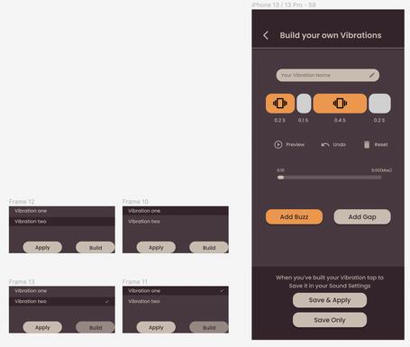
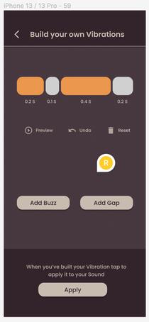
Our group felt uncertain with one of our interactions (and screens) going into the heuristic evaluations - the custom vibrations page. However, through our testing with experts, we had gotten feedback that were helpful in further refinements, and we were better able to flash out what we wanted our next prototype to look like. Hence, we made changes to how a user would interact with this screen to complete their user task and achieve their outcome of producing a custom vibration for mindfulness practice.
Example (before): users tasked to play with screen and figure out how to build their own vibrations
Example (after): clearer affordances using symbols and colour; building more functions; allowing users to save several vibrations


After refinement from our Heuristic Evaluation, The Think-Aloud protocol was conducted alongside a post-session unstructured interview for non-expert users. We wanted to delve deeper into points of hesitation, uncertainty and displeasure when the user was interacting with the system, and how we could improve on that. Hence, by encouraging users to think aloud while performing tasks, we could have a better gauge of our interfaces' affordances, and how we can potentially improve on them.
Unstructured interviews were done post think-aloud. The questions focused on whether the emotions they had while interacting with the app (pathos). However, we also focused on whether users understood the purpose and objective of the app (logos), and how well they understood key concepts after interacting with the app.
A key advantage of using SUS is that it is able to quantify usability data, and gives a score to our app. It is also easily administered and understood by users, and can be done easily over an online or in-person platform.
Because of the importance of statically relevant data for our evaluation, we chose SUS as one of our methods to help us gather insights on our usability and make improvements.
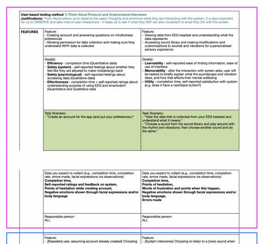
For the first step of the think-aloud protocol, we gathered tasks that we encouraged our design experts to do previously in our heuristic evaluation for this user-based testing.
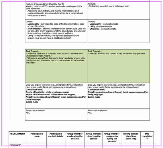
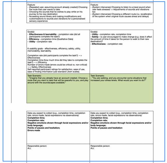
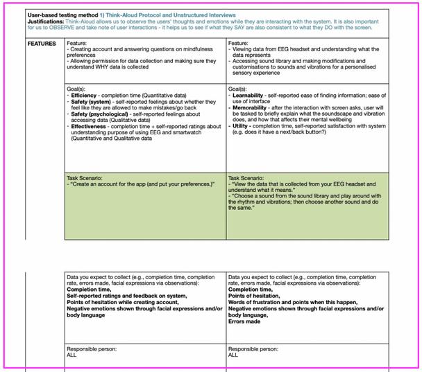
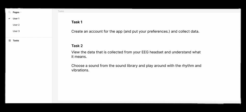
We split the interactions into three main users - each approaching the app as a different persona and different intentions. The detailed user testings are first explained, we then simplified them extensively just for each user to refer to during the session. user 1 user 2 user 3
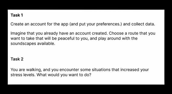
https://www.figma.com/file/uAme2eaDvAH9oJOZmx32Mx/SOUNDSCAPE---Heuristic-Evaluation-Template?node-id=330%3A683 https://www.fgma.com/file/yd3cZam7G9BhhI9GQztwhy/User-Testing-(for-Users)?node-id=0%3A1

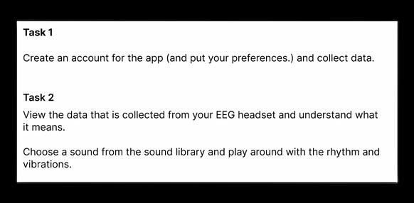
https://www.figma.com/file/uAme2eaDvAH9oJOZmx32Mx/SOUNDSCAPE---Heuristic-Evaluation-Template?node-id=330%3A683
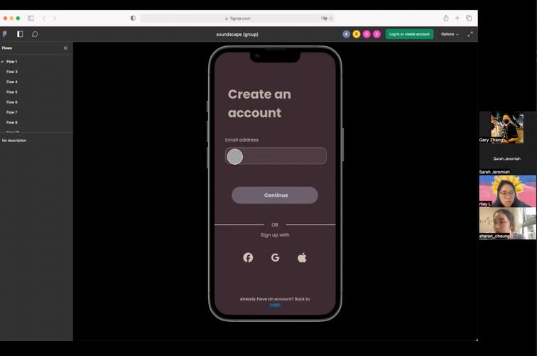
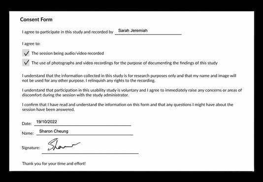
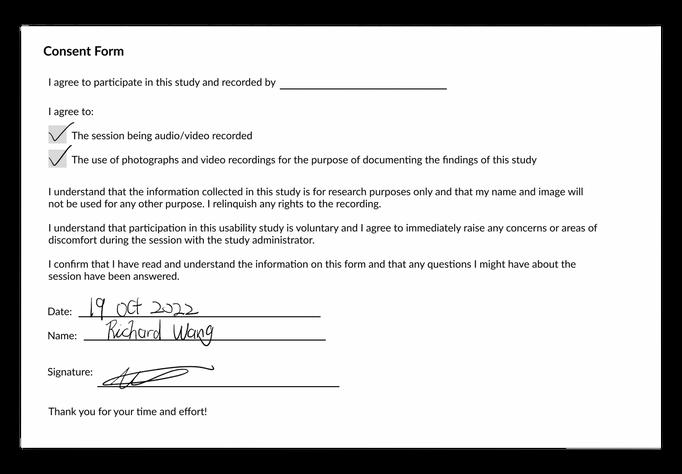
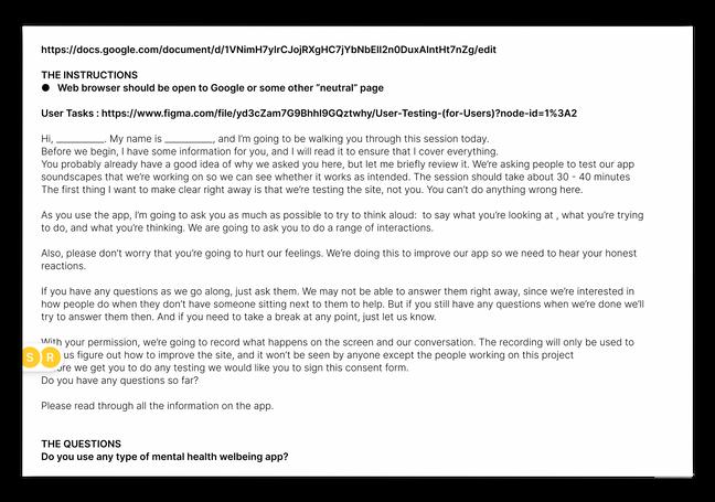
During the session, we send out these user tasks, and users are prompted consistently to think-aloud while they are going through the prototype. We explain to them that thinking aloud allows us to understand what they are seeing and what they are thinking, so that we can better refine our prototype later. We also make our own observations (Appendix L), to identify any points of uncertainty, or questions we may have for users later. Alongside filling up a consent form, we also get permission for them to share their screen and for us to record the session, so that we can refer back to these qualitative data later.
Signed consent form (above)
Permission asked to record before start of the session (above)
Sample tasks for one user; Other tasks for different users in other Pages (left)
https://forms.gle/g3d1aMHMovnbMPuq7
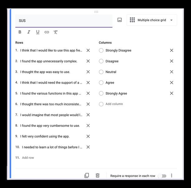
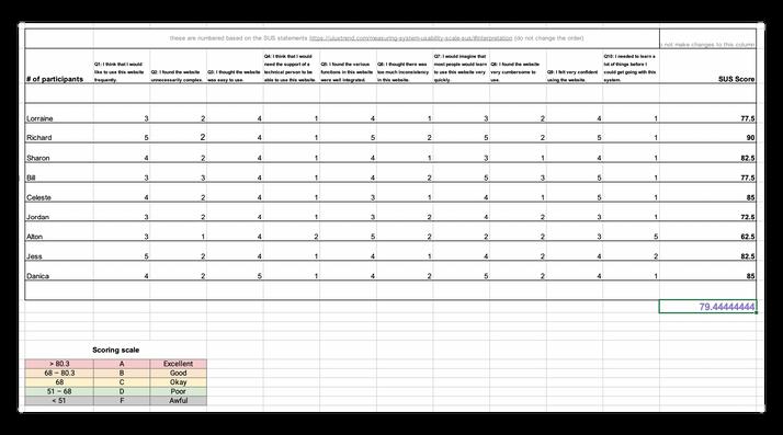
The System Usability Scale (SUS) was used to quantify the usability of our app. Participants are asked to score 10 items with one of five responses that range from Strongly Agree to Strongly Disagree. We created a Google Form where participants can more easily input their responses.
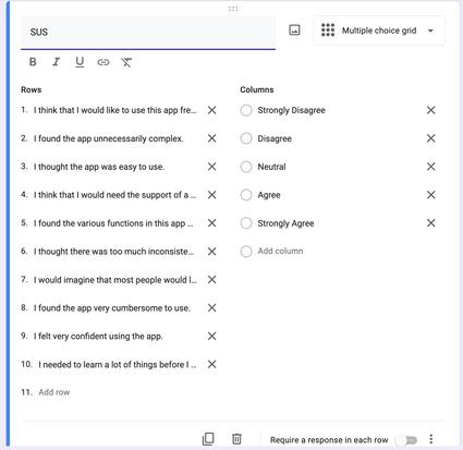
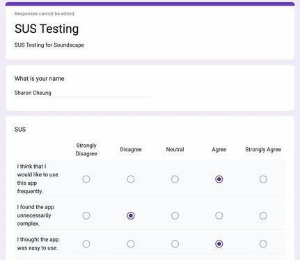
During the user testing session, after they have filled in the SUS form, we created a breakout room over Zoom, where the team got in and discussed the rating given by the user. We also discussed any questions we would like to ask through the observations we have made while they were completing the user tasks. This was part of our unstructured interviews.
After the user testing session, we collated all responses, and input the responses using a number scale from 1 to 5 (strongly disagree to strongly agree). Based on how users answer the questionnaire, a score between 0 (terrible usability) and 100 (excellent usability) is calculated.
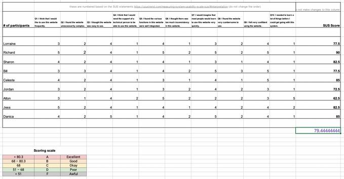 SUS testing created on Google Forms Response for SUS test from user
Calculation of SUS using Excel
https://www.figma.com/file/4dugi7obtxZUGnuyG469uV/soundscape-(group)?node-id=543%3A477
Using our learnings from our user-based testings, we did 2 refinements (Refined Prototype 2 & 3) of our prototype to arrive at our Final Prototype (for our promotional video).
We did our first refinement after six user testings (Appendix K), and another round of refinements after the final three user testings.
The first iteration focused on minor changes to the visuals and interactions on the screen (e.g. addition of help buttons). We did so because we wanted to enhance the experience, so as to better mimic how a user would interact with the system and make it as close to the real life app as possible.
Initially, while we were running the user-based testings, we realised that people were uncertain about the key terms and concepts that our app was operating on. Examples include: 'What does mindfulness mean though?'.
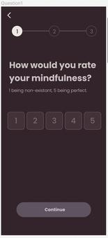
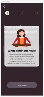
Hence, we added definitions, including visual representations for ease of reading, to aid users better understand their meaning, as well as give implications on what our app wish to achieve.
Because the functions of this app are new to the real world, users were challenged to explore these new interactions. Hence, after reflection, we felt that it is important for users to be guided through tutorials and help buttons.
Example (before): users tasked to input preferences without clarifications of definitions
Example (after): users can click to understand what they need to input, also implying what this app will be about
Example: Help button added to the top right of the screen, which brings user through a quick and simple summary of key interactions on the page
https://www.figma.com/file/4dugi7obtxZUGnuyG469uV/soundscape-(group)?node-id=543%3A477
Several users gave feedback that there was 'too much reading' involved. Through our observations, we also realised that there were users who skipped the reading altogether, and this impaired their understanding of the app and its interactions later on.
Hence, adding visual elements such as graphics and photos helped ease user into the app - it provided a sense of simplicity by reducing cognitive load from reading, and it created more affordances in terms of what is to be expected from the user.
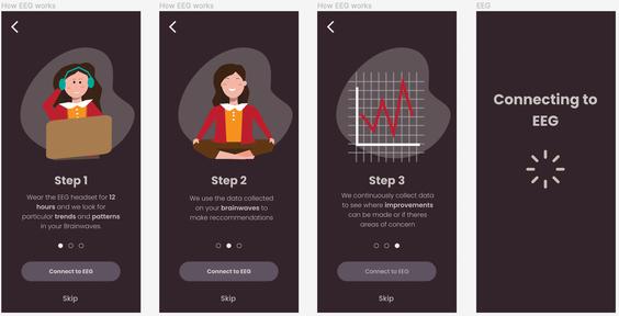
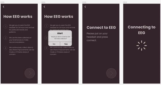
Some visual elements within the app achieved their functions by communicating information to the users. However, through our observations, we felt that users can better understand the underlying implications if it were to have similarities to already existing UI elements in current apps. Hence, we changed up visual representations to be closer to those that users are more familiar with in current systems.
Example (before): physical activity data represented in blocks in a single row
Example (before): instructions given to users in a single page, with no visual guides
Example (after): instructions broken down in step-by-step pages, graphics included
Example (after): physical activity data represented in blocks multiple rows, similar to Apple's iOS system
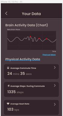
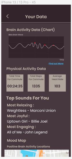


After all nine user testings, we conducted a data analysis process in order to refine the interactions for our prototype. Previously for the first six, we had only made quick and easy visual changes, but we wanted to gather consolidated insights from all nine to produce our final prototype.
This process included: transcribing, quoting, affinity diagramming, categorising, creating an internal checklist for refinement.
We have recorded our user testings while conducting them on Zoom. Using Otter.ai as a tool, we managed to transcribe the testings to get the general content. After that, we came in to clean up the data by editing the words and sentences that were wrongly picked up by the AI.
We then took out quotes (yellow post-its) that could have been points of improvement for our app, possible areas of refinement for the concept, understandings of the app (both functionally and conceptually) and even general comments.
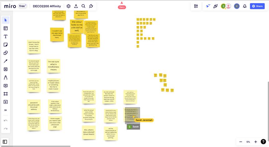
Screenshot of Google Docs of all transcripts
Screenshot of quoting process on the Miro Board for data analysis
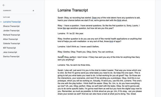
Once the quotes are gathered, we conducted a process of affinity diagramming. The objective is to identify common patterns that can be used as insights to improve our app, or to get a general gauge of what users understand of our app and its concept (i.e. what it aims to achieve).
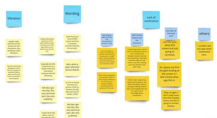

It was during this affinity diagramming process when we started to add categories to our quotes (blue post-its). Some of the quotes required several layering of analysis and categorisation. We found out that most of the layered ones concentrate around the need for clarification of how to interact with the app, and the definitions of technical terms used. This would be then be the focus of our final iteration.
Our final categorisation (green post-its) was also useful in helping us create an internal checklist to refine our prototype. It gave us the big picture of the points where the app requires changes, and this aided us in ensuring accountability for what needs to be completed.
Screenshot of affinity diagramming process on the Miro Board for data analysis
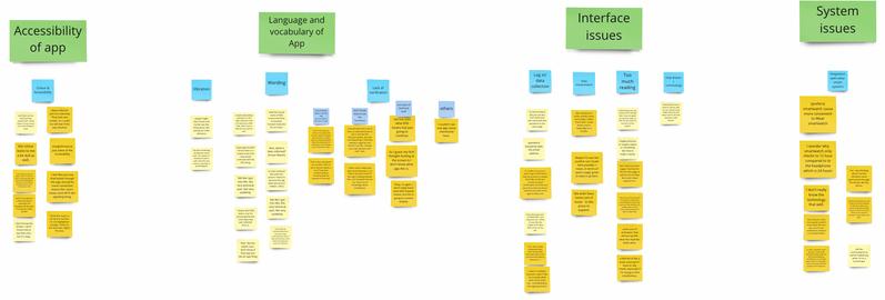
Screenshot of affinity diagramming and categories
Screenshot of final categorisation for an internal checklist
After having the big picture analyses of what needs to be completed, as well as the smaller details, we proceeded to complete our final iteration of the prototype.
Many users felt that there were readability issues at the beginning of the app - for example, when one hovers or clicks on key terms and have to read their definitions. This is due to the visual opacity of the information presented. Hence, we made minor changes to the visual on the screen by increasing opacity and therefore contrast of colour. This helped increase readability and accessibility.
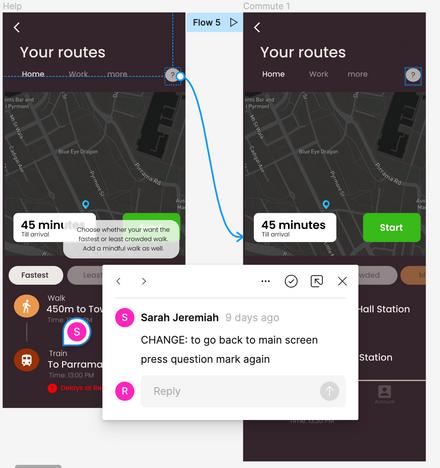
During our tests, we observed that some interactions for tasks were not being able to be fully completed. In other words, there was no endpoint or closure for a user interaction. Hence, we went back to our user flow chart and ensured that either all interactions had an endpoint, or led to other new interactions (that themselves have an endpoint).
Example (before): decreased opacity that presented information on mindfulness
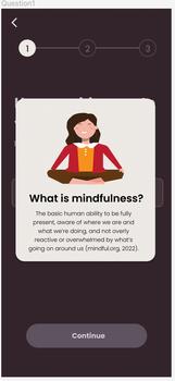
Example (after): full opacity of information to ease reading

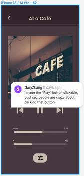
While we were testing, we observed that users were clicking on elements (e.g. play button) and expecting a change in system status.
Hence, because playing sounds and customising rhythmic beats and vibrations are important interactions of our app, we added these elements for interactivity, and made some interactions (e.g. hover) more obvious.
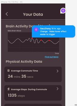
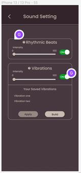
Example 1 and 2: Play button, sliders and on-off switches are interactive for users to understand how the interface works.
Example 3: Hover elements made more obvious, and increase area around elements to trigger them
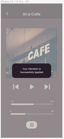
Several users have given feedback on how the system did not notify them after they have input an action on the interface. Hence, we ensured that for all interactions, there is feedback given back to the user - whether it is a visual or haptic feedbackto inform user that their actions are successful.
Example: additional screen added to give users feedback after they have applied vibrations
Example: (3) (others) Different opacity to indicate possible clickable interaction
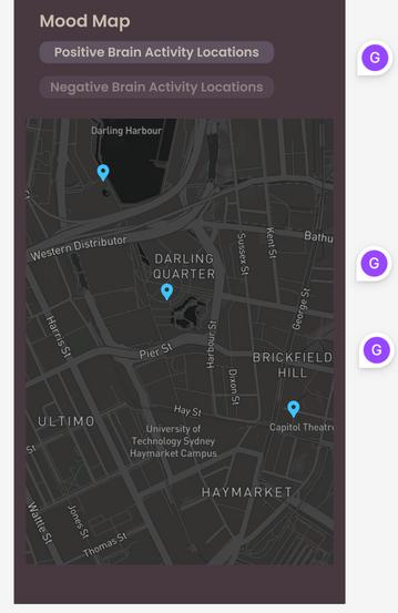
This is apart from the usability of the system. We wanted to maintain the colour palette of our app because we wanted to make consistent the branding of our app.
Hence, for our final prototype, we ensured that we finalised our colour, typography and all visuals on our app.
Example: (2) (others) bright blue pins used to increase visibility
Example: (1) change of colour of the map to dark themed to be consistent with the colour of the one in the commute page


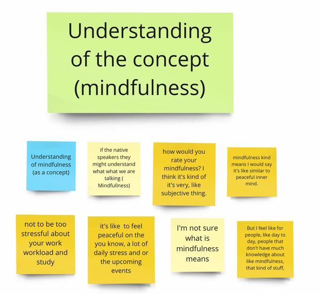
While users had understood what the app was supposed to do (i.e. the functions of the app) many struggled with the why. This tuned in on how there could possibly be a lack of understanding of what 'mindfulness' is.
Hence, we felt that there is opportunity in researching into how people understand and perceive mindfulness, and therefore how we can support them in regulating emotion throughout their dayto-day living.
Because our main demographic lies in urban dwellers, and with more cities being built in the next few decades, we believe that 'prevention is better than cure'. With better understanding of how people perceive mindfulness, we hope to tailor solutions that support individuals living in cities present and future.
Our ultimate goal is to have individuals be able to regulate their emotions independently - without any digital interventions (i.e apps or other digital products), and that comes with empowering them with knowledge and nurturing mindfulness habits.
possible future steps (cont'd)
We identified that for all of our user-based tests, our demographic lies in individuals in their early to mid 20s. However, for our concept, we wanted to target the age group of between 15 to 57.
Hence, there could be more insights gathered if we were to run more tests with a different age range. Besides age, we also felt that there is a need to understand their priorities and their attitudes towards mental wellness, and therefore if our product will be of value to their lives.
While our ideas can be concrete, executing them may be a different story. If we were to develop the product, there needs to be a check-and-balance into what can be made reality, and what may require alterations and even elimination.
Questions could be,
"How much processing and data can our app hold across such a wide audience?"
"Who is in charge of regulation?"
"How do we get our product to gain traction, especially if mindfulness seems to be easily dismissed with an urban dweller's busy schedule today?"
Hence, it falls back to identifying SWOTs for both internal and external processes, and whether tangibility of our ideas can exist.
Over the course of the project, we felt that the most challenging aspect was to figure out how to combine our initial concepts together. While we were aware that our concepts circled around the idea of urban living, it was still not easy to converge these ideas for a final concept. We overcame this by referencing the foundation of a Double Diamond design processproblem vs solution. We read one another's reports to have a greater understanding of the purpose behind all of our projects, and decipher which aspects of our projects could be most salient and build on best to the others. Hence, through this 'problem vs solution' lens, we were able to figure out how each of our projects fit into the big picture, and narrowed down the specific scenarios (i.e. stress and commuting) to develop further.
After refining our final concept, we moved on to thinking how we could break down the big idea into smaller tangible aspects of the prototype - hence the 'phases' of our product, and also its development. Individually, we had existing user research data and secondary research knowledge that helped 1. develop the product using the 5W1H (e.g. how data can be collected, or what sounds bring peace), and 2. justify our all of our design choices. From there, each member spearheaded parts of the prototype and development, depending on who had greater knowledge on which. For example, Sarah's focus was on data collection, and Riley's focus was on digital and physical interventions. The rest of the team provided supporting roles, and grew the prototype in tandem.
With better concept and task allocations, we moved on to creating sketches, wireframes and high-fidelity prototypes for each of these phases. We had ensured that we generated a main user flow to work alongside. This was a priority - it helped us keep in focus the parts of the prototype that we ought to create for our interactions, which we will later use for our testings (and assignment submission for A2).
In hindsight, we felt that it was crucial to have a direction (i.e. the user flow) that we could all reference to as we develop the product. It ensured that we were all aligned in our progress and development, and that we were able to justify the each of our parts of the prototype throughout the process. Accountability was key.
We believed that refinement was the more important part of product development, rather than the first initial prototype itself. While many may strive for a perfect initial concept, we directed our focus on planning the refinement processes that will eventually follow. As long as our main interactions and interfaces were set, we moved on to developing the material we needed for the refinement processes. These included feedback from A2, heuristic evaluations (expert-based testing), think-aloud protocols and system-usability scales (user-based testing).
We made sure that we had thoroughly understood, planned, produced and consolidated the material needed for all these processes, as well as allocated roles for each member to take charge of and even experience.
During the refinement processes, we all had the chance to conduct the heuristic evaluations and think-aloud protocol sessions. Particularly for user-based testings, we made sure that we had a single member who was the main facilitator for the session, and the rest were to offer support in gathering data (e.g. users' points of hesitation and perceived emotions through our observations).
This was effective in allowing us to focus on a more comfortable and efficient experience for users, especially so because we wanted to respect their time and opinion, but still gather feedback for our refinement.
Comparing the feedback we had gathered from expert-based testings and user-based testings, we felt that we were able to generate more in-depth insights from the latter. While experts were good at identifying minor details that needed change (based on usability heuristics), non-experts were better at questioning and challenging the general flow and interactions of the product. Additionally, using non-experts, we were also able to test their understanding of the purpose behind our product, and this was crucial in identifying if such a product is really needed in the market.
As much as possible, we kept in our check our own biases, not just as a designer, but also as a human being susceptible to preconceived notions of our users (based on demographic). We did so by always looking at data neutrally, and not associating any data to personal traits of the user.
With data analysis, we adopted a more bottom-up approach to generate insights (i.e. affinity diagramming). This is because we were wary of top-down approaches that may possess vulnerability to internal assumptions. Hence, after every stage of data collection from expert-based and user-based testings, we came together as a group to conduct data analyses sessions that focused on identifying patterns.
After these patterns were identified, we made sure that we had to produce tangible next-steps for us to refine our prototype. Consistently, we asked ourselves 'What outcome(s) do we wish to produce from the data?', and that kept us in focus.
Finally, as we approached our final prototype, we checked in on one another to make sure that changes are commented and notified, and progress was informed. Again, it drew us back to the importance of refinement, rather than to perfect the first idea. We felt that because of this mindset, it gave us confidence to present our prototype and change it as we go. This translated beyond the development of our product.
Throughout the process, our focus on 'refinement' had nurtured a space for all of us to be able to make mistakes, to be honest and to support one another. While we strived for high ideals, we could still understand that a product - even real ones - are constantly evolving. Their dynamic nature meant change was constant, and we admittedly will always be part of that.


Benedictus, L. (2014, February 25). Sick cities: why urban living can be bad for your mental health. The Guardian; The Guardian. https://www.theguardian.com/cities/2014/feb/25/city-stress-mental-health-rural-kind
Carruthers, T. (2017, November 29). Health effects of environmental noise pollution. Curious; Nova. https://www.science.org.au/curious/earth-environment/health-effects-environmental-noise-pollution
Einöther, S. J. L., Giesbrecht, T., Walden, C. M., van Buren, L., van der Pijl, P. C., & de Bruin, E. A. (2013). Attention Benefits of Tea and Tea Ingredients. Tea in Health and Disease Prevention, 1373–1384. https://doi.org/10.1016/b978-0-12-384937-3.00115-4
Healthdirect Australia, (2022). Electroencephalogram (EEG). Healthdirect.gov.au. https://www.healthdirect.gov.au/electroencephalogram-eeg
Neurable (2022). Enten: Smart Headphones for Smarter Focus Habits). Indiegogo. https://www.indiegogo.com/projects/enten-smartheadphones-for-smarter-focus-habits#/ Usability.gov (2022). System Usability Scale (SUS). Usability.gov. https://www.usability.gov/how-to-and-tools/methods/system-usabilityscale.html
Haddad, L., Schafer, A., Streit, F., Lederbogen, F., Grimm, O., Wust, S., Deuschle, M., Kirsch, P., Tost, H., & Meyer-Lindenberg, A. (2014). Brain Structure Correlates of Urban Upbringing, an Environmental Risk Factor for Schizophrenia. Schizophrenia Bulletin, 41(1), 115–122. https://doi.org/10.1093/schbul/sbu072
Healthdirect Australia (2021). 7 ways pets improve your mental health. Healthdirect.gov.au; Healthdirect Australia. https://www.healthdirect.gov.au/7-ways-pets-improve-your-health
Urban Design Mental Health (UDMH) (2022). How the city affects mental health. Centre for Urban Design and Mental Health. https://www.urbandesignmentalhealth.com/how-the-city-affects-mentalhealth.html#:~:text=Cities%20are%20associated%20with%20higher,click%20here%20for%20more%20detail
WebMD. (2021, May 27). What to Know About Gamma Brain Waves. WebMD; WebMD. https://www.webmd.com/brain/what-to-knowabout-gamma-brain-waves
Kropotov, J. D. (2009). Beta Rhythms. Quantitative EEG, Event-Related Potentials and Neurotherapy, 59–76. https://doi.org/10.1016/b9780-12-374512-5.00003-7
Neurohealth Associates. (2019, September 26). Train Your Brain Waves to Treat Anxiety, ADHD & More. NeuroHealth Associates. https://nhahealth.com/neurofeedback-train-your-brain-waves-to-treat-anxiety-adhdmore/#:~:text=Beta%20waves%20are%20associated%20with,activity%20might%20be%20your%20goal.
Scientific American (1997). What is the function of the various brainwaves? Scientific American. https://www.scientificamerican.com/article/what-is-the-function-of-t-1997-12-22/ Simplypsychology.org (2021). What is an EEG Test and What it is Used for. https://www.simplypsychology.org/what-is-an-eeg-test-andwhat-is-it-used-for.html


Sarah: https://drive.google.com/file/d/19f7ehm4g69ywIs6SPTnrdZEnwgBnL2ij/view?usp=sharing
Gary: https://drive.google.com/file/d/1jJx5vRJEtVsvdxrYPZ2Gm3SXMlZZpr6P/view?usp=sharing
Appendix A Appendix B
links for individual projects (A1) More information on the electroencephalogram (EEG) and EEG headphones
Riley: https://www.canva.com/design/DAFKaICLecA/cPVEYyzw0tqFRb6E4svbUQ/view? utm content=DAFKaICLecA&utm campaign=designshare&utm medium=link&utm source=homepage design menu
Conventionally, electroencephalogram (EEG) is used to diagnose or monitor conditions such as epilepsy, brain tumours, sleep disorders, head injuries, strokes and even dementia (Health Direct, 2021).
An EEG itself, is a test that measures the electrical activity of the brain. Whether we are asleep, going about our every day, working hard at our desk or doing reps at the gym, our brain is constantly in action. Our brain helps us coordinate our mind and body by sending signals within the brain, which then affects parts of the body and mind. During an EEG, these signals (i.e. electrical activity) are being picked up by the metal discs (electrodes) that are used, and are reflected on a computer as 'brain waves'. By observing these brain waves, we are able to 1. deduce how the brain is responding to different stimuli, and 2. detect any anomaly in brain activity that is of concern.
Because the EEG allows us to gain insight on how the brain responds to stimuli - both in our physical environment and our internal thoughts, there is greater research into how the EEG can be commodified, and how information on the brain can be more widely available to the general public.
(to be continued on the next page)
An EEG measures 5 different brain waves: gamma, beta, theta, alpha, delta (Abhang, 2016; Guy-Evans, 2021).
Gamma waves are the fastest brain waves (30 to 80 Hz), which are associated with high levels of thought and focus. It is deduced that high levels of gamma waves indicate better emotions and a more receptive mind, and hence higher IQ levels and better concentration. Gamma waves are associated with cognition and memory.
Beta waves (13 to 30 Hz) are seen in people who are awake, eyes opened or closed. They are viewed most in the frontal lobes, which are responsible for conscious thought and more rest. With low amplitude but varying frequencies, they indicate active thinking, concentration and anxious thoughts.
Theta waves (4 to 7 Hz) show slow activity, occurring during sleep, meditation and in younger children. The excess of theta activity also indicate abnormal activity, and could relate to drowsiness.
Alpha waves (8 to 13 Hz) are witnessed in people who are awake, with their eyes opened or closed, often in a relaxed state. They are reflected most in the occipital lobes at the back of the brain, which is responsible for vision.
Delta waves (up to 4 Hz) are the slowest waves, but they have the highest amplitude and hence strongest intensity. They are most common during slow wave sleep and in infants who are younger than 1.
By observing the combination of brain wave activity, we are able to infer the psychological state of a person, which can also help with emotional regulation and cognitive management.
Neurable (Neurable, 2022) is an example of the commodification of EEG into a consumer product. It is a company that designs EEG-woven headphones that offer insight on brain activity to users. They also give recommendations on how the user can ease their stress or boost their focus during times of stress or flow. The headphones are paired with their app (Enten) that allows users to access their data and customise the settings for their headphones.

Link for 'Refined Prototype 1' - after A2's feedback
https://www.figma.com/file/4dugi7obtxZUGnuyG469uV/soundscape-(group)?node-id=82%3A29
Appendix F Appendix G
Heuristic Evaluations - All Material & Data
includes all filled-up heuristic evaluations and comments, and planned features to be tested
https://www.figma.com/file/uAme2eaDvAH9oJOZmx32Mx/SOUNDSCAPE---Heuristic-Evaluation-Template?node-id=286%3A101
Sample screenshot of features to be tested
Sample screenshot of Heuristic Evaluation from one expert
https://miro.com/app/board/uXjVPanCeuU=/?moveToWidget=3458764535811275460&cot=14

https://www.figma.com/file/4dugi7obtxZUGnuyG469uV/soundscape-(group)?node-id=389%3A301
https://www.figma.com/file/uAme2eaDvAH9oJOZmx32Mx/SOUNDSCAPE---Heuristic-Evaluation-Template?node-id=330%3A683
SUS Tests:
Google Form (for Users):
https://docs.google.com/forms/d/e/1FAIpQLSdNG eskHql0B4STseQtFBn 8ExJqXRPs128FPR9vSL8ZP6uw/viewform
SUS Calculations: https://docs.google.com/spreadsheets/d/177CxD dD lARhiDO13gUMsfDXCJ3p97ys4XJmYRRKlc/edit?usp=sharing
Appendix K Appendix L Appendix M
https://www.figma.com/file/4dugi7obtxZUGnuyG469uV/soundscape-(group)?node-id=543%3A477 to follow at the end of this document to follow at the end of this document

Appendix N
https://miro.com/app/board/uXjVPanCeuU=/?moveToWidget=3458764537030522441&cot=14
Link for 'Final Prototype' - after User-Based Testings
Appendix P
Team Charter
Appendix O --- end ---
https://www.figma.com/file/4dugi7obtxZUGnuyG469uV/soundscape-(group)?node-id=680%3A1266 to follow at the end of this document
We would like to thank our friends, family, course mates, tutor (Brittany Klaassens), unit coordinator (Dr. Senuri Wijenayake) and others who have provided guidance and support to our journey thus far.

