
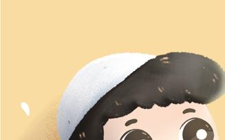
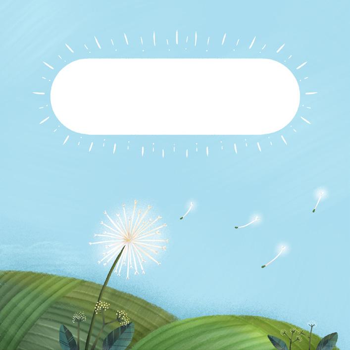
My name is Aya, and I’m thrilled to welcome you to my illustration portfolio. Creating art has always been a joyful escape for me, and I’ve channeled that passion into specializing in children’s illustration—one of my lifelong dreams. Thank you for visiting my portfolio, and I hope you enjoy exploring my creations as much as I enjoyed making them!
I have been a freelance illustrator for several years, working on a variety of projects, including:
Illustrate a book cover
Design and layout a book cover
Create typograph for title Prepare book cover and content file for printing
Illustrate a book content: spread, single, and thumbnail
Design and illustrate of packaging for brands Design and illustrate for homepage
I also enjoy participating in various challenges and have had the opportunity to win several times. I took part in:
Illustrating posters Designing merchandise with illustrations
Redesigning brand packaging Creating mascot

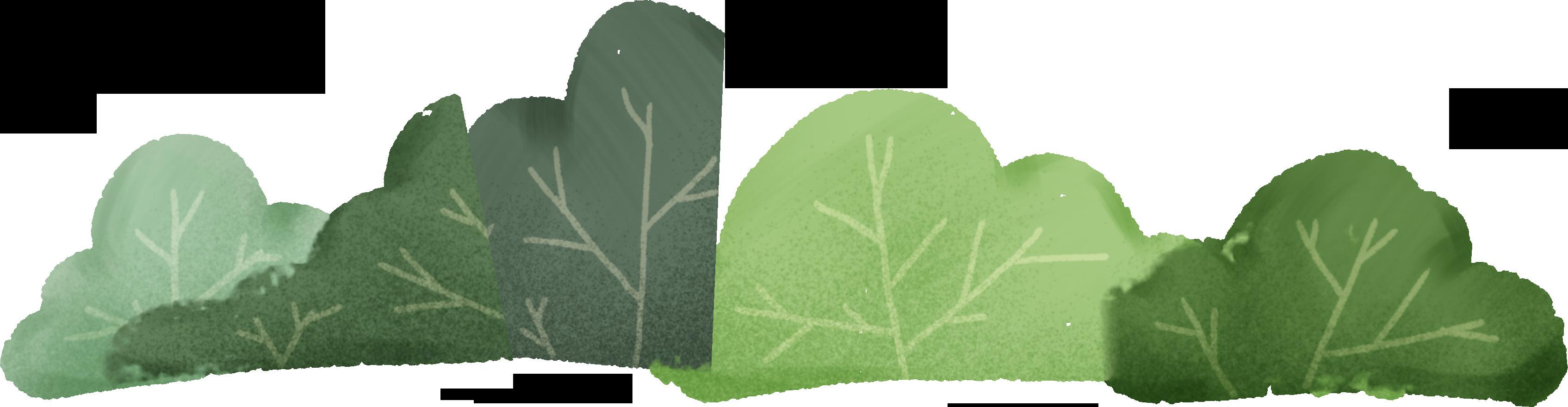
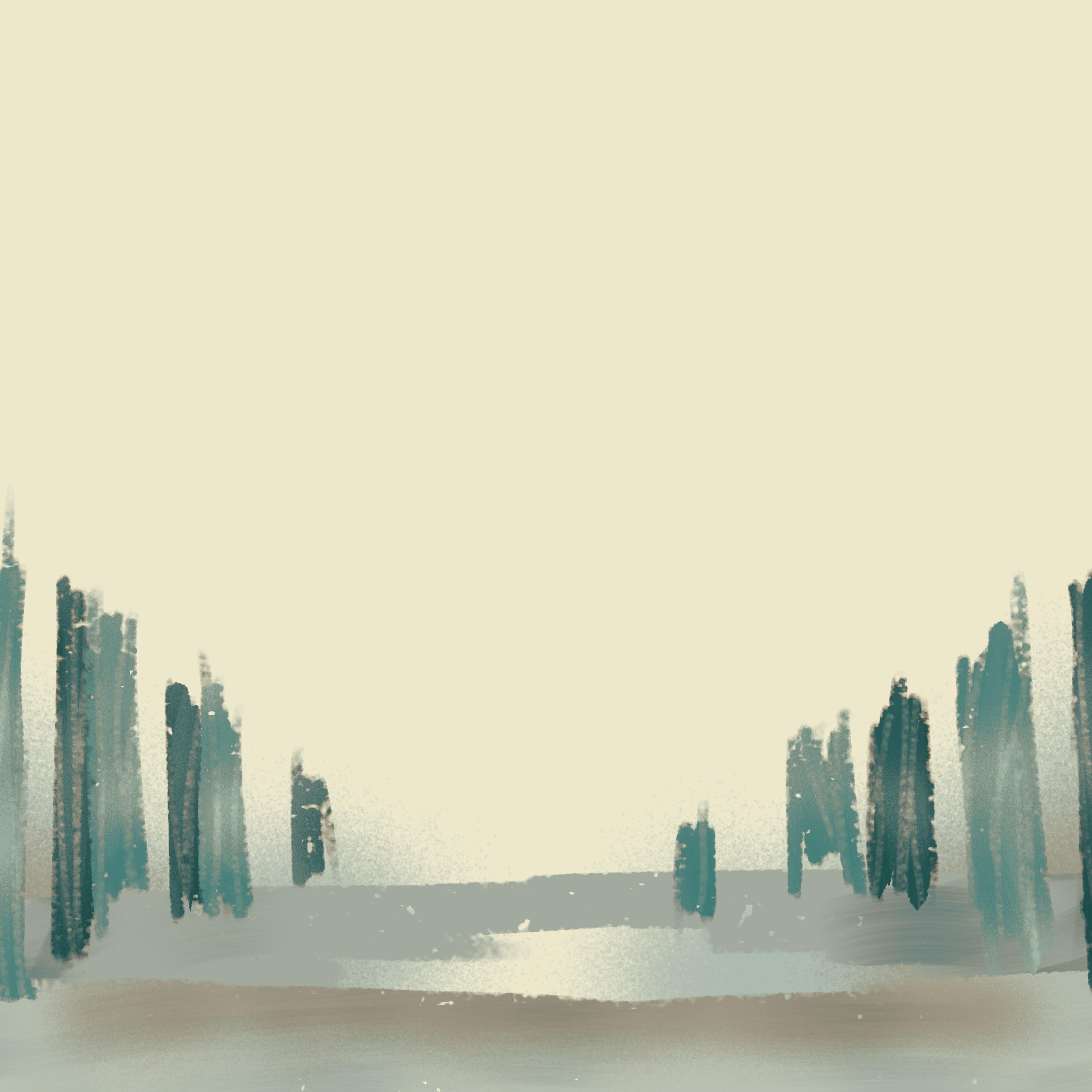
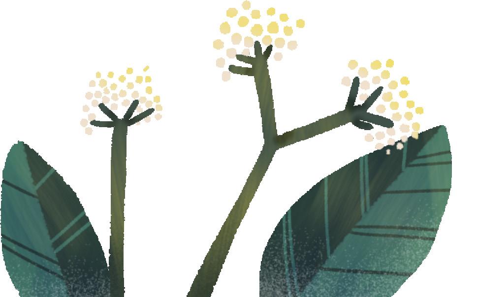
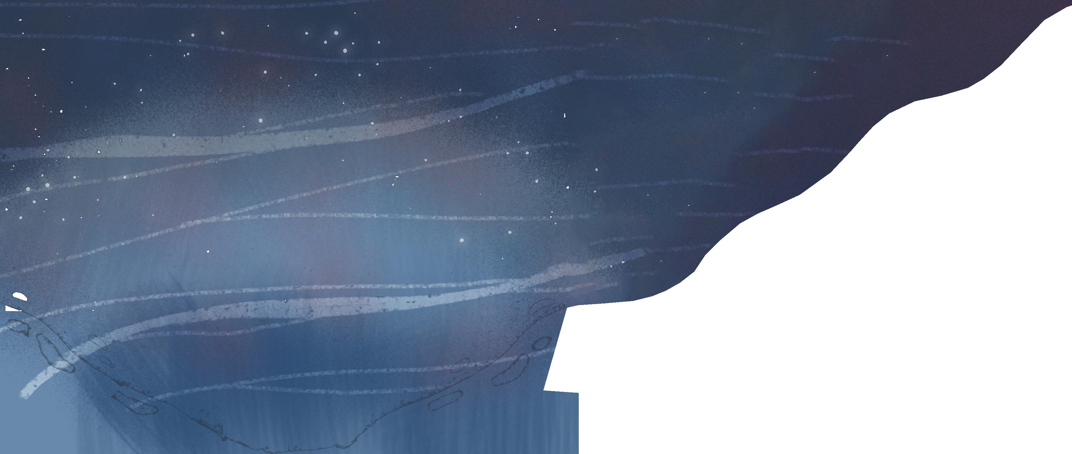
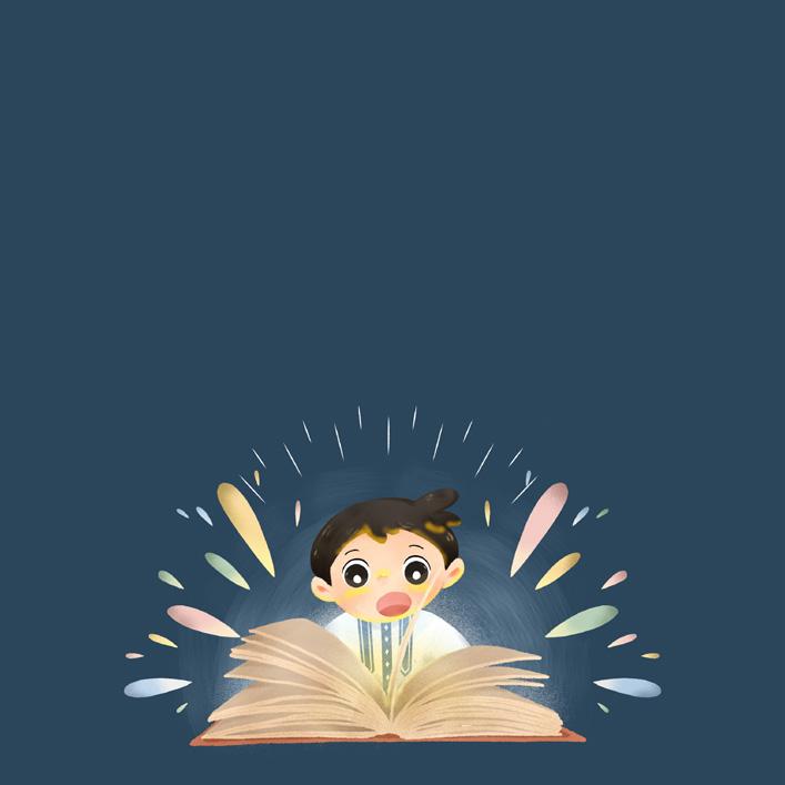
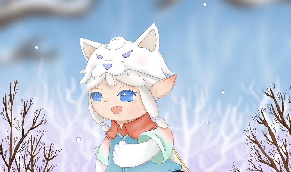
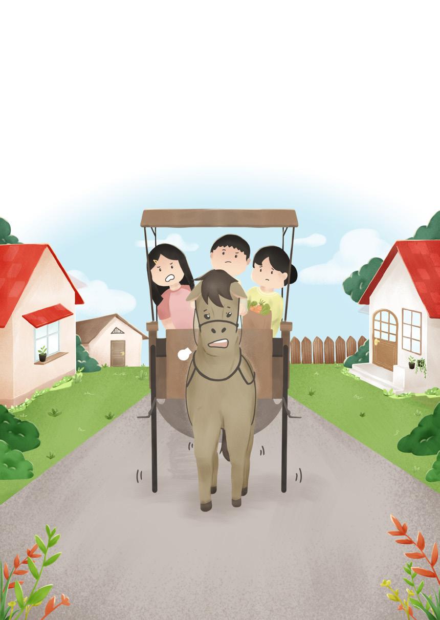
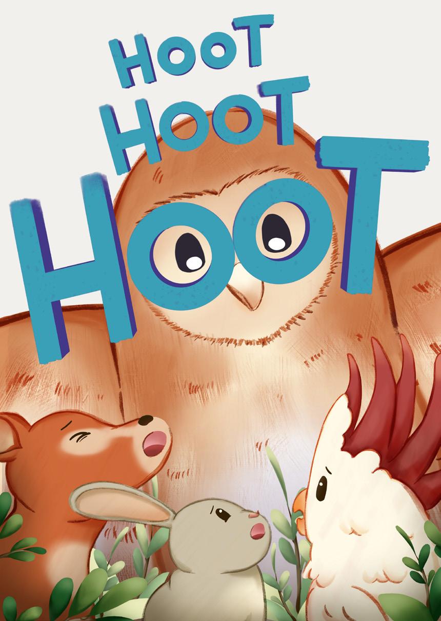
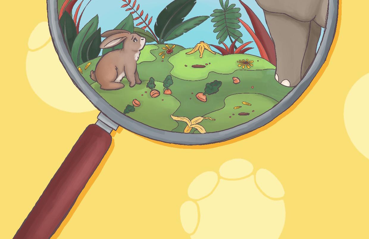
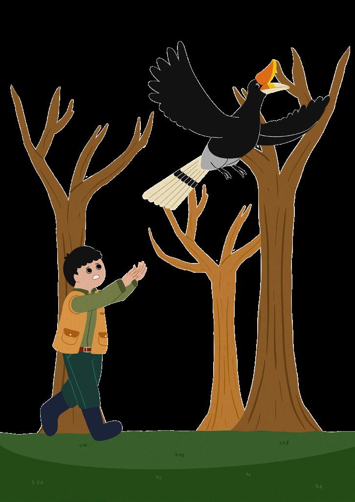
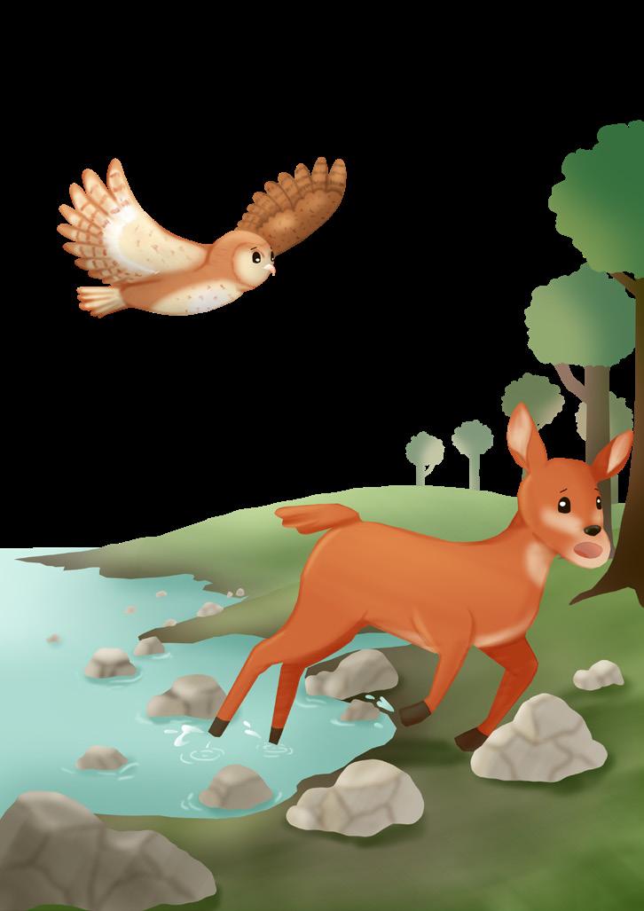
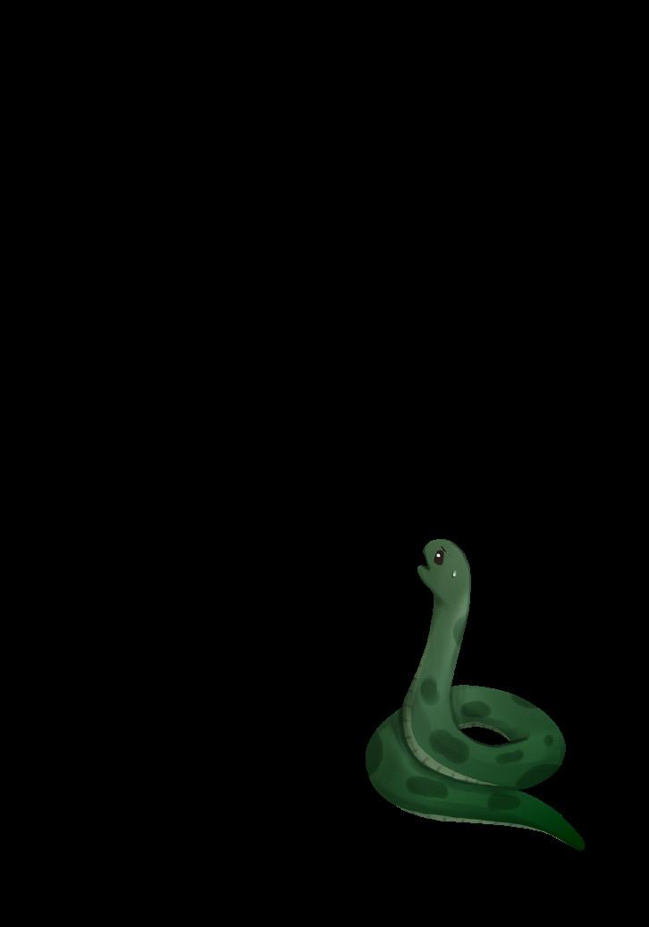
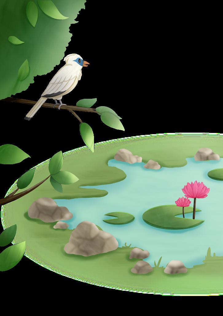
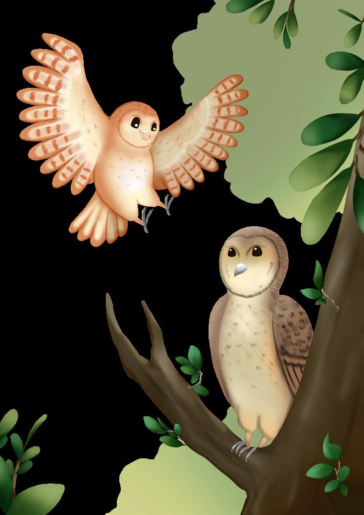
In this section, you’ll find some of my favorite book illustrations, where I illustrate both covers and content. While most of my work is focused on children’s literature, I also create illustrations for teenagers, bringing stories to life through vibrant and engaging imagery.

Project with : Kanak Publisher
Scope of Work : Create illustrations for the cover and content of a picture book
Pages : 48 + cover
Software Used : Ibis Paint
Job Details : - Developed creative concepts for the cover illustration.
- Illustrated the content based on the provided brief, detailing full image spreads, single images, and thumbnail pictures.
- Collaborated with the layout designer to ensure the proper alignment of text and illustrations.


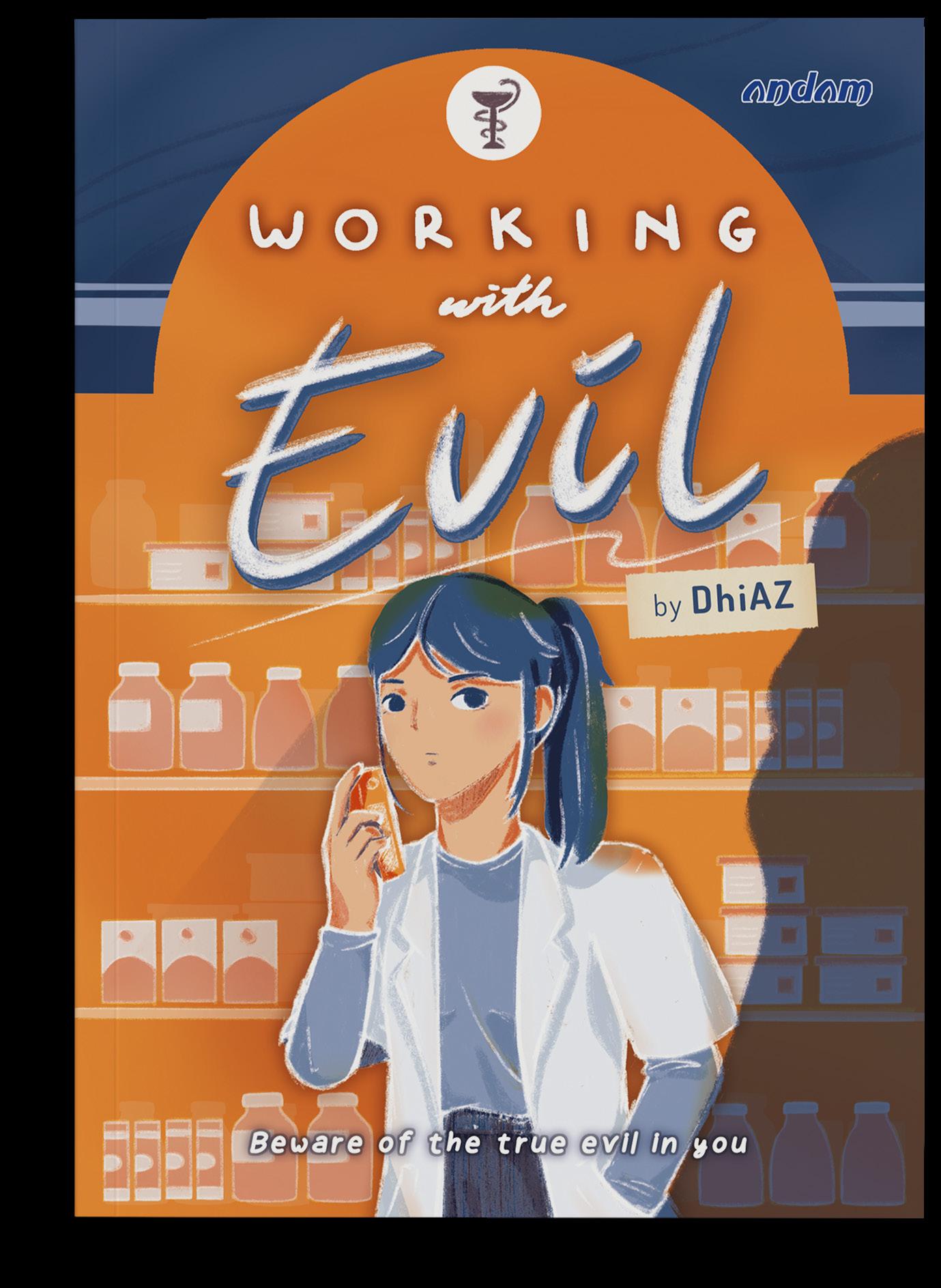
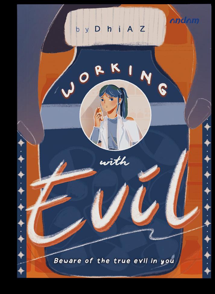
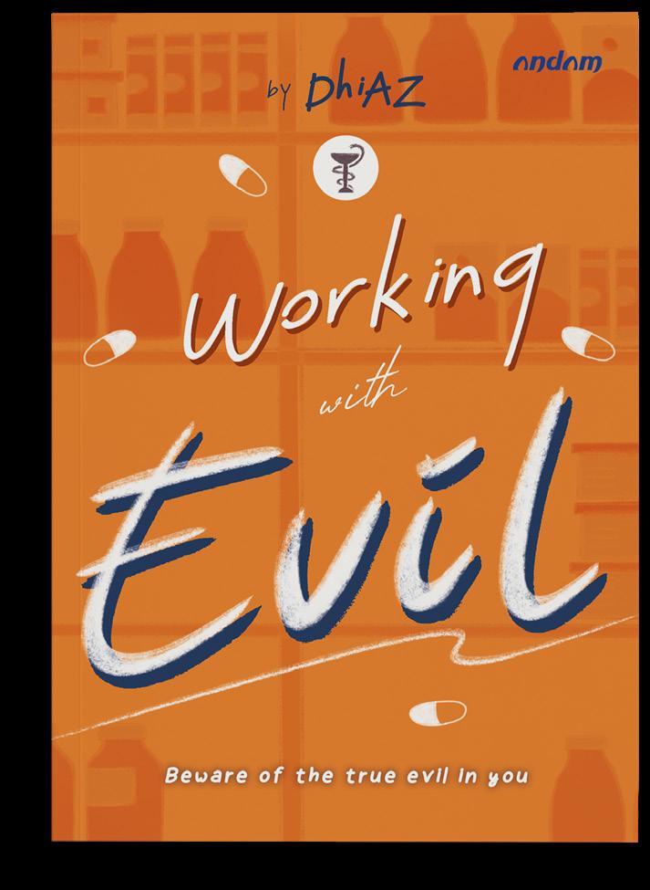
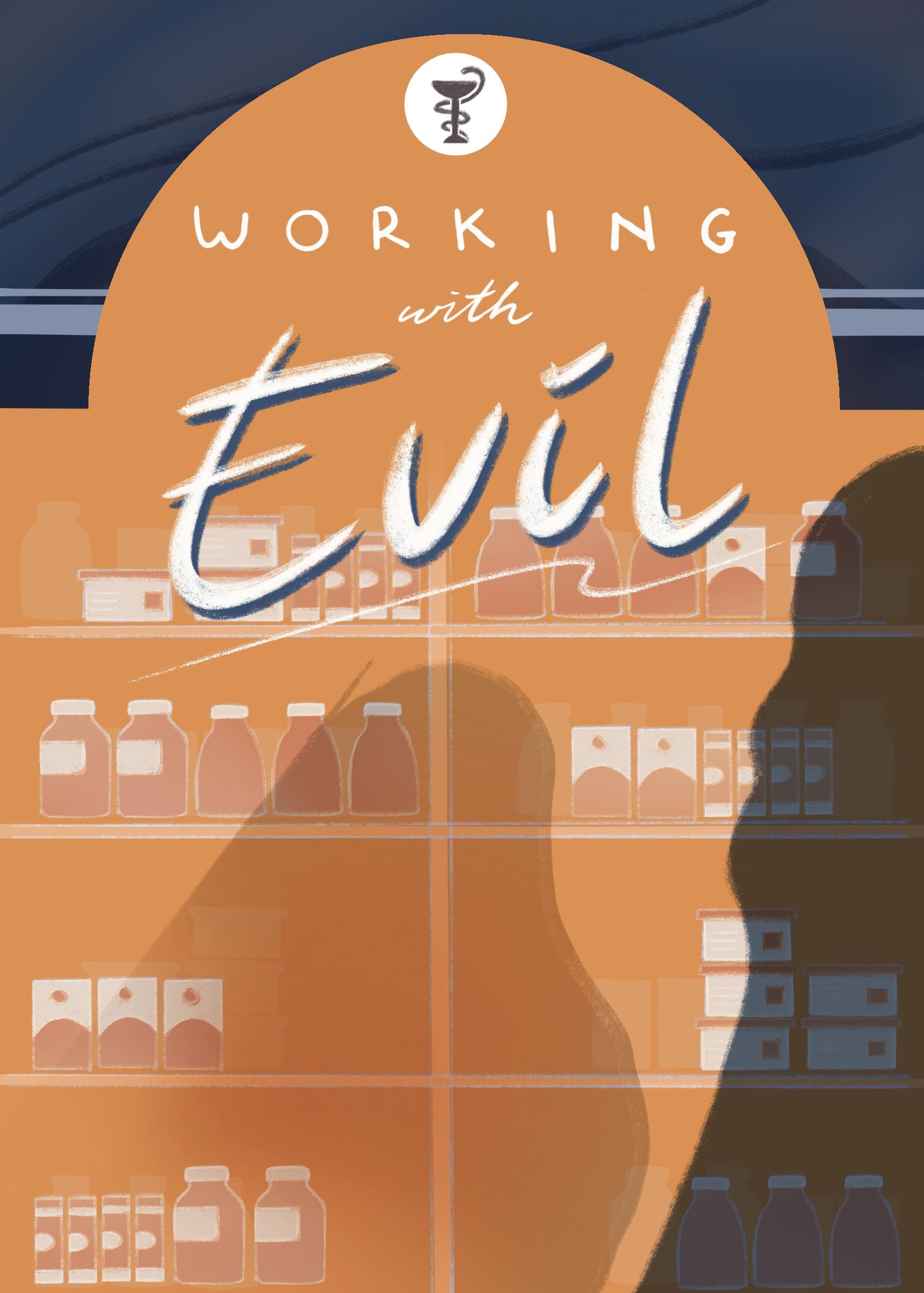
Project with : Andam Publisher
Scope of Work : Design and illustrate the cover and content of a novel
Software Used : Procreate & Adobe Photoshop
Job Details : - Created three design concepts for the cover illustration.
- Designed the cover layout, incorporating the title, author’s name, and publisher’s logo.
- Illustrated the content based on the provided brief, rendered in black and white.
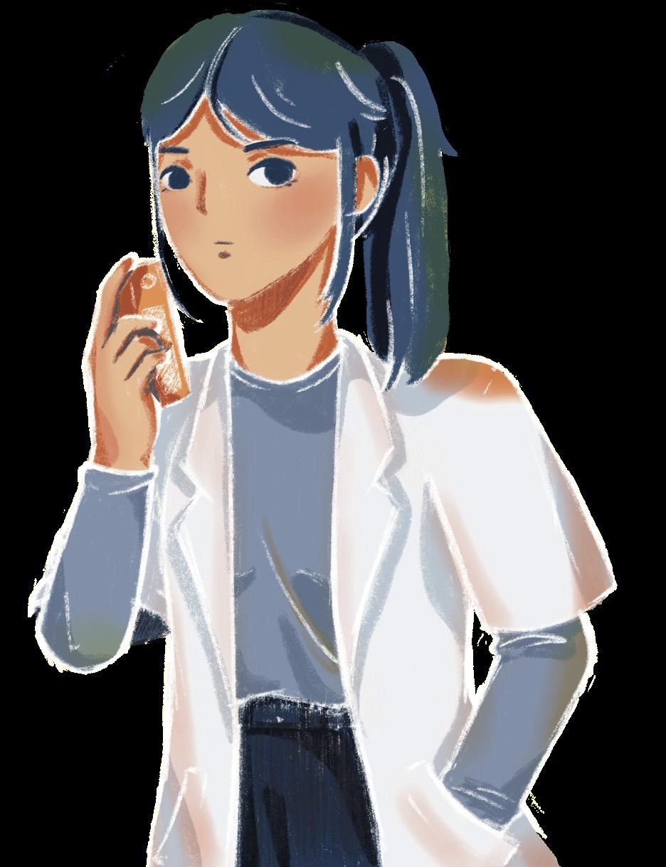
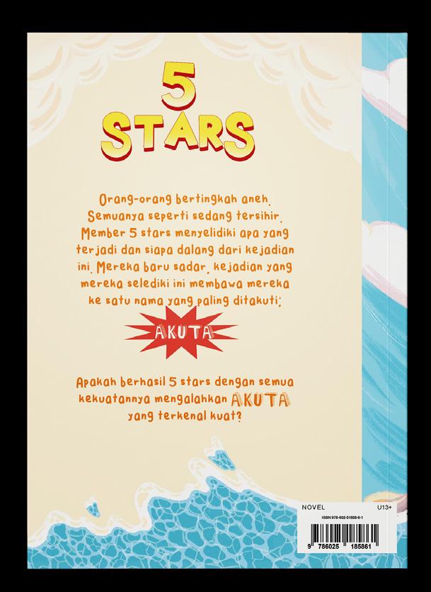
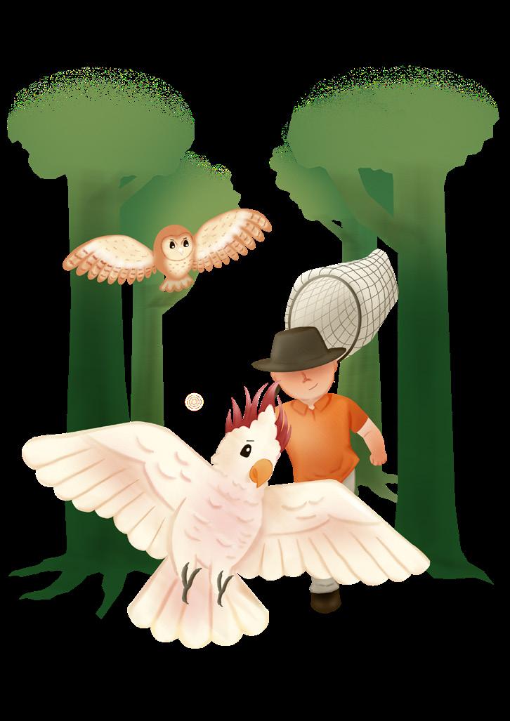
Project with : YBS Publisher
Scope of Work : Design and illustrate the cover of a novel
Software Used : Procreate
Job Details :
- Developed a design based on provided references, including character illustrations.
- Illustrated the front cover and selected fonts for the title and back cover blurb.
- Prepared the cover design for printing, incorporating the publisher’s logo, author’s name, and ISBN barcode.


Project with : Kidpublish Scope of Work : Illustrate covers and contents of short stories
Software Used : Procreate & Ibis Paint
Job Details : - Created content illustrations featuring character designs and various elements to convey ambiance and setting.
- Collaborated with the editor to select one illustration for development as the cover design.


This section showcases my work in branding and competition illustration, where I explore creative concepts and unique designs that elevate brands and engage audiences.
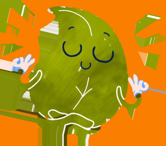
Status : Winner - Best Creativity
Level : International
Software Used : Procreate
Brief :
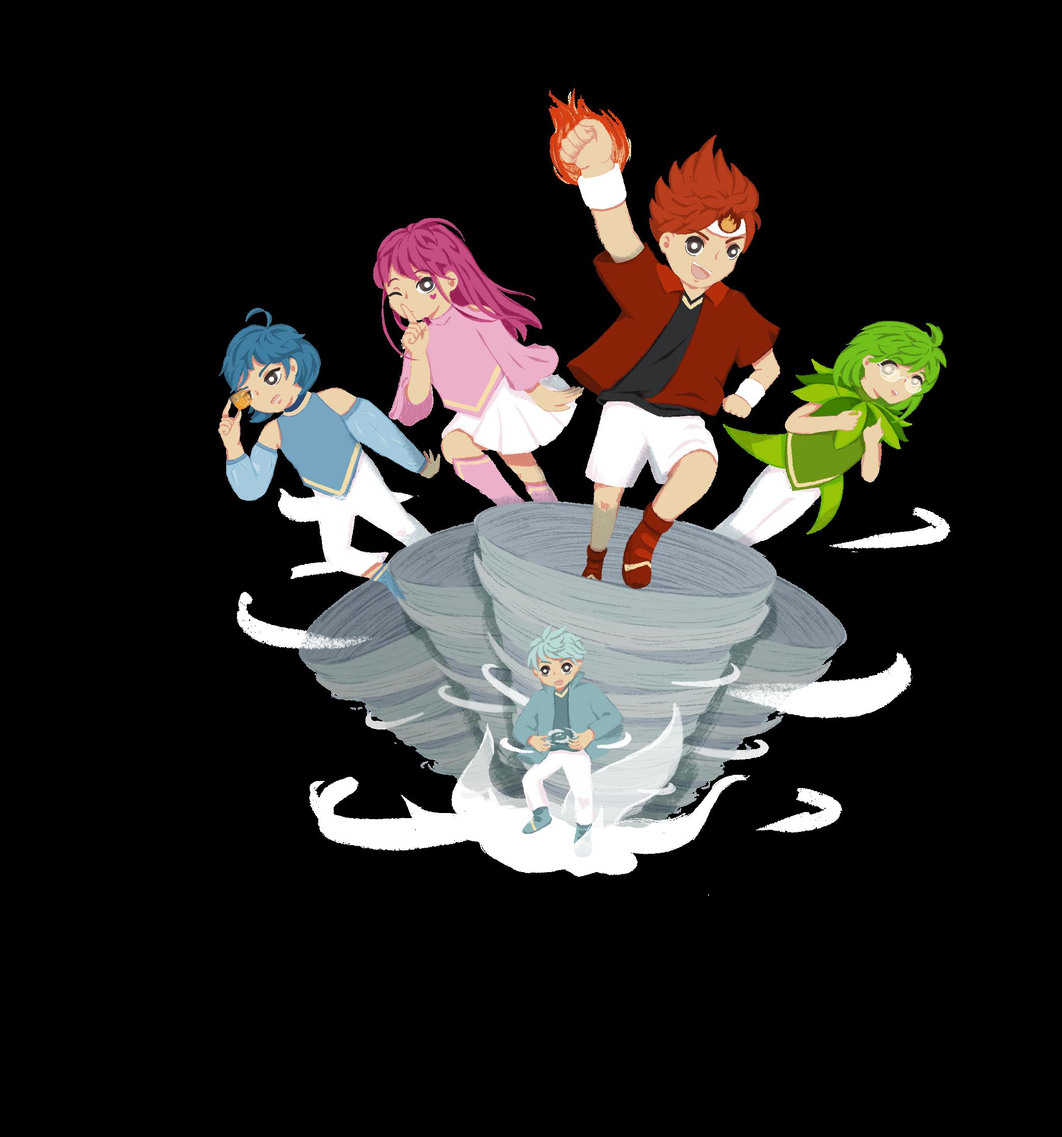
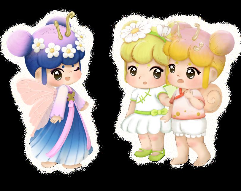
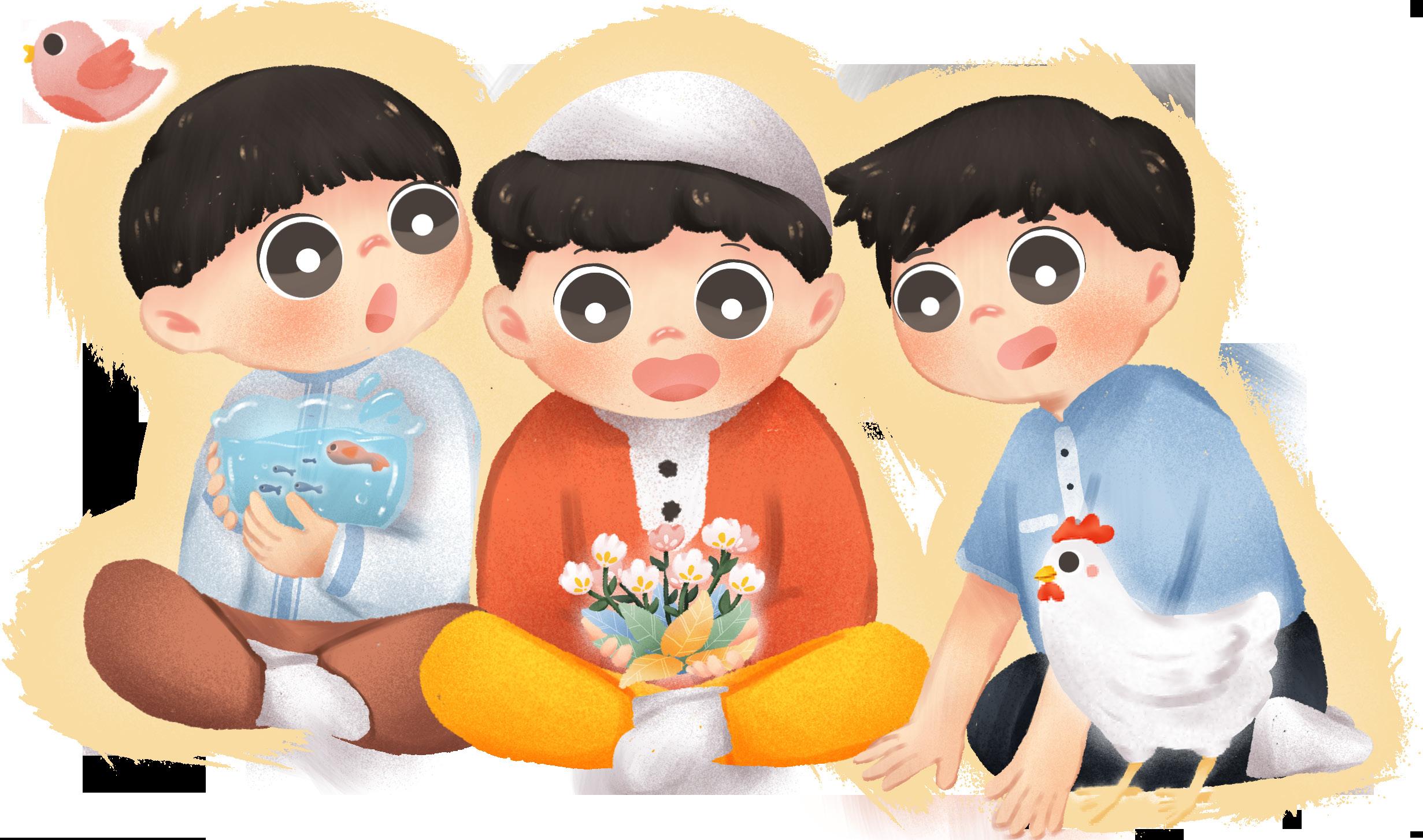
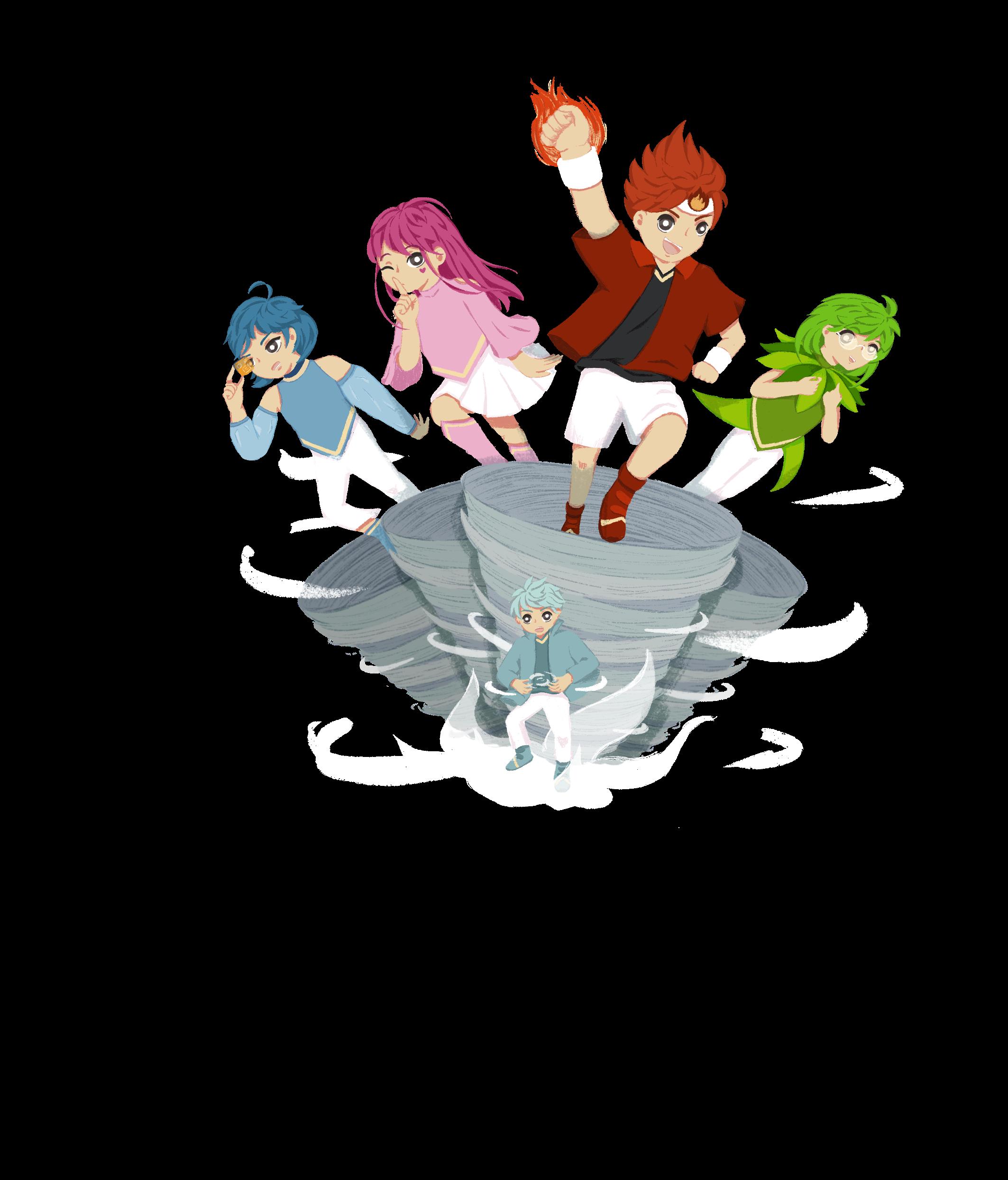
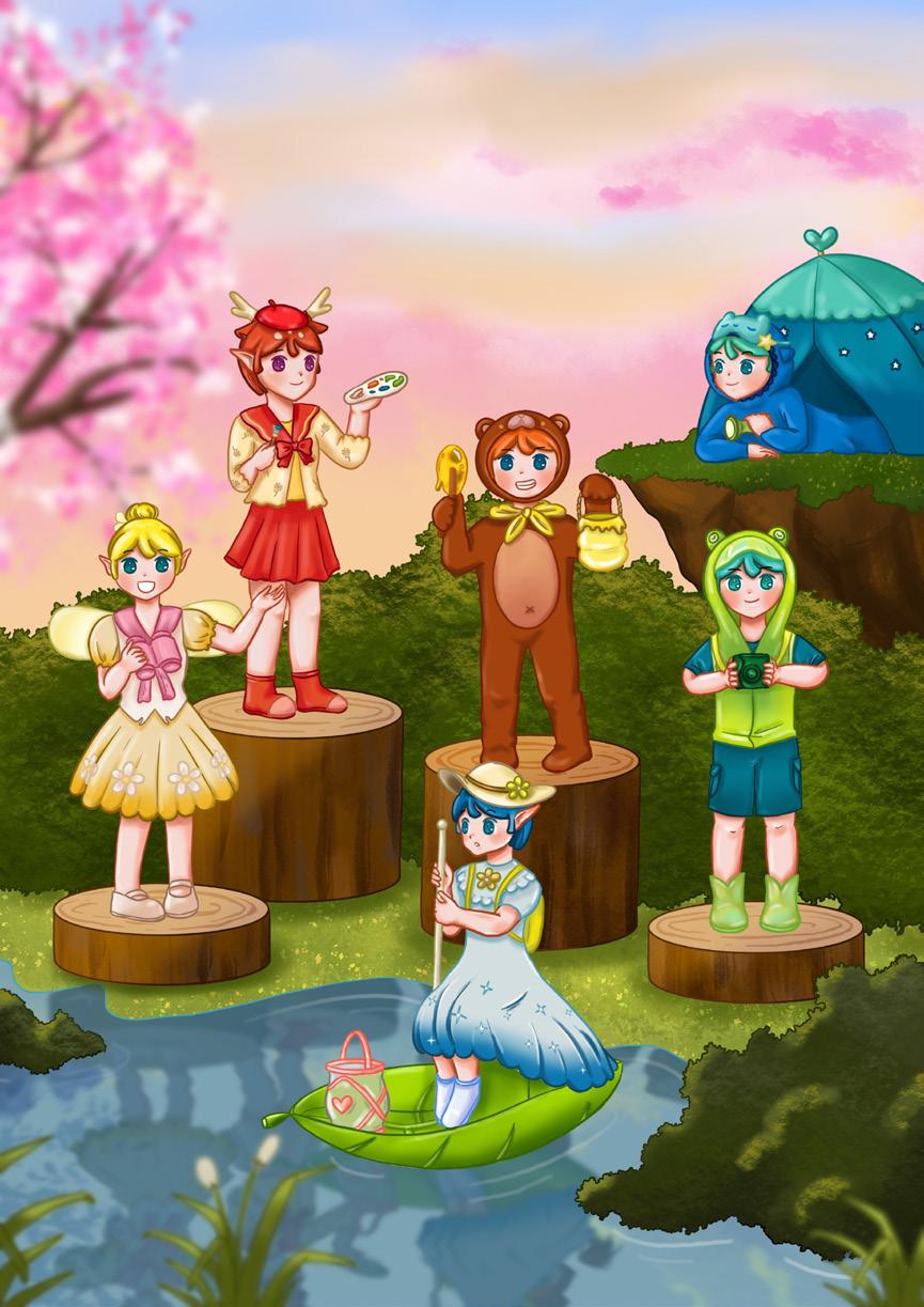
When we were children, we often dreamed that the monsters in the cartoons became our good friends.
To bring those dreams to life, we would like to collect illustrations of monster friends and select and re-create several monster friends from submissions to become a part of our Kid Space around world. These monsters will accompany children through various usage scenarios, and will send friendly reminders that promote healthy habits and lifestyle choices.
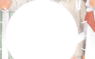
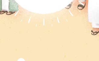
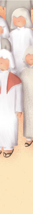
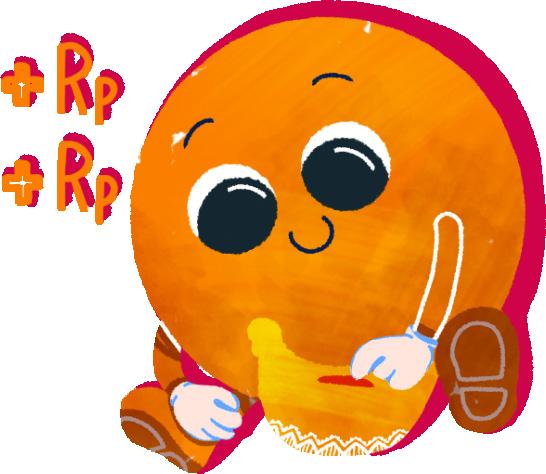
Status : Winner
Level : International Software Used : Ibis Paint
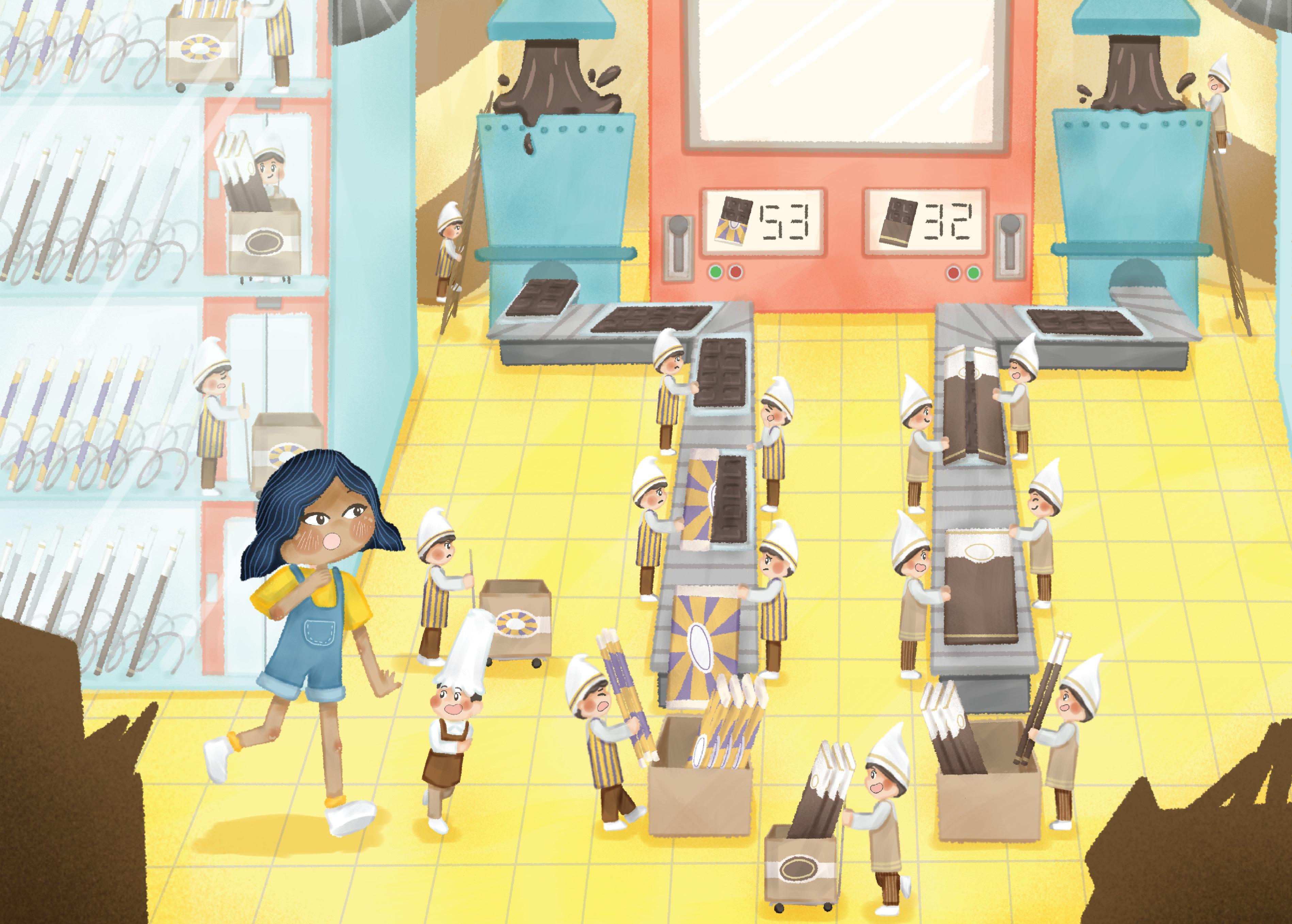
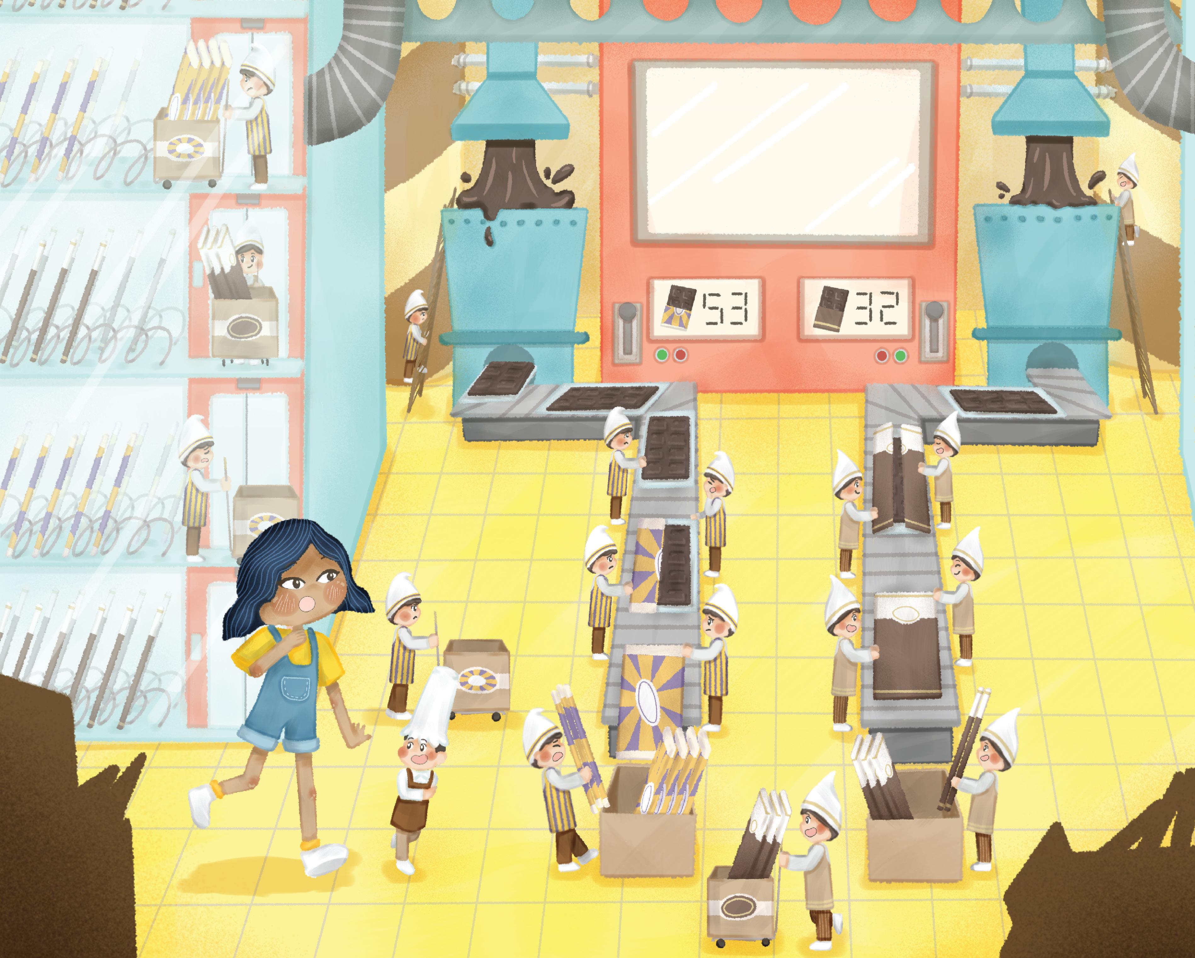
Brief :
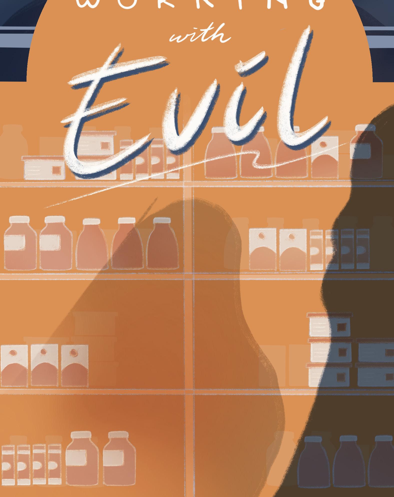
A girl named Anya shrinks as she enters a chocolate vending machine. Inside, she encounters some happy employees, while others appear less content. This artwork aims to highlight the existence of modern slavery systems that may be happening around us, often unnoticed.

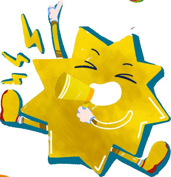
Status : Participant
Level : National
Software Used : Ibis Paint & Adobe Photoshop
Concept :
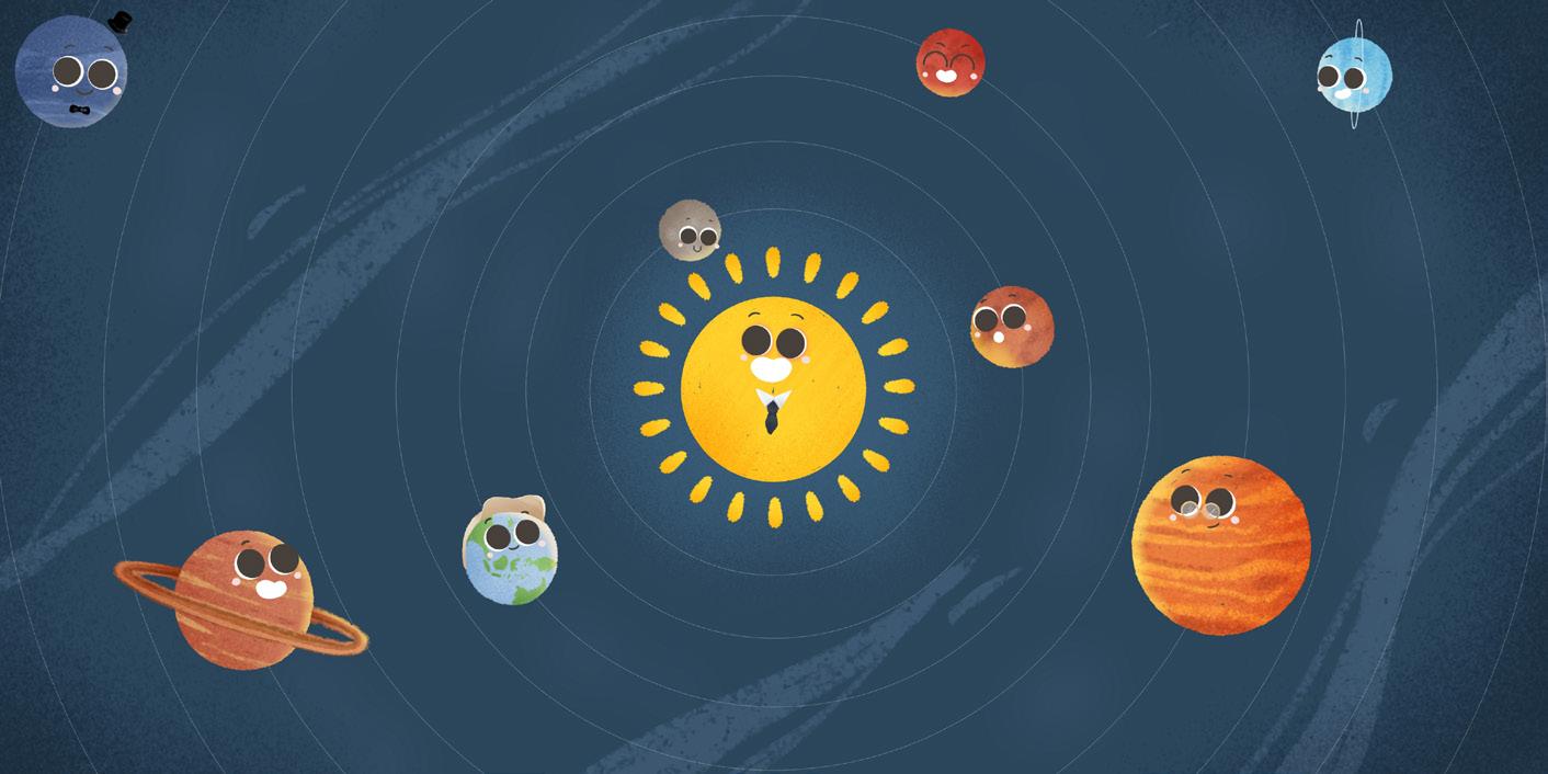
On this occasion, we were challenged to express what we felt for the new year. I illustrate our wish, either it has been done or still stays on our bucket list, as an abstract character. It happened because we have different appearances, but we have the same desires.
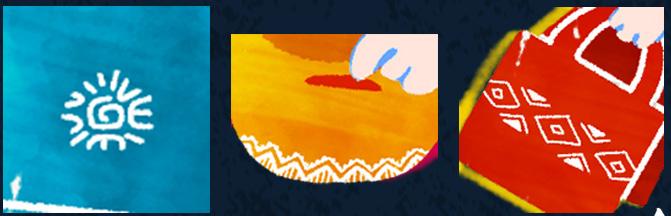
The various colors are like a rainbow to give a cheerful Mexican impression in the middle of the New Year’s Eve sky. In addition, there is a touch of Mexican ornaments in some items at the picture.
Status : Participant Level : National
Software Used : Ibis Paint
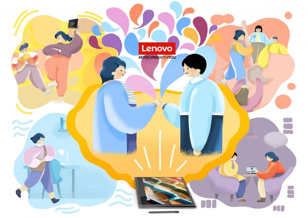
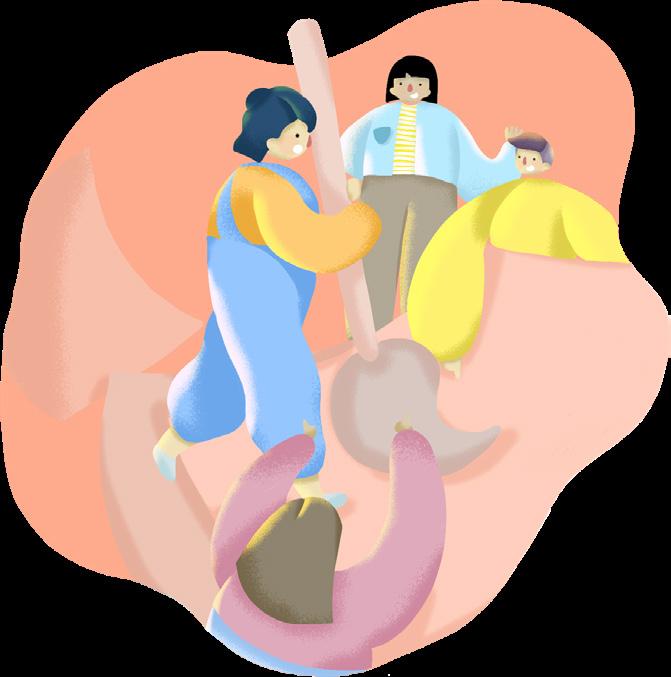
Concept : Make It Easy with Lenovo
There’s no need to worry about creating under the constraints of limited time, space, and media. Thanks to Lenovo laptops, work can be done flexibly. Creators can instantly bring their ideas to life with a wide selection
of applications and features when inspiration strikes. This ease of use enhances time efficiency, allowing creators to meet their commitments while continuously developing their skills and producing new works.


Lightweight and portable, it can be taken anywhere to find a different atmosphere, whether indoors or outdoors.
Working on a laptop can adapt to any environmental conditions, allowing for more extensive and immersive work.

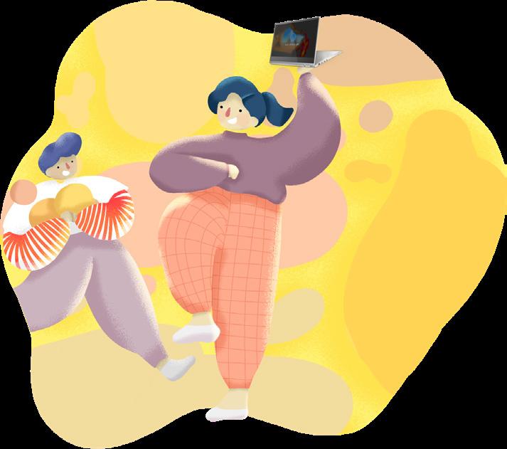

With the latest audio features, finding ideas, expressing yourself, and creating the desired atmosphere become easier.

With powerful endurance for creating masterpieces, you won’t have to worry about the battery running out quickly.
The sequence of illustrations employs the basic colors blue, yellow, orange, and purple to symbolize the times of day—morning, afternoon, evening, and night. Arranged in a cyclical pattern, this color scheme symbolizes that the laptop can be used continuously throughout the work.

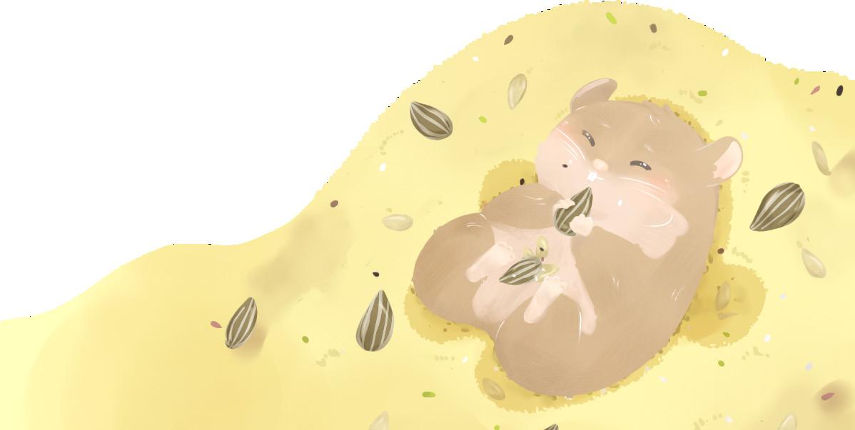
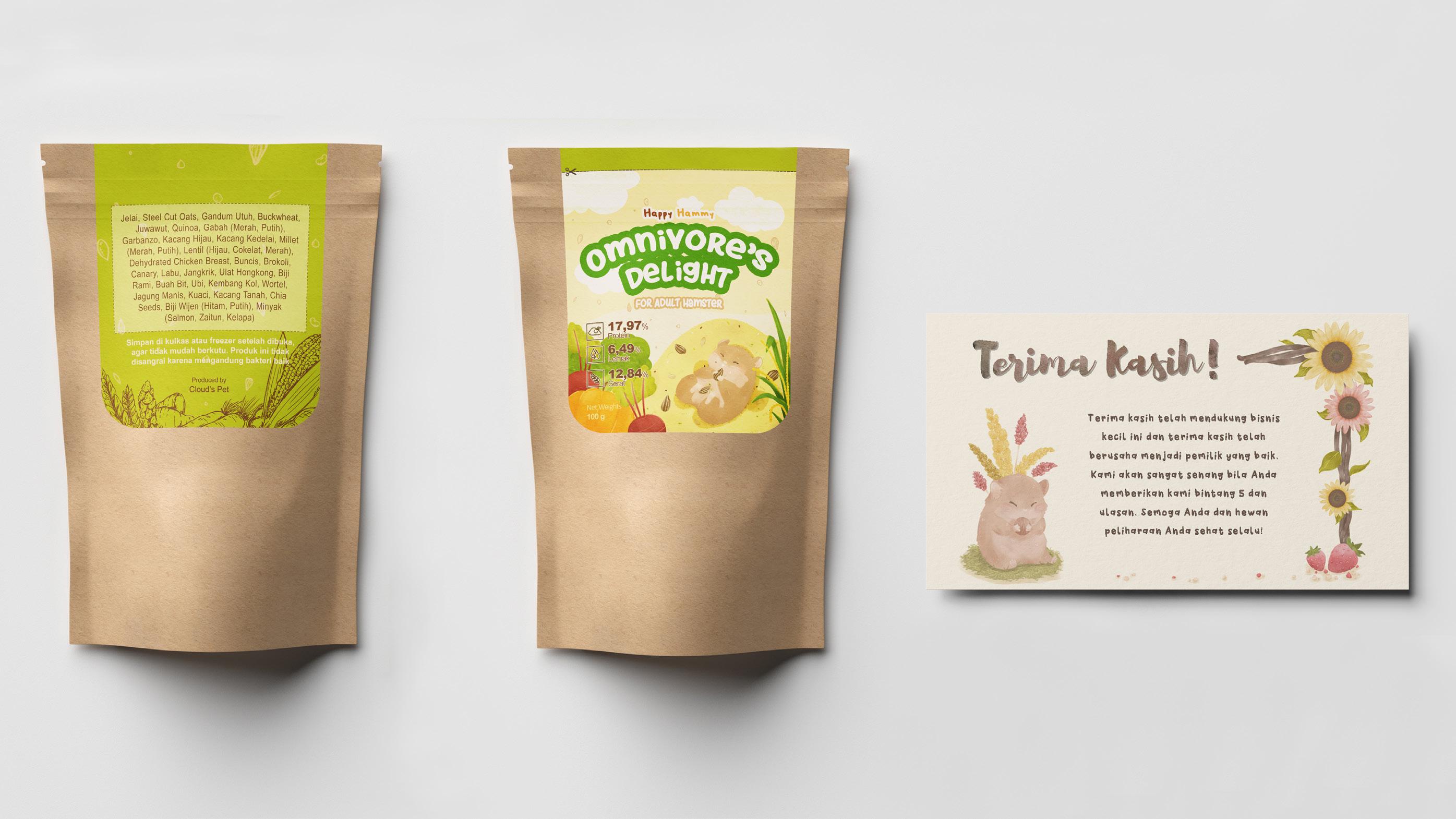
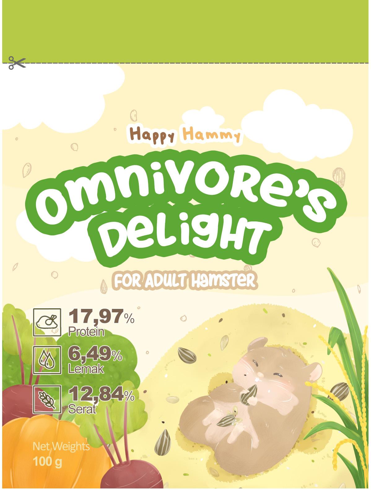
Software Used : Ibis Paint & Adobe Photoshop
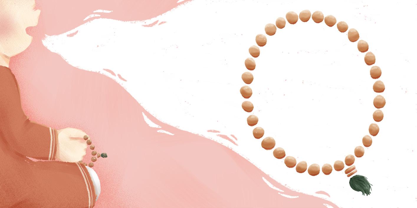
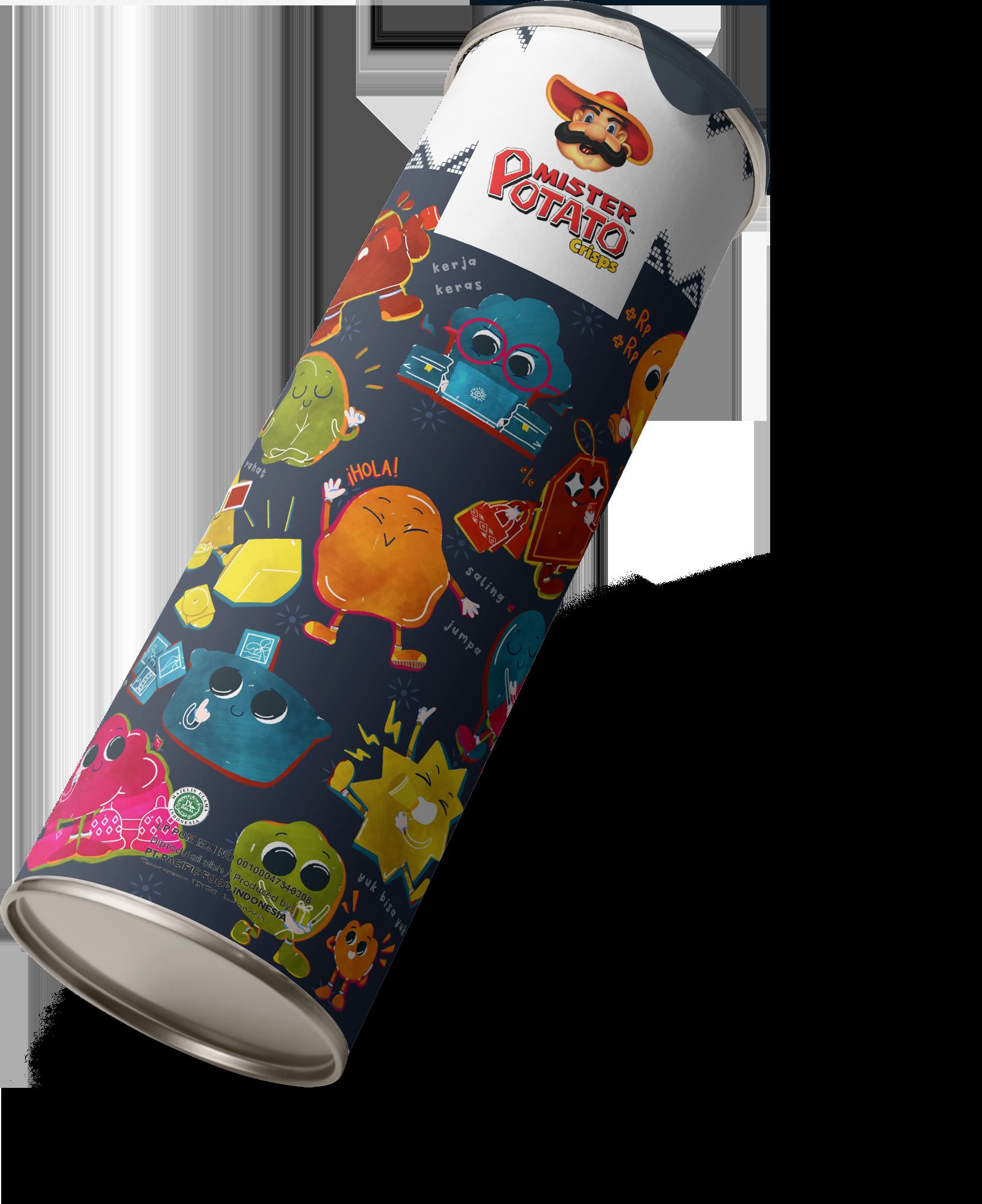
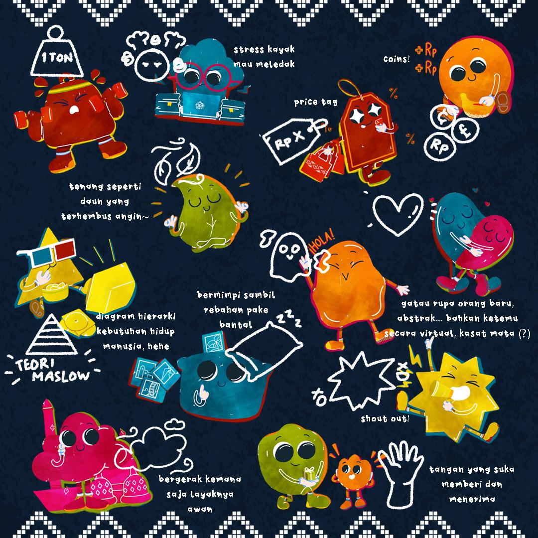
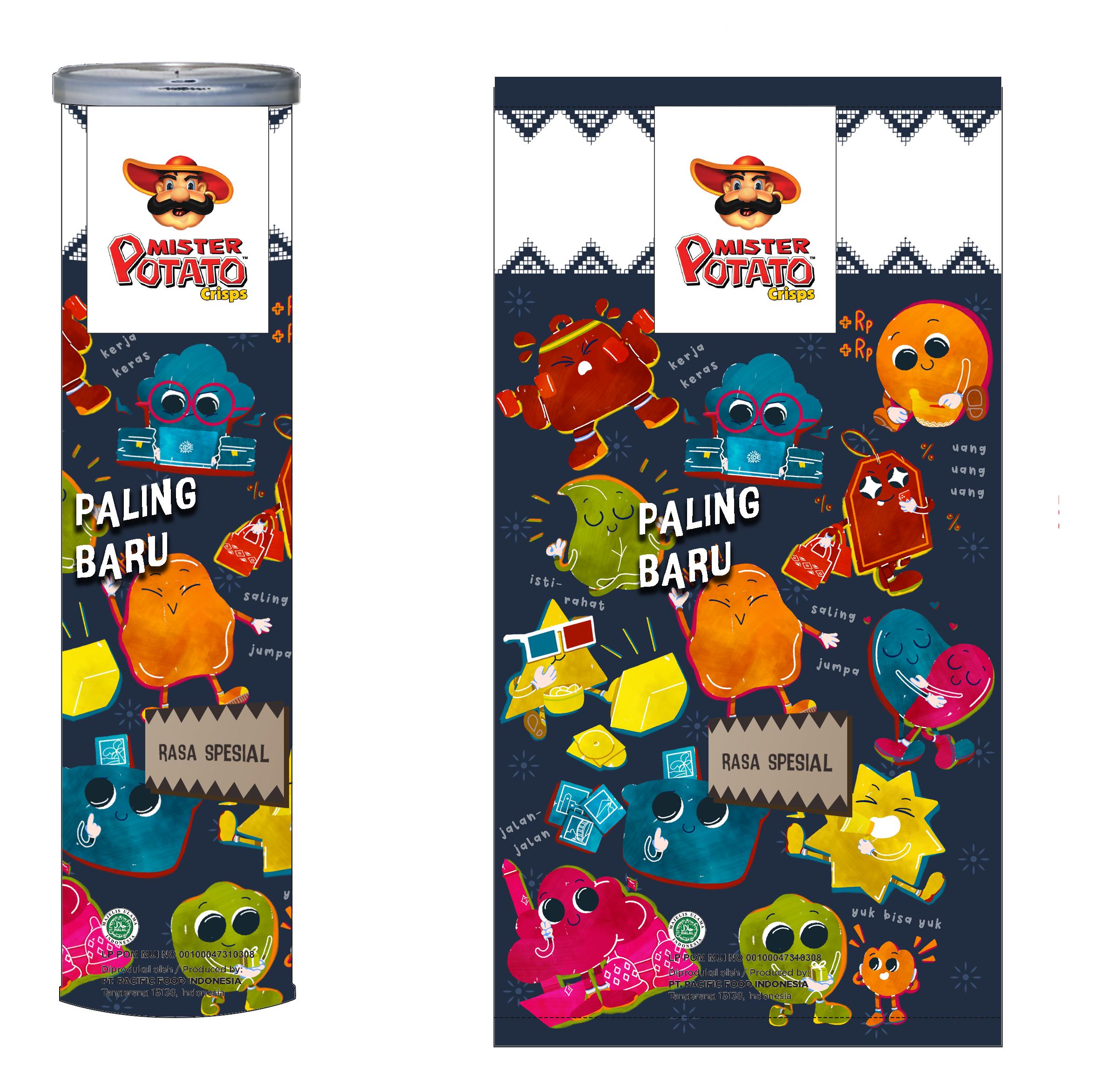
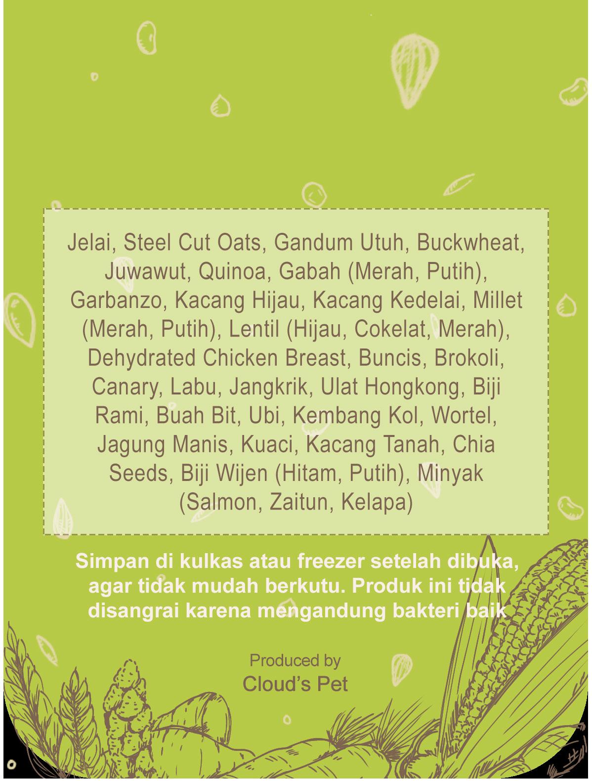
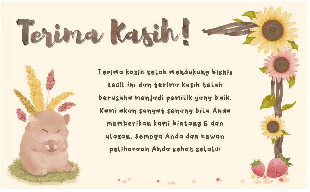
Job Details :
Create sticker packaging and a thank you card for customers who purchase Happy Hammy organic food for hamsters.
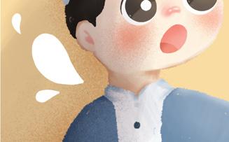
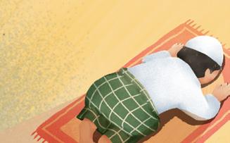
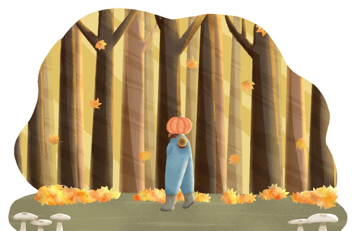
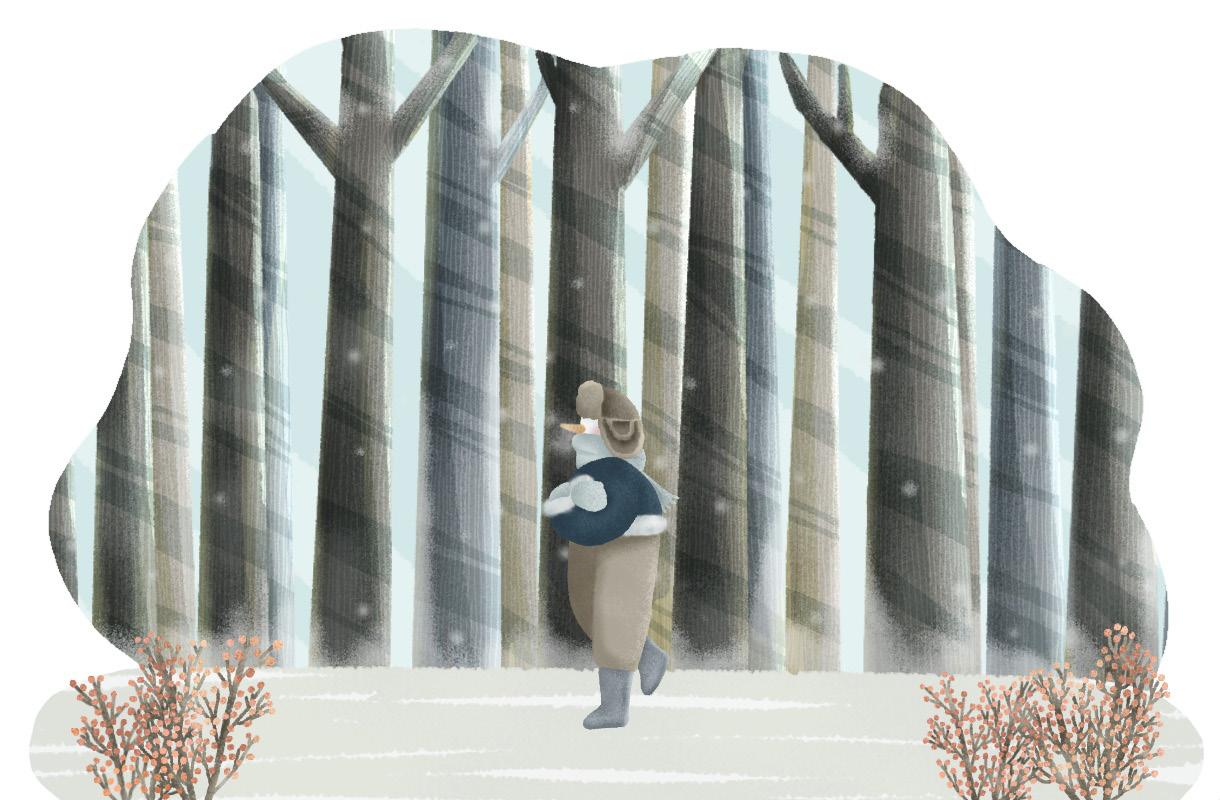
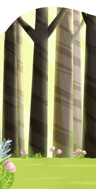
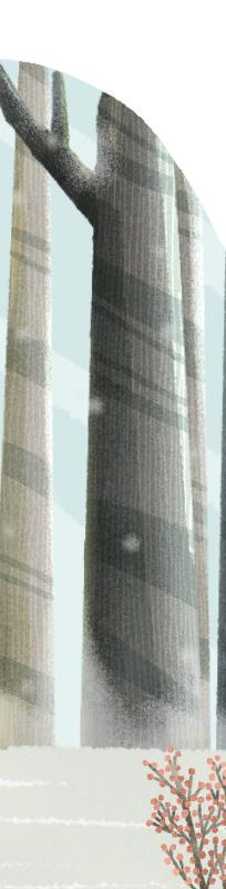
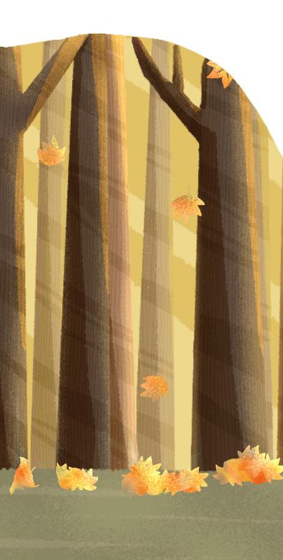
This section highlights my personal projects, reflecting my artistic journey and passion for experimentation.
I explore my own illustrations as they will be published in a book, adding text and laying them out myself. I express my thoughts and feelings through varying colors, depth, and perspectives.
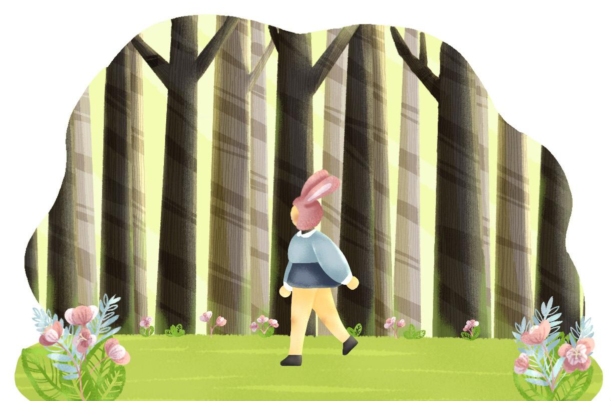
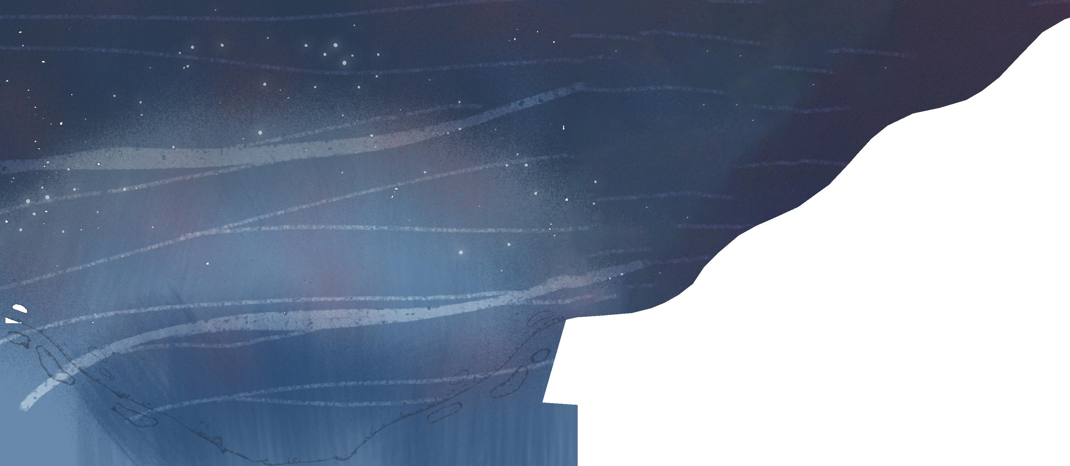
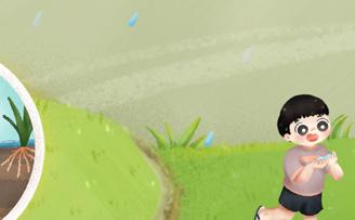
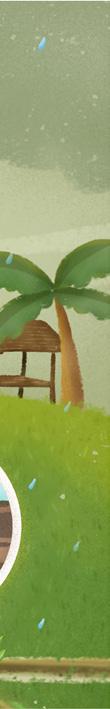
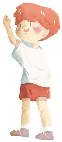
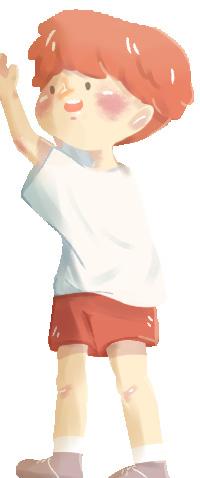
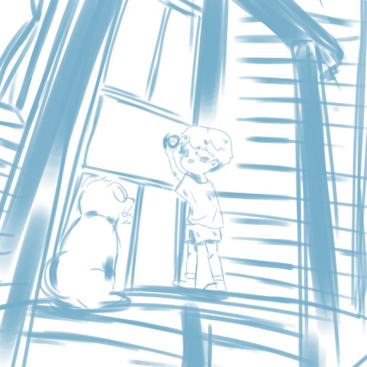
Yeay, it’s finally windy outside! Ma had waited to fly my first kite!
Oh? This kite? Ma made it myself at school on today’s art class!
Mrs. Stephen said we should make something to represent hope as today’s theme and Ma decided to make kite! Mrs. Stephen said it was a good idea because hope is high and free, it should be flown above everything.
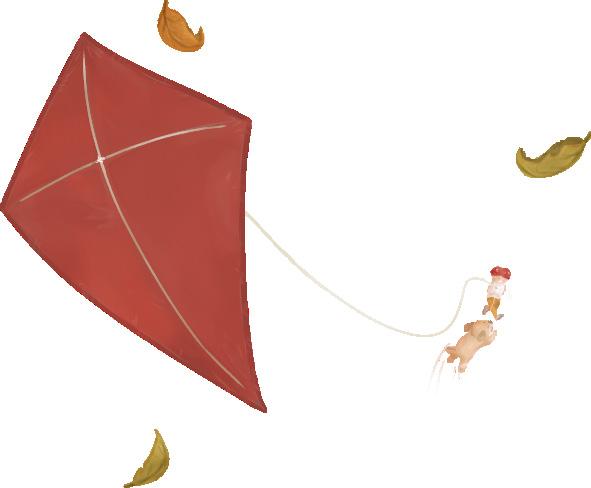
Ma ran through the backyard and look! Ace is here! His tail is wagging! He must be very happy to fly the kite with me!
Soar, kite, soar! Bring my hope as you go!

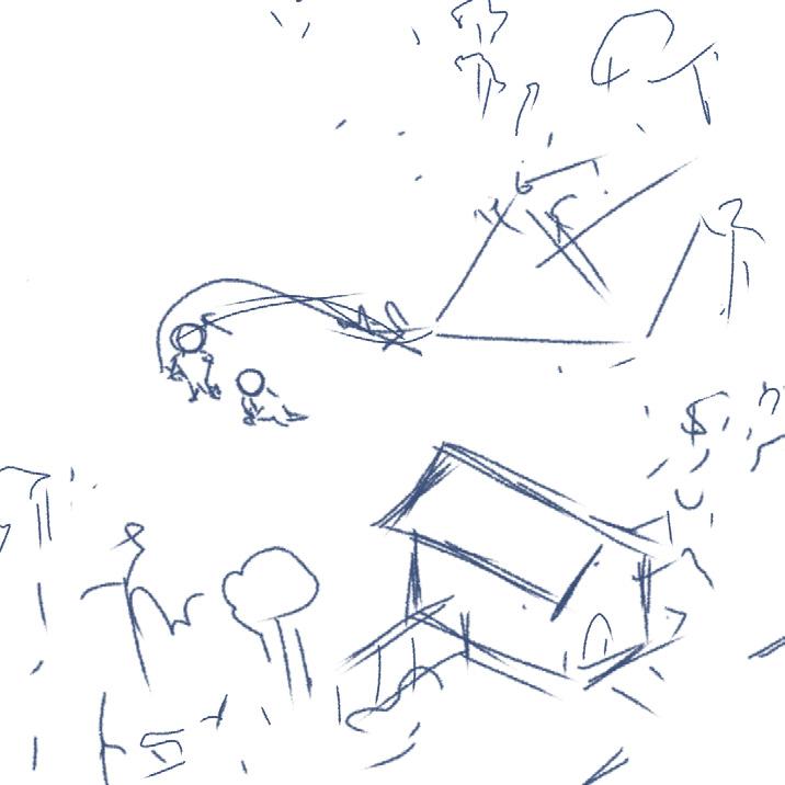
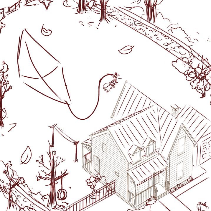
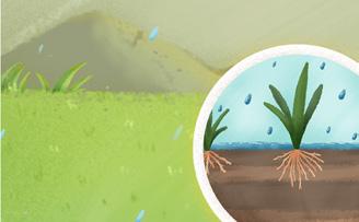
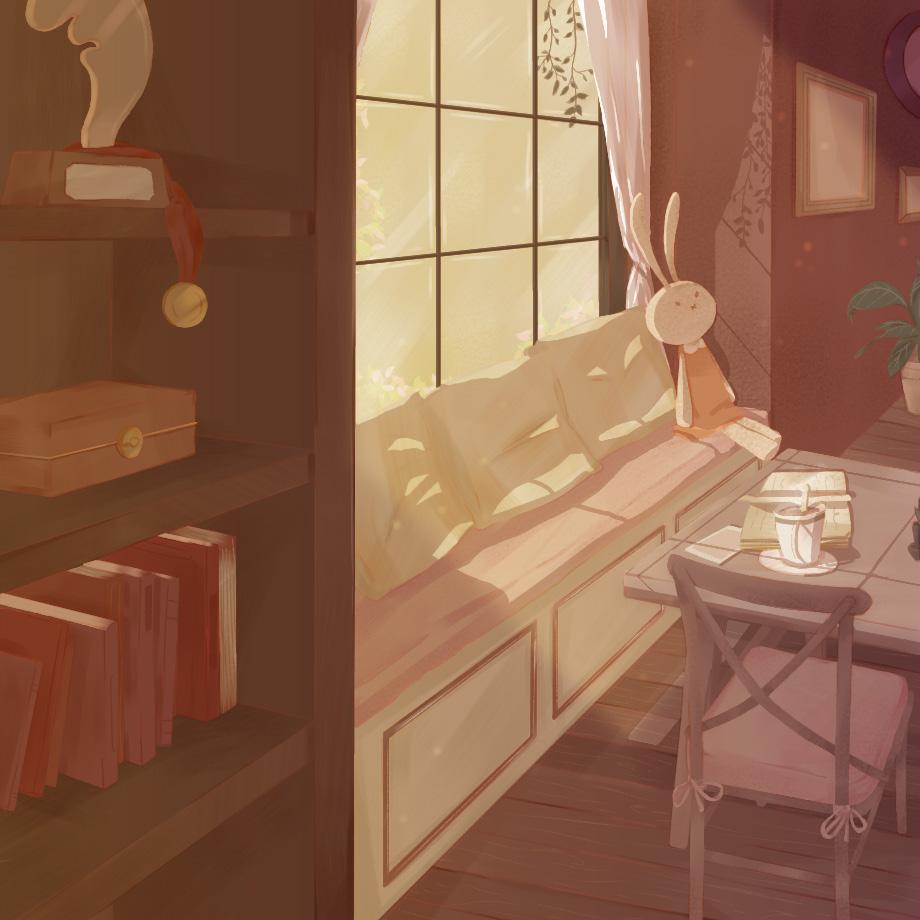
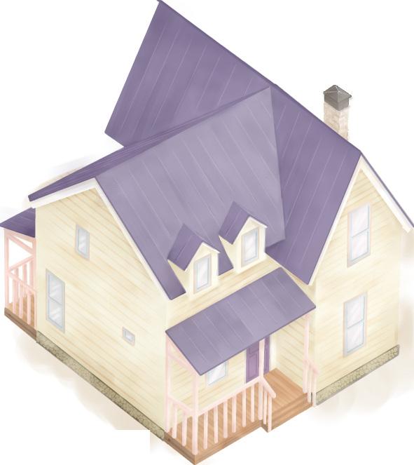
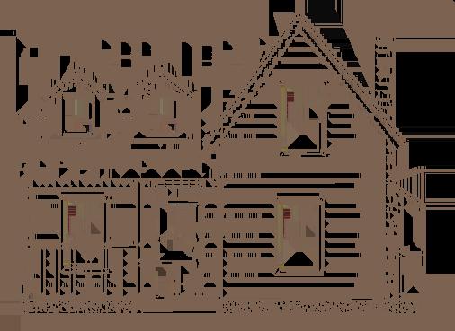
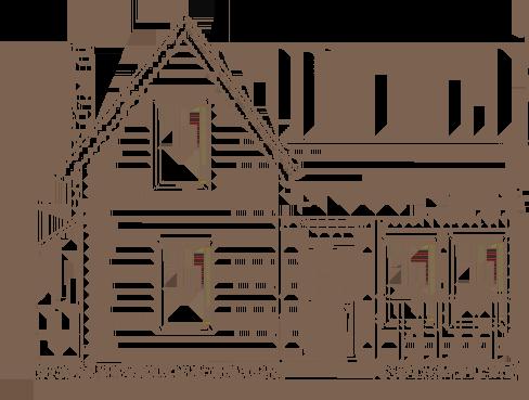
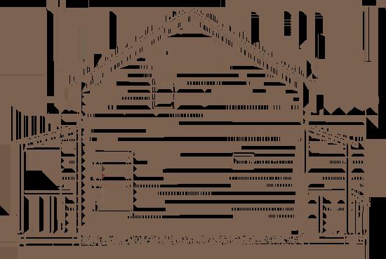
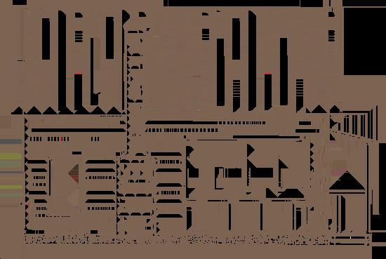
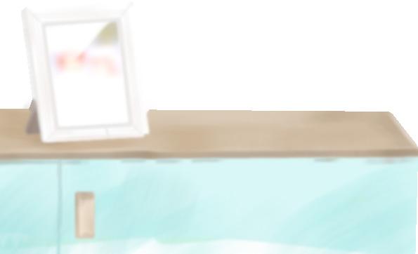
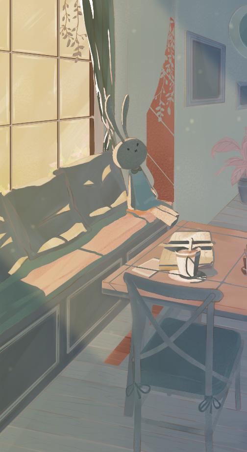
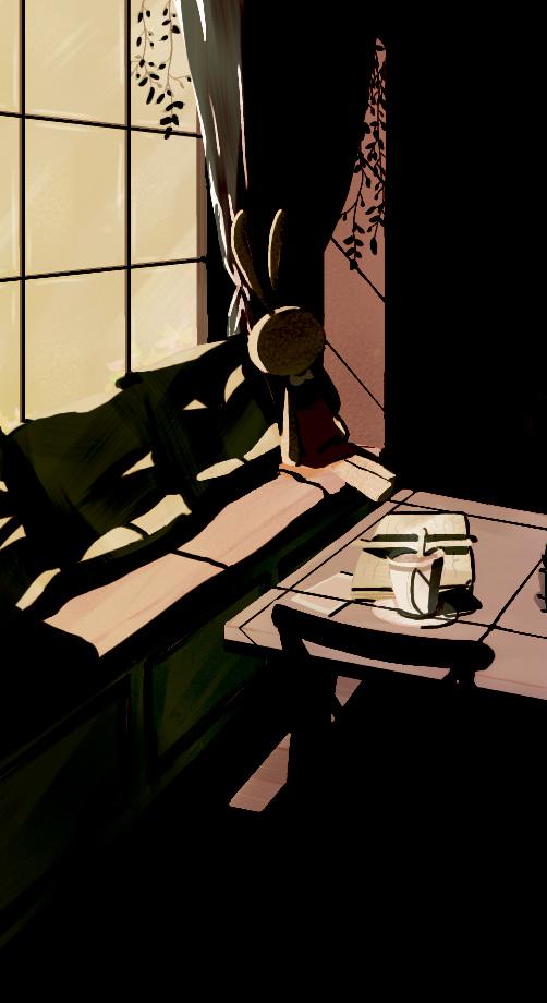
In this painting, I aim to depict where Ma lives. Using orthographic projection, I illustrate the house and its surroundings. To achieve this, I created a concept for the house facade before starting the painting process.
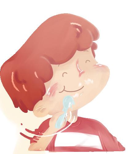
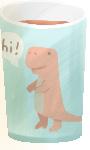
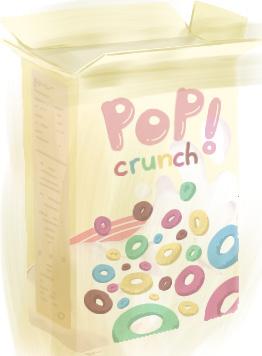
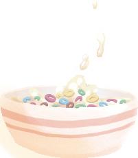
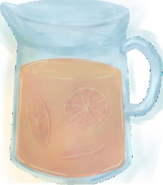
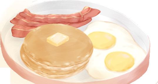
Guess what!
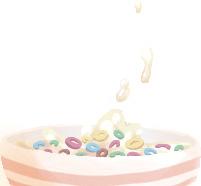
Mom said she bought me the new cereal I saw on TV last time! Oh, boy, they’re so colorful and looks very yummy and, and, they said they are very crunchy! That must taste delicious with milk!
Oh, I’m so ready and excited to try the new cereal in front of me! I took a large spoon of the cereal and milk from my bowl, and-
Oh, it’s so yummy! I really like it! This will be Ma’s favorite forever!

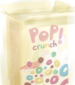
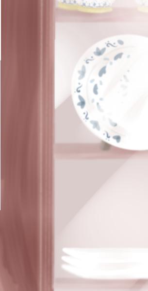
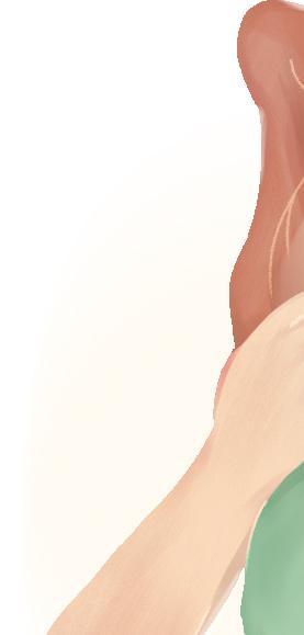
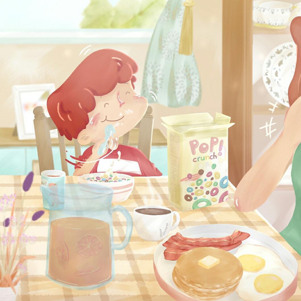
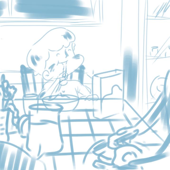
I challenged myself to use more contrasting colors while ensuring the painting remains enjoyable for viewers. To achieve this balance, I softened the strong colors so they harmonize with one another. For the breakfast theme, I opted for a vibrant and bright color scheme to attract attention and radiate joyful energy to the audience.

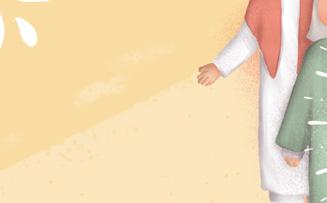
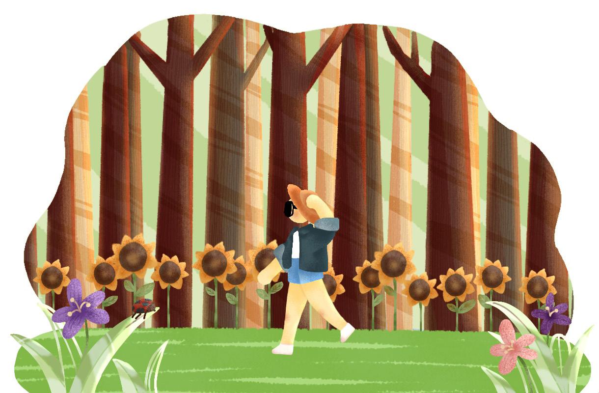
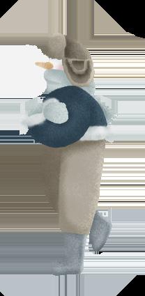
The sky has turned orange and the sun starts to set, it is time for me to go home. Come on, let’s hurry, hurry, hurry! Mama said there are so many surprising things waiting at home. I am so excited!
But, look! There is a dog standing in front of Ma’s door!
Hello, dog! Why are you at Ma’s house? Are you lost? Do you live around here?
The dog only wags its tail. What does it mean?

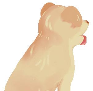
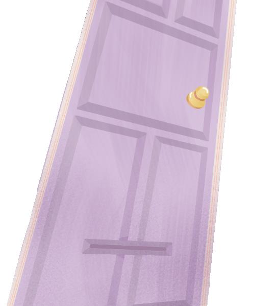
Hmm..
I know! He wants to play with Ma at home!
Let’s go, doggy! Let’s surprise mom and have fun together inside!

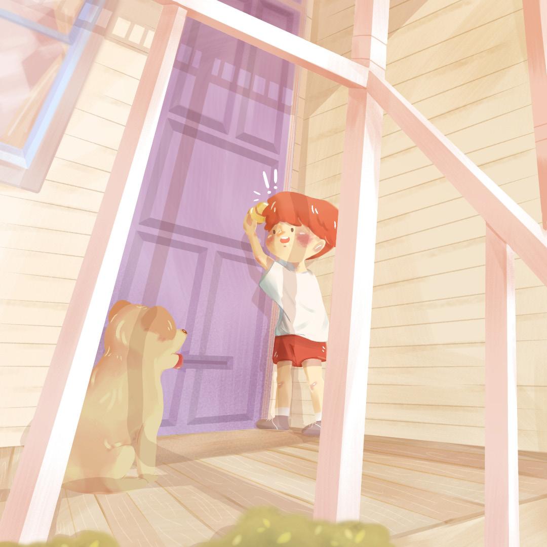
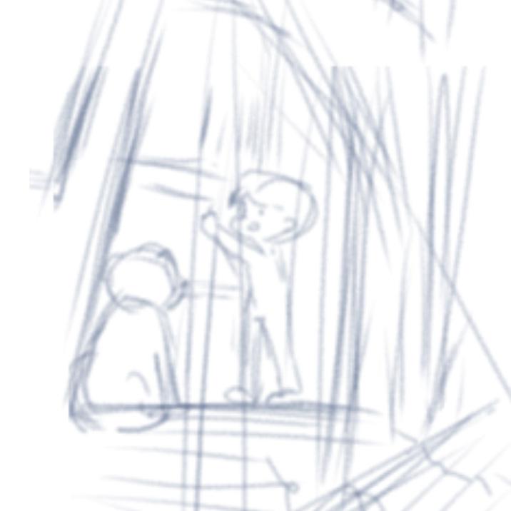
In this painting, I use contrasting colors to highlight the subject while maintaining harmony throughout the composition. My intention is to depict the event that occurred in front of the door before the subject entered his house.


ranafitri23@gmail.com behance.net/ayaaaw
issuu.com/ranafitriathaya