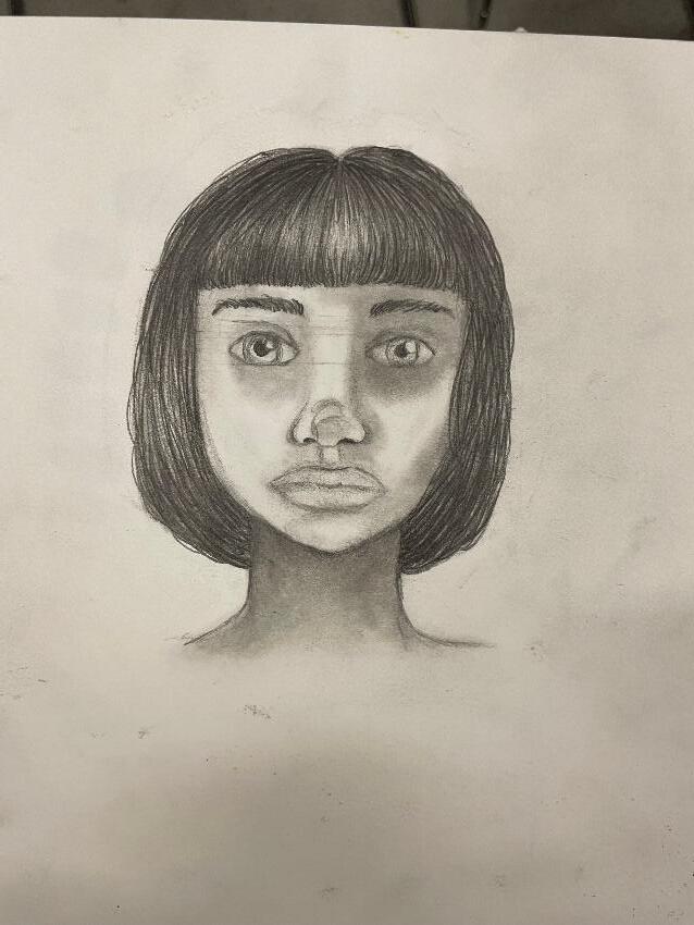
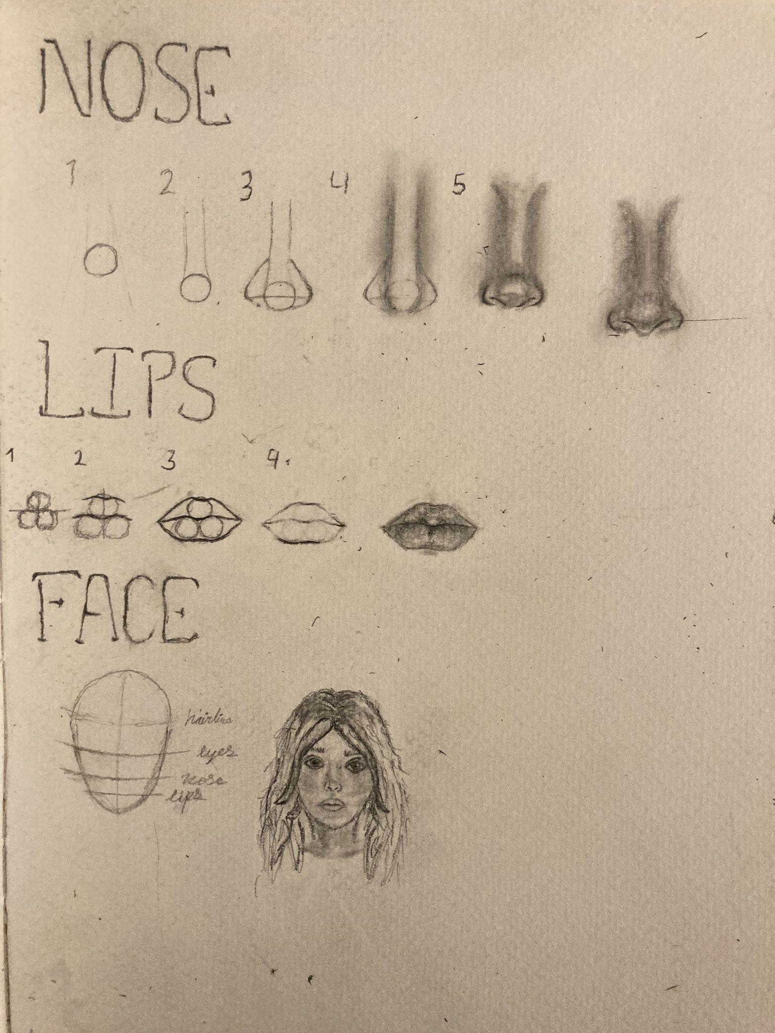
InthispieceIhavemadeadrawingofaportraitinthestyleofrealism Tocreatethisdrawing,Ihaveuseda4B pencil,a7Bpencil,anda9Bpenciltoachievedifferentlevelsofvalue.Aswellasablendingstickandan eraser
Ibeganbydrawingtheeyes,beginningwithshadingthebagsoftheeyes,applyingheavierpressurewherethe shadowswouldbe Thiscreateddepthtomyportraitmakingitlookrealistic StartingwithundertheeyesIwas
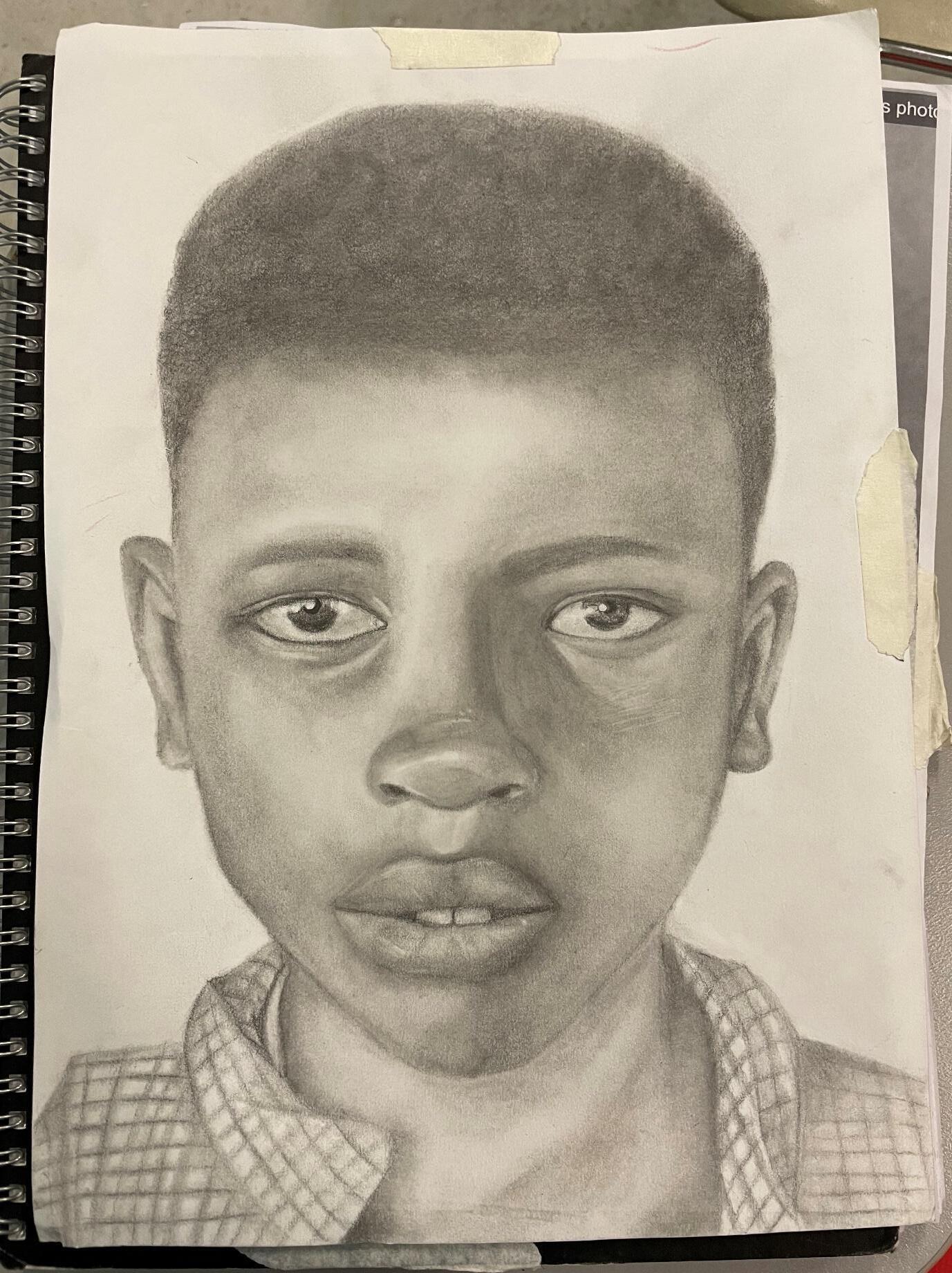
abletoworkmywayaroundtheeye,blendingintotherestoftheface Iaddedheavierpressureunderthebrow andbesidethenosetocapturehowthefacialfeaturesstandoutontheface Usinganeraser,Ierasedwherethe lighthitcertainpartsoftheface.Thismademysubjectlookmorerealandyouthful.Ilightlyshadedaroundthe eyeballtomakeitlook3D,gettinglighterinthecentre Imadetheirisoftheeyebyscribblingdifferentvalueto makethedetail Imadethepupildarkandaddedwhitehighlightswherethelightwouldreflect Thecontrast betweentheblackpupilandwhitehighlightsmakestheeyeslookglossyandcontainemotion,overalllooking realistic.Toachieveasmoothtexture,Iusedablendingstickafterapplyingthepencil.Whendrawingtheeyes andaroundtheeyes,Ilearnedthatwhenyoucontinuouslyaddlayersofvalueontoyourpiece,youseethatit addsmoredepth,becominglivelier
Ithenbegandrawingthenose,Ididthisbyblendingheavierpressureanddarkerpencilatthebridgeofthe nose,creatingtheshapeofthenose Ialsoblendedthetipofthenoseincircularmotionstocreatethe roundness,applyingheavierpressurewheretheshadowswouldbe Whilstdrawingthenose,Iwassuccessfulin makingitlooklikeitstuckoutoftheface.Thisisimportantbecausethenoseisthemostpredominantfeature onperson Iaddedwhitehighlightswherethelightwouldhitbyrubbingtheeraseroverthetipofthenose This addsmorepersonalityandrealismtothedrawing
Toachievethestructureoftherestoftheface,Iusedmyblendingsticktostarttoemphasisethefeaturessuchas theeyebrowsandfaceshape,addingmoreandmorevaluestocreatethefeatures Focusingonthelipsofmy subject,Ibeganbyaddingdarkvaluesaroundthecupid’sbowmakingthelipsappeartobefullandstickingout oftheface,continuingbyblendingitintotherestofthefaceusingmyblendingstick.Inthecentreofthelips, wherethepartingis,Iaddedheavierpressure,blendingitoutleavinglightershadingonthetopofthelips This makesthelipslookrounderandfuller Iaddedthealmostchappedtextureofthelipsbyapplyingsmallstrokes ofpencilinacurvedmotionclosertothepartingthelips,contrastingwiththewhitehighlightsIcreatedusing strokesofmyeraser Fortheteeththatareshowing,Iusedmyblendingsticktoapplyshadowaroundtheteeth topreventthemfromlookingliketheystickout,astheyareunderthelips
Tocreatethehair,Iusedthesideofmypencilandscribbledincircularmotions,thenIusedmyblendingstick incircularmotionstoblendthehairout Thesoft,woollytextureofmyblendingstickmadeachievingthe textureforthehaireasier Thiscreatedavisualtexturewhichlookssoftand3d
Whilstdrawingmyportrait,I’velearnedthatusingablendingstickcreatesalotmorerealismthanjustapencil, asnoharshoutlinesareseen ThisisapparentespeciallywhenIdrewtheshirtofmysubject,whereIuseda blendingsticktocreatedirectionallineswhichlookapartofthefabric.
Inmyportrait,Iwassuccessfulwithmakingthefeaturesofmysubject’sfacelookthreedimensionalbyusinga varietyofvaluestocreatedepth,andsmoothblendingmakingtheskinlooksoftandyouthful.However,Ithink Icouldhavefocusedonmakingthehaircontainmoretextureandlookmoreaccuratetomysubject Thepencil onmyportraitalsostaredtocrumbleonmypaperafterIleftitinmyportfolio,toavoidthisIshouldhaveused settingspray Theproportionofthefacefeatures,suchasthemouth,couldhavealsobeenimproved
The Memory Project Part 1
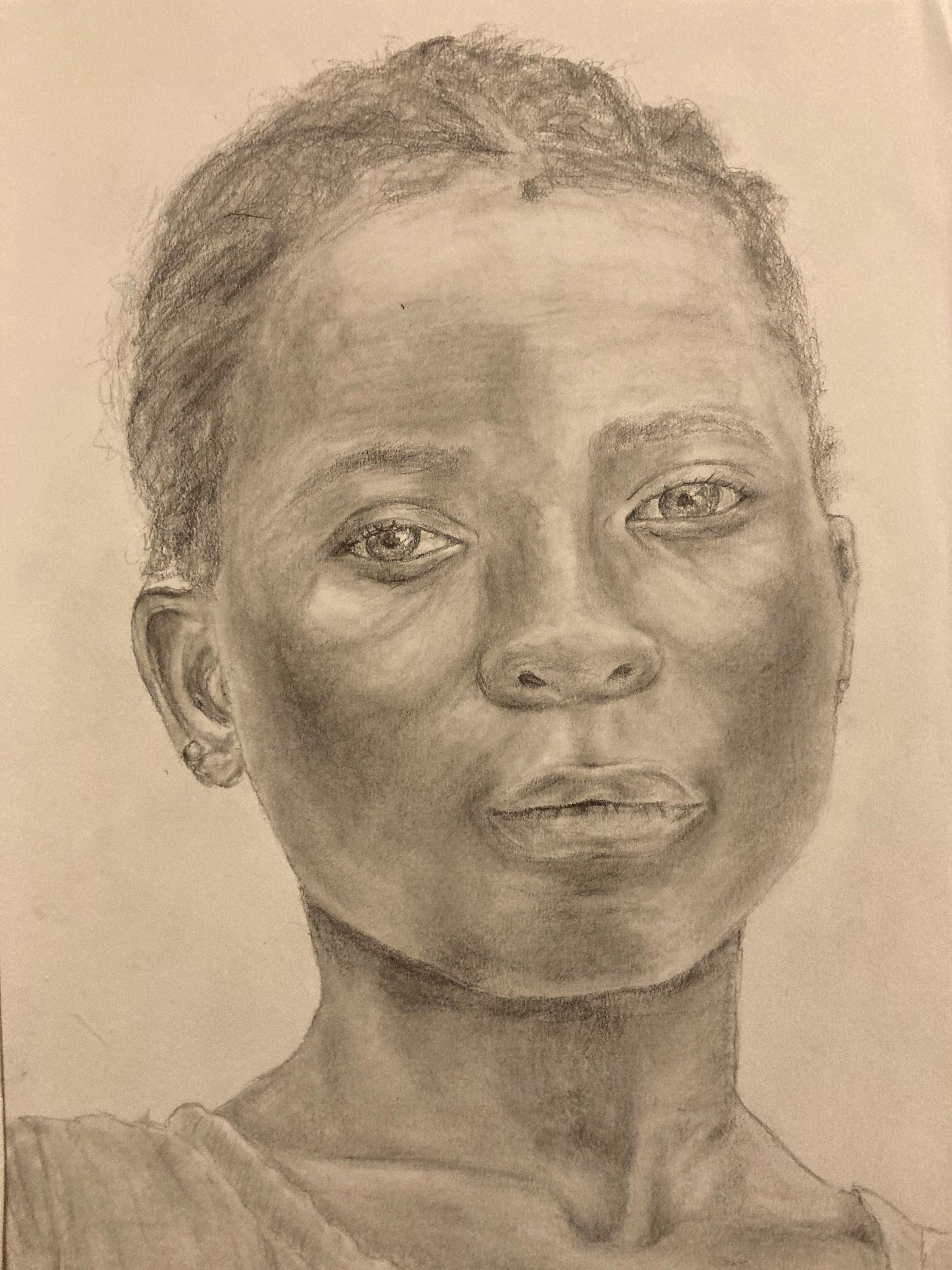
Finished pencil portrait:
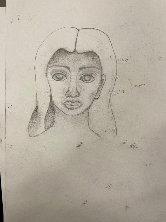
Facial features:
Analysis:
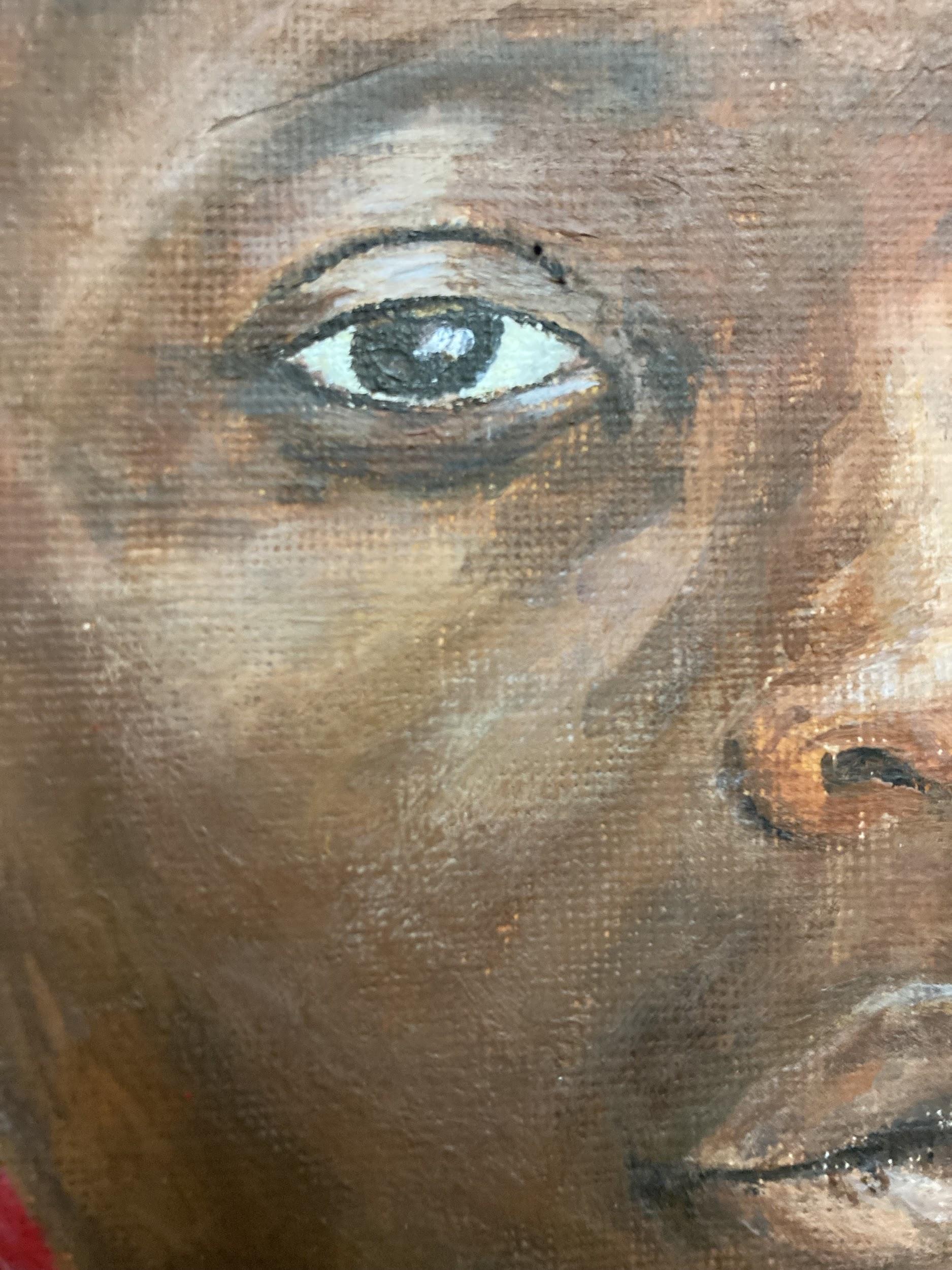
Here I have composed a pencil portrait made from reference I have used a 2B pencil and tools to blend and erase, creating texture within the piece. I started by creating an outline by copying key features from the original image onto the portrait using carbon paper. I used feathery lines and broken tones in certain areas to provide contrast throughout the piece It was important to portray a rounded portrait as the face is not meant to be a flat image.To do this I used graduating tones, blending fine lines throughout the piece both to smooth the texture and to contrast from angular areas such as the eyes and ears I have learned how to portray facial features both individually and as cohesive pieces of a portrait. I have learned how to blend and shade to create depth and dimension within a piece I was able to apply what I knew of line, tone, form, and pattern to create texture and display a three-dimensional composition from a flat surface. One of my favorite things about this piece is the varying patterns within the hair.The textures within the hair differ immensely from the fluent motion portrayed within the face The hair contains a more fragmented composition in comparison with the rest of the piece through the use of irregular sharp lines This irregularity provides a character within the piece showcasing the likeness of the original photograph Another great feature within this piece is the level of detail. Looking at the reference sheet, it is clear that the contrasting tones, such as eye bags and colour irregularity, are displayed quite well The tones throughout this piece are possibly the best part of the portrait The variation between dark tones in shaded areas to lighter tones in more spacious areas is the sole reason for dimension within the piece.These areas allow for realistic details to be embellished, such as the shadow underneath the eyes and the abnormal highlights on the cheeks and collar bones To improve this piece I would simply emphasize what is done well, adding more contrast and more detail to the face. One of the shortcomings of this piece is that key features do not stand out as much as I would like To enhance my work, my goal would essentially be to have less muted tones. I would darken dark spots and emphasize areas that deserve emphasis (the hair, for example, should be more intense) in order to move away from the uniform variation of the portrait This would increase contrast and detail.
VisualArt
March 2022
HS Elective Memory Portraits
I have created a portrait using a variety of colors and textures as a way to represent a particular individual as part of the memory project.
I began by creating a base color for the portrait (this does not include the background or shirt) using the original picture (and color wheel) as a reference I did this by mixing different hues of primary colors as well as standard brown shades, such as burnt sienna, to match the brown portrayed in the reference picture and create the predominant color within the portrait I then created different tints and tones of this shade by adding white and black (as well as other primary colors at times) to create various highlights and shadows within the painting I also used this technique of adding to the leading color to create the tones seen in the hair.

In creating the skin, I used a small angled brush to give a smooth texture and to differentiate from the rougher textures of the hair. Fine lines were added for detail using a dark, near black, tone and fine tip brush in areas such as the eyes, nose, and inner mouth line.
The contrast was the most important obstacle in painting the skin as it was necessary to have a clear mark of shadows and highlights, as portrayed in the original photo To do this, I used tints and tones of the base brown color for lighter and darker hues throughout the portrait For the cheeks (as well as the upper eyelids), as prominently displayed in the photo to the left, I used a very small layer of opaque white to create a glaze adding an illusion of reflected light to the piece
In creating the piece, I started by outlining individual facial features (ie eyes, nose, lips) After creating an outline of the original photo using carbon paper, I was able to single out facial features and add different hues of paint where various highlights and shadows would be needed The lips were quite difficult as it was hard to find a color that matched the original photograph. In creating the lips, highlights and shadows were extremely important as there was both a defined line showing where the light seemed to hit the lip, as well as the actual end of the lip portrayed in the photograph With that said, it was important that I used my prior knowledge of how to draw lips to create dimension and portray them as a continuation of the face rather than a singled out facial feature The previous trials of painting eyes were absolutely crucial to my success in painting this portrait Without prior knowledge of how to blend the whites of eyes, for example, they would likely look washed out or somewhat cartoonish, either way, simply unrealistic Facial features, while only being segments of the face, come to define the portrait as they are the key qualities of the subject.
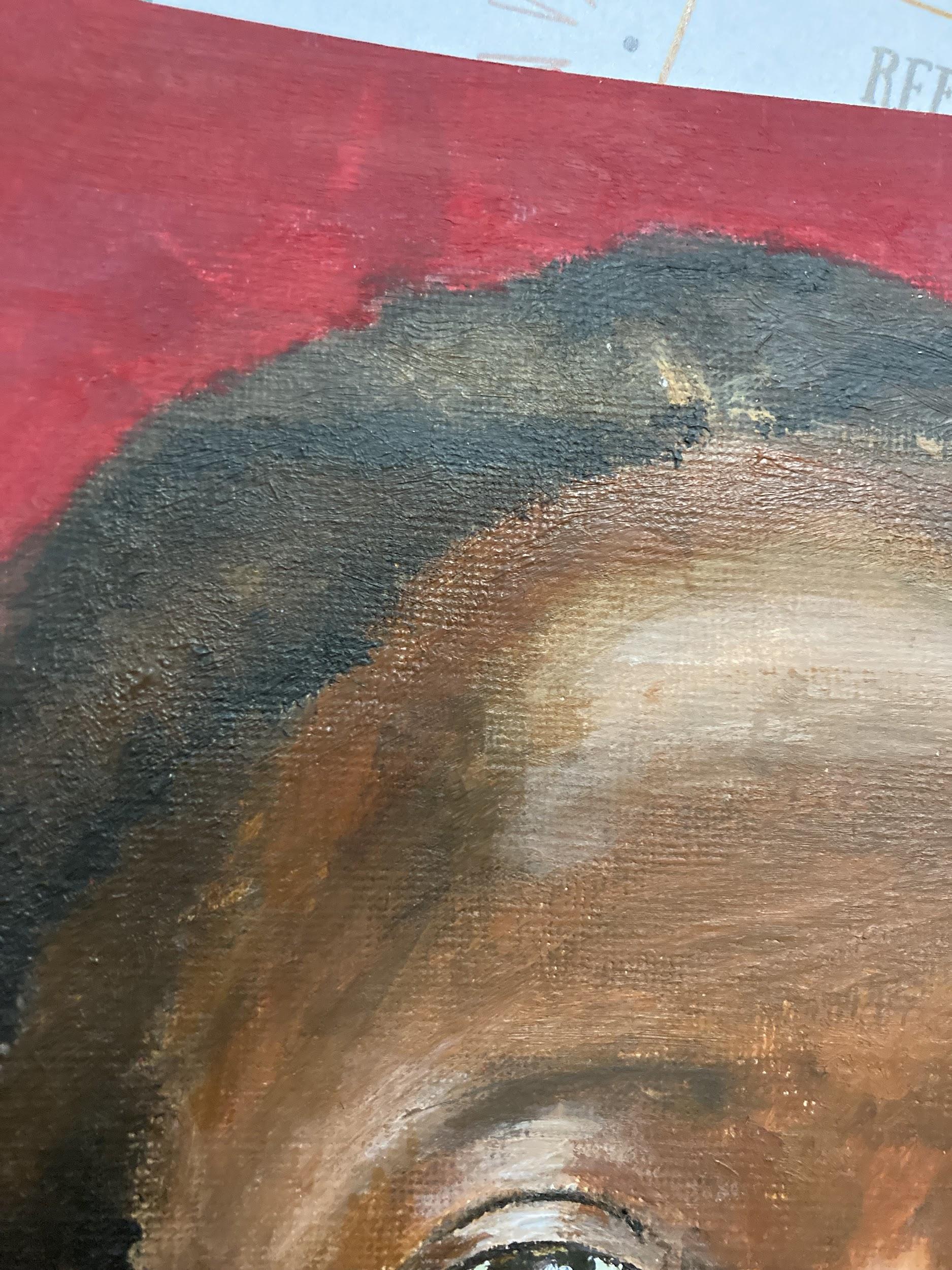
For the hair, I used a different technique in order to differentiate between the textures of skin and hair as seen in the original photograph I wanted to give the hair more of a rugged look.To go about this I used a rough paint brush, as well as a darker palette, and used more of a stippling brush application (ie repeated spots of paint rather than continuous strokes) The hair was very difficult to portray as I not only had to create a more uneven texture, but also had to incorporate highlights and such while maintaining that texture
The color harmony between the shirt andthe background could be interpreted as both a complementary color harmony or a split complementary color harmony As green and red are complementary colors, the bright turquoise hue displayed in the shirt contrasts the vibrant red background creating an intense and striking atmosphere This dramatic contrast also creates a rather stimulating mood, drawing the viewer into the piece
I love this piece because I think it is generally an accurate representation of the original photograph While there are many flaws and clear differences, a viewer is able to look at the piece and clearly make out the subject of the portrait.
One of the first things that stands out to me as needing improvement in this piece is the eyes. By using such a dramatic and harsh tint, the eyes’upper lids look almost flat. In addition, because the crease in the eyelid is so far spaced from the eye itself in the left eye, it looks as if she is almost sleeping, or that her eye is partially closed.This also stands out when shown in relation to the right eye, which appears to be much more open and is also just generally bigger Because of this contrast, the variation in the eyes is a huge flaw within the piece In looking at the images attached to this document, it is also evident that there are a number of places where the canvas is still visible underneath the paint To prevent this in the future, I should add more paint to those areas and perhaps start with a base coat of paint ensuring that the entirety of the canvas is covered before adding details.
Memory
Diamantopoulou
Portrait Alexandra
Finished Portrait:
Photographs of Parts in my portrait:
Annotations
Whathaveyoudoneandwhyyoudidit/ howyoudidit,suchasthemediaand techniquesused?
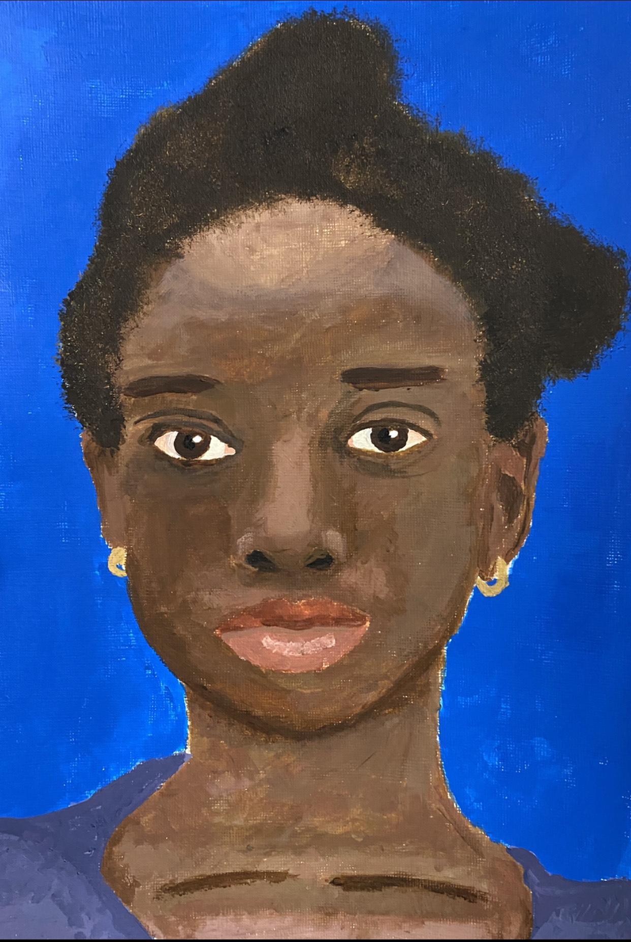
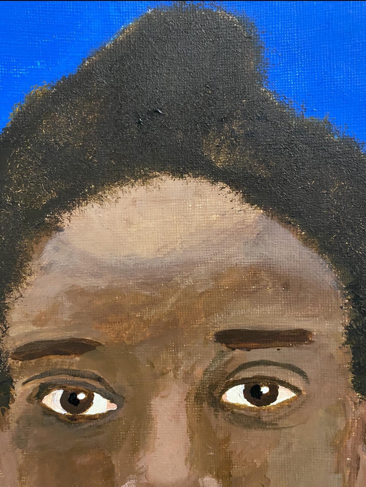
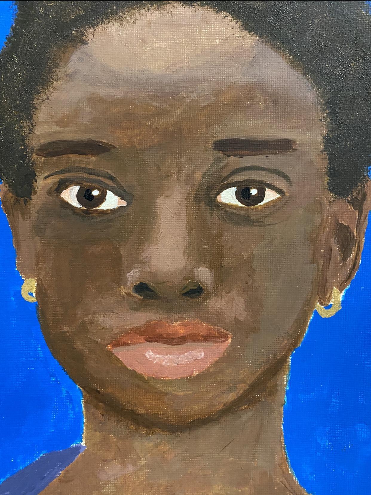
What I've created is a portrait of a young African girl (10 years old). This was a lengthy procedure, but it served a useful purpose. The goal was to make the child happy by giving her something to remember for the rest of her life. Initially, the method employed of experimenting with how to obtain realism of the girl's face features was sketching the portrait with pencil. The end result was an acrylic portrait of the girl on paper as support. It began with a basic outline of the girl’s reference photo, after which I had to continue painting the various shades and values of the skin tone and hair until it resembled the reference photo. By choosing to add tones and tints of blue (limited palette) in the cloth and the background I aimed to bring volume and add an atmosphere in the portrait. Blue, I believe, is an excellentchoiceformysubject.
whyyouchoseaparticulartechnique.?
The use of the glaze technique was a special process for my portrait. It is a semi-transparent layer of thin paint that is mostly used to produce skin tones. The reason I chose this technique was that it allowed me to apply a smoother layer of color to create the skin tone and further easily blend it. I believe that by utilizing glaze, I was able to deepen the skin tone color and give the portrait's facial features a vibrant brightness.
whyyouchoseaparticularcolourharmony/colourcombinations forthebackgroundandclothing?
The background was intended to be blue (primary color) because it is the girl's favorite color and I wanted to include it in her portrait. The purple color of the garment, on the other hand, was a personal choice (palette). Blue and purple, in my opinion, are complementarycolorsthatactuallybringtheportraittolife.
#2
Annotations
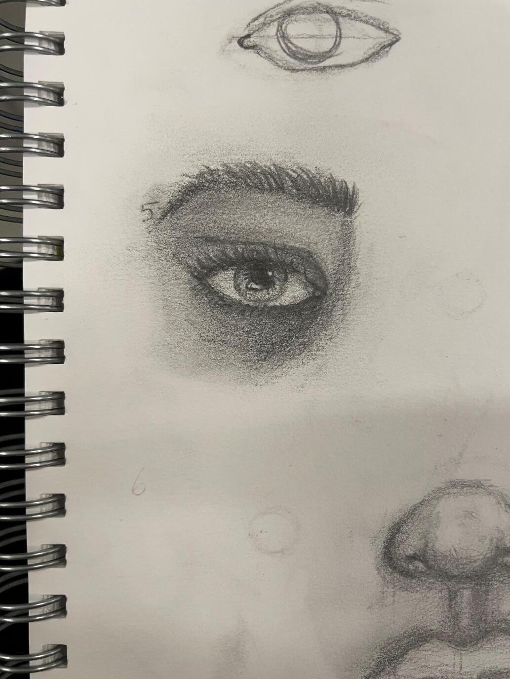
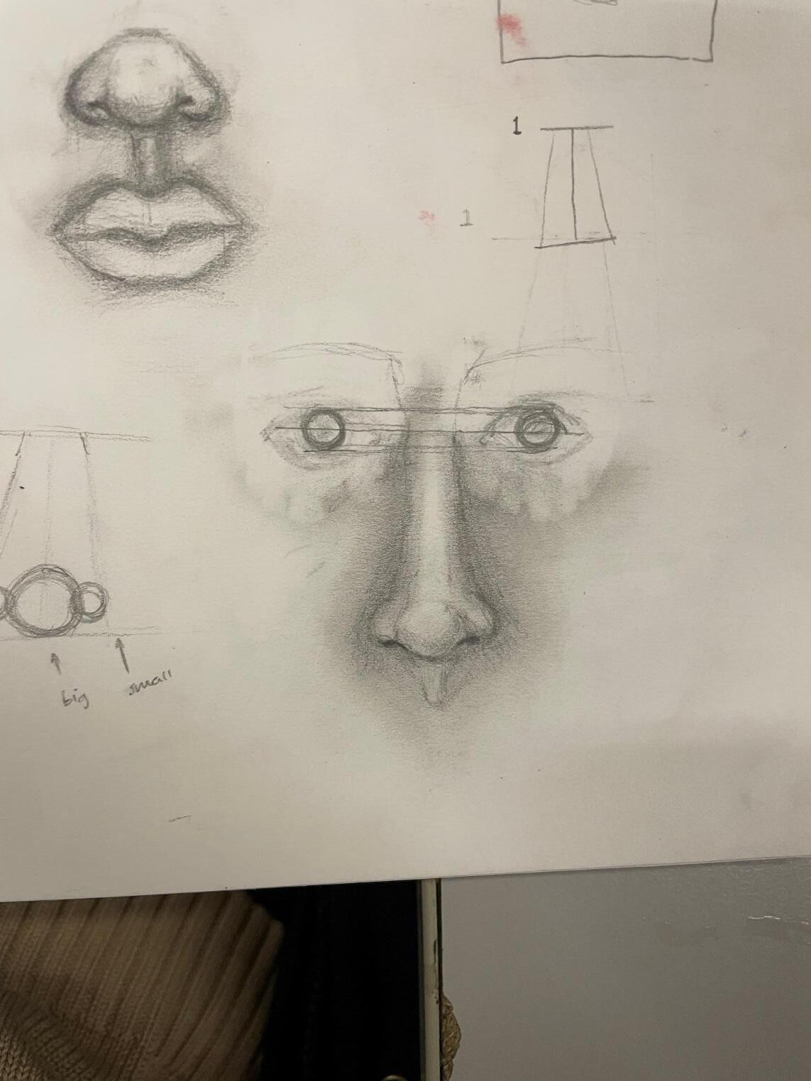
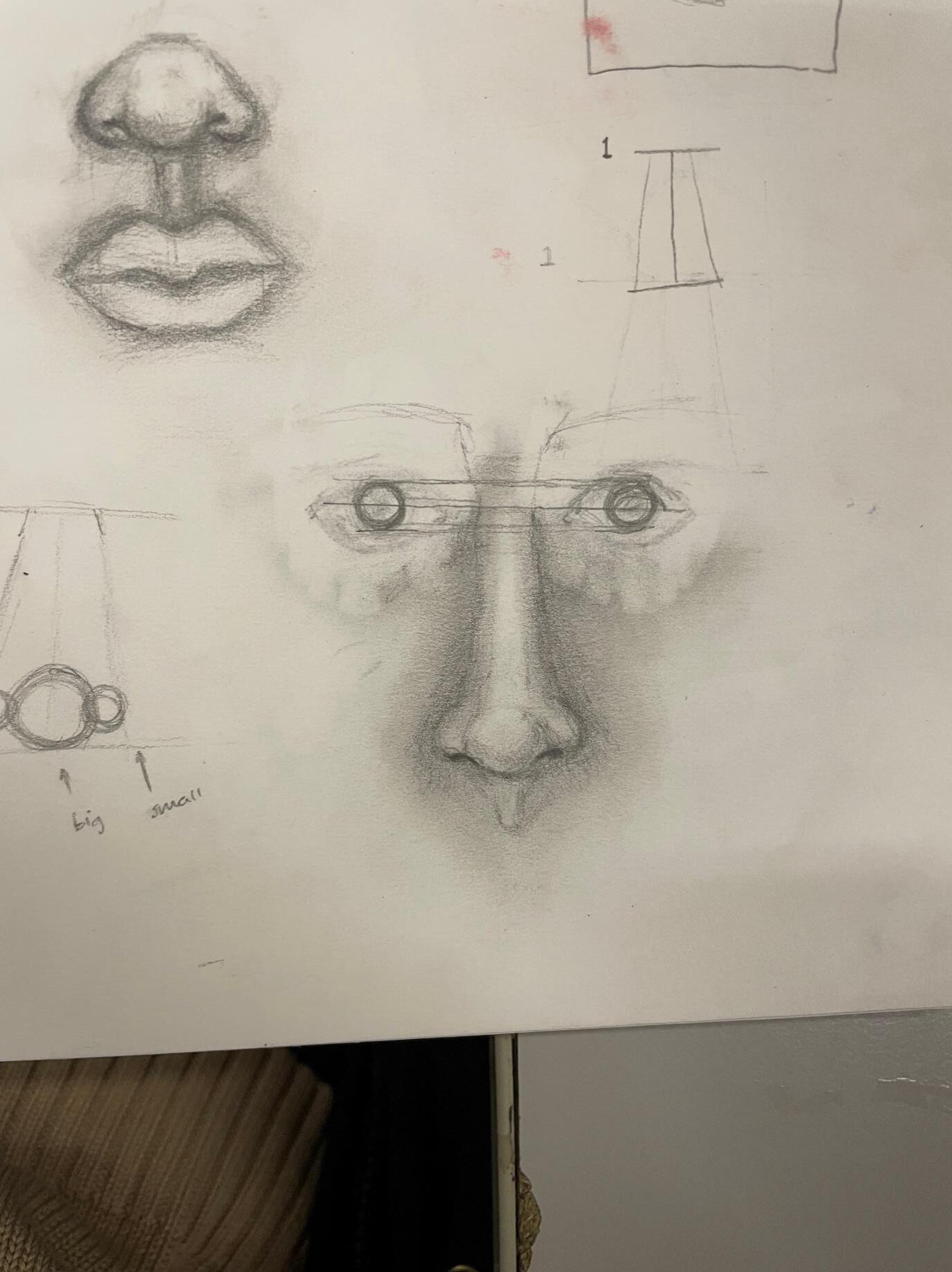
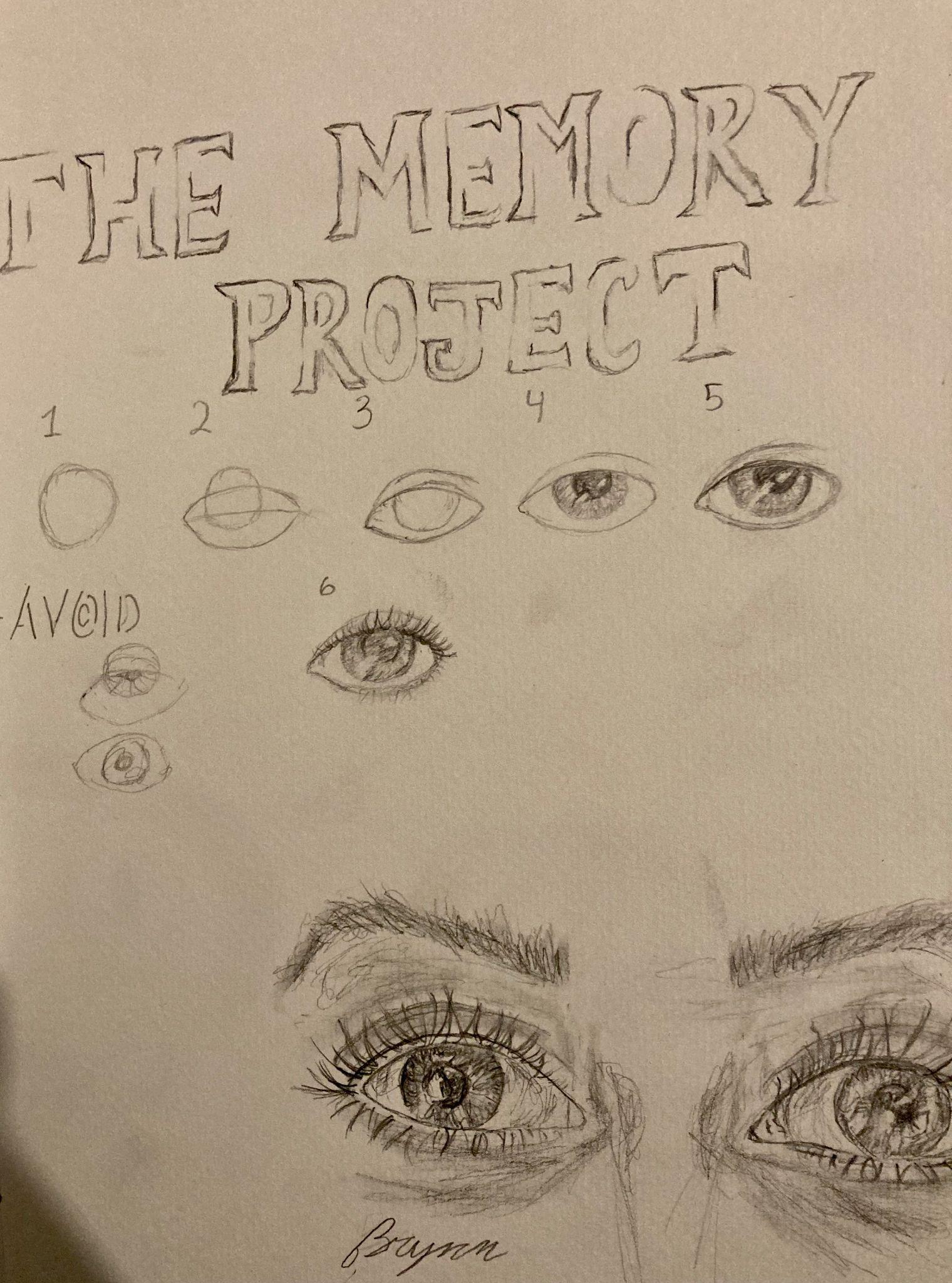
whichofthepreviousexperimentsofdrawingfacialfeatures,paintingtheeye/nosewas helpfulandinwhatway?
Experimenting with drawing eye features was particularly helpful, as in my portrait, I focused on eye expression because I think it’s the most straightforward way to elicit a response from the viewer. To draw the nose in my portrait, I had to have a lot of practice with varied light and dark patterns, as it is crucial to use tonal variations to create volume inthefeature.
Whataspectsofyourworkdoyoulike?
I'mreallypleasedwithhowthehairturnedout.Theoverpainteddetailsandtextureofthe hair provide depth and body to the hair, catching the eye of the viewer. I also like how the eyes turned out. They bring life into the portrait, a dramatic tone that is fascinating to watch.
Annotations #3
Annotations #4 howyoucouldimproveyourwork?
Working on my nose-drawing skills is one option to improve my work with acrylic portraits. I observed that I was having problems making my nose pop out further, and I understood that I need to focus more on it. Another minor point I'd like to improve is the amount of acrylic color used. That didn't seem to be enough, and the result was almost transparent on the paper, requiring multiple layers of paint to coveritup.
