
TO MY DAUGHTERS AND HUSBAND, London, Savannah, and Colin: Thank you for inspiring, encouraging, and loving me.
AND TO YOU, my creative friend who has found this book: May you grow and stretch and learn so much from these pages. This book is from my heart
yours.
of your
TABLE OF CONTENTS
INTRODUCTION
Perhaps you’re brand new to this art and have been meaning to give it a try. Or perhaps you’re returning to it after a long hiatus. Or maybe you’ve painted your way through my first two Watercolor Workbooks, and holding this new book in your hands feels like the best present in the world because you get to continue your watercolor journey! Wherever this book finds you today, I want you to know that I created this workbook with all of these creative paths in mind. It lays out the foundations of watercolor so you can get your brush wet and begin painting today.
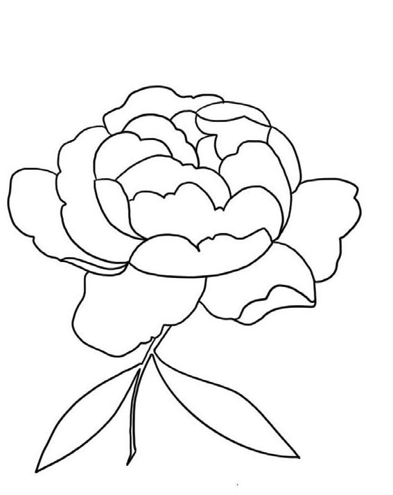
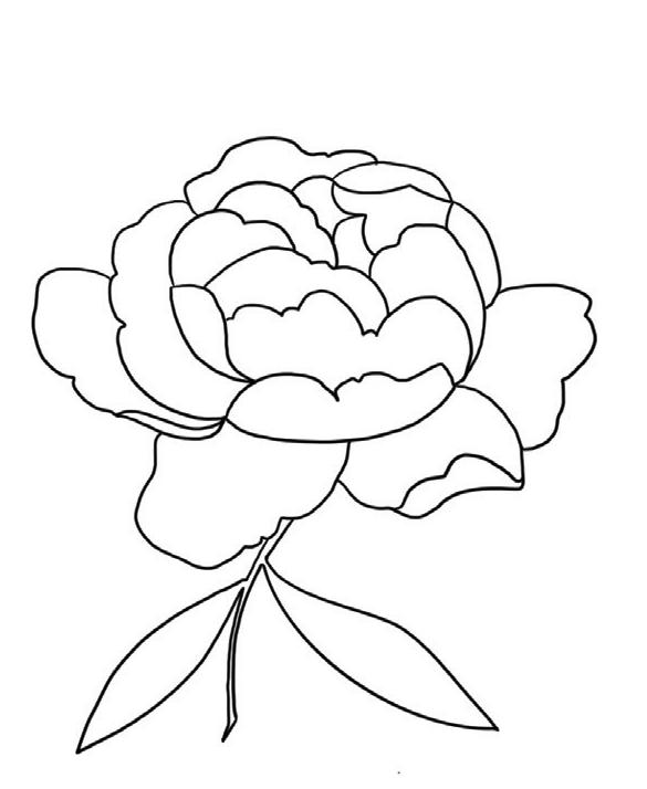
Each page features a line drawing on high-quality watercolor paper. After gathering your materials and practicing a few essential techniques, you’ll be ready to paint more than twenty botanicals, characters, and café scenes. Get ready to delight your senses and grow your watercolor knowledge! The projects increase in complexity as you move along so that you build your skills and gain confidence with every page. It’s normal to feel clumsy and slightly resistant to growth at first, but allow yourself the space—and grace—to push through. You are on the artist’s path—welcome!
I believe in the magic of painting. When my paintbrush moves just right and creates a beautiful image on the paper, it feels like I’ve grabbed hold of a dream and brought it to life. When the paint flows and my hands create things beyond what my mind can imagine, I enter a state of creative mindfulness. When I’m fully engrossed in my art, it’s as if time stands still. This workbook comes from my hands and my heart, and it is my gift to you as you embark on your own painting journey. I want your experience to be equally fulfilling and encouraging. I hope it inspires you to continue with your painting practice and connect with the wider community of artists.
I cannot wait to see what you create!
Use the hashtag #watercolorworkbook if you’d like to share your paintings with me on social media!

MATERIALS
TO BEGIN .
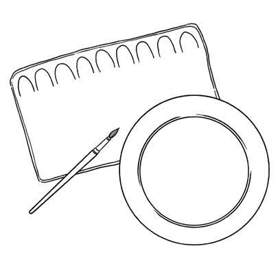
All you need are some basic tools. A fancy brush? Nope, not necessary. You can do everything in this book with an inexpensive, student-grade paintbrush. Painting palette? Not necessary either! If you don’t have one, use a dinner plate. I want you to enjoy the process and not fuss about the other stu . You’ll see how much beauty you can create with minimal supplies and expense.
01.
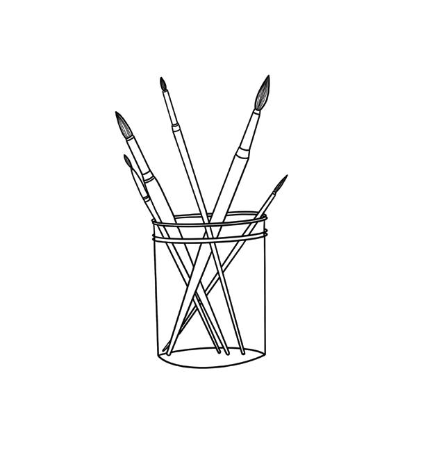
The projects in this book can be completed with just two brushes: a Round 4 and a Round 1. As a general rule, it’s best to use your Round 1 for small boundaries, and the Round 4 for larger boundaries. I will make suggestions for which brush to use as you start on each project, but feel free to use whichever brush you’re most comfortable with, especially as you work through the book and become more familiar with how each brush works! I suggest student-grade Princeton brushes in the “Select Artiste” series.
Why a round brush? Round watercolor brushes are the most versatile. Applying light pressure engages just the point of the brush, giving you the control to make small details and delicate lines. Applying more pressure engages the full width and length of the brush, allowing for broader strokes and larger deposits of water and paint on your paper.
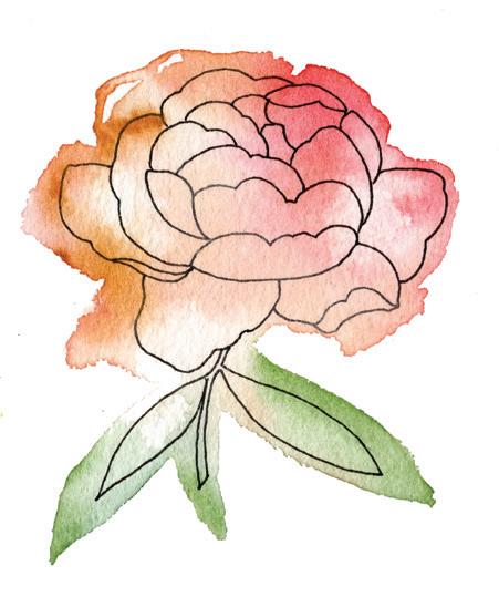
I recommend using a pen to trace the outlines of each pattern before you start painting. Although optional, tracing will help you relax, get into a creative mindset, and improve hand-eye coordination. Design-wise, incorporating ink adds contrast and definition, giving your pieces a modern crispness.
If you do want to add ink to your creations, I suggest the Sakura Pigma Micron pen because it creates a thin and consistent waterproof line that doesn’t run or bleed when you paint over it. A size 01 (0.25 mm) or 02 (0.30 mm) pen is the perfect size for the illustrations in this book.
You can also use a calligraphy dip pen to add playfulness to your pieces. With a dip pen, the line width varies significantly, and outcomes can be unpredictable, making anything you draw with this pen quite an adventure. Make sure you add the dip pen details after your paint is dry; usually these inks are not waterproof and will smear if applied before the watercolor paint.
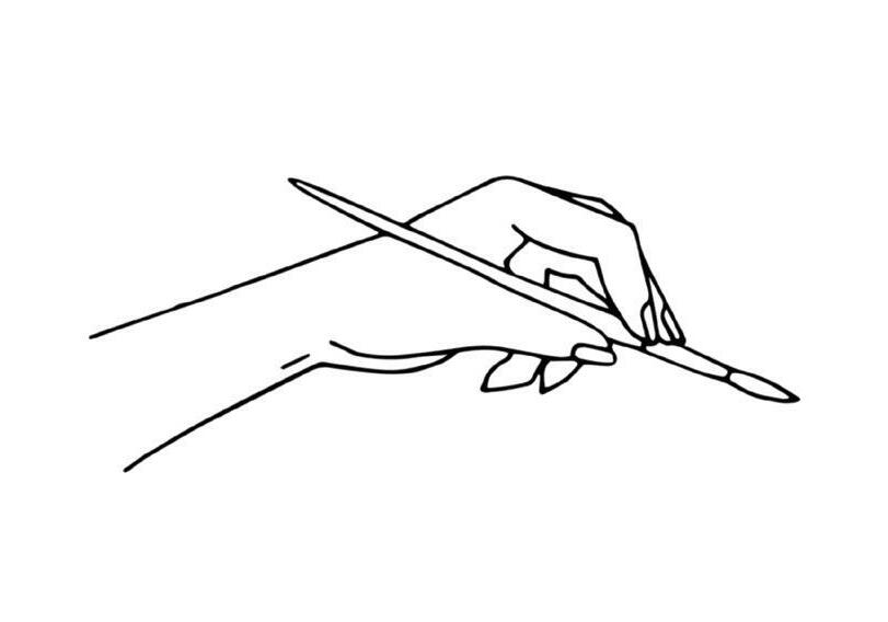
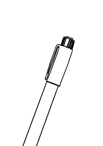
PRO TIP: How to Hold Your Brush
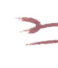
This is an illustration of a “classic hold” for a watercolor brush. This grip is similar to how most people hold a pen or pencil for writing. When you pick up your brush, grip the thickest part of the handle— above the ferrule (the metal piece connecting the bristles to the brush)—and hold it like you are getting ready to write a letter. Think of the point of your brush like the tip of your pen. As you begin to make marks with your brush, keep in mind that you have the most control if you use your brush to pull the paint down or move it from side to side, as opposed to “pushing” the paint upward. Where you hold the brush makes a di erence in the type of mark you’re making. Holding the brush closer to the bristles (on the metal ferrule) gives you more control in finer strokes, like in painting the details of a leaf. Holding it farther back on the handle gives you more agility in your movement and works well for making looser strokes for a wash. The amount of pressure you use as you touch your paintbrush to paper will also a ect the shape and style of the mark you create. W
03. PAINT
Here are the colors you will need to mix up all of the color recipes for this workbook. You can use dry pan watercolors—my favorites of which are from Stoneground Paint Co.—and you can also use tube paints. For these, I primarily use the Winsor & Newton brand, all student-grade quality, except Payne’s Gray, which is professional.
PAINT COLORS:
Lemon Yellow Hue
Yellow Ochre
Alizarin Crimson
Burnt Sienna
Oxide of Chromium
Cobalt Blue Hue
Payne’s Gray
Ivory Black
White (any white will do!)
If it’s in your budget to add a few more colors to your collection, I would suggest the two below. They are beautiful, and we use them throughout the book. However, if you’d rather stick with just the colors above, I’ll show you how to mix recipes that achieve a hue similar to these colors, using the original paint tube colors above.
AND SOME EXTRAS:
Perylene Maroon
Perylene Violet
Throughout this book, I share the color palette I use to paint each piece and provide you with an “icon” of my painting that you can use to reference colors. If you don’t want to follow my palette, or if you can’t find the exact colors listed on the prior page, don’t worry! Color is one of the most expressive tools a painter can use, and color preference is deeply personal. As you develop your skills with practice, you will begin to see color similarities across your palettes and painted pieces. These similarities represent your personal style and are your unique expression in the world of color. Use the colors that resonate with you.
I also want to teach you how to mix colors . . and yes, I am going to give you the secret ingredients to every one of the color recipes I used for this book. Recreating my recipes is a fun and easy way to begin, but I hope you gain the confidence to start mixing your own. Remember, every color imaginable is hidden inside these primary colors. By playing around with the colors in this book, you’ll learn how to make your own delicious palettes!
PRO TIP: A Note on Gouache and White Paint
First things first, it’s pronounced “guh-wash” and we’ll be using it as a way to incorporate opaque white paint into a watercolor painting. Gouache paints are essentially an opaque version of watercolors. Watercolor and gouache go well together because they can both be reanimated with water. They can also be blended together to create some beautiful colors, which we will play with in this workbook! I like to use white gouache pigment to gradually lighten a watercolor pigment, which reduces its translucent quality and increases its opacity. Adding a little white gouache paint to my watercolors is like adding cream to co ee.
Your new mixture is a creamier and slightly thicker version of your watercolor. It’s opaque, which means you cannot see through it as easily as the translucent watercolor, so it can be used to layer and cover any mistakes beneath. It’s also a beautiful way to add highlights or create light in a dark space in your work.
Most watercolor kits come with a white tube of paint, often the pigment called “Chinese White.” You can mix up your own gouache by adding white pigment to your watercolor paint, and we will be doing this with many of the recipes in this book. Just like when using watercolors, you don’t want to layer gouache too thickly, as it may crack if it becomes too heavy. A little gouache goes a long way!
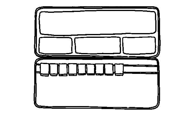
04. PAINT PALETTE
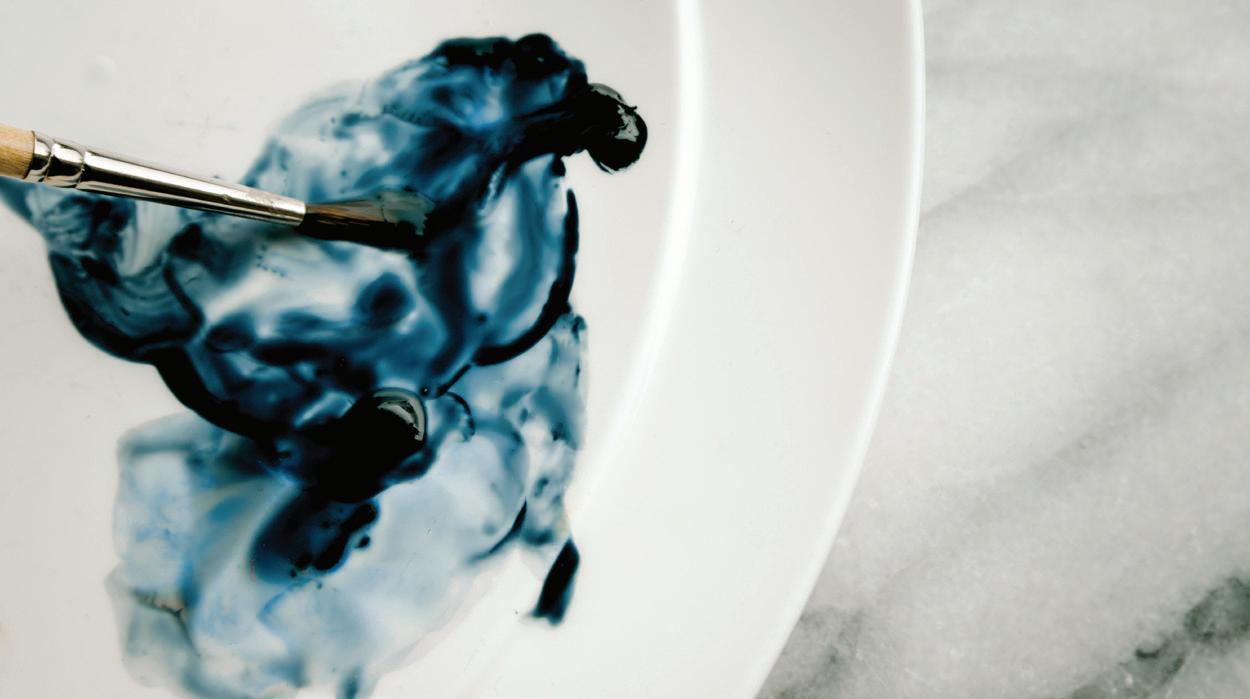
When I’m using tube paints, I squeeze small dabs of my watercolor tube paints onto my palette. (I recommend using a white dinner plate if you don’t have an o cial paint palette!) Depending on how many colors I want to use, and how much space I have available, I like to place the dabs a few inches apart to leave some room to blend colors. I tend to place the pure pigment dabs near the outer edges of the palette and then mix the colors and water closer to the center of the palette. The same holds true for using pan or cake watercolors. You can place the individual pans of color on your palette just as you would wet tube paint dabs.
05. WATERCOLOR PAPER
Good news! The project pages of this book are made out of watercolor paper—200 gsm, cold-press, wood-free paper, to be precise. (Pretty amazing, right?) Should you want to continue painting after you’ve completed all the projects here, I suggest continuing to use a minimum of 200 gsm cold-press paper. If you’re looking to invest a few more dollars in a paper that will really enhance the beauty of your final pieces, spring for a professional-grade watercolor paper, like the Hahnemühle brand.
06. MASKING TAPE
If you prefer to have very clean edges in your pieces, you can achieve this look by using washi tape or masking tape before you begin your project. If you do use tape, make sure it’s a tape intended for art paper, like Tamiya Masking Tape, to prevent tearing your paper once you remove the tape from your dried art.
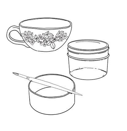
07. WATER JAR
A clear container that’s shorter than the length of your brushes makes it easy to rinse between paint strokes and allows you to see when your water needs changing. When it comes to changing the water, some say that you want your water to remain clean enough that a goldfish could swim in it. If they were to swim in my water, I’m afraid my fishies would not fare very well! I always start with clear, room-temperature water, but it muddies up pretty quickly. As you begin to paint and develop your style, you’ll see if you don’t mind a little muddiness to your wash water, or if you prefer to follow the “goldfish guideline” by refilling your water as you go. Either way is fine.
08. DR. PH. MARTIN’S BLEEDPROOF WHITE
Dr. Ph. Martin’s Bleedproof White is designed to be completely opaque. Depending on whether you’d like to add pops of bright white spots to your pieces, you can choose to add this supply. Titanium White or Chinese White will also add opaque white highlights, but Dr. Ph. Martin’s Bleedproof White is the boldest and most opaque choice.
NOTE:
This book gives you the tools and basic information you need to get started with watercolor, but it is not a comprehensive guide. If you want to learn more about the intricacies of this fine art, you can find an in-depth study of watercolor in my first book, Modern Watercolor Botanicals.
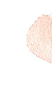
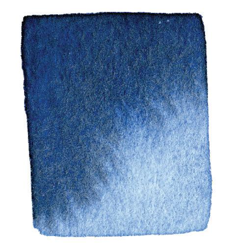
WATERCOLOR WASH
A WASH is a transparent layer of color brushed onto your watercolor paper. Whether you’re painting a small flower or an immense seascape, the wash will begin the process for almost every watercolor piece you paint.
MOVEMENT AND SHINE
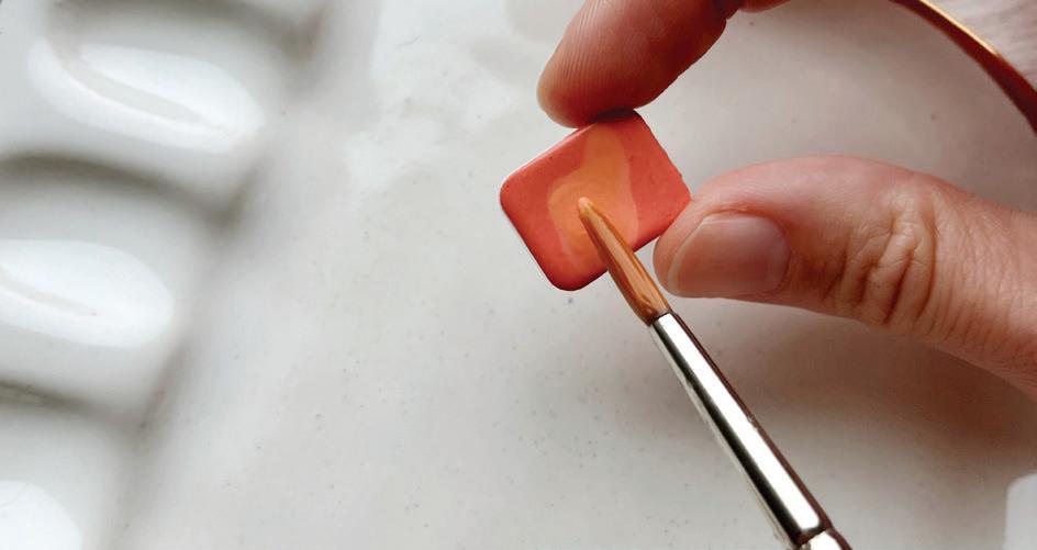
Finding the right balance of water and paint is the key to creating lovely pieces, and it starts right on your palette. Before the paint even touches your paper, it needs to be mixed on your palette and have both movement and shine.
To animate your palette, or “wake up” your paints, you’ll use your brush to bring water from your water jar to your palette with paints. You can take your brush back to your water as many times as you need to wake up the paint mixtures on your palette.
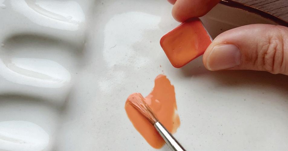
If you’re working out of dried tube paint or cake/pan watercolors, simply bring your water right onto the dried paint and move your brush in a back-and-forth motion to engage the dry color. Once you have a thick film of watery paint on top, simply tilt the cake and use your brush to pour the saturated mixture onto your palette to mix and build the water-to-paint ratio you need. If you’re working out of wet tube paints, treat the fresh dab of paint as a highly saturated version of dried paint. In other words, you don’t need much! Use your brush to draw a small bit of wet paint away from the freshly poured
dab, then add water to that smaller area. In the pictures on the next page, you can see that the paintbrush is engaged in the small puddle of blue paint water next to the highly saturated fresh dabs of paint.
To see if you’ve added enough water, pick up your palette and tilt it vertically, shifting it back and forth. If you see small raindrops of your paint and water mixture beginning to form, you’re on the right track. You’re looking for movement (the small drops moving on the surface) and shine (the surface of the mixture shining and reflecting the light).
Since paint dries quickly, it works best to animate just one or a few colors at a time. You’ll repeat wetting the paint on your palette again and again as you use di erent colors to create your painting.
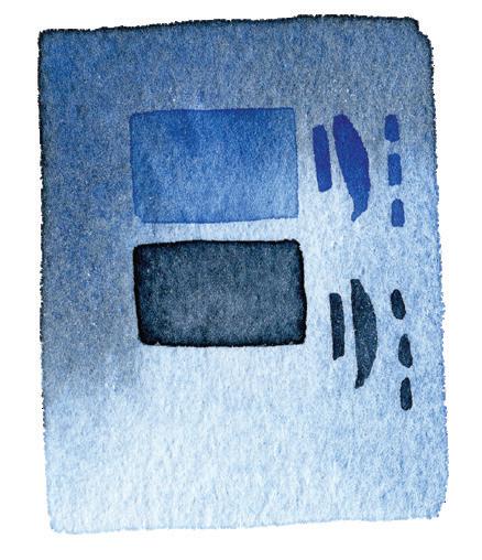
PAINT CONSISTENCY:
In watercolor, every time you bring paint to paper, you will be using a mixture of paint and water. For the washes in the projects in this book, the consistency of that mixture is about 80 percent water and 20 percent paint. For finer details, it will be about 50 percent water and 50 percent paint. Check out the next page for some helpful visuals of how I like to think about these consistencies.
80W/20P:
80w/20p above stands for 80 percent water and 20 percent paint. Think of it like soy sauce and wasabi. If you’ve ever enjoyed sushi, you know how potent wasabi can be—a little goes a long way! If you think of your water as soy sauce and the dab of paint as wasabi, you will be well on your way to mixing a perfect paint consistency and beautifully transparent watercolor washes.
50W/50P:
50w/50p above stands for 50 percent water and 50 percent paint. With this consistency, you want more pigment in your water-to-paint ratio. For tube paint, that means a heavier paint saturation right from the tube. For cake/pan paints, that means adding less water to the poured mixture on your palette or working directly from the top of the wet cake or pan.
COLOR SWATCHING
Creating a watercolor wash with movement and shine is your first step to begin painting. A “swatch” is just a wash of pure color. We are going to practice creating washes by making swatches of each of the colors I suggested in the Materials section.
NOW IT’S TIME TO PRACTICE . .
It’s time to start practicing some techniques. On the next few pages, you’ll find instructions to guide you along. The
watercolor paper in the second half of this book has dedicated space to practice. We structured the book this way to provide all this information alongside premium watercolor paper. This requires you to flip back and forth for the first few techniques, but once you get to the projects, all of the instructions will be on the adjoining pages—no flipping required! And remember, while the paper is premium, this is a workbook, so use it as such! If your pages aren’t wavy and tattered by the end, you haven’t played enough with your paints!
PRO TIP: Paint Upside Down
You can turn your workbook around as needed—you can even paint the image upside down if it’s easiest for you. Accidentally running your hand through your newly painted work is such a drag, and I avoid this by flipping my art around to change the angle so I can be careful not to disturb the wet boundaries that are drying.
PRO TIP: Color Matching and Swatching
If you don’t have the exact paint colors listed in the Materials section, swatch the colors that you can get. If these colors are new to you, I suggest swatching them on scrap paper, or in the margins of this workbook, before you put them down in your swatch chart. Once they dry and you are sure of their color, add them to your book. Keep in mind that watercolors dry 10 to 20 percent lighter than when they are wet. My swatches are dry, so they will look lighter than your wet swatches to start.
Since we are working on white paper, we’ll skip creating a color swatch of the white paint. Whites are wonderful to experiment with when you are playing with gouache, as you will explore more as we create color recipes in the upcoming Color Recipes section. Di erent brands and grades of white pigment have di erent consistencies, staying power, and opacities, so I suggest playing around with white paints on your own and discovering what you enjoy using in combination with your favorite colors.
WASH
To practice, please flip to page 30 of your watercolor paper. Above each practice row, you will see a row of my washes, labeled by color. On the bottom, you’ll see a row of empty boxes, ready and waiting for your swatch! Follow the instructions below to practice.
STEP-BY-STEP INSTRUCTIONS
01. Select the first color you’d like to swatch. You’ll be using your Round 1 brush for this exercise. Add water to animate the paint on your palette, creating that 80w/20p consistency. Remember, you want movement and shine!
02. Fill your watercolor brush by brushing your paint bristles back and forth in the water-and-paint mixture on your palette.
03. Take your filled brush to your watercolor paper and stroke your brush from left to right and right to left. Work to fill in the square with this filled brush until you notice the texture of the paper beginning to show through your strokes. That’s your cue to refill your brush.
04. To complete your WASH, dip your paintbrush into your water jar and return to your paper, using the water in your paintbrush to smooth out hard lines and invite the pigment into the whole square. Watercolor paint moves to where the paper is wet—so by wetting a nice smooth square, you are telling your paint that this is where you’d like it to hang out and dry.
05. Label your square with your paint color and continue creating color swatches for all of your paint tubes.
NOTE:
Your wash water does not have to be crystal clear every time you go to paint something new. Just make sure that it’s clear enough to not drag any previous color with your brush.
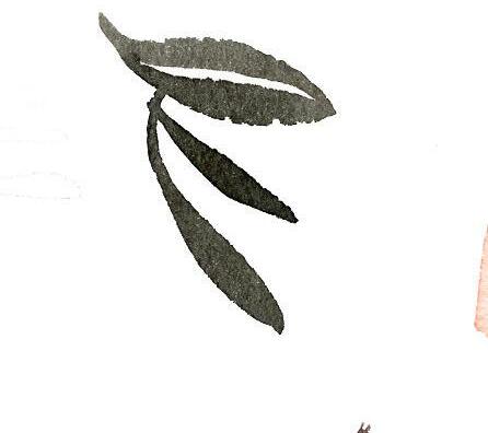
INK
The lines for every project in this book are printed for you and will not dissolve when you add watercolor. That said, I designed these projects to be outlined first with a waterproof pen (see Materials on page 3) and then painted. Getting in the habit of outlining your designs is great practice for when you start drawing your own designs. Plus, tracing is incredibly calming and relaxing!
PRO TIP: Test Your Ink
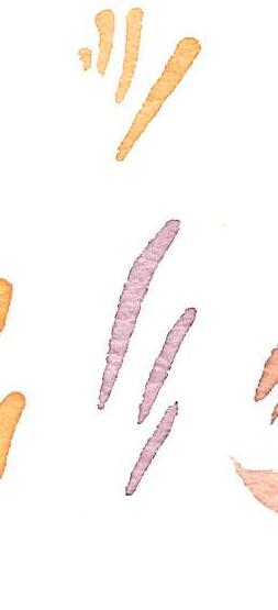
Test your pen tips on the bottom of this page to see what types of marks you can make with your pens.
You will have the most control over your lines when you pull your pen down toward you. Move your paper as you work so you can continue to pull lines, marks, and strokes toward you.
If you have di erent sizes of pens, you can add visual interest by alternating the thicknesses of your lines. Try a few lines in a very small pen tip size, then make a bold line with a larger pen tip size. Play around!
WET-IN-WET
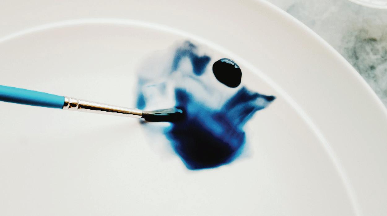
Next, we are going to learn the WET-IN-WET technique, which is the process of adding wet paint into wet paint. You can use this technique to create shadows, high-to-low contrast, and interesting movement in your watercolor paintings. The goal is to introduce a more saturated, brighter splash of color into the lighter wet wash you’ve already laid down. A 50w/50p consistency for the paint you’re dropping in will be perfect for a wet-in-wet. When you introduce, or “drop in,” a saturated wet color into the lighter wet base wash, the newly introduced paint will bloom from your brush, moving in interesting ways into the wet wash boundary. This is commonly referred to as a “watercolor bleed” or “veining,” but I like to think of it as “watercolor fireworks”!
Be prepared: Once you drop the color into the wet boundary, the way the paint moves will be unpredictable and mostly out of your control. Don’t worry, this is a good thing! With wet-in-wet, your paint makes beautiful e ects that you could not achieve with a brush. In many ways, you are not really “painting” in wet-in-wet; you are merely releasing the paint from your brush and letting it do its thing. It’s a beautiful way to create clouds, oceans, flower petals, and more.
Be mindful that this technique relies on a bit of speed. You will add your wet-in-wet application soon after painting your wash, so you want to have all of your paint mixtures ready to go before you begin.
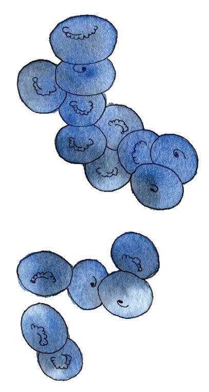
WET-IN-WET
Select a light color and a dark color. I’m using Cobalt Blue Hue as my light color, and Payne’s Gray as my dark color. Before you start, double-check your palette. Are your chosen colors animated? Can you see movement and shine? If so, you’re ready to begin!
01. Next to my example on page 31, find the empty box on the top left side of your page. WASH the box with your light color using your Round 4 brush.
02. Before your light wash begins to dry, use your paintbrush to bring some of your darker color in, using 50w/50p for the paint consistency you’re dropping in. Fill your bristles with the darker color from the palette, then lightly touch your paint-saturated bristles to the wet wash on your paper and lift your brush. Voilà! This is how we build transparent color smoothly and without hard lines.
03. Notice that wherever you place and lift your paintbrush, you leave the highest saturation of color. Keep this tip in mind as you paint because this is how you build color in your art. Whichever section of your piece you would like the darkest, drop in color and lift your paintbrush there. You STEP-
can repeat this dropping in of color as many times as you wish, and this will build the saturation in the spot you lift your brush. Timing comes into play here as well! Remember, you can make changes to your wet-flowing wash, as long as it is wet. Dropping in saturated 50w/50p color with the WETIN-WET technique as it begins to dry will give you an even more saturated color in that area.
04. Once you have completed WET-IN-WET in the practice box, it is time to practice this technique using the blueberry illustrations on the same page. First, INK the blueberries with your pen using the tips you learned about inking on the previous page. Then, using your Round 4 brush, follow these WET-IN-WET steps to paint your own blueberries below mine!
NOTE:
If your attempt at adding color isn’t flowing into “exciting fireworks,” it’s most likely because your light wash boundary has already begun to dry. Don’t worry. Just WASH your entire square again, rewetting the boundary with the water from your jar and adding the base wash color you were using. Once you’ve wetted your square (ensuring movement and shine!), dab the more saturated paint into the light wash and celebrate your fireworks!
PRO TIP: Light Watercolor Washes
For very light flowers or fur, I will often wash the entire boundary in my clear water, creating movement and shine with JUST water. A very lightcolored watercolor actually begins with a water wash that starts clear, or almost clear, and then you use the wet-in-wet technique to introduce the lightest of colors. By slowly building saturation with this technique, you’ll achieve a whimsical look to your botanicals and animal friends that dry airy and light.
PRO TIP: Natural Shading
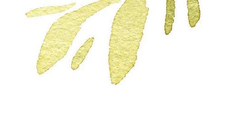
The most natural way to add wet-in-wet for botanicals is to locate the base of the petal or leaf, or find where it attaches to the rest of the plant. Slowly build color there, leaving the ends of the petal or leaf the lightest in color.
PRO TIP: Is It Dry?
How can you tell if your paint is dry? Make a flat palm and hover your hand a quarter-inch above the boundary. If you feel any coolness coming up from the paper, your paint is still wet!
WET-ON-DRY
Most people think of watercolor as a transparent, dewy medium with a smooth and fast-drying application. While this is true most of the time, you can also achieve bolder e ects with your watercolor paints.
One way to do this is with the WET-ON-DRY technique, which involves waiting for the first layer of your wash to completely dry, then applying new paint to the dry surface. This method works perfectly for layering color, adding fine lines and details, and building definition into your pieces.
For small areas of higher saturation (for example, flower centers that you would like to be more detailed and concentrated in color), it’s best to use a smaller brush (such as your Round 1) to apply new wet paint to dry paint on your piece. For finer details, aim for a 50w/50p paint consistency.
For larger areas, like a petal, you can use a larger brush (like your Round 4) and simply layer a new wet wash on your existing dry base wash. Because watercolor is known for its transparency, you can create depth in your pieces by overlaying your washes and building the color saturation slowly. The wet-on-dry technique is also called GLAZING, which is just the fancy term for laying a wet layer of watercolor to “glaze” over a dry layer.
Select a light color for your base wash and a darker color to add wet-on-dry details. In my example, I’m using Cobalt Blue Hue as my light color, and Payne’s Gray as my darker color. Before you start, double-check your palette. Are your chosen colors animated? Can you see movement and shine? If so, you’re ready to begin!
01. Next to my example on page 31, find the empty box in the top right side of your page. WASH the box with your light color using your Round 4 brush.
02. Before your wash begins to dry, practice the WETIN-WET techniques on page 12. Use your paintbrush to bring some of your darker color in, using 50w/50p for the paint consistency you’re dropping in. Fill your bristles with the darker color from the palette, then lightly touch your paint-saturated bristles to the wet wash on your paper and lift your brush. Add only one or two drops of this darker color to see if you can keep this wash box a bit lighter. We want room to practice our wet-on-dry details next.
03. Wait for your light wash to dry. This is a great time to INK the blueberries below the box you just painted, which we will practice painting next. Once your wash box is dry, you can GLAZE a small square in Cobalt Blue Hue and Payne’s Gray, which is what I did in my example on page 31. In my example, you can see that most of the layered washes still allow visibility of the underneath layers because watercolors are transparent. Your art becomes more dynamic with increased depth when you add wet-on-dry layers like this. You can use this technique to paint a shadow, build color saturation, di erentiate one flower petal from another, and generally make your watercolor compositions richer.
04. Let’s practice the WET-ON-DRY technique by making two separate layers of color on top of the lighter wash. Use your paintbrush to bring in some of your Cobalt Blue Hue,

using 80w/20p for the consistency. Fill your Round 1 bristles with this Cobalt Blue Hue mixture and paint a small squareshaped wash on top of the now-dry wash you completed in steps 01 and 02. This is a wet-on-dry layer, also known as a GLAZE. Repeat this step again, but with your darker color of Payne’s Gray.
05. Another way you can use the WET-ON-DRY technique is by making small, concentrated marks. This is a fantastic technique to produce crisp, sharp edges! Let’s practice this wet-on-dry technique on top of our light dry wash too. Use your paintbrush to bring each of the wet-on-dry layers in, using 50w/50p for the paint consistency. You’re making small marks, so you don’t need your paint to move and shine— in fact, you want it to stay put! For more controlled detail work, you can use the 50w/50p paint consistency (or even 20w/80p to get a really saturated mark that will stay where you want it). Fill your Round 1 bristles, alternating between Cobalt Blue Hue and Payne’s Gray, and make a few marks on top of your dry light wash, just like the example on page 31.
06 . Once you have completed your WET-ON-DRY practice box, practice this technique using the blueberries on the same page. First, INK the blueberries with your pen. Add a WETIN-WET wash to both blueberries, and let them dry. Then, follow these wet-on-dry steps to paint your own blueberries next to mine, adding your new wet-on-dry techniques to your blueberries, using your Round 4 brush for the wet-in-wet and your Round 1 for the detailed wet-on-dry marks.

WET-IN-WET & WET-ON-DRY
INSTRUCTIONS: Follow the steps on pages 12 and 14. Use your Round 4 brush for the washes. Use your Round 4 brush for the bees and your Round 1 brush for the wet-on-dry bee details.
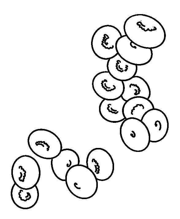
01. Only 1-2 wet-in-wet drop-ins of Cobalt Blue Hue
02. Deeper blue saturation with 3-4 wet-in-wet drop-ins of Payne's Gray
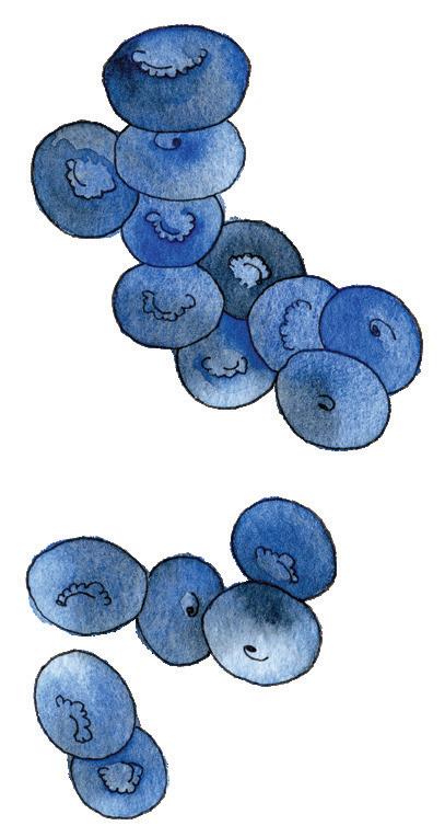
01. Glazing with wet-on-dry translucent layers creates shadows
02. Blueberry details with concentrated wet-on-dry marks
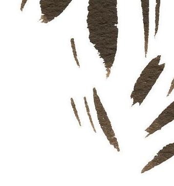
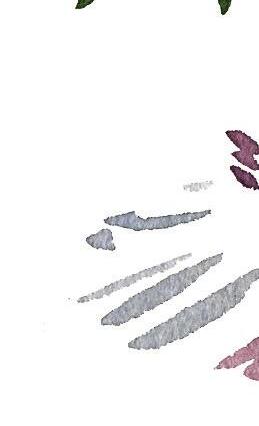
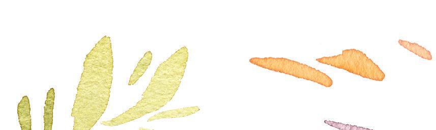
BLOTTING & BOUNDARIES
INSTRUCTIONS: Follow the steps on page 17 for blotting the florals on the left, and page 20 for boundaries with the florals on the right. Use your Round 4 brush for blotting. Use your Round 4 and 1 brushes for boundaries.
01. Light paper towel dabbing blotting techniques
02. Heavy paper towel dabbing blotting techniques
03. Dry brush technique, sweeping color in
04. Reserved edges of the white paper
“SARAH IS AS DELIGHTFUL A TEACHER AS SHE IS AN ARTIST SHE MAKES EVEN THE MOST LUMINOUS, COMPLEX PIECES ABSOLUTELY ACHIEVABLE FOR ARTISTS OF ALL SKILL LEVELS. THIS BOOK IS A MUST - HAVE FOR ANY WATERCOLOR LOVER LOOKING FOR BEAUTY AND FUN IN THEIR PRACTICE!”
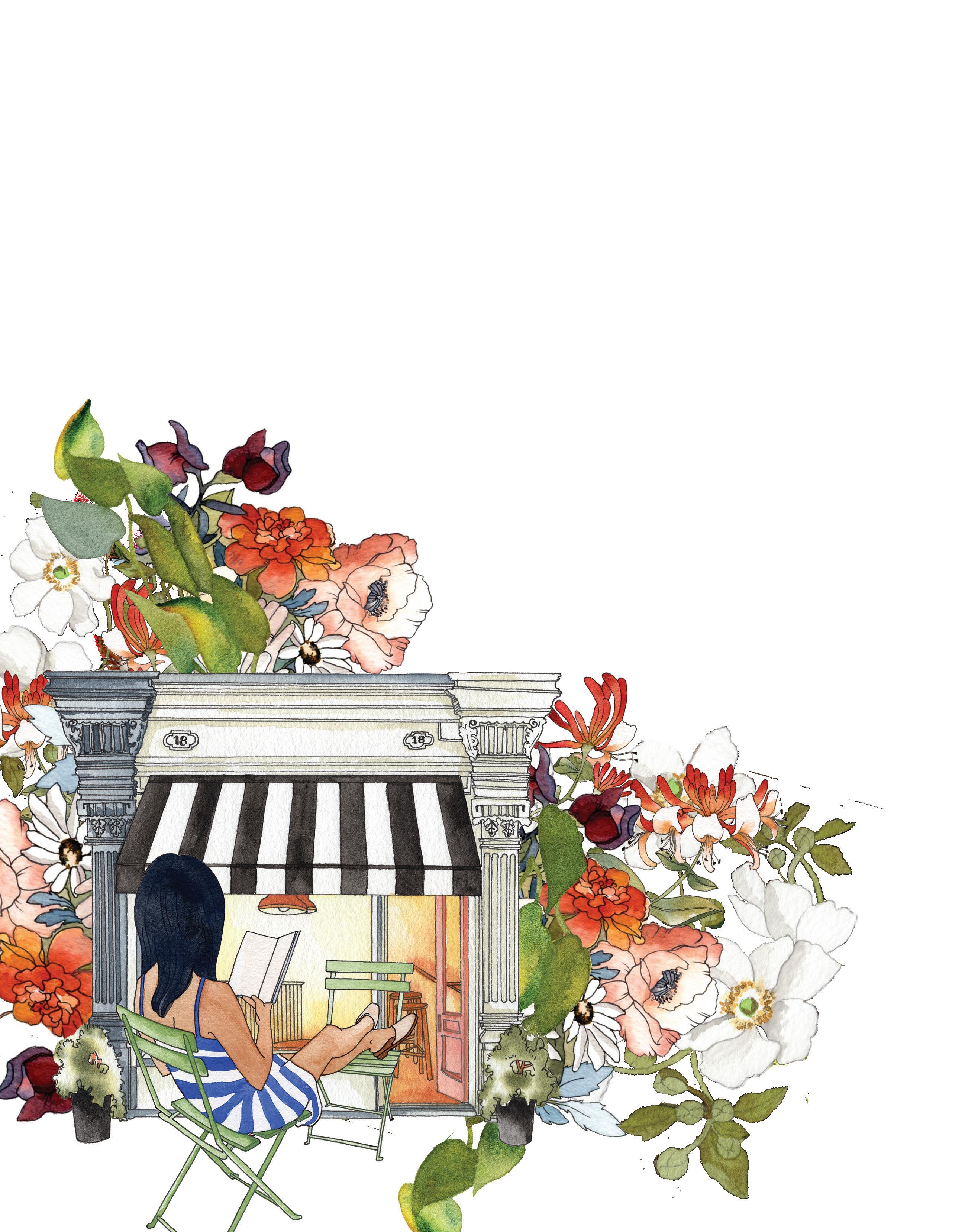
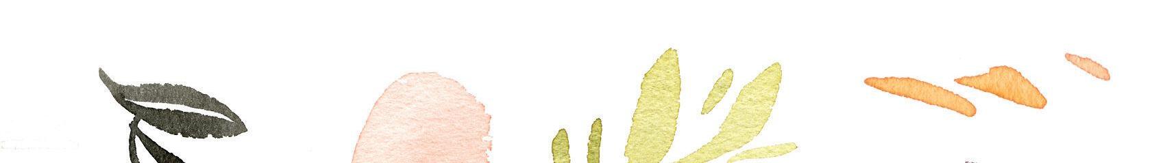
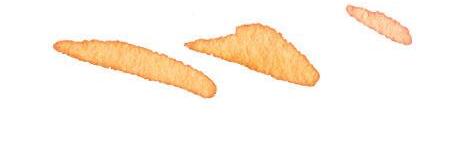
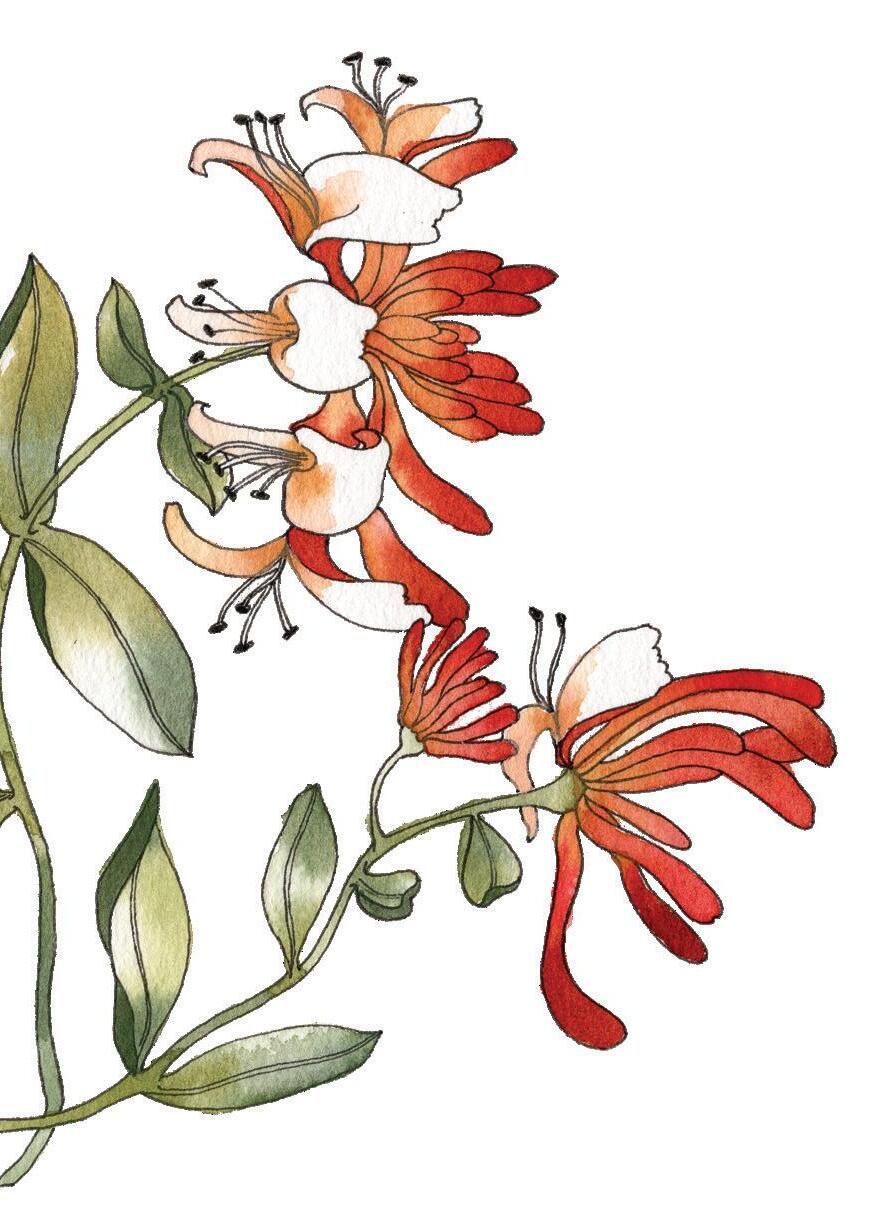
RELAXING CAFÉ SCENES, ELABORATE ARCHITECTURE, AND BEAUTIFUL BOTANICALS
Escape to cozy cafés and blooming gardens with Watercolor Workbook: Café in Bloom, Sarah Simon’s third Watercolor Workbook that includes 25 beginner-friendly projects—no tracing required! This book teaches you all the basic watercolor techniques and provides simple, step-by-step project instructions so you can easily and confidently start painting today. Divided into two sections, the book begins with the foundations of this fine art. Then, when you’re ready, you can dive into painting your beautiful projects on the premium, wood-free watercolor paper. Luxurious and crisp white, this paper withstands watercolor paints and ink so there is no bleed-through. Plus, the author designed all her artwork on the same paper to ensure your final pieces are just as bright and beautiful as her examples!
THIS BOOK FEATURES:
An introduction to fundamental watercolor and 25 projects on thick, 200 gsm premium watercolor
Easy-to-follow instructions, as well as suggestions for paint and paintbrush materials—perfect for seasoned watercolorists and beginner artists alike
ABOUT THE AUTHOR:
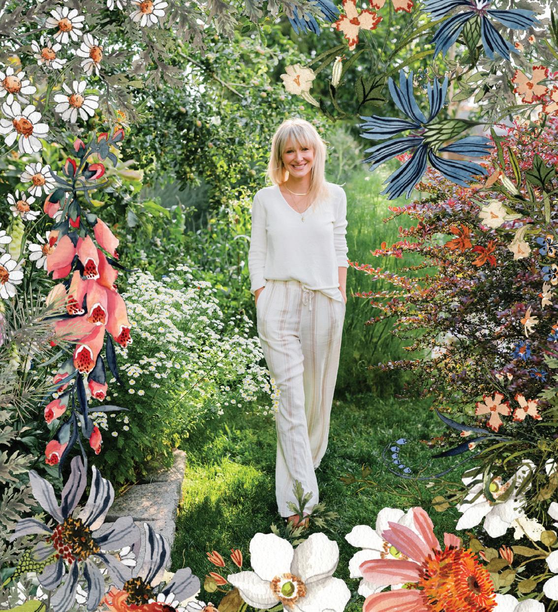
Artist and author Sarah Simon, a.k.a. @themintgardener, has taught thousands of people how to paint with watercolor. With this third workbook in her popular Watercolor Workbook series, Simon o ers 25 new projects that will teach you how to paint your own watercolor and gouache masterpieces. 803608
$24.95 USD / $34.95 CAD
ISBN 9781958803608
52495
Kolbie Blume, watercolor artist, educator, and author of Wilderness Watercolor Landscapes