
YINGHAO ZHANG
& REPRESENTATION
WORKS FROM 2017-2022
DESIGN
SELECTED
CONTENTS PROLOGUE
I think architecture is about a series of relations: the relation between people and buildings; the relation between society and life; the relation between conceptualization and representation.
With such a belief, my interest in architecture was developed by exploring the relationships between the implied notions of subjectivity and objectivity in different representation mediums. This portfolio demonstrates the outcome of my investigation: the additional value a good representation can endow on a design, as well as the evidence of representation’s ability to back in turn nurture the design itself.
ARCHITECTURE
SHENZHEN NEW CULTURAL CENTER
PEACH GROVE RESIDENCES
MICRO-CAMPUS OF FAKERY
DIAMOND | DWELLING | DIMENSION
PATCHWORK URBANISM
Yinghao Zhang
05/1999, Male, Chinese
University of California, Los Angeles
Architecture and Urban Design
1317 Perloff Hall, Los Angeles Califronia, United States
Zip Code: 90095
+1 213 204 0249
arch4yhzh.cnbj@gmail.com
1 CATALOG PROLOGUE 02 06 12 18 26
SHENZHEN NEW CULTURAL CENTER CONCEPTUAL SCHEME FOR sec COMPETITION PROJECT

My efforts in this project are reflected in the individual production of digital site models, analytical diagrams, and expressive drawings. Collectively, these outcomes set the basic tone for the design narrative of the Shenzhen New Cultural Center scheme. As shown by this set of drawings, such a narrative employs a comprehensive yet unique viewpoint to construct an oriental scenario by shaping three box massings that mimics flower petals of Bougainvillea-the city flower of Shenzhen, emphasizing the site's particular cultural background, enabling optimized visibility, and proposing a meaningful space in the central core.

INTRODUCTION
INTERNSHIP AT MADASPAM SUPERVISOR SAMUEL CLOVIS SUMMER 2020
2 COVERIMAGE 3
Interior Organization Diagram
Each “petal is programmed specifically but layouted diversely, while the “pistil” funtions as the main public space for central circulation.
Sectional Program Diagram
Green Space Diagram
The public green spaces surround the “petals“ form landscaped paths that snake along the base and perimeter of the building.
Circulation Diagram
Clear circulations from outside to inside of the building, combined with efficient spatial oragnization, create optimal spatial experience.
Program Layout Diagram
Composed of the ground, the foundation part, the landscape part, and the aboveground building part, the whole project sequencially organizes different function layers and formal languages to simulate the botanical structure of a Bougainvillea flower: Receptacle → Calyx → Pistil → Petals
Form Generation Diagram

In terms of major form manipulation strategy, the design first lifts and transforms the topography of the foundation, and then places three separate boxed volumes on the site in close relationships to form a central public space. The sloped surfaces around the main building are then detailed with plantings, footpaths, and stairs.

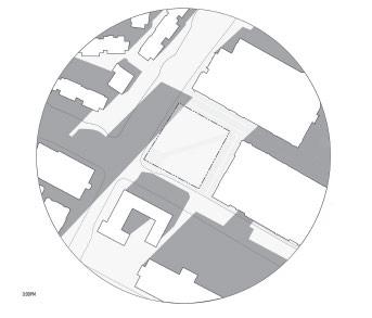
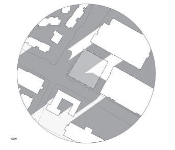
The masterplan shows how the building is situated within site context, including the water channel at the north, traffic roads defining the other three sides of the site, and a subway station at the southwest corner. These contextual elements force the project to encompass a series of new public spaces around the central core, allowing visitors and workers to engage in the purposeful environment.


Plan Elevation Rendering 5 DIAGRAM & DRAWING ANALYTIC DRAWING 4
Site
PEACH GROVE RESIDENCES
HOUSE DESIGN IN RURAL CONTEXT

INTERNSHIP AT MADASPAM SUPERVISOR QINGYUN MA SUMMER 2020
As the most importantproject participated induring MADAspam internship, the Peach Grove Residencesaimto explore an expansivevision ofdesign inruralarchitectureand landscape. individuallyconducted site analysis, produced axonometric drawings, and rendered perspectives by leveraging digital tools anddrawingtechniques. The outcomes primarilyshapedthe ideationandcontentcreation ofthe project.
INTRODUCTION
6 COVERIMAGE 7
Box Yard HouseAxon
In terms of formal language, the Box Yard shares the idea of cantilevered rectangular box with Gate Hall #2. It has fully-glazed facades on both levels and both sides to miximize the view to the mountain and yards, and is unique fora poolandgap yard.


L HouseAxons

As another single-family house with an emphasis on the frontyard andbackyard, the L House is made distinctive by its crossed relationship of public and private spaces, as well as the bedroom roof, which has the form of an irregular trapezoidal prism.

C House Axon
Amongallthe housesinthisproject, the CHouse hasthe highestcomplexity andmostdistinctive formal elements.

Asalarge-scale multi-familyresidence, itsynthesizesthe ideasofrooftrusses, underground level, sideyard, shared courtyard, and rounded glazing.


Gate Hall#2Axons
The Gate Hall #2 is a multi-family residence highlighting the idea of cantilevered living space and interconnected courtyards. Similar to the Gate Hall #1, this building uses white plasterwallsoftraditional Chinese styleand roundedaperturesasthe main facade language.

UDl!IOUl£IJll(lAXONOMETRIC /
8 JIIIIL:s&W..tlC
9
Thenatural environment ofthe siteis knownfor itsdistinctive greenerycolors, andcreates picturesque viewsfor the inhabitantsinthisresidentialcomplex. 200 varieties ofpeachesare grownin themountain areaof Pinggu, and some ofthe groves arehundreds ofyears old andhave been cultivated for generations
Site Rendering


Utilizing the techniques honed throughout this project, create this photo collage from various elements, including rendering and processed photographs in order to visualize the C house from street view.

ILWSTRATION&PERSPECTIVE
Peach Grove Site
Courtyard Rendering
RoofRendering
10 PERSPECTIVE \{p
RoofRendering Courtyard Rendering
L House DayRendering Gate Hall#2 Rendering
L House Night Rendering Gate Hall#2 Rendering
11
MICRO-CAMPUS OF FAKERY EXTENSION SCHOOL DESIGN

This project aims for an vocational extension school at the southwest corner of USC Village, which is adjacent to multiple programed outside spaces and characterized by collegiate gothic stylistic appearance. I develop the design by extracting elements of “micro-campus“ and “fakery“ from the village site and campus buildings, and recreate them in exaggerated ways, and then represent the product in a even more fabricated way using digital visualization tools. The mis-displayed representation on one hand becomes a explorative visual practice, and on the other hand corresponds to the design idea of superficiality and fakery.
 USC SCHOOL OF ARCHITECTURE INSTRUCTOR RYAN MARTINEZ FALL 2021
13 COVER IMAGE INTRODUCTION 12
Site Analysis - Axonometric
The USC Village comes through the history of redevelopment. The block was previously occupied by an industrial complex, and the parcel at the southest corner used to be a fire station.
Site Analysis - Axonometric


Comprised of five mixed-use buildings with student dormitaries, basic amenities and retail stores, the Village claimed to connect to the local community but didn’t show up doing that formally.
Bubble Diagrams
Based on selected programs, explored two schemes of bubble diagrams representing logics of compounded versus scattered.
Net/Gross Chart and Program Diagram

Additional diagrams entail net-gross calculations and charts in addition to a distribution diagram based on my initial arrangement.
Site Analysis - Windrose
The circular format of the wind rose shows the direction the wind blew from, while the length of each “spoke” around the circle shows how often the wind blew from that direction.
Site Analysis - Sun Path
The sun path diagram indicates how the sun will impact site conditions observably throughout the day, providing me with reference on how the building should be designed and oriented.


After I’ve established the program relationship, move on to spatial operation by extracting the profile geometric shapes from surrounding buildings of various functions and forms.
Several typical shapes are selected, transformed to align to grids, and put on the site as section outlines. Then extrude them into each other, to generate chunks from geometry.
Site Analysis - Elevation

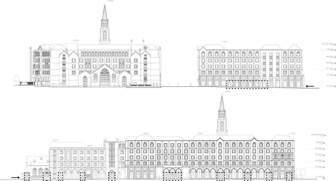
The elevations show the formal language of the existing buildings around my site, characterized by their collegiate gothic appearance. The context turns out to be fake and pretentious, with no actual depth but only a unanimous facade panelized into modules.
Site Analysis - Winter Solstice

The winter solstice is important as the day in a year with the fewest hours of daylight. The diagrams indicate how adjacent buildings will cast shadows at different times of the day with minimum daylight, and what the corresponding lighting conditions of the site will be.

By operating boolean intersections with these extruded volumns, I get the basic massing prototypes with the geometric characteristics of the original shapes from all four directions.
The massings get further contextualized and detailed with integration of more diversified forms, such as arched connections, colonnades and terrace, which are all elements of surrounding buildings.
winter solstice DIAGRAM Scale: 1” = 150’ winter solstice ANIMATION LINK: https://vimeo.com/599916379 usc village 2011 AXONOMETRIC Scale: 1” = 40’ LEGEND parking usc village buildings LEGEND p p p p p p usc village 2021 AXONOMETRIC Scale: 1” 40’ LEGEND GREENSCAPE usc village buildings GREENSCAPE LEGEND 32,000 sf 37 PRINCIPLE ORIENTATION FOR ENTRIES site plan Scale: 1/16” = entries for site entries/exits for buildings LEGENDLEGEND BUILDINGS STUDENT SERVICES PROGRAMS /EVENTS LONG-TERM EXHIBITIONS LOBBY ATRIUM MINI THEATER MULTI WORKSHOP RESTROOM CLASSROOM CLASSROOM CLASSROOM TEMPORARY EXHIBITIONS CONTROL ROOM ADMIN SERVICE STUDY RESTROOM OFFICE CONTROL ROOM STORAGE STUDY LOUNGE SHARED FACILITIES MINI THEATER WORK SHOP GALLERY MULTI AUDITORIUM Essential LEGEND Entry Direction Support Space Private Space Public Space Bubble Diagrams Additional Diagrams WINDROSE winrose diagram Scale: 1” = 30’ 10% of yearl verage wind m/s M/s m/s M/s m/s wind direction LEGEND LEGEND LEGEND LEGEND Summer Spring and Fall Winter SUN PATH DIAGRAM Scale: 1” = 30’ 5PM 3PM 7a 9a 11am SUN PATH LEGEND fall 15 DIAGRAM 14 ANALYTIC DRAWING
"Digital
attempttointentionallyrenderthe3Dmassingmodellikearealphysicalmodel, whichmeansithave visible imperfectionsincludinglasercutburnmarks,gluemarksanddetached edges. When takeafurthersteptophotoshoptherenderingontothephotoofsitemodel, those "calculatedaccidents" blurredthe boundary between reality and fakery - one ofthe capabilities explore from architectural visualization.


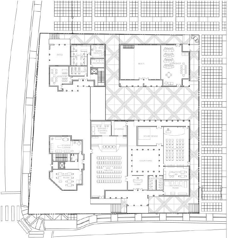


DIAGRAM & DRAWING
Facadelangugeofsurroundingbuildingsextractedand duplicated withvariations to create tetonicstemplates.
SiteAxon
Site Plan Elevation
Thereadjustedtectonicstemplatesarethenprojectedonto theunrolled and panelized encelops ofmy own buildings.
SiteAxon
16 AXONOMEIBIC
Wall Section Oblique Elevation
"Chipboard Model"
"Lasercut Model"
Physical Model"
17
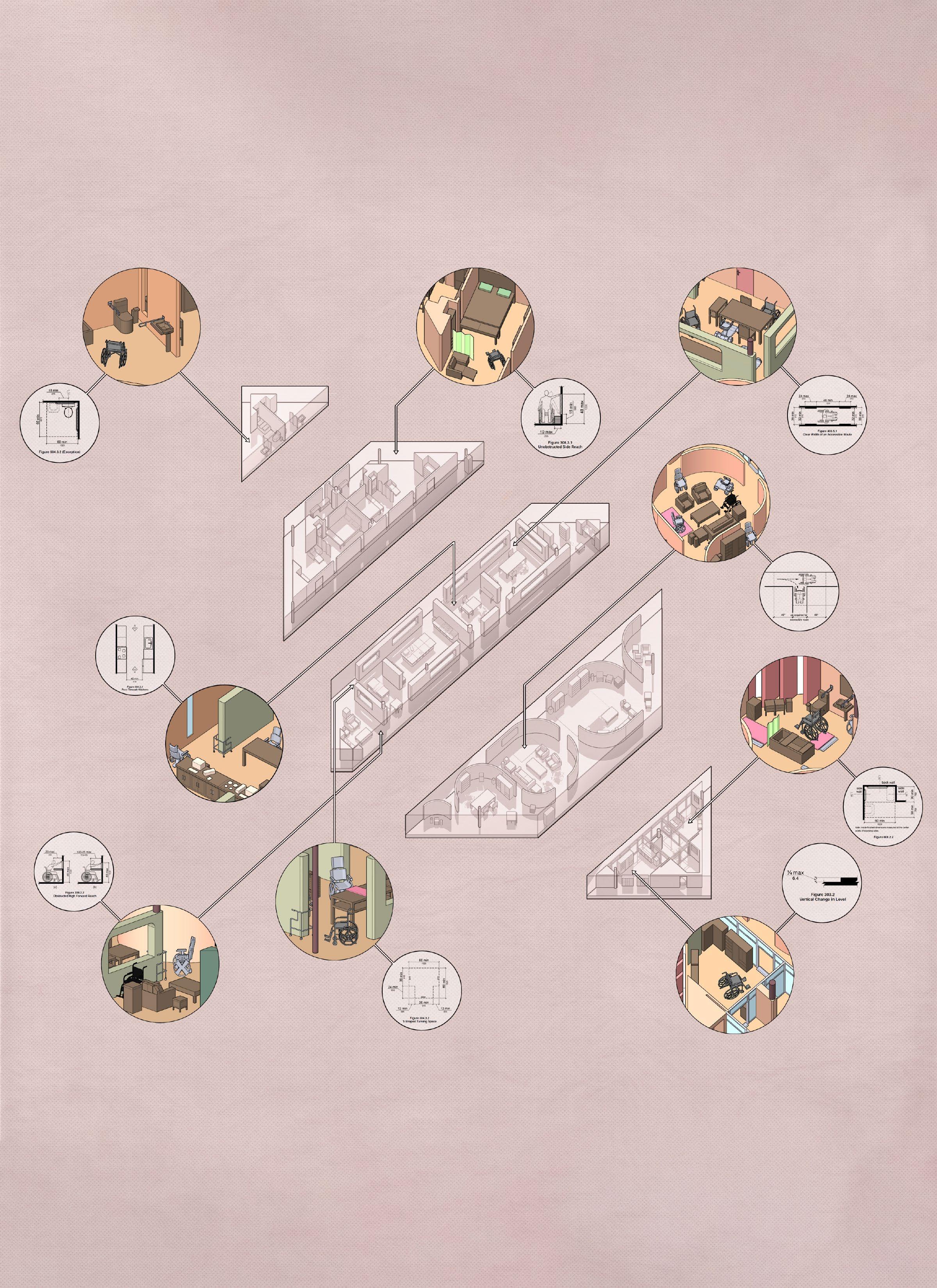
DIAMOND | DWELLING | DIMENSION ACCESSIBILITY RESEARCH AND DESIGN
This project coordinates a pursuit on formal language variations, and the concern of creating accessible space within a given form. The effort involved in this process is not limited to technically solving accessibility issues, but also incarnating moments where the spatial arrangement inside the space provides inhabitants a better residential experience. As represented by a series of drawings, diagrams and collage vignettes, the design begins with the adherence to ADA Standards for Accessible Design, and ends up with the production of a certain sort of lifestyle with the caring and inclusiveness for disabled group.
 USC SCHOOL OF ARCHITECTURE INSTRUCTOR ALFIE KOETTER FALL 2020
19 18 COVER IMAGE INTRODUCTION
Diamond Shape Study
The ideation of this project evolved from John Hejduk’s Diamond House schemes, a series of drawings and sketches showing floor plans in multi-level houses, with columns being vertical support and all walls in a diagonal relationship with boundaries.

Diamond House B Accessibility Study
As the specific precedent I studied, House B shows great formal qualities of free plan, but as it only focuses on formal language clarity within constrained shapes, it totally neglects consideration for mobility and has many accessibility problems.
Grid Diagram


As the original house is prioritizing variations in the plans, my initial compositional approach is taking the diamond form and expanding it to a broader scale, which becomes a bigger frame to bring elements together into one floor for reconfiguration.


Floor Plan


The strategy of removing the vertical difference resolves issues caused by limited floor scale and bld corners and stairs, and the primary challenge becomes arranging different elements effectively to diagonally fit into diamond floor plan while ensuring accessibility. I parallelly divides the single floor into 4 parts corresponding to the 4 levels in Diamond House, to allocate the programs from most public to most private sequentially.
Annotated Plan
To be more specific about its ADA code compliance, the functionality of space is well-assured by form. the blue dashed boxes are showing all necessary passing space and turning space more than 36’’, the green lines shows maneuvering clearances at doors and alcoves, while the orange dashes are the passage and maneuvering space in kitchen and accessible bathroom, and the red circles show the turning space of wheelchair.
21 PLAN 20 DIAGRAM
This diagram takes out the circulation in the entire building to visualize main passage clearances going both horizontally and vertically across all the programs of different functions.


All corridors are capable of navigation via wheelchair movements, so the disabled residents have accessible route every part of the house and extra turning space at all the corners.
The lower left parts are the bedroom, closet and bathroom, being enclosed but connected together for private use.
The middle band is the kitchen and dining room, defined by perpendicular floated thick walls with fillet edges.

Different spatial features also ensure accessibility in different ways. Showned in this view is the kitchen and dinning space.
Accessibility also achieved in another direction, where openness of space and multiple corridors ensure better mobility.
The parts marked by curved walls are primary living rooms and studies, framed within discrete partitions of curvature.
At the lower right corner are the entrance, storage and shared bathroom, with glass curtain walls as transparent threshold.
Plan Oblique Plan Oblique Plan Oblique Plan Oblique Circulation Diagram Section Oblique Circulation Diagram Section Oblique23 OBLIQUE 22 DIAGRAM & SECTION
A more experiential medium showing how disabled people and caretakers use and occupy the house is the illustrative vignette. I grasp imaginary moments of interaction between inhabitants, and visualize them in perspective views.


What’s filling the corner is a fireplaces for people to sit together and enjoy warm atmosphere. As one of the small design moments, the thickness and rounded edges of floated wall is just capable of situating a walker.
The living space is surrounded by the curved walls, with the function at the center and clearance round it, while the curvature is making mobility devices to be more easily navigated without necessarily wasting any space.
The kitchen is a combination of linear and U-shape kitchens, having maximum openness and connecting to corridors on both sides. The larger clear floor space and work surfaces allow more activities at the same time.
The dinning room is open to corridors as well, with a lot of left-over space. A wheelchair could go on one side of the table and another device still able to pass behind it.

In the bathroom, auxiliary furnish elements and devices of mobility aids help user adapt to a cleansing space, where the sinks and toilets ensure maneuvering clearances.
Instead of adopting standards in a compact way, the kitchen have actual maneuvering clearance much more than 60’’ to minimize possible circulation issues.
In a word, these vignettes show how challenges on accessibility are tackled differently on the user-end, and illustrate how the life could be like for inhabitants.


 Exterior Vignette
Interior Vignette
Interior Vignette
Interior Vignette
Interior Vignette
Interior Vignette
Interior Vignette
Interior Vignette
Exterior Vignette
Interior Vignette
Interior Vignette
Interior Vignette
Interior Vignette
Interior Vignette
Interior Vignette
Interior Vignette
ILLUSTRATION 25 24 ILLUSTRATION
PATCHWORK URBANISM
Themed on patchwork urbanism, this project both coheres and contrasts affordable housing with parks and landscapes. Methodologically, the project is progressed by conducting urban context analysis through various perspectives, drawing a full set of unit plans for modularized affordable housing, and making digital collages with collected elements and site photographs. As the idea permeates the whole process, patchwork is an explicit spatial strategy related to the idea of fabric and how fabric can be used to reestablish the built environment. It is characterized by orthogonal organization, but is also randomized and non-hierarchized, and is therefore a model of unpredictable final results within a fixed frame.


Concept Prototypes
The proposal is to think about spacial forms in the given site of residential neighbourhood as a possible “patchwork”: a collection of different indoor and outdoor programs collaged into a unique urban fabric.

Site Analysis
Original site is an empty block and transmission powerline corridor.


Site Analysis
Located at Huntington Park, residential-based, adjacent to a public park.
Landscape Programs Diagram
To enrich the living experience of the low-income communities, a variety of gardens and park amenities are linearly arranged on the longer site, while a mixed-use multilevel building occupies the rectangular site as affordable housing and community center.
ARCHITECTURE AND LANDSCAPE DESIGN USC SCHOOL OF ARCHITECTURE INSTRUCTOR GARY PAIGE | SUMMER 202127 26 INTRODUCTION DIAGRAM & ANALYTIC DRAWING
Concept Diagrams


The concept evolves sequentially by emulating parcel fabrics of adjacent residential blocks, reorganizing it into systematic base grid, and transforming the grid into a base plan of rhythmic patchwork pattern.


Typology Evolution Diagrams
Site Plan and Elevation Ground Level Diagram Unit Plan - A1 Unit Plan - B1 Unit Plan - C1 Unit Plan - A2 Unit Plan - B2 Unit Plan - C2 Unit Plan - A3 Unit Plan - B3 Unit Plan - C3 Second & Third Level Diagrams Second & Third Level Plans and Elevations Site Solid Block Mass Readjustment 35’ × 100‘ Parcel Grid Mat Retreat Simplified Mass + Courtyard Mat Typology Void Block Mass Void Addition Level × 2 Block Extraction Amenities Extension PLAN 29 28 DIAGRAM & PLAN
Site Plan
As shown by the site plan (and floor plans on the last page), the inner space of the building creates its own patchwork using a different languagefrom theparks.Witheachvariationofeachroomunit beingdistributedbothorganizationally(orthogonaland well-sorted)butalsorandomlyintermsofwheretheservice corridors andcourtyards arelocated inthe same typeofunit plans.

Site Perspective
The orthographic views helpvisualize the green space in park and buildingprograms, aswellastheurban context ofproject.


Site Perspective
Different colors show facade of the building, communual courtyardsandroofgardens, andbuilt-inoutdoorspacesforeachunit.

PLANI,AXONOMETRIC � � • 0 I • el I [Jg� ._ � liiiiiiii □ ._ � � �� � �
30 DIAGRAMI,PERSPECTIVE 31
Courtyard Perspective Courtyard Perspective Roof Perspective Interior Collage Interior Collage Interior Collage
Axonometric Diagram
YINGHAO ZHANG
WORKS FROM 2017-2022