Good Example
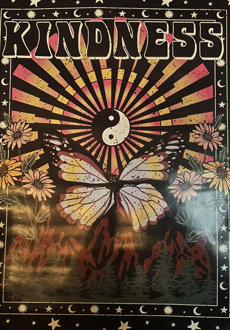
I believe this example of Typography In The Wild to be a good example. This poster contains the word “KINDNESS” in bold and beveled with an understroke. While a lot is happening on the poster, I believe the postitioning of the text is aesthetically accurate and works perfectly with the subjects of the poster. The understroke allows for an almost “lift” out of the paper and the beveled edges of the letterforms allows for contrast to draw the audience’s eyes directly to the text firsthand. The kerning, while appearing closer than a normal kerning, works out perfectly with the purpose of the lettering as it adds even more contrast and the subject of closeness within the poster without forcing the letters to become conjoined with one another. While many may see that too much contrast can be distracting, the contradicting black and white text to the subjectivity of color within the poster adds to the almost need for this fontface as it draws in the audience’s eye at a higher magnitutude than the physical elements could ever do just on their own.
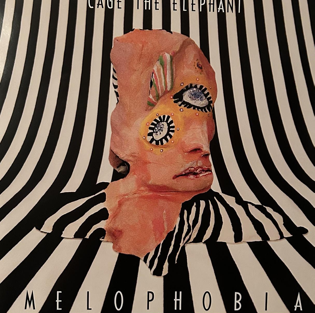
I believe this example of Typography In The Wild to be a bad example of Typography. While looking at an artistic aspect, the physicality of this music album cover poster is intriguing and works very well for the target audience, but the typography does npt worl properly. Looking from an aspect of professionalism, the typeface is very difficult to read here, with the black and whiite interchanging every letter. While this effect works well with the purpose, it makes it very difficult to read unless the album is right in your face or unless you are someone who has seen it many times. The letterform positioning can alos become awkward, as the kerning is not as evently proportioned as it could be. Additionally, the name of the band is in a font size at least a third of the size as the title, making it extremely difficult to read with the color issue and the hard-to-read font sizing. Overall, this could have been much better if the fontface maybe was not altering colors or if the type was bolder and more visible to any audience.
Bad Example
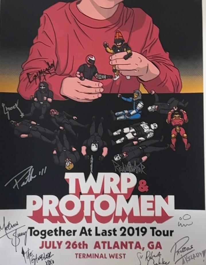
Good Example
This poster, while not having as much text as the last, is much more contained and aesthetically eye-drawing for the target audience at hand. Personally, what usually draws my eyes most is when typography is stacked on each other to make an almost shadow appearance. While I think the “&” symbol looks out of place with just being red, I believe the band did this in order to show the emphasis on the band names, which is an excellent design technique. While 2 different fonts are used here, they are both from the same font family. This is the best way they could have gone with fonts, as we do not want a single font as it could end up boring the audience, but we also don’t want to be so chaotic with the fonts that we take attention away from the purpose of the text itself. The aspect of font color makes this font even more important, as the main subject and another object in the background are colored in the same red as the shadow of the main font face. This helps to pull the viewer’s attention to the font, as it correlates and connects directly with the subject, making this a very appealing element to the target audience.
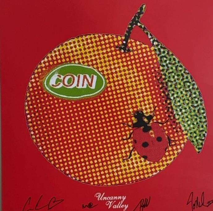
I have provided a full poster image, along with a close up to the text at hand i order to provide the most efficient context and viewing opportunities. First viewing the poster, you see that it is a tour poster for the alternative band COIN. Seeing the visual elements of the stippling technique bring your attention to the art. Looking up closer the band also used the stippling technique on the font face. While I see why they would think this was a good idea in order to get the artistic element across, this is very distracting and not the point of typography. The text should stand out in order to bring attention to who the band is, and it is doing the exact opposite by placing text that blends on top pf the subject. This also makes the name appear to be almost pixelated, which is not exactly what the band was going for. They are additionally using font faces from 3 different font families. Along with the font we have already discussed, the font of the tour dates is in a sans serif font family and the name of the album seems to be in a script font family. Overall, this piece would have been much better if it would have included font from just one font family, using bolder varieties on text they needed more evidence on, and regular or thinner variations for the information based text. The use of the stippling technique is a great art aspect, but could be much more apparent if it were limited to either subject or text.
Bad Example
Good Example
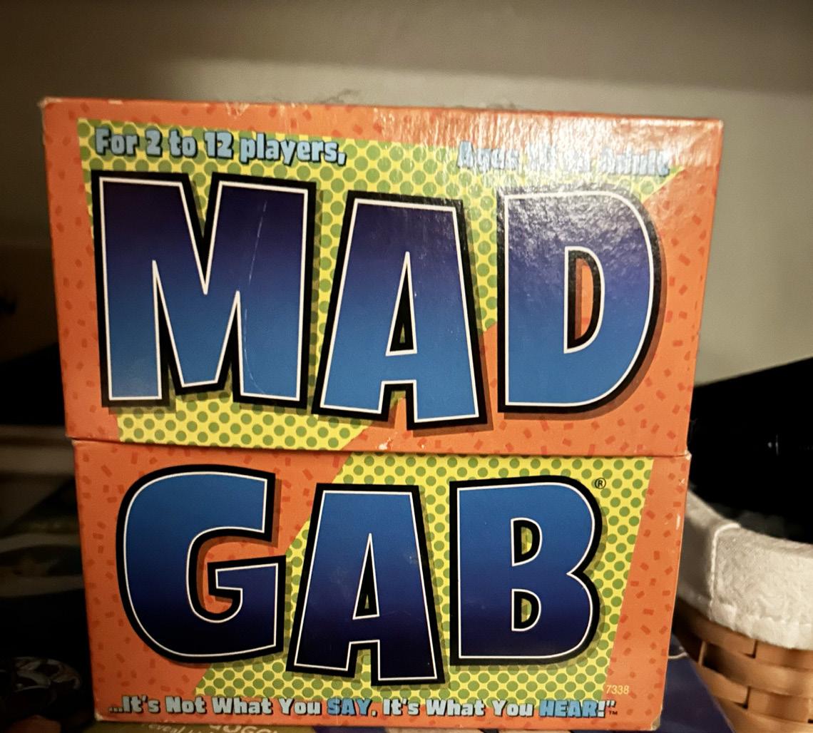
This is an old game from my childhood that my friends and family used to play as much as possible. I’m not sure if it was the giant letterhead or the color coordination that pulled me in, but my eye always caught this game first when I looked at all the games we owned. The colors of this box are so bright and compliment each other so well, no mystery since 2 of the colors are complementary, while the other is analogous. This allows for the most contrast the colors could provide, drawing the viewers attention to this box, and drawing them in even further with the stand alone uppercase font used in the main logo design. The Usage of the double stroke, along with slightly adjusting the heights of the individual letters allows for an implement of boldness that almost makes the text pop off the box.
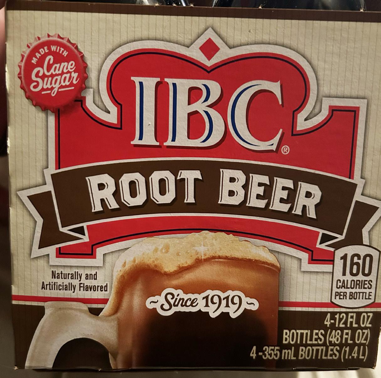
While I love this root beer brand, especially since it keeps the vintage style with the translucent glass bottles, their packaging is not typographically satisfying. While some of the type faces may be similar and in the same font families, all of them are not and there are about 5 different font faces going on in this packaging alone. The blue lines in “IBC” and the brown lines in “root beer” in the main logo of the company brand drink is very appealing, as it allows for more depth. Although, the blue lines almost look out of place once you realize that is the only presence of the blue color. Red and brown shades are thought of as going well together, but typographically speaking, these colors are far too similar to each other in which they start to blend in with each other, which is not the best design factor. As in the root beer banner as a brown-white-brown pattern, I believe this logo should keep the brown as it is the direct correlation of a design element that has to do with the good at hand. However, I believe this logo would improve by just changing the red dominance to a blue of the same shade as the stroke in “IBC” in order to keep a continual pattern, as well as making sure the design is efficient in standing out and not allowing for the typography to be blended in because of a color mistake.
Bad Example
Good Example
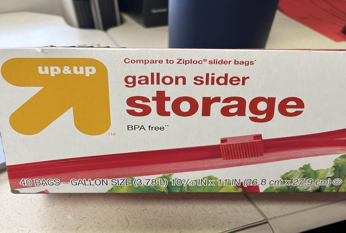
I found this box of gallon plastic bags in my kitchen and it drew my attention almost immediately. Specifically the text and the color combination. The coordination of the red on top of the white background aids the text in popping off the box in order to draw in the eyes of customers at the stores, which is an excellent advertising technique that no one thinks of as an advertisement. The usage of the sans serif font, which I believe looks most similar to Helvetica, provides the most efficient legibility due to the lack of stress and serifs, as well as having a set width and an equal stroke size in every character. The same font families are also included so the product does not appear to be chaotic in any way. Different techniques such as text color and uppercase versus lowercase is used in order to put an emphasis on different items on the box.
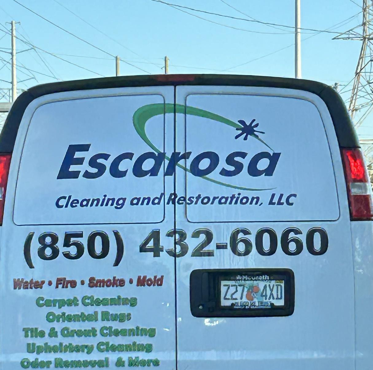
This is the back of a van for a local cleaning and restoration company that I passed on Nine Mile. While the main font is very similar to the last with being a sans serif font, the fonts on the information have an added stroke to try to add a 3d bevel effect, but it ends up just becoming blurry to read. The leading between the green lines of text could also be increased so it doesn’t appear to be all crammed in. The company name could also benefit from being centered so the “r” is not cut off in the middle of the doors. While the green and blue colors go very well together, as they are adjacent on the color wheel, the blue symbol on the green in the logo is confusing, as it kind of looks like a paint splatter, and I am not entirely sure as what it is actually supposed to be
Bad Example
Good Example
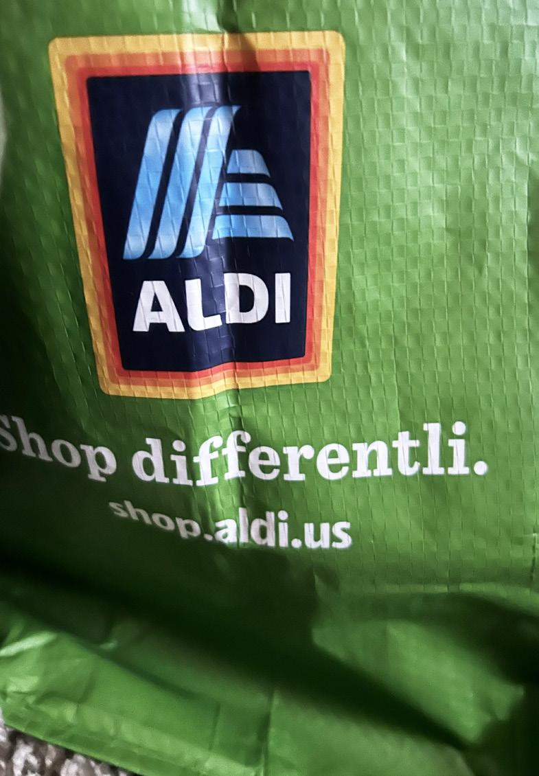
This is a bag from a recently new chain of plastic reducing stores name Aldi. I am not exactly sure if it is obvious that this is my good typography but this typography definitely catches my eye every time I see it. The usage of all uppercase typefaces is what draws my eye in the most when looking at different types of typography personally, so it is definitely no surprise. When I used to work on projects that involved typography when starting out, I used to use a script font for everything because I felt like everything had to have a sense of elegancy and flow. However, learning more about typography has definitely changed my mind on this, as the simplicity of this sans serif font. The usage of only uppercase and absence of serif strokes increases the simplicity, showing audiences at hand how legible the font face is and helping us to understand why the graphic designer chose to design the logo with such a font. The font with the link is also a sans serif font, which is incredibly nice because staying inside one font family is always super helpful in not being too chaotic or distracting. While the middle line, the phrase, is a serif font, I do not seem to find it distracting, as the strokes are minimal and the stress and sizing and positioning of points and stress seems to appear to be at the same levels. The baseline and x height also seem to be the same for the two lines of text so the different font family does not appear to become distracting.
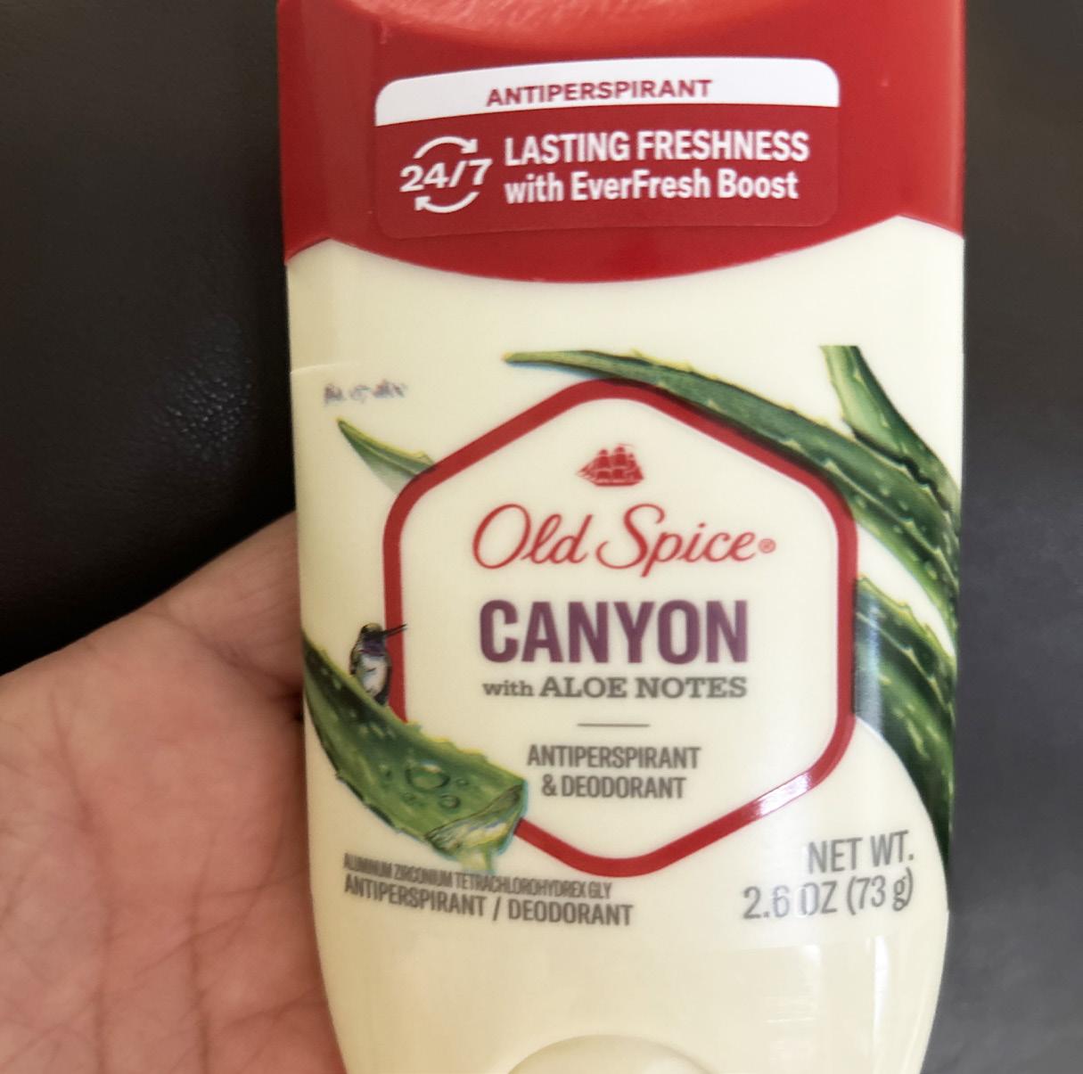
This is the brand of deodorant I use. No one has really ever talked very in detail about how distracting the typography in their branding is because of the good quality and no one really talks bad about things that have been on brand for so long. This definitely needs to be addressed in my eyes though. Old Spice deodorant, while a classic, is classically poor at type design. The first thing I look at in typography when determining if it is good or bad is how many font families are branched out into one single object. While I prefer objects of interests that stay in one font family, there are some exceptions to this in which using two different font faces does not create chaos, but enough difference to draw in the view of an audience and leave an impact of them. However, this brand is using 3 different font faces from 3 different font families; that is 60% of all of the font families, which is way too much to not be considered a distraction. I think that if a logo is going to use a script font in their main point, they should not be so distracting as to use a serif and sans serif font additionally, it is just way too much for an audience to keep up with. The serifs used along with the cursive look of the script font is like using two head fonts in the body of an article, it becomes way too distracting for the audience and takes directly away from the point at hand.
Bad Example
Good Example
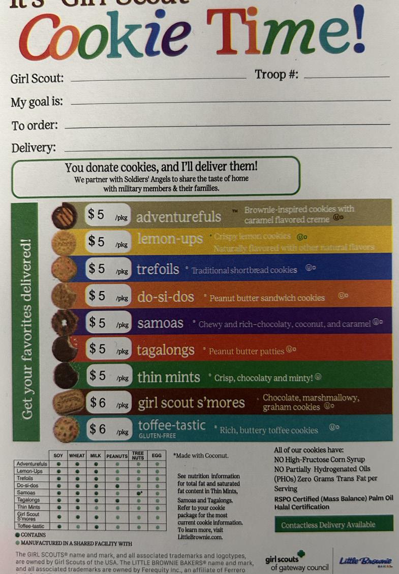
This is the slip of paper that girl scouts give you when you want to make an order. This may look a little chaotic since there’s so much information that has to fit on one slip of paper, but I believe this to be good typography. While there are definitely different fonts faces being applied here, they all fit very well together, being from the same font families and just consisting of different kerning, font sizings, and stress. In order to create a typographical hierarchy here, the slip uses type color but most importantly font size and stress in order to show the most important type to the audience at hand. COOKIE TIME has a different stress level than every other word on this slip of paper, as the rest are at an almost neutrality while these words are tilted at an angle on their. axis. While I believe that the kerning is a little too close on the wording COOKIE TIME, I believe that the company may have did this in order to use hierarchy in order to show emphasis on these words as anyone’s eyes would draw to this aspect. Some of this lettering also appears to be in italics to bring eyes closer to that first. The emphasis on the stress on some specific letters instead of every letter also brings emphasis. The usage of serif fonts also helps with readability, as the stroke sizing is limited and the kerning is spaced out evenly among all the characters.
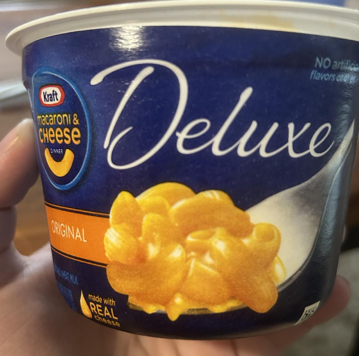
This is a cup of mac and cheese from the grocery store. Probably and honestly some of the worst typography I have posted about so far. This cup of noodles has at. least 8 different font faces going on here on just the front half shown here, probably more on the back. The logo itself in the corner has 3 different font families. The word DELUXE should also definitely not be the main words with the most emphasis and the highest position on the hierarchy. The company name seems to be condensed and pretty low on the hierarchy as well. Using this font face as the biggest font size and the main point was a mistake as well. Not only is it a script font among 3 other font families, this brand is not usually associated with script fonts in the rest of their products so this one looks extremely out of place. This font is also way too condensed and thin stroke lines make it very difficult to read. The usage of blue text on blue background also makes it very hard to read. While the wording of DELUXE compared to the rest creates an emphasis of organic vs type, this is not exactly ideal, as deluxe is the main type and should not appear to look almost childish and hand written on the advertisement of a company that should appear to be formal or professional in their designs on their products. While the kerning is okay on most, it is definitely not even among all the text and becomes distracting.
Bad Example
Good Example
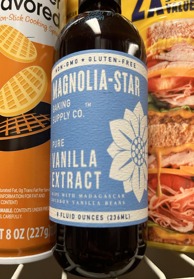
This is a bottle of vanilla extract that I also found sitting in the kitchen where I work. All the fonts used in this design are in all uppercase lettering, also known as titling fonts. While there are multiple different font faces being used together here, they are mostly all coming from the same font family, sans serif, so this designer wanted to keep the typography pretty simplistic so the viewer was able to focus easily. There is one font that is outside of the sans serif family, but it is contained and fits perfectly with the rest of the design elements, in an almost italic serif uppercase font style. My picture is a little blurry so I apologize but the font faces on this bottle are definitely sharp and simplistic, pulling a certain kind of audience in. This brand of vanilla extract is called MAGNOLIA STAR. This is ironic, as this is the first example I have covered that has any dingbats at all, and the dingbat we have happens to be a star, the perfect element that this company could have included in their typographical design. Dingbats are used to show a pictographic element that uses textual elements to draw in the viewer, which is perfectly flowing in this design. The kerining of the characters are also made to flow easily for the viewer’s sight. The leading within the design is also flowing easily, as it is not just even, but on the perfect design technique of spacing, as the leading makes the words almost looks like they are layers of the flower on the bottle, pulling you back in to the company name.
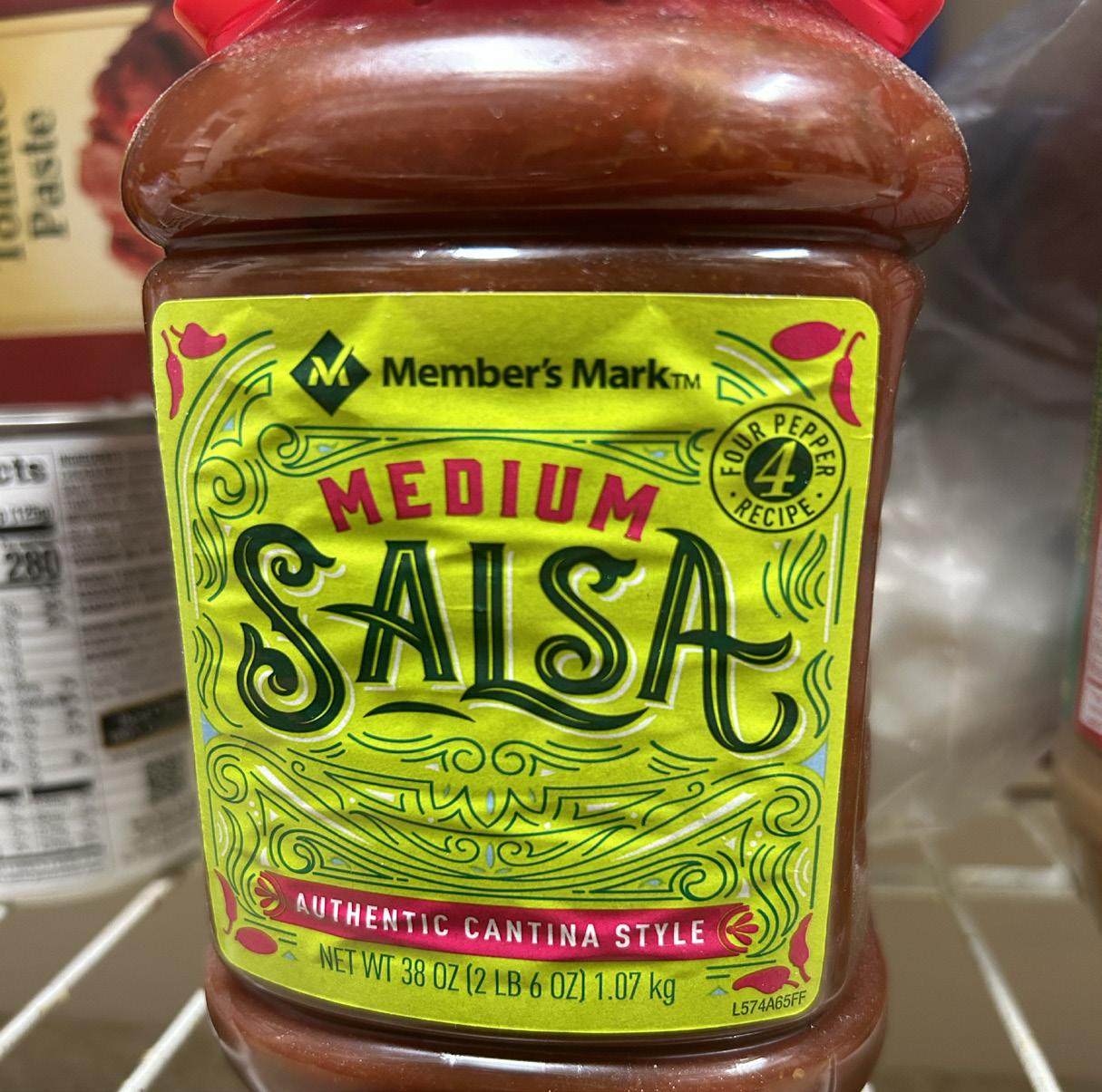
This is a bottle of salsa I found in the kitchen at my work place. This main font. which reads MEDIUM SALSA is 2 different font faces, which both of them cannot seem to pick what kind of font it wants to be. When I first saw the word MEDIUM I for sure thought that is was a sans serif font. However, when I looked closer there seemed to be the tiniest strokes of serifs on the letterforms, which threw me off because I could not see that unless the bottle was right by my face. I also noticed all the lines for design elements, which is nice for flow of packaging but the word SALSA has the same exact lines as an inner stroke of the typeface. While I see that the designer was trying to carry out a subject of design, this distracts and blends the word SALSA into the background and does not make for an efficient design aspect overall. The text from the company “Member’s Mark” and the word MEDIUM are way too similar typefaces. They are not the same typeface, which would be fine in design, but they barely have a difference occurring. We learned in this week’s content notes that multiple family mixes are okay, but if they are “too close for comfort” then the typefaces can provide a counterpart for one another which ends up distracting the viewers from the objective. I think that the designer would benefit from adding a little more contrast between the top 2 fonts and by cancelling out the distracting element of the lines within the main font.
Bad Example
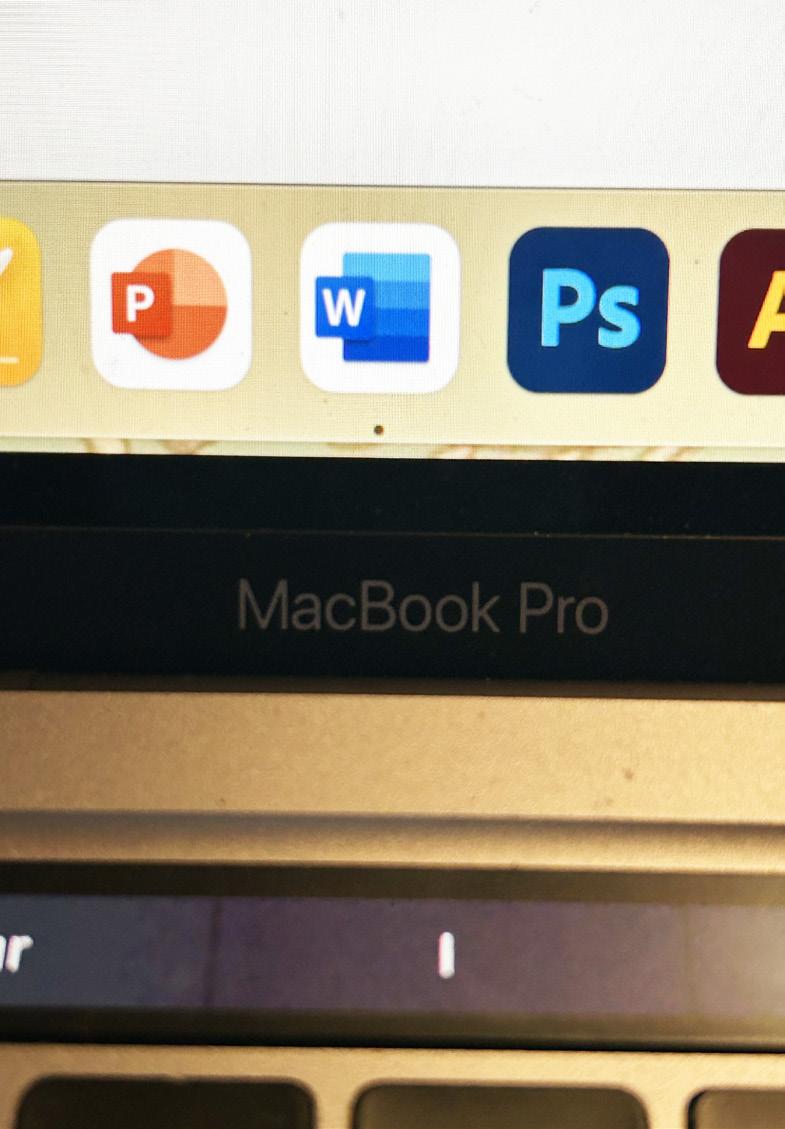
Good Example
This is the font on my MacBook that appears in every Apple product. This is very interesting, as there is a ton of history behind the typography of this company. This font is called “San Francisco”. Appearing very similar to Helvetica, this sans serif font was created by the company Apple to be put on all of their products and advertisements globally in 2017. Sans serif has become a very popular type of font family and this family has become very known for being used for the most efficient legibility, so it is definitely no surprise that this is the font family that Apple picks from. This font is simplistic, to ensure to not become distracting from the product, but also to implement a minimalistic lifestyle that Apple promotes not only through their devices but through the font face used on their devices. Apple’s old fonts became almost retro and, as a company as popular as Apple, they needed a new typeface that showed not only an easier readability for all consumers, but also a sense of modern day professionalism. While I could comment that an increase in kerning by just the slightest bit, about a 0.5 difference, would benefit the company in the most efficient readability, I believe they most likely chose a more compact type of kerning to once again show the audience their theme of a compact, minimalist lifestyle within the name brand. The spacing between different words is the perfect amount of points. Overall, I see this typography as efficiently used.
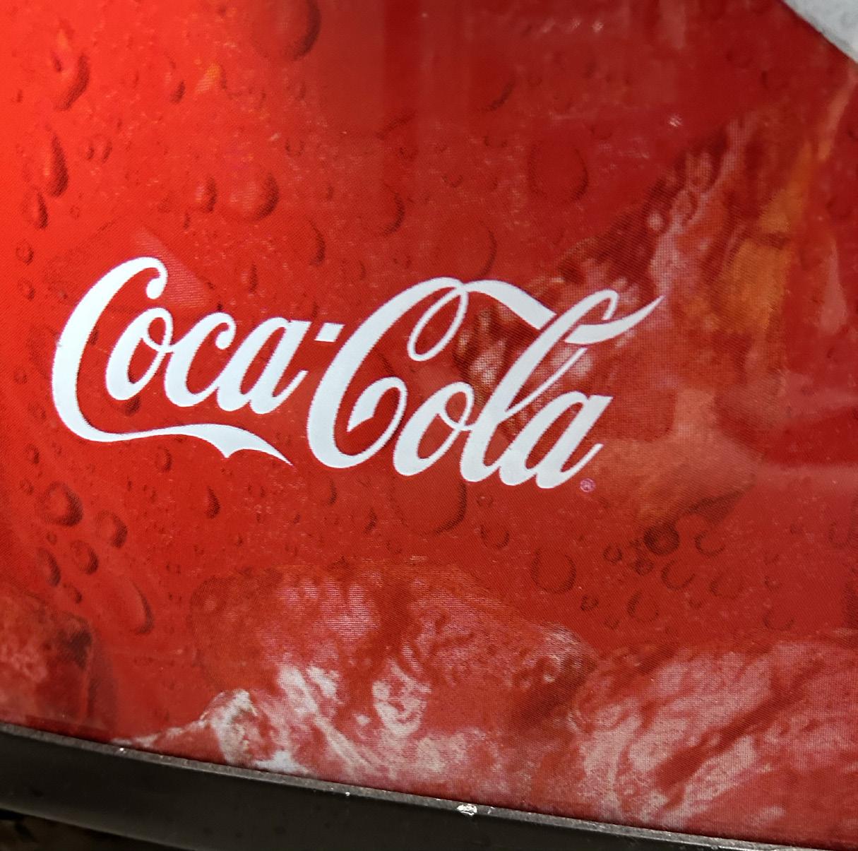
This is The Coca Cola logo that I found at the bottom of a drink vending machine at my work place. I honestly used to really like this logo but I do not particularly love it anymore. It’s in a script font and the letters almost combine together and this might be me personally but I find this to be very distracting, per say how the second “C” loops into the “L”. This is also inconsistent, as the first letter “C” does not do this as well so it seems randomized and not apart of the “C”, making it seems like a random line. The dot in between the two words also confuses me. I am not exactly sure if it is supposed to be a dingbat, or a period, or maybe an apostrophe. My guess is it was supposed to separate the words as a lot of consumers reference to this drink as just “cola”, but I feel as though when the viewer does not know what something is it becomes distracting and pulls away from the purpose and appeal of the typography in the logo. I realized that, even though it looks as though one font is being used, examining the “C” of both words, they are completely different. The first C has the same type of loop at the top as the font bodoni and century expanded, two fonts in our “5 typefaces” assignment. The second C is inconsistent with this and loops into the letter L instead.
Bad Example
Good Example
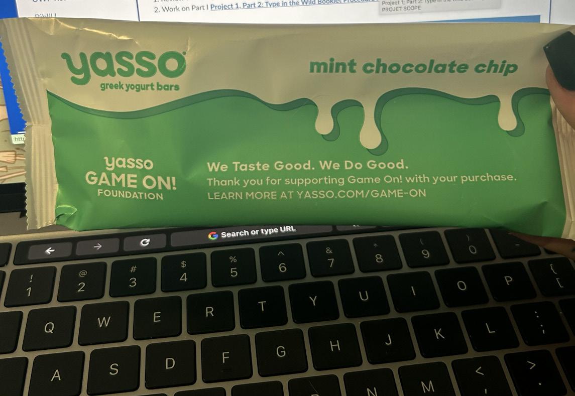
This is actually a new “ice cream” I tried this week, which happens to actually be greek yogurt. This is my good example and my examples happen to ironically be accidentally related to each other. If you can see the “dripping” on the packaging and then look to my bad example, I think these correlate well. These are two very different designs, but look like a customer said similar things to each designer. While both designs are very well thought out, this design is a god example because the drip is apart from the typography. Although typography is an art form, some added elements just become too distracting, which is why this simplicity of each font face being similar and the subtle type hierarchy overtakes the chaos of the other drip factor. I am seeing 3 different font faces here, but most of them are coming from one family and a little diversity is working in this dynamic style. While the same font faces are being used, positioning, stroke thickness, and type sizing are all used in order to create a hierarchical account within the typography of this design. Although many do not exactly think of typography as an art form, nearly this entire product packaging is just typographical elements and it definitely drew my eyes in enough to buy a different type of ice cream at the store. The swap of the colors of white on green and green on white also shows another hierarchical aspect as a switch to the important titles and subheads, differentiating to the “body” of the packaging purpose.
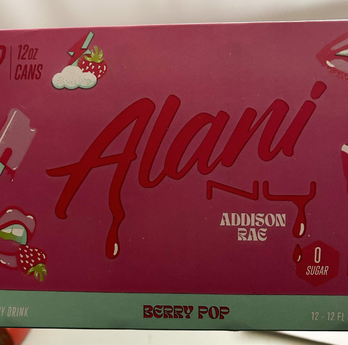
As I mentioned in the above good example, this is my bad example of typography. This is a company of energy drinks that I drink often, but this packaging in particular is of a collaboration with Addison Rae. Nothing against her but I fully think this design came from her, as I think the simplistic typographical design on the rest of Alani’s products appear to be very compelling. The drip added to these different font faces become way too distracting as they mold the different font faces into something that gives the audience a completely different feeling. There seem to. be about 5 different font faces here, whereas there were about 3 on my good example and the same on Alani’s usual packaging. I love the dynamic of the positioning and hierarchy, as not everything is read top to bottom and most important to least important which I find intriguing. I however do not find the spacial aspect to be efficiently carried out, as some elements are touching one another in a way that might have very well been intended but ends up looking like an accident. I also find the going between script and other font faces needs to be very precisely carried out. The original packaging carries this out slightly better as there are less font faces, but this design is pretty much consisting of each font family and some that are very differentiated as well. Overall I love the creativity of this design, but looking at it from a technical point of view I do not find it very attractive.
Bad Example
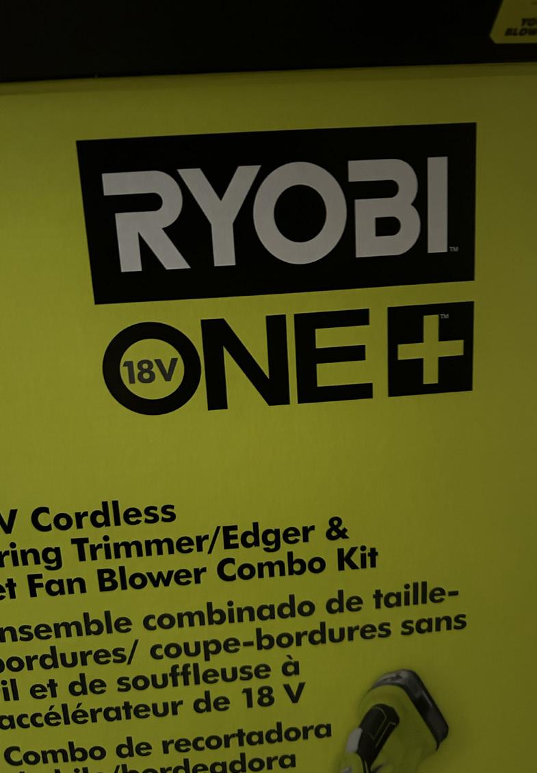
Good Example
This is the box to a Ryobi lawn care kit with an edger and a blower duo. I wanna start with talking about the simplicity of this design. Typography can be used to make something become interesting for sure but with this specific design the simplicity works perfectly. This product is gonna be used by almost everyone and people looking for something like this are not particularly seen as looking at the typographical design anyways so the simplicity within the design goes along with the company’s easy-to-use equipment. With only one font family being used here, each sans serif font allows for the best visual quality and readability. Font color and the usage of switching between font faces that either consist of regular casing or all uppercase letter heads are both used in order to show a hierarchical aspect within the packaging. This allows for new customers to tell easily what the brand name is, what the product is, and what part is the description. I see the cut through the letter r and B as an artistic element. While the length difference does not seem to be the same, it is consistant between both letters and this is a physical aspect within the typography that shows the point of the product, as it almost appear like the typeface itself has been edged. The type pf the head is centered perfectly in the middle top of the box and the kerning and leading seem to be efficiently measured in this product packaging.
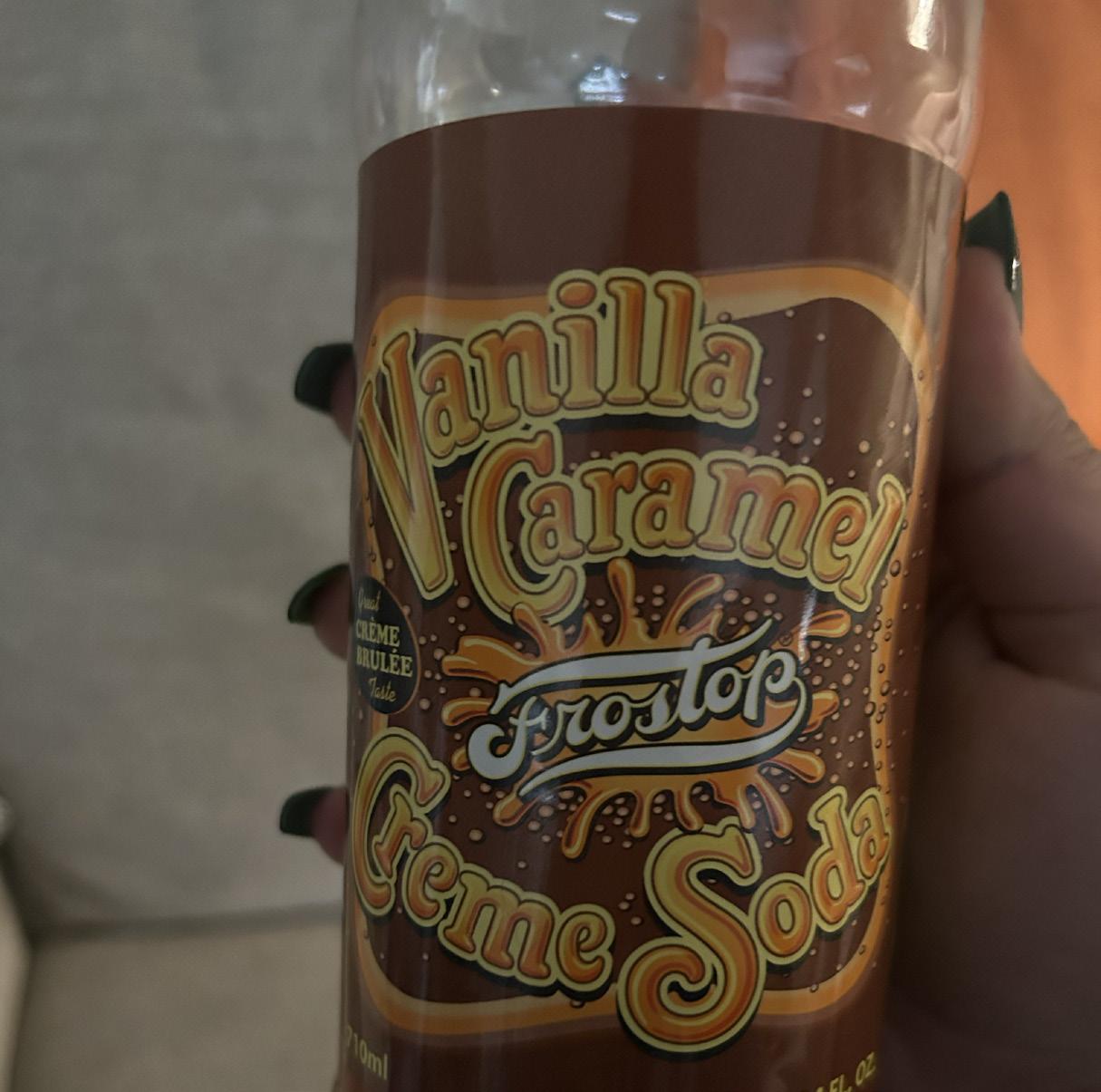
This is a very interesting bottle of creme soda I found at a local store. It honestly caught my eye, which I guess was the point of the designer, but ironically. This design honestly looks like a child made it, or it was made for a child. It almost becomes obnoxious after looking at it for a while and it starts to mess with your vision for sure. Although this picture does not exactly show the entire bottle, I have counted about 9 or 10 different font faces on just this 24 ounce bottle. The two smaller fonts at the bottom are not positioned the same and overall these fonts are very distracting. If a designer is going to use an all typography based design for a product it needs to be well thought out. There are 3 different script fonts alone on this bottle, and I think that if you are going to use a script font you definitely should not pair it up with another script font as the hierarchy could the become very difficult to understand and almost nonexistent. Other than the nutrition level, there is one sans serif font on this bottle. I think the designer would benefit much from limiting the amount of “fancy” fonts put on one product. They should definitely start by developing a hierarchy and work their way from there. This design has a lot of potential but I do not think it could succeed unless the thought about being able to “overdo” something is reevaluated.