2 minute read
Good Example

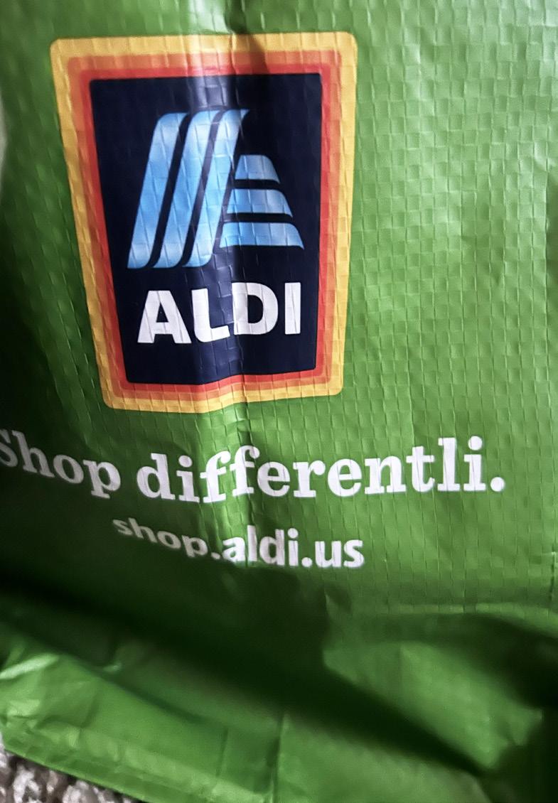
This is a bag from a recently new chain of plastic reducing stores name Aldi. I am not exactly sure if it is obvious that this is my good typography but this typography definitely catches my eye every time I see it. The usage of all uppercase typefaces is what draws my eye in the most when looking at different types of typography personally, so it is definitely no surprise. When I used to work on projects that involved typography when starting out, I used to use a script font for everything because I felt like everything had to have a sense of elegancy and flow. However, learning more about typography has definitely changed my mind on this, as the simplicity of this sans serif font. The usage of only uppercase and absence of serif strokes increases the simplicity, showing audiences at hand how legible the font face is and helping us to understand why the graphic designer chose to design the logo with such a font. The font with the link is also a sans serif font, which is incredibly nice because staying inside one font family is always super helpful in not being too chaotic or distracting. While the middle line, the phrase, is a serif font, I do not seem to find it distracting, as the strokes are minimal and the stress and sizing and positioning of points and stress seems to appear to be at the same levels. The baseline and x height also seem to be the same for the two lines of text so the different font family does not appear to become distracting.
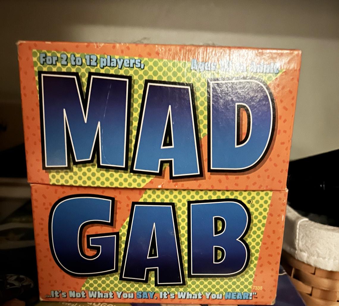
This is the brand of deodorant I use. No one has really ever talked very in detail about how distracting the typography in their branding is because of the good quality and no one really talks bad about things that have been on brand for so long. This definitely needs to be addressed in my eyes though. Old Spice deodorant, while a classic, is classically poor at type design. The first thing I look at in typography when determining if it is good or bad is how many font families are branched out into one single object. While I prefer objects of interests that stay in one font family, there are some exceptions to this in which using two different font faces does not create chaos, but enough difference to draw in the view of an audience and leave an impact of them. However, this brand is using 3 different font faces from 3 different font families; that is 60% of all of the font families, which is way too much to not be considered a distraction. I think that if a logo is going to use a script font in their main point, they should not be so distracting as to use a serif and sans serif font additionally, it is just way too much for an audience to keep up with. The serifs used along with the cursive look of the script font is like using two head fonts in the body of an article, it becomes way too distracting for the audience and takes directly away from the point at hand.
Advertisement