2 minute read
Good Example

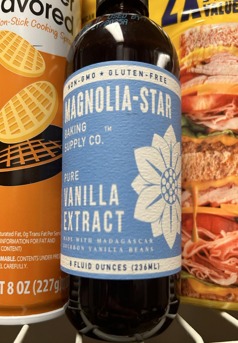
This is actually a new “ice cream” I tried this week, which happens to actually be greek yogurt. This is my good example and my examples happen to ironically be accidentally related to each other. If you can see the “dripping” on the packaging and then look to my bad example, I think these correlate well. These are two very different designs, but look like a customer said similar things to each designer. While both designs are very well thought out, this design is a god example because the drip is apart from the typography. Although typography is an art form, some added elements just become too distracting, which is why this simplicity of each font face being similar and the subtle type hierarchy overtakes the chaos of the other drip factor. I am seeing 3 different font faces here, but most of them are coming from one family and a little diversity is working in this dynamic style. While the same font faces are being used, positioning, stroke thickness, and type sizing are all used in order to create a hierarchical account within the typography of this design. Although many do not exactly think of typography as an art form, nearly this entire product packaging is just typographical elements and it definitely drew my eyes in enough to buy a different type of ice cream at the store. The swap of the colors of white on green and green on white also shows another hierarchical aspect as a switch to the important titles and subheads, differentiating to the “body” of the packaging purpose.
As I mentioned in the above good example, this is my bad example of typography. This is a company of energy drinks that I drink often, but this packaging in particular is of a collaboration with Addison Rae. Nothing against her but I fully think this design came from her, as I think the simplistic typographical design on the rest of Alani’s products appear to be very compelling. The drip added to these different font faces become way too distracting as they mold the different font faces into something that gives the audience a completely different feeling. There seem to. be about 5 different font faces here, whereas there were about 3 on my good example and the same on Alani’s usual packaging. I love the dynamic of the positioning and hierarchy, as not everything is read top to bottom and most important to least important which I find intriguing. I however do not find the spacial aspect to be efficiently carried out, as some elements are touching one another in a way that might have very well been intended but ends up looking like an accident. I also find the going between script and other font faces needs to be very precisely carried out. The original packaging carries this out slightly better as there are less font faces, but this design is pretty much consisting of each font family and some that are very differentiated as well. Overall I love the creativity of this design, but looking at it from a technical point of view I do not find it very attractive.
Advertisement