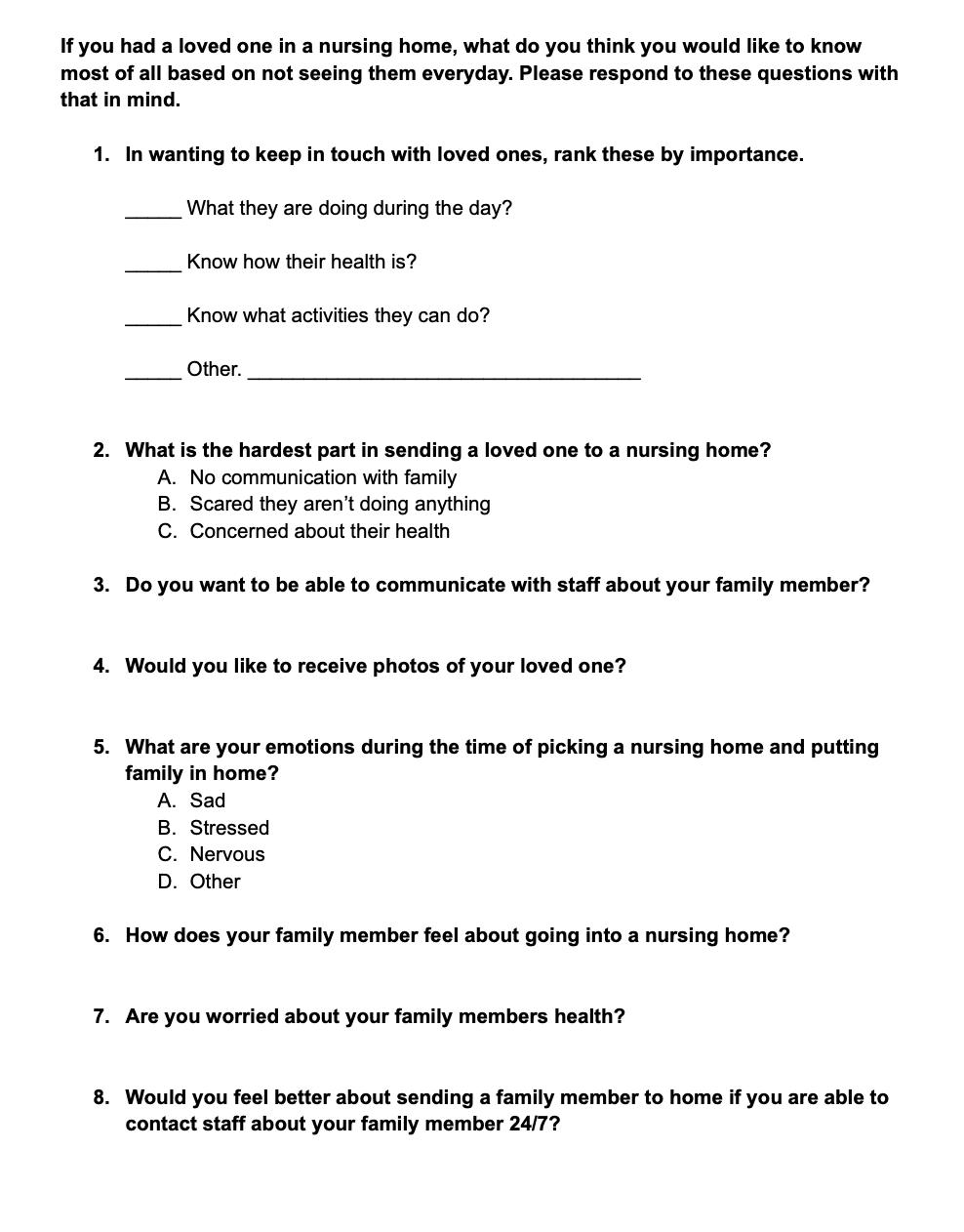
Peaceful Placement
UI/UX Design
Designer
Taylor Whitted

Designer
Taylor Whitted
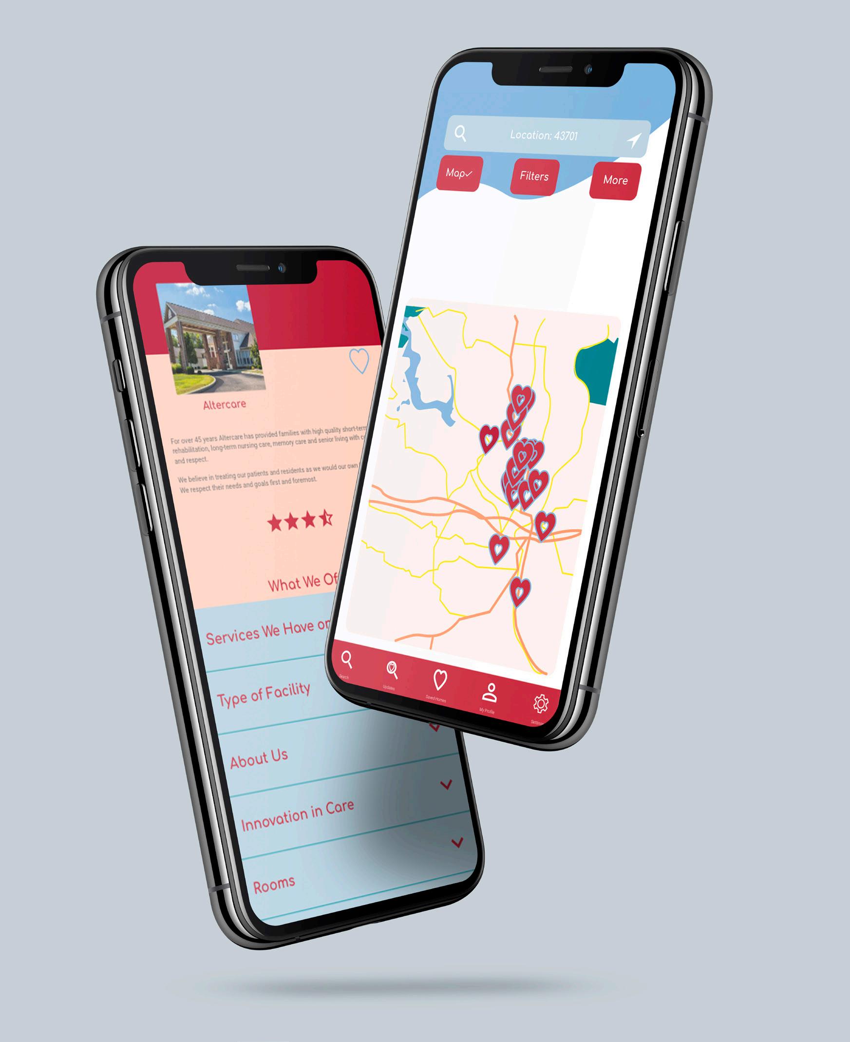
The app, Peaceful Placement, is going to make it easier for people to find a nursing home for their loved one. This app is designed for you to be able to search through different nursing homes based on location or ZIP code. You will see details about what the home offers, as well as reviews on the home. Once you find one you like, you can select it as a favorite. Then, either continue to search for other homes or virtually tour the home and finalize your decision.
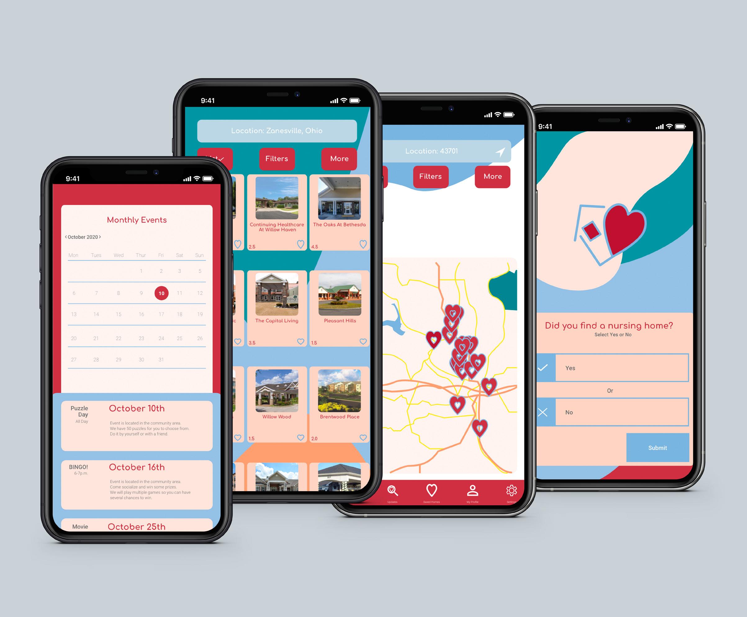
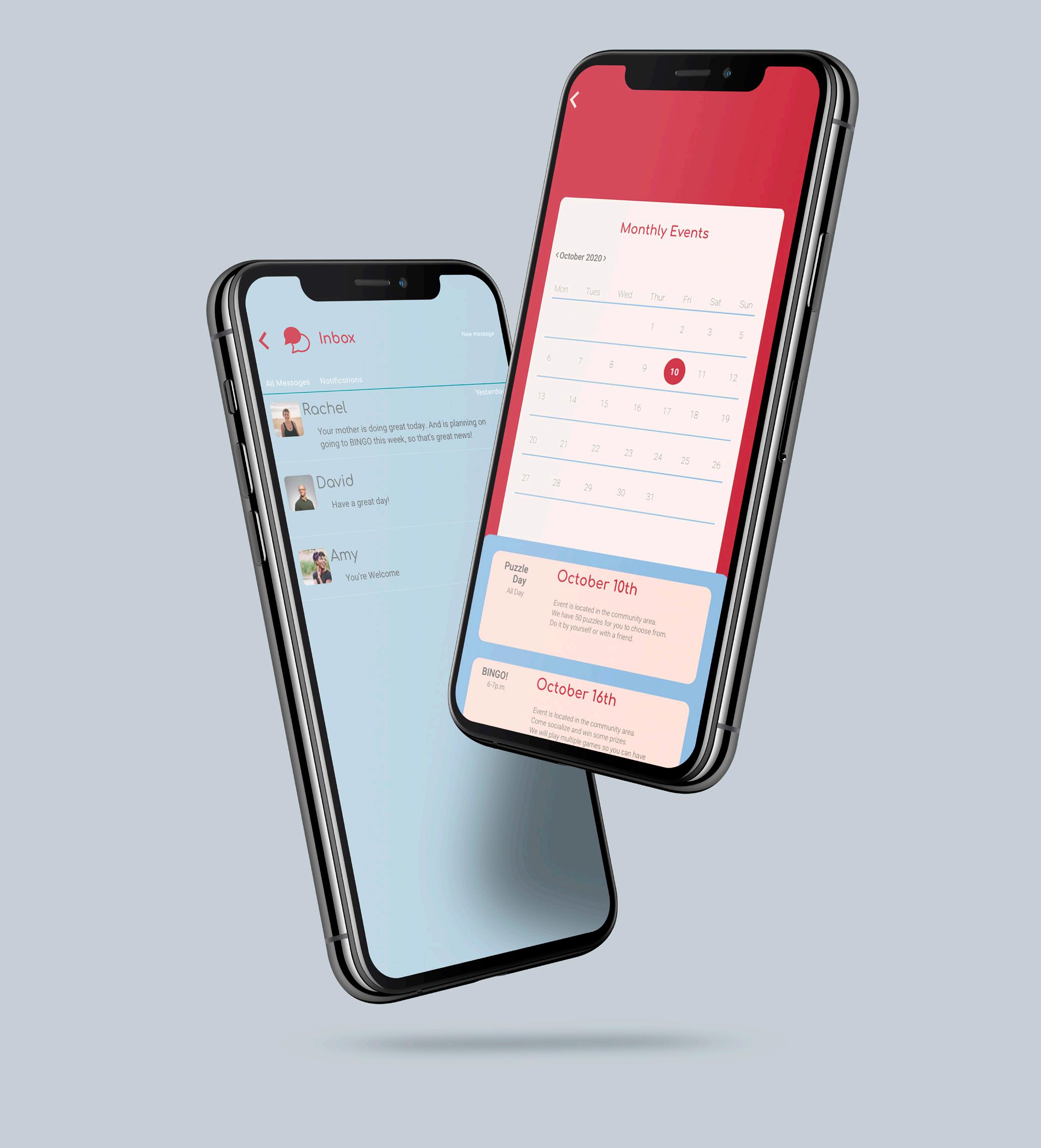
What makes Peaceful Placement so unique and special is that once you find the perfect home, you will be able to communicate with the staff of the home regarding any questions or concerns you may have about your family member. You also have the ability to view a calendar of events for the home.
What makes this company unique?
This company is unique because it will provide information on each nursing home which will make finding a home for your loved one much easier.
How will you reach your customers?
Peaceful Placement is designed as an app. The app will advertise on social media and nursing home and hospital websites.
Challenge
The challenge in creating this app will be to make it look professional while also welcoming. Other challenges will be making the app visually attractive, user friendly, and have a modern look.
Tone/Feeling
Gives off a professional, informative, comfortable, and safe feeling.
About the Company
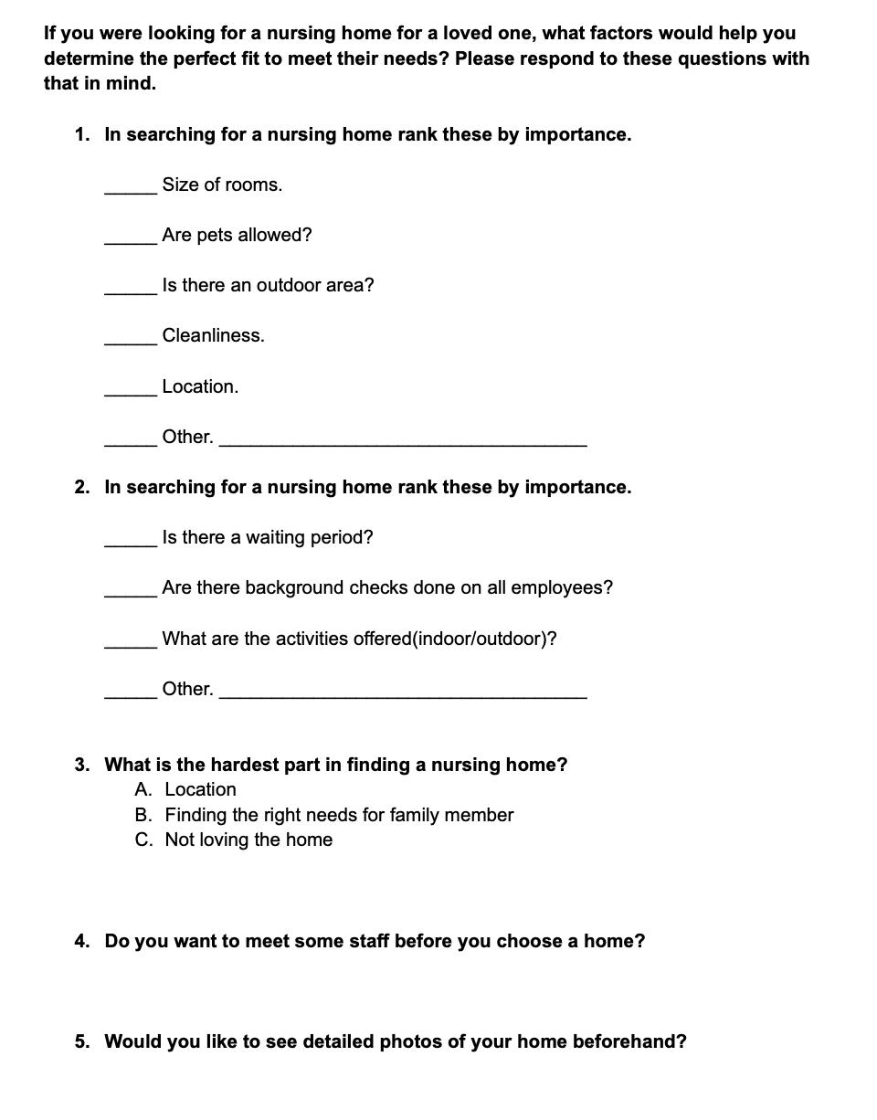
Peaceful Placement is a company created to help families find the perfect nursing home for their loved ones. Via this app families can find homes within a city or ZIP code, view the ratings of each nursing home, and once you choose the perfect home you will be able to communicate back and forth with the staff 24/7 with any updates on your family member.
Objective
The goal is to make the app user friendly and convenient. The end goal is to enable the user to find the perfect nursing home for their loved one and feel confident with their decision with as little stress as possible.
35-60 year old men & women
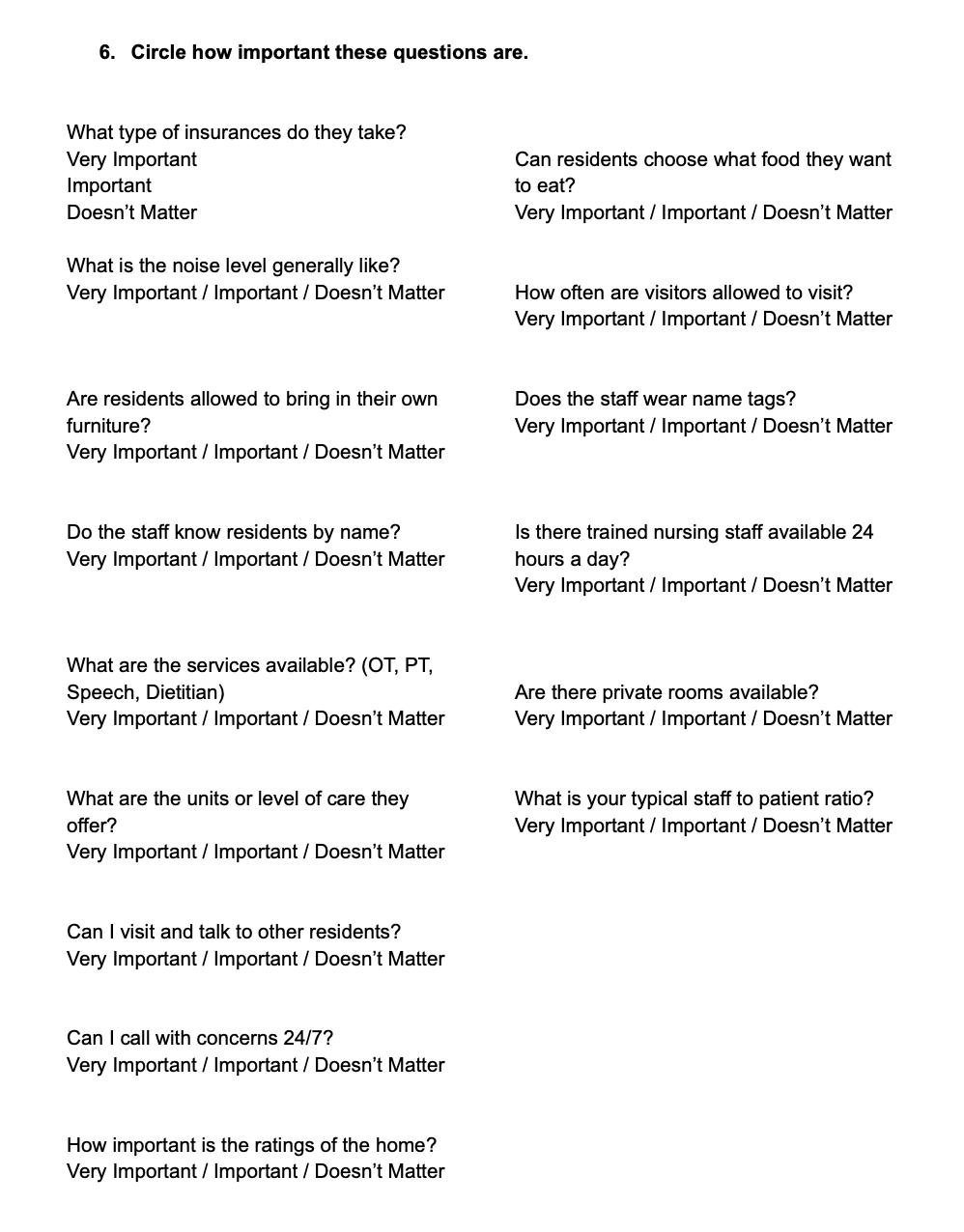
Offer a testimonial page. List what each nursing home offers their customers. Provide reviews for each home and links to each home’s website. The ability to search by location. Photos of each place. Provide information for state requirements.
Research, Design, Mock Up, & Prototype
Three Months Continued...
Peaceful Placement is designed to give people the ability to easily find a nursing home for their family member, with little stress. How to solve the problems your audience have?
Logo Design, Set Colors, An App Design, & Advertisements for the App
Tools
Adobe XD, Illustrator, Photoshop, & InDesign
Colors
#FAB58C #FEE6DD #FDD6C5 #BF3E46
#9CC0E2
#C0D6E3
#FAEF07
#93A064
The outcome of this project was a beautifully designed app, created to make it easy for people to find a nursing home for their loved ones. The design is made easy and simple for the users to flip through homes and find the perfect one.
Fonts
Comfrontaa
ABCDEFGHIJKLMNOPQRSTUVWXYZ abcdefghijklmnopqrstuvwxyn
Roboto Thin
ABCDEFGHIJKLMNOPQRSTUVWXYZ abcdefghijklmnopqrstuvwxyn
Roboto Regular
ABCDEFGHIJKLMNOPQRSTUVWXYZ abcdefghijklmnopqrstuvwxyn
Roboto Medium
ABCDEFGHIJKLMNOPQRSTUVWXYZ abcdefghijklmnopqrstuvwxyn
Deciding what color scheme will work best.
How to create a design to fit with the age range of 35-60 year olds?
What type of background is going be simple and modern, yet not too distracting?
What movement inside the app will flow the best?
How can I create the app to be user friendly?
The goals for this project are:
To make the app user friendly. The app will be successful in helping people find nursing homes for their loved ones while also keeping the user feeling confident in their decision.
The app will continue to be used beyond placement by allowing family to stay in communication with the staff at the nursing home, and view the calendar of events each month.
What should be included in the app? What is the tone and feeling of the brand?
During the research process I found that most people want a soft modern feel to the app, as well as wanting to stay in touch with their loved one. This is a very sad and stressful process. The app would be sucessful if it were able to make this process smooth and easy. The look of the home is not as important as the feeling they get when visiting the home.
Survey One
Survey Two

Occupation: 58 Dicrector of Community Based Clinical Services
Location:
Married Zanesville, Ohio
Jimmy is a fifty-eight year old man. He works hard to make sure kids and families get the support they need to be healthy. He stays pretty busy, but also enjoys hiking and kayaking on his days off.
He is interested in finding a comfortable and safe home for his mother. I need to know that she is well taken care of.
He is worried about being able to afford a good home for his mother and learning all about the insurance red tape.
Jimmy would use this app to be able to easily search through nursing homes to find the right fit for his mother.
What interests you in the look of an app
Simple
Vector
Friendly Focused Leader Organized Connected

Age:
Occupation 45 Full time principal Married Zanesville, Ohio Status: Location:
Sophia is a forty-five year old middle school principal. She is very busy but loves spending time with her husband and two children. She enjoys being outside, as well as excercising daily.
Goals
Sophia wants to find the perfect home for her elderly mother. who suffers from memory loss. She is very busy and hoping to find the home with very little stress.
Sophia has to find a home for her elderly mother. As she is looking for a nursing home she is having trouble finding a good fit. She needs to find one that has a memory care unit and has private single rooms.
Sophia would use this app to be able to easily search through nursing homes to find the right fit for her mother.
What interests you in the look of an app
Outdoors
Organic Simple Modern
Extrovert

Jimmy is a fifty-eight year old man. He works hard to make sure kids and families get the support they need to be healthy. He stays pretty busy, but also enjoys hiking and kayaking on his days off.
feelings
actions
thoughts
Find somewhere that is a good fit
Find out what they offer
I hope it’s clean and very nice
Find the perfect home
goals
Will it be a good fit for my loved one?
Make sure its the perfect fit
Can you see your loved one living there and be taken care of
Make sure they are nice and know what they are doing
Investigate
I hope the room is nice, with enough space?
Can you see your loved one living there?
Liking the room and its a good price
The journey map was created to show different scenarios that could happen while using the app and how the user would feel and react with every situation.
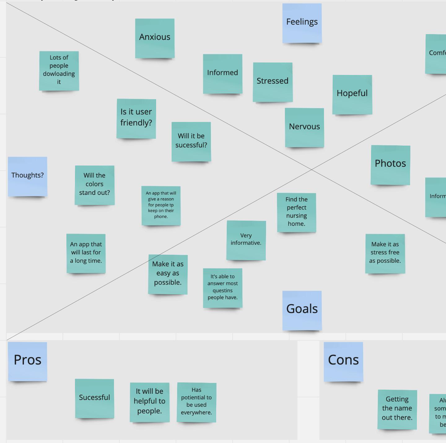
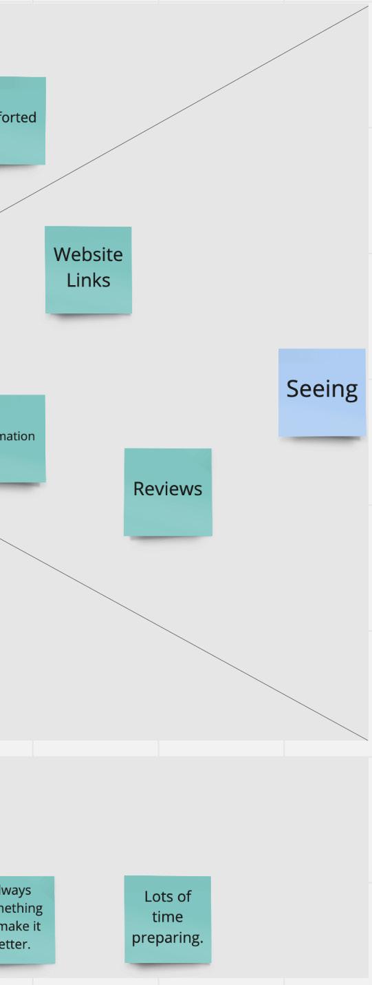
The empathy map is created to show the pros and cons of this app, figure out the app look and what the main goals in designing this app will be.
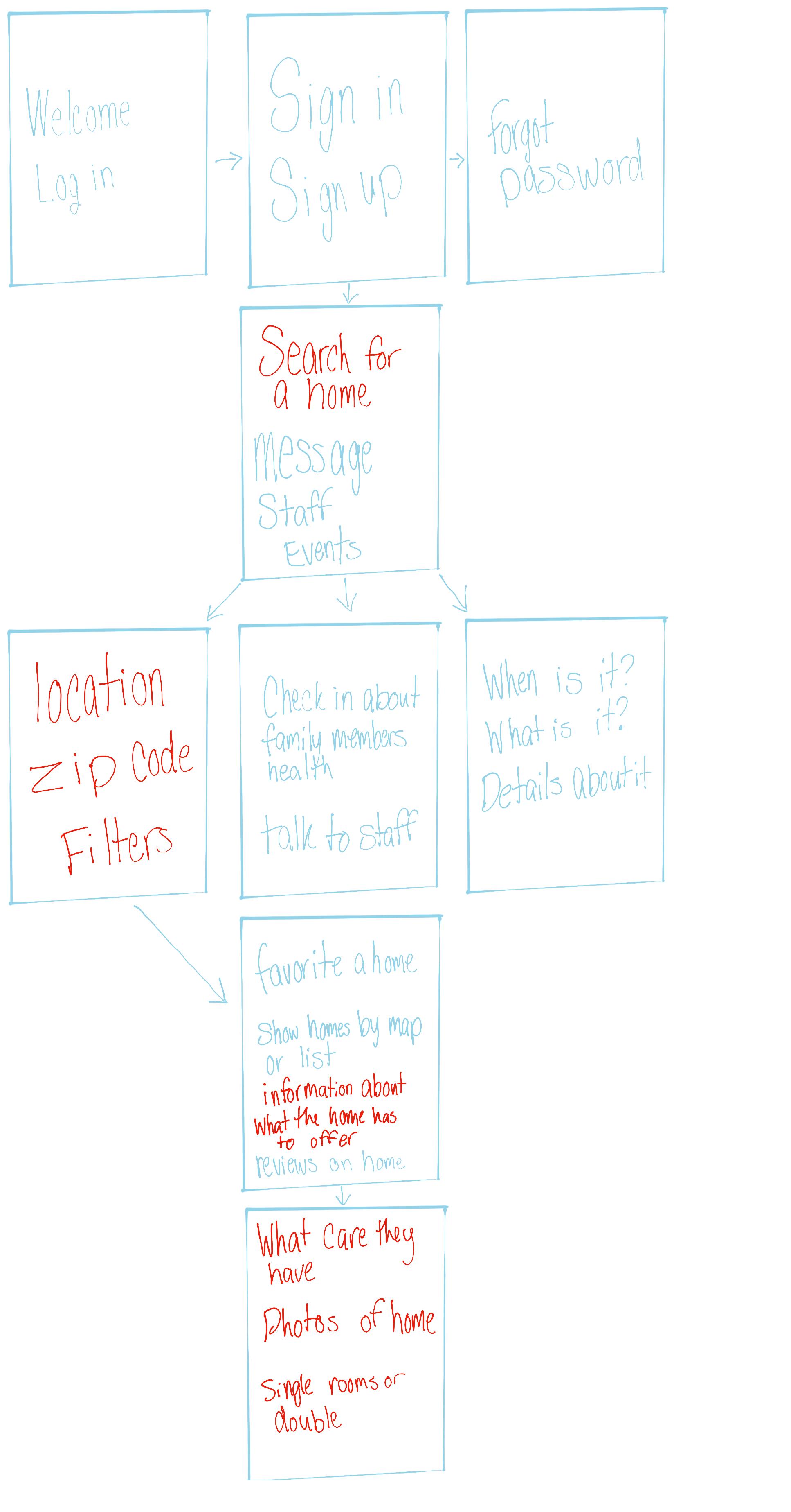
The user flow map is created to show how a user is easily going to move through your app from beginning to end. It also shows what is included with each step along the way.
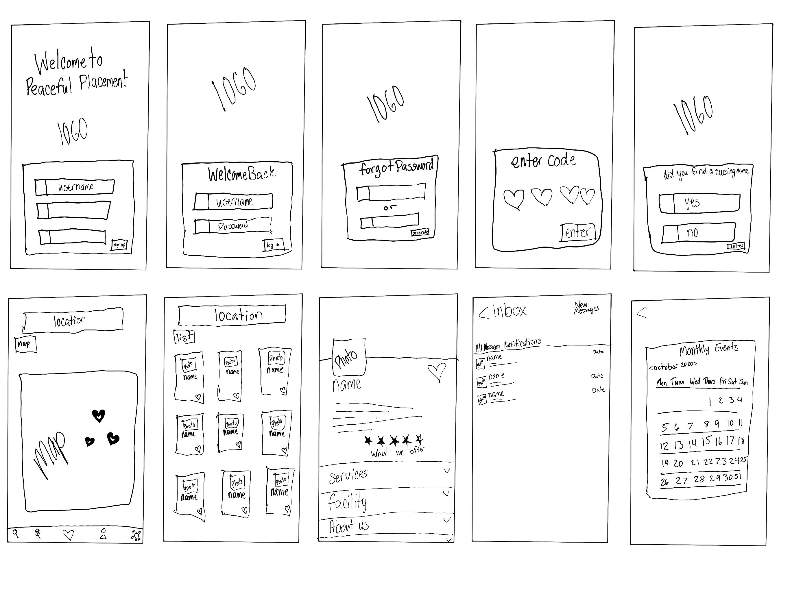
Wireframing is the process in your app design where you start sketching out how each page of your app will look, what movements will go with it, and what will come after each page.
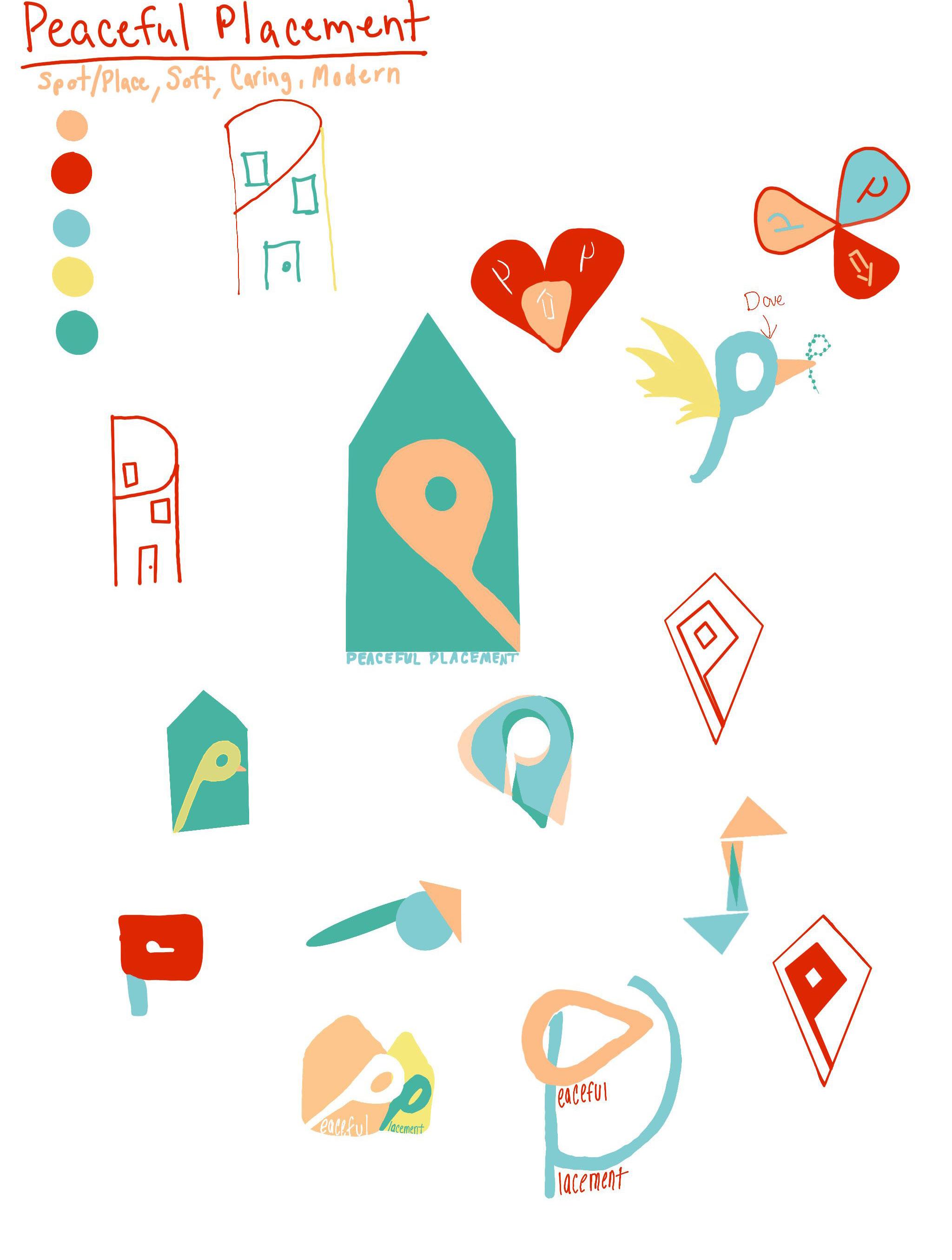
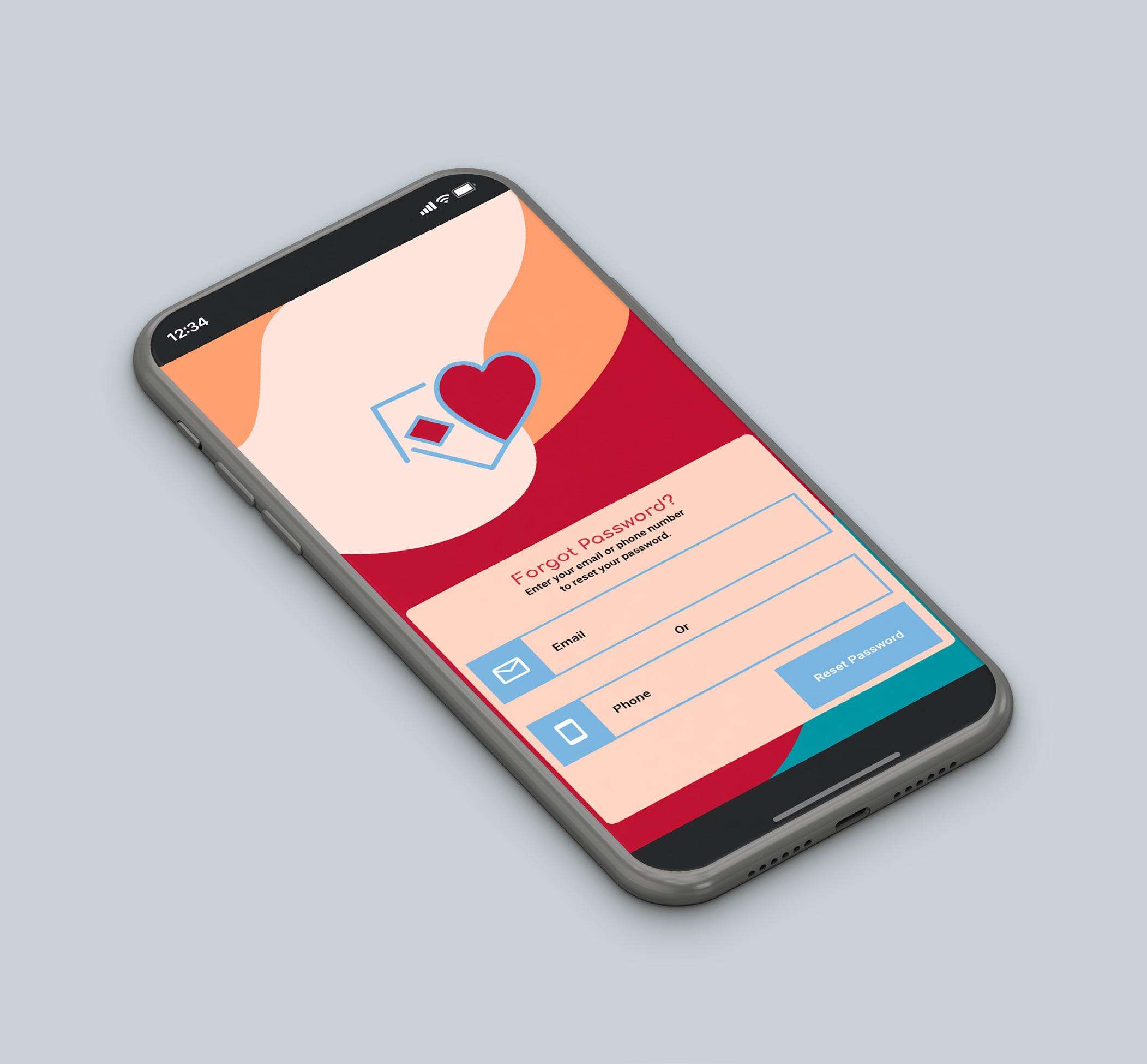
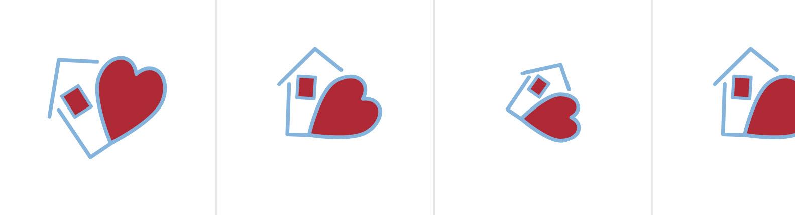
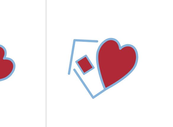
Spot/place, soft, caring and modern were the focus in creating the logo.
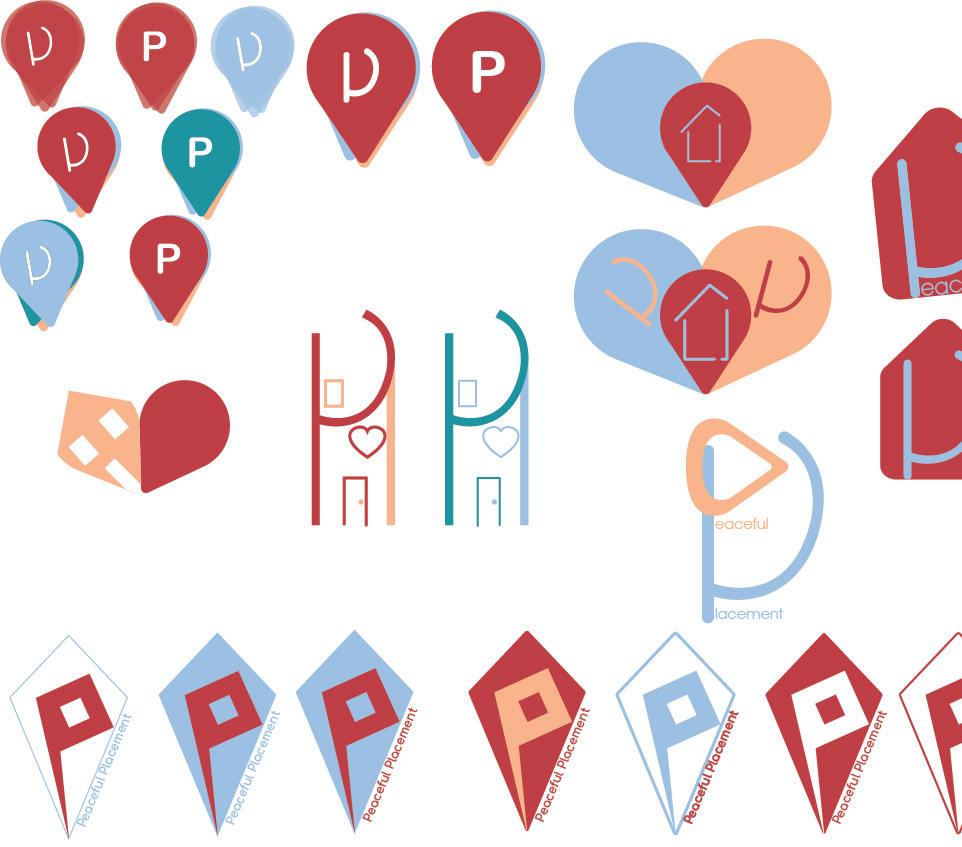
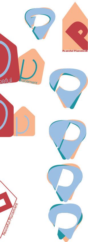
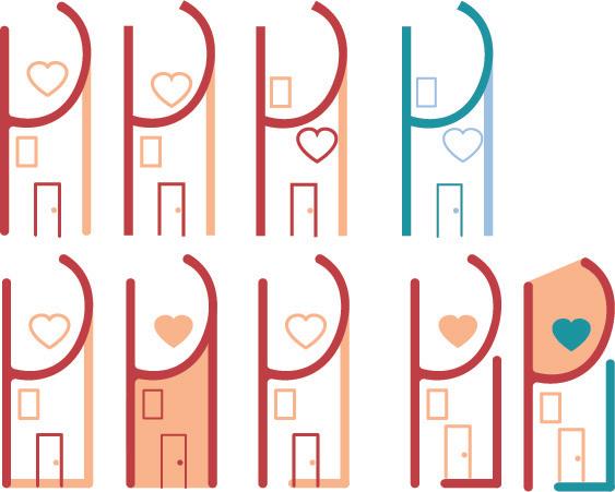
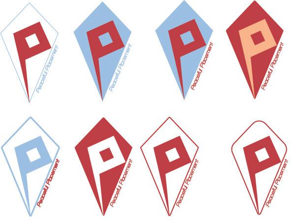
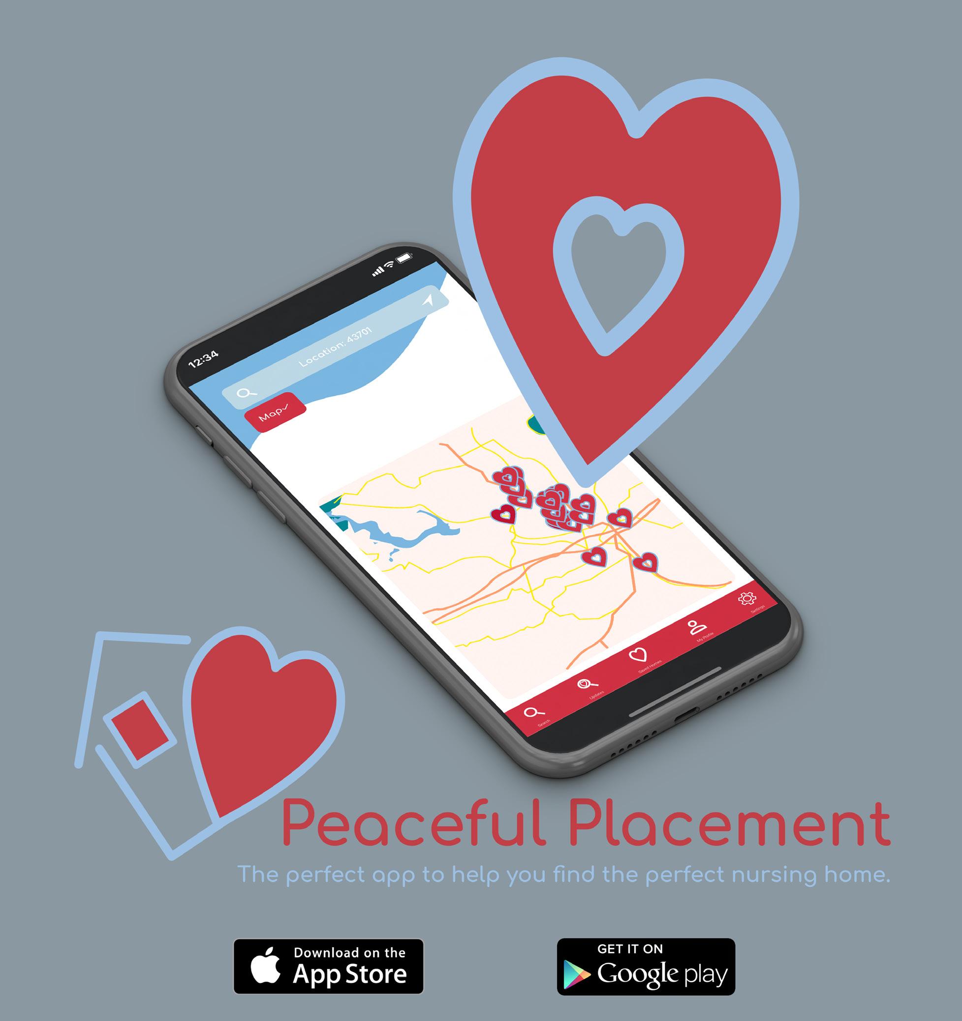
Included in the final logo is a house and a heart. The overall shape is designed to represent a bigger heart. The small heart in the logo is stretched out to be seen as a pin point.
The perfect app to help you find the perfect nursing home.
In this stage I took the original logo along with the name of the app as one signature logo. For the second signature I kept the logo with name and added a brief statement about the app.
Prototype is the stage when your design is completed and will flow together. Then you begin adding in the movements of each page of the app and make sure it all fits together.
In the overall design of the app my goal was for it to look soft, welcoming, and modern, so the app does not overwhelm the users.

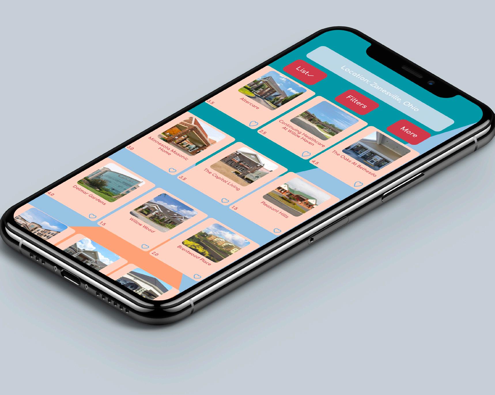
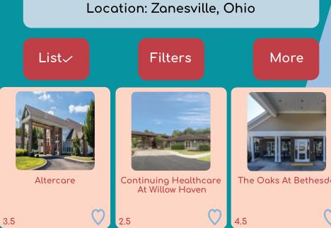
The list mode function is an option in which you will see the homes with photos and ratings.
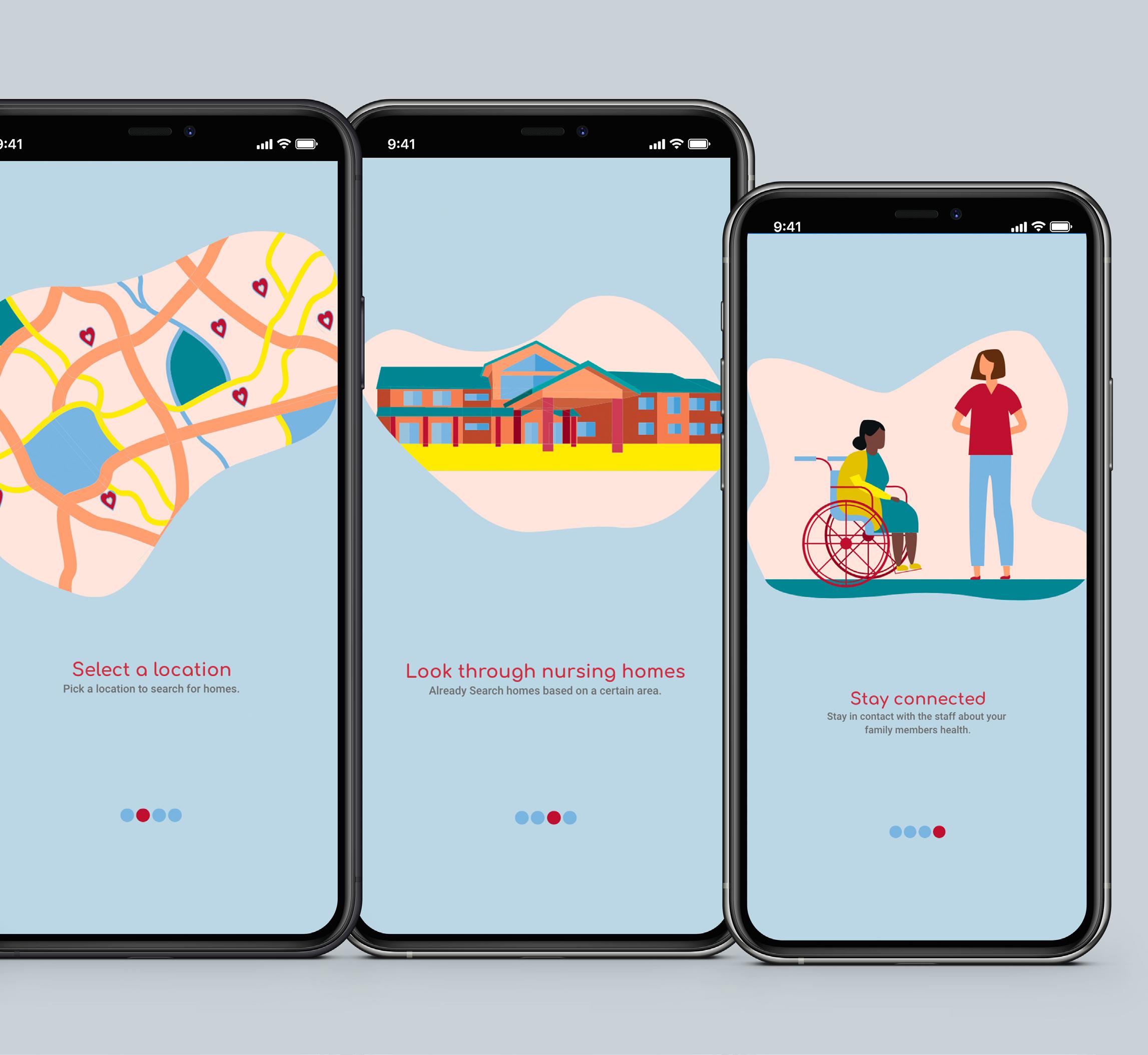
In searching for a home this is what you will see on the app. The hearts are pins of each nursing home found in the area you are searching.
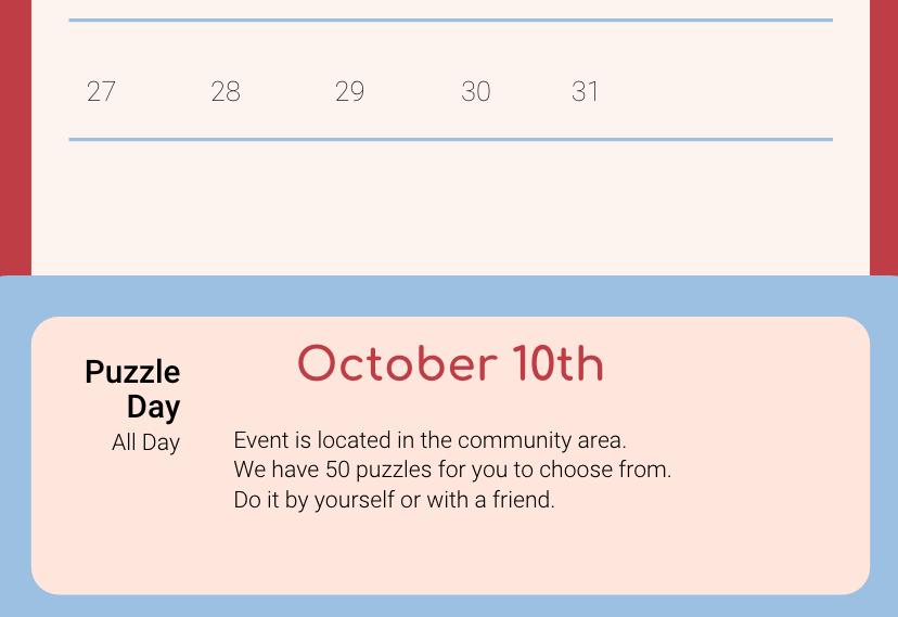
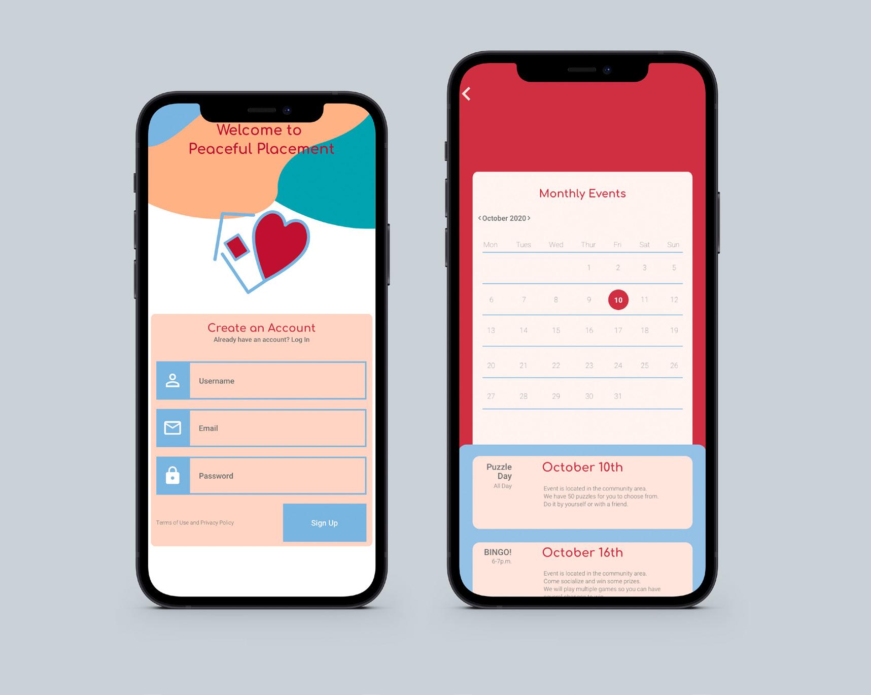
Once the user finds a home for their loved one, they will be able to view the calendar of events offered each day.
Onboarding is the user’s first impression of the app. If it is well designed it will increase the chances of people downloading the app. Once a user opens the app for the first time the onboarding will show the value in the app and the key elements and features used on the app.
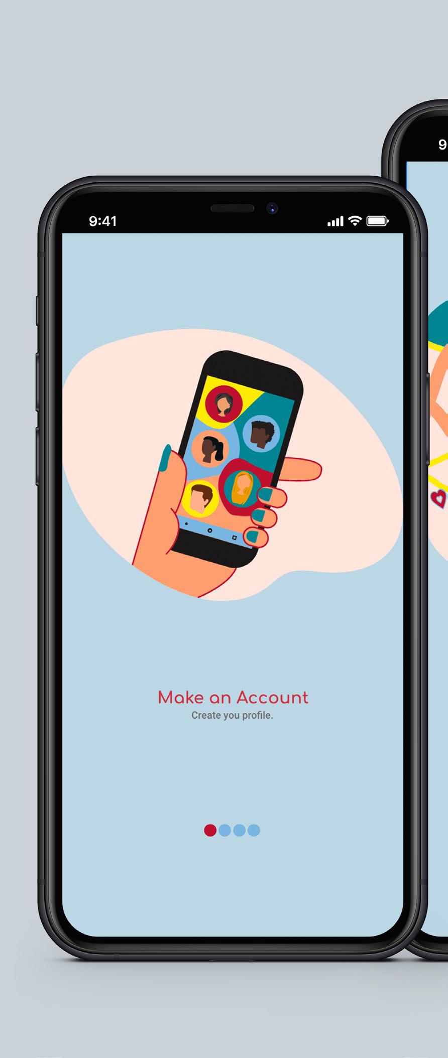
The loading screen is the first screen that is displayed when an application loads. It can also be the welcome screen of your mobile app the users encounter while launching the application.
This ad was created to draw in more users and encourage them to download the app once they see it.
https://peppercreativede.myportfolio.com