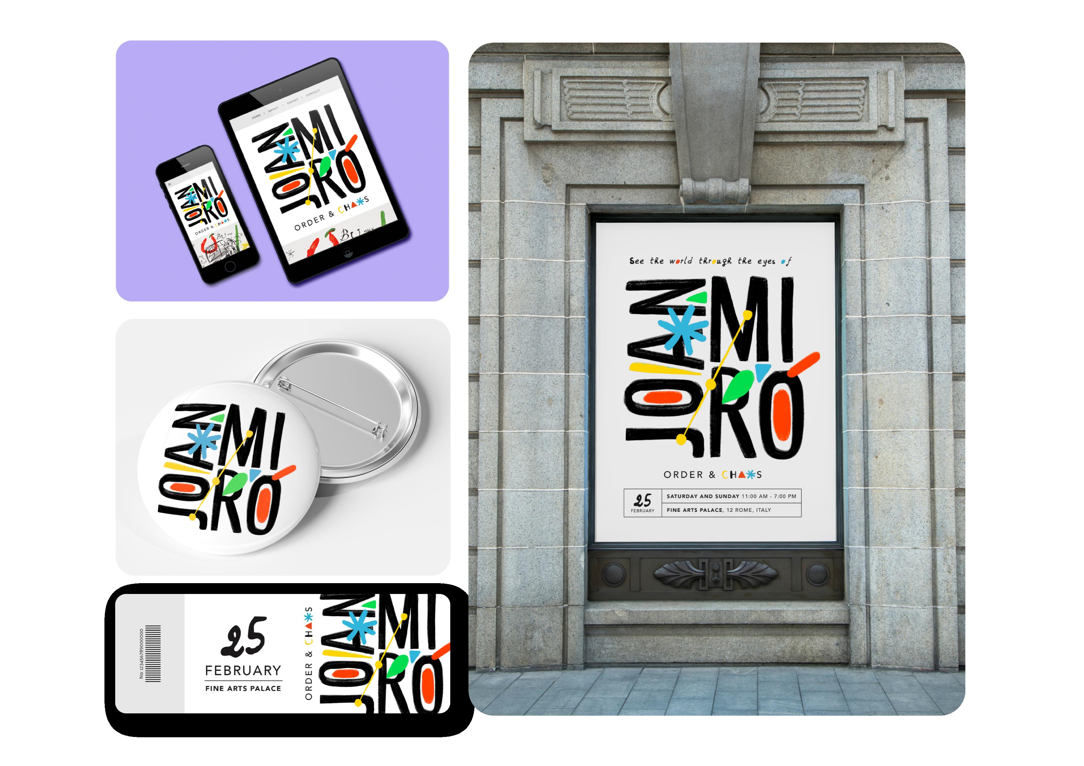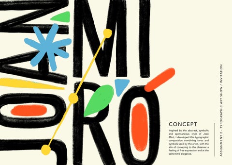

CONCEPT
Inspired by the abstract, symbolic and spontaneous style of Joan Miró, I developed this typographic composition combining fonts and symbols used by the artist, with the aim of conveying to the observer a feeling of free expression and at the same time elegance.
SATURDAY AND SUNDAY 11:00 AM - 7:00 PM
FINE ARTS PALACE , 12 ROME, ITALY FEBRUARY
www.exhibitmiro@info.net 1. 2.
3.
BEBAS
I used Bebas as the basic font to create the logotype. Subsequently I reworked the font by recreating its features with a brush style and inserting shapes reminiscent of Joan Miró's style.
AVENIR
As a secondary font I used Avenir because it is the element that serves to balance the composition of the invitation, giving a feeling of order, seriousness and elegance thanks also to the greater spacing between the characters.
JDHands
This ‘’handwritten‘’ style font recalls the free and impulsive dimension typical of Miró's art. I used this font for the descriptions, as if the painter himself were writing and inviting us.