
packaging design


Best practices for powerful packaging design based on a meta-analysis of MetrixLab’s PACT database.


Best practices for powerful packaging design based on a meta-analysis of MetrixLab’s PACT database.

When you have multiple variants of the same brand, it’s a challenge to balance design elements that create:
a strong brand block for higher shelf visibility and design elements
• easy variant recognition for better shelf findability

Eye tracking that reveals the visibility of specific design elements can help you find the optimal balance and improve visibility without taking away from findability, or vice-versa.
visibility. This includes the row on which the product is placed, the number of facings it gets and the immediate product adjacencies. Brand managers, designers and trade marketers should align packaging design and planogram recommendations.
in the most basic sense, powerful packaging designs increase sales from the shelf and outshine the competition. But design serves an even greater purpose – it’s the primary embodiment of your brand across all touchpoints. With powerful design, your packaging delivers awareness and familiarity. It communicates brand values, connects with consumers’ values and enhances their experience with the product. Furthermore, consumers increasingly want packaging that contributes to sustainability initiatives.
Our latest research mined insights from more than 5,000 pack design tests in our benchmark database.
We’ve detailed our findings in this guide, with insights into:
Key sales drivers of packaging designs

By understanding exactly how and why packages are more attractive to consumers, we believe brands can tap into all the benefits of powerful packaging design.
Powerful packaging designs excel in three fundamental areas:
Visibility
• Attraction
Communication
A meta-analysis of our benchmark database uncovered the key sales drivers within each area. Half of sales from the shelf are dependent on consumers being able to clearly see the product and easily find the exact variant of the brand they want. Next, communication
influences 30% of sales. The design successfully conveys product benefits, credibility (RTBs) and emotional-end promise. Finally, 20% of sales from the shelf are driven by attraction –consumers find the designs appealing.
We recommend three strategies for creating designs with high shelf visibility and variant findability.
1. Use colors or color combinations that contrast with adjacent products to drive shelf stand-out.
2. Build, nurture and leverage branded visual assets that draw consumers to the product, ensuring they quickly and easily recognize your brand.
3. Drive shelf visibility with brand blocking. Avoid compromising variant recognition.
Packaging for refrigerated breakfast meats is typically designed so that shoppers can see the meat inside, giving the impression of product freshness. The downside is that all the sliced bacon brands look alike on the shelf. The one packaging design that stands out in this section is the bright red Jimmy Dean brand.

The brand strikes a good balance by continuing to benefit from the seethrough window while creating more shelf visibility with color contrast.
A brand’s logo is often the most important visual asset. The logos that emerge in our benchmark database among the most visible and findable packaging designs have a few things in common:
strong primary colors round or oval shapes opportunity for contrast
Another effective strategy uses a combination of two colors to create visual assets that really pop. These designs are also top-performers in our benchmark database on visibility and findability.
Although it’s not a design element, shelf placement is another important component of product

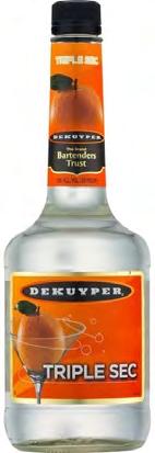
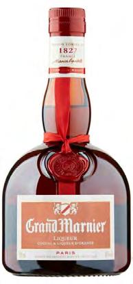
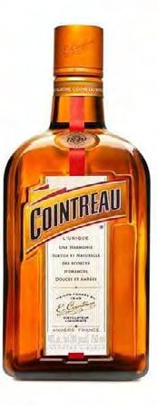
Decreasing visibility with shelf placement | Gran Gala and DeKuyper have the most visible orange liqueur designs on this shelf. Why? They benefit from color contrast with adjacent products and shelf placement. The products on the top row have lower shelf visibility. It’s that simple. You can have a fantastic packaging design, but an unfavorable shelf position will compromise visibility and findability. >
% having seen the product on shelf, while shopping for a liqueur/cordial by P12M orange liqueur buyers


Packaging design is amongst the most powerful tools that brand and marketing managers have to support their brands growth strategy. Design can simultaneously help drive mental and physical availability, making investments in pack design optimization potentially incredibly impactful.
Alexander Kleijngeld, Senior Solution Consultant at MetrixLabUnlock the most powerful designs by targeting the four key sales drivers.
b. Designing for traditional trade visibility
For Southeast Asia and India, traditional trade is the main channel for several fast moving consumer goods (FMCG) categories. In this case, the shopkeeper typically plays a large role in the purchase journey by recommending brands, best value, etc. Traditional trade stores are organized in different ways:


• Shelf barely visible and the shopkeeper retrieves products requested by the customer.
• Some shelf visibility but most products are stored where the customer cannot see them.
• Shelf visible however, the shopkeeper retrieves products requested by the customer.


Powerful packaging designs successfully answers 2 questions within 2 seconds:
Who am I? Why should you buy this particular product?
Use our tips for communicating these points in a powerful way.
1. Follow the recipe Very few designs contain all of these design elements, but they tend to perform better when they do.
Above all, the designs are more powerful when they communicate to consumers in this specific order:
1. Brand name

2. Variant name description
3. (sub-)category description
4. One or multiple functional benefit claims
5. New: Sustainability message
6. Reason-to-believe (RTBs)
7. Emotive end-benefit
8. (optional): Call to action
9. Info such as: pack content/weight, etc.
2. Congruence
The most powerful designs have congruence – the label design, text, and packaging structure work in harmony to communicate functional and emotional benefits.
3. Value
Packaging design also signals whether the brand is premium, mainstream, or economy. Most often, brands aim for a premium perception. Successful premium designs convey authenticity and heritage with darker colors, seals and symbols, and embossing.
Since the pandemic, value propositions have become more important for brands. The design for new Schweppes mixers emphasize the product’s affordability. It’s colorful, clean, easy-going and lacks premium design cues.

Creativity and artistic appeal aren’t as quantifiable so we compared the most and least appealing pack designs in our database. We uncovered these common factors in designs that are the most attractive to consumers.
Orderly, clean, uncluttered design.
Symmetry and the golden ratio are important design principles
Fitting colors or color combinations
Visuals of ingredients that offer a benefit or RTB, such as natural or premium
Visuals & photos that subconsciously promote the end promise, for example health, beauty, joy or happiness
Packaging shapes or structures that visualize the brand promise
Visual touches of magic, such as sparkles, bubbles, rays or swooshes –suggesting a dynamic, active brand
Best practices can guide creativity, but creating beauty is more art than science.
Consumers are becoming more aware of the role they play in environmental sustainability. As a result, sustainable packaging is also becoming a priority. But how and where should brands feature sustainability messaging?
We tested dozens of pack designs with a product or packaging sustainability benefit in recent years and discovered:
Consumers want to be told about a brand’s sustainable packaging initiatives
Sustainability should be a secondary message on the packaging
It’s important to simulate a more disorderly store layout with lower shelf visibility when testing packaging for traditional trade environments. Considering that shelf visibility and findability are less important to sales in this environment, we can reasonably conclude that design elements driving communication and persuasion are even more crucial.
Eye tracking is essential to design testing because it reveals the order that consumers see information.
The 4Life bottled water was named the prettiest of all new designs, according to the 2020 Dieline Awards. The design symbolizes water as supporting all living things. It’s artistic, functional and congruent.

A packaging redesign for Hill’s dog food brand gains appeal from high quality photography and consumers’ love of animals. A white background reinforces the clinical positioning of the Hill’s brand. Again, the art serves the dual purpose by bolstering the brand’s positioning. >

It’s best when the consumers see the sustainability message after the primary benefit. Method soap communicates sustainability in the ideal order. Consumers first see the brand, variant and key benefits before being exposed to the sustainability message. The Ocean Plastic label at the top of the bottle helps drive shelf visibility and attention.

sustainability
In a separate two-year study, we explored consumer conversations related to environmental sustainability. The deep dive revealed these recommendations for influencing consumers’ sustainable choices with carbon labels: Be transparent and accurate about calculations. Account for the entire product lifecycle, from sourcing to production to waste. Implement internationally recognized standards. Aim for consistency and design simplicity. Use cohesive information that enables comparability between labels. Consider how much information is already displayed.
Gain more sustainability insights and best practices from our in-depth guides:
Communicating advances in packaging sustainability
How brands can drive consumer engagement in sustainability initiatives
2D GT virtual shelf with interactive haircare sachetsOne emerging trend in packaging design is to add a digital interactive element on the pack. Brands aim to enrich their story, communicate more information, or even create an experience with QR codes and smartphone integrations.
The 19 Crimes wine brand has successfully engaged consumers with this trend. The dark bottle features a black and white image of a convict staring back at the camera. When consumers access the labels’ Augmented Reality component through the 19 crimes app, they’re immersed in a story about the featured convict.

Striking a balance
Balance is often the most difficult to achieve when creating powerful packaging design. Improving design performance in one area can diminish another.
Lipton’s new tea packaging design successfully conveys a message of natural, organic, and sustainable.


However, the design change results in lower shelf visibility, lower findability and lower brand recognition.
• Volatility • Modernity • Visibility •
Changing the design of your logo delivers the highest risk or reward. This simply means that of all imaginable disruptive changes, redesigning a logo is the most volatile, followed by design color. Other types of design changes typically have more stable results.
Modernizing iconic designs is tricky and often pointless. Sometimes
Midol’s redesign revived the brand. It’s now modern and bright, appealing to millennials and Gen Z consumers. The new M logo has the potential to quickly grow into a strong branded asset with shelf stand-out.


Pringles successfully modernized its iconic design while maintaining the classic brand features that consumers recognize – logo, color, Mr. Pringles, and the package shape.

Miller Genuine Draft altered its design by elevating existing distinctive assets. The eagle is now larger and much more prominent. The colors are the same but applied differently. The result is dramatically different but still recognizable.


brands are unaware how much brand recognition their pack design delivers. We frequently find that iconic designs are so strong on all metrics it would be very difficult to further improve them. The most sensitive metric is the ‘perception or modernity’ metric. This is the metric we recommend monitoring if your design is an iconic design. Any iconic redesign should
take an evolutionary approach, rather than revolutionary, and respect existing brand assets.
New designs struggle to retain shelf visibility. As we’ve mentioned, visibility is one of the leading drivers of shelf sales. This is all the more reason to recognize shelf visibility as a critical component to packaging redesign tests.


Risk/reward (volatility) indices associated with design change types
In summary, we recognize three types of risk factors one should be aware of when considering a redesign
A. Shelf visibility is a metric that is typically negatively impacted the most in redesigns. This is a problem, as shelf visibility is a critical driver of the power of a pack design
• The implication is to always include shelf visibility as an action standard in pack design tests and be prepared for new designs to fail on this metric.
B. From all the disruptive design changes that are possible, a change of your logo design has the highest risk/reward profile.
• The risk from disruptive design changes can be properly managed through extensive testing. A disruptive design strategy is possibly better-suited for challenger brands as opposed to marketleading brands
C. Iconic pack designs are difficult to improve upon, and as such ambition should probably be limited to keeping the design fresh and contemporary.
• The implication is that you must first know if you have an iconic design or not. Depending on the answer to that question, you should set your redesign ambitions and associated action standards accordingly. >
IN SUMMARY:
Based on our findings, we’ve created our best practices for creating more powerful packaging designs. Use these tips to guide your creative strategy or self-assess your current design.
Maintain a proper balance between visibility, findability, appeal and communication


How can our team help your brand build powerful and impactful packaging designs that stand out and beat the competition? Reach out to us so we can show you!
Want