3 minute read
PACT SUITE AT METRIXLAB


b. Designing for traditional trade visibility
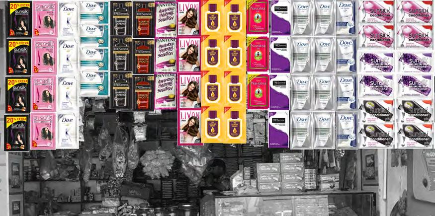
For Southeast Asia and India, traditional trade is the main channel for several fast moving consumer goods (FMCG) categories. In this case, the shopkeeper typically plays a large role in the purchase journey by recommending brands, best value, etc. Traditional trade stores are organized in different ways:
Advertisement
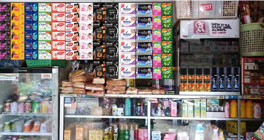
• Shelf barely visible and the shopkeeper retrieves products requested by the customer.
• Some shelf visibility but most products are stored where the customer cannot see them.
• Shelf visible however, the shopkeeper retrieves products requested by the customer.
How to create powerful packaging design with persuasive communication
Powerful packaging designs successfully answers 2 questions within 2 seconds:
Who am I? Why should you buy this particular product?
Use our tips for communicating these points in a powerful way.
1. Follow the recipe Very few designs contain all of these design elements, but they tend to perform better when they do.
Above all, the designs are more powerful when they communicate to consumers in this specific order:
1. Brand name
2. Variant name description
3. (sub-)category description
4. One or multiple functional benefit claims
5. New: Sustainability message
6. Reason-to-believe (RTBs)
7. Emotive end-benefit
8. (optional): Call to action
9. Info such as: pack content/weight, etc.
2. Congruence
The most powerful designs have congruence – the label design, text, and packaging structure work in harmony to communicate functional and emotional benefits.
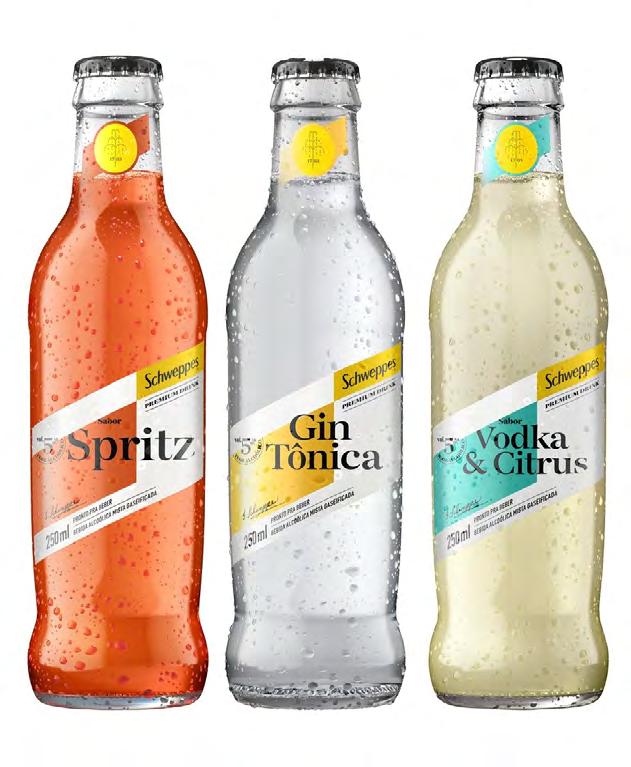
3. Value
Packaging design also signals whether the brand is premium, mainstream, or economy. Most often, brands aim for a premium perception. Successful premium designs convey authenticity and heritage with darker colors, seals and symbols, and embossing.
Since the pandemic, value propositions have become more important for brands. The design for new Schweppes mixers emphasize the product’s affordability. It’s colorful, clean, easy-going and lacks premium design cues.
How to create designs that attract consumers
Creativity and artistic appeal aren’t as quantifiable so we compared the most and least appealing pack designs in our database. We uncovered these common factors in designs that are the most attractive to consumers.
Orderly, clean, uncluttered design.
Symmetry and the golden ratio are important design principles
Fitting colors or color combinations
Visuals of ingredients that offer a benefit or RTB, such as natural or premium
Visuals & photos that subconsciously promote the end promise, for example health, beauty, joy or happiness
Packaging shapes or structures that visualize the brand promise
Visual touches of magic, such as sparkles, bubbles, rays or swooshes –suggesting a dynamic, active brand
Using art to elevate appeal
Best practices can guide creativity, but creating beauty is more art than science.
Communicating packaging sustainability
Consumers are becoming more aware of the role they play in environmental sustainability. As a result, sustainable packaging is also becoming a priority. But how and where should brands feature sustainability messaging?
We tested dozens of pack designs with a product or packaging sustainability benefit in recent years and discovered:
Consumers want to be told about a brand’s sustainable packaging initiatives
Sustainability should be a secondary message on the packaging
It’s important to simulate a more disorderly store layout with lower shelf visibility when testing packaging for traditional trade environments. Considering that shelf visibility and findability are less important to sales in this environment, we can reasonably conclude that design elements driving communication and persuasion are even more crucial.
Eye tracking is essential to design testing because it reveals the order that consumers see information.
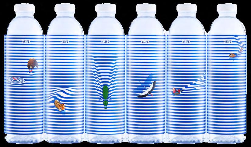
The 4Life bottled water was named the prettiest of all new designs, according to the 2020 Dieline Awards. The design symbolizes water as supporting all living things. It’s artistic, functional and congruent.
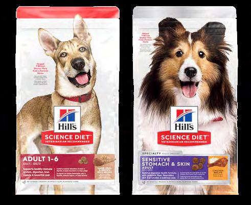
A packaging redesign for Hill’s dog food brand gains appeal from high quality photography and consumers’ love of animals. A white background reinforces the clinical positioning of the Hill’s brand. Again, the art serves the dual purpose by bolstering the brand’s positioning. > sustainability
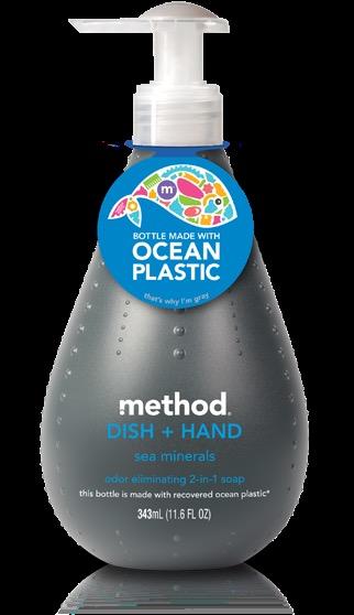
It’s best when the consumers see the sustainability message after the primary benefit. Method soap communicates sustainability in the ideal order. Consumers first see the brand, variant and key benefits before being exposed to the sustainability message. The Ocean Plastic label at the top of the bottle helps drive shelf visibility and attention.
Best practices for carbon labeling
In a separate two-year study, we explored consumer conversations related to environmental sustainability. The deep dive revealed these recommendations for influencing consumers’ sustainable choices with carbon labels: Be transparent and accurate about calculations. Account for the entire product lifecycle, from sourcing to production to waste. Implement internationally recognized standards. Aim for consistency and design simplicity. Use cohesive information that enables comparability between labels. Consider how much information is already displayed.
Gain more sustainability insights and best practices from our in-depth guides:
Communicating advances in packaging sustainability
How brands can drive consumer engagement in sustainability initiatives

