
2 minute read
PACT SUITE AT METRIXLAB


Leveraging the power of brand blocks
When you have multiple variants of the same brand, it’s a challenge to balance design elements that create: a strong brand block for higher shelf visibility and design elements
Advertisement
• easy variant recognition for better shelf findability
Eye tracking that reveals the visibility of specific design elements can help you find the optimal balance and improve visibility without taking away from findability, or vice-versa.
a. Don’t forget the benefits of good shelf placement
visibility. This includes the row on which the product is placed, the number of facings it gets and the immediate product adjacencies. Brand managers, designers and trade marketers should align packaging design and planogram recommendations.
in the most basic sense, powerful packaging designs increase sales from the shelf and outshine the competition. But design serves an even greater purpose – it’s the primary embodiment of your brand across all touchpoints. With powerful design, your packaging delivers awareness and familiarity. It communicates brand values, connects with consumers’ values and enhances their experience with the product. Furthermore, consumers increasingly want packaging that contributes to sustainability initiatives.
Our latest research mined insights from more than 5,000 pack design tests in our benchmark database.
We’ve detailed our findings in this guide, with insights into:
Key sales drivers of packaging designs

• Latest design trends Design challenges and risks
By understanding exactly how and why packages are more attractive to consumers, we believe brands can tap into all the benefits of powerful packaging design.
Key drivers of powerful packaging design
Powerful packaging designs excel in three fundamental areas:
Visibility
• Attraction
Communication
A meta-analysis of our benchmark database uncovered the key sales drivers within each area. Half of sales from the shelf are dependent on consumers being able to clearly see the product and easily find the exact variant of the brand they want. Next, communication influences 30% of sales. The design successfully conveys product benefits, credibility (RTBs) and emotional-end promise. Finally, 20% of sales from the shelf are driven by attraction –consumers find the designs appealing.
How to design highly visible and findable packaging
We recommend three strategies for creating designs with high shelf visibility and variant findability.
1. Use colors or color combinations that contrast with adjacent products to drive shelf stand-out.
2. Build, nurture and leverage branded visual assets that draw consumers to the product, ensuring they quickly and easily recognize your brand.
3. Drive shelf visibility with brand blocking. Avoid compromising variant recognition.
Using color to catch consumers’ attention
Packaging for refrigerated breakfast meats is typically designed so that shoppers can see the meat inside, giving the impression of product freshness. The downside is that all the sliced bacon brands look alike on the shelf. The one packaging design that stands out in this section is the bright red Jimmy Dean brand.
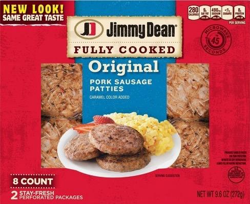
The brand strikes a good balance by continuing to benefit from the seethrough window while creating more shelf visibility with color contrast.
Building brand recognition with strong visual assets
A brand’s logo is often the most important visual asset. The logos that emerge in our benchmark database among the most visible and findable packaging designs have a few things in common: strong primary colors round or oval shapes opportunity for contrast
Another effective strategy uses a combination of two colors to create visual assets that really pop. These designs are also top-performers in our benchmark database on visibility and findability.
Although it’s not a design element, shelf placement is another important component of product

Decreasing visibility with shelf placement | Gran Gala and DeKuyper have the most visible orange liqueur designs on this shelf. Why? They benefit from color contrast with adjacent products and shelf placement. The products on the top row have lower shelf visibility. It’s that simple. You can have a fantastic packaging design, but an unfavorable shelf position will compromise visibility and findability. >
% having seen the product on shelf, while shopping for a liqueur/cordial by P12M orange liqueur buyers


