Brand Guidelines
Spring 2024
BRAND IDENTITY 18
Goal & Purpose
The goal of these brand guidelines is introduce you to Be Upbeat and what the campaign is about.
Looking through these pages you’ll learn everything you need to know about keeping the brand upbeat through the use of our visual guidelines. This includes elements such as brand colors, typefaces, iconography, and the correct usage of our logo.
Understanding and implementing these guidelines will insure that the Be Upbeat campaign lives up to its name.
| BE UPBEAT

Primary Logo & Rules
Secondary Logo & Rules
Primary Icon & Rules
Logo Dos & Don’ts
Brand Colors
Color Combinations TYPOGRAPHY |
Brand Typefaces Rules & Hierarchy
OUR BRAND
1
Us Brand
Our Mission Our Vision LOGO IDENTITY
Table of Contents
|
About
Personality
| 5
BRAND COLORS | 13
DESIGN
APPLICATION
Website Brochure Packaging Merchandise
TABLE OF CONTENTS ||
17
ELEMENTS | 19 Iconography Illustrations
| 23
(Merch)
OUR BRAND

About Us Brand Personality Our Mission Our Vision
About Us

The Be Upbeat campaign was created in hopes bringing light to and making up for the lack of funding provided by university administrations in favor of collegiate marching bands in the American Midwest. We strive to enhance the experience of band programs and their impact on school spirit both on and off the field. We want to encourage and financially assist programs to help them march forth.
Brand Personality
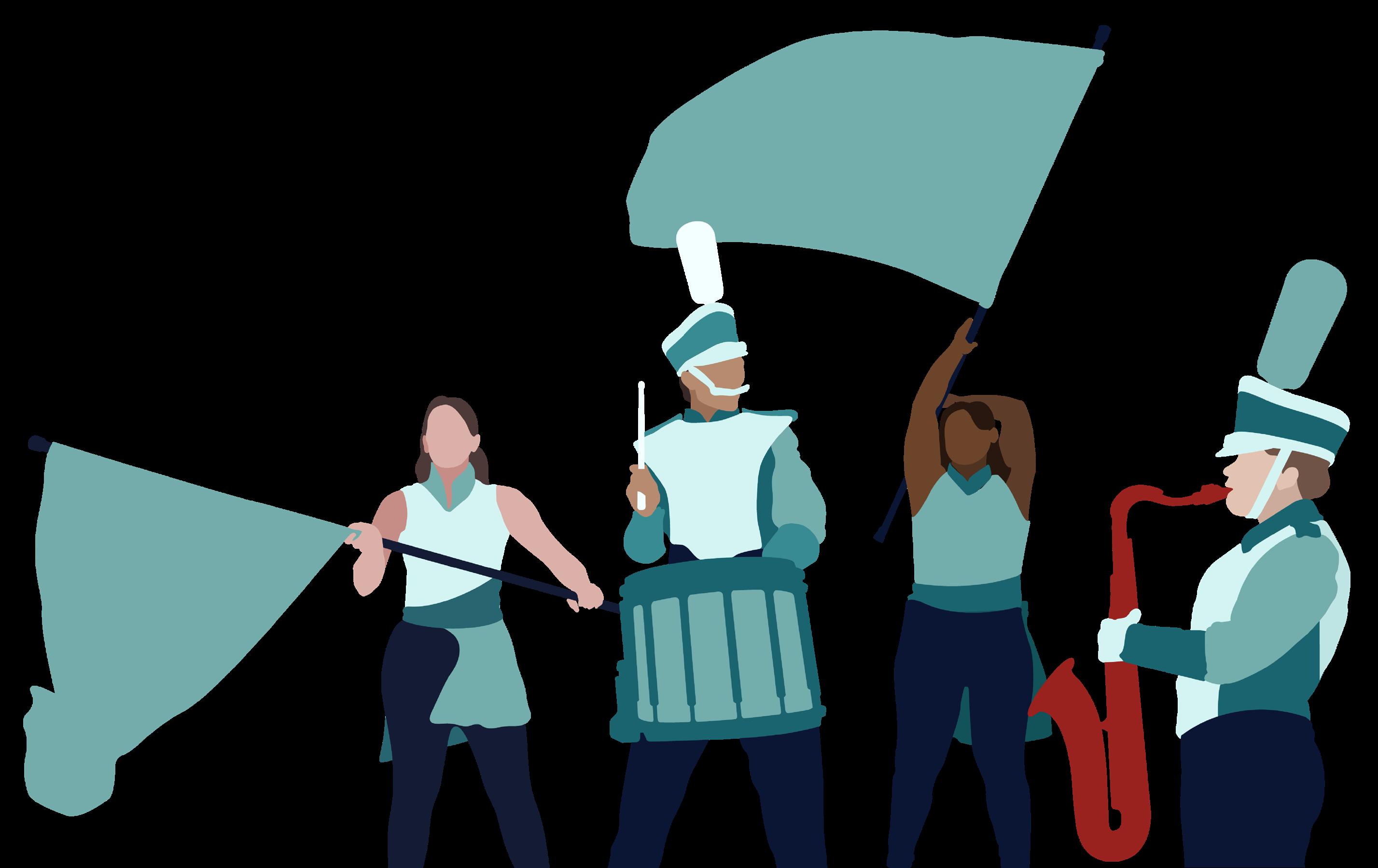
COMMUNITY BASED DEDICATED EXPERIENCED HIGH-SPIRITED SPUNKY
OUR BRAND 2
Our Mission
To motivate and facilitate fundraising initiatives for faculty and students involved in collegiate athletic band programs across the Midwest while also financing future projects that will enhance the overall student experience within a marching band

3 BE UPBEAT | BRAND GUIDELINES

Our Vision
To establish a campaign that showcases the importance of musical performances on the game day experience and to establish a band program’s purpose within their respective college communities.
OUR BRAND 4
LOGO IDENTITY
Primary Logo & Guidelines
Secondary Logo & Guidelines
Primary Icon
Logo Do’s & Dont’s
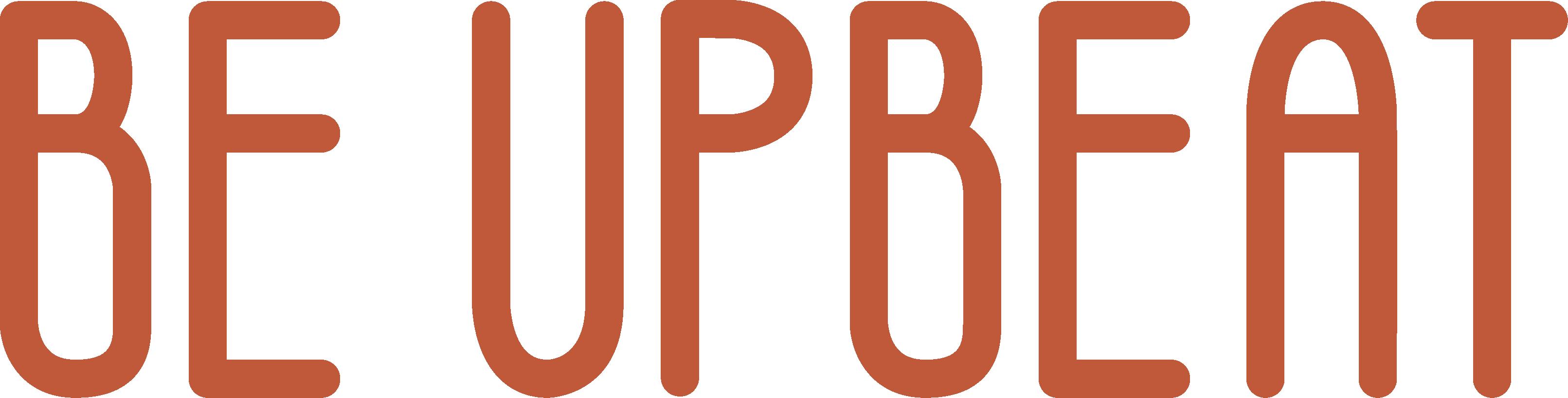
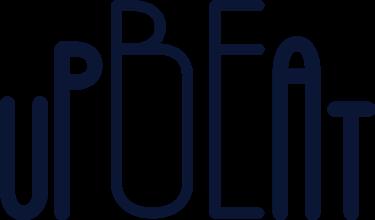
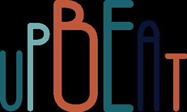
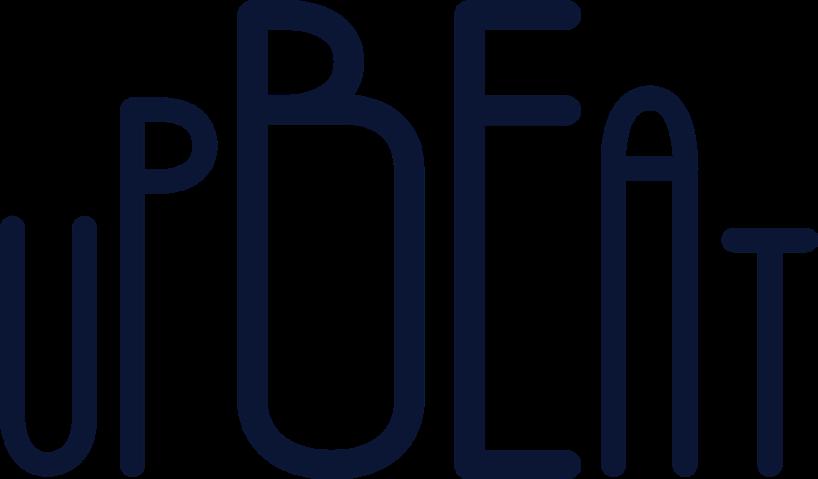
Primary Logo
This is the primary logo for the Be Unbeat campaign. It was created using the Be Upbeat typeface, It is set up in such a way that highlights “Be” within “Upbeat” despite the two words being merged.
LOGO 6 LOGO IDENTITY 6
Clear Space & Sizing
PRIMARY LOGO
The primary reason for these guidelines is to ensure that the logo continues to be legible and identifiable as the Be Upbeat logo. The logo should be the key point of wherever it is placed.
SIZING REQUIREMENTS
Minimum size allowance:
• Print: 1 inch (Length)
• Digital: 96 px (Length) 1 inch
CLEAR SPACE REQUIREMENTS
Created with “B“ used in primary logo
7 BE UPBEAT | BRAND GUIDELINES
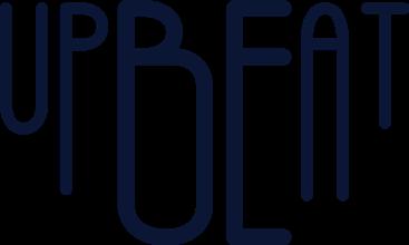
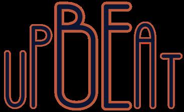
Secondary Logo
The secondary logo is in a more traditional, straight line set up that is used whenever it fits a design layout better. t uses the same Be Upbeat typeface but presents the logo in a more versatile format.
LOGO IDENTITY 8
Clear Space & Sizing
SECONDARY LOGO
The primary reason for these guidelines is to ensure that the logo continues to be legible and identifiable as the Be Upbeat logo. The logo should be the key point of wherever it is placed.
SIZING REQUIREMENTS
Minimum size allowance:
• Print: 1 inch (Length)
• Digital: 96 px (Length)

CLEAR SPACE REQUIREMENTS
Created with “B“ used in secondary logo
7 TONNE WINERY
9 BE UPBEAT | BRAND GUIDELINES
1 inch

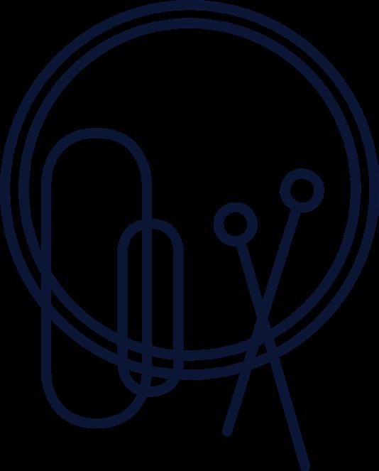
Primary Icon
The primary icon is created to reflect the shape of a trumpet, one of the most critical instruments within a marching band. The curves that make up the icon are meant to compliment the shape of the letters within the Be Upbeat logo.
LOGO 8
LOGO IDENTITY 10
Clear Space & Sizing
PRIMARY ICON
The primary reason for these guidelines is to ensure that the logo continues to be legible and identifiable as the Be Upbeat logo. The logo should be the key point of wherever it is placed.
SIZING REQUIREMENTS
Minimum size allowance:
• Print: 1 inch (Length)

• Digital: 96 px (Length) 1 inch
CLEAR SPACE REQUIREMENTS
Created with ““ used in primary icon
11 BE UPBEAT | BRAND GUIDELINES
Dos Don’ts
The logo was carefully designed in a way that visually best represents our brand . It’s important to avoid changes to the brand that could compromise it’s significance.
upbeat
Change the typeface of the logo
Adjust the stroke/add a stroke to the logo
Adjust the position of letters within the logo.
LOGO DO’S
Understand the concept of the logos composition
Use approved brand colors to present the logo in a visually flattering way.
Apply these rules to both logo variations and all icons.
(Primary and supporting icons)
Use colors outside brand color pallet
Tilt the logo
Use multiple colors in one logo instance
Outline any aspect of identity design

Stretch or condense the logo
Add effects or filters to logo
LOGO IDENTITY 12
BRAND COLORS
Brand Colors
Color Combinations

Primary Secondary
Primary colors should be used dominantly on any asset or logo concept. These colors should always be paired with at least one secondary color.
LIGHT BLUE
HEX: B6DDDD
RGB: 182, 221, 221
CMYK: 33, 0, 14, 0
TEAL
HEX: 1A6470
RGB: 26, 100, 112
CMYK: 100, 44, 47, 18
ORANGE
HEX: BF593A
RGB: 191, 89, 58
CMYK: 9, 80, 89, 1
Secondary colors are used to compliment the primary colors and shouldn’t be used alone or in dominating placements.
LIGHT TEAL
HEX: 71B0B0
RGB: 113, 176, 176
CMYK: 69, 8, 34, 0
BURNT ORANGE
HEX: 99221F
RGB: 153, 34, 31
CMYK: 21, 100, 100, 12
BASS BLUE
HEX: F3FFFF
RGB: 11, 22, 53
CMYK: 97, 88, 47, 63
TREBLE WHITE
HEX: 0B1635
RGB: 243, 255, 255
CMYK: 5, 0, 1, 0
BRAND COLORS 14
Color Combinations
These are examples of color combinations that are acceptable when designing assets for our brand. Combinations should have high contrast and colors should compliment each other well.
Color combinations should often be made up of a pair including a primary color and a secondary color.
15 BE UPBEAT | BRAND GUIDELINES


BRAND COLORS 16
TYPOGRAPHY
Brand Typefaces
Rules & Hierarchy

Be Upbeat HEADER
The Be Upbeat Logo was created using a custom typeface of the same name. It was created with curves that reflect stylized sound waves.
Raleway Medium, Regular, Light
Raleway is used to compliment the slim figure of the Be Upbeat typeface and for its large type family. It is also the only other typeface used in this brand for that reason.
TYPOGRAPHY 18 Raleway
ABCDEFGHIJKLM NOPQRSTUVWXYZ
2ND HEADER/SUBHEADER/BODY
Rules & Hierarchy
The typefaces should be used a ccording to these rules.
HEADER
Typeface: Raleway Bold
Leading: 100%
Kerning: Metrics
Tracking: 0
SUB-HEADER
Typeface: Raleway Bold
Leading: 100%
Kerning: Metrics
Tracking: 0
BODY 1
Typeface: Raleway Medium
Leading: 100%
Kerning: Metrics
Tracking: 0
BODY 2
Typeface: Raleway Regular
Leading: 100%
Kerning: Metrics
Tracking: 0
HEADER Subheader
Erate pa venis unto modistias que volo consequias nonsequatius pro et ut ventur sundio tem autem sit ut optatinitas acest ea quis eicil
Magnissequam velibus, seque nam harum, quis que officil ipsamApellenienia sequi in plabo. Magnatem dolore nonsedis si culpario
Caption
CAPTION
Typeface: Raleway Light
Leading: 100%
Kerning: Metrics
Tracking: 0
If needed, leading may be adjusted to fit a space, but keep it tasteful.
19 BE UPBEAT
DESIGN ELEMENTS
Iconography
Illistrations

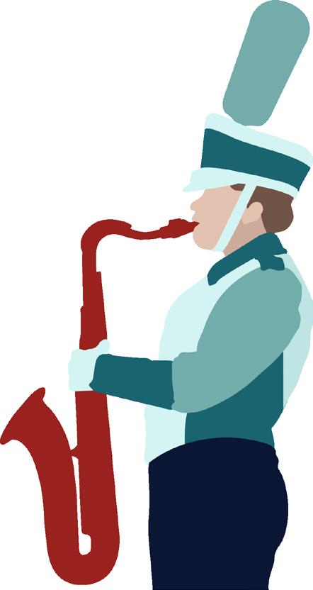
Musical Icons


These instrument icons were designed to compliment the shape of the primary trumpet-shaped icon. They were designed to add variation to design choices while also introducing patterns within the campaign. The music note icons are used to create movement throughout designs.
17 BE UPBEAT
21 BE UPBEAT | BRAND GUIDELINES
TRUMPET
SAXOPHONE
TROMBONE BASS DRUM
Illustrations are used to break up space and as a visual interest within Be Upbeat design assets
22
DESIGN ELEMENTS
APPLICATION
Website
Brochure
Packaging
Apperal
Website
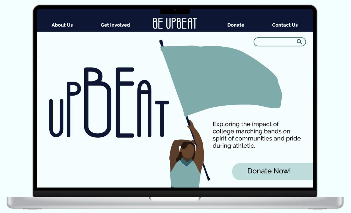
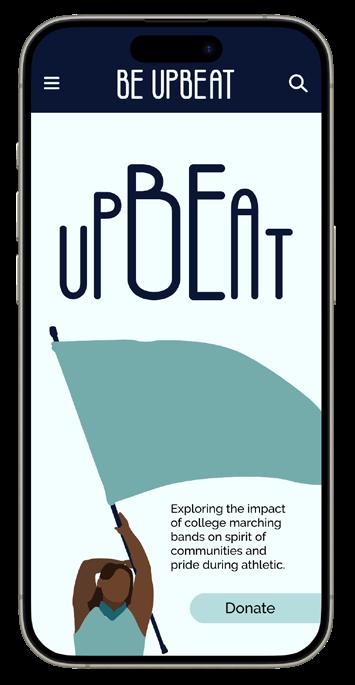
The Website serves as the main hub for information regarding the Be Upbeat campaign. The campaign spreads across multiple universities throughout the Midwest so the website will also serve as a central place with information about the campaign.
APPLICATION 24
Brochure
The Brochure serves as a quick introduction explaining the basis of the Be Upbeat campaign. It can easily be handed out to potential supporters and based both on university campus (such as music/art schools) or mailed out to those who aren’t able to access a participating campus.
Exploring the impact of college marching bands on the spirit of communities and pride during athletic events.
Support@BeUpbeat.com
Exploring the impact of college marching bands on the spirit of communities and pride during athletic events.
Learn more about our cause and how to donate at: To motivate and facilitate Support your favorite bands! Earn Rewards! Share with friends! To establish a campaign that showcases the importance of music performances on the game day experience and to establish a band program’s purpose within their respective college communities. Exploring the impact of college marching bands on the spirit of communities and pride during athletic events. First Last 1234 Street Name Town, ST 12345-0000 Be Upbeat 1234 Street Name Town, ST 12345-0000 US Postage Stamp 25 BE UPBEAT | BRAND GUIDELINES
Website: www.BeUpbeat.org Email:
Phone: 1-800-BEUPBEAT
www.BeUpbeat.org\GetInvolved
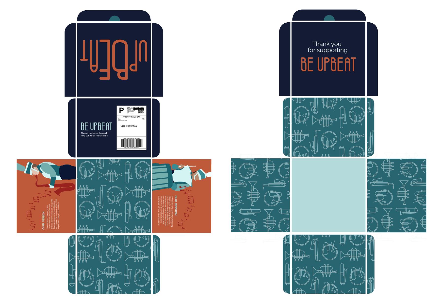
Package
The packaging deliverable will serve as a fun incentive for supporters. These will include apparel items (delivered in designed packaging) which can either be used as prizes or merchandise (TBD).
APPLICATION 26
Merch
This is the primary logo for the Be Unbeat campaign. It was created using the Be Upbeat typeface, It is set up in such a way that highlights “Be” within “Upbeat” despite the two words being merged.
27 BE UPBEAT | BRAND GUIDELINES


17 BE UPBEAT If you have questions about the brand guidelines please contact Support@BeUpbeat.com 1234 Street Name, Street, ST 12345 1-800-BEUPBEAT