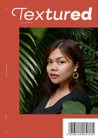
Textured
Type design is a discipline that truly embodies skillsets required in both design and fine art — functionality is crucial to a successful typeface, even if it means cutting corners on aesthetics. Whether a type designer is replicating organic handwriting or digitizing an indigenous alphabet, balancing readability and making an artistic statement can be a real challenge.
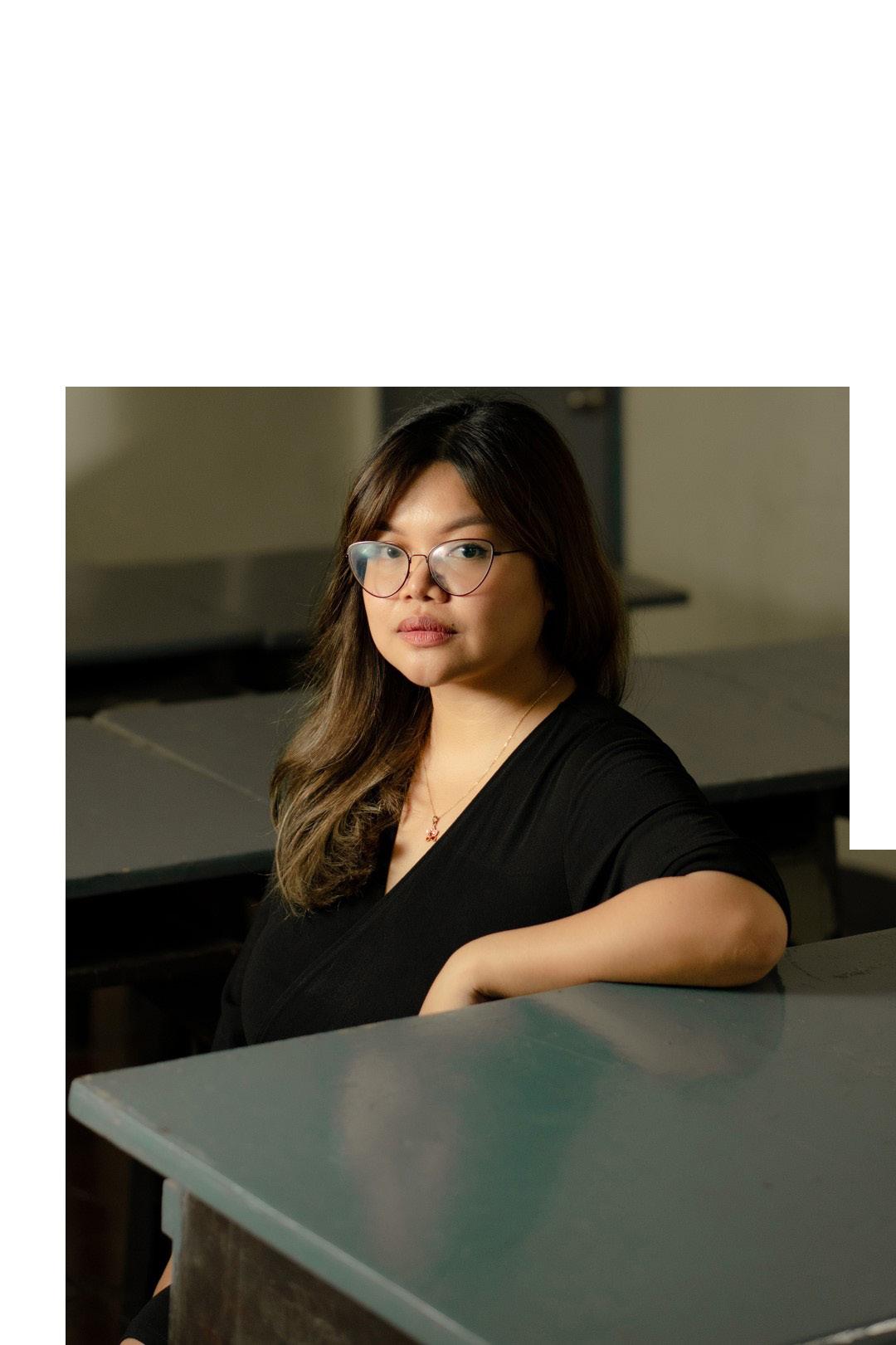
Jo Malinis is a Manila-based type designer who will not compromise. Her typefaces are stunning statement pieces that are just as functional as they are beautiful. Jo also practices graphic design, illustration, and brand identity work, in addition to teaching at UP Diliman College of Fine Arts. She’s been a force for community activism as well — launching a font to benefit Manila’s design community and founding Type63, a platform that showcases typography by Filipino designers.
We caught up with Jo to learn about her approach to designing fonts, strengthening the Filipino design community, and her inspirations.
“The most important part for me is how it makes me feel and how I react to it.”
When did you first realize that you wanted to work in design, and how did you get involved in type design?
Can you walk me through your process for designing typefaces?
My parents both work in creative fields. My mom’s an editor and my dad’s a graphic designer. So, it kind of came naturally to me that I wanted to work in the creative field as well. I got into design after I finished a degree in Fine Arts, and then type was something that I discovered along the way by accident. I got assigned a project in the studio and I had to create a custom type for the brand that I was working on. That was the first time that I had to do it. So, you know, I was jumping into something that I had no idea how to do. And it’s been one of the best decisions that I’ve made.
It always starts with inspiration and I find that it’s hard for me to work on something without inspiration. I look for that first. Then I supplement that with research. Then, I’ll start sketching, and after like a bunch of sketches, that’s when I start to do digitization. I’ll jump into Photoshop or Illustrator to try and figure out the vectors before I go to Glyphs and figure out how it can work as a workable typeface. And then afterwards, it’s that process of forever iterating, fixing all of the forms, and revising and adding all of the finishing touches before I export the font to a typeface that is actually usable.
And there will always be a round of tests that come with it. That’s when it feels like an infinite loop. But after I get out of that period, that’s when I tried to create specimen materials that can help present the typeface properly. Actually, during the whole process, I’ve been thinking of how to present that typeface, so it always goes hand in hand. Then, I just put it out there and then hope for the best.
10
I noticed that the Hook typeface (which, by the way, I’m obsessed with) was inspired by the “hook” of a song. I also checked out your social media Instagram and it’s obvious you really love music. What role does it play in your design process?
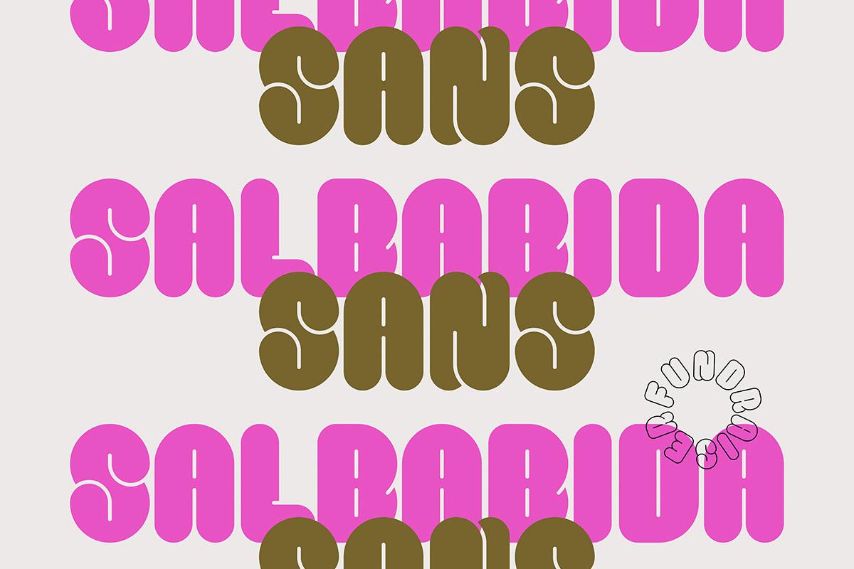
I love how you’ve used your work to give back to your community. I’ve written about Salbabida Sans before, but would you let our audience know a little bit about this typeface in your own words: how it came to be, and the impact it allowed you to make?
Well, for me, even before I started working on type, I’ve I found that I really can’t work on any project without listening to music. I can’t work properly without music. I usually have a certain album that I’m listening to, or a playlist that I work with. I assign a playlist to each project, so I use that to keep me productive while working on that specific project.
I like music, mostly because of how it makes me feel — like the lyrics, the melody, and the background story of the artists all comes into play. But the most important part for me is how it makes me feel and how I react to it. I can’t really explain it, but it’s what triggers my imagination to go wild. And it actually serves as the best inspiration for me to turn something that abstract into something more concrete and more visual.
Salbabida Sans is a project that I worked on last - I actually forgot the date! - I think around last November, after the two super typhoons struck the Philippines and a lot of people were devastated. Among those were my friends Pau and Dyam of Bad Student Press, which is a risograph printing company here in the Philippines. They’re the only riso printing company here that focuses on the art prints. They’ve actually supported the community so much by collaborating with different designers, and their impact on the whole community and especially the design community has been massive. So, when that happened to them, it felt like not just a blow to them, but a blow to everyone.
When I saw my friends trying to raise funds for them to get back on their feet, I wanted to do something as well. A lot of my friends sell their prints and artwork, but I didn’t have any of those things at the time because I don’t usually work with prints. So, I wanted to create something that was very natural to me (like a typeface), sell it, and give all of the proceeds to Bad Student Press afterwards.
The first forms of Salbabida Sans, were actually stuff that I’ve been experimenting with for a while. My first drawings of the letters existed way before, but when that typhoon happened, that’s when I just completed all of the characters and brought the typeface to life.
The name actually came after because I’m not a good copywriter, or a good writer at all. So, I asked for some of my friends’ help. I just told them that, “Oh, I want a name for the font to be related to how the forms are like lifeboats, life vests, and like inflatable water floaters.” And one of my friends actually suggested the name Salbabida, so that’s what we went with.
11
Salbbida Sans by Jo Mailinis
In July 2020, you launched Type63, a fantastic initiative to get eyes on the incredible and often overlooked work of Filipino type designers. Can you tell me a little bit about what inspired you to set Type63 in motion?
Well, I mentioned that I got into type design by accident. Here in the Philippines, there are no programs that focus on type, and so all of my knowledge came from my research online. As I was getting more into type design, the number one thing that I had a hard time with was finding people to talk about it with, especially locally. I was only exposed to a few people because they were friends of friends. But apart from them, I knew no one. And I felt like that’s kind of impossible. I don’t think I’m the only one who’s working on type in the whole country.
It also didn’t help that when I look for type design work online, I’d rarely see work made by Filipino designers.
Then, I came across FEMME TYPE’s Instagram account and saw how they would feature female type designers and female designers who focus on typography. And that’s what actually made me think, “Oh, I wish we had something like this.”
When I talked to one of my friends about it, he told me, why don’t you start it yourself?
It was never an idea that I thought was possible. But really, there just needs to be someone in your community to start it. And I feel like that was my role at that time. I just made an Instagram account because it was easy, you know, it’s basically just logging in with an email and creating an account. Then, I just hoped for the best.
The response has been incredible, and it’s been going on ever since.
Many of our customers are graphic designers, so we know how important finding the “right” font can be. Before or after you started designing typefaces, did you ever have a creative project where finding the right font was a gamechanger?
I can’t think of one specific project because I feel like all of them rely heavily on the tone that the typefaces set. Since I work on brand identity projects a lot, it’s very crucial to find the right typeface that can set the right tone for the brand, because it’s going to be what the audience will see first. Especially for logo projects that really only rely on the typefaces, like logos without icons or marks that really rely on the type, it’s always crucial to pair them with the right typefaces.
12 Textured
Terno Calendar by Jo Mailinis

What are you working on right now and what’s next?
Right now, I am trying to finish a work in progress typeface called Terno. It’s based on a traditional dress here in the Philippines that has accentuated butterfly sleeves and I want to try and embody that and the font. So, I’m working on that right now and will hopefully get it finished within the year.
If you had an extra 60 minutes in a week, what would you do with that extra time?
Honestly, just sleep. I feel like even if we’re working from home during this pandemic, it’s the one thing that I still have a hard time doing. So, if I had an extra hour in my life, I’d really just dedicate it to sleeping.
“Why don’t you start it yourself?”
“It was never an idea I thought was possible.”
Do you have any design heroes who inspire you?
Locally, there’s my mentor. His name is Dan Matutina. He’s also my boss at the design studio that I work with called Plus63 Design. He is an illustrator and an amazing graphic designer who also received a Young Guns award. I look up to him not only because he’s amazing at what he does, but also because he’s very generous with his time and his knowledge. That has been very impactful for my growth as a designer.
This is also the same reason that I look up to another designer called Felix Ng. He’s Singaporean and he co-founded a studio called Made By Anonymous based in Singapore.
Felix and Dan are both really great designers and very, very generous with all of their knowledge and their resources.
As for type design, I really look up to the foundries Klim Type Foundry, Grilli Type, and Ohno Type Co.
14 Textured
You
teach design at University of the Philippines
Diliman College of Fine Arts. What’s your approach to teaching?
I’d like to be able to offer a close mentorship to my students where I figure out what their strengths are and help them improve on those. It’s just a bit hard to do that now in the pandemic, when everything is online. But I try and I hope that it’s working.
Do you have an alltime favorite font?
It’s good that you mentioned “all-time” because I feel like my favorite typeface always changes during with the seasons. But there are two that I come back to — Newzald and National by Klim Type Foundry.
They have a special place in my heart because they’re the fonts that got me exposed to the world of type foundries. And when I discovered type foundries, I was able to understand the process of creating them through those foundries’ blog posts. It was very eye-opening for me, and those fonts had an influence on me creating my own typefaces as well. They’re some of my biggest inspirations.
If you collect fonts for your design work, you’ll want to have a wellorganized, easily accessible collection so you can always find the one you need, when you need it. Using a font manager can put you back in control of your font collection, so you’re ready when inspiration strikes.
15
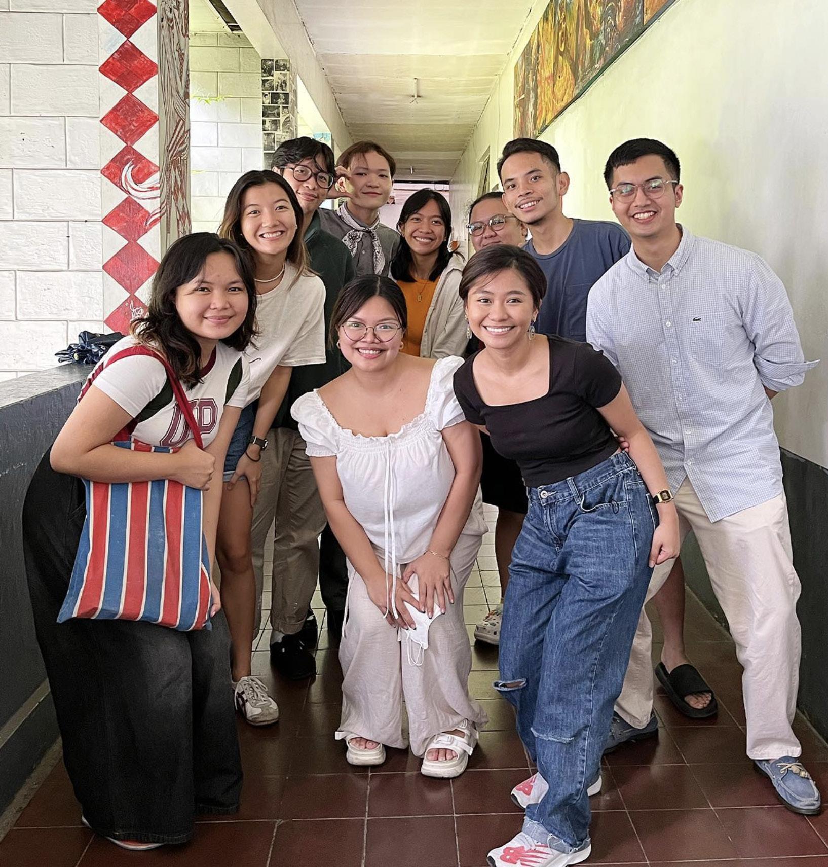
Jo Mailinis and her class at the University of the Philippines
“It is not enough that we just exist”
A discussion on the continued imbalance of female representation in type design.
Lucy Bourton
When compiling Global Type, our directory of 100 independent foundries around the world, the imbalance of female leadership became immediately clear. In this extract of our report, we sit down with three practitioners to discuss why this divide is still present.
In recent years, when conversation turns to female designers’ contribution to the heavily male-dominated industry that is type design, attention has focused on recognising specific and often historical figures. Subsequently, heralded individuals who paved the way for women in type – from Elizabeth Friedlander, one of the first women to design a typeface, to creator of the Rail Alphabet font, Margaret Calvert – are regularly pointed towards alongside an enthusiastic “Look! They were here all along!” narrative. And while educating ourselves on their output is worthwhile, when faced with the remaining lack of female-founded, or female-led foundries on a global scale today, looking to the past feels a little redundant.
There are of course plenty of resources available to discover women in type working across the industry at present – titles such as A Messy History of Women in Printing and Typography and Femme Type have been vital in researching this report – with increasing numbers of emerging, independent female-identifying typographers entering the industry. Yet the numbers falter when we look closer at leadership positions and in turn, influential mentors for those learning type design to look up to.
For a discussion on this very point, we sat down with three individuals from alternate areas of type design: Aasawari Kulkarni, an India-born, Washington DCbased educator and designer with an independent practice centred around type; Nadine Chahine, Lebanese type designer and founder of ArabicType and font distribution site and type academy I Love Typography; and Chantra Malee, the co-founder and CEO of Sharp Type and founder of The Malee Scholarship, which aims to advance and empower women who are part of underrepresented racial and ethnic groups in the type design field.
The following conversation was conducted over WhatsApp one evening, London time, in February 2023, while Nadine walked her dog round the block in her now home of Barcelona, Chantra texted in between looking after her newborn in early morning West Coast America and Aasawari began her day in Washington. Despite the incredible work and change these three individuals have advocated for in type design, this conversation was an opportunity to vent about this subject matter and while it may not provide a concise answer of next steps, it is a vital discussion on the imbalance of gender representation in type, and the effects this can have on female-identifying creatives currently operating within it.
16 Textured
It’s Nice That:
Nadine Chahine:
Chantra Malee:
Nadine Chahine:
As you know, we’ve been developing a report of 100 foundries and type designers across the world. I hadn’t originally planned to feature a conversation such as the one we’re having today, but we’ve been shocked at how few female-founded type foundries there are in comparison to those led by men.
I think I was admittedly naive about how much I perceived the field had changed in recent years, with platforms like Femme Type, and the work of yourselves and many emerging designers. With this in mind, I thought it would be great to start with how you feel gender representation is across the work you do currently?
Your observation is very much on the mark!
Agreed!
When we were inviting foundries to join I Love Typography we noticed how few foundries were led by women, so we started a mentorship programme for those that are led or co-led by women. For many years the industry has patted itself on the back, pointing to the female designers all around and yet no one looked at how many of them are in a position of leadership, and how many were leading the medium sized foundries, and they were so few. This will write women out of history, again, and there is so much we can contribute.
So, the point is: in order to answer the question of gender representation and equity, it is not enough that we just exist. We need to exist on every level.
Chantra Malee:
Chantra Malee: Asawari Kulkarni:
Nadine, I really like what you have to say here.
Agreed, when it comes to researching and finding the contribution of women in (type) design history, it has been difficult. It is indeed good to have platforms and resources that highlight contemporary designers, but a steep hill to climb when it comes to history.
That was certainly something I identified shortly after joining the industry, which led to my founding of the Malee Scholarship to provide financial support, mentorship, and a platform for emerging female type designers. There is so much unacknowledged talent out there that needs to be brought to the forefront and recognised.
17
Lucy Bourton
Nadine Chahine:
Chantra Malee:
It’s Nice That:
Nadine Chahine:
Absolutely. There is so much imposter syndrome and very high barriers to overcome, just because you’re a woman.
Indeed!
I completely agree, especially around elements of leadership. With this in mind, but taking a step back slightly, would you be able to share more about how you felt studying design and the gender divide on your respective courses? And did you feel supported in those institutions?
At university level there were quite a lot of female designers but once we got to the real world, those in positions of power were almost always men. Both at university and at work, there were mentor figures for me who 100 per cent supported me, and there were others who perhaps were uncomfortable with the scale of my ambitions. Like, I could be a little bit ambitious, but I should stay in my little corner and not make waves.
Chantra Malee:
Nadine Chahine:
Asawari Kulkarni:
That’s a good question. I think from my own personal experience, I felt very supported by most of my professors that I could achieve excellence. I feel very lucky and grateful for that. It was a different experience after I started to work professionally, where I began to experience the gender gap in a profound way. That can be quite a blow to a young adult, who is starry eyed and full of expectation.
Asawari Kulkarni
I was told no one will hire me after my masters because “I haven’t paid my dues”.
In India, most of my classes and professors were women. While college felt like a very supportive environment, it was more difficult to even get in the door. I got shot down by someone saying they were not there to hold my hand and teach me type design, they were running a business and not a design school.
This was very disheartening to a new student. Where or how would I learn if something wasn’t taught in school – which is why finding mentors in the industry has been SO important.
18 Textured
Nadine Chahine:
Asawari Kulkarni:
Nadine Chahine:
Chantra Malee:
It’s Nice That:
Nadine Chahine:
Ouch, that’s terrible…
And I got my ITF internship after that comment as well – where someone literally did hold my hand and teach me!
Amazing!
So incredible.
Off the back of this, I wanted to also ask you Nadine about your career at some of the most prestigious and large scale type foundries. Were these mostly male dominated at the time, and did this affect your experience?
Yes, they were definitely male dominated. You find your allies and you walk past the ones who get in the way. I joined when I was 26 and I was very aware that I had to work twice as hard just to prove that I got my role for merit, not any other reason (there was the occasional gossip and I just had to tune that out). There were incidents, of course – worse as I had higher positions – where it felt that I was not allowed to exercise my authority because of my gender, and that’s when you stand your ground and fight.
It’s Nice That:
Nadine Chahine:
Asawari Kulkarni:
Chantra Malee:
This is a perfect analogy: “You find your allies and you walk past the ones who get in the way.” I am so sorry to hear that though, and it’s particularly frustrating to hear it became worse as you moved higher up.
To be honest, I only realised the scale of that impact when I quit my job in 2018. I had learned to toughen up so much, so that I could survive those meetings and long emails, that I stopped feeling like a woman. I was in fighting mode non-stop. After I removed myself from that environment I suddenly felt safe enough to be me, and not the warrior me.
I’m sorry you had to go through that. That really sucks.
I had to take a moment with this question, because I have worked with many incredible men who I love to work with, but it certainly hasn’t always been that way.
When I was a young professional, I was running many projects for clients who were all men. I was treated very well by some, and I’m still friends with them in fact, but others were very disrespectful and made me feel very small. I once received an email from a client, an older man, who wrote an incredibly vindictive and hurtful email that came at me personally telling me I was incompetent and mentioned hateful things. I knew this was his own stress about his business and unhappiness with our agency as a whole, but he felt empowered to bully the young woman on the job and not address the two male partners, who were really the ones that should have been addressed. That experience has always stuck with me.
19
Nadine Chahine:
It’s Nice That:
Asawari Kulkarni:
Chantra Malee:
So true about taking it out on the young women! I do have to admit though: I learned so much from so many colleagues so it wasn’t all too bad. Many I am still friends with today!
I am so sorry that it was this way for you, but equally thank you for sharing these day-to-day aspects of working in design that people need to hear.
I’m sorry that happened to you.
I really know where you’re coming from here, Nadine. You know I had an interesting interaction with someone in the holistic world, who was reading my energy, and saw that my Yang was overpowering my Yin. For those who don’t know, Yang represents the masculine and Yin the feminine in every individual. I’m no expert, but that is the gist of it. She continued to say that she experiences this with a lot of women who are working professionally in any industry. Whether or not one believes in the spiritual aspect of this, I think this is an incredible insight. From a personal point of view, I realised I was taking on this role of the masculine, feeling the need to fill in a more masculine set of shoes to earn respect and maintain authority in my position.
Nadine Chahine:
Chantra Malee:
Asawari Kulkarni:
It’s Nice That:
For me it felt like I needed steel to run in my veins...
Yes, absolutely.
I’m coming from a slightly different background here, but I know what you both mean. In the expectations that my students have in me vs a male professor; of having to be extra stern, extra dominant to be taken seriously in the classroom, even if that might not be in my nature.
That’s so unfortunate. I’m so interested in what you’re seeing as an educator at the moment Aasawari, would you be able to share some insight from recent or current classes you’re teaching? Are these barriers something that’s discussed, or are there narratives behind their work which speak to issues such as this?
Asawari Kulkarni:
It’s Nice That:
The good thing I’m noticing is that students expect teachers to include women in the narrative. They hold us accountable.
I had an interesting conversation with a student last year when we were talking about what it means to design with a feminist lens. She told me later that she has had classes where one class of the semester was dedicated to “women designers” which didn’t feel inclusive exactly. And so conversations about gender in design with a new generation are encouraging to have.
Beyond that, like I was saying earlier, I think as a young woman in the classroom setting, I have to be extra careful. I have found strong mentorship in women in higher positions and without that I think it wouldn’t be easy to go on dealing with the experience. It’s easier to talk over young women than it is with older men and the fact that even young students can see this is kind of sad. Academia is taxing. I don’t think I could survive without the support and shared experience with my colleagues.
That’s so interesting and I completely resonate with having a group of people around you who lift you up – and tell you to step up when needed! Thank you for sharing, it’s really brilliant to have a voice of someone interacting with students here.
I suppose it’s slightly different for you Chantra, now being the co-founder of a foundry. Are there things you have in place to ensure that this behaviour doesn’t happen at your own company?
20 Textured
20
Chantra Malee:
It’s Nice That:
Absolutely. As we grow our team, we’re of course always looking for those with talent, but a lot of it comes down to their personal qualities. We invite people who we believe, have a moral framework akin to our own. Whenever I interview a new candidate, I emphasise the importance of respecting one another at our foundry. We’re all on the same team. We believe that everyone has their own set of talents, and it’s a matter of finding it in each person and giving them enough autonomy to explore and develop those innermost skills. I think that’s the way to accomplish great things, by encouraging and truly respecting others. I always say in my interviews that first and foremost everyone must respect one another, and we are not a team who gossips or speaks poorly behind another’s back. I had that in previous jobs, and it is so incredibly toxic and unproductive.
I suppose a wider question to you all... Like we’ve all said, there appears to be a barrier to enter the industry when it comes to female-identifying individuals setting up their own practices or foundries as type designers. They certainly seem to be working within type foundries, but not necessarily forming their own. But where do you each believe this actually stems from? What are the blocks we need to work towards breaking down?
Asawari Kulkarni:
I think the things I’m thinking about are like a summary of many things we’ve spoken about. Not having the required confidence, support, and examples to look up to. I am in the process of releasing my first typeface ever and without the generous mentorship I have received in the industry, I would be nowhere close to this process. I’m still not confident because of the many past experiences of being shut down, laughed at. I go through this after having received tons of support; and wonder how many immensely talented women out there are not receiving the required mentorship, support, and confidence to build something. Which is why the existence of programmes like Alphabettes mentorship and Malee scholarship is so, so important. It’s not just a one off thing but can build so much up AND can build a belief in you.
21
Chantra Malee
Nadine Chahine
Asawari Kulkarni:
Nadine Chahine: Chantra Malee:
It’s a complex situation with many factors at play. Firstly, until recently there were very few role models for this. Secondly, imposter syndrome (and I expect that to inhibit women more than men). Then, the demands of running a business spill over outside of a nine to five, so if you’re planning a family this becomes difficult very quickly (women typically shoulder more burdens at home so there is less capacity to bring work home too). Finally, male-led startups are more likely to get funding (the statistics on this are terrible for women) so raising money for a startup is difficult for women. This means that there is a financial barrier as well.
Then there is also a wider societal issue of what society teaches young boys and girls. Men are encouraged to lead, women to foster and nurture a “home” environment. What society has often failed to understand is that an emotionally balanced work environment, where people prosper, is the key to unlock so much.
1,000 per cent. Women are considered too ambitious to want to build something. They are also shamed for not being the caretakers of the household and for taking into account their own interests first.
I completely agree with this. Both sexes are equally capable, but objectively there are fewer roadblocks for some over others. I think also, we’d be remiss not to mention that this is not only an issue of gender. One’s race and social standing can inhibit one’s “success” as well. A question that we ask all applicants at Malee, is to describe one’s financial need. A lot of our applicants don’t have access to the same resources from software programs to books. How can one compete if they can’t get the same education or access to tools as others can?
“What are the blocks we need to work towarddown?”breaking
22 Textured
Nadine Chahine: Chantra Malee:
Asawari Kulkarni:
Nadine Chahine: We’ve seen the world that alpha males have built; plagued by war and rampant capitalism. A world where women take leadership roles alongside men can perhaps build a kinder society. One where empathy is a plus not a minus.
Building off of Nadine’s comments, I believe there has to be a shift in priorities. At least in the western world I am glad to see we’re starting to question our capitalist society where world power is considered the most valuable currency. It drives the individual to serve one’s self often at the cost of others and they are lauded for it. I think we need to restructure or redefine what success means. Prioritising a thriving community versus a single person would objectively make for a better world. Perhaps if we looked beyond ourselves as individuals we would have free healthcare for all in the wealthiest nation in the world, an education system that was truly equal opportunity, and a food system that nourished us, rather than make us more sickly. I enjoy a challenge, and I think competition is and can be very healthy, but we’ve gone too far in that direction.
I completely agree with this and want to add that, as an Indian here in the United States, the isolation can be deeply felt especially when you’ve grown up in a community-oriented society like India. I have often felt that instead of looking at the west as an epitome of idealistic society we would be better off looking at our roots that preach values of community and at individual work as something that might yield results for the greater good.
It’s Nice That:
Asawari Kulkarni:
Nadine Chahine:
To be honest, I would say I found it quite difficult to plan questions for this conversation as it feels like a conversation that has been had multiple times, but this was so brilliant thanks to you all. I guess lastly, what would you say to any female-identifying practitioners out there who are on the fence of taking that leap of setting up their own initiative?
I felt that way while answering many questions to be honest. But I think conversations like these, even if they feel repetitive, will drive the point home, hopefully away from just those that are part of the echo chamber.
I do want to stress a point: just because it’s hard doesn’t mean it’s impossible and the more of us who fight forward, the easier it will be for those who come after. I think this would be my answer to those who are on the fence. Also to know that the rest of us have their back and we will do everything we can to support.
And finally, we can no longer accept that women are written out of the history of type. As long as we do not have the space to tell our stories, no one else will. So we need to step up and lead.
23
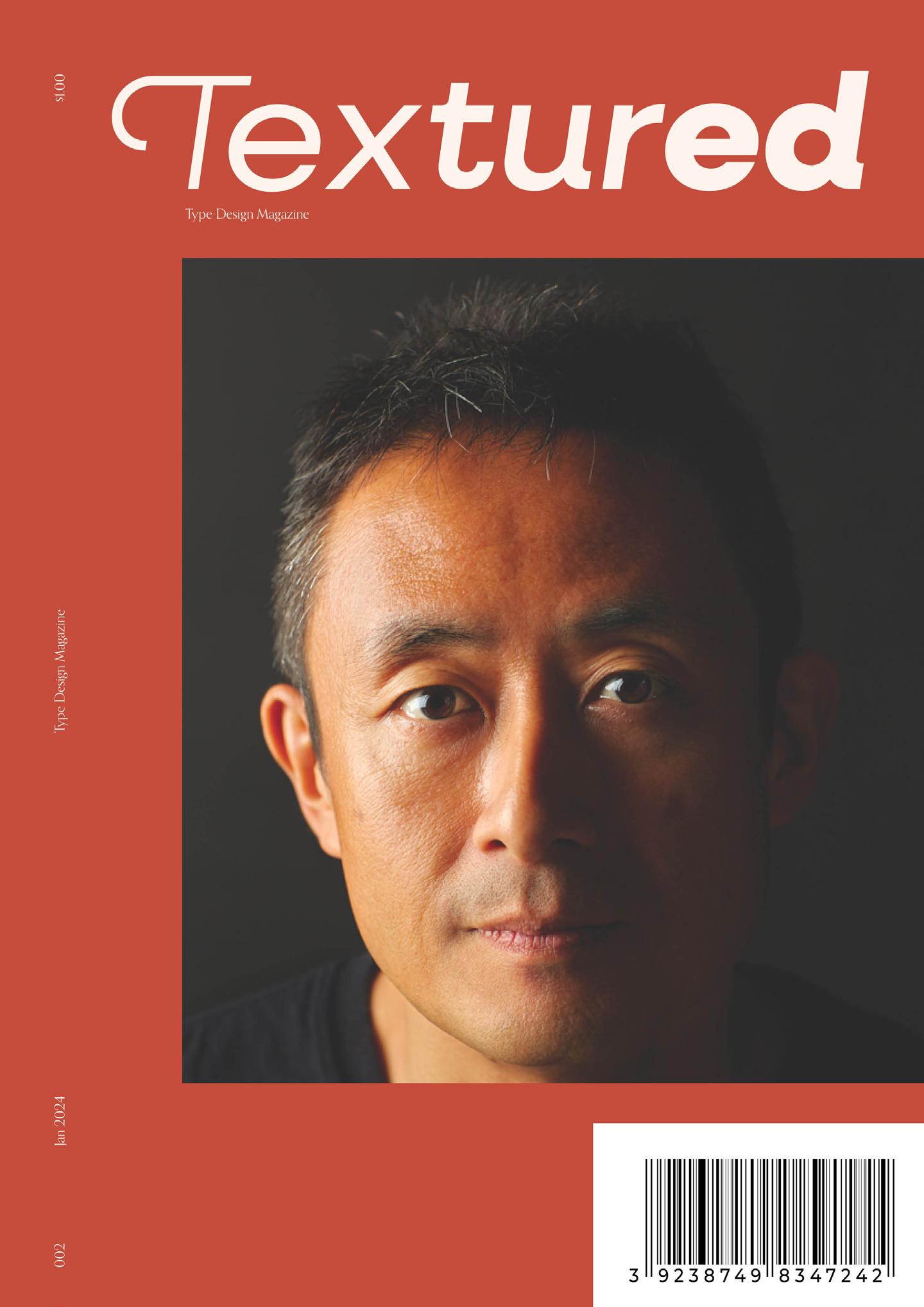
24 Textured Excited for the next issue?
a sneak peak at the next cover here!
Take