Bunbury Revised Identity Proposal
 Maggie Arway
Graphic Design 1
Summer 2022
Maggie Arway
Graphic Design 1
Summer 2022

Maggie Arway
Graphic Design 1
Summer 2022
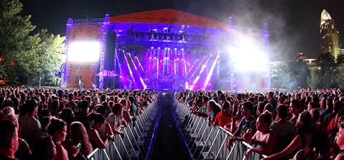
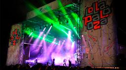
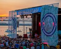
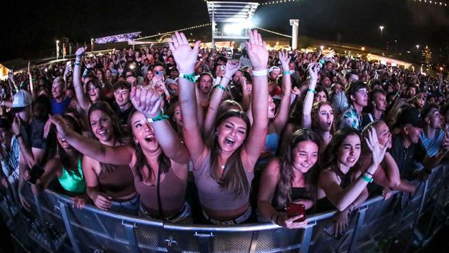
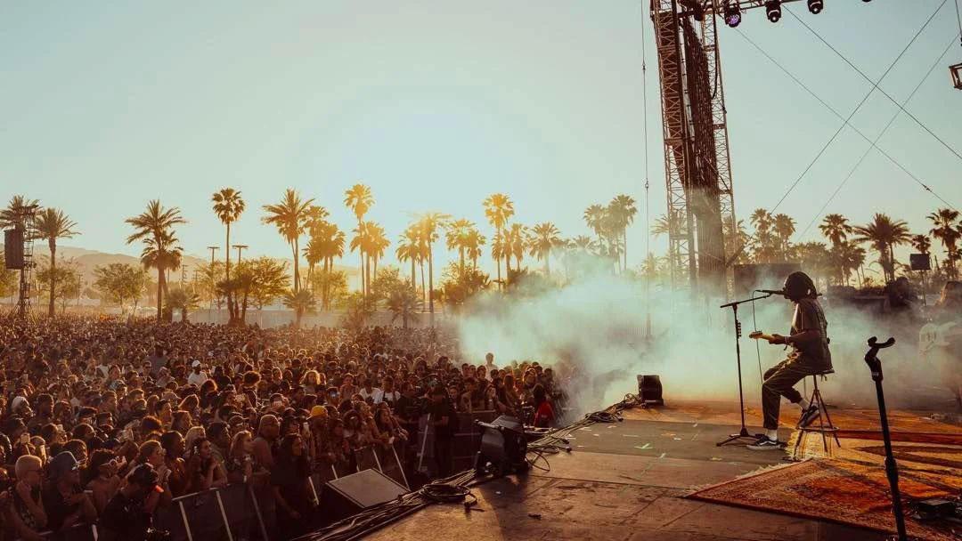
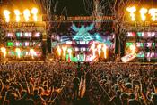
The Bunbury Music Festival is an authentic musical escape. It is a celebration of music situated on the scenic banks of the Ohio River in Cincinnati, Ohio. As a festival we place an emphasis on having a safe, fun, affordable, and accessible option for music lovers in and around Cincinnati.


The Bunbury Music Festival strives to make live music affordable and accessible to all listeners. Built on a love for both live music and the city of Cincinnati, we want to highlight the best parts of both by creating an amazing experience for all guests.

After contacting the client and the founder of Bunbury Music Festival I learned some key information about the festival and its creation.
The current owners overall goal is to sell tickets and have a fun event. They want to create the best fan experience possible.
The founder of Bunbury, Bill Donabedian, informed me that the brand mantra has 3 main parts: Essence (Never Changing): Authentic Character (Audience): Musical Identity (What the audience wants): Escape This makes Bunbury and authentic musical escape. The goal was to allow people who love music to attend the event and leave their troubles behind for one weekend.


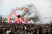
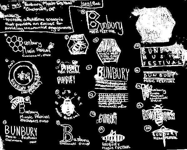
In the creation of the event Donabedian wanted to have a mascot. His wife suggested a bee due to the alliteration with the name of the festival.
The target age range 18-45. They target people in Cincinnati and northern Kentucky, but their acts appeal to people all over the country. They want people with free time, music lovers, and people who are looking for a musical getaway in the summer.

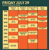
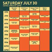
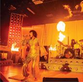
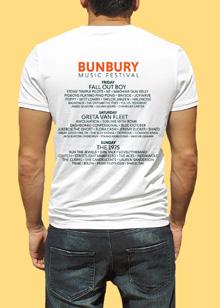
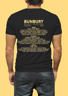
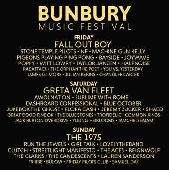
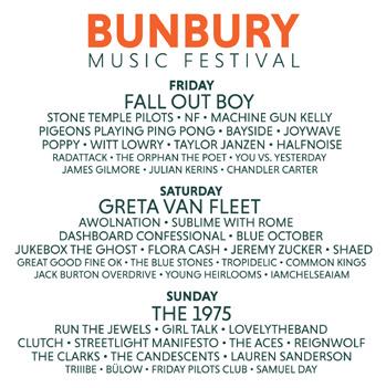
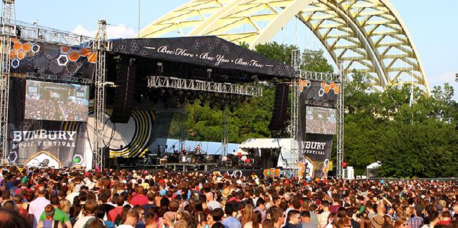
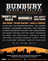
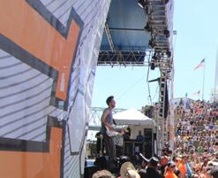
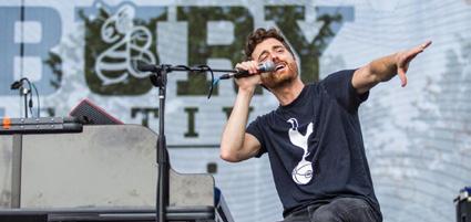
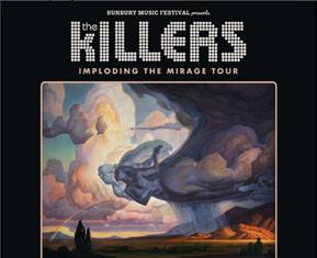
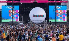
In 2012 the Bunbury music festival was created. It was sold in 2014 to PromoWest Productions who has hosted the festival since. Since the start the festival has been held at Yeatman’s Cove and Sawyer Point on the banks of the Ohio River. They have featured various artists such as Greta Van Fleet, the 1975, and The Killers.

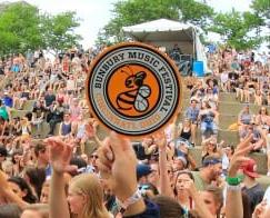


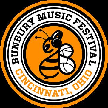
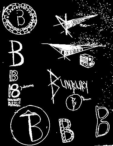
The icon becomes confusing with the headphones on the bee as well as the wings not fitting with the rest of the icon
The current hierarchy of the logo mark emphasizes the text and the bee falls into the background
The current color scheme is similar to the colors of the Bengals NFL team, which does not fit with the bee iconography
The current typeface of the logo mark does not belong to a music festival and competes with the bee for importance.
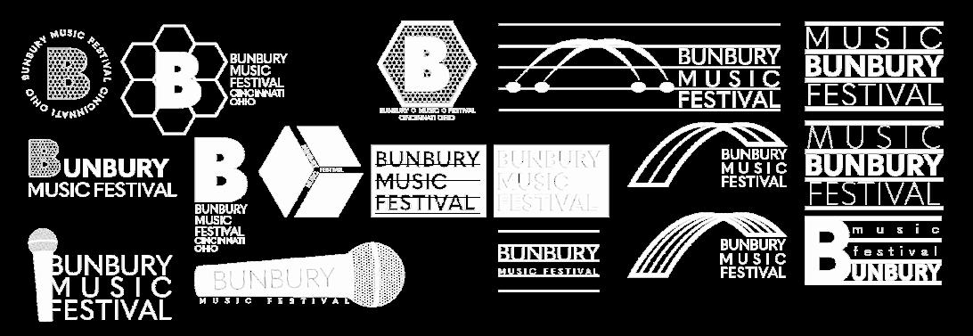
I plan to address the hierarchy, bee icon, typeface, and colors found in the current identity system. By addressing these areas, I hope to be able to create a more cohesive brand that is understandable upon a quick glance at the logo.
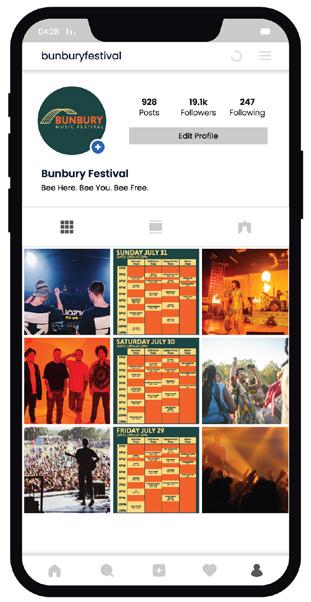
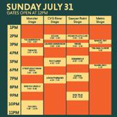
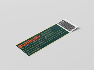
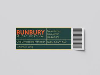
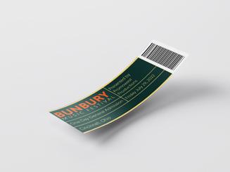
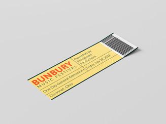
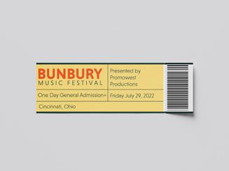
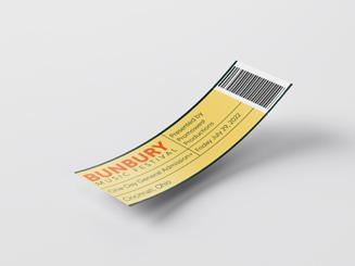
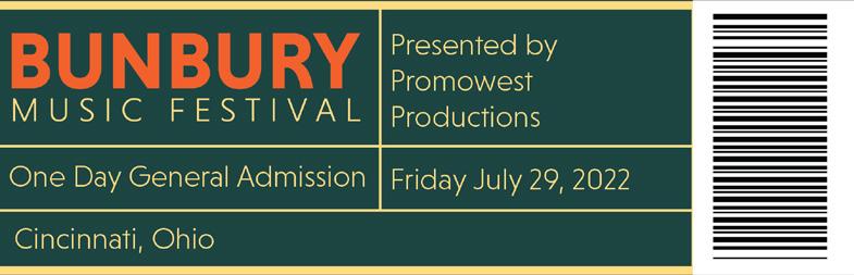
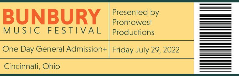
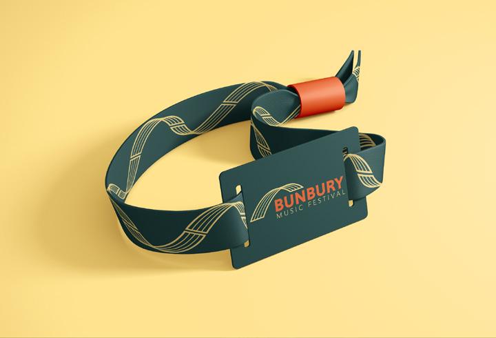
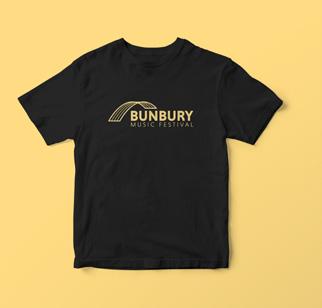
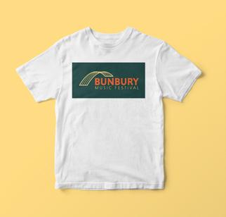
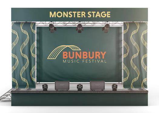
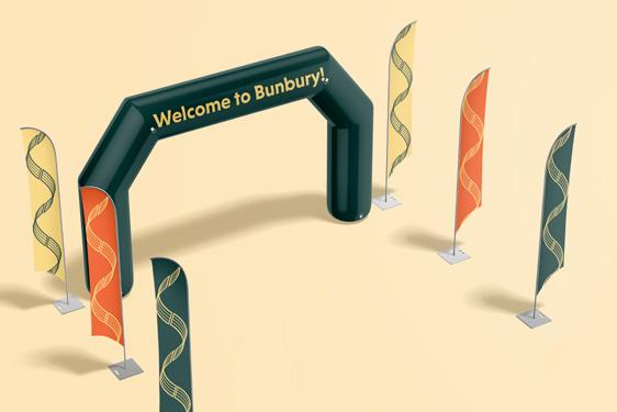
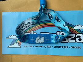
A new identity system will be created and presented in a range of applications. The versatality of these applications in format and scale will showcase the new identity system’s success. The application that will be created are: wristbands, tickets, shirts, a stage, a gate, and an Instagram page.
Energetic Timeless Experience


Annual Successful
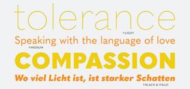
Typeface:
Current Identity
Main Weights:
Type Specifications
Regular:
Medium: Black:
Extra Light: ABCDEFGHIJKLMNOPQRSTUVWXYV abcdefghijklmnopqrstuvwxyv 1234567890!?() ABCDEFGHIJKLMNOPQRSTUVWXYV abcdefghijklmnopqrstuvwxyv 1234567890!?() ABCDEFGHIJKLMNOPQRSTUVWXYV abcdefghijklmnopqrstuvwxyv 1234567890!?() ABCDEFGHIJKLMNOPQRSTUVWXYV abcdefghijklmnopqrstuvwxyv 1234567890!?()