MOHAMED KASSAB PORTFOLIO
Mohamed Kassab-@00672327 ARCHITECTURE DESIGN STUDIO 1A
KIT OF PARTS MICRO STUDIO
PAGE 5- MODELLING
PAGE 28- MICRO STUDIO
PAGE 16- ORTHOGRAPHIC DRAWING
PAGE 21- RENDERINGS
PAGE 31- PRECEDENCE
PAGE 35- SITE ANALYSIS
PAGE 40- MODELS
PAGE 46- SKETCHES
PAGE 50- ORTHOGRAPHIC DRAWINGS
PAGE 57- PHOTOSHOP
CONTENTS PAGE
KIT OF PARTS
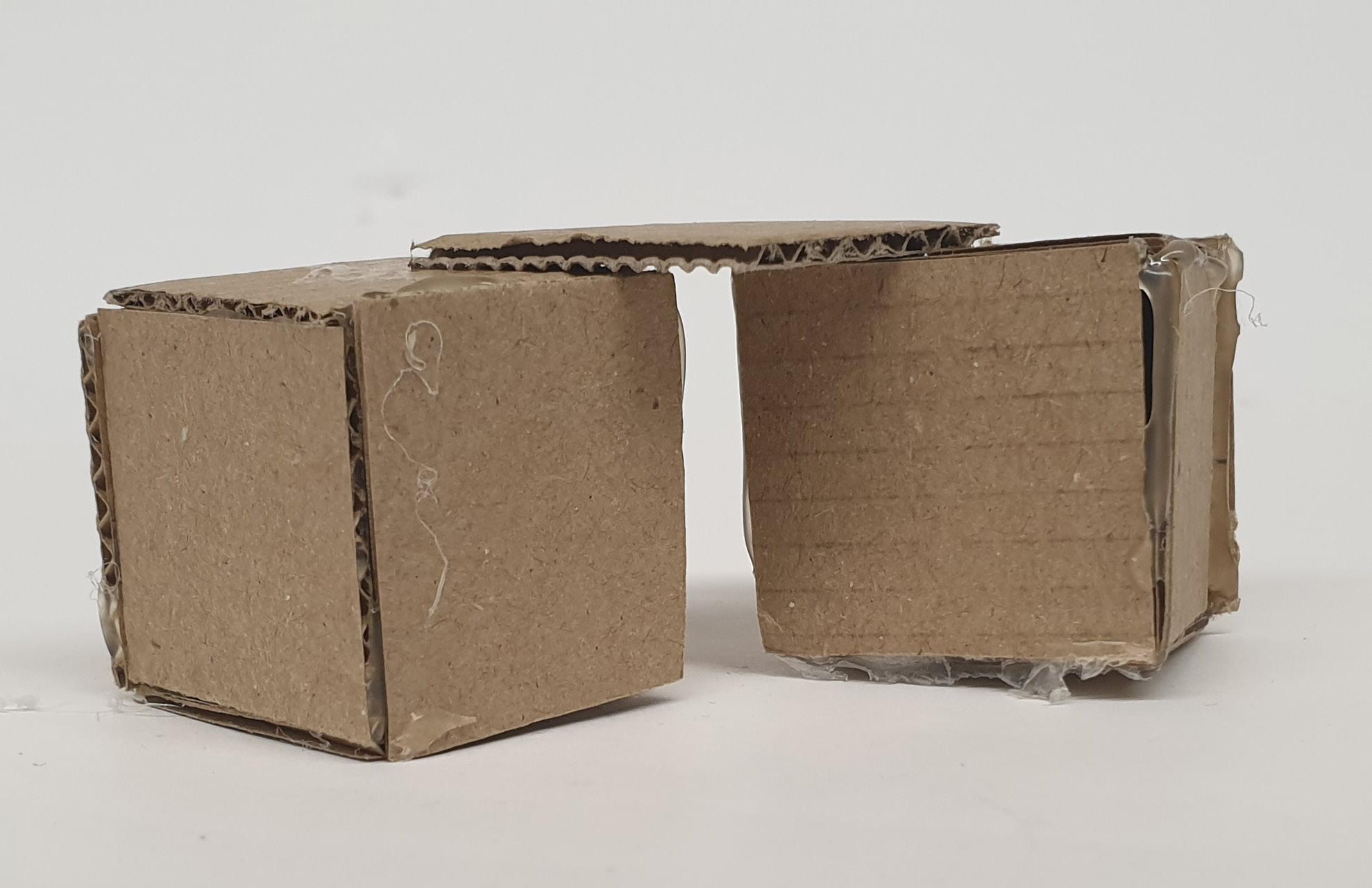
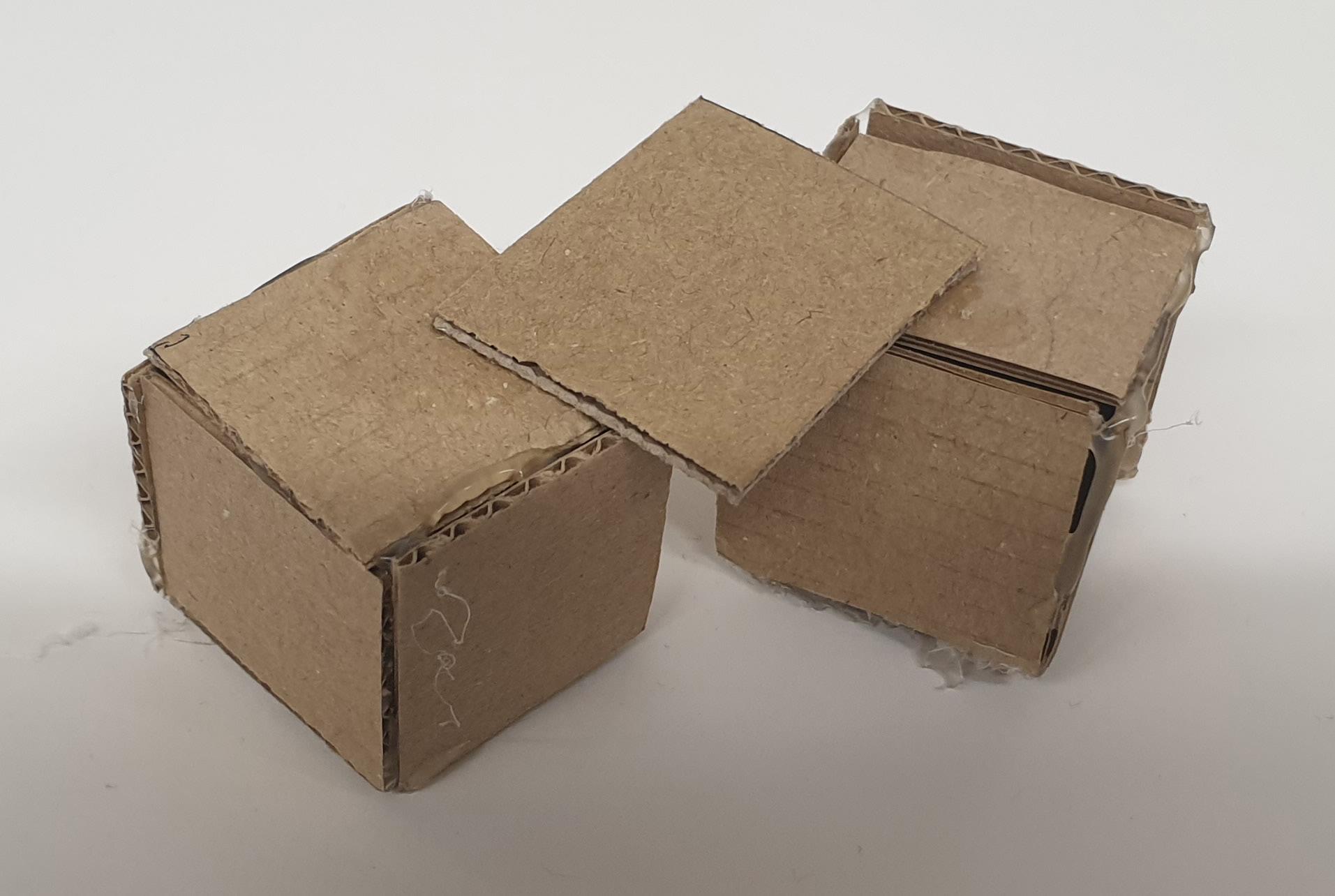
MODELLING
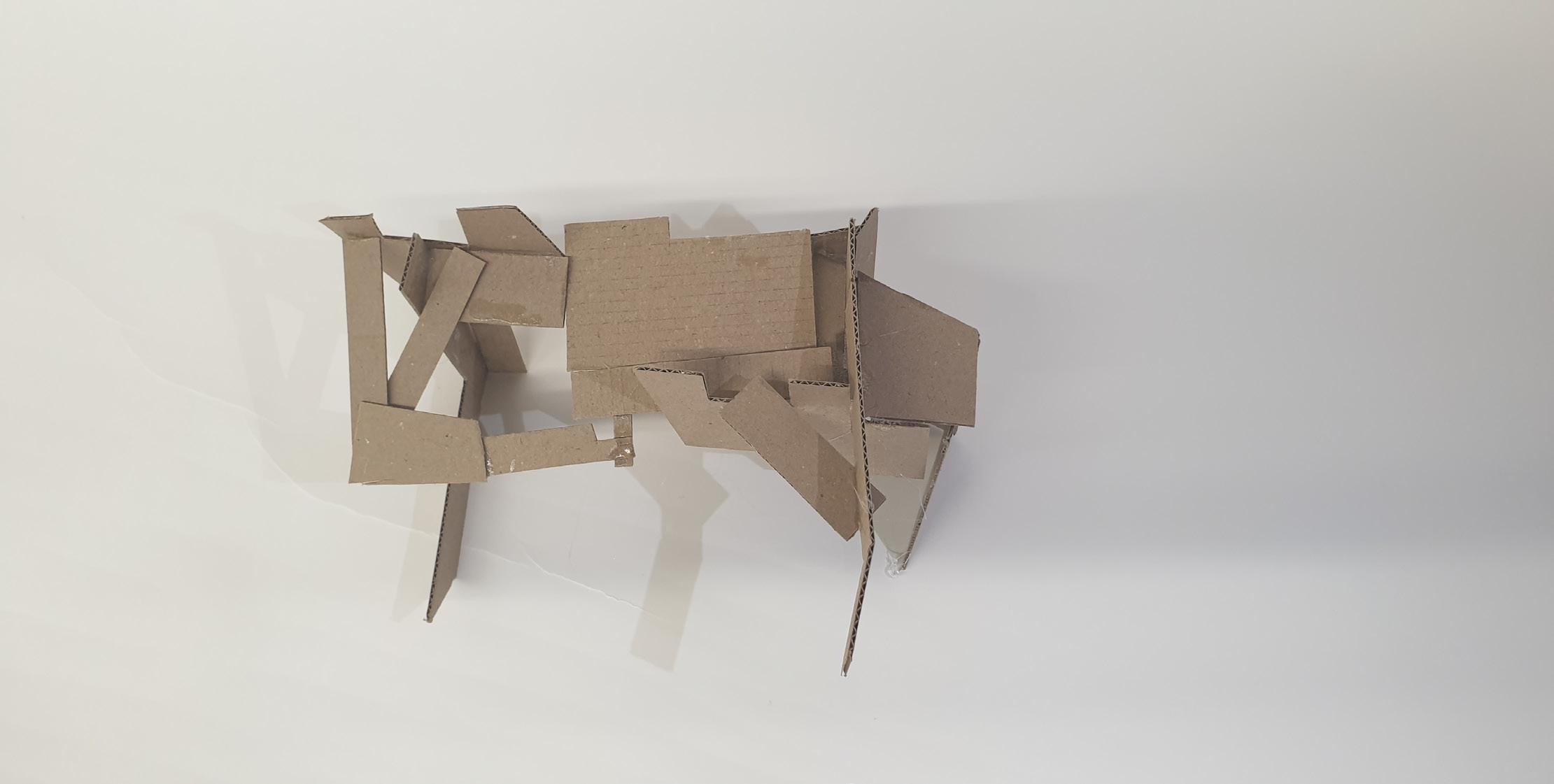
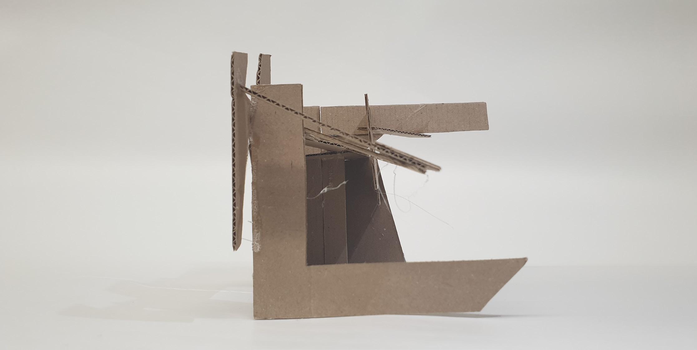
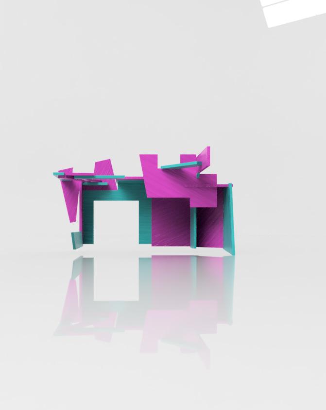
It was easy to use the large pieces as they helped me space out my model as I wanted by creating the outline of my model. I used the small pieces to make the top of my model. they worked well as they allowed us to create pockets of space where light can be shone through. it was interesting to see how any shape can work with another by just adjusting its position.
2 Back Top
Right Left
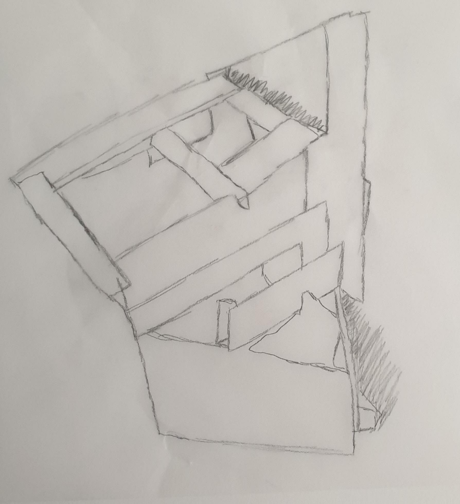
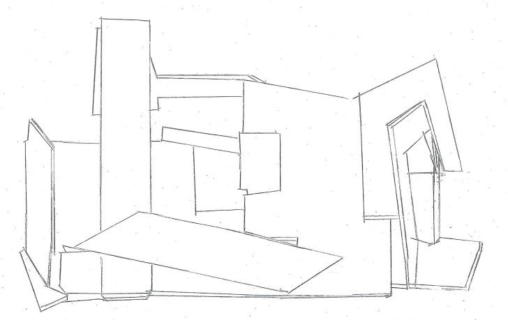
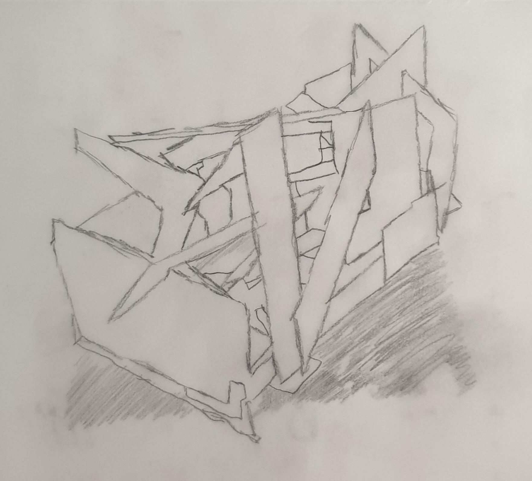
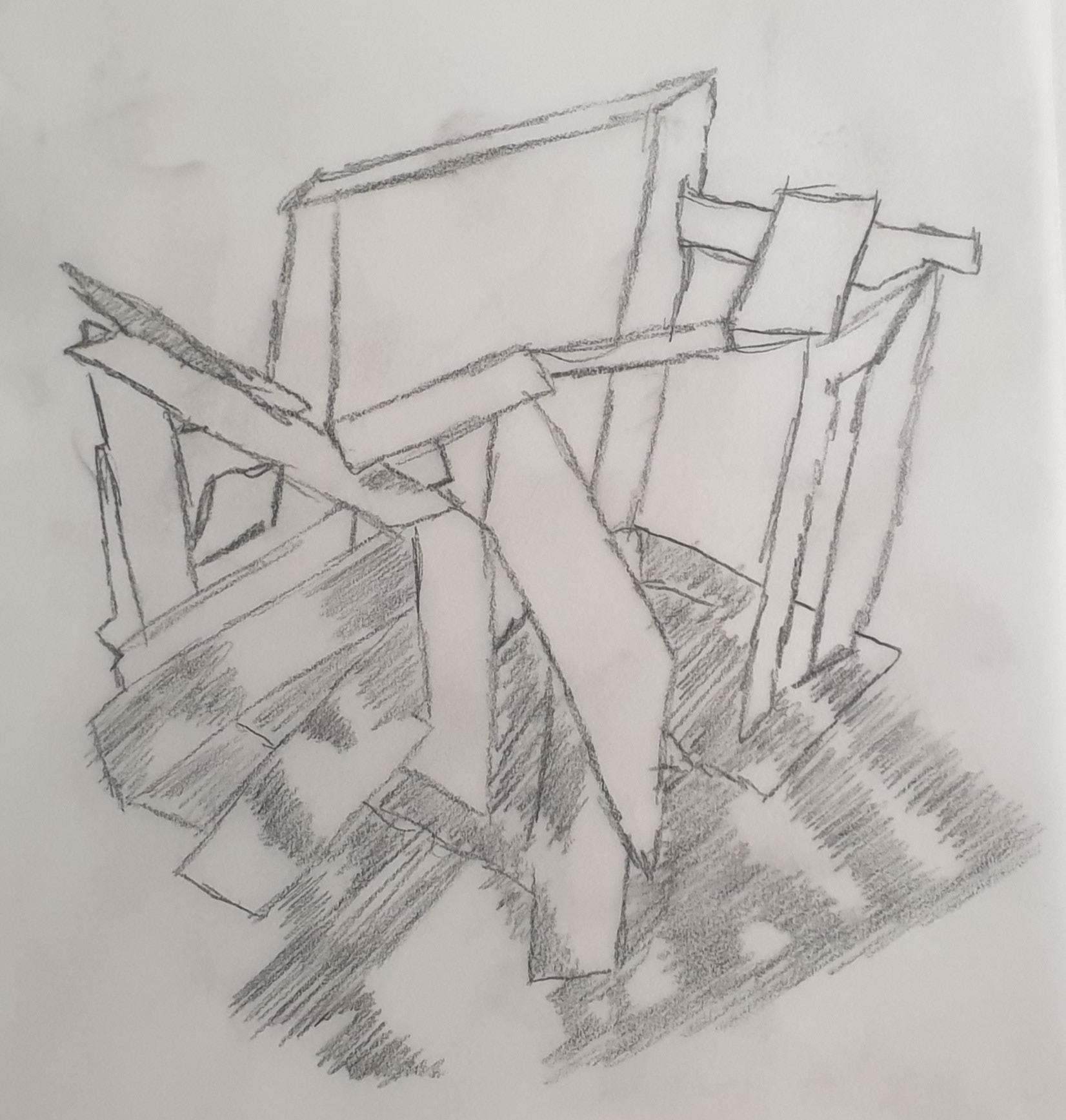
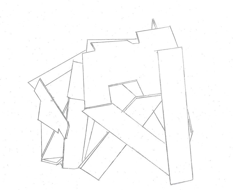
Sketches
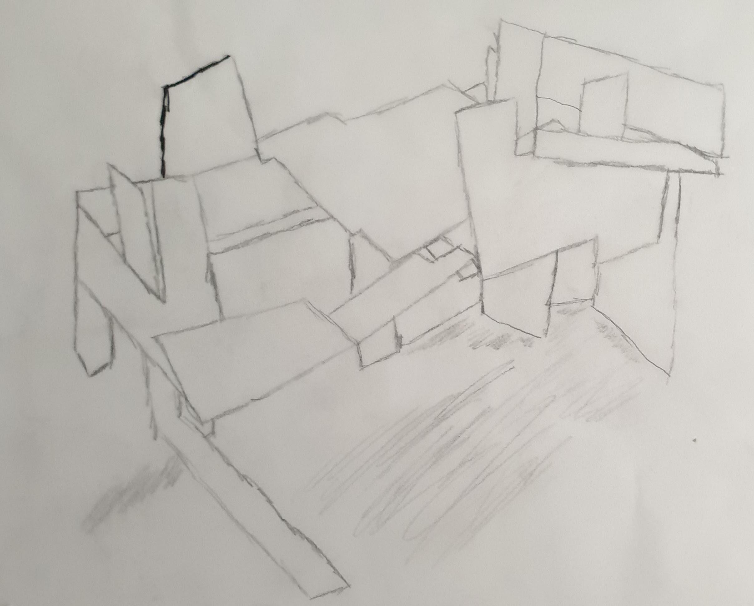
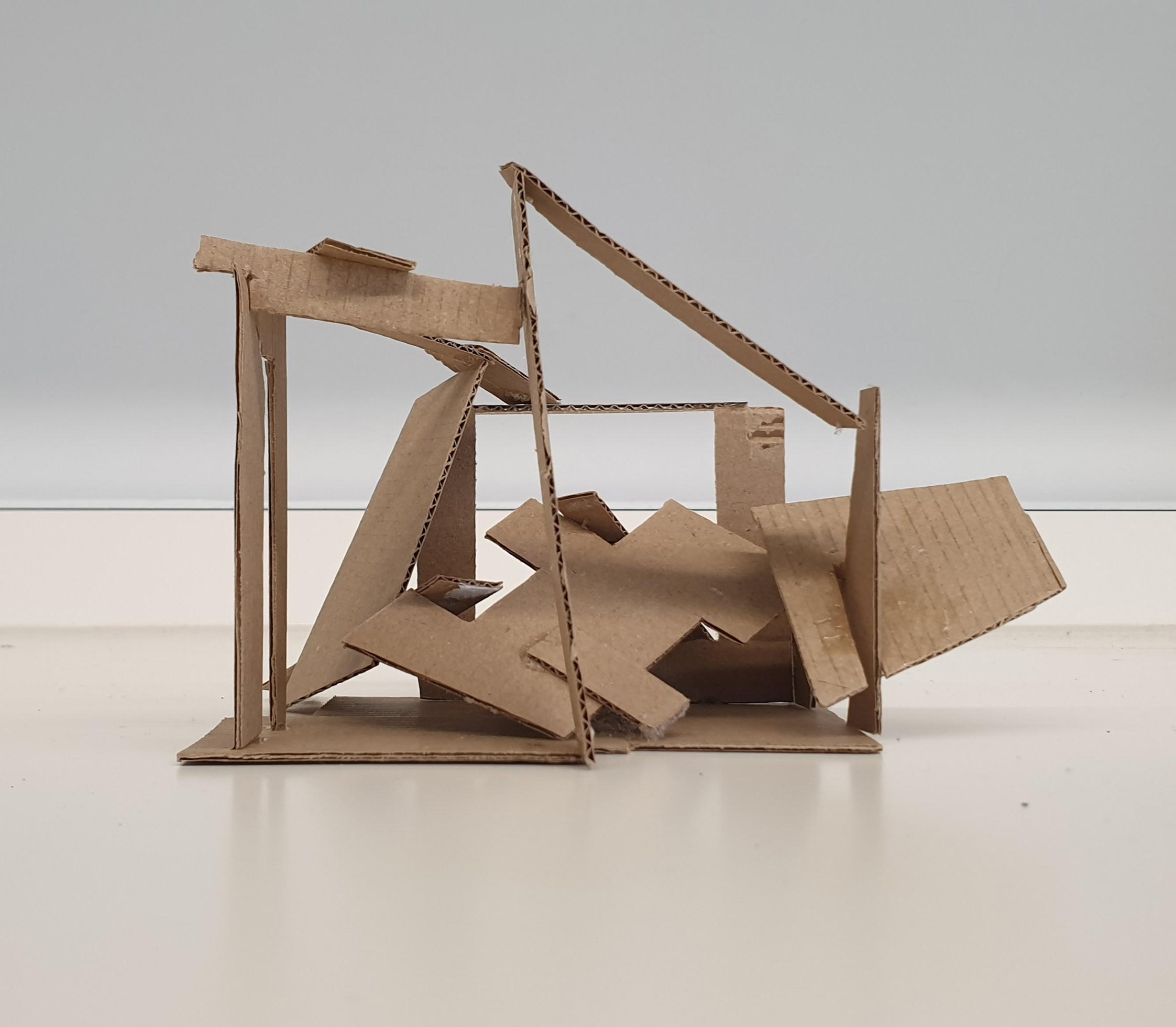
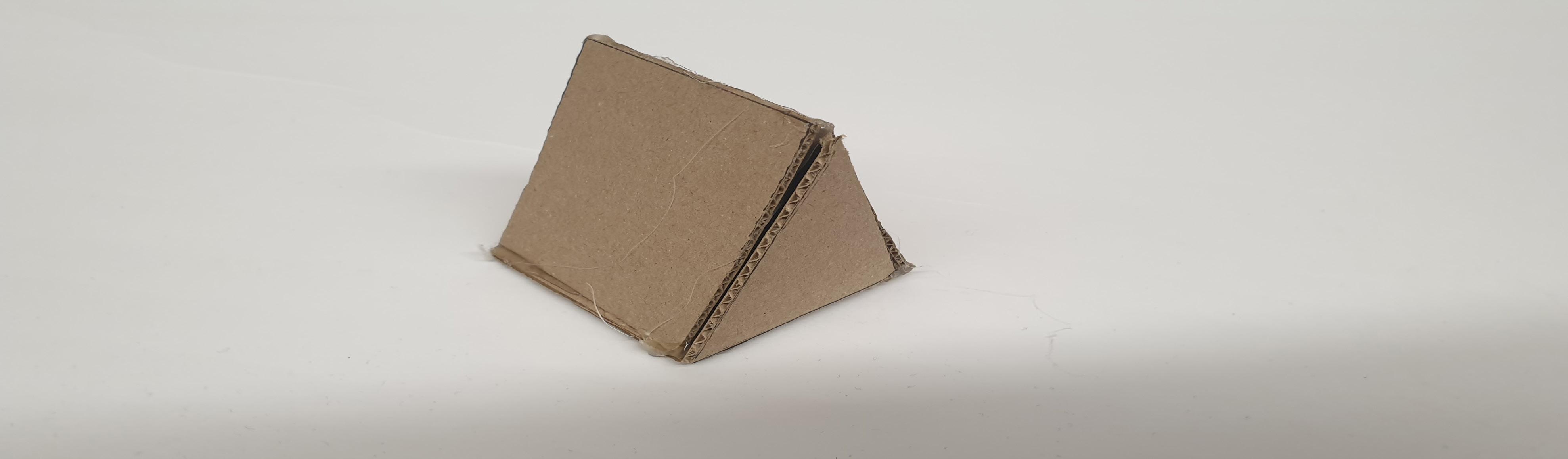
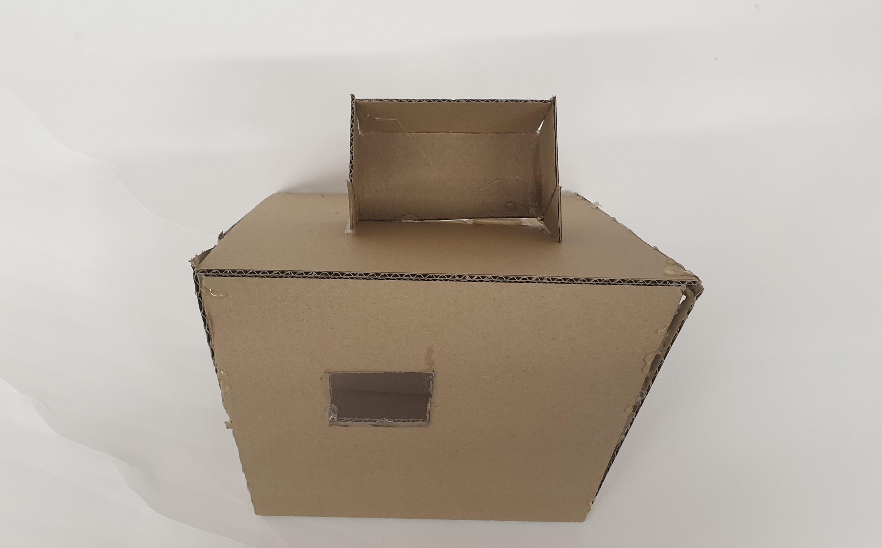
For the first model, I wanted to start with something simple. Model 1 has lots of spaces where light can go through. I wanted model 1 to have a large surface area as it would be easier for light to shine through, instead, of making it tall with not a lot of space where light can be shone through.
3
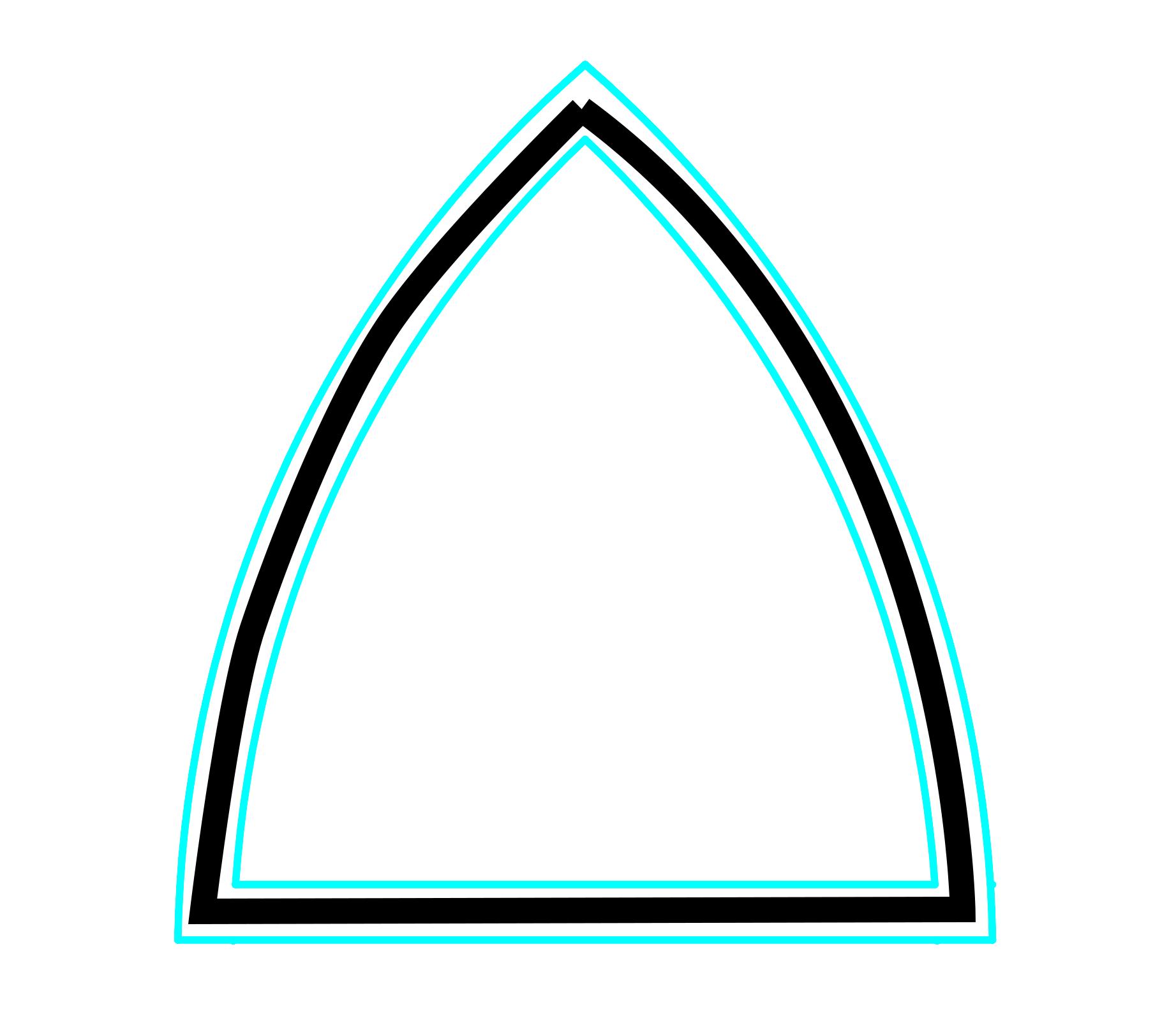
By creating different-sized triangles made my model look unique because we rarely see houses or rooms made of triangles from all sides without any other shape.
Model 2 Photography 4 Back Top
Right Left
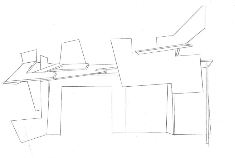
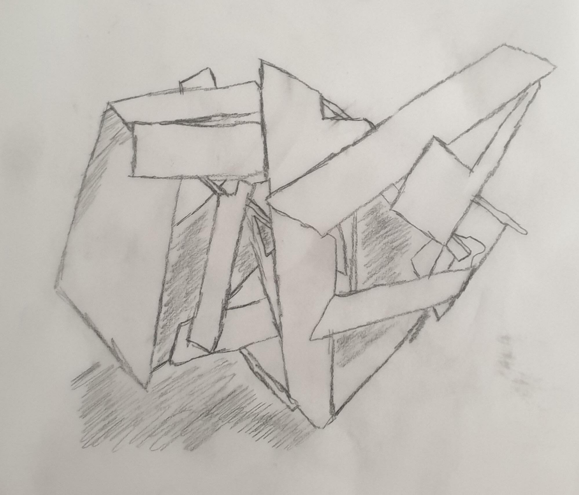
Sketches
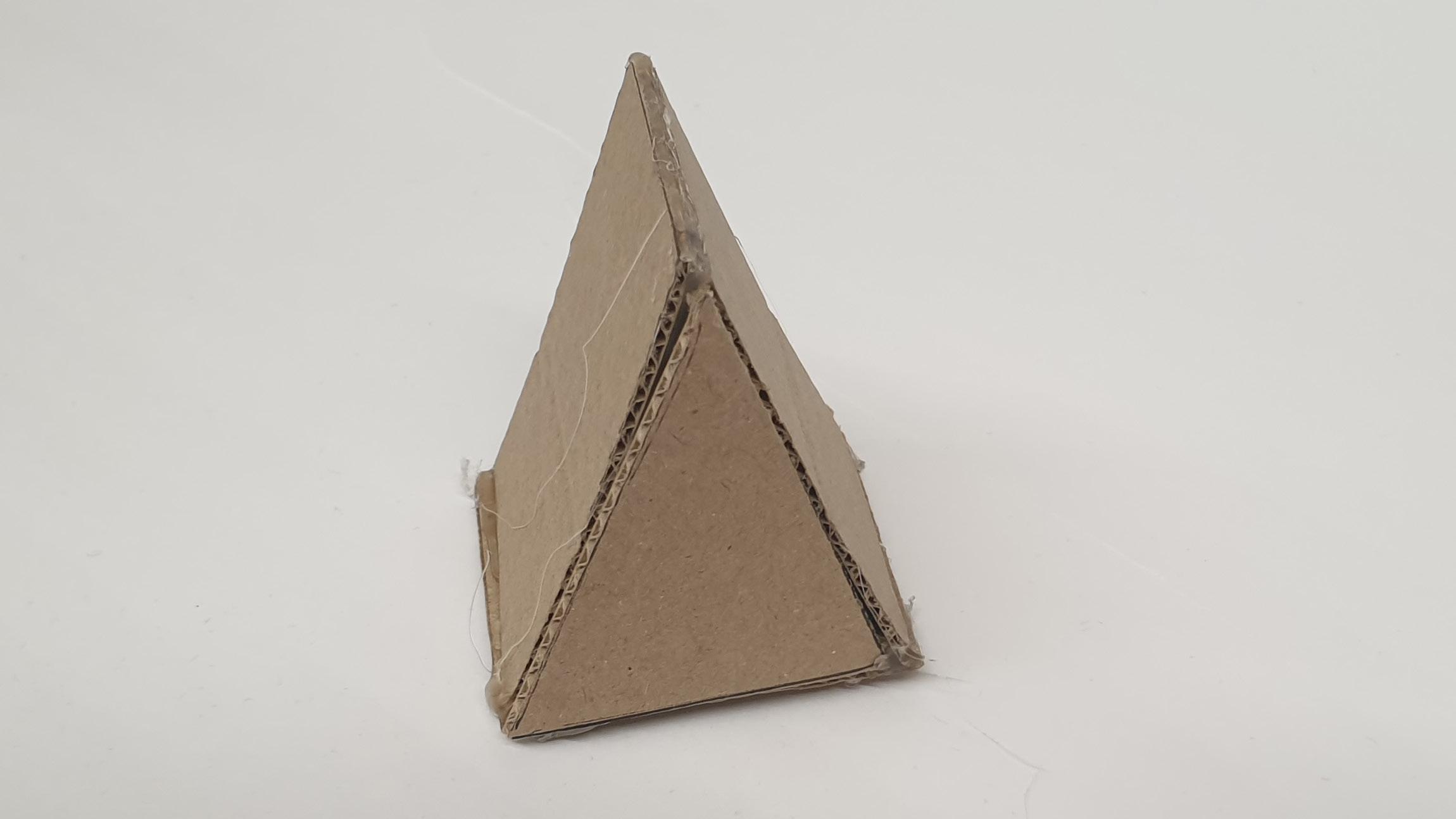
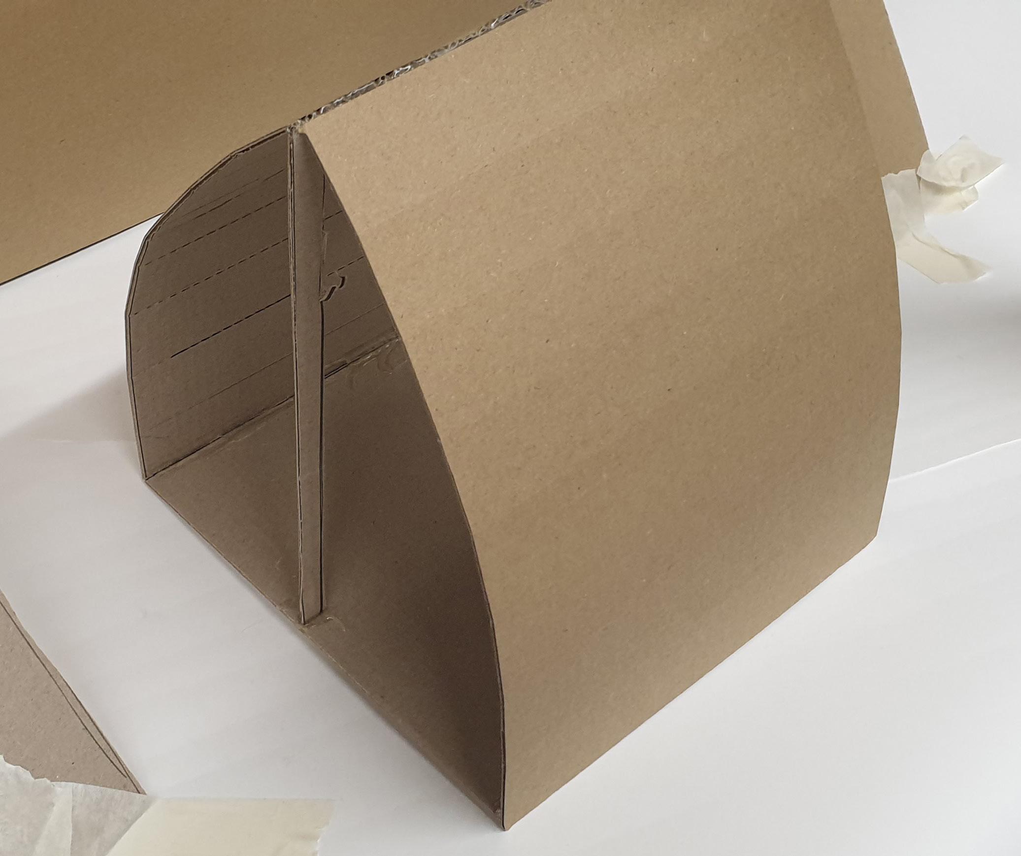
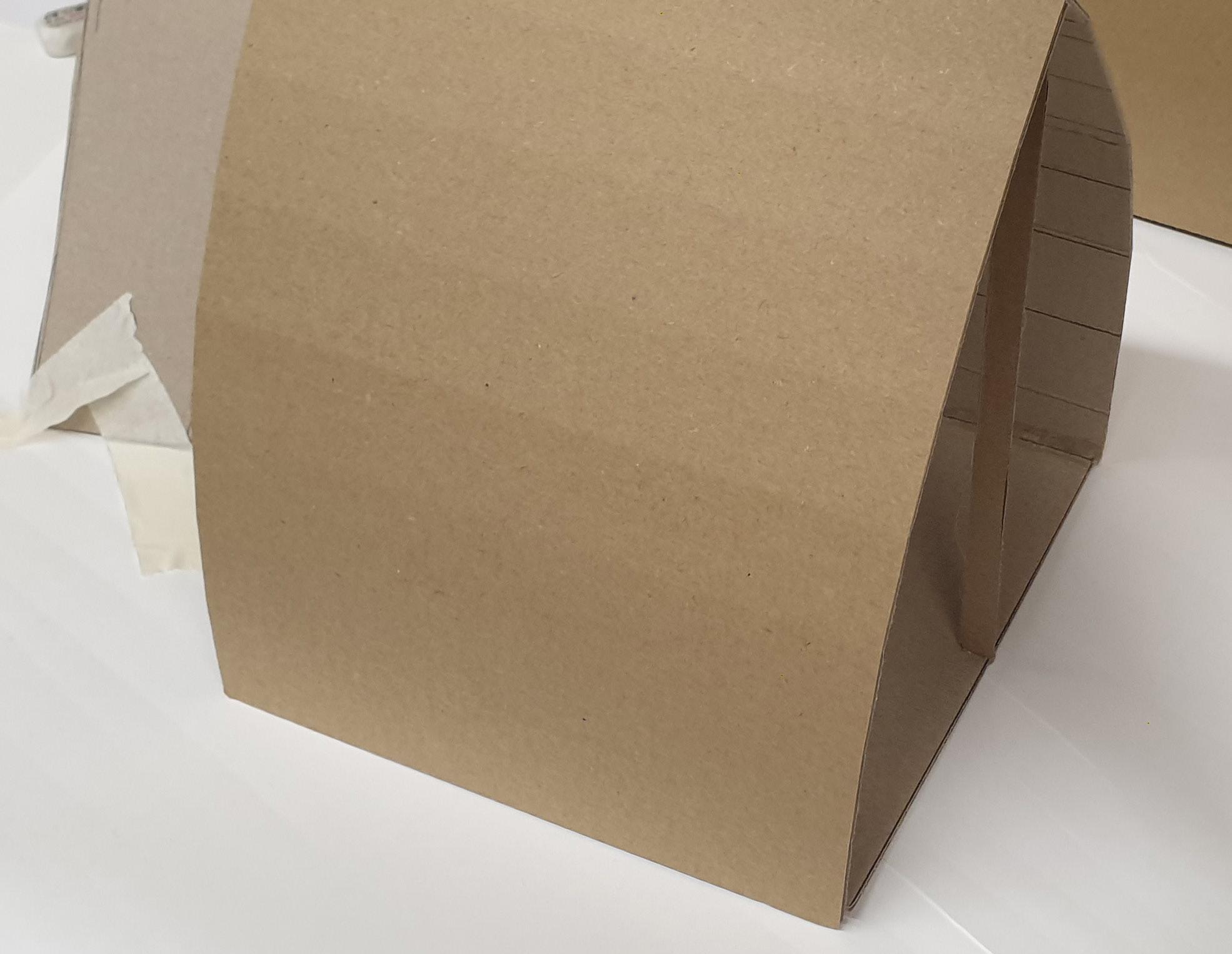
for model 2 I wanted to use a certain shape and show how light can change. I focused on triangles as their 3 sides help light bounce off differently compared to other shapes.
5
The pieces with multiple sides were the hardest to place, as it was hard to find another piece that worked with them. So, I combined them with another shape to make them suitable, and then I added them to the full model.
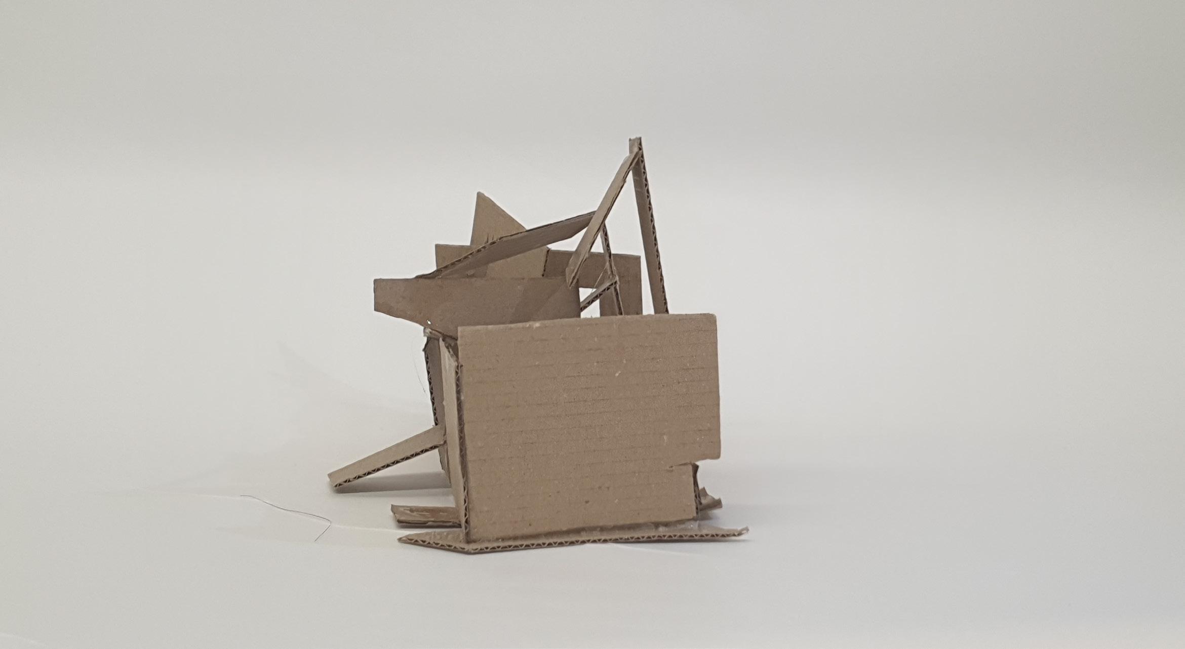
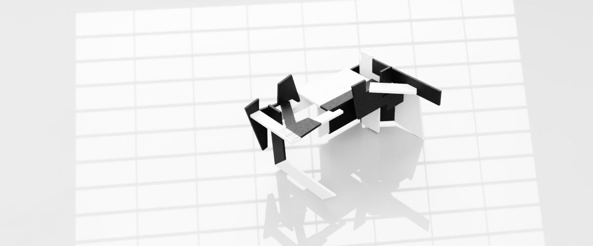
Model 3 Photography 6 Back Top
Right Left
Sketches
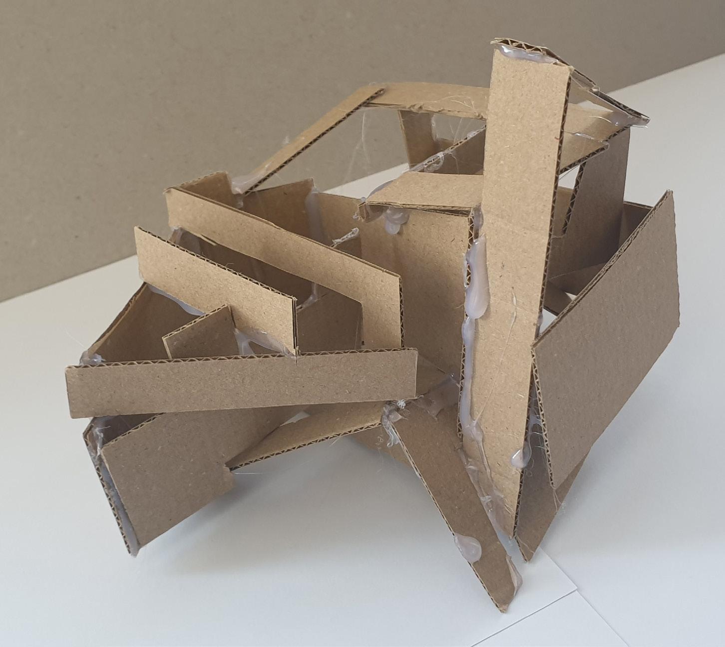
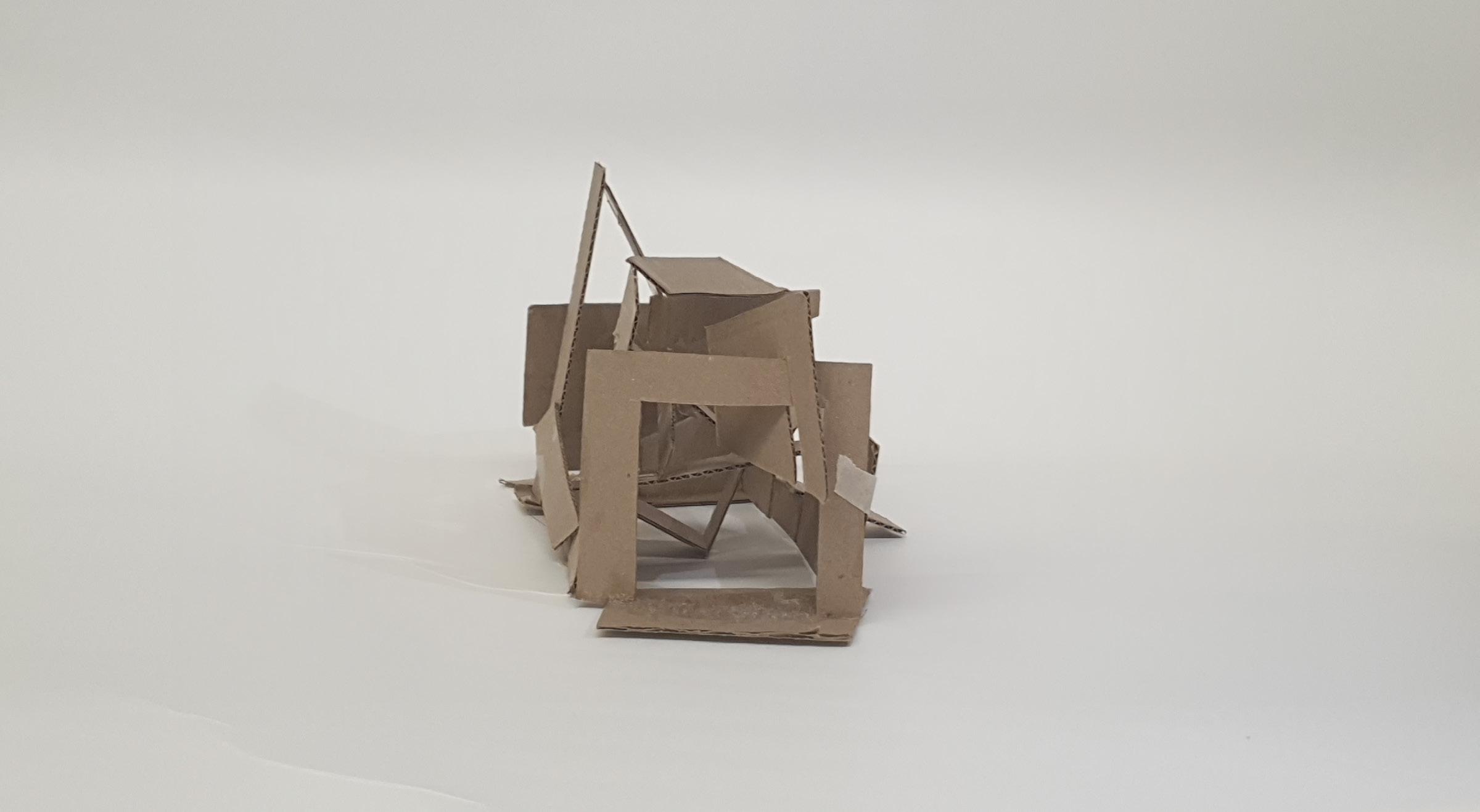
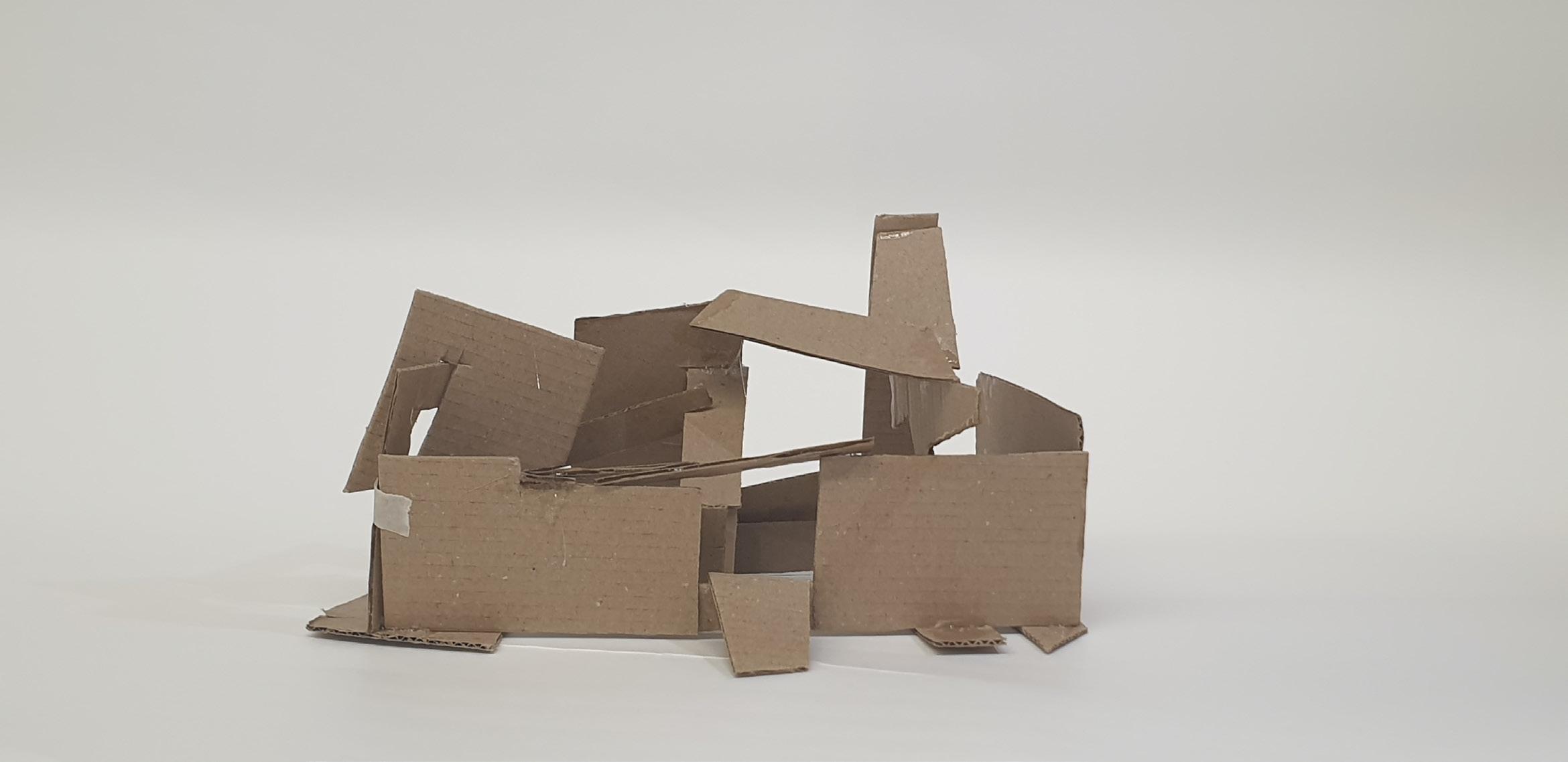
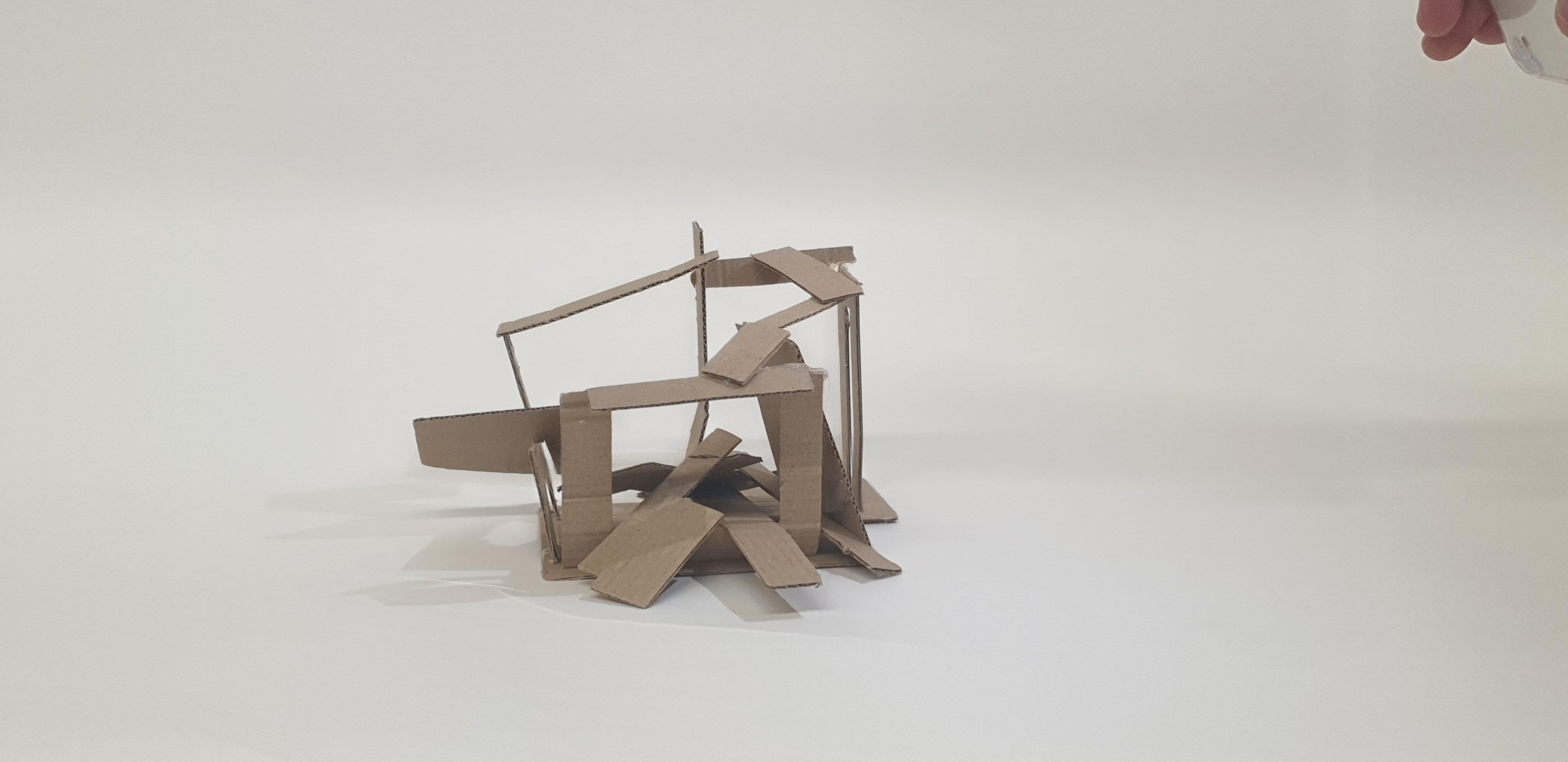
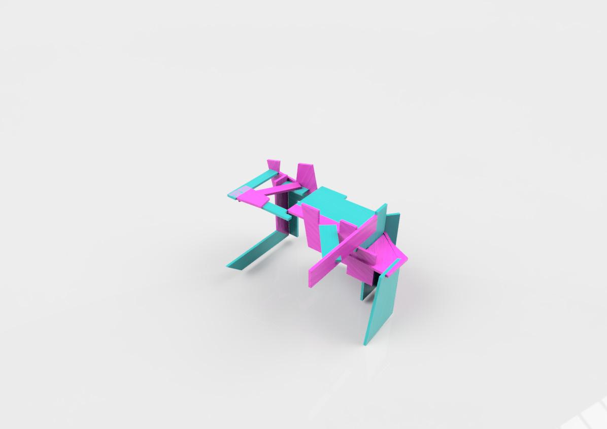
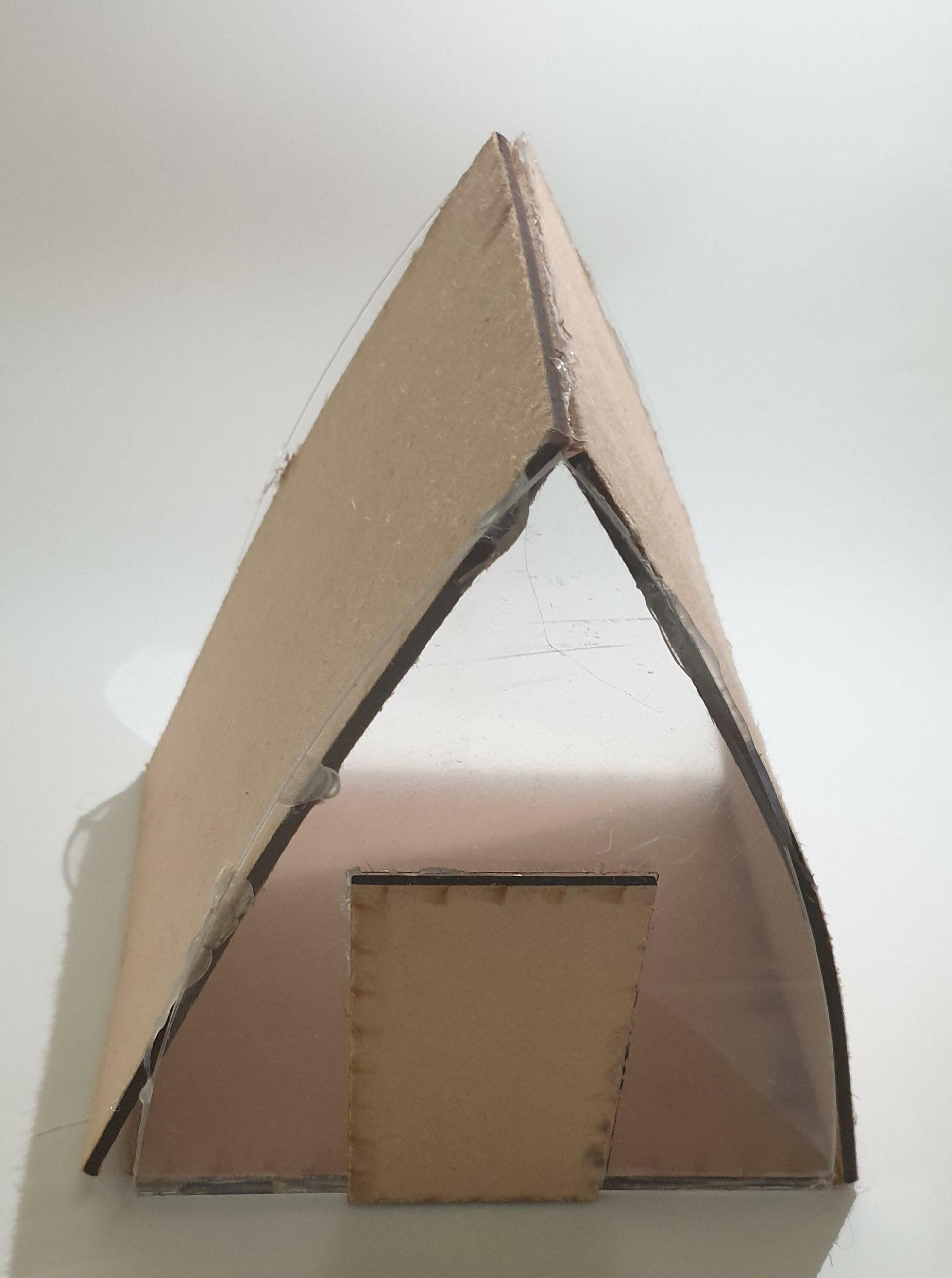
I wanted this model to have the shapes of model 2 and space model 1. So, when placing the pieces, I made the base first so I would know how much space I had to build inside it. Then I began creating small pockets of space by trying out different pieces together. The pieces with multiple sides were the hardest to place, as it was hard to find another piece that worked with them. So, I combined them with another shape to make them suitable, and then I added them to the full model. With the straight pieces, I made little bridges, creating one side to another, which created little triangular and square shapes.
7
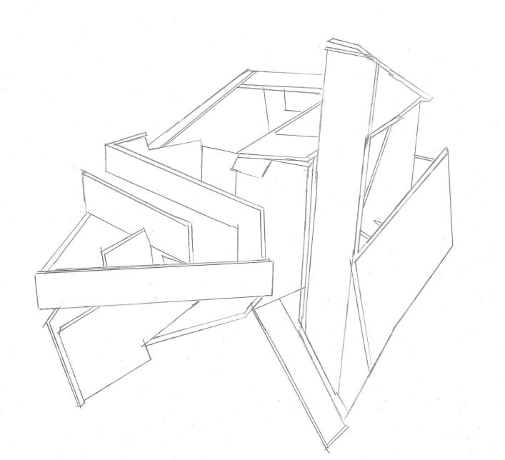
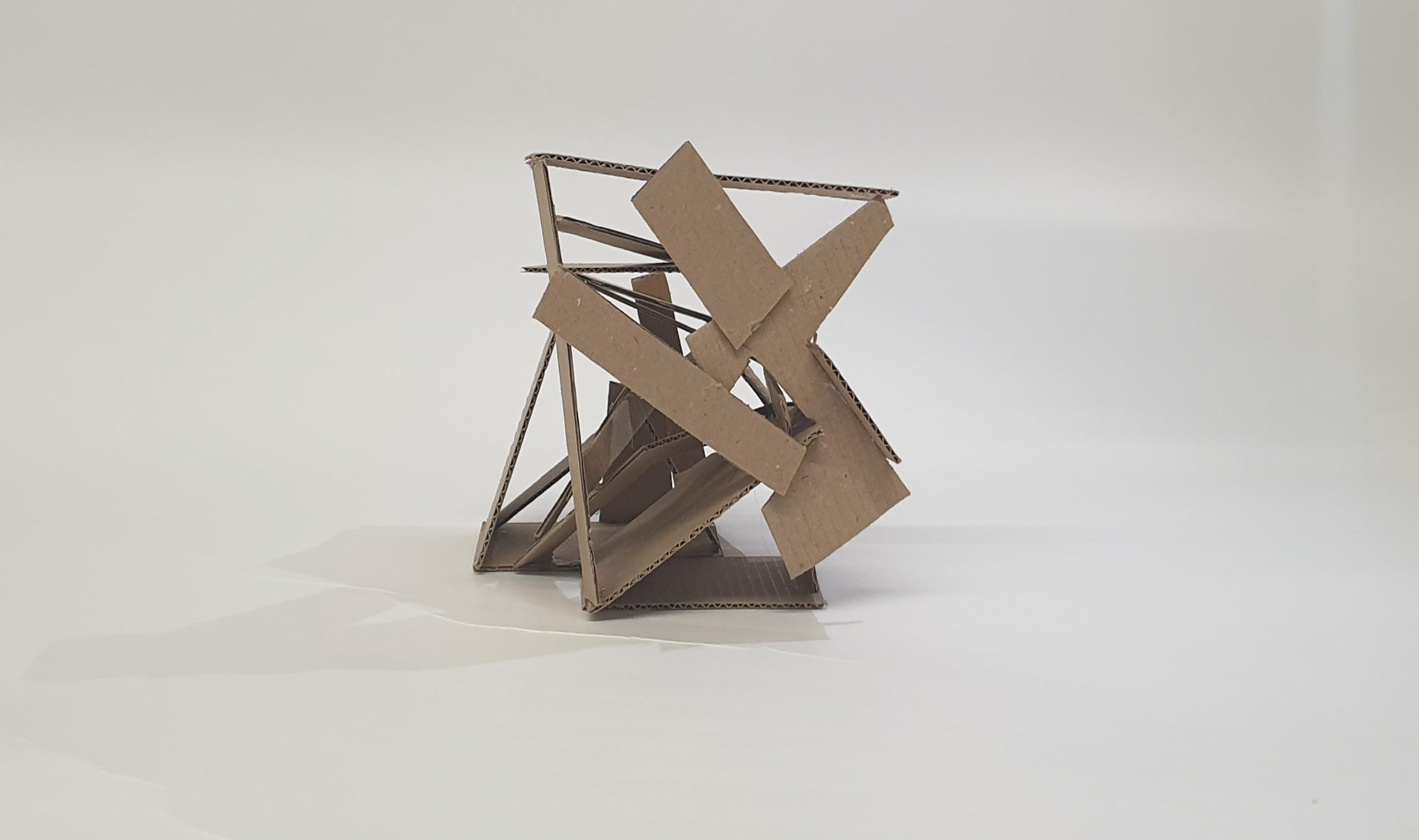
Making gate-looking shapes around the small model allowed light to be seen from big spaces to small gaps inside the model. This model is my favourite as it's simple but powerful at the same time. I used less glue, which allowed the pieces to stay in the position I wanted them to stay.
8 Back Top
Right Left
Sketches
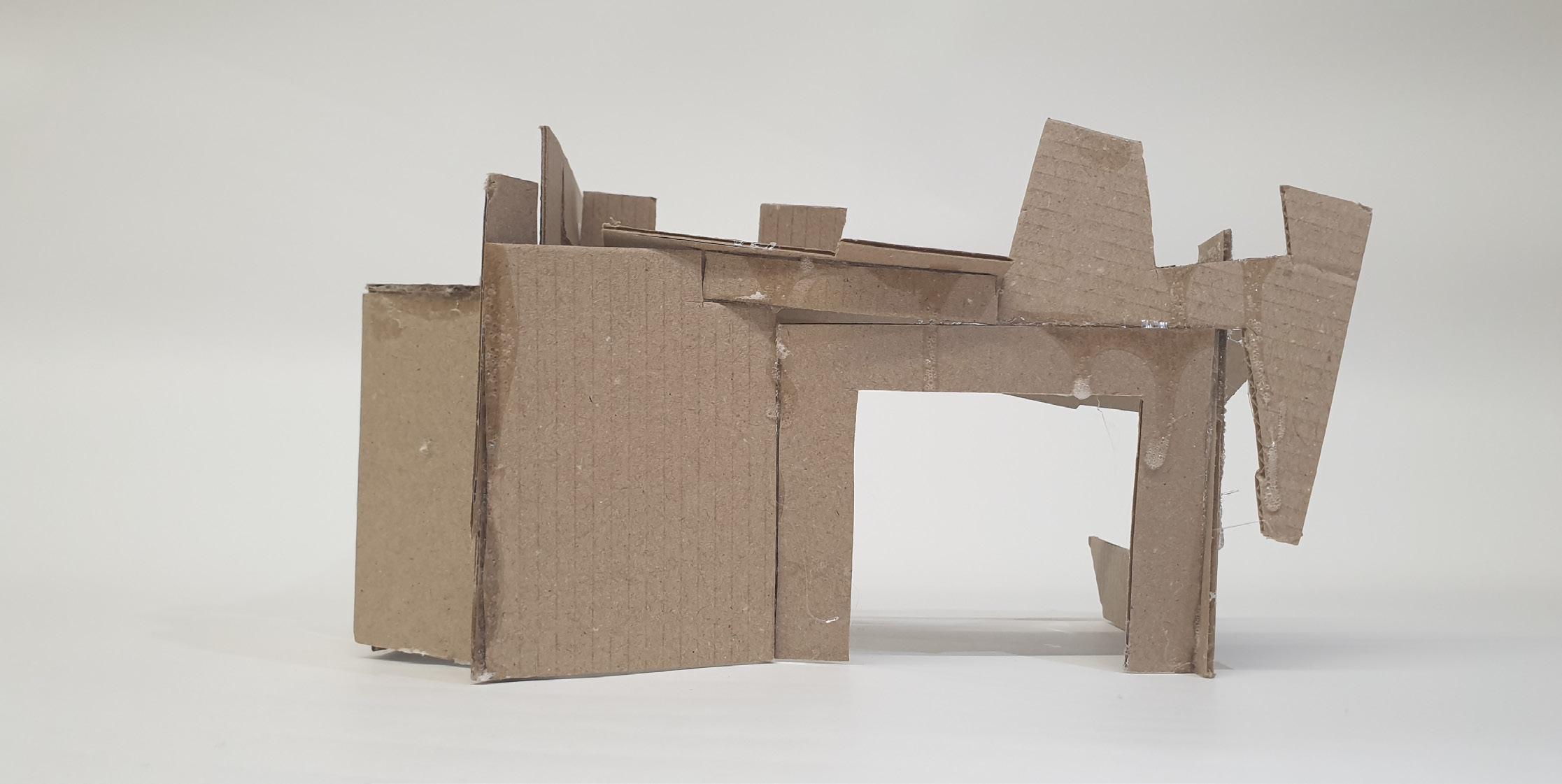
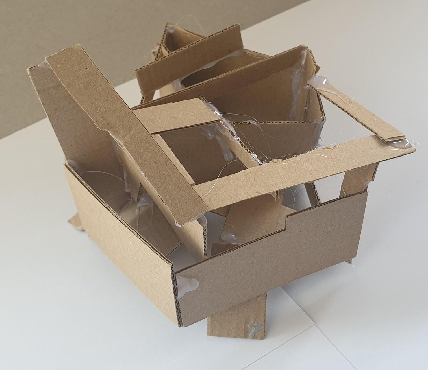
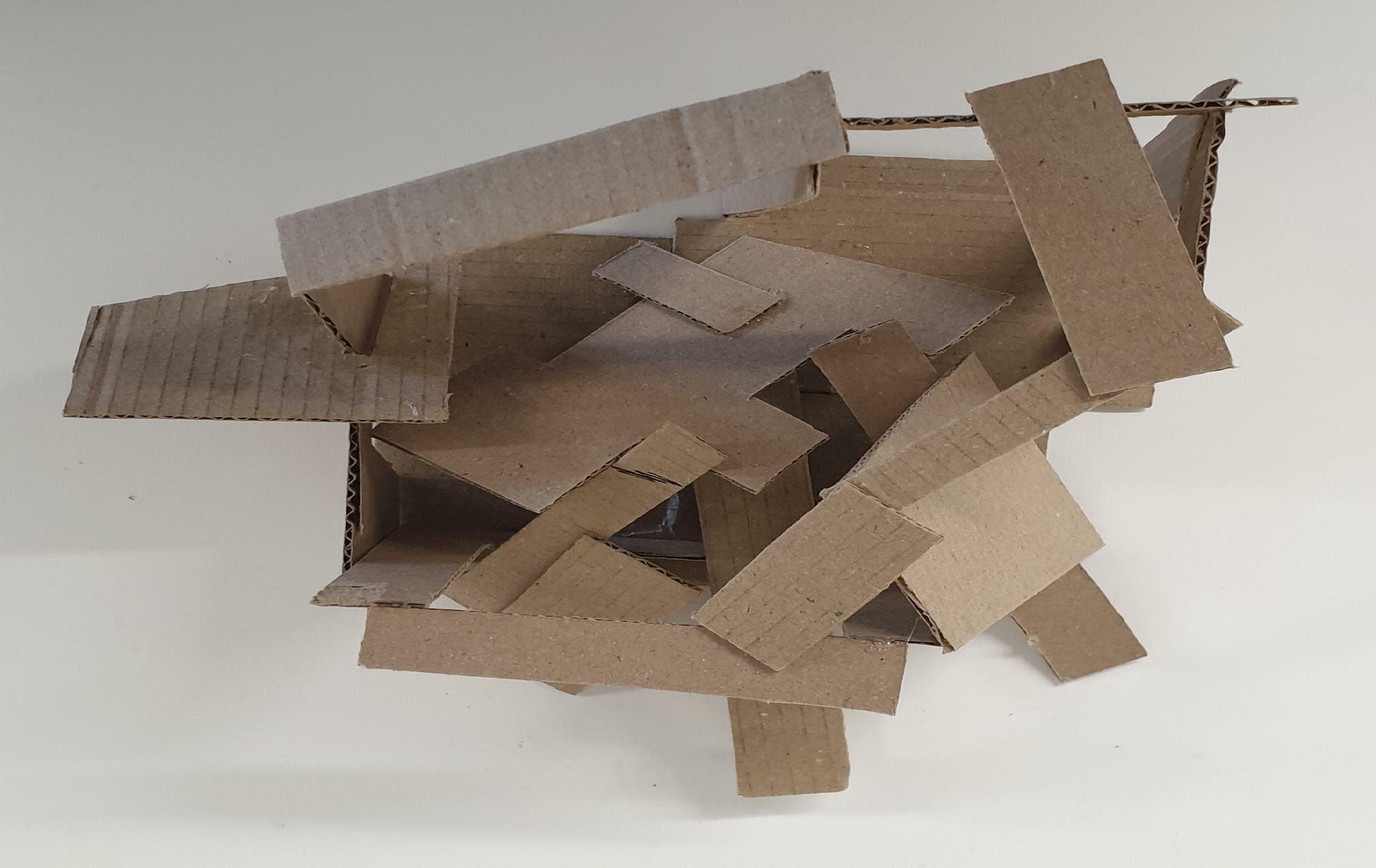
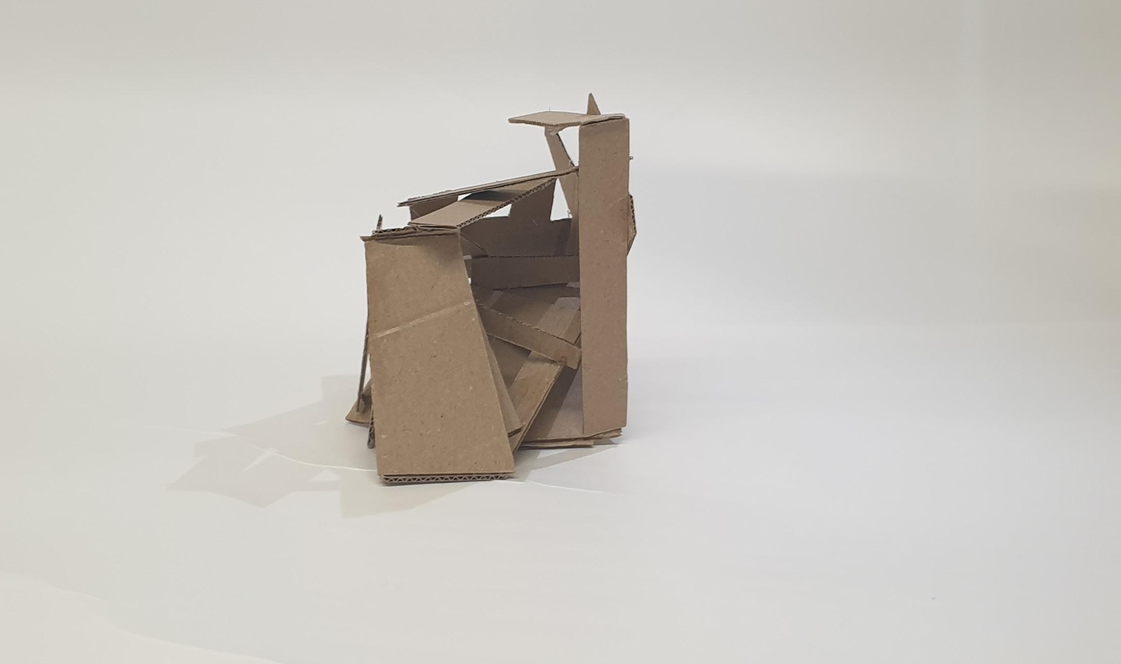
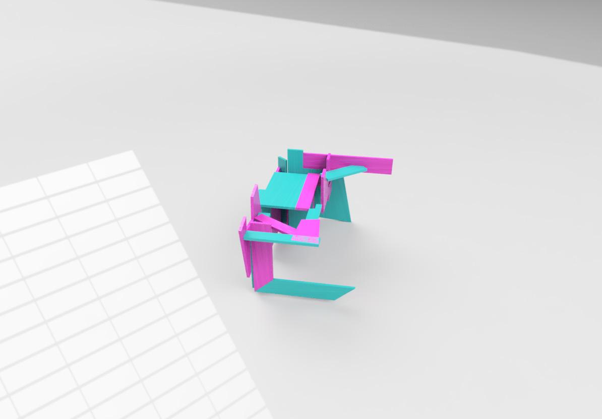
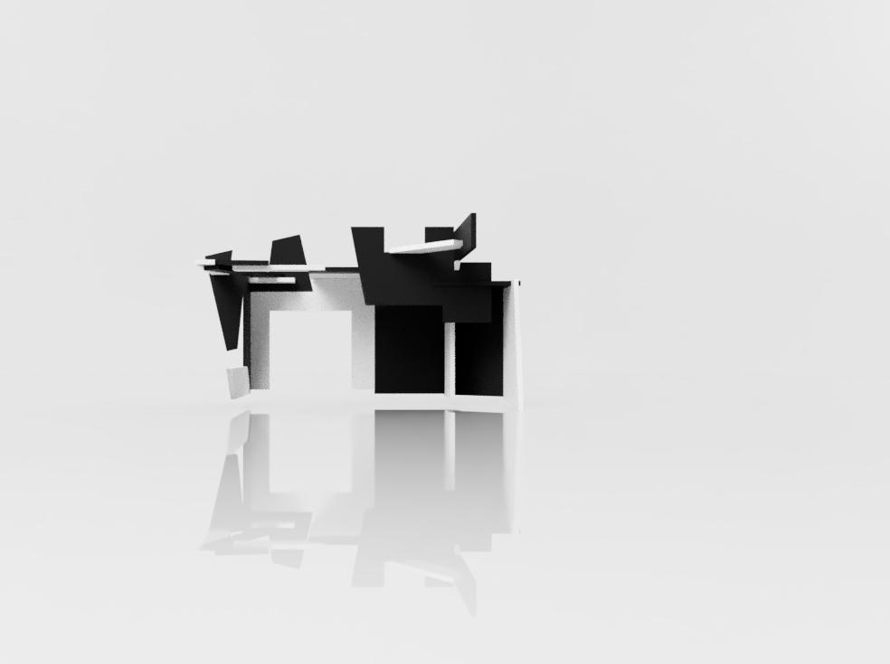
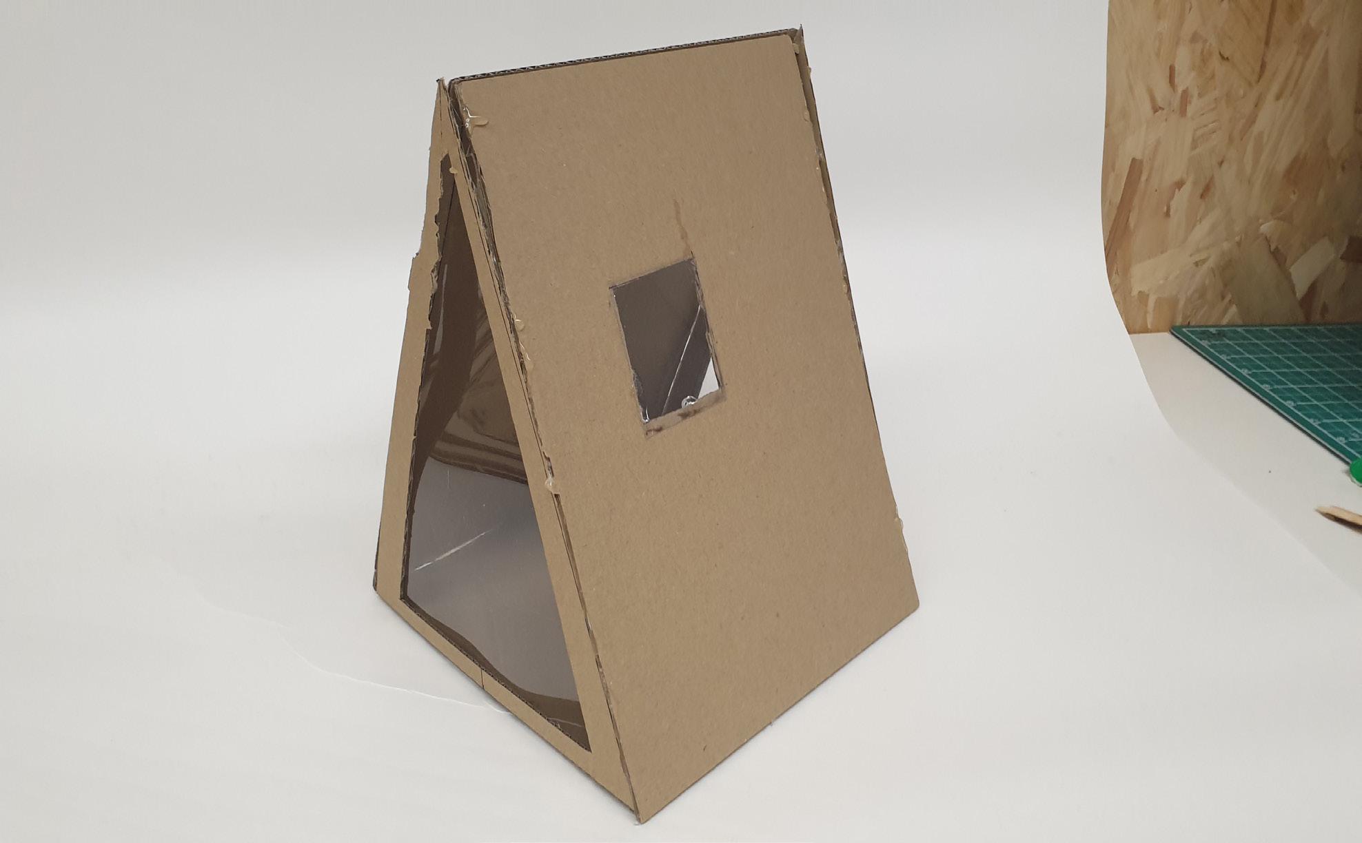
This model is different from the last 3 models. I wanted to make small pockets of space to show that small places can still allow light to shine through as well as big spaces. So, I made a base using the 3 biggest pieces as they were not going to allow me to achieve what I wanted if I placed them on top of the model. I placed the pieces in a shape so from whatever angle you look at the model, you will still see every small detail that I added.
9
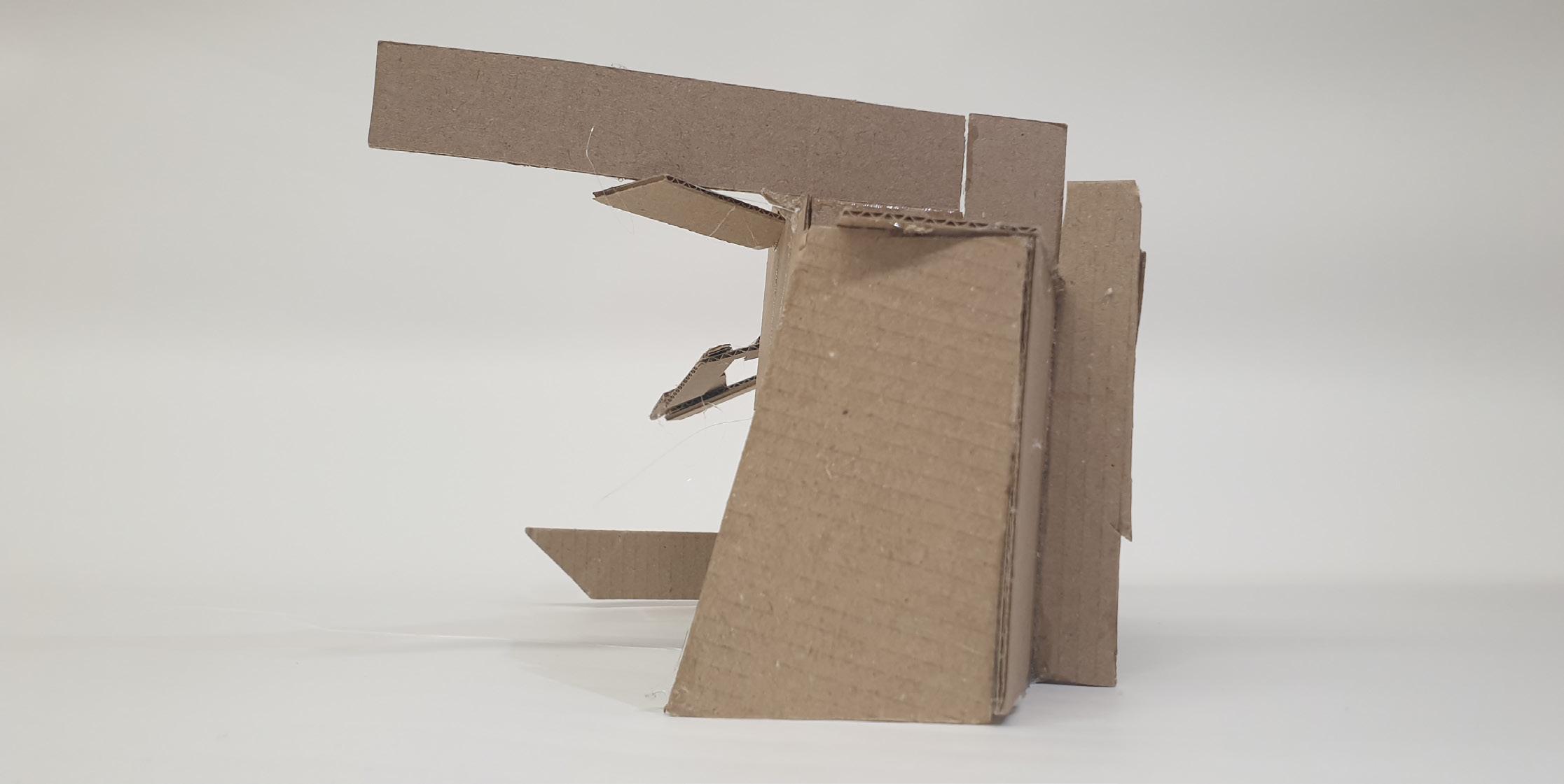
I liked how the triangles looked in my second model, so I reused them a lot in this model. So, I made small triangles to show tight spaces and how different shapes can affect the model.
Model 5 Photography 10 Back Top
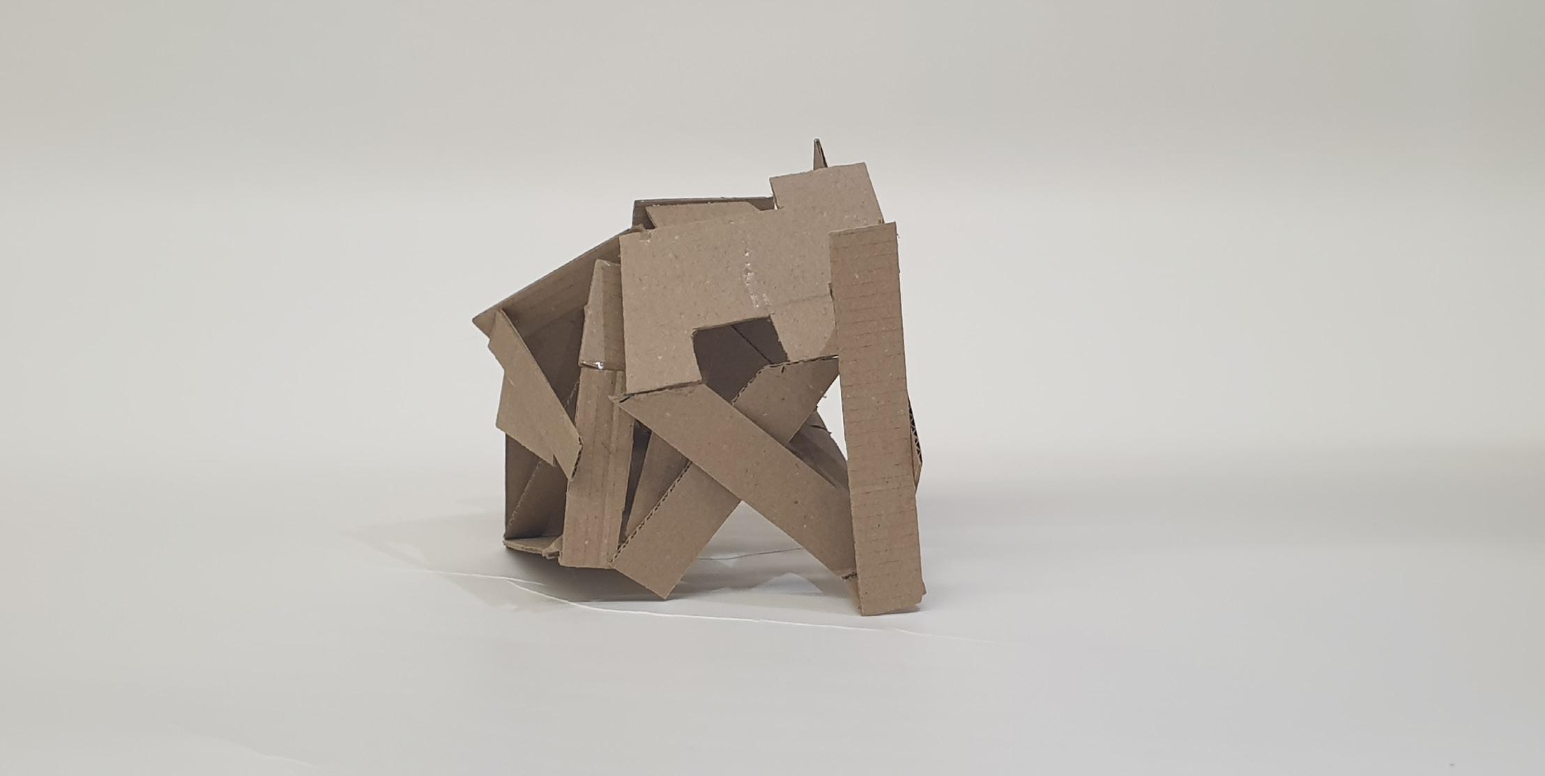
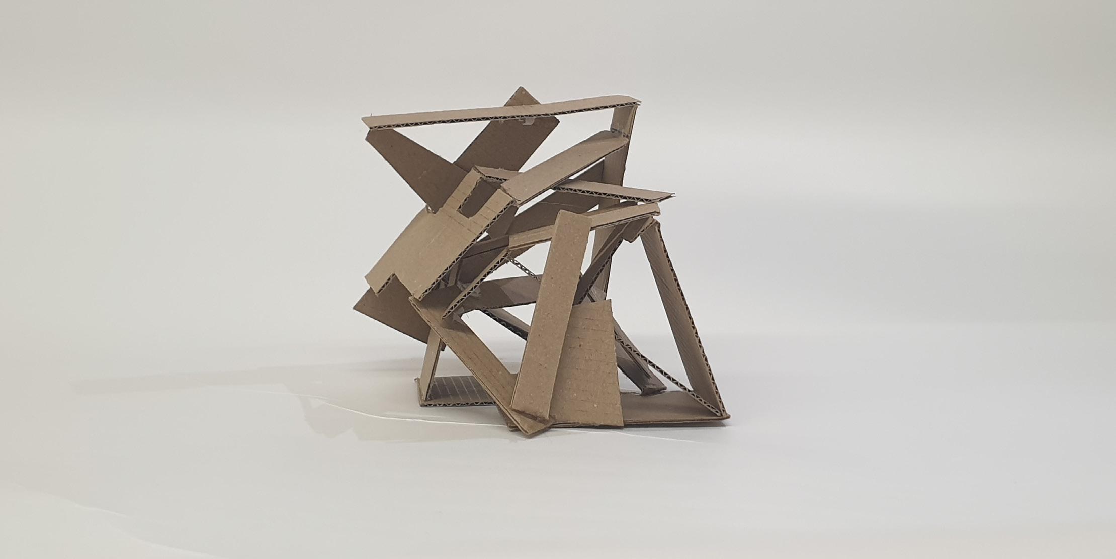
Right Left
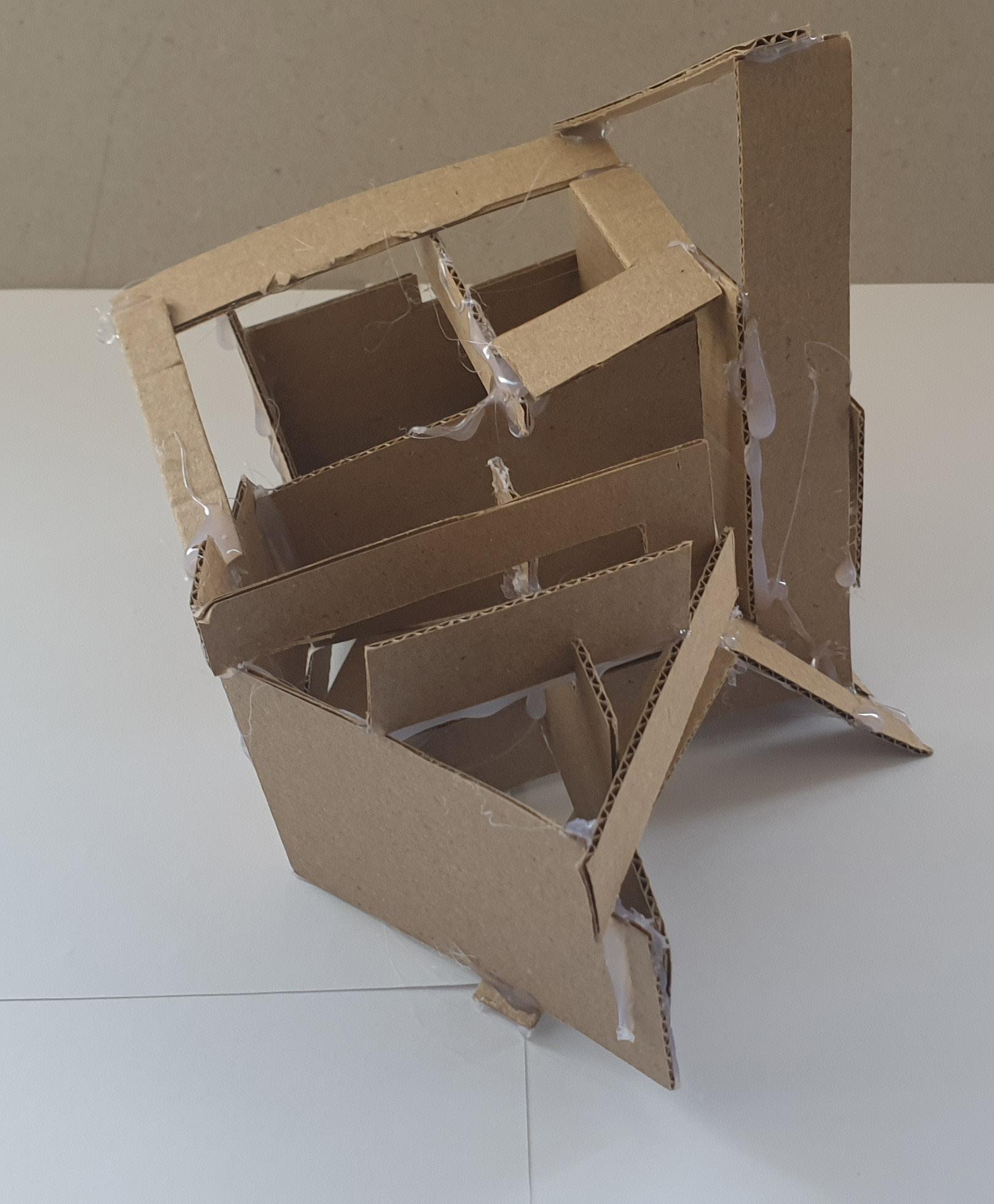
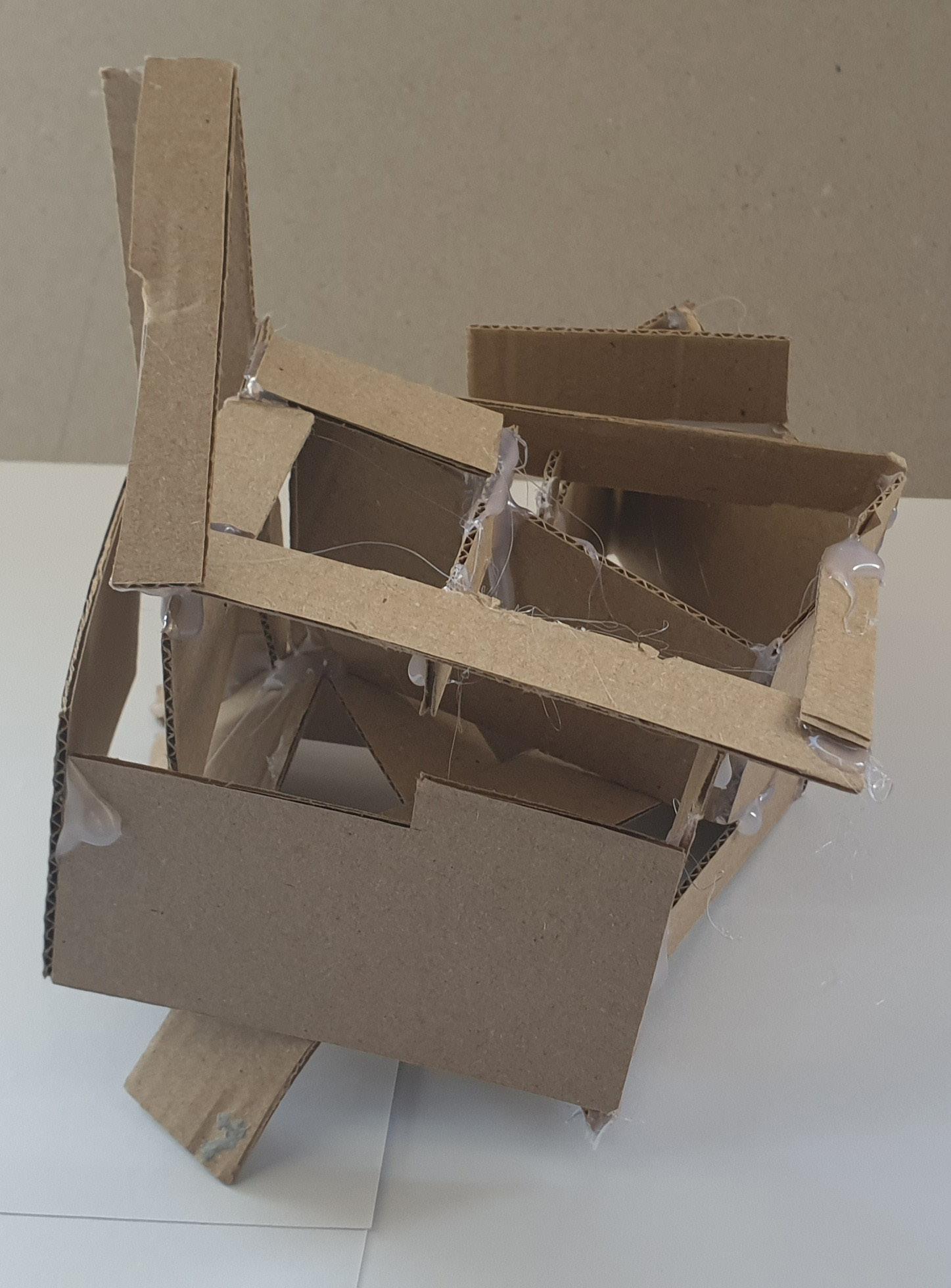
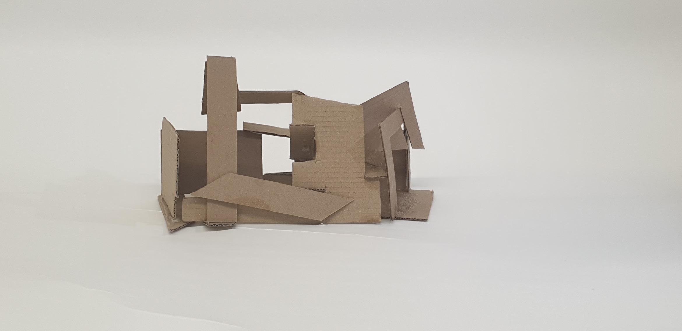
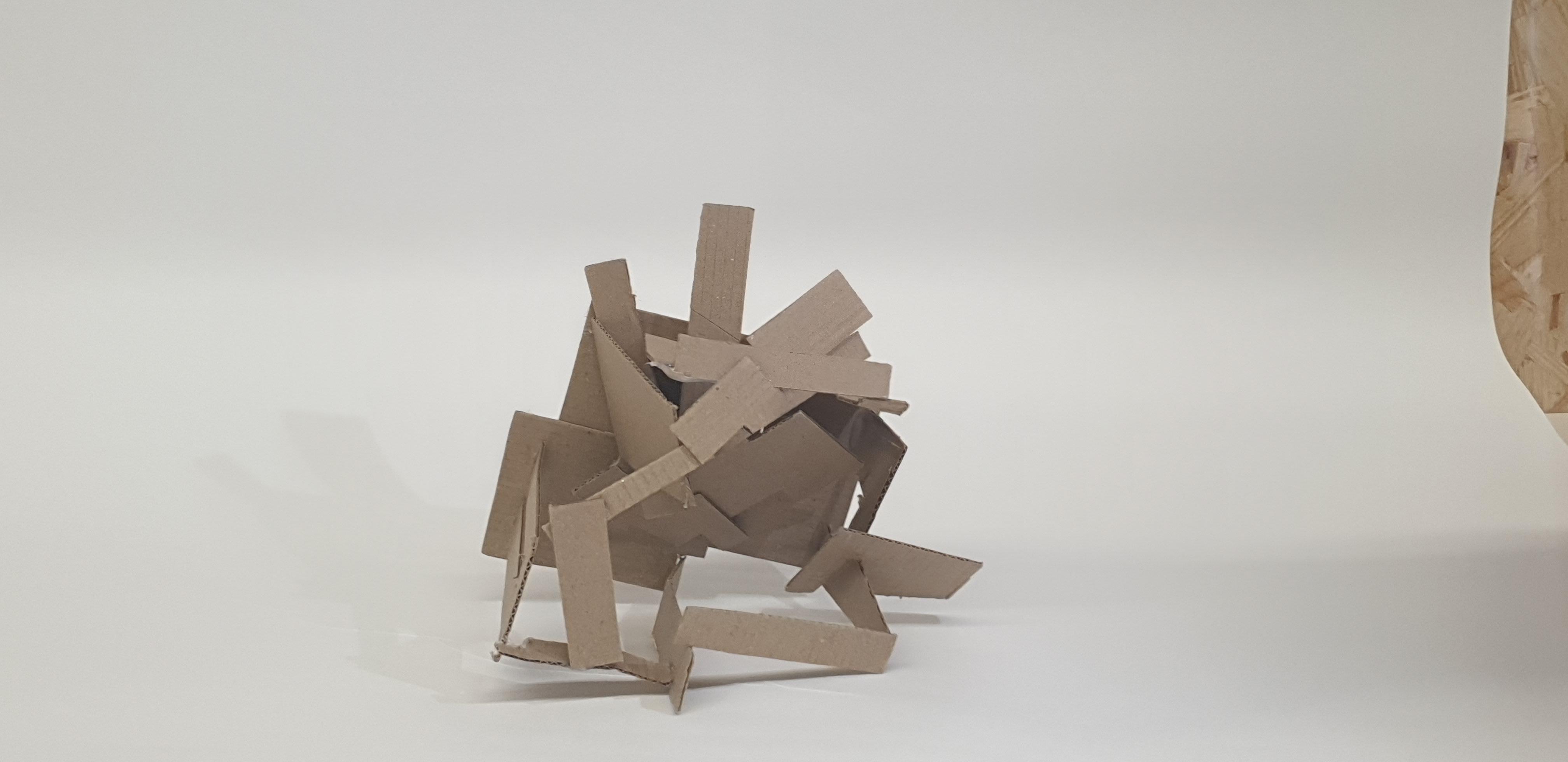
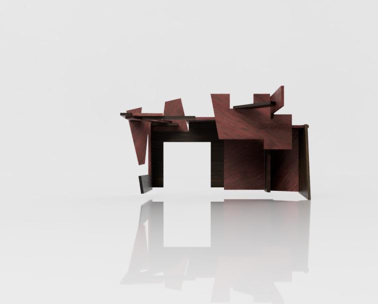
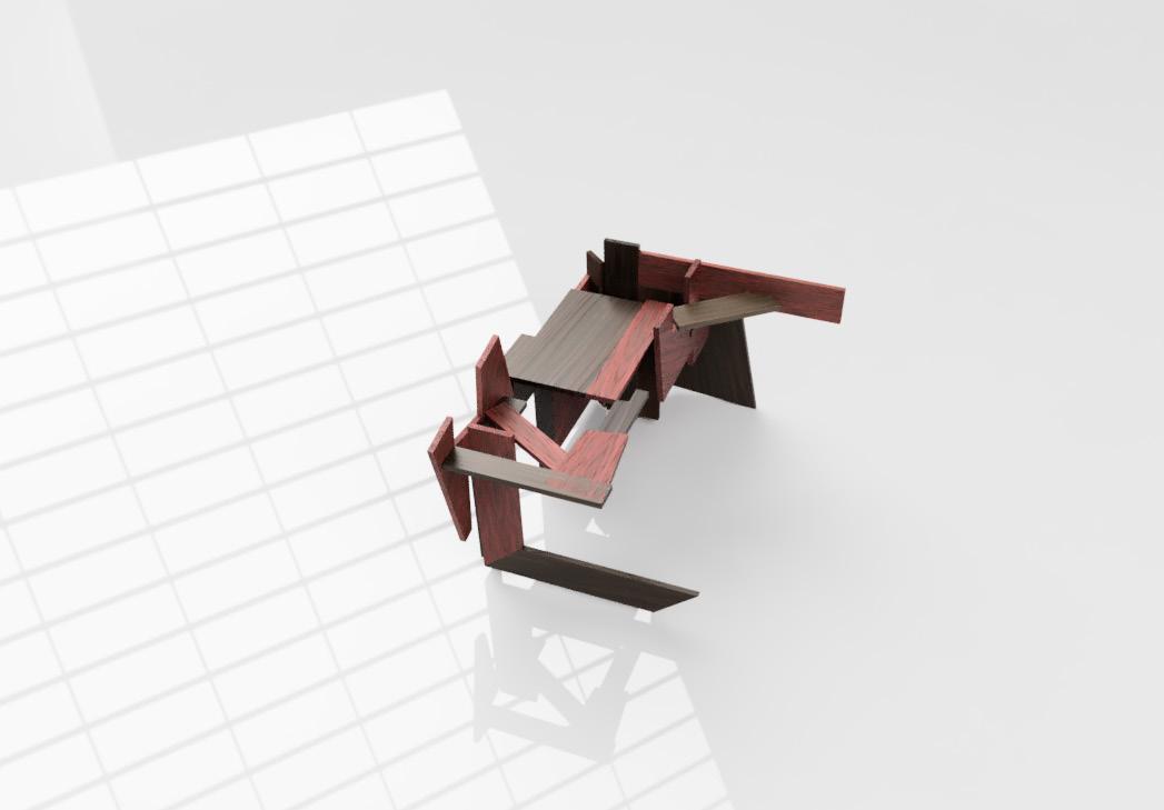
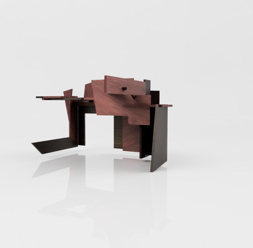
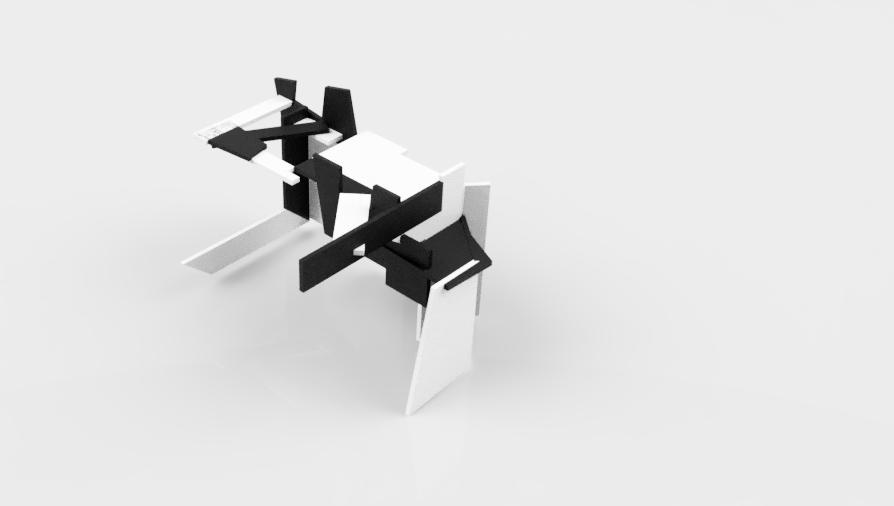
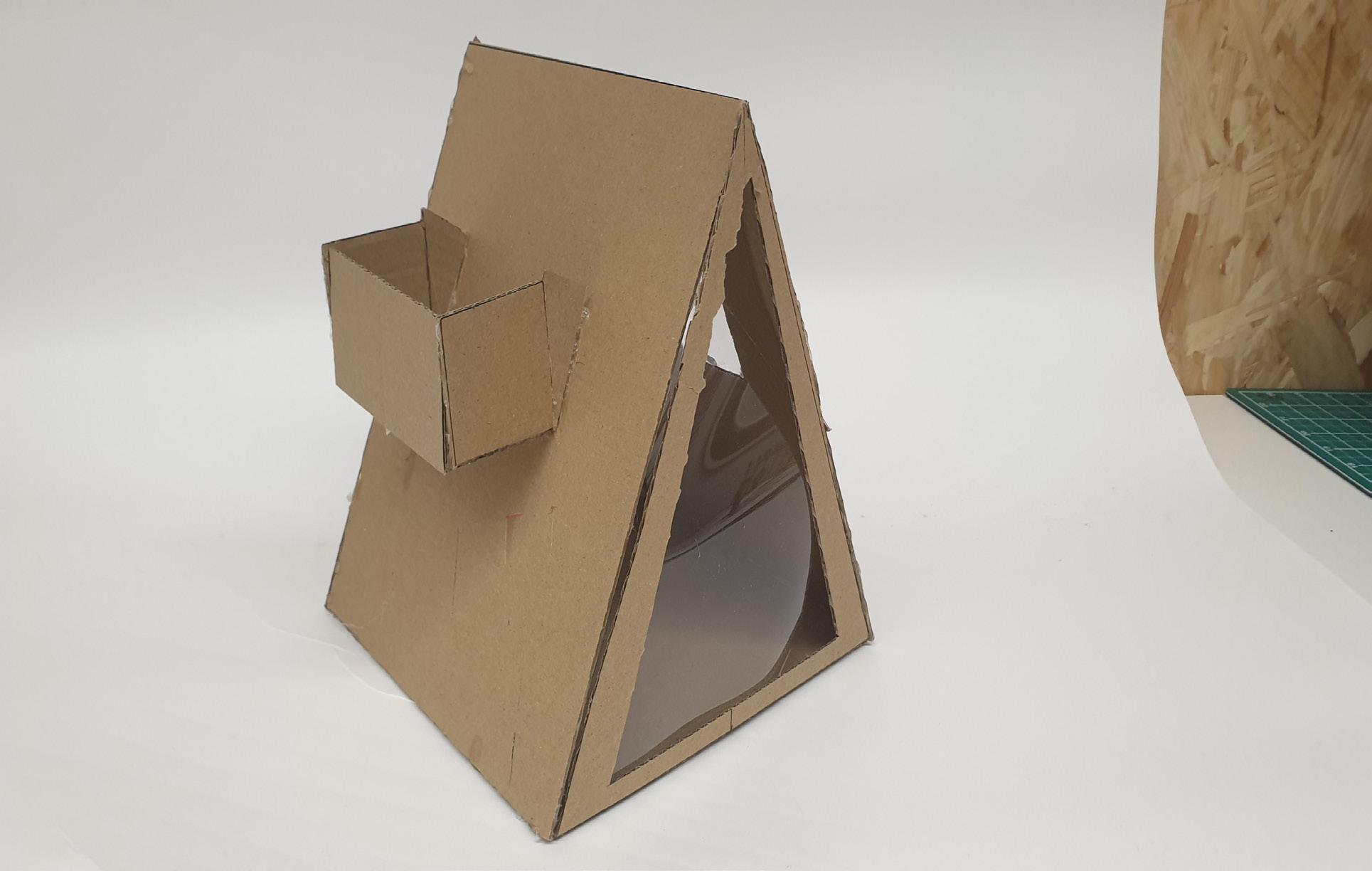
Considering this is my final model, I wanted it to have a bit of everything the other four models had. I wanted to show light and shadows in tight and big spaces and create a hierarchy in spaces.I liked how the triangles looked in my second model, so I reused them a lot in this model. So, I made small triangles to show tight spaces and how different shapes can affect the model. Because of the sharp edges on the outside, this model does not require a base and can stand in any direction.
11 Sketch
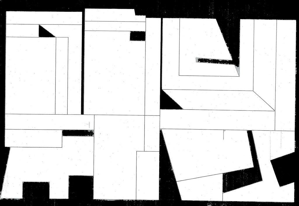
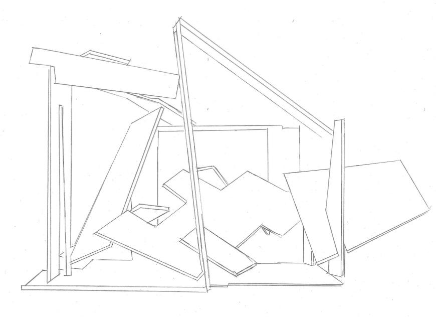
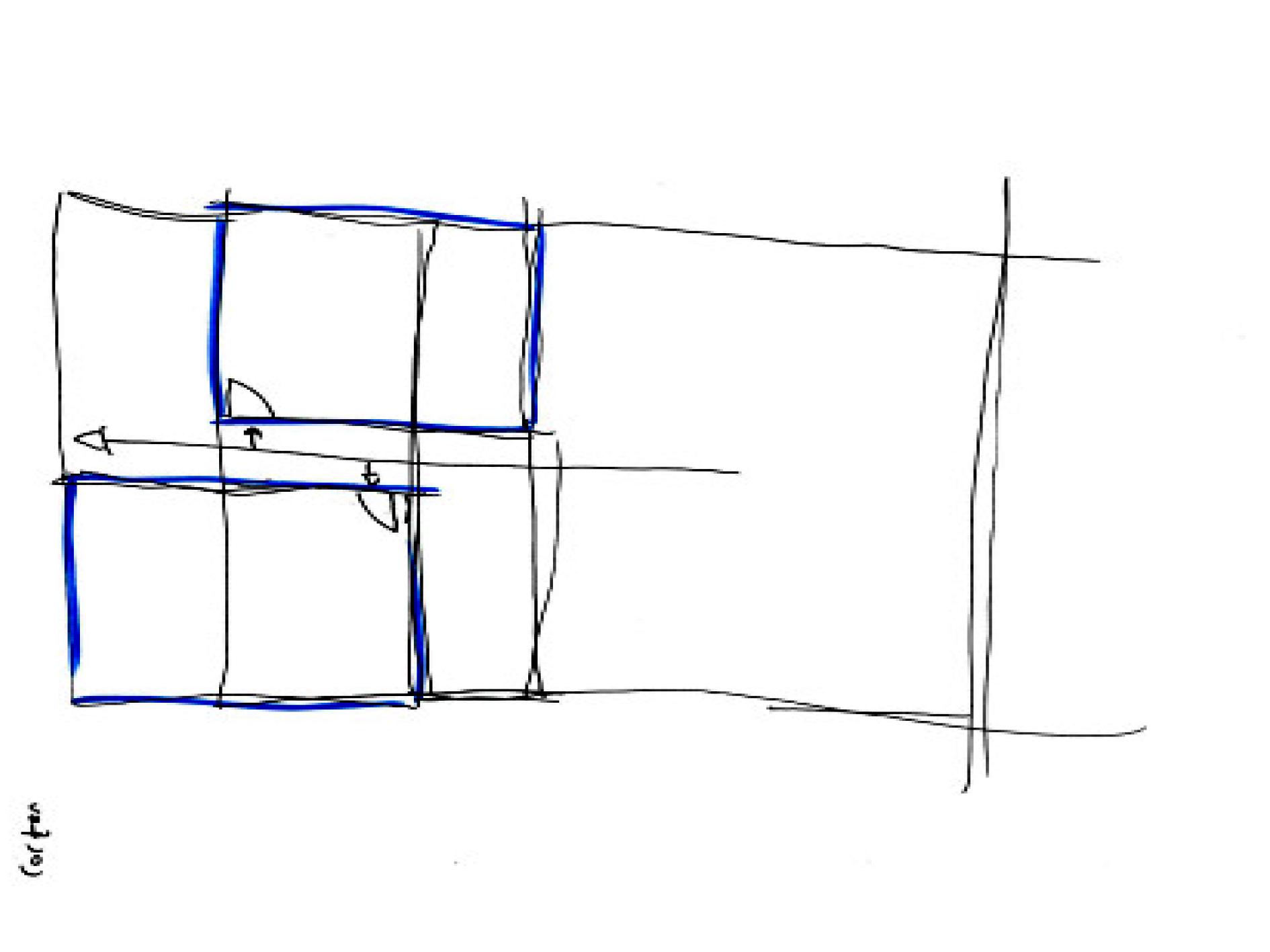
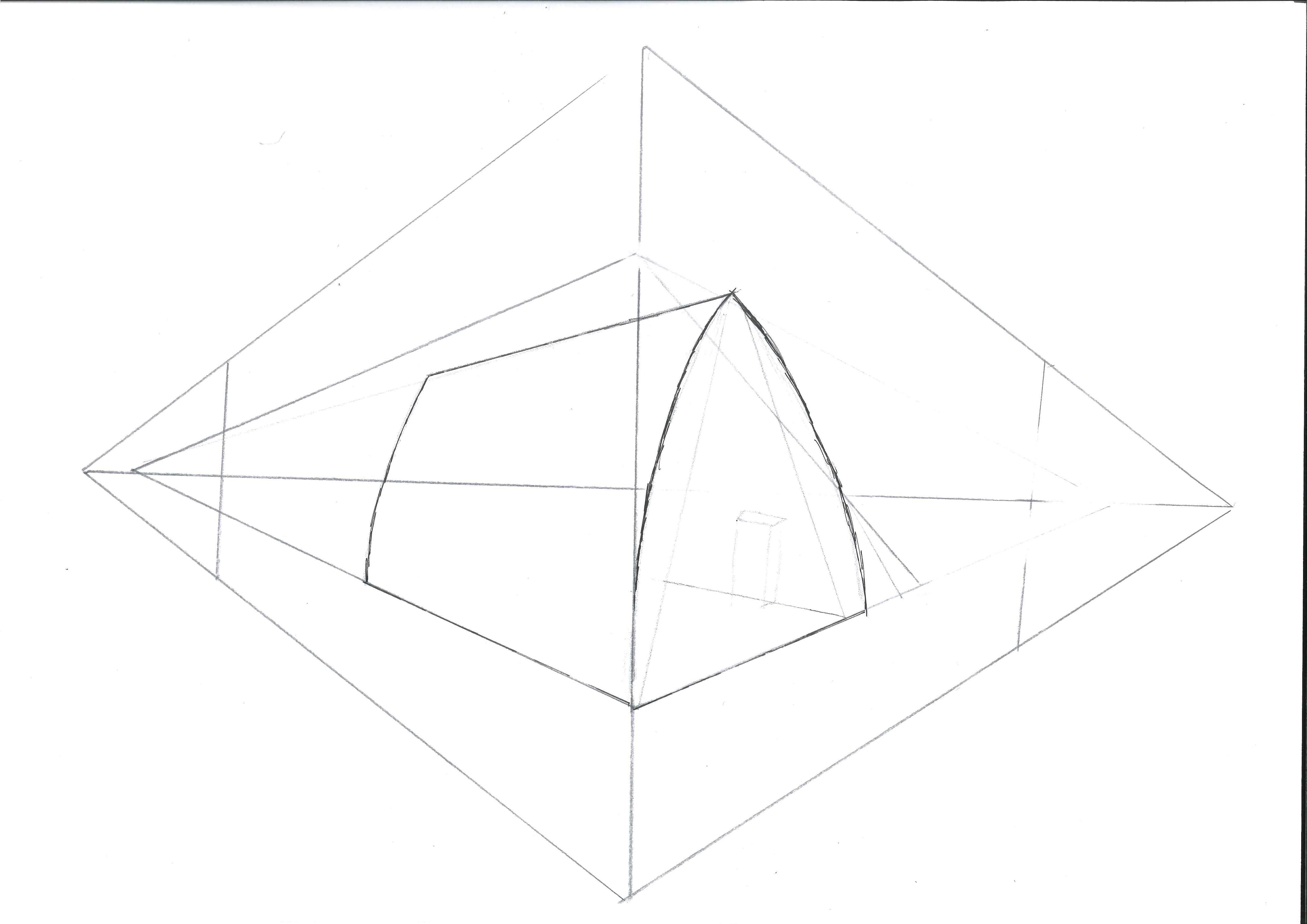
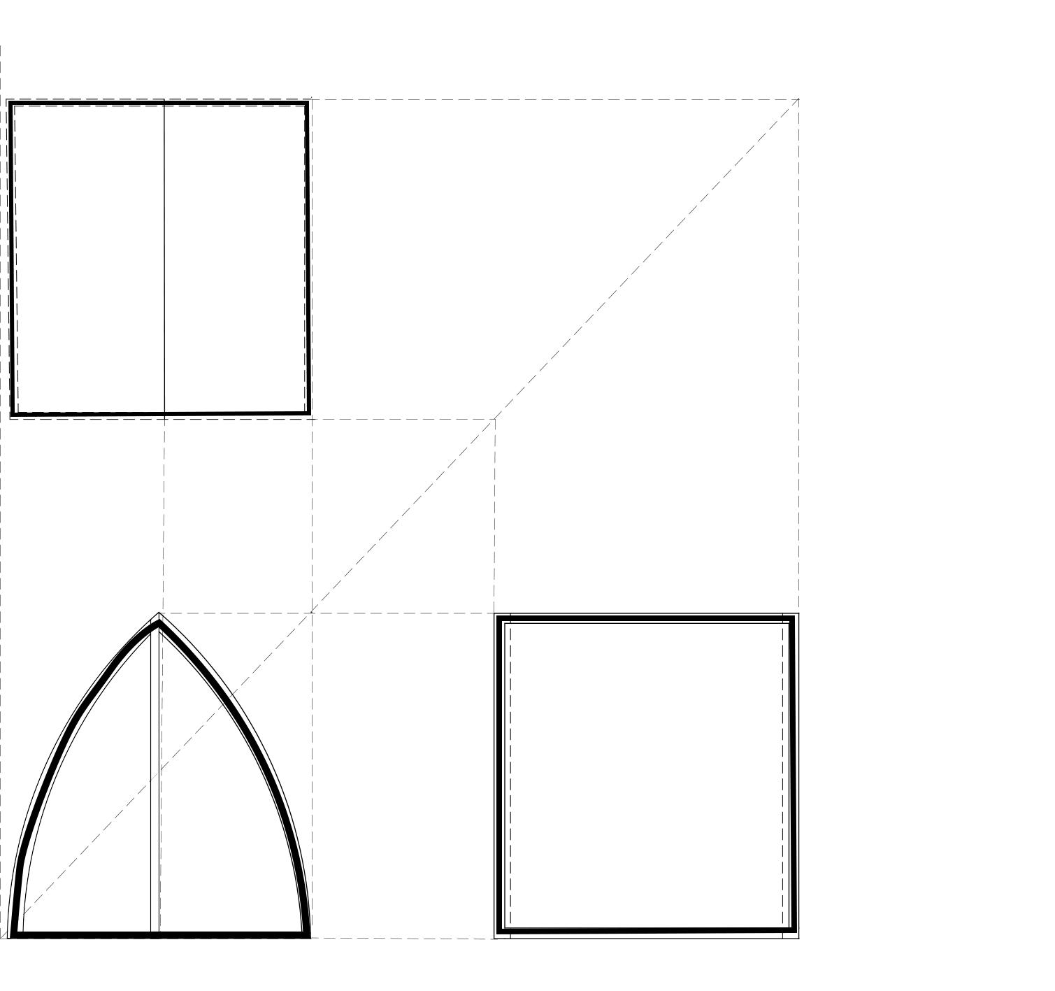
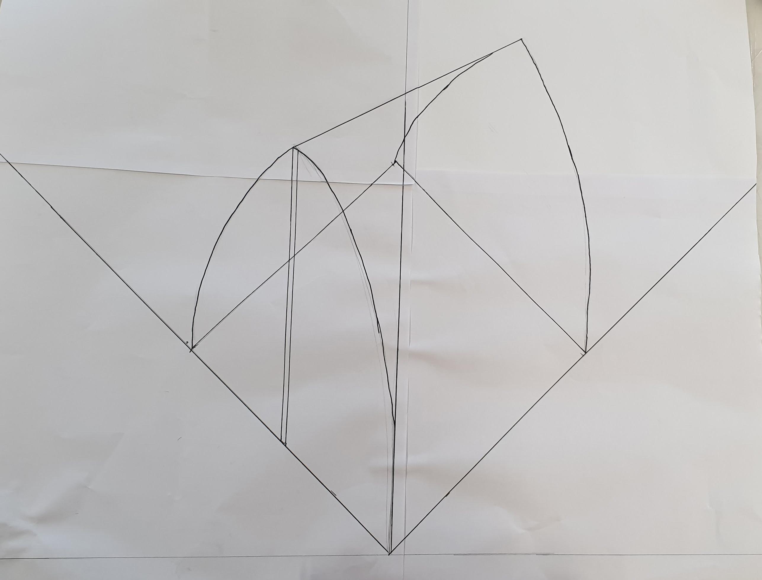
ORTHOGRAPHIC
DRAWINGS
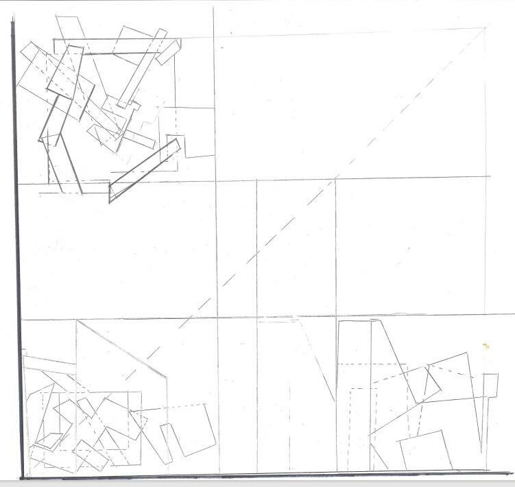
Orthographic Drawing 12
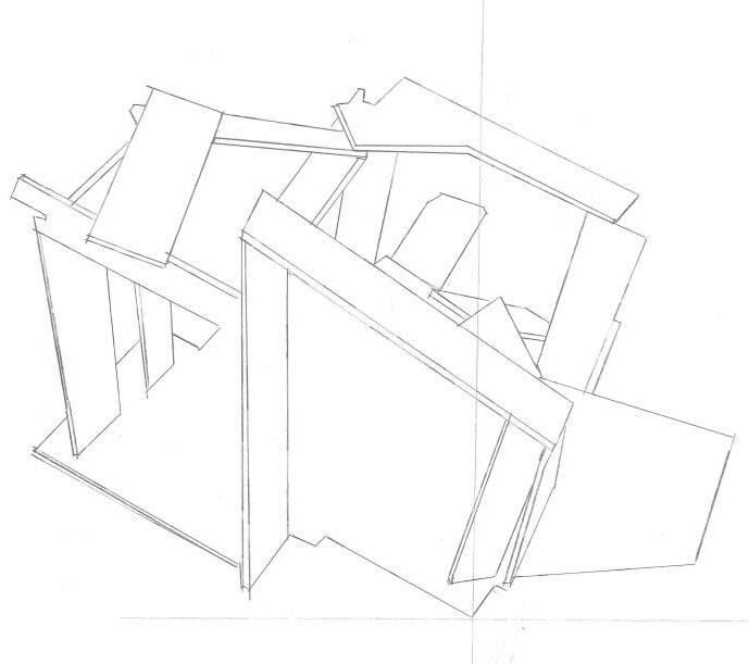
Axonometric Drawing 13
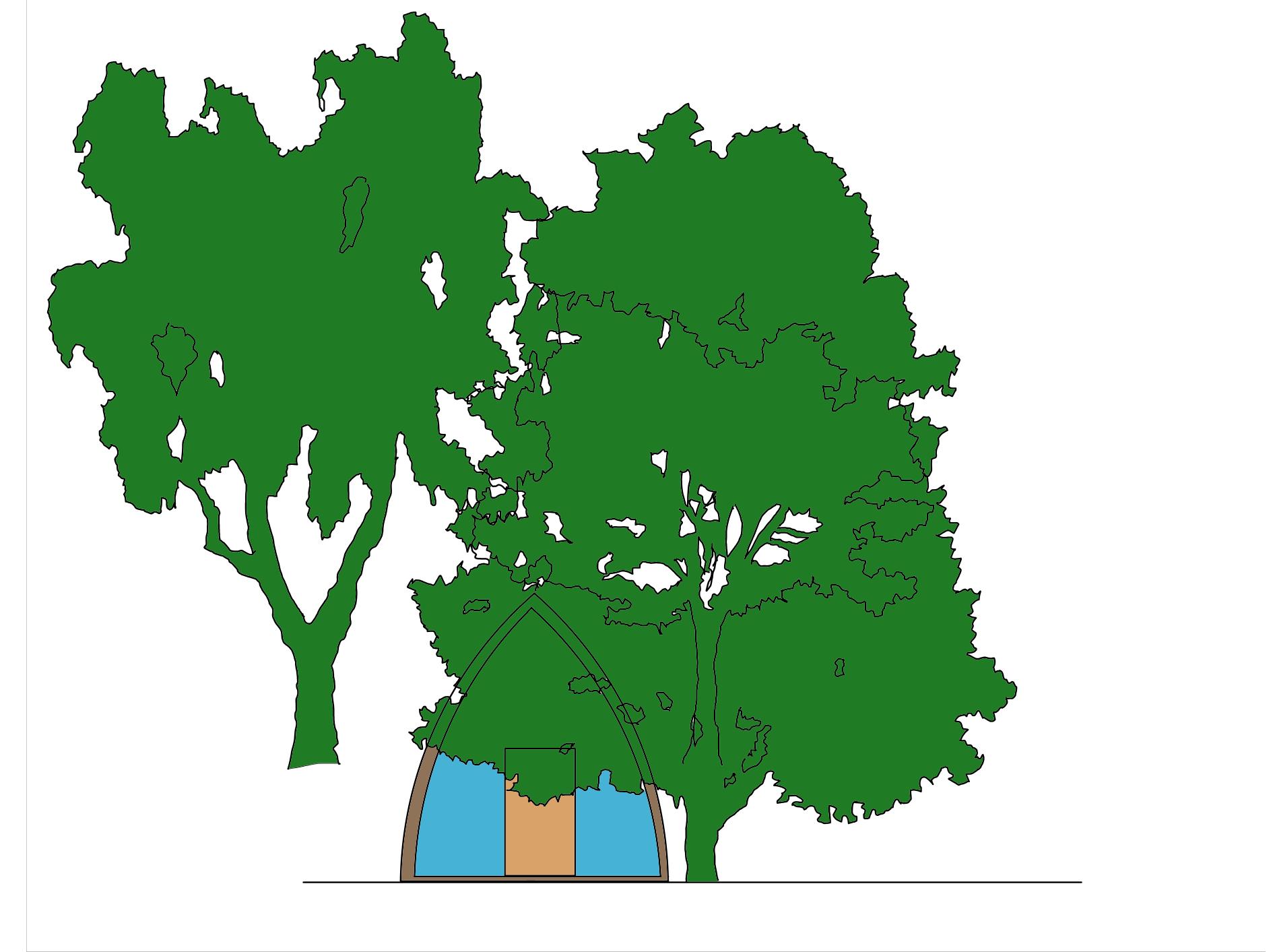
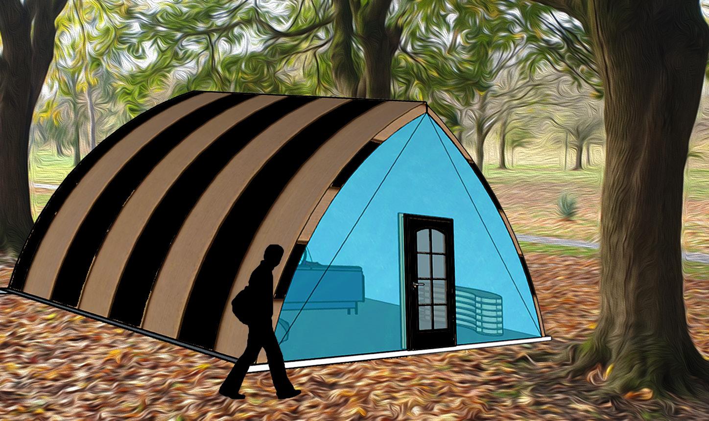
RENDERINGS
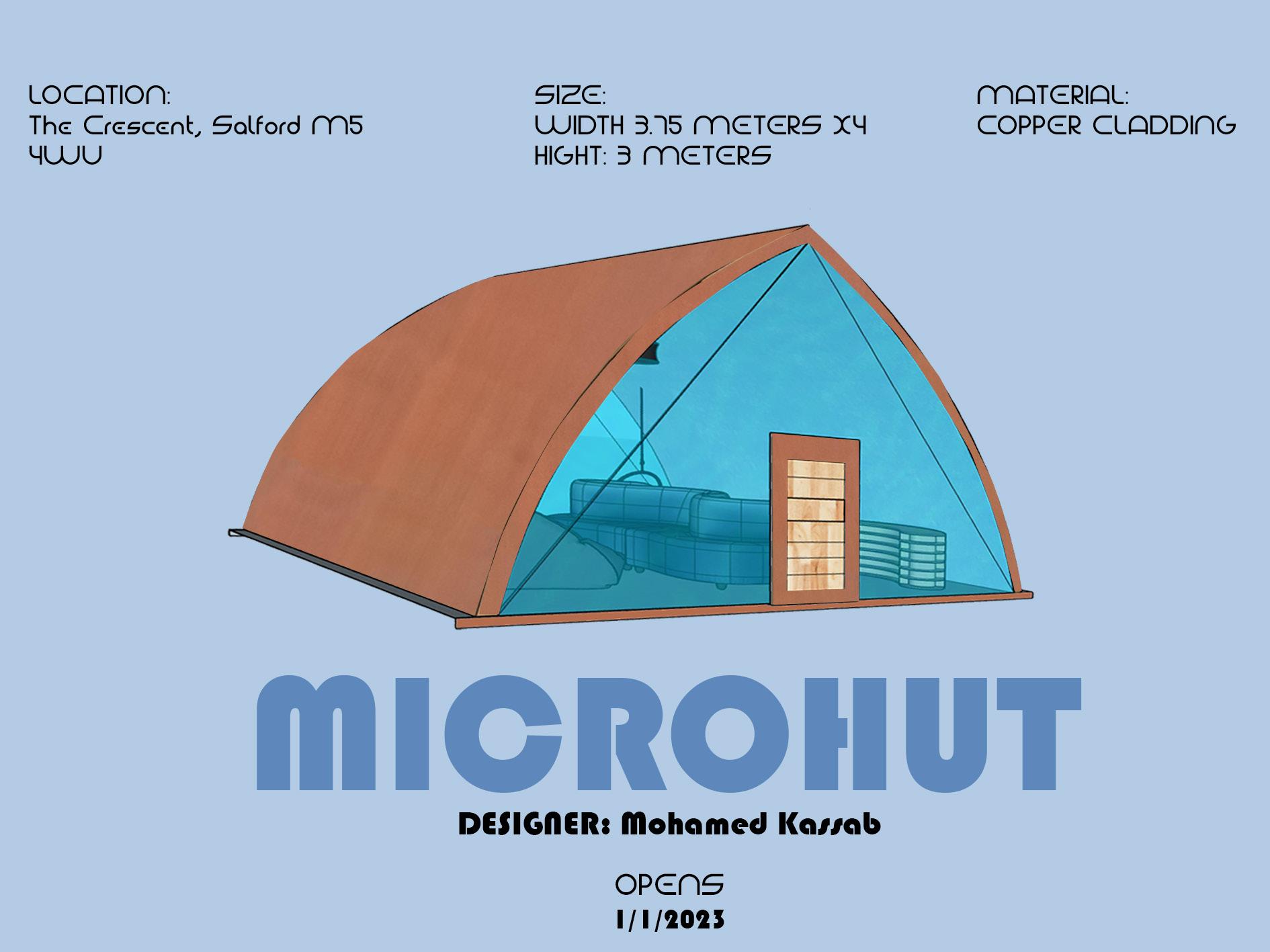
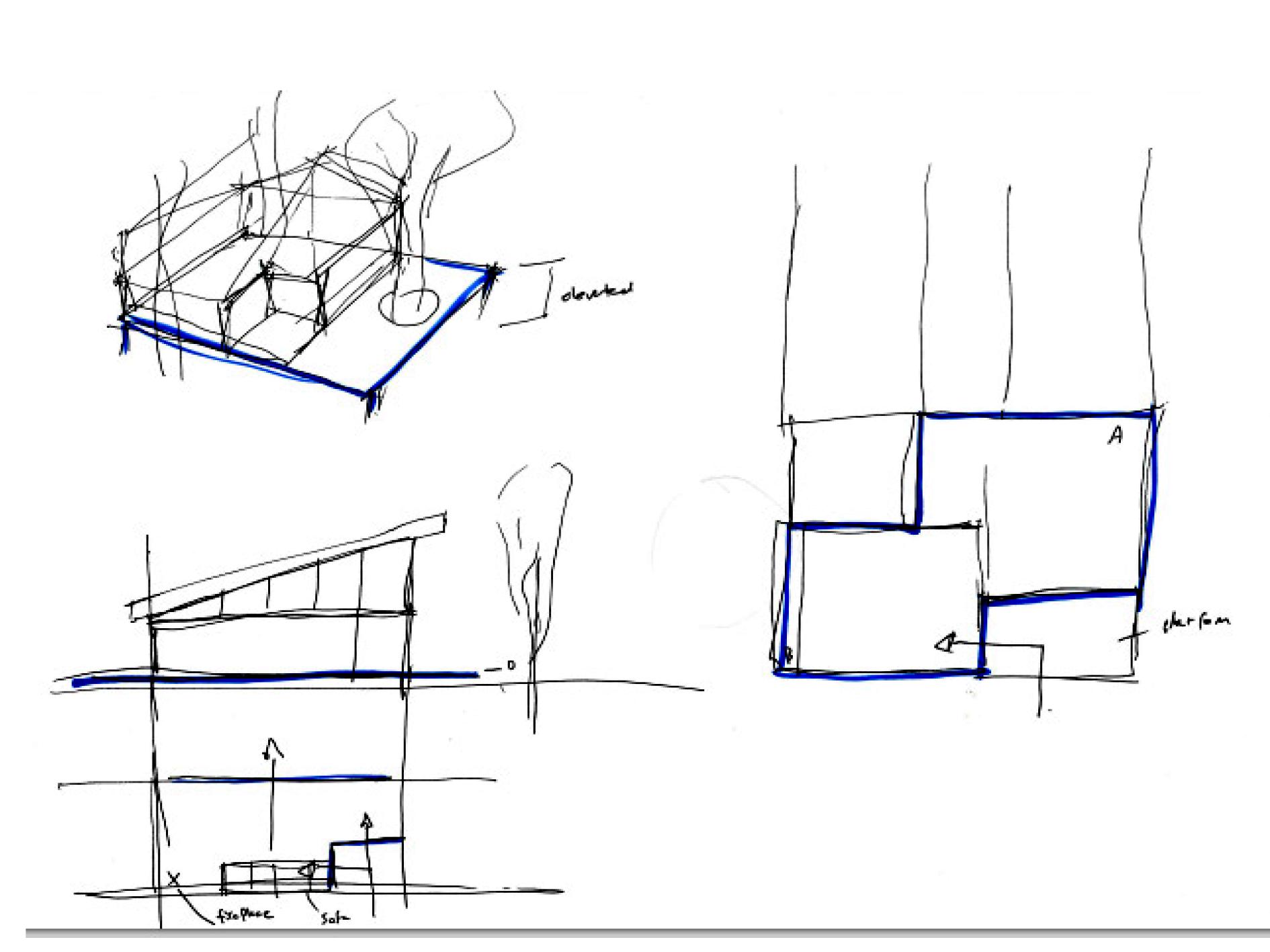
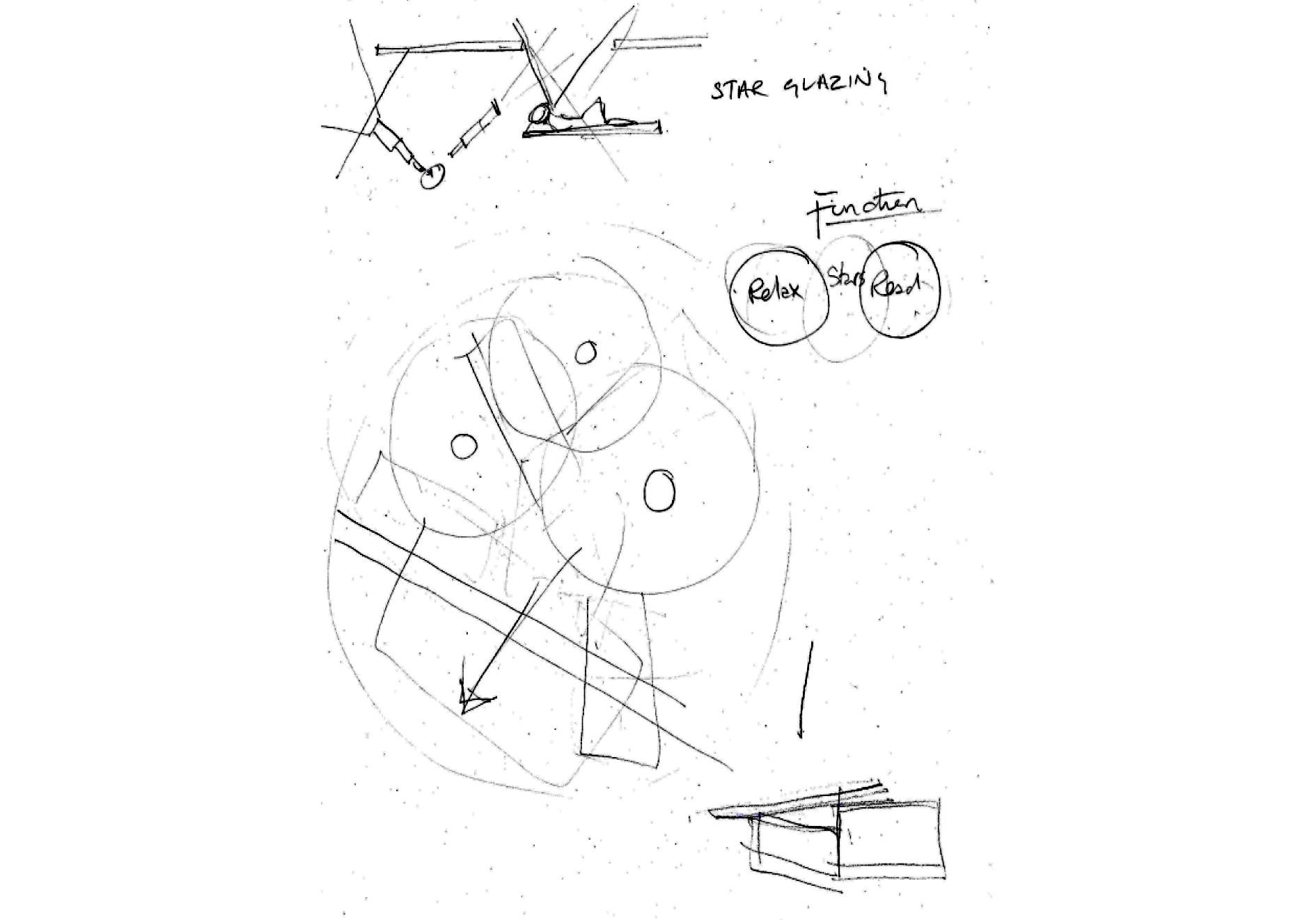
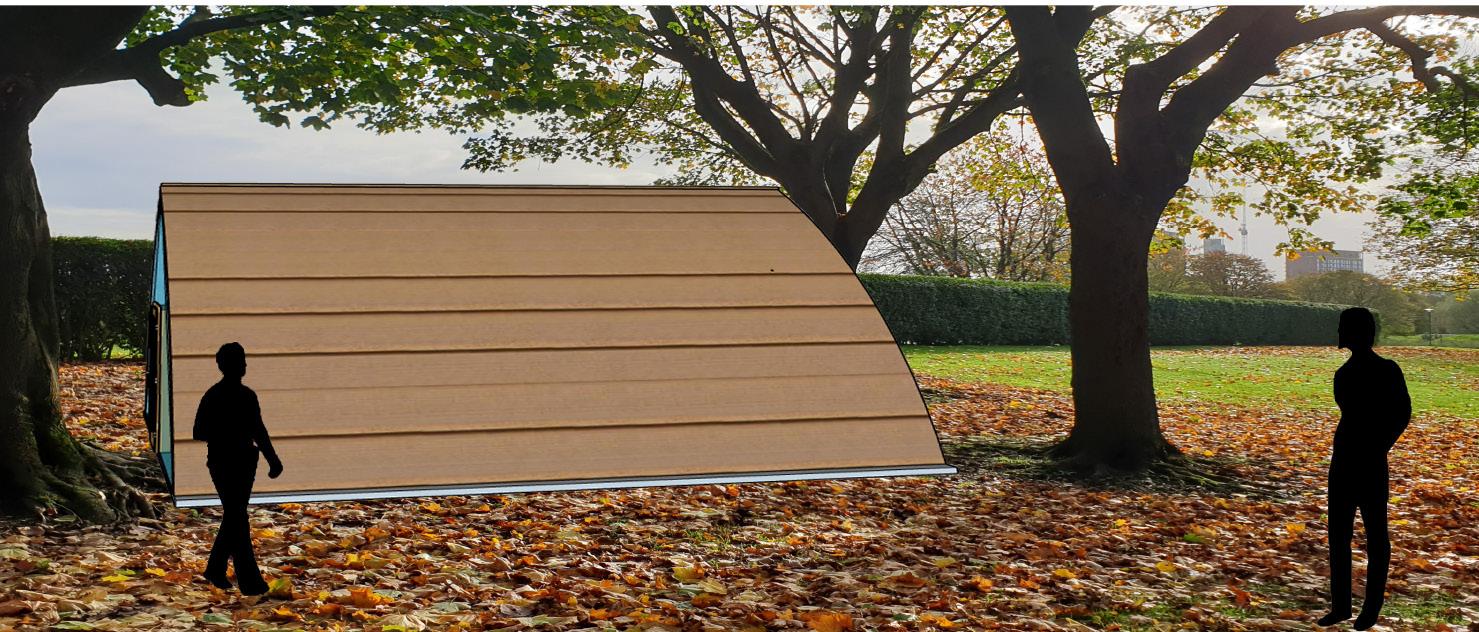
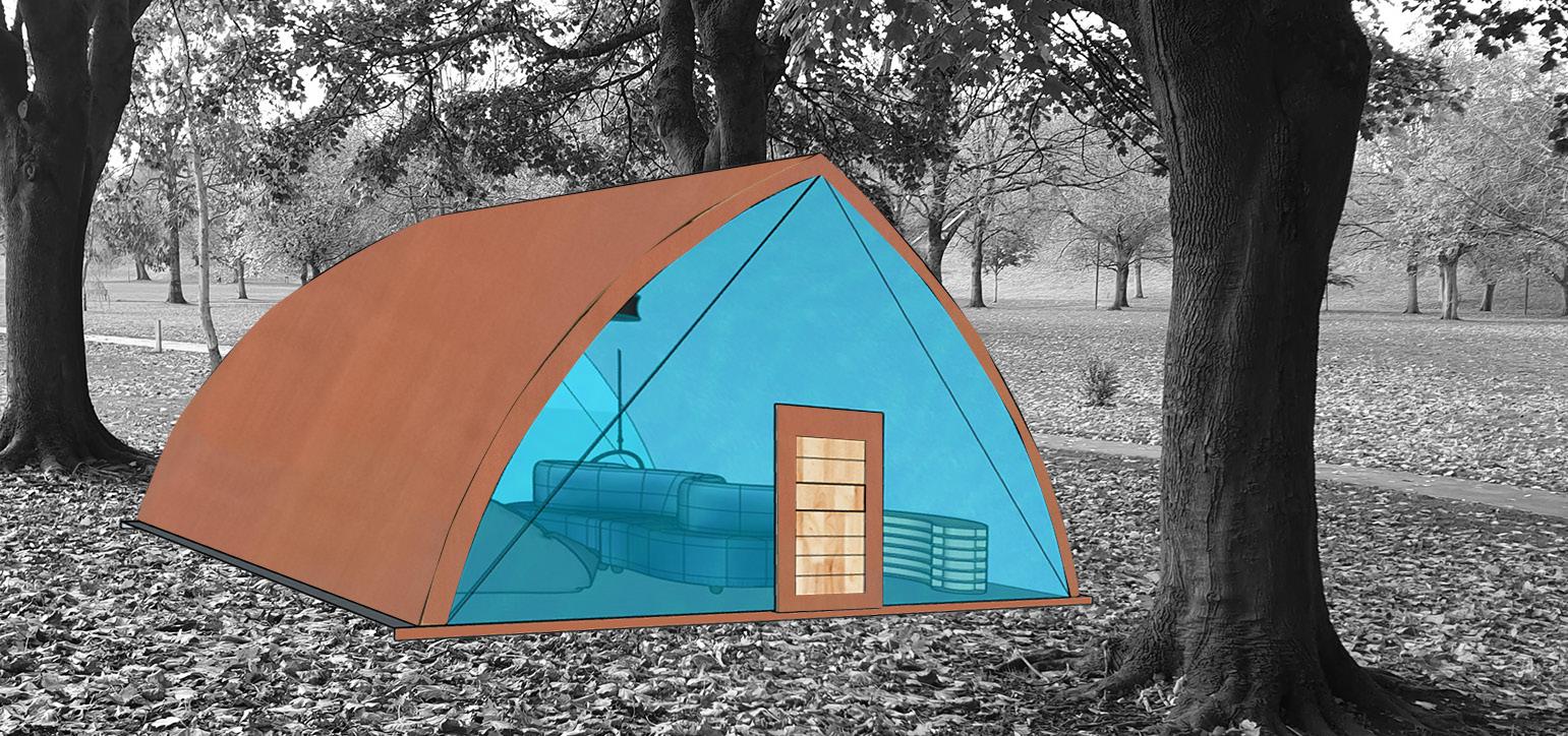
IDEA 1 floor 1 room Inside= silver and blue Outside=copper cladding/brown to blend in with the grass/ surroundings Inside Hammock sofas and cushions Bookshelf Beanbags copper cladding
READING PAINTING RELAXATION

USER EXPERIENCE
PRECEDENCE
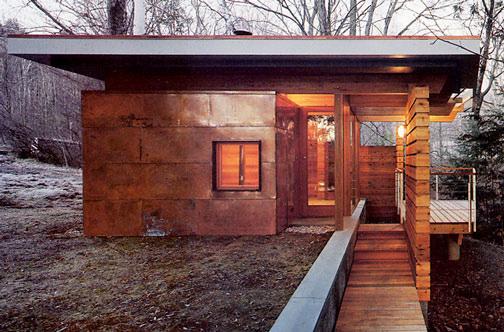
This structure uses its shape as the focus. When looked at from different angles it never looks the same. It uses irregular shapes to create that effect. Not all sides are equal. The material used to make it is Wood (Western Red Cedar). Because it’s set in a national park the architects wanted to make it blend in with nature, therefore, they used western cedar wood to allow that to happen. Using biomimicry works well and allows people visiting the park to enter the lodge and explore the inside.
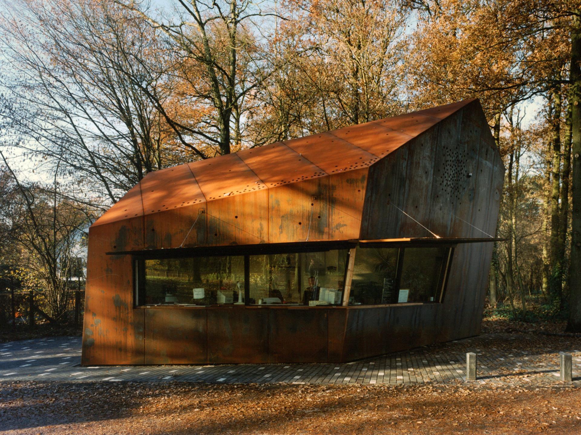
Park lodges MVRDV
Architect: Henry Van De Velde
With the roof being in this shape it allows rainwater to be stored without interfering with the main structure design. It’s also used to connect anything extra outside the original structure. The window blends in well as the window frame isn’t a different colour from the copper cladding. This extra structure is used as a view over the river.
This house design is inspired by a mountain cabin. The materials used to allow it to blend in with nature. It's made from copper cladding as it’s resistant to wind and rain. This material works for this house because it is located on the side of a river and makes it suitable for staying in. The blending in makes the house special as it has glass around it, but it still blends in well. This is because the lights inside the house are the same col our as the copper cladding.
The lights used are the same colour as the copper cladding which allows it to blend in with the surrounding.
Architect:
Sal Tranchina
The shape of this bridge is the focus of it. Most bridges have an open top, but this bridge is closed, and it doesn’t allow cars to cross it. It's made for pedestrians to cross it and explore the inside structure.
This bridge is designed over a thin river. Because of the shape of this bridge, it’s different compared to any other bridge. It used complexity and simplicity to show how a complex structure can fit in an open space. The colour used is important. As the national colour of China is red an architectural piece like this bridge must reflect the country its in. The gaps in the bridge allow sunlight to shine on the inside and show details that are hidden inside the bridge. The sharp and clean edges give the bridge a futuristic and efficient look.
The weight of the bridge is balanced out. So, when a load is applied it does knock off the bridge as the force travels throughout the bridge as there isn’t one part heavier than the other.
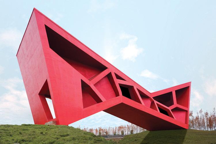
Bridging tea house Jinhua China Architect: Fernando Romero
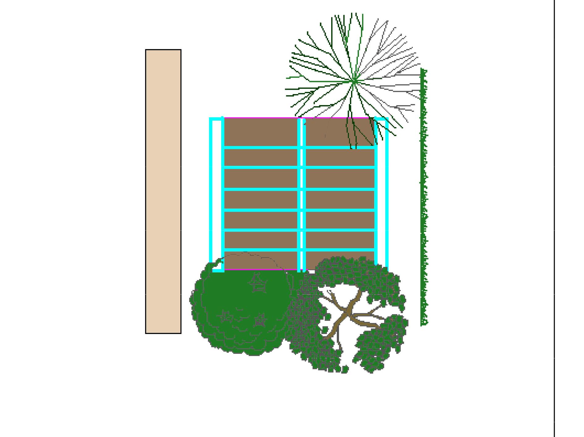
SITE ANALYSIS
2 1
100mm
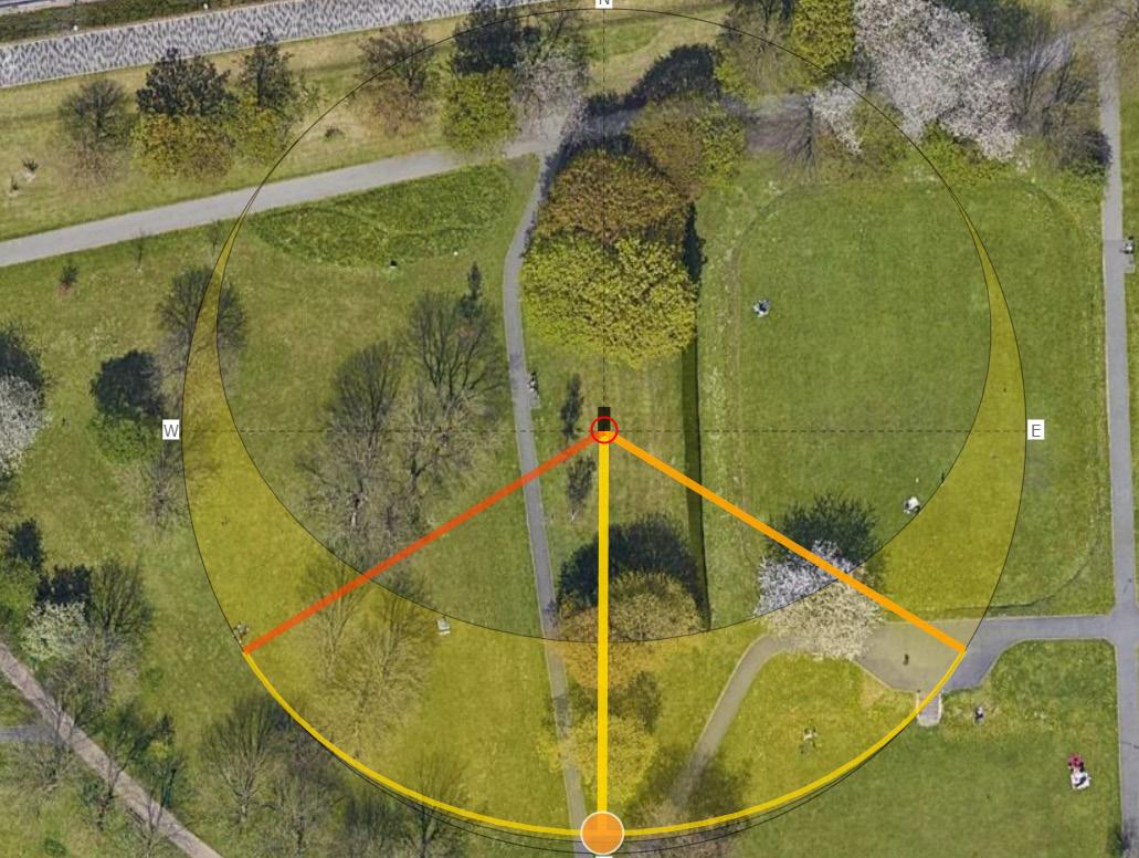
W E S
N
3.75 METERS 3.75 METERS 3 METERS
MODELS
MODEL 1
MODEL 2
MODEL 3
MODEL 4
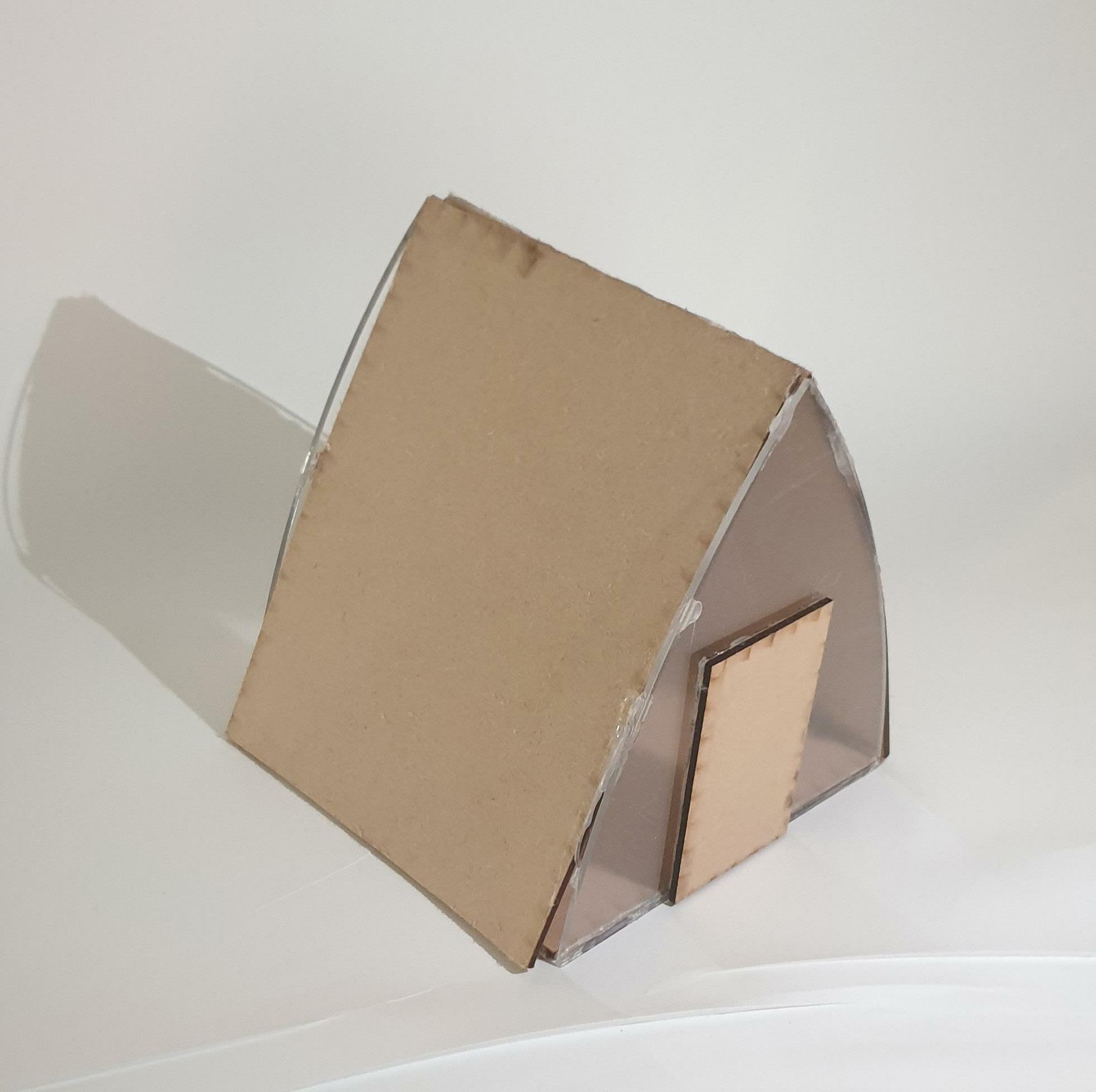
so for the models, I wanted to make 5 to help me with my design. I wanted the first 3 to guide me with my idea development and the final 2 to be my main design. After I focused on one design I laser cut it to show the 2 sides of the glass in my micro studio.
MODEL 5
SKETCHES
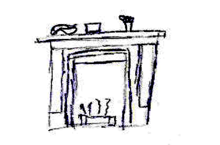
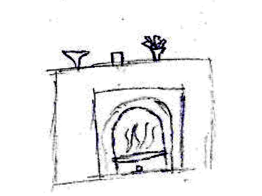
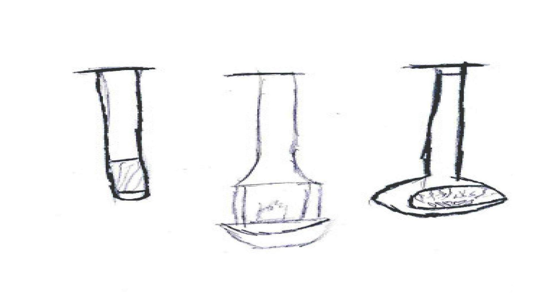
FIREPLACES HANGING FIREPLACES
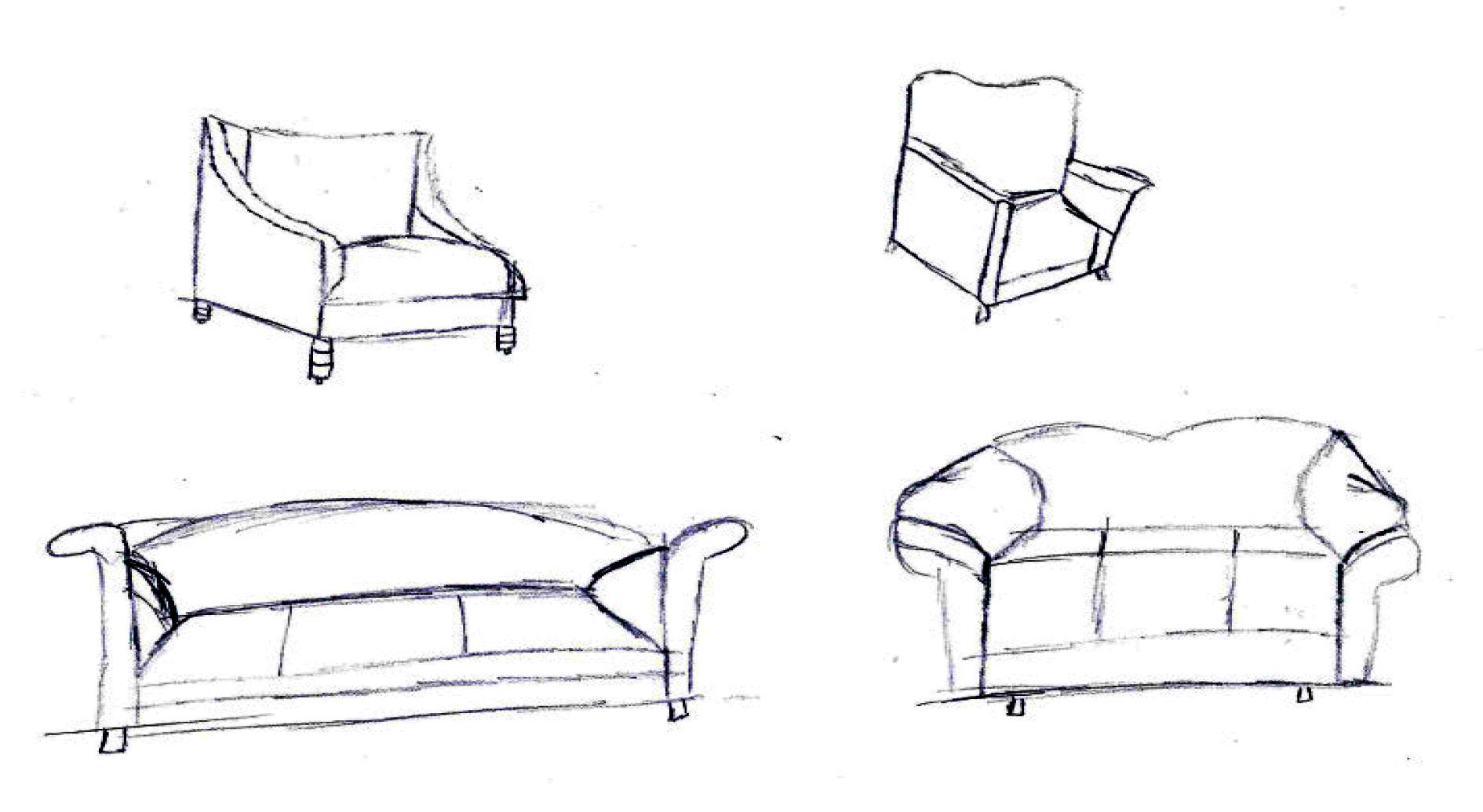
SOFAS AND CHAIRS
ORTHOGRAPHIC
DRAWINGS
PERSPECTIVE DRAWING
FRONT VIEW CAD
CAD DRAWING
FRONT SIDE
TOP
AXONOMETRIC DRAWING
SECTION DRAWING
ROOF PLAN
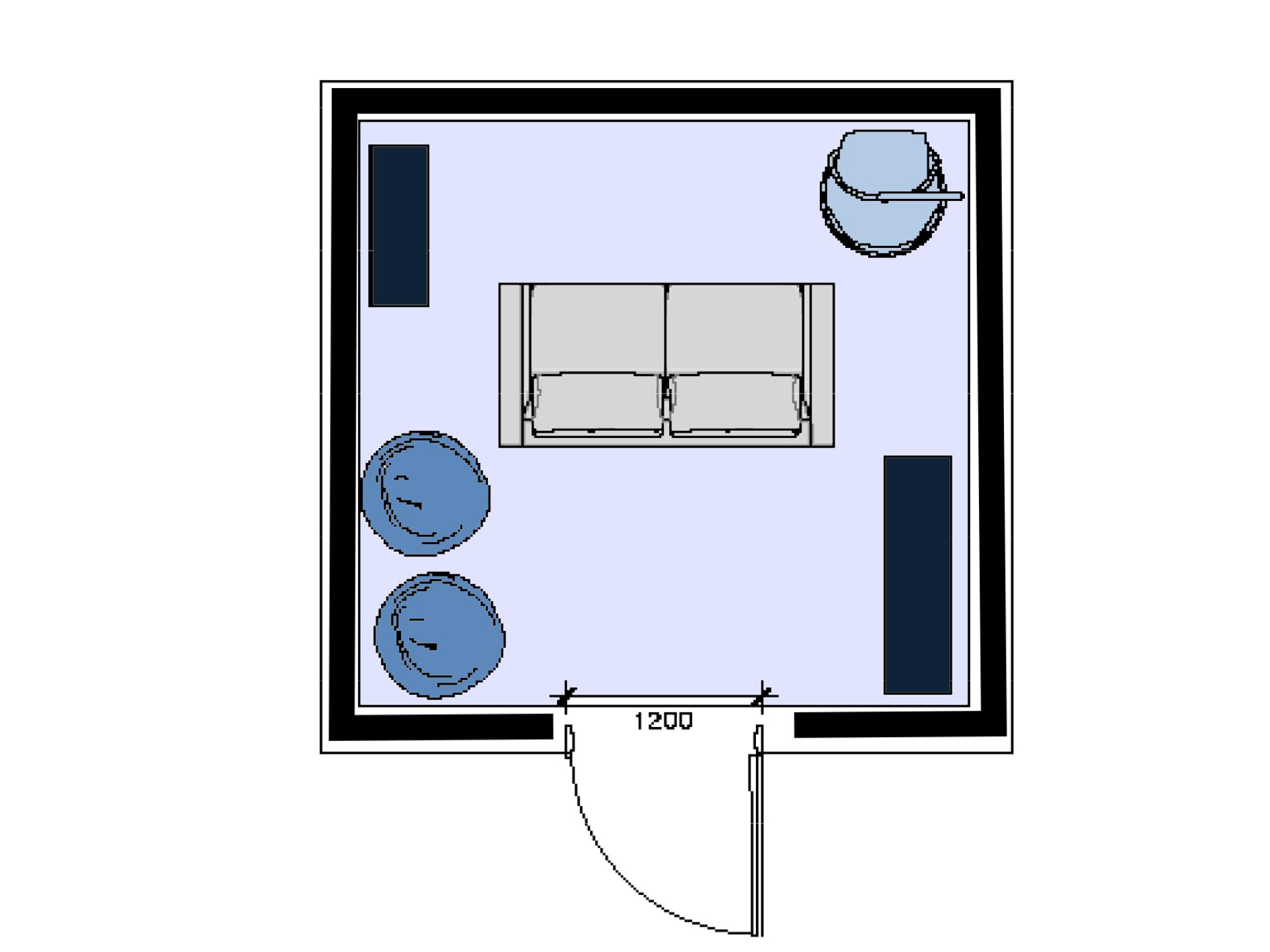
FLOOR PLAN
PHOTOSHOP
SKETCHUP
Thank You