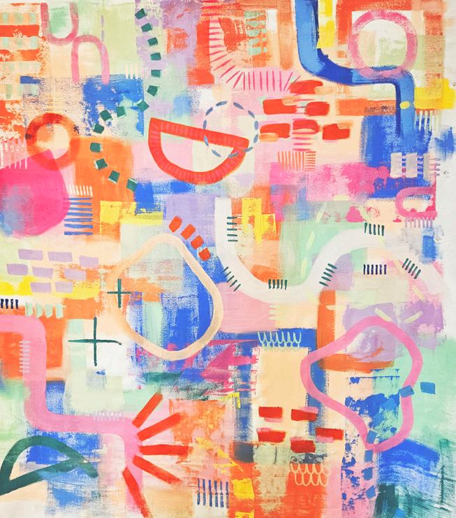
unbounded 2023
VCE VISUAL ART AND PRODUCT DESIGN & TECHNOLOGY EXHIBITION


unbounded 2023
VCE VISUAL ART AND PRODUCT DESIGN & TECHNOLOGY EXHIBITION
We would like to acknowledge and extend our appreciation to the Wadawurrung People, the Traditional Owners of the land on which Loreto College Ballarat stands and where the VCE Exhibition takes place. We pay our respects to leaders and Elders past, present and emerging for they hold the memories, the traditions, the culture and the hopes of all Wadawurrung People.
The 2023 Unit 3 & 4 Art Creative Practice, Visual Communication Design and Product Design Technology students have shown incredible resilience and creativity this year. They have moved through the traumas of last year and of previous Covid lockdowns to become unbounded. There is a strong sense of leaving tired and well-maintained ideas to testing and considering new levels of optimism. Learning through life is limitless.
As educators we have felt a determination to research concepts, experiment with mediums, seek technical methods and processes, and form new ideas. This exhibition of paintings, printmaking, drawing, photography, ceramics, installations, product and environmental designs, mixed media artworks and textile garments is evidence of a range of diverse ideas, interests, and skills of students at Loreto College Ballarat. We are proud of their achievements and wish them all the best in their future endeavours.
As an Arts Faculty, we would like to thank our newly appointed Art Technician - Carly Pitts, the Marketing team - Narelle Mulrooney and Jayde Harrington, Performing Arts OfficerSamantha Marks, former Loreto College staff member - Janine Ronaldson and photographer - Robert Lean. I would like to thank the Visual Arts and Product Design & Technology staff Ms Alex Davison, Mrs Esta Anderson, Ms Rachel Myers, Ms Erin Shortal, Mrs Tracey Lean and former Arts Faculty Coordinator Ms Stephanie Greet for their energy and enthusiasm, commitment, and professionalism. We would also like to acknowledge the generous support of Frankie & Co Clothing.
Thank you to all the parents, teachers, Year Level coordinators and Leadership Team of the class of 2023 who have supported and championed this creative cohort. We hope you enjoy unbounded 2023, VCE Visual Art and Product Design Technology Exhibition.
Ms. Julia West
Faculty Coordinator: The Arts

Connection and heartbreak have been the focus of my work this year. I have drawn on personal experiences that have helped to shape the subject matter of my works. My aim was to portray the feeling of warmth and comfort during a time of great difficulty. The use of delicate printmaking juxtaposed with heavy steel helps to echo the theme of heartbreak and connection.
My artworks explore the idea of fantasising about places that I would rather be. I focused on the concept of daydreaming about both holidays and luxury items that seem so out of reach at the moment - these things have helped to keep me hopeful during stressful moments whilst studying VCE. I have created my artworks with a mix of materials and applications which include acrylic paint, gouache, collage and printmaking techniques. When viewing the artworks I hope that the audience can be transported to a more desirable place.
My aim was to portray the feeling of warmth and comfort during a time of great difficulty.


My artwork focuses on the fluctuating nature of mental health throughout the human lifespan. I chose to represent this idea through a series of ceramic brains that contain exaggerated features to convey periods of bad mental health, as well as stages of good mental health throughout an individual’s life.

My piece focuses on the ambiguity of nature in the absence of humanity. The ability that nature has to allude to its history and the impact that human life has had on the self sufficiency of an environment. I aim for my audience to feel a sense of intrigue and intimidation by the vastness of the landscape. Using realism and impressionism inspired techniques, I have used oil to create a connected and fluid artwork. I’ve included abandoned human materials to enhance humanity’s fingerprint on nature.
I aim for my audience to feel a sense of intrigue and intimidation by the vastness of the landscape.

The focus of my work was to recreate archival footage of subcultures. The cyanotype artworks show the subjects and how we expect to view them in a more traditional lens. The collages however, aim to suggest a more exaggerated view of how they want to be seen. Showing a more personal and expressive picture of themselves.

In my hand stitched cyanotype ‘r.a.w’ I have attempted to capture the rawness of fleeting moments experienced by young people to create a sense of nostalgia for people of all ages to connect to. To achieve this, I chose to capture real, candid moments rather than curating scenes. The same people being used throughout the series was an intentional choice to create a documentary-like style, following and capturing the real moments of young people in my life. My inspiration comes from film directors such as Larry Clark who created the controversial cult classic film ‘Kids 1995’ whilst my photography techniques have been drawn from Sofia Coppola and Wong-Kar Wai.
The cyanotye artworks show the subjects and how we expect to view them in a more traditional lens.

My work explores the intrinsic separations between past and present, and the corroding grief that comes with the loss of childhood. I was intrigued by the shadowy and ghostlike patterns that could be created by ink in water and used this to examine the nature of memories and their ability to warp and eventually fade throughout time. The window frames emphasise the sense of isolation I feel from my childhood persona, symbolising the distance between past and present almost as if they were different worlds. Meanwhile, the eery figures and silhouetted trees represent nostalgic sites of my childhood in an empty and lifeless energy to communicate the inherent sorrow of separating from the past, as well as speaking to the people and places that have faded from my life.

I have reflected my childhood memories into my artworks this year. The overarching theme of my works is nostalgia. Thinking back to simpler moments in my life to create meaningful and sentimental artworks. I have incorporated colour into my work to add a childlike sense of fun and carefree feeling.
Thinking back to simpler moments in my life to create meaningful and sentimental artworks.

My artworks explore my journey with scoliosis. My aim was to portray something which has been hard for me throughout my life and has caused me pain. I wanted to allow the audience to appreciate my differences and uniqueness and focus on the beauty of the curves of my body. I have juxtaposed the softness of the human body with pain I have experienced through the use of plaster and wire. The use of wire in my work is used to symbolise what I endure in my day to day functioning, whereas the organic lines used in the plaster celebrate my shape and curves.
My work is a series of layered paintings that express the experience and feelings of dealing with mental illness, shown through symbols of animals and bugs. Each illustration represents something different, such as unwanted and intrusive thoughts, social anxiety, depression and chattering thoughts. My aim was to capture how it looks and feels to deal with these things through my character.

I wanted to allow the audience to appreciate my differences and uniqueness and focus on the beauty of the curves of my body.

My artwork explores the physical emotion every individual can go through in a vibrant, colourful and quirky way. I have used materials or acrylic paint creating a range of colours both vibrant and dull. Both organic and geometric lines, shapes and patterns are used to display the range of emotions people can gather. Emotions can vary on how individuals think and feel, I wanted to convey the message that the more geometric and straighter the lines were, the harsher and dominant the feelings are, and the more organic and natural the shapes are, reveal less distinguished emotions.
My work explores the relationship between trauma and memory; how memories of events that have happened long before an event can be tarnished and warped by trauma. I explored this theme by experimenting with print making, fine liner and cyanotype, looking at how the mediums interact with one another. I ultimately only used cyanotype and fine liner, using photos from both my recent and younger years for the cyanotypes, then fine liner to express the trauma I have experienced. I was mainly influenced by artists such as Joy Gregory, Rohan Daniel Eason, and Frida Kahlo, who I was able to connect with and the messages conveyed through her artworks depicting the trauma she also has experienced.

My artwork explores the physical emotion every individual can go through in a vibrant, colourful and quirky way.
My artwork focuses on the importance of friendship and family, and the memories they can make. My idea incorporates the concept of travel and being in places with people you care about. I have created a series of postcards that are inspired from my trips and experiences.

My focus for the year has been to explore what makes a space a home. I have used the medium of printmaking to portray aspects of homes in my artworks. I have depicted spaces of people that are close to me as well as household objects that reflect a story. The organic and rough nature of lino prints help to portray the personalities of the people I have explored. The loose marks that are left behind when printing helps to add dimension and a more personal effect to the works.
My focus for the year has been to explore what makes a space a home.

My work explores the issue of climate change which has consumed our everyday lives. Throughout the year I have experimented with etchings of buildings on different surfaces. My works are of photos I took of different cities that have been significant in my life. I wanted to convey the message of how climate change can be overlooked at times due to the beauty of things that cause it. I was particularly influenced by artists such as Mandy Martin.
My artwork explores the connection we have to the ocean and water. Nature and summer trips to the beach have a special place for me. To construct my ideas I have used ceramic processes and techniques to create plant and animal life found in the ocean. In constructing a viewing box I wanted to emulate the idea of someone seeing a rock pool filled with life. The sand is a symbol of hot Australian summers. This helps the audience to think of their own experience of the ocean and their own feelings of nature. I have also incorporated the aspect of “lost” things, which represent how the ocean holds many memories physically and mentally.

My work explores the issue of climate change which has consumed our everyday lives.

My work focuses on highlighting features of architecture that people would otherwise disregard in their day to day lives. For example, people may see a door and just walk through it, but it’s not until they take a step back and actually notice the door, that they appreciate the beauty of it. The style of the door handle, whether the door has glass in it, what type of door frame encompasses its beauty. I used drawing techniques using fineliner, as I enjoyed creating details such as line and texture.

My work represents different types of relationships and the different ways that people can become joined, disconnected or isolated. The artworks I have created are sculptural, portraying aspects of the built environment. I find sculpture a more tactile and responsive method of art making and feel that it has the ability to immerse the audience as they can view the artworks from different perspectives.
My work represents different types of relationships and the different ways that people can become joined, disonnected or isolated.

My work attempts to catalogue the vastness of humanity and time. I have sourced different objects and created miniature gouache artworks that look at the world through the many things we have valued, invented and experienced over the years. The base of the work is these large, rough rocks that symbolise the connections we have with one another and the non-linear movement of history that repeats and challenges itself everyday.

I started the year exploring the variations in physical space and how it can reflect upon variation in emotional states, however I felt that this idea was too broad. I then began to focus on the personal meaning and comfort found in objects and spaces. The space I have focused on is my bedroom, and the objects within my room. I have experimented with photography, sketching with conte’, model making with clay and balsa wood. My aim was to express ideas about homely feelings and comfort in familiar spaces. I was inspired by artists Michael Yurkovic and Aleia Murawski.
My aim was to express ideas about homely feelings and comfort in familiar spaces.

My installation piece employs ceramic, linoprint, digital, photography, woodwork and paint mediums in order to document a realistic and nostalgic perception of youth and the fragments of teenage-hood. I aim for my audience to consider the fleeting nature of the ‘transition period’; the cherished in-betweenness of independence and living in a familiar space, in which personal identity can be explored. The bedside table reflects space; our space to explore, trash, and document our lives.

My work explores both the beauty and destruction that can come from dance. I soon began to draw from my own and others’ experiences with the mental aspect of dance. A common pattern seen in young dancers is body dysmorphia, which is described as “a mental illness involving obsessive focus on a perceived flaw in appearance.” The ‘flaw’ is usually imagined and can alter an individual’s whole perception of themselves. I am conveying this intent through movement vocabulary, comparison between two feature dancers, and symbolism such as red paint to signify ‘consumption by the illness’. By creating a video to present my ideas, I was able to deliver a clearer understanding and meaning of what it is like to live with this illness.


I aim for my audience to consider the fleeting nature of the ‘transition period’ (of teenage-hood).
My work focuses on the significant and positive emotions that are reciprocated through the unconditional love provided by friendships. I used acrylic and oil paints as I enjoyed the texture and fluidity of these mediums. In choosing my color palette, I selected green as it represents new beginnings and growth, renewal and abundance. The faces are the people who represent friendships who are connected through line work. The lines and color show how friendships can uplift and uphold you as you move through life.

This year I have used predominantly fine liner to portray themes of absent mindedness and spontaneity. By layering fineliner over watercolour, I have created a pattern using the repetition of line. The organic style this has created connects to my theme of mindfulness. In my first artwork I focused on the idea of my environment and surroundings, using fineliner I attempted to mimic a street by portraying familiar buildings in a long line, however, in my second work I have focused on a more abstract subject matter with a focus on patterns which has allowed me to lose myself in the moment of my artmaking.

My work focuses on the significant and positive emotions that are reciprocated through the unconditional love provided by friendships.
Throughout the year I have focused my art making in relation to my personal experiences. My family has been a large inspiration for me and has helped me to develop ideas about both my art as well as exploring my own identity. I chose to create my works from fabric as sewing has been a part of my life since I was a young child. My artworks both feature the use of repeated organic shapes, this helps to create a sense of unity between the artworks.
My family has been a large inspiration for me and has helped me to develop ideas about both my are as well as exploring my own identity.


The Macaw dress is inspired by fashion label Rat and Boa’s ‘Rhythm of the Sun’ collection. When designing this dress, I sought to embody the culture of Latin dance, hot summer evenings, music, and energy. Created for my end-user to be worn in summer for her 18th birthday celebration, the gown encompasses the rich, bright features of Latin dance culture. Created using vibrant silk chiffon, the cascade of floating ruffles featured on the front of the gown exudes energy and vitality. The very sole of rhythm and movement is accentuated by the asymmetrical wrap-like form of the skirt, with shorts beneath to allow for freedom of movement while dancing and celebrating.

The Elegant Gown
This two-piece evening outfit inspired by ball gowns of the past and present is for my end-user, Alice, to wear to an outdoor wedding later this year. Throughout the design process I explored the potential of creating a look that on first appearance appeared to be a dress, but in fact, consisted of two separate garments. This would allow Alice the flexibility to wear the pieces separately on other occasions. Experimenting with many colour palettes, fabrics, and themes, an oriental pink blossom embroidered satin corset top and fluid full skirt was made.

Jane Austen
Inspired by the costumes of Bridgerton, Emma, and Pride & Prejudice, I produced a Regency era gown for my end-user, who requested a gown that was aesthetically pleasing, using her favourite colours of cream, pastel greens and blues. As a fan of period dramas, my enduser requested features such as puff sleeves and an empire line silhouette. The gown was made using vintage silk grosgrain fabric and features an embroidered neckline using colours and floral motifs that are evocative of the era. Passementerie trim was used on the front panel seams using traditional layering methods. The back of the skirt is pleated to create volume, and the back bodice princess line seams have been altered specifically to make the back appear narrower, as seen on gowns of the period.

Sparkle in the Dark
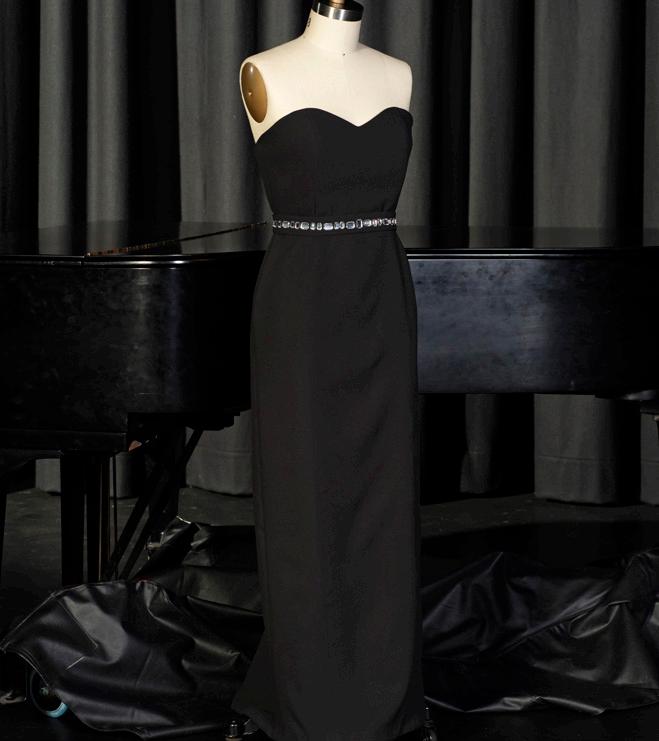
My end-user, Lily Davis, requested I design her an outstanding evening gown to be worn to her 18th birthday party. I was inspired by the gemstone embellishments Chanel famously featured on many of her gowns. Drawing upon designs and patterns of the art deco period I created a silver jewelled belt with an alternating pattern to give my end-user that “stand out” look she so desired. The silver gems against the black crepe fabric provides an elegant, mature look, fitting to the context of the garment.
This 1920’s inspired Gatsby dress was sewn with precision using sequined gold mesh and satin. It reflects Chanel’s timeless pieces with the cross between the modern/true interpretation, creating a sophisticated and elegant garment. Throughout the course of making this garment, I trialled many different colour palettes, designs and embellishments to ensure balance, unity, and the silhouette of the period were reflected. My gown emphasizes the timeless beauty and elegance the 1920s portrayed through the gold sequins and fringing along the hem of the dress.

The dress, is inspired by the sparkling light shining on Lake Wendouree in the summer, creating a liquid silver appearance. I designed this dress for my end-user, Imogen, who will be wearing it to her Graduation Dinner in November of 2023. Imogen was keen to have a dress that was visually and aesthetically pleasing, highlighting her natural beauty, colour, and style. She requested a formal evening dress reminiscent of 1930’s elegance and sophistication. Throughout the design process I researched many evening fabrics, colours and designs trends until I found a look that reflected Imogen’s personal style and taste. This dress has been created for Imogen to wear as she enjoys her last moments as a Loreto Girl.

Romance at the Park
The dress I have designed is a semi-formal feminine style, inspired by romantic garden parties in the surrounds of a stately manor house of the past. I designed this dress for my end-user, Sarah, who will wear it this summer to her bachelorette party at Werribee Park Mansion. The use of sheer fabrics is something both Sarah and I associate with romance, femininity, and elegance, which we love. Sarah was keen to have a dress that highlighted her natural colouring and personal style. This included a request for long sleeves and a short skirt so that she may be able to wear this on other semi formal occasions. To create this vision, I used soft white bridal tulle and satin for the final romantic look.
The 1920’s Flapper
This garment is inspired by classic 1920’s flapper dresses. I stayed true to the key features such as the drop waist that defines this iconic style of dress while drawing inspiration from Coco Chanel. My end-user requested a 1920’s dress for a gala event on a cruise this December. It would also need to be breathable, easy to pack, easy to move in and styled in a light, summery colour. Many young women of the 1920’s period embraced this style as it gave them freedom from traditional societal constraints. I made sure to incorporate a square skirt that is easy to move and dance in, as well as a masculine silhouette which is the most notable aspect of the 1920’s dress.


The boldness of camp fashion is embodied in every stitch and seam of this piece. A thigh-high leg slit ensures that the entrance is nothing short of show-stopping, while the strapless corset bodice cinches the waist, creating a silhouette that is striking. What sets this dress apart is its use of feathers along the trim. Each feather serves as a flamboyant homage to camp culture, invoking memories of iconic fashion moments that blur the line between the extravagant and the everyday.

Inspired by the lavish puffy sleeves of a 1980s wedding dress, I felt compelled to address the environmental impact of one-time-use wedding gowns. My vision was to create a dress that seamlessly transitioned from ceremony to reception, while minimizing its ecological footprint and fusing timeless grace with durability. The adaptable skirt effortlessly shifts from a classic pleated look to a whimsical bubble silhouette, defying bridal norms and showcasing versatility. My ultimate goal is to establish a deep emotional connection between the bride and her dress, transforming it into a cherished heirloom. In this era of evolving sensibilities, my creation stands as a testament to the harmonious coexistence of beauty and environmental consciousness.


Harsh Drive is an American grunge band from the 1990’s. My client, Alicia Roman, the bassist of the band, required a new bass guitar design that she’ll play on their upcoming Australian reunion tour. The band also required merchandise graphics that would be sold at the concert venues.

My brief was to design a logo, packaging and magazine cover for my client - a soft drink company - ‘Fervent Flight’. Their aim is to create a new line of healthy, carbonated juices and they are passionate about raising awareness for endangered animals. I explored three potential drinks that promote endangered birds. The package design incorporated a small logo to highlight the colourful surface graphics. Birds are presented clearly with friendly characteristics, appealing to a younger audience. The magazine cover kick started the launch of the product in order to reach a large target audience. I have used tropical characteristics to compliment the product in the magazine layout.
Their aim is to create a new line of healthy, carbonated juices and they are passionate about raising awareness for endangered animals.

CodFather Fish and Chippery is a newly established food truck along the Mornington Peninsula serving an upmarket and unique take on traditional style fish and chips. The client, 28-year-old Leo, is a successful restaurant owner who requires a logo and menu design, as well as a packaging net and tissue paper insert. With a focus on sustainability and strong ocean themes, I explored both an obvious take on an ocean theme as well as a unique colour scheme that is more understated.

My brief was to create a 3D model to showcase surface graphics and an isometric drawing of a lamp shade for my client, Dianne Dickson. The client is an artist and has requested for the surface graphics to be inspired by her own artworks. She has also requested that the isometric drawing of the lampshade illustrates its scale and dimensions.
The client is an artist and has requested for the surface graphics to be inspired by her own artworks.

Juice Press, Richmond is a new and upcoming juice bar in the heart of Richmond, Melbourne. My client, a young business owner, required a logo and menu as well as surface graphics for cup sleeves. With a heavy influence on health and wellbeing, I focused on ways in which this could be presented in a clean and simple way, therefore reflecting the business’s beliefs and principals.

Sunday Skincare is a gender-neutral skincare brand releasing a new line in January 2024. The client, Megan Clark, established the business in Melbourne, Australia. She required packaging designs with a colourful logo and brightly coloured surface graphics with patterns that represent a clean look. This theme will match the online website where potential buyers will be able to buy affordable and aesthetically pleasing skincare once the product has launched.

With a heavy influence on health and wellbeing, I focused on ways in which this could be presented in a clean and simple way...
Little Mouse Art Supplies is an emerging small business located in metro Melbourne. They are looking to create accessible and helpful tools for growing artists to further their hobbies and passions. They plan on opening their own studio and store in the coming months where they will release the new art kit which will contain art supplies and other resources that are high quality, portable and keeps all the supplies safe while in transit. The client required a logo and brochure to be designed as well as an isometric technical drawing to send to the manufacturers in order to create the art kit.

Frozen Grove is a new juice & sorbet bar opening in Ocean Grove in January 2024. The client required a logo and surface graphic designs for their take away juice & sorbet cups. An invitation design for the grand opening was also required. The juice bar has a rustic, coastal theme which the designs were required to match through the use of coastal colours and imagery.
The juice bar has a rustic, coastal theme which the designs were required to match through the use of coastal colours and imagery.

Furusato Cafe specialises in Matcha and is located in the CBD of Melbourne. The client, Benji, owns the cafe and is from Japan. He has a passion for sharing his culture through the food and drinks of his cafe. Benji required a new logo and menu design to inform customers of what is on offer at the cafe.

Due to the busyness of the cafe from morning commuters going to work, Benji also requires an Ordering App design, which customers will be able to order ahead of time and skip the queue making wait times quicker.

Country Passion is a small accommodation business located on client, Tommy Parker’s family’s winery, located in the Barossa Valley. Due to the accommodation being an expansion of the winery, Tommy required floor plans and elevations to depict the layout and appearance of a simply designed, short stay, Airbnb. To promote the new part of the business, Tommy also required a logo to represent the accommodation part of the winery and a brochure to inform the guests of everything available in the Barossa Valley.
He has a passion for sharing his culture through the food and drinks of his cafe.

Promontory is a luxurious holiday house located in Noosa, Queensland. The clients were Alexander and Kate, a young couple who required floor plans and elevations for a cozy, modern holiday home that will attract the young to middle aged demographic. In addition to this the clients also required a logo and brochure design informing guests about the activities and dining opportunities while advocating the surrounding region.

Falcon Bandroom is a music venue and bar located on Smith Street in Fitzroy. The client, Mathilda Slater, hopes to renovate and rebrand her late father’s pub, Falcon, in order to attract a new demographic of customers while retaining the existing older audience. The client required a simple but colourful and distinctive logo in order to distinguish the new brand, as well as a poster announcing the venue launch. The renovations must be represented as a two story floor plan, incorporating the historical exterior charm of the original building. I have focused on colour in my communication designs, while using open floor plans to create a warm and inviting environment.

The client required a simple but colourful and distinctive logo in order to distinguish the new brand...

The Juice Bar Co, is a vibrant oasis soon to grace Noosa’s Main Beach by my clients, Brittany and Jesse Williams. They required a unique logo which creates a strong brand identity, as well as juice cup surface graphics to enhance overall customer satisfaction. Along with this, they required a comprehensive menu to ensure customers have a clear understanding of the available options. A loyalty card design, reinforcing their connection to the brand and encouraging repeat business was also required. All designs reflected a coastal/vintage colour scheme to embody a timeless seaside charm.

My brief was to create a site plan and branding for the launch of Golden Glamping. Located in the heart of Lorne, Victoria, Golden Glamping offers luxurious glamping caravans for young professional couples, with a perfect blend of sophistication and natural beauty. Jack and Millie, the visionary couple behind the business, required branding that reflected the area’s natural charm, creating a memorable experience for their guests.
They required a unique logo which creates a strong brand identity...

World renowned Bosnian chef, Ana Kovacevic, has opened her new and exclusive restaurant, Kuhinja Sarajevo along Geelong’s waterfront. She hopes to immerse Victorians into her much loved Balkan culture. Ana required a logo and menu design, as well as floor plans and elevations for a two-story restaurant. Throughout the presentations, I explored the Balkan culture and how it could be incorporated within the designs.
She hopes to immerse Victorians into her much loved Balkan culture.

