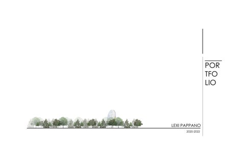
![]()
-GLASS CUBE TO SYMBOLIZE STRUCTURE/ ENCLOSED SPACE -VEGETATION INSIDE TO SHOW INTENSION TO INCORPORATE VEGETATION INTO DESIGN
The Biophilia hypothesis details that we as humans have a natural desire to connect with other natural forms of life. This desire to connect to the natural world can be recognized today in forms of landscape design, or using natural materials in a building. But how can biophilic design be intensified to fully benefit from the pros of incorporating biophilia into a building design? My concept examines the fine line between an interior space and an exterior space, and what characteristics classify each as such. To examine this differentiation, I used biophilia in both the interior and exterior environments, incorporating different design elements to ensure the biophilia is successful in its growth throughout the building.
Two “eco pockets” can be seen on the ground floor of the building, carrying up to the second floor. The pocket interupting the lobby area houses shrubs and mosses that don’t require an abundance of sunlight. The pocket inturupting the child care spaces houses a Common Pawpaw tree, since the pocket opens into the outdoor playspace and allows a lot of sun access.
“indoor” trees
-glass surrounding tree -allows sunlight and rain to get through
indoor green wall in each childcare suite as the age groups progress, so does the size of the vegetation BRICK BARRIER AROUND TREES PROVIDES PRIVACY FROM STREET
moss wall small plants/grasses larger plants/big leaves artificial sunlight suspendid from ceiling lockers/ bookshelf on outside of curve green wall on inside of curve WOOD EXTERIOR LIGHT WOOD BEIGE BRICK BRICK GIVES EDUCATIONAL FEEL BENCH INSIDE
For the artisit retreat assignment I designed a space tailored to Margaret Atwood. Atwood is a well-known author and environmental activist, making a cottage in the woods the perfect home away from home for her. This space was designed with relaxation, and production in mind, for inner peace while she writes a new novel.
The main shape of the artist retreat takes after a combination of nordic churches and finnish cabins with there steep sloped roofs. The dramtic roof shape resembles the imaginative structures in fairy tales, which is what I wanted this work space to feel like.
Looking at the front elevation you can see the materiality that was used. The smaller entrance area features vertical wood boards that are stained a dark walnut in order to ground the structure. The taller triangular portion has horizontal boards that are light and natural to give it a light and airy element. The horizontal boards on the taller portion of the artist reatreat contrast with the surrouding trees, which draws your eye to the structure.
The main floor of my building includes the key features that Margaret would need. As you enter the front door, you see a half bathroom to the left, and a storage closet to the right. Continuing through the building there is a kitchenette for snacks and drinks while she works. Decending down a few steps brings us to a large desk area for writing, along with a large library that continues up the back wall. The library can be easily accessed by a sliding ladder. The back wall also has an exterior door which leads to a small standing deck perfect for getting fresh air.
Going up the sliding library ladder, you come to a small loft that is perfect for relaxing and reading. You also have access to two window balconys that open for a treetop experience.
Building section A cuts through the bigger area of the artist retreat, giving viewers a better view of the library, loft, balcony windows, and kitchenette. Building section B gives a better view of the loft and balcony window. It also gives more of an understanding of the library ladder that slides around on a track system to access as many shelves as possible.
The Lake Laurentian Conservation Area is a site unique to Sudbury with its rocky landscapes,its variety of winding trails, and is home to many different species all while still being in the city. All of these great components make the conservation area an active place when it comes to local visitors as well as students. Since the education center is open to the public, the learning spaces could get pretty packed with eager visitors. I wanted to make your experience at the education center as enjoyable and interactive as possible, which presented itself to me in the form of acoustics. Acoustical architecture often gets overlooked when the building program is unrelated to music or performing spaces. I wanted to bring back this concept of controlling acoustics, even when you have double heighted spaces that could fill with echos.
To make the space enjoyable I needed to use different methods to absorb and reflect some of the sound in the building. The solid walls that are closer to North are made with two types of insulation, one of them absorbing any artificial noises that may come from the parking lot. However, the East, South, and West facing walls are curtain glass, which invites the sound in. This part of the building is surrounded by Lake Laurentian, the marsh, and a forested area that is home to different animals. By keeping the artificial noise out and the natural noise in, it creates a calming environment.
To make the space interactive and to strengthen my concept of controlling acoustics, I added what I call megaphones around the building. I took inspiration for these bright pink megaphones from Coryn Kempster and Julia Jamrozik who designed an interactive sound installation in Buffalo, New York. The megaphones protrude from the floor or come down from the ceiling, each megaphone connecting to another through a tube system that runs through the floors and ceilings. Visitors can talk into the megaphones and try and guess which megaphone is connected to which by listening to the other participants' surroundings.