Visual Standards Guide
Leila San Jose | GR604: Nature of Identity

Leila San Jose | GR604: Nature of Identity

12–23 LOGO IDENTITY
23–33 VISUAL SYSTEM
New Logo
Logo Anatomy
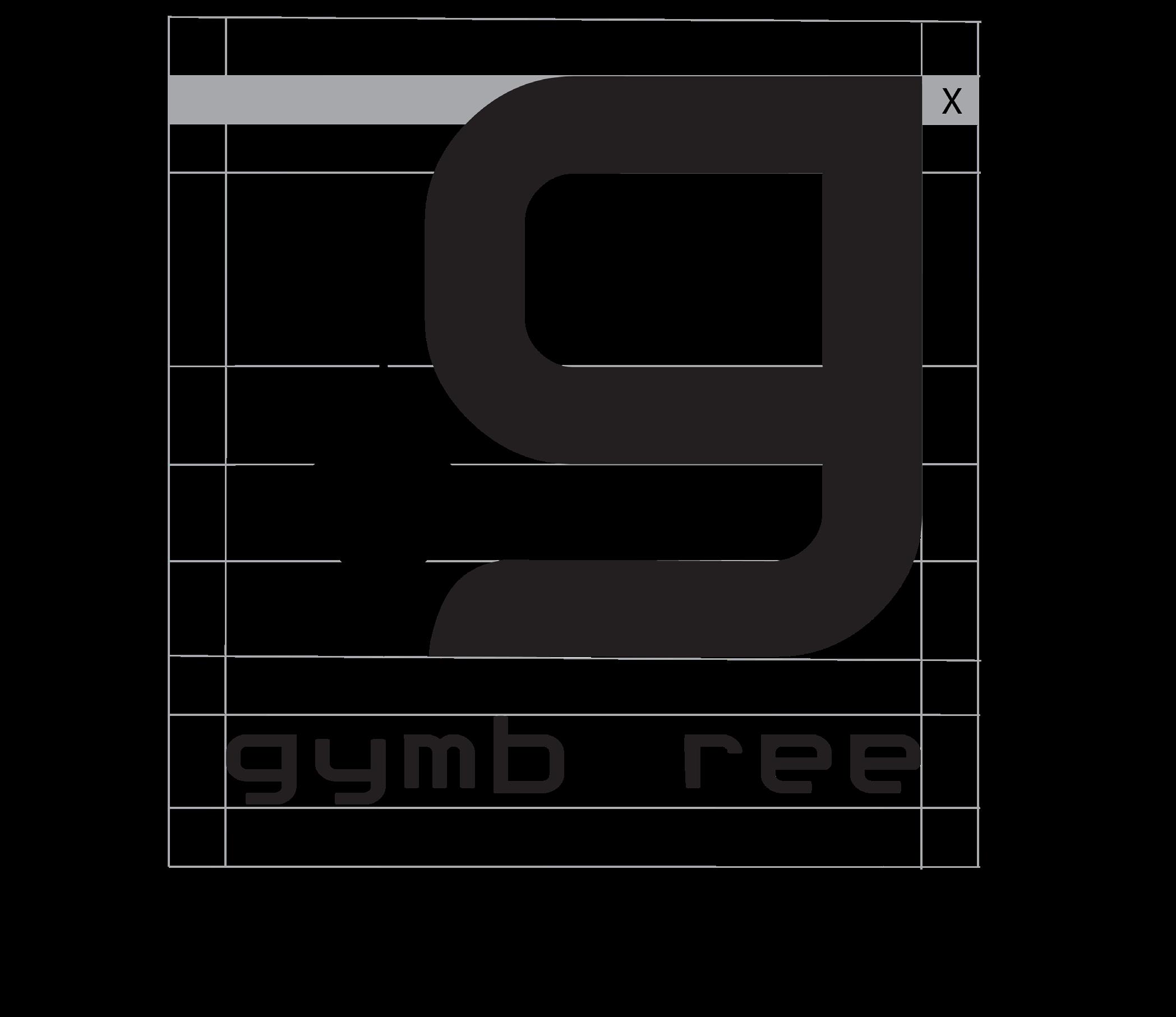
Clear space
Size Chart
Logo Don’ts
Color Palette
Typography
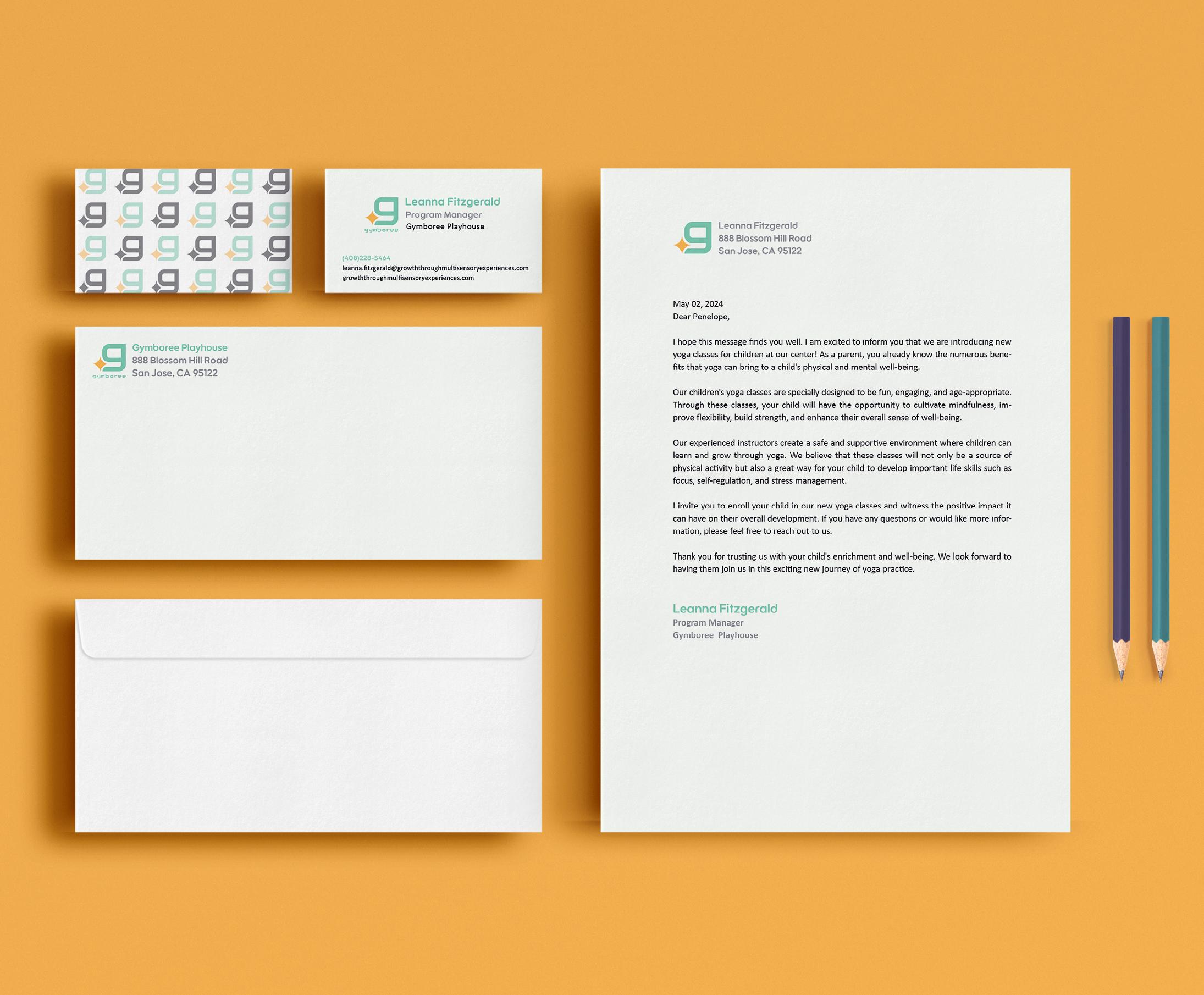
Business System
Gymboree is a company founded in Marin County, California in 1976. They opened a chain of clothing stores in 1986. In January 2019, they operated 380 stores, 154 outlets, 147 Janie & Jack stores, 253 Crazy 8 stores and 11 Crazy 8 Stores in the US and Canada.
In 2016, the Gymboree corporation sold the Gymboree Play & Music business to a private company and is now completely separate from the Gymboree Corporation.



We inspire and motivate multi sensory experiences for all children to support the holistic development of nurturing physical and mental growth so they can be active in growing independently and their communities.

Creating happy moments. can learn from and grow. explore the world.



These standards are meant to be the guidelines for correct way of use of the new Gymboree logo. It strives to bring clarity in maintaining the consistency of the design of the logo.
This includes the final logo itself, anatomy, clear space, size chart and logo don’ts.
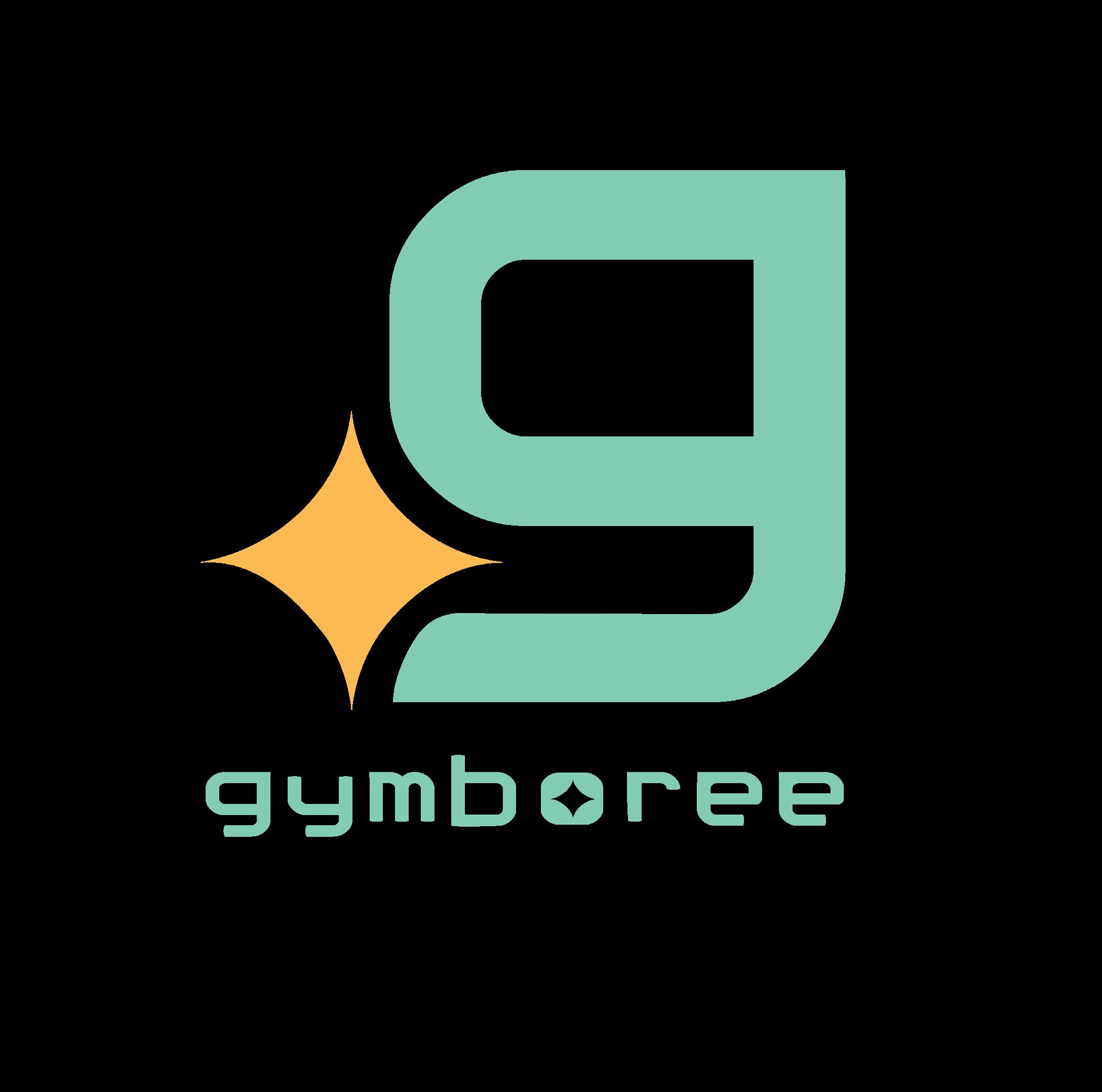
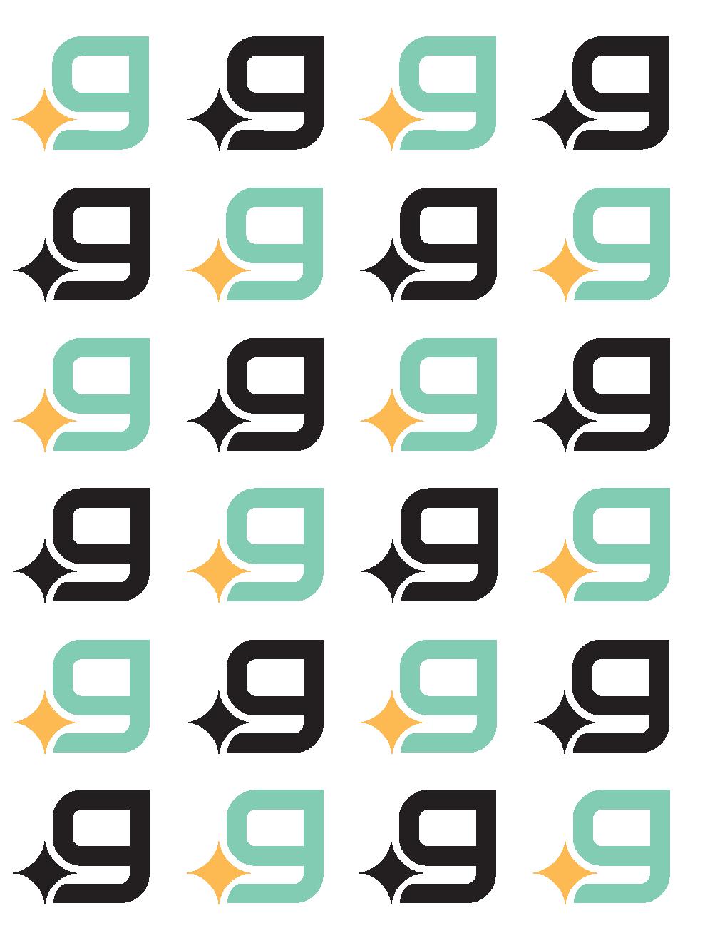
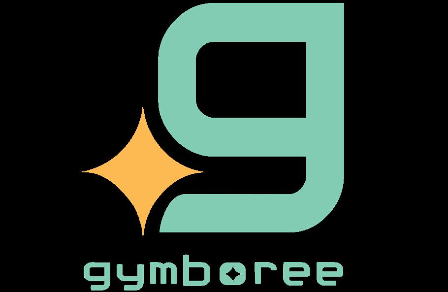
Gymboree’s final logo depicts the key phrase “Be bold and bright as you grow”. The lowercase fish hook “g” due to its larger scale represents youth as the diamond shape symbolizes bright and happiness as the rounder edges of the letter provide a more playful approach to the logo.
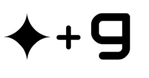
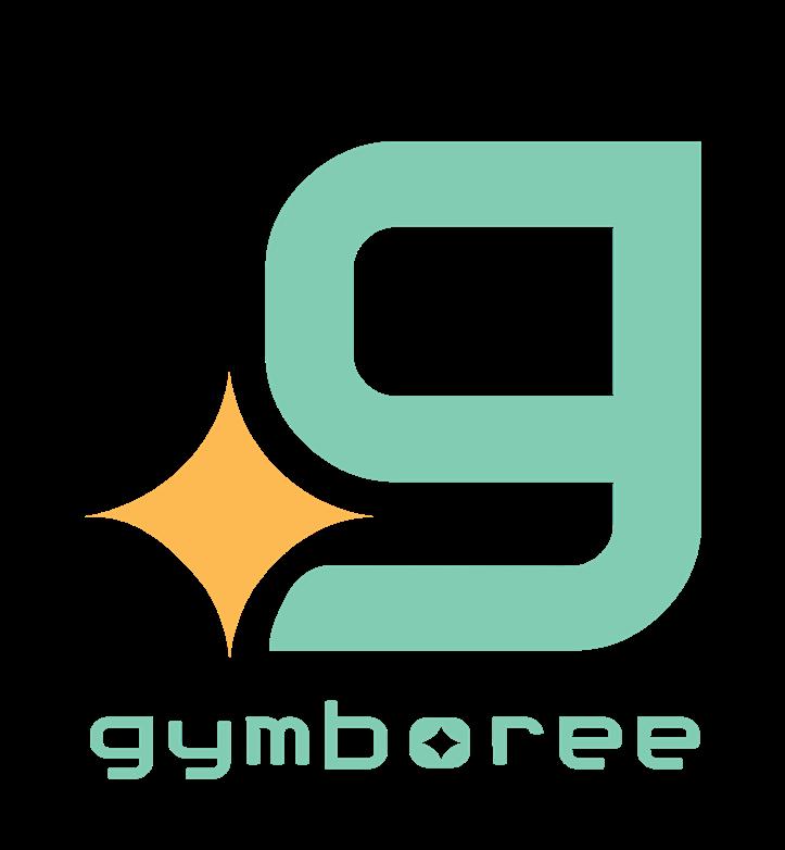
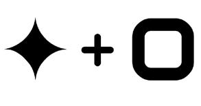
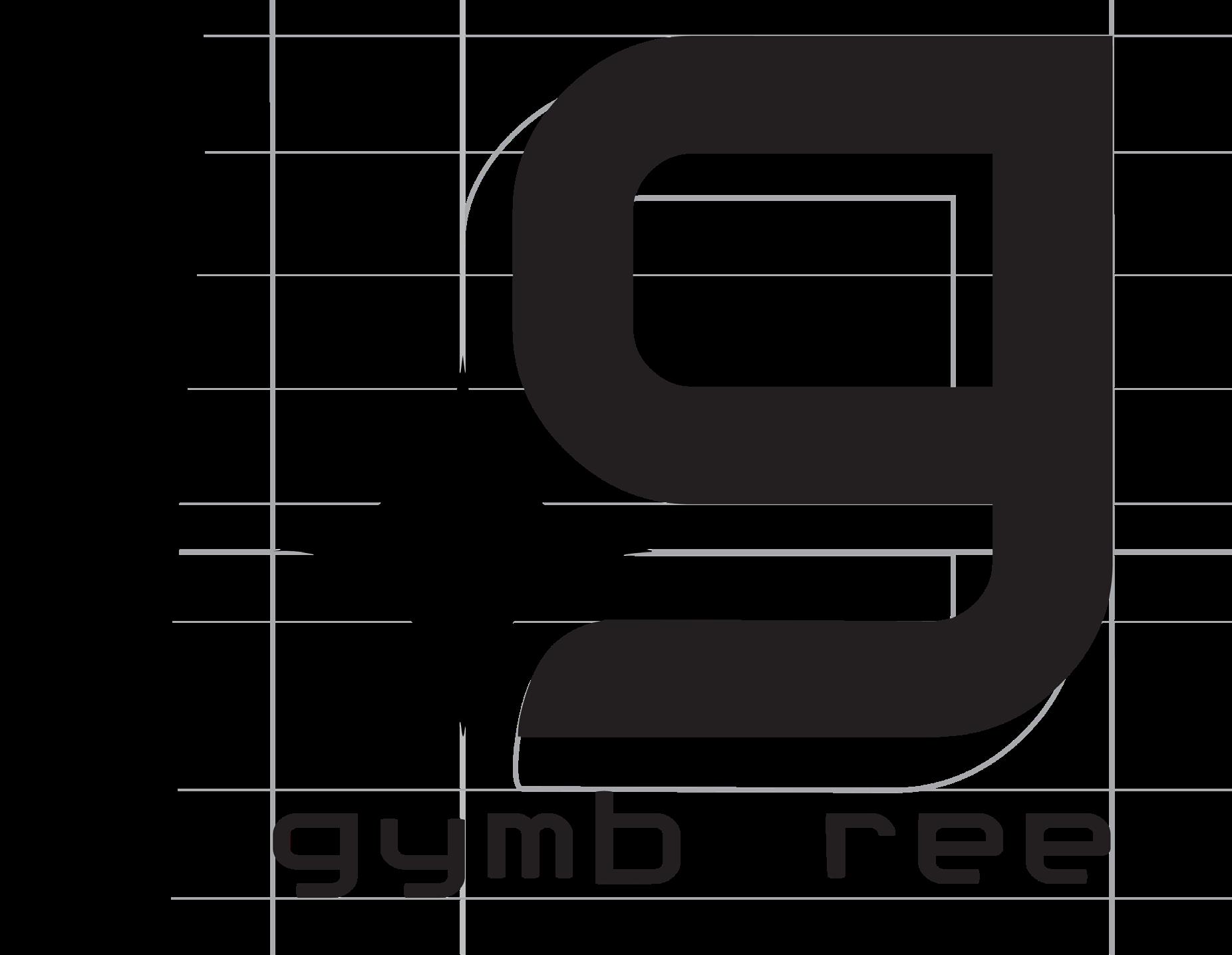
The anatomy depicts parts of the logo design to ensure meaning and concept. It is significant because it establishes the brand identity.
SIGNATURE

SYMBOL
LOGOTYPE
As a finalized logo, it must have specific amount of space on all sides no matter how it is used. This ensures that the final logo design has maximum visibility and impact.
With the finalization of the logo, this chart shows how the various versions of the logo will be used.
2 INCH
1 1/2 INCH


1 INCH

1/2 INCH
BELOW 1/2 INCH
The logos provided are the incorrect ways to use Gymboree’s logo. In comparison to the correct version, it sets the guidelines to how to use it properly.

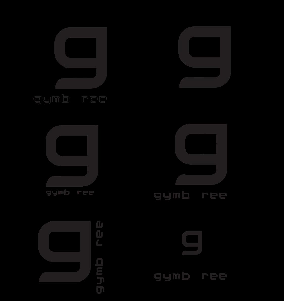
DON’T spell out Gymboree using the symbol as a “g”.
DON’T outline the wordmark.
DON’T shrink the size star.
DON’T place the star in the bowl of the “g”.
DON’T place the wordmark vertically against the side of the “g”.
DON’T shrink the size of symbol mark.


As part of a guideline to Gymboree’s rebranding, specific typography and color helps to define its branding visually. The type specs, color palette, alternative versions and logo don’ts will help guide specific details as a standard of its visual system.
These are the typeface fonts used to make up Gymboree’s rebranding visual system. They are meant to be secondary to the logo typeface and still convey the same style just different weights and sizes.
LOGO-WHITE RABBIT
ABCDEFGHIJKLMNOPQRSTUVWXYZ
abcdefghijklmnopqrstuvwxyz 1234567890
HEADERS & TITLES-LT SAEDA MEDIUM
ABCDEFGHIJKLMNOPQRSTUVWXYZ
abcdefghijklmnopqrstuvwxyz 1234567890
SUBHEADERS-CALIBRI BOLD
ABCDEFGHIJKLMNOPQRSTUVWXYZ
abcdefghijklmnopqrstuvwxyz 1234567890
BODY TEXT-CALIBRI
ABCDEFGHIJKLMNOPQRSTUVWXYZ
abcdefghijklmnopqrstuvwxyz 1234567890

This is a Subheader
This is some body text. Lorem ipsum dolor sit amet, consectetur adipiscing elit. Donec aliquam mauris sed quam male suada, pellentesque blandit orci tristique. Nulla posuere massa ut nunc vestibulum, sed ornare ipsum vehicula. Nullam non turpis sapien. Nam eget risus non urna placerat gravida sit amet eget mauris.
The colors chosen are to be more sophisticate but still have a sense of brightness, eagerness and growth. This depicts the new direction and meaning of the new Gymboree branding.
There are specific primary colors and secondary colors within Gymboree’s visual system.
130-4 C 17-6 C 98-5 U RGB
129, 204, 178 49, 0, 38, 0
253, 185, 82 0, 31, 78, 0 107, 96, 31 64, 65, 28, 8
88-5 C 184, 117, 177 28, 63, 0, 0
81CCB2 FDB952 6B6083 HEX E49C96 95979A B875B1
149, 151, 154 0, 0, 0, 49
58-1 C 173-4 C 228, 156, 150 8, 45, 32, 0
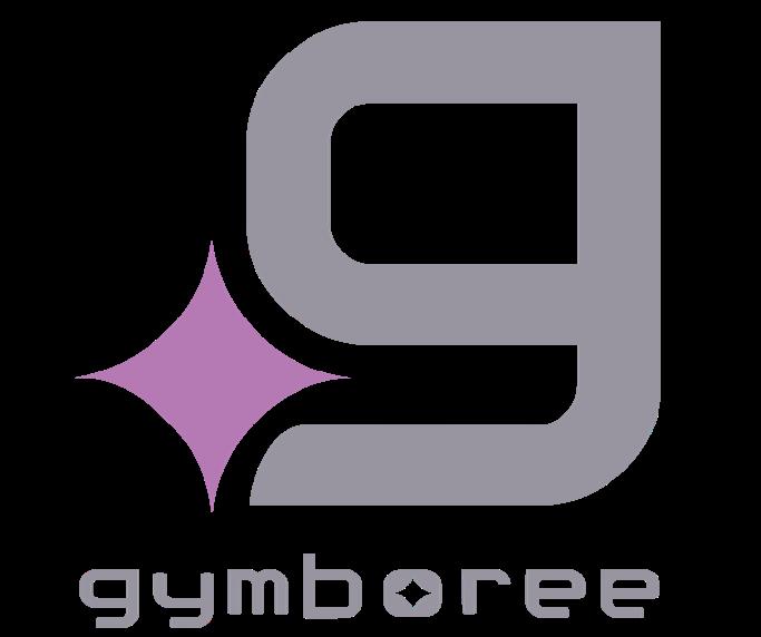
These are other logo versions that can be used based on the background the logo is on. There is only a limit of two colors or one color for the logo.

The importance of this is to show brand consistency, be able to communicate the visual system and still be able to differentiate the products used for a company. These products include a business card, envelope, pencils, letterhead and folder.
