Visual Development Guide
Leila San Jose | GR604: Nature of Identity

Leila San Jose | GR604: Nature of Identity
12–37 ROUND 1
38–43 ROUND 2
44–55 ROUND 3
56–67 ROUND 4
Camp 1 Rough & Refined Sketches
Camp 2 Rough & Refined Sketches
Camp 3 Rough & Refined Sketches
Camp 4 Rough & Refined Sketches
68–73 ROUND 5
74–85 INSPIRATION
Camp 5 Rough & Refined Sketches
Camp 5 Rough & Refined Sketches
Refined Concepts
Digital Explorations
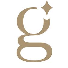
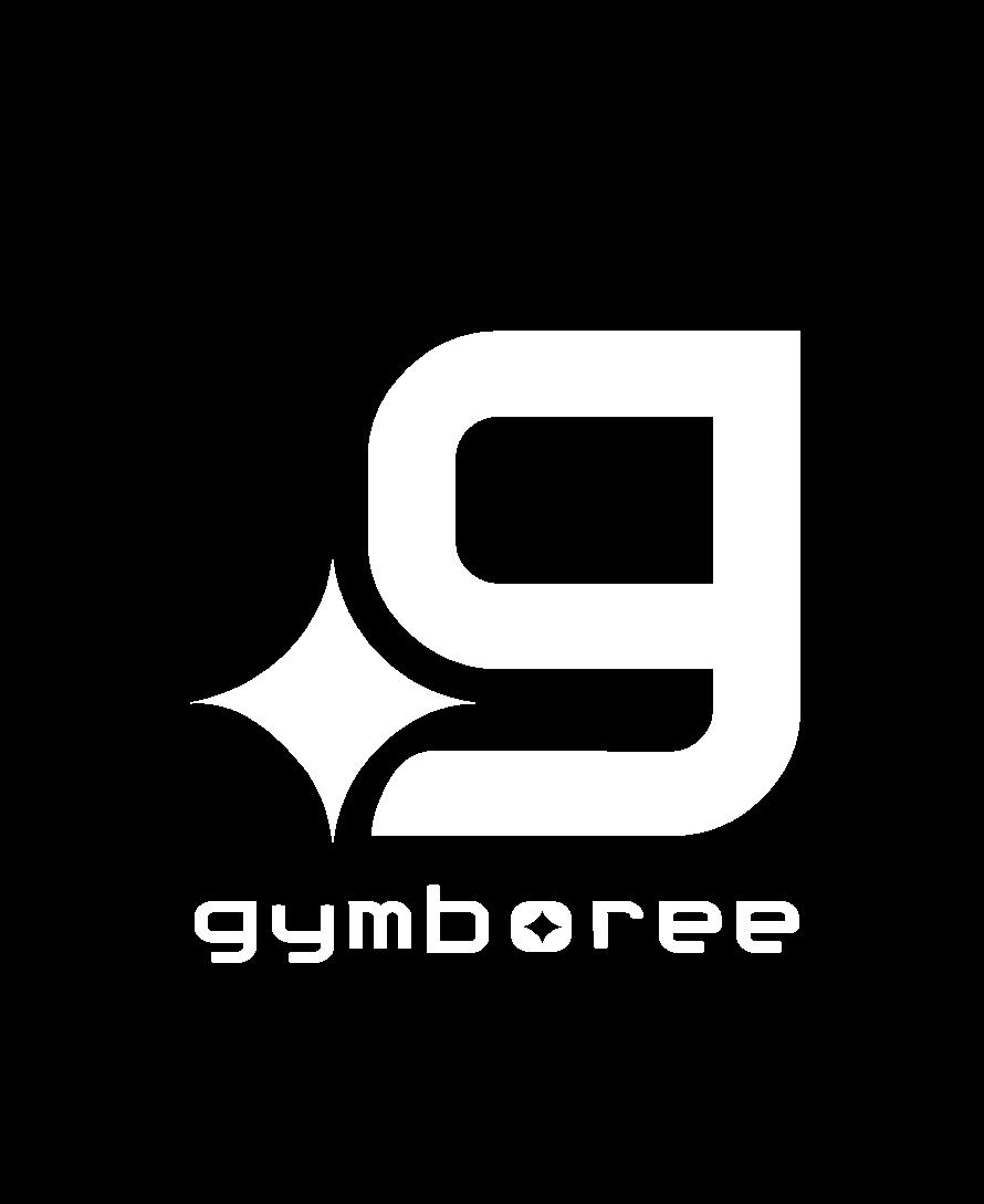
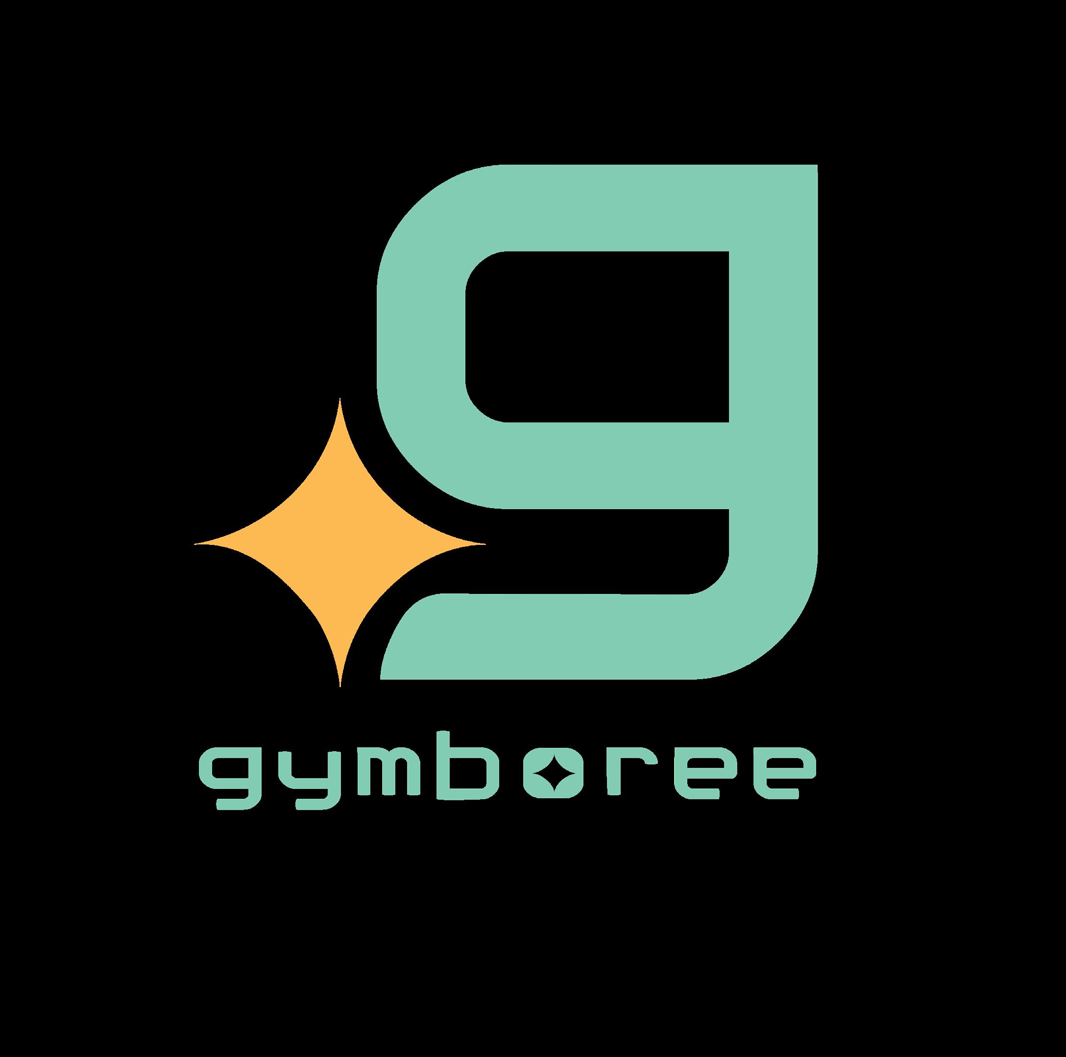
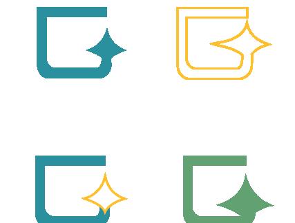
Final Options
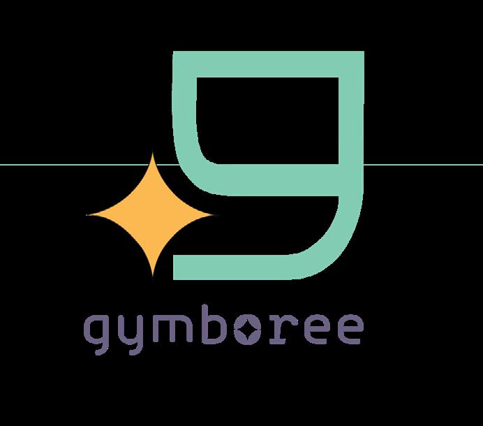
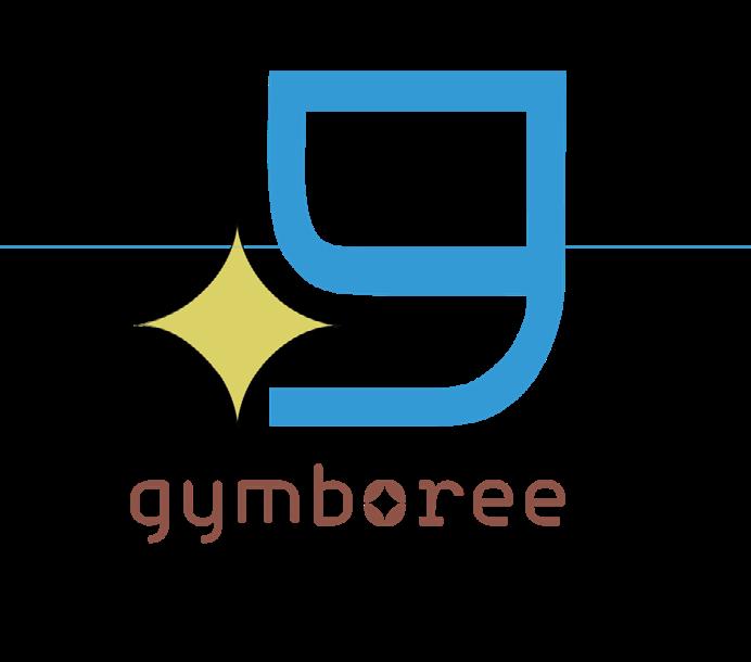
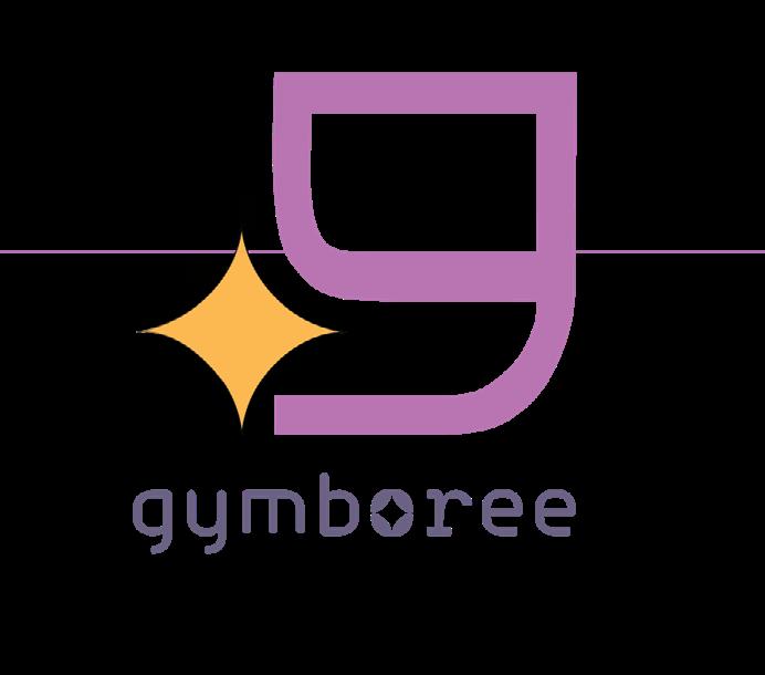
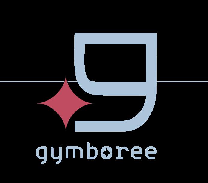
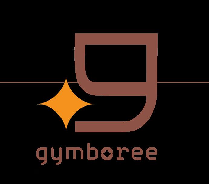
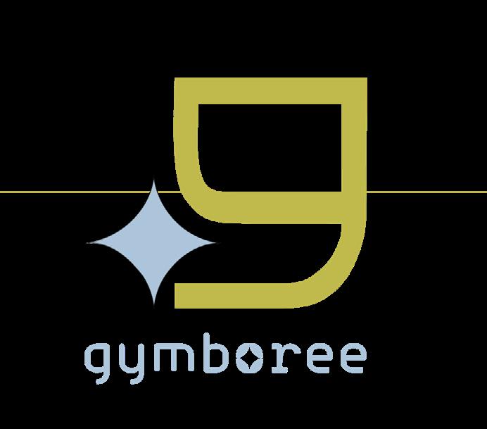
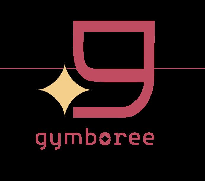
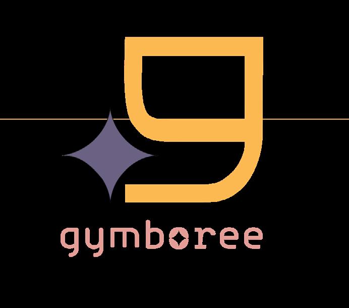
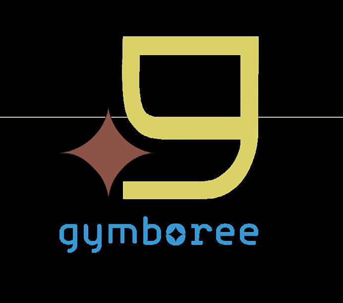
Final Logo Typeface & Color
Visual Inspiration
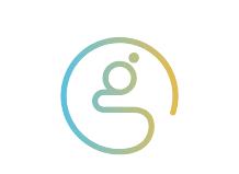
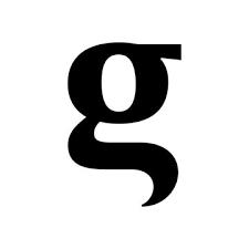
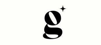
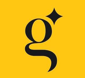
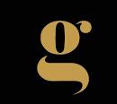
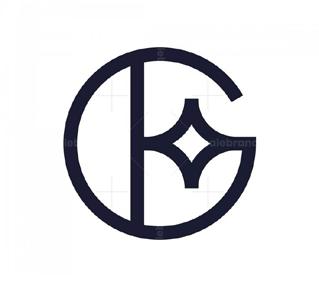
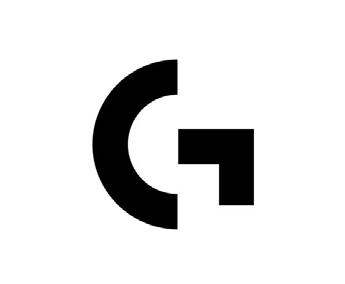
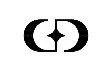
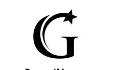
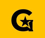
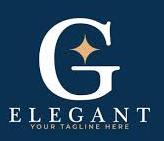
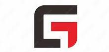
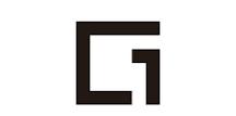
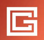
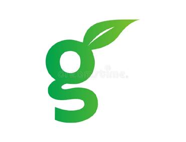
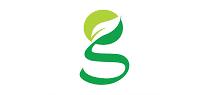
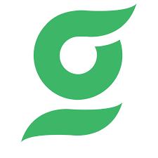
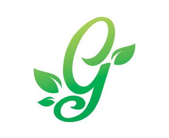
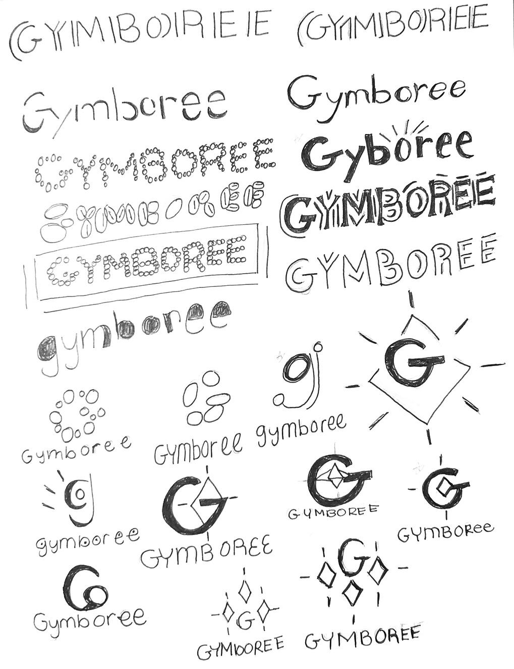
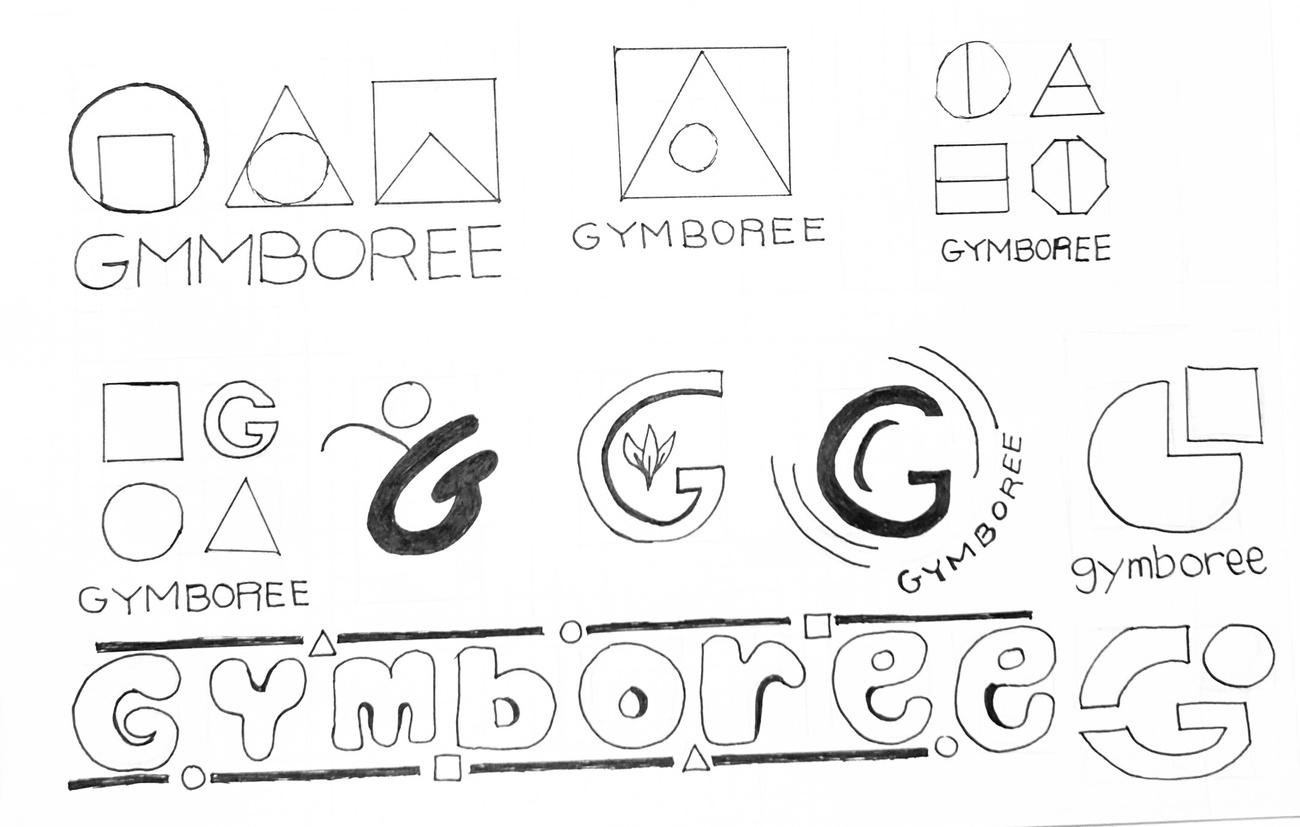
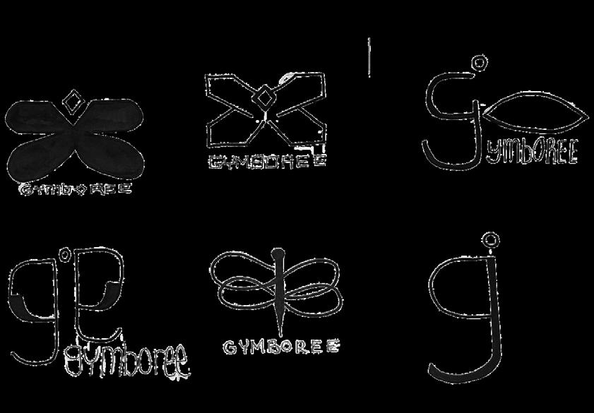
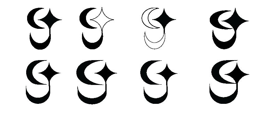
Look–alike Logos
Gymboree is a company founded in Marin County, California in 1976. They opened a chain of clothing stores in 1986. In January 2019, they operated 380 stores, 154 outlets, 147 Janie & Jack stores, 253 Crazy 8 stores and 11 Crazy 8 Stores in the US and Canada.
In 2016, the Gymboree corporation sold the Gymboree Play & Music business to a private company and is now completely separate from the Gymboree Corporation.

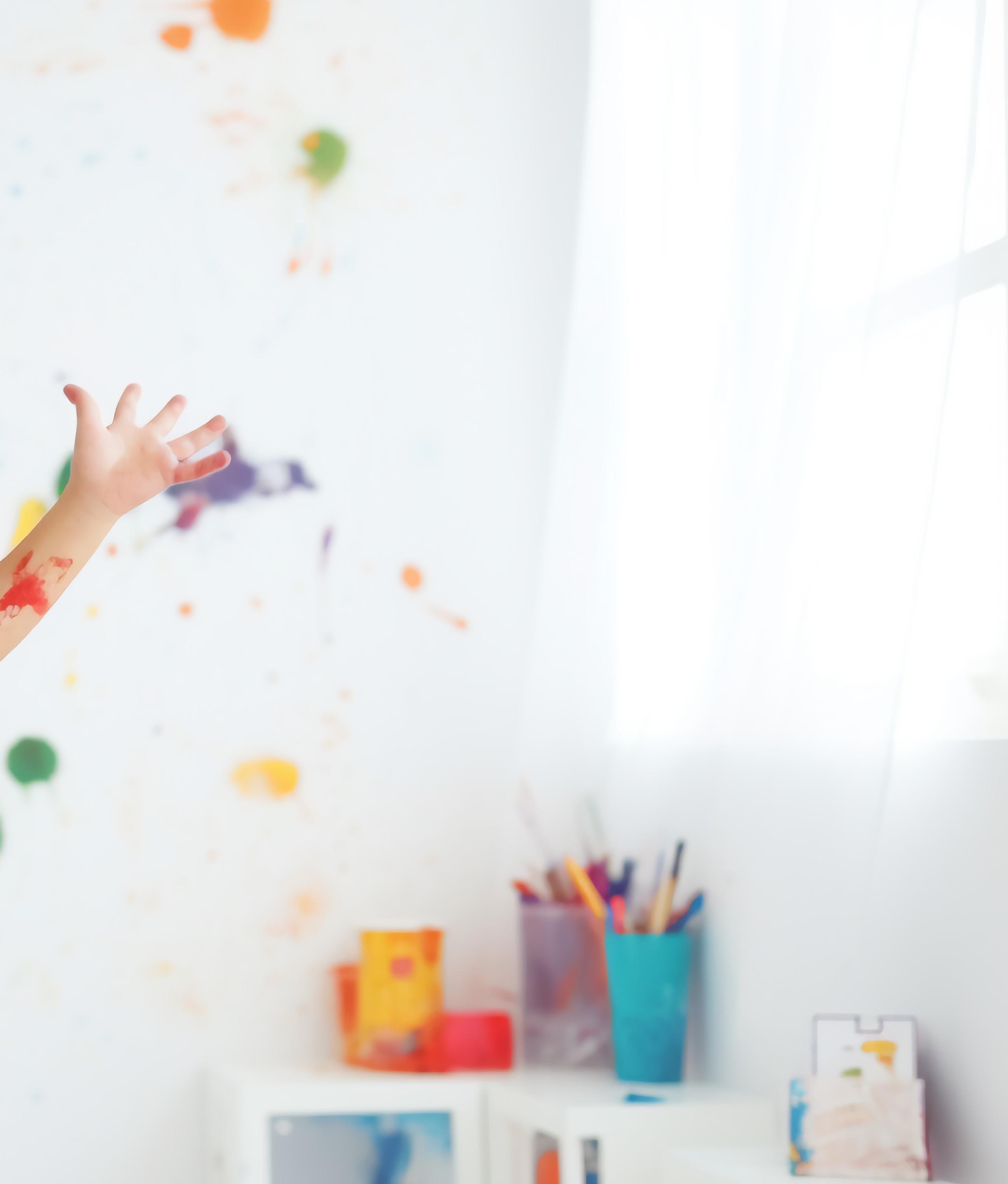
We inspire and motivate multi sensory experiences for all children to support the holistic development of nurturing physical and mental growth so they can be active in growing independently and their communities.
Creating happy moments.
Providing activities where children can learn from and grow.
Helping children to discover and explore the world.
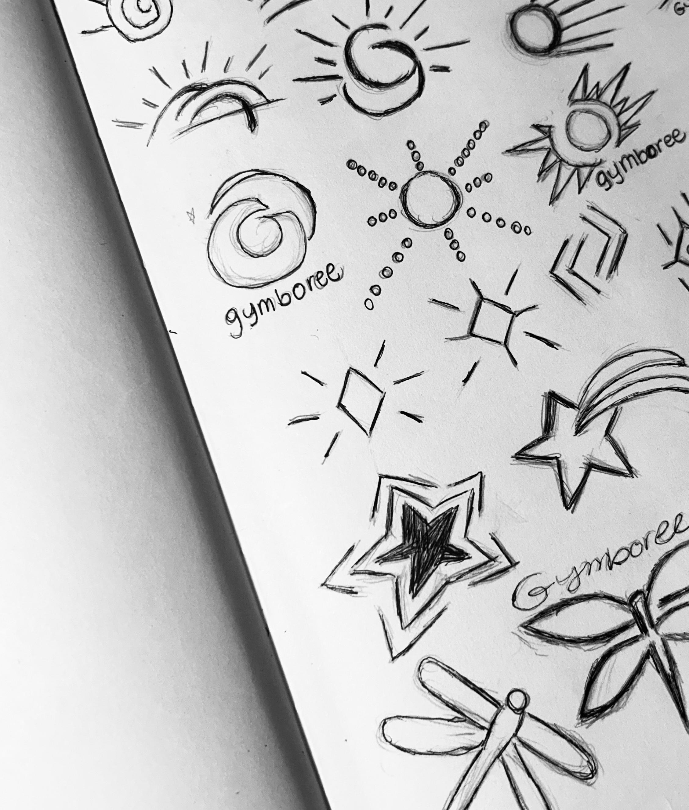
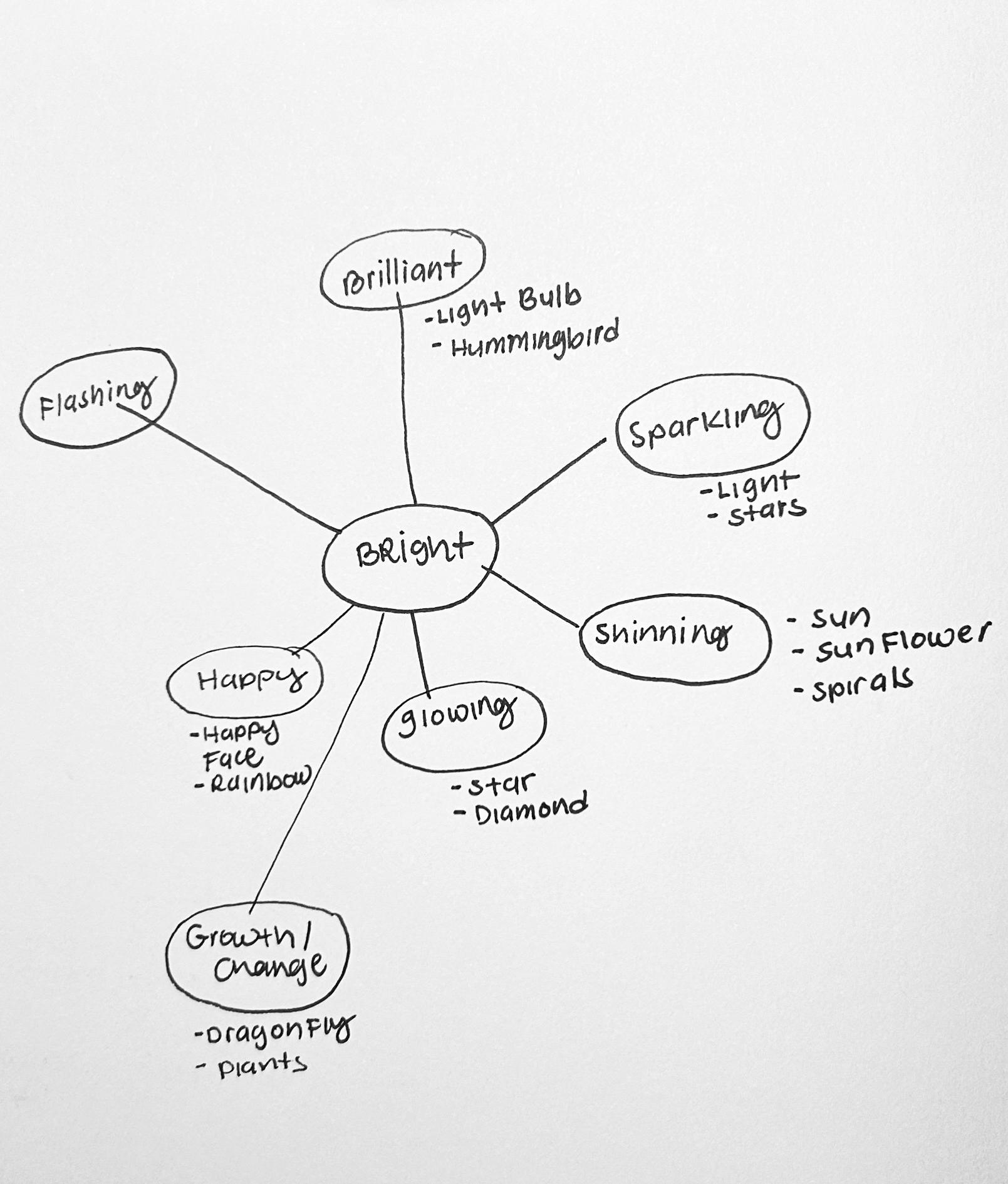
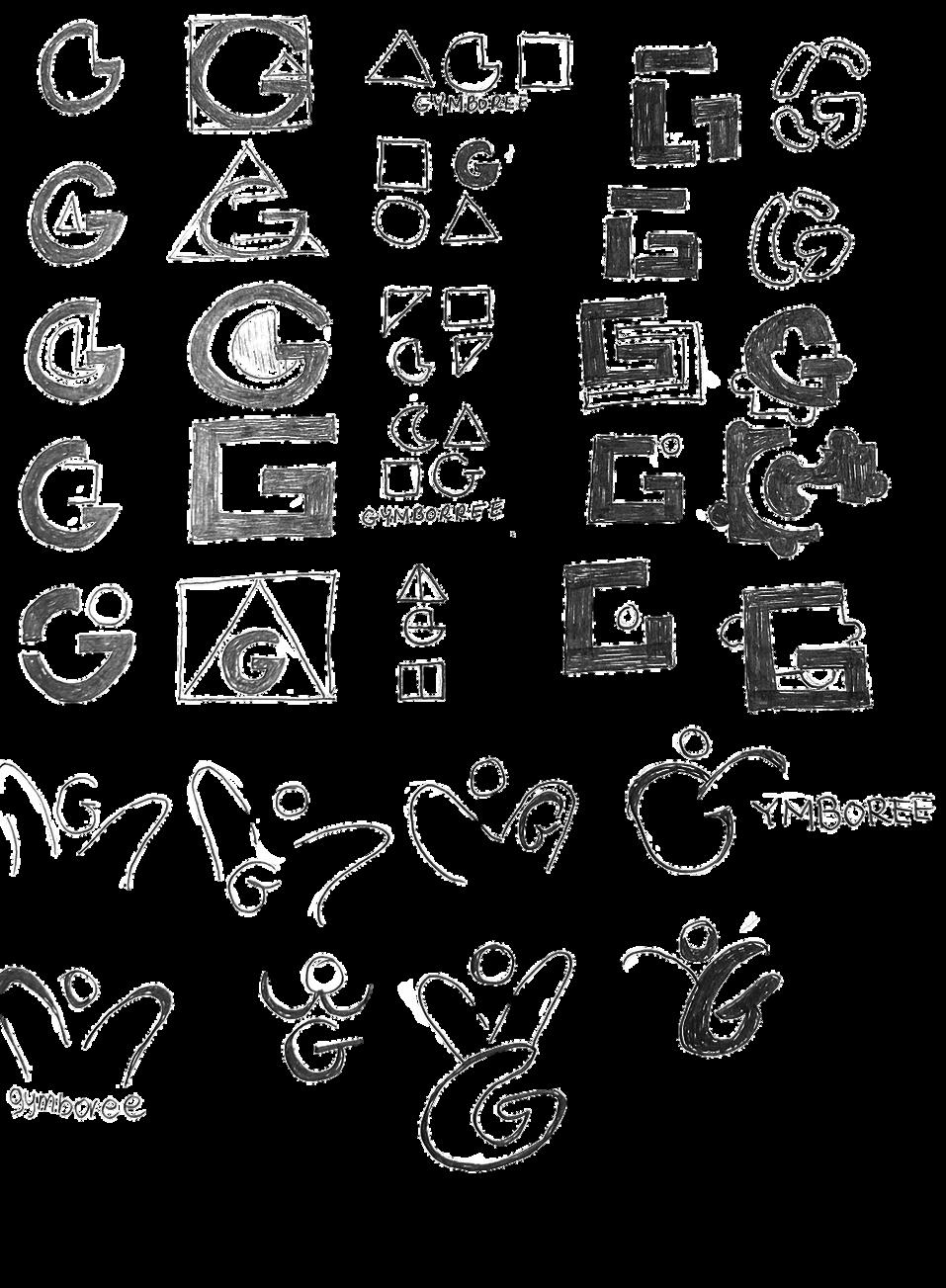
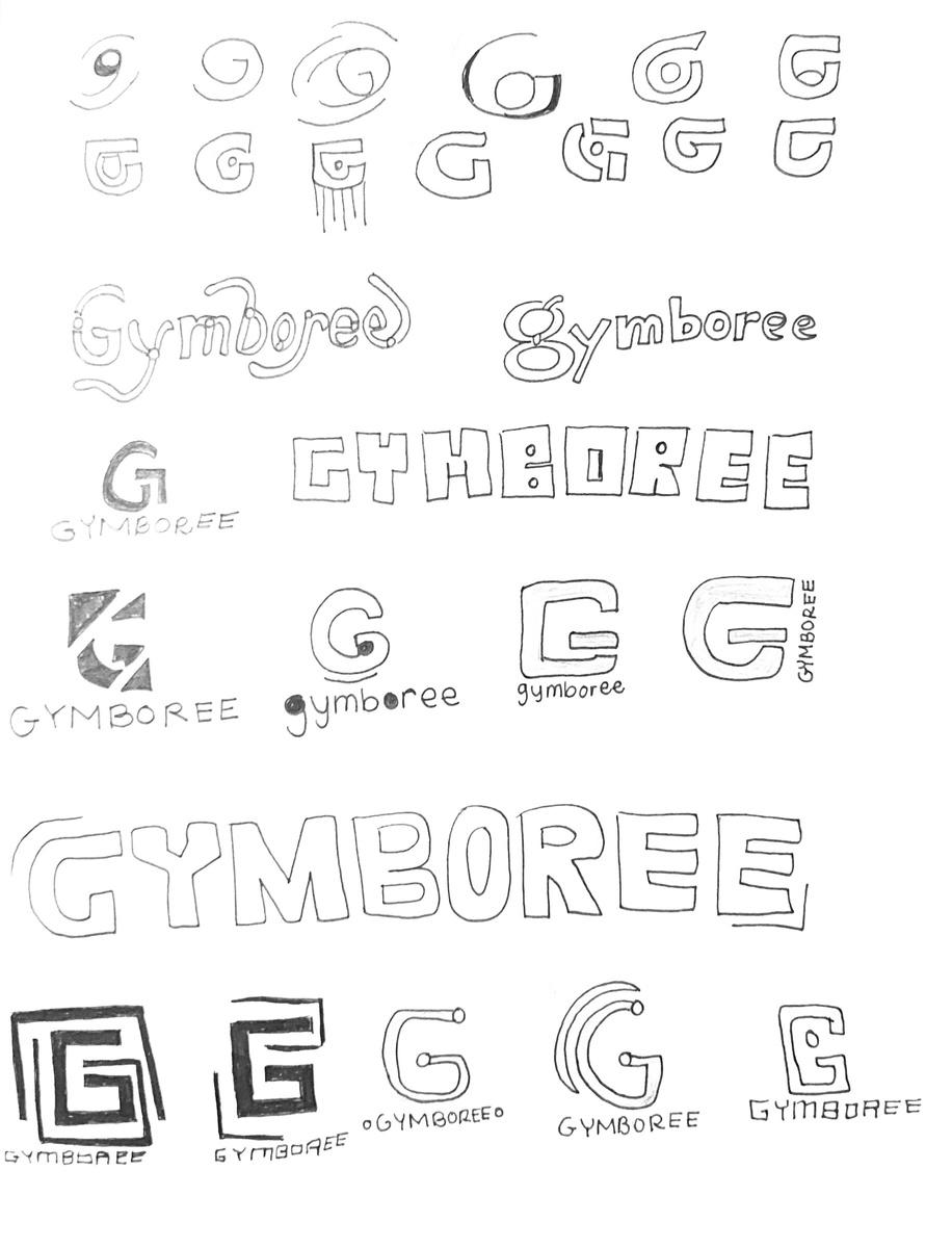
Sketch explorations with the goal of finding a strategic direction for Gymboree. In this first round, dove deeper into the keywords and their meaning that are derived from Gymboree’s soul and mission statement. These elements will help guide Gymboree’s visual development through symbols, graphics, and wordmarks to depict bright, eager and curious; where the best ten rough sketches will be refined.
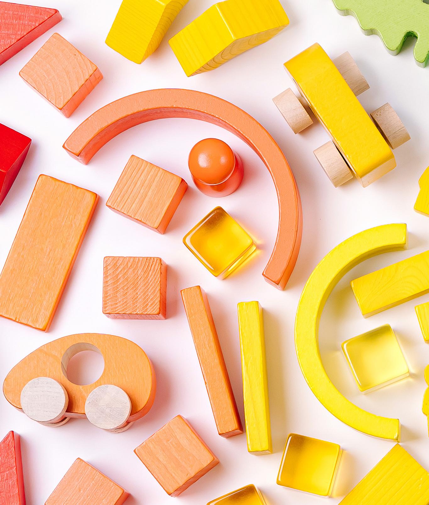
Deeper dive into the keyword bright and its meaning of flashing, brilliant, sparkling, shinning, glowing, happy and growth or change. As a result, conducted research of symbolic elements of light bulb, hummingbird, light, stars, sun, sunflower, spirals, diamond, happy face, rainbow, dragonfly and plants.
Proceeded forward in creating sketches that depict sun (shining), star (shining and glowing), dragonfly (growth or change), and sparkle mark elements.
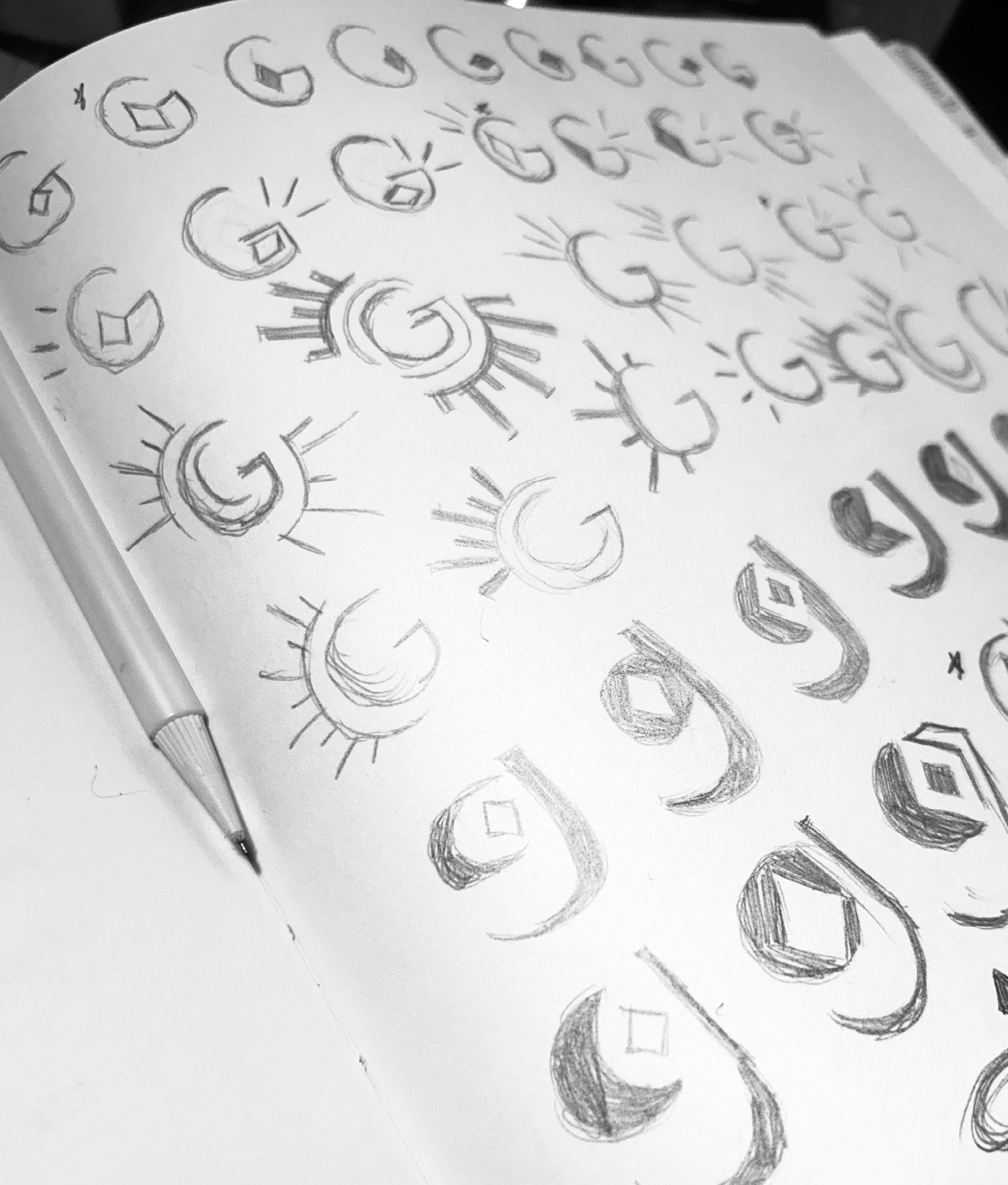
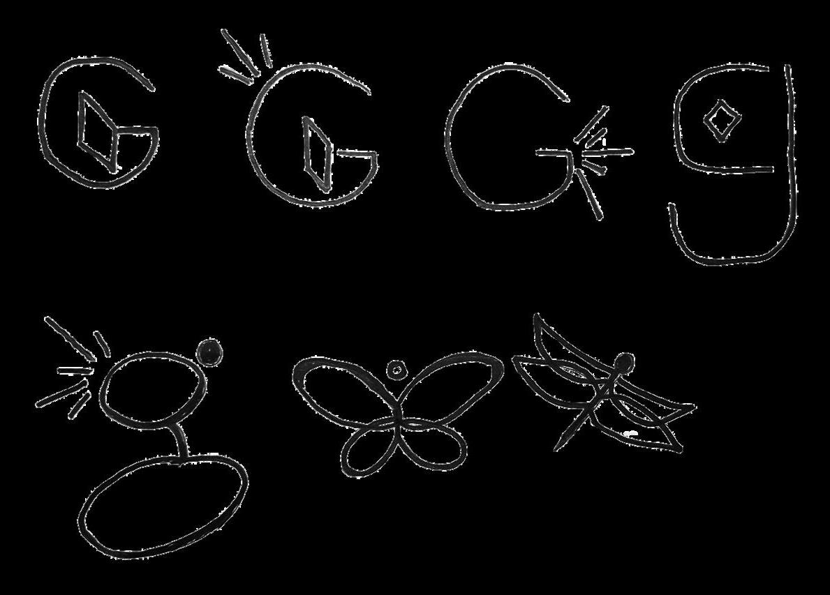
CAMP 1 Bright | Create happy moments.
SYMBOL
1. Symbol represents a bright sun glowing.
2. Shine bright like a star.
3. Dragonfly symbol symbolizes bright change or growth. 1 1
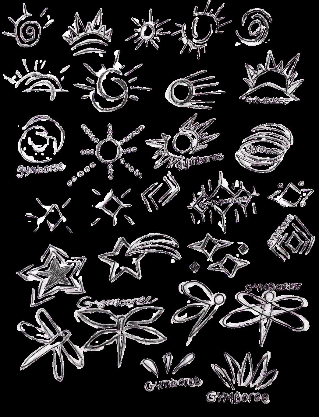
4. The uppercase “G” represents a sun and the marks symbolize shine.
5. Uppercase “G” with a bold shine.
6. Uppercase “G” shine bright like a diamond.
7. Lowercase “g” with lines representing rays of sunshine.
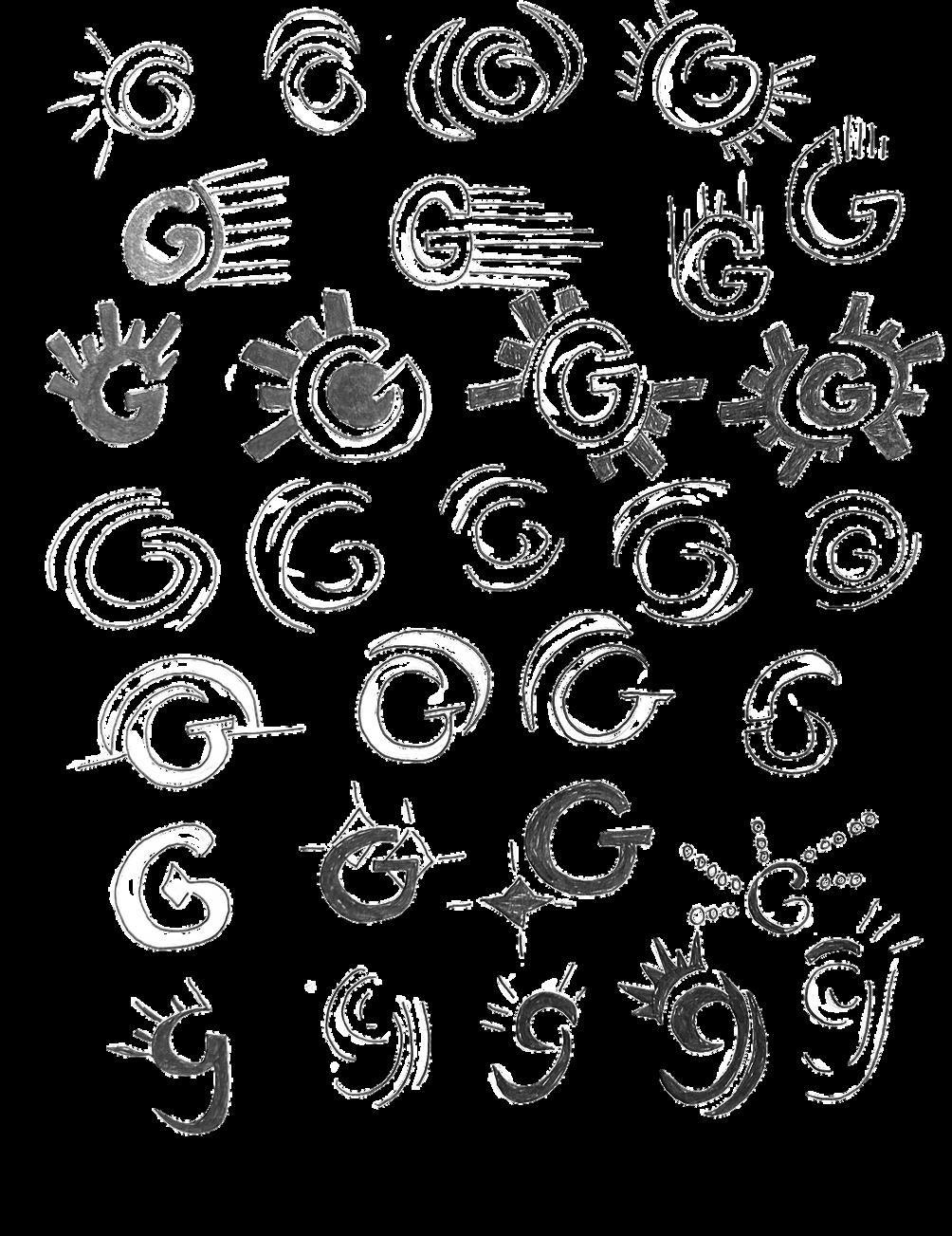
CAMP 1 Bright | Create happy moments.
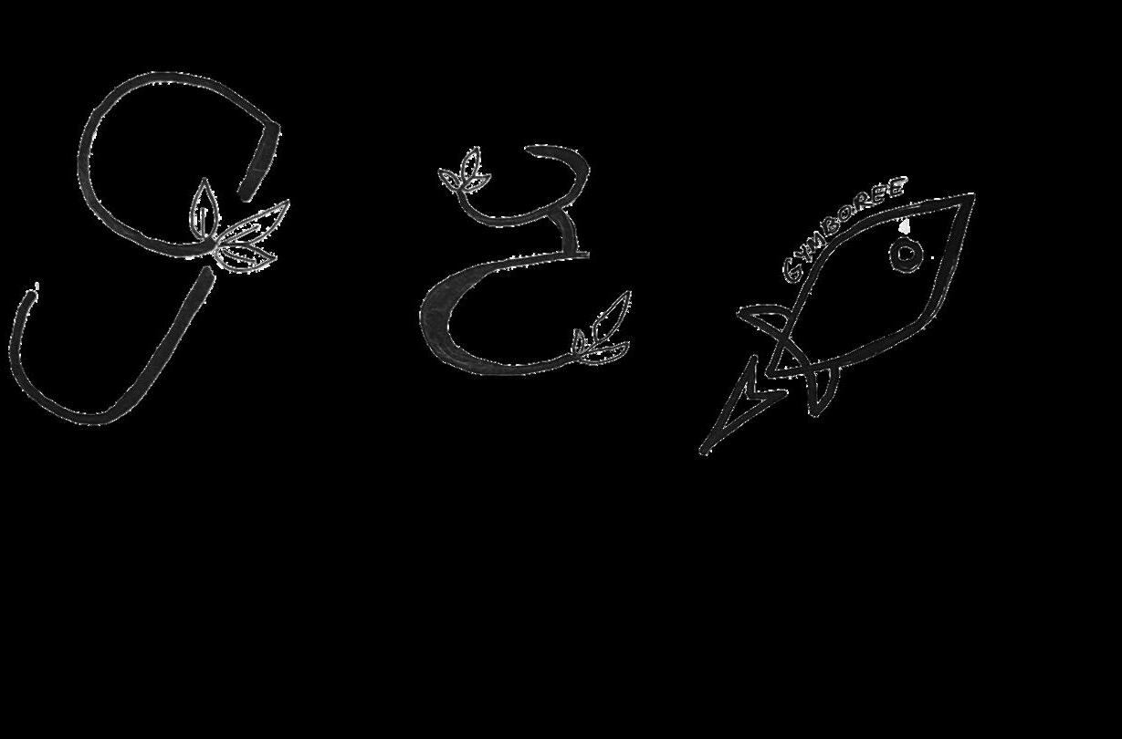
8. Lowercase “g” with diamond as the ear.
10. Dragonfly connected to the uppercase”G” for a place to land.
11. Uppercase “G” as the body of a dragonfly.
12. Bold weight font with an emphasis shine on “o”.
13. Letters that glow like a broadway musical sign.
14. Bold uppercase “G” with glowing diamond.
15. Bold uppercase “G” with diamond connected to it’s bar glowing.
CAMP 1 Bright | Creating happy moments.

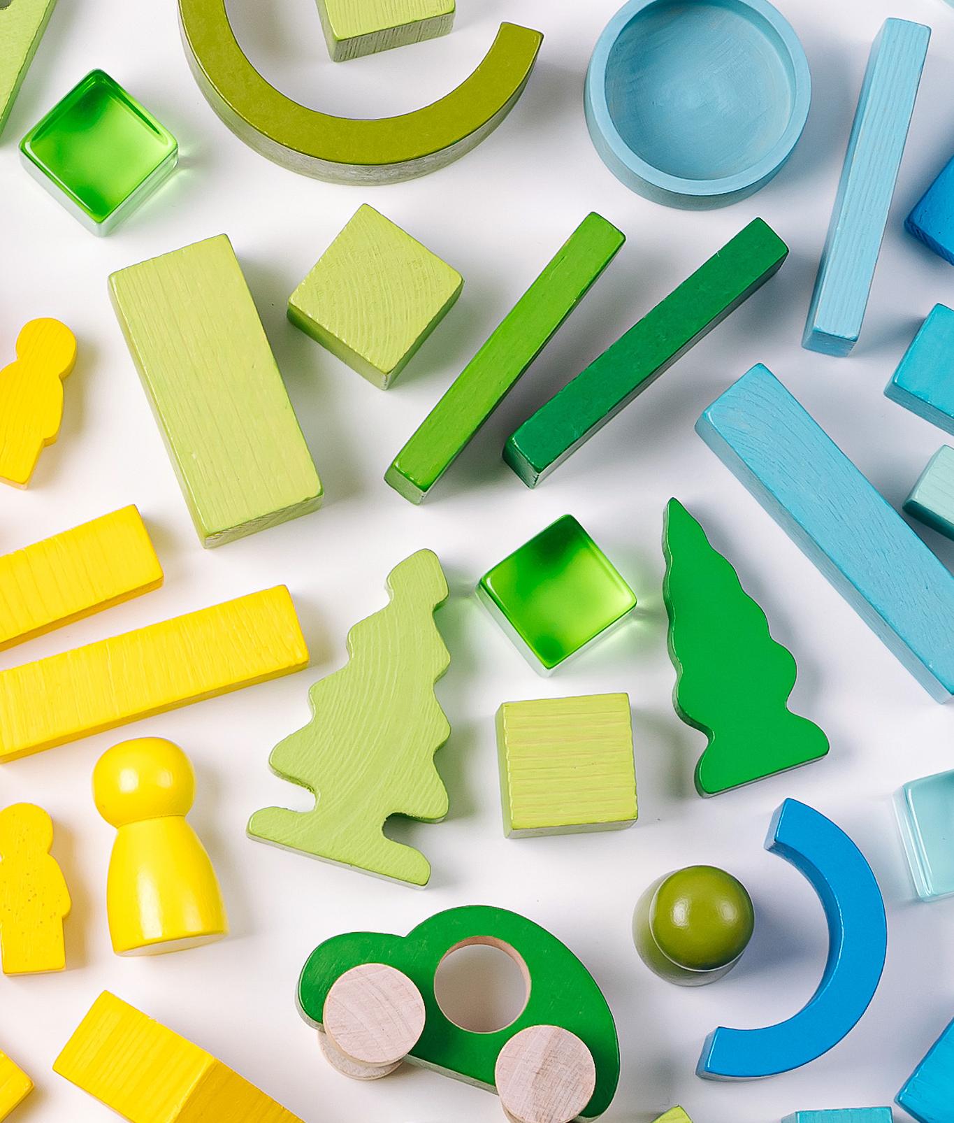
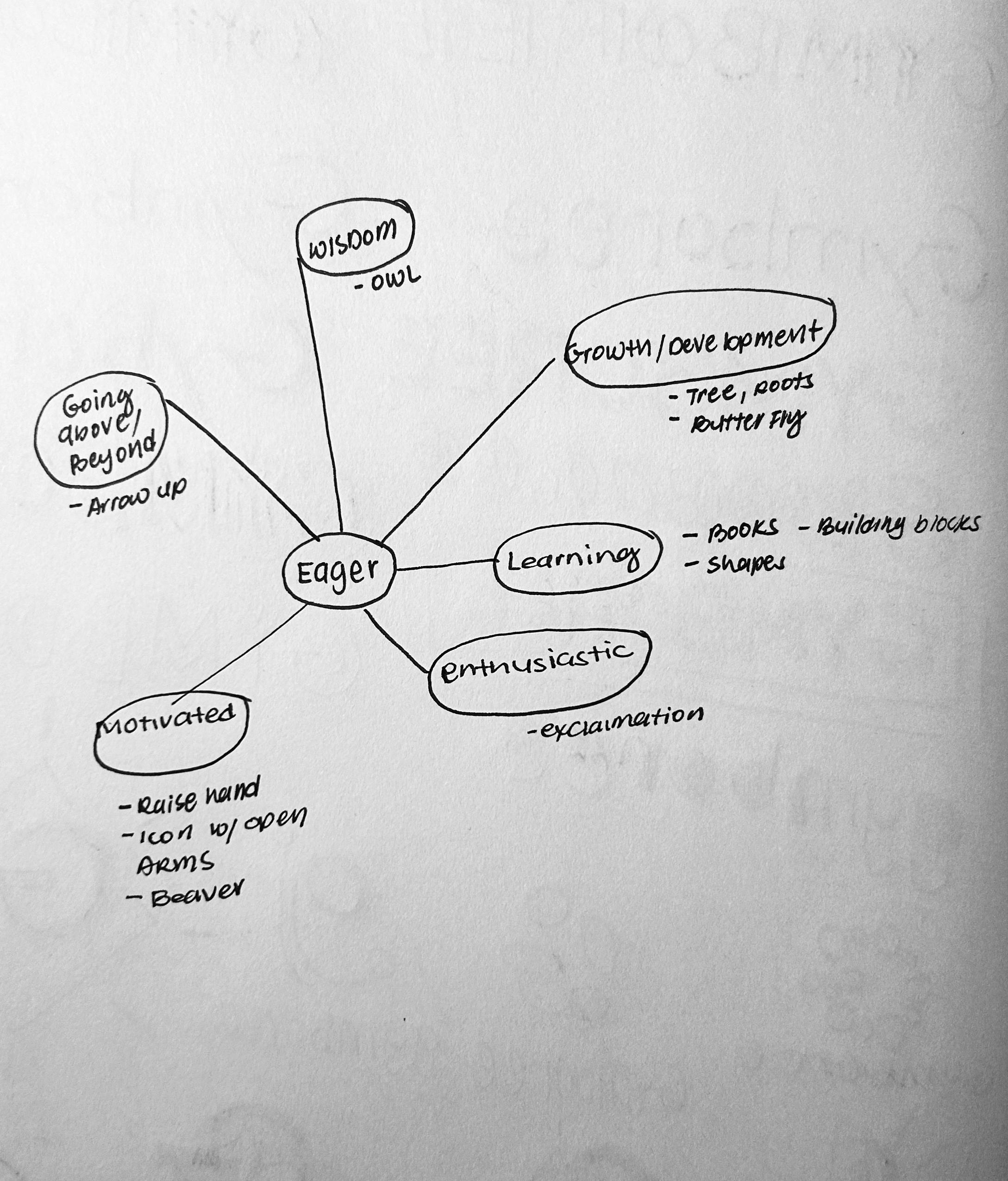
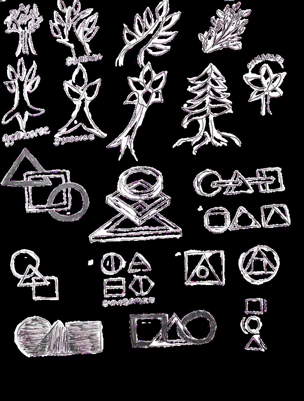
Dove deeper into keyword eager and its meaning of wisdom, going above and beyond, growth or development, learning, enthusiastic and motivated. As a result, conducted research of symbolic elements of an owl, arrow pointing up, tree, roots, butterfly, books, shapes, building blocks, exclamation mark, raised hand, icon with open arms and a beaver.
Proceeded forward in creating sketches that depict trees and roots for growth and development, shapes for learning, and sprites for enthusiastic.
CAMP 2 Eager | Providing activities where kids can learn from and grow.
SYMBOL
1. Inspired by trees or sprouts for growth from learning.
2. Combined shapes inside shapes for learning.
3. Combined the square shape with a triangle and circle inside.
4. Shapes that symbolize two piece puzzles for learning.
4
3
2
1
5. Shapes that children play with including the uppercase letter “G”.
6. Uppercase “G” formed by block pieces and circle for learning to connect shapes.
7. Enthusiastic sprite that incorporates uppercase “G” as the body.
CAMP 2 Eager | Providing activities where kids can learn from and grow.
8. Uppercase “G” with small sprout symbolizing growth from learning.
9. Hand symbolizes learning through touch where index and thumb forms the curve of uppercase “G”.
10. Uppercase “G” symbolizing learning ABC’s from dashes.
11. Uppercase “G” symbolizing learning from connect the dots.
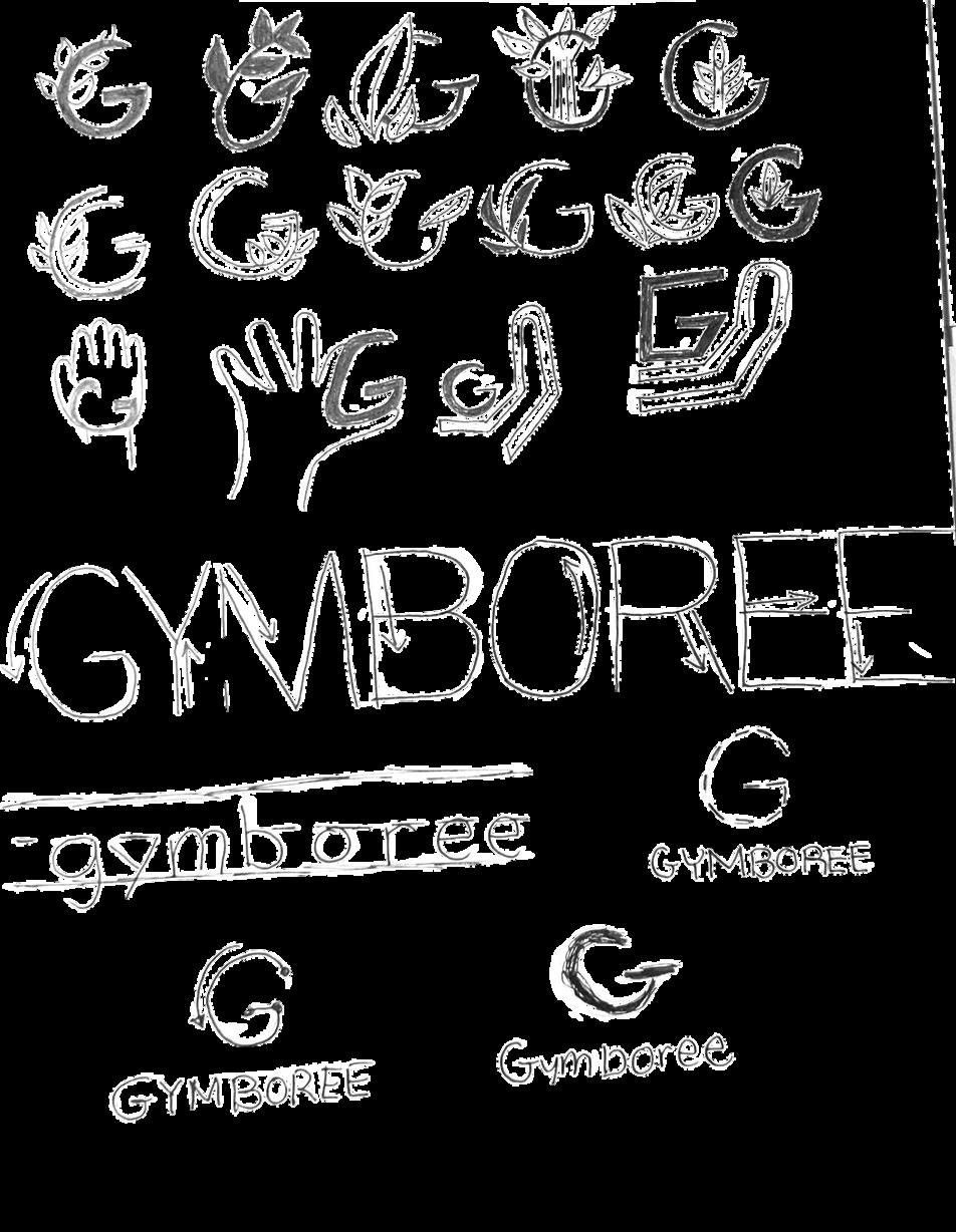
12. Inspired by college varsity letters.
13. Uppercase “G” with graphic elements to depict sound (eager to hear).
14. Lowercase “g” with exploration of big/small every other letter.
CAMP 2
|
15. Wordmark starts with small size and extends to show growth in volume.
16. A playful rounded typeface with a border of lines and shapes.
17. Uppercase “G” in block pieces with a circle.
18. Shapes that connect together to make an abstract uppercase “G”.
CAMP 2 Eager | Providing activities where kids can learn from and grow.
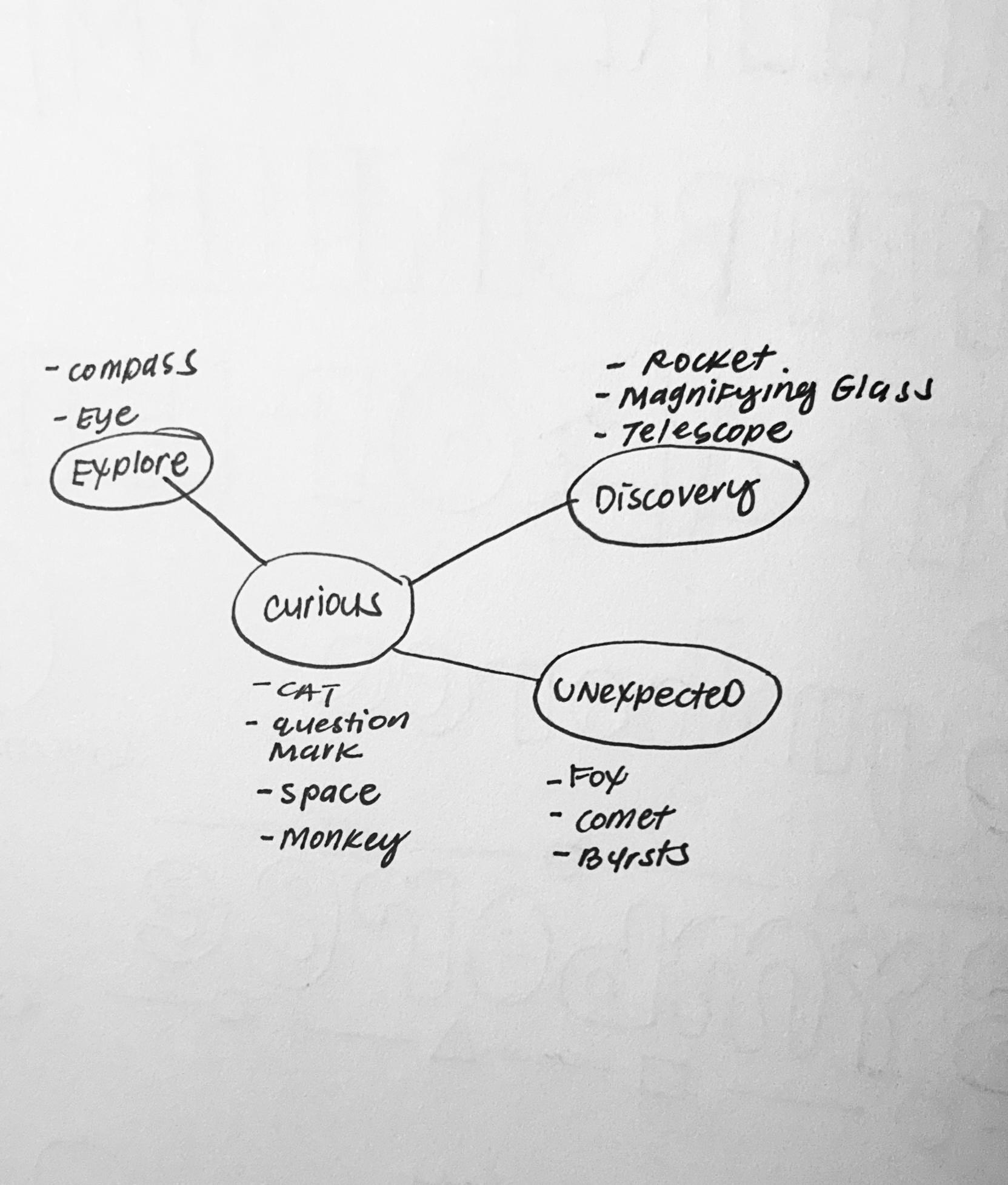
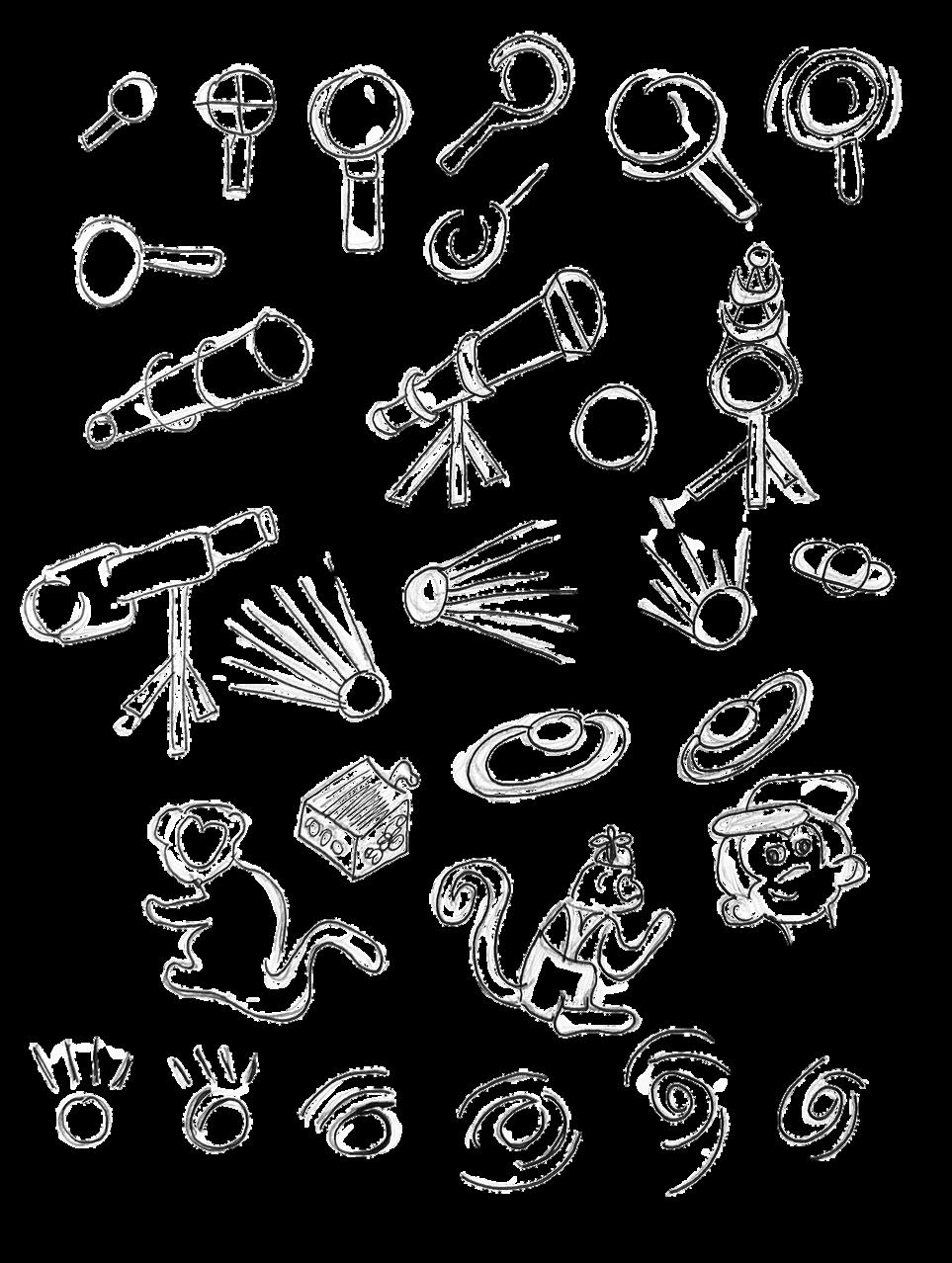
Dove deeper into keyword curious and its meaning of explore, discovery, and unexpected. As a result, conducted research of symbolic elements of a cat, question mark, space, a monkey, a compass, eye, rocket, magnifying glass, telescope, fox, comet, and bursts.
Proceeded forward in creating sketches that depict magnifying glass, telescope, burst, monkey, eye, and direction.
CAMP 3 Curious | Helping children to discover and explore the world.
SYMBOL
1. Comet bursting symbolizes discovery.
2. Monkeys are considered curious about things.
3. Symbolizes an eye that discovers or vision.
1 1 2 3
4. Inspired by a telescope with a focus target on an uppercase “G”.
5. Inspired by the moon and space.
6. Lowercase “g” as a curious little guy.
7. Lowercase “g” inspired by Saturn and planets to symbolize discovery.
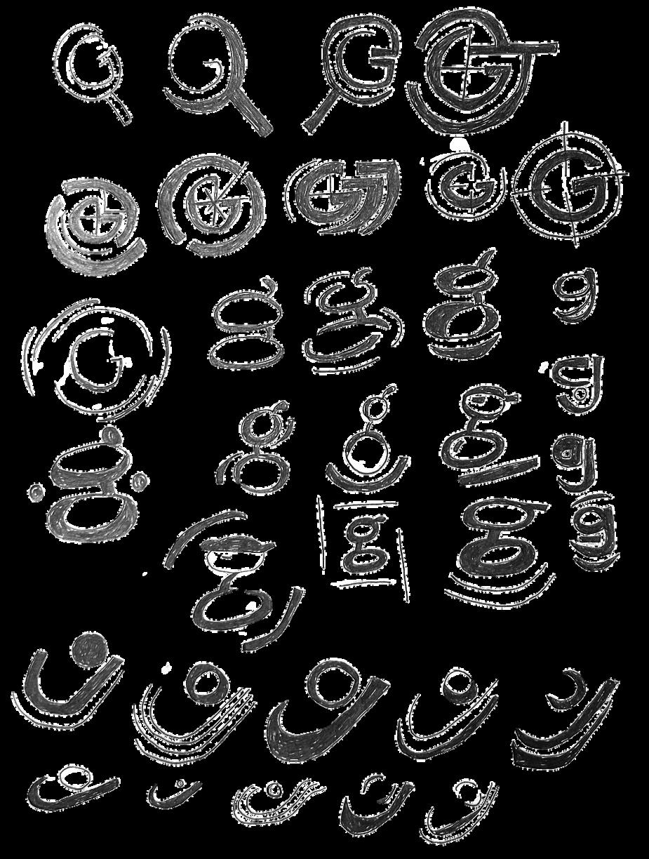
8. Eye inspired graphic uppercase “G”.
9. Uppercase “G” inspired by space and the shape of an eye.
10. Uppercase “G” inspired by constellations.
11. Uppercase “G” inspired by space and the shape of an eye. 1
12. Uppercase “G” in bold font inspired by superman.
13. Uppercase “G” bold outline inspired by an eye with the circle as a pupil.
CAMP 3 Curious | Helping children to discover and explore the world.
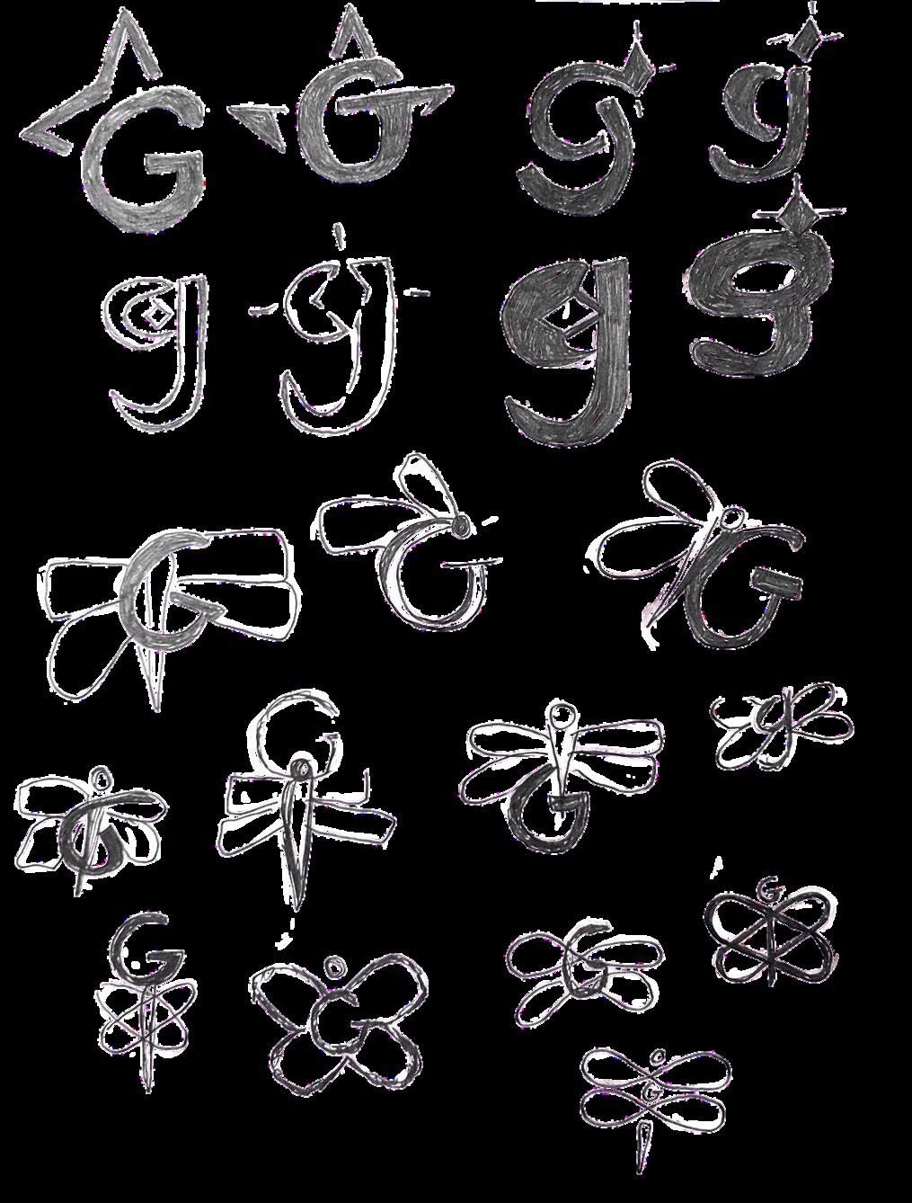
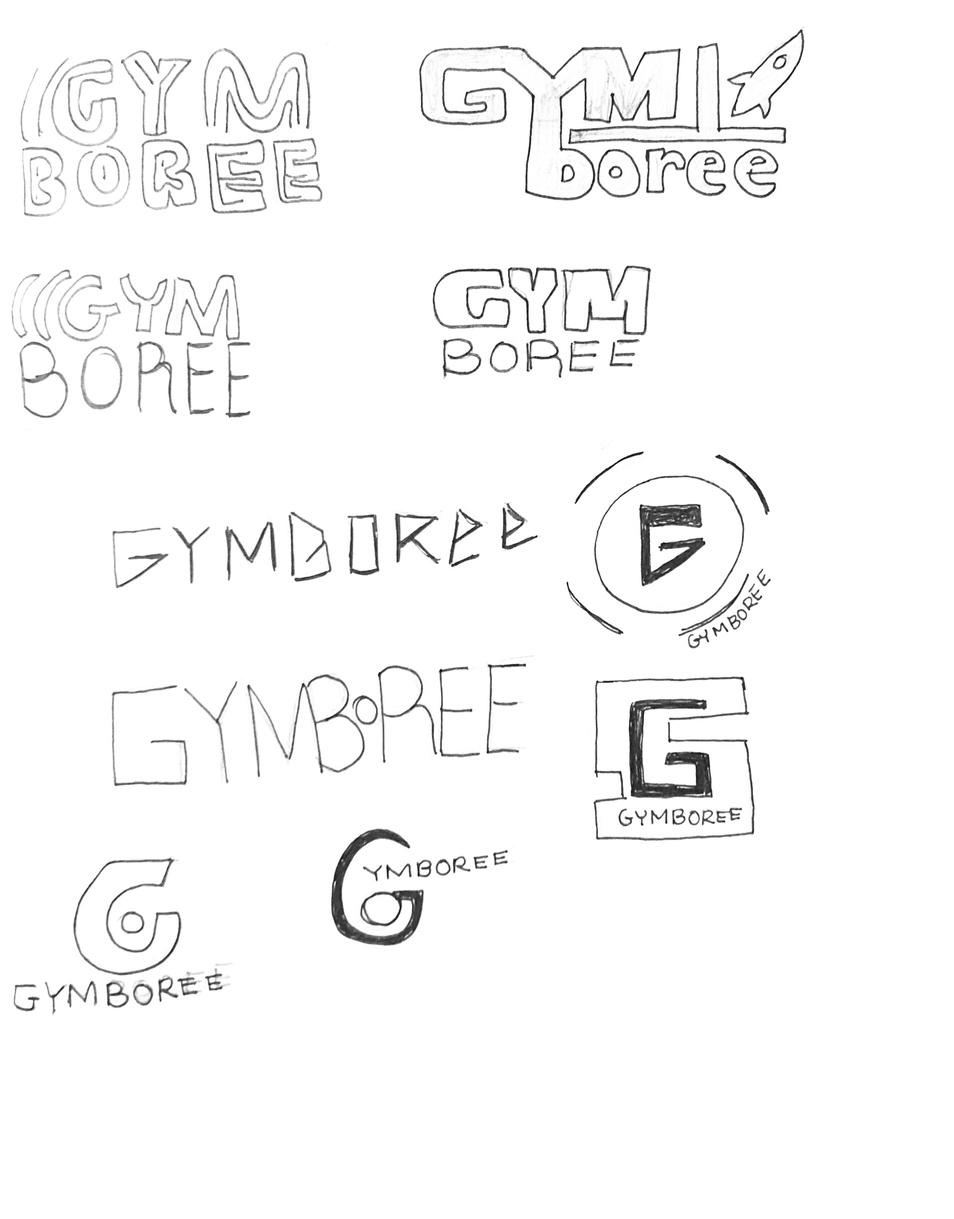
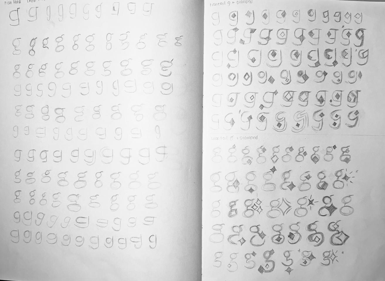
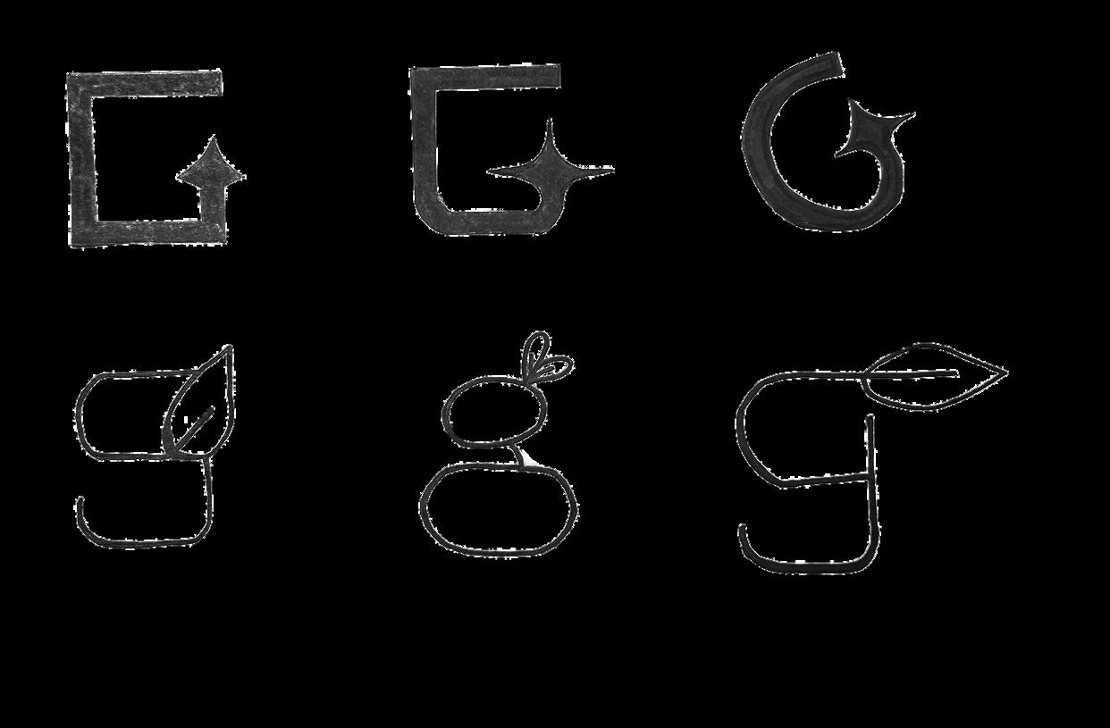
Based on feedback from round one of sketches, moved forward in exploration of graphic marks. Goal was to focus on sparkle, dragonfly, rocket ship, and sprout. In these efforts, this combined all the camps from round one becoming camp four as “happy in learning new things”.
CAMP 4 Happiness in learning new things.
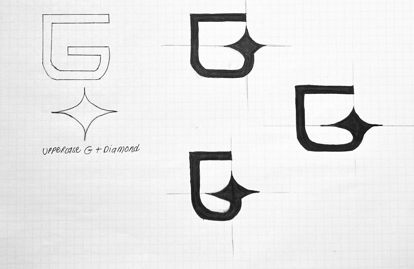
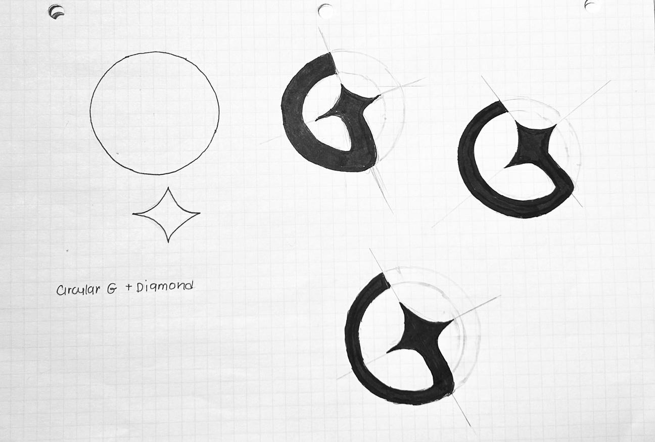
1. San serif uppercase “G” with a slant and diamond shape outline.
2. San serif uppercase “G” with diamond and glowing from upper.
3. Explored glowing uppercase “G” with less mechanical line marks.
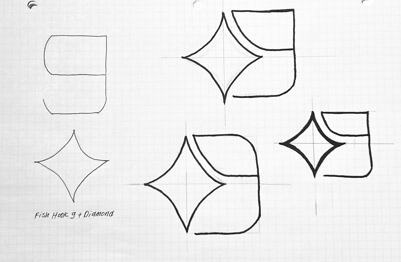
4. Explored a thinner weight fish hook lowercase “g” with a diamond in the bowl.
5. Explored the loop tail style lowercase “g” with the placement of shiny like diamond.
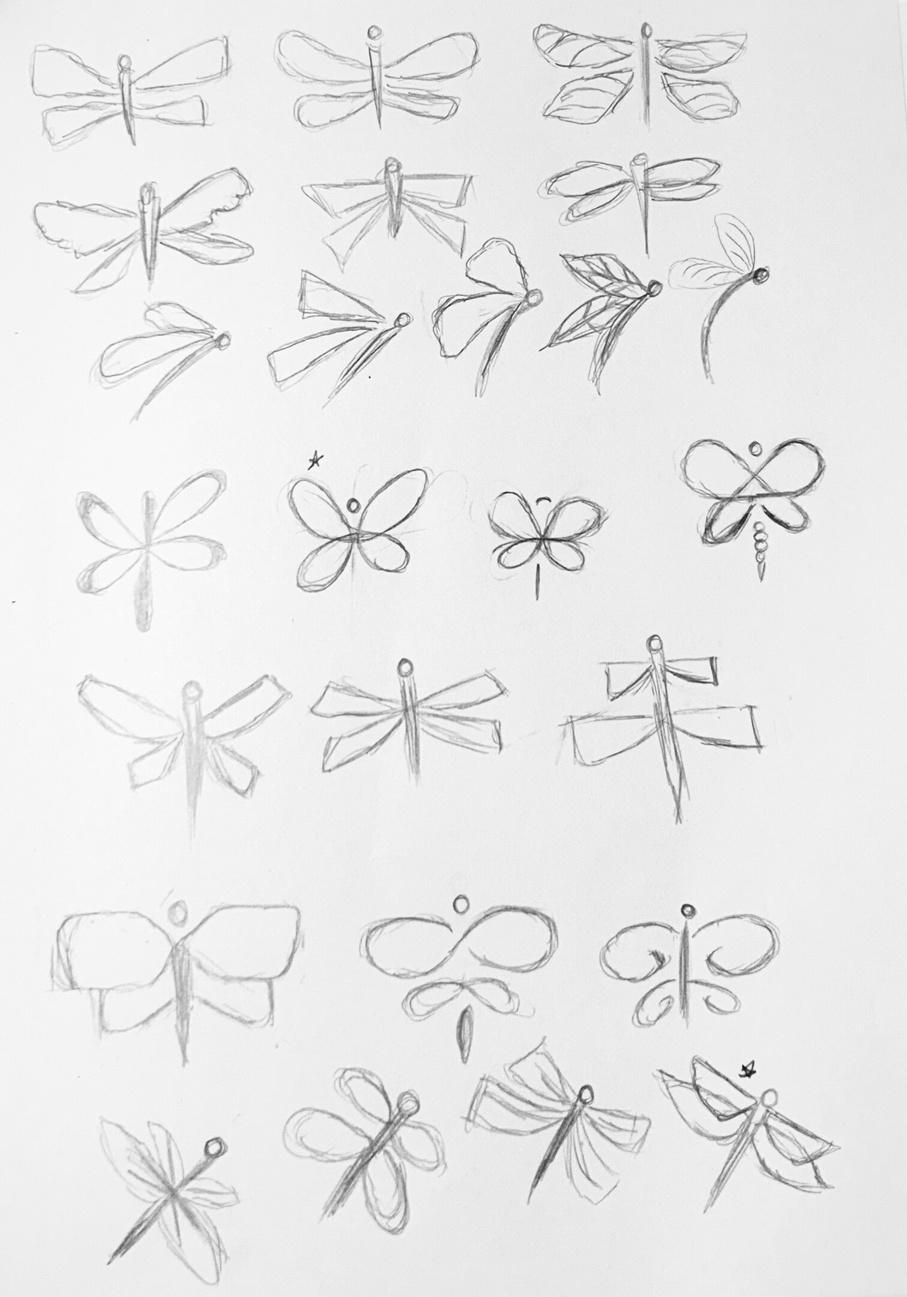
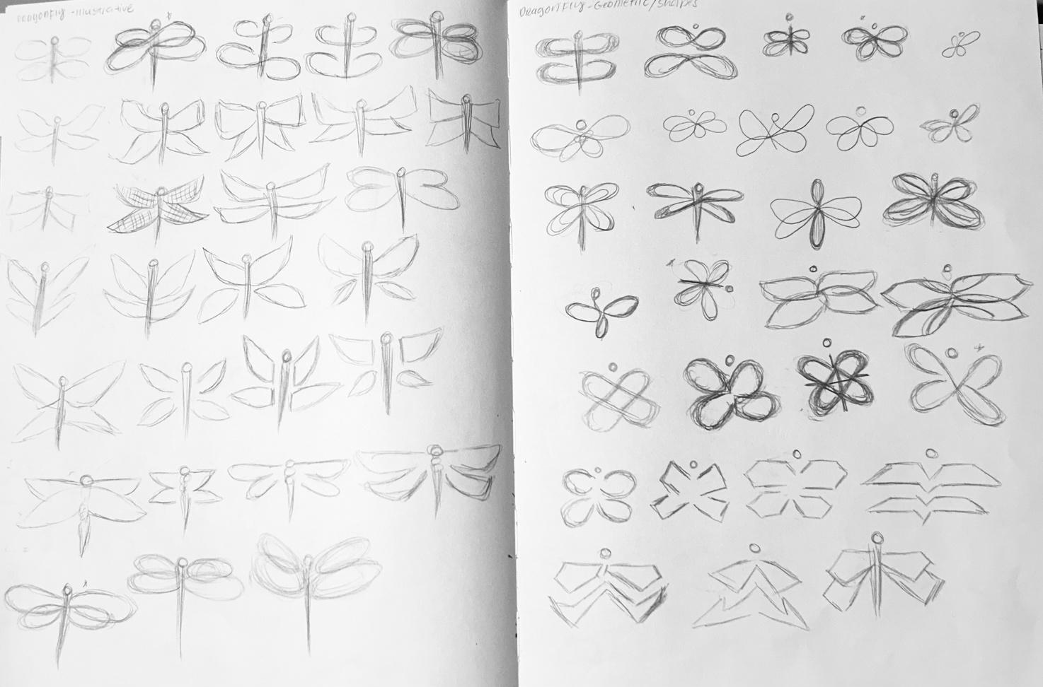
6. Dragonfly with more detailed wings.
7. Dragonfly with square wings as a profile view.
8. Dragonfly with a connected loops (like infinity sign).
10. Dragonfly with overlapping leaf shaped wings at a slanted angle like position.
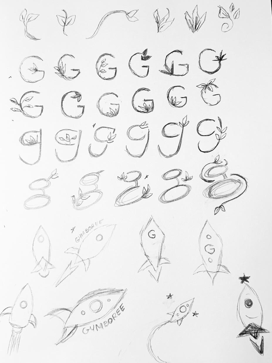
11. Uppercase “G” with sprout sprouting from the bar.
12. Lowercase fish hook “g” with sprout sprouting from the top of the ear.
13. Lowercase loop tail “g” sprouts are sprouting from both top and bottom loops.
14. Rocket flying up and right with “Gymboree” written above.
CAMP 4 Happy in learning things.
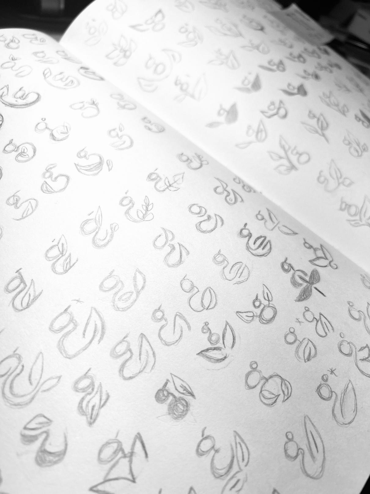
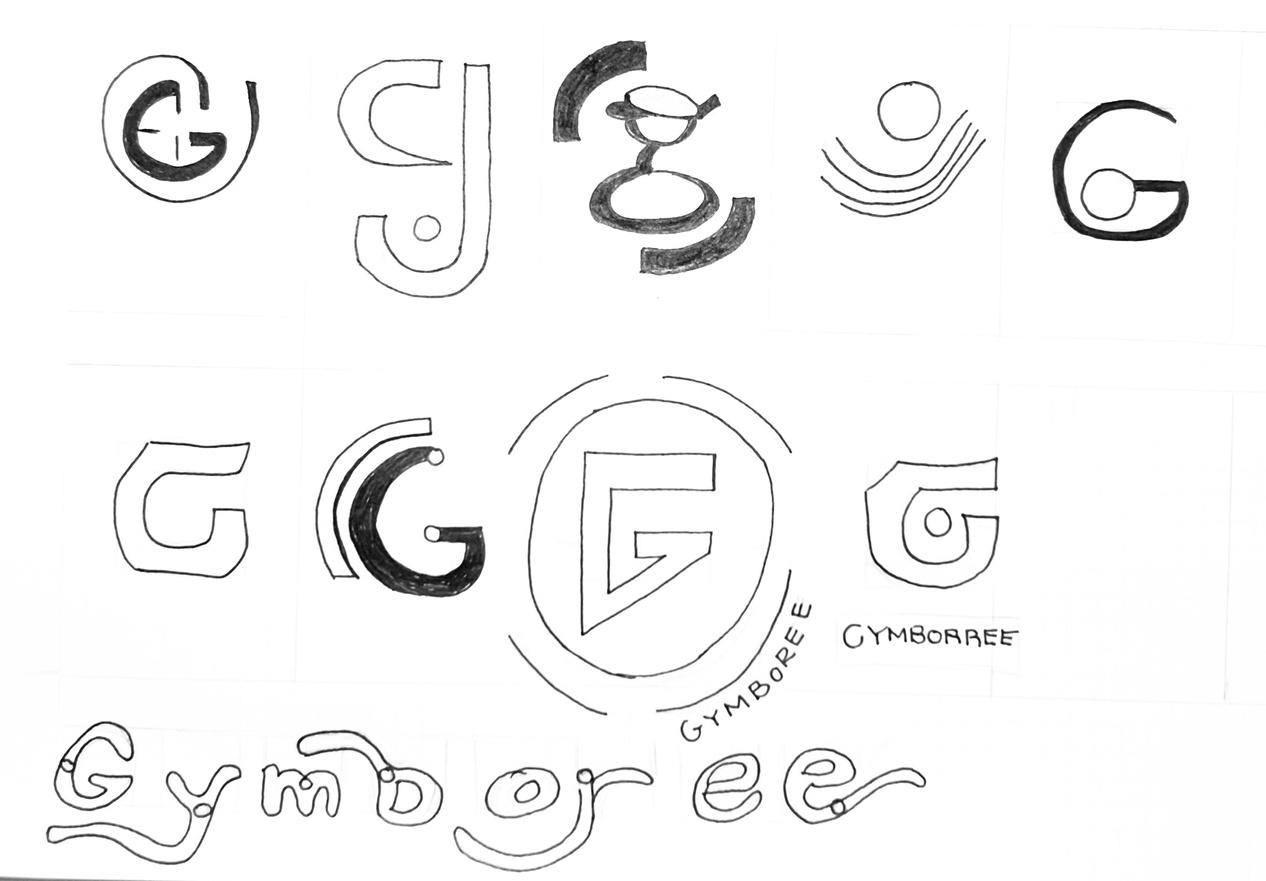
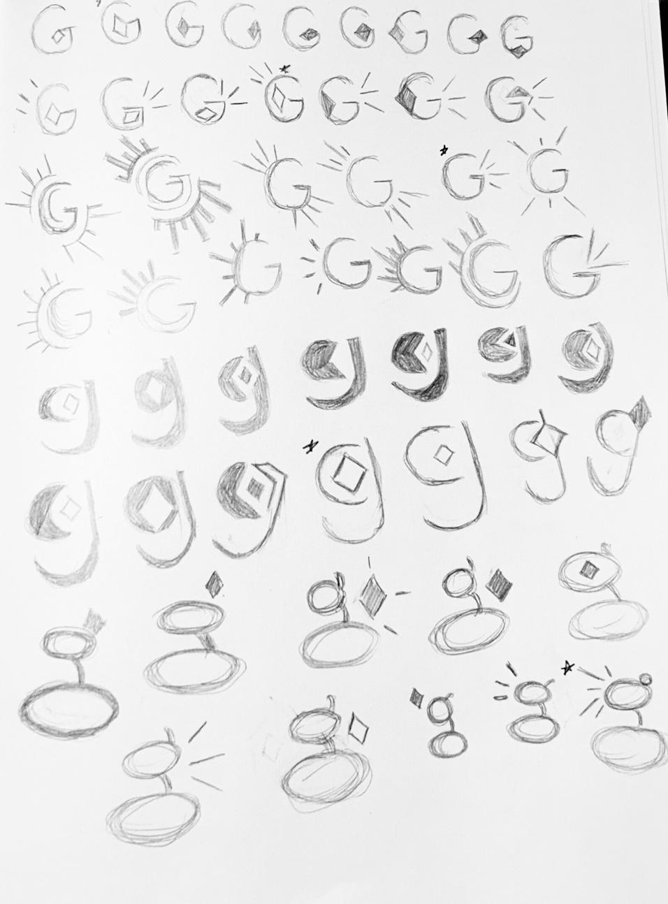
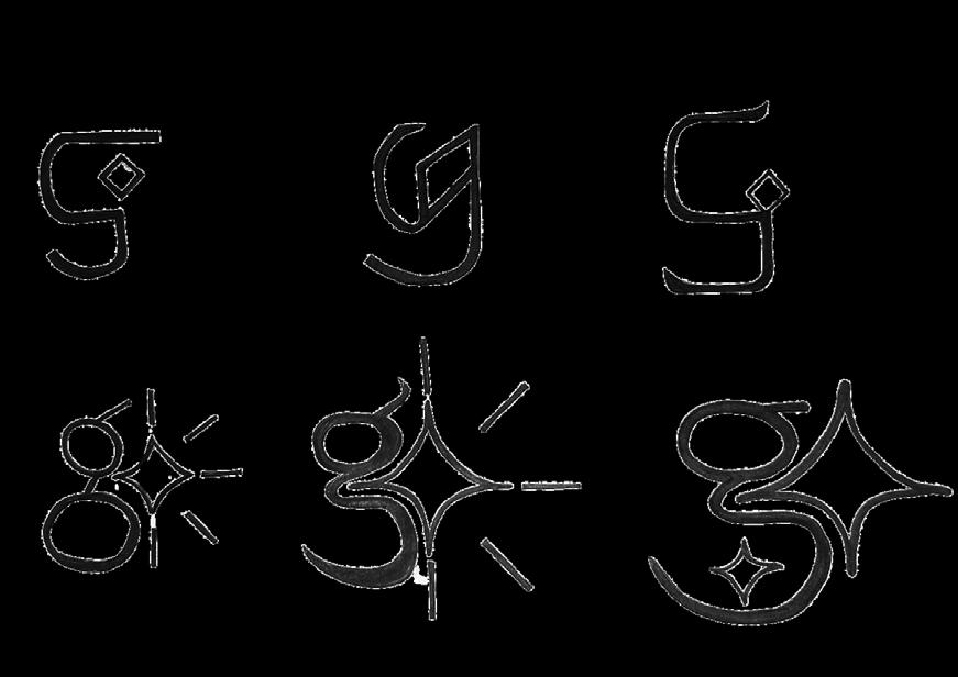
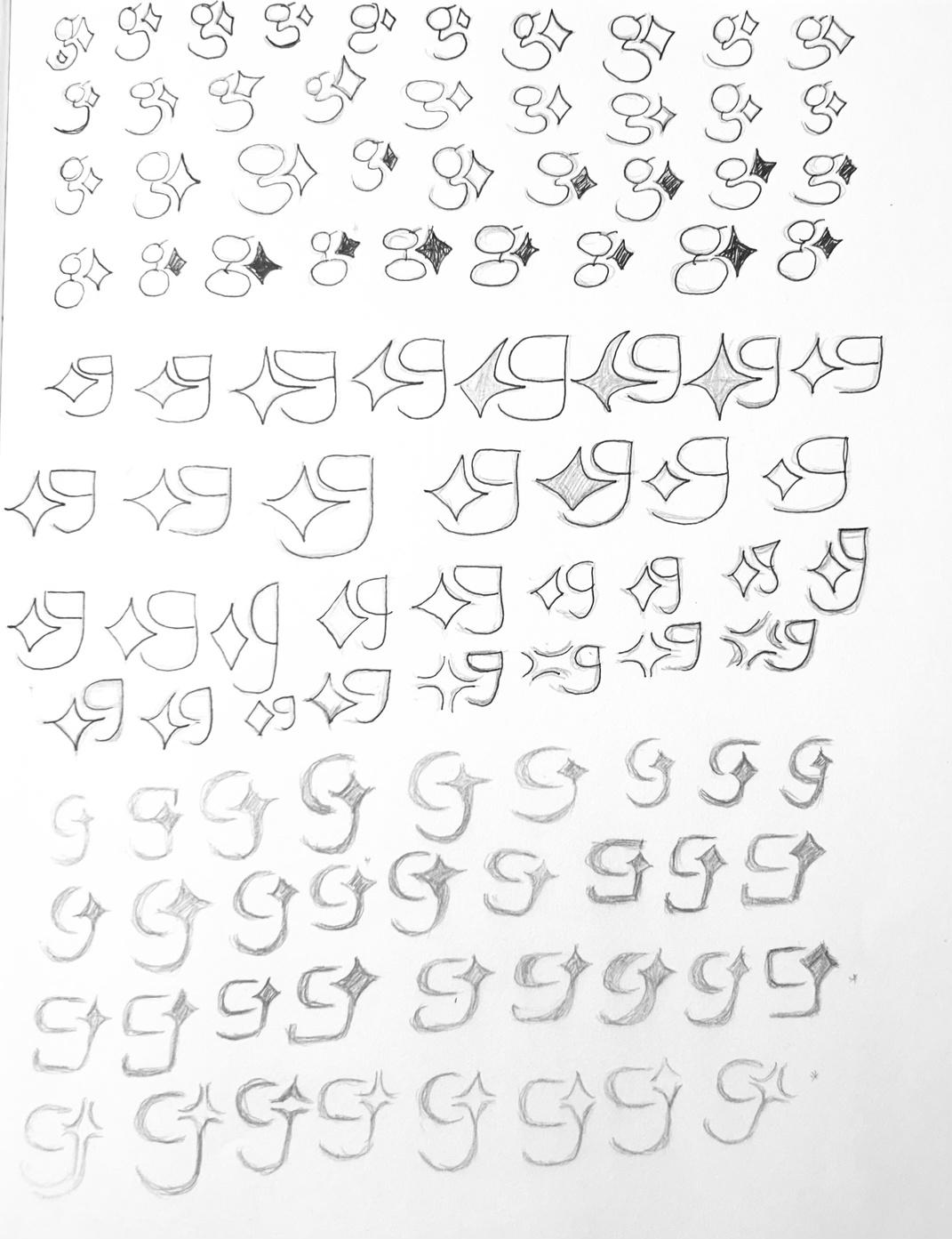
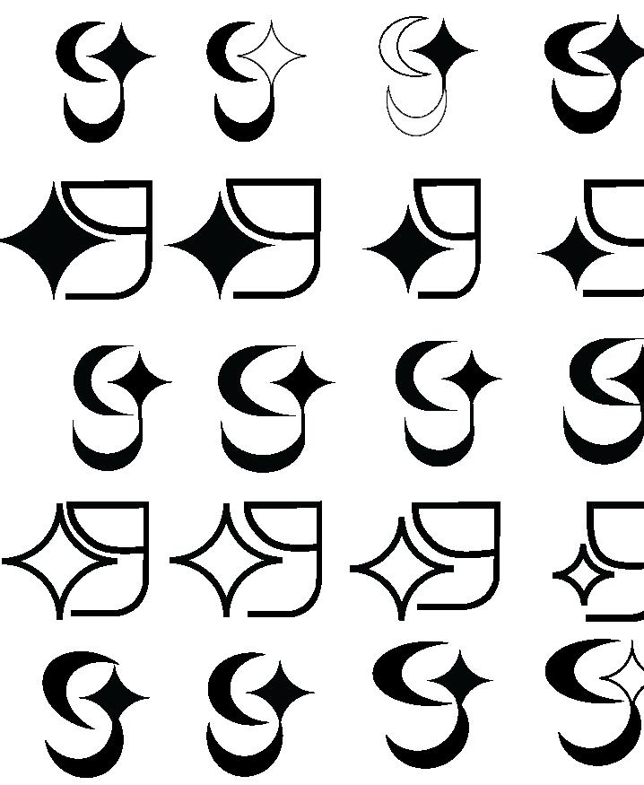
Based on feedback from round two of sketches, moved forward in the exploration of graphic marks and symbols of the theme “a spark in learning and growth”. In this round, the focus was on the lowercase loop tail and fish hook style “g” with a sparkly diamond, dragonfly, or sprout. Created more variations by incorporating the “G” with symbols of different weights and different placements. Refined ideas of the most potential based on peer feedback.
CAMP 5 A spark in learning and growth. 1 2 3
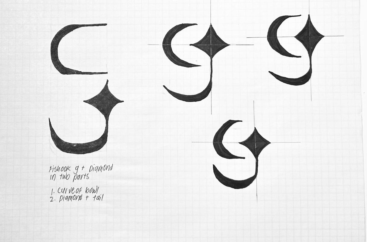
7. Fish hook lowercase “g” with diamond as the closed counter but more squared body.
8. Fish hook lowercase “g” with diamond as the closed counter and curved elements as the body.
9. Fish hook lowercase “g” with diamond as the ear and separated in two parts.
CAMP 5 A spark in learning and growth.
10. Block like fish hook lowercase “g” with diamond below the ear.
11. Loop tail lowercase “g” with diamond more minimal and abstract.
12. Loop tail lowercase “g” with diamond made of four lines to indicate shining more minimal and abstract.
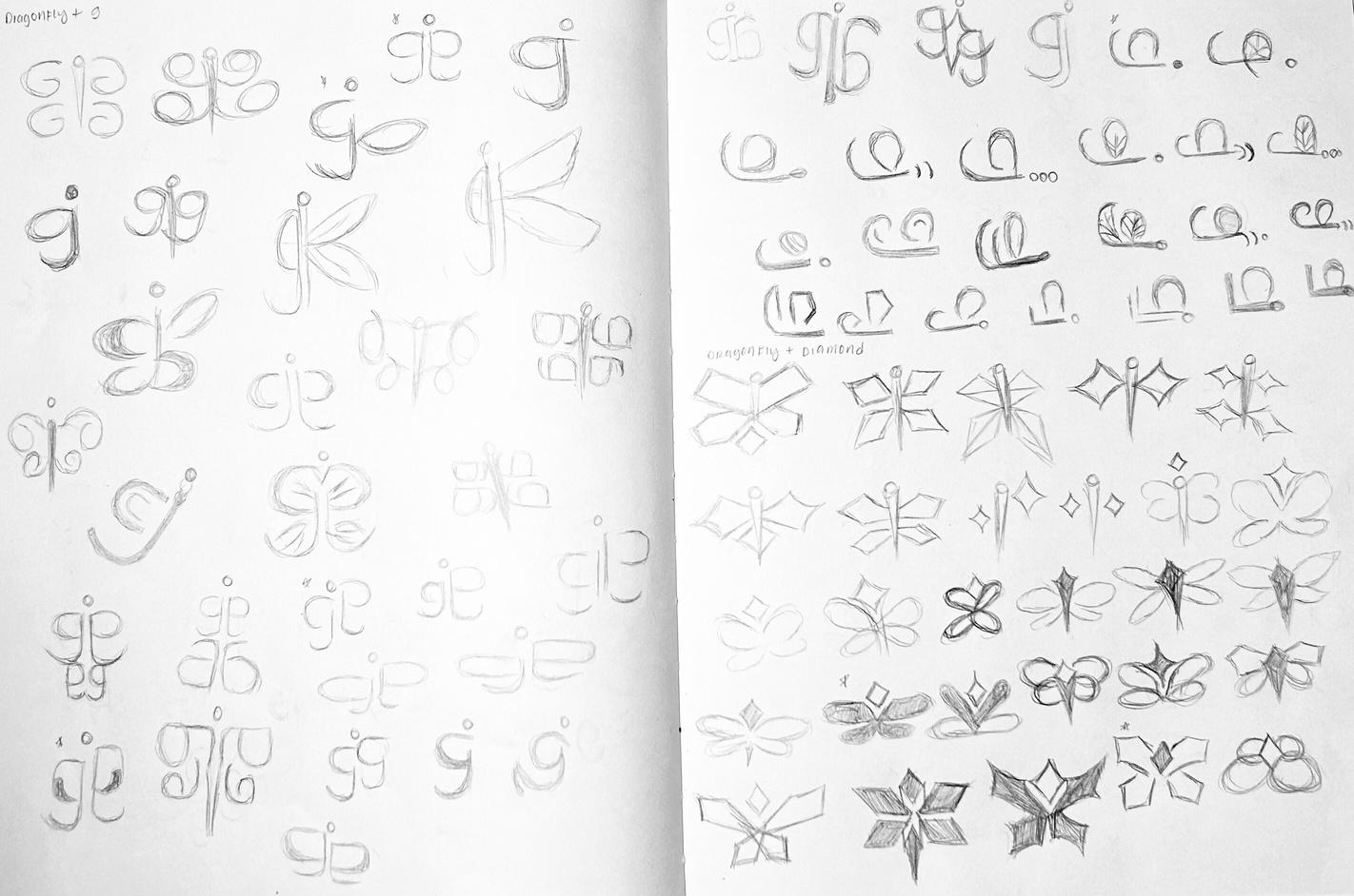
13. Dragonfly with infinity signs used as the wings.
14. Dragonfly with oval looped over wings.
15. Dragonfly with wings that connect opposite of each other.
16. Dragonfly flying with line and circle representing the body.
17. Dragonfly has two abstract hearts as the wings with the circle representing the body.
18. Side view of dragonfly, fish hook lowercase “g” represents body.
19. Fish hook lowercase “g” mirrored to create dragonfly.
20. Fish hook lowercase “g” with more elongated bowl, mirrored to create dragonfly.
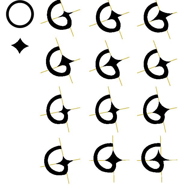
CAMP 5 A spark in learning and growth.
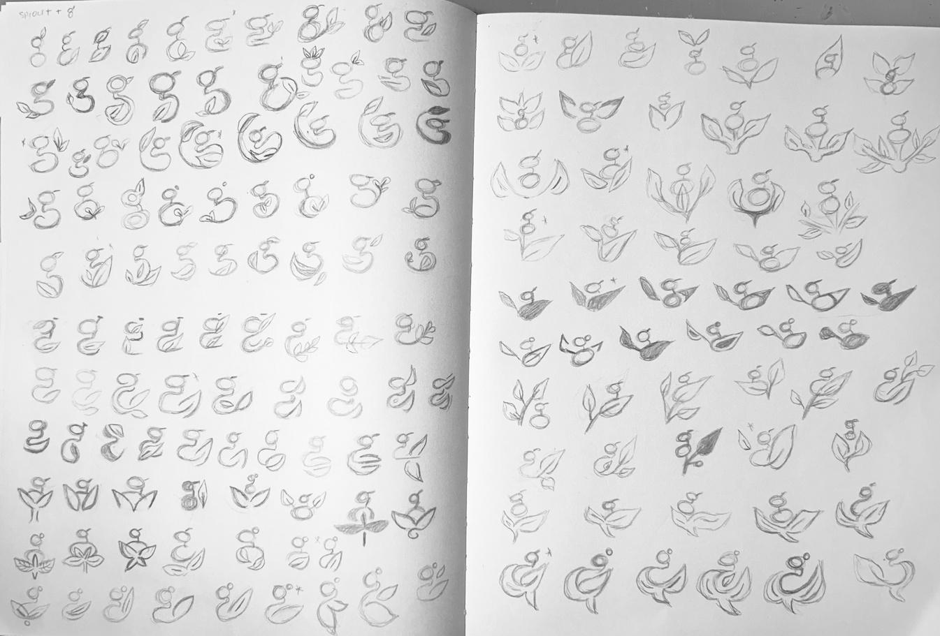
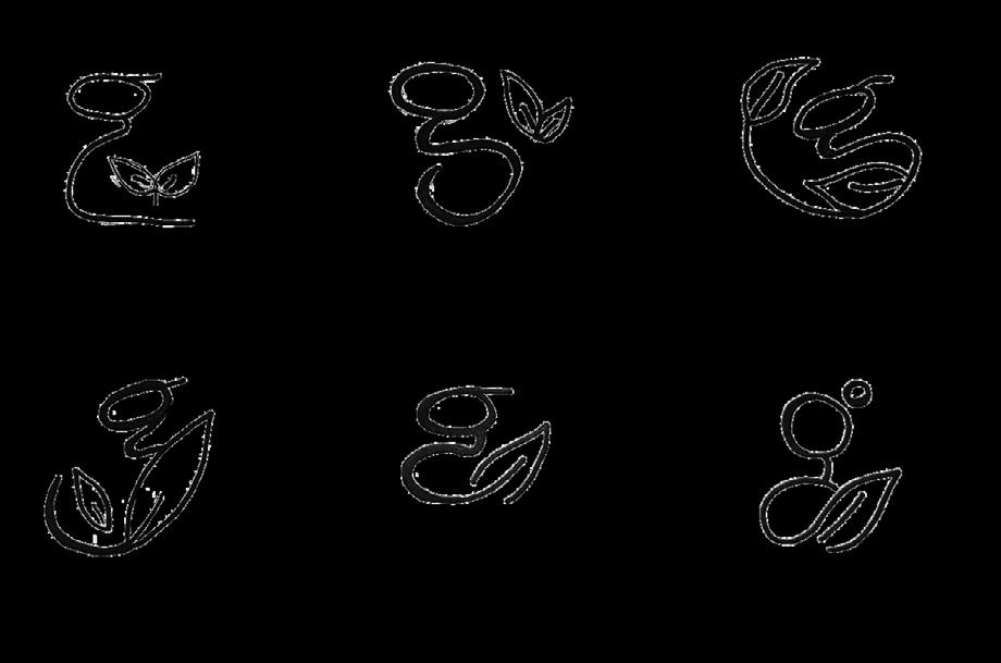
24. Loop tail lowercase “g” with a little sprout.
25. Loop tail lowercase “g” with sprouts circulating.
26. Loop tail lowercase “g” with a simple leaf.
27. Loop tail lowercase “g” with sprout of half it’s bottom loop.
28. Loop tail lowercase “g” with a circle for ear and leaf for bottom loop.
CAMP 5 A spark in learning and growth.
CAMP 5 A spark in learning and growth.
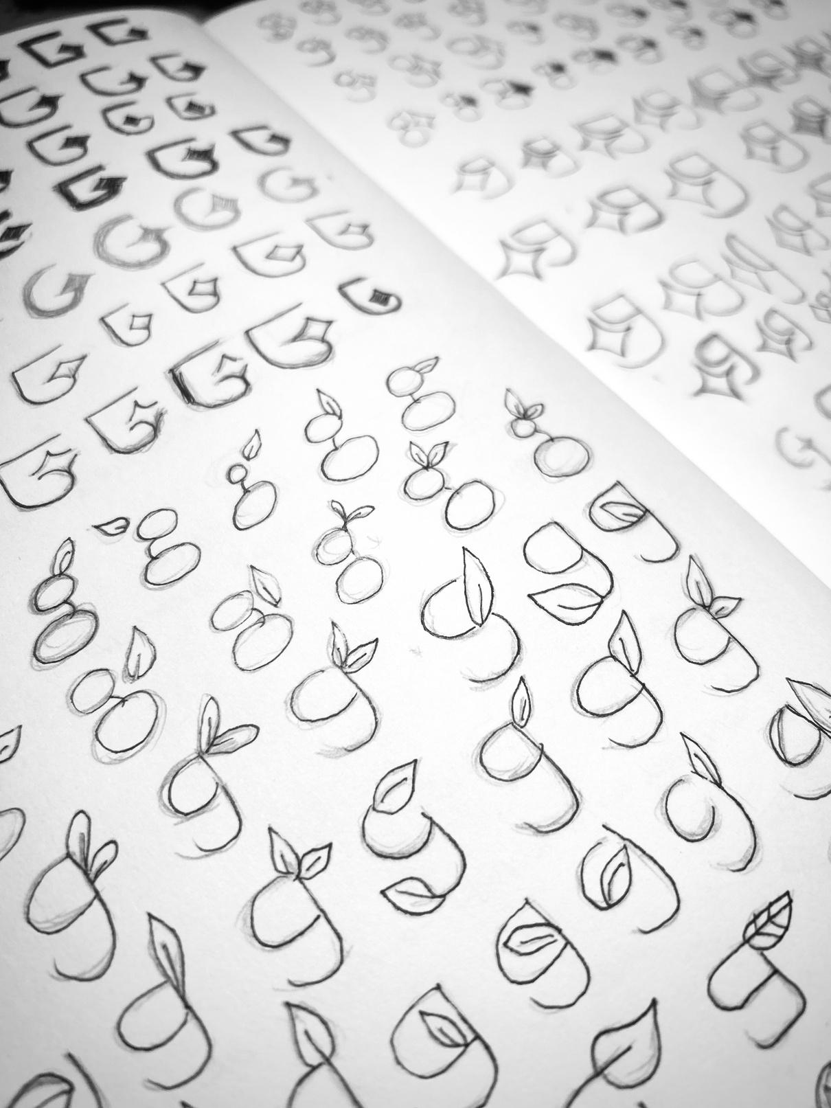
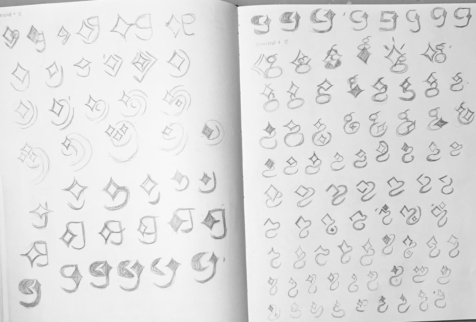
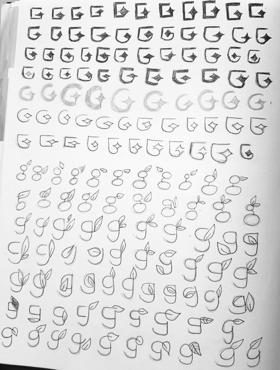
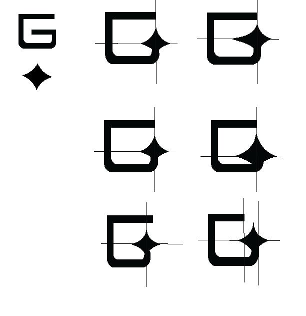
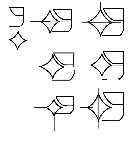
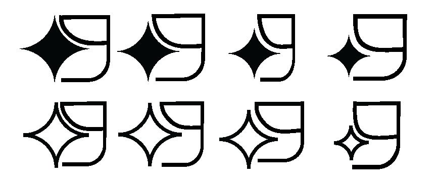
Based on feedback, moved forward and explored simple lowercase g and diamond, uppercase G with diamond and simple lowercase g with sprout ideas. This resulted in refined drawings of the most simple and justified sketches that symbolized bright and growth.
Based on the refined sketches, the top 3 chosen are further refined based on shapes in connection to the g. They are then digitalized in black and white and then in color.
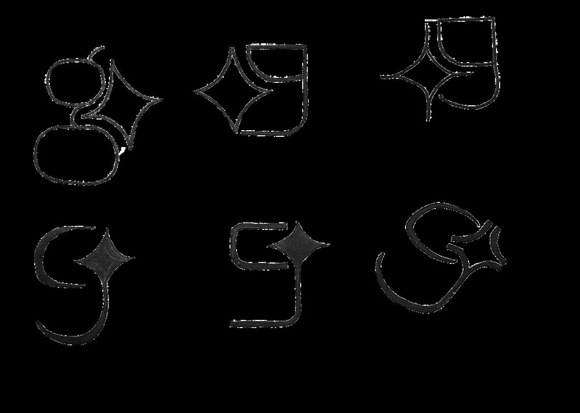
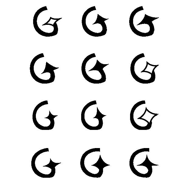
CAMP 6 A spark in learning and growth.
1. Block square style uppercase “G” with diamond as the counter connected to the spur.
2. Block curved bottom uppercase “G” with diamond as the counter connected to the spur.
3. Rounded uppercase “G” with diamond as the counter connected to the spur.
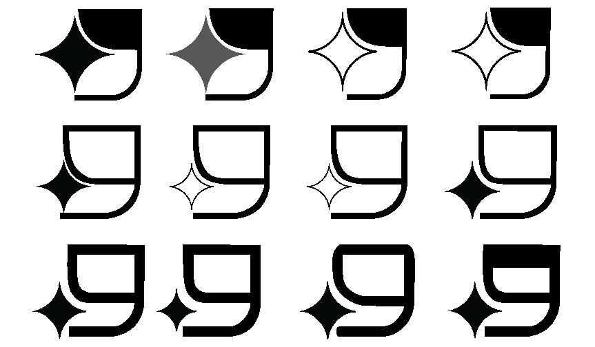
4. Loop tail lowercase “g” with sprouts as the ear.
5. Fish hook lowercase “g” with leaf aligned with upper curve as the ear.
6. Fish hook lowercase “g” with open counter and leaf as the ear.
1 2 4 3 5 6
7. Loop tail lowercase “g” with diamond.
8. Fish hook lowercase “g” where top counter aligns with shape of diamond and tail is parallel to bottom point of diamond.
9. Fish hook lowercase “g” where top counter aligns with shape of diamond and tail is parallel to the center of diamond bottom.
10. Rounded counter of fish hook lowercase “g” and tail is connected to diamond.
11. Squared counter of fish hook lowercase “g” and squared tail is connected to diamond.
11. Slanted rounded fish hook lowercase “g” and diamond as the ear. 7 8 9 10 11 12
CAMP 6 A spark in learning and growth.
Be bold, shine bright like a diamond.
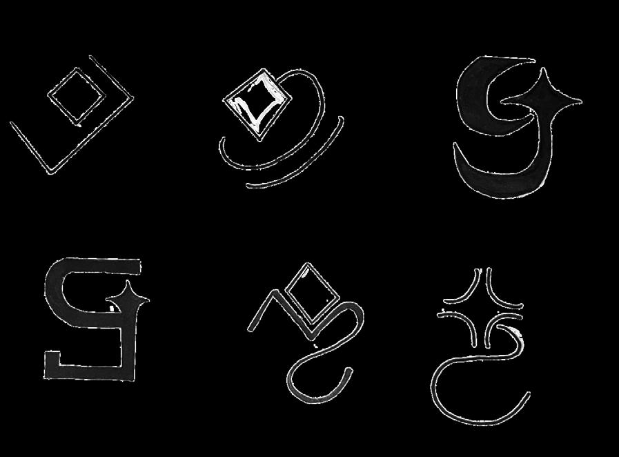
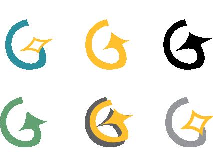
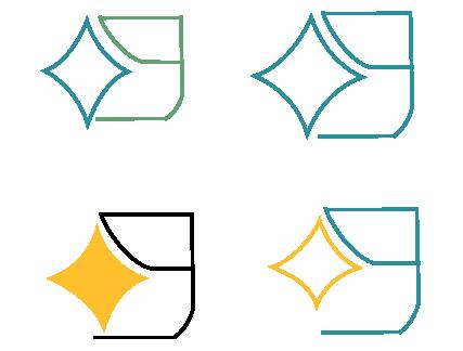
REFINED CONCEPT 1
Blocked with curved bottom uppercase“G” combined with diamond as the counter.
REFINED CONCEPT 2
Slanted curved uppercase “G” combined with diamond as the counter.
Be bold, shine bright like a diamond.
REFINED CONCEPT 3
Fish hook lowercase “g” accompanied by the diamond, upper counter adjacent to the curved top part of the diamond.
REFINED CONCEPT 4
Fish hook lowercase “g” accompanied by the diamond, as the ear.
Be bold, shine bright.
Be bold, shine bright.
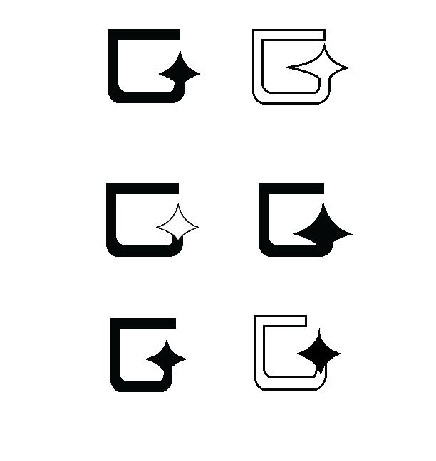
Let the youth shine bright.
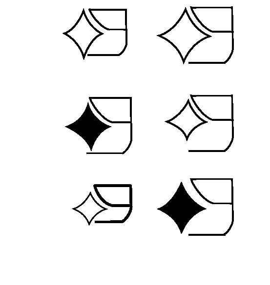
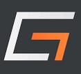
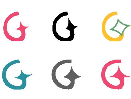
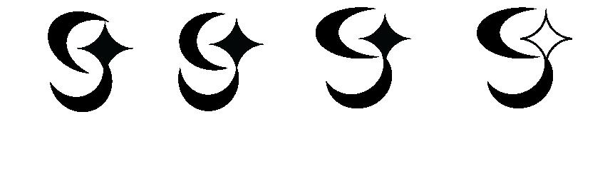
Moved forward and created digital versions (final options) of the lowercase fish hook g with the star and explored the two part lowercase g with the star as the ear. Explored more versions of the first logo because the shape from round 4 looked more like a nine. After further consideration, the final logo has been chosen. Explored different swatches for color.


SV BASIC
ABCDEFGHIJKLMNOPQRSTUVWXYZ
abcdefghijklmnopqrstuvwxyz 1234567890
ABCDEFGHIJKLMNOPQRSTUVWXYZ
abcdefghijklmnopqrstuvwxyz 1234567890
ABCDEFGHIJKLMNOPQRSTUVWXYZ
abcdefghijklmnopqrstuvwxyz 1234567890
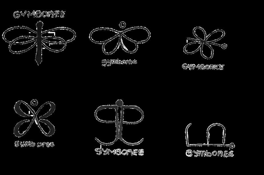
For the visual inspiration, visual research is crucial to establishing and expanding the visual system of a brand. Finding other brand visual standards help guide us to recognize the design principles and be inspired of new ideas for the visual system of our own. Analysis of the best class examples in this section is the best to begin for research as a foundation for Gymboree.
For the look–alikes, research was conducted before deployment. Verified the field to confirm the chosen mark is not currently or has been in use. This prevents unnecessary identity issues the new branding may have.
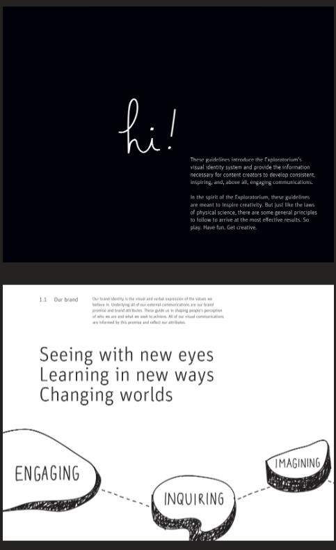
The introduction for Exploratorium includes their keywords visually drawing in the reader. They use typographical hierarchy to guide the reader through the page.
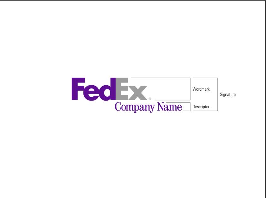
This is very straight forward with the details of the parts of the logo. They provide details of what the word mark is and the descriptor which both resembles the signature.
The introduction for Exploratorium includes their keywords visually drawing in the reader. They use typographical hierarchy to guide the reader through the page.
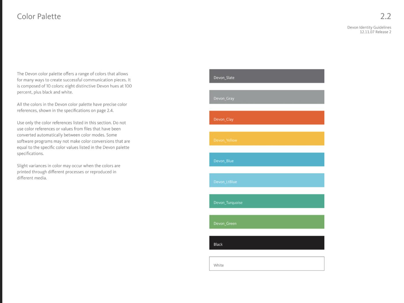
The layout of this is simple with use of negative space. The importance of info is easy to understand from the title, to the details, and to the colors of the color palette.
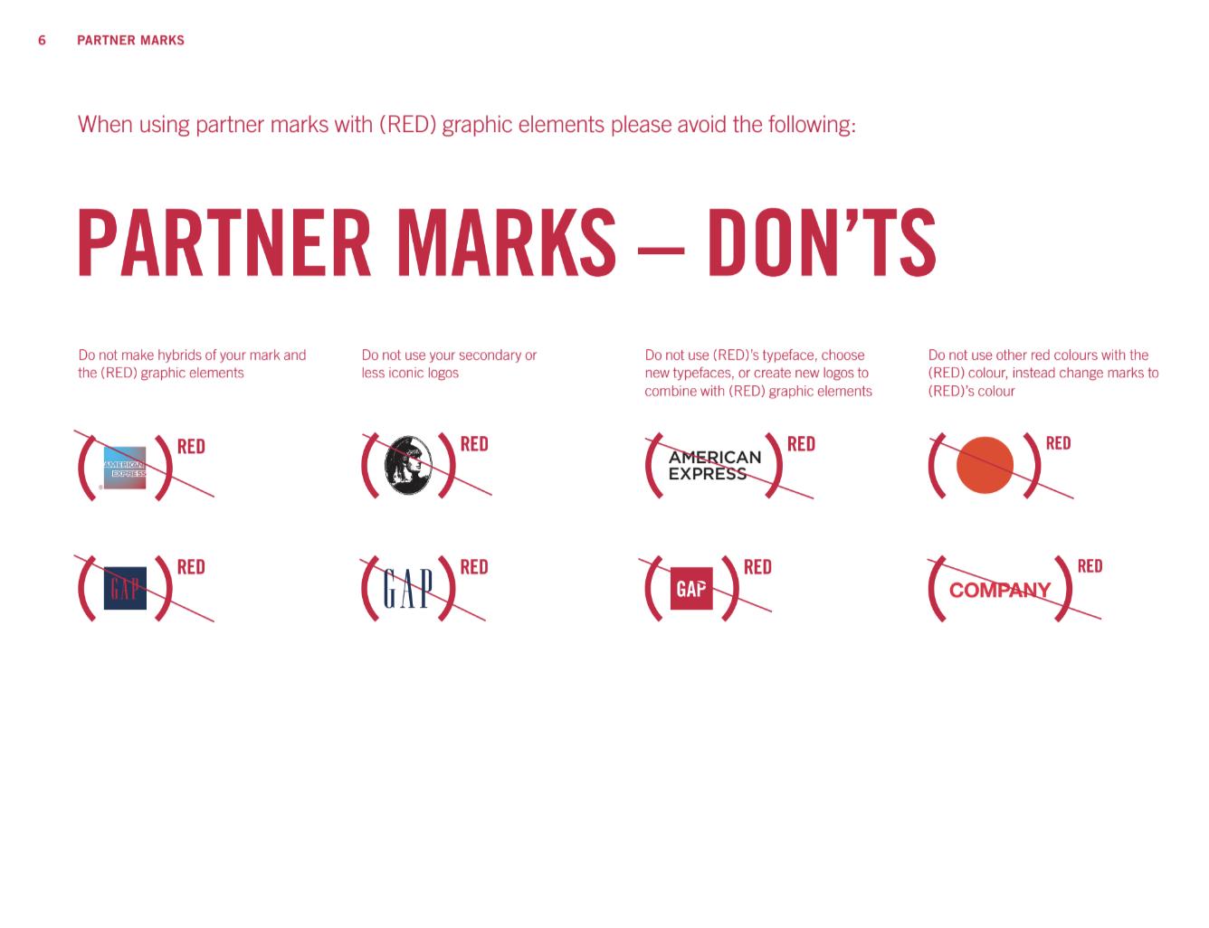
The layout with details above each example of the don’t helps to clarify what they mean of the “don’t” visually. The layout of the page helps to keep the information organized and labeled.
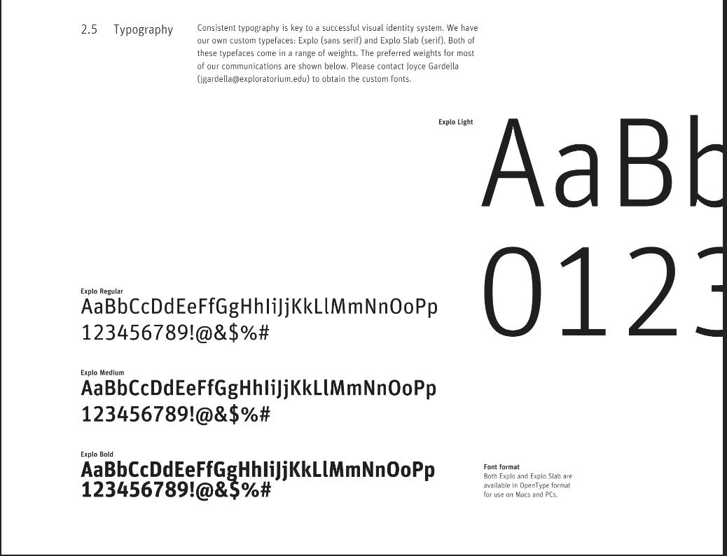
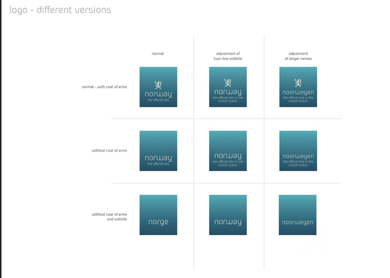
The layout is very simple and clean showing other styles or versions. There are labeled columns and rows that helps viewer to understand the versions with a detailed description.
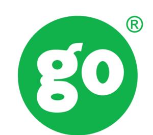
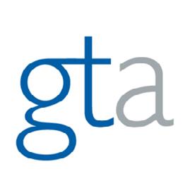
Existing Companies that inspire Gymboree three design concepts.
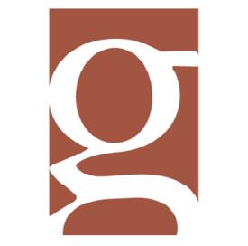
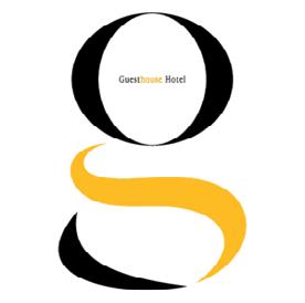
Already been done logos that inspire Gymboree three design concepts.