
Architecture Portfolio Diploma in Architecture @ Singapore Polytechnic
Familia
Computational Design I
Computational Design II

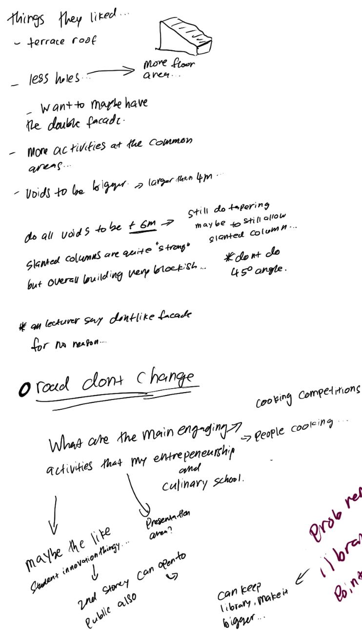
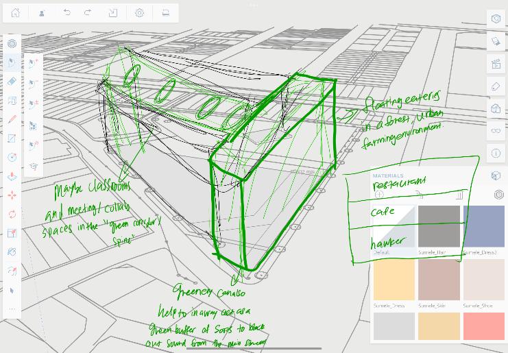
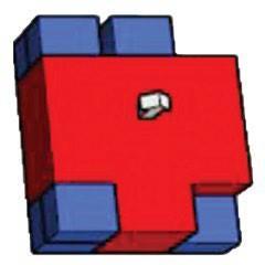
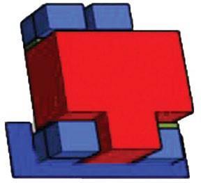
School of Culinary & Entrepreneurship (SCE)
Personal Works
Graphic & Product Design
Content

Lee Yao Yu Selected Works ( 2020-2023) +65 9626 8990 Leeyaoyuyy1@gmail.com Diploma in Architecture, Singapore Polytechnic.
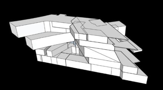
Final Year Project
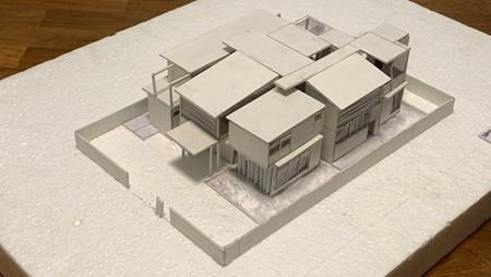
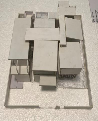
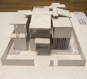
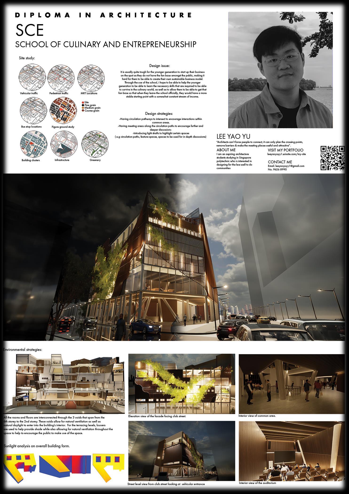
School of Culinary & Entrepreneurship


It is usually quite tough for the younger generation to start up their business on the spot as they do not have the fan base amongst the public, making it hard for them to be able to create their own sustainable business model.
Through this school, i hope to be able to help the younger generation to be able to learn the necessary skills that are required to be able to survive in the culinary world, as well as to allow them to be able to get that fan base so that when they leave the school officially, they would have a more stable starting point with a somewhat constant stream of income.
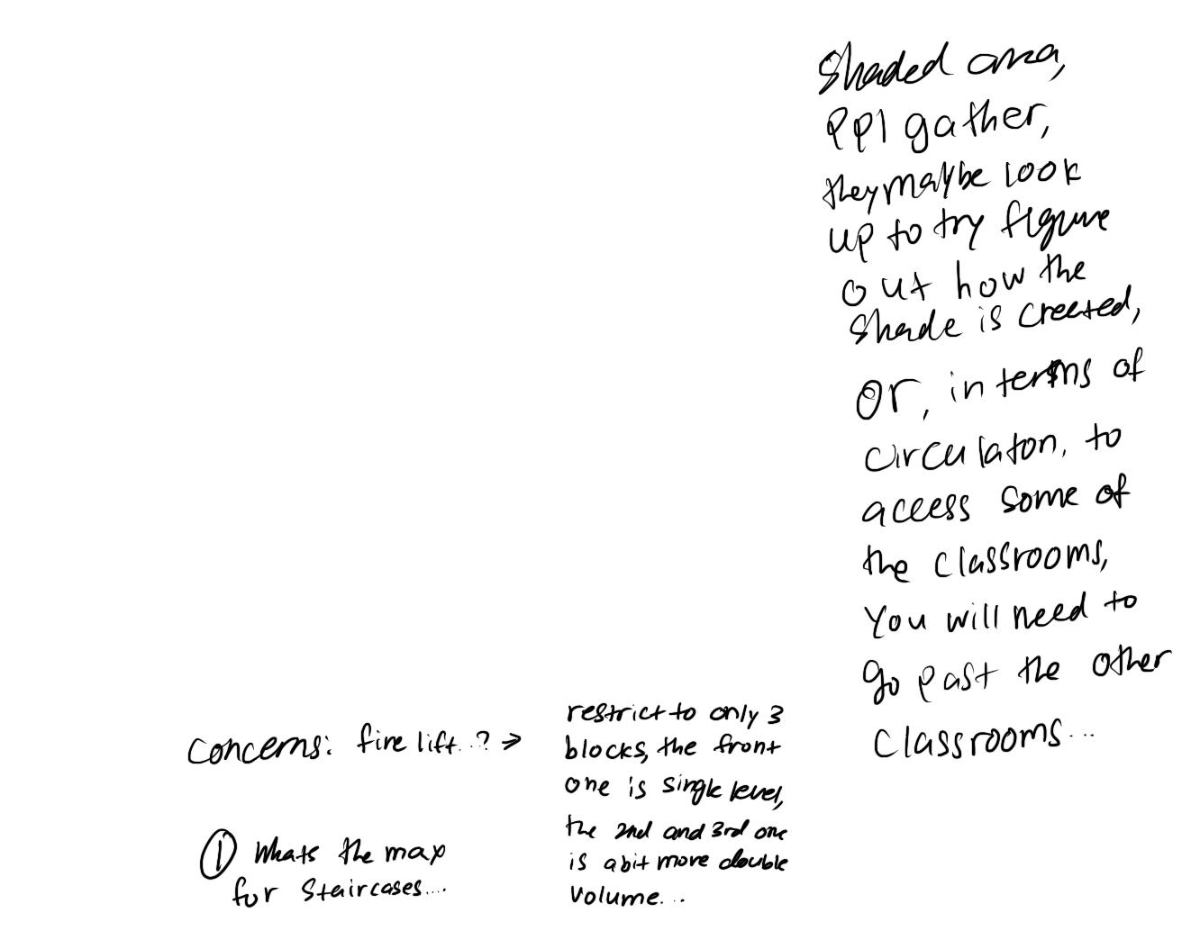
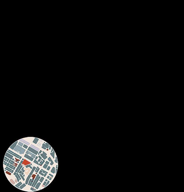
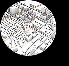
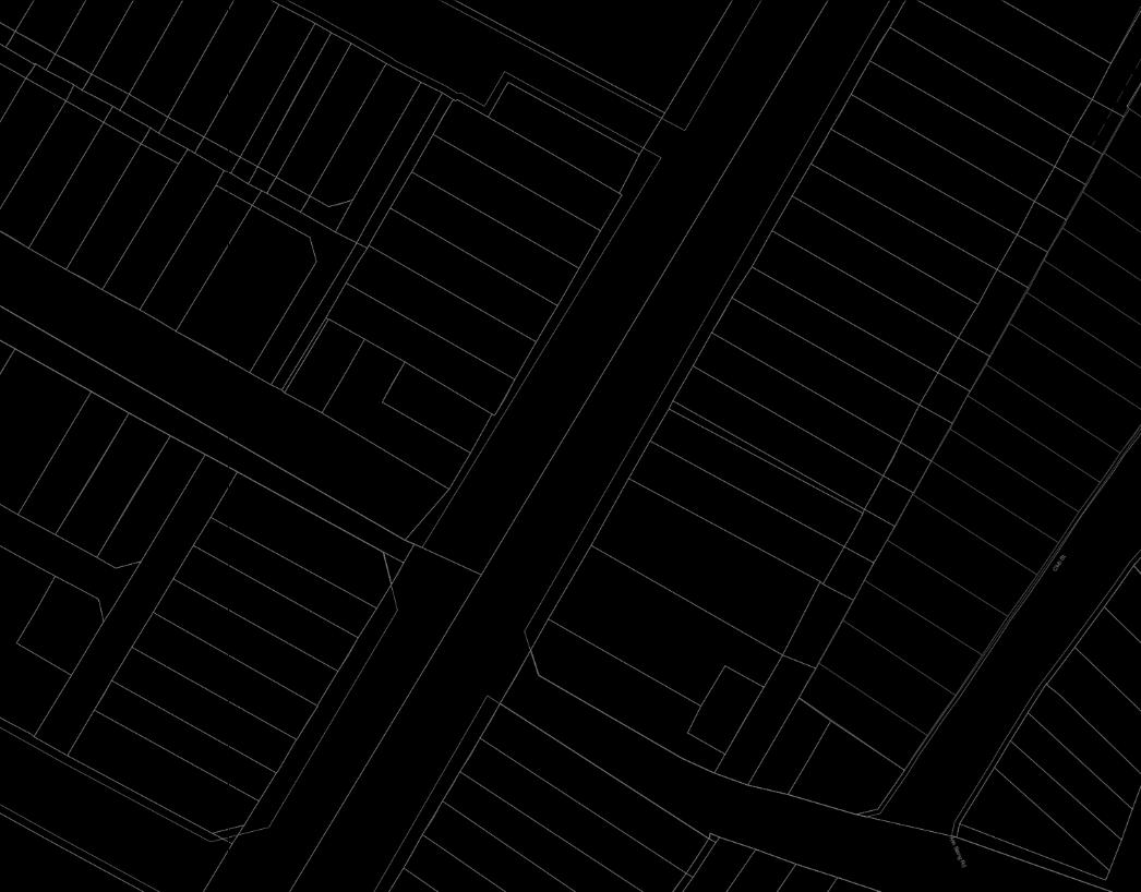
Traffic: Roads with a lighter shade of brown have a lighter traffic flow
Roads with a darker shade of brown have a heavier traffic flow
Greenery: Through this analysis, we can identify how nature is being used to influence the urban landscape as well as the architecture.
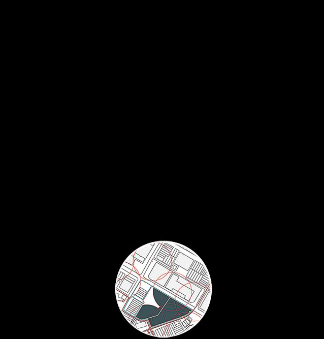
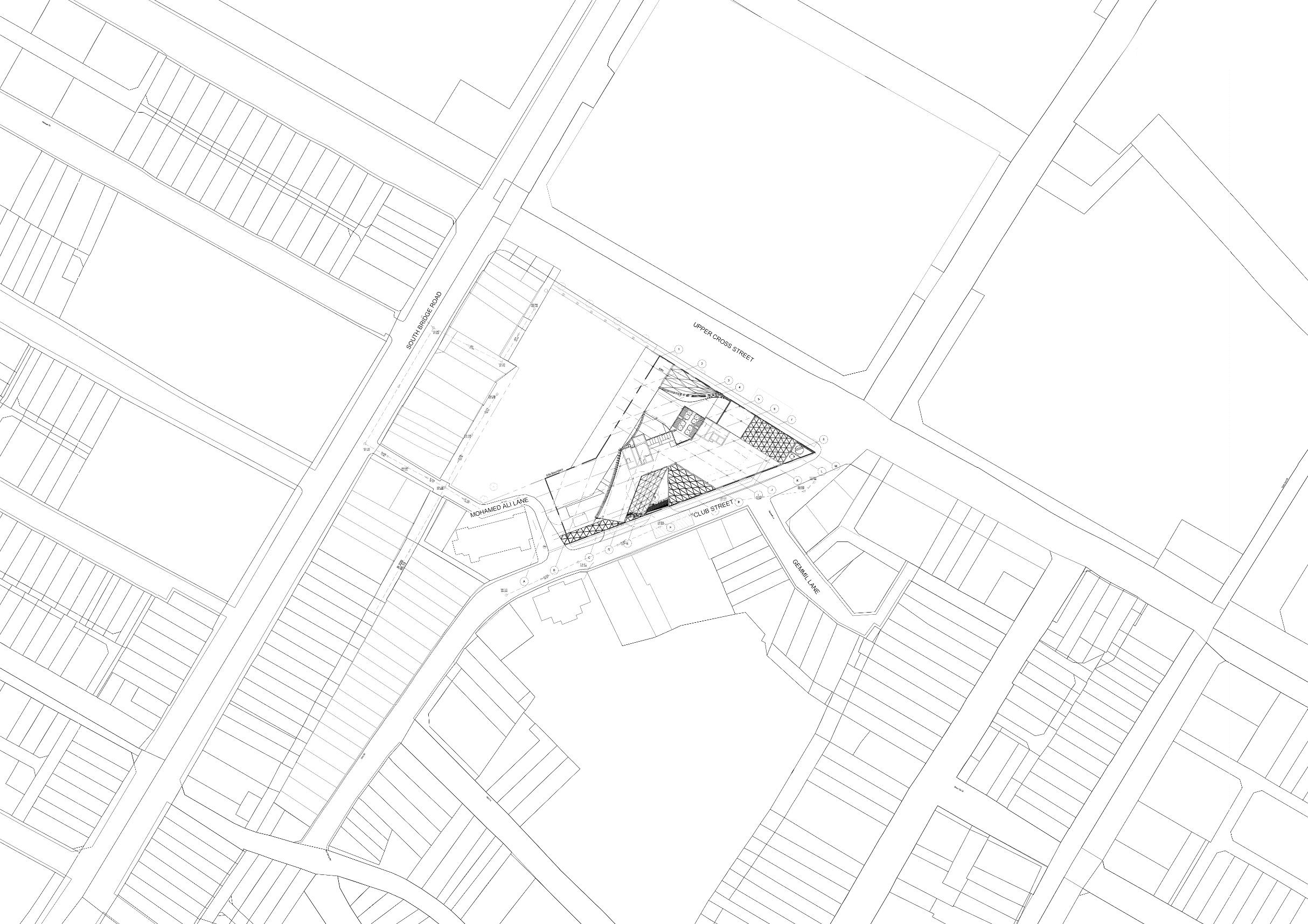
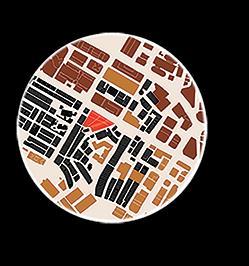
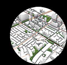
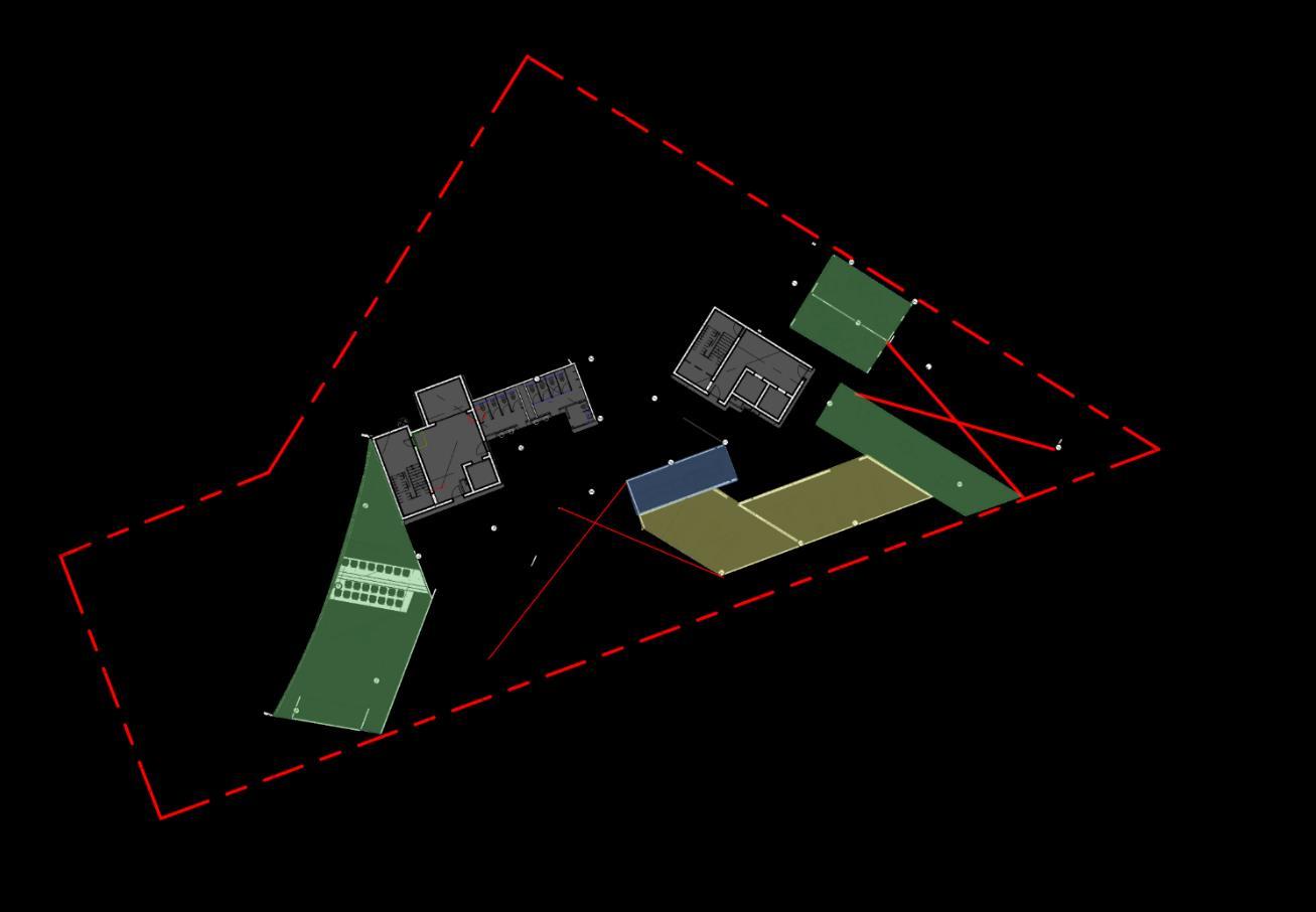
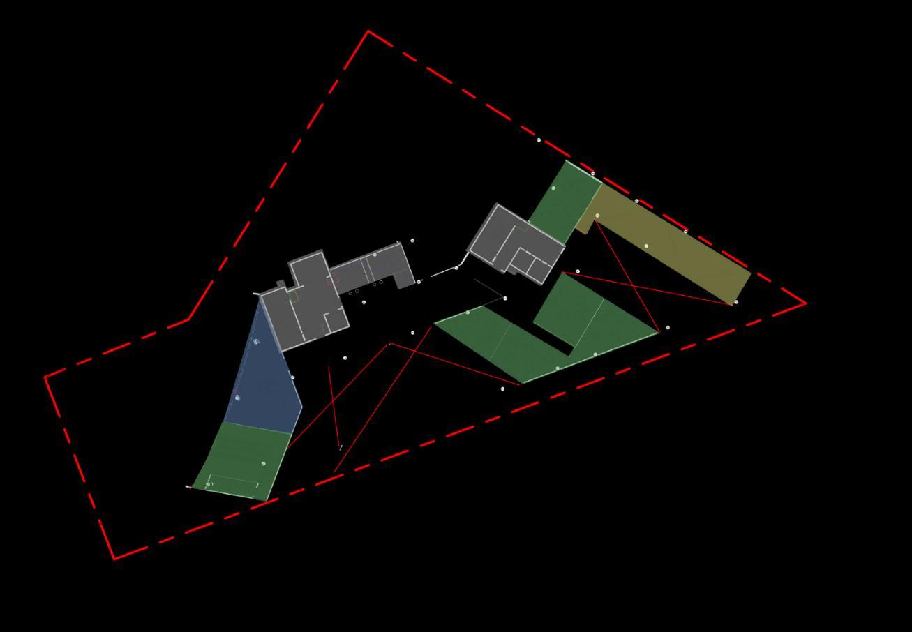
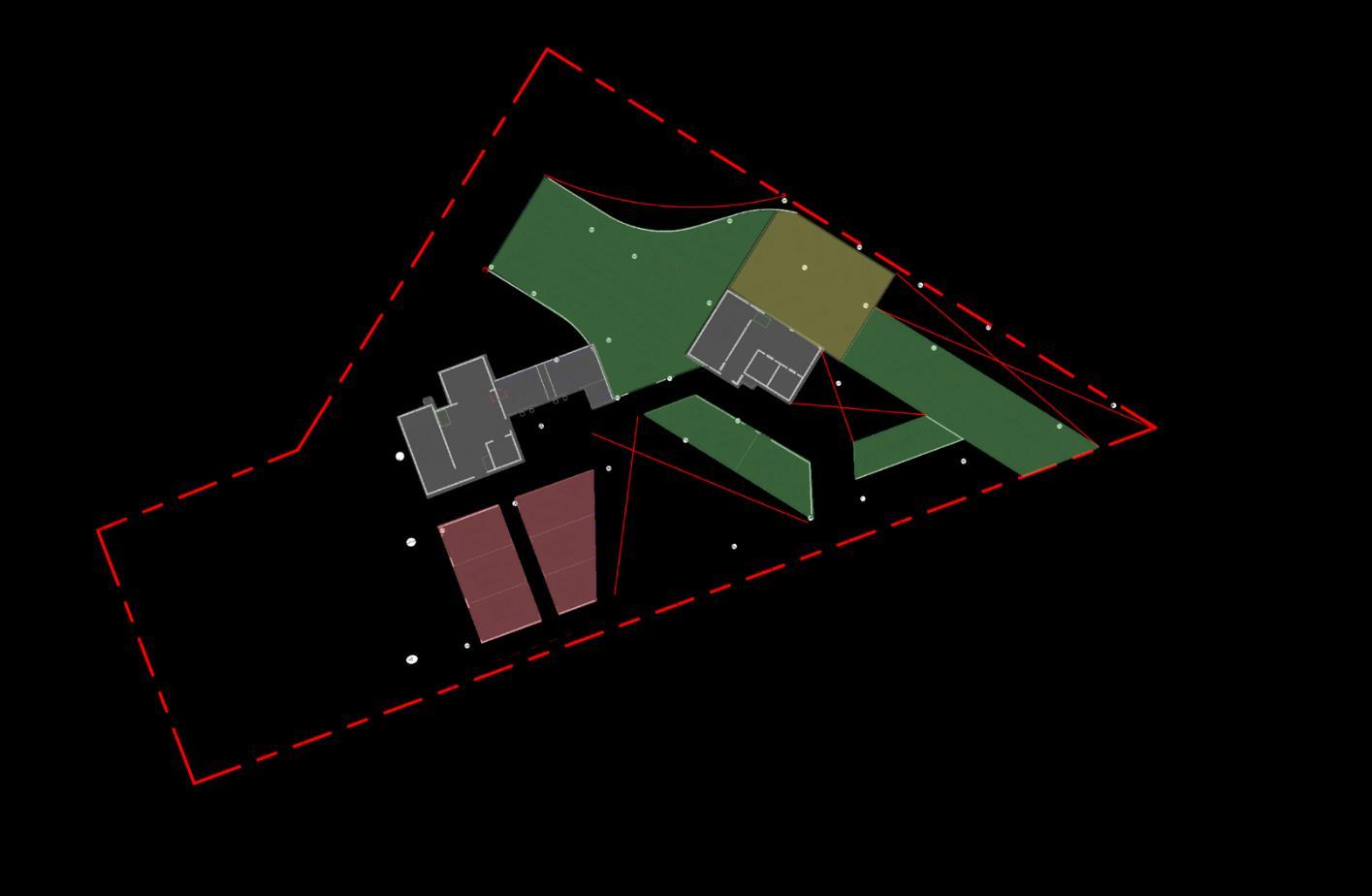
Figure ground study: Site
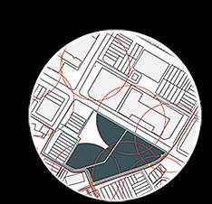
Fine grain
Medium grain
Course grain
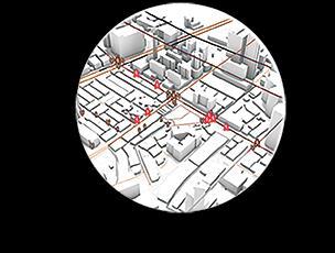
Human traffic: Through this analysis we can identify the location of where people tend to gather.
Existing infrastructure: Through this diagram we can find out the existing coverage of fire services as well as it’s sewerage system.
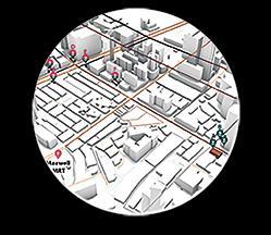
Public transport: Through this diagram we can identify the location of the MRT stations and its exits to see how it can affect the circulation around the site.
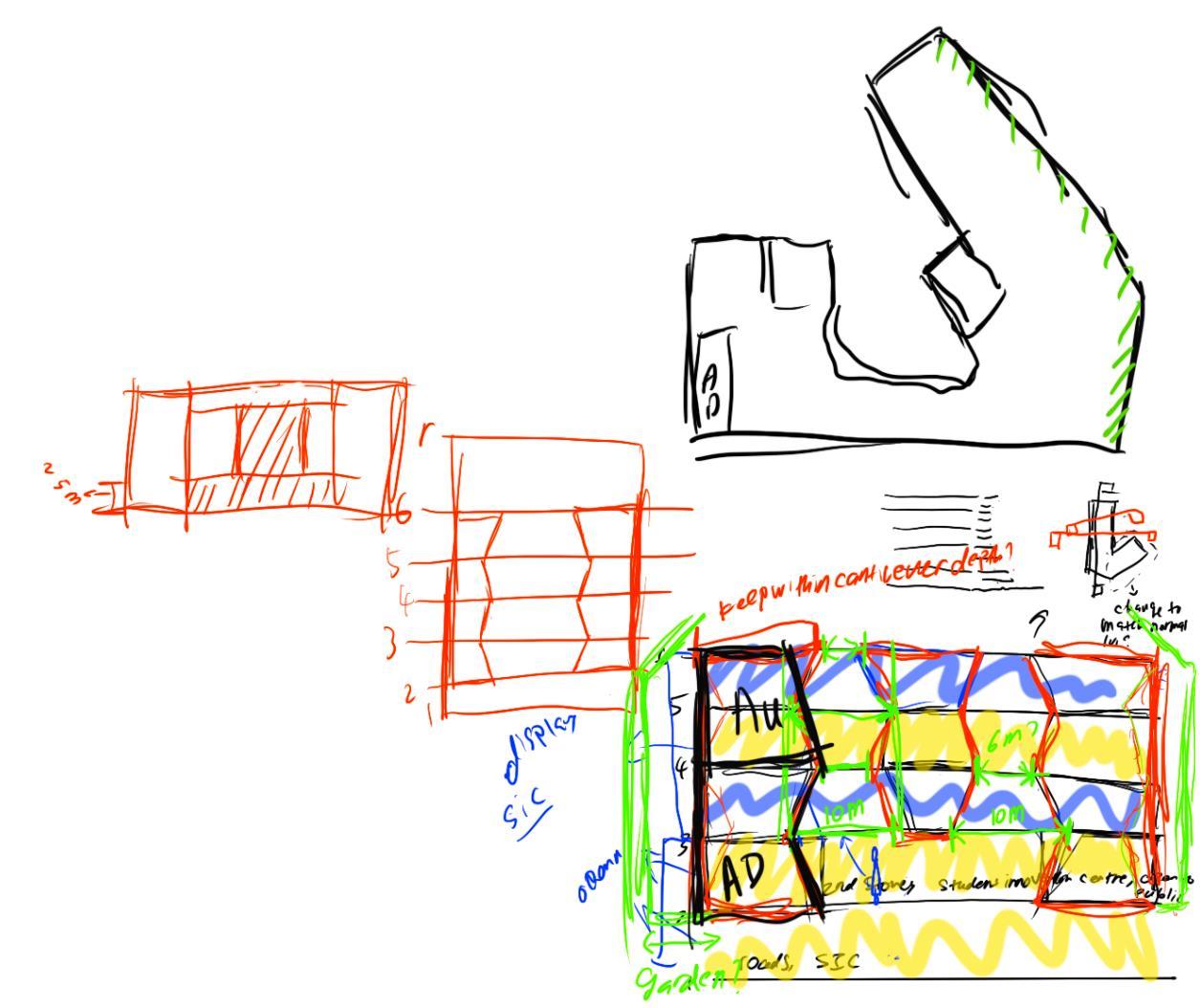
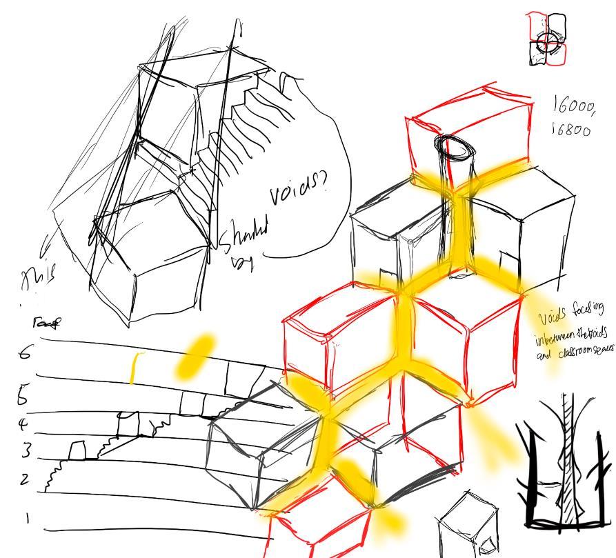
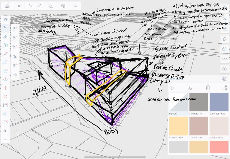
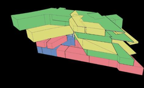
Extruding massing from site
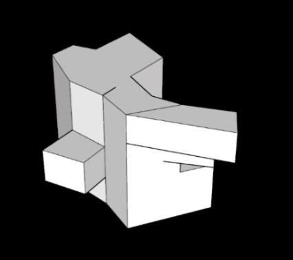
Removing mass to create visual portals to existing hawker centers
Introducing voids
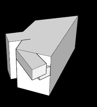
Adjusting visual portals according to the site
Adjusting the voids to encourage more Interaction between users
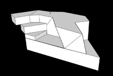
Further defining the mass Into different levels
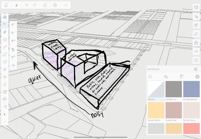
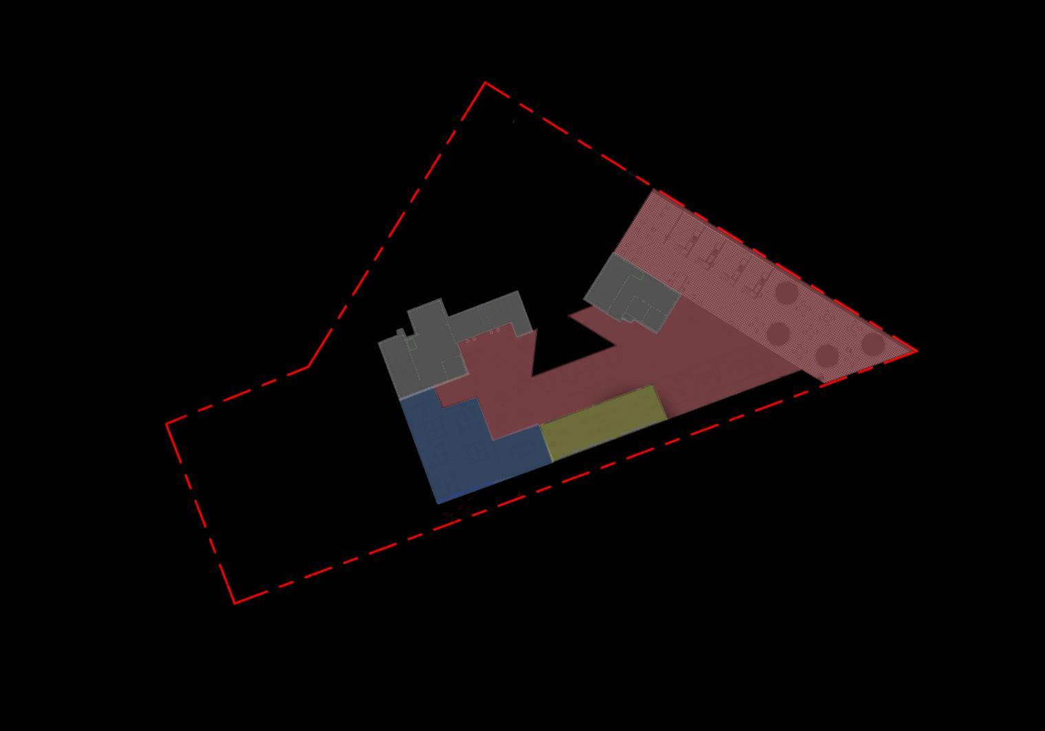
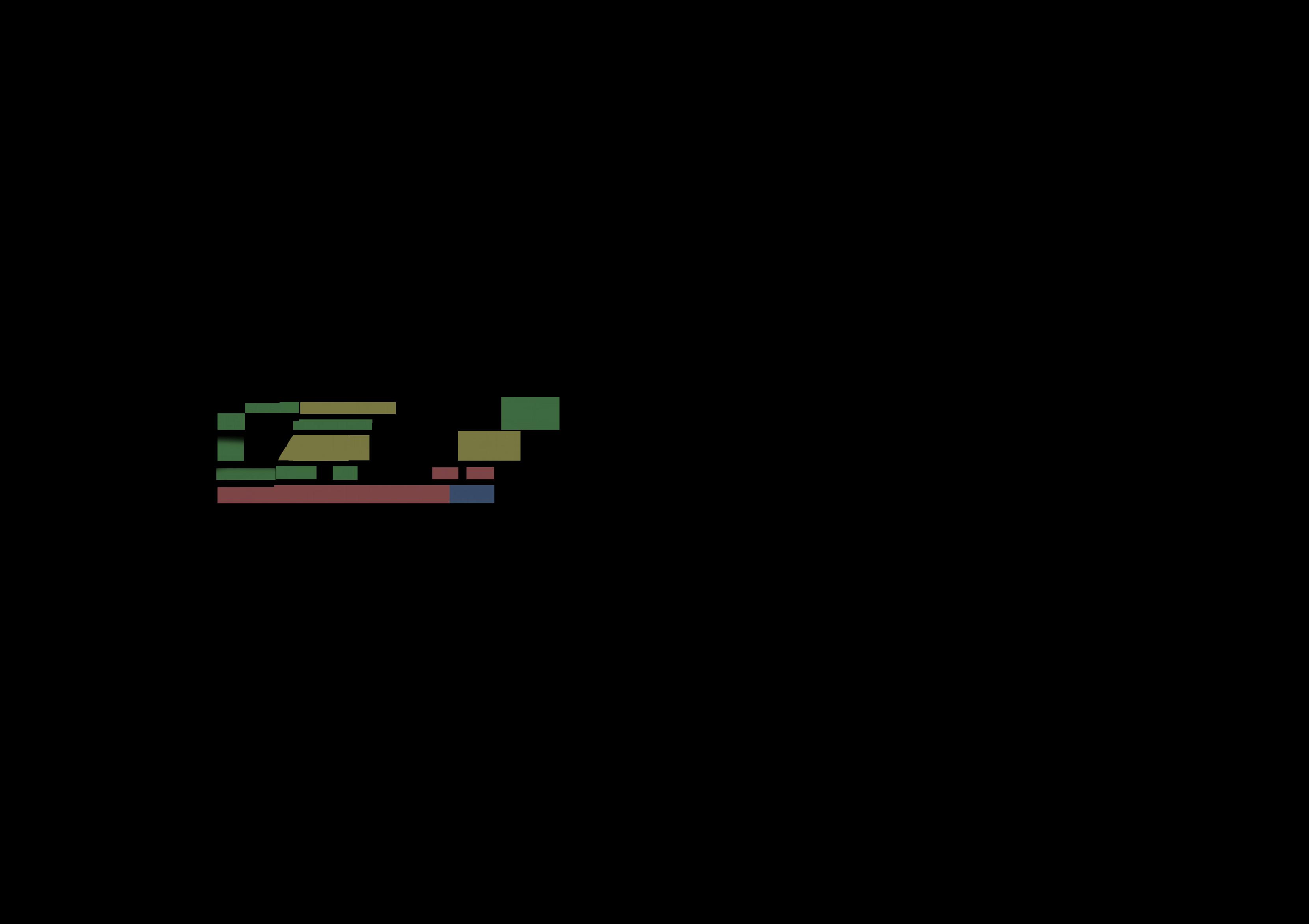
Splitting the levels into the type of uses
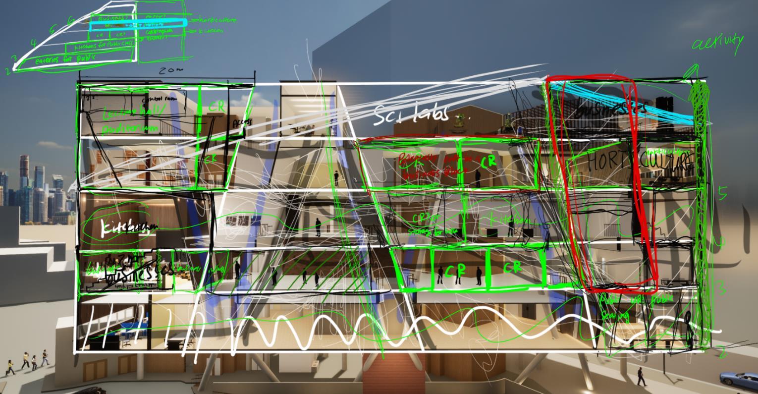
Theory
Practical Collaborative Admin
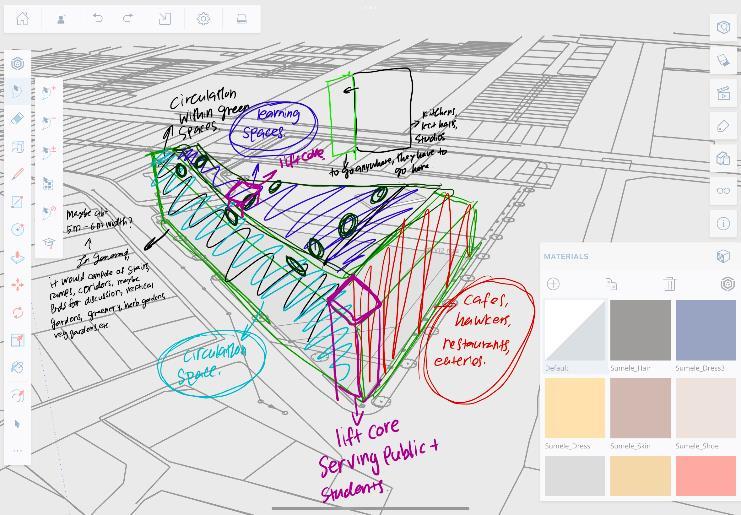
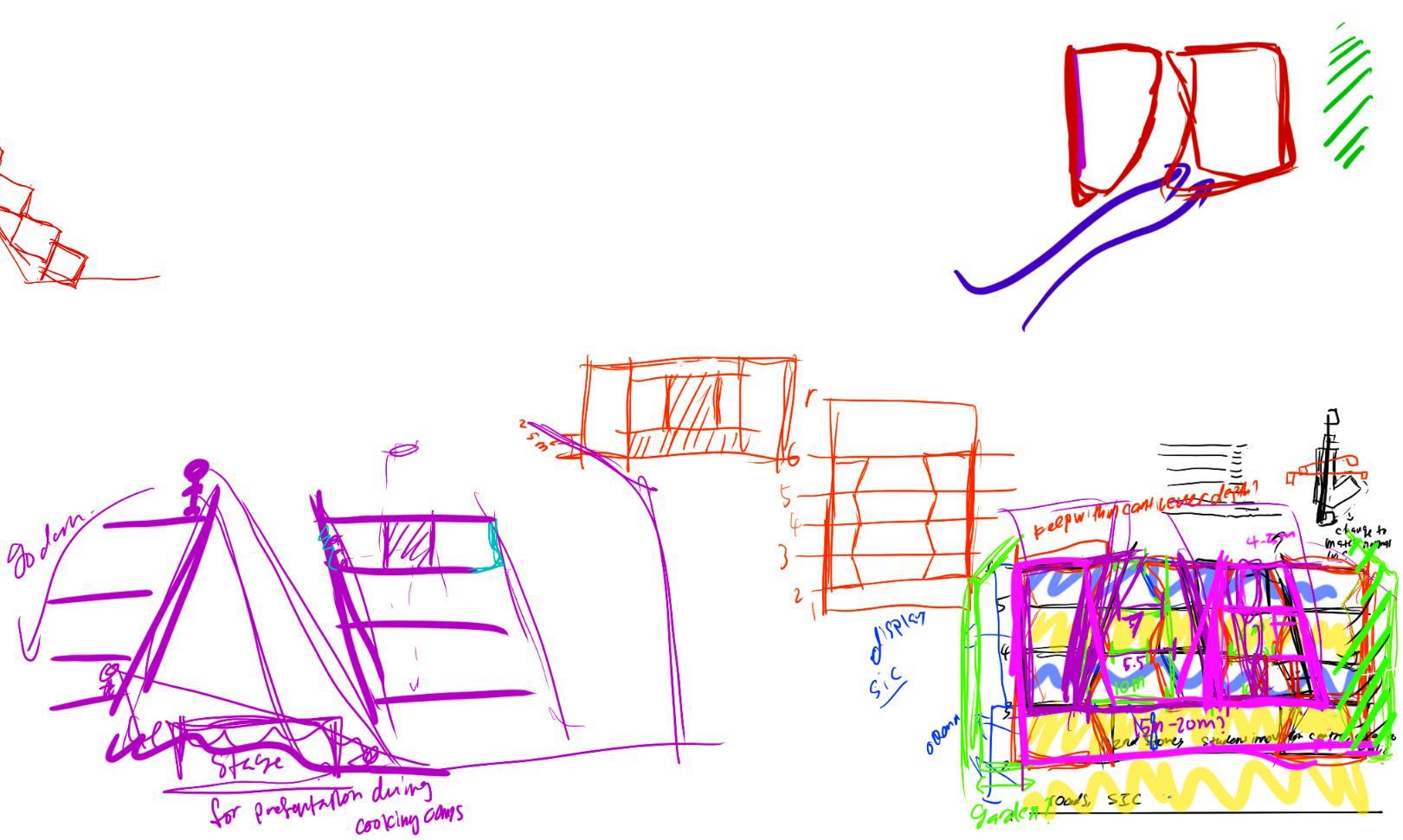
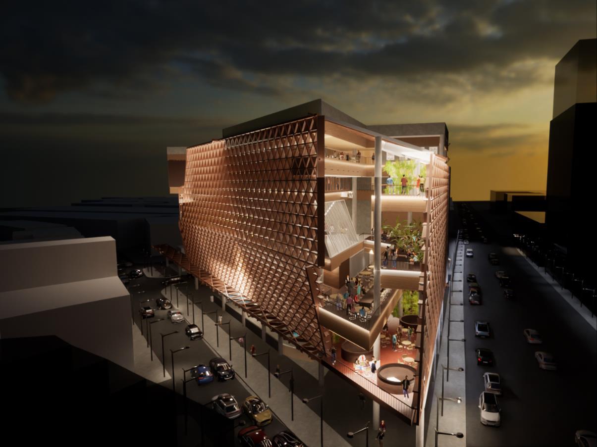
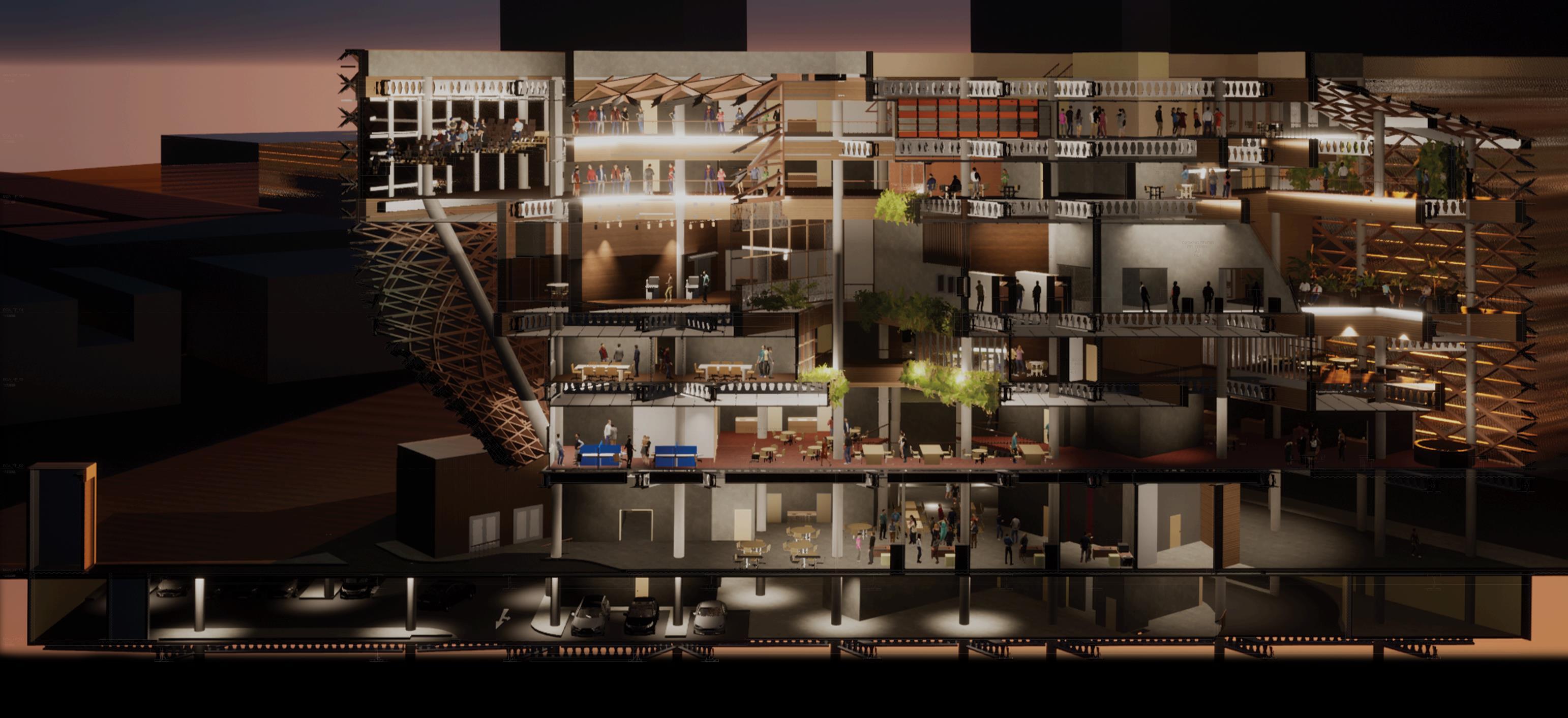
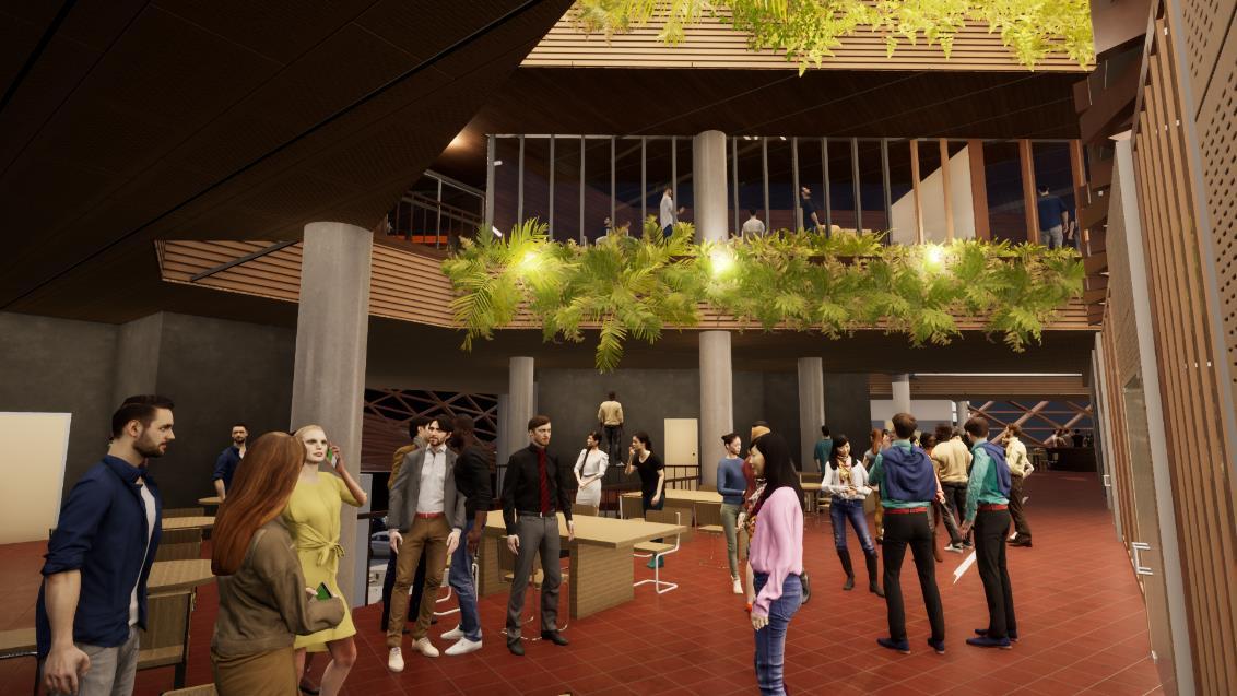
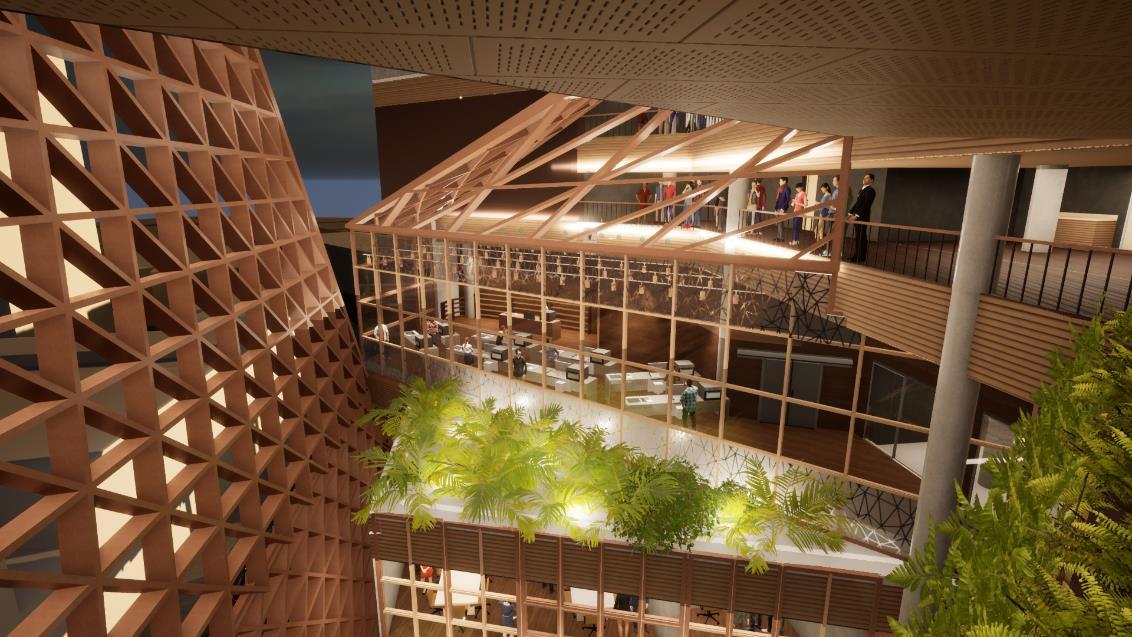
The 1st storey is made up of a student innovation centre where current and pass students are able to set up their own stores to sell their products and to allow them to test out their business model before having to move into the working industry. The plan is quite open to allow for potential patrons to easily walk around the space.
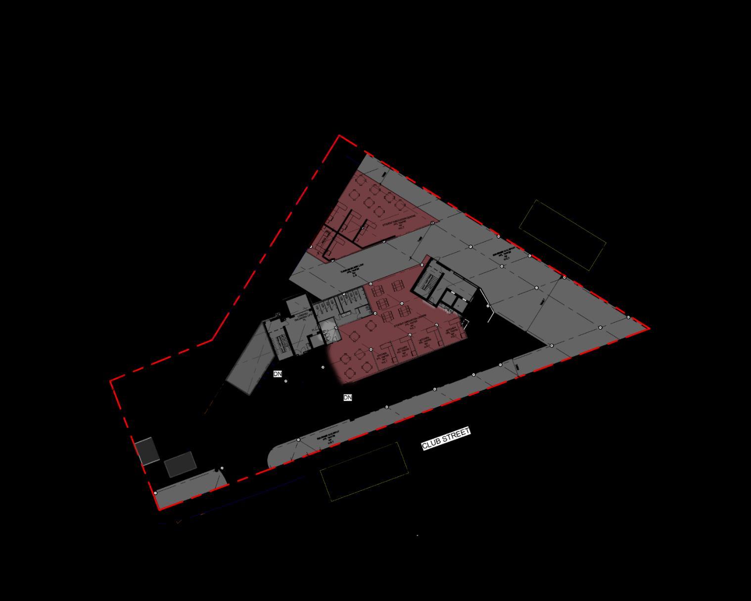
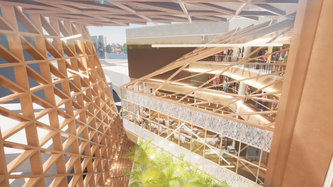
The 2nd storey is also made up of a hawker area for the public to access. There is also a cooking studio for students and guest lecturers to use while also allowing the public to watch the live lessons which can spark the public’s interest in the school’s program.
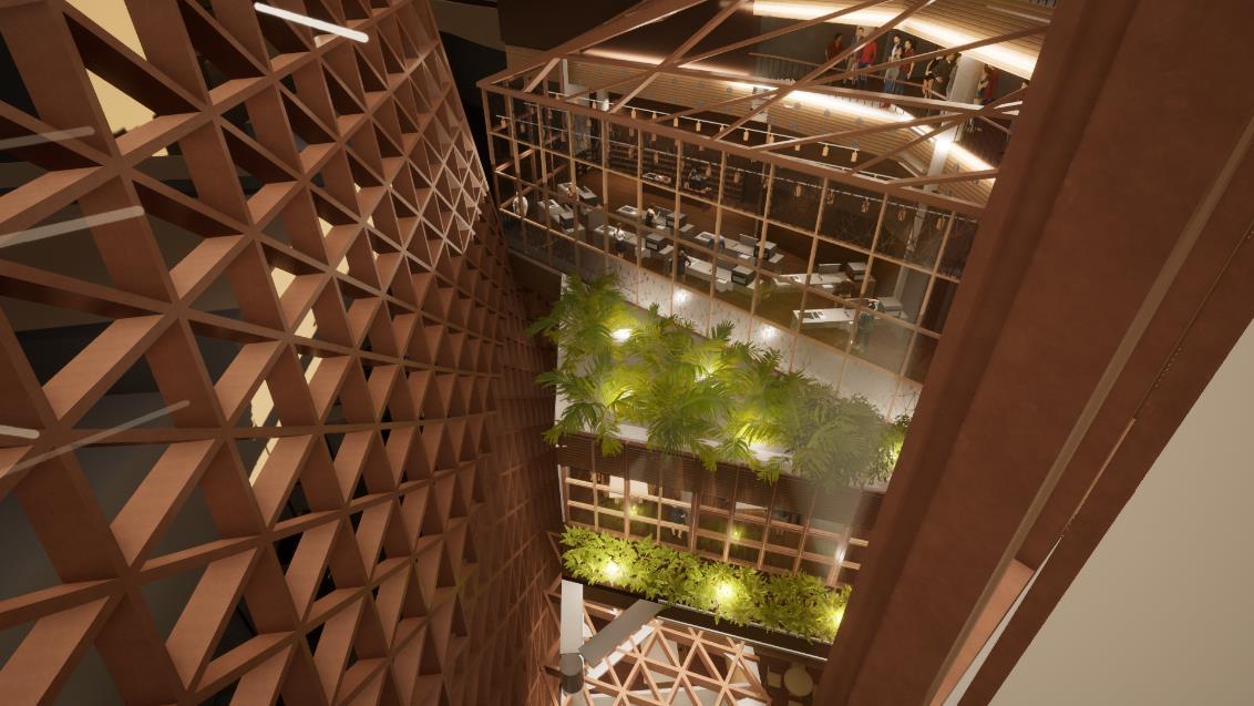
The 5th storey has more theoretical spaces such as classrooms, storage and the lecture hall. The classrooms are placed in a way so that the students are able to look through the void spaces into the different practical and social spaces.
The 6th storey has a mixture of practical and theoretical spaces. Students are also able to directly look down into the 4th storey kitchen, allowing the corridor space to also be used as a viewing area for students to learn from their peers and to listen in to any special guest lectures.
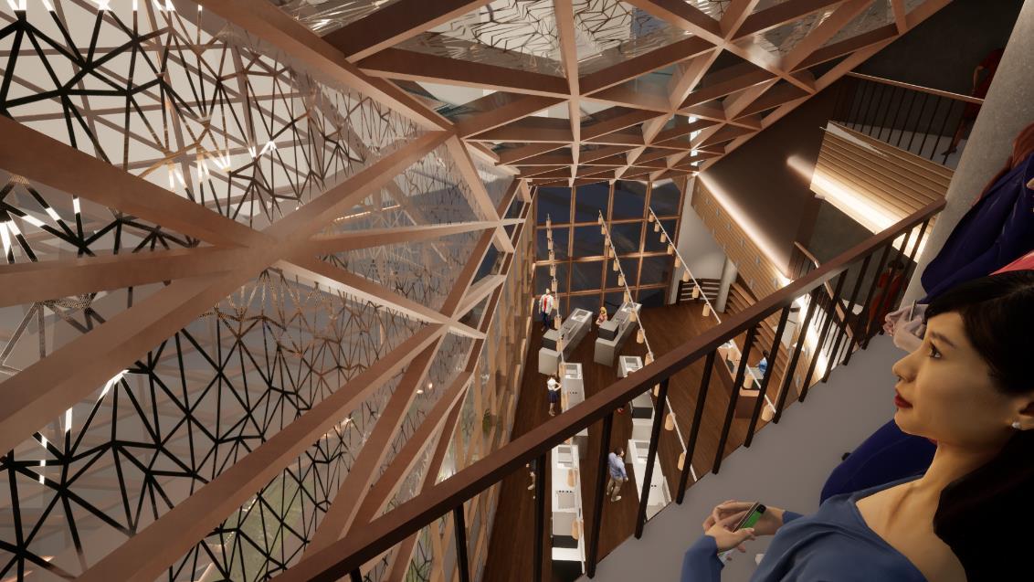
The 3rd level consist of meeting rooms that allow external companies to use the space and to also help engage the students. There is also a library for the students. The classrooms on this level also look into the voids that allow students to look down into the event space below.
The 4th storey has a feature space which is a kitchen for the student’s culinary lessons. There are also classrooms as well as food science labs for the students to use. The 4th storey also has the library space where students can look down into the 3rd storey library space.
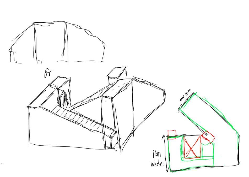
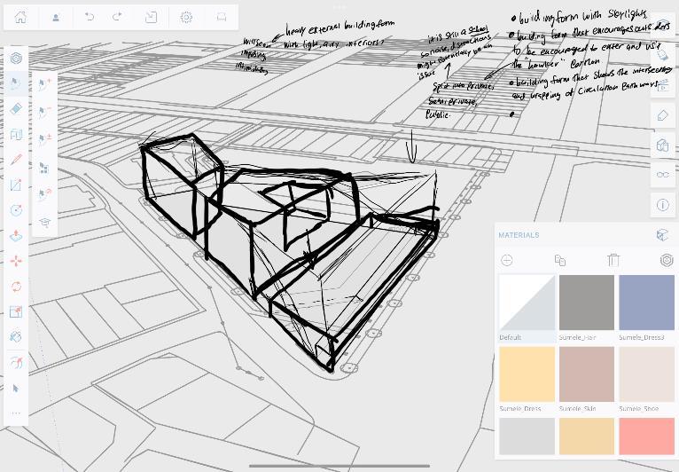
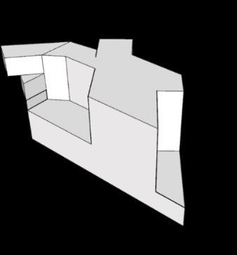
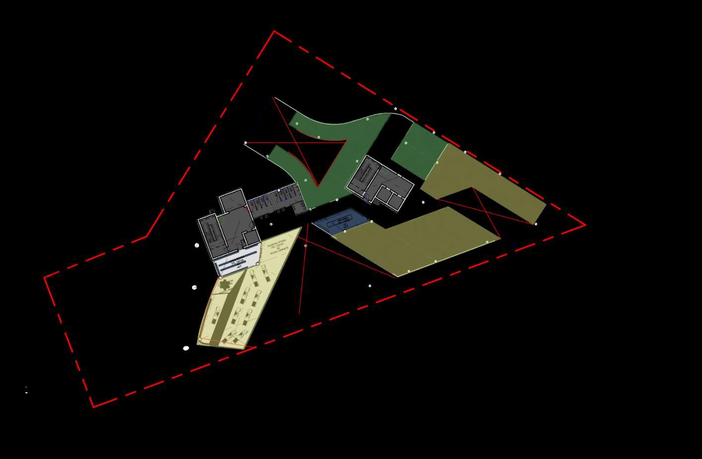
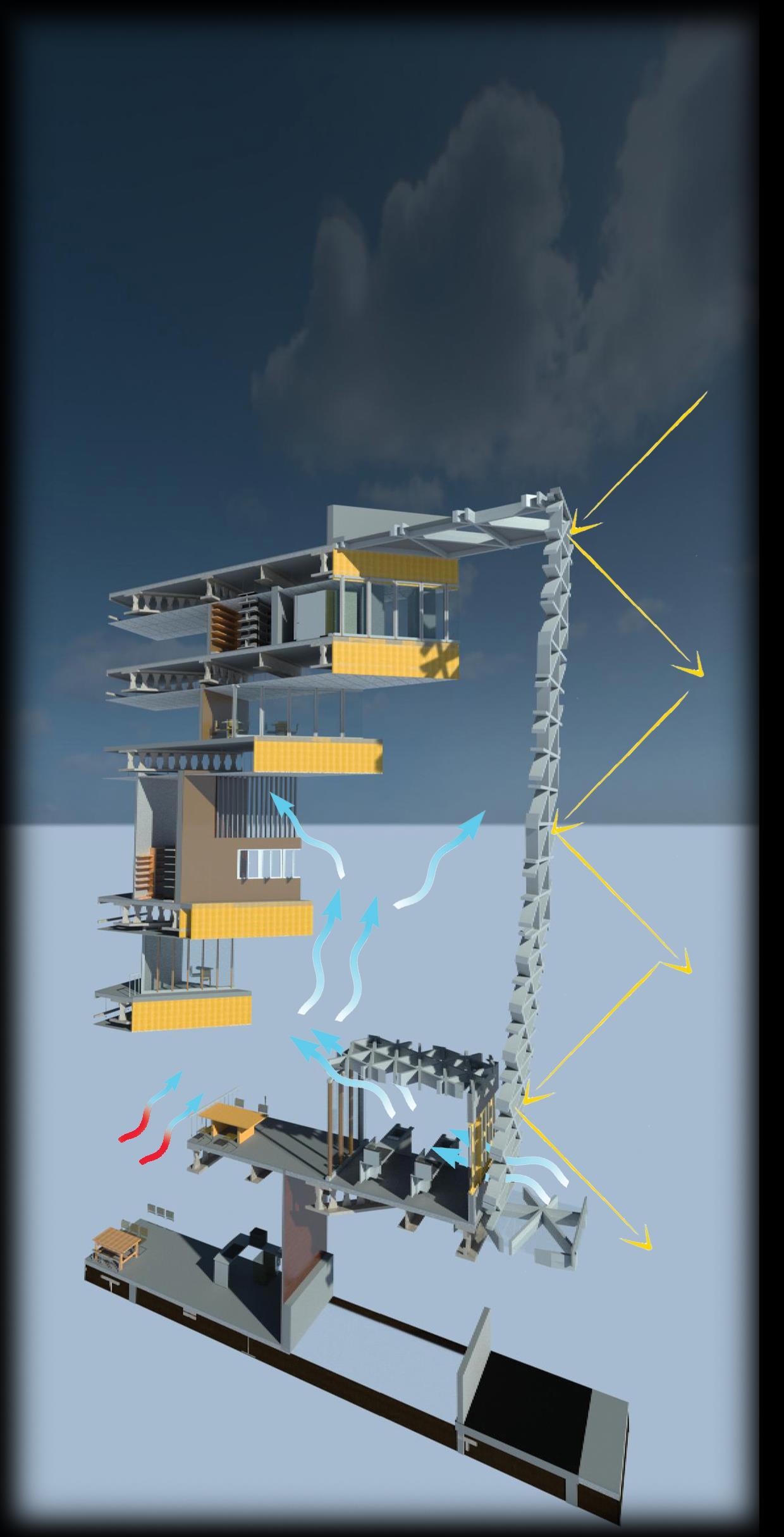
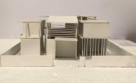
Through this section, the arrangement of theoretical and practical spaces can be seen. Through a difference in headroom levels, the emphasis on the 4th storey can be seen. As the kitchen is a feature space, the taller headroom will
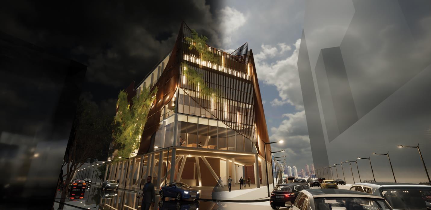
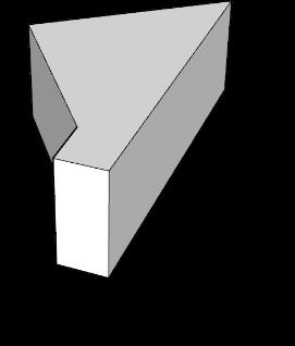
Through this elevation, it shows how the façade wraps around the entire building, exposing 2 of the 3 visual portal openings that look to the surrounding hawker centres in the area.

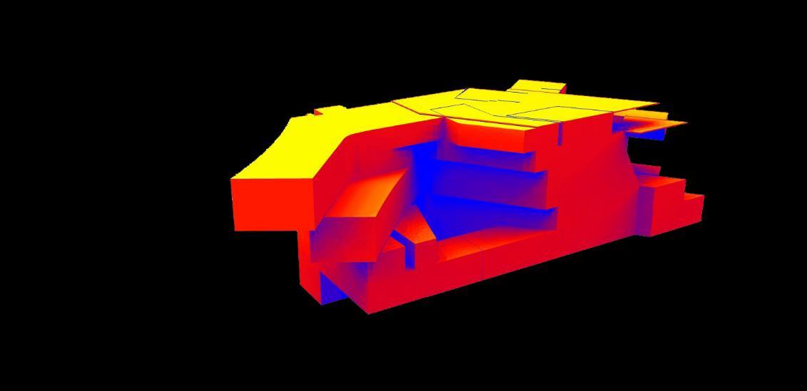
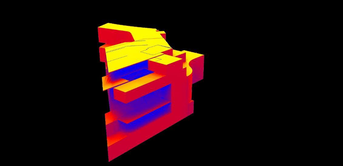
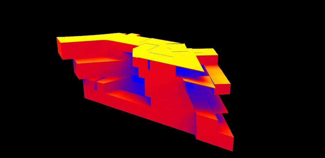
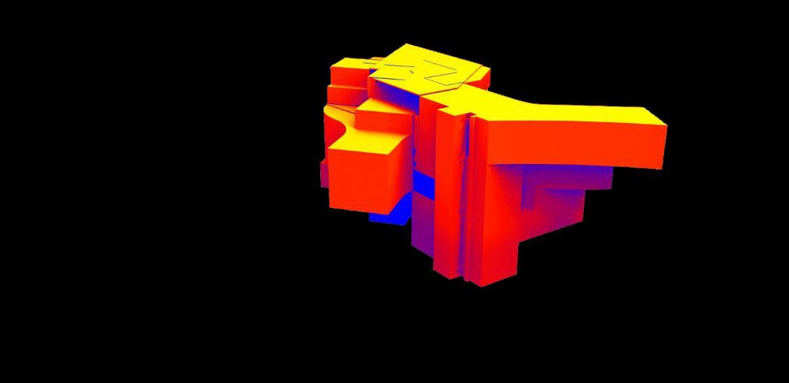
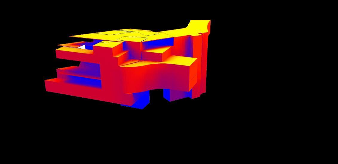
Areas that are shaded in blue receive less sunlight
Areas shaded in red receive a moderate to high amounts of sunlight, with the areas shaded in yellow receive large amounts of direct sunlight.
In terms of an environmental sustainability standpoint, I had done a sunlight analysis in order to find out exactly how much direct sunlight is hitting the actual building itself. After this analysis, I decided to do a triangular shaped grid like façade in order to reduce the total amt of sunlight hitting the façade while also allowing for a certain amount of natural ventilation and wind to enter and ventilate the building throughout.

C omputational Design II
Design Concept
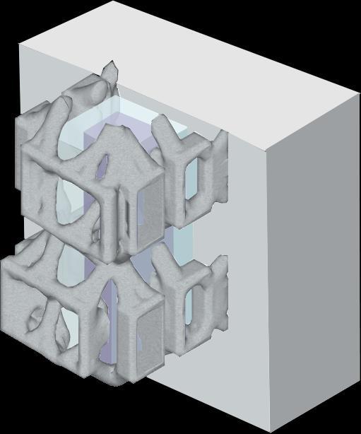
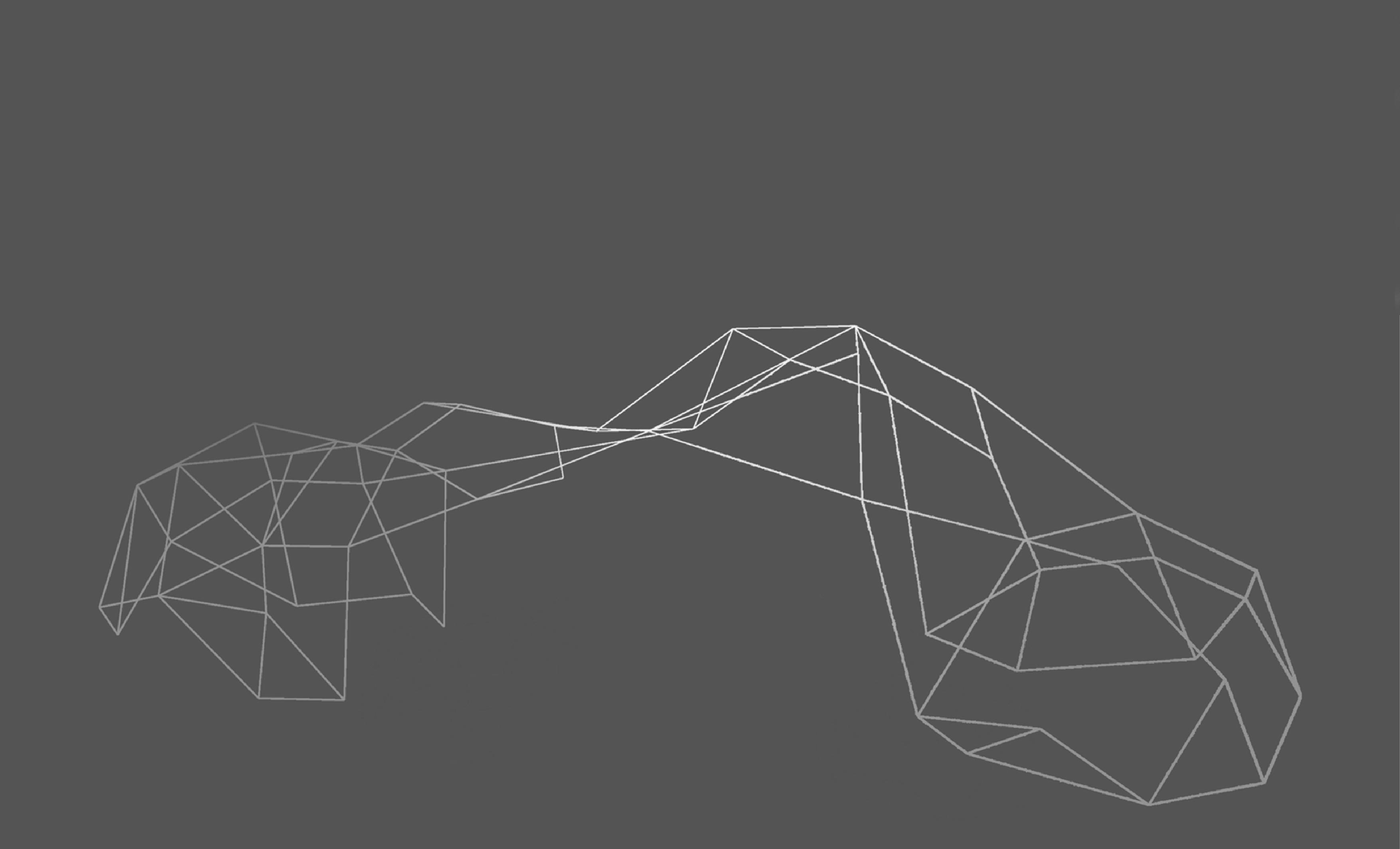
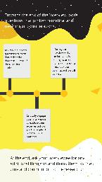
Optimized Central Core with 3 MAIN COMPONENTS
TRADITIONAL ARCHITECTURE
TOPOLOGICALLY OPTIMISED ARCHITECTURE


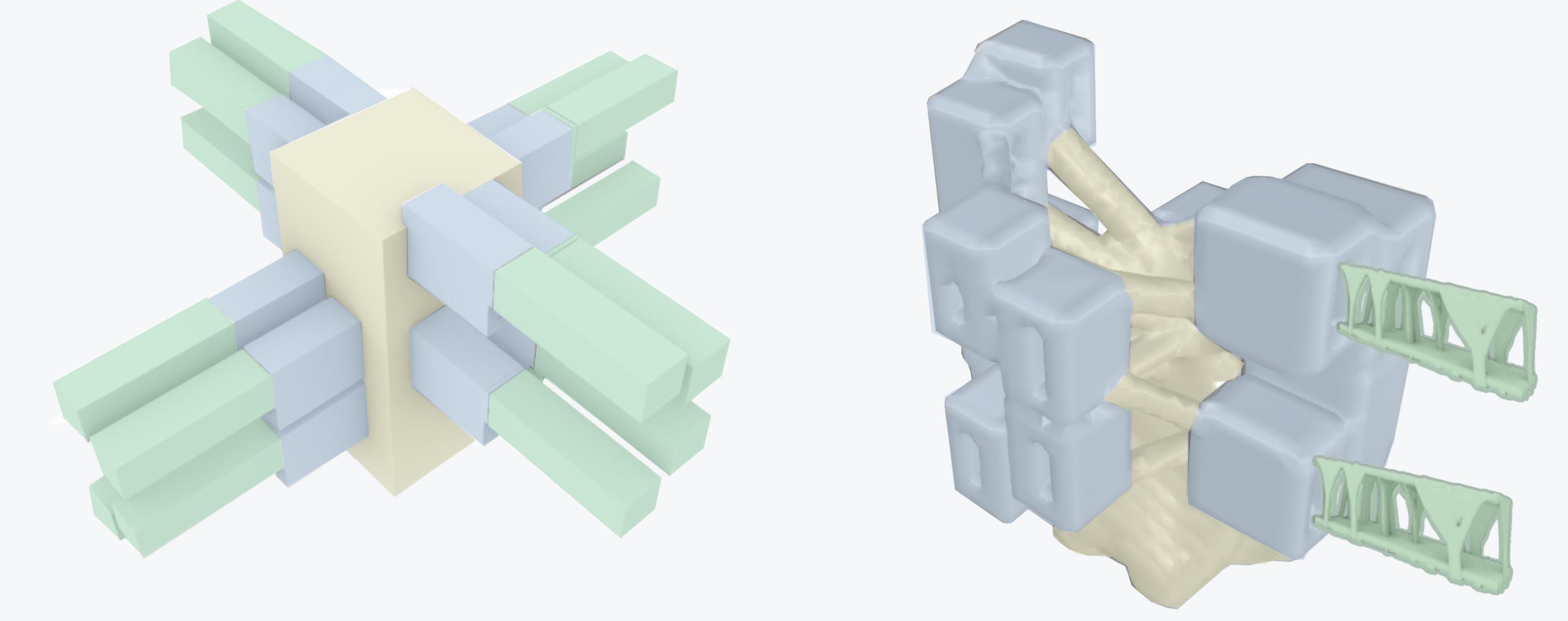
Central core
-Circulation (Lift and Staircases)
-Common area such as corridors
Connecting Structure
-Steel framing
(detail shown later)
Topo Optimised Custom Unit -Customised according to owner
via connecting structure to central core 1 1 2 2 3 3 1 2 3
-Attached
ISSUE 1
Structure rendered by 'Topos' is too bulky and does not allow for circulation and lifts and staircase core to be placed
SOLUTION
A negative mass is introduced at the centre of the structure to make way for central core so the topo optimised parts do not cut through this designated spots
ISSUE 2
Housing units are on multiple levels instead of a common level on each floor
Aligned all units to a common level for easier circulation and construction
ISOMETRIC PERSEPCTIVE SIDE VIEW TOP VIEW
Multiple levels Common levels
ISSUE 3
Connecting structure may not be strong enough to hold these attached customized units
SOLUTION
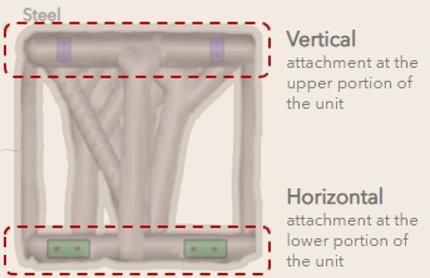
Attachment is similar to there off the Nagakin capsule where steel bolts were placed to attach the units onto the structural core effectively.
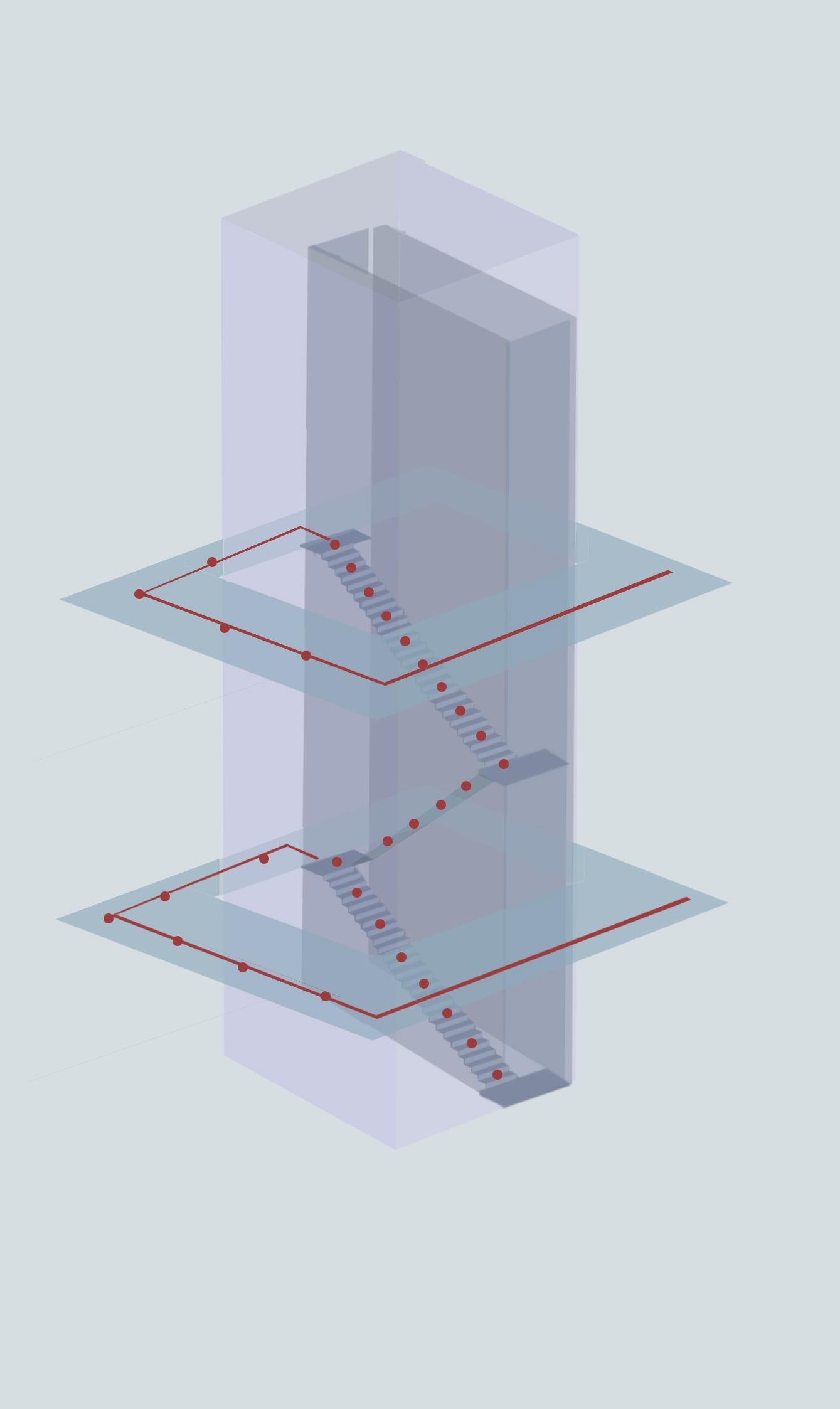
CIRCULATION DIAGRAM
While designing the Topologically optimized structure, it was designed around the concept of including a central core which allows for both vertical and horizontal forms of circulation through the use of the central core. This central core can include a lift and staircase core along with a set of corridors to allow for efficient circulation throughout the entire structure itself.
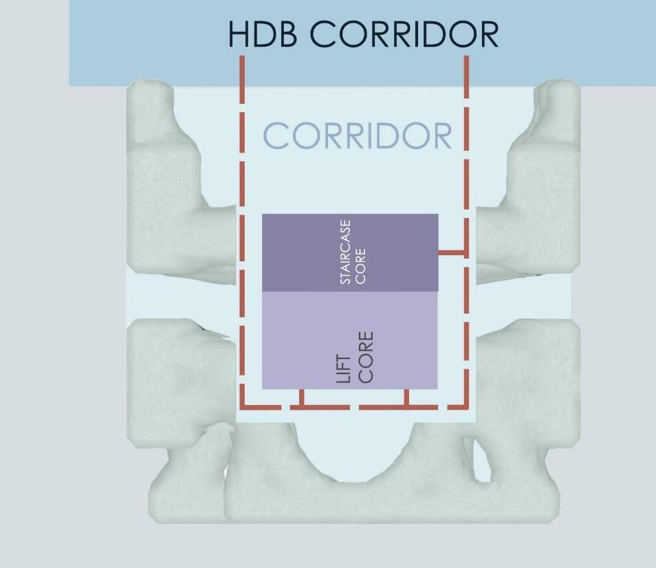
Staircase circulation that can be used for fire safety purposes.
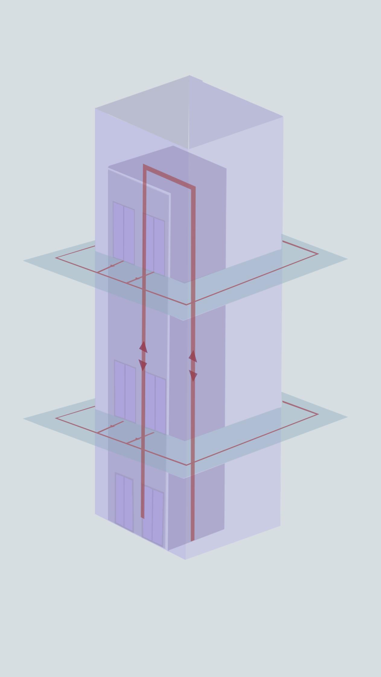
Lift circulation that can be used for easy access for all different users regardless of their mobility needs.
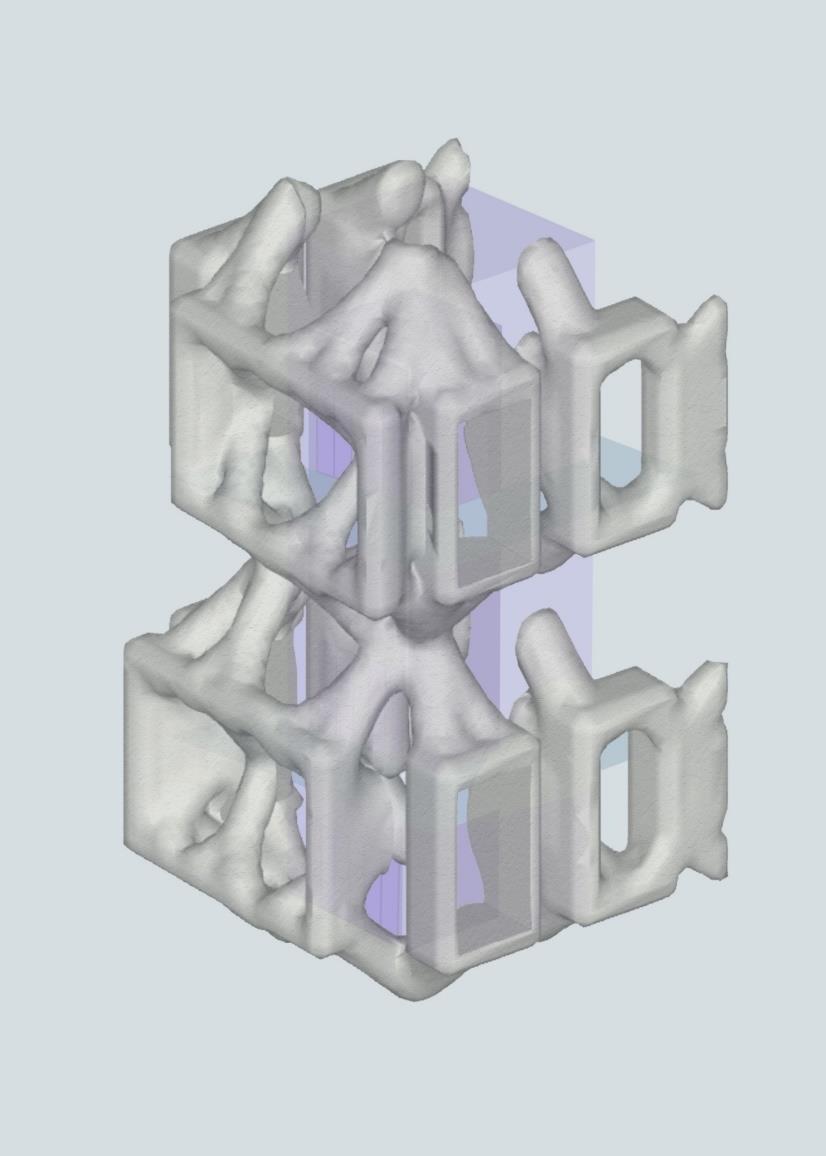
INTEGRATING INTO CURRENT MASS HOUSINGS
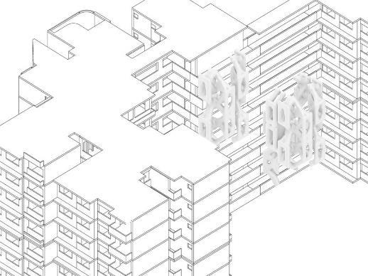
The topo optomised structure is attached to the HDB Via steel bolts but it relies on the structural Support of the central core and not the HDB since it is Not able to provide strong supports by itself.
They are connected via the corridor so the topo Optomised housing can be accessible via the existing Hdb lift and staircase core while having its own lift And staircase core.
The structure only hugs onto the hdb On the first 1 to 4 storeys.
CONCEPT

Currently, majority of the models are designed with the usage of steel in mind.
However, we can also set Topos to design with the usage of concrete, or any material depending on the client’s specification and needs.
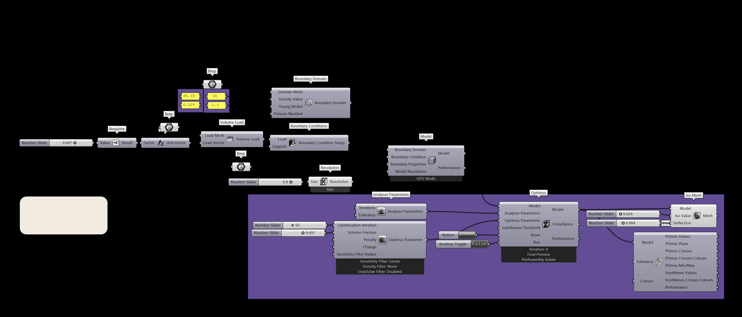
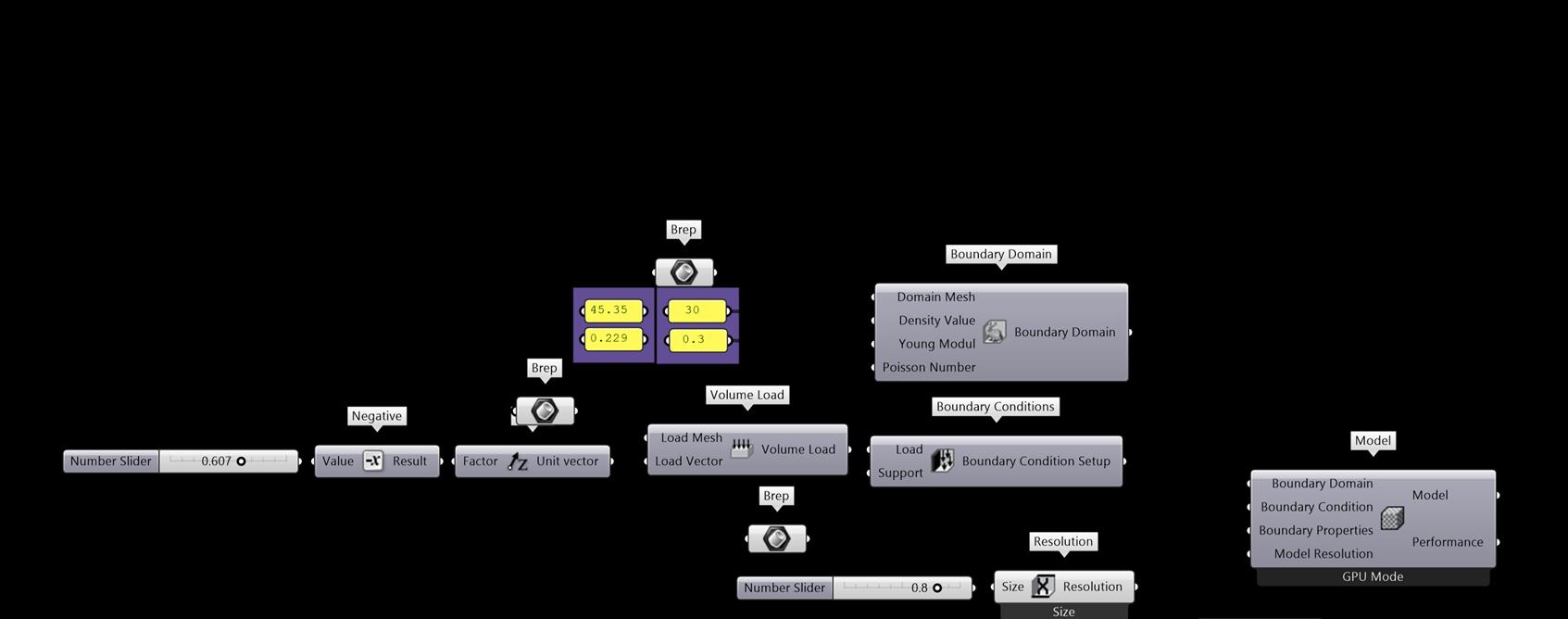
Grasshopper Definition
In terms of a structural analysis, although Karamba is not a suitable software to calculate a topo optimised structure, the topos plug in is already able to take into account the different types and forms of loading.
In order to imitate gravity loads, one can assign the load vector of the load mesh to face downwards along the z axis. In the even that there is a structural component where the forces of the load is pushing upwards, one can remove the “negative” component to allow the load to act upwards.
In order to imitate wind load, one can assign the load vector of the load mesh to face in the orientation of the wind and assign a value to it to imitate the strength of the wind currents.
Topos would then take into account these forces and loads and come up with a structure that is able to accommodate for the different loads to ensure that the building is structurally sound.
TOPOS STRUCTURAL ANALYSIS
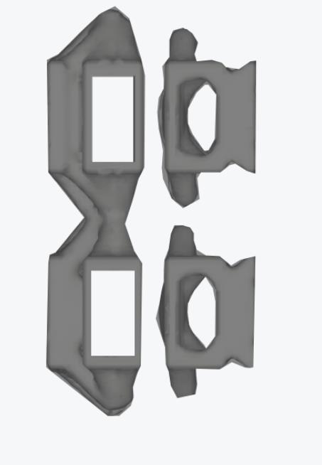
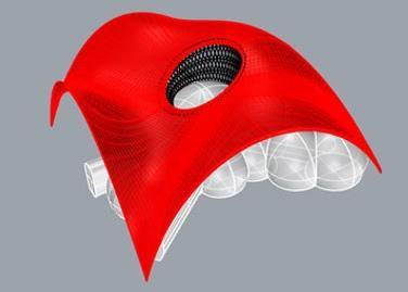
C omputational Design I
Prototypes
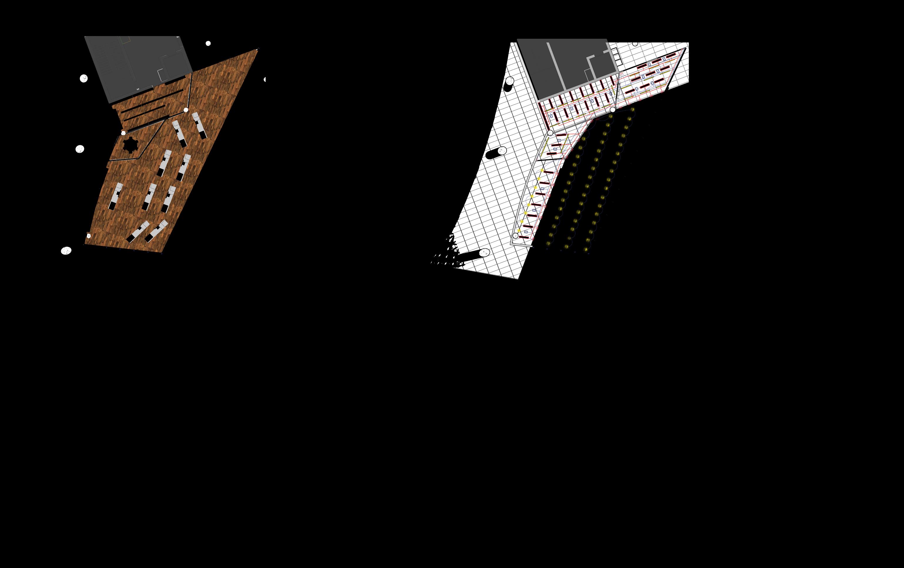
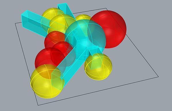
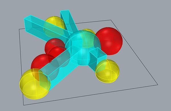
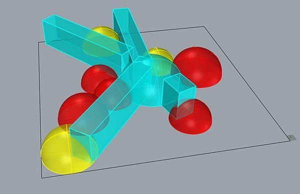
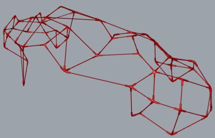
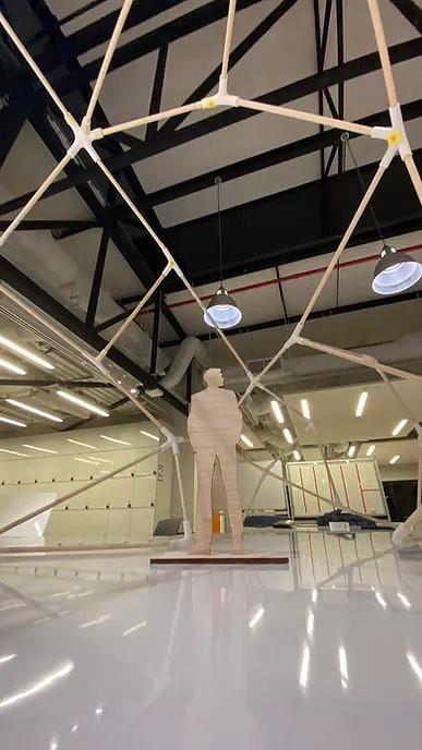
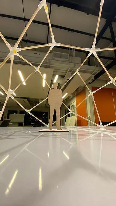
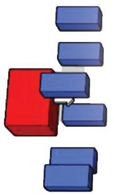
Prototype 1: 1.1
For the First prototype, we tried to experience with where we were going to place the walkways as well as the different domes
Red – common spaces
Yellow – private studying pods
Cyan – circulation spaces
Prototype 2: 2.1
For the 2nd group of prototypes, we tried to include a roof over the series of geodesic bubbles to help provide protection from the rain and sun.
For prototype 2.1, we placed the shelter to face the walkways to the toilet area as well as to one of the entrance walkways.
For prototype 2.2, we wanted to provide even more shade for the entire space. We then also took into consideration the wind path which is why we lifted up the south and north end of the roof to help to encourage wind flow into the interior of the space
Prototype 3: 3.1
For the 3rd prototype, we decided to not include the roof and decided to go with a slightly more simplified pavilion shelter.
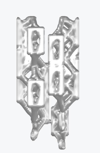
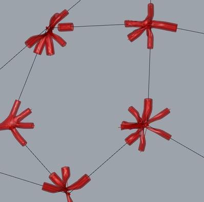
After more or less finalising the design, we then started trying to come up with the components that were to be printed out. this included the locations of the joints as well as connecting components.
1.2 1.3 2.2
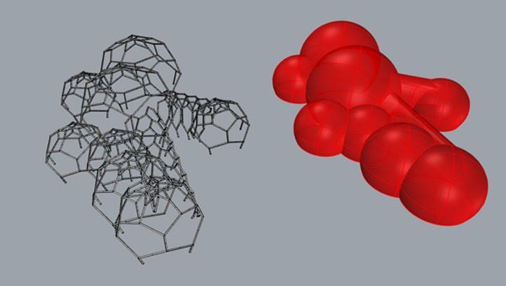
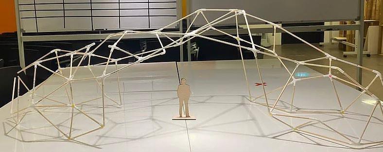
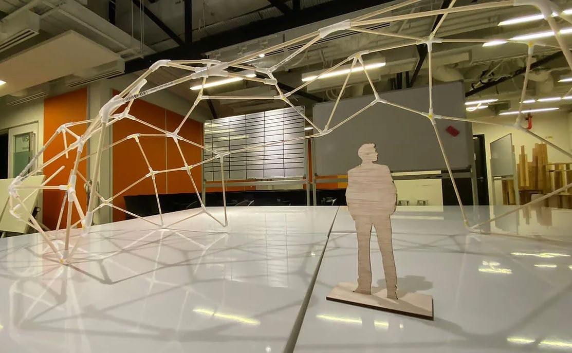
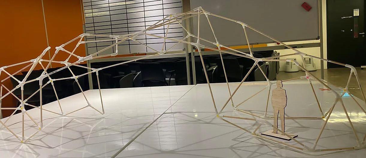
Final Design
3D model of disfigured joint
However, when we tried to generate the different joint components, a lot of them were disfigured and there was a lack of consistency between the different joints.
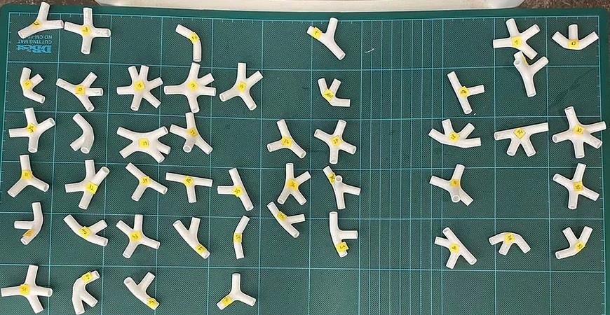
3D model of actual joint
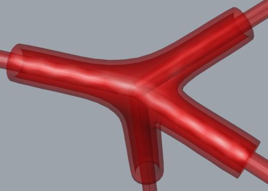
We then tried to export the model into a new file and managed to fix it.
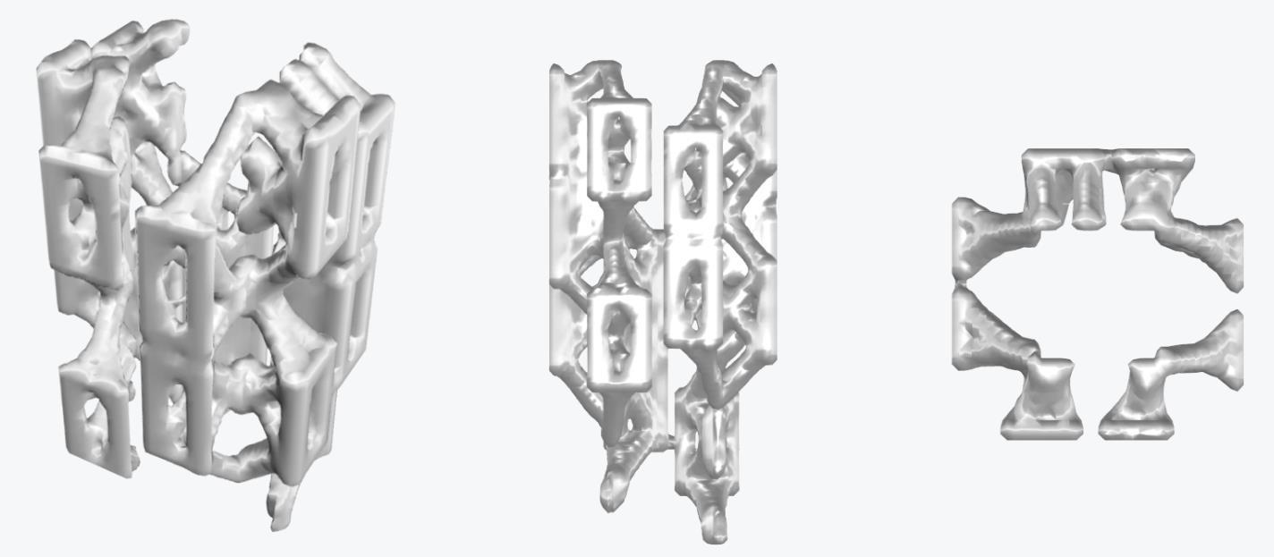
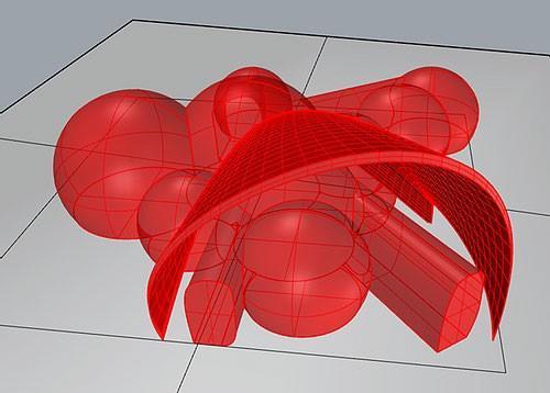
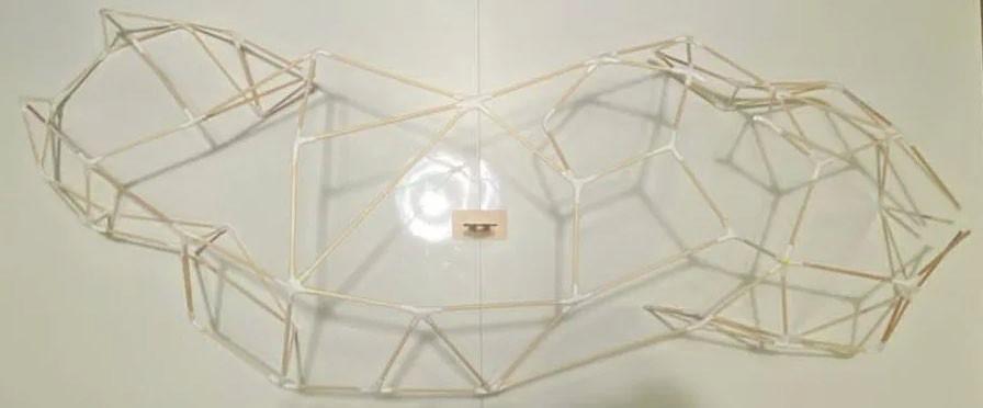
Finalising of Rhino model Assembly of physical model
Final model including the joints as well as the connecting elements. Due to the time constraint, we ended up having to decrease the overall size of the model as well as the amount of spheres that are in the building.
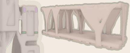
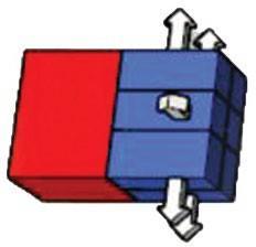
For this model, we prioritised the environmental factors that are affecting the site itself. this consist of the wind flow as well as the sun path.
That is why we placed the main entrance and exit at the north and south of the site to encourage wind flow into the structure itself.
After finalising the design of the overall structure, we then finalised the joints so that we could use the 3D printer to print out the joints. In order to 3D Print out the joints, we had to use the Ultimaker Cura app to export the 3D models of the joint into a thumb drive in order to print it out.
We then also had to cut the wooden dowels to form the connecting elements that are suppose to span between the joints. In order to cut out the dowels, we had to calculate the length of each individual dowel before using a scroll saw to cut it up.
Physical Model
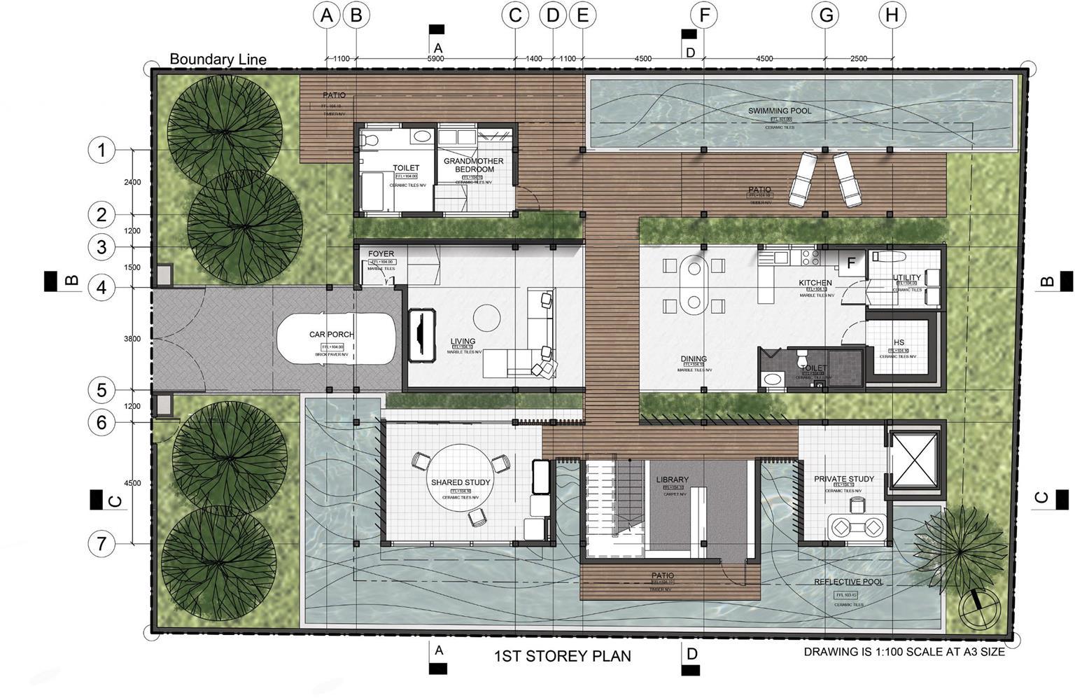
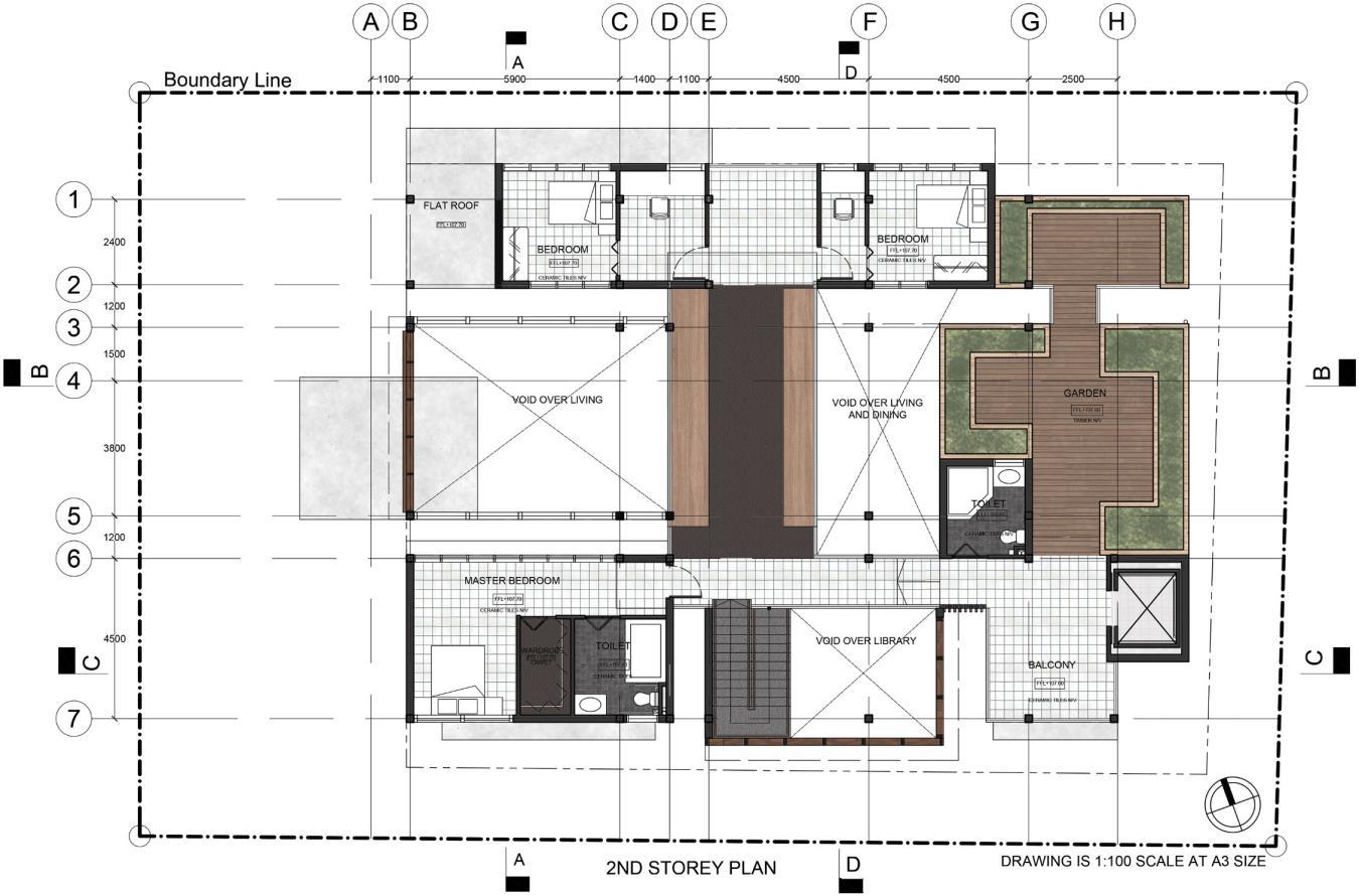
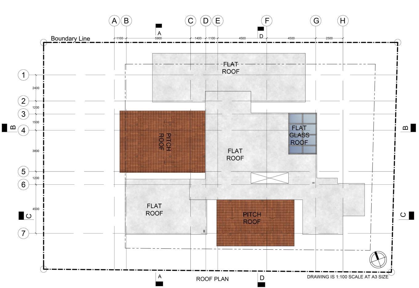
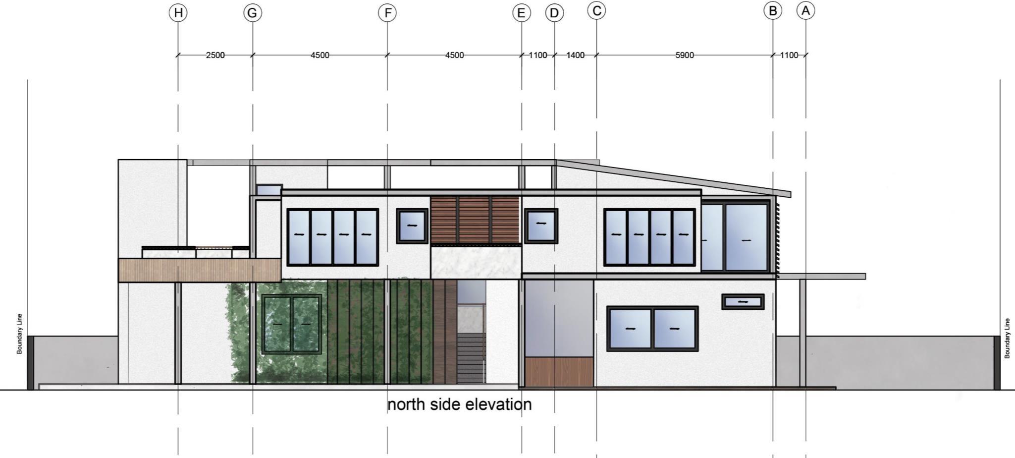
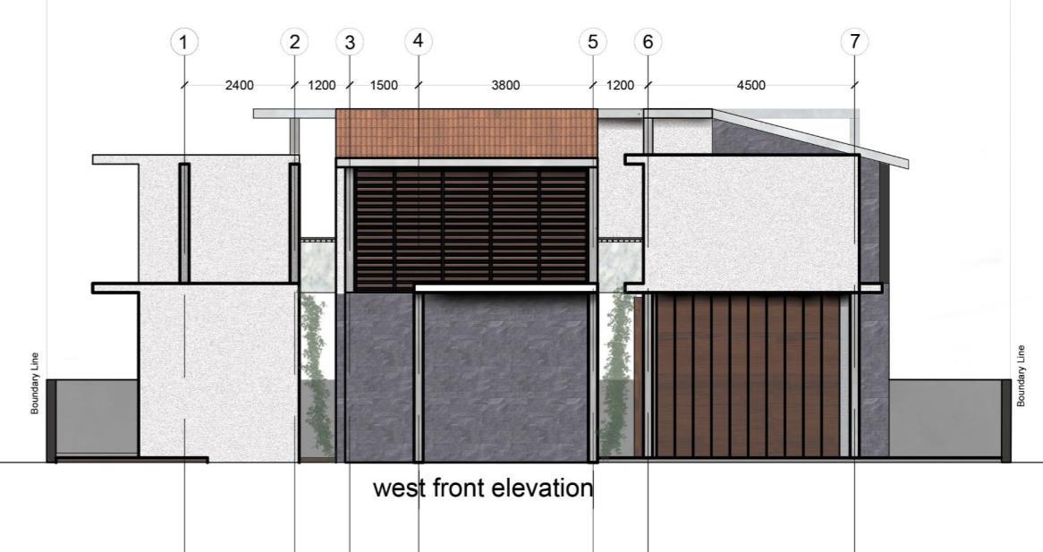
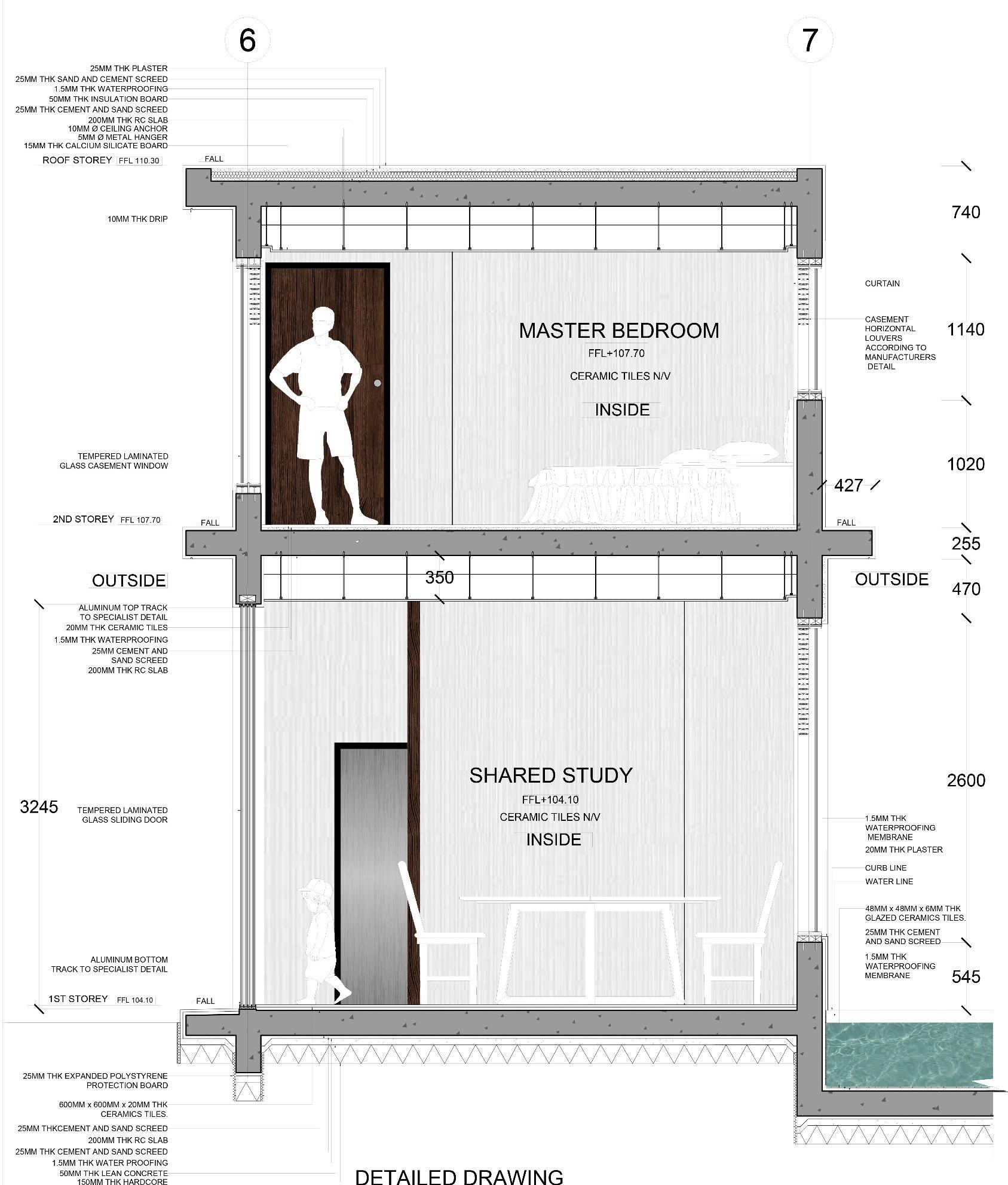
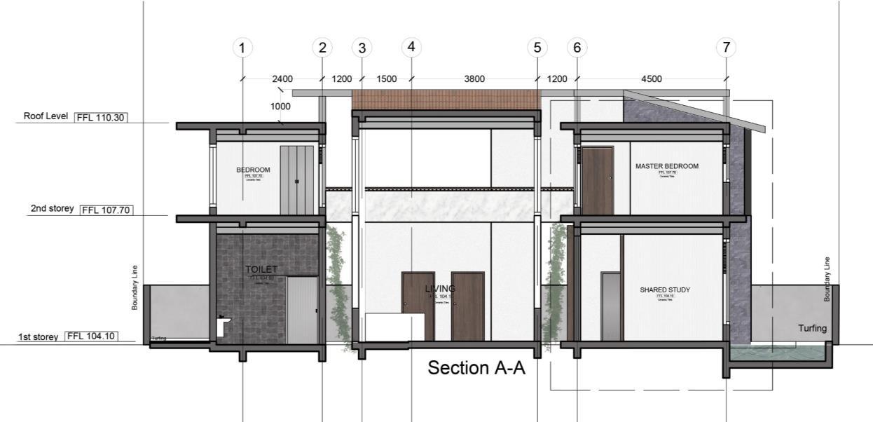
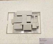
Familia – Year 1 Project
Design Brief:
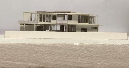
To design a Bungalow for a family of 5 comprising of an 85-year-old wheelchair bound Grandmother, 50-year-old Father, 45-year-old Mother, 10-year-old boy and a 15-year-old daughter.
Design Intent:
To encourage family bonding by encouraging the family members to spend more time in the main common spaces.
Design Strategies:
•Placing the smaller and more private spaces around the large common spaces
•Using greenery and water features to provide a sense of privacy to the common spaces as well as to encourage the family members to spend more time in the common space
•Ensure that even when the family members are at the private space, there would still be a certain amount of visual connection between the private and public spaces
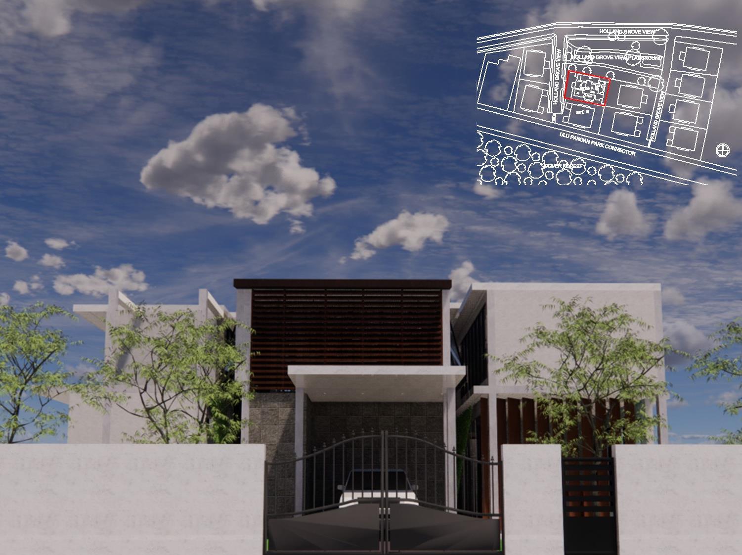
Location Plan:
Site A
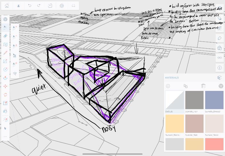
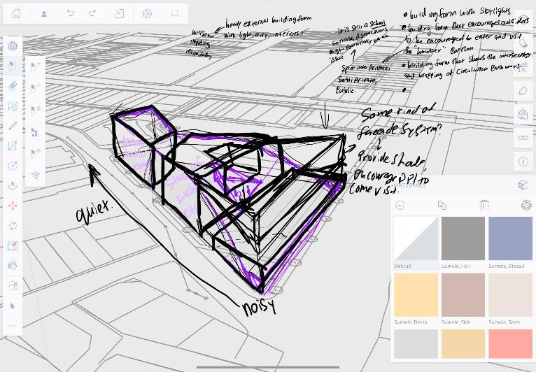
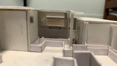
Overall building has been segregated into 2 different zones: Blue: Private Spaces Red: Public Spaces
The private zones are then split up into smaller spaces
The private zones are then placed around the public spaces. The private spaces are then made smaller to further emphasize the hierarchy between private and public spaces.
I then pulled out a portion of the public spaces to make space for the library. I decided to place the library at a different area from the main common areas as it is a more “ quiet “ area, different from the more “noisy” area such as the living and dining areas.
The public spaces are then Pulled out and made bigger
I then pulled up the public spaces to further emphasize on the public spaces as well as the different hierarchy of the spaces.
I then added greenery as well as water features around and in the building to help to provide a sense of privacy for the common areas as well as to help to influence the circulation of the family members.
By putting the private spaces around the common space, it allows for a sense of visual connection between the private and common spaces by allowing for a sense of visual connection between the spaces, should something interesting occurs in the public spaces, people would then be able to easily notice it and would then be motivated to join those who are in the common space.
OFFICIAL (CLOSED) \ NON-SENSITIVE
E nd of Year Showcase @ URA Atrium
Personal Works
Photography
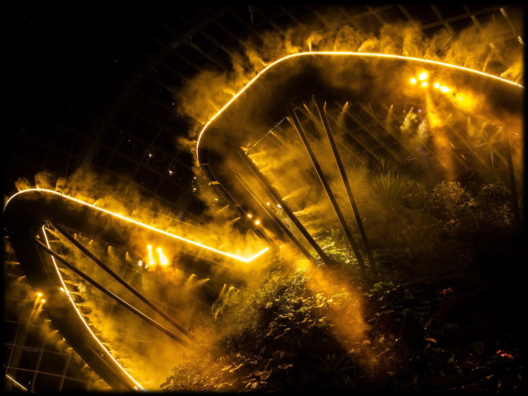
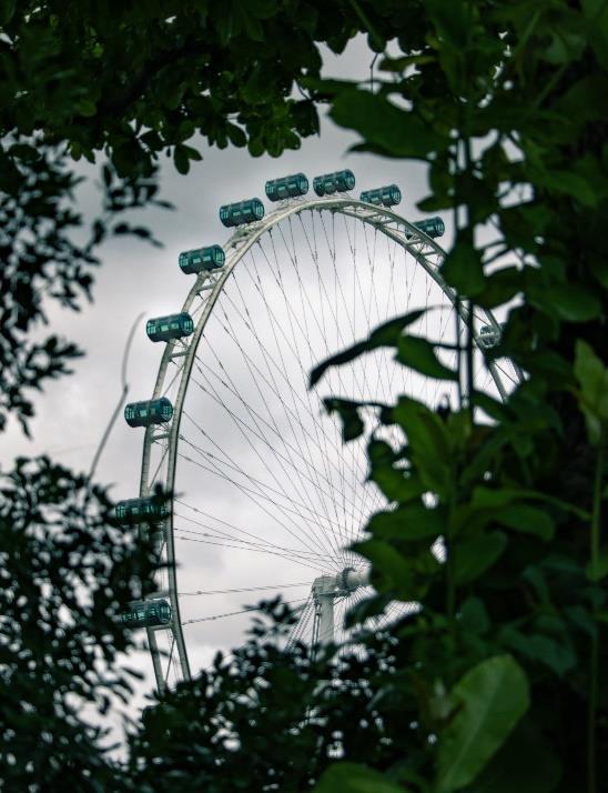
My thought process for this photo was that I wanted to try to get a slightly different angle of the structure. As the structure is quite unique, I wanted to make use of the greenery that it sits in to give the image a slightly more mysterious point of view and to not give off the entire structure itself. I also made use of the grey paint on my bicycle to also somewhat reflect of the dark clouds in the sky to give it some sense of symmetry that can be seen in the domed shaped structure.
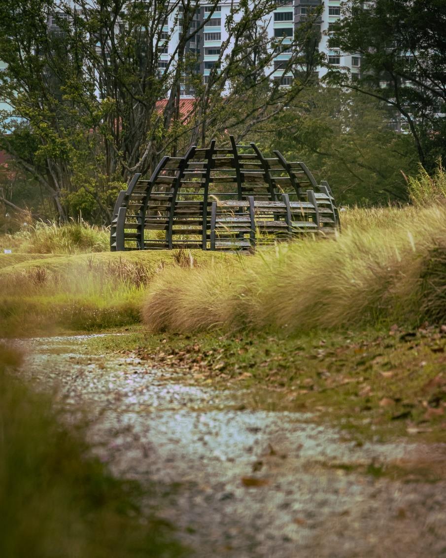
For this photo I was further away from the dome, and I wanted to make use of the leading lines that the pathway and the patches of greenery to direct the viewer’s eyes towards the dome itself. Furthermore, the dark colour of the dome structure itself also stands out from the green surroundings.
For this photo I was further away from the dome, and I wanted to make use of the leading lines that the pathway and the patches of greenery to direct the viewer’s eyes towards the dome itself. Furthermore, the dark color of the dome structure itself also stands out from the green surroundings.
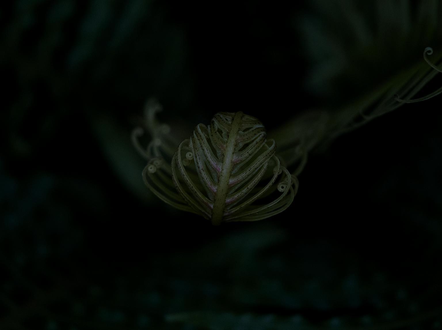
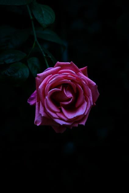
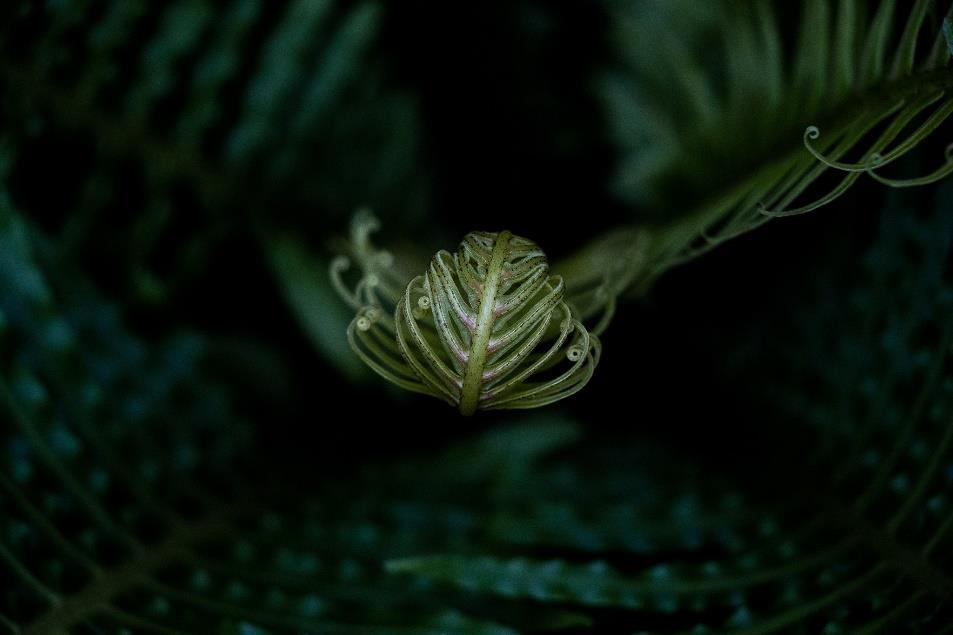
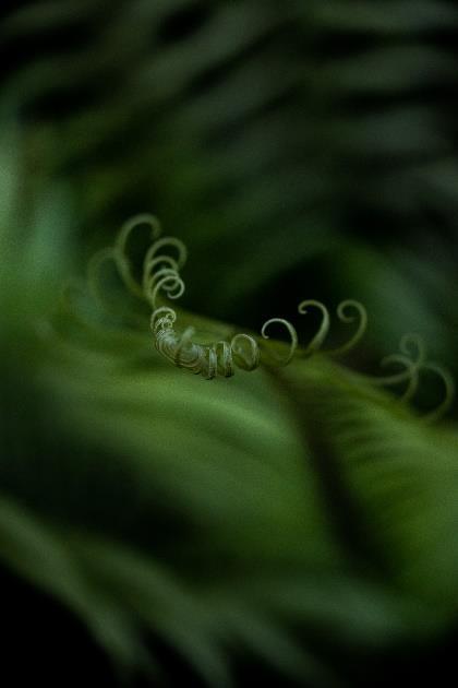
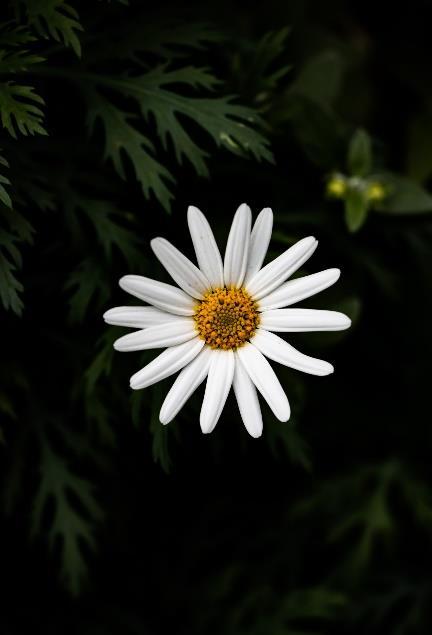
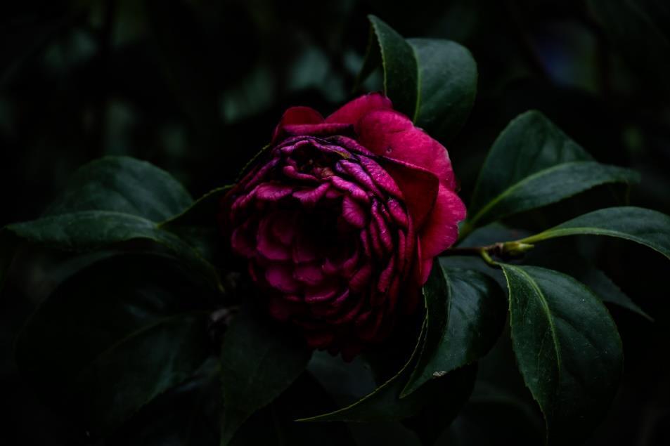
I took the first 3 images very near the start of my photography journey, I wanted to take photos of the flowers at garden by the bay and had wanted to try taking some detailed shots of the flowers. During the editing process, I tried to make use of lightroom to bring out the natural beauty of the flowers focusing on the colours and the sharpness of the images.
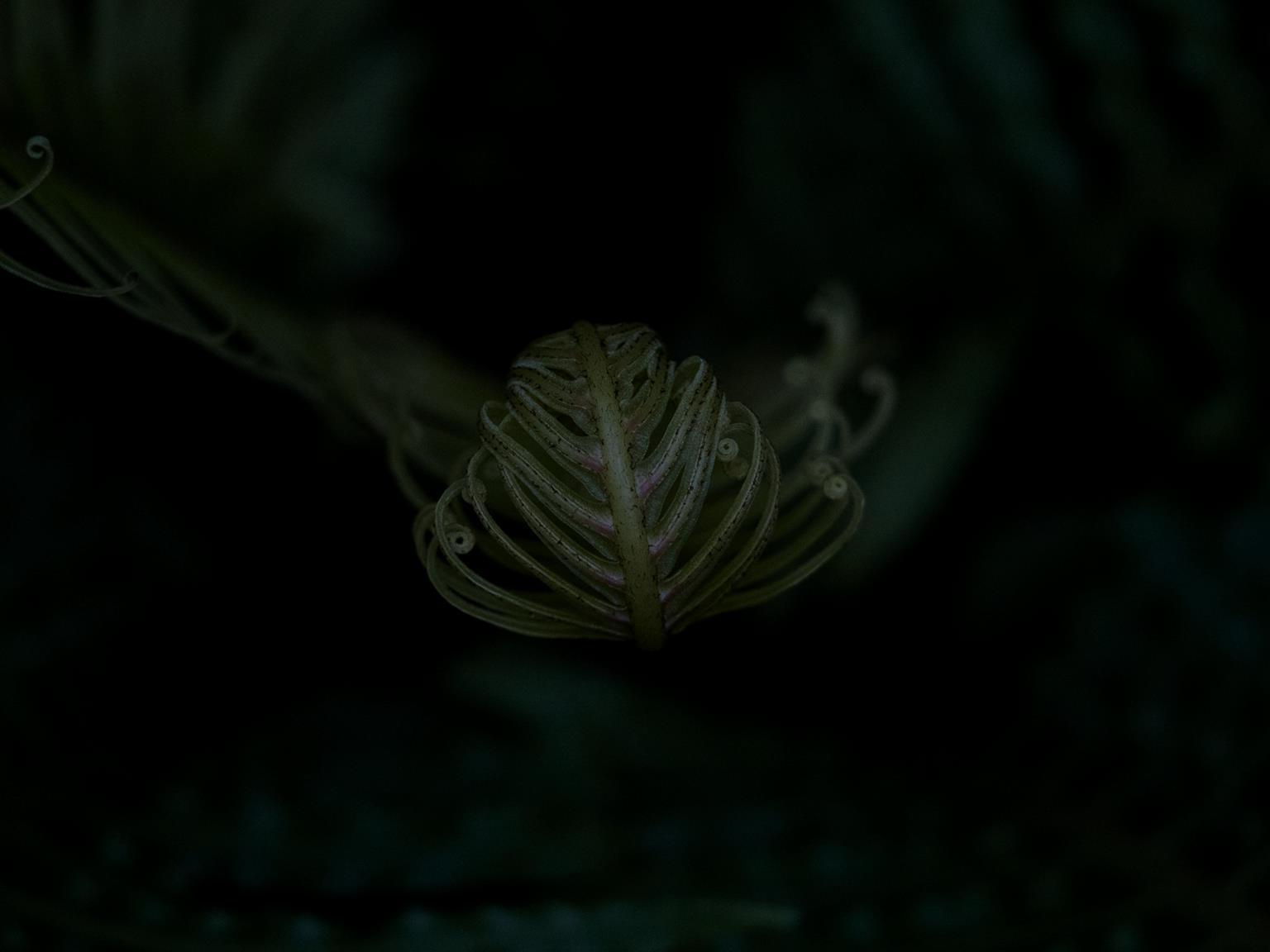
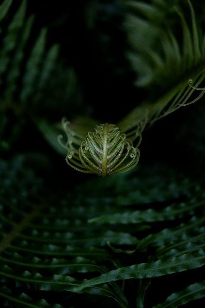
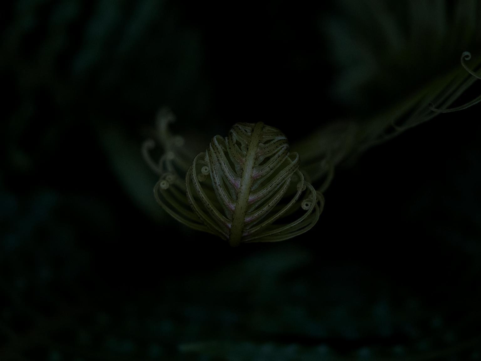
For the next other 3 images, I wanted to improve the photos by creating a shallower depth of field, focusing on the curls of the leaves, and using the other leaves to help to draw the audience's eyes to the main focus of the image.
Nature Photography
Architecture Photography
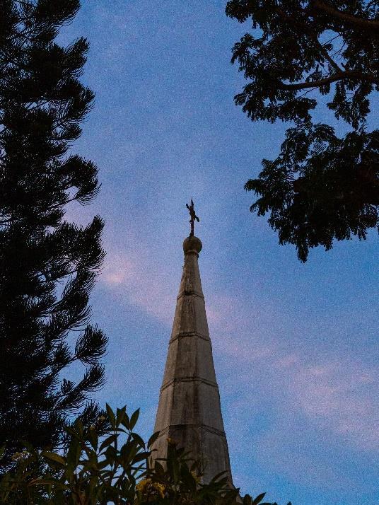
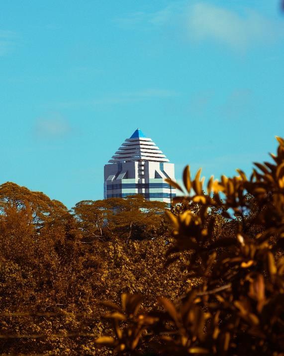
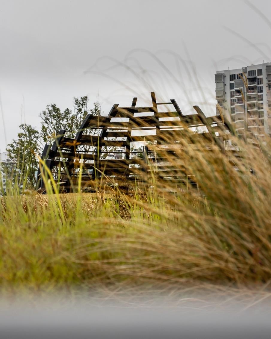
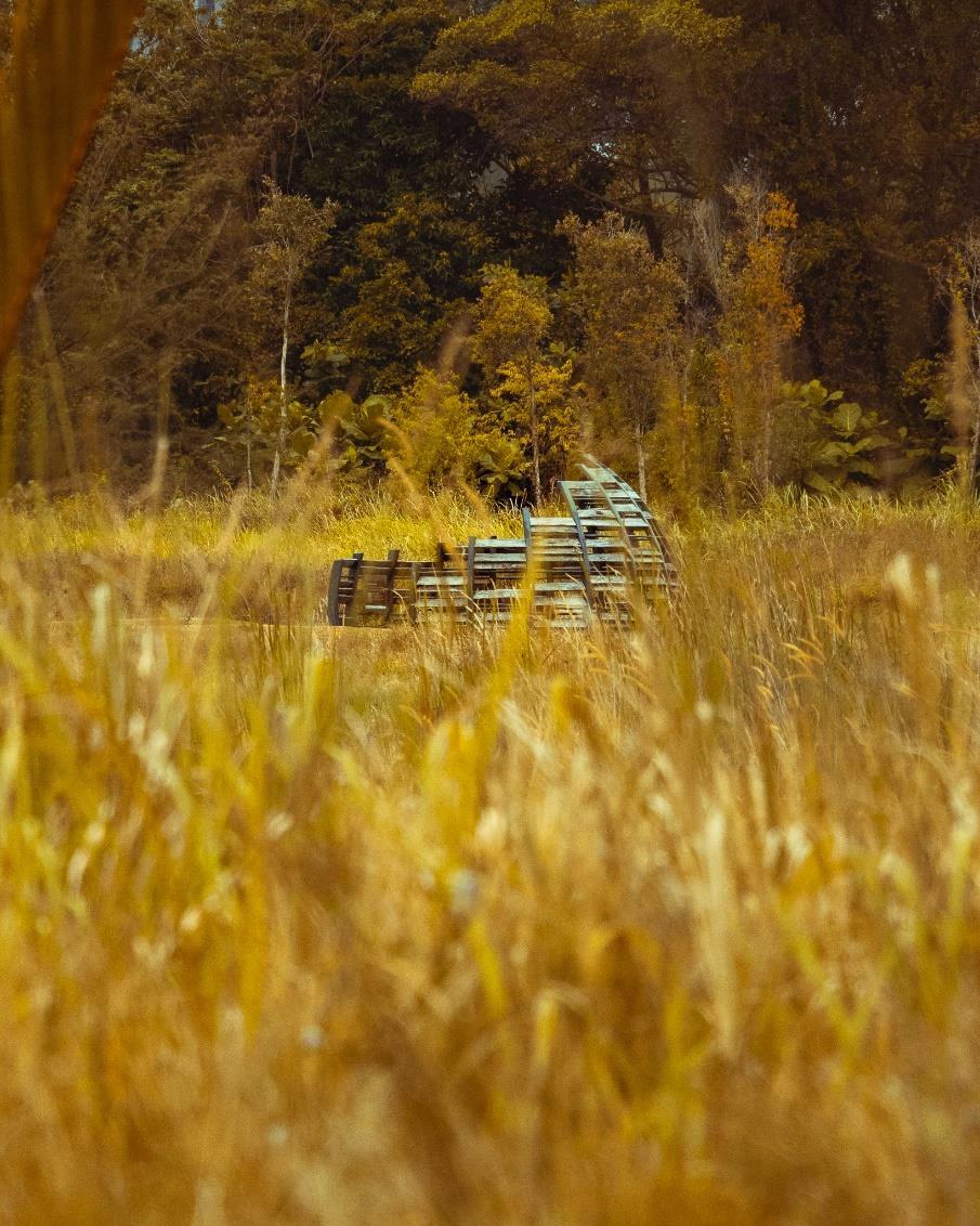
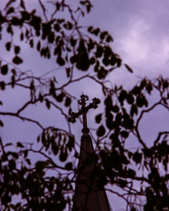
For these few shots, I wanted to take photos of these man-made structures through the use of nature to create a slightly more unique shot.
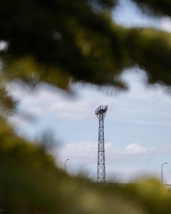
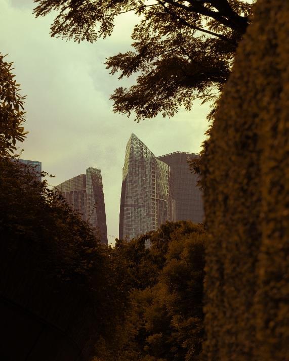
To a certain extend these photos can also represent how through time, nature will slowly be able to take over these structures when people are gone.
In order to take these photos, I had to really take the time to look for these shots and compose them. Through this experience I learnt that finding interesting frames can be quite easy and one just needs to take the time to look for these frames.
Graphic & Product Design

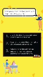
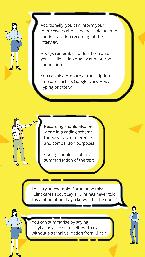
Through this task, I was able to learn abit more on graphic design and as well as what are some of the things to take note of when designing slides for a presentation. Some of the things that I learn include the importance of ensuring that there is sufficient border space around the individual components as well as how to ensure that although there can be quite a number of images and elements on the screen itself, it should not come to a point where the graphics
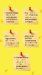
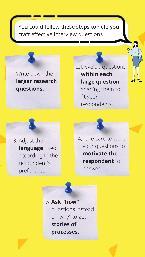
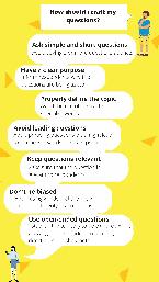
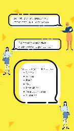
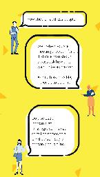
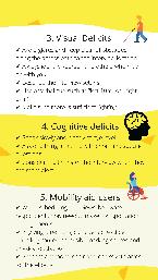
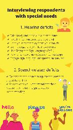
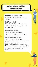
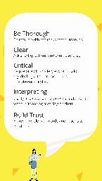
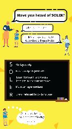
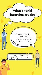
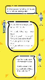
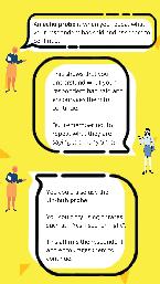
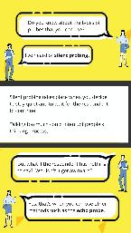
Informative Social Media Posts
Product Design
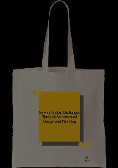
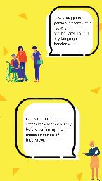
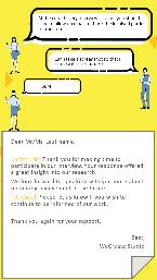
I was tasked to help to design the cooperate gift for the company so that they are able to send it out to the interviewees that we had interacted with for the empathy box project. For this project, I was able to learn about how to ensure that the design would be visible in terms of the visibility of the design as well as in terms of doing some market research as to what are some of the trendy designs for tote bags that people would be willing to bring out and use even when they are not working at WeCreate Studio.
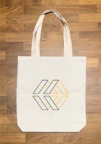
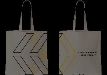
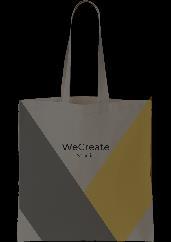
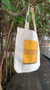
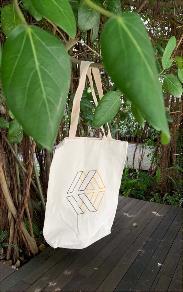
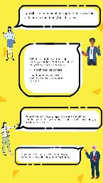
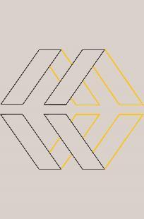
Through this task, I was able to practice using photoshop to help to draw out graphics such as the company’s logos and was able to better understand how the scale on a digital page would be affected when it is being converted to hard copy “Pages”
I was tasked to help to design the cooperate gift for the company so that they are able to send it out to the interviewees that we had interacted with for the empathy box project. I was able to learn more about graphic and product design.

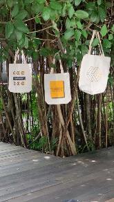
For this project, we came up with a total of 4 designs, 3 of them are just coloured post it notes which were selected by my colleagues and one with the company’s logo in the post it note


Cooperate Gift Post-It Notes
End
