
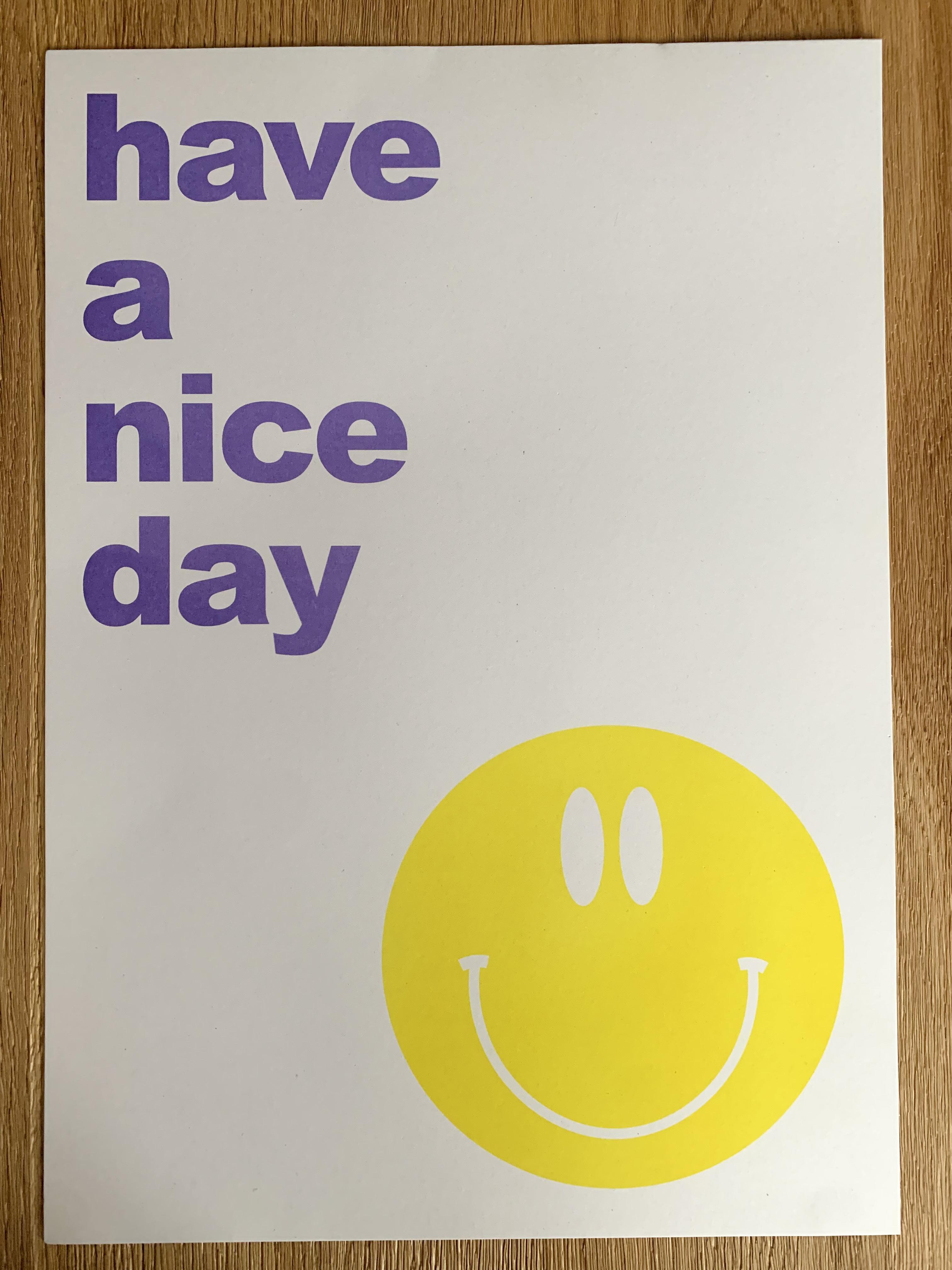
Portfolio
By Lauren BarnesContents 01- Introduction 02- Research Methodologies 03- Production Schedule 04- Passion Projects & Illustrations 19- Future Shock Book 39- Radical Landscapes 45- Workshops 50- Audience 51- Interviews 55- Persona 58- Image Developments 65- Unused & Unfinished Graphics 70- Ink Bleed Development 73- Presentation 75- Photo Book 96-Risograph Print 99- Evaluation 100- References 101- Image References
Literature review
Graphic design continues to be influenced by rave culture, which is continually evolving. The relationship between graphic design and rave culture still exists as it’s strongly influenced by art and culture. Club culture’s impact on graphic design is still immensely popular today, inspiring many artists and creative practices. The sense of freedom and a wilful naivety in approaching graphics is what made the imagery of rave culture so pure, fresh, and enduringly striking (Gosling, Eye on Design, 2016).
Clubbed is the story of what came after Design After Dark, taking its cue from the acid house explosion and its wider after-effects, the shocks from which we are feeling now. “It was like the Big Bang” (Bill Brewster, 2018). Clubbed considers the creativity and influence of club culture as the story illustrates UK clubs and their influence on graphic design from the 1980s until 2017. The Preface written by the editor examines the beginning of the influence of clubs and how it shaped his love for designing, which I can strongly relate to. The publication begins by expressing how the explosion of house music slowly transformed art, creating a domino effect on all clubs. “So step this way and feast your eyes on 35 years of British club history, told through the eyes, pens, scalpels, and MacBooks of some of our most gifted designers” (Brewster, 2018) communicates a sense of excitement and anticipation and, also communicates the shift in technology. From Hacienda to Printworks, the book stretches back three decades, demonstrating the creative process and artwork the acid house explosion had, and what still has in the creative industry.
One of the most correlative themes that emerged from the publication is the graphics representing each club illustrated through the pages, showcasing the artwork behind them. Breaking up the text, some pages display graphics for a handful of pages, allowing the reader to take in the visuals to relate the content to the graphics. The book presents the artwork with such pristine composition allowing each visual to communicate the type, colours, and content each design holds. Clubbed is most relevant to the design aspect of my study as the history of the graphics impacts my research.
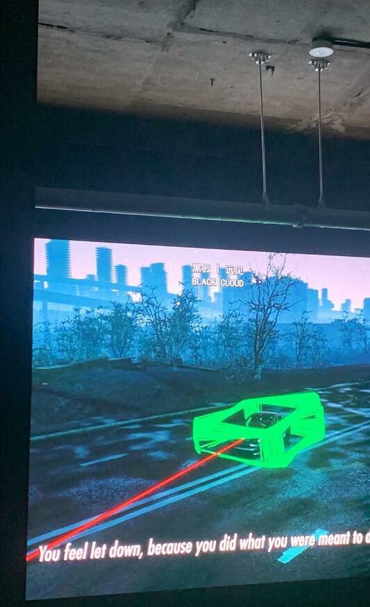
Future Shock by Alvin Toffler was published in 1970, which is a publication based on the term culture shock. Toffler investigates how the future is approaching us so quickly that we’re all experiencing shock as a result of adjusting to the rapid changes. Toffler examines the three causes which generate future shock: transience, novelty, and diversity. Time, change, and the technological engine is the main factors as Toffler analyses change in every perspective, making his views still significant today.
The book acts as a diagnostic tool for the issue, explaining why the author believes that future shocks will occur as well as posing the question of what we can do to address it. Communicating confident predictions within each story, Toffler identifies the importance of managing change, almost as if it was written yesterday.
This volume has a significant impact on my study since it expresses my current thoughts and emotions. As I express my feelings through my design work, Toffler’s words massively relate to current events, influencing my practice. The power of the words within the book not only
remarkably narrates the stories but fuels my study with visionary concepts.
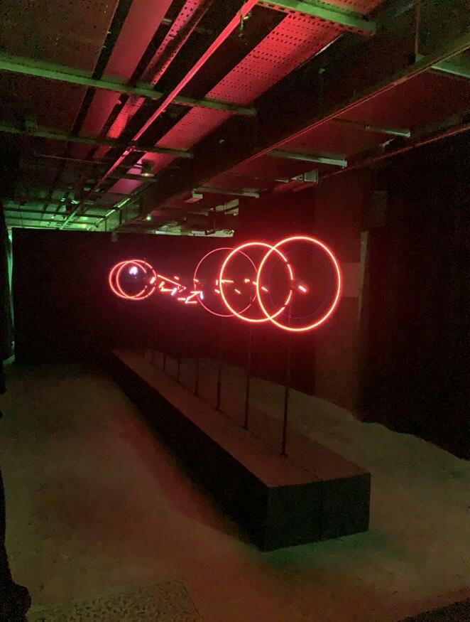
After discovering the publication, I learned that there was a Future Shock exhibition in London. The exhibition blurred perspectives of digital and physical which boasted mesmerising installations. The exhibition consisted of multiple studios which showcased different artists’ work. Upon walking into one room, there were normal circular fans lined vertically in a line in front of each other, with each fan displaying a very similar rhythm. When the fans would operate, different colours and rhythms of lights would array from the fans, creating an exhilarating show.
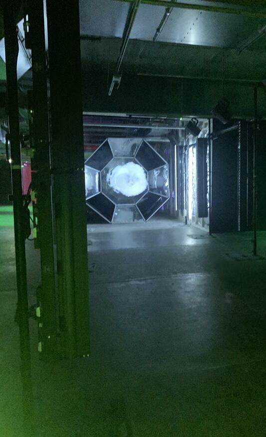
Another studio, which was in a large open space, presented a large smoke machine. The machine was flat against the wall, and every few seconds it would dramatically push out smoke in a circle effect, almost as if someone smoking a cigarette would be blowing “rings”. As the audience to the exhibit stood further back, the rings travelled further towards us, slowly getting weaker, but eventually touching the audience.
What is immediately striking about Clubbed and Future Shock is the dramatic contrast that both publications hold. However, both volumes are incredibly important and inspiring for my study. Future Shock contrasts with my prior review of Clubbed since it symbolises the radical change in my project idea while still being influenced by the rave culture aesthetic. Yet the Future Shock exhibition communicates the concept of the publication, however, showcases modern artists and the future of art.
Introduction
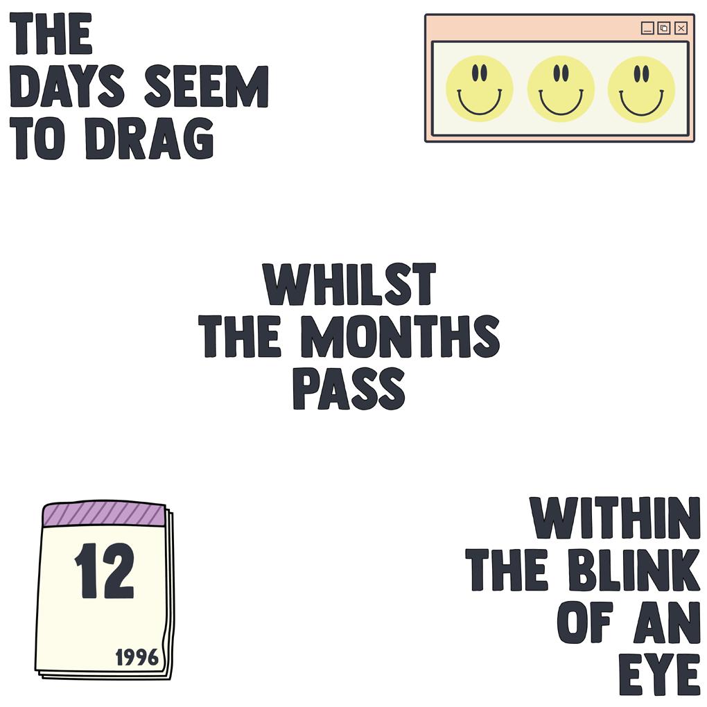
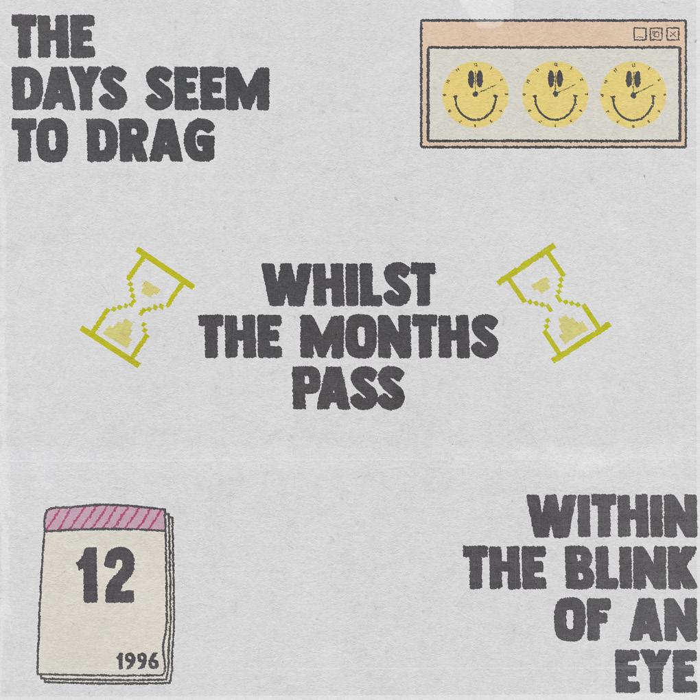
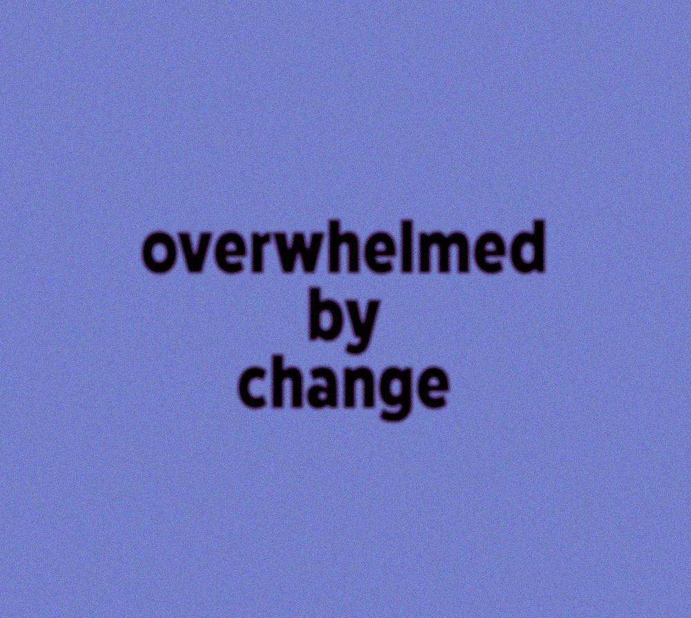
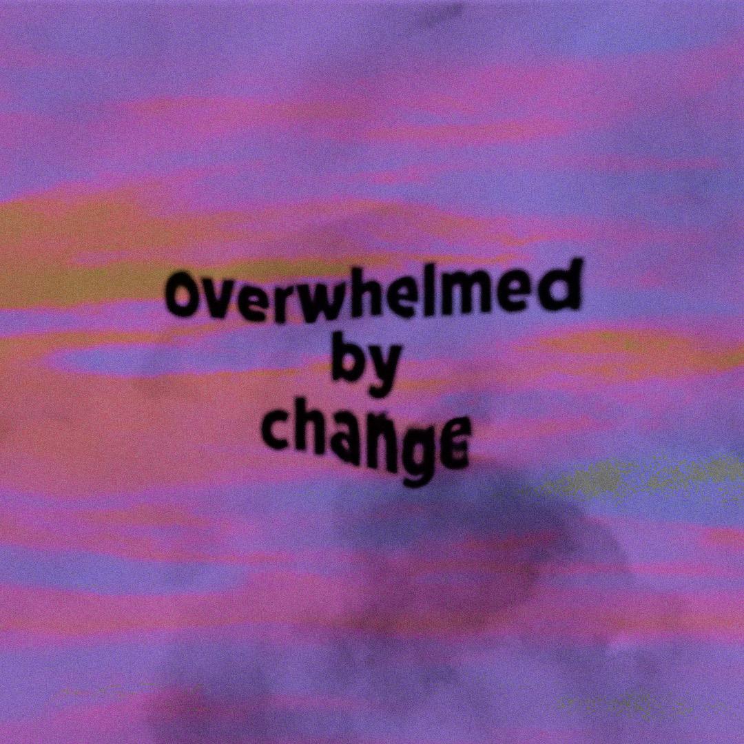
My Portfolio documents the rigorous process of Graphic Design Major Study from the initial evolving concepts to the final outcome. At the beginning of this study, the ideas for my project were completely different from how the project developed, as it was hugely influenced by artists and writers, and strongly impacted by history. My initial aim of this study was to recreate posters, flyers, tickets, and stickers inspired by 1990s rave culture, which was planned in Research Methods and Project Proposal. My creative practice throughout my master’s has always focused on rave culture and the aesthetic that surrounds it. Although in Professional Platforms, Art, and Communication my ideas diverted from the free party dance scene, to communicating the depressing reality we live in now. Changing my project idea was a risk that I was willing to take to produce quality researched work. The new aim of my study focused on the unpromising post-pandemic life. Although my research idea developed, I didn’t want to entirely abandon the rave culture element as it has always inspired my creative practice. Therefore, I chose to communicate my work inspired by the rave culture aesthetic by using texture, colour, and layers, yet expressing it through a modern context.
Much attention has been drawn to Clubbed, Future Shock, and Fact Magazine, which are three publications that dramatically shaped my concepts into a project I envisioned. Clubbed inspired the creative processes aspect of my project, Future Shock inspired the context, and Fact Magazine inspired the presentation and layout.
Improving my skills as a graphic designer was the goal of this project. As I’m heading into the creative industry, I want to ensure that my knowledge and skills are to the best of their abilities.
1.
Research Methodologies
The research methodologies I used to undertake my project were qualitative methods. I chose to use these methods to conduct my research as they were more suited to my project. “Catherine Dawson: An Introduction to Research aduring Research Methods and Project Proposal, to help aid my practice and educate me on different research approaches to a project. When deciding upon my research methods for this project, I referred to this book to refresh my memory on which research methods would suit my practice and why. Qualitative research aims to understand the social reality of individuals, groups, and cultures as nearly as possible as its participants feel it or live it. Thus, people and groups, are studied in their natural setting (McLeod, n.d).
The advantage of using qualitative research methods for my project is that it’s an open-ended process. When constructing my interview questions, it was essential that they were open-ended to encourage deeper, detailed responses allowing me to gain knowledge from the industry within. Moreover, by using qualitative methods I was able to choose my participants to ensure they are suited to my project and will be relevant to my research topic.
Despite this, the only disadvantage when conducting my research, I found it difficult at first to contact participants. My main reason for contacting designers was to inspire my creative practice, and for it to influence my research. Instead of merely contacting anyone, the designers I was contacting needed to be significant to my study. After three weeks of contacting relevant designers, I finally gained responses from my favourite designers.
2.
Production Schedule
At the beginning of my project, it was essential for me to create a production scedule to ensure I mapped out what I needed to do, and measure how long I needed to do it. As I was unsure where my project was heading at the beginning of my project, I didn’t create my production schedule until around 1/4 of the way into my project. However, once I had a solidified project idea, I began mapping out what else I had to do.
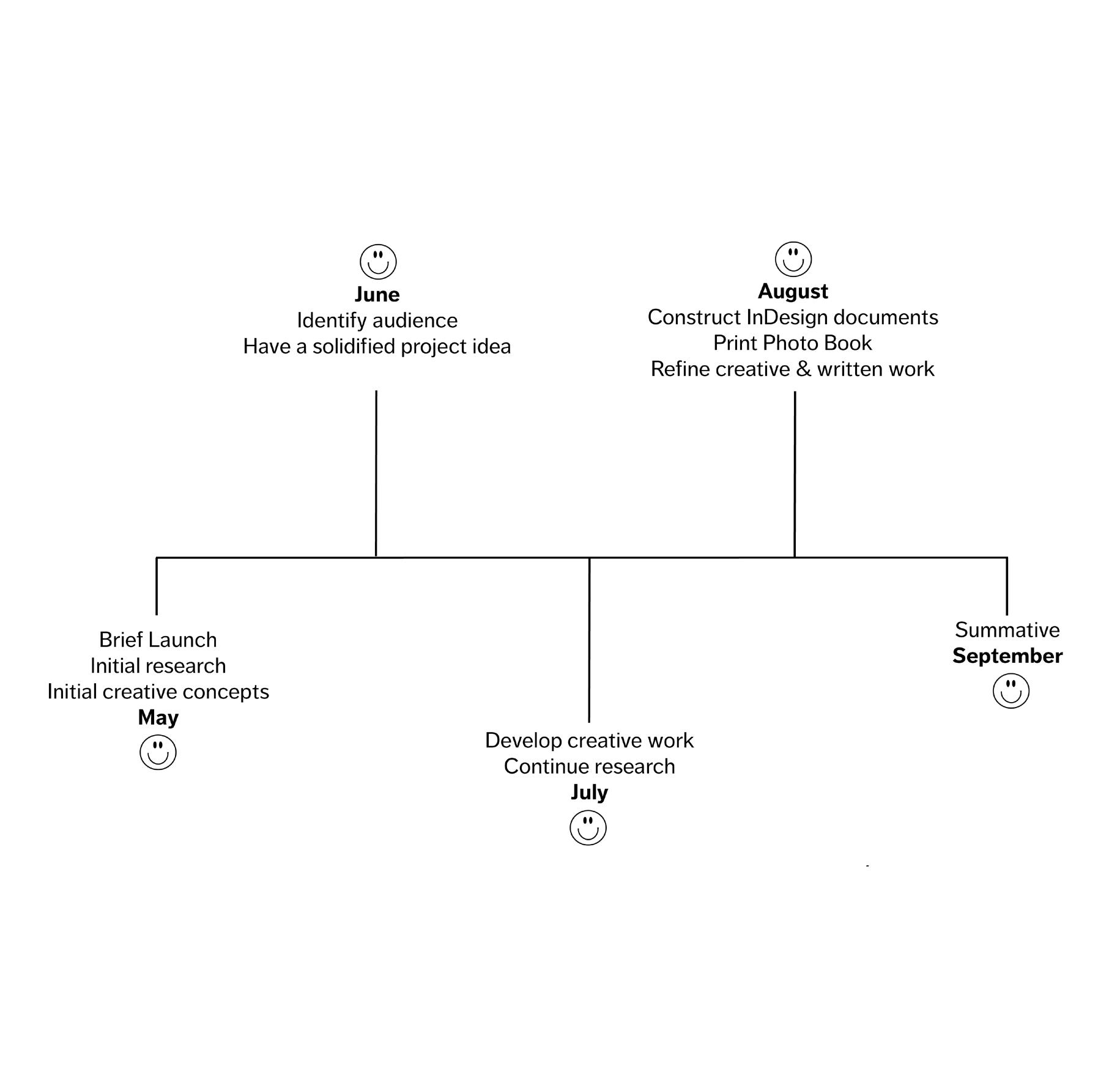
3. Figure 1
Passion Projects & Illustrations
At the beginning of Graphic Design Major Study, my main aim towards the end of the module was to become a better Graphic Designer. Although I had a huge project idea ahead of me, my main aim was to learn new skills and better myself as a creative, to ensure I’m fully prepared for the industry. As I’m a self-taught graphic designer I’ve always worked on my aesthetic using the same software. Adobe Illustrator is software that graphic designers use, however, I’m not familiar with it. I regrettably put off learning Illustrator until now, therefore, I decided to utilise this project by broadening my knowledge and skills.
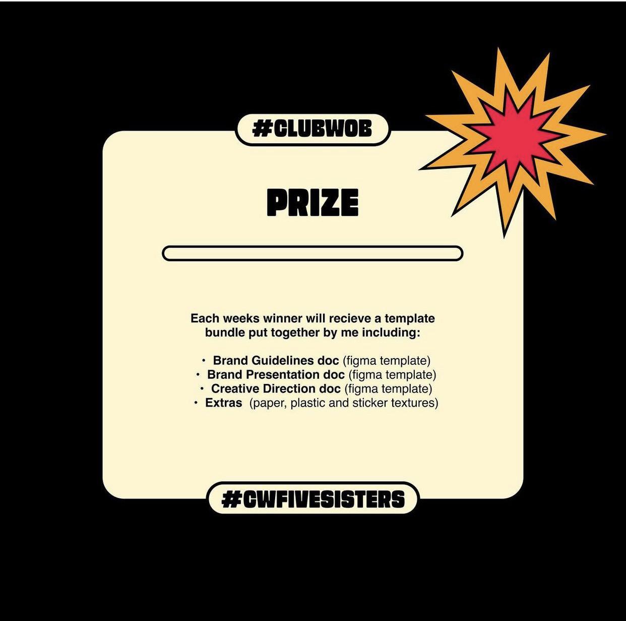
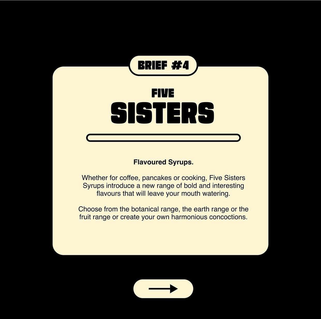
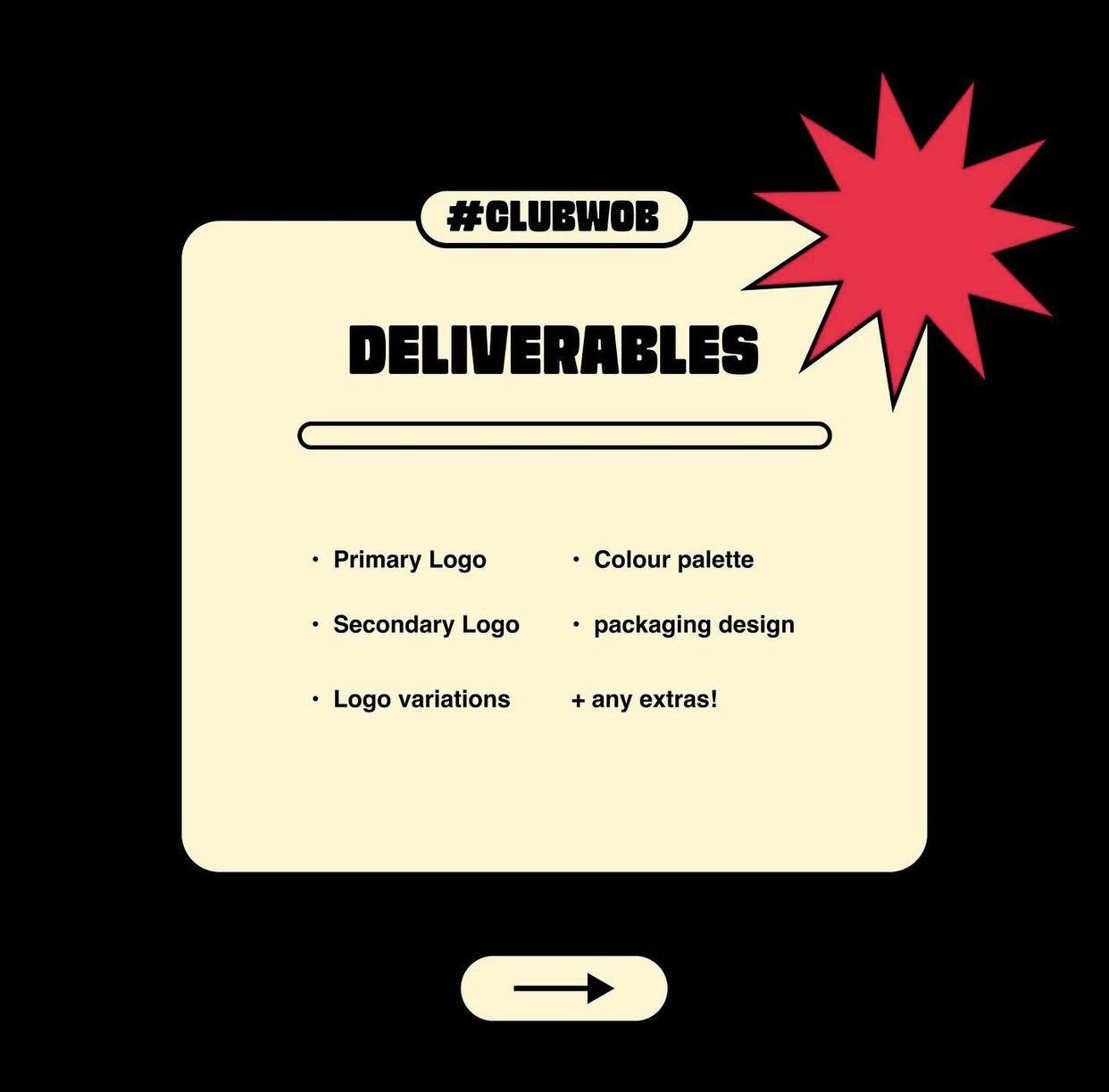
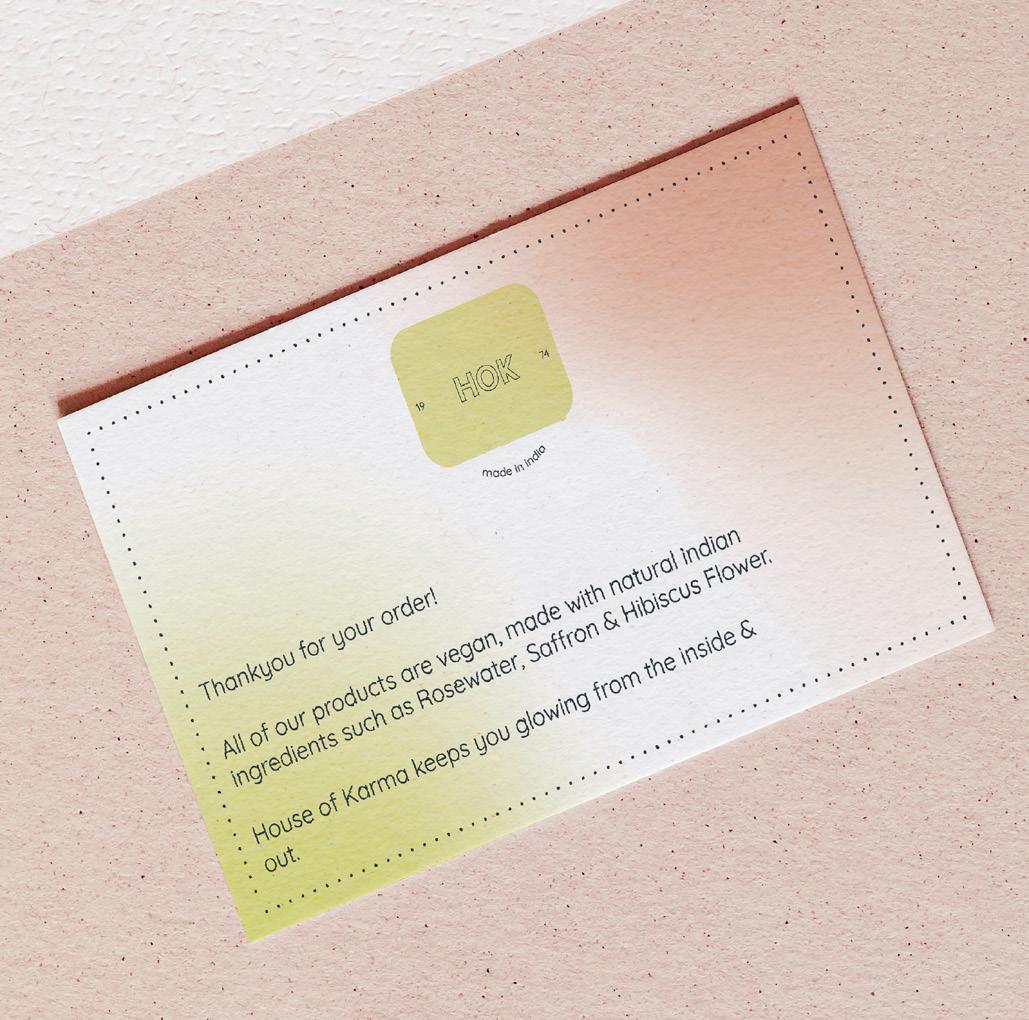
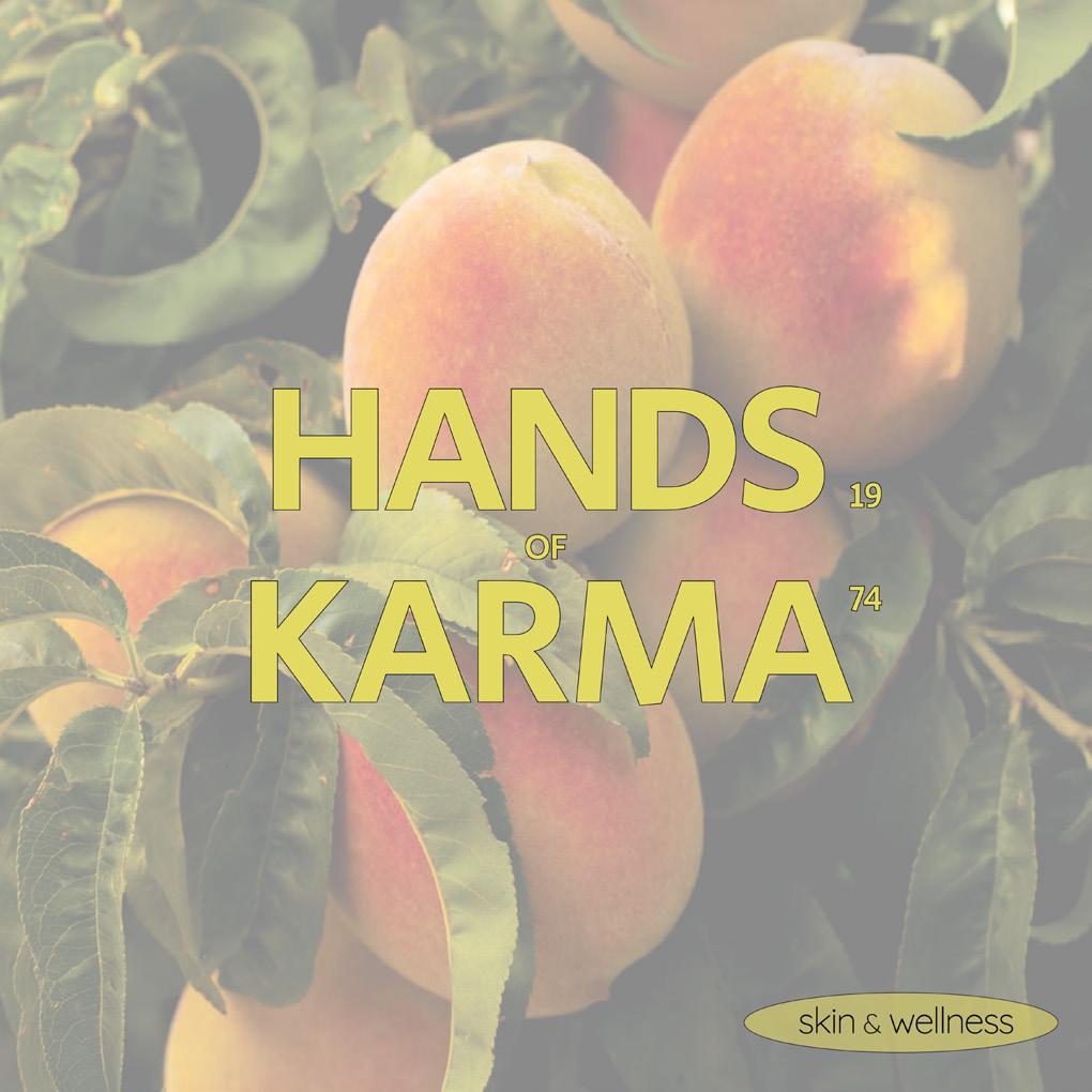
I began learning Illustrator by taking part in “Passion Projects” on Instagram. Passion Projects are a light-hearted, educational, and fun way to build your skills, portfolio, and following. After seeking Instagram for a designer whose aesthetic fits mine, I eventually found a designer named @wob.agency. Wob agency’s creative practice is 70’s inspired, and her work is creative and fun. The briefs to which I responded to were; Five Sisters, a dessert syrup company. And Hands of Karma; a female-owned aromatherapy skincare brand was established in 1970.
Another way to expand my skills by learning Adobe Illustrator was to copy illustrations from other designers. Exactly copying a design, allowed me to learn new techniques and methods.
Upon creating one of my designs, I decided to re-create Windows 95 Paint from the 1990s. When I’d finished creating it, I wasn’t sure on what to include in the empty canvas part. I’d recently seen on Instagram a designer “@edgykatrina” had created a poster and challenged other designers to re-create the poster in their own design. “I invite anyone who wants to draw this in their own style and tag me!!! Feel free to use the same colours and composition (or not) – it’s a fun little prompt if you’re in a creative rut so go crazy” (edgykatrina, 2022).
After completing my illustration, I used the text edgykatrina used to fill the empty canvas of the paint illustration. I uploaded it to my creative Instagram account and tagged her, which she commented on and re-posted to her story. Using Instagram as a social platform as a creative is such a great way to have fun with design work and interact with other designers.
4.
Deliverables


5.
Figure 2
Figure
3
Figure
4
Figure
5
Outcome


6. Figure 6 Figure 7 Figure 8 Figure 9
Deliverables


7.
Figure 10 Figure 11
Figure 12
Figure 13
Outcome


8.
Figure 14 Figure 15
Figure 16 Figure 17
Original Illustration

9. Figure 18
My Illustration
10. Figure 19
Original Illustration

11. Figure 20
My Illustration

12. Figure 21
Original Illustration
13. Figure 22
My Illustration

14. Figure 23
@edgykatrina Poster
15. Figure 24
My response

16. Figure 25

17. Figure 26
@edgykatrina Repost

18. Figure 27
Future Shock Book
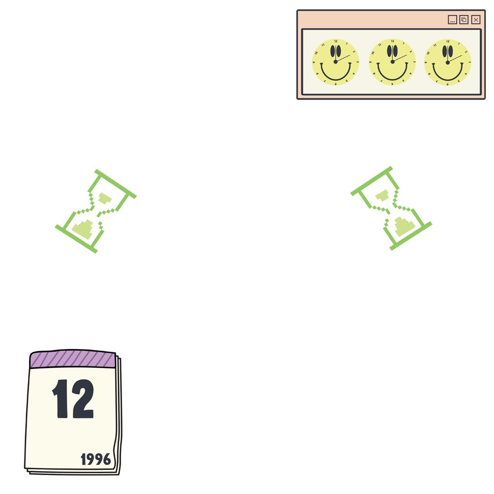
Future Shock by Alvin Toffler is a book I discovered through WGSN, a trend forecasting website that is a major research tool for my project. At first, I thought “Future Shock” was just a term that is described as “a state of distress or disorientation due to rapid social or technological change” (Google, 2022). Upon researching the subject, I discovered the author of the book “Future Shock”, which was written in the 1970s. Although the book was written some time ago, its somewhat very relatable now, as we are living through history shortly after the pandemic and highlights the real-life changes which are happening currently.
After reading the first couple of pages of the book, I instantly knew it was going to be a research tool for my project. In essence, my project communicates the “Future Shock” of the global pandemic, and how creatives including myself, are responding to it. Future Shock helped my research massively as it facilitated a deeper exploration of the publication as generated new ideas and concepts for my practice.
As Tofflers book reshaped my project, I wanted to include extractions from the publication itself in my portfolio to allow the book to speak for itself since such wise remarks convey history.
19.
“Now imagine not merely an individual but an entire society, an entire generation – including its weakest, least intelligent, and most irrational members – suddenly transported into this new world. The result is mass disorientation, future shock on a grand scale. This is the prospect that man now faces. Change is avalanching upon our heads and most people are grotesquely unprepared to cope with it.”
20.
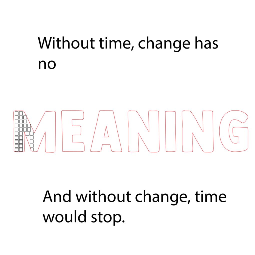
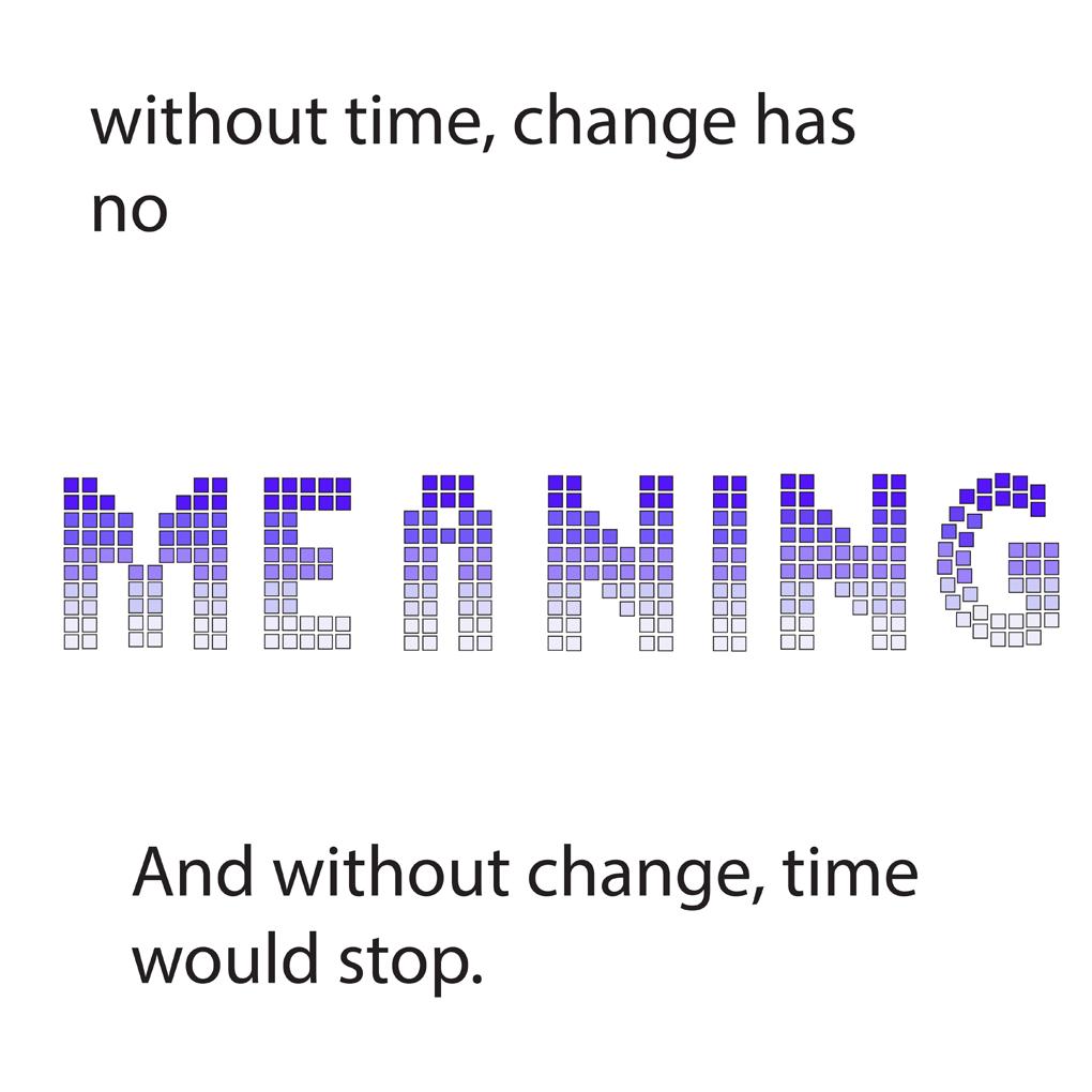
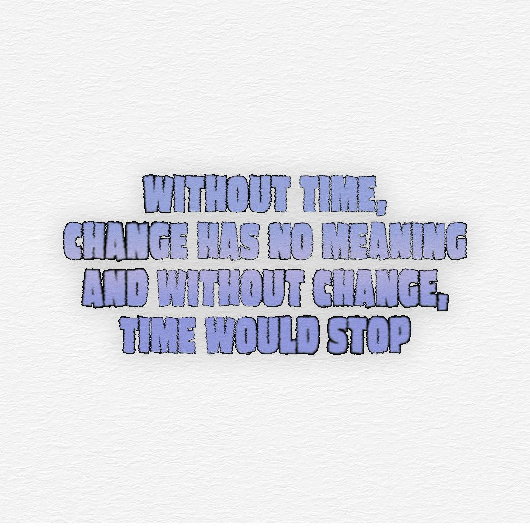
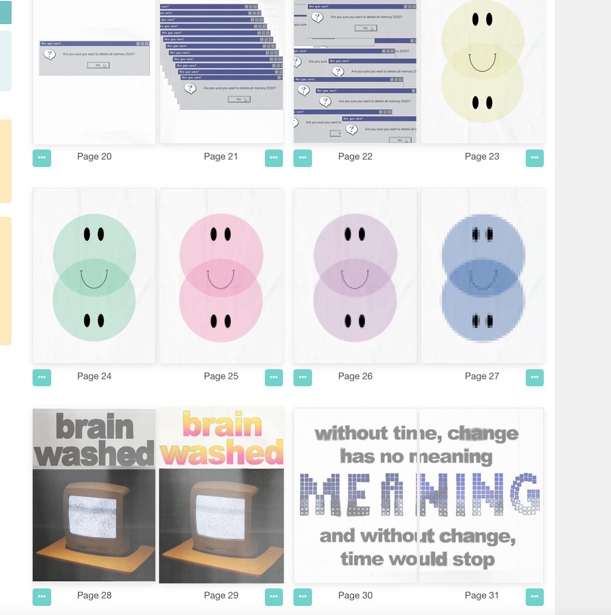
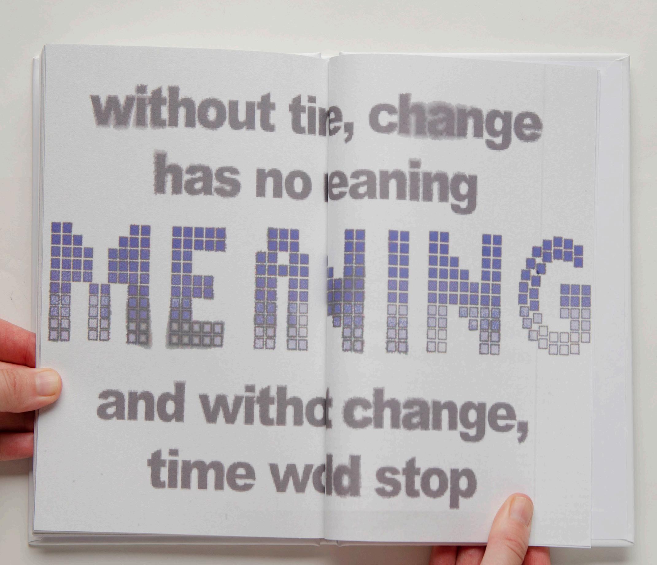
“Without time, change has no meaning. And without change, time would stop. Time can be conceived as intervals during which events occur.”
21.
“This book is about change and how we adapt to it. It is about those who seem to thrive on change, who crest its waves joyfully, as well as those multitudes of others who resist it or seek flight from it. It is about our capacity to adapt. It is about the future of the shock that its arrival brings.”
22.
Future Shock Exhibition
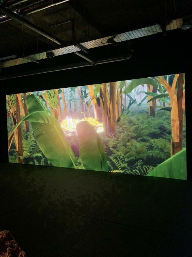
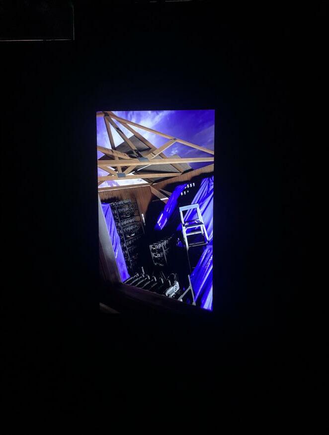
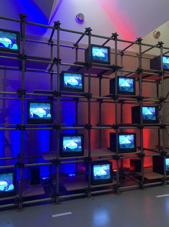
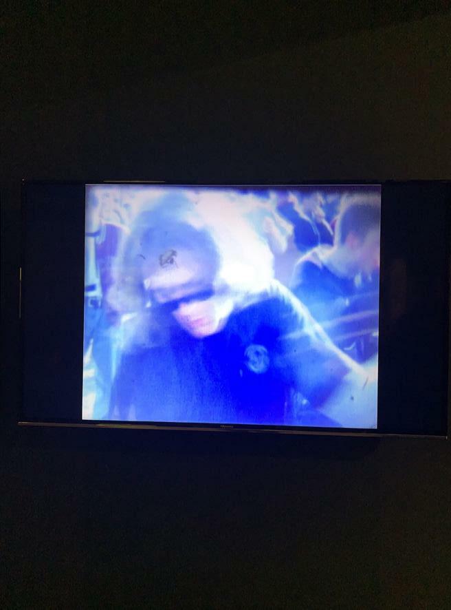
As my project is majorly influenced by the book Future Shock, once I researched the book, I become aware of a “Future Shock” exhibition in London. The exhibition was located at 180 The Strand and blurred the boundaries between the physical and virtual. The studios present an exhibition by 14 pioneers at the apex of sound and vision who are imagining a world of new space (Fact , 2022).
Future Shock transforms 180 Studios’ subterranean spaces through mesmerising and immersive digital technology - from generative and interactive algorithms, AI and 3D digital mapping, to spellbinding laser work, holographic projections and ground-breaking electronic music (Future Shock, 2022).
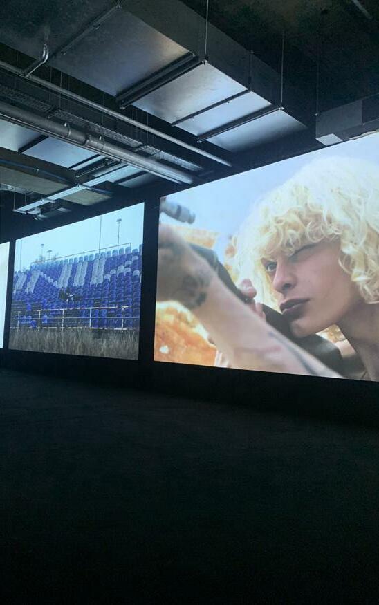
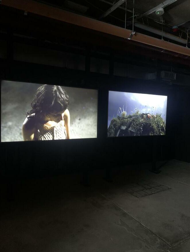
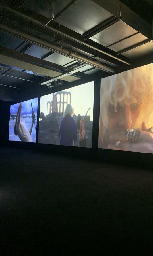
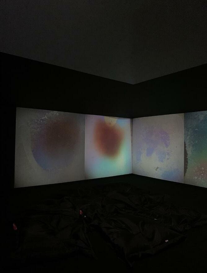
In the exhibition, multiple studios were showcasing different artists’ work. Most studios were hidden in a black room where you move a black curtain to the side to access. Although there were multiple exhibitions, I will reflect upon which exhibits influenced my creative practice.
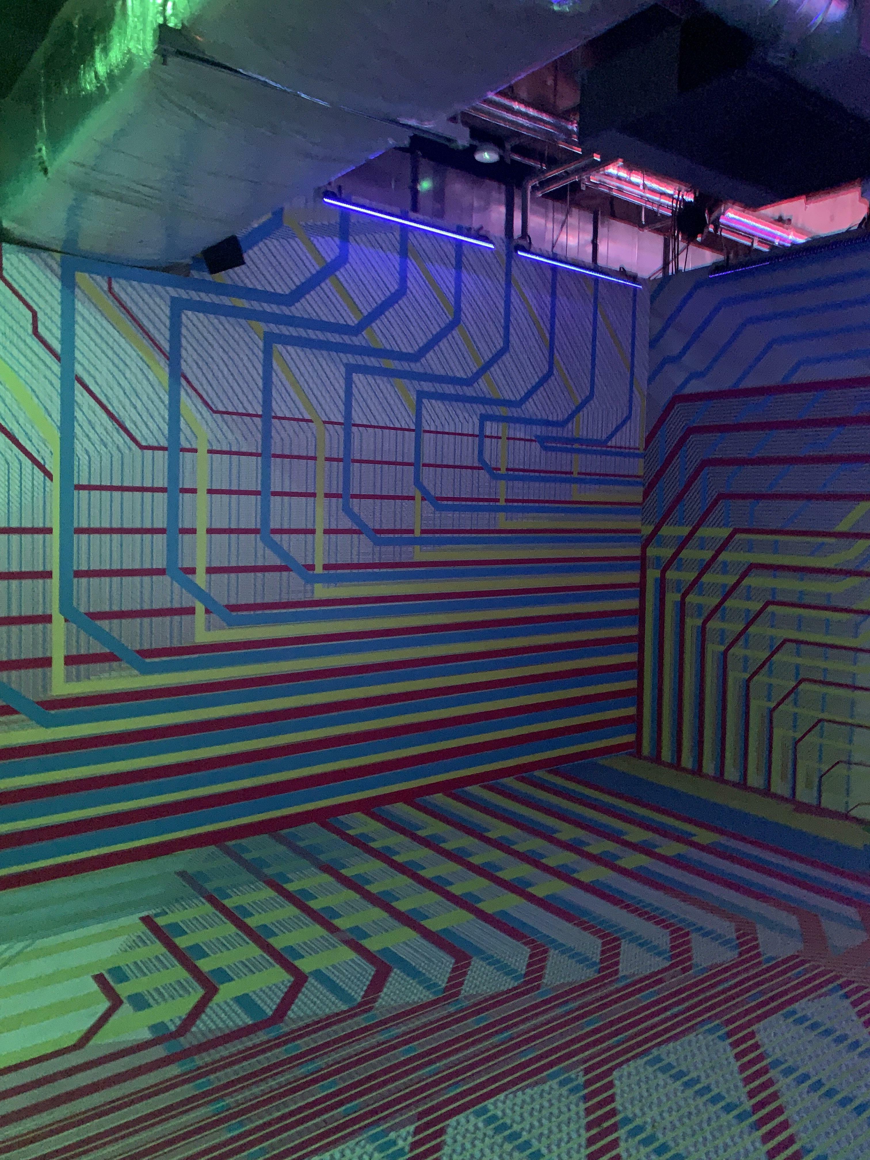
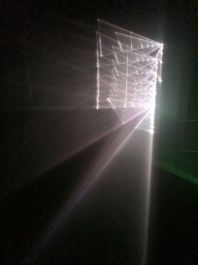
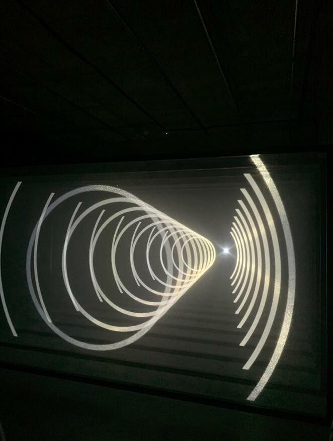
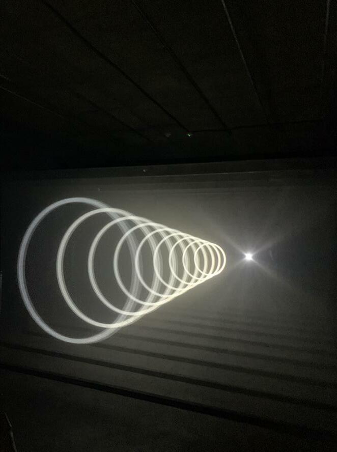
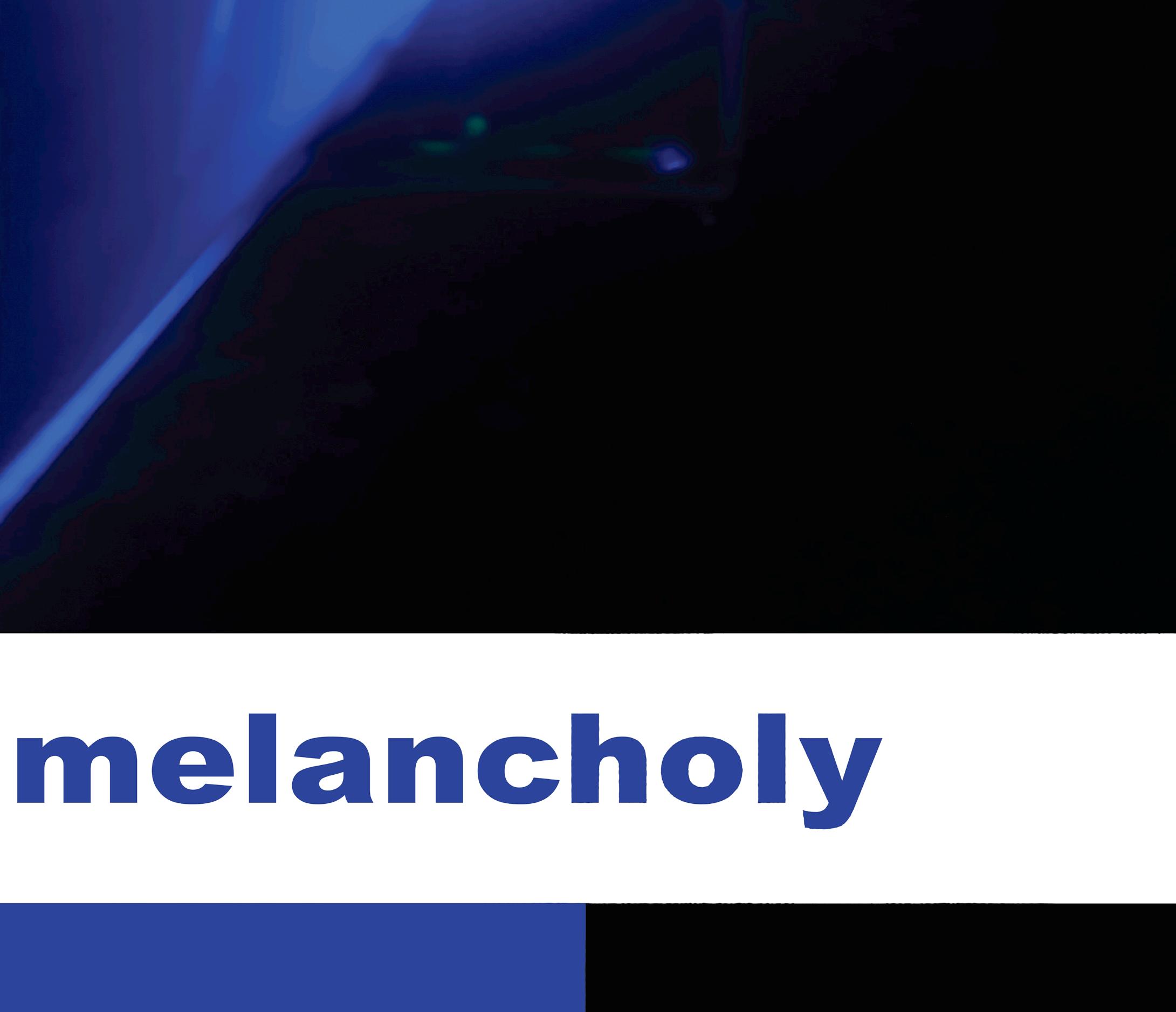
Upon walking into the studios, the first section was almost pitch black, except for a deep blue strobe light rotating around the spacious room. The artist of the studio was “UVA”, and the studio displayed the continuing UVA’s explorations of sensory experiences through the lens of technology called “Topologies”. Topologies consist of four kinetic sculptures that project single-colour planes of light, forming shifting geometries that continually divide and reconfigure space, creating an intangible realm that alters the viewer’s perception and their relationship with the spaces around them (UVA, 2022).
As I entered the studio the deep blue strobe light slowly rotated the room and the floor gradually sloped downwards. This immersive experience was not only captivating, but the colour used instigated the colour I’ve considered for the colour palette for my personal brand. As soon as I entered the studio, I immediately knew that the colour pulsing around the room was the colour which would fit perfectly into my project. From the images, I colour pickled a colour directly from the strobe light and named it “Melancholy Blue”.
23.

25.


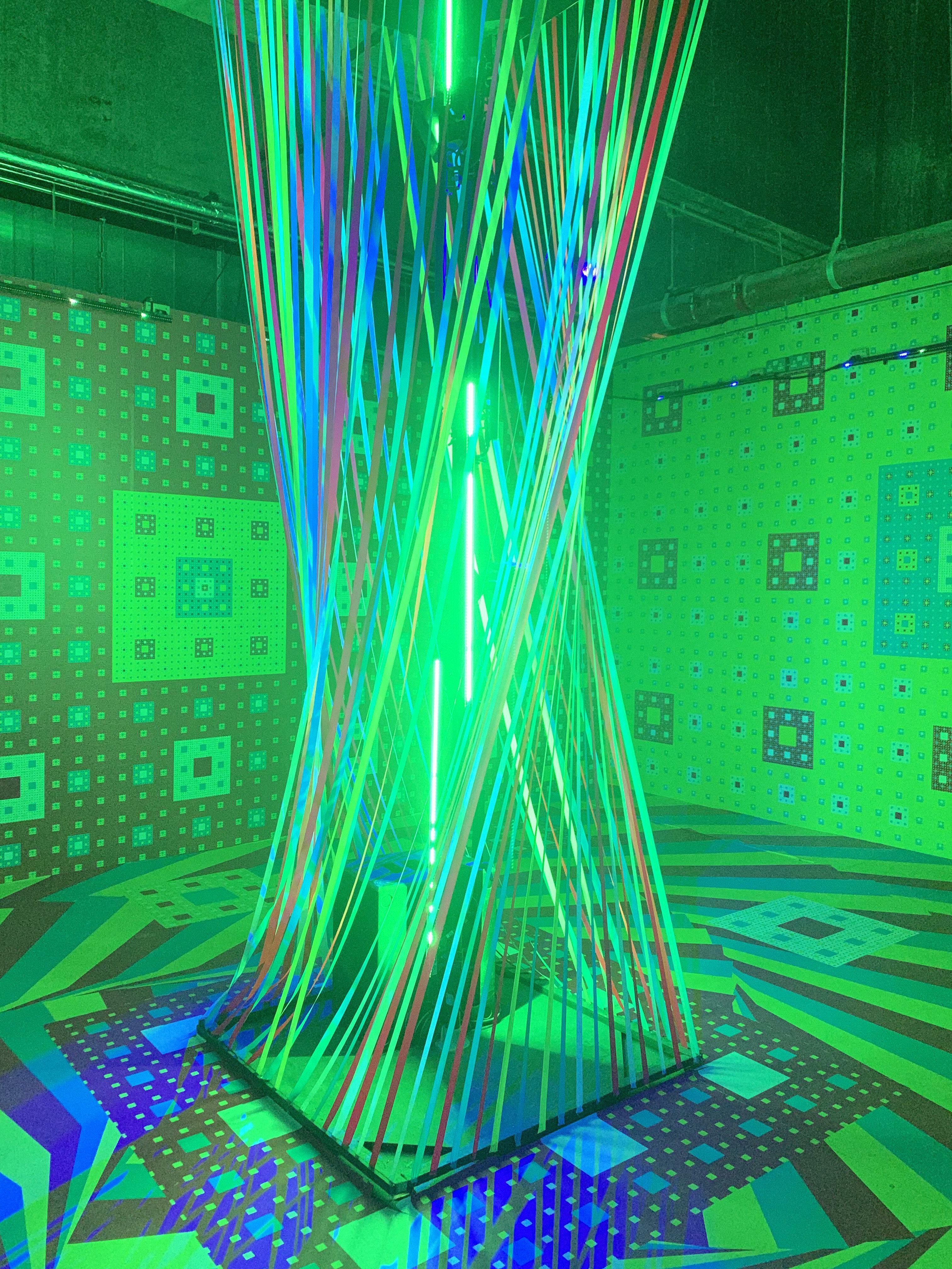
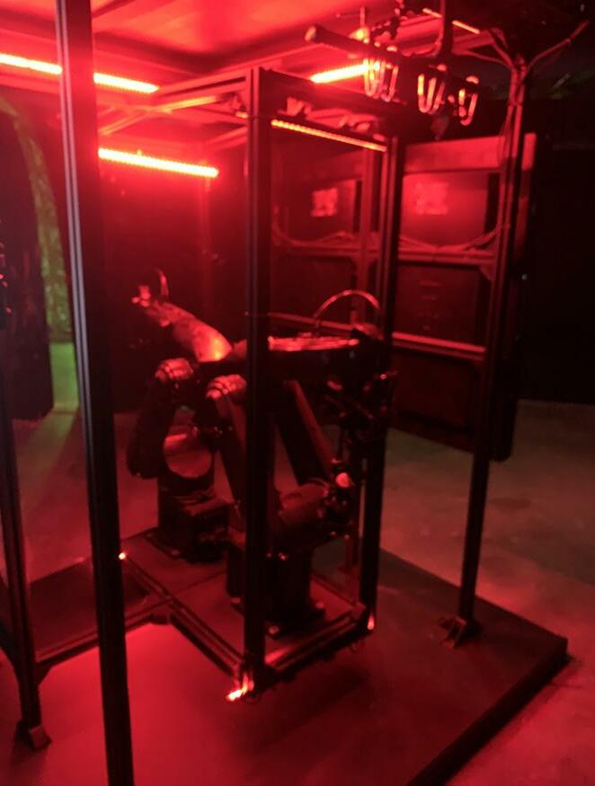
The second exhibition which drew my interest was “Subconscious” by Weirdcore, which invents boundary-pushing interfaces between sound and vision. Weirdcore is one of the UK’s leading digital artists. A 180 Studios commission, inspired by the phenomenon of lucid dreaming. Subconscious is an abstract journey into the inner mind (Weirdcore, 2022). The exhibition featured coloured geometric shapes and lines throughout the walls and floor accompanied by a sparse soundtrack by Aphex Twin. Following through to next room there was different coloured strobe lights flashing to the beat of the track, again with shapes displayed on the walls and floor. The use of colour and sound impacted an engaging creative experience. Weirdcore himself talks about the evolution of Subconscious, and how its strange visual effect has its roots in his early video work and classic rave videos (n.d, Factmag, 2022). The Future Shock exhibition was not only a surreal, immersive experience, but it introduced me to other inspiring artists. As the exhibition blurred the boundaries of physical and virtual, this showcased work from artists which are the future of now. Future Shock allowed me to discover new art and artists, broadening my research and demonstrating a strong influence on my practice.
28.

29.
30.
31.

32.
33.

34.
35.

36.


37.


38.
Radical Landscapes
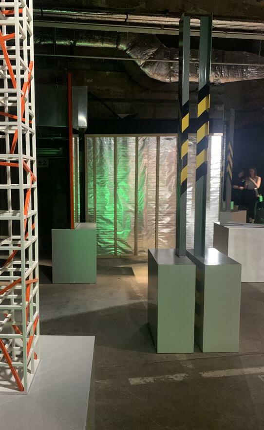
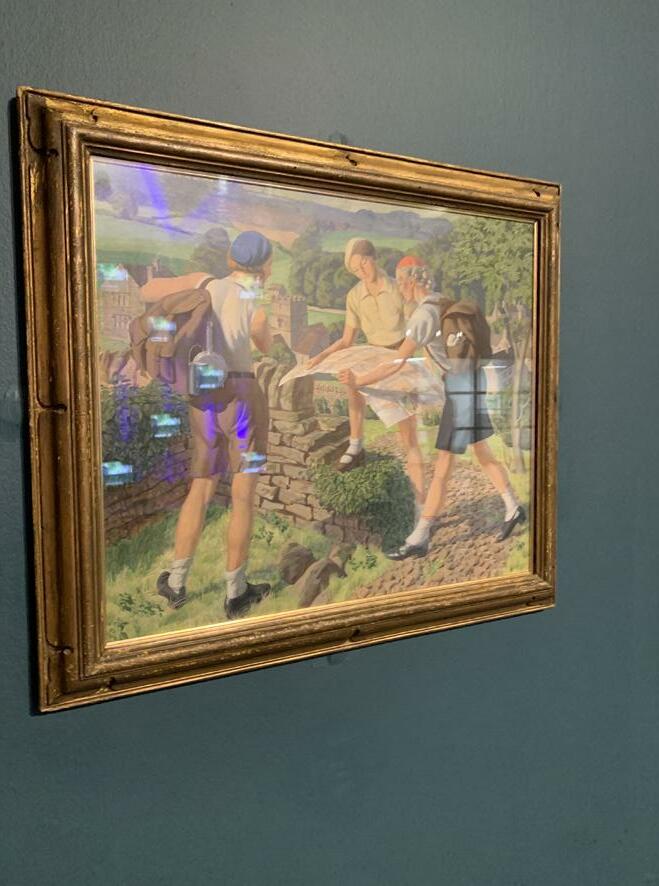
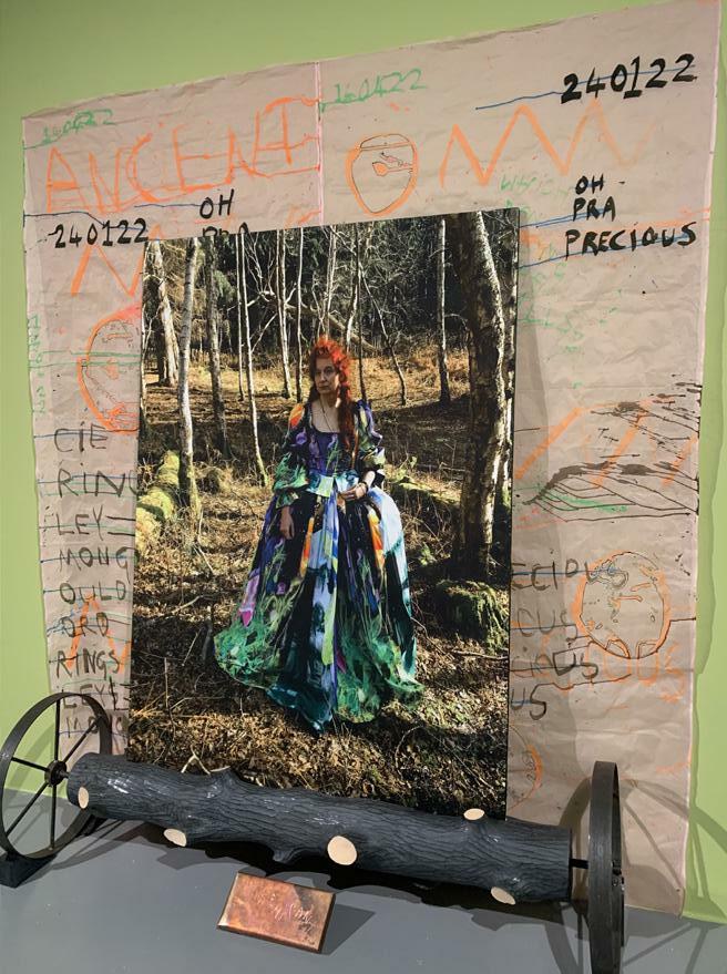
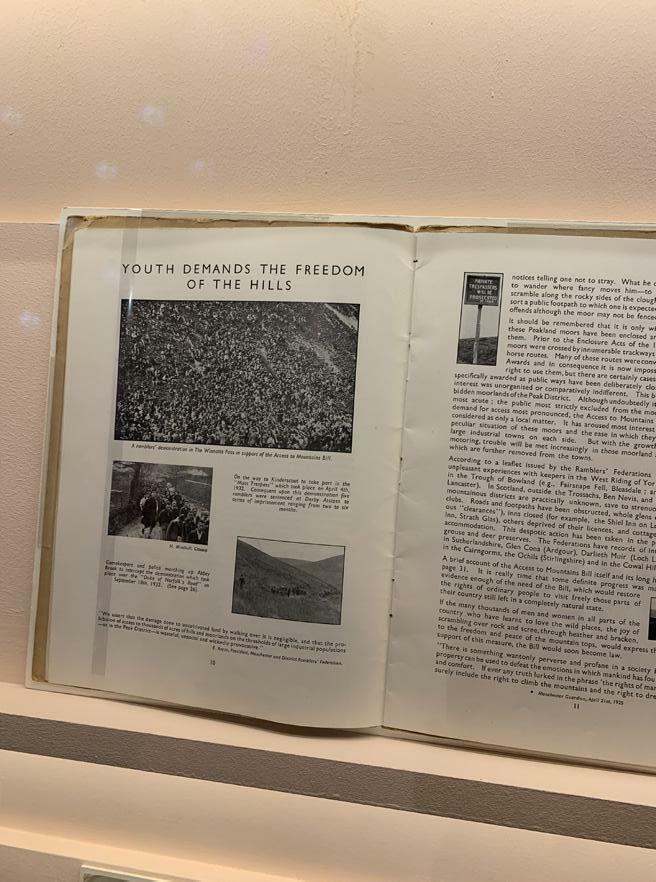
From rural raves in Castlemorton to anti-nuclear protests at Greenham Common, this exhibition presents a radical review of the British landscape art. Expanding on landscape art as being limited to paintings of lush green hills, enjoy art that reflects the diversity of the British Landscape and the communities that inhabit it (Tate, 2022). Radical Landscape is an exhibition at the Tate Museum in Liverpool which I initially wanted to visit at the beginning of my project. When my concepts for this project were centred around rave culture, I was interested in visiting this exhibition as Jeremy Deller’s work was exhibited here. Deller is an artist who explores the significance of rave culture and acid house and has been a topic of my research throughout most projects I’ve completed throughout my masters. Although my project has changed and I’m not longer researching rave culture, I’m still influenced by this movement. Therefore, I decided to still visit the exhibition to collect potential research.
The exhibition itself was quite interesting, however, I felt that it wasn’t useful towards my study. The area featuring Jeremy Deller’s work was fantastic as it showcased two huge smiley faces which were made from straw. I was drawn to the smiley’s instantly as they’re the iconic nostalgic representation of the acid house era. On a tv there was a film playing which looked at the rave culture of the late 1980s. The only aspect of the exhibition which influenced ideas towards my project were the worn, textured paper of the displays. As most of the displays were collections from up to 80 years old, the paper of the posters and books were old and coarse. The texture from the collections inspires me to explore new textures like. Since the beginning of my studies, I’ve always aimed to communicate a vintage, old effect to my graphics, as if they’d been “pulled down from the attic”.
39.

40. Figure 73

41. Figure 74
42. Figure 75


43.


44.
Workshops
As part of my research, I attended multiple workshops run by “Daisie”, an online platform that hosts live classes hosted by industry experts. I chose to attend the workshops as I’m approaching the end of my degree, I wanted to learn some extra tips and tricks which will not only aid my study but will prepare me for the industry also.
The first class I attended was a class hosted by Jasmine McPhee and it was a workshop on “How to layout and create a killer portfolio”. Jasmine is an industry professional who I’ve followed on Instagram for around 3 years. Jasmine helps students build their portfolios and skills to become successful in the creative industry, as she was in the same position once before. “I’ve been accepted, rejected, ignored and I’m here to tell you how to get there” (McPhee, 2022).
The workshop focused on four sections: Preparation, the beginning, development, and transformation. Preparation discussed elements such as how many pages and projects your portfolio should have. Stage two was identified as “the beginning”, which represents the initial brief information. “What was the brief? What was your take on the brief? How do you turn that brief into something?”. These were a handful of questions Jasmine shared to question your project beginning, and to introduce the beginning of your story. Additionally, Jasmine suggests ideas such as mind-maps, sketches, mood boards, rough ideas, and your initial inspiration to represent your initial concepts for the project.
The third stage was represented as the “development phase” which showcases your developed designs throughout the project, and the “what happens next?”. At this stage, the project development should be the research and planning, as Jasmine described “the caterpillar ate more food and got a little more developed”.
Finally, the fourth step is the transformation of the “caterpillar turning into a beautiful butterfly”. This step demonstrates the final designs and outcome of the project. Without everything before this point, the journey wouldn’t have happened, which states the power of storytelling. Jasmine structured the presentation representing a children’s book, identifying the similar structure your portfolio should have.
One of the main takeaways I took from the lecture was “try to get rid of the perfectionism thing, show behind the scenes”. As a creative, I’m always striving to create aesthetically pleasing outcomes. For my final major project, I planned to
45.
create a digital book that will showcase my journey. Before attending this lecture, I planned to showcase my best work. However, now I know that showing the progress is vital, I’ll now include image developments and images I’ve created for this module but didn’t feel that they fit into the second outcome of my final major project, the “Photo Book”.
After attending the session, I browsed other workshops, and watched two more pre-recorded workshops which were “Art Direction- creating a cohesive vision” and “How to create a distinct brand identity”. Although these workshops weren’t entirely suited to my practice, it was refreshing to listen to artists in the creative field discuss their practice and network.
I was eager to attend more workshops to assist me in becoming more confident and knowledgeable as a creative. I discovered a new event posted on Instagram, hosted by @fonts.colour via Zoom, recommended by a designer I follow. Colour is one aspect of design that I lack knowledge of, therefore, I knew attending this workshop would benefit my creative practice.
The workshop began with Sam introducing herself and discussing herself and her business. Sam then began educating the audience on colour and how it affects your brand. Colours alone can influence up to 90% of an initial impression. Colour influences 85% of shoppers’ purchase decisions. Colours affect people’s behaviour, mood, and stress levels (Remboldt, 2022). Primary colours are the iconic, main colours that someone thinks of when they remember your brand. Whereas, accent colours are on-brand, but are less iconic and are what someone thinks of when they remember your brand. Neutral colours are unremarkable colours that someone thinks of when they remember your brand. A brand should have at least 2 light and 1 dark neutral colour. There are three colour formulas which consist “hero colour, dynamic duo, and iconic family”. Hero colour consists of one iconic primary colour, with other colours in accent or neutral colour. The dynamic duo involves two primary colours with three accent or neutrals. And finally, the iconic family includes three to four primary colours with one accent or neutral (Remboldt, 2022).
The workshop was intense on colour and branding, however, as I begin my career as a creative in the industry, this educated me extensively compared to what I knew before. As I begin to brand my Instagram ready to apply for jobs and create my website to use as my portfolio, I must consider what I’ve learnt in this workshop to successfully create a consistent, recognisable brand for myself. From this, I’m able to build the correct colour palette which fits my brand and communicate it efficiently.
After attending the workshop, I immediately began constructing my colour palette and working on my personal brand. I decided using a hero colour palette suits my brand as I have one chosen colour which represents it. The colour code of my chosen colour is hex code “393791”, named “Melancholy Blue”.
46.
47.
48. Figure 109
“Try to get rid of the perfectionism thing and show behind the scenes”
49.
Audience
As a creative, it’s always vital to consider the end user. At the beginning of my project, I was unsure of who my target audience was as I was also unsure where my project was heading. It wasn’t until around 4-5 weeks in that my ideas began to solidify, and my project began to structure. Since then, I’ve decided on a solid target audience who would be the perfect end user for my practice. Initially, the original concept for my project was to re-create rave memorabilia such as posters, flyers, stickers, and tickets. For this, my target audience was aimed at individuals who attended the rave scene in the 90s or have a genuine interest in it. However, now I’ve changed my idea and my project communicates the new history of the postpandemic, my target audience was questioned thoroughly throughout, and now focuses on individuals in the creative industry.
50.
Interviews
I reached out to three designers who inspire my work and asked them to take part in my research by answering three semi-structured open-ended questions. The questions were “What inspires you?”, “How has the pandemic affected your practice? Has it helped you? What are the pros and cons?”, “How has Instagram helped your business? Is it the main platform you market your business?”. I reached out to the designers via Instagram message and received the responses here also. Communicating through Instagram, gave a relaxed, friendly but professional approach, and it also potentially allowed the designers to view my creative account.
One of the main reasons for reaching out to the designers was to use the data I collected to inspire my project. Acting upon the feedback, allows me to use the data collected from my ideal target audience to inspire my project and influence my practice. More importantly, interviewing industry creatives allowed me to collect information about my specific study area.
Additionally, as my project revolves around post-pandemic trauma, I wanted to ask designers how the pandemic affected their creative practice, and whether it was affected positively or negatively. I also wanted to ask their opinion on using Instagram to communicate their work and market their business, as I mainly use Instagram and wanted to seek advice from an industry professional.
51.
LB: Interviewer KR: Interviewee LB: What inspires you? KR: My friends and the people/places/things I love inspire me the most (as you can see from my magazine socially distanced pals project, etc). I think if you’re truly passionate about your subject it will easily show through your designs. LB: How has the pandemic affected your practice? Has it helped you? What are the pros and cons? KR: I probablly wouldnt have gotten into freelance if it wasn’t for the pandemic haha, I had extra time and decided to take on some design enquiries because of it. LB: How has Instagram helped your business? Is it the main platform you market your business? KR: IG definintely helped - it’s where I get most of my opportunities. @edgykatrina Followers: 47.9k 52.
@yolanda.pdf Followers: 50k
LB: Interviewer
YP: Interviewee
LB: What inspires you?
YP: Life in general but especially feelings, thoughts and emotions. I’m still learning and trying to figure them out. The process and certain realisations really inspires me.
LB: How has the pandemic affected your practice? Has it helped you? What are the pros and cons?
YP: The pandemic pretty much put a pause on life for many others and myself too. The free time I had pushed me to creating and exploring designs. It also got me into different communities and meeting like minded people. With all these, it brought me quite a few work and freelance opportunities. I think I also got to learn about myself a lot as a creative. Also another pro would be online interviews haha. All my interviews have been online so far and honestly the idea of going to a physical one kinda scares me. Cons wise, I was still a student when it happened. I missed my friends and classmates, exchange trips were cancelled, and there were many limitations to showcasing my work as well since we’re all online.
LB: How has Instagram helped your business? Is it the main platform you market your business?
53.
YP: I honestly have a love/hate relationship with instagram. It is the only platform I’ve been ising consistently.
Back when I had free time, I was posting consistently which brought me audience and opportunities. But now I’m working full time as a designer in a studio, my online presence decrease, and so did my engagement.
Instagram is a platform that rewards consistency which can be detrimental and put creatives, who puts in time and effort in their work, at disadvantage.
54.
Persona
As part of my project, I created two detailed audience personas who will be the ideal target audience for my work. Within the personas, I’ve included information such as demographics, psych ographics, behavioural, and engagement information. The personas were constructed using the consumer insights from the WGSN white paper 2024, a trend forecasting company.
55.

56. Figure 110

57. Figure 111
Image Developments


58.
Figure 112
Figure
113
Figure 114 Figure 115


59.
Figure 116
Figure 117
Figure
118
Figure
119

60. Figure 120 Figure 121 Figure 122 Figure 123


61.
Figure 124
Figure 125
Figure 126 Figure 127


62.
Figure
128 Figure 129 Figure 130 Figure 131


63. Figure 132 Figure 133 Figure 134 Figure 135


64.
Figure 136 Figure 137
Figure 138 Figure 139
Unused & Unfinished Graphics
The image below is an image that I created in a different colour and included in Photo Book. I wanted to create another colour of the image, therefore, create a pink version. However, the image didn’t go as I wished so I decided not to include it in Photo Book. There are a couple of other images which I started and shortly after decided I wasn’t feeling it.

65. Figure 140
66. Figure 141
67. Figure 142

68. Figure 143

69. Figure 144
Ink Bleed Development
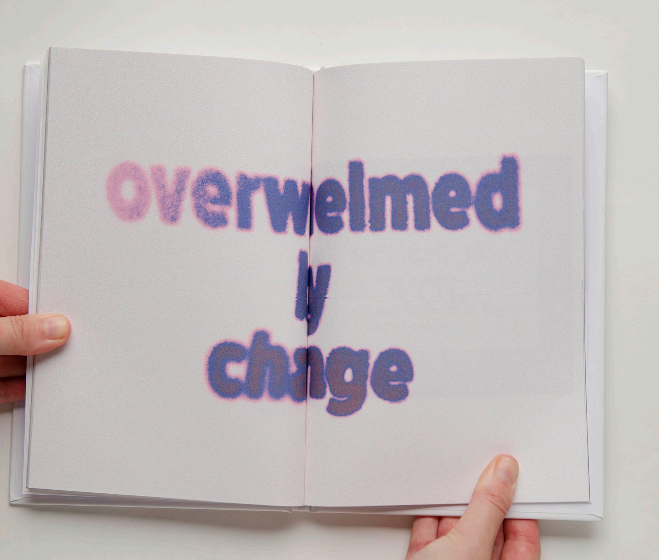
“Ink Bleed” is a technique I’ve been learning since the beginning of my Masters. As my work is inspired by the 90s, I aim to communicate nostalgia with an old, textured look to convey the look as if these items have “just been pulled down from the loft”.
70. Figure 145

71. Figure 146

72. Figure 147
Presentation
As my Portfolio and Photo Book are the journey and outcome of my final major project, I wanted to demonstrate a professional presentation of work. Usually when producing work, my aesthet ic consists of overuse of colours, layers, and overlays. However, as this project is my final major project, when considering the presentation of my Portfolio and Photo Book, I decided to keep the layout and presentation slightly more minimal by using just black and white. By stripping back and demonstrating a minimal layout, this allowed my creative work to contrast and be communicated more effectively.
As I work opposite to minimal, working “more minimal” for me meant that I’d step back slightly on the overuse of colour and layers, rather than solely communicate an extreme clean, simplistic layout. By still using colour I was able to communicate my aesthetic, however, convey a slightly watered-down version to remain true to my work yet professional.
When deciding upon the typeface for my books it was crucial to consider the front page and the presentation throughout. After narrowing down my options to my favourite three, I then created a front cover using all three typefaces to compare. I chose “Dagny Pro” as it’s a Sans Serif font which displays multiple weights, allowing me to use two different weights for my heading and body copy.
73.
Graphic Design Major Study Graphic Design Major Study Graphic Design Major Study Dagny Pro (Chosen font) Graphic Design Major Study Graphic Design Major Study Graphic Design Major Study Interstate Forma DJR Display Graphic Design Major Study Graphic Design Major Study Graphic Design Major Study 74.
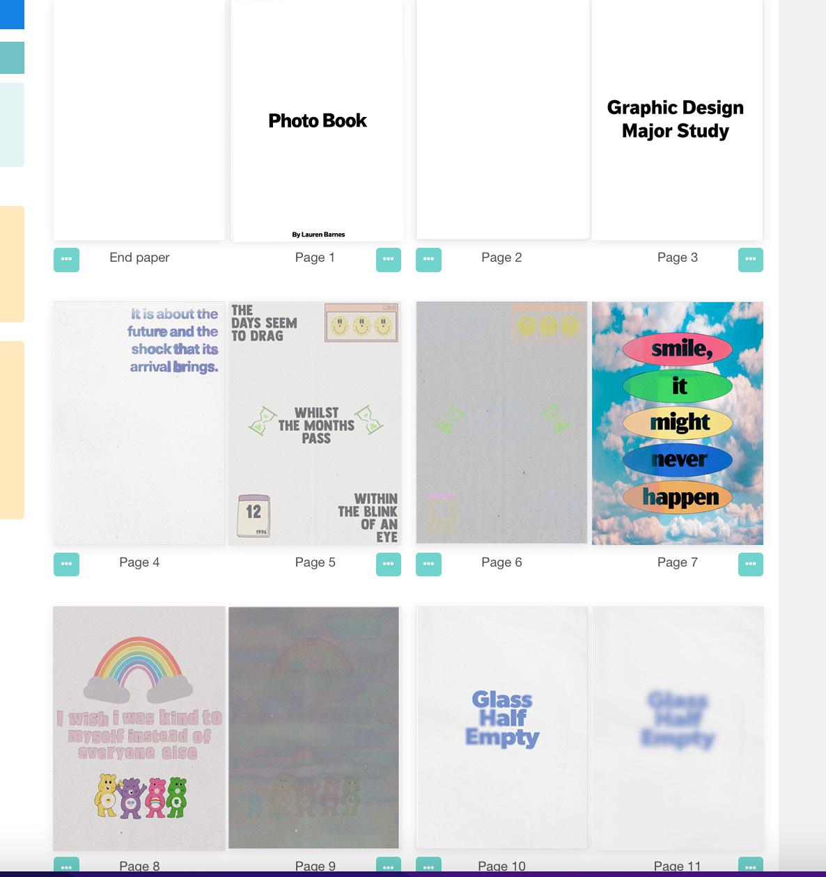
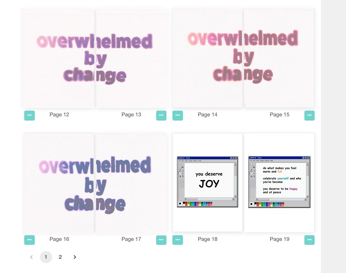
Photo Book
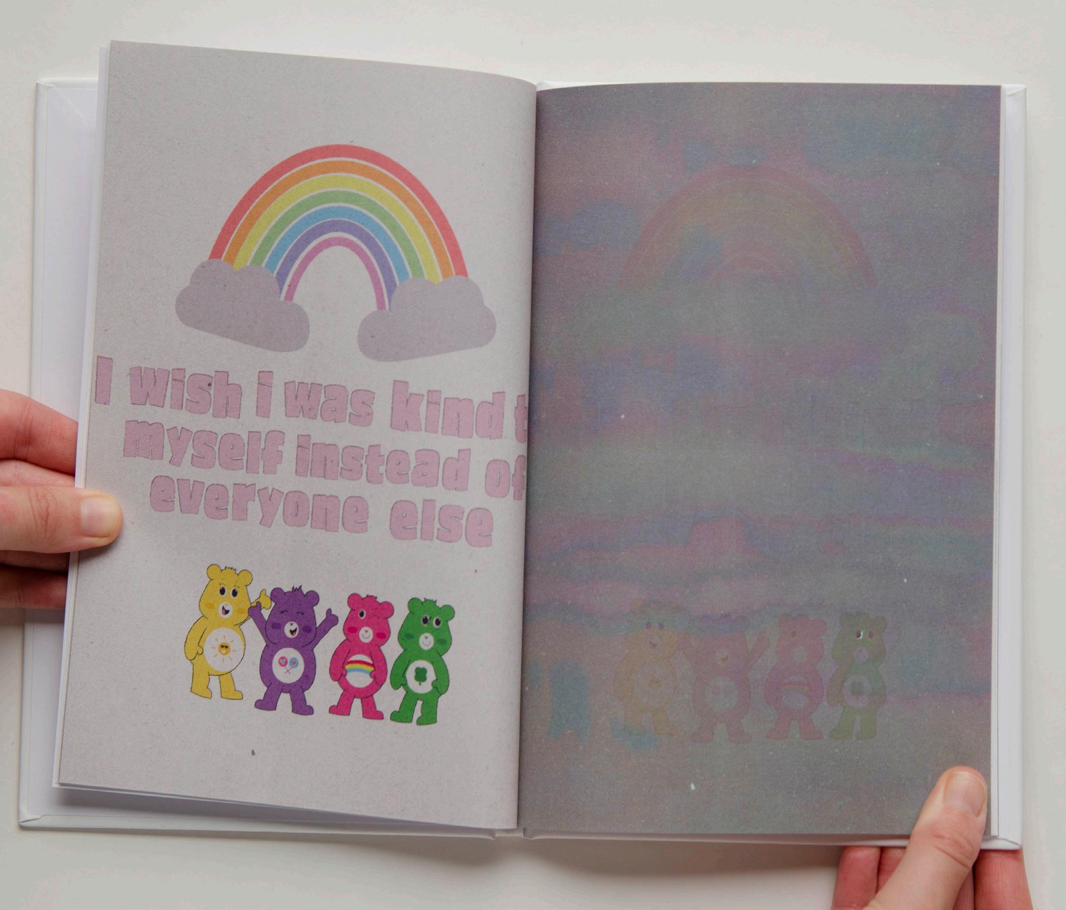
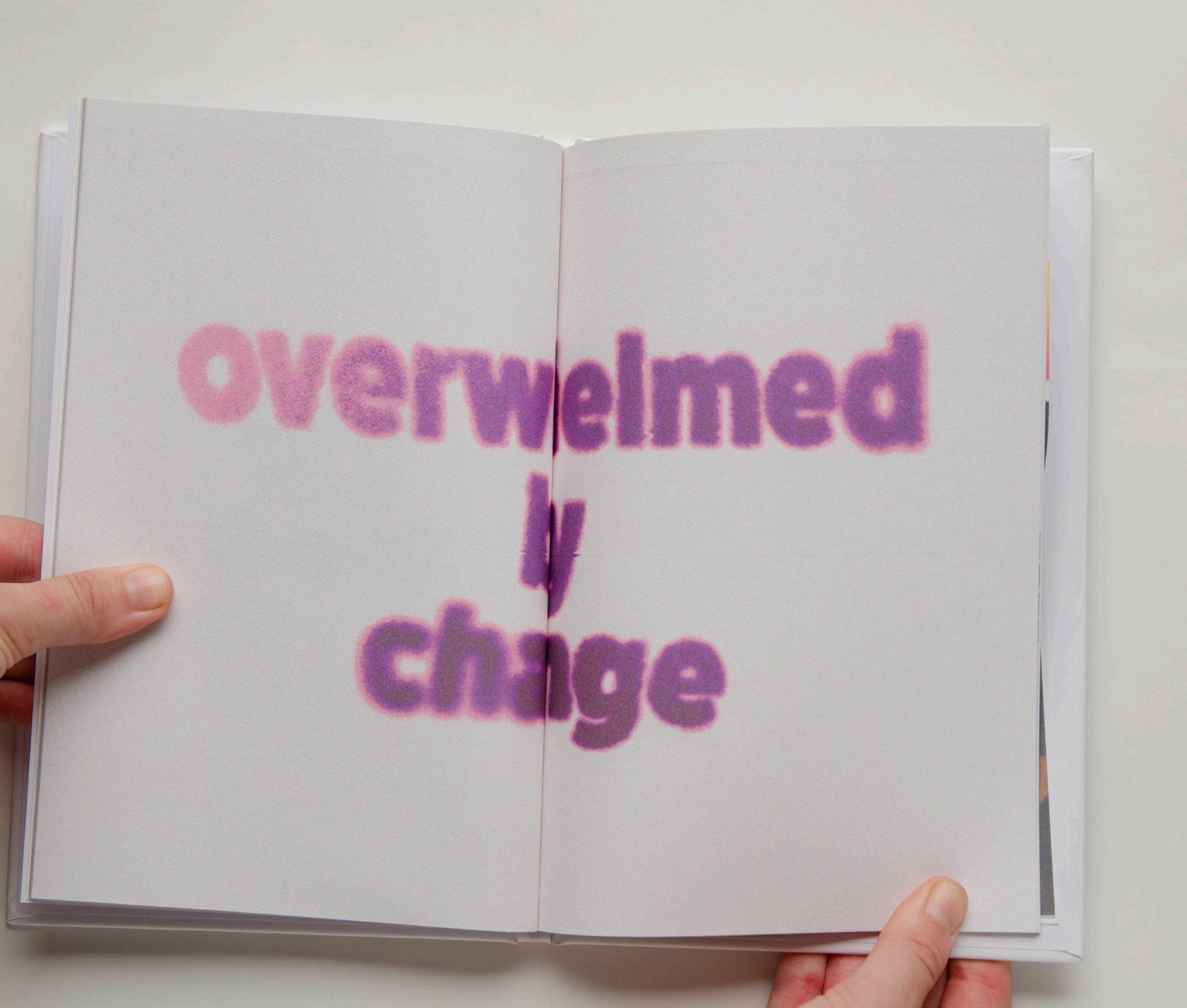
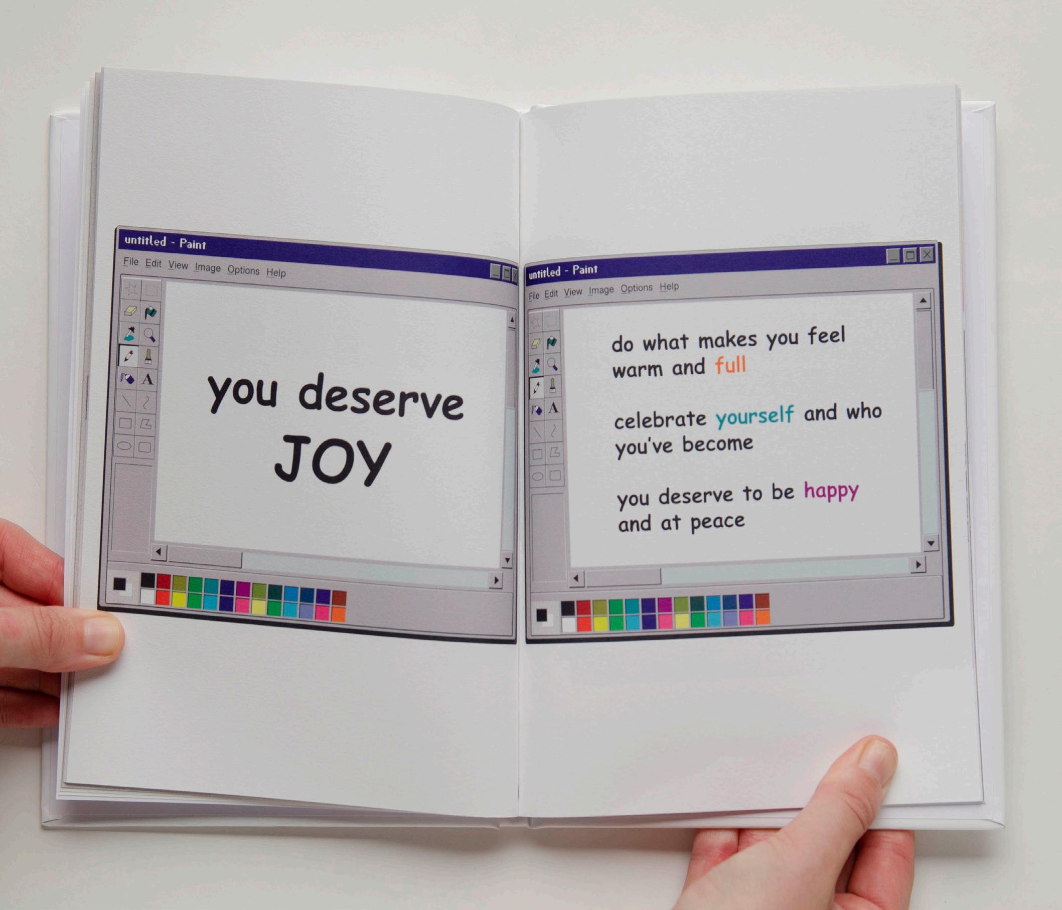
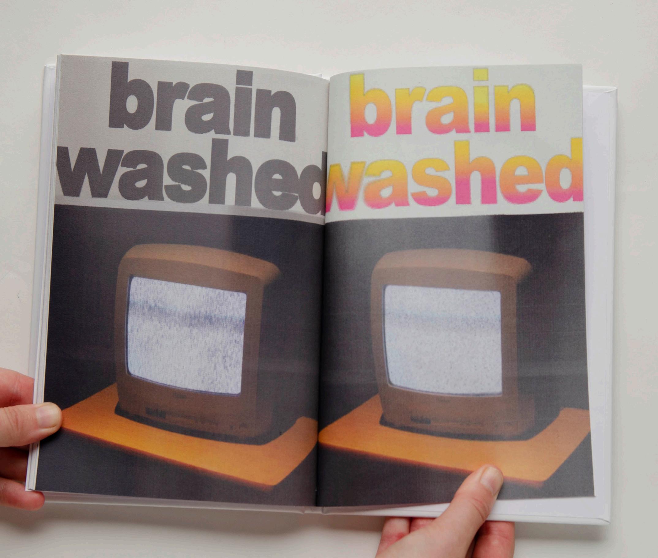
Accompanying Portfolio, Photo Book is a separate book produced as part of Graphic Design Major Study. As a main goal of this study, I wanted to become a better graphic designer therefore, I decided to create a book showcasing the graphics I’ve created throughout my project to showcase my journey. By creating a separate book, this allowed me to display a collection of my artwork professionally, and solely focusing on the graphic design I’ve created and produced for Graphic Design Major Study.
Constructing Photo Book layout:
75.
Figure 148
76. Figure 149 Figure 150
151

77. Figure
Final outcome of Photo Book:

78.
Figure 152

79. Figure 153
80. Figure 154

81. Figure 155

82. Figure 156
83. Figure 157

84. Figure 158
85.

86. Figure 160
87.
88. Figure 162

89.

90. Figure 164

91.

92. Figure 166
93.
94. Figure 168

95.
Risograph Print
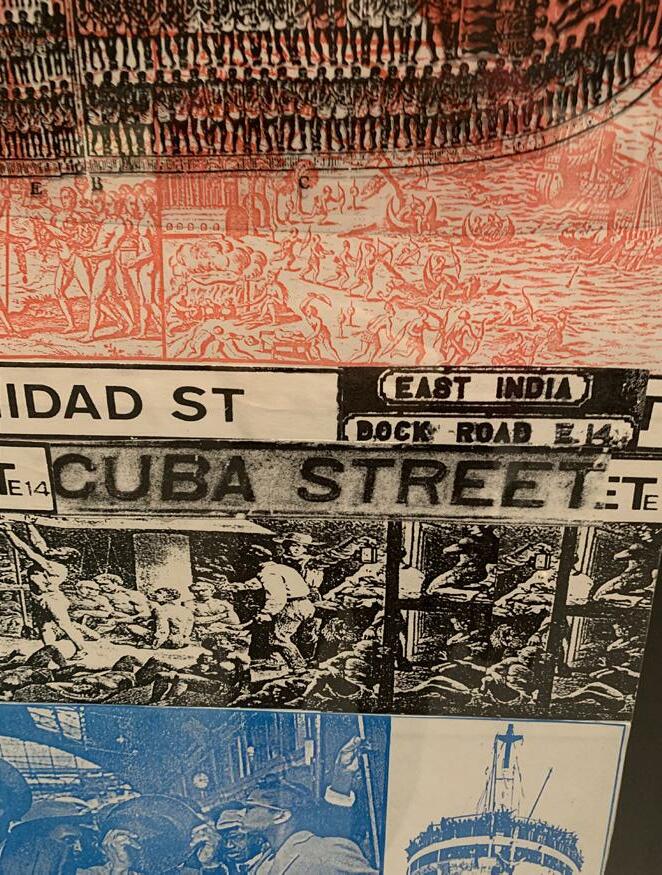
At the beginning of my project, I initially planned to re-create posters from the 90s, until my project ideas diverted. Towards the end of my project when looking at risoprint online I was craving producing more tangible pieces. After purchasing Fact Magazine I desired more physical pieces, therefore, I decided to create a poster and print it off using a risoprinting service online.
96.
97.
98.
Evaluation
Discovering the book Future Shock strongly supported my new research direction. Uncovering different aspects of change, Alvin Toffler supported my study with his powerful argument. By incorporating Toffler into my study, I’ve been able to use my inspiration from other sources to build a project which conveys a personal journey which built a final major project.
Much attention has been drawn to Clubbed and Fact Magazine, which are another two publications that dramatically shaped my concepts into a project I envisioned. Clubbed inspired the creative processes aspect of my project, and Fact Magazine inspired the presentation and layout.
I consider my project different as it communicates new and old history. When learning about rave culture, the statements which were raised such as rave culture no longer exists like it used too, alongside the graphic design too. I aimed for my work to communicate new history, of modern-day society, whilst conveying it in the same aesthetic as I work in, inspired by acid house. Through rigorous research and influence from artists and writers, I was able to articulate my current thoughts and emotions whilst still holding onto the rave culture aesthetic, ensuring my creative work is consistently communicated. Graphic Design Major Study allowed me to experiment with new software and document the huge contrast in the shift of history.
Looking at what I would do next time, I’d just enjoy the process more. Looking back at the work I’ve produced makes me happy as I’ve progressed as a graphic designer. The main goal of my project was to become a better graphic designer, which I feel like I’ve fulfilled. However, if I was to do this again, I’d enjoy every moment more. Expanding my knowledge and skills as a graphic designer is a stressful, intense process. Spending hours of a day learning, creating work for it potentially not to turn out how it planned is frustrating. Although, looking at it from the bigger picture it’s a journey of progression. Mistakes are happy mistakes and are learning curves. At the time, it seemed like a waste of time, however, learning new creative skills doesn’t come easy but is ultimately worthwhile.
99.
References
Bill Brewster, R. B. (2018). Clubbed. Bolton: Push. Brewster, B. (2018). Clubbed. Bolton: Push. edgykatrina. (2022, July 8). Instagram. Retrieved from Instagram: https://www.instagram.com/p/ CfwgDGdFQ6r/
Fact . (2022, August 7). Fact. n.d, n.d: The Vinyl Factory. Future Shock. (2022, August 6). London. Google. (2022, August 4). Google . Retrieved from Google: https://www.google.com/ search?q=what+is+future+shock&oq=what+is+future+shock&aqs=chrome.0.69i59j0i512l2j0i22i30l3j0i15i22i30j0i22i30j0i390j69i59.2929j1j7&sourceid=chrome&ie=UTF-8
Gosling, E. (2016, August 24). Eye on Design. Retrieved from Eye on Design: https://eyeondesign. aiga.org/what-rave-culture-is-teaching-modern-graphic-designers/#:~:text=%E2%80%9CUltimately%2C%20this%20unbridled%20creativity%20is,ingredients%20for%20groundbreaking%20graphic%20design.
Gosling, E. (2016, August 24). Eye on Design. Retrieved from Eye on Design: https://eyeondesign. aiga.org/what-rave-culture-is-teaching-modern-graphic-designers/ McLeod, D. S. (n.d, n.d 2019). Simply Psychology. Retrieved from Simply Psychology: https://www. simplypsychology.org/qualitative-quantitative.html
McPhee, J. (2022, June 27). How to create a killer portfolio. n.d, n.d, n.d: n.d. n.d. (2022, August 7). Factmag. Retrieved from Factmag: https://www.factmag.com/2022/07/29/ future-shock-weirdcore/ n.d. (2022, August 7). Factmag. Retrieved from Factmag: https://www.factmag.com/2022/07/29/ future-shock-weirdcore/ n.d. (2022, August 18). Tate. Retrieved from Tate: https://www.tate.org.uk/art/artists/edward-rus cha-1882/ed-ruscha-and-art-everyday Remboldt. (2022, May 16). Fonts and Colors. n.d, n.d, n.d: n.d. Remboldt, S. (2022, May 16). Fonts and Colors. n.d, n.d, n.d: n.d. Tate. (2022, August 4). Retrieved from Tate: https://www.tate.org.uk/whats-on/tate-liverpool/rad ical-landscapes
UVA. (2022, August 7). Future Shock. London. Weirdcore. (2022, August 6). Subconscious. London.
100.
Image References
Figure 1: Production Schedule
Figure 2: wobagency (2022). Screenshot of Instagram Post [Screenshot]. Instagram. https://www. instagram.com/p/CdnQf61MnJH/
Figure 3: wobagency (2022). Screenshot of Instagram Post [Screenshot]. Instagram. https://www. instagram.com/p/CdnQf61MnJH/
Figure 4: wobagency (2022). Screenshot of Instagram Post [Screenshot]. Instagram. https://www. instagram.com/p/CdnQf61MnJH/
Figure 5: wobagency (2022). Screenshot of Instagram Post [Screenshot]. Instagram. https://www. instagram.com/p/CdnQf61MnJH/
Figure 6: Graphics, background: https://unsplash.com/
Figure 7: Graphics, background: https://unsplash.com/
Figure 8: Graphics, background: https://unsplash.com/
Figure 9: Graphics
Figure 10: wobagency (2022). Screenshot of Instagram Post [Screenshot]. Instagram. https:// www.instagram.com/p/CedWX72LDz4/
Figure 11: wobagency (2022). Screenshot of Instagram Post [Screenshot]. Instagram. https://www. instagram.com/p/CedWX72LDz4/
Figure 12: wobagency (2022). Screenshot of Instagram Post [Screenshot]. Instagram. https:// www.instagram.com/p/CedWX72LDz4/
Figure 13: wobagency (2022). Screenshot of Instagram Post [Screenshot]. Instagram. https:// www.instagram.com/p/CedWX72LDz4/
Figure 14: Graphics, background image https://unsplash.com/photos/f7FwHomDgzg
Figure 15: Graphics, background image https://unsplash.com/photos/nt6KRD9im7A
Figure 16: Graphics, box mockup: https://www.freepik.com/free-psd/boxes-pedestals-mock up_21445048.htm#position=1
Figure 17: Graphics, packaging https://www.freepik.com/free-psd/soft-drink-glass-beveragebottle-mockup_16716452.htm#page=2&query=bottle%20packaging&position=38&from_view=search
Figure 18: Alejandro Parilla (n.d). Illustration [Illustration]. Closer and Closer. https://closerandcloser.co/Alejandro-Parrilla
Figure 19: Illustration
Figure 20: Lauren Martin (n.d). Illustration [Illustration]. Pinterest. https://www.pinterest.co.uk/ pin/478859372886073850/
Figure 21: Graphics
Figure 22: n.d (n.d). Illustration [Illustration]. Pinterest. https://www.pinterest.co.uk/ pin/667236501029554495/
Figure 23: Illustration
Figure 24: Katrina Romulo (2022). Illustration [Illustration]. Instagram. https://www.instagram. com/p/CfwgDGdFQ6r/
101.
Figure 1: Production Schedule
Figure 2: wobagency (2022). Screenshot of Instagram Post [Screenshot]. Instagram. https://www. instagram.com/p/CdnQf61MnJH/
Figure 3: wobagency (2022). Screenshot of Instagram Post [Screenshot]. Instagram. https://www. instagram.com/p/CdnQf61MnJH/
Figure 4: wobagency (2022). Screenshot of Instagram Post [Screenshot]. Instagram. https://www. instagram.com/p/CdnQf61MnJH/
Figure 5: wobagency (2022). Screenshot of Instagram Post [Screenshot]. Instagram. https://www. instagram.com/p/CdnQf61MnJH/
Figure 6: Graphics, background: https://unsplash.com/
Figure 7: Graphics, background: https://unsplash.com/
Figure 8: Graphics, background: https://unsplash.com/
Figure 9: Graphics
Figure 10: wobagency (2022). Screenshot of Instagram Post [Screenshot]. Instagram. https:// www.instagram.com/p/CedWX72LDz4/
Figure 11: wobagency (2022). Screenshot of Instagram Post [Screenshot]. Instagram. https://www. instagram.com/p/CedWX72LDz4/
Figure 12: wobagency (2022). Screenshot of Instagram Post [Screenshot]. Instagram. https:// www.instagram.com/p/CedWX72LDz4/
Figure 13: wobagency (2022). Screenshot of Instagram Post [Screenshot]. Instagram. https:// www.instagram.com/p/CedWX72LDz4/
Figure 14: Graphics, background image https://unsplash.com/photos/f7FwHomDgzg
Figure 15: Graphics, background image https://unsplash.com/photos/nt6KRD9im7A
Figure 16: Graphics, box mockup: https://www.freepik.com/free-psd/boxes-pedestals-mockup_21445048.htm#position=1
Figure 17: Graphics, packaging https://www.freepik.com/free-psd/soft-drink-glass-beveragebottle-mockup_16716452.htm#page=2&query=bottle%20packaging&position=38&from_view= search
Figure 18: Alejandro Parilla (n.d). Illustration [Illustration]. Closer and Closer. https://closerandcloser.co/Alejandro-Parrilla
Figure 19: Illustration
Figure 20: Lauren Martin (n.d). Illustration [Illustration]. Pinterest. https://www.pinterest.co.uk/ pin/478859372886073850/
Figure 21: Graphics
Figure 22: n.d (n.d). Illustration [Illustration]. Pinterest. https://www.pinterest.co.uk/ pin/667236501029554495/
Figure 23: Illustration
Figure 24: Katrina Romulo (2022). Illustration [Illustration]. Instagram. https://www.instagram. com/p/CfwgDGdFQ6r/
Figure 25: Graphics
Figure 26: Graphics
Figure 27: Katrina Romulo (2022). Story Post [Screenshot]. Instagram. https://www.instagram. com/edgykatrina/
Figure 28-72: Photographs from Future Shock Exhibition
Figure 73-Figure 108: Photographs from Radical Landscapes Exhibition
Figure 109: Blank colour
Figure 110: Persona 1
Figure 111: Persona 2
Figure 112-147: Graphics
Figure 148: Screenshot of Graphics
Figure 149: Screenshot of Graphics
Figure 150: Screenshot of Graphics
Figure 151: Screenshot of Graphics
Figure 152-168 Photograph of Photo Book
102.
Lauren Barnes U1568486 MA Graphic Design TMA1442-2122