FRAME DESIGN A MASTERCLASS WITH JON PRICE GCF (APF)
Lockdown wasn’t easy for any of us and I’m sure that things have been tough for many framers. However, one positive has been the growth of webinars; giving us the opportunity to attend seminars or workshops without the need to travel. This article is based on one of the webinars I produced for Larson-Juhl. I’ve cut down on the content considerably, so as not to fill this whole edition of 4Walls. The entire presentation can be viewed via Larson-Juhl’s website.
Considering that design is arguably the most important aspect of framing, it’s surprising that there isn’t that much written on it. The framing books I regularly refer to skim over design in a few paragraphs. Magazine articles, social media posts and other reference material is either very general or very specific and only applicable to certain scenarios. Either way, exceptions to these rules can easily be found. I want to examine apparent design rules, standard practices and frame designs that don’t follow those rules. My intent is to question preconceptions and, therefore, I don’t expect you to be in constant agreement with me. However, I hope that the designs chosen prove thought provoking and provide inspiration. I have read, on more than one occasion, that a strong coloured bottom mount of over 5mm on a double mount design will overwhelm the artwork. This is true in certain scenarios, but shouldn’t the proportions of the mount, including the bottom mount, increase in proportion with the size of the artwork? In some cases, the answer must be yes. This dominating effect by the bottom mount can sometimes be overcome by increasing the white space around the artwork. In other words, the bottom mount is ‘distanced’ from the image. In Picture 1, this additional white space has been highlighted by the white of the V-groove. I would have to conclude that the amount of a strong coloured bottom mount which should be displayed depends on the balance and proportions of other aspects of the frame design.
28
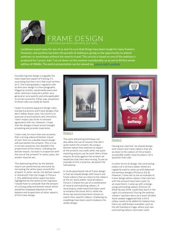
Picture 1 The same distancing technique can also allow the use of mounts that don’t quite match the artwork. By using a bottom mount that matches an aspect of the artwork very well, other not quite matching mounts can be used. Were those mounts directly against the artwork we would see that they were wrong. To see an example of this in practice, do watch the full webinar. A rarely questioned rule of frame design is that we should design with mount and frame colours that are close to the colours of the art work and/or neutral colours. Picture 2 shows the use of a combination of neutral and matching colours. A neutral grey undermount has been used to enhance the three shirts, while the three top mounts have been chosen to match their specific colours. Stacked grey mouldings have been used to balance the whole design.
Picture 2 Having just said that ‘we should design with mount and frame colours that are as close to the colours of the artwork as possible and/or neutral colours’ let’s question that rule! In other forms of design, the contrasting colours of a tertiary colour wheel are regularly used to come up with balanced harmonious designs (Pictures 3 & 4). However, I have yet to see an example of frame design where colours that contrast with the artwork have been used. As an experiment, I came up with a design using contrasting colours (Picture 5). What do you think, could they work in the right circumstances? During the webinar viewers’ opinions were very much divided. Some people suggested that a third colour needs to be added for balance but there are well known examples, such as the old Sainsbury’s logo, where just two contrasting colours have been used.


