

F A L L 2 0 2 2 A R C H 1 5 1 10 3 F R
H A N D R
S
E E
E P R E S E N T A T I O N F O R A R C H I T E C T
DR. MARIAM MAREI LINA HELAL


Pen ing Pages: 1 to 4 Intro to Orthographic Projections Pages: 5 to 8 Exterior/ Interior Pages: 9 to 12 Intro to Colors Pages: 13 to 16 Markers Pages: 17 to 20 Intr ective Pages: 21 to 24 I II III IV V VI


Shade and Shadow Pages: 29 to 32 Orthogonal Drawings Pages: 33 to 36 Sultan Hassan Project Pages: 37 to 40 Final Project Prep Pages: 41 to 44 Final Project Pages: 45 to 48 VIII IX X XI XII Perspective Cont. Pages: 25 to 28 VII T A B L E O F C O N T E N T S


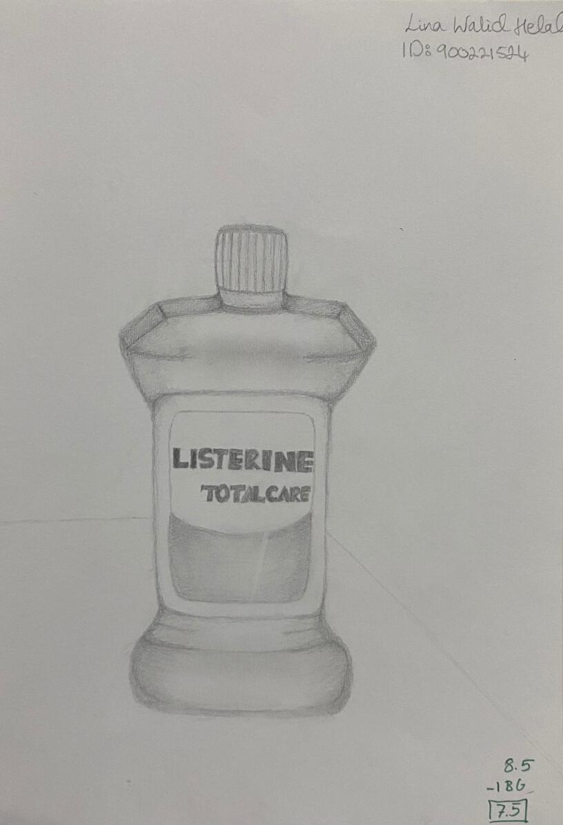
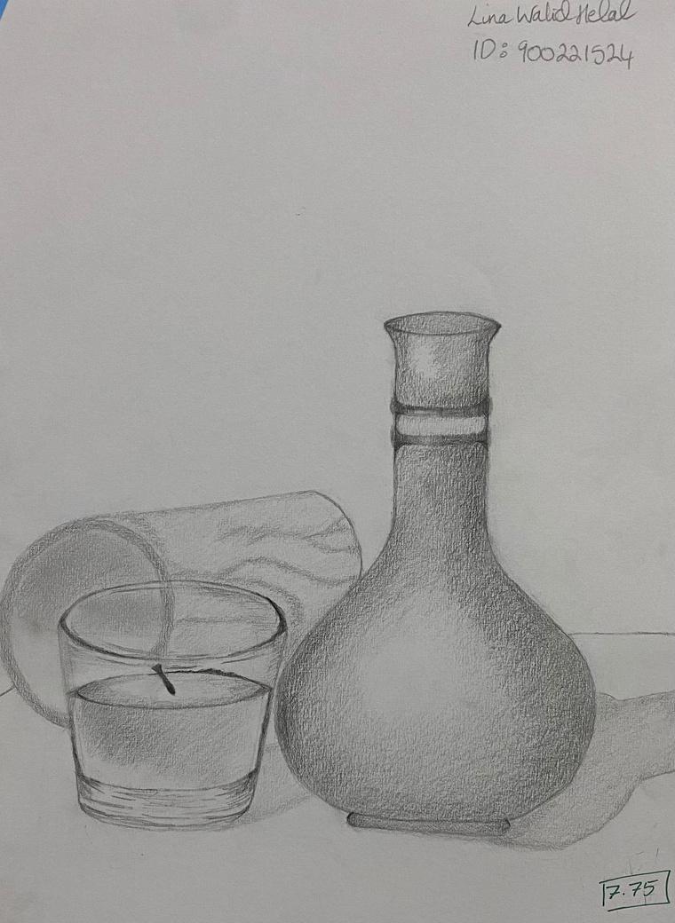
GRADE: 7.5/10 I PENCIL RENDERING 1
2
PENCIL RENDERING
Assignment: Render a single object in pencil.

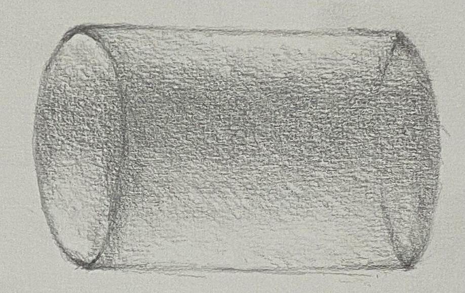

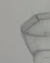
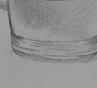
Darker shades added to create contrast between contents inside and outside the bottle. Simple geometric shapes were rendered before, to visualize the shape of Listerine. Also, to draw the lid and body.
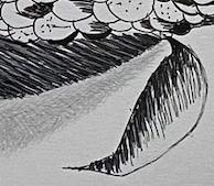
Hatching and Smudging were used here
I
3
REFLECTION
1. Background should have been added to support the subject of the drawing, so that the object is not "floating".

2. Surface of the object seems a little light overall, darkening the lines of the label ( to show the contents inside better) was needed.
14
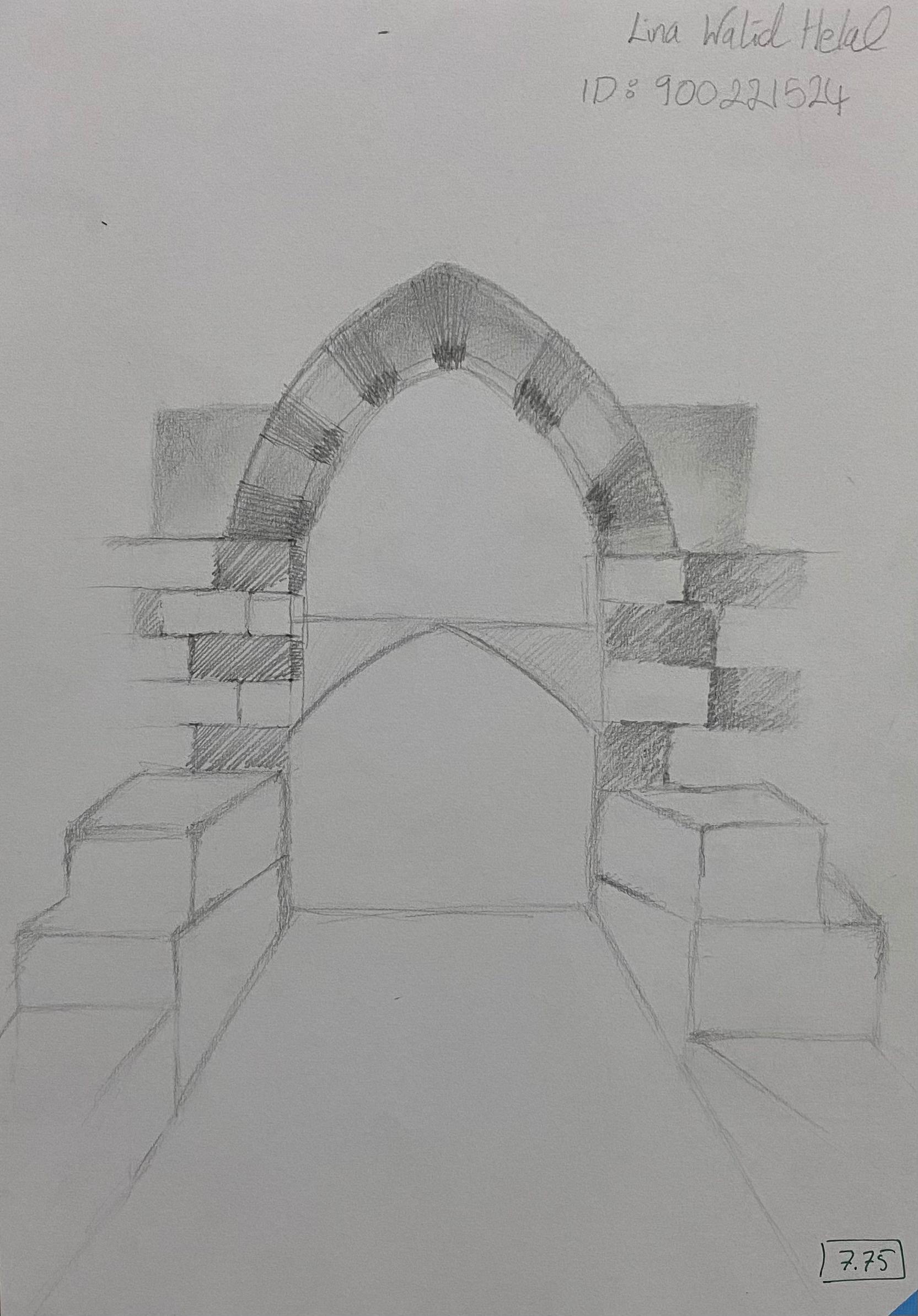
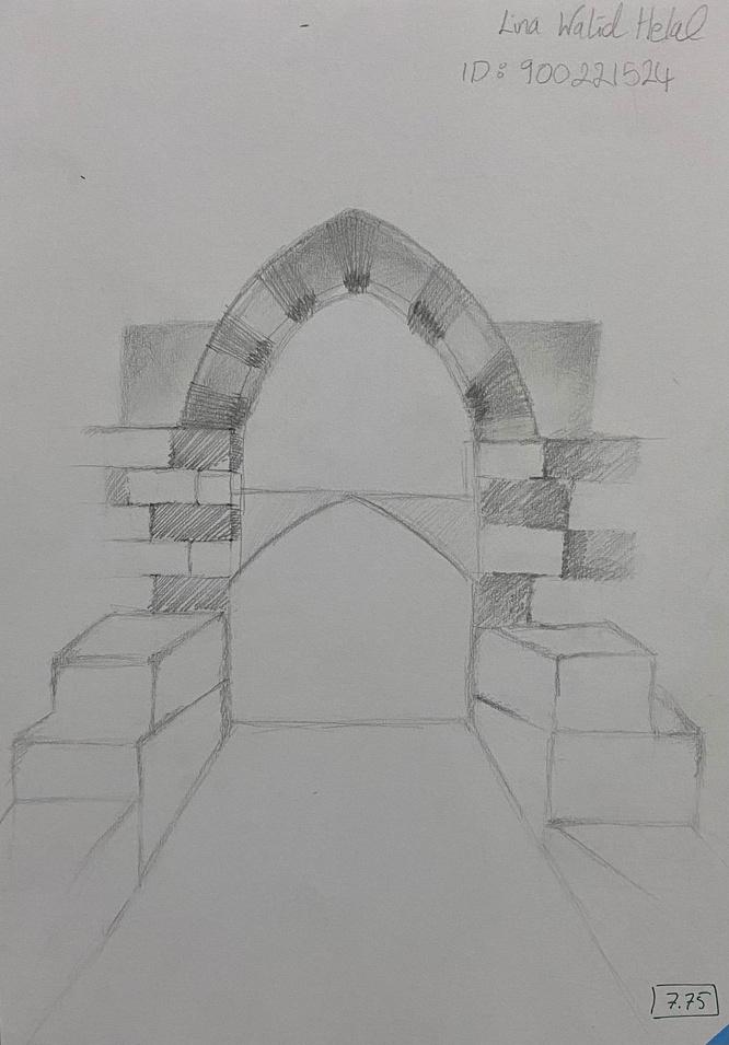
II PENCIL SKETCHING: INTRO TO ORTHOGONAL PR GRADE: 7.75/10 5
6
PENCIL SKET
To show a source of light di shining on the items, lighte of pencil were used.
Extra lines added to presen surface (using soft strokes)


II
7
EFLECTION
rve appears distorted, since s to be more round than adow is inaccurate because ion shouldn't be visible. e and the neck of the vase n shown.
F I N A L D
R A W I N G
8
III 9
10
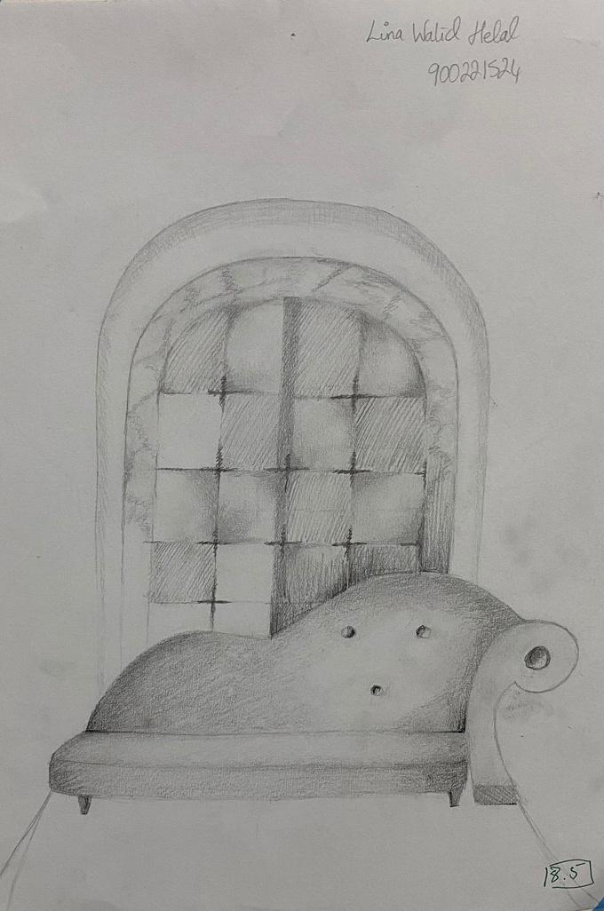
INTERIOR / EXTERIOR
III
11
REFLECTION
1. More contrast in shading is needed in order to make the drawing clearer.
2. Better to draw from a different perspective. This could be done by choosing to focus on smaller details.
Use of cross-hatching technique to create tonal effect.
12
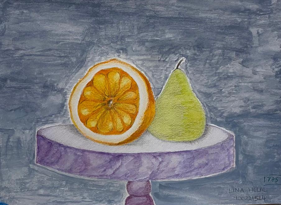
GRADE: 7.75/10 IV INTRODUCTION TO COLORS 13
14
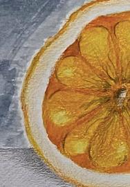
IV INTRO TO COLORS
Use of regular black p details necessary, to l realistic.
REFLECT
1. Although details wer have been better if the t colored (to increase real
2. Background could be natural touch.
15
ghter shades of navy blue e used at the edges in order resent a difference in planes
REFLECTION
o much Ink was used in the final m box, as details of the perfume really showing.
okes of golden ink could have been to produce the actual color of the hee eft box).
16
V MARKERS GRADE: 9.5/10 17
18
V MARKERS
REFLEC
1. Too much ink was drawing a bit too hars be used for large spac added to give more de
2. Blocks on the right, in the drawing which life.
3. More details after th added in order to mak more realistic.
19
Several shades of markers and ink were used to make this effect.
REFLECTION
n a couple of other corn kernels er give contrast.
is part was done by using cross ching as the main technique.
20
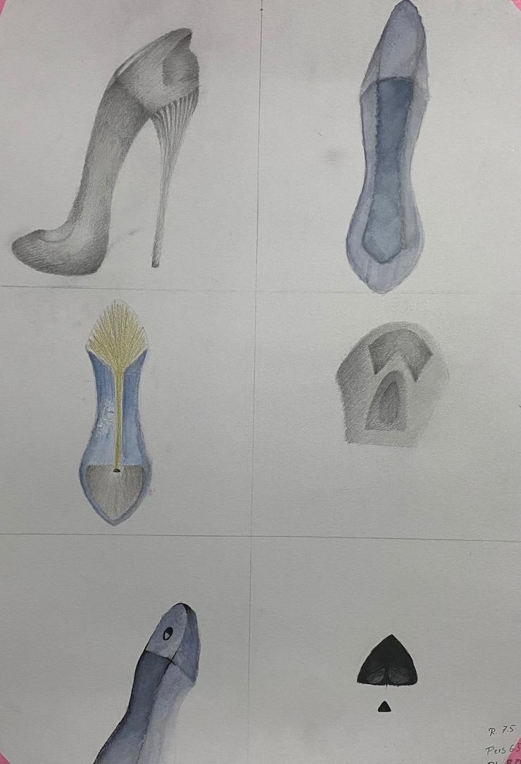
GRADE: 8.75/10 VI INTRODUCTION TO PERSPECTIVE 21
22
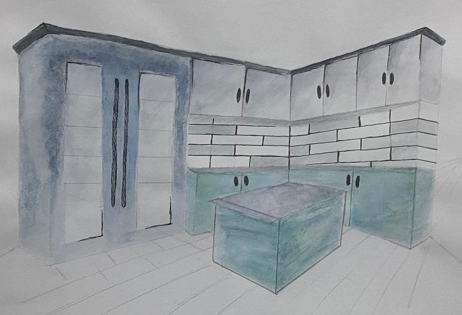
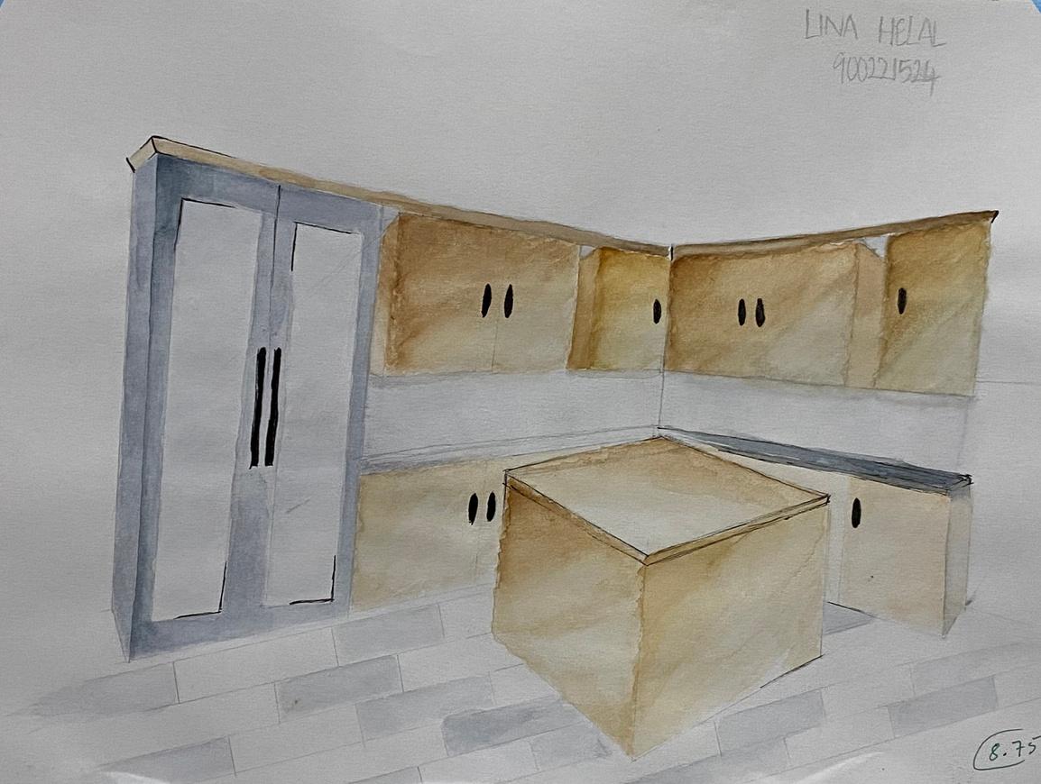
VI INTRO TO PERSPECTIVE
Assignment: Interior perspective rendered in Watercolor and Ink
Points Taken into Cons
1. Brick walls look distorted that they do not align with th perspective.
2. More neutral colors are ne

23
REFLECTION
s on the floor are not drawn ly according to the laws of ctive. more Ink to the cabinets/ island to ention to small yet important s and the fridge needed to be ed to give a more realistic view to wing.
24
VII PERSPECTI CONTINUE Grade: 7.5/10, 8.75/10 25
26
VII PERSPECTIVE CONT.
REFLECTION
1. The shades are very dark, m more water should be added, decrease the intensity of color
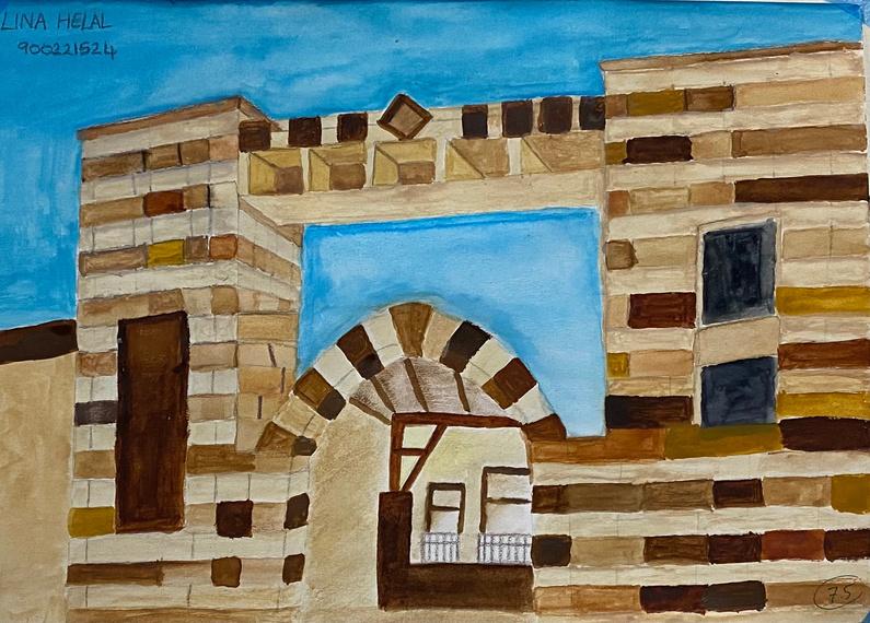
2. Balcony needed to be smalle it's distance from the campus

27
Darker shades of brown are placed to contrast the beige in the drawing
REFLECTION
1. Not much contrast is made between the arc and the buildings behind. To improve such, darker shades could be placed at the back.
2. Additional objects could have been added to make the drawing realistic.
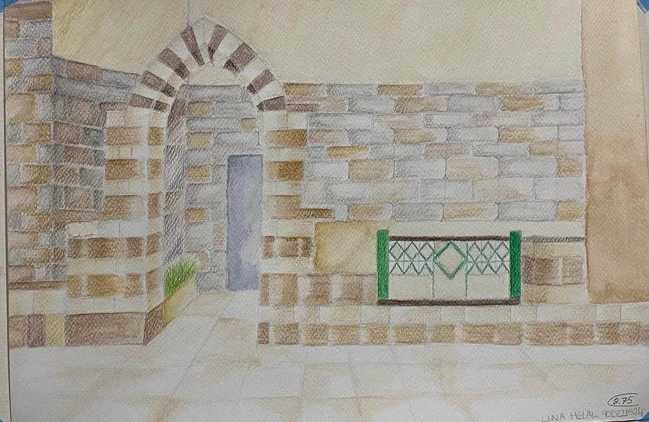
Grade: 7.5/10
28
VIII SHADE AND SHADOW IN PERSEPECTIVE
29
Grade: 9.5/10
30
VIII SHADE AND SHADOW
REFLECTIO
1. Shadow of the circle is dr inaccurately. To improve it, must be smaller and drawn d the circle.
2. Source of light is drawn in direction, as it seems like the of the wall which is not the c
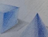
Different shapes were drawn to practice all types.
31
Drawn from an angle to make the scene less basic
REFLECTION
1. Source of light could have appeared to be more natural, by using watercolor.
2. Background needed to be darker to differentiate between the marble ground and wall.
32
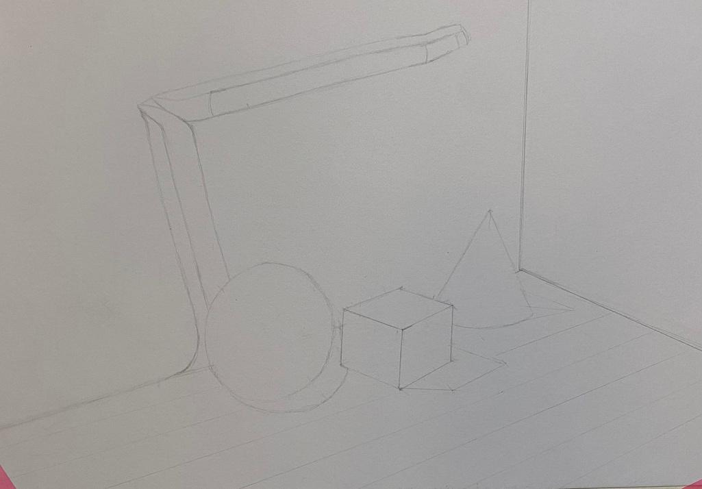
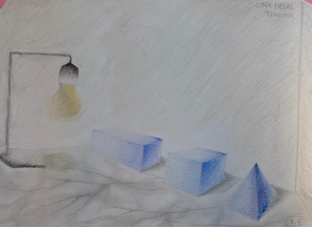
IX ORTHOGONAL DRAWINGS Grade: 8.25/10 +1 Bonus 33
34
ORTHOGONAL DRAWINGS
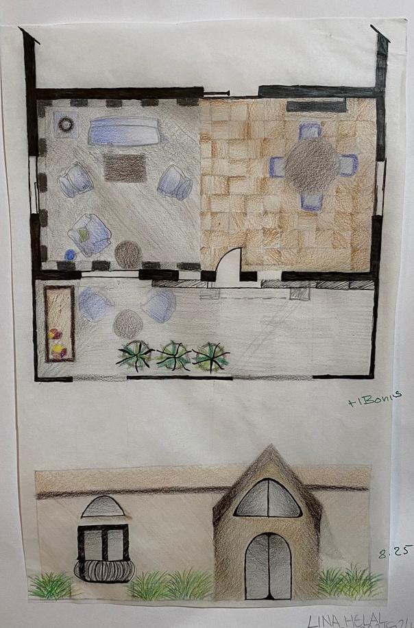
IX
35
Drawn from an angle to make the scene less basic and Grey colors are used
REFLECTION
e drop shadow is needed in the on view, especially for the couches ats. e colors from the color wheel were to further increase intensity.
36
X SULTAN HASSAN PROJECT Grade: 65% Project Weight: 15% 37
38
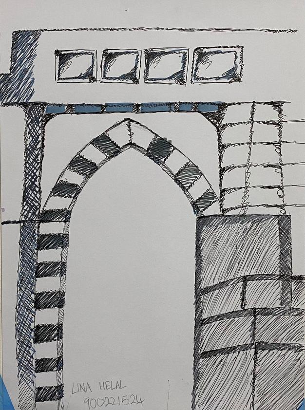
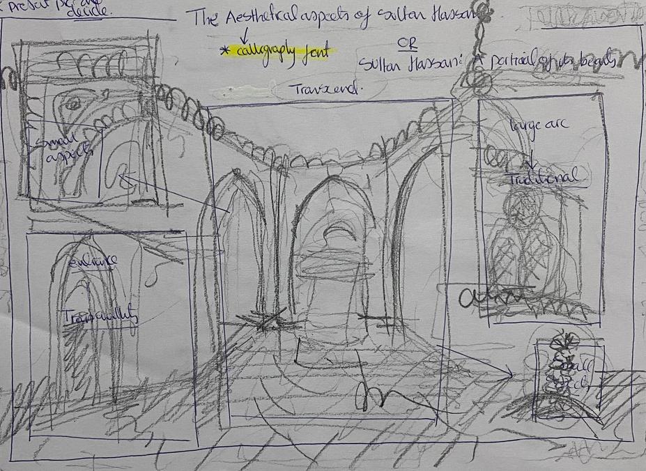
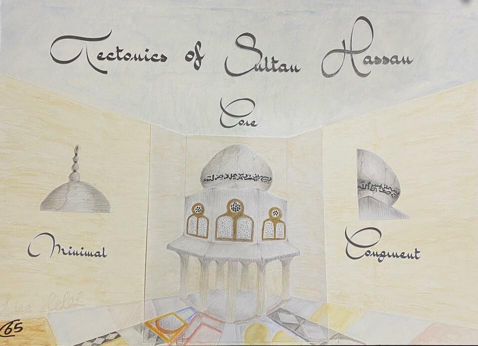
SULTAN HASSAN MOSQUE
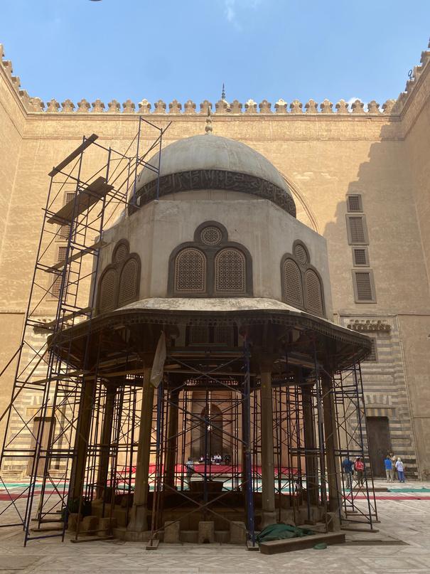
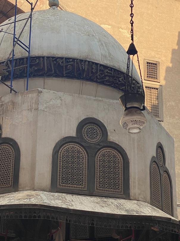
Assignment: To draw perception of Sultan Hassan Mosque via sketches and keywords on an A2 board.
 ed by he
X
39
INSPIRATIO
Used Architectural terms/ common words to relate understanding to learning.
Blue represents the sky.
Drawn from an angle to make the scene less basic
REFLECTION
1. Much negative space exists making the project seem empty.
2. More scenes of the mosques could have been used to contribute to the keywords.
3. Darker shades within the project were needed.
40
XI FINAL PROJE Weeks 11,12,13 41
42
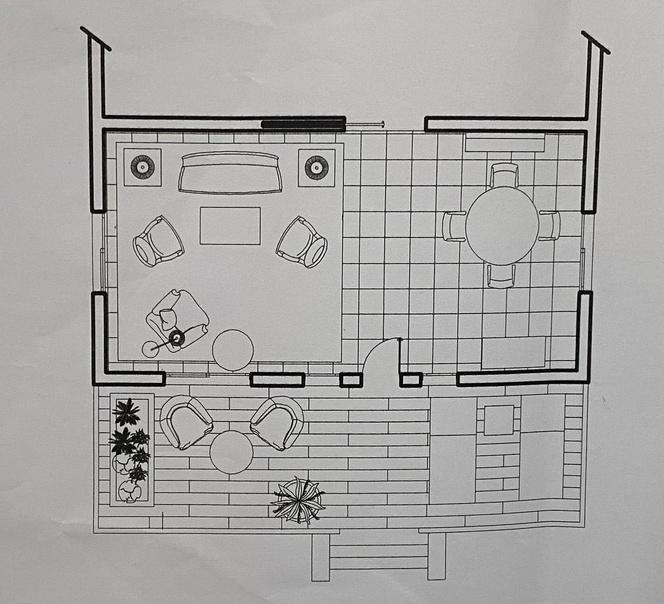
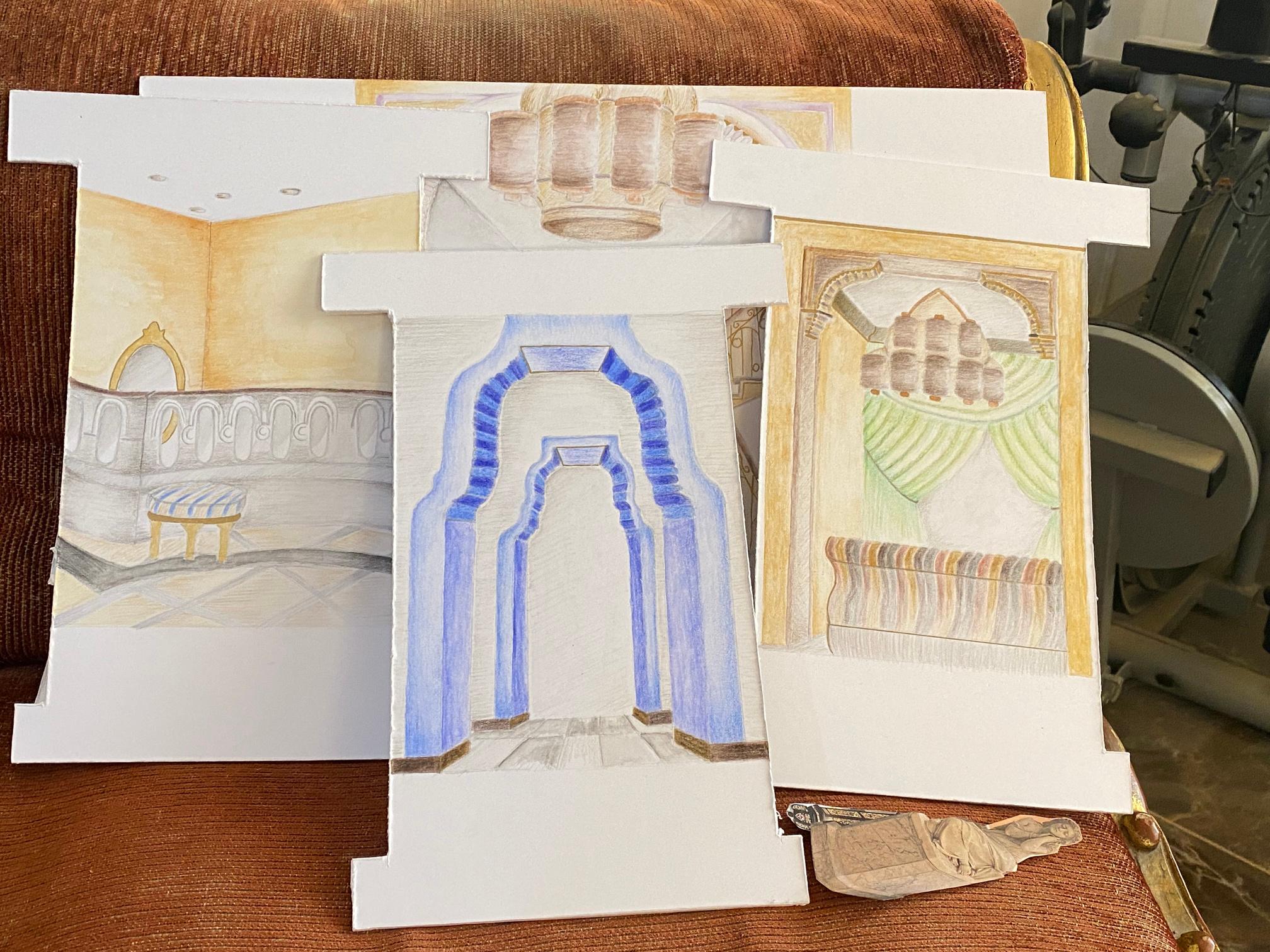
XI FINAL PROJECT PREPARATION
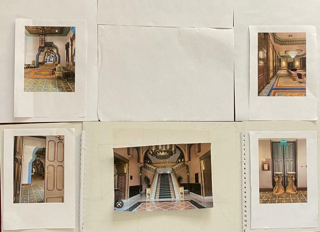
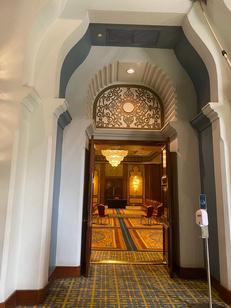
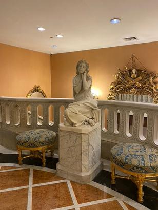
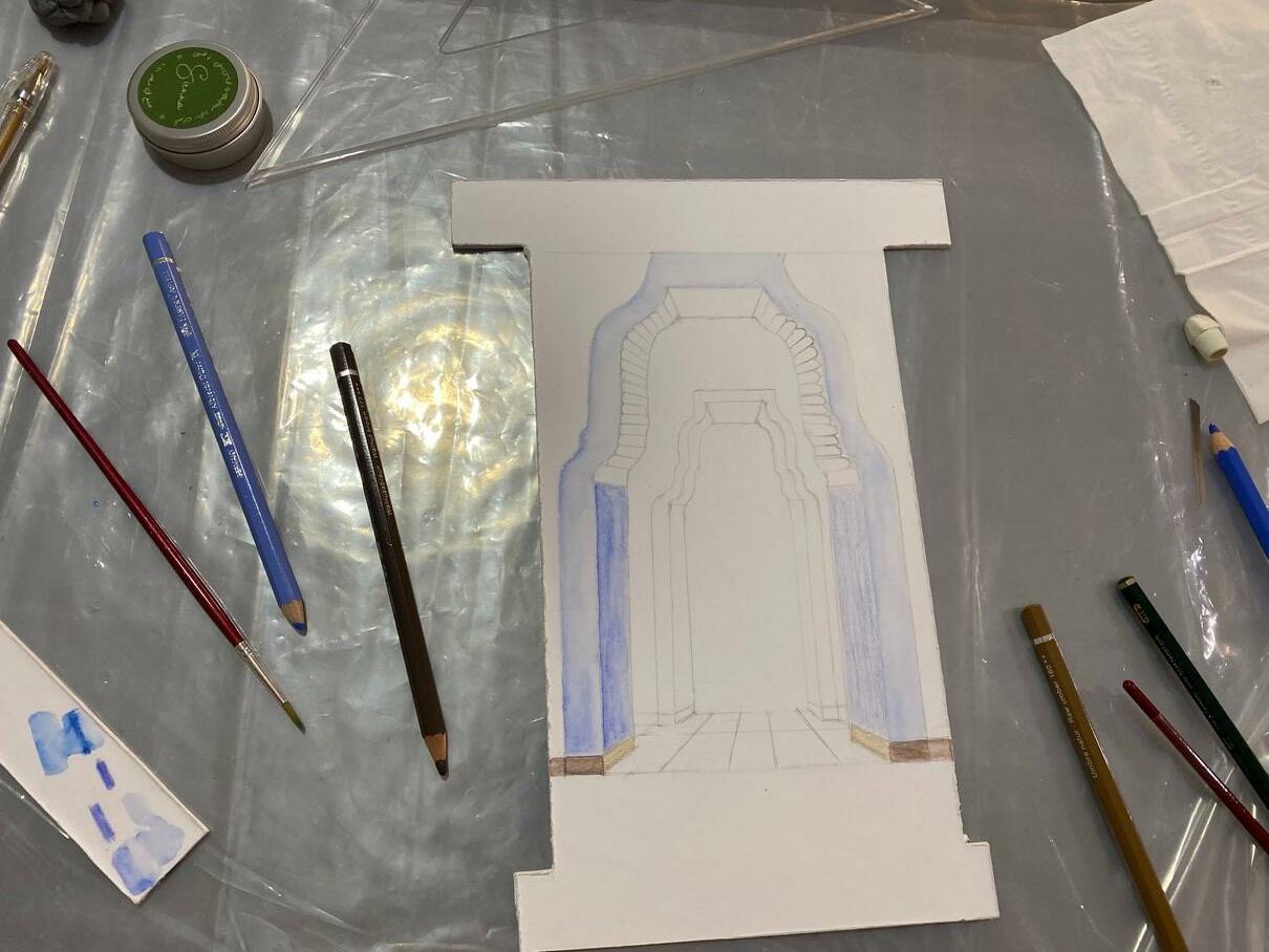
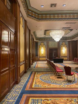
INSPIRATION
Media: Watercolor and regular coloring pencils
PLAN
Rooms at the end of the hotel will be placed last
Layers will also arise from here.
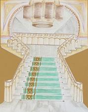
Inspired by the hotel, the project will have parts that will open and close The journey begins with the steps.
43
Step 1 of the process represents experimenting colors
INSPIRATION
l
1 2 3
D f
44
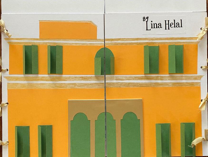
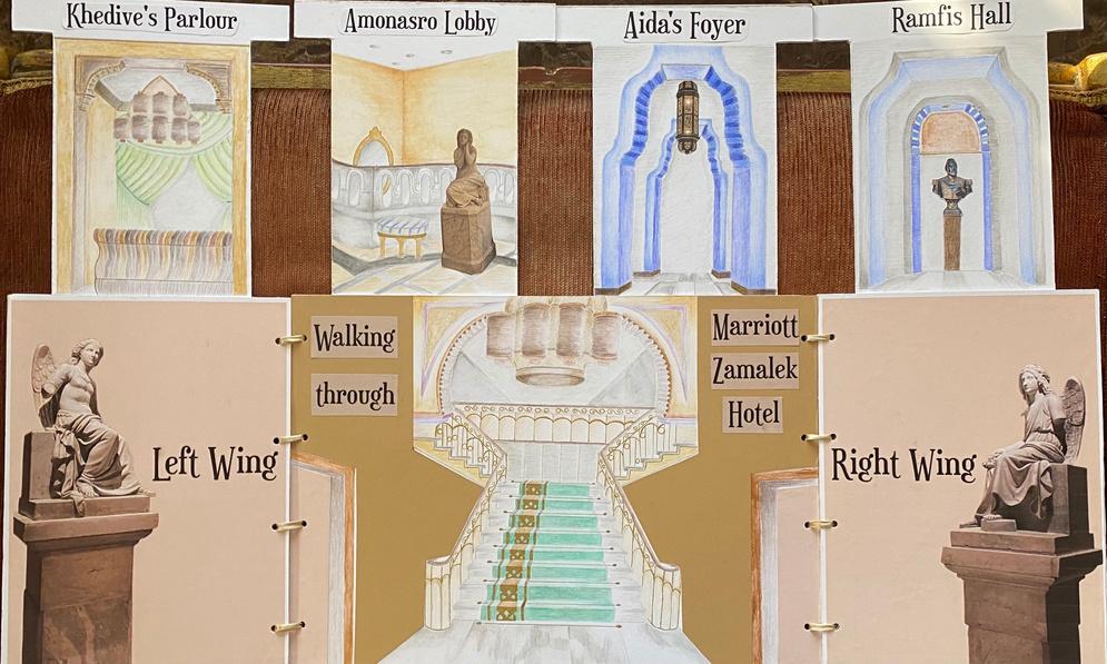
XII FINAL PROJECT - MARRIOTT Grade: 89/100 Project Weight: 20% 45
46
XII
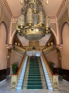
MARRIOTT ZAMALEK
Assignment: Present a walking in experience of your choice on A1 board or an equivalent.
FRONT VIEW
Represents the architecture of Marriott Hotel in Zamaleks
The project will open to reveal the internal aspects and begin the journey of walking through it
47
Names of the rooms within the hotel
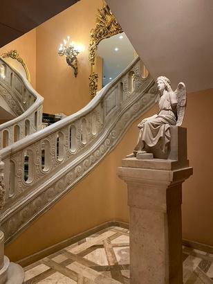
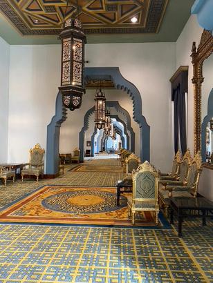
INTERNAL VIEW
Main entrance which takes visitors to both the left and right wings
Drawn from an angle to make the scene less basic
REFLECTION
1. It would have been better to add details in Aida's foyer's drawing, to make the scene a little more realistic.
2. Plants could have been added to the hotel entrance (stairs).
48
