EssentialGuide toMatplotlib

Visualizedatawithclarityandstyle:master Matplotlibwithhands-onexamples.
ApracticalanddetailedguidetocreatingplotswithMatplotlib,from simplechartstoadvancedfigures.

Visualizedatawithclarityandstyle:master Matplotlibwithhands-onexamples.
ApracticalanddetailedguidetocreatingplotswithMatplotlib,from simplechartstoadvancedfigures.
Matplotlib isthemostwidelyusedplottinglibraryinthePythonecosystem.It providesacomprehensiveinterfaceforcreatingstatic,animated,andinteractive visualizationsinPython.OriginallydevelopedbyJohnD.Hunterin2003,itwas inspiredbyMATLAB’splottingcapabilities,aimingtoprovidesimilarfunctionalities inPython.
WithMatplotlib,youcancreateawidevarietyofcharts,fromsimplelineplotsto complex2Dor3Dfigures.ItintegrateswellwithNumPyandpandas,makingit idealforscientificcomputinganddataanalysisworkflows.
ToinstallMatplotlib,youcanusepiporconda,dependingonyourenvironment:
MatplotlibworkswithPython3.7orlateranddependsonlibrariessuchasNumPy andcycler.Ifyou’reusingaJupyterNotebookorJupyterLab,Matplotlibiso en preinstalledindatasciencedistributionslikeAnaconda.
StructureoftheLibrary:pyplot,Figure,andAxes
Matplotlibhastwomaininterfaces:
1. Pyplotinterface (matplotlib.pyplot):Astate-basedinterfacethat mimicsMATLAB.
2. Object-Orientedinterface:Givesmorecontrolandflexibilitybyworking directlywith Figure and Axes objects.
• A Figure inMatplotlibistheentirewindoworpageonwhicheverythingis drawn.Thinkofitasthecanvas.
• An Axes isapartofthefigurewheredataisplotted.Afigurecancontain multipleaxes.
Here’sasimplediagramofthestructure:
1 1. Figure (wholecanvas)
2 1.1. Axes (individualplots)
3 1.1.1. Axis (XandYaxis)
Thefollowingcodesnippetshowsbothinterfaces:
1 import matplotlib.pyplotasplt
2
3 #Pyplot(state-based)interface
4 plt.plot([1,2,3],[4,5,6])
5 plt.title("BasicLinePlot")
6 plt.show()
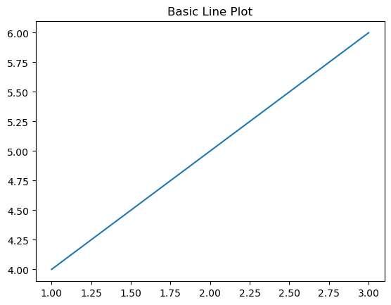
Figure1: Imagegeneratedbytheprovidedcode.
1 #Object-Orientedinterface
2 fig, ax = plt.subplots()
3 ax.plot([1,2,3],[4,5,6])
4 ax.set_title("BasicLinePlot(OOInterface)")
5 plt.show()
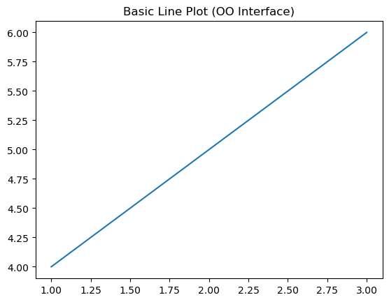
Figure2: Imagegeneratedbytheprovidedcode.
Bothapproachesgeneratethesameplot,buttheobject-oriented(OO)styleis preferredformorecomplexvisualizations.
FirstPlot:Hello,Matplotlib!
Let’screateourfirstplotusingthe pyplot interface.We’llvisualizeasimpleline graph.
1 import matplotlib.pyplotasplt 2
3 x =[0,1,2,3,4]
4 y =[0,1,4,9,16]
5
6 plt.plot(x, y)
7 plt.title("Hello,Matplotlib!")
8 plt.xlabel("x")
9 plt.ylabel("y")
10 plt.grid(True)
11 plt.show()
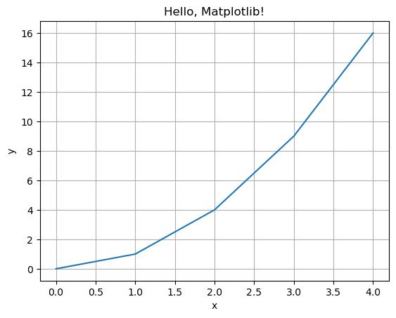
Figure3: Imagegeneratedbytheprovidedcode.
Thiscodewillproduceabasiclineplotwhere:- x and y definethedatapoints.- plt .plot() drawstheline.- plt.title(), plt.xlabel() and plt.ylabel
IbonMartínez-ArranzPage7
() addlabels.- plt.grid(True) enablesagridforbetterreadability.
ThisisyourstartingpointintheworldofMatplotlib!
Inthischapter,weexplorethemostcommontypesofplotsthatcanbecreated usingMatplotlib’s pyplot interface.We’llcover lineplots, scatterplots, bar charts, histograms,and piecharts,providingvisualexamplesandexplanations foreachtype.
Lineplotsarethemostbasictypeofchartandarecommonlyusedtodisplaytrends overtimeorsequentialdata. 1 import matplotlib.pyplotasplt
x =[0,1,2,3,4]
y =[0,1,4,9,16]
6 plt.plot(x, y, color='blue' , linestyle='-' , marker='o')
7 plt.title("LinePlot")
8 plt.xlabel("X-axis")
9 plt.ylabel("Y-axis")
10 plt.grid(True)
11 plt.show()
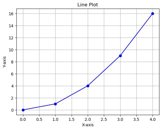
Figure1: Imagegeneratedbytheprovidedcode.
Commonarguments:
• color:linecolor(e.g., 'red' , 'blue')
• linestyle: '-' , ' ' , ':' , ' -. '
• marker:markerstyleateachdatapoint(e.g., 'o' , 's' , '^')
Scatterplotsareusefulforvisualizingtherelationshipbetweentwocontinuous variables.
1 x =[1,2,3,4,5]
2 y =[5,4,3,2,1]
3
4 plt.scatter(x, y, color='green' , marker='x')
5 plt.title("ScatterPlot")
6 plt.xlabel("X")
7 plt.ylabel("Y")
8 plt.grid(True)
9 plt.show()
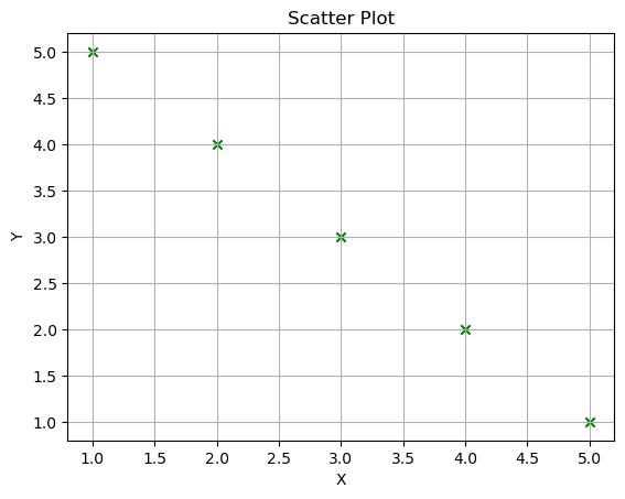
Figure2: Imagegeneratedbytheprovidedcode.
Commonarguments:
• color:colorofthemarkers
• marker:shapeofthepoints
• s:sizeofmarkers
• alpha:transparency(0to1)
BarCharts(plt.bar and plt.barh)
Barchartsareusedtoshowcomparisonsamongdiscretecategories.
VerticalBarChart(plt.bar):
1 categories =['A' , 'B' , 'C']
2 values =[5,7,3]
3
4 plt.bar(categories, values, color='purple')
5 plt.title("BarChart")
6 plt.ylabel("Values")
7 plt.show()
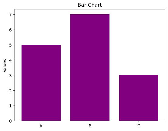
Figure3: Imagegeneratedbytheprovidedcode.
HorizontalBarChart(plt.barh):
1 plt.barh(categories, values, color='orange')
2 plt.title("HorizontalBarChart")
3 plt.xlabel("Values")
4 plt.show()
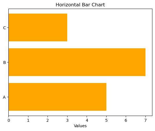
Figure4: Imagegeneratedbytheprovidedcode.
Commonarguments:
• color:barcolor
• width / height:barthickness
• align: 'center' or 'edge'
Histogramsshowthedistributionofadatasetbygroupingdataintobins.
data = np.random.randn(1000)
5 plt.hist(data, bins=30, color='skyblue' , edgecolor='black ')
6 plt.title("Histogram")
7 plt.xlabel("Value")
8 plt.ylabel("Frequency")
9 plt.grid(True)
10 plt.show()
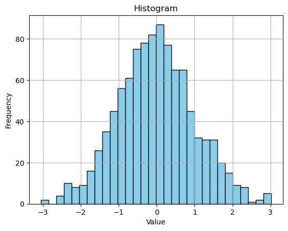
Figure5: Imagegeneratedbytheprovidedcode.
Commonarguments:
• bins:numberofbinsorbinedges
• density:if True,showprobabilitydensity
• alpha:transparency
Piechartsshowproportionsofawhole.Theyarebestusedforsmallnumbersof categories.
1 sizes =[30,45,25]
2 labels =['Apples' , 'Bananas' , 'Cherries'] 3
4 plt.pie(sizes, labels=labels, autopct='%1.1f%%' , startangle=90)
5 plt.title("PieChart")
6 plt.axis('equal') #Equalaspectratioensurespieis drawnasacircle.
7 plt.show()
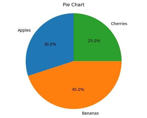
Figure6: Imagegeneratedbytheprovidedcode.
Commonarguments:
• labels:categorylabels
• autopct:formatofvaluelabels
• startangle:rotationofstartangle
• explode:highlightslices
Thesefundamentalplotsformthebasisofmostdatavisualizations.
Inthenextchapters,wewillexploremorecomplexplotsandlearnhowto fullycustomizethem.
Matplotlib’spowerliesinitsflexiblestructurebuiltaroundtwocoreobjects:the Figure andthe Axes.Understandingtheseconceptsiscrucialtomasteringthe object-orientedinterfaceandcreatingcomplex,well-organizedvisualizations.
• A Figure isthetop-levelcontainerforallplotelements.Itrepresentsthe entiredrawingorcanvas.
• An Axes isapartoftheFigurethatcontainsasingleplot.AFigurecancontain oneormultipleAxes.
1 import matplotlib.pyplotasplt
2
3 fig = plt.figure() #CreateablankFigure
4 ax = fig.add_subplot(1,1,1) #AddoneAxestothe Figure
5 ax.plot([0,1],[0,1])
6 plt.show()
Figure1: Imagegeneratedbytheprovidedcode.
Intheaboveexample:
• plt.figure() createsanemptycanvas.
• add_subplot(1,1,1) means1row,1column,andselectingthe1st subplot.
• ax.plot() drawsthelineontheAxes.
YoucancreatemultipleAxesinasingleFigureusingeither plt.subplot() or themoremodern plt.subplots().
1 fig, axs = plt.subplots(2,2) #2x2gridofsubplots 2 3 axs[0,0].plot([1,2,3],[1,4,9]) 4 axs[0,0].set_title("TopLeft")
6 axs[1,1].bar([1,2,3],[3,2,1]) 7 axs[1,1].set_title("BottomRight") 8 9 plt.tight_layout() 10 plt.show()
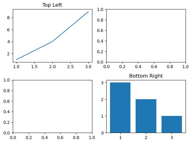
Figure2: Imagegeneratedbytheprovidedcode.
• axs isa2DNumPyarrayofAxesobjects.
• tight_layout() adjustsspacingtopreventoverlap.
Youcanalsoflattenthearray:
1 axs = axs.flatten() Toloopoverallsubplots.
Theobject-orientedinterfaceismorepowerfulandrecommendedfor:-Creatingmultipleplots-Customizingindividualelements-Bettercodestructureand readability
Basicstructure:
1 fig, ax = plt.subplots()
2 ax.plot([1,2,3],[1,4,9])
3 ax.set_title("Object-OrientedPlot")
4 ax.set_xlabel("X")
5 ax.set_ylabel("Y")
6 plt.show()
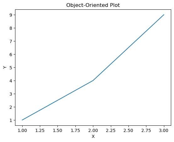
Figure3: Imagegeneratedbytheprovidedcode.
Youcanaccessallelements(lines,ticks,labels,etc.)viathe ax object.
plt.subplots() vs plt.subplot()
Feature plt.subplot() plt.subplots()
SimplicityGoodforquick,singleAxes BestforcreatingmultipleAxes
Feature
plt.subplot()
plt.subplots()
ReturnvalueReturnsasingleAxesReturns(Figure,Axes)tuple
Recommended Legacy/notveryflexiblePreferredinmostmodern code
Exampleusing plt.subplot():
1 plt.subplot(1,2,1)
2 plt.plot([1,2,3],[3,2,1])
3 plt.title("LeftPlot")
4
5 plt.subplot(1,2,2)
6 plt.plot([1,2,3],[1,2,3])
7 plt.title("RightPlot")
8
9 plt.tight_layout()
10 plt.show()
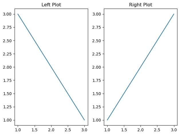
Figure4: Imagegeneratedbytheprovidedcode.
While plt.subplot() isusefulforquickplots, plt.subplots() provides betterlayoutcontrolandaccesstothefullfigureobject.
MasteringFiguresandAxesallowsyoutobuildhighlycustomizedandmulti-panel visualizations.
Inthenextchapters,we’llusethisstructureextensivelyasweexploreplot customizationandstyling.
Creatinginformativeandreadableplotso enrequiresmorethanjustdisplaying data.Adding titles, axislabels, legends, tickcustomization,andotherelements improvesbothclarityandimpact.Thischaptershowshowtocustomizethese elementsusingMatplotlib’s pyplot andobject-orientedAPIs.
PlotTitle
1 plt.title("SamplePlot")
Or,usingtheobject-orientedAPI:
1 ax.set_title("SamplePlot")
AxisLabels
1 plt.xlabel("X-axislabel")
2 plt.ylabel("Y-axislabel")
Orwithobjects:
1 ax.set_xlabel("X-axislabel")
2 ax.set_ylabel("Y-axislabel")
Youcanaddtextanywhereontheplot:
1 plt.text(2,15, "Thisisapoint", fontsize=12, color=' red')
Usefularguments:
• fontsize, color, ha, va (horizontal/verticalalignment)
1 plt.plot(x, y1, label="Linear")
2 plt.plot(x, y2, label="Quadratic")
3 plt.legend() LegendLocation
Youcanpositionthelegendwith:
1 plt.legend(loc="upperleft")
Somevalidlocations: 'best' , 'upperright' , 'lowerleft' , 'center ' .
1 plt.legend(title="LegendTitle", frameon=True, fontsize=' small')
1 plt.xticks([0,1,2,3])
2 plt.yticks([0,10,20])
1 plt.xticks([0,1,2],['A' , 'B' , 'C'])
Withtheobjectinterface:
1 ax.set_xticks([0,1,2])
2 ax.set_xticklabels(['A' , 'B' , 'C'])
Youcanalsorotateticklabels:
1 plt.xticks(rotation=45)
AddingGridlines
1 plt.grid(True)
Customizewith:
1 plt.grid(color='gray' , linestyle=' ' , linewidth=0.5)
Spinesarethelinesthatconnecttheaxistickmarksandformtheborderofthe dataarea.
1 ax.spines['top'].set_visible(False)
2 ax.spines['right'].set_visible(False)
Youcanalsochangespinecolorsandthickness:
1 ax.spines['left'].set_color('blue') 2 ax.spines['bottom'].set_linewidth(2)
Thefollowingexamplebringstogetheralltheelementsdescribedabovetoproduce aclean,informative,andwell-customizedvisualization: 1 import matplotlib.pyplotasplt 2 import numpyasnpy
4 x = npy.linspace(0,10,100)
y2 = x**2
#Plotlineswithlabels 11 ax.plot(x, y1, label="Linear", color='blue' , linestyle=' ' , marker='o')
ax.plot(x, y2, label="Quadratic", color='green' , linestyle='-' , marker='s')
ax.set_title("CustomizedPlotExample", fontsize=14)
ax.set_xlabel("X-axisLabel")
ax.set_ylabel("Y-axisLabel")
ax.legend(title="Functions", loc="upperleft", fontsize=' small')
ax.set_xticks([0,2,4,6,8,10])
ax.set_xticklabels(['Zero' , 'Two' , 'Four' , 'Six' , 'Eight' , 'Ten'], rotation=45)
25 ax.set_yticks([0,20,40,60,80,100])
#Gridandannotation
28 ax.grid(True, linestyle=' ' , alpha=0.5)
29 ax.text(5,60, "Notethispoint", fontsize=10, color='red ')
31 #Spinecustomization
32 ax.spines['right'].set_visible(False)
33 ax.spines['top'].set_visible(False)
34 ax.spines['left'].set_color('gray')
35 ax.spines['bottom'].set_linewidth(2)
37 plt.tight_layout()
38 plt.show()
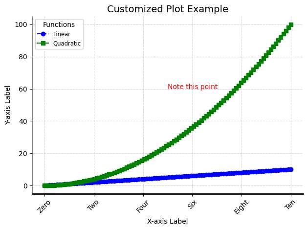
Figure1: Imagegeneratedbytheprovidedcode.
Thisplotdemonstratesbestpracticesforplotcustomizationandmakesuseofall thecorefeaturesexplainedinthischapter.
Thesecustomizationsgiveyoucontroloverthevisualandsemanticclarityofyour plots.
Inthenextchapter,we’llexplorehowtocontrolthestyle,color,andappearanceoflinesandmarkers.
Visualappearanceisakeycomponentofe ectivedatavisualization.Inthischapter,weexplorehowtocustomize colors, linestyles, markers,andhowtouse colormapsandgradients inMatplotlibtoenhancethereadabilityandaesthetics ofyourplots.
Matplotlibsupportsseveralwaystospecifycolors:
Namedcolors
1 plt.plot(x, y, color='red')
Shortcolorcodes
1 plt.plot(x, y, color='r') # 'r' =red, 'g' =green, 'b' =blue,etc.
Hexcodes
1 plt.plot(x, y, color='#FF5733')
RGBtuples
1 plt.plot(x, y, color=(0.1,0.2,0.5)) #valuesbetween0 and1
Transparency
1 plt.plot(x, y, color='blue' , alpha=0.5) #alphacontrols opacity
Changingthelinestyle
1 plt.plot(x, y, linestyle=' ') #dashedline
2 plt.plot(x, y, linestyle=' -. ') #dash-dot
3 plt.plot(x, y, linestyle=':') #dottedline
Changinglinewidth
1 plt.plot(x, y, linewidth=2.5)
Linestylescanalsobecombinedwithcolorandmarkers:
1 plt.plot(x, y, color='green' , linestyle='-' , linewidth=2)
Markersaresymbolsshownateachdatapoint.Youcancontroltheir shape, size, and color independentlyfromtheline.
Commonmarkershapes:
• 'o':circle
• 's':square
• '^':triangleup
• 'D':diamond
• 'x' , '+':crosses
Addingmarkers:
1 plt.plot(x, y, marker='o')
Customizingmarkers:
1 plt.plot(x, y, marker='o' , markersize=8, markerfacecolor= 'white' , markeredgecolor='blue')
Colormapsareusefulwhenplottingdatawithathirddimension,suchasvalues representedbycolor.
Examplewith scatter():
1 import matplotlib.pyplotasplt
4 x = npy.random.rand(100)
5 y = npy.random.rand(100) 6 colors = npy.random.rand(100)
8 plt.scatter(x, y, c=colors, cmap='viridis')
9 plt.colorbar(label="Value")
10 plt.title("ColormapExamplewithScatter")
11 plt.show()
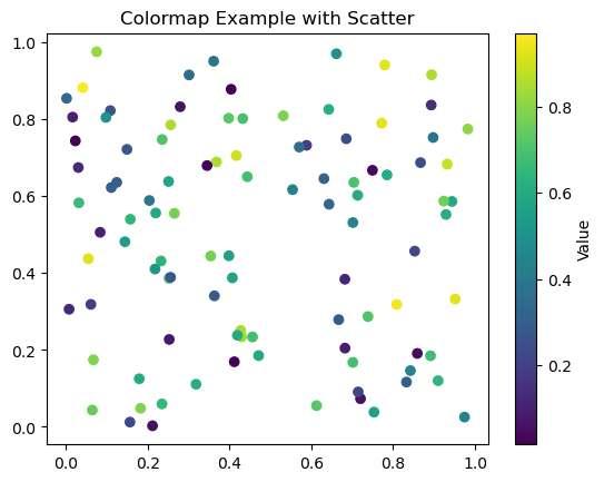
Figure1: Imagegeneratedbytheprovidedcode.
Commoncolormaps:
• 'viridis' (default)
• 'plasma' , 'inferno' , 'magma'
• 'coolwarm' , 'cividis' , 'Blues' , 'Greens'
Youcanreverseacolormapbyappending _r,e.g. 'viridis_r' .
Thefollowingexamplebringstogetherthekeyelementsdiscussedinthischapter:
1 import numpyasnpy
2 import matplotlib.pyplotasplt 3
4 x = np.linspace(0,10,100)
5 y1 = npy.sin(x)
6 y2 = npy.cos(x)
7 y3 = npy.exp(-0.1* x)* np.sin(2* x)
8 y4 = npy.exp(-0.1* x)* np.cos(2* x)
9
10 fig, axs = plt.subplots(nrows=1, ncols=2, figsize=(10,5) )
11
12
#Firstsubplot:sin(x)andcos(x)
13 axs[0].plot(x, y1, label='sin(x)' , color='darkorange' , linestyle=' ' , linewidth=2,
14 marker='o' , markersize=6, markerfacecolor=' white' , markeredgecolor='darkorange')
15 axs[0].plot(x, y2, label='cos(x)' , color='#1f77b4' , linestyle='-' , linewidth=2,
16 marker='s' , markersize=6, markerfacecolor=' white' , markeredgecolor='#1f77b4')
17 axs[0].set_title("SineandCosine")
18 axs[0].set_xlabel("x")
19 axs[0].set_ylabel("y")
20 axs[0].legend()
21 axs[0].grid(True, linestyle=':' , linewidth=0.5, alpha =0.7)
22
23
#Secondsubplot:dampedsineandcosine
24 axs[1].plot(x, y3, label='dampedsin(2x)' , color=' mediumseagreen' , linestyle=' -. ' , linewidth=2,
25 marker='^' , markersize=5, markerfacecolor=' yellow' , markeredgecolor='black')
26 axs[1].plot(x, y4, label='dampedcos(2x)' , color='crimson ' , linestyle=':' , linewidth=2,
27 marker='d' , markersize=5, markerfacecolor=' white' , markeredgecolor='crimson')
28 axs[1].set_title("DampedOscillations")
29 axs[1].set_xlabel("x")
30 axs[1].set_ylabel("y")
31 axs[1].legend()
32 axs[1].grid(True, linestyle=' ' , linewidth=0.6, alpha =0.6)
33
34 plt.suptitle("CombiningColors,Styles,andMarkersin MultiplePlots", fontsize=16)
35 plt.tight_layout()
36 plt.show()
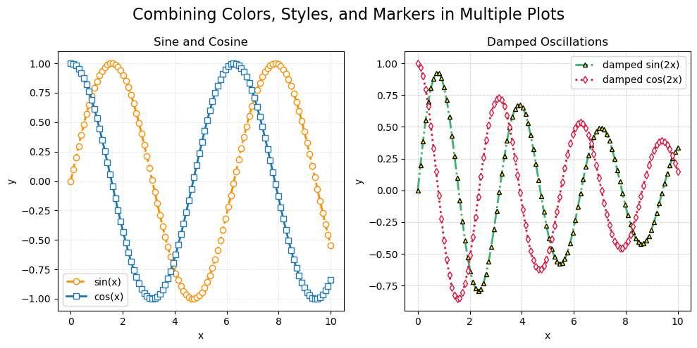
Figure2: Imagegeneratedbytheprovidedcode.
Thisexampleusesnamedcolors,hexcolors,customlinestyles,markerswith styling,andagridtoillustratehowdi erentvisualelementscanbecombinedfora professionalandinformativeplot.
Thesestylingoptionsallowyoutomakeyourplotsbothattractiveande ectivein conveyinginformation.
Inthenextchapter,wewilllookintomoreadvancedplottypessuchas boxplots,heatmaps,anderrorbars.
Matplotlibsupportsawidevarietyofplottypesbeyondthebasics.Theseadvanced plotsareusefulforstatisticalanalysis,visualizingdistributions,representinguncertainty,andexploringmultidimensionaldata.Inthischapter,weexplore errorbars, boxplots, violinplots, heatmaps, contourplots, filledplots,and polarplots.
Errorbarsrepresenttheuncertaintyorvariabilityofthedata.
1 import matplotlib.pyplotasplt
2 import numpyasnp 3
4 x = np.linspace(0,10,10)
5 y = np.sin(x)
6 error =0.2+0.2* np.sqrt(x)
8 plt.errorbar(x, y, yerr=error, fmt='o-' , color='purple' , ecolor='gray' , capsize=4)
9 plt.title("ErrorBarsExample")
10 plt.xlabel("x")
11 plt.ylabel("y")
12 plt.grid(True)
13 plt.show()
Boxplotssummarizethedistributionofdata,highlightingthemedian,quartiles, andpotentialoutliers.
1 data =[np.random.normal(0, std,100) for std in range(1, 4)]
2
3 plt.boxplot(data, patch_artist=True)
4 plt.title("BoxplotExample")
5 plt.xlabel("Group")
6 plt.ylabel("Value")
7 plt.grid(True)
8 plt.show()
Use patch_artist=True tofillboxeswithcolor.
Violinplotsshowthedistributionofdataacrossdi erentcategories,similarto boxplotsbutwithadensityestimation.
1 data =[np.random.normal(0, std,100) for std in range(1, 4)]
2
3 plt.violinplot(data, showmeans=True, showmedians=True)
4 plt.title("ViolinPlotExample")
5 plt.xlabel("Group")
6 plt.ylabel("Value")
7 plt.grid(True)
8 plt.show()
Heatmapsareusefulforvisualizingmatrix-likedata,suchascorrelationsorintensities.
1 matrix = np.random.rand(10,10)
2
3 plt.imshow(matrix, cmap='hot' , interpolation='nearest')
4 plt.title("Heatmapwithimshow")
5 plt.colorbar()
6 plt.show()
1 plt.matshow(matrix, cmap='Blues')
2 plt.title("Heatmapwithmatshow")
3 plt.colorbar()
4 plt.show()
Contourplotsareusedtorepresent3Ddatain2Dusinglevelcurves.
1 x = np.linspace(-3,3,100)
2 y = np.linspace(-3,3,100)
3 X, Y = np.meshgrid(x, y)
4 Z = np.exp(-X**2- Y**2)
5
6 plt.contour(X, Y, Z, levels=10, colors='black')
7 plt.contourf(X, Y, Z, levels=10, cmap='viridis')
8 plt.title("ContourPlot")
9 plt.colorbar()
10 plt.show()
Filledplotshighlighttheareabetweencurves,o enusedtoshowuncertaintyor ranges.
1 x = np.linspace(0,10,100)
2 y = np.sin(x) 3 error =0.3
5 plt.plot(x, y, color='blue')
6 plt.fill_between(x, y - error, y + error, color='blue' , alpha=0.2)
7 plt.title("FilledPlotExample")
8 plt.xlabel("x")
9 plt.ylabel("y$\pm$error")
10 plt.grid(True)
11 plt.show()
1 theta = np.linspace(0,2* np.pi,100)
2 r = np.abs(np.sin(5* theta))
4 plt.polar(theta, r, color='teal')
5 plt.title("PolarPlot") 6 plt.show()
4 plt.pie(sizes, labels=labels, autopct='%1.1f%%' , startangle=90)
5 plt.axis('equal')
6 plt.title("PieChart")
7 plt.show()
Towrapupthischapter,here’sacombinedfigureshowingsixdi erentadvanced plottypesina2x3layout:
1 import numpyasnp
2 import matplotlib.pyplotasplt
3
4 fig, axs = plt.subplots(2,3, figsize=(15,8))
5
6 #Subplot1:Errorbarplot
7 x = np.linspace(0,10,10)
8 y = np.sin(x)
9 error =0.2+0.2* np.sqrt(x)
10 axs[0,0].errorbar(x, y, yerr=error, fmt='o-' , color=' purple' , ecolor='gray' , capsize=4)
11 axs[0,0].set_title("ErrorBars")
12
13 #Subplot2:Boxplot
14 data =[np.random.normal(0, std,100) for std in range(1, 4)]
15 axs[0,1].boxplot(data, patch_artist=True)
16 axs[0,1].set_title("Boxplot") 17
18 #Subplot3:Violinplot
19 axs[0,2].violinplot(data, showmeans=True, showmedians= True)
20 axs[0,2].set_title("ViolinPlot")
21
22 #Subplot4:Heatmap
23 matrix = np.random.rand(10,10)
IbonMartínez-ArranzPage47
24 cax = axs[1,0].imshow(matrix, cmap='coolwarm' , interpolation='nearest')
25 axs[1,0].set_title("Heatmap")
26 fig.colorbar(cax, ax=axs[1,0], shrink=0.7)
28 #Subplot5:Contourplot
29 x = np.linspace(-3,3,100)
30 y = np.linspace(-3,3,100)
31 X, Y = np.meshgrid(x, y)
32 Z = np.exp(-X**2- Y**2)
33 contour = axs[1,1].contourf(X, Y, Z, levels=10, cmap=' viridis')
34 axs[1,1].set_title("ContourPlot")
35 fig.colorbar(contour, ax=axs[1,1], shrink=0.7)
36
37 #Subplot6:Filledareaplot
38 x = np.linspace(0,10,100)
39 y = np.sin(x)
40 axs[1,2].plot(x, y, color='blue')
41 axs[1,2].fill_between(x, y -0.3, y +0.3, color='blue' , alpha=0.2)
42 axs[1,2].set_title("FilledPlot")
43
44 plt.suptitle("AdvancedPlotTypesOverview", fontsize=16)
45 plt.tight_layout()
46 plt.show()
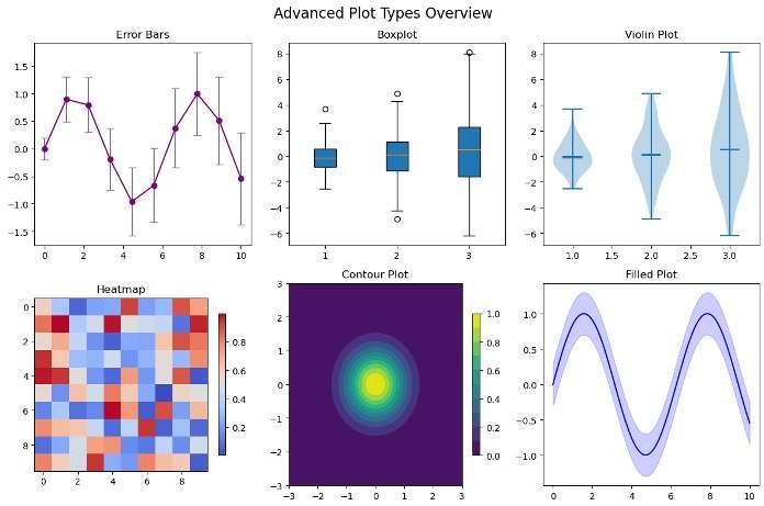
Figure1: Imagegeneratedbytheprovidedcode.
Thissummaryplotshowcasesdi erentfiguretypesinonego,helpingyoucompare theirusageandvisualfeatures.
Theseadvancedplotsallowyoutoexploredatadistributions,variabilities,patterns, andrelationshipsmoree ectively.
Inthenextchapter,we’llexplorehowtohandletimeseriesdatainMatplotlib.
Handlingdatesandtimesisanessentialpartofmanydatavisualizationtasks, especiallyfortimeseriesdata.Matplotlibprovidestoolsvia matplotlib.dates toparse,format,andcustomizedateaxes.
Inthischapter,wewillcover:
• Plottingtimeseriesdata
• Formattingandrotatingdatelabels
• Customizingtickfrequencyandappearance
Weuse matplotlib.dates (aliasedas mdates)toworkwithdatetimeobjects. First,let’screateasampletimeseries:
1 import matplotlib.pyplotasplt
2 import matplotlib.datesasmdates
3 import numpyasnp
4 import datetime
5
6 #Generate30daysofdata
7 base = datetime.datetime.today()
8 dates =[base - datetime.timedelta(days=x) for x in range (30)][::-1]
9 values = np.random.normal(loc=0.0, scale=1.0, size=30). cumsum()
11 fig, ax = plt.subplots(figsize=(10,5))
13
ax.plot(dates, values, marker='o' , linestyle='-' , color=' tab:blue')
14 ax.set_title("TimeSerieswithDates") 15 ax.set_xlabel("Date") 16 ax.set_ylabel("CumulativeValue")
18 #Formatx-axiswithreadabledates
19 ax.xaxis.set_major_locator(mdates.WeekdayLocator(interval =1))
20 ax.xaxis.set_major_formatter(mdates.DateFormatter('%b%d' ))
21 fig.autofmt_xdate(rotation=45) 22
23 #Minorticksperday
24 ax.xaxis.set_minor_locator(mdates.DayLocator())
25 ax.grid(True, which='both' , linestyle=' ' , linewidth =0.5, alpha=0.7)
26
27 plt.tight_layout()
28 plt.show()
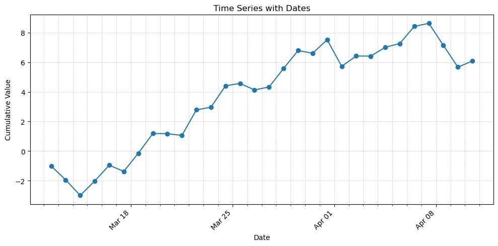
Figure1: Imagegeneratedbytheprovidedcode.
• WeekdayLocator(interval=1):showsonetickperweek
• DateFormatter('%b%d'):formatsdatesas“Apr10”,“Apr17”,etc.
• fig.autofmt_xdate(rotation=45):auto-rotatesandalignsdates
• DayLocator():addsminorticksforeachday
Thisexamplegivesyoufullcontroloverhowdatesappearandbehaveinyourtime seriesplots.
Inthenextchapter,we’lllearnhowtosaveandexportfigureswithdi erent formatsandresolutions.
Onceyou’vecreatedaplot,youmaywanttosaveitforinclusioninreports,presentations,orpublications.Matplotlibprovidesthe plt.savefig() function forexportingfiguresinvariousformatswithdetailedcontroloverquality,size, background,andlayout.
Youcansaveafigureusing:
1 plt.savefig("filename.png")
Supportedformatsinclude:-PNG(default):forwebandscreendisplay-PDF:for high-qualitydocuments-SVG:scalablevectorgraphics(usefulforweb)-JPG,EPS, TIFF(dependingonbackend)
Youcanspecifytheformatexplicitly:
1 plt.savefig("plot.pdf", format='pdf')
DPI(dotsperinch)controlstheresolutionofrasterformats(likePNGorJPG).The defaultisusually100.
1 plt.savefig("high_res_plot.png", dpi=300)
HigherDPIvaluesproducesharperimages,especiallyusefulforprintpublications. TransparentBackgroundandTightLayout
Youcanremovethebackgroundboxandtrimwhitespace:
1 plt.savefig("transparent_plot.png", transparent=True, bbox_inches='tight')
Options:
• transparent=True:removesbackgroundfill(goodforoverlays)
• bbox_inches='tight':reducesextramarginsandpadding
ForintegrationintoLaTeXdocumentsorscientificreports,vectorformatsarepreferred:
1 plt.savefig("figure.svg")
2 plt.savefig("figure.pdf")
Theseformatspreservequalityatanyzoomlevel.
YoucanalsoembedfiguresinJupyternotebooksusingthe %matplotlib inline magiccommandandexportthenotebookasHTML,PDForMarkdown.
x = npy.linspace(0,2* npy.pi,100)
y = npy.sin(x)
7 fig, ax = plt.subplots()
8 ax.plot(x, y, label='sin(x)' , color='crimson' , linewidth =2)
9 ax.set_title("SineFunction")
ax.set_xlabel("x")
ax.set_ylabel("sin(x)")
ax.legend()
ax.grid(True, linestyle=' ' , alpha=0.6)
15 #Savefigurewithhighquality 16 plt.savefig("sine_plot.pdf", format='pdf' , dpi=300, bbox_inches='tight' , transparent=True)
17 plt.show()
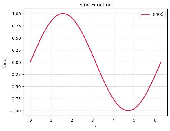
Figure1: Imagegeneratedbytheprovidedcode.
Thisexamplecreatesaclean,annotatedplotandsavesitasahigh-resolutionvector PDFwithnopaddingorbackgroundcolor—idealforreportsandpublications.
Inthenextchapter,we’llexploreMatplotlib’sruntimeconfigurationsystem,styles, andhowtogloballyorlocallydefinecustomaesthetics.
Matplotlibo erspowerfulconfigurationoptionstocontrolthelookandfeelof plots.Theseincludeglobalandlocalsettings,predefinedstylesheets,andeven theabilitytodefineyourownstylesforconsistentbrandingorpublication-ready figures.
Theappearanceofplotsiscontrolledbythe rcParams dictionary,whichstores thecurrentsettings.
1 import matplotlib.pyplotasplt 2
3 plt.rcParams['lines.linewidth']=3
4 plt.rcParams['axes.titlesize']=14
Thesechangeswillpersistforthecurrentsession.
Youcanalsousethe rc functionformoreconcisecontrol:
1 plt.rc('lines' , linewidth=2)
2 plt.rc('axes' , facecolor='#f0f0f0')
• Global settingsa ectallplotsonceconfiguredvia rcParams or plt.rc().
• Local settingscanbedefinedusingthe withplt.rc_context() contextmanager:
1 withplt.rc_context({'lines.linewidth':4, 'axes. titlesize':18}):
2 plt.plot([0,1,2],[0,1,4])
3 plt.title("LocalStyleExample")
Outsidethe with block,settingsreturntopreviousvalues.
Matplotlibcomeswithasetofbuilt-instylesheets.Youcanlistthemwith:
1 print(plt.style.available)
Somecommonstyles:
• 'default'
• 'ggplot'
• 'seaborn'
• 'fivethirtyeight'
• 'bmh'
Applyastyleglobally:
1 plt.style.use('seaborn-v0_8') #or 'ggplot' , 'bmh',etc. Applyastyletemporarily:
1 withplt.style.context('ggplot'): 2 plt.plot([1,2,3],[1,4,9])
Youcancreatecustomstylesbysavingconfigurationsettingsina .mplstyle file.
1 axes.titlesize:16 2 axes.labelsize:14 3 xtick.labelsize:12
ytick.labelsize:12
6 lines.linewidth:2 7 lines.linestyle:8 lines.marker: o
lines.markersize:6
axes.facecolor: F7F7F7
figure.facecolor: FFFFFF
xtick.major.size:6
22 ytick.major.size:6
23 xtick.direction: in 24 ytick.direction: in 25 grid.linestyle:--
26 grid.linewidth:0.5
Savethefileandapplyitwith:
1 plt.style.use('my_style.mplstyle')
1 import matplotlib.pyplotasplt
2 import numpyasnpy
3
4 plt.style.use('my_style.mplstyle')
5 x = npy.linspace(0,10,100)
6 y1 = npy.sin(x)
7 plt.plot(x,y)
8 plt.title("Title")
9 plt.xlabel("xlabel")
10 plt.ylabel("ylabel")
11 plt.grid()
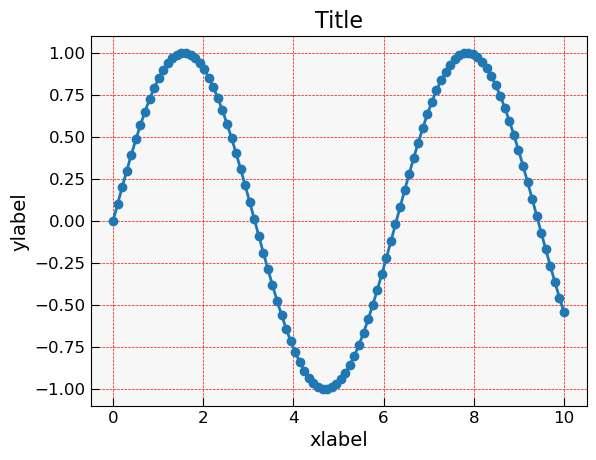
Figure1: Imagegeneratedbytheprovidedcode.
Placeitinyourworkingdirectoryorin ~/.config/matplotlib/stylelib/ tomakeitreusable.
1 import matplotlib.pyplotasplt 2 import numpyasnpy 3 4 x = npy.linspace(0,10,100) 5 y1 = npy.sin(x)
18 fig, axs = plt.subplots(2,3, figsize=(15,8))
axs = axs.flatten()
21 for ax, style, title in zip(axs, styles, titles):
withplt.style.context(style): 23
ax.plot(x, y1, label='sin(x)')
ax.plot(x, y2, label='cos(x)') 25
ax.plot(x, y3, label='sin(x)cos(x)')
ax.set_title(f"Style:{title}")
ax.set_xlabel("x")
ax.set_ylabel("y")
ax.legend()
ax.grid(True)
32 fig.suptitle("Comparisonof6MatplotlibStyleSheets", fontsize=18) 33 plt.tight_layout()
plt.show()
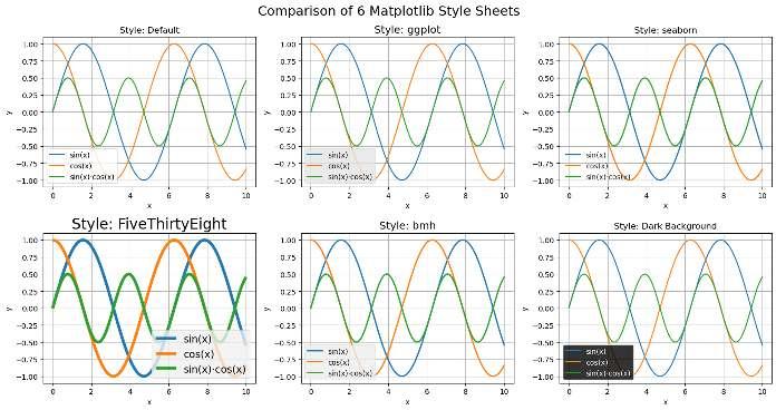
Figure2: Imagegeneratedbytheprovidedcode.
Thisplotwillautomaticallyadoptthestylingdefinedbytheseabornstylesheet.
Inthenextchapter,we’lllookintointeractiveandanimatedplotsformore dynamicvisualizations.
Thisfinalchapterservesasareferenceguideforfrequentlyusedargumentsin Matplotlibfunctions.Itincludescomparisontablesacrossplottypes,defaultvalues, andconcisecheatsheets.Italsoprovideslinksforfurtherreadingandagalleryof examples.
ArgumentPurposeExampleValue
cmap
fmt
bins
orientation
stacked
Colormapforscalarvalues 'viridis' , 'plasma'
Formatstring(for errorbar) 'o--' , 's:'
Histogrambincount 10, 30
Histogram/barorientation 'vertical' , 'horizontal'
Stackbarsorhistograms True, False
Lineplot plt.plotlinestyle, linewidth, marker
Scatterplot plt.scatters, c, marker, cmap
Barchart plt.barwidth, align, color
Histogram plt.histbins, density, alpha
Boxplot plt.boxplotnotch, patch_artist, vert
Violinplot plt.violinplotshowmeans, showmedians
Errorbarplot plt.errorbaryerr, xerr, fmt, capsize
Piechart plt.pieautopct, startangle, explode
Heatmap plt.imshowinterpolation, cmap
Contour plt.contourflevels, cmap, alpha
• Defaultlinewidth: 1.5
• Defaultmarkersize: 6
• Defaultfontsize: 10
• DefaultDPI: 100 foron-screendisplay
Youcanoverridegloballyvia:
1 plt.rcParams['lines.linewidth']=2.5
Orlocallyviafunctionarguments:
1 plt.plot(x, y, linewidth=2.5)
Youcanfindmanycategorizedexamplesintheo icialMatplotlibgallery:
• https://matplotlib.org/stable/gallery/index.html
Matplotlib’so icialcheatsheet(PDF):
• https://matplotlib.org/cheatsheets/
• MatplotlibDocumentation IbonMartínez-ArranzPage69
• PyplotAPIReference
• CustomizingMatplotlibwithrcParams
• ColormapsReference
• Seabornintegration
Thiswrapsupthe EssentialGuidetoMatplotlib.Keepexperimenting,building,andcustomizing—andmayyourplotsalwaysbesharp,informative, andbeautiful!