kwintessens Design Vlaams tijdschrift voor vormgeving en mode 3de trimester, jaargang xix Abonnement â‚Ź 23,55 / Los nummer â‚Ź 6,25
Hoofdredacteur / Editor in chief
Johan Valcke
Redactie / Editorial team
Steven Cleeren Christian Oosterlinck Lut Pil Auteurs / Authors
Christophe De Schauvre Frank Huygens Roel Jacobus Kurt Vanbelleghem
2
Dynamische patronen in Insid’Out Dynamic patterns in Insid’Out
6
Lut Pil
Geritmeerd textiel Rhythmical textile
14
Frank Huygens
Publieke ruimte, ruimte voor iedereen Public space, space for everyone
Fotografie portfolio / Photography portfolio
Redactieadres / Editorial offices
22
Ellen Adam
Christian Oosterlinck
Ambigue camouflagepatronen
Design Vlaanderen/Kwintessens Koloniënstraat 56 (6de verdieping) 1000 Brussel t +32 (0)2 227 60 60 / f +32 (0)2 227 60 69 info@designvlaanderen.be www.designvlaanderen.be
Vormgeving / Design
Druk / Printing
35
Portfolio
Vertaling / Translation
45
Textielrevolutie verpakt als evolutie
Pascal Van Hoorebeke
30
Sint-Joris
ElaN Translations DataTranslations
Abonnementen kunnen schriftelijk of telefonisch worden aangevraagd op het adres van Design Vlaanderen of door overschrijving van € 23,55 op het rekening nummer be 16 0912 2120 3374. Subscriptions may be requested in writing or by telephone by contacting the Design Flanders editorial offices or by transferring € 23.55 to bank account number iban be 16 0912 2120 3374.
50
Adreswijzigingen worden gemeld op het redactieadres. Changes of address may be sent to our editorial offices.
60
Niets uit deze uitgave mag worden gebruikt zonder toestemming van de uitgever. © Design Vlaanderen Nothing contained in this publication may be used, whether in part or in whole, without the publisher’s consent. © Design Flanders Alle adressen van designers, kunstenaars, galeries e.a. kunnen bij Design Vlaanderen verkregen worden. The addresses of designers, artists, galleries and other information are available upon request from Design Flanders.
56
65
Ambiguous camouflage patterns Lut Pil
Scherp op snee: trendboeken Cutting Edge: Trend books Christophe De Schauvre
Textile revolution packaged as evolution Roel Jacobus
Maarten De Ceulaer. Design is er om verhalen te vertellen Maarten De Ceulaer. The role of design is to tell stories Kurt Vanbelleghem
Art of the Loom
Christian Oosterlinck
Fighting the Box
Christian Oosterlinck
Nieuws en agenda
voorwoord
Het komende najaar zal, zoals elk jaar opnieuw, weer bijzonder ‘designgevoelig’ zijn. In de maanden Johan Valcke september en oktober vinden in heel België tal van designevenementen plaats die Design Vlaanderen De natuur biedt ontzettend veel vormen, organisatiestrategieën en methodes die zelf organiseert of waaraan het minstens partici- zich tonen in patronen en ritmes. Ze zowat overal te vinden; bij dieren, peert. Zo tellen we in Vlaanderen onder meer het zijn insecten, planten en geologische strucdesigncircuit Oeverture (Gent, september) en de turen. Ingenieurs laten er zich door inspi reren voor hun innoverende producten. biënnale Interieur (Kortrijk, oktober). In Brussel Het ligt dan ook voor de hand dat ook architecten en designers van zulke voor is er dan nog Design September en in Wallonië beelden uit de natuur kunnen leren om ze aan te wenden voor allerlei creaties. vinden de Biennale du design (Luik, oktober) en Slechts één voorbeeld uit de vele is de onze eigenste 6de Triënnale voor Vormgeving productie van zelfreinigend textiel, op de propere lotusbloem. (Grand Hornu Images, Hornu) plaats. Deze laatste gebaseerd Het is een plant die in Aziatische religies met reinheid wordt geassocieerd, tentoonstelling loopt van 20 november 2010 tot omdat ze nooit vuil wordt. Dit heeft en met 27 februari 2011 onder de titel Belgium is te maken met haar bladstructuur, uit een patroon van noppen design. Design for mankind. De thematiek is het bestaande die uit waskristallen zijn samengesteld. mensgerichte aspect van design, in de theorie daar Ingenieurs over de hele wereld – onder meer in de Hogeschool Gent – hebben omtrent bekend onder de noemers user-centered zulke textielmaterialen ontwikkeld. Het lotusverhaal en nog veel meer vind je design, service design of nog: human-centered in Das große Buch der Bionik. Neue Tech nologien nach dem Vorbild der Natur van design. Het volgende nummer van Kwintessens de professoren Nachtigall en Blüchel. zal, aanvullend op de triënnale, dergelijke nietHet verscheen al in 2000 en is daarmee niet meer het nieuwste boek, maar het tastbare vormen van design behandelen. biedt nog steeds een verbazingwekkend Je kan eigenlijk al zien dat de herfst in aantocht is, want overal in de natuur, in tuinen en parken, in heggen en hagen vind je spinnenwebben. Je vindt de veel hoekige patronen in allerlei formaten terug. En laat nu net deze Kwintessens over ritmes en patronen gaan. Niet over spinnen. Ritmes en patronen zijn eigen aan de mens, zoals talloze andere levens
Foreword
This autumn, like every year, will be a ‘design-sensitive’ period. Numerous design events that are organised, or at least participated in, by Design Flanders, take place all over Belgium in the months of September and October. In Flanders, we have the designer circuit, Oeverture (Ghent, September), and the bien nial Interieur (Kortrijk, October). In Brussels, there is Design September and in Wallonia the Biennial of Design (Liege, October) and our very own 6th Triennial for Design (Grand Hornu Images, Hornu). The latter, entitled Belgium is design. Design for mankind runs from 20 November 2010 to 27 Feb ruary 2011 inclusive. The theme is peopleoriented design, a theory known by
vormen in de natuur hun eigen ritmes en patronen vertonen. De mens gebruikt ze niet alleen om esthetische, maar ook om constructieve en technische redenen. In wezen leeft een mens tussen, met en volgens patronen en ritmes. Ik zou zelfs durven stellen dat het leven zelf gebouwd is op patronen en ritmes. Kijk maar naar onze dna-strengen.
various labels, i.e., user-centred design, service design or human-centred design. The next issue of Kwintessens will, com plementary to the triennial, look at these non tangible forms of design. The approach of autumn is perceptible, as everywhere we look in nature – in gardens and parks, in bushes and hedg es – we see spider webs. Their polygonal patterns come in every format. So this Kwintessens will be about rhythms and patterns (not about spiders). Humans have as many rhythms and patterns peculiar to them as other life forms. Humans use them for constructive and technical reasons as well as aesthetic. Essentially, people live between, with and according to patterns and rhythms. I would go so far as to say that life it-
perspectief op de natuur als leerschool voor de mens en de ontwerper. Dit nummer bevat vooral artikels over patronen en ritmes in textiel en aanverwante disciplines. Daaruit blijkt dat onze designers zich best nog wat meer mogen verdiepen in deze thematiek, om ze ook toe passen in andere domeinen. De toekomst zal dan – hoop ik – nog verrassender zijn.
self is built on patterns and rhythms. Just look at our DNA strands. Nature offers a myriad of forms, organ isational strategies and methodologies that manifest as patterns and rhythms. You can see this in everything: animals, insects, plants and geological structures. Engineers use nature as the inspiration for innovative products. It isn’t surprising then that architects and designers also learn from nature’s example. Self-cleaning textiles based on the lotus flower is one example, in many. Asian religions associate this plant with purity because a pattern of wax crystal spots on an orchid’s leaves means that it is never dirty. This has inspired engineers all over the world – including those at the
Hogeschool in Ghent – to develop copycat textiles. You can find the lotus story and much more in Das große Buch der Bionik. Neue Technologien nach dem Vorbild der Natur by professors Nachtigall and Blüchel. It appeared back in 2000, so it isn’t the latest book, but it still offers an amazing perspective on nature as a school for the designer and people in general. The articles in this issue are focused on patterns and rhythms in textile and related disciplines. It seems that design ers might be advised to plunge deeper into this theme and consider applying it to other fields. The future could then be – I trust – even more surprising.
Patronen kunnen op een onverwachte manier Lut Pil ontstaan of zich ongewoon gedragen. Ze zijn immers niet altijd ontworpen vanuit een gerichte vraag naar visuele schema’s. Soms zijn ze eerder (neven-)effecten van beslissingen die technisch, praktisch of conceptueel van aard zijn. Ook dan zijn ze structureel verbonden met de constructie en vormen ze geen toevoeging achteraf.
Dynamische patronen in Insid’Out Patronen vallen niet samen met ornament, ondanks de vele gelijkenissen. “[O]rnamentation [....] differs by defini tion from patterns by being described as an additive element, something attached subsequently. Otherwise patterns and or namentation have more similarities than differences. Both rest on the principle of repetition and both present a perfectly proportioned reaction between patterns and background.” 1 insid’out, een samenwerkingsproject tussen de textielopleidingen van het kask in Gent en La Cambre dat vorig jaar in Brussel op de stoffenbeurs mood
2
Dynamic patterns in Insid’Out
Patterns can come about in unexpected ways and exhibit strange behaviours. They are not always the result of a direct demand for visual schema. They can be the side effect of a decision that is tech nical, practical or conceptual. Even then, they are structurally linked with a construction and are not an additive element. Patterns are not the same as ornaments, in spite of the many similarities. “[O]rnamentation [....] differs by definition from patterns by being described as an additive element, something attached subsequently. Otherwise patterns and ornamentation have more similarities than differ ences. Both rest on the principle of repetition and both present a perfectly proportioned reaction between patterns and background.” 1
is getoond, creëert op een speelse wijze ongewoon patroongedrag. Uitgangpunt van het project zijn de concepten ‘bedekken’ en ‘dynamiek’. Patronen zijn geen expliciet thema, maar het is opval lend hoe essentieel ze zijn in de stofont werpen en objecten die voor insid’out zijn ontworpen. Het lijkt er haast op alsof bedekken niet echt dynamisch kan zijn zonder een fundamentele inbreng van patronen. En omdat bedekken meest al betrekking heeft op een volume, blijven de patronen niet tweedimensionaal. Ze krijgen een ruimtelijke context en bepalen mee relaties tussen zichtbaar/
insid’out, a collaborative project between the textile department of kask,
Ghent, and La Cambre, presented last year at the mood fabric fair, creates unusual pattern behaviours in a playful way. The concepts ‘cover’ and ‘dynamic’ formed the starting point for this project. While not the explicit theme of insid’out, it is striking how essential patterns are to the fabric designs and objects created. It almost seems as if ‘covering’ cannot be dynamic without the profound input of patterns. And since covering is usually related to volume, the patterns do not remain two dimensional. They acquire a spatial context and contribute to the relationship between visible/invisible and internal/ external. Rocking Chair interprets the project themes both literally and unusually.
niet-zichtbaar en inwendig/uitwendig. Letterlijk en toch verrassend vertaalt Rocking Chair de thema’s van het project. Het ontwerp wikkelt een rekbare stof rond een opblaasbare zitzak. Aanvankelijk is het textiel niet veel meer dan een compact breisel zonder duidelijk patroon. Naarmate meer lucht in de zitzak wordt gepompt, rekt de stof uit en verschijnt het motief. Het patroon wordt letterlijk uitvergroot en contrasteert nu met de kleur van de zitzak die zichtbaar wordt doorheen het textiel. De dynamiek van het bedekken krijgt in Rocking Chair nog een tweede bewe-
The design wraps an elastic fabric around an inflatable seat. At first, the textile is little more than a compact jersey fabric without a defined pattern. As air is pumped into the seat, the fabric stretches and the pattern emerges. As the pattern is literally magnified, it con trasts with the colour of the seat that shines through the fabric. The dynamic of covering receives yet another interpretation when someone sits in Rocking Chair: the round ball transforms into an undefined spatial structure. Rocking Chair is, therefore, more akin to Sacco Chair (1968), the famous pop art piece that demonstrated flexibility of form, designed by the Italians Piero Gatti, Cesare Paolini and Franco Teodoro, than it is to the pneumatic objects from the same period of the 60s, although Sacco Chair has no fixed contour and
Rocking Chair springs back to its original form. When sat upon, the pattern of the knitted cover also alters. Any movement disturbs the pattern grid. Sitting down on it means a collaboration where you give it shape and it gives back a visual game of altered colour and intensity, lines bending and dancing. At the same time, the inflated object moves beneath the textile, press ing against different zones to the point where it seems to burst apart through the fabric. Because: “The inflatable object is frail, delicate, but also ridi culous, always on the point of abject eruption and collapse.” 2 Hosting Place uses a fabric that is woven in several layers. The textile illustrates a subtle repetition through the layers. The pattern is deliberately applied and can be seen as decorative,
ging. Want het zitten creëert extra vervorming: de ronde bol verandert in een ongedefinieerde ruimtelijke structuur. Rocking Chair is daarom meer verwant met de Sacco (1968), het beroemde pop art voorbeeld van vormflexibiliteit ontworpen door de Italianen Piero Gatti, Cesare Paolini en Franco Teodoro, dan met de ‘pneumatische’ objecten uit diezelfde jaren 1960, ook al heeft de Sacco geen vastgelegde contouren en veert Rocking Chair telkens terug naar zijn oorspronkelijke vorm. Ook de patronen van de gebreide hoes veranderen door de druk van het zitten. Elke beweging verstoort het raster van de motieven. Zit ten betekent mee vormgeven en visueel verrast worden: kleuren wisselen en veranderen van intensiteit, lijnen buigen en dansen. Tegelijkertijd drukt het opgeblazen object tijdens het schomme len voortdurend op andere zones in het textiel, tot op het punt waar het – door het patroon heen – uit elkaar lijkt te spat ten. Want: “The inflatable object is frail, delicate, but also ridiculous, always on the point of abject eruption and collapse.” 2 Hosting Place gebruikt een stof die in verschillende lagen is geweven. Het textiel tekent een discrete herhaling in de gelaagde stof. Het patroon wordt bewust aangebracht en mag decoratief zijn, maar is vooral belangrijk omwille van de ‘gastvrije ruimte’ die zo ontstaat. Hosting Place is een uitnodiging naar de gebruiker om elk compartiment vrij op te vullen. Kleurrijke ballen of flexibele buizen veranderen bijvoorbeeld de twee dimensionale stof in een ritmisch dagbed. De interactie is hier duidelijk geen
3
Vanishing graphics
but its significance is in the ‘hospitable space’ it creates. Hosting Place is an invitation to the user to freely fill each compartment. Colourful balls or flexible tubes change, for example, the two dimensional fabric into a rhythmic day bed. The interaction clearly goes beyond the decoration of a surface, and Hosting Place is rather a construction, built from inside out, that gives credence to the philosophy of do-it-yourself. Lifting also manipulates regular patterns. A stretch fabric with a stripe or
diamond motif is pulled over existing objects like a membrane. The objects then run with the pattern: a folding chair unfolds its seat and a revolving stool turns on its axis. The actions dis turb the regularity of the decorative pattern and create an ambiguous rela tionship between the object’s structure and the fabric cover. They evoke the image of an old-fashioned upholstered chair that has lost weight and is now only a (modernist) frame under a stretched skin. The elasticity of the piece of fur-
niture seems to have collapsed and replaced one sort of formlessness with another. In Mechanization Takes Com mand (1948), Sigfried Giedion stressed the amorphous nature of upholstered furniture: “The easy furniture of the upholsterer no longer owns any decided shape. It has lost its clarity of structure and has become boneless. The skeleton of the chairs and sofas has retreated deep into the cushions: a process that the French have called La victoire de la garniture sur le bois.” 3
The over abundant upholstering that makes a chair look like a mass of inflated cushions 4, implodes here in the formlessness of skin and bone. The supporting construction only structures the fabric in a few places. Spaceball is well-padded, but the design uses stuffing unconventionally. The Spaceball concept allows for mem ories to break through the surface pat terns. Classic lace motifs are crocheted into a cushion cover. The many openings in the pattern mean that the
decoratie van een oppervlak, maar een constructie die van binnenuit wordt opgebouwd en ruimte geeft aan een doe-het-zelf-filosofie. Ook Lifting manipuleert regelmatige patronen. Een stretchstof met lijnenmotief of ruitjesstructuur wordt als een membraan over bestaande gebruiks objecten getrokken. De objecten gaan dan aan de haal met het patroon: een opklapbare stoel vouwt zijn zitvlak open en een draaikruk cirkelt om zijn as. De acties verstoren de regelmaat van het decoratieve schema en creëren een dubbelzinnige relatie tussen de structuur van het object en de stoffen hoes. Ze roepen het beeld op van een ouderwetse dikbuikige zetel die zijn gewicht heeft verloren en enkel nog een (moder nistisch) geraamte is onder een opgespannen huid. De elasticiteit van het meubel lijkt in elkaar gezakt en de ene soort vormeloosheid vervangen te hebben door een andere soort. In Mechani zation Takes Command (1948) noteerde Sigfried Giedion nadrukkelijk het amorfe karakter van het gestoffeerde meubel: “The easy furniture of the upholsterer no longer owns any decided shape. It has lost its clarity of structure and has become bone less. The skeleton of the chairs and sofas has retreated deep into the cushions: a pro cess that the French have called La victoire de la garniture sur le bois.” 3 De overvloed aan stoffering die het zitmeubilair een geheel van opgeblazen kussens doet lijken 4, implodeert hier in de vormeloosheid van vel over been. De dragende constructie structureert de stof slechts op enkele punten.
4
filling is not completely locked in and can be pulled through it ‘like memories sometimes emerge’. Memories that are carried with us like our belongings when we move house. Since 1997, the Bottari Truck by the Korean artist SooJa Kim has transported - under a network of knotted ropes - not only loads of bundles of clothing but also the mem ories and images associated with those clothes and the traditional Korean bed spreads in which they are wrapped. Spaceball works on a similar inter action between textile and memory but translates this into its own Western context, in which lace and lace patterns have a long tradition and are therefore associated with memory. Even disregarding its metaphorical meaning, this design plays with contrasts, between form and content,
Spaceball heeft wel genoeg vulling, maar het ontwerp gebruikt die onconventioneel. Het Spaceball-concept laat herinneringen doorheen patronen aan de oppervlakte komen. Vertrouwde kant motieven worden tot een kussenomhul sel gehaakt. Door de vele openingen in het patroon omsluit de gehaakte hoes de vulling niet volledig en kan het opvulmateriaal doorheen het patroon naar buiten dringen, “zoals herinneringen soms opduiken”. Herinnering die zoals andere bezittingen worden meegenomen wanneer iemand verhuist. De Bot tari Truck van de Koreaanse kunstenares Soo-Ja Kim vervoert vanaf 1997 onder een geknoopt netwerk van touwen niet enkel massa’s klerenbundels, maar nog veel meer de herinneringen en beel den die verbonden zijn met die kleren en de traditionele Koreaanse bedspreien waarin de kleren zijn gewikkeld. Space ball werkt met een soortgelijke inter actie tussen textiel en herinneringen, maar het vertaalt dit naar een eigen, westerse context waarin kant en kantpatronen een lange traditie hebben en sowieso al verbonden zijn met herinneringen. Zelfs zonder deze metaforische betekenis speelt dit ontwerp met inhou delijke en vormelijke tegenstellingen tussen licht en donker, binnen en buiten, norm en normdoorbreking. “Dit principe doet de conventie tussen stoffering en bekleding kantelen en reveleert genereus wat gewoonlijk verborgen blijft.” Zoals de andere ontwerpen toont Spaceball de materiële dimensie van patronen. De kantmotieven en de stoffering die erdoor steken, zijn geen
light and darkness, interior and exterior, convention and subversion. “This principle upsets the conventional rela tionship between upholstery and stuff ing and generously reveals what is usually hidden.” As with the other designs, Spaceball reveals the substantive dimension of patterns. The lace motifs and the stuffing that sticks through it are not graphic patterns that were added but visual forms that are caught in a concrete material. It asks to be touched. It invites an imme diate experience. Looking at it demands sensual touch: the gaze is eroticised. “Vision reveals what the touch already knows. We could think of the sense of touch as the unconscious of vision. Our eyes stroke distant surfaces, contours and edges, and the unconscious tactile sensation determines the
Spaceball
agreeableness or unpleasantness of the experience. The distant and the near are experienced with the same intensity, and they merge into one coherent experience.” 5 The tension between the textile object and the viewer is thus palpable and drawn out. Spaceball intrigues, attracts, but also creates a certain unease. Some of the insid’out designs, such as Nest, are conceived as highly functional objects. The experimental Nest concept seeks a solution to the demand for comfortable lounge objects for festivals and other events. The require ments: inexpensive, flexible and recyclable after temporary use. Nest examines how polyether foam can be folded and compressed into convenient seats. The foam sheets are fixed in seductive forms with ropes. When
used as a chair or mattress filling, polyether foam is usually kept out of sight but here it enjoys a starring role. When the material is folded and compressed, its buoyancy has to be taken into account but Nest combines this with a focus on multi layered patterns. “By layering the polyether foam sheets and pulling them together with a belt, geometric patterns are formed that resemble floral motifs. The zones exposed to air and light fade. [...] A different form is created due to the woollen dry felting in the polyether foam.” One of the motifs used inside the perforated foam is a chequered diamond pattern. It is a classic design that we know well from the Harlequin costume from Commedia dell’arte, and which recalls traditional tiled floors or the still popular Scottish Argyll diamonds
grafische patronen die worden toegevoegd, maar visuele vormen die vastzitten in concreet materiaal. Ze vragen om gevoeld te worden. Ze nodigen uit tot een directe ervaring. Het kijken wordt aangesproken in een zintuiglijk aanraken: een erotiseren van de blik. “Vision reveals what the touch already knows. We could think of the sense of touch as the unconscious of vision. Our eyes stroke dis tant surfaces, contours and edges, and the unconscious tactile sensation determines the agreeableness or unpleasantness of the experience. The distant and the near are experienced with the same intensity, and they merge into one coherent experience.” 5 Hierdoor blijft de spanning tussen het textiele object en de toeschouwer lang aanhouden. Spaceball intrigeert, trekt aan, maar wekt ook een zeker onbehagen op. Sommige ontwerpen in insid’out zoals Nest zijn erg functioneel gedacht. De experimenten in het Nest-concept zoeken een antwoord op de vraag naar comfortabele lounge-objecten voor festivals en andere evenementen. De vereisten: goedkoop, flexibel en na tijdelijk gebruik weer recupereerbaar. Nest onderzoekt op welke wijze polyetherschuim kan worden geplooid en samen gedrukt tot gemakkelijke zetels. Met touwen worden de schuimplaten in ver leidelijke vormen vastgezet. Als zetelof matrasvulling is polyetherschuim meestal aan het zicht onttrokken. Hier krijgt het de hoofdrol in een verhaal waar het plooien en samendrukken ook reke ning moet houden met de veerkracht van het materiaal. Nest combineert dit
on sweaters and socks. Does this pattern change the character of the foam sheet? Does the use of the pattern make the filling material a designed element? Beauty and banality are curiously inter twined here. And the small amount of costly material tells another story. Associations with Harlequin and tiled floors gives the polyether a theatrical air. It becomes a sort of red carpet for a modern fool, such as the Spanish designer who created, among other things, the brightly coloured Camper shoes whose soles are embossed with a diamond pattern (2008). Or is it an unlikely stage for the spring 2008 ladies shoe collection by the Dutch designer duo Victor & Rolf, with a high heel in a black and white diamond pattern supporting a shoe that wears a Harlequin mask? Are these patterns a masquerade, a game of ornamentation and identity?
met een aandacht voor patronen op verschillende niveaus. “Door verschillende lagen polyetherschuim op elkaar te leggen en via een riem samen te druk ken ontstaan geometrische vormen die gelijkenis vertonen met florale motieven. De zones die blootgesteld zijn aan lucht en licht verkleuren. [...] Een andere vorm ontstaat dankzij het droogvilten van wol in het polyetherschuim.” Een van de aangebrachte motieven waarmee het geperforeerde schuim wordt opgevuld is een geruit diamantpatroon. Het is een vertrouwd motief dat we kennen van het kostuum van Harlekijn uit de Commedia dell’arte, of dat herinnert aan oude tegelvloeren of aan de nog steeds populaire Schotse Argyle-ruiten op truien en sokken. Verandert het patroon de sfeer van de schuimplaat? Wordt het opvulmateriaal een ‘gedesigned’ zitelement door het invoeren van het patroon? Schoonheid en banaliteit zijn er op een vreemde manier met elkaar verweven. En het wei nig edele materiaal wordt een ander ver haal binnengeleid. Door de associaties met Harlekijn en tegelvloer krijgt het polyetherschuim een theatrale uitstraling. Het wordt een soort rode loper voor een hedendaagse nar, zoals de Spaanse designer Jaime Hayon die vormgeeft, onder meer met zijn fel gekleurde schoe nen voor Camper waarvan de zool een diamantpatroon in reliëf heeft meegekregen (2008). Of is het een onmogelijk podium voor de damesschoenen van het Nederlandse designersduo Victor & Rolf uit de lentecollectie 2008, waar een hoge hak in zwart-wit diamantpatroon
Decoration and decorationless: Vanishing Graphics explores the two poles by presenting materials whose surfaces, depending on the perspective and the fall of light, display a pattern in relief in one moment and a flat surface in the next. Patterns are conjured up that then vanish. Challenging and fun, Vanishing Graphics seems to demand a space where minimalism is alternated with an almost baroque decor, both in the home interior and more industrial environments. The textile departments of kask, Ghent, and La Cambre will once again have a stand at mood in September 2010.
een schoen ondersteunt die vooraan een harlekijnmasker draagt? Zijn deze patronen een maskerade, een spel met ornament en identiteit? Decoratie en decoratieloos: Vanishing Graphics zoekt de twee polen op door materialen voor te stellen waarvan het oppervlak, afhankelijk van het gezichts punt en de lichtinval, nu eens een (reliëf-)patroon vertoont, dan weer egaal oogt. Het changeant effect tovert patro nen tevoorschijn en laat ze in een volgend ogenblik weer verdwijnen. Met een uitdagend plezier lijkt Vanishing Graphics ruimte op te eisen om minimalisme af te wisselen met een haast barok decor, zowel in het interieur als in een meer industriële omgeving. De textielopleidingen van het kask Gent en La Cambre hebben in september 2010 opnieuw een stand op mood.
1 Annette Tietenberg, ‘The Pattern Which Con-
nects’, in Petra Schmidt, Annette Tietenberg en Ralf Wollheim (eds), Patterns in Design, Art and Architecture, Basel: Birkhäuser, 2005, p. 7. 2 Steven Connor, ‘Next-to-Nothing’, in Tate Etc., 12, lente 2008. 3 Sigfried Giedion, Mechanization Takes Command. A Contribution to Anonymous History (1948), New York-Londen: W.W. Norton & Company, herdruk, 1975, p. 366. 4 Giedion, o.c., p. 366. 5 Juhani Pallasmaa, The eyes of the skin. Architecture and the senses, Chichester: Wiley-Academy, 2007, p. 42.
1 Annette Tietenberg, ‘The Pattern Which Connects’, in Petra Schmidt, Annette Tietenberg and Ralf Wollheim (eds), Patterns in Design, Art and Architecture, Basel: Birkhäuser, 2005, p. 7. 2 Steven Connor, ‘Next-to-Nothing’, in Tate Etc., 12, spring 2008. 3 Sigfried Giedion, Mechanization Takes Command. A Contribution to Anonymous History (1948), New York-London: W.W. Norton & Company, reprint, 1975, p. 366. 4 Giedion, o.c., p. 366. 5 Juhani Pallasmaa, The eyes of the skin. Architecture and the senses, Chichester: Wiley-Academy, 2007, p. 42.
5
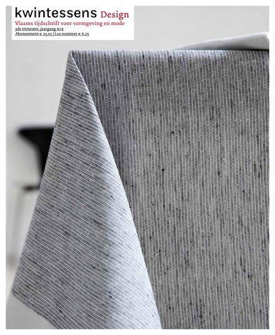
Waar kan men beter terecht voor ritmes en patronen dan bij textiel? Elk weefsel vertoont per definitie een ritmische structuur, al was het maar het recht-op-recht van schering en inslag. Maar de inherente mogelijkheden van het mate riaal worden niet altijd even succesvol uitgebuit. Nochtans worden textielproducten met een meer waarde almaar belangrijker als we de Vlaamse textielerfenis ook een levendige toekomst willen geven. Hoogtechnologische innovatie biedt één oplossing, maar ook kwalitatief textieldesign Frank Huygens opent perspectieven.
Geritmeerd textiel
Francine Van der Biest, Black-white cushions, linnen en katoen, 50 x 50 cm, 2008
6
Maison Marie Mees Cathérine Biasino, Tafelkleed Joan (collectie Alfred), katoen, 2009 Maison Marie Mees Cathérine Biasino, Kussenslopen Eva (collectie Alfred), katoen, 2009
In textiel kan men ruwweg twee domeinen onderscheiden; enerzijds is er het vrije, beeldende textiel, waarbij het traditionele figuratieve wandtapijt meteen in het oog springt. Het gaat hier om een variant van de monumentale schilderkunst waarbij een beeldend kunstenaar – vaak een schilder – zijn figuratieve compositie in textiel laat weven. In de jaren 1960 komt het vlakke wandtextiel
Rhythmical textile
Where better to find rhythms and patterns than in textiles? By definition, every weave has a rhythmic structure, even if it is just the over and under of warp and weft. But the inherent possibilities of the material are not always successfully utilised. Nevertheless, textile products of added value are becoming ever more important if we are to give the Flemish textile legacy a vibrant future. High-tech innovations provide a solution, but high quality tex tile design broadens horizons. We generally distinguish between two domains in textile. On the one hand there is free, expressive textile – tradi tional figurative tapestries stand out here. They are a variation of monumen tal painting in which a graphic artist – often a painter – has his or her figu-
langzaam maar zeker van de muur los en evolueert dan tot een vrijstaande textielsculptuur. Niet zelden zoekt de textielkunstenaar andere materialen op, zowel organische als synthetische. Een tweede vorm van textiel is het toegepaste textiel, dat breed uitwaaiert van interieurtextiel als bed-, tafel en badlinnen, naar kleding en modeaccesoires. Bij het gebruikstextiel primeert uiter-
rative composition woven in textile. In the 1960s flat wall textiles were slowly but surely removed from the wall; they evolved into freestanding textile sculp tures. Textile artists frequently seek out other materials, both organic and synthetic. A second form of textile is applied textile, which ranges from inte rior textiles like bed linen, napery and bath towels to clothing and fashion accessories. For consumer textile prac tical usefulness takes precedence, but for clothing the design is also determined by all kinds of symbolic values and personal touches. Clothes still make the man and the woman. For centuries interior textile has played a less flamboyant role with regard to design and the recognition it receives. Colours, decoration and patterns provided a beautiful trim or a surprising
aard het praktische nut maar bij kleding bijvoorbeeld, wordt de vormgeving ook op indringende wijze bepaald door aller lei symbolische waarden en persoonlijke uitstraling. Kleren maken nog steeds de man én de vrouw. Interieurtextiel speelde sinds eeuwen een minder opzichtige rol inzake ontwerp en waardering. Kleuren, decoratie en patronen zorgden weliswaar voor een
motif, but daily usefulness took pre cedence until the visual artists got involved. In the English Arts and Crafts Movement and in West European Art Nouveau, integrated design came first when decorating the home. The concept of ‘total art’ united architects, graphic artists and progressive designers. Inte rior textile was finally able to free itself from the grip of décorateurs and ensem bliers. Middle-class interiors were weighed down by an excess of rich and heavy fabrics used in curtains, floor coverings, upholsteries and table cloths. Even with high ceilings and large windows a shadowy atmosphere dominat ed; this was aptly painted by James Ensor circa 1880. In Bauhaus, textile design was an autonomous discipline where students with lots of artistic and technical baggage drew contemporary
fabrics. Since the pioneers developed interior textile into a fully fledged form of design, it experienced fast and far-flung growth. Contemporary textile designers that combine artistic, penetrating visual statements with technical knowl edge have the most relevant results. In Flanders Francine Van der Biest and the duo Marie Mees and Cathérine Biasino are the most prominent textile designers. They are known outside Belgium for their minimalist and timeless designs. Francine Van der Biest Francine Van der Biest (b. 1954) followed the Monumental Art degree programme at the Higher Sint-Lucas Institute in Ghent from 1971 to 1975. She was the only student at that time who used textile as a medium. For
7
Francine Van der Biest, Sjaal 5 plooien, 100% wol, 35 x 200 cm, 2009
8
decades it was customary for monu mental painters to concentrate on murals, stained-glass windows, tapes tries and to a lesser degree on mosaics. From the beginning Francine chose an extremely sober, geometric style. She distinguished herself from the heavy textile art of that time. Manufacturers like Tapta, Liberta and Marga set the tone in Belgium with baroque, organic textile sculptures. Young Francine did nothing of the kind. She created flat wall textiles from cut up monochrome fabrics that she sewed together creating linear structured surfaces. The smooth cloth receives relief due to the slightly raised seams. She left delicate, irregular openings between the diverse panels that were connected with thin bands. The basic elements of her later textile design were already present in
their pure essence: giving smooth textile a sober, linear rhythm, a deliberate division between line and surface, and a subdued, almost repressed playfulness. Van der Biest was known as a textile artist until 1984. In that year she won the contest D’84 with a collection of interior textile. A year later she established herself as an independent textile designer. Assignments for the Belgian companies Tulipe, Tant, Holvoet, Deltracon, Deco Pur and Verilin followed. Alongside these activities, she launched her own collections starting in 1993. The same leitmotiv runs through her assignments and her own collections: sober and straightforward. She never feels impeded by the limitations of diverse weaving techniques. On the contrary, she finds a creative chal-
fraaie boord of een verrassend motief, maar het dagelijkse nut primeerde. Tot de beeldende kunstenaars er zich mee gingen bemoeien. In de Engelse Arts and Crafts Movement en in de West-Europese art nouveau werd bij de inrichting van de woning een geïntegreerde vormgeving vooropgesteld. Het begrip ‘totaalkunst’ verenigde architecten, beeldende kunstenaars en vooruitstrevende vormgevers. Eindelijk kon het interieur textiel zich bevrijden uit de greep van de décorateurs en ensembliers. De burger lijke interieurs gingen gebukt onder een overdaad aan rijke en zware stoffen, gebruikt in gordijnen, vloerbekleding, meubelstoffering en tafelkleden. Zelfs met de hoge plafonds en de ruime raam partijen heerste er daardoor een schimmige sfeer, die omstreeks 1880 door James Ensor trouwens treffend werd geschilderd. In het Bauhaus was textielontwerp een autonome discipline waar studenten met een ruime artistieke en technische bagage eigentijdse weefsels tekenden. Sinds de pioniers het interieurtextiel tot een volwaardige vorm van design ontwikkelden, kende het een snelle en wijdvertakte groei. Bij de hedendaagse textielontwerpers komen de designers die een artistiek indringende beeldentaal combineren met een grondige technische kennis, tot de meest relevante resultaten. In Vlaanderen behoren Francine Van der Biest en het duo Marie Mees en Cathérine Biasino tot de meest toonaangevende textielontwerpers. Zij zijn tot over de landsgrenzen bekend voor hun minimalistische en tijdloze vormgeving.
lenge in these technical limitations. She constantly makes sketches in which small patterns like dots, crosses, dotted lines and squares form endless variations resulting in a strong pattern. Her rich collection of non-Western textile, purchased during countless foreign trips, continues to vibrate in her mind. In this textile from Africa, South America and Asia the graphic power of simple geometric motifs are woven into a dense and complex pattern. Francine steers clear of a nostalgic imitation of these textilia. The natural simplicity and the graphic rhythm of her collection plays an unwitting part. Constantly searching and exploring in countless sketches results in this textile designers ability to easily come up with subtle, modulating patterns.
The weaving technique often determines the rhythmic, horizontal repetition of a motif; the distance between the horizontal rows is variable. The mutual ratio of horizontal and vertical lines is always deliberate. Francine Van der Biest adjusts this, for example for bed linen in different sizes. In the bedding that she designed for Verilin, she often chooses a geometric grid of squares that serves as a background for geometric motifs. The sober colour pallet of blacks, greys and broken whites also determines the general rhythm of the bedding. The soft contrasts between duvet cover, pillowcase and bottom sheet provide a pleasant diversity in coloured areas. The combination of small motifs and large coloured areas creates a strong, unambiguous image. From close up there is an optical
FRANCINE VAN DER BIEST
Francine Van der Biest (°1954) volgde van 1971 tot 1975 de opleiding Monumentale Kunst aan het Hoger Sint-Lucasinstituut te Gent. Toen was zij de enige studente die textiel als medium hanteerde. Sinds tientallen jaren was het gebruike lijk dat de monumentale schilderkunst zich eerder toelegde op muurschildering, glasraam, wandtapijt en in mindere mate ook mozaïek. Van bij de start koos Francine voor een uiterst sobere, geometrische vormentaal. Ook hier onderscheidde zij zich van de toenmalige zwaarwichtige textielkunst. In België zetten producenten als Tapta, Liberta en Marga de toon met barokke organische textielsculpturen. Niets van dit alles bij de jonge Francine. Zij creëerde vlakke wandtextielen die bestaan uit versneden monochrome stoffen die zij vervolgens aan elkaar naaide tot lineair gestructureerde vlakken. Het egale doek krijgt dan reliëf door de lichtjes opstaande naden. Tevens liet zij fijne onregelmatige openingen tussen de diverse panden die verbonden worden met dunne strookjes. De basiselementen van haar latere textieldesign zijn hier al in hun zuivere essentie aanwezig: een sobere lineaire ritmering van het vlakke textiel, een weloverwogen verdeling van lijn en vlak en een ingetogen, haast onderhuidse speelsheid. Tot 1984 staat Van der Biest bekend als textielkunstenares. In dat jaar wint zij met een collectie interieurtextiel de wedstrijd d’84. Een jaar later vestigt ze zich als zelfstandig textielontwerpster. Opdrachten voor de Belgische bedrij-
game of receding and protruding areas in the geometric grid. Francine goes one step further in her geometric rhythmicity in pillows and kitchen towels that, different from the bed linen, play a more autonomous role in the interior. The cross or square motif can move more freely along vertical and horizontal lines. Francine Van der Biest does not always use black-white (and grey). In the collections Bed & Colours and Home & Colours (2004-2006) for the Belgian textile manufacturer Ourson she showed her talent of working in striking colour contrasts. It is never glaring. The large coloured areas are given their own rhythm due to the deliberate divisions. In one coloured area thin lines in the colour of the other area give the abstract composition direction.
ven Tulipe, Tant, Holvoet, Deltracon, Deco Pur en Verilin volgen elkaar op. Naast deze activiteiten lanceert zij vanaf 1993 ook enkele eigen collecties. Doorheen haar opdrachten en eigen collecties loopt eenzelfde rode draad: sober en zonder franjes. Ze voelt zich nooit belemmerd door de beperkingen van diverse weeftechnieken. Integendeel, zij vindt in deze technische begrenzing een creatieve uitdaging. Voortdurend maakt ze kleine schetsen waarbij kleine motieven als stippen, kruisjes, gestippelde lijnen en vierkantjes in een einde loze variatie tot een hecht patroon vervloeien. Haar rijke verzameling van nietWesters textiel dat zij tijdens talloze buitenlandse reizen kocht, blijft in haar geest nazinderen. In dit textiel uit Afrika, Zuid-Amerika en Azië treft de grafische kracht van eenvoudige geometrische motieven die zich vervlechten tot een dicht en complex patroon. Francine houdt zich echter ver van een nostalgische imitatie van deze textilia. De ongekunstelde eenvoud en de grafische ritmiek van haar collectie spelen veeleer onbewust mee. Het voortdurende zoeken en aftasten in talloze schetsen leidt er toe dat de textielontwerpster met een verbluffend gemak tot subtiel modulerende patronen komt. De weeftechniek legt vaak de ritmische horizontale herhaling van een motief vast; de tussenafstand tussen de horizontale rijen is dan weer wel variabel. De onderlinge verhouding van horizon tale en verticale lijnen is steeds welover wogen. Francine Van der Biest past dit eventueel aan, bijvoorbeeld bij bedlinnen
For the last few years Francine has also been covering sofas that she designs herself. This enables her to intertwine her girlish, mischievous humour and her love of linear rhythms into slightly unusual sofas. One ‘wrongly’ placed stool support provides a playful detail that gives the furniture’s visual experience an interesting stratification. The designer will certainly continue to explore this subject. Marie Mees and Cathérine Biasino The sober textile designs by the closeknit duo Marie Mees and Cathérine Biasino are related to those of Francine Van der Biest. Their working method and points of departure differ. Marie Mees (b. 1956) completed the Graphic Art degree programme at the Royal Academy of Fine Arts in Ghent.
in verschillende maten. In het beddengoed dat zij voor Verilin ontwierp, kiest zij niet zelden voor een geometrisch raster van vierkantjes dat als ondergrond kan dienen voor al even geometrische motiefjes. Het sobere kleurenpalet van zwarten, grijzen en gebroken witten bepaalt eveneens het algemene ritme van een gedekt bed. De zachte contrasten tussen dekbedovertrek, kussensloop en onderlaken zorgt voor een aangename schakering in kleurvlakken. Door het samenspel van kleine motieven en grote kleurvlakken ontstaat een sterk eenduidig beeld. Van dichtbij speelt het optische spel van wijkende en vooruit springende vlakjes in het geometrische raster. In kussens en keukenhanddoeken die anders dan het bedlinnen een meer auto nome rol in het interieur spelen, zet Francine een stap verder in haar geome trische ritmiek. Hier kan het motief van kruis of vierkant zich vrijer bewegen langs verticale en horizontale lijnen. Het gaat er echter niet steeds zwart-wit (en grijs) aan toe bij Francine Van der Biest. In de collecties Bed & Colours en Home & Colours (2004-2006) voor de Bel gische textielfabrikant Ourson toont zij haar talent om in sprekende kleurcontrasten te werken. Nooit wordt het schreeuwerig. De grote kleurvlakken krijgen een eigen ritme door de weloverwogen vlakverdeling. In het ene kleurvlak geven fijne lijnen uitgevoerd in de kleur van het andere kleurvlak richting aan de abstracte compositie. Sinds enkele jaren waagt Francine zich ook aan de bekleding van bankjes naar eigen ontwerp. Hier kan zij haar meisjes
Shortly after her studies she started working as an independent textile designer. She quickly drew a uniform oeuvre that enjoyed wide recognition in Belgium and abroad. Cathérine Biasino (b. 1970) inquired about a work placement position in 1998. She had just obtained her Master in Textile Design from the Higher Institute for Visual Arts Sint-Lucas in Ghent. The collaboration was so pleasant that after the work placement they continued working together. They share the same fascination for prints. In 2003 they started a joint design studio called Maison Marie Mees Cathérine Biasino. They work together daily on designs for the interior textile industry. They do not demarcate individual lines or specialisations within the company. On the contrary, sometimes Marie
starts a design and Cathérine continues working on it, or vice-versa. In the end it is always a mutual creation that both ladies are proud of. The strength of their collaboration – and consequently of their designs – is found in a resolute approach and an absolute unanimity. It is never possible to distinguish one hand or the other in their designs. The time was ripe for establishing their own collection in 2009. It is called Alfred. From design to execution, from promotion to invoicing, the duo is in control of everything. It is exciting to search for the diverse rhythms and patterns in the collection Maison 01 for Arte and in their own col lection Alfred. Both collections employ a striking choice of high-quality, durable fabrics and a meticulous finish. These strict selection criteria make it possi-
9
achtige, guitige humor en haar zin voor lineaire ritmes verweven in lichtjes ongewone bankjes. Eén ‘verkeerd’ geplaatst onderstel van een krukje zorgt voor een speels detail dat de visuele ervaring van het meubel een interessante gelaagdheid geeft. De ontwerpster heeft hierover zeker nog niet het laatste woord gezegd. MARIE MEES EN CATHÉRINE BIASINO
De textielontwerpen van het hechte duo Marie Mees en Cathérine Biasino zijn in hun sobere vormgeving verwant aan deze van Francine Van der Biest. Hun werkwijze en uitgangspunten verschillen echter. Marie Mees (°1956) genoot een opleiding Vrije grafiek aan de Koninklijke Academie voor Schone Kunsten in Gent. Kort na haar studies begon ze als zelfstandig textielontwerpster. Al snel tekende ze een homogeen oeuvre dat in binnenen buitenland een ruime erkenning geniet. In 1998 klopt Cathérine Biasino (°1970) bij haar aan voor een stage. De jongedame heeft net haar Master Textielontwerpen behaald aan het Hoger Instituut voor Beeldende Kunst SintLucas in Gent. De samenwerking tussen beiden verloopt zo aangenaam dat ze na de stage nog regelmatig samen aan de slag gaan. Ze delen immers dezelfde fascinatie voor prints. In 2003 starten ze een gemeenschappelijke ontwerpstudio onder de naam Maison Marie Mees Cathérine Biasino. Hier wer ken zij dagelijks samen aan ontwerpen voor de interieurtextielindustrie. Binnen het bedrijf zetten ze geen individuele lijnen of specialisaties uit. Integen-
10
ble to realise a design in the best circumstances. Both the feel of the fabrics (linen, wool and cotton for Alfred) and their look in various light conditions provide added value. Technical, highquality execution means the well-defined motifs are fully expressed on textile or paper. For the hand-woven carpets for Casalis, made from 100% Tibetan wool, it is primordially important that the large oval motifs that are a bit higher are sharply outlined from the background. Lower quality wool might result in a blurred contour and this would cause the graphic finesse of the motif to lose strength. The subtle relief difference is even stronger in the Maison 01 collection of wallpaper that they designed in 2009 for the Belgian wall covering manufacturer Arte. The wallpaper Francine Van der Biest, Bench 03 large, katoen, hout en staal, 130 x 40 x 48 cm, 2008
11
deel. Nu eens begint Marie met het ontwerp en gaat Cathérine ermee verder, dan weer gebeurt het omgekeerd. Uiteindelijk is het echter altijd een gemeen schappelijke creatie waar beide dames volledig achter kunnen staan. De sterkte van hun samenwerking – en bijgevolg ook van hun ontwerpen – schuilt in een resolute aanpak en een absolute eenstemmigheid. Op geen enkel ogenblik is het mogelijk de ene of de andere hand in hun ontwerpen te onderscheiden. In 2009 is de tijd dan rijp om een collectie in eigen beheer op te zetten. Alfred is de naam. Van ontwerp tot uitvoering, van promotie tot facturatie, heeft en houdt het duo alle touwtjes in handen. Boeiend is het om op zoek te gaan naar de diverse ritmes en patronen in de collectie Maison 01 voor Arte en in hun eigen kersverse collectie Alfred. Opmerkelijk in beide collecties is de keuze voor kwaliteitsvolle, duurzame materialen en een zorgvuldige afwerking. Deze strenge selectiecriteria maken het mogelijk om een ontwerp in de beste omstandigheden te realiseren. Zowel het aanvoelen van de materialen (linnen, wol en katoen voor Alfred) als hun beleving in een wisselende lichtinval krijgen hierdoor een meerwaarde. Door een tech nisch hoogstaande uitvoering kunnen de haarscherp afgelijnde motieven voluit in textiel of papier tot uiting komen. Bij de handgeknoopte vloertapijten voor Casalis, uitgevoerd in 100% Tibetaanse wol, is het van primordiaal belang dat de grote ovale motieven die wat hoger liggen zich scherp aftekenen ten opzichte van de ondergrond. Een mindere
kwaliteit wol zou kunnen leiden tot een wazige contour waarbij de grafische finesse van het motief aan kracht verliest. Het subtiele reliëfverschil speelt nog sterker in de collectie behangpapier Maison 01 die zij in 2009 ontwierpen voor de Belgische muurbekledingsproducent Arte. In het behangpapier Cube tekent zich een patroon van geschakelde, onregelmatige vierkanten af met een mini maal reliëf. Dit patroon komt tot leven door het licht dat volgens een wisselende invalshoek en sterkte over het opper vlak glijdt. Het contrast tussen de satijn glanzende ‘voegen’ en de matte vierkante motieven komt tot leven. Het bijzondere aan deze contrastwerking is dat het ogenschijnlijk sombere muurvlak in de loop van de dag een steeds wisselende aanblik biedt. Nu eens sprin gen de voegen naar voor, dan weer duikt de contour van de Cube op. Het is trouwens niet toevallig dat de ontwerpers kiezen voor de term Cube en niet voor het tweedimensionale square. Ze deinzen er immers niet voor terug om grote motieven op wand en textiel te printen of in te weven. De monumentale look refereert naar een architectuur met een sterke belijning en sobere ruimtewerking. De grootse motieven worden op een omvangrijke muurpartij nooit plomp of imposant. Door een fijnzinnige ritmering in de contouren van de motieven ontwijken de ontwerpers het starre van een klassieke vermenigvuldiging van vlakken. Het contrast tussen mat en zacht glanzend, de verschuiving in omtreklijnen en de bestudeerde koppeling van de afzon-
12
derlijke motieven zorgen voor een fijne spanning. De grote motieven worden vaak uitgehold en herleid tot hun omtrek waardoor een al te zwaar of vol effect wordt vermeden. Al deze kleine ingrepen in het grote motief maken het mogelijk dat brede oppervlakten kunnen overspannen worden. Naast een aanbod van dessins met grote motieven biedt de collectie ook vele ontwerpen met kleinere patronen. Ook de kleine motieven worden op eenzelfde speelse wijze gestript tot hun lineaire essentie. Ondanks de rijke variatie in dessins oogt de collectie Maison 01 als één homogene lijn. De vloertapijten die Mees en Biasino ontwerpen voor het Spaanse Gandia Blasco kennen eenzelfde sobere monumentaliteit. Het uitgesproken grafische patroon van Swing Rug (2007) in contras terende kleuren (zwart, goud of ivoor op een blauwe achtergrond) heeft door het dichte netwerk van lijnen een hypnotiserend effect dat herinnert aan op art. Het ongewone, uitgerekte motief dat wat van een slank blad heeft, is gekoppeld in horizontale rijen. Bij elke rij wisselt de richting van het motief. Meteen ontstaan ook verticale rijen waar het bladmotief telkens om zijn as lijkt te draaien. Eens te meer verkrijgt het ontwerpersduo met één simpel motief een rijk gevarieerd ritme dat wisselt naargelang het gezichtspunt van de per soon die langs of over het tapijt loopt. De ongewone kleurencombinatie draagt ertoe bij dat het bladvormige motief uit de blauwe achtergrond opduikt of er eerder in weg zinkt.
Cube has a pattern of linked, irregular squares with a minimal relief. This pattern comes alive when light glides over the surface in accordance with a changing point of view. The contrast between the satin finish ‘seams’ and the matt square motifs comes alive. The seemingly sombre wall offers an ever-changing appearance throughout the day. Sometimes the seams jump out, other times the contour of the Cube pops up. It is not coincidental that the designers chose the word Cube rather than the two-dimensional square. They do not shy away from printing or weaving large motifs on walls and textile. The monumental look refers to an architecture with strong lineation and sober three-dimensional effects. The largest motifs never become unwieldy or Francine Van der Biest, Canvas 12, textiel op doek, 30 x 30 cm, 2008
commanding on a large wall. A subtle rhythm in the contours of the motifs enables the designers to avoid the rigid ity of a classical multiplication of areas. The contrast between matt and soft glossy, the shift in contours and the linking of separate motifs ensures a delicate tension. The large motifs are often hollowed out and reduced to their perimeter thus avoiding a too heavy or full effect. All these small interventions in the large motif make it possible to span wide surfaces. In addition to patterns with large motifs, the collection also offers many designs with small er patterns. The small motifs are also stripped down to their linear essence in the same playful manner. Despite the rich variation in patterns, the Maison 01 collection looks like one homogeneous line.
Maison Marie Mees Cathérine Biasino voor Arte, Ontwerp en behangpapier Loop, 2009
Een bijzonder element in het werk van Mees en Biasino is het verfijnde tekenwerk op computer. In het dessin Loop (2009) voor Arte kan men als het ware het computerontwerp voelen zonder dat het daardoor ook mechanisch of gekunsteld oogt. Blokjes worden met lijnen verbonden, schuiven in horizontale en verticale richting, klitten samen en gaan dan weer verder uit elkaar. Een grillig motief ontstaat. De ruimtes tussen de herhaalde motieven wordt gevuld met gelijkaardige blokjes van wisselende omvang en richting. Van op enige
The carpets that Mees and Biasino design for the Spanish brand Gandia Blasco have the same sober monumen tality. The distinctive graphic pattern of the Swing Rug (2007) in contrasting colours (black, gold or ivory on a blue background) is reminiscent of op art and has a hypnotising effect due to its close network of lines. The unusual, elongated motif that resembles a slen der leaf is linked in horizontal rows. On each row the motif changes direction. This creates vertical rows where the leaf motif always seems to turn on its axis. With one simple motif the design duo once again obtains a richly varied rhythm that changes depending on the viewpoint of the person that walks next to or over the carpet. The unusual colour com bination helps the leaf-like motif to pop up or sink into the blue background.
afstand verdwijnt het oorspronkelijke computerontwerp uit zicht en groeit een geometrische figuur. Soms lijkt het wel een hoekig figuurtje dat met grote stappen naar links loopt. Het mechaniekje komt wonderwel tot leven. Hier en in andere dessins van Maison 01 duiken verre herinneringen aan het moder nisme uit de jaren 1920-1940 op, zonder dat het mogelijk is een rechtstreekse inspiratie te duiden. Verre van dat. Alle kwaliteiten die in hun diverse collecties voor textielproducenten aan te wijzen zijn, worden gebundeld in de
A special element in the work of Mees and Biasino is the refined computer drawings. In the Loop (2009) pattern for Arte one can feel the computer design without it appearing mechanical or arti ficial. Blocks are linked with lines, slide in horizontal and vertical directions, become entangled then split up. A whim sical motif is created. The spaces between the repeated motifs are filled with similar blocks of alternating size and direction. From a distance the original computer design disappears from sight and a geometric figure grows. Sometimes it looks like a angular figure that walks to the left with large strides. Aston ishingly, the mechanism comes alive. Here and in other Maison 01 patterns, distant recollections of Modernism from the 1920s to 1940s arise yet one is not able to point out a direct inspiration.
eigen collectie Alfred, die sinds september 2009 op de markt is. Met een superbe kwaliteit in materialen (linnen, katoen, wol) en een overwogen palet van muisgrijs, satijnzwart en wit, komen de fijne, ritmisch vloeiende dessins tot leven. De motieven zijn bewust klein gehouden, omdat ze toch van dichtbij beleefd worden. Nooit opdringerig, maar steeds aanwezig. www.francinevanderbiest.be www.TheAlfredCollection.be
All the qualities that can be assigned to their diverse collections for textile manufacturers are combined in their Alfred collection, which was launched in September 2009. The delicate, rhyth mically flowing patterns come alive with superb quality materials (linen, cotton, wool) and a colour pallet of mouse-grey, satin black and white. The motifs are kept small because they are experienced from close by. Never intrusive, but always present. www.francinevanderbiest.be www.TheAlfredCollection.be
13
Enkele jaren geleden schreef ik een artikel over de aanleg van pleinen in BelgiĂŤ. Toen was dat iets dat in Vlaanderen nog vooral door stadsdiensten uitgevoerd werd, of Christian Oosterlinck waarvoor Nederlandse bureaus de opdrachten binnenhaalden. Intussen is er veel veranderd, want ook in Vlaanderen is men het jongste decennium aandacht beginnen besteden aan de inrichting van de publieke ruimte.
Publieke ruimte, ruimte voor iedereen
14
Omgeving, N80 Sint-Truiden, zicht in in zuidelijke richting
Omgeving, ontwerp sluis Geraardsbergen
Bureaus als Omgeving, Buur, Bundl, Quadrant en Stramien zijn in enkele jaren uitgegroeid tot belangrijke spelers op de markt. Daar hebben de open oproepen van de Vlaams Bouwmeester veel toe bijgedragen. We gingen op bezoek bij twee van hen. OMGEVING
Als eerste gingen we langs bij Omgeving, waar we praatten met Luc Wallays en Filip Lagiewka. Het bureau bestaat reeds 40 jaar als architectenbureau, maar werd 10 jaar geleden vervoegd door Luc Wallays, die dan al 20 jaar ervaring in de in richting van publieke ruimtes had verzameld in Nederland. Welke rol spelen ritmes en patronen bij de inrichting er-
Public space, space for everyone Some years ago, I wrote an article about the construction of public squares in Belgium. In Flanders, this was, at the time, mainly the concern of municipal services or otherwise contracted out to Dutch agencies. Much has changed since then, with the past decade seeing Flanders begin to invest more time and effort in the design of public spaces. Agencies such as Omgeving, Buur, Bundl, Quadrant and Stramien have become, in only a few years, key players on the market. The open calls by the Flemish Government Architect have contributed greatly. We pay a visit to two of these agencies. Omgeving First, we drop in on Omgeving, where we speak with Luc Wallays and Filip
van? Dan blijkt eerst dat men in Vlaande ren liever spreekt over ‘structuren’, terwijl in Nederland wel de term ‘patronen’ wordt gebruikt. Luc maakt een onderscheid tussen gehele landschappen en – op een kleiner niveau – stedenbouw. Landschapspatronen variëren van een heel simpel model, zoals in de polders, tot een complex patchwork. De Vlaamse stedenbouw gaat van onze typische verkavelingen tot middeleeuwse stadskernen met hun radiale plannen. Waar architectuur zijn eigen structuren en patronen creëert, gaat Omgeving bij elke opdracht uit van de elementen die aanwezig zijn, de bestaande context. Men probeert de ruimte te begrijpen, te analyseren. Soms wordt zelfs het advies gege
Lagiewka. The agency has been an architectural firm for 40 years, but 10 years ago was joined by Luc Wallays, who had accumulated 20 years of experience in the design of public spaces in the Netherlands. What is the role of rhythms and patterns in this type of design? It is immediately clear that people prefer to speak of ‘structures’ in Flanders, whereas in the Netherlands the term employed is ‘patterns’. Luc makes a distinction between total land scapes and – on a smaller level – town planning. Landscape patterns vary from a very simple model, such as the polders, to a complex patchwork. Flemish town planning ranges from typical housing estates to the radial streets of medieval town centres. Whereas architecture creates its own structures and patterns, Omgeving
ven om helemaal niets te veranderen. Meestal wordt echter een landschaps kader uitgetekend, een totaalvisie op de omgeving en een methode om ruimte te dimensioneren. Bij grote projecten ontstaat dan dikwijls het probleem dat de uitgetekende structuur niet door gezet kan worden over de hele oppervlakte. Werken met de bestaande context is ook moeilijk wanneer bepaalde elementen onvoldoende zijn, zoals bij de aanleg van het klaverblad in Lummen, waar een klein beekje nauwelijks zijn stempel kon drukken op de immense wegeninfrastructuur. Nochtans is het één van de doelstellingen van Omgeving om – als de randvoorwaarden het toelaten – de natuur een zo prominent mogelijke plaats laten innemen. We doorlopen het portfolio van Omgeving op zoek naar enkele voorbeelden om dit te illustreren. De Manchesterlaan in de Antwerpse wijk Luchtbal wordt de centrale plek in een nieuwe sociale wijk. Op het terrein zelf lagen een aantal grachten, volgens een vrij informeel patroon, en waarvan sommige afgesloten waren. Er werd geopteerd voor een maximale vrije ruimte. De grachten wer den in de oorspronkelijke staat hersteld en bomen werden aangeplant als groene accenten in het straatbeeld. Semipublieke, introverte binnentuinen contrasteren met brede straten. Een grindpad met brede betonnen zitranden, speeltuigen en groeninplantingen, slin gert door de binnentuinen, doorbreekt de lange zichtlijnen en accentueert de kleinschaligheid. Het gebied Ruggeveld in Antwerpen
approaches each assignment from the context of the already present elements. The agency sets out to understand the space, to analyse it. It may even advise that nothing should be changed. Generally, however, a landscape context is drawn up, an overall view of the environment, and a method with which to dimension the space. With larger projects, it is often unfeasible to place the planned structure over the entire surface. Working within an existing con text is also difficult when certain elements are insufficient, such as with the ‘clover leaf’ (traffic intersection) in Lummen, where a small stream can hardly make its stamp on the immense road infrastructure. Yet one of Omge ving’s objectives – where pre-existing conditions allow – is to give nature as prominent a position as possible.
We look through Omgeving’s portfolio in search of some examples to illustrate this. Manchesterlaan, in the Antwerp Luchtbal district, became the centre point of a new social neighbourhood project. The site had a number of canals, laid out in a fairly informal pattern, of which some were closed off. A maximum of free space was opted for. The canals were restored to their original state and new plantings of trees created green accents in the streets. Semipublic, introverted enclosed gardens contrast with wide streets. A gravel path with wide concrete seating, play equipment and greenery winds through the gardens, breaking up the mono tonous sightlines and accentuating a sense of intimacy. The Ruggeveld area in Antwerp combines allotments with a recreation area,
15
Stefan Schöning, ontwerp meubilair parkbos
combineert volkstuinen met een recreatiegebied, een niet evident gegeven. Volgens het ruimtelijk uitvoeringsplan blijven beide functies strikt gescheiden. Het centrale pad loopt tussen beide door, waardoor echte interactie met het gebied uitgesloten wordt. De bezoeker kan enkel via zichten en doorkijkjes worden geprikkeld. Een oplossing zou eruit bestaan om het gebied anders te doorsnijden, doorheen de tuintjes en het park. De parkbezoeker beleeft de omgeving dan geheel anders. Maar er is nog een derde mogelijkheid: een slin gerend pad, waardoor kleine verhoogde eilandjes ontstaan. Bij het bestuderen van het Stationsplein in Kalmthout kwam men tot de ontdekking, door de aanwezigheid van een dubbele bomenrij, dat het plein in vroegere tijden anders georiënteerd was. Door de jaren heen was echter het sta tion het belangrijkste element gewor-
Omgeving, Geelhandplaats, Antwerpen
16
which is not an easy marriage. The spatial implementation plan kept each function strictly separated. The central path ran between them, which excluded any real interaction with the space. The visitor could only be stimulated by narrow views. One solution could have been to divide the area differently, cut ting through the allotments and the park. The park visitor would then experience the environment in a totally different way. But there was a third alternative: a winding path creating small raised islands. A study of the Kalmthout Station square revealed – due to the presence of a double row of trees – that in ear lier times the square was oriented in a different direction. Although over the years the station building became the most important element, the layout
of the square and surrounding streets was not changed. A new structure was designed with the Essen-Mechelen cycle path as the binding element. The Public Psychiatric Care Centre of Geel was also restored to its original design through the demolition of many of the more recent buildings in the park. The original structure of the Brasschaat town park, comprising 3 elements (man or house grounds, woods and recreational area) was returned to it, with the winding paths, ponds, historic stands of trees, views and buildings protected. Omgeving conducted a study for the Flemish Social Housing Association on the expansion of an existing social neighbourhood. A semi-open, agrarian landscape with rows of trees defined the terrain, while some 70 houses need ed to be planned for. The decision was
made to build very compact homes. This also reduces costs: less infrastruc ture and lower power consumption. The houses have small, functional gardens but views over the countryside and a large playing field. Luc Wallays does not like to receive assignments that are too similar or to simply copy solutions on to other locations. What may seem like a mundane commission can turn out to be the most interesting. He offers the lock complex in Geraardsbergen as an example: historically valuable but in urgent need of renovation. The land scape was returned to its original state, restored and made accessible to visitors. The east weir channel was given a new function as a trap pool for anglers. The necessary new weir runs invisibly under the east lock island.
A new control house and an apparently floating pedestrian bridge form contemporary elements that have been carefully integrated into their surroundings. The Aalst lock was also tackled. The control house is hidden almost completely underground with bicycle paths and footpaths above. It forms a sort of extension to the nearby city park. Only the control tower stands out in the landscape, offering a look-out point high above for cyclists and hikers. Another enjoyable project is the SintTruiden N80 masterplan, a 5.5 km long busy thoroughfare. The aim is to turn it into a green entrance to the town and to separate local and through traffic. Haspengouw is characterised by sunk en roads and fruit trees. By working with embankments and thousands of
den, zonder dat daarbij de inrichting van het plein en de omliggende straten aangepast werd. Een nieuwe structuur werd uitgetekend, met als bindelement het fietspad Essen-Mechelen. Ook het originele plan van het Openbaar Psychiatrisch Zorgcentrum van Geel werd in zijn oorspronkelijke staat hersteld, door de afbraak van vele, recentere gebouwtjes in het park. Ook het gemeentepark van Brasschaat, bestaande uit 3 elementen (kasteelpark, bos en recreatiegebied) werd naar zijn structuur hersteld. Slingerpaden, waterpartijen, historische bomengroepen, vergezichten en de gebouwen werden beschermd. Voor de Vlaamse Maatschappij voor Sociaal Wonen deed Omgeving een studie voor de uitbreiding van een bestaande sociale wijk. Een halfopen agrarisch landschap en bomenrijen bepalen daar het landschap, terwijl er toch een 70-tal woningen ingepland moeten worden. Er werd geopteerd om heel compact te bouwen. Dit reduceert ook de kosten: er is minder infrastructuur nodig en er wordt minder energie verbruikt. De woningen krijgen kleine functionele tuintjes, maar zien uit over een mooi landschap met grote speelweide. Luc Wallays houdt er niet van om steeds gelijksoortige opdrachten aan te vangen, of om simpelweg oplossingen te kopiëren naar andere locaties. Wat op het eerste gezicht een banale opdracht lijkt, kan uiteindelijk soms het meest interessant zijn. Als voorbeeld geeft hij het sluizencomplex in Geraardsbergen: historisch waardevol, maar dringend aan vernieuwing toe. Het landschap werd
trees that blossom in spring, Wallays makes the link to this fact. For the Limburg province, they are in the proc ess of working on a study for the instal lation of wind turbines. According to Luc, the issue is not where they should be sited but how they fit in. There is the possibility of bringing new structures into the landscape to drive the implementation of the wind turbines. A far smaller assignment, involving quite different types of pattern, is the construction of the Geelhandplaats in Antwerp. This is a semi-public square located in the middle of several grey apartment blocks. Since the residents of the apartments look down on the square from above, a colourful rubber mat was selected as the material most suited to playing children. The square is slightly tilted so that the lower end
in zijn oorspronkelijke staat hersteld, gerestaureerd en toegankelijk gemaakt voor bezoekers. De oostelijke stuwgeul krijgt een nieuwe functie als een trap voor vissers. Een noodzakelijke nieuwe stuw loopt onzichtbaar onder het ooste lijke sluiseiland door. Een nieuw bedieningshuis en een schijnbaar zwevende voetgangersbrug zijn hedendaagse, voorzichtig ingepaste, elementen. Ook de sluis van Aalst werd onder handen genomen. Het bedieningshuis is bijna volledig onder de grond weggestopt, met boven het maaiveld fiets- en wandelpaden. Het vormt een soort uitbreiding van het nabije stadspark. Enkel de controletoren is een baken in het landschap, met bovenaan een uitkijkpunt voor fietsers en wandelaars. Een ander leuk project is het meesterplan voor de N80 te Sint-Truiden, een 5,5 km lange drukke verkeersader. De bedoeling is om er een groene toegang tot de stad van te maken en lokaal en doorgaand verkeer van elkaar te scheiden. Haspengouw wordt gekenmerkt door holle wegen en fruitbomen. Door te werken met taluds en duizenden, in het voorjaar bloeiende bomen, legt hij een link naar dit gegeven. Voor de provincie Limburg maakten ze nog een studie over de inplanting van windmolens. Volgens Luc is het probleem niet wáár deze ingeplant worden, maar hóe ze er staan. Door de implementatie van windmolens te sturen, kunnen mogelijks nieuwe structuren in een landschap aangebracht worden. Een opdracht van veel kleinere omvang en met een gans ander soort patronen,
creates a sandbox, while the upper side serves as a half metre high bench. A few trees complete the picture. While Omgeving has grown into an agency with fifty employees, it still regularly calls on the services of exter nal experts for particular contracts. A team is assembled for each project, based on the expertise needed. There is thus a regular collaboration with engineers and interior designers. Omgeving sometimes calls on the talents of designer Stefan Schöning for furniture design. Recently, Stefan designed further furniture elements for the passageways of Parkbos, Ghent, for which Omgeving was commissioned to create a new corporate identity. It had previously drawn up the master plan. There was a similar project for the Merode, a green area that extends
is de aanleg van de Geelhandplaats in Antwerpen. Dit is een semipubliek plein temidden van enkele grauwe blokken. Omdat de bewoners van deze appartementen het pleintje van bovenuit bekijken, wordt gekozen voor een kleurrijke rubberen mat waarvan het materiaal uiterst geschikt is voor spelende kin deren. Het plein wordt licht gekanteld aangelegd, zodat de laagste kant geschikt is als zandbak, terwijl de hoogste zijde kan dienen als een halve meter hoge zitbank. Enkele bomen vervolledigen het geheel. Al is Omgeving uitgegroeid tot een bureau met een vijftigtal medewerkers, toch doen zij nog regelmatig beroep op externe krachten voor specifieke opdrachten. Voor elk project wordt een team samengesteld op basis van de nood zakelijke expertises. Er wordt dus geregeld ook samengewerkt met ingenieurs en interieurarchitecten. Voor de vormgeving van meubilair doen ze soms beroep op designer Stefan Schöning. Zo maakte Stefan recent nog een ontwerp voor de inrichtingselementen voor de portalen van het Parkbos in Gent, waar voor Omgeving de opdracht kreeg een nieuwe huisstijl te ontwikkelen. Eerder hadden ze al het structuurplan opgesteld. Een dergelijke opdracht was er ook voor de Merode, een groengebied dat zich uitstrekt over de provincies VlaamsBrabant en Antwerpen. Het ontwerp dateert van 2007-2008 en de bedoeling is om alles geleidelijk te integreren. Stefan ontwierp daarvoor onder meer bewegwijzering, zitelementen, fietsstallingen en picknickplaatsen.
over the provinces of Flemish Brabant and Antwerp. The plan dates from 2007-2008 and the aim is to gradually integrate all the elements. Stefan’s work for this project includes signage, seating, bicycle racks and picnic areas. BUUR buur, or Bureau voor Urbanisme (Agency for Urbanisation), is a young Leuven agency specialising in urban design and planning. Most assignments on this scale consist of planning and studies. Initially, clients were mainly towns and municipalities, followed by provinces and the federal government. More recently, private contracts have come in, usually for the design of indus trial estates. Due to scale and potential cost price, not all of these studies
result in a realised project. buur is not only an acronym but a word that recalls ‘buren’ and ‘buurten’ (neighbours and neighbourhoods). After all, a quality environment is the basis for social cohesion. buur has a workforce of thirty employees. I spoke to Jonas Vanneste. Natural and urban landscapes have inherent patterns and rhythms. They tell a story that consists of several historical layers. Familiar landscape patterns include the tea plantations in Japan, the lavender fields in France or - closer to home - the military cemeteries in West Flanders and the plot structures in Meetjesland. When it comes to city images, one thinks of the street layout of Manhattan, the Cerdà grid of Barcelona, the stacked containers in Antwerp port or our spaghetti junctions. Flanders does
17
Buur, ontwerp dorpsplein Assenede
18
Buur, ontwerp heraanleg centrum Wachtebeke
BUUR
buur, oftewel Bureau voor Urbanisme, is een jong Leuvens bureau gespecialiseerd in stadsontwerp, aanleg van de publieke ruimte en strategische en ruimtelijke planning. Opdrachten op dergelijke schaal bestaan vooral uit planning en studie. Opdrachtgevers waren in het begin vooral steden en gemeenten, daarna ook provincies en de federale overheid. Recent zijn er ook privéopdrachten, vooral dan naar de inrichting van bedrijfsterreinen. Door de omvang en de mogelijke kostprijs worden niet alle studies ook gerealiseerd. buur is een letterwoord. Het is tegelijk de treffende uitdrukking van hun enga gement voor de stad als sociaal netwerk, de verstedelijkte ruimte als kwalitatieve en toekomstgerichte leefomgeving. buur telt een dertigtal medewerkers. Ik sprak met Jonas Vanneste. Natuurlijke en stedelijke landschappen zichzelf al patronen en ritmes. Ze vertellen een verhaal dat bestaat uit ver schillende historische lagen. Bekende landschappelijke patronen zijn de thee plantages in Japan, de lavendelvelden in Frankrijk of – dichter bij ons – de militaire begraafplaatsen in de Westhoek en de smalle perceelstructuren in het Meetjesland. Bij stedelijk beelden denkt hij aan de plattegrond van Manhattan, de Cerdà-grid van Barcelona, de opgestapelde containers in de Antwerpse haven of onze autosnelwegenspaghetti. Vlaanderen vertoont evenwel weinig structuur, op enkele middeleeuws binnensteden na. En waar die structuur dan aanwezig is, is hij
not demonstrate much structure, aside from a few medieval city centres. And where there is such structure, it’s pro tected and unalterable, even where change may be desirable. Traffic struc tures can be so hierarchically construc ted that they leave town planners little room for manoeuvre. How are patterns and rhythms used technically when drawing up a plan? Patterns are flexible, which makes them an attractive part of the design of public spaces, according to buur. They are a formal and functional means of organising and guiding things. They can be adapted to the different scales used, from masterplan to the detail of a road surfacing. But you can only use them where spatial conditions allow. A pattern or rhythm is only as strong as its deviation from the norm. At buur, they
beschermd en dus niet wijzigbaar, ook al is die verandering soms wel wenselijk. Verkeersstructuren zijn dan weer zo hiërarchisch opgebouwd dat ze weinig manoeuvreerruimte laten aan ruimtelijke planners. Hoe worden patronen en ritmes als techniek gebruikt bij het opmaken van een plan? Patronen zijn flexibel en dat maakt ze volgens buur aantrekkelijk om in te zetten bij het ontwerp van een publieke ruimte. Het is een vormelijk en/of functioneel middel om dingen te ordenen en te geleiden. Ze kunnen toegepast worden op verschillende schaalniveaus, van het meesterplan tot in de details van wegverhardingen. Je kan ze als ontwerpmethodiek wel enkel inzetten als de ruimtelijke condities het toestaat. Een patroon of ritme is maar zo sterk als waar er van afgeweken wordt. Bij buur spreken ze dan over ‘ruis’, een toevoegen van extra’s aan het heldere basisplan. Het aanbrengen van patronen en motie ven als decoratief element beschouwt buur als een formele kwestie en dus onderworpen aan subjectieve smaak. De één vindt het mooi, de ander vindt het maar niks. Ze kunnen enkel gebruikt worden als ze ook betekenisvol zijn. Als voorbeeld wordt het meesterplan en de heraanleg van het centrum van Wachtebeke aangehaald. Dat project kaderde in een open oproep van de Vlaams Bouwmeester en is momenteel in de detailleringfase. Het kerkplein lag er vrij verloederd bij en er loopt nog een gewestweg door het dorp. Bij het ontwerp stond het ‘verblijfskarakter’
speak of ‘noise’, the addition of extras to an otherwise straightforward plan. buur considers the decorative application of patterns and motifs as a formal matter and thus subject to taste. Someone will like it and someone else will not. They can only be used if they also have meaning. The masterplan and redevelopment of the centre of Wachtebeke is presented as an example. This project was part of an open call by the Flemish Government Architect and is currently in progress. The church square was rather neglect ed and there was still a regional road running through the village. The redesign prioritised the residential nature of the central space. The impact of the regional road was limited by a southern location and the grouping of both traffic directions. This creates an un-
van de ruimte in het centrum voorop. De impact van de gewestweg blijft beperkt door zijn zuidelijke ligging en de bundeling van beide rijrichtingen. Zo ontstaat een aaneengesloten centrum gebied waar de voetganger absolute voor rang geniet, en waar ruimte ontstaat voor terrasjes. De kerk krijgt binnen dit geheel een bijzondere omkadering door de aanplanting van een streek eigen boomgaard. Ten slotte wordt het Dr. Jules Persynplein ingericht als een landschappelijk geheel waarin parkeervelden, speelplekken en parkruimtes vervlochten worden. Om de ruimte te structureren en het gevraagde program ma (groenruimte, veel parkeerplaats, ruimte voor markt) mogelijk te maken, werd een streepjescode gebruikt om het ontwerp te structureren. Bepaalde streepjes geven plaats aan groen en het raster van bomen, andere streepjes faci literen parkeerveldjes waar ook de markt en de kermis op kunnen staan. In de inrichting wordt dit geaccentueerd door betonplaten en banken en bloembakken. Het plein kreeg zo meer ‘body’ en uitstraling. De streepjescode werd doorheen het planproces meermaals aangepast, maar bleef als ordenend en visueel principe overeind. Een ander voorbeeld is het centrum van Assenede. De gewestweg die door het dorp loopt, wordt opnieuw aangelegd in asfalt. Het kerkplein moet daarop een uitzondering blijven. Er werd geopteerd voor een sterk gearticuleerde vormgeving en specifieke materialisatie in mineraal gesteente. De binnenrand van het plein wordt vormgegeven met
broken centre where the pedestrian enjoys absolute priority and there is space for cafe terraces. Within this area, the church has been given an attractive setting through the planting of an orchard, which is typical of the region. Finally, the Dr. Jules Persyn square is laid out as a uniform entity with integrated parking lots, playing areas and park spaces. In order to structure and facilitate the requested scheme (green spaces, lots of parking space, space for the market), a code using stripes was used on the plan. Certain stripes indicated green areas and the grid of trees, others showed parking lots where markets and fairs can be located. On site, this was accen tuated by concrete slabs, benches and flower boxes, giving the square more body and personality.
The centre of Assenede is another example. The asphalt of the regional road that traverses the village was relaid. But an exception was made for the church square. It was decided to design a strongly articulated and specific materialisation. The inner edge of the square is structured with a wide curb that accentuates the contours. Local residents are called ‘cobblestone biters’ so it was decided to lay cobblestones. As a polder village, Assenede has had to defy the waters repeatedly. This inspired the little stone fountains in the shape of beech leaves that are integrated into the square. In the area of the school, patterned concrete slabs were laid. The grooves in the slabs cause a loud noise when driven over rapidly, thereby reducing traffic speed. buur has also worked on numerous
19
Buur, ontwerp Ninoofsepoort, Brussel
een brede boordsteen waardoor de contouren geaccentueerd worden. De plaat selijke bewoners worden ‘kasseibijters’ genoemd en daarom wordt bij de aanleg geopteerd voor kasseien. Assenede heeft in het verleden als polderdorp meermaals gestreden tegen het water. Daarom worden fonteintjes in natuursteen en in de vorm van beukenblaadjes, die als het ware op het plein zijn gedwarreld, geïntegreerd. In de schoolomgeving komen betonplaten met patro nen. Het geluid dat de groeven in de platen veroorzaken, reduceert de snelheid van het verkeer. Ook in Brussel heeft buur heel wat gewerkt aan projecten, al dan niet in samen werking met andere studiebureaus zoals Arcadis. Het is in Brussel wel moeilijk werken omwille van de vele partners die bij elk project betrokken zijn. Heel spijtig vonden ze het feit dat de heraanlag van het Anspachplein niet aan hen gegund werd, waarin centraal een enorm beeld van de Catalaanse kunstenaar Jaume Plensa voorzien was. Ze zijn als ontwerper betrokken bij de heraanleg van de westelijke kleine ring, tussen het Saincteletteplein en de Ninoofsepoort, langs het kanaal Willebroek-Brussel-Charleroi. Wegverkeer neemt beide zijden van het kanaal volle dig in. De verblijfskwaliteit is nagenoeg onbestaande, het water bijna onzichtbaar. Het ontwerp voorziet een grondige herschikking van het verkeer, zodat ruimte ontstaat voor een promenade langs het water en een vrije bus- en tram baan, met een halte om de 500 meter. Aan de Ninoofsepoort is gekozen voor
20
een rubberasfalt met patronen zodat de voegen ook een hoorbare cadans veroor zaken. Door de heraanleg van het kruis punt is ook een park ontstaan. De espla nade in het park zal worden uitgevoerd in dicht asfalt beton (dab) met een gekleurde coating. De functionele scheur voegen werden in een patroon getekend dat doet denken aan een schildpadmotief. Werkt buur ook met externe ontwerpers samen? Opnieuw valt de naam Stefan Schöning. Voor verlichting werkten ze ook al samen met de Italiaanse Suzanna Antico en de Engelse lichtontwerper Graham Phoenix. Men heeft ook de ambitie om in de toekomst zelf straatmeubilair te ontwerpen. Zo hadden ze voor het project in Wachtebeke zelf betonnen zitbank ontworpen, waarvoor ze samenwerken met Urbastyle.
projects in Brussels, sometimes in col laboration with other agencies such as Arcadis. Brussels is not easy to work in as every project involves many partners. It is a pity that buur was not awarded the Anspach square remodelling project, as it planned a huge statue of the Catalan artist, Jaume Plensa. buur is a partner in the redevelopment of the western inner ring, between the Sainctelette square and the Ninoofsepoort, along the Willebroek-BrusselsCharleroi canal. Road traffic monopo lises both sides of the canal. Quality of life is almost non existent and the water barely visible. The plan provides a thorough reorganisation of the traffic so that there’s space for a promenade along the water and a dedicated bus and tram lane with a stop every 500 metres. A rubber asphalt scored with patterns
Wie meer wil weten over de inrichting van publieke ruimtes kan ook terecht op www.publiekeruimte.be, met info over ontwerp, inrichting of beheer van publieke ruimtes. Je vindt er links naar partners: studie- en adviesbureaus, producenten en leveranciers, opleidingsen onderzoeksinstellingen, vakverenigingen en gemeenten. Onder de kop ‘documentatiecentrum’ vindt men allerlei artikels, gerangschikt volgens thema. Deze site is een initiatief van het Steunpunt Straten (Voetgangers beweging vzw). Zij publiceren ook het Praktijkboek Publieke Ruimte, dat in 2011 voor de 4de maal zal verschijnen. Ontwerpers, bouwheren of aannemers kun nen daarvoor tot 4 oktober projecten van de jongste 3 jaar insturen, zowel uitgevoerde, als in planning.
was chosen for the Ninoofsepoort, which also creates an audible rhythm. The relaying of the intersection led to the creation of a park. Does buur work with external designers? The name Stefan Schöning comes up again. For lighting, they also work with the Italian designer Suzanna Antico and the English Graham Phoenix. The agency has ambitions to design its own street furniture. It designed concrete poufs for a project in Wachte beke and was in contact with Urbastyle. If you want to know more about the design of public spaces, go to www. publiekeruimte.be, and find out about design, realisation and management of public spaces. You will also find links to partners: study and consultancy agencies, manufacturers and suppliers, training and research institutions,
trade associations and municipalities. Under the heading ‘documentation centre’, you can find various articles organised by theme. This site is an initiative by the Steunpunt Straten (Pedestrians Movement, non-profit organisation). It also publishes the Praktijkboek Publieke Ruimte, which will be reissued in 2011 for the 4th time. Designers, builders and contractors can submit for inclusion projects from the past 3 years (both realised and in planning), until 4th October.
Design Biennale since 1968
21
Professional day: 15 October 2010 10am – 9pm Public days: 16 – 24 October 2010 10am – 6pm
Organisation: Interieur Foundation Venue: Kortrijk Xpo Doorniksesteenweg 216 8500 Kortrijk, Belgium T +32 (0)56 22 95 22 interieur@interieur.be www.interieur.be
The cultural programme of INTERIEUR 2010 has been granted the support of the Belgian Presidency of the Council of the European Union. / La Présidence Belge du Conseil de l’Union Européenne a accordé son soutien aux activités culturelles d’INTERIEUR 2010. / Het Belgische EU-Voorzitterschap van de Raad van de Europese Unie heeft zijn steun verleend aan het cultureel programma van INTERIEUR 2010.
Ilke Theeuwes, project productielijn in de fabriek in Eindhoven. Foto: Peter Cox
Waarom kiest een jonge textielontwerpster voor een concept waarbij patronen in water oplossen en op de huid bezinken als een vorm van mimicry? En wat heeft een bezoeker aan een cafetaria die volledig in camouflagepatronen is geschilderd, terwijl er geen reden is om deze ruimte aan het Lut Pil zicht te onttrekken? Zijn dit frivoliteiten of communiceert een dergelijke vormgeving iets wat relevant kan zijn voor onze tijd?
Ambigue camouflageÂpatronen
Ilke Theewes, stoffen Ilke Theewes, filmstill
PATRONEN ALS DESIGNARGUMENT
In het artikel ‘Declaration by Design: Rhetoric, Argument, and Demonstration in Design Practice’ uit 1985 argumenteert theoreticus Richard Buchanan dat elke vorm van design communiceert. Dit communiceren is voor Buchanan een ‘argumenteren’: vanuit een actieve betrokkenheid met mogelijke gebruikers tracht een designer zijn publiek te over tuigen van zowel de technologische rede nering achter een ontwerp als van het ontwerp zelf, waarbij die designer dan bijvoorbeeld bewust kiest voor een bescheiden of net excentriek karakter voor dat ontwerp. Een derde element in de argumentatie bestaat voor Buchanan uit emotie of pathos: de designer tracht een situatie te creëren waarbij de gebruiker het gevoel heeft dat het product ook emotioneel wenselijk en waardevol is. De uitgangspunten van een ontwerp zijn telkens door de designer gekozen, want deze zijn niet als universele wetten of absolute waarheden gegeven. Ook de technologische keuzes volgen trouwens geen absolute waarheden. Buchanan schrijft zijn artikel in een tijd waarin enerzijds Dieter Rams zijn designfilosofie – zoals belichaamd in tal van producten voor Braun – verduidelijkt in de tekst ‘Omit the Unimportant’ en, anderzijds, Memphis als een vorm van avant-gardedesign op het toneel verschijnt. Hoe verschillend deze designfilosofieën ook zijn, telkens leiden ze tot keuzes in het designproces die voor de gebruiker overtuigend moeten zijn. En wanneer een designontwerp niet vanzelfsprekend is, wordt het pu-
Ambiguous camouflage patterns
Why does a young textile designer choose a concept in which patterns dissolve in water and sink into the skin like a form of mimicry? Can visitors enjoy a cafeteria that is entirely painted in camouflage patterns even though there is no reason to hide this space from view? Are these frivolities or do they communicate something that can be relevant for our era? Patterns as design arguments In the article ‘Declaration by Design: Rhetoric, Argument, and Demonstration in Design Practice’ from 1985 theo retician Richard Buchanan argues that every form of design communicates. This communication is ‘arguing’ for Buchanan: from an active involvement
Ilke Theewes, filmstill
bliek uitgedaagd om bewust na te denken over de logica die aan het ontwerp ten grondslag ligt, zo gaat de redenering van Buchanan. In het derde, emotionele element van het designargument spelen volgens Buchanan ook patronen een rol: “Much feeling is conveyed in the experience of movement, whether in the gestures made in using an object or in the shift of visual attention across its lines, colors, and pat terns. This is what makes the emotive argu ment of a design so powerful and persua sive: it collapses the distance between the object and the minds of the users, leading them to identify with the expressive move ment and allow it to carry them where it will.” 1 Door hun bestudeerde schoon-
with possible users a designer tries to convince his audience of the techno logical reasoning behind a design and of the design itself. For example, that designer can consciously choose a modest or eccentric quality for that design. For Buchanan, a third element in the argumentation consists of emotion or pathos: the designer tries to create a situation in which the user feels that the product is emotionally desirable and valuable. The departure point of a design is always chosen by the designer because they are not universal laws or absolute truths. The technological choices also do not follow absolute truths. Buchanan wrote his article in an era when Dieter Rams clarified his design philosophy – as embodied in several products for Braun – in the text ‘Omit
heid of groteske lelijkheid, hun dynamiek of bevreemding spreken patronen de gebruiker niet enkel visueel maar ook inhoudelijk aan. Ze kunnen de gebruiker aanzetten tot een nieuwe omgang met het product en tot een openheid voor de andere aspecten in het designargument. CAMOUFLAGE VERMIJDEN?
Patronen kunnen discreet zijn of juist ingaan tegen de ‘goede smaak’. Dieter Rams heeft altijd een designfilosofie verdedigd waarin functionalisme en gedisciplineerde eenvoud een grote rol spelen. Dit sluit echter een esthetische vormgeving niet uit. Op bijna lyrische wijze worden in een recente publicatie
the Unimportant’ and when Memphis came on the scene as a form of avantgarde design. No matter how different these design philosophies are, they always lead to choices in the design process that must be convincing for the user. When a design is not obvious, the audience is challenged to consciously think about the logic at the foundation of that design, or so reasons Buchanan. According to Buchanan, patterns also play a role in the third, emotional element of the design argument: “Much feeling is conveyed in the experience of movement, whether in the gestures made in using an object or in the shift of visual attention across its lines, colors, and patterns. This is what makes the emotive argument of a design so power ful and persuasive: it collapses the distance between the object and the
minds of the users, leading them to identify with the expressive movement and allow it to carry them where it will.” 1 Due to their studied beauty or grotesque ugliness, their dynamism or surprise, patterns appeal to users both visually and regarding content. They can incite users to a new asso ciation with the product and to an openness for the other aspects in the design argument. Avoid camouflage? Patterns can be discrete or they can go against ‘good taste’. Dieter Rams has always defended a design philo sophy in which functionalism and disciplined simplicity play a big role. This does not exclude aesthetic design. The rhythms and discrete patterns of a Rams speaker are described in
23
de ritmes en discrete patronen van een luidspreker van Rams beschreven: “A rectangular, pale grey block with black perforated metal trim on the front is hung above and in line with it on a vertical tube. [...] a delicate appearance that still com prises elementary, asymmetrical geometries of rectangle and line. It recalls the fragility of Alexander Calder’s mobiles [...].2 Tegelij kertijd is het product duidelijk verstaan baar. Terecht omschrijft Klaus Klemp in datzelfde boek Rams’ designvisie als een proces waarbij elke vorm van camouflage vermeden wordt. Opvallende patronen en camouflage lijken daarentegen karakteristiek voor de Memphis-ontwerpers. In de jaren 1980 zijn ze gekend om hun meubels met op vallende decoratieve prints op laminaat. In wat als een manifest van de Memphisfilosofie kan gelezen worden, schrijft Barbara Radice over dit gebruik van kunststof: “Using different materials pro vides not only new structural possibilities, but – above all – new semantic and meta phoric possibilities, other modes of commu nication, another language, and even a change of direction, broadening of perspec tive, appropriation and digestion of new values and the concomitant rejection of traditional structures that renewal always involves. With Memphis and plastic lami nates, the renewal was generated by a vio lent switch of cultural context combined with, and magnified by, the introduction of an absolute novelty: surfaces decorated with patterns of the designer’s own inven tion.” 3 Terwijl laminaat wordt geassocieerd met vulgariteit en slechte smaak en ervaren als niet-cultureel en artifici-
24
an almost lyric manner in a recent publication: “A rectangular, pale grey block with black perforated metal trim on the front is hung above and in line with it on a vertical tube. [...] a delicate appearance that still comprises elemen tary, asymmetrical geometries of rectangle and line. It recalls the fragility of Alexander Calder’s mobiles [...].2 At the same time the product is clearly comprehensible. In that same book Klaus Klemp described Rams’ design vision as a process in which each form of camouflage is avoided. Conversely, striking patterns and cam ouflage seem characteristic for Memphis designers. In the 1980s they became famous for their furniture with eyecatching decorative prints on laminate. In what can be read as a manifest of the Memphis philosophy, Barbara
eel, met een oninteressant uniform oppervlak, ontwerpen de Memphis-designers voor het laminaat patronen die in eenzelfde mate als inert, fake, mechanisch, agressief en niet-cultureel gelden en onderzoeken ze hoe ze deze patronen in nieuwe contexten kunnen gebruiken. Design is voor Memphis geen vorm van rationele verbetering van de leefwereld, maar “een middel tot directe communicatie”. 4 EEN CAFETARIA IN CAMOUFLAGEPATRONEN
Memphis is reeds lang geschiedenis, maar opvallend patroongebruik niet. Recentelijk werd dit nog duidelijk in de permanente inrichting van de cafetaria van het centrale tentoonstellingspaviljoen van de Biënnale van Venetië. De Duitse kunstenaar Tobias Rehberger heeft vorig jaar de ruimte van de cafetaria volledig laten beschilderen met camouflagepatronen en dat werk Was du liebst, bringt dich auch zum Weinen (2009) genoemd. In het kader van een tentoonstelling in de Kunsthalle in Baden-Baden heeft hij deze werkwijze herhaald voor het café van de kunsthal en de titel vervolgens aangevuld met ‘Franchised’. Wanden, vloer en plafond zijn telkens verdwenen achter abstracte grafische patronen in zwart, wit en fluo rescerend geel en rood. Ook de meubels zijn in het patronenspel opgenomen. In de cafetaria in Venetië zijn de stoelen onder meer klassiekers van de Finse designer Alvar Aalto, in Baden-Baden meubilair dat reeds ontworpen was door de kunstenaar Franz West en een nieuwe
Radice wrote about this use of plastic: “Using different materials provides not only new structural possibilities, but – above all – new semantic and metaphoric possibilities, other modes of communication, another language, and even a change of direction, broadening of perspective, appropriation and diges tion of new values and the concomitant rejection of traditional structures that renewal always involves. With Memphis and plastic laminates, the renewal was generated by a violent switch of cultural context combined with, and magnified by, the introduction of an absolute novelty: surfaces decorated with patterns of the designer’s own invention.” 3 While laminate is associated with vulgarity and bad taste and experienced as non-cultural and artifi cial with an uninteresting uniform sur
stoel ontworpen door Rehberger zelf. Het camouflagepatroon is er niet gebruikt als grote verdwijntruc. Op zich is de camouflage onnodig, want de cafe taria is geen vijandig doelwit (zelfs niet van de kunstwereld). De ruimte mag in het vizier komen en valt door het gebruikte camouflagepatroon zelfs nadrukkelijk op. Het verwarrende ritme van de inrichting verwijst naar de tradi tie van de ‘camoufleurs’: Franse, Ameri kaanse en Britse kunstenaars die tijdens wo I in dienst van het leger schepen met dazzle-patronen beschilderden om het geschut van Duitse onderzeeërs te ontlopen. In het zeelandschap konden de schepen moeilijk uit het zicht verdwij nen, maar door de gebroken en dansende lijnen van het patroon kon de vijand de exacte positie en beweging van het schip moeilijk bepalen. De patronen waren zelf gedeeltelijk beïnvloed door de kubistische schilderkunst van Pablo Picasso en Georges Braque en de schepen leken wel “kubistische schilderijen op kolossale schaal”.5 Wat wordt er gecommuniceerd door een inrichting of installatie die dergelijke camouflagepatronen gebruikt in een niet-militaire context? Het camouflagepatroon in de cafetaria creëert afstand. Het is moeilijk om je als bezoeker met de architecturale ruimte te iden tificeren. De desoriëntatie is bewust bedoeld door de kunstenaar en wordt nog versterkt door spiegelpartijen die de duizelingwekkende patronen caleidoscopisch herhalen en verstrooien. Zijn ingreep wil niet naar de achtergrond verdwijnen. Hij wil de afstand
face, the Memphis designers designed patterns for laminate that rank as inert, fake, mechanical, aggressive and noncultural and they investigated how to use these patterns in new contexts. For Memphis, design is not a form of rational improvement of the environment but “a means for direct communication”.4 A cafeteria in camouflage patterns Memphis is history, but the use of eye-catching patterns is not. This was recently made clear in the permanent decoration of the cafeteria in the central exhibition pavilion of the Biennale di Venezia. The German artist Tobias Rehberger had the entire cafeteria painted with camouflage patterns last year. The work was entitled Was du liebst, bringt dich auch zum Weinen
(2009). Related to an exhibition in the Kunsthalle in Baden-Baden, he repeated this working method in the café of the Kunsthalle and added the word ‘Franchised’ to the title. Walls, floor and ceiling disappeared behind abstract graphic patterns in black, white and fluorescent yellow and red. The furniture was also given patterns. In the cafeteria in Venice the chairs include classics by the Finnish designer Alvar Aalto, in Baden-Baden furniture that was designed by the artist Franz West and a new chair designed by Rehberger himself. The camouflage pattern was not used as a big disappearing act. In theory the camouflage is unnecessary because the cafeteria is not an enemy target (not even in the art world). The space can be spotted; it even gets noticed
25
Ilke Theewes, filmstills
die de toeschouwer ervaart tegelijkertijd dicht bij die toeschouwer houden. Ambiguïteit blijkt een centraal idee in deze installatie, niet alleen in de fysieke realiteit van de ruimte en de ruimteervaring, maar ook in de inhoudelijke betekenis van het werk. En niet voor niets verwoordt ook de titel deze ambiguïteit. Het gaat niet om kunst die eenvoudigweg een dienst wil leveren. Het is ook geen kunst die voornamelijk institutionele kritiek levert, ook al kreeg Rehberger voor de inrichting van de bar de Gouden leeuw als beste kunstenaar van de 53ste Biënnale omdat hij kunst en toeschouwer buiten de witte kubus brengt en het kunstwerk een echte cafetaria wordt. Rehberger is er niet op uit om de grens tussen kunst en design te bespelen, wel om via designstrategieën ideeën en concepten te bevra gen. Hij wil letterlijk onrust en afstand creëren, zodat er ook ruimte is voor kri tische afstand. Als een essentiële medeuitvoerder van het werk denkt de toeschouwer-gebruiker na over vragen die ook de kunstenaar stelt: Waar bevindt deze installatie zich? Waar zijn haar con touren, waar is haar structuur? Heeft ze nog een duidelijk te bepalen positie? Als dit een echte cafetaria is, kan het werk dan nog een kunstwerk genoemd worden? Is bruikbare kunst nog wel kunst? Is kunst nog vrij van het fenomeen van ‘verdesignen’? Wordt kunst bekeken en gekocht als een product, als een merknaam? Moet een kunstwerk een uniek product zijn of kan het concept ‘in franchise’ gegeven worden aan iemand anders, zoals de inrichting van
26
het café in de kunsthal van Baden-Baden? Kunst wordt dan opgenomen in een marketingstrategie die van de kunstenaarsnaam een brand maakt en de grafische patronen van het ene kunstwerk reproduceert als elementen van een corporate identity.6 Het kunstwerk kan door de toeschouwer niet ‘scherp’ gesteld worden, zoals kunst als concept ambigu is en voor onrust en onzekerheid zorgt. Rehberger probeert niet onze leefwereld via design tot een visueel totaalspektakel om te bouwen. Op een onverwachte manier creëert hij net kritische ‘beweegruimte’, wat ingaat tegen een wereld die tot in de kleinste details is vormgegeven en waarin ook het individu als een designobject wordt gekneed.7 Tobias Rehberger heeft zelf gezegd: “I am not actually designing the bar-cafeteria in the new Palazzo delle Espo sizioni [in the Giardini]. The sculpture I am making, which is based on dazzle painting, is the bar-cafeteria.” 8 Hij maakt gebruikt van de geschiedenis van design om kritische vragen te stellen over kunst, over goede vorm, over stijl, over onze omgang met kunst en vorm. Hij gebruikt design in eerste instantie als instrument, als een mogelijke ingang tot kunstproductie en niet als doel op zich.9 Zijn rol als kunstenaar ziet hij als katalysator en projectleider.10 CAMOUFLAGE EN DE DYNAMIEK VAN HET ‘WORDEN’
Patronen en camouflage kunnen ook op een visueel minder dominante manier worden toegeëigend. Ilke Theeuwes is in haar textielonderzoek vooral ge-
boeid door wat er inhoudelijk gebeurt in het camouflageproces. Ze laat zich hierbij inspireren door Neil Leach die in zijn boek Camouflage (2006) de stelling verdedigt dat wij gedreven worden door een drang om één te worden met onze omgeving, vanuit een nood om ons thuis te voelen.11 Deze aanpassing situeert zich op fysiek en mentaal niveau. Waar Leach zich in zijn boek vooral richt op een architectuurcontext, vertaalt Ilke Theeuwes dit aanpassen en camoufleren naar een textielcontext. Haar ontwerp is echter weinig traditioneel en presenteert zich het best in een video die ze maakte. Op een wateroplos baar vlies zeefdrukt de ontwerpster geo metrische patronen. De strakke ritmes van cirkels en vierkanten horen thuis in een lange traditie van textielontwerp waarin patronen worden gebruikt. Textiel is immers minder gebonden (geweest) aan de semiotiek van efficiëntie dan bijvoorbeeld architectuur of design. In het rasterpatroon creëert ze variatie door op bepaalde plaatsen de modules te vergroten of met kleur op te vullen. De ritmes die zo ontstaan verlevendigen de strakke regelmaat. Het verschil in de modules heeft geen kwalitatieve beteke nis, enkel een decoratieve. Het blijft een patroon dat alomvattend werkt en een fysiek veld creëert dat eindeloos zou kunnen worden uitgebreid, zonder centrum, als een terrein dat zich eendimensionaal uitstrekt en via een haast cartografische indeling ruimtelijke relaties aangeeft tussen fysieke punten op een vlak. Voor camouflage zijn deze patronen interessant wanneer ze in een
Tobias Rehberger, cafetaria Biënnale van Venetië
due to the camouflage pattern. The decoration’s confusing rhythm refers to the camoufleur tradition: French, American and British artists painted dazzle patterns on army ships during WWI to avoid the artillery of German submarines. It was difficult for ships to disappear from sight in the sea, but the broken and dancing lines of the pattern made it difficult for the enemy to deter mine the ships’ exact position and move ment. The patterns were partially influenced by Pablo Picasso and Georges Braque’s cubist paintings. The ships looked like “cubist paintings on a colossal scale”.5 What is being communicated via a decoration or installation that uses camouflage patterns in a non-military context? The camouflage pattern in the cafeteria creates distance. It is
Ilke Theewes, filmstill
Ilke Theewes, stoffen
netstructuur worden opgehangen boven bewegende elementen in een landschap. Camouflagenetten fungeren zo als een scherm boven militair materieel dat her kenning vanuit de lucht bemoeilijkt. Ze creëren schaduwpatronen die de con touren van wat zich onder de netten be vindt openbreken.12 Aanvankelijk lijkt het textiel in het ontwerp van Theeuwes op deze wijze te werken. Wanneer het vlies in een bad met water ligt, worden de niet bedrukte partijen geleidelijk aan transparant en vormen de patronen een raster boven een lichaam dat doorheen het vlies zichtbaar wordt. Theeuwes is echter niet geïnteresseerd in deze klassieke vorm van camouflage. Het patroon transformeert immers verder. Naarmate het vlies verder oplost in het water, verliest het gezeefdrukte patroon
difficult for visitors to identify with the architectural space. The disorientation is conscious and it is reinforced by mirrors that repeat and disperse the staggering patterns like a kaleidoscope. The artist’s intervention does not disappear into the background. He wants to keep the distance that the observer experiences close to the observer. Ambi guity is a central idea in this installation, not only in the physical reality of the space and the space-experience, but also in the contextual meaning of the work. The title articulates this ambiguity. It is not about art that simply wants to deliver a service. It is also not art that mainly delivers institutional criticism, although Rehberger did receive the Golden Lion for the Best Artist of the 53rd Biennale for his decoration of the bar because he placed art and
zijn drager. Het geometrische patroon valt uiteen en zinkt als losse partikels naar beneden, op het lichaam. De heldere leesbaarheid van de oorspronkelijke tekening wordt een toevallige en onvoor spelbare configuratie die veel weg heeft van chaos. Zo ontstaat een vreemde tegen stelling tussen geometrie en organische wanorde, tussen beweging en onbeweeg lijkheid, tussen vlak en volume. Ilke Theeuwes is echter vooral geïnteresseerd in de idee van ‘worden’, een cen traal thema in Leachs publicatie. In het hoofdstuk Becoming verbindt Leach de idee van camouflage met de reflectie van Gilles Deleuze en Félix Guattari over de complexe relatie tussen de graafwesp en de vliegenorchis. De bloem van de orchidee gelijkt op een vrouwelijke graafwesp en haar geur trekt de manne
the observer outside the white cube and the work of art became a real cafeteria. Rehberger is not trying to manipulate the border between art and design. He does try to question ideas and concepts via design strategies. He literally wants to create turmoil and distance so that there is room for critical distance. As an essential co-executer of the work, the observer-users thinks about questions that the artist asks. They include: Where is this installation located? Where are its contours, where is its structure? Does it still have a posi tion that can be clearly determined? If this is a real cafeteria, can the work still be called a work of art? Is usable art still art? Is art still free from the phenomenon of overdesigning? Is art viewed and sold as a product, as a brand name? Should a work of art
lijke wespen aan. Misleid en verleid door de bloem beginnen de wespen een paringsritueel (pseudocopulatie). Het stuifmeel dat hierbij op hun lichaam valt dragen ze mee naar een volgende bloem, waardoor ze zorgen voor bestui ving. Deleuze en Guattari focussen hier bij niet zozeer op de imitatie of de mimicry (de plant die het dier nabootst), maar op het proces van wederzijdse aanpassing, op de dynamiek van het ‘worden’ van de andere. Zeggen dat de orchidee de wesp imiteert, is slechts één beschrijving van wat er gebeurt. Tegelijkertijd gebeurt er nog iets anders: een echt ‘worden tot’, een wespworden van de orchidee en een orchidee-worden van de wesp.13 De dynamische wederzijdse interactie van dit ‘wor den’ vindt plaats in een tussenruimte;
be a unique product or can the concept be given ‘in franchise’ to someone else, like the decoration of the café in the Kunsthalle of Baden-Baden? In that case art is included in a marketing strategy that turns the artist’s name into a brand and reproduces the graph ic patterns of one work of art as elements of a corporate identity.6 The observer cannot ‘focus’ on the work of art, in the same way that art as a concept is ambiguous and creates tur moil and uncertainty. Rehberger does not try to convert our social environment into a visual spectacle via design. In an unexpected manner he creates critical ‘room for movement’, which runs counter to a world that is designed to the smallest detail and in which the individual is moulded like a design object.7 Tobias Rehberger said: “I am
not actually designing the bar-cafeteria in the new Palazzo delle Esposizioni [in the Giardini]. The sculpture I am making, which is based on dazzle paint ing, is the bar-cafeteria.” 8 He uses the history of design to ask critical questions about art, form, style, and our contact with art and form. He primarily uses design as an instrument, as a possible gateway to art production and not as a goal in and of itself.9 He sees his role as an artist as a catalyst and project manager.10 Camouflage and the dynamism of ‘becoming’ Patterns and camouflage can also be appropriated in a visually less dominant manner. In her textile research, Ilke Theeuwes is fascinated by what happens during the camouflage process.
27
Ilke Theewes, project productielijn in de fabriek in Eindhoven. Foto: Peter Cox
28
She is inspired by Neil Leach, whose book Camouflage (2006) defends the position that we are driven by an urge to become one with our environment from a need to feel at home.11 This adaptation is situated on a physical and mental level. In his book, Leach mainly addresses an architecture context; Ilke Theeuwes translates this adaptation and camou flage into a textile context. Her design is not very traditional and is best presented in a video that she made. The designer screen printed geometric patterns on a water-soluble film. The austere rhythms of circles and squares are part of a long tradition of textile design that uses patterns. After all, textile is/was less bound by the semiotics of efficiency than architecture or design. She creates varia-
tion in the grid pattern by enlarging the modules in certain places or filling them with colour. The rhythms that are created enliven the austere order. The difference in the modules does not have a qualitative meaning, only a decorative one. It remains a pattern that works universally and creates a physical field that could be expanded endlessly, without a centre, like a terrain that stretches out one-dimension ally and, via an almost cartographic arrangement, indicates spatial relation ships between physical points on a plane. These patterns are interesting for camouflage if they are suspended in a net structure above moving elements in a landscape. Camouflage nets act like a screen above military equipment that makes recognition from the sky difficult. They create
shadow patterns that break open the contours of what is under the nets.12 At first the textile in Theeuwes’ design seems to work in this manner. If the film is in a bath filled with water, the unprinted parts gradually become transparent and the patterns form a grid above a body that becomes visible through the film. Theeuwes is not inter ested in this classical form of camouflage. The pattern continues to transform. As the film continues to dissolve in the water, the screen printed pattern loses its base. The geometric pattern falls apart and individual particles sink onto the body. The clear legibility of the orig inal drawing becomes a coincidental and unpredictable configuration that resembles chaos. A strange contradic tion is created between geometry and organic chaos, between movement and
immobility, between flat and volume. Ilke Theeuwes is mainly interested in the idea of ‘becoming’, a central theme in Leach’s publication. In the chapter entitled Becoming, Leach links the idea of camouflage with the reflections of Gilles Deleuze and Félix Guattari on the complex relationship between the digger wasp and the fly orchid. The orchid resembles a female digger wasp and her scent attracts the male wasps. Deceived and seduced by the orchid, the wasps start a pairing ritual (pseudocopulation). They carry the pollen that falls on their body to the next orchid thereby ensuring pollination. Deleuze and Guattari do not focus on the imita tion or the mimicry (the plant that imitates the animal), but on the process of mutual adaptation, on the dynamism of ‘becoming’ the other. Saying
het gaat om een ontmoeting tussen de twee instanties, een worden dat zich tussen de twee bevindt en dat een eigen richting heeft die niet parallel loopt met de een en/of de ander.14 Het is dit samenspel in het concept camouflage dat in het textielontwerp wordt opgezocht. Textiel en lichaam beïnvloeden elkaar, groeien naar elkaar toe in een organisch proces. Beide zijn voortdurend onderhevig aan transformatie en re-creatie. Identiteit bestaat niet uit een vaste essentie, maar is het resultaat van destructieve en creatieve processen. Zo zijn constructie en decon structie voortdurend met elkaar verbonden, wat in Theeuwes’ video duidelijk als een proces in de tijd te ervaren is. Zelf zegt de ontwerpster hierover: “Het water is hier slechts een middel om het spel van verandering en interactie te laten plaatsvinden. Het lichaam wordt de nieuwe drager van de patronen. De oorspronkelijke drager is verdwenen. We kunnen de componenten, lichaam en patroon, niet langer van elkaar schei
den. [...] De patronen passen zich aan aan de persoon en vormen zich naar het lichaam. Het lichaam neemt deze patronen vervolgens op en ‘wordt’ het patroon. Het lichaam is dus vervolgens niet meer naakt en de patronen zijn niet meer geometrisch. De patronen en het personage vormen meer een letterlijk geheel. Door het filmpje weer achteruit af te spelen wordt de oorspronkelijke scheiding van patroon en lichaam in de verf gezet. Het doek verstoort het gezichtsveld van de kijker als een scherm over het beeld.” En dan begint opnieuw het interactieve proces tussen de patronen en het lichaam, in een spel van camouflage opgevat als ‘worden’. 1 Richard Buchanan, ‘Declaration by Design:
Rhetoric, Argument, and Demonstration in Design Practice’, in Design Issues: History, Theory, Criticism, vol. 2, nr. 1, lente 1985; overgenomen in Victor Margolin, Design Discourse. History, Theory, Criticism, Chicago-Londen: University of Chicago Press, 1989, p. 103. 2 Less and More. The Design Ethos of Dieter Rams, Berlijn: Gestalten, 2009, p. 142. 3 Barbara Radice, Memphis. Research, Experiences, Results, Failures and Successes of New Design, Londen:
Thames and Hudson, 1985 (1984, vertaald uit het Italiaans door Paul Blanchard), p. 35. 4 Ibid., p. 35-36, 88, 141. 5 Hardy Blechman, Disruptive Pattern Material. An Encyclopedia of Camouflage, Buffalo: Firefly Books, 2004, p. 29. 6 Katrin Menne, ‘Kunst, Design und Nutzbarkeit. Die Cafégestaltung von Tobias Rehberger auf der Biennale von Venedig und in der Kunsthalle Baden-Baden’, in Kunsttexte.de. Journal für Kunstund Bildgeschichte, Themenheft 1: Kunst und Design, G. Jain (ed.), 25 mei 2010, p. 3, www. kunsttexte.de. 7 Zie Hal Foster, Design and Crime (And Other Diatribes), Londen-New York: Verso, 2002, p. 13-26. 8 Tobias Rehberger in ‘Does Venice still matter?’, in The Art Newspaper, 29 mei 2009, http://www. theartnewspaper.com/articles/Does-Venice-stillmatter?/17441. 9 Tobias Rehberger in ‘Tobias Rehberger, Translation, perspective et perception. Interview par Jérôme Sans’, in Art Press, 284, November 2002. 10 Matthias Mayr, ‘Der Katalysator – Tobias Rehberger im Porträt’, in Deutsche Welle DW-World.de, 8 juni 2009, http://www.dw-world. de/dw/article/0,,4311396,00.html 11 Neil Leach, Camouflage, Cambridge, Mass.Londen: MIT Press, 2006, p. IX. 12 Hardy Blechman, O.c., p. 244-245. 13 Leach, op. cit., p. 84. 14 Gilles Deleuze en Claire Parent, Dialogues, vert. door Hugh Tomlinson en Barbara Habberjam, Londen: Athlone Press, 1987, p. 6-7; geciteerd door Leach, Op. cit., p. 86.
Ilke Theewes, filmstills Becoming
that the orchid imitates the wasp is only one description of what happens. Something else happens at the same time: a true ‘becoming’, the orchid becomes a wasp and the wasp becomes an orchid.13 The dynamic, mutual inter action of this ‘becoming’ takes place in a gap; it is about a meeting between the two instances, a becoming that is located between the two and that has its own direction, which does not run parallel to the one and/or the other.14 Textile design seeks this combination in the concept of camouflage. Textile and body influence each other, grow towards each other in an organic process. Both are constantly subject to transformation and re-creation. Identity does not consist of a fixed essence, it is the result of destructive and creative processes. Construction
and deconstruction are constantly linked to each other; in Theeuwes’ video it is clearly a process experienced over time. The designer says: “The water is only a means to allow the game of change and interaction to take place. The body becomes the new base of the patterns. The original base has disappeared. We can no longer distinguish the components, body and pattern from each other. [...] The patterns adapt to the person and model the body. The body then takes on these patterns and ‘becomes’ the pattern. The body is no longer naked and the patterns are no longer geometric. The patterns and the personage form more of a literal unit. When playing the film backwards, the original separation of pattern and body are highlighted. The screen interferes with the viewer’s field of
vision like a shade across the image.” Then the interactive process between the patterns and the body start all over again in a game of camouflage that is interpreted as ‘becoming’. 1 Richard Buchanan, ‘Declaration by Design: Rhetoric, Argument, and Demonstration in Design Practice’, in Design Issues: History, Theory, Criticism, vol. 2, no. 1, spring 1985; found in Victor Margolin, Design Discourse. History, Theory, Criticism, Chicago-London: University of Chicago Press, 1989, p 103. 2 Less and More. The Design Ethos of Dieter Rams, Berlin: Gestalten, 2009, p 142. 3 Barbara Radice, Memphis. Research, Experiences, Results, Failures and Successes of New Design, London: Thames and Hudson, 1985 (1984, translated from the Italian by Paul Blanchard), p 35. 4 Ibid., p 35-36, 88, 141. 5 Hardy Blechman, Disruptive Pattern Material. An Encyclopaedia of Camouflage, Buffalo: Firefly Books, 2004, p 29. 6 Katrin Menne, ‘Kunst, Design und Nutzbarkeit. Die Cafégestaltung von Tobias Rehberger
auf der Biennale von Venedig und in der Kunsthalle Baden-Baden’, in Kunsttexte.de. Journal für Kunst- und Bildgeschichte, Themenheft 1: Kunst und Design, G. Jain (ed.), 25 May 2010, p 3, www.kunsttexte.de. 7 See Hal Foster, Design and Crime (And Other Diatribes), London-New York: Verso, 2002, p 13-26. 8 Tobias Rehberger in ‘Does Venice still matter?’, in The Art Newspaper, 29 May 2009, http://www.theartnewspaper.com/ articles/Does-Venice-still-matter?/17441. 9 Tobias Rehberger in ‘Tobias Rehberger, Trans lation, perspective et perception. Interview par Jérôme Sans’, in Art Press, 284, November 2002. 10 Matthias Mayr, ‘Der Katalysator – Tobias Rehberger im Porträt’, in Deutsche Welle DW-World.de, 8 June 2009, http://www. dw-world.de/dw/article/0,,4311396,00.html 11 Neil Leach, Camouflage, Cambridge, Mass.-London: MIT Press, 2006, p IX. 12 Hardy Blechman, O.c., p 244-245. 13 Leach, op. cit., p 84. 14 Gilles Deleuze and Claire Parent, Dialogues, translated by Hugh Tomlinson and Barbara Habberjam, London: Athlone Press, 1987, p 6-7; quoted by Leach, Op. cit., p 86.
29
In de tredmolen van vernieuwing geven trendboeken handzame koersbepalingen. Ook de textielsector blijft er aan vasthouden. Deze papieren indicatoren blijven vooralsnog belangrijk, maar Christophe De Schauvre hoe lang nog? Alles verandert en zoals trendcycli op- en neerwaarts verlopen, is het voor de trendboeken niet helemaal zeker welke kant het opgaat.
Scherp op snee: trendboeken
30
Een kleine rondvraag bij textielontwerpers leert alvast dat er nog steeds belang wordt gehecht aan trendboeken. Als medium werd het vroeger evenwel hoger ingeschat. Ligt dit aan het tanende belang van de textieltrendboeken? Is er een devaluatie van hun inhoud mee gemoeid, of misschien de inflatie van het medium als dusdanig? Boeken mogen dan al tast baar zijn, wie wil weten wat er inter nationaal aan de gang is, kan dat nu met enkele drukken op de muisknop. Zonder de analyse naar een metaniveau
te tillen, heeft deze niet te veronacht zamen evolutie een impact op het belang van trendboeken. ORAKEL
Het belang van internationale vakbeurzen – waaraan trendboeken hun bestaans recht ontleenden – was al tanende, want met de trendpublicaties hoefde je niet zo nodig van de ene beurs naar de andere te hollen. Internet heeft dat fenomeen al aanzienlijk bijgestuurd, want via de gespecialiseerde, vaak betalende
websites kan je de beurzen bijna virtueel bezoeken of toch zeker de trendanalyses raadplegen. Met de opkomst van blogs en intussen ook sociale media is die snelheid alleen maar toegenomen. Een boek lijkt een traag vehikel op de informatiesnelweg, maar er gaat dus nog wel een zeker belang van uit, zo blijkt althans uit de reacties die we
BigFish Creative Pool, MoOD 2011/2012, Kiss
Cutting Edge: Trend books
In the hurly burly of innovation, trend books offer a handy roadmap. The tex tile sector is remaining faithful to them. But while these paper indicators clearly remain important, how much longer will they actually last? Everything chang es, and the rise and fall of trend cycles cannot always be predicted by trend books. A quick survey of textile designers tells us that trend books are still taken seriously. But they used to be more highly rated. Is this due to a decline in interest in textile trend books? Is a devaluation of the content involved or perhaps the inflation of the medium as such? Books may be tangible things but if someone wants to know what’s going on internationally, a few clicks on the mouse is sufficient. Without
taking analysis to a meta-level here, this not to be disregarded development has impacted on trend books. Oracle The importance of international trade fairs – from which trend books derive their very existence – has already been in decline, as trend publications make it unnecessary to tramp from one fair to another. The internet has merely added to this phenomenon with specialised, often pay-for websites that may or may not offer visitors a virtual tour of the fair but that at the very least provide trend analyses. With the emer gence of blogs and other social media, this tendency has only accelerated. A book can seem like a slow vehicle on the information highway, yet the reactions we recorded tell us that
they are still of some importance. Trend books that continue to wield authority correspond to the names of the trend watchers who compile them. This is also significant. And they can be counted on one hand. “The most important, or rather biggest trend watcher is Li Edelkoort with her Trend Union”, is the word from the Flemish textile designer camp. Edelkoort, the oracle, enjoys world renown and her biannual Trend Book – distributed in 250 copies – is perceived rather as a creative petrol station at which the most influential engines from the (textile) sector can refuel. Nelly Rodi’s agency enjoys at least as much prestige. This Paris trend agency, although slightly more focused on the big fashion houses, is large enough to shine its light on just about every-
31
Richard Ginori, Renaissance
binnen de sector konden noteren. De trendboeken waaraan nog autoriteit wordt toegedicht, vallen samen met naam van de trendwatchers die ze samen stellen. Ook dat is tekenend. En ze zijn op één hand te tellen. “De belangrijkste, of toch grootste trendwatcher is Li Edel koort met haar Trend Union”, klinkt het unisono uit de hoek van de Vlaamse textielontwerpers. Het orakel Edelkoort geniet wereldrenommee en haar halfjaarlijkse Trend Book – verspreid op 250 exemplaren – wordt elke keer onthaald als een creatief tankstation waaraan de meest vermogende motoren van de (textiel-)sector zich laven. Minstens evenveel aanzien geniet het bureau van Nelly Rodi. Dit Parijse
32
thing, including scent trend books. Nelly Rodi’s trend books are so highly valued that amounts over € 2,000 have been paid for one, and even more telling, they are counterfeited. In the mood The textile sector is no exception to many other sectors when it heeds the prognostications of trend watchers such as Edelkoort and Rodi. They serve their purpose, for what it’s worth. The rhythm of publication of these books permits trend analyses to mature. Hence the fact that while there is respect for inspirational trend magazines in the Viewpoint mode, it cannot match that attributed to the content of trend books. In conclusion: a highly globalised world has caused more than just a consolidated sector – the trend
trendbureau is evenwel iets meer toegelegd op de grote modehuizen, maar is zelf groot genoeg om over alles hun licht te laten schijnen, tot zelfs geurentrendboeken toe. De trendboeken van Nelly Rodi worden als dusdanig belang hebbend getaxeerd dat er bedragen boven de € 2 000 voor worden neergeteld, sterker nog, ze worden zelfs nagemaakt. IN THE MOOD
De textielsector vormt geen uitzondering op de vele andere sectoren als ze de ogen richten op wat Edelkoort en Rodi orakelen. Voor wat het waard is, zal het dienen. Het ritme waarmee boeken verschijnen laat ook toe om trendanalyses te laten rijpen. Vandaar dat
institutes are all the same. This is not so much a trend as the law of economics. Trend books wrestle with a conceptual fault: if one wants to make the latest innovations tangible in fabric, texture and colour, then one has a titanic feat of organisation on one’s hands, without even going into the limitations of printing technology. Limited runs are one solution, but then, one has to ask how relevant such a trend book can be if it isn’t available to the entire sector? The international-style mood – Meet only Original Designs – also presents a trend publication and, as it is produced in Belgium, it is to date the only textile trend book we have that is worthy of the name. The interaction between the exhibitors of this trade fair ensures both resources and take-up for the publication.
inspirerende trendmagazines van het allooi Viewpoint wel aanzien hebben, maar inhoudelijk nooit de kracht van trendboeken kunnen evenaren. Belangrijkste conclusie: de sterk geglobaliseerde wereld heeft niet alleen een consolidatie in de sector op gang gebracht, van hetzelfde laken een pak voor de trendinstituten. Geeneens een trend maar een economische wet is dat. Trendboeken worstelen ook met een conceptueel euvel: wil het nieuwigheden tastbaar maken in stof, textuur en kleur, dan loert er meteen een organisatorisch titanenwerk om de hoek, zonder nog maar in te gaan op de limie ten van de druktechnische (re)productie. Beperkte oplages bieden dan wel
Trend teamwork Niek De Prest, from BigFish Creative Pool (previously Scritto + Little Grayhound), professional trend coach and editor of the mood trend book, explains the modus operandi: “mood takes place in September every year, and this is the starting gun for the trend team to pool their individual analyses. This team is composed of experts from the various textile industry sectors.” This is the sociologist’s sixth year in a row as editor, and he has learned the best recipe for success: “The simplest way is for the team to decide on a theme and then work out their own ideas within it. Then we meet for two days, usually in December, to exchange ideas and it’s the synthesis of this that forms the basis for the book.” You can see it as a bottom-up approach,
where members of the team pick up on certain developments and turn them into an editorial line. At the same time, a specific vision is formed top-down: “Trends don’t exist on their own and always have a societal basis. A broader, global perspective on people and society is therefore important, particularly for textiles, in order to arrive at a trend vision. You need to provide a conceptual and substantive framework in which to work. Otherwise you get nowhere. A team of 20 specialists aligning their visions is the critical limit. With more people involved the process becomes unwieldy and cumbersome.” The specialists that mood calls on are a select group that includes Axel Venn, a renowned professor of colour theory, but also Monthaha Hidefi, who mainly focuses on pigments, or Milou Ket,
soelaas, maar tegelijk kan je dan vragen stellen bij de relevantie van dergelijke trendcahiers als ze niet door een hele sector gedragen kunnen worden. Het op internationale leest geschoeide mood – Meet only Original Designs – pre senteert ook telkens een trendpublicatie en aangezien dit vanuit België wordt geïnitieerd, is het tot op heden het enige textieltrendboek bij ons die naam waardig. De wisselwerking tussen de exposanten van de beurs zorgen voor zowel de inbreng van de middelen als voor de afname van deze publicatie. TRENDTEAMWORK
Niek De Prest, professioneel trendcoach en samensteller van het mood-trendboek licht de modus operandi toe: “mood vindt elk jaar in september plaats en dit vormt het startschot voor het trendteam om hun individuele analyses te bundelen. Dat team is samengesteld uit experts uit de verschillende domeinen van de textielindustrie”, licht Niek De Prest van de BigFish Creative Pool (voor heen Scritto + Little Grayhound) toe. De sociologe doet dit al voor het zesde jaar op rij en kent intussen de beste receptuur voor het menu. “Het makkelijkste is als je het team vooraf een thema voorschotelt waarbinnen ze dan zelf hun ideeën gaan uitwerken. Vervolgens komen we twee dagen samen, meestal in december, om van ideeën te wisselen en de synthese daarvan vormt de basis van het boek.” Je zou er een bottom-up aanpak in kunnen zien, waarbij de teamleden bepaalde evo luties oppikken en omzetten naar een
who brings out a trend book herself and who organises trends into a form of mood board. For mood 2011/2012, two diametrically opposed themes were postulated: kiss and memento mori, aimed at illustrat ing two types of housing, one modern, one classic. The trend forecast thus delivered refers to interior concepts that embrace this contradiction while simultaneously demanding that you make a choice. You are for or you are against. But this restriction implies a certain freedom, for example, the free dom to create new hybrids. “In the books, we try to capture a trend in words and pictures,” says Niek De Prest, referring to the symbolisation of what is almost statistically based. “You have to be able to back up trends with research, or at least that’s my
inhoudelijke lijn. Tegelijk wordt er topdown ook een bepaalde visie neergezet: “Trends staan nooit alleen en hebben altijd een maatschappelijk draagvlak. Een bredere, algemene visie op mens en maatschappij is dus van belang om tot een trendvisie voor textiel in het bij zonder te komen. Conceptueel en inhoudelijk moet je een bepaald kader aanreiken waarbinnen je gaat werken. Anders geraak je nergens. Een team van 20 specialisten die hun visies samenbrengen is de kritische grens. Méér men sen betrekken zou het proces te log en omslachtig maken.” De specialisten waar mood zich op beroept is een select gezelschap met onder meer Axel Venn, een gerenommeerd professor in de kleurenleer, maar ook iemand als Monthaha Hidefi die vooral focust op pigmenten of iemand als Milou Ket die zelf een trendboek uitgeeft maar die de trends tot een soort mood board uitwerkt. Voor mood 2011/2012 werden twee, lijnrecht tegenover elkaar staande thema’s vooropgesteld: kiss en memento mori, bedoeld om twee types van wonen te belichten: de ene modern, de andere klassiek. De trendprognose die hiermee wordt gegeven, maakt gewag van interieurconcepten die deze tegenstelling omarmen en je tegelijk verplichten om een keuze te maken. Je bent voor of je bent tegen. Maar die beperking houdt ook een zekere vrijheid in, de vrijheid bijvoorbeeld om nieuwe mengvormen te creëren. “Inhoudelijk proberen we met de boeken een trend te vatten in woord en beeld”, verwijst Niek De Prest naar de
opinion.” This base makes a difference to vision and approach. It is partly due to this that the mood publication is a different animal to, for example, that of Li Edelkoort, who approaches it from a more emotional angle. Edelkoort thus predicted a strong rise in folklore, where as numerous studies immediately undermine this as society continues to demand glamour. “Trend books all have their right to exist, as each one works from a different perspective and approach”, Niek De Prest believes. Resistance The dna of every trend book is determined by its independence, otherwise there can be potentially life-threatening deformities. It is not for the sector to determine the focus of a trend book, although it would love to appear on
Hermes, Memento Mori
verzinnebeelding van datgene wat bijna een statistische basis heeft. “Trends moet je wel altijd kunnen staven met onderzoeken, althans zo redeneer ik.” Die basis vormt een verschil in visie en in aanpak. De mood-publicatie is mede daardoor van een andere orde dan bijvoorbeeld die van Li Edelkoort, die eerder vanuit een gevoelsmatige benadering vertrekt. Zo voorspelde
the front-line of a trend. “Of course one can feel pressure, from every possible angle”, admits Niek De Prest, “but the art is to resist these pressures. If you open the door to them, it’s all over. You can resist but that also requires perseverance.” The mood books follow their own course in every sense. On the subject of organisational head aches, De Prest comments: “The great challenge is gathering photographic material. We are always looking for images that intrigue and inspire. That are consistent with a trend or illustrate a particular development in texture, colour or design, or architecture… all exemplifying what we see happening in the textile sector. Often, photographers don’t immediately grasp what the point is, or it may not be feasible to obtain the rights to photographic
material.” Once again, the power of numbers, resources and print runs plays its part, though one would imag ine that anyone would feel honoured to be included in a trend book. “You would think so, sure”, comes the rather cynical response. The Nelly Rodis and Edelkoorts of this world can undoubtedly depend on greater inter national cooperation. Effective spearhead? The crucial question remains as to whether the textile sector sees trend books as spearheading the core of their objectives. Is an industry that is fighting for its life, let alone to make a profit, still willing to invest in such products? Can trend books such as mood produces create sufficient momentum for a creative boomerang effect?
33
Edelkoort ooit een sterke toename van folklore, wat je met tal van studies meteen kon onderuit halen, want de maatschappelijke trend neigde nog steeds naar glamour. “De trendboeken die er bestaan hebben elk hun bestaansrecht, omdat er telkens vanuit een andere visie of aanpak wordt gewerkt”, vindt Niek De Prest.
van het getal, de middelen en de oplage, al zou je denken dat iedereen het een eer vindt om opgenomen te worden in een trendboek. “Zou je denken, ja”, klinkt enigszins cynisch. De Nelly Rodi’s en Edelkoorts van deze wereld zullen ongetwijfeld op meer internationale bereidwilligheid kunnen rekenen. DOELTREFFEND SPEERPUNT?
WEERSTAND
Het dna van elk trendboek wordt bepaald door hun onafhankelijkheid, anders krijg je misvormingen die moge lijk levensbedreigend worden. Het is niet de sector die kan bepalen waarop een trendboek focust, ook al wil het graag in de voorlinie van de trends verschijnen. “Uiteraard voel je soms druk, uit elke mogelijke hoek”, geeft Niek De Prest toe, “alleen is het dan de kunst om daaraan te weerstaan. Zodra je de deur openzet, is het voorbij. Weerstand is er ook, maar ook dat vergt volharding.” De mood-boeken weten alleszins een onafhankelijke koers te varen. “De grote moeilijkheid is het bij elkaar zoeken van het fotomateriaal”, klinkt het over de organisatorische kopzorgen. “We zoeken altijd naar beelden die intrigeren en inspireren. Ze sluiten aan bij een trend, of illustreren een bepaalde evolutie in textuur, in kleur, in design, in architectuur ... allemaal exemplarisch voor datgene wat we in de textielsector zien gebeuren. Vaak begrijpen de fotografen niet meteen wat de bedoeling is, of is het niet haalbaar om de rechten te verkrijgen op het fotomate riaal.” Ook hier speelt dan de macht
34
Blijft de cruciale vraag of de textielsector in die trendboeken een heus speerpunt ziet waarmee het de kern van haar doel kan raken. Is een sector, waarin gevochten wordt om te overleven, laat staan om winst te maken, nog bereid om te investeren in dergelijke producten? Kunnen trendboeken zoals die van mood voldoende vaart maken om als een boemerang van creativiteit terug te keren naar de basis om daar te inspireren? We zijn geneigd te zeggen van wel. Temeer omdat uit een kleine rondvraag bij de Vlaamse textielontwerpers blijkt dat ze die boeken toch graag even inkijken. “Vernieuwing associeer ik er niet echt mee, het is eerder interessant om te zien of je ergens parallellen vindt met datgene waar je zelf mee bezig bent”, verwoordde Marie Mees het bijvoorbeeld. Daar is Niek De Prest het helemaal mee eens: “Trends ontstaan helemaal niet uit het ijle, maar hebben een langere cyclus. Als we nu bijvoorbeeld over cradle to cradle spreken, dan is dat het resultaat van een stroming die al langer aan de gang is. In trendboeken orakel je niet, maar probeer je de opgang van een trend te kaderen.” De manier waarop een ‘trendwatcher’
We are tempted to say yes. The quick survey among Flemish textile designers revealed that they still like to glance through these books. “I don’t really associate them with innovation, rather I find it interesting to spot parallels with what I’m doing myself”, explains Marie Mees, speaking for many. Niek De Prest is completely in agreement. “Trends do not materialise out of thin air, but have a longer cycle. If we talk about cradle to cradle, for example, then that is the result of a movement that has been around for much longer. You don’t make predictions in trend books, what you do is to try and formulate a rising trend.” The method that a trend watcher or trend coach employs to get information shows that there is a major change going on that itself influences the
of ‘trendcoach’ zich laat informeren, bewijst dat er een belangrijke evolutie aan de gang is die ook van invloed zal zijn op het trendboek zelf. “Naast een lidmaatschap van de Future Club zoals die van Kopenhagen en een karrenvracht aan magazines als Viewpoint en Mono cle, spelen boeken nog steeds een belangrijke rol, zowel om hun inhoud als om hun vormgeving. Toch zorgt het gewicht van het internet met zijn so ciale media én vooral de blogs dat de weegschaal overhelt”, klinkt het dan ook. De moeilijkheden waarmee trendboeken en dus ook mood niet van gespaard blijven, namelijk de afkalvende budgetten en tanende oplages, zou men mogelijk kunnen counteren door zwaar der in te zetten op een andere medium. “Bij mood proberen we de lat hoog te leggen en ook de budgetten rond te krijgen. Dat is een echte verdienste, gezien de evolutie de je hier aankaart. Via andere media zouden we de boodschap kunnen versterken. Twitter, Face book, blogs ... Ze spelen allemaal mee en ik speel nu al in mijn hoofd met de idee om de communicatie in de textielsector via die wegen te pushen. Als er één ding is waar ik rotsvast van overtuigd ben, dan is het dat de textielsector nooit echt geleerd heeft om een ver haal te brengen. Ze brengen een product, vaak een halffabrikaat en het is moeilijk om daar een verhaal rond te vertellen, maar er kán en móet vooruitgang geboekt worden. Ze moeten leren communiceren, een boodschap ontwikkelen om hun product mee te verpakken.”
trend books. “In addition to membership of a Future Club, such as the one in Copenhagen, and plenty of magazines such as Viewpoint and Monocle, books still play an important role, both for content and style. Yet it is the weight of the internet, with all its social media and especially the blogs, that tips the scales”, it would seem. The problems that trend books, and therefore mood, encounter, namely crumbling budgets and declining circulations, could be tackled by putting more energy into a different medium. “We try, at mood, to set the bar high and come in on budget. That is a real achievement, if you take into account the issues that you’ve raised here. We could reinforce the message through other media. Twitter, Facebook, blogs ... they all play a part and I’m already playing with the
idea of pushing communications in the textile sector in that direction. If there’s one thing I’m really convinced about, then it’s that the textile sector has never really learned how to create a narrative. They deliver a product, often half finished, and it’s hard to create a story around it, but there can be and there has to be progress. They need to learn to communicate and to deliver a message that is part of the product package.”
Warner Berckmans MaDe (Simon De Smet en Timothy Macken) Lotte Martens RaphaĂŤl Charles Mariken Dumon Ria Lins Jensdawn (Jens Pieters) Kaspar Hamacher
portfolio
Warner Berckmans
Naast het ontwerpen en uitvoeren van opdrachten voor glasintegraties in architectuur, creëert Warner Berckmans ook autonoom werk, waarbij op een vrije en associatieve manier gezocht wordt naar poëtische uitdrukkingsmogelijkheden. Dit is de jongste jaren geëvolueerd naar het bijna uitsluitend gebruik van blauw vlakglas zonder oppervlaktestructuur. Dit ultramarijnblauw doet denken aan het werk van Yves Klein. In tegenstelling tot Klein, die in de pigmentbehandeling alles deed om glans en weerspiegeling te vermijden, wordt hier via reflecties en transparantie een relatie met omgeving en toeschou wer nagestreefd. Wanneer het kleinere werk – zoals hier met An Uncommon Want – tegen een witte achtergrond geplaatst wordt, verhoogt de intensiteit van het blauw de relatie met de toeschouwer. Warner Berckmans not only designs and executes glass integration projects in architectural constructions, but he also works autonomously. In this latter context, he seeks poetic modes of expression in a free and associative manner. In recent years, this has developed into the almost exclusive use of blue flat glass without surface structure. This ultramarine blue is reminiscent of Yves Klein’s work. How ever, unlike Klein, who did everything to avoid shine and reflections when he used pigments, Berckmans tries to establish a relationship here with the environment and with the observer using reflections and transparency. When his smaller work – such as his An Uncommon Want here – is placed against a white background, the inten sity of the blue increases the relationship with the observer.
MaDe (Simon De Smet en Timothy Macken)
De icon xy is het eerste usb- modem dat de gebruiker volledig kan customizen. MaDe werd betrok ken in elke stap van het ontwikkelingsproces, van de technische constructie tot de opdruk op de verpakkingen. Dit gebeurde in hechte samenwerking met de marketing-, verkoops- en r&dafdeling van de producent Option. MaDe is immers overtuigd van de voordelen van een multidisciplinaire aanpak in het ontwikkelingsproces. The icon xy is the first usb modem that the user can entirely customize. MaDe was involved in each step of the development process, from the technical construction to the print on the packaging, in close cooperation with the marketing, sales and r&d departments at Option, the manufacturer. MaDe is convinced that a multidisciplinary approach in the development process is very beneficial.
Lotte Martens
Textielontwerpster Lotte Martens creëert fantasievolle werelden om haar publiek te doen glimlachen, om hen op de één of andere manier te raken. Haar inspiratie haalt ze uit de dagelijkse realiteit, aangevuld met kleuren, woorden, fantasieën, sprookjes en bloemen. Ze is de ultieme verzamelaar die via fotograferen, tekenen, knippen en plakken een eigen wereld in elkaar steekt. Het vrolijke, fantasievolle is nooit zonder inhoud en het serieuze is nooit zonder een knipoog. Zo komt ze tot een brede variëteit aan producten: van sjaals en handtassen over lampen kappen, tapijten en tafellakens, tot speelmatten, gezelschapsspelen, knuffels, badges en broches. Textile designer Lotte Martens creates imaginative worlds to make her audience smile, to touch them in one way or another. She draws her inspiration from day-to-day reality, to which she adds colours, words, fantasies, fairy tales and flowers. She is the ultimate collector who puts together her own world through photography, drawing, cutting and pasting. This cheerfulness and fantasy is never with out content, and seriousness always comes with a wink. She has created a wide variety of products: from shawls and handbags, through lampshades, carpets and tablecloths to play mats, party games, cuddly toys, badges and brooches.
Raphaël Charles
Raphaël Charles houdt ervan materialen te onderzoeken en te manipuleren. Hij wil het materiaal ‘temmen’. In zijn ontwerpen speelt hij met de illusie van het materiaal: een tapijt dat lijkt alsof het bestaat uit steenkool of een ring die lijkt te smelten. Derge lijke strategieën verrassen de toeschouwer en provoceren hem ook een beetje. Bovendien stelt Raphaël voortdurend de vorm en de functionaliteit in vraag. De tafel Mul tiple bestaat uit een reeks modules in massief beukenhout, aan elkaar geplakt door een onzichtbaar magnetisch systeem. Hierdoor kan de tafel op oneindig veel manieren samengesteld en ontleed worden. Raphaël Charles enjoys examining and manipulating materials. He wants to ‘tame’ the material. He plays with the illusion of the material in his designs: a carpet that looks as if it’s made of coal or a ring that looks like it’s melting. Such strategies surprise the observers and also slightly provoke them. Raphaël is also continuously bringing the form and the functionality into question. The Multiple table consists of a group of modules in solid beech that are ‘stuck’ to one another by an invisible magnetic system that makes it possible to assemble and divide the table with endless variety.
Mariken Dumon
Mariken Dumon trok na haar opleiding aan Sint-Lucas in Gent en het ika in Mechelen naar de Kosta Glas School in Zweden. Vooral het blazen fascineert haar. Ze wil zowel designer als uitvoerder zijn. Haar grootste inspiratiebron is de eigenschap van het glas zelf. Eindproducten zijn nauw met het creatieproces verbonden. Subtiliteit, beweging, perfectie en de soberheid zijn de essentie. The Black Line is een serie basisvormen met zwarte lijn, die ze ontwikkelde voor het Glazen Huis in Lommel. De zwarte lijn als een allesbepalend element, als een limiet of als een beslissende fractie van een seconde. Het aanbrengen van de zwarte lijn is het cruciale moment, de exaltatie in het vervaardigingsproces. After training at Sint-Lucas in Ghent and at the ika in Mechelen, Mariken Dumon set off for the Kosta Glass School in Sweden. What fascinates her most is the blowing. She wants to design the glass as well as work it. Her greatest source of inspiration is the property of the glass itself. Indeed, the final products are closely related to the creation process itself, and sub tlety, movement, perfection and sobriety are the essence of her work. The Black Line is a series of basic forms with a black line that she developed for the House of Glass in Lommel. The black line works like a decisive element: it is either a limit or a determining fraction of a second. Adding the black line is the crucial moment, the exaltation of the manufacturing process.
Ria Lins
De verwondering bij de intermenselijke relaties en het aanpassingsvermogen aan de diversiteit van onze samenleving, vormen steeds de rode draad doorheen het oeuvre van Ria Lins. Al kan dit best ook een groene of een blauwe draad zijn. Haar werk evolueert de jongste jaren van vrij anekdotisch naar een strakke lijn. Draagbaarheid en vooral de manier waarop de juwelen zich gedragen, primeren in het ontwerp. Themawoorden in deze nieuwe Connection-serie zijn: aansluiting, contact, verbinding, relatie en samenhang. Amazement at interpersonal relationships and the adaptability to the diver sity of our society are threads that can be found throughout Ria Lins’s work, and these threads can take on a variety of colours. Her work over the last few years has developed from the anecdotal to a strict line. Wearability and, above all, the way jewels behave are primordial in the design. The key words for this new Connection range are: connection, contact, link, relationship and coherence.
Jensdawn (Jens Pieters)
Grafisch ontwerp is voor Jens Pieters (Jensdawn) nooit een oppervlakkig, vrijblijvend be denken van visueel materiaal. Op jonge leeftijd ontwerpen be tekent voor hem vooral gedurfd ontwerpen. Hij heeft ook iets tegen de wegwerpcultuur. Dankzij Toegepast 13 won hij de jbc Fashion Award en mocht hij de T-bag realiseren. Door een simpele ritsbeweging wordt een hemdje omgevormd tot een originele draagtas. Het product wil de mensen bewust maken van ecologische alternatieven voor de plastic draagtas. Om het design te verfijnen heeft Jens gewerkt met een stijlvol patroon waarin subtiel een voorstelling van het proces van upcycling verwerkt is. De T-Bag werd geproduceerd in biokatoen. For Jens Pieters (Jensdawn), graphic design is never a superficial, non-committal reflection on visual material. For him, as a young man, design means above all daring design. He is also against disposable culture. Thanks to Toegepast 13, he won the jbc Fashion Award and was able to produce the T-bag. Simply by opening a zip, a t-shirt turns into an original carrier bag. The product wants to raise people’s awareness of ecological alter native to the plastic carrier bag. To refine the design, Jens worked with a stylish pattern into which the process of upcycling is subtly incorporated and displayed. The T-Bag is made of organic cotton.
Kaspar Hamacher
Kaspar Hamacher groeide op als zoon van een boswachter in de Oostkantons, en die erfenis is duidelijk te merken in zijn werk. De liefde voor hout en andere natuurlijke materialen ligt aan de basis van zijn ontwerpen. Hij is een man van het ambacht. Kaspar volgde dan ook eerst een opleiding schrijnwerker vooraleer productdesign te gaan studeren in Maastricht. Zijn meubelen zijn duurzaam en tijdloos, mooi en functioneel. Der Hocker n°7 voldoet aan al deze omschrijvingen: een functioneel krukje, vertrekkend vanuit een strakke eenvoudige vorm, in eerlijk materiaal. Het kan zowel op zichzelf staan, als in serie. Kaspar Hamacher grew up as the son of a forester in eastern Belgium on the German border, and this can be clearly seen in his work. His love of wood and other natural materials lies at the heart of his designs. Kaspar is a craftsman: he first trained as a cabinetmaker before going to Maastricht to study product design. His furniture is durable and timeless, beautiful and functional. Der Hocker n°7 meets all of these descriptions: it is a functional stool that is based on a strict, simple shape and is made of a noble material. It can stand alone or in a row.
Ellen Adam Portret – en reclamefotografie Grafische vormgeving www.ellenadam.be / info@ellenadam.be / tel 0496 10 25 57
Lokatie: Arteveldehogeschool Gent. Campus Kantienberg / Make-up: Elisa Utzeri Model: Hannelore Vertriest / Assistent: Ilse Lambrechts
Roel Jacobus Aan de Leieboorden speelt zich
Textielrevolutie verpakt als evolutie
een revolutie af. Concordia Textiles uit Waregem belichaamt de inno vatieve reconversie van de Vlaamse textielbedrijven. Het blindstaren op volume maakte onder druk van de Chinese lage kosten plaats Concordia Textiles uit Waregem voor specialisatie en technische draait de rollen drastisch om vernieuwing.
“De enige manier om te overleven was anders gaan ondernemen, andere producten maken, anders gaan nadenken over technische eigenschappen en vormgeving. Een revolutie die we laten doorgaan als een evolutie”, zegt gedelegeerd bestuurder Carl Baekelandt. Concordia Textiles uit Waregem werd in 1925 opgericht door de familie Tuytens. Het grootste deel van de vorige eeuw focuste het bedrijf op de uitbouw van productiecapaciteit voor voeringstoffen. Bedrijven uit de Leiestreek beleefden gouden jaren, toen België nog meestreed in de wereldtop in textiel. Vloeiend integreerde Concordia een weverij, ver-
Bedrijfsgebouw Concordia Textiles
Textile revolution packaged as evolution
Concordia Textiles, Waregem, dramatically reverses role A revolution is taking place on the banks of the Leie. Concordia Textiles, Waregem, epitomises the innovative restructuring of the Flemish textile companies. The focus on volume is making way, through pressures from the Chinese, to specialisation and technical innovation. “The only way to survive is to change, make other products, think differently about technical features and design. A revolution that proceeds as evolution”, says ceo Carl Baekelandt. Concordia Textiles, based in Waregem, was founded in 1925 by the Tuytens family. For the greater part of the last
century, the company focused on the expansion of production capacity for lining materials. Companies in the Leie region experienced a golden age when Belgium was still one of the world lead ers in the textile industry. Concordia smoothly integrated weaving, dyeing and printing departments and later technology for extrusion and coating. The strategy was simple: volume, volume, volume. “During the great economic years, China was still a distant land. Until the Chinese tsunami hit us in 2000. The only way for us to deal with it was to execute a complete turnaround on all fronts. It was a revolution but we tried to let it proceed as evolution. Without this movement, we would no longer exist today”, explains ceo Carl Baekelandt. In five steps, the
structure and vision of Concordia Textiles underwent a profound transformation.
and outdoor blinds. We sell some products under our own brand name, others are supplied to major labels.”
Step 1: from production to market orientation “From production orientation we switched to market orientation. To this end, we split up the organisation into three business units that together comprise ten main segments. The first division, Fashion, consists of sportswear and outdoor fashion. The second division, Technical Textiles, makes protective clothing for workers and public services such as the army and police, as well as dedicated fabrics for medical and industrial applications. The third division, Home Concepts, makes curtains, nonwoven wallpapers and indoor
Step 2: from local to global “We made the switch from being a local to a global company. After developing a small business in China, we gradually set up our own branch. In 2005, we started in Shanghai with a finishing department. In 2008, we opened a small Concordia in Suzhou, with its own production line.” Step 3: the right technology for the right customer “We have become a technology provider. We used to design a collection and take it to the textile fairs and there either sell or be copied. Now we link the most suitable technology to each
45
verij, drukkerij en later technologie voor extrusie en coating. De strategie was eenvoudig: volume, volume, volume. “Gedurende die mooie economische jaren was China nog een ver land. Tot we vanaf 2000 de Chinese tsunami over ons heen kregen. De enige manier om ons te hand haven was een volledige turn-around op alle vlakken. Het was een revolutie maar we hebben geprobeerd ze als een evolutie te laten doorgaan. Zonder deze beweging zouden we vandaag niet meer bestaan”, vertelt gedelegeerd bestuurder Carl Baekelandt. In vijf stappen werden de structuur en de visie van Concordia Textiles diepgaand getransformeerd. STAP 1: VAN PRODUCTIE NAAR MARKTORIËNTATIE
“Van productiegerichtheid schakelden we over naar marktgerichtheid. Daartoe splitsten we de organisatie op in drie business units, die samen tien hoofdsegmenten omvatten. De eerste divisie, Fashion, omvat sportkleding en outdoor fashion. De tweede divisie, Technical Textiles, maakt beschermkleding voor
arbeiders en overheidsdiensten als leger en politie, en levert daarnaast ook speci fieke stoffen voor medische en industriële toepassingen. De derde divisie, Home Concepts, maakt gordijnen, non woven muurbehang, binnen- en buiten zonwering. Sommige producten verkopen we onder eigen merknamen, andere leveren we toe aan grote labels.” STAP 2: VAN LOKAAL NAAR GLOBAAL
“We schakelden over van een lokaal naar een globaal bedrijf. Nadat we in China eerst een kleine activiteit ontwikkelden, hebben we er stilaan een eigen vestiging opgezet. In 2005 startten we in Sjanghai met een afwerkingeenheid. In 2008 open den we in Suzhou een klein Concordia met eigen productie.” STAP 3: DE JUISTE TECHNIEK VOOR DE JUISTE KLANT
“We zijn een technology provider geworden. Vroeger ontwikkelden we een collectie en trokken daarmee naar de textielbeurzen, om daar ofwel gekocht ofwel gekopieerd te worden. Nu koppelen
we de meest geschikte techniek aan de specifieke klant, in een directe relatie. Wij hanteren de strategie van de drie valiezen. Voor elk van onze handelsreizigers staan drie koffers klaar: een met de Europese collectie, een met de Aziatische collectie en een met de service en plus. Vroeger telde onze specialiteit drie gelijkwaardige bedrijven in Waregem alleen, vandaag zijn er nog drie over in heel Europa. De survival of the most adapted to change is meer dan ooit van toepassing. Het kwam er op aan het volledige technische proces in handen te houden. Alles van weven, verven en afwerken houden wij onder één dak, zowel in Waregem als in China. We heb ben ook confectie in het leven geroepen om elke klant volgens zijn behoefte te kunnen bedienen.” STAP 4: VAN VOLGEN NAAR ZOEKEN
“Vanuit een vroegere positie als r&dvolger, beslisten we de nadruk te gaan leggen op eigen research. Dit actieve onderzoek naar nieuwe mogelijkheden
Concordia Textiles, Medical Concordia Textiles, Active Sports
voor grondstoffen en toepassingen leid de tot drie wereldexclusieve, gepatenteerde producten. Solimbra, een nieuw polymeer voor all weather-toepassingen, komt in het najaar op de markt. Deze vezel heeft op alle gebieden betere eigen schappen dan acryl. Hij is lichter, uvbestendiger en bovendien 100% recycleerbaar. Een tweede eigen ontwikkeling is schokabsorberend polymeer. Bij
client in a direct relationship. We employ ‘the three suitcases’ strategy. There are three suitcases standing packed for each of our business travellers: one with the European collection, one with the Asian collection and one with the valueadded service. Previously, our special ism counted three equal companies in Waregem alone, today there are three left in the whole of Europe. The survival of the most adapted to change is truer than ever. It came to the point where the entire technical process had to be brought under control. We keep all the weaving, dyeing and finishing under one roof both in Waregem and China. We also began the clothing lines in order to serve the needs of each client.” Step 4: from following to seeking “From an earlier position as R&D fol-
impact wordt de energie omgezet in een verharding van het weefsel. Wanneer bijvoorbeeld een politieagent een klap op zijn schouder krijgt, vormt zijn jas onmiddellijk een harde bescherming. Nadien wordt de stof vanzelf weer zacht. Deze innovatie komt tegen eind 2011 op de markt. Ten derde ontwikkelden we samen met Bekaert een stof die straling tegenhoudt en daardoor het lichaam
lower, we decided to shift the emphasis to our own research. The active search for possible new uses for raw materials and applications has led to three world exclusive, patented products. Solimbra, a new polymer for allweather applications, is going on the market in the autumn. This fibre has superior properties in all ways to acrylic. It is lighter, more UV resistant and, furthermore, 100% recyclable. The second in-house development is shock absorbent polymer. Upon impact, energy is converted into a hardening of the fabric. For example, if a police agent receives a blow to the shoulder, the jacket immediately forms a hard protective surface. The fabric then nat urally returns to its soft state. This inno vation will arrive on the market in late 2011. Thirdly, together with Bekaert,
toelaat zijn interne elektrische stromen beter te kanaliseren. Dit bevordert het recuperatievermogen van het spierstelsel. Ook met deze vernieuwing zouden we tegen eind 2011 naar buiten treden. Vijf jaar geleden waren we een volger, nu zijn we een zoeker. Dit doen we niet alleen voor onszelf maar ook specifiek voor klanten.”
we developed a fabric that blocks radiation and therefore allows the body to channel its internal electrical currents better. This promotes recupe ration of muscles. We will be bringing this innovation out in late 2011 as well. Five years ago, we were a follower, now we are a seeker. We don’t only do this for ourselves as a company but also specifically for clients.” Step 5: Strengthening Europe “Through acquisitions and partnerships, we retain not only the knowledge centre in Europe but also sufficient critical mass. In 2008, we took over Uco Leon Declerck in Deinze. At the end of 2009, we entered into a strategic alliance with Seyntex, Tielt, with its production being transferred to Concordia.”
Treasury of 40,000 designs Research and development is the beating heart of Concordia Textiles. Product managers from each market segment develop, in consultation with R&D cells, the right products for their end users. Over the years, this has created a huge library of knowledge and designs. How do you handle creativity and design? “Each business unit has a separate R&D cell. These are coordinated by the R&D general manager. He sees the opportunities for synergy and determines priorities for the cells. From his global perspective on potential, we distil the strategic projects for the next five years. This is done in close consultation with the product managers from each of our ten market segments. We play the European market
47
STAP 5: EUROPA VERSTERKEN
“Door acquisities en partnerschappen behouden we in Europa niet alleen het kenniscentrum maar ook voldoende kritische massa. In 2008 namen we Uco Leon Declerck in Deinze over. Eind 2009 gingen we een strategische alliantie aan met Seyntex uit Tielt, waarvan de productie bij Concordia werd onder gebracht.” SCHATKIST VAN 40 000 DESSINS
Onderzoek en ontwikkeling vormt het kloppende hart van Concordia Textiles. De productmanagers van elk marktsegment ontwikkelen in overleg met de R&Dcellen de juiste producten voor hun eindgebruikers. In de loop der jaren ontstond een gigantische bibliotheek van kennis en dessins. Hoe gaat u om met creativiteit en vormgeving? “Elke business unit heeft een aparte r&d-cel. Deze worden overkoepelend geleid door een algemene r&d-manager. Hij ziet kansen voor synergie en bepaalt de prioriteiten in de cellen. Vanuit zijn algemene kijk op het potentieel, distilleren we de strategische projecten voor de komende vijf jaren. Dit gebeurt in nauw overleg met de productverantwoordelijken van elk van onze tien markt segmenten. Vanuit Waregem bespelen we de Europese markt, vanuit China benaderen we Azië en de VS.” Hoe stemt u R&D en verkoop op elkaar af? “Wij zien drie belangrijke innovatiestromen. In de eerste plaats het continue verbeteren van de performantie van de doeken, bijvoorbeeld op het vlak
48
van vlamwering, waterbestendigheid en antibacteriële eigenschappen. De tweede innovatiestroom komt voort uit de gigan tische expertise van onze 300 medewer kers en de fantastische mogelijkheden van het machinepark. We onderzoeken welke andere polymeervezels we hierop kunnen verwerken, uit andere bronnen dan het klassieke petroleum en katoen. We denken hier bijvoorbeeld aan maïs. Het gebruik van complexere synthetische vezels zal sterk groeien. De derde bron van vooruitgang is de aandacht voor de ecologische voetafdruk. Wij zetten sterk in op gerecycleerde en recycleerbare materialen, en gaan duurzaam om met energie en water.” Vormt het fraaie bedrijfsgebouw dat bulkt van de moderne kunst een bewuste, inspirerende keuze? “Dankzij de familie Tuytens vertoeven wij in een klein MoMA’tje. Zelfs in de productieruimtes zijn kunstwerken aangebracht. Dit is goed voor de inspiratie, voor het opwekken van open denk patronen. Ook de open bureaus, met veel glas, creëren deze sfeer. De uitbreiding van de gebouwen werd in 2000 getekend door Vincent Van Duysen. Zijn visie was perfect complementair met de gedachtegang van wijlen Albert Tuytens. We houden de drempels voor onderlinge interactie laag, onze deuren staan altijd open. Van bij de receptie kijk je doorheen het hele bedrijf. Dit schept een sfeer van een bedrijvencentrum waarin elk subsegment ten volle zijn ‘intrapreneurschip’ kan ontwikkelen. Dat is ook nodig: zoals de wereld
from Waregem and Asia and the US from China.” How do you coordinate R&D and sales? “We see three important innovation streams. Firstly, there is the continual improvements to the performance of the cloths, for example, in terms of flame resistance, water resistance and antibacterial properties. The second innovation stream issues from the huge expertise of our 300 employees and the brilliant potential of the machinery. We are looking into what other polymer fibres we can process here, from sourc es other than the traditional petroleum and cotton. We are considering corn, as one example. The use of more complex, synthetic fibres will increase greatly. The third source of progress is the focus on our carbon footprint. We are strongly committed to recycled and
nu zo snel verandert, staat een tafel met tien poten steviger dan een met twee poten.” Hebt u een eigen designteam of werkt u samen met externe ontwerpers? “Voor de collecties werken we met heel wat externe designers. Door onze strategische keuze om marktvernieuwend op te treden, koppelen we het ontwerpen nadrukkelijk aan technische innovatie. Stoffen voor sportkledij werden het jongste decennium bijvoorbeeld veel performanter en maar liefst vijf keer lichter. Dit biedt enorme mogelijk heden tot vernieuwing in het design.” Geldt deze omschakeling ook in uw divisie Home Decoration? “Vroeger maakten we vooral gordijnen, nu zijn het meer jaloezieën en andere nieuwe concepten. Een eigen teken bureau legt zich toe op de dessins en kleurbepaling. Veel modes en trends zijn cyclisch, waardoor vroegere dessins opgefrist moeten worden met de juiste kleuren van het moment. In de loop van de jaren ontstond een gigan tische bibliotheek van wel 40 000 dessins. Het is de kunst om binnen de main stream de eenvoud te vinden. Je moet de essentie van een trend distilleren. En daarop kun je werken om het dessin tegelijk een tijdloosheid te geven zodat het niet te snel gedateerd geraakt. Een collectie moet immers minstens drie jaar meegaan om de investering terug te betalen. En nog liefst langer om extra inkomsten te genereren. Vergelijk dit met de doorlooptijd voor kleding
recyclable materials and use water and energy sustainably.” Are these handsome premises, teeming with modern art, a conscious, inspirational choice? “Thanks to the Tuytens family, we live in a little MoMA. There are works of art even in the production rooms. This is good for inspiration, for stimulating open thinking. The open plan offices, with lots of glass, also create this atmosphere. The extension of the buildings in 2000 was the work of Vincent Van Duysen. His vision perfectly complements the philosophy of the late Albert Tuytens. We keep barriers to interaction low, our doors are always open. From reception, you can see throughout the entire building. This creates the atmosphere of a business centre, where each subsegment can
fully develop its intrapreneurship. This is really necessary: as the world is changing so rapidly, a table with ten legs is stronger than one with only two.” Do you have your own design team or do you work with external designers? “We work with many external designers for the collections. Since we made the strategic decision to be innovative, we conspicuously pair our designs with technical innovations. In the last decade, for example, fabrics for sportswear have been much more performant and at least five times lighter. This offers huge opportunities for innovation in design.” Does this change of direction apply to the Home Decoration division too? “We used to mainly make curtains, now it’s more blinds and other
Concordia Textiles, Technical Concordia Textiles, Army
die één, maximaal twee jaar bedraagt. Een interieurontwerper moet verder vooruit kunnen kijken.” Welke trends, evoluties merkt u momenteel? “In het behang ruimt het klassieke papier steeds meer plaats voor nonwoven. Daarbij wordt niet het behang maar de muur belijmd. Je kunt het er later ook weer makkelijker afhalen. Dit is een blijvende trend. Daarnaast keren de bedrukte gordijnen terug na een uitzonderlijke afwezigheid van tien, twaalf jaar. Het gaat wel om eenvoudige, niet al te drukke dessins. De jongste jaren had het accent in interieurs zich verlegd van de gordijnen naar de muren, maar nu zien we dus de omgekeerde beweging. Trends zien we eerst arriveren in de kle ding en pas daarna volgt de interieurdecoratie. Nog een blijvende trend is dat binnenmeubelen buitenmeubelen worden. Dankzij nieuw ontwikkelde stoffen krijgen ze superieure eigenschappen inzake uv- en vochtbestendigheid, slijtvastheid, enzovoort.” Heeft textiel in Vlaanderen nog een toekomst? “Ja, en wel op twee niveaus. Enerzijds zal r&d de bestaande textielactiviteit hier houden. Anderzijds nadert de dag dat goedkope arbeid niet meer verplaats baar zal zijn wegens te dure energieen transportkosten. Dan zal het weer belangrijk worden om dicht bij de klant te produceren. Daarom geloof ik in de toekomst van Europese productie. Wij voelen nu al dat grote spelers hierop anti
new concepts. Our own drawing department applies itself to the design and colour decisions. Many fashions and trends are cyclical, so earlier designs need to be updated with the colour of the moment. A huge library has grown over the years, with some 40,000 designs. The art is to find some thing unpretentious within the mainstream. You need to distil the essence of a trend. And then, at the same time, you can strive to give the design a time lessness so that it doesn’t date too quickly. A collection has to go on selling for at least three years to repay investment. And preferably longer in order to generate additional revenue. Compare that to the shelf life of clothing, which is one, maximum two, years. An interior designer has to be able to look further ahead.”
ciperen. Zij spreiden hun productie over de werelddelen. Wij zijn bijvoorbeeld nu al de grootste leverancier van Decathlon voor de Europese markt. Nochtans zouden ze hun producten in China aan de helft van de prijs kunnen laten maken.” Verliezen we door de afbouw van de sector intussen niet onze knowhow? “De kennis zit inderdaad bij de textielingenieurs, waarvan er momenteel maar twee per jaar afstuderen. In mijn lichting waren er dat nog 40, in latere jaren zelfs tot 70. Maar vergeet niet dat Vlaanderen nog altijd de nummer twee van de wereld is inzake tapijt, meubelstoffen en matrassen. De bedrijven moe
What are the trends or developments that you are noticing for the moment? “In wallpaper, non-woven is taking over increasingly from the classic paper. With non-woven, the glue goes on the wall rather than the paper. It’s also easier to remove at a later date. This is a lasting trend. Besides that, curtains are making a come back after an extraordinary absence of ten, twelve years. They are simpler, not too busy designs. In recent years, emphasis in interiors had shifted from the curtains to the walls but now we’re seeing the reverse. Trends arrive first with clothing and only then move on to interior decoration. Another con tinuing trend is that interior furnishings are becoming outdoor furnishings. Newly developed fabrics have superior properties concerning UV and water resistance, wear and tear, and so on.”
ten het dus doen met ingenieurs uit andere specialismen. Dat is misschien interessant als je out of the box wil denken, maar voor het echte textielwerk zijn zeer grote inspanningen voor interne opleiding nodig.” www.concordiatextiles.com
Does textile still have a future in Flanders? “Yes, and on two levels. On the one hand, R&D will keep the existing textile business here. Secondly, the day is approaching when cheap labour will no longer be transferable due to high energy and transport costs. Then it will be important once more to manufacture near the client. That’s why I believe in the future of European production. We can already sense the major players anticipating this. They are spreading their manufacturing over the continents. For instance, we are now Decathlon’s largest supplier for the European market. Yet they could have their products made in China for half the amount.”
Has the shrinking of the sector not caused us to lose our knowhow? “The expertise is indeed with the textile engineers, of whom there are but two graduating each year at this time. In my class, there were still 40 and in later years there were even up to 70. But don’t forget that Flanders is still number two in the world for carpets, upholstery and mattresses. So companies have to make do with engineers from other fields. That may be interesting for out of the box thinking, but, for the real textile work, great efforts have to be put into internal training.” www.concordiatextiles.com
49
Maarten De Ceulaer, A Pile of Suitcases
De jonge Vlaamse ontwerper Maarten De Ceulaer is iemand die graag voorwerpen ontwerpt die een ‘verhaal’ in zich dragen. Hij is nog maar net afgestudeerd en toch verschijnen zijn ontwerpen al in tal van internationale tijdschriften, werkt hij samen Kurt Vanbelleghem met internationaal gerenommeerde galerieën en kan je zijn creaties op vele belangrijke Design is er om verhalen te vertellen beurzen aantreffen.
Maarten De Ceulaer
Maarten De Ceulaer, Balloon Bowls
Maarten is vol levensdrang, creativiteit en ongeduld. Toen hij ooit voor de keuze stond om ofwel architectuur ofwel design te gaan studeren, koos hij voor het laatste, alleen al omdat hij architectuur een veel te langzaam proces vond. Het is bijna vanzelfsprekend dat er in je jonge oeuvre nog geen rode draad of specifieke stijl waar te nemen valt. Je bent nog maar twee jaar afgestudeerd aan de Design Academy Eindhoven. Toch vallen nu al twee basiselementen op in de ontwikkeling van je oeuvre. Ten eerste is er het hoge gehalte aan speelsheid en frivoliteit, en ten tweede meen ik dat je steeds streeft naar een symbiose tussen een functioneel basisidee en een goed ‘verhaal’. Vooral dat laatste, dat narratieve, lijkt heel belangrijk voor jou. MAARTEN DE CEULAER: De wereld is al vergeven van stoelen, kasten, tafels en van alles wat ook maar ontworpen kan worden. Ik vind het maar normaal dat als je daar nog iets aan wil toevoegen, je daar een goede reden voor moet hebben. Een object kan niet gewoon een object meer zijn. In de eerste plaats moet het natuurlijk een doordacht en functioneel product zijn, maar als er een verhaal ach ter zit, of als het ontwerp je ook op andere manieren kan raken, dan ga je er als gebruiker ook meer belang aan hech ten. Het object wordt dan persoonlijker en je zal het met meer plezier gebruiken.
Maarten De Ceulaer: the role of design is to tell stories
The young Flemish designer Maarten De Ceulaer likes to design objects that bear a ‘story’. He is a recent graduate but his designs have already appeared in several international magazines. He works together with international, renowned galleries and you can find his creations at many important fairs. Maarten is full of energy, creativity and impatience. When he had to decide whether to study architecture or design, he chose design simply because he thought architecture was a much slower process. It is almost a matter of course that one cannot detect a leitmotiv or specific style in your young oeuvre. You only graduated from the Design Academy in Eindhoven two years ago. Yet two
basic elements are already conspicuous in the development of your oeuvre. First there is the high degree of playfulness and frivolity, and secondly you always strive for a symbiosis between a functional basic idea and a good ‘story’. The latter, that narrative, seems very important to you. MAARTEN DE CEULAER: The world is already filled with chairs, cupboards, tables and all kinds of things that can be designed. If you want to add to all of that stuff, I think you need a good reason for it. An object can no longer simply be an object. In the first place it must be a well thought-out and functional product, but if there is a story behind it or if the design touches you in different ways then users will attach more importance to it. The object becomes more person al and it is used with more pleasure.
Even if it is your personal story? I try to design things that enable every one to make a story. A good example is the work A Pile of Suitcases: everyone that looks at that wardrobe sees a pile of suitcases. Of course they are not regular suitcases, because the dimensions have been changed and they were made to serve as wardrobe elements. Yet it is obvious to me that every one can make the connection with travel. It is a wardrobe, and the association of suitcases with clothing is quickly made. That design grew very spontaneously. Originally I wanted to make a ‘dynamic’ cupboard, not a whopping piece of furniture. I wanted a system of exchangeable elements. The separate modules, the suitcases, are easy to transport if you move house or the entire wardrobe can be expand-
ed or reconfigured. It’s really meant for modern city nomads. I have moved house several times in the last few years and this idea originated from that per sonal experience. Those suitcases were a nice visual statement and the connection with travel was obvious. The material, leather, enhances this feeling and reinforces associations of exotic cruises with luxurious trunks from brands like Louis Vuitton or Hermès. They help you dream and fantasize. This results in a very ‘layered’ design. By giving your designs an atmosphere, are you attempting to arouse stories amongst the users of your furniture? Indeed I am. A similar concept is the foundation of Desk of Briefcases: the desk is a continuation of the same story. While the Pile of Suitcases evokes a travel feeling, one immediately asso-
51
Maarten De Ceulaer, A Small Pile of Briefcases
Maarten De Ceulaer, A Desk of Briefcases
Ook als het jouw persoonlijke verhalen zijn? Ik probeer dingen te ontwerpen waarbij iedereen een verhaal kan maken. Een goed voorbeeld is het werk A Pile of Suitcases: iedereen die naar die kast kijkt, ziet een stapel koffers. Het zijn natuurlijk geen gewone koffers, want de dimensies zijn veranderd en ze zijn zo gemaakt dat ze als kastelementen kunnen dienen. Toch lijkt het mij evident dat iedereen de link kan legt met reizen. Het is een kleerkast, en de associatie van reiskoffers met kleding is vol gens mij ook snel gemaakt. Dat ontwerp is heel spontaan gegroeid. Ik wilde aanvankelijk een ‘dynamische’ kast maken, geen joekel van een meubel uit één stuk. Het moest een systeem van verwisselbare elementen worden. Zo kan je de aparte modules, de koffers makkelijk meenemen als je verhuist of de totale kast uitbreiden of herconfigureren. Echt bedoeld voor de moderne stads nomade dus. Ik ben zelf de laatste jaren meermaals verhuisd en uit die persoon lijke ervaring is dit idee ontstaan. Die koffers vormden een mooie beeldentaal en de link naar reizen lag voor de hand. Het materiaal, leder, versterkt dit gevoel alleen maar en werkt associaties in de hand van exotische bootreizen met luxu euze reiskoffers van merken als Louis Vuitton of Hermès. Ze doen je dromen en fantaseren. Zo kom je dan tot een heel ‘gelaagd’ ontwerp. Door je ontwerpen een sfeer mee te geven, wil je verhalen oproepen bij de gebruikers van je meubels? Inderdaad. Een gelijkaardig concept zit
ciates the Desk of Briefcases with busi nessmen. They almost always carry a briefcase as their mobile storage space. The desk looks like a collection of brief cases floating through the air that were frozen in time at a certain moment. I wanted to convey the dynamism of hasty commerce, while simultaneously making a playful and original yet usable desk. The idea of making an object open to the user’s stories is also central in the lights that you design. You also try to do this in the prototype for Colour Lights. I wanted to create the first lamp that adapts to the user’s mood. You start thinking about how you can realise that. A few days later I came across a photo of laboratory bottles filled with colour ed liquids; this led to a fantastic eureka moment! I decided to use those beau-
ook achter Desk of Briefcases: het bureau is een verderzetting van hetzelfde verhaal. Waar de Pile of Suitcases een reisgevoel oproepen, associeert men de Desk of Brief cases onmiddellijk met zakenlui. Die dragen bijna altijd een aktetas mee, als hun mobiele opslagruimte. Het bureau lijkt wel een verzameling een verzameling aktetassen die door de lucht zweven en op een bepaald moment bevroren zijn in de tijd. Ik wilde hiermee de dynamiek van het haastige zakenleven weergeven, en er tegelijk een speels en origineel maar bruikbaar bureau mee maken. Het idee om een object toegankelijk te maken voor meerdere verhalen van de gebruiker, staat ook centraal in de verlich ting die je ontwerpt. In het prototype voor Colour Lights probeer je dat ook te doen. Ik wilde de eerste lamp creëren die men volledig kan aanpassen aan de gemoeds toestand van de gebruiker. Dan begin je na te denken hoe je dat kan realiseren. Toen ik enkele dagen later op een foto van laboratoriumflessen met gekleurde vloeistoffen stootte, had ik een geweldig eureka-moment! Ik besloot om die mooie laboflessen te gebruiken en er onderaan een stolp in te persen om daar een led-lampje in te stoppen. Door de stolp te zandstralen, werkt deze als diffuser. De fles vul je gewoon met water en daar voeg je dan voedingskleurstoffen aan toe. Zo kan je de kleur aanpassen naargelang de situatie. Wanneer je als gebruiker zo een lamp koopt, krijg je er een flesje cyaan, magenta en geel bij en met deze drie basiskleuren kan je dan alle kleuren zelf gaan samenstellen.
tiful lab bottles and to place a led light underneath. The sandblasted bottom acts as a diffuser. You simply fill the bottle with water and add food colouring. You can adapt the colour in accord ance with the situation. When you purchase the lamp you receive phials containing cyan, magenta and yellow. You can compose any colour with these three basic colours. That playfulness, that frivolousness is indeed a second constant that is present in all your designs. I try to make my objects look as spontaneous as possible: not too artificial, not too intellectually loaded, yet not too boring. I want to make objects that appeal to everyone. Sometimes my designs originate from a feeling, other times from an experiment. A good example of this is the plaster Balloon
Die speelsheid, dat ludieke is inderdaad wel een tweede constante die in al jouw ontwerpen aanwezig is. Ik probeer om mijn objecten er zo spontaan mogelijk te laten uitzien: niet te gekunsteld, niet te intellectueel geladen, maar ook niet te saai. Ik wil objecten maken die iedereen aanspreken. Soms ontstaan mijn ontwerpen vanuit een gevoel, soms vanuit een experiment. Neem nu de gipsen schalen, de Balloon Bowls, die ik onlangs geproduceerd heb. Voor een ander project wilde ik een gipsen mal maken van een ballon, maar toen dat tegenviel, bedacht ik dat het makkelijker zou zijn om de ballon zelf als mal te gebruiken. Ik goot wat gips in een ballon en het resultaat was een dikke ‘druppel’ gips, waar ik niet veel mee kon aanvangen. Wat mij wél opviel, was dat deze druppel een bijzonder mooie ronde buitenkant had, gevormd door het zachte rubber van de ballon. Ik wilde die druppel vervolgens hol maken, waarbij de binnenkant even mooi moest worden als de buitenkant. Nadat ik gips in de eerste ballon heb gegoten, breng ik daarom een tweede ballon aan in de eerste. Hoe groter ik die ballon opblaas, hoe groter de binnenmal en dus ook het oppervlak van de kom wordt. Bovendien slingerden de kleurstoffen van de Colour Lights nog in mijn atelier rond, zodat ik enkele dagen later de gips ben gaan kleuren, met als resultaat telkens weer unieke kommen, scha len of borden, waarbij ook de kleur telkens op een andere, gelaagde manier naar buiten komt.
Bowls that I recently produced. I want ed to make a plaster mould of a balloon for a different project, but when that failed I thought it would be easier to use the balloon as a mould. I poured some plaster into a balloon and the result was a fat ‘droplet’ of plaster that I could not do much with. I did notice that this droplet had an especially beautiful, round outside shaped by the balloon’s soft rubber. I wanted to make that droplet hollow; the inside was to be just as beautiful as the outside. After pouring plaster into the first balloon I place a second balloon in the first one. The bigger I blow up that balloon, the bigger the inner mould becomes. This results in a large bowl surface. Furthermore, the food colour ing for the Colour Lights was still lying around in my atelier. A few days later
I started colouring the plaster. The result was unique bowls, dishes and plates in which the colour always appears in a different, layered manner. The Nomad Lights were also specifically created to be used in a very playful and flexible manner. The starting point was the ability to carry light around, to liberate light from its static position. Most home lamps are fastened to the wall or ceiling, or are floor lamps that are almost never moved. Only candles and torches provide portable light. The idea was to depart from a ‘mother light’ that can be placed somewhere in the space and that acts as an atmospheric light and as a charging station for independent light sources. If you need a light to go sit in the garden in the evening or to take to the bedroom as a reading
53
Maarten De Ceulaer, maquettes Indigenius-serie
De Nomad Lights zijn ook specifiek gecreëerd om op een heel speelse en flexibele manier te gebruiken. Daar was het uitgangspunt om licht te kunnen meenemen, om licht te bevrijden van zijn statische gegeven. De mees te lampen in huis zijn verankerd in muur of plafond, ofwel zijn het staande lampen die bijna nooit verplaatst worden. Alleen bij kaarsen of zaklampen wordt licht verplaatsbaar. Vandaar het idee om te vertrekken vanuit een ‘moederlicht’ dat ergens in de ruimte kan gezet worden en dat dan fungeert als zowel sfeerlicht als oplaadbron voor afhankelijke lichtbronnen. Als je op een bepaald moment nood hebt aan verlichting om bijvoorbeeld ’s avonds in de tuin te gaan
54
lamp, you simply take one light element along. In the event of an electrical failure all the mobile light elements will turn on automatically. That is the basic idea, I am looking for a shape that suits this idea. When employing this personal way of working, do you take into account the fact that your objects will be produced on a large scale or do you prefer a more artisanal approach: handmade pieces in limited quantities for galleries, like your leather furniture? As a student or beginning designer I always thought about how a design could be produced. It doesn’t make sense to think up something that can never be built. However, there is a big difference between making something yourself, with the aid of talented professionals, or designing something
zitten, of om mee te nemen naar de slaap kamer als leeslamp, dan neem je één lichtelement mee. Bij een elektriciteits panne gaan alle mobiele lichtelementen zelfs automatisch aan. Dat is het basisidee, vervolgens zoek ik naar een vormentaal die daarbij past. Hou je bij deze persoonlijke manier van werken ook rekening met het feit dat je voorwerpen op grote schaal geproduceerd moeten worden, of verkies je eerder de meer ambachtelijke aanpak: handgemaakte stukken in beperkte oplagen voor galerieën, zoals met je lederen meubels? Als student of beginnend ontwerper dacht ik uiteraard altijd na over hoe een ontwerp geproduceerd zou kunnen
for mass production. The latter is in finitely more difficult. That is why the Nomad Light series still has not made its way to a large light manufacturer, even though I have written to all of them. It is currently too expensive and too difficult to produce those lamps on a large scale. At that time I was not famil iar with the gallery world. My collabora tion with gallery Nilufar and my presence at fairs like Design Basel enabled me to discover incredible freedom and originality in this segment of the design world. You frequently see great but difficult to produce designs, which are made in limited quantities. I do not want to be a designer that only designs for the happy few, but I do enjoy being able to make things in complete freedom, without being limited by the demands of the industry. Yet I do want to con-
worden. Het heeft geen zin om iets te bedenken wat je nooit kan bouwen. Maar er is natuurlijk een groot verschil tussen zelf iets maken, met behulp van goede vakmensen, of iets te ontwerpen voor echte massaproductie. Dat laatste is oneindig veel moeilijker. Vandaar dat bijvoorbeeld de Nomad Light-serie nog geen weg heeft gevonden naar de grote verlichtingsfabrikanten, alhoewel ik die wel allemaal heb aangeschreven. Het is voorlopig steeds te duur en te moeilijk gebleken om die lampen op grote schaal te produceren. De galeriewereld was toen nog onbekend voor mij. Door mijn samenwerking met galerie Nilufar, en door aanwezig te zijn op beurzen als Design Basel, ontdek ik
centrate on realising a good and afford able product, with those limitations, for a large manufacturer because it must be great to have your design used by thousands of people. At the beginning of our conversation you stated that the world is filled with all kinds of design. How do you define your own role in our society? I think it is interesting to give people ideas, to stimulate, fascinate and move them. I studied design because I want to be creative. Originally I wanted to study architecture, but I was discouraged by the many years it takes to realise a building project. I am quite impatient and in design everything goes faster. You can think up something and then make a prototype in a relatively cheap manner. The process is also much more in your own hands.
You graduated two years ago and you have gained lots of experience; you quickly started working with foreign manufacturers and galleries and your work is mentioned in Japanese, American and Russian magazines. How do you experience this jump start? I don’t really think about it. I rolled into things thanks to my training at the Design Academy in Eindhoven. The entire Dutch Design world approached me there and it was much more creative, dynamic and playful than what I had come across before my studies. You become acquainted with the work of designers such as Jurgen Bey, Hella Jongerius and Richard Hutten. The con cept, humour, irony or frivolity often predominates. In addition, the school provided a good start to my professional life. The graduation show
binnen dit segment van de designwereld een ongelofelijke vrijheid en originaliteit. Hier zie je wel vaker geweldige maar moeilijk te produceren ontwerpen, die dan in beperkte oplagen gemaakt worden. Ik wil geen designer zijn die enkel ontwerpt voor de happy few, maar ik vind het wel aangenaam om soms dingen te kunnen maken in volledige vrijheid, zonder beperkt te worden door de eisen van de industrie. Toch wil ik me ook toeleggen om met die beperkingen een goed en betaalbaar product te realiseren voor een grote fabrikant, want het moet geweldig zijn om te zien dat je ontwerp door duizenden mensen gebruikt wordt. Bij het begin van ons gesprek stel je dat de wereld vergeven is van allerlei design. Hoe definieer jij dan je eigen rol in onze samenleving? Ik vind het interessant om mensen ideeën te geven, te prikkelen, te fascine ren, te emotioneren, te doen wegdromen. Ik heb design gestudeerd omdat ik crea tief bezig wil zijn. Aanvankelijk wilde ik architectuur studeren, maar ik werd ontmoedigd door de vele jaren die het in beslag neemt om een bouwproject te realiseren. Ik ben nogal ongeduldig van aard en bij design gaat het allemaal wat sneller. Je kan iets bedenken en vervolgens op een relatief goedkope manier een prototype maken. Je hebt het proces ook veel meer in eigen handen. Je bent nu twee jaar afgestudeerd en je hebt al heel wat ervaring opgedaan; je bent snel gaan samenwerken met buiten-
landse fabrikanten en galerieën en je werk wordt vermeld in Japanse, Amerikaanse en zelfs Russische tijdschriften. Hoe ervaar je zelf deze jump-start? Ik sta er niet echt bij stil. Ik ben er als het ware in gerold, vooral dankzij mijn opleiding aan de Design Academy Eind hoven. De volledige Dutch Design-wereld is daar op mij afgekomen en die was veel creatiever, dynamischer en speelser dan wat ik tot dan toe was tegen gekomen. Je maakt er kennis met het werk van ontwerpers als Jurgen Bey, Hella Jongerius of Richard Hutten, waarbij het concept, de humor, de ironie of de frivoliteit vaak de boventoon voert. Daarnaast zorgt die school ook voor een goede start in het professionele leven. Ten eerste is er de Graduation Show tijdens de Dutch Design Week. Daar komt werkelijk iedereen uit de designwereld op af. Je krijgt er een uniek presentatiemoment en uit die confrontatie met de professionele wereld leer je heel veel. Het resultaat was voor mij uitstekend: ik heb enorm veel aandacht gekre gen in heel wat tijdschriften uit alle hoeken van de wereld. Vervolgens heeft de directrice van de Design Academy, Lidewij Edelkoort, mijn Pile of Suitcases meegenomen naar de designbeurs Art Object Rotterdam, waar het opgepikt werd door Nilufar, en vanaf daar is het steeds spontaan verder blijven groeien.
ten die ik wil uitwerken in samenwerking met enkele galerieën. Ik hoop dat fabrikanten zo mijn werk oppikken en dat ik ooit de kans krijg om een goed ontwerp in massaproductie te laten ontwikkelen. Op dit ogenblik is het zeker niet gemakkelijk om als kleine, onbekende designer door te dringen tot de beslissingsmakers in de grote productiebedrijven. Door de crisis spelen die nog meer op zeker en je ziet dat ze minder geneigd zijn om met jonge, onbekende ontwerpers uit te pakken. Ze verkiezen nieuwe ontwerpen van de grote designnamen, die bij het brede publiek beter bekend zijn. Ik zit daar nu ook niet op te wachten, maar als het gebeurt, zoveel te beter. Ondertussen experimenteer ik en ontwikkel ik nieuwe prototypes. Momenteel ben ik bezig met een serie meubels geïnspireerd op de woningen van tribale samenlevingen, op paalwoningen, boomhutten enz. Er zijn ook nog wat ideetjes rond ballonnen die volgens mij heel leuk kunnen worden: originele meubels die voor iedereen toch heel herkenbaar zijn, en opnieuw een interessant verhaal in zich meedragen.
Hoe zou het voor jou dan verder mogen evolueren? Ik hoop gewoon dat ik rustig verder kan werken aan mijn ideeën. Ik heb momen teel nog een aantal interessante projec-
during the Dutch Design Week was a great boost. Literally everyone in the design world attends. You get a unique presentation moment and you learn a lot from that confrontation with the professional world. The result was excellent for me: I received an enormous amount of attention from many magazines in every corner of the world. The director of the Design Academy, Lidewij Edelkoort, took my Pile of Suit cases to the design fair Art Object Rotterdam, where it was picked up by Nilufar. Things continued to grow spontaneously from there. How would you like things to evolve? I simply hope that I can continue working on my ideas. I currently have several interesting projects that I want to work out in collaboration with a few galleries. I hope that manufacturers
pick up my work and that I get the opportunity to mass produce a good design. At this moment it is not easy for small, unknown designers to persuade decision makers in large production companies to take a chance on them. The crisis means that they play it safe and you see that they are less inclined to promote young, unknown designers. They prefer new designs by the big design names that the public already knows. I am not sitting back waiting for it to happen, but if it happens so much the better. In the meanwhile I am experimenting with and developing new prototypes. I am currently working on a series of furniture inspired by the homes of tribal societies, of dwellings on stilts, tree houses, etc. I also have some ideas for using balloons that I think will
be great: original furniture that is very recognisable for everyone and that once again has an interesting story.
55
Jan De Cock, D53 before conversion - 051123.271 Fig.2G, 240x292 cm, 2006
Mark Deweer runde 40 jaar lang Assur Carpets-Deweer. Zijn vader was na wo ii begonnen met het weven van huishoudtextiel. Zijn zoons Mark en Dirk vormden het bedrijf om tot een tapijtenfabriek Christian Oosterlinck die vooral in de jaren ’60 en ’70 succesvol was met haar eigen ontwerpen en productie. Door de crisis in de sector moest de fabriek haar deuren sluiten in 2006.
Art of the Loom
Mark richtte in 1979 met steun van zijn echtgenote Marleen de Deweer Gallery op. De eerste jaren organiseerden ze ten toonstellingen bij hen thuis in Otegem. In 1985 verhuisde de galerie naar de site van het bedrijf. Deweer werd een begrip in de internationale kunstwereld. Ze brachten onder meer de Britse pop art, met kunstenaars als David Hockney en Allen Jones, de Duitse Nieuwe Wilden met Georg Baselitz, A.R. Penck en Thomas Lange en de Italiaanse Transavanguardia met Mimmo Paladino en Enzo Cucchi. In 1983 reeds organiseerden ze een eerste tentoonstelling met Panamarenko. Gekende namen die verder nog een plaats vonden in de galerie zijn Stephan Balkenhol, Tony Cragg, Wim Delvoye, Jan Fabre en Koen Vanmechelen. Om het verhaal van de tapijtenfabriek eervol af te sluiten besloot de familie Deweer een link te leggen naar de heden daagse kunst. Kunstenaars van de galerie werden uitgenodigd tapijten te ontwerpen, die nog in de fabriek vervaardigd konden worden. Het project kreeg de naam Art of the Loom. De collectie bevat 32 tapijten van 14 kunstenaars: Stephan Balkenhol, Sergey Bratkov, Tony Cragg, Stefaan Dheedene, Jan Fabre, Günther Förg, Ilya & Emilia Kabakov, Thomas Lange, Matthieu Laurette, Josef Felix Müller, Panamarenko, Koen Vanmechelen en Anne-Mie Van Kerckhoven. Het was zeker niet de eerste keer dat Deweer tapijten voor kunstenaars maakte. Thomas Lange tekende in 1985 reeds een ontwerp en zag het als een middel voor de galerie om zijn eigen plaats in de kunstwereld te veroveren.
Art of the Loom
Mark Deweer has been running Assur Carpets-Deweer for 40 years. After WWII, his father started with household textile weaving. His sons, Mark and Dirk, transformed the company into a carpet factory that was successful through its own designs and production in the 1960s and 1970s. The factory had to close its doors in 2006 due to the crisis in the sector. In 1979, Mark, with the support of his wife Marleen, founded the Deweer Gallery. In those early years, they organ ised exhibitions in their home in Otegem. In 1985, they moved the gallery to the company’s premises. Deweer became famous in the international art world. Among others, they showcased British pop art, with artists such as David Hockney and Allen Jones; the German
In 1987 won een tapijt van de Belgische kunstenares Muriel Adam de Eerste prijs voor Textieldesign van het Instituut voor Textiel en Confectie (itcb). Alchimia creëerde in 1988 drie ontwerpen voor Assur Carpets, waarvan er uiteindelijk twee werden uitgevoerd. Voor de collectie Eureka creëerde Boudewijn Delaere een ontwerp. Ook Wim Delvoye liet enkele tapijten uitvoeren, al bestem pelt hij dit nog altijd als een jeugdzonde. Men dacht er zelfs aan om Starck te contacteren, maar via Samsonite vernamen ze dat onderhandelingen lang konden aanslepen. Men heeft dat idee dan maar laten varen. Om praktische redenen beperkte men zich dus hoofdzakelijk tot kunstenaars die vertegenwoordigd werden door de galerie. Vaak betrof het een reeds bestaand beeld dat dan naar een tapijt werd omgezet. Op technisch vlak was de realisatie ervan niet altijd eenvoudig. Stephan Balkenhol, van opleiding noch tans textielontwerper, gaf bijvoorbeeld zelf aan dat hij nog heel wat overleg en informatie nodig had op het vlak van materialen en kleuren. Een ontwerp van Andy Wauman, met felle kleuren als oranje en rood, ging de mist in bij het verven van de wol en kon niet meer worden overgedaan omdat het weef getouw ondertussen was verkocht. Er werden ook twee kunstenaars uit genodigd die geen band hadden met de galerie. Voor de tentoonstelling De draad van Ariadne, een hulde aan de tex tielarbeidsters in Ronse, realiseerde Deweer in 2003 een tapijt van Anne-Mie Van Kerckhoven. Haar keuze voor het
Neue Wilde including Georg Baselitz, A.R. Penck and Thomas Lange and the Italian Transavanguardia including Mimmo Paladino and Enzo Cucchi. In 1983, they organised their first exhi bition with Panamarenko. Other famous figures who found a niche in the gallery are Stephan Balkenhol, Tony Cragg, Wim Delvoye, Jan Fabre and Koen Vanmechelen. In order to give the carpet factory an honourable end, the Deweer family decided to create a link from it to contemporary art. Artists who were show cased in the gallery were invited to design carpets, which could then still be brought to life in the factory. The project was given the name Art of the Loom. The collection includes 32 carpets by 14 artists: Stephan Balkenhol, Sergey Bratkov, Tony Cragg, Stefaan
medium van tapijten had te maken met haar voorliefde om ook de vloer te betrekken in een tentoonstelling of instal latie. Een tapijt heeft immers geen bovenof onderzijde. De kijker wordt gedwongen tot rondlopen, waarbij het beeld van alle kanten kan worden bekeken. Jan De Cock deed als vriend van de familie ook mee. Naar eigen zeggen zijn zijn zes tapijten “de enige tekeningen die van [hem] op de markt zijn”. Van bij het begin had hij vooropgesteld om geen kunstwerken te maken, maar eerder gebruiksvoorwerpen. De tapijten moesten wit zijn, zodat ze als witte vlakken op de grond de ruimte transformeren tot een volledige white cube. De kleur wit die hij voor ogen had, bestond niet, en dus heeft men de wol speciaal moeten bleken. Sommige kunstenaars deden mee uit praktisch overwegingen. Panamarenko heeft als kunstenaar nooit een tapijt willen ontwerpen omdat hij er enkel een decoratieve functie in zag. Maar dat vormde geen bezwaar: “De bedoeling was dat er één tapijt zou komen om bij ons thuis in de boerderij op de grond te smijten, zodat die plaats direct helemaal gevuld zou zijn en het niet meer nodig was om de vloer af te werken.” Het tapijt werd naar zijn hond Bobby genoemd omwille van de associatie met vliegen en vlooien. Ook Jan Fabre zag het als de ideale kans om aan tapijten te geraken voor de kleedkamers van zijn theatergebouw in Antwerpen. Het tapijt dat Koen Vanmechelen in 2005 als onderdeel van zijn tentoonstelling Cosmopolitan Chicken Project–Virtual
Dheedene, Jan Fabre, Günther Förg, Ilya & Emilia Kabakov, Thomas Lange, Matthieu Laurette, Josef Felix Müller, Panamarenko, Koen Vanmechelen and Anne-Mie Van Kerckhoven. It certainly wasn’t the first time that Deweer had made carpets for artists. Thomas Lange had already created a design in 1985, seeing it as a means for the gallery to gain its own place in the art world. In 1987, a carpet by the Belgian artist Muriel Adam won first prize for Textile Design from the Insti tuut voor Textiel en Confectie (itcb) (Institute for Belgian Textiles and Fashion). In 1988, Alchimia created three designs for Assur Carpets, two of which were ultimately carried out. Boudewijn Delaere created a design for the Eureka collection. Even Wim Delvoye had a few carpets made,
even though he still refers to this as a ‘youthful lapse’. They even considered contacting Starck, but discovered via Samsonite that negotiations could drag out for ages. So they abandoned that idea. Therefore, for practical reasons, they limited themselves mainly to artists who were represented by the gallery. It often concerned an existing image that was then transferred onto a carpet. Technically speaking, the realisation of this was not always simple. Stephan Balkenhol, who coincidentally studied to be a textile designer, even admitted that he still needed a lot of explanation and information concerning materials and colours. A design by Andy Wauman, with bright colours like orange and red, misfired when the wool was dyed and couldn’t be redone because the
57
58
loom had been sold in the meantime. Two artists who had no connection to the gallery were also invited. For the 2003 exhibit De draad van Ariadne, een hulde aan de textielarbeidsters in Ronse, Deweer created a carpet designed by Anne-Mie Van Kerckhoven. Her choice of carpeting as the medium had to do with her love of including the floor in her exhibitions or installations. After all, a carpet doesn’t have a top or bottom. The viewer is forced to walk around, allowing the image to be viewed from all sides. Jan De Cock, a friend of the family, also took part. According to him, the resulting six carpets are “the only draw ings [done by him] on the market”. From the very beginning, he suggested not making works of art, but rather usable objects. The carpets had to be
Koen Vanmechelen, Janus, 240 x 240 cm, 2005
Jan Fabre, The Fountain of the World (installatie Gallery Artist, Istanbul), 2006
Mechelse Fighters in de Deweer Gallery creëerde, was niet het eerste experiment in die richting. Naar aanleiding van een expeditie in Nepal had hij in Peking een Aubusson van 5,2 bij 3,9 meter rond het thema van de oerkip laten weven, met natuurlijke, vegetale kleuren. Met zijn tweede tapijt wilde hij een andere richting uit, machinaal en virtueel, een poging om kippen digitaal te laten krui sen. Het beeld is ontstaan uit het samen voegen van scans van de hoofden van twee dode kippen. De achtergrond werd in matte wol geweven, terwijl in de afbeelding een mengeling van vlas en kunstzijde overheerst. De afbeelding ligt wat verzonken in het tapijt, zodat er een reliëf ontstaat. Sergey Bratkov had enkele reserves bij het project. Hij zag tapijten als een vorm van kitsch en buitte dit aspect vervolgens maximaal uit. Hij verweefde diverse materialen. Een vlag voelt aan als een dikke, fluwelen mat, en een gou den insigne kreeg met behulp van viscose extra glans.
white, so that they could, by creating white space on the floor, transform the space into a completely white cube. The tone of white that he had in mind didn’t exist at this point and therefore they had to specially bleach the wool. Some artists took part for practical reasons. Panamarenko, as an artist, never wanted to design a carpet because he didn’t see a single decorative function in them. But this didn’t cause any problems: “The intention was that one carpet could be thrown on the floor at our home on the farm so that that place was immediately covered and it would no longer be necessary to finish the floor.” The carpet was called Bobby and was named after his dog because of the association with flies and fleas. Jan Fabre saw it as the ideal oppor
tunity to get carpets for the dressing rooms of his theatre house in Antwerp. The carpet created by Koen Vanmeche len in 2005 as a part of his exhibition, Cosmopolitan Chicken Project-Virtual Mechelse Fighters in the Deweer Gallery was not the first experiment of this sort. After an expedition in Nepal, he had an Aubusson rug of 5.2 by 3.9 meters woven around the theme of the ‘primal chicken’ using natural, vegetable-based colours. With his second carpet, he wanted to go in another direction, mechanical and virtual, an attempt to digitally represent chicken crossbreds. The image is made from combining scans of the heads of two dead chickens. The background is woven with a matte wool, while the image itself is a mixture of flax and synthetic fibres. The image is slightly sunken in
Stefaan Dheedene heeft als zoon van een tapijtenfabrikant zijn roots in de sector. Als laatste kunstenaar in de rij stond hij ervan versteld dat geen enkele andere deelnemende kunstenaar de typische kenmerken van het tapijtontwerpen had geëxploiteerd. Als beeldhouwer ziet hij een tapijt als een sculptuur waar je rond moeten kunnen lopen, die almaar nieuwe perspectieven opent, vanuit welke hoek je ook kijkt. Het motief van een keurig mannetje met snor en geweer wordt over het oppervlak van het tapijt herhaald. De armen lijken in elkaar te grijpen, terwijl het geheel van op afstand een abstract geometrisch patroon lijkt. Hij maakte ook video’s waarin het productieproces en de geschiedenis van Assur Carpets centraal staan. In oktober 2010 zal de volledige collectie voor het eerst aan het publiek getoond worden, in Berlijn en op Interieur 2010. Tevens verschijnt er een boek, met tekst van Max Borka, over de historiek en de productie van de collectie.
the carpet, which creates a relief. Sergey Bratkov had a few reservations regarding the project. He thought carpets were kitsch and thusly exploited this aspect to the max. He wove various materials together. A flag felt like a thick velvet mat, and a golden insignia was given a helping hand with an extra viscous gloss. Stefaan Dheedene, as the heir to a carpet factory, has roots in the sector. As the last artist in the row, he was amazed that no other participating artist had exploited the typical characteristics of carpet design. As a sculp tor, he sees a carpet as a sculpture on which you must be able to walk, that continuously opens new perspectives from whichever corner you view it. The motif of a tidy little man with a moustache and rifle is repeated
across the surface of the carpet. The arms appear to be griping each other, while at a distance the whole thing appears as an abstract geometric pattern. He also made videos which feature the production process and the history of Assur Carpets. In October 2010, the entire collection will be shown to the public for the first time in Berlin and at Interieur 2010. A book will also be published at the same time, with text written by Max Borka, on the history and the production of the collection.
59
Diane Steverlynck voor Trico International, Tight Stool
De Elektriciteitscentrale is het kunstencentrum van de stad Christian Oosterlinck Brussel en profileert zich al enkele jaren als het European Centre for Contemporary Art. Voor de eerste maal krijgt ook design er nu een forum, met Fighting the Box.
Fighting the Box
Tentoonstelling Fighting the Box. Foto: Frederik Vercruysse
Nedda El-Asmar, selectie flessen. Foto: Erik Indekeu
De tentoonstelling kadert in het Belgisch Voorzitterschap van de Europese Gemeen schap en is ook één van de hoofdactiviteiten van Design September. De tentoonstelling is voortgekomen uit de wens van Giovanna Massoni en Dieter Van den Storm om eens samen een tentoonstelling op poten te zetten.
Fighting the Box
La Centrale Électrique/De Elektrici teitscentrale is Brussels’ art centre; it profiles itself as the European Centre for Contemporary Art. Design is receiving a forum here for the first time with Fighting the Box. The exhibition is part of the Belgian Presidency of the Council of the European Union and is also one of the main activities of Design September. The exhibition stems from Giovanna Massoni and Dieter Van den Storm’s desire to organise an exhibition togeth er. Giovanna is an Italian journalist in Brussels but is also active as a design advisor. Dieter is also a journalist and is the project coordinator for Interieur. It is obvious that when two such people collaborate, they want to show something completely different from what
Giovanna is een Italiaanse journaliste in Brussel maar is ook als designadviseur actief. Dieter is eveneens journalist en kennen we vooral als projectcoördinator van Interieur. Nu ligt het voor de hand dat wanneer twee zulke mensen samen werken, zij willen uitpakken met iets helemaal anders dan wat zij elk apart of anderen doorgaans zouden tonen. En daarin zijn ze zeker geslaagd. Fighting the Box is niet de zoveelste designtentoon stelling met de traditionele namen, maar een zoektocht naar de bron van de objecten. Hoe ontstaat bijvoorbeeld een idee en hoe wordt dat idee technisch omgezet? Fighting the Box toont design in de ontwerpfase (schetsen, plannen, maquettes) en legt daarmee de ziel van de ontwerper bloot, maar evenzeer het compromis met de industrie. Het uiteindelijke resultaat, het afgewerkte product, staat er maar louter ter illustratie naast. De ‘doos’ uit de titel symboliseert de ruimte van het project. Die bevat te gelijkertijd het potentieel en de tegemoetkomingen en omkadert de uitstraling van de intenties van een voorwerp of designer naar de buitenwereld. De scenografie sluit aan bij het idee van de doos: transportkisten worden als sokkel gebruikt. Dit heeft het bijkomende voordeel dat de tentoonstelling gemakkelijk getransporteerd kan worden. Zo zal ze ook te zien zijn tijdens de designbiënnale van Saint-Etienne van 20 november tot 5 december 2010. Video’s en andere presentatie completeren het verhaal van de ontwerpers en de bedrijven waarvoor ze werken.
they would exhibit separately. They have been very successful at this. Fighting the Box is not the umpteenth design exhibition with the traditional names; it is a quest for the source of the objects. What is the origin of an idea and how does that idea become a technical reality? Fighting the Box shows design in the design phase (sketches, plans, scalemodels) thereby revealing the soul of the designer and their compromise with industry. The final result, the finished product, stands there purely for illus tration. The ‘box’ in the title symbolises the project’s space. It holds both the potential and the constraints, and contextualises the intentions of an object or designer to the outside world. The scenography is in keeping with the idea of a box: transport crates
De keuze van de 20 designers is niet echt verrassend en er is gelet op een typisch Belgisch evenwicht. De namen mogen dan al voor de hand liggen, de keuze van de ontwerpen is minder evident: het gaat veelal om vrij recente pro jecten die niet geselecteerd werden om hun eindresultaat, maar omwille van het achterliggende verhaal. Enkel Frost, het jongste Swarovski-project van Vincent Van Duysen, is waarschijnlijk opgenomen als spectaculaire blikvanger. Heel illustratief is de presentatie van Nedda El-Asmar. De Waterfles no.1 is een zoektocht naar een klassieke hedendaagse vorm waarbij heel wat restricties gelden en technische moeilijkheden optreden. De herbuikbare fles moet in het productieproces van de bottelarij geïntegreerd kunnen worden, in bakken
are employed as pedestals. This has the additional advantage that the exhibition is easy to transport. It will also be shown during the Saint-Etienne design biennale from 20 November to 5 December 2010. Videos and other presentations complete the story of the designers and the companies that they work for. The choice of the 20 designers is not surprising and a typical Belgian balance was respected. The names may be familiar, but the choice of designs is less obvious: they include rather recent projects that were not selected for their final result but due to the underlying story. Only Frost, the newest Swarovski project by Vincent Van Duysen, was probably included as a spectacular eye-catcher. Nedda El-Asmar’s presentation is
very illustrative. Waterfles no.1 (Waterbottle no. 1) is a quest for a classical, contemporary shape; many restrictions apply and technical difficulties occur. The reusable bottle must be integrated into the bottling plant’s production process, fit in crates and refrigerators, and must not show wear and tear after a few washings. More over, the positioning of the label on the conic form must be investigated. The somewhat funny presentation reflects this process marvellously: every new proposal wasn’t quite right, then it was, but then it wasn’t right once again… Will undoubtedly be continued. Roel Vandebeek finished a design for a porcelain Schuine vaas (Oblique vase) during his student days. Serax released the design in three sizes. The problem was that porcelain shrinks
61
en koelkasten passen en mag na enkele spoelbeurten geen slijtage vertonen. Daarenboven moet de plaatsing van het label op de conische vorm nog onderzocht worden enz. De ietwat grappige presentatie geeft dit proces schitterend weer: elk nieuw voorstel was net niet, of toch weer wel, maar dan opnieuw niet … Wordt ongetwijfeld vervolgd. Roel Vandebeek had al van zijn studietijd een ontwerp klaarliggen voor een porseleinen Schuine vaas. Serax bracht het ontwerp uit in een serie van drie maten. Het probleem was echter dat porselein tijdens het bakproces krimpt en ook de strakke hoeken lopen het risico te vervormen. Soms worden onderliggende structuren blootgelegd. De Tight Stool van Diane Steverlynck bestaat uit drie poten en een zitting die bijeengebonden worden door slechts een kleurrijk lint. Of hoe een functioneel element ook decoratief wordt. Of neem de Big Table van Alain Gilles voor Bonaldo. Oorspronkelijk zou de dragende structuur moeten passen in enkele metalen profielen onderaan het houten tafelblad, maar door een aanpassing was dit niet meer nodig en kan ook een glazen blad gebruikt worden. Benoit Deneufbourg kreeg carte blanche voor de Twist voor Interni Editions. Hij moest zich enkel beperken tot de materialen hout en metaal. Een eerste ontwerp gaf echter niet de nodige stevigheid en de tafel begon te bewegen van zodra er iets op geplaatst werd. Om dat op te lossen, volstond het om de schuine elementen enkel wat dichter bij elkaar te zetten.
during baking and the rigid corners run the risk of warping. Sometimes underlying structures are exposed. The Tight Stool by Diane Steverlynck consists of three legs and a seat that is bound together only with a colourful ribbon. Functional elements can be decorative too. Or take the Big Table by Alain Gilles for Bonaldo. Originally, the bearing structure was supposed to fit in a few metal profiles under the wooden tabletop but this was not necessary due to an adaptation; now a glass tabletop can be used as well. Benoit Deneufbourg was given carte blanche for the Twist for Interni Editions. He was only limited to using wood and metal. A first design didn’t provide the necessary sturdiness and the table moved as soon as something was placed on it. To solve this
Toen Danny Venlet de vraag kreeg van Viteo om een bed te ontwerpen, opteerde hij voor een waterbed dat zowel inals outdoor kon gebruikt worden. Hij vertrok van de vorm van de meest evidente recipiënt voor vloeistoffen: een soepbord. Op de zak met water is een 5 cm dik kussen in imitatieleder geplaatst. Drie kussens vervolledigen alles. Het aldus gecreëerde eiland geeft de gebruiker de indruk van een eiland temidden van rustig water. Het collectief Big-Game, met onder meer Elric Petit, bracht in 2007 de leeslamp Woodwork uit, in een oplage van
problem the oblique elements had to be moved closer together. When Viteo asked Danny Venlet to design a bed, he opted for a waterbed that could be used indoors and outdoors. He started from the shape of the most obvious recipient for liquids: a soup plate. A 5 cm thick pillow in imitation leather was placed on the bag filled with water. Three pillows complete the project. The island he created gives users the impression of an island in the middle of calm water. The Big-Game collective, which includes Elric Petit, launched the Woodwork reading lamp in 2007; only eight lamps were produced. Smallwork is, with the necessary adaptations in scale and materials, the smallest industrial sister issued by Moustache.
slechts 8 exemplaren. Smallwork is, met de nodige aanpassingen in schaal en materiaal, de kleine industriële zuster uitgebracht door Moustache. Nathalie Dewez vertrok dan weer voor de Sakhaline-lamp van bestaande alumi nium buizen van 120 cm. Door ze eenvoudigweg te laseren kunnen uit één zo’n buis 2 lampen vervaardigd worden. Maar wie de geheimen achter de objecten en hun ontstaansgeschiedenis echt wil ontdekken, kan nog tot 3 oktober 2010 terecht in De Elektriciteitscentrale, SintKatelijneplein 44, Brussel. Open van woensdag tot zondag van 10.30 u. tot 18 u.
For her Sakhaline lamp Nathalie Dewez started from existing alumi nium pipes of 120 cm. By cutting them with a laser, two lamps can be produced from one pipe. Those who really want to discover the secrets behind the objects and their origins can visit La Centrale Électri que/De Elektriciteitscentrale, SintKatelijneplein 44 in Brussels until 3 October 2010. Open from Wednesday to Sunday from 10.30 a.m. to 6 p.m.
63
PASCAL VAN HOOREBEKE
grafische vormgeving
pascal.vanhoorebeke@telenet.be
Tentoonstellingen
België Andenne
Rik Delrue, incursions inattendues tot 26.09.2010 Musée de la Céramique d’Andenne rue Charles Lapierre 29 085 84 41 81 www.ceramandenne.be
Antwerpen
10 Jaar Vlaams Bouwmeester 03.09.2010 – 29.09.2010 Designcenter De Winkelhaak Lange Winkelhaakstraat 26 03 727 10 30 www.winkelhaak.be Stephen Jones: Het accent op Mode 08.09.2010 – 13.02.2011 Modemuseum Nationalestraat 28/1 03 470 27 70 www.momu.be Sayaka Yamamoto: Collecssion tot 21.09.2010 Ra Kloosterstraat 13 0478 562 543 www.ra13.be
Beveren
Kris Campo: Aarde, water, lucht en vuur 11.09.2010 – 26.09.2010 Kasteel Cortewalle 03 750 10 00 www.beveren.be/tervesten
Borgloon
Baquba, kleine berichten – grote verhalen: Hélène De Ridder, Rita Trefois, Jette Clover 20.11.2010 – 12.12.2010 Gasthuiskapel Graethempoort 012 67 36 00 www.artborgloon.be
Bornem
Textiel/Textuur: Lam de Wolf, Tilleke Schwartz, Julie Fogel, Annelies Slabbynck, Sara Bomans e.a. 10.10.2010 – 05.12.2010 Park & gallery Henri Lannoye – Monumental Luipegem 77 03 889 01 69 users.pandora.be/monumental
Brugge
Flandria – Francia: Tjok Dessauvage, Jean-Pierre Umbdenstock tot 19.09.2010 Thor – Freya: Zweeds-Vlaams in 3d: Hans De Pelsmacker, Bertil Vallien, Anna Danielson & Eva Marmbrandt 25.09.2010 – 21.11.2010 Art-O-Nivo Wollestraat 25 050 33 50 61 www.artonivo.be
Brussel
Borders: Raphaël Charles, Maarten De Ceulaer, Damien Gernay, Kaspar Hamacher, Olivier Pitot 16.09.2010 – 27.09.2010 Danemark 0486 73 73 68 Denemarkenstraat 74 Intersections: Nicolas Destino, Jean-François D’Or, Linde Hermans 09.09.2010 – 14.11.2010 Atomium Eeuwfeestlaan www.atomium.be Un peu de design des Pays des Montagnes 09.09.2010 – 30.09.2010 Daniel Perahia Brandhoutkaai 63 02 223 38 90 www.danielperahia.be
La Belgique des autres 01.10.2010 – 02.01.2011 Espace Architecture Flageyplein 19 02 642 24 50 Piet Hein Eek, Nedda El-Asmar 10.09.2010 – 12.10.2010 Galerie Janssens van der Maelen Ernest Allardstraat 23 02 502 71 80 www.fineartsilver.com Mei Lee: Accent-collectie 10.09.2010 – 30.09.2010 Gallery O Kolenmarkt 15 02 502 93 33 www.ogallery.be Een ander Marokko. Wanneer design hand in hand gaat met duurzame ontwikkeling 09.09.2010 – 17.10.2010 Huis van Folklore en Tradities Eikstraat 19 02 279 64 36 31 www.brupass.be Kwangho Lee: Lifelike design 11.09.2010 – 30.09.2010 Hunting and Collecting Kartuizersstraat 17 02 787 99 57 www.victor-hunt.com
Fighting The Box tot 03.10.2010 De Electriciteitscentrale Sint-Katelijneplein 44 www.brupass.be
Studio Joon & Jung 09.09.2010 – 30.09.2010 Isabelle Azaïs Gallery Kolenmarktstraat 96 0488 23 86 73 www.azais.be
Toegepast 15 Jaar 10.09.2010 – 14.11.2010 Design Vlaanderen Galerie Kanselarijstraat 19 02 227 60 68 www.designvlaanderen.be
Anne-Marie Laureys, Nèle Content tot 09.10.2010 isel – Librairie Rayon Art Waterloosesteenweg 31 02 504 80 70 www.iselp.be
Specimen Editions tot 14.09.2010 Designed in Brussels Lakenstraat 99 02 218 01 40 www.designedinbrussels.be
Singuliers/Pluriels. Carte Blanche à Marie Chantelot 01.10.2010 – 27.11.2010 iselp Waterloolaan 31 02 504 80 70 www.iselp.be
Finland Attitude: Into the Woods, 2nd cycle: Artek, Made in Belgium 18.09.2010 – 02.10.2010 Diito Dageraadstraat 62 02 646 16 10 www.diito.be
Studio Joon & Jung 10.09.2010 – 30.09.2010 Jonas Gallery Vlaamsesteenweg 35 02 503 50 55 www.jonasgallery.com
65
Thalen & Thalen tot 14.09.2010 Kelman-Visser Gallery 37 Rue Lebeau 02 503 49 42 www.gallery-visser.com Jules Wabbes door Bulo 16.09.2010 – 26.09.2010 Alain Berteau 09.09.2010 – 03.10.2010 ingang Grasmarkt Koninklijke Sint-Hubertusgalerijen www.designseptember.be Dynamo Belgian Young design Awards 2010 15.09.2010 – 10.10.2010 Museum voor Architectuur Kluisstraat 86 02 642 24 62 www.aam.be Magische Draden tot 14.09.2010 Atelier textieldesign Koninklijke Academie voor Schone Kunsten 17.09.2010 – 17.10.2010 Sixties! Bevrijdende kleuren tot 31.12.2010 Museum voor het kostuum en de kant Violetstraat 12 02 213 44 50 A Better Life (Thanks to Design) tot 30.09.2010 Septante Sept Edelknaapstraat 77 0484 74 68 80 www.septantesept.be Michele De Lucchi 17.09.2010 – 03.10.2010 The Gallery Moderne Schoolstraat 17 02 217 63 58 www.thegallerybruxelles.com
66
Brainport Design for Happy Living 09.10.2010 – 19.09.2010 Wiels Van Volxemlaan 354 02 347 30 33 www.wiels.org
Deurne
Wiener Werkstätte Zilver 14.09.2010 – 12.12.2010 Zilvermuseum Sterckshof Hooftvunderlei 160 03 360 52 52 www.zilvermuseum.be
Gent
Plantin Moretusprijs 2010 tot 12.09.2010 Piet Stockmans: retrospectieve Jasper Morisson: Super Normal, Sensation of the ordinary Nilton Cunha: Good Luck! (Sterckshofopdracht) 03.07.2010 – 24.10.2010
Maarten Van Severen: De geschiedenis van een icoon 20.11.2010 – 27.02.2011 Design Museum Gent Jan Breydelstraat 5 09 267 99 99 design.museum.gent.be Lore Vanelslande Travelling by Book tot 11.09.2010 Verzameld Werk Onderstraat 23a 09 224 27 12 www.verzameldwerk.be
Lommel
De smaak van glas tot 03.10.2010 Glazen Huis. Vlaams Centrum voor Hedendaagse Glaskunst Dorp 14b 011 54 02 21 www.hetglazenhuis.be
Morlanwelz
Le livre. Variations et déclinaisons II 02/10/2009 – 29.11.2010 Musée Royal de Mariemont Ch. de Mariemont 100 064 21 21 93
Hasselt
Oudenaarde
Devout/Devine. Fashion vs Religion 26.06.2010 – 09.01.2011 Modemuseum Hasselt Gasthuisstraat 11 011 23 96 21 www.modemuseumhasselt.be
Seneffe
Kleurboel: selectie kinderboekillustraties 03.10.2010 – 17.11.2010 Het Stadsmus Guido Gezellestraat 2 011 23 98 90 www.hetstadsmus.be
Philip Metten tot 03.10.2010 Toegepast 15 19.09.2010 – 12.12.2010 Re-thinking Granulationxx 02.10.2010 – 12.12.2010 Z33 Zuivelmarkt 33 011 29 59 60 www.z33.be
Hornu
In Progress: Studio Wieki Somers, Big-Game, Matali Crasset e.a. tot 12.09.2010 Daniel Weinberger: Plastique c’est chique. Bijoux éternels tot 26.09.2010 Belgium is Design! 6de Triënnale voor Vormgeving 21.11.2010 – 13.03.2011 Grand Hornu Images Rue Sainte-Louise 82 065 65 21 21 www.grand-hornu.be
Liège
Je Suis Dada 01.10.2010 – 24.10.2010 Institut St. Luc Liège Bd. de la Constitution 41 04 341 80 00 www.saintluc-liege.be Design Nature 01.10.2010 – 24.10.2010 Liège Province Culture-Création & Promotion Artistiques Rue des Croisiers 15 04 232 86 76 culture.prov-liege.be
Aan de kant: de kantcollectie van barones Liedts tot 31.10.2010 Huis de Lalaing Bourgondiëstraat 9 055 31 48 63 www.oudenaarde.be L’âme de Sissi, ou la transformation de corps et des objets 19.09.2010 – 20.02.2011 Domaine du Château de Seneffe rue Lucien Plasman 6 064 55 89 92 www.chateaudeseneffe.be
Denemarken Ebeltoft
Flora. The Botanical Experience tot 29.09.2010 Glasmuseet Ebeltoft Strandvejen 8 +45 86 34 17 99 www.glasmuseet.com
Middelfart
Lin Utzon tot 28.11.2010 Grimmerhus Center for International Studiokeramik Kongebrovej 40 +45 64 41 47 98 www.grimmerhus.dk
Duitsland Essen
Multiple Plan. Design crossroads in Belgium 29.10.2010 – 21.11.2010 Red Dot Design Museum Gelsenkirchener Straße 181 +49 201 30 10 40 www.red-dot.de
Frankfurt am Main
Mike Bouchet: New Living tot 12.09.2010 Playing the City II 09.09.2010 – 26.09.2010 Schirn Kunsthalle Frankfurt Römerberg +49 69 29 98 82 0 www.schirn.de
Hanau
Ulla und Martin Kaufmann: Different from 15.08.2010 – 28.10.2010 now. Norman Weber – Best of Jewels 02.09.2010 – 05.11.2010 16. Silbertriennale 2010 04.11.2010 – 01.02.2011 Deutschen Goldschmiedehaus Altstädter Markt 6 +49 61 81 25 65 56 www.gfg-hanau.de
Heidelberg
Tagung der aic (Academie Inter national de la Ceramique), Paris 13.09.2010 – 22.09.2010 Helen Britton – Pippin Drysdale 03.10.2010 – 14.11.2010 Vincent Potier 21.11.2010 – 06.01.2011 Galerie Marianne Heller Friedrich-Ebert-Anlage 2 +49 6 221 619 090 www.galerie-heller.de
Höhr-Grenzhausen
6. Förderpreis der Nassauischen Sparkasse: Mixed Media – Keramik plus 17.09.2010 – 31.01.2011 Keramikmuseum Westerwald Lindenstrasse 13 +49 262 494 60 10 www.keramikmuseum.de
Idar Oberstein
Stroh zu Gold (Staatlichen Zeichen akademie Hanau) tot 28.09.2010 FH-Studiengangs Edelsteinund Schmuckdesign 01.10.2010 – 06.11.2010 Ulo Florack 09.11.2010 – 11.12.2010 Villa Bengel Wilhelmstrasse 44 www.jacob-bengel.de
Leipzig
Deutsche und Internationale Glaskunst seit 1960 tot 17.10.2010 Grassi Museum Johannesplatz 5-11 www.grassimuseum.de
München
Frozen-in Tension tot 27.01.2011 Alexander Tutsek-Stiftung Karl-Theodor-Straße 27 +49 89 34 38 56 www.atutsek-stiftung.de bkv Preis 2010 17.09.2010 – 02.10.2010 Bayerischer Kunstgewerbe-Verein e.V. Pacellistr. 6-8 +49 89 29 01 47 0 www.kunsthandwerk-bkv.de
Alessi: Storia e Futuro di una Fabbrica del Design Italiano tot 19.09.2010 Die Neue Sammlung, Museum für Angewandte Kunst Türkenstrasse 15 +49 89 27 27 250 www.die-neue-sammlung.de
Lyon
Munster
Paris
8. Internationale Ausstellung: Glasplastik und Garten tot 11.09.2010 Stadt Munster Postfach 1464 +49 5192 130 240 www.munster.de
Schwäbisch Gmünd
Aufbruch in die Moderne. Silber aus Schwäbisch Gmünd tot 10.10.2010 Museum im Prediger +49 71 71 60 34 130 www.schwaebisch-gmuend.de Aufbruch in die Moderne. Silber aus Schwäbisch Gmünd tot 10.10.2010 Silberwarenfabrik Ott-Pauser Milchgässle 10 +49 71 71 389 10 www.schwaebisch-gmuend.de
Solingen-Gräfrath
Virgil England: Het Land Tales tot 31.10.2010 Deutsches Klingenmuseum Klosterhof 4 +49 2 12 58 36 10 www.klingenmuseum.de
Finland Helsinki
Oiva Toikka: Moments of Ingenuity Fashion Photo Helsinki tot 19.09.2010 Designmuseo Korkeavuorenkatu 23 +358 9 622 0540 www.designmuseum.fi
Frankrijk Le Fel
Claire Curneen, Olivia Chagué tot 14.10.2010 Peter Beard, Christiane Wilhelm 17.10.2010 – 02.12.2010 Galerie Du Don Le Don du Fel +33 5 65 54 15 15 www.galeriedudon.com
Art pour tous. Promenade graphique au cœur des transports Brittaniques 15.10.2010 – 13.02.2011 Musée de l’imprimerie 13 rue de la Poulaillerie +33 4 78 37 65 98 www.imprimerie.lyon.fr Céramique – la nouvelle génération: Lut Laleman 09.09.2010 – 02.10.2010 L’Atelier – Viaduc des Arts Avenue Daumesnil 55 www.ateliersdart.com Mobi Boom: l’Explosion du design en France 1945-1975 23.09.2010 – 02.01.2011 Circuit céramique. La scène française contemporaine 17.09.2010 – 20.02.2011 Les Arts Décoratifs 107 rue de Rivoli www.lesartdecoratifs.fr
Sars-Poteries
Les Journées de la Céramique 18.09.2010 – 19.09.2010 Musée-Atelier du Verre 1, rue du Général de Gaulle +33 327 61 61 44
Vallauris
Biennale Internationale de Vallauris 2010 tot 15.11.2010 Musée Municipal de la Céramique & d’Art Modern Place de la Libération biennale.vallauris.free.fr
Groot-Brittannië London
Paul Boudens: Trust me. Graphic design 1990-2010 tot 03.10.2010 The Wapping Project Wapping Hydraulic Power StationWapping Wall www.thewappingproject.com
St Andrews
Causing Chaos. Five contemporary art & craft 11.09.2010 – 31.10.2010 St Andrews Museum Kinburn Park - Doubledykes Road +44 13 34 41 26 90 www.fcac.co.uk
67
Italië Como
2010 Miniartextil Como 25.09.2010 – 21.11.2010 Arte & Arte, Associazione Culturale Onlus Via Pannilani 23 +39 31 30 56 21 www.miniartextil.it
Nederland Acquoy
dnktnk: Tuttobene tot 29.09.2010 Kunstfort Asperen Langedijk 60 www.kunstfortasperen.nl
Delft
Marta Nagy 04.09.2010 – 16.10.2010 Jennifer Forsberg 23.10.2010 – 20.11.2010 Susanne Silvertant 27.11.2010 – 31.12.2010 Galerie Terra Keramiek Nieuwstraat 7 +31 15 214 70 72 www.terra-delft.nl
Deventer
Lut Laleman 12.09.2010 – 09.10.2010 Loes & Reinier Korte Assenstraat 15 +31 57 00 13 004 www.loes-reinier.com
Echt
Peter Cox, Herma van den Heuvel tot 30.10.2010 Galerie Graus Wijnstraat/Ursulinenplein www.galeriegraus.nl
Eindhoven
68
Play van Abbe: Tijdmachines tot 12.09.2010 Van Abbemuseum Bilderdijklaan 10 +31 40 238 10 00 www.vanabbemuseum.nl
Enkhuizen
Huis/Stijl: Kiki van Eijk, Joost van Bleiswijk, Scholten & Baijings tot 10.04.2011 Zuiderzee Museum Wierdijk 12-22 +31 228 35 11 11 www.zuiderzeemuseum.nl
Leeuwarden
Oranjegoed! Vier eeuwen Oranje-Nassau op keramiek tot 14.11.2010 Keramiekmuseum Princessehof Grote Kerkstraat 11 +31 58 2 948 958 www.princessehof.nl
Middelburg
Monique van Heist: Mode met Monique tot 24.10.2010 Zeeuws Museum Abdij Middelburg +31 118 65 30 00 www.zeeuwsmuseum.nl
Polen Lodz
13th Lodz Tapestry Triennial tot 31.10.2010 Central Museum of Textiles ul. Piotrkowska 282 +48 42 684 61 42 www.muzeumwlokiennictwa.pl
Roermond
Artshakers & Makers: Carine Neutjens, Bea Crevecoeur e.a. tot 19.09.2010 Galerie Mariska Dirkx Wilhelminasingel 67 +31 475 317 137 www.galeriemariskadirkx.nl
Rotterdam
Atelier Van Lieshout: Infernopolis tot 26.09.2010 Museum Boijmans-van Beuningen 18-20 Museumpark Postbus 2277 +31 10 44 19 400 www.boijmans.nl
Tilburg
Lijnen in mijn hoofd. Dertig jaar Lam de Wolf, 1980-2010 26.06.2010 – 12.09.2010 Audax Textielmuseum Goirkestraat 96 +31 13 42 22 41 www.textielmuseum.nl
Slovenië Ljubljana
Bio 22 07.10.2010 – 07.11.2010 Biennial of Industrial Design (bio) Arhitekturni muzej Ljubljana Pot na Fuzine 2 +386 1 54 00 346 www.bio.si
Spanje L’Alcora
Bases2010 – 30th edition of the International Ceramics Competition of L’Alcora 2010 tot 10.10.2010 Museo de Cerámica C/ Teixidors 5 www.lalcora.es
Utrecht
Taiwan Taipei
Oostenrijk Wien
Verenigde Staten Miami
Aziz: Goud tot 06.01.2011 Catharijne Convent Nieuwegracht 63 +31 30 23 13 835 www.catharijneconvent.nl
Ina Seidl tot 26.10.2010 Minimal. Art and Furniture from the mak Collection tot 31.10.2010 Mihaly Biro: Pathos in red 06.10.2010 – 09.01.2011 100 Best Posters 09 Germany – Austria – Switserland 24.11.2010 – 09.01.2011 The Eligius Austrian Jewelry Design Award 24.11.2010 – 27.02.2011 Crossover. Two Collections Private and Public 26.10.2010 – 27.03.2011 Museum für Angewandte Kunst Stubenring 5 +43 1 71 13 62 33 www.mak.at
2010 Taiwan Ceramics Biennale tot 31.10.2010 Taipei County Yingge Ceramics Museum 200 Wunhua Road www.ceramics.tpc.gov.tw
International Textile Exhibition 06.09.2010 – 12.10.2010 Red Textil Iberoamericana 12355 S.W 129 Court Suite #10 www.redtextilia.org
San Jose
itab: Intl. Techstyle Art tot 31.10.2010 San Jose Museum of Quilts & Textiles 520 South First Street +1 408 97 10 323 www.sjquiltmuseum.org
Zwitserland Lausanne
Zep: le Portrait dessiné Matali Crasset: In Vino Veritas tot 10.10.2010 Mu.dac Place de la Cathédrale 6 +41 21 315 25 30 www.mudac.ch
Beurzen
Wedstrijden
Keramisto 2010 18.09.2010 – 19.09.2010 Info: Noord Limburgs Pottenbakkerscollectief, Violenberg 3, 6595 mc Ottersum www.keramisto.nl
Algemeen
100% Design London 23.09.2010 – 26.09.2010 Info: 100% Design London, Gateway Housen, 28 the Quadrant, Richmond, uk-tw9 1dn Surrey +44 20 89 10 71 93 www.100percentdesign.co.uk Origin 2010 23.09.2010 – 29.09.2010 Old Spitalfields Market, Londen Info: Crafts Council, 44a Pentonville Road, uk- N1 9BY London Islington, uk +44 20 72 78 77 00 www.craftscouncil.org.uk Goldsmith’s Fair ’10 27.09.2010 – 10.10.2010 Info: Goldsmith’s Hall, Foster Lane, uk-ec2v 6bn London +44 171 60 67 010 www.thegoldsmiths.co.uk Interieur 2010 15.10.2010 – 24.10.2010 Info: Stichting Interieur, Groeningestraat 37, 8500 Kortrijk www.interieur.be Cocoon 20.11.2010 – 28.11.2010 Info: FISA-Decofair, Terhulpse steenweg 181, 1170 Brussel 02 663 14 00 www.fisa.be I-Deco 08.12.2010 – 12.12.2010 Info: Sine Trade Fairs Inc., cnr Holding, cnr Expo CenterYesilkoy, 34149 Istanbul +90 21 24 65 74 74 ext: 2785 www.cnrexpo.com
Supergreen vs Superlight 08.12.2010 – 11.12.2010 inschrijven tot 18.09.2010 Voor lichtobjecten Info: Galerie Roger Tator, 36 rue d’Anvers, 69007 Lyon +33 4 78 58 83 12 www.rogertator.com Project Decostation inschrijven tot 25.09.2010 Decoratie uitgang Zuidstation Thema: toegangspoort tot hoofdstad van Europa Info: Atrium Midi Zuid, Paul-Henri Spaaklaan 29, 1060 Brussel www.atriumirisnet.be Commerce Design Brussels Award inschrijven tot 30.09.2010 Wedstrijd voor design van handelszaken (2007-2010) Info: Pro Materia, Onze-Lieve-Vrouw Van Vaakstraat 2, 1000 Brussel 02 768 25 10 www.promateria.be Talente 2011 16.03.2011 – 22.03.2011 inschrijven tot 01.10.2010 Info: Handswerkskammer für München und Oberbayern, Max Josephstrasse 4, d-80333 München +49 89 51 19 293 www.hwk-muenchen.de Concours Design 2011 inschrijven tot 01.10.2010 Thema: les nouveaux matériaux et les nouvelles technologies Info: Cinna, bp 1, 01470 Briord www.cinna.fr Incheon City Design Competition 2010 inschrijven tot 10.10.2010 Wedstrijd voor de inrichting van 2 publieke ruimtes Info: Incheon City Design Competition Secretariat +82 70 86 33 04 76 www.icdc.kr Toegepast 16 inschrijven tot 15.11.2010 Springplank naar professionele loopbaan Info: Z33, Zuivelmarkt 33, 3500 Hasselt 011 29 59 60 www.z33.be
Packaging Award 2010 inschrijven tot 03.12.2010 Info: International Forum Design GmbH, Messegelaende, d-30521 Hannover +49 51 18 93 24 04 www.ifdesign.de Index 2010 inschrijven tot 17.12.2010 Info: Index, Bredgade 66, dk-1260 Copenhagen +45 33 89 20 05 www.designtoimprovelife.dk Einfach Spitze 11.06.2011 – 07.09.2011 inschrijven tot 20.01.2011 Objecten geïnspireerd op kant, maar vervaardigd in niet-textiel materiaal Info: Handwerksform Hannover, Berliner Allee 17, d-30175 Hannover 1 +49 51 13 48 59 www.hwk-hannover.de
Glas
New Glass Review 32 inschrijven tot 01.10.2010 Info: The Corning Museum of Glass, 5 Museum Way, Corning ny, 14830-2253 New York www.cmog.org Jutta Cuny – Franz Foundation Memorial Award 2011 inschrijven tot 15.10.2010 Info: Museum Kunst Palast, Ehrenhof 4, D-40479 Düsseldorf +49 21 18 92 91 73 www.museum-kunst-palast.de
Grafische vormgeving
16th International Postage Stamp Design Contest inschrijven tot 17.09.2010 Info: Korea Post–Postage stamps & Philately Division, 6 Jongno (154-1 Seorin-dong) Jongno-gu, 110-110 Seoul www.koreastamp.go.kr The Power of Print: Culturele affiche- en folderwedstrijd 2010 inschrijven tot 17.09.2010 Info: Prospekta vzw, Centrum voor Kunstcommunicatie, Grote Markt 13, 2000 Antwerpen 03 220 81 11 www.prospekta.be
69
Cursussen, workshops, conferenties en lezingen
Industriële vormgeving
Textiel en papier
Concurso de Diseno Ceramico Toepassingen van keramiek in de architectuur Concurso de Diseno Bano Thema: The minimal bathroom 08.02.2011 – 11.02.2011 inschrijven tot 10.12.2010 Info: Feria Valencia, Avenida de las Ferias s/n, E-46035 Valencia +34 963 86 11 00 www.feriavalencia.com
Internationale kantwedstrijd voor kinderen en jongeren 11.11.2010 – 19.12.2010 inschrijven tot 01.10.2010 Info: Kant in Vlaanderen vzw, Infirmeriestraat 5, 3290 Diest www.kantinvlaanderen.be
if-Award 2011 inschrijven tot 15.09.2010 Info: International Forum Design GmbH, Messegelaende, d-30521 Hannover +49 51 18 93 24 04 www.ifdesign.de
Keramiek
Rag Revolution, Aufstand! Der nichtsnutzigen Textilien 12.03.2011 – 15.04.2011 inschrijven tot 15.10.2010 Gebruik van gerecycleerde textielmaterialen Info: Workshop Hannover e.v., Lister Meile 4, Raschplatzpavillon, 30161 Hannover +49 511 34 47 11 www.workshop-ev.de
ix. Internationales Keramiksymposium in Römhild 14.08.2011 – 11.09.2011 inschrijven tot 31.10.2010 Thema: Pantha Rhei – alles fliesst Info: Museum Schloss Glücksburg, Griebelstrasse 28, 98631 Römhild +49 36 94 88 01 40 www.keramiksymposium-roemhild.de
6th Int. Biennial of Contemporary Textile Art 16.05.2011 – 01.06.2011 inschrijven tot 15.12.2010 Xalapa, Mexico Info: World Textile Art, 4640 n.w. Doral Court, fl, 33178 Miami +1 78 65 46 80 17 www.wta-online.org
Designpreis Brandenburg 2010 inschrijven tot 30.09.2010 Info: Ariadne an der spree GmbH, August-Bebel-Str. 27, 14482 Potsdam www.designpreis-bb.de
70
Körperhüllen 19.03.2011 – 16.04.2011 inschrijven tot 15.09.2010 Info: Handwerksform Hannover, Berliner Allee 17, D-30175 Hannover +49 51 13 48 59 www.hwk-hannover.de
4. Internationaler Wettbewerb für Kleinformate inschrijven tot 18.01.2011 Thema: Freiheit Info: Quilts und Mehr, Gudrun Heinz, Westliche Karl-FriedrichStraße 24, 75172 Pforzheim +49 72 31 35 60 08 www.quiltsundmehr.de 7ème Triennale internationale des arts textiles contemporains de Tournai 10.06.2011 – 25/09/2001 inschrijven tot 01.02.2011 Thema: Continere-Tenir ensemble Info: Triennale de la Tapisserie et des Arts de Tissu, Boulevard des Frères Rimbaud 1, 7500 Tournai 069 84 61 05 www.triennaletournai.be
Algemeen
Jeremy Morisson: Hedendaags design op veiling 14.09.2010 Plaats: Sotheby’s Brussels, Jacob Jordaensstraat 32, 1000 Brussel Michele De Lucchi 16.09.2010 Harri Koskinen 17.09.2010 Ineke Hans, Kiki van Eijk 21.09.2010 Plaats: Flagey, Heilig Kruisplein, 1050 Brussel Saïd Guihia: Marokkaans design, balans, vooruitzicht en duurzame ontwikkeling 22.09.2010 Plaats: Academie voor Schone Kunsten van Brussel, Zuidstraat 144, 1000 Brussel www.designseptember.be Ecolizer 2.0 tot 16.09.2010 Info: ovam, Stationsstraat 110, 2800 Mechelen 015 28 42 84 www.ovam.be 7th Conference of the International Committee of Design History and Design Studies 20.09.2010 – 22.09.2010 Thema: Design and Craft – A History of Convergences and Divergences www.designandcraft2010.be Emotionele innovatie in design 21.09.2010 Sprekers: Roland en Rogier van Kralingen Plaats: Graphic Design Museum, Breda Info: Design Management Netwerk, p.o. Box 166, nl-1170 ad Badhoevedorp +31 20 358 21 82 www.dmnetwerk.nl Intellectueel eigendom in de kijker 21.09.2010 – 22.03.2011 10-delige cyclus over octrooien, auteursrechten, merken, tekeningen en modellen Info: Innovatiecentrum VlaamsBrabant, Ubicenter (3de verd.), Philipssite 5, 3001 Leuven 016 31 10 81 www.innovatiecentrum.be
7th International Conference on Design & Emotion 04.10.2010 – 07.10.2010 Info: iit Institute of Design, 350 North LaSalle Street 350, 60610 Chicago, Illinois, usa +1 31 25 95 49 00 www.id.iit.edu Barcelona Design Week 18.10.2010 – 22.10.2010 Thema: Facing New Challenges through Design Sprekers: Steve Rogers (Google), Paul Jeremiah (hp), Ted London (William Davidson Institute), Victor Grau (mit), Ezio Manzini (Politecnico di Milano) e.a. Info: Barcelona Design Center, Av. Diagonal, 452-454, 5a pl., e-08006 Barcelona +34 93 21 82 822 www.bcd.es Flanders DC’s Creativity Forum: Creative Minds Leaving an Impact 21.10.2010 Enkel vrouwelijke sprekers, met o.m. Christie Hefner (ex-ceo Playboy), Marleen Temmerman Info: Flanders District of Creativity, Diestsevest 76, 3000 Leuven 016 24 29 24 www.flandersdc.be Design at the Edges. 2011 ida Congress Taipei 24.10.2010 – 28.10.2010 Info: Taiwan Design Center, 3f, Bldg.G, 3-1 Park Street, 115 Nangang Taipei +886 2 26 55 81 68 www.tdc.org.tw Design et mobilité dans les villes créatives 23.11.2010 inschrijven tot 29.10.2010 Sprekers: Jaime Lerner, Mireille Apel-Mullerl Info: Biennale du Design, 3, rue Javelin Pagnon, F-42000 Saint-Etienne +33 4 77 33 85 13 www.citedudesign.com
Grafische vormgeving
Design Per 2010. International Graphic Design Week 05.10.2010 – 09.10.2010 Workshops, lezingen, tentoonstellingen enz. Info: aiap, Viale Col di Lana 12, I-20136 Milano +39 02 58 10 72 07 www.aiap.it Brussels Design Forum: Graphic Design at City Scale 01.10.2010 Sprekers: A deux c’est mieux, Anthony Burrill, Thomas Castro, Lust, Why not associates e.a. Plaats: Flagey, Heilig Kruisplein, 1050 Brussel www.brusselsdesignforum.be
Textiel en papier
Int. Conference on Contemporary Textile Art 16.05.2011 – 20.05.2011 Thema: Considerations between Textiles and Society – a Recaputulation. Plaats: Universidad Veracruzana, Xalapa, Mexico Info: World Textile Art, 4640 n.w. Doral Court, fl, 33178 Miami +1 78 65 46 80 17 www.wta-online.org
Juwelen & zilversmeden
Plato Juweelontwerpers 27.09.2010 – 15.06.2011 Avondsessies met kennisoverdracht over ondernemerschap en ervaringsuitwisselingen, i.s.m. voka Plaats: voka Antwerpen, Markgravestraat 12, 2000 Antwerpen Info: ffi, Nationalestraat 28/2, 2000 Antwerpen 03 226 14 47 www.ffi.be Creatieve zettingen (richel-, bolle kast-, kroonzetting) 02.10.2010 – 23.10.2010 Juweeltechnieken in polymeerklei 05.10.2010 – 19.10.2010 Verloren wastechniek: hanger in zilver 26.10.2010 – 09.11.2010 Parels knopen 06.11.2010 Technische vaardigheden 11.09.2010 – 12.09.2010 Info: Atelier Lotte De Mey, Schijfstraat 3, 2020 Antwerpen 0476 75 42 30 www.lottedemey.com
71
Prijzen
Red Dot Award
Hierbij een overzicht van alle Belgische Red Dot winnaars: Bertus van Alain Monnens voor Durlet; Atmos Wall van Carl Devolder voor Brick in the Wall; Sanaa Museum Display Case van Concrete voor Meyvaert; Arzy van Frank Janssens voor Wever & Ducré; Enzo Switch van Klaas Arnout en Sandra Maes voor Basalte; Cubo Knives van Leen Lisens voor Berghoff; Banksys Yomani Payment Terminal voor Atos Worldline; DotPot Toddler Toilet voor Baby Matters; Daikin Emura Air Conditioner voor Daikin Europe; Travel Kit & Bag voor Tupperware; ucb / oxo Cimzia ® pfs Pre-Filled Syringe voor ucb. En Best of the Best: Cosmolite van Eric Symons voor Samsonite.
Winnende waterkaraf
Het Limburgse consortium van Limburg.net, vmw/iwm en de provincie Limburg, begeleid door recentre (Euregionaal centrum voor Duurzaam Design), heeft een wedstrijd georganiseerd voor het ontwerpen van een eigen Limburgse waterkaraf, die ook nog eens origineel en duurzaam is. De bedoeling is om zo het drinken van kraanwater te stimuleren. Ontwerpbureau Hegge id haalde het met zijn ontwerpvoorstel nipt van Linde Hermans. Tegen het einde van het jaar zal de karaf in Limburg te koop zijn.
WCC-Europe Eunique Award for Contemporary Crafts 2010
wcc-Europe reikte deze prijs uit tijdens de Eunique-beurs in Karlsruhe, waar ook Design Vlaan deren aan deelnam. De prijs ging naar de Belgische keramiste Françoise Joris.
72
Plantin-Moretusprijs 2010
Tien boeken werden bekroond met de Plantin-Moretusprijs 2010, de prijs voor de best verzorgde boeken. Het gaat om boeken die uitblinken door hun verzorgde en originele vormgeving, typografie, illustratie en grafisch-technische produc tie. Daarnaast werd ook nog de Publieksprijs voor het Beste Boek omslag uitgereikt. De prijsuitreiking vond plaats op donderdag 3 juni in het stadhuis van Gent. De bekroonde boekvormgevers zijn: Luc Derycke en Jeroen Wille (Studio Luc Derycke) met Groot Verzenboek. 555 gedichten over leven, liefde en dood van Jozef Deleu, Danny Dobbelaere met Practicum of het steriele schrijven van Willy Roggeman, Van Looveren & Princen met Karel Appel van JeanFrançois Lyotard, Dion Boodts met Gezondheid bij bewoners van Limburgse opvangcentra voor thuis lozen van Liesbeth Vanheusden, Geoffrey Brusatto met ’40-’45 Sint-Truidense getuigen van Fred Bonaers, Leen Depooter met Tel feest! van Jaak Dreesen en Soetkine Aps, Kris Demey met Toen de duis ternis viel, heb ik ze opgeraapt van Annemie Leysen en Gerda Dendooven, Gert Dooreman met Doore man met tekstbijdragen van Jan Middendorp e.a., Kim Beirnaert met The State of Things van Luc Tuymans e.a., en Sander Vermeulen met Tierra Celeste van Veronique Vandekerchove e.a. De PlantinMoretus Publieksprijs voor Beste Boekomslag ging naar Het Boek van Mannetje Koek van vormgever Pieter Gaudesaboos.
Design Vlaanderen nieuws
Toegepast: Fit to Boost!
Design Platform Limburg is met de verjaardagseditie Toegepast: Fit to Boost! van 9 september tot 13 november te gast in de Design Vlaanderen Galerie te Brussel. Ontwerptalent dat de afgelopen 15 jaar in de prijzen viel bij Design Platform Limburg is de eregast op deze allesbehalve klassieke overzichtstentoonstelling. De Galerie doet dienst als een dynamische denk-, doe- en feestruimte. Designers, producenten, academici en zelfs koks geven de ontwerpen van Toegepast een nieuwe boost. Design Platform Limburg en Design Vlaanderen brengen hun verschillende netwerken, invalshoeken en werkwijzen samen. Curator TeamTank katapulteert Limburg even naar Brussel, met een reeks remix objecten, dream team dinners, eventsin-event, nieuwe netwerken en prettig gestoorde botsingen tot gevolg. U bent van harte welkom om mee aan tafel te schuiven, te participeren aan deze ontmoetingen en interviews af te nemen met de betrokkenen.
Belgium is Design. Design for Mankind
Design Vlaanderen organiseert voor de 6de maal zijn designtriën nale, onder de naam Belgium is Design. Design for Mankind, van 21 november 2010 tot 2 maart 2011. Deze triënnale wordt georganiseerd n.a.v het tweehonderdjarige bestaan van de Grand Hornu-site en in het kader van het Belgisch voor zitterschap van de Europese Unie.
Interieur
Design Vlaanderen vindt u ook in 2010 weer op Interieur in Kortrijk, van 15 tot 24 oktober, op stand 432. Wij brengen er een preview van Belgium is Design.
Je Suis Dada
Van 1 tot 24 oktober strijkt onze tentoonstelling Je Suis Dada, rond het surrealistische aspect in Vlaamse vormgeving, neer in het Institut Saint-Luc, in het kader van de Designbiënnale van Luik.
Ecolizer 2.0
Met de Ecolizer 2.0 lanceert de ovam een wetenschappelijk onderbouwd hulpmiddel dat kan bijdragen tot het verhogen van het milieuverantwoord karakter van een ontwerp of product. De eerste Ecolizer dateert van 2005. Nu, vier jaar later, werden alle data geactualiseerd en opnieuw verwerkt naar indicatoren volgens ‘ReCiPe’, de nieuwe eco-indicatormethode. Nieuw is ook dat de Ecolizer 2.0 tweetalig is (Nederlands en Engels). De ovam hoopt zo een actueel instrument aan te bieden dat ontwerpers en bedrijven inspireert tot innovatieve en milieuverantwoorde producten. In samenwerking met Design Vlaanderen organiseert de ovam nog een Ecolizer 2.0 workshop op 16 september 2010, bij Design Vlaanderen in Brussel.
73
kwintessens Mode
Vlaams tijdschrift voor vormgeving en mode 3de trimester, jaargang xix Abonnement â‚Ź 23,55 / Los nummer â‚Ź 6,25
Hoofdredacteur / Editor in chief
Veerle Windels
Auteurs / Authors
Stéphanie Duval Jolien Vanhoof Fotografie afstudeershows / Photography graduation shows
Etienne Tordoir Joanathan Philippe Lévy
Redactieadres / Editorial offices
Flanders Fashion Institute Nationalestraat 28/2 2000 Antwerpen t +32 (0)3 226 14 47 / f +32 (0)3 232 63 96 ffi@modenatie.com / www.ffi.be Vormgeving / Design
Pascal Van Hoorebeke Druk / Printing
Sint-Joris
Vertaling / Translation
ElaN Translations DataTranslations
Abonnementen kunnen schriftelijk of telefonisch worden aangevraagd op het adres van Design Vlaanderen of door overschrijving van € 23,55 op het rekening nummer be 16 0912 2120 3374. Subscriptions may be requested in writing or by telephone by contacting the Design Flanders editorial offices or by transferring € 23.55 to bank account number iban be 16 0912 2120 3374. Adreswijzigingen worden gemeld op het redactieadres. Changes of address may be sent to our editorial offices. Niets uit deze uitgave mag worden gebruikt zonder toestemming van de uitgever. © Design Vlaanderen Nothing contained in this publication may be used, whether in part or in whole, without the publisher’s consent. © Design Flanders Alle adressen van designers, kunstenaars, galeries e.a. kunnen bij Design Vlaanderen verkregen worden. The addresses of designers, artists, galleries and other information are available upon request from Design Flanders.
De karakteristieke denktank van Ronald Stoops en Inge Grognard
Jolien Vanhoof
7
Paris, je t’aime
Veerle Windels
8
Vlaams modetalent op kunstzinnige toplocatie
Jolien Vanhoof
13
Belgische hoedenmakers
1
The idiosyncratic thinktank of Ronald Stoops and Inge Grognard
Paris, I love you
Flemish fashion talent in top art venue
Belgian hatters
Stéphanie Duval
16
Het nieuwe verkopen
Veerle Windels
22
Profiel Joanne Vanden Avenne
Stéphanie Duval
25
The new selling
Profile Joanne Vanden Avenne
Nieuws en agenda
Zij verwierf faam met haar Jolien Vanhoof grensverleggende make-up, hij met zijn onconventionele foto’s. Samen doen ze al 30 jaar hun ding. Hoog tijd voor een boek met ver zameld werk, dacht uitgeverij Ludion. Ook voor een dubbel interview, vond Kwintessens. Inge Grognard en Ronald Stoops over donkere romantiek, hokjes denken en kunst met een kleine k. En over plakband.
De karakteristieke denktank van Ronald Stoops en Inge Grognard
Ik ontmoet Inge en Ronald in hun prachtige huis in hartje Antwerpen. Zes katten begroeten me wanneer ik plaatsneem op het terras. “Ze zijn spon taan naar ons toegekomen, net als de ontwerpers waarmee we de voorbije decennia hebben samengewerkt”, lacht Ronald. “In al die tijd hebben Inge en ik geen enkele keer gesolliciteerd. De op drachten kwamen vanzelf binnenrollen.” Ronald verwijst naar zijn werk als mode fotograaf, eerst voor de Antwerpse Zes toen zij nog op de schoolbanken van de Academie zaten, later voor ontwer pers als Raf Simons, Jurgi Persoons, Veronique Branquinho en A.F. Vande vorst. Zijn partner Inge heeft met de zelfde namen samengewerkt. Ook zij was van bij het begin van haar carrière gebeten door de modewereld. Niet ver wonderlijk, met Martin Margiela als soul mate. Hem volgen naar de Academie deed ze niet, maar ze studeerde wel voor make-upartieste in Antwerpen. Na haar studies ging Inge aan de slag voor enkele Vlaamse damesbladen en verzorgde ze de maquillage voor de defilés van Martin en de meeste van de Antwerpse Zes. Daarna werkte ze voor tijdschriften als Vogue, Purple, Dazed & Confused, i-D, AnOther Magazine en V Magazine, linkte ze zichzelf aan campagnes voor Chanel, Nina Ricci en Stella McCartney, en tooi de ze Björk met parels in de videoclip van Pagan Poetry. Inge Grognard en Ronald Stoops hebben ook als duo een aardig parcours afgelegd. Hun boek bij Ludion is daar het bewijs van. Het werd een mengelmoes van hun werk met Belgische ontwerpers,
1
van Ronalds uitspattingen met kunste naars als Narcisse Tordoir, en van hun gezamenlijke, gedurfde projecten die helemaal niets met mode te maken heb ben. Wel met mensen, herinneringen en inspiratiebronnen, zoals de muziek van Nick Cave en films van Ingmar Bergman, Quentin Tarantino en Andrei Tarkovsky. Zeg eens, een samenwerking tussen Stoops en Grognard, hoe verloopt dat? RONALD: Vol discussies! INGE: We geven elkaar inderdaad veel feedback. We zijn elkaars grootste cri ticus. Het is niet zo dat ik gewoon de make-up doe en Ronald enkel het beeld vastlegt. We overleggen en wisselen voortdurend ideeën uit totdat we een verhaal in onze beeldenreeks kunnen leggen. Wanneer we in opdracht werken, kan het wel eens zijn dat de opdracht gever er zijn zin mee doet en één of meer dere beelden weglaat. Dat gebeurt dan één keer, maar geen tweede keer. [lacht] We maken altijd een frame, dus als de ene foto voor de andere zit, is dat met een reden. Okay, we zitten voornamelijk in de modewereld en zijn geen kunste naars met een grote k, maar ik vind het wel jammer als één van onze oorspron kelijke kleurenfoto’s opeens in zwartwit verschijnt. Op een afgewerkt schil derij klad je toch ook niet? RONALD: We leveren altijd een totaal product af waarin we onze cultuur en achtergrond verwerken. Inge en ik vin den het belangrijk om onszelf te kunnen herkennen in ons werk. Als een opdracht gever er hier en daar iets aan verandert, is het toch altijd even slikken. Gelukkig
2
The idiosyncratic thinktank of Ronald Stoops and Inge Grognard
She shot to fame with her groundbreaking make-up, he with his uncon ventional photographs. Together, they have been doing what they do for 30 years now. Ludion publishers, decided that it was high time for a book of collected works; Kwintessens for a double interview. Inge Grognard and Ronald Stoops discuss dark romance, narrowmindedness and art with a small a. And adhesive tape. I meet Inge and Ronald in their beautiful home in the centre of Antwerp. As I take my seat on the terrace, six cats greet me. “They came to us of their own accord, just like the designers with whom we have worked over the decades”, laughs Ronald. “In all
is dat bij onze eigen projecten niet aan de orde en kunnen we gewoon lekker ons ding doen. Jullie praten over ‘onze cultuur’ en ‘ons ding’. Zijn die dan dezelfde? INGE: Het klinkt als een cliché, maar wij zijn twee handen op één buik. Ronald is de enige die mijn verhaal, mijn wereld in beeld kan brengen. We zijn al lang samen en hebben dus één en ander meegemaakt. Aan een woord, soms zelfs een blik, hebben we voldoende. RONALD: Bij ontwerpers als Walter Van Beirendonck, Dirk Van Saene en A.F. Vandevorst hebben we datzelfde gevoel. Daar hoeft ook weinig uitleg bij te pas te komen. Iedereen heeft natuurlijk zijn eigen ideeën, maar die laten we gewoon samensmelten. En dat lukt wonderwel. Bij ons komen uiteenlopende karakters over de vloer: jong, oud, kunstenaars, mensen uit de modewereld ... De meest bizarre theorieën passeren hier de revue. Er wordt ontzettend veel gelachen, maar soms ook zwaar gediscussieerd. Het zijn zulke gesprekken die onze herse nen laten werken en ons input geven voor nieuwe projecten. Die werkwijze hanteren Inge en ik al 30 jaar. Grijpen jullie wel eens terug naar een succesformule uit het verleden? INGE: Het verleden boeit ons, maar niet zozeer dat we er in ons werk steeds naar teruggrijpen. Ik erger me wanneer een opdrachtgever mij vraagt om gezichten uit de sixties of seventies neer te zetten. Die periode kan een inspiratiebron zijn, maar ik wil dat naar vandaag vertalen
that time, Inge and I have never had to go looking for work. The commissions rolled in by themselves.” Ronald is referring to his work as a fashion photo grapher, first for the Antwerp Six when they were still students at the Academy, later for designers such as Raf Simons, Jurgi Persoons, Veronique Branquinho and A.F. Vandevorst. His partner, Inge, has worked with the same names. She was also bitten by the fashion bug at the start of her career. Not surprising, when you have Martin Margiela as a soulmate. She didn’t follow him to the Academy, but she did study with makeup artists in Antwerp. Her studies behind her, Inge went to work for a number of Flemish women’s magazines and was in charge of the make-up for runway shows by Martin and most of the Antwerp Six. She then worked for
magazines such as Vogue, Purple, Dazed & Confused, i-D, AnOther Mag azine and V Magazine, was attached to campaigns for Chanel, Nina Ricci and Stella McCartney, and adorned Bjork with pearls for the Pagan Poetry music video. Inge Grognard and Ronald Stoops have also achieved much as a duo. The book published by Ludion is proof of this. It deals with a mix of their work with Belgian designers, Ronald’s extravagant work with artists such as Narcisse Tordoir, and daring joint projects that have nothing to do with fashion and everything to do with people, memories and inspirational sources such as the music of Nick Cave and the films of Ingmar Bergman, Quentin Tarantino and Andrei Tarkovsky.
Work by Inge Grognard-Ronald Stoops
Tell me, a collaboration between Stoops and Grognard, how does it work? RONALD: With lots of discussions! INGE: We do give each other a lot of feedback. We’re each other’s greatest critic. It’s not like I only do the make-up and Ronald only captures the images. We talk and exchange ideas constantly, until our images can tell a story. When we work on commission, the client might get his way and one or more of the images will be omitted. That might happen once, but not a second time [laughs]. We always make a frame, so if one picture is before another, that’s for a reason. Okay, we are mainly in the fashion world and are not artists with a capital a, but I think it’s a pity if one of our original colour photos suddenly turns up in black and white. You don’t mess with a finished painting, do you?
en niet zonder meer kopiëren. Waarom iets doen wat ooit al gedaan is? RONALD: Dat is nu ook blijkbaar de trend in tijdschriften: een foto ‘oud’ maken, met vlekken en krassen erover. Dat snap ik niet! Het heeft geen zin om beelden van vroeger na te maken. Het is net de kunst om je te laten inspireren door een bepaalde creatie en er vervolgens je eigen wending aan te geven, er je eigen wereld van te maken. Hoe ziet die wereld van Ronald Stoops en Inge Grognard er dan uit? INGE: Ik vind dat er veel romantiek in onze wereld zit, en tegelijkertijd ook iets donkers en mysterieus. Maar zeker niet in negatieve zin. Donkere roman tiek dus, volgens mij een perfecte match. [lacht] RONALD: Ik hoop vooral dat ons werk inspireert. Onze beelden zijn authen tiek en uniek, je vindt er geen twee van dezelfde soort. Daarom is het ook altijd even afwachten of ze wel gesmaakt wor den door het publiek, want voor hen zijn de beelden nieuw, soms misschien te experimenteel. De mate van herkenning bepaalt vaak of je van iets houdt of niet, en dat ligt bij ons werk net wat moeilijker. Het mag inderdaad gezegd: jullie werk is origineel en puur, zelfs bijna onaangeroerd. Geen Photoshop voor Stoops en Grognard? INGE: We gebruiken Photoshop, maar wel op onze eigen manier. Ronald en ik houden van een zekere ‘rauwheid’. Onze beelden zijn zelden perfect afgeborsteld, behalve dan de reeksen die we in op dracht maken. Ook in mijn make-up
We always deliver a total prod uct that incorporates our culture and background. Inge and I find it important to be able to recognise ourselves in our work. When a client changes something here or there, it’s always a challenge. Fortunately, this does not apply to our own projects and we can just enjoy doing our own thing. You talk about ‘our culture’ and ‘our thing’. Are they the same thing? INGE: It sounds like a cliché, but we are two peas in a pod. Ronald is the only one who can illustrate my story, my world. We’ve been together a long time and so have experienced all sorts of things. To put it simply, sometimes just a look will suffice. RONALD: With designers like Walter Van Beirendonck, Dirk Van Saene and A.F. Vandevorst we have the same RONALD:
feeling. Not much explanation is need ed for us to fall in line with each other. Naturally, everyone has their own ideas, but we let the ideas coalesce. And it works wonderfully. Such diverse char acters come through our doors: young, old, artists, people from the fashion world… The most bizarre theories are aired here. There is lots of laughter but some pretty heavy discussions too. These debates get the blood flowing in our brains and provide input for new projects. Inge and I have been working like this for 30 years. Do you ever fall back on a winning formula from the past? INGE: The past interests us, but not so much that we keep harking back to it in our work. I get irritated when a client asks me to do looks from the sixties or seventies. That period can be a source
of inspiration, but I want to retell it in today’s terms, not simply copy it. Why repeat what’s already been done? RONALD: That’s clearly the trend at the moment in magazines: making a photo appear old, with stains and scratches. I don’t get it! There’s no point in imitating images from the past. Be inspired by a particular work, give it your own twist and create your own world, that’s art. What does the world of Ronald Stoops and Inge Grognard look like then? INGE: I think there’s a lot of romance in our world, but at the same time something dark and mysterious. Definitely not in the negative sense. Call it dark romance, which seems like a perfect combination to me [laughs]. RONALD: My greatest hope is that our work inspires. Our images are authen
tic and unique, you won’t find two the same. That’s why we always have to wait and see if the public appreciates it, because for them the images are new and can be too experimental. The extent of recognition can be the determining factor for liking something or not, and that’s trickier with our work. It can indeed be said that your work is original and pure, even almost untouched. No Photoshop for Stoops and Grognard? INGE: We use Photoshop, but in our own way. Ronald and I like a certain rawness. Our images are rarely perfectly airbrushed, unless it’s a series we’re doing for a client. In my makeup too, there have to be imperfections. I find that much more interesting than delivering a perfect face. I will get rid of a pimple, but a scar or wrinkles?
3
moeten er imperfecties zijn. Dat vind ik veel boeiender dan een perfect gezicht af te leveren. Een puistje werk ik wel weg, maar een litteken of rimpels? Neen, dat camoufleer ik niet. Perfection is boring. Het zijn net die onregelmatigheden die een verhaal vertellen. Getrukeerde foto’s missen leven. Daarom werken we ook graag met natuurlijke settings. Veel ongerepter dan een donker bos wordt het niet. [lacht] Het spel van de identiteit staat vaak centraal in jullie werk: modellen met maskers van verf of plakband over het gezicht. Vanwaar die fascinatie? INGE: Ik ben tamelijk streng opgevoed en heb dus altijd gereageerd tegen van alles en nog wat. Mijn werk draagt daar nu de vruchten van. [lacht] In de jaren 80 bestond er nauwelijks een avant-garde op het gebied van make-up. Er is één madame die mij ooit heeft geïnspireerd en dat was Linda Mason, de eerste makeupartieste die tekst op een gezicht te kende. Ontzettend revolutionair in die tijd. Zij heeft mij de aanzet gegeven om mij los te maken van de standaard makeup op ogen, lippen en wangen. Wat niet wil zeggen dat ik spijt heb van mijn jobs als klassieke make-upartieste. Ik leerde er het vak beheersen. Je kan pas grenzen verleggen en experimenteren als je de basisprincipes van je beroep kent.
Work by Inge Grognard-Ronald Stoops
4
Nope, I don’t camouflage that. Perfection is boring. It’s the irregularities that tell a story. Faked photos lack life. That’s why we like to work with natural settings too. You don’t get anything more untouched than a dark forest [laughs]. Questions of identity are often central to your work: models with painted masks or adhesive tape on their faces. Where does this fascination come from? INGE: I had a fairly strict upbringing and have therefore always been reactionary. My work is now bearing the fruits of that [laughs]. In the 80s, there was virtually no avant-garde in the make-up world. There was one lady who inspired me and that was Linda Mason, the first make-up artist to draw text on a face. Very revolutionary at the time. She gave me the courage to free myself from the standard eye, lip,
Make-up om de make-up zegt jou niet veel meer? INGE: Neen. Ik beschouw make-up als een middel om bepaalde kwaliteiten te accentueren. Zo zijn rimpels voor
cheek make-up. That isn’t to say that I regret my jobs as a classic make-up artist. I learned my profession that way. You can only push boundaries and experiment if you understand the basic principles of your job. Make-up as make-up doesn’t interest you much anymore? INGE: Yes. I see make-up as a means to accentuate certain qualities. To me, wrinkles are a beautiful thing. They tell the story of a life so I want to treat them in a positive way. For an earlier project, I was inspired by plastic surgery, by the procedure where gold threads are introduced beneath the skin to smooth out wrinkles. I went about it in the oppo site way and filled the wrinkles on the outside with gold and silver thread. This created a beautiful pattern that has the look of a personalised jewel.
mij iets moois. Ze vertellen een levens verhaal en daarom wil ik ze ook op een positieve manier benaderen. Bij één van mijn oudere projecten heb ik me laten inspireren door de plastische chirurgie, waarbij men rimpels vervlakt door on der de huid gouddraden in te kapselen. Ik ben omgekeerd te werk gegaan en heb de rimpels aan de buitenkant opgevuld met goud- en zilverdraad. Zo ontstaat een mooi patroon dat eruitziet als een gepersonaliseerd juweel. RONALD: Dat merk je ook aan haar werk met plakband. Inge beschouwt dat mate riaal als een snelle manier om iets te re pareren. Bij het beeld van Roos en haar grootmoeder met plakband over neus, voorhoofd en wangen is het de bedoeling dat de twee op elkaar lijken. Het is duide lijk dat de ene vrouw ouder is, maar met die tape trek je toch één en ander gelijk. Al blijft de identiteit van het individu wel gewaarborgd. Heel symbolisch. Ronald, jij vat modellen vaak in surrea listische kaders. Ook vrij ongewoon … RONALD: Ja, zo ben ik, dat is mijn karak ter, vol met kronkels. [lacht] Vernieuwing ligt niet in de manier waarop je nadenkt over het leven, wel in hoe je de dingen rondom je opneemt. Je moet voortdurend leren kijken met een ander paar ogen en alles in een nieuw perspectief plaat sen. Dan komen die surrealistische beelden vanzelf. Jullie werk heeft de weg geopend voor nieuw talent. Denken jullie wel eens terug aan die beginperiode? RONALD: De jonge generatie verliest
RONALD: You also see this in her work with adhesive tape. Inge sees this mate rial as a quick fix. In the image of Roos and her grandmother, with tape stuck over nose, forehead and cheeks, the point is to make them look like each other. It’s obvious that one woman is older than the other, but the tape makes you look more or less alike. Yet the identity of the individual remains. Highly symbolic. Ronald, you often place models in surreal contexts. Also quite unusual… RONALD: Yeah, that’s me, my personal ity, pretty twisted [laughs]. Innovation doesn’t come from how you think about life but how you record the things around you. You have to continually learn to see with a fresh eye and place everything in a new perspective. Then the surreal images arrive automatically.
Your work has opened the way for young talent. Do you ever think back to the earlier times? RONALD: The new generation wastes less time as the road has indeed been paved. When I went to New York with my work, way back when, I kept hearing: great pictures, but what the hell should we do with them? Now they love avant-garde work. I was just too early [laughs]. In the meantime, Belgians have made a name for themselves and even abroad we’re recognised as having something to say. INGE: My early years were difficult even in Belgium, with very little understanding for my work. I was pigeonholed, a very small pigeonhole, and I hate that. It took my first book, MakeUp, and the Flemish Community Culture Prize in 2002 to start the ball
nu minder tijd omdat de weg inder daad al geplaveid is. Toen ik destijds naar New York ging met mijn materi aal, kreeg ik voortdurend te horen: geweldige foto’s, maar wat moeten wij er in godsnaam mee? Nu vinden ze avant-gardistisch werk tof. Ik was gewoon te vroeg. [lacht] De Belgen heb ben intussen naam gemaakt en ook in het buitenland weten ze nu dat wij echt iets te vertellen hebben. INGE: Mijn eerste jaren verliepen zelfs in België moeizaam, met heel weinig begrip voor mijn werk. Ik werd in een hokje geduwd en daar heb ik een gron dige hekel aan, zo’n hokje met dikke lij nen rond. Dankzij mijn eerste boek MakeUp en de Cultuurprijs van de Vlaamse Gemeenschap in 2002 is de bal aan het rollen gegaan. Eindelijk erkenning in België! Ik was de eerste in mijn domein om zo’n prijs in ontvangst te mogen nemen. De jury was blijkbaar unaniem akkoord dat mijn projecten vernieu wend waren, een soort van make-up kunst. Ik kan niet anders dan daar met een trots gevoel aan terugdenken. In 1998 was er Make-Up, een boekje met werk van Inge, gefotografeerd door Ronald. Nu ligt er een nieuw oeuvre klaar met projecten van jullie beiden. Over 10 jaar nog eentje? INGE: Neen, dat denk ik niet. [lacht] RONALD: ... of het zou een compleet ander boek moeten zijn, ingevuld door een ander aspect uit ons leven, niet langer mode. INGE: Wat de toekomst ook brengt, het zal altijd met beelden te maken hebben. Dat is onze wereld: verhalen vertellen aan de hand van karakteristieke foto’s.
5
rolling. Finally, recognition in Belgium! I was the first in my field to receive such a prize. Apparently, the jury was unani mous that my projects were innovative, a sort of make-up art. I can’t think back on it without a sense of pride. In 1998, Make-Up appeared, a book of Inge’s work photographed by Ronald. Now there’s a new body of work ready, with projects by both of you. Another book in about 10 years? INGE: No, I don’t think so [laughs]. RONALD: ... or it would be a completely
different book, filled with a completely different aspect of our lives, not about fashion. INGE: Whatever the future brings, it will always be about images. That is our world: telling stories through idiosyncratic photographs.
Ronald Stoops/Inge Grognard, uitgegeven bij Ludion, 192 pagina’s, 170 illustraties, te koop voor € 34,95 Ronald Stoops/Inge Grognard, published by Ludion, 192 pages, 170 illustrations, price € 34.95
Een modeontwerper kan nog zo creatief zijn, als het werk niet onder de aandacht gebracht wordt, gaat het verloren: het is maar een van de redenen waarom het FFI ieder seizoen uitpakt met zijn Showroom Antwerp. Een trekpleister voor jong Belgisch talent. En dat in het hart van de Parijse modeweek.
Schipper/Arques. Foto: Paul Reinquin
Noor d’Izar. Foto: Filip Van Roe
Veerle Windels
Paris, je t’aime Bij het binnenlopen van de Showroom Antwerp staan we meteen oog in oog met de opmerkelijke foto’s van Flore Zoé. De fotografe maakte een zesluik waar bij mode centraal staat. Het was haar vooral om de modecontext te doen: die hanteert ze als een manier om uit te leg gen hoe een collectie tot stand komt, van idee tot finale uitwerking. Daarna vallen meteen enkele mode collecties op. Die van Noor d’Izar springt in het oog, omdat alles hier draait rond de hoofddoek, die in modemiddens nog steeds geen vaste waard is (tenzij in het Midden-Oosten). Inge Rombouts en Fatima Rafiy leerden elkaar kennen op een buurtfeest in Antwerpen en merkten dat ze een passie voor mode deelden. Ze startten Noor d’Izar op, een collectie moslimaproof hoofddoeken. Noor staat voor schoonheid, Izar is de naam van de rechthoekige doek waar mee Berbers hun hoofd omwikkelen. Bedoeling van de collectie is modieuze hoofddoeken te creëren die oost en west weten te smaken.
Paris, I love you
No matter how talented a designer may be, if his/her work is not shown, it is simply lost: this is just one of the many reasons why the FFI holds its Showroom Antwerp every season. A major draw for young Belgian talent, this event takes place right in the heart of Paris Fashion Week. As soon as we enter the Showroom Antwerp, we are confronted with the remarkable photographs of Flore Zoé. The photographer has created six pan els focused on fashion. Her primary concern was to put fashion in context: her way of going about it was to show how a collection comes into being, from concept to the final finishing touches. Then we come to several fashion collections. The Noor d’Izar designs catch one’s eye immediately; it’s all about
Ook boeiend: de collectie van Schipper/ Arques. Het Limburgse duo heeft zich ingelaten met de psyche van een jonge vrouw die aan body dysmorphic disorder lijdt. Wanneer ze in de spiegel kijkt, voelt ze zich plomp en dik, en dus zoekt ze naar manieren om haar look aan te pas sen. Concreet betekent dat bijvoorbeeld nekkorsetjes die het profiel verlengen, en jasjes die het lichaam langer doen lijken. Heel interessant als oefening, en niet helemaal ondraagbaar: de T-shirts met bijvoorbeeld een iconische Marilynprint zijn leuk. Marc Philippe Coudeyre tekent voor Natan maar heeft toch tijd gemaakt voor een eerste eigen collectie. Avalon staat voor fijn geknipte pantalons en los gedra peerde blouses, een mini-jurk en een heerlijke gouden short. Goud is ook een voltreffer in een glimmend broekpak met ritsjasje. Coudeyre heeft vriend en adviseur Jan Verheyen onder de arm genomen en gelooft in de grote door braak. Vandaar ook het gevoel van een total look, inclusief bijzondere juwelen.
the headscarf, which is still not a fixture on the fashion scene (except possibly in the Middle East). Inge Rombouts and Fatima Rafiy met each other at a neighbourhood party in Antwerp and found that they shared a love of fashion. They started Noor d’Izar, a collection of ‘Muslima-proof’ headscarves. Noor means beauty and Izar is the name of the rectangular scarf that Berbers wrap around their heads. The collection aims to create fashionable headscarves that appeal to eastern and western tastes alike. The Schipper/Arques collection is also arresting. With this project, the Limburg duo concern themselves with the mind of a young woman suffering from body dysmorphic disorder. A per son suffering from that condition sees herself as fat and heavy when she looks
Samen met [les belges]
Voor de komende editie van Showroom Antwerp, van 1 t.e.m 5 oktober, heeft het FFI opnieuw een reeks designers uit genodigd naar Parijs, dit keer in een gezamenlijk initiatief met het platform Wallonie-Bruxelles Design/Mode. In de showroom van wat onder de noemer [les belges] doorgaat, zullen zo’n veer tien designers hun collectie presente ren. Onder meer Marko Galovic, Peter Ceursters, Schipper/Arques, Noor d’Izar, en nieuwkomers Izumi Hongo en Cem Cako tonen er hun nieuwe zomerlijn. Katrien Van Hecke pakt uit met een installatie, Stephanie D’heygere heeft een leggingcollectie mee.
in the mirror and therefore looks for ways to change her appearance. Some examples are neck corsets that length en the profile and jackets designed to streamline the body. An interesting exercise and not totally unwearable: the printed T-shirts, with, for example, an iconic Marilyn Monroe print, are fun. Marc Philippe Coudeyre designs for Natan but has still found time to create his own first collection. Avalon comprises expertly cut loose trousers and draped blouses, a mini-skirt and lovely golden shorts. Gold is also a hit in a shiny pantsuit with zipper jacket. Coudeyre has teamed up with friend and advisor Jan Verheyen and is confi dent of making a breakthrough. Which is why one gets the feeling of a total look, including exciting jewellery.
Together with [les belges] For the next edition of Showroom Antwerp, from 1 - 5 October, the FFI has once again invited a number of designers to Paris, this time in a joint initiative with the Walloon-Brussels Design/Fashion platform. Some fourteen designers will present their collec tions in the showroom under the title [les belges]. Showing their new summer lines will be Marko Galovic, Peter Ceursters, Schipper/Arques, Noor d’Izar, and newcomers Izumi Hongo and Thrive, among others. Katrien Van Hecke will unveil a new installation and Stephanie D’heygere is bringing along a leggings collection.
7
Marko Galovic en Sandro Faber moeten zich zowat de gelukkigste ontwerpers ter wereld hebben gevoeld toen ze hun collectie in de Londense National Gallery Jolien Vanhoof mochten voorstellen. Ze stonden er niet zomaar. Hun creaties ver tellen een tijdloos verhaal zonder grote theorieÍn. Een dosis talent, doorzettingsvermogen en passie voor authentieke schoonheid volstaan voor de heren.
Vlaams modetalent op kunstzinnige toplocatie
Marko Galovic. Foto: Etienne Tordoir
Heimweh & Marko Galovic @ National Gallery. Foto John Decoene
ZWEVENDE DROMEN BIJ MARKO GALOVIC
Elke modeliefhebber heeft ongetwijfeld al iets van zijn werk opgepikt, maar voor het grote publiek blijft Marko Galovic (°1975) een mysterie. Althans nog voor even. Want de goedlachse ontwerper met Joegoslavische roots heeft maar één doel voor ogen: zijn creaties laten opmerken in het straatbeeld, en niet louter gedrapeerd op paspoppen of op size zero modellen. “Mode is alleen geslaagd wanneer iedereen het kan dra gen”, vertelt hij. “Het is zoveel eenvou diger om kleding te doen schitteren op modellen, maar de collectie verkopen aan een divers publiek, dát is de uitdaging.”
Flemish fashion talent in top art venue
Marko Galovic and Sandro Faber must have felt like the luckiest designers in the world when the opportunity came their way to present their collections in London’s National Gallery. They were not there by chance. Their creations tell a timeless tale without the need for grand theories. For them, a fair share of talent, perseverance and a passion for beauty is quite sufficient. Dreamy floatiness with Marko Galovic Trend-watchers will already have snap ped up a piece of his work, but Marko Galovic (b. 1975) is still an unknown to the general public. This state of affairs is set to change. The charming design er with the Yugoslavian roots only has one objective in mind: to get his crea-
Als zestienjarige knaap was Marko al ge fascineerd door de energie die de shows van onze Antwerpse succesverhalen uit straalden. Enkele jaren later mocht hij alles van dichtbij beleven als backstage assistant voor Martin Margiela, Dries Van Noten, Veronique Branquinho en A.F. Vandevorst. “Ik hou van de Antwer pse modescène, ze ademt persoonlijk heid uit en is heel open-minded. Aan de Modeafdeling van de Koninklijke Acade mie voor Schone Kunsten leerde ik aller lei etnische toetsen in mijn werk weer te geven. Mijn Oost-Europese achtergrond zit altijd wel ergens in verweven, maar het zijn vooral de levendige culturen in Antwerpen die mijn collecties tekenen.”
tions off the size-zero models and shop mannequins and on to the street. “Fashion only succeeds when everyone can wear it,” he explains. “It’s much easier to make clothing look fabulous on a model, so the challenge is to sell the collection to a diverse public.” Marko was already fascinated by the energy he saw in shows by top Antwerp designers at the age of sixteen. A few years later, he was experiencing it first hand as backstage assistant to Martin Margiela, Dries Van Noten, Veronique Branquinho and A.F. Vandevorst. “I love the Antwerp fashion scene; it exudes personality and is very open-minded. When I was in the fashion department of the Royal Academy for Fine Arts, I learned to reflect all sorts of ethnic touches in my work. My East European background is always woven some-
De inmiddels 35-jarige ontwerper praat nog steeds laaiend enthousiast over zijn jaren in de Antwerpse Modeafdeling. Tijdens zijn studies al kaapte hij enkele gerenommeerde prijzen weg, zoals de Coccodrillo Award en de Italiaanse IGuardi SPA Award voor most creative shoe. In 2003 studeerde Marko af met een knallende eindshow. Samen met de Vlaamse operazangeres Deborah McClung betoverde hij het publiek met zijn transparante en zacht gekleurde collectie Gods and Women Who Go to the Opera. De betovering werkte door tot in Japan, waar Marko’s afstudeercollectie in de winkelrekken van Tokyo, Hiroshima en Nagoya hing. Na zijn big in Japan avon
where into my work, but the vibrant cultures of Antwerp are what really characterise it”. The 35-year-old designer still speaks with wild enthusiasm about his years in the Antwerp Academy’s fashion department. He was already carrying off prestigious prizes, such as the Coccodrillo Award and the Italian IGuardi SPA Award for most creative shoe, while still a student. In 2003, Marko graduated with a stunning final show. Along with the Flemish opera singer Deborah McClung, he enchanted the audience with his transparent, delicately hued Gods and Women Who Go to the Opera collection. The enchantment reached all the way to Japan, where Marko’s graduation collection travelled to the shelves of shops in Tokyo, Hiroshima and Nagoya.
Following on the big in Japan adventure, the young designer was catapult ed onto the Belgian fashion scene. He was enlisted by the sports label Offshore Legends, designed a football outfit for SV Zulte Waregem and went to work as a stylist for various fashion magazines. Marko doesn’t hide his preference for feminine proportions. His entire philo sophy revolves around a celebration of the female body. No wonder he feels delighted to be with the Belgian lingerie manufacturer Van de Velde and Marie Jo L’Aventure, where he has worked as chief designer since April 2008. “Marie Jo is a commercial label, so there are limitations on what I can do. Think of it as a set framework, where fit and quality come first, but I can enhance them with my own creativity.”
9
Sandro Gaber, Heimweh. Foto: Raymond Tassignon
10
Galovic’s style does not fit into any one category, but his work invariably radiates innovation and subtlety. His designs for Marie Jo are modern and seductive but never tacky. His clothing collection is characterised by the frequent use of concealing touches, such as a wide collar or draping. “A woman doesn’t have to wear a low neckline to be attractive”, Marko explains. “My priority is that she feels strong and secure in my clothes”. Until recently, Marko’s career followed a path of collaborations and commissions. But he felt a growing urgency for a line that would carry his own name. When the Flanders Fashion Institute recently asked him to present his first collection in one of the largest art museums in the world, he jumped at the chance. The National Gallery on
London’s Trafalgar Square seemed like the perfect setting for a timeless collection inspired by the Scottish artist, Alison Watt. Her own exhibition, Phan tom, had appeared two years previously in the same museum. “I have always been fascinated by drapery, but I had never before seen it done as successfully as in Alison’s work. Her depiction of pleats, folds and curls resembles the structures in my silhouettes,” Marko explains with some pride. “She also uses pale, mother-of-pearl colours that make her paintings incred ibly light. My designs should emit the same floating sensation.” Also spotted on the runway in London was Marko’s capsule collection Passionissimo by Marko Galovic, a collaboration with the Flemish diamond jewellery house of the same name. His four 18-carat
rings, each with its own design, were inspired by the undulating motion of the sea. The colours range from deep purple to midnight blue. With his own first collection, Marko Galovic aims to be part of the new trend in fashion land: slow fashion, which was also the subject of the previous edition of the Vitrine fashion trail. “Fashion needs to take its foot off the accelerator. Okay, nothing lasts forever, but more sustainable clothing and craftsmanship in this sector is hardly a luxury.” Another way of putting it: fashion for intelligent people, the line Marko uses in his (unfinished) website. Homesick men’s underwear with Sandro Faber He was previously linked to Mayerline and the Italian Dondup, but recently
set about creating his own collection of men’s undergarments, alongside his freelance work for Xandres. Sandro Faber (b. 1974) has already tested the fashion waters: from his own shop with men’s and women’s collections in the centre of Antwerp to a limited range of underwear with the rather melancholy name of heimweh (homesickness). But the designer is not perturbed. “The whole of the fashion world with its exclusive shows is not my thing. heimweh is different. The collection suits my personality perfectly and tells the tale of my childhood. I have no ambition to turn it into a commercial enterprise. Let heimweh be small and genuine.” This down-to-earth approach, accord ing to Sandro himself, comes from his Croatian roots. His decision to study
Sandro Gaber voor Dondup. Foto: Srdjan Stancic
Vlaamse Feestdag in Londen
Om de Vlaamse Feestdag te vieren, organiseerde de Vertegenwoordiger van de Vlaamse Regering in Londen op 8 juli in de Londense National Gallery een receptie voor de gemeenschap van Vlaamse expats en voor een aantal Britse genodigden uit het bedrijfsleven en de pers. Flanders Investment and Trade en Toerisme Vlaanderen in de UK vonden het dit jaar bovendien het uitgelezen moment om ook onze modetroef uit te spelen. Flanders Fashion Institute haalde er Marko Galovic en Sandro Faber bij.
tuur werd de ontwerper gekatapulteerd in de Belgische mode. Hij werd ingelijfd bij het sportlabel Offshore Legends, ontwierp een voetbaloutfit voor SV Zulte Waregem en ging aan de slag als stylist bij verschillende modebladen. Zijn voorliefde voor vrouwelijke propor ties steekt Marko overigens niet onder stoelen of banken. Zijn hele filosofie draait rond een celebration of the female body. Vandaar dat hij zich helemaal in zijn sas voelt bij de Belgische lingerie fabrikant Van de Velde en Marie Jo L’Aven ture, waar hij sinds april 2008 als hoofd designer werkt. “Marie Jo is een com mercieel label, en dus zijn er beperkin gen op mijn doen en laten. Beschouw het als een vast kader waarbinnen fitting en kwaliteit primeren, maar dat ik ook naar mijn eigen creativiteit kan invul len.” Galovics stijl is niet onder één noemer te vatten, maar zijn werk
fashion in Antwerp was also a common-sense response. “After my textile design studies at Zagreb University, I wanted to continue studying in a real fashion capital, like London or Paris. In the end, I chose the fashion department of Antwerp Royal Academy for Fine Arts, but not because I was aware of its great reputation but rather because the registration cost was low,” he laughs. After his studies, Sandro left for Italy. Once there, he went to work almost im mediately for the casuals label Dondup, as there wasn’t any money for his own collection. In 2005, Sandro was suffer ing too much homesickness for the city where his love of fashion had truly been born. He returned to the Belgian fashion Mecca and opened his own shop/atelier, Achterland, in the Munt-
straalt steeds weer innovatie en subti liteit uit. Zijn ontwerpen voor Marie Jo zijn modern en verleidelijk, maar nooit smakeloos. Ook zijn kledingcollecties kenmerken zich vaak door verhullende toetsen, zoals een brede kraag of gedra peerde lagen. “Een vrouw heeft geen decolleté nodig om er aantrekkelijk uit te zien”, legt Marko uit. “Ik wil dat zij zich in de eerste plaats zeker en sterk voelt in mijn kleren.” Tot voor kort bestonden Marko’s mode stappen uit een aaneenschakeling van samenwerkingen en opdrachten. Maar de behoefte aan een lijn die zijn eigen signatuur zou dragen, bleef groeien. Toen het Flanders Fashion Institute onlangs aan Galovic vroeg om zijn eer ste collectie voor te stellen in één van de grootste kunstmusea ter wereld, twij felde hij geen seconde. De National Gal lery op Trafalgar Square bleek perfect
straat. Alongside the work of Eva Balg and Steffi Schneider, he sold his own limited men’s and women’s collections. Faber’s reference to the poetic and playful nature of his Slavic roots was appreciated by the stylish Flanders public. Subtle details and sober, unisex colours pervade his sophisticated designs. “I love the duality in every person and that’s why my creations often have an androgynous look,” explains Sandro. “Although I start with a romantic image in my mind for the women’s collections, the designs usually end up powerful and dark. My men’s clothing, on the other hand, is rather childlike and soft, the style I like to wear myself.” Sandro found out all too quickly how tough it is for a new designer to make it to the top. “It was extremely difficult
voor zijn tijdloze creaties die hij inspi reerde op de schilderijen van de Schotse kunstenares Alison Watt. Haar tentoon stelling Phantom prijkte de voorbije twee jaar in datzelfde museum. “Drapering heeft mij altijd gefascineerd, maar ik heb het nooit eerder zo geslaagd gezien als in Alisons werk. Haar voorstelling van plooien, vouwen en krullen is gelijk aardig aan de structuur in mijn silhou etten”, zegt Marko trots. “Ze gebruikt ook bleke parelmoerkleuren die haar schilderijen ongelooflijk ‘licht’ maken. Mijn ontwerpen moeten eenzelfde zwe vende gevoel uitstralen.” Ook gespot op de catwalk in Londen, was Marko’s capsulecollectie Passionissimo by Marko Galovic, in samenwerking met het gelijk namige Vlaamse diamantjuwelenhuis. Zijn vier 18-karaats ringen hebben elk een ander design, geïnspireerd op de golven de beweging van de oceaan. De tinten
to stay financially solvent and in the end I had to close my shop. That hurt terribly, as over time Achterland had become a fertile meeting place for young talent.” Faber managed to maintain his no-nonsense mentality. As a designer, he felt it was important to keep believing in what he did. “There isn’t a magic formula for a successful career. There are so many determining factors that have little to do with creativity,” Sandro believes. “As long as I feel the challenge to keep delivering something that keeps me sharp, then I’ll keep working.” One recent challenge is his collaboration with the Belgian label, Xandres, where he is working as freelance designer in charge of the plus-size range. “The x line demands more of me than a typical collection,” he explains.
“The market virtually ignores plussize women, so I see it as part of my job to offer them a varied choice of garments with a well-thought-out fit.” As a graduate of the Antwerp Fashion Academy, experience with Italian and Belgian labels and his own men’s and women’s collections behind him, it’s not surprising that Sandro’s heimweh line is more than just men’s underwear. Like Galovic, Faber also had the opportunity to launch his pilot collection on the runway at the National Gallery. The result: five simple models in cotton jersey, presented in various basic colours. Two subtle identifying elements make the underwear a real must-have. Firstly, the heimweh logo, practically unreadable without the aid of a magnifying glass (not included). And then there is the narrow ribbon
11
variëren van dieppaars tot nachtblauw. Met zijn eerste eigen lijn wil Marko Galovic deel uitmaken van de nieuwe trend in modeland: slow fashion, ook het onderwerp van de voorbije editie van het modeparcours Vitrine. “De mode moet maar eens wat gas terugnemen. Oké, niets duurt eeuwig, maar meer duur zame kleding en vakmanschap in de sec tor is geen overbodige luxe.” Oftewel: fashion for intelligent people, zoals te lezen is op Marko’s nog onafgewerkte website. SANDRO FABERS HERENSLIPPEN MET HEIMWEE
Eerder linkte hij zichzelf aan Mayerline en het Italiaanse Dondup, sinds kort kiest hij resoluut voor een eigen collec tie herenlingerie, naast zijn freelance werk voor Xandres. Sandro Faber (°1974) heeft al menig modewatertje doorzwom men: van een eigen winkel met mannenen vrouwencollectie in hartje Antwerpen naar een beperkte onderbroekenlijn die de ietwat droevige naam heimweh mee kreeg. Maar dat deert de ontwerper niet. “De hele modewereld met zijn exclu sieve shows is niet mijn ding. heimweh is anders. De collectie past perfect bij mijn persoonlijkheid en vertelt het ver haal van mijn jeugdjaren. Ik heb geen ambitie om er een commerciële lijn van te maken. Laat heimweh maar klein en oprecht zijn.” Die down-to-earth benadering heeft Sandro naar eigen zeggen te danken aan zijn Kroatische roots. Zijn beslis sing om mode te studeren in Antwer pen was er ook eentje van het gezonde verstand. “Na mijn opleiding textiel
12
sewn into the elastic so that the under wear can be hung up. A tad nostalgic, but oh so original. Just like the packag ing that Sandro uses to evoke memories of the good old days. “There’s a story behind the heimweh collection. The designs sketch a picture of my background and memories of everything I miss and want to experience again. It’s not just homesickness for home or family, but for all the moments in life when one is intensely happy.” Alongside his dream of living in the countryside with as few people around him as possible, Sandro Faber wants to expand heimweh to a complete men’s collection. “But nothing commercial and no catwalks for me!”
design aan de universiteit van Zagreb wilde ik nog verder studeren in een echte modestad, zoals Londen of Parijs. Uiteindelijk koos ik voor de Antwerpse Modeafdeling van de Koninklijke Aca demie voor Schone Kunsten, niet omdat ik op de hoogte was van haar uitsteken de reputatie, maar omdat het inschrij vingsgeld laag was”, lacht hij. Na zijn studies trok Sandro naar Italië. Daar kon hij vrijwel meteen aan de slag bij het casual merk Dondup, want geld voor een eigen collectie was er nog niet. In 2005 had Sandro te veel heimwee naar de stad waar zijn passie voor mode pas echt was ontstaan. Hij keerde terug naar het modemekka van België en opende er zijn winkel/atelier Achterland, in de Muntstraat. Naast het werk van Eva Balg en Steffi Schneider verkocht hij er ook zijn eigen beperkte mannen- en vrouwen collectie. Fabers verwijzing naar de poëti sche en speelse natuur van zijn Slavische achtergrond werd gesmaakt door stijlvol Vlaanderen. In zijn geraffineerde ontwer pen keren subtiele details en sobere, uni seks kleuren steeds terug. “Ik hou van de dualiteit in elke persoon en daarom heb ben mijn creaties vaak een androgyne look”, legt Sandro uit. “Hoewel ik voor mijn vrouwencollecties een romantisch beeld voor ogen heb, vallen de ontwerpen doorgaans fors en donker uit. Mijn man nenkleding is dan weer heel kinderlijk en zacht, zoals ik het zelf graag draag.” Dat het voor beginnende ontwerpers een zware weg naar de top is, moest Sandro veel te snel ondervinden. “Het was ontzettend moeilijk om financieel overeind te blijven en uiteindelijk moest
Flemish Community Day in London To celebrate the Flemish national holiday, the London Representative of the Flemish Government organised a reception on 8 July at the National Gallery in London for the community of Flemish expatriates, a number of British guests from trade and industry and the press. Flanders Investment and Trade and Flanders Tourism in the UK found this to be the perfect moment to play on our strengths in the fashion sector. Flanders Fashion Institute brought Marko Galovic and Sandro Faber on board.
ik mijn winkel sluiten. Met pijn in het hart, want Achterland was intussen uitgegroeid tot een vruchtbare ont moetingsplek voor jong talent.” Faber hield er wel zijn no-nonsensementali teit aan over. Als ontwerper vindt hij het belangrijk om te blijven geloven in wat hij doet. “Er bestaat geen magisch recept voor een succesvolle carrière. Er zijn zo vele andere factoren die dat voor jou beslissen en maar weinig met creativiteit te maken hebben”, aldus Sandro. “Zolang ik de uitdaging voel om telkens iets te brengen dat mij scherp houdt, blijf ik er voor gaan.” Eén van die uitdagingen is zijn recente samen werking met het Belgische label Xandres, waar Sandro als freelance designer ver antwoordelijk is voor de lijn voor grote maten. “De x-line vraagt meer van mij dan een doorsnee collectie”, zegt hij. “De markt laat vrouwen met een maatje meer op hun honger zitten, dus zie ik het deels als mijn taak om hen een ge varieerd aanbod met doordachte pas vorm te presenteren.” Met een diploma van de Antwerpse Modeacademie, ervaring bij Italiaanse en Belgische labels en een eigen mannenen vrouwencollectie in het verleden, is het niet verwonderlijk dat Sandro’s heimweh-lijn meer is dan enkele man nenslipjes. Net als Galovic kreeg ook Faber de kans om zijn pilootcollectie los te laten op de catwalk in de National Gallery. Het resultaat: vijf simpele mo dellen van katoenen jersey, voorgesteld in verschillende basiskleuren. Twee sub tiele herkenningselementen maken van de onderbroeken echte must haves. Eerst is er het heimweh-logo, praktisch onlees baar tenzij met vergrootglas (niet bij geleverd). En dan is er nog het kleine lintje dat Sandro in het elastiek naait zodat de slip kan worden opgehangen. Een tikkeltje nostalgisch maar ook zo origineel. Net als de verpakking waar mee Sandro herinneringen aan de good old days wil oproepen. “Er schuilt een verhaal achter de heimweh-collectie. De modellen schetsen mijn achtergrond en herinneringen aan alles wat ik mis en graag opnieuw wil beleven. Het is niet alleen de heimwee naar thuis of familie, maar naar alle momenten in het leven waarop iemand intens gelukkig is.” Naast zijn droom om in de natuur te leven met zo weinig mogelijk mensen om zich heen, wil Sandro Faber heimweh ooit nog uitbreiden tot een volwaardige mannencollectie. “Maar geen commer ciële, en ook geen catwalk voor mij!”
Stéphanie Duval
Belgische hoedenmakers In september wordt het ModeMuseum Antwerpen ingenomen door de creaties van Stephen Jones. De Britse hoedenontwerper studeerde aan de modeafdeling van Central Saint Martins, maar maakte tijdens zijn studies al furore in het nachtleven en in het modewereldje met zijn exuberante en excentrieke hoofddeksels. Dit najaar viert het huis Stephen Jones Millinery zijn 30ste verjaardag, en dat wordt gevierd. Dankzij een bruikleen van privéverzamelaars Eddy Michiels en Geert Bruloot, bewaart het MoMu de grootste collectie Stephen Jones hoeden ter wereld en het stelt die col lectie van 120 exemplaren nu tentoon in een schitterende overzichtsexpositie. Voor Kwintessens is dit tevens het uitge legen moment om talent van Belgische bodem in de spotlights te zetten, want ook ons land kent verschillende hoeden ontwerpers die internationaal op hoog niveau een belangrijke rol spelen. We gingen bij drie van hen op bezoek in het atelier en merkten op dat – hoe gelijk aardig hun passie en gedrevenheid ook
Belgian hatters
In September, the Antwerp Fashion Museum (MoMu) will present the crea tions of Stephen Jones. The British hat designer studied fashion at Central Saint Martins, but his exuberant and eccentric headwear was already all the rage in the clubbing and fashion scene while he was still at school. This autumn, Stephen Jones Millinery will have its 30th anniversary and that is being celebrated. Thanks to a longterm loan of hats from private collectors Eddy Michiels and Geert Bruloot, the MoMu houses the largest collection of Stephen Jones hats in the world and will exhibit the 120 pieces in a splen did retrospective. For Kwintessens this is the perfect moment to focus on Belgian talent, as we have several hat designers playing
moge zijn – het telkens gaat om drie erg verschillende stijlen en persoonlijkheden. VAN THEATER TOT POPCULTUUR
Christophe Coppens ontdekte zijn fas cinatie voor hoeden tijdens zijn theater studie aan het conservatorium. “Ik ont dekte daar dat het medium mij niet lag. Ik was niet geïnteresseerd in de acteurs en de teksten, maar in het visuele.” Toen hij voor de regie van een stuk hoeden nodig had en die nergens kon vinden, besloot hij ze zelf te maken. Hij ging in de leer bij een 76-jarige modiste in Melsele, en lanceerde een jaar later zijn eerste eigen collectie. Daarna ging het hard voor Coppens. Voor hij het wist stond hij in Parijs,
leading roles on the international scene. We visited the studios of three of them and noted - no matter how similar their passion and enthusiasm how very different their styles and personalities are. From theatre to pop culture Christophe Coppens discovered his fascination with hats during his theatre studies at the conservatory. “I realised while there that theatre was not my medium. I wasn’t interested in the actors or the texts, but in the visual.” When he needed hats for a piece he was directing and couldn’t find any, he decided to make them himself. He apprenticed with a 76 year old dressmaker in Melsele and one year later launched his own first collection. Things took off for Coppens.
en creëerde hij hoofddeksels voor Yohji Yamamoto en Guy Laroche. Tijd voor een bijkomende opleiding was er niet – en van zo’n opleiding was toen trou wens nog geen sprake. “Ik denk dat het verstandig is om een opleiding en stages te volgen, maar het is niet mijn weg ge weest”, stelt de ontwerper. Hij startte wel zelf een opleiding, die vandaag nog steeds wordt ingericht door Syntra, want het maken van hoeden zit onmisken baar weer in de lift. “Ik zou niet spreken van de revival van de hoed, want zoals het vroeger ooit geweest is, zal het nooit meer worden. Maar het is wel iets dat opnieuw kan”, verklaart Coppens. En daar zit de popu laire cultuur zeker voor iets tussen.
Before he knew it he was in Paris creating headwear for Yohji Yamamoto and Guy Laroche. There was no time for additional training - and this type of training did not exist in any case. “I think it’s smart to undergo training and follow courses but that didn’t happen for me”, the designer says. In fact, he set up a training course him self that is still being run by Syntra, for hat-making is unquestionably making a comeback. “I wouldn’t call it a hat revival, because it will never be back to like it used to be in its heyday. But it is something that can be done once more”, says Coppens. Popular culture certainly has something to do with it. Celebrities such as Rihanna and Lady Gaga are regularly spotted sporting his creations on their heads: a fact
Christophe Coppens
that leaves the designer fairly unmoved. The only celebrity collaboration that does get him excited is that with his idol Roisin Murphy, for whom he provided all the hats for a tour. “She has had our entire archive on her head!” In interviews, Coppens is regularly described as a creative jack-of-alltrades, but he doesn’t agree. “I don’t think I am. I only know one trade. All the other things I do simply come with the territory”. That he keeps himself busy is harder to deny. Every year, Coppens presents two women’s and two men’s collections, creates unique pieces for his salons in Brussels and Antwerp (in the Princess fashion boutique) and puts on an exhibition once every year-and-a-half to two years. Coppens puts it into perspective:
13
Elvis Pompilio
Fabienne Delvigne, Berêt Damier
Met de regelmaat van de klok worden beroemdheden zoals Rihanna en Lady Gaga gespot met designs van zijn hand: iets waar de ontwerper zelf redelijk on verschillig bij blijft. Het enige voorbeeld van zijn celebrity following waar hij wel enthousiast van wordt, is de samen werking met zijn idool Roisin Murphy,
14
“For me it all goes together, actually”. He describes his style as classic with a twist: hats based on traditional shapes but with one corner invariably ‘off’. The designer cites Paul Smith as an example to him: not so much in terms of his designs but rather in how he runs his business and has built his own universe. Coppens derives inspira tion from everything but particularly from his addiction: books. “I study all the time: anything to do with beauty, aesthetics and history.” Asked about his plans for the future, Coppens’ response is evasive: “The future is today and tomorrow and perhaps next week. It’s only a matter of being able to move forward, little by little, to develop this language, form an identity. We have always worked hard and it hasn’t been easy.
voor wie hij een ganse toer van gepaste hoeden voorzag. “Ze heeft toen ons hele archief op haar hoofd gehad!” Coppens wordt in interviews regelmatig een creatieve duizendpoot genoemd, maar tegen die benaming verzet hij zich: “Ik vind dat ik dat niet ben. Ik ken maar één vak. Alle andere dingen die ik doe, horen daar gewoon bij.” Dat hij zich weet bezig te houden, valt moeilijk te ontkennen. Jaarlijks presenteert hij twee dames- en twee herencollecties, hij cre ëert unieke stukken voor zijn salons in Brussel en Antwerpen (in de modezaak Princess), en presenteert eens per ander half tot twee jaar een tentoonstelling. “Voor mij hoort het toevallig allemaal bij elkaar”, relativeert Coppens. Zijn stijl omschrijft hij als classic with a twist: hoeden gebaseerd op klassieke vormen, maar waar steevast ‘een hoek af is.’ Paul Smith is een voorbeeld voor de ontwerper: niet zozeer op het vlak van zijn creaties, maar wel hoe hij zijn zaak runt en eigen universum heeft op gebouwd. Inspiratie haalt hij uit alles, maar vooral uit de boeken waaraan hij verslaafd is: “Ik studeer de hele tijd: alles wat met schoonheid, esthetiek en geschiedenis te maken heeft.” Gevraagd naar zijn toekomstplannen, antwoordt Coppens ontwijkend: “De toekomst is vandaag en morgen, en mis schien volgende week. Het is gewoon een kwestie van voort te mogen doen. Beetje per beetje die taal te mogen ont wikkelen, een identiteit te kunnen vor men. We hebben altijd hard gewerkt, en het is niet gemakkelijk geweest. Ik had ook bij een groot huis kunnen gaan
I could have gone to work for a large house and been director of accessories for some brand or other, but I chose this path, however rough and bumpy it may be.” From global hype to Brussels authenticity It is not easy to get hold of Elvis Pompilio for an interview: he has a reputation for disliking comparisons with his colleagues. But then he invites us to his atelier in Brussels and we are warmly received. He is putting the finishing touches to a hat and we wait while he finishes the stitching. He is apologetic, but it’s clear that his passion for his trade takes precedence over anything else. The rumours about Pompilio’s sen sitivity are quickly confirmed when
werken en accessoiredirecteur bij een of ander merk kunnen worden, maar ik heb deze weg gekozen, hoe moeilijk en hobbelig die ook is.” VAN WERELDWIJDE HYPE TOT BRUSSELSE AUTHENTICITEIT
Het is niet gemakkelijk om een inter view met Elvis Pompilio te pakken te krijgen: hij heeft de reputatie niet graag vergeleken te worden met zijn collega’s. Maar dan worden we toch uitgenodigd in zijn atelier in Brussel, waar hij ons ontvangt in een warme sfeer. Hij is bezig de laatste hand te leggen aan een hoed, en laat ons wachten tot hij klaar is met stikken. Niet zonder zich te ver ontschuldigen, maar de passie voor het metier gaat duidelijk voor op al de rest. De geruchten rond Pompilio’s gevoelig heid worden meteen bevestigd als hij van wal steekt en verwijst naar de tentoon stelling in het Modemuseum: “Stephen Jones heeft een van mijn ontwerpen ge stolen! 20 jaar geleden ontwierp ik een muts in de vorm van een gebreid truitje, en drie jaar geleden hoorde ik plots van iemand dat zo’n muts lag bij Colette in Parijs. Maar mijn naam stond er niet op, wel die van Stephen Jones! Mijn ontwerp heeft zelfs in musea gestaan. Het is onbegrijpelijk hoe hij dat zo maar gekopieerd kan hebben.” Het duurt even vooraleer de ontwerper tot bedaren komt, maar dan probeert hij zijn verbouwereerdheid uit te leggen. “Er zijn zoveel dingen te doen met hoe den, dat ik niet snap dat iemand iets zou nadoen. Ik lees nóóit modemagazines, want ik wil niet beïnvloed worden door
he brings up the subject of the Fashion Museum’s upcoming exhibition: “Stephen Jones stole one of my designs! 20 years ago, I designed a hat in the form of a knitted sweater and three years later suddenly heard from someone that such a hat was in Colette in Paris. But my name was not on it, but Stephen Jones’s was! My design has even been in museums. It’s incomprehensible that he could just copy it like that.” It takes a while for the designer to recover his composure, but when he does he tries to explain his bewilderment. “There are so many things to do with hats, I don’t understand the need to imitate. I never read fashion magazines because I don’t want to be influenced by others. I don’t want to make anything that’s already been done,
only completely new things. I would get bored if I had to keep making the same thing. That’s also why I stopped for eight years, because my passion had become an obligation. People began to take my work for granted. Now that I’m back, they’re glad that I’m designing again. I am no longer a fixture.” Elvis Pompilio did in fact vanish from the fashion scene but is making a come back this year with his own boutique in Brussels and a biography. Pompilio wants the book to make the point that you don’t have to come from a wealthy or intellectual background to get some where in the world. “I’m from Liege and did not have a great childhood. I grew up without expecting much from life. But look at how I’ve lived! I want to tell people that anything is possible as
anderen. Ik wil niets maken dat al eens gedaan is, enkel maar compleet nieuwe dingen. Ik verveel me als ik telkens het zelfde zou moeten doen. Dat is ook waarom ik acht jaar ben gestopt, omdat mijn passie een verplichting werd. Men sen begonnen mijn werk als vanzelf sprekend te beschouwen. Nu ik terug aan de slag ben, zijn ze blij dat ik weer ontwerp. Ik ben geen evidentie meer.” Elvis Pompilio verdween inderdaad enige tijd uit de modescene, maar maakte dit jaar zijn comeback met een eigen boetiek in Brussel en een biografie. Met dat boek wil Pompilio duidelijk maken dat rijke komaf of een intellectuele achtergrond geen noodzaak zijn om ergens te geraken in het leven. “Ik kom van Luik en heb geen fijne jeugd beleefd. Ik groeide op zonder al te veel van het leven te verwachten. Maar kijk wat ik heb mee gemaakt: ik wil mensen vertellen dat alles mogelijk is als je doet wat je graag doet.” En dat de ontwerper nog steeds graag hoeden ontwerpt, mag duidelijk wezen. Van vrijdag tot zondag staat hij zelf in zijn boetiek, de overige dagen brengt hij door in zijn atelier. De shop is overigens de enige plek waar je nog een hoed van zijn hand kan bemachtigen: een grote verandering tegenover de dozijnen wereldwijde ver kooppunten van weleer, maar dat is een bewuste keuze. “Ik ben gedegouteerd door de manier waarop mensen winke len: overal ter wereld vind je hetzelfde. Ik wil iets exceptioneel maken en doen. Ik wil dat mensen die mijn hoeden kopen een ervaring ondergaan. Ze moeten naar Brussel komen; ik vind mijn collectie
long as you do what you love to do.” That the designer still loves creating hats is quite clear. He is at his shop from Friday to Sunday and at his atelier on the other days. The shop is in fact the only place where you can still buy a hat made by his own hand: a big change from the dozens of sales points worldwide that he used to have, but that’s a conscious choice. “I’m repelled by the way that people shop: finding the same things wherever you go. I want to do something and create something exceptional. I want the people who buy my hats to have an actual experience. They have to come to Brussels: I think that my collection is typically Belgian, with its slightly surreal edge. I want people to take the time to come to my boutique, where I can talk to them
ook echt typisch Belgisch, met een iet wat surrealistisch kantje. Ik wil dat mensen de tijd nemen om naar mijn boetiek te komen, waar ik met hen kan praten om hen beter te begrijpen. Ik wil gerust aan celebrities verkopen, maar dan moeten ze tot hier komen.” VAN KONINKLIJK ALLURE TOT FEEËRIEKE DROMEN
Wanneer we in het atelier van Fabienne Delvigne ons gesprek starten, veront schuldigt de ontwerpster zich meteen: “Ik werk voor vier koninklijke families, ik heb dus een obligation de réserve.” Daarmee doelt ze geenszins op een reserve in haar enthousiasme, want in het daaropvolgende gesprek struikelt de Brusselse haast over haar woorden om zo sterk mogelijk te verduidelijken met welke passie ze haar beroep uitoefent. Ook Delvigne volgde geen formele op leiding tot modist, maar ging in de leer bij een van de laatste ateliers in België die volgens haute couture-methoden en -technieken tewerk gingen. “Die manier van werken bestaat vandaag niet meer in België, maar ik vind het zo belang rijk om zo’n dingen in stand te houden”, vertelt ze. “Onlang zei een klant nog tegen me, ‘kijk, mijn hoed is mooi van alle kanten!’ en dat vind ik ontzettend belangrijk.” Daarom gaat de ontwerp ster ook op zoek naar de meest zeldzame materialen, die allemaal een bijna sur realistische lichtheid met elkaar gemeen hebben. Van sommige materialen, die met de hand gemaakt worden, koopt ze zelfs wereldwijd alle stocks op. Tekenen doet Delvigne niet: hoeden
and understand them better. I’m happy to sell to celebrities, but then they have to come here.” From royal allure to enchanted dreams When we begin our conversation with Fabienne Delvigne at her atelier, the designer starts by apologising: “I work for four royal families, so I have an obligation of discretion.” This does not, however, translate into a lack of enthusiasm and during the discussion that follows the Brussels designer often stumbles over words in her rush to convey the passion she feels for her trade. Delvigne is another who did not formally train as a seamstress but instead was apprenticed to one of the last ateliers in Belgium to employ haute couture methods and techniques. “This way of working no long-
worden gemaakt op haar eigen hoofd, voor de spiegel. “Soms loop ik dus rond met haar dat alle kanten uitsteekt, war rig door de spelden die in mijn pas gevormde hoed zaten”, lacht ze. Haar stijl omschrijft ze als elegant, vrouwe lijk en puur. “Ik hou niet van te veel rommeltjes en decoratie. Yves Saint Laurent zei ooit: ‘het is niet moeilijk een jurk te ontwerpen, het is moeilijk een jurk te ontwerpen die de lijn van de vrouw niet verhult.’ Ik ga voor mijn hoeden op dezelfde manier te werk: ze mogen de vrouw niet verbergen, maar moeten haar mooier maken.” Ook voor Delvigne is het contact met haar klanten erg belangrijk. Ze ont vangt hen in haar showroom in Brussel, of reist speciaal voor hen naar Parijs of waar ze zich ook bevinden, om via een gesprek te ontdekken wat het beste bij hen zou passen. “Mijn motto is: alle dromen kunnen werkelijkheid worden!” Ze vertelt een van haar favoriete anek dotes, over een dame die haar pas aan gekochte schoenen, tas en hoed van Fabienne Delvigne naast haar bed zet, om er tijdens de nacht over te kunnen dromen. Het typeert niet enkel haar clientèle, maar ook de manier waarop Delvigne over haar passie denkt. MEER INFO / More info www.christophecoppens.com www.elvispompilio.com www.fabiennedelvigne.be Stephen Jones & Het Accent op Mode ModeMuseum Antwerpen. Nog tot 13 februari Stephen Jones & The Accent of Fashion. ModeMuseum Antwerp. Until 13 February 2011 www.momu.be
er exists in Belgium, but I find it so important to preserve such practices”, she says. “A client recently said to me, ‘Look, my hat is beautiful from every angle!’ and I find that extremely impor tant.” To achieve that, the designer seeks out the most unusual materials she can find, fabrics that have an almost surreal lightness in common. She has been known to buy up all the stocks worldwide of some of the handmade materials. Delvigne doesn’t draw: hats are made on her own head, in front of the mirror. “Sometimes I wander around with my hair sticking out all over the place, the result of having pins stuck in it from a newly shaped hat,” she laughs. She describes her style as elegant, feminine and pure. “I don’t like it if it’s too busy with too much decora-
tion. Yves Saint Laurent once said: ‘It isn’t difficult to design a dress, it’s diffi cult to design a dress that doesn’t con ceal the shape of a woman.’ I set about making hats with the same thing in mind: they should not hide the woman but must make her more beautiful.” Contact with her clients is also vital to Delvigne. She receives them in her Brussels showroom or travels to Paris or wherever they may be in order to find out, through consultation, what will work best for them. “My motto is: all dreams can come true!” She tells one of her favourite anecdotes, about a lady who placed her new shoes, bag and a Fabienne Delvigne hat next to her bed so that she could dream about them while she slept. This sums up not only her clientele’s, but Delvigne’s own relationship with her passion.
15
De verkoop van designerkleding gebeurt steeds minder via de geijkte kanalen. De modeboetiek zoals we die al een goeie veer Veerle Windels tig jaar kennen, krijgt de hete adem in de nek van cross-over concept stores, pop-up stores, thuisverkopen en vooral e-commerce. Een repor tage over het fenomeen.
Het nieuwe verkopen
Knokke. 1 juli. Filip Arickx komt fris gedoucht de site van Gustav in Het Zoute binnengewaaid. “Tot een uurtje geleden stond ik hier te schrobben. Meer dan een snelle douche kon er niet af ”, grapt hij. Arickx is samen met Ann Vandevorst de drijvende kracht achter het Belgische modemerk A.F. Vandevorst, waarvan hier vandaag op de voormalige kinder trekpleister Gustave Siska een pop-up store geopend wordt. “Onze allereerste ervaring met een pop-up store in de Ant werpse Volkstraat was mooi”, zegt Filip. “Nu die dicht is, konden we alle kanten op. In Knokke tijdens de zomermaan den een tweede pop-up store openen,
16
The new selling
The sale of designer clothing is being done less and less frequently via traditional channels. The fashion boutique as we have known it for a good forty years is feeling the heat of competition from cross-over concept stores, pop-up stores, selling from home and, most of all, e-commerce. A report on this phenomenon. Knokke. 1 July. Filip Arickx comes breezing into the site of Gustav, in Het Zoute, fresh from a shower. “I was here scrubbing until an hour ago. I couldn’t manage more than a quick shower,” he laughs. Along with Ann Vandevorst, Arickx is the driving force behind the Belgian fashion label A.F. Vandevorst, for which this former children’s attraction, Gustave Siska, will be reopened today as a pop-up
Pop-up store A.F. Vandervorst, Knokke
mag velen verbazen, maar wij denken dat het een interessante zet is. Niemand verwacht designerkleding in een residen tiële buurt, maar het kan onze klanten basis verstevigen en vooral verruimen.” Arickx ging hiervoor in zee met Jan Hoet jr., die de site van Gustave Siska huurde tot eind september en er een tijdelijke pop-up galerie met boeiend werk van verschillende kunstenaars opende. Op 1 oktober gaat de site tegen de grond. Pop-up stores zijn de voorbije jaren het undergroundcircuit ontgroeid. De eerste pop-up stores werden guerilla stores ge noemd en dateren van 2003. Ze doken op in New York en Tokio, in Berlijn en in
store. “Our first experience with a pop-up store in Antwerp’s Volkstraat was great”, says Filip. “Now that it’s closed, all our options are open. The idea of opening a second pop-up store in Knokke for the summer season might surprise many, but we think it’s an interesting move. Nobody expects designer clothing in a residential neighbourhood, but this can strengthen and especially expand our client base.” For that purpose, Arickx teamed up with Jan Hoet Jr., who has rented the Gustave Siska site until the end of September and opened a temporary pop-up gallery here, with exciting work by a variety of artists. The building is to be demolished on 1 October. Pop-up stores have outgrown the underground circuit in the past few
years. The first pop-up stores were called guerrilla stores and date back to 2003. They appeared in New York and Tokyo, in Berlin and in London. The Japanese fashion label, Comme des Garçons, was one of the first to open one but it was soon followed by young designers and established names on the fashion circuit alike. For new designers, the concept of the pop-up store was a financial nobrainer: they chose cheap, empty, quick-to-do-up buildings and thus got around the costly rentals of prime locations in the cities. These stores still offer that alternative to upcoming talents: for example, Jan-Jan Van Essche is opening a pop-up store in Antwerp’s Dambruggestraat in September, with a shop at the front and his atelier at the back.
The pop-up concept has been cheerfully picked up in recent years by respectable luxury labels that love to play a part in new and, especially, much-discussed phenomena. Chanel, hardly the big risk-taker when it comes to its image, opened a pop-up store in Saint-Tropez in early June. Karl Lager feld, creative director, also showed the luxury house’s cruise collection in this fashionable seaside resort, and plainly felt it was time for a new kind of store: a stunning villa now houses Chanel clothing, handbags, shoes and watches. This has never been done before. Even high-street chains have jumped on the bandwagon: in the US, Target came up with a floating store on the Hudson River in New York for the Christmas season. Gap drove school buses transformed into pop-up
Levis Pop-up Store: Foto: Andy De Decker
Corso Como 10, Milaan. Foto: Vanni Burkhart
Londen. Het Japanse modelabel Comme des Garçons was een van de eerste om er mee te starten, maar al snel volgden zo wel jonge ontwerpers als gevestigde waarden in het modecircuit. Voor begin nende designers was het concept van de pop-up store vooral financieel interessant: ze kozen goedkope, leegstaande, en snel op te knappen panden, en gingen zo voorbij aan de dure huren op A of B- locaties in de steden. Nu nog bieden ze dat alternatief aan opkomend talent: zo opent bijvoorbeeld Jan-Jan Van Essche vanaf september een pop-up store in de Antwerpse Dambruggestraat, met voor aan de winkel en achteraan zijn atelier.
stores and Wal-Mart (hardly impressive when it comes to image) headed for Miami’s South Beach to open a pop-up in a southern cabana. In the Netherlands, pop-up stores are also known as ‘flash shops’, referring to the speed with which they appear and disappear. Pop-up stores exist for two or three days to three months maximum. Examples: the American fashion duo behind Proenza Schouler opened a pop-up store for special bar gains in Manhattan. Lifespan: four days. Nike kept it to the same short time span: in four days, 250 pairs of the unique Zoom basketball shoes signed by top player Le Bron James passed over the makeshift counter. At 250 dollars a pair. The flashing past of pop-up stores is one thing, the sense of having missed
Het pop-up-concept is de voorbije jaren aardig opgepikt door respectabele luxe labels die zich al te graag inlaten met nieuwe en vooral spraakmakende feno menen. Chanel, toch niet van de minste in het bewaken van zijn imago, opende begin juni een pop-up store in SaintTropez. Creatief directeur Karl Lagerfeld toonde in de mondaine badplaats ook de cruise collectie van het luxehuis en vond het blijkbaar tijd voor een ander soort winkel: Chanel kleding, handtassen, schoenen én horloges vind je er nu in een fenomenale villa. Ongezien. Ook ketens zijn op de trein gesprongen: in de VS pakte Target tijdens de kerstperiode
out on something is quite another. This concept owes much to the appeal of the limited edition. So it’s not surprising that some brands install special collections that are not to be found in their regular shops. More examples: Puma sold its Africa collection by Kehinde Wiley primarily in pop-up stores in Berlin, Paris and New York. Adidas did the same with its Jeremy Scott collection. Such pop-up stores are clearly a highly effective and visible marketing stunt. It is also a way to take the consumer pulse. In 2007, the Japanese fashion label, Uniqlo, came up with a pop-up store in two container ships that constantly toured the Hudson river, two months before the official opening of its Broadway store. One day it shipped stock to the pop-up in
uit met een drijvende winkel op de Hudson-rivier in New York, Gap reed rond met schoolbussen omgetoverd tot pop-up stores, en Wal-Mart (toch niet de meest indrukwekkende inzake imago) trok naar Miami South Beach voor een pop-up in een zuiderse Cabana. In Nederland worden pop-up stores ook wel flitswinkels genoemd. Dat heeft uiteraard te maken met de snelheid waarmee ze komen en gaan. Pop-up stores zijn open vanaf twee of drie dagen tot maximaal drie maanden. Voorbeelden: het Amerikaanse modeduo achter Proenza Schouler opende een pop-up store in Manhattan voor bijzondere
Union Square, the next to the one in Brooklyn. The message was clear: Uniqlo had sailed to New York all the way from Tokyo. Could there have been a more obvious word of mouth campaign? The queues waiting at the doors on the day of the official opening said it all. The best known pop-up store is probably to be found on rue Saint-Honoré in Paris. This is where you’ll find Colette, the concept store that over the past ten years has come to represent every thing that’s avant-garde and hip. Colette sells fashion and make-up alongside books and cds, electronic gadgets and - yes - designer water. During fashion weeks, it can boast of being home to a very special pop-up store. Among other things, a limited, luxury edition of Yves Saint Laurent’s
sketches can only be bought here. Other concept stores worthy of the name include Corso Como 10 in Milan and Merci in Paris. And no, not all fashion boutiques that sell three books and two types of champagne can be called concept stores. The real concept store is a place where everything revolves around image, where you, as client, are constantly triggered by items that you can’t find anywhere else or which you didn’t know existed. As a consumer, you get the desire to shop and more than that, you feel like a privileged insider. “I didn’t want to play the game. I want ed to provide a personal service,” Maureen Declercq tells me. It is early July and she has just shown me her new winter collection. A white wool coat and a host of dresses. Three
17
koopjes. Bestaansduur: vier dagen. Nike hield het ook op die korte tijdspanne: op vier dagen tijd gingen 250 paar van de bijzondere Zoom-basketschoen met signatuur van topspeler Le Bron James over de geïmproviseerde toonbank. Aan 250 dollar per paar nog wel. Het voorbijflitsen van de pop-up store is één ding, het gevoel van iets gemist te hebben als je er niet bent geweest, een ander. Dit concept heeft veel weg van een limited edition. Het is dus niet verwon
derlijk dat bepaalde merken er bijzon dere collecties in droppen die in hun gewone winkels niet te vinden zijn. Alweer voorbeelden: Puma verkocht zijn Africa-collectie van Kehinde Wiley vooral in pop-up stores in Berlijn, Parijs en New York, Adidas deed net hetzelfde met zijn Jeremy Scott-collectie. Zie zo’n pop-up ook als een ongeloof lijke marketingstunt die nooit onopge merkt voorbij gaat. Een manier ook om heel snel de polsslag van de consument
te meten. Zo bedacht de Japanse mode keten Uniqlo in 2007 twee maanden voor de officiële opening op Broadway een pop-up store in twee containerschepen die voortdurend op de Hudsonrivier rondtoerden. Eén dag verscheepten ze spullen naar de pop-up van Union Square, nog een dag deden ze hetzelfde in Brooklyn. De boodschap was duide lijk: Uniqlo kwam helemaal vanuit Tokyo naar New York gevaren. Moest er nog meer mond-tot-mondreclame zijn? Pop-up store Jan-Jan van Essche
Pop-up store A.F. Vandervorst, Knokke
18
De rijen wachtenden voor de deur van de officiële shop nadien spraken in ieder geval boekdelen. De bekendste pop-up store is allicht te vinden aan de Rue Saint-Honoré in Parijs. Daar bevindt zich namelijk Colette, de conceptstore die het de voorbije tien jaar schopte tot uithang bord van alles wat avant-garde en hip is. Colette verkoopt mode en make-up, naast boeken en cd’s, elektronische gadgets en – jawel – designerwater. Tijdens de modeweken kan je er prat op gaan dat de winkel tegelijk onder dak biedt aan een specifieke pop-up store. Onder meer de gelimiteerde luxeeditie van alle schetsen van Yves Saint Laurent verkocht hier in alle exclusivi teit uit. Andere conceptstores die naam waardig zijn Corso Como 10 in Milaan en Merci in Parijs. En neen, niet alle mode zaken die ook drie boeken verkopen en twee soorten champagnes aanbieden zijn conceptstores. De échte conceptstores zijn plekken waar alles draait rond be leving, waar je als klant voortdurend getriggerd wordt door spullen die je ner gens anders te zien krijgt of niet eens wist dat ze bestonden. Je krijgt er als con sument zin om te shoppen, en meer zelfs: je voelt je er een bevoorrechte insider. “Ik wilde het spel niet meespelen. Ik wilde een persoonlijke service brengen”, vertelt Maureen Declercq. Het is begin juli en ze heeft me net haar nieuwe wintercollectie getoond. Een witte wollen jas en een resem jurken. Drie seizoenen geleden begon ze haar eigen lijn, maar niet via de klassieke weg. Maureen, die al jaren als freelancer in
seasons ago, she started her own line, but not in the traditional way. Maureen, who has freelanced in the fashion world for years, presents her collection at home in Antwerp, far from the brouhaha of Milan and Paris, and far also from expensive showrooms and ditto middlemen. She will present her winter collection to the public in September. Following that event, anyone who would like a personal appointment can come and then place an order if they so wish. Three weeks later, the order is delivered to your door. “Every one understands my concept immediately”, says Maureen. “I find it crazy to show a winter collection in January. I have much more control, and further more, I match the designs to suit my customers. It is really almost tailormade.” The designer is not alone in
de modewereld aan de slag is, presen teert haar collectie thuis in Antwerpen, ver weg van de heisa in Milaan of Parijs, ver weg ook van de dure showrooms en dito tussenpersonen. In september zal ze haar wintercollectie aan het publiek voorstellen. Nadien kan wie dat wil per soonlijk op afspraak komen en eventu eel een bestelling plaatsen. Drie weken later wordt de bestelling thuis geleverd. “Iedereen begrijpt mijn concept met een”, zegt Maureen. “Ik vond het gek om in januari een wintercollectie te tonen. Ik speel veel korter op de bal, en bovendien pas ik de ontwerpen aan mijn klanten aan. Het wordt op die ma nier bijna maatwerk.” De ontwerpster staat niet alleen met haar verkoopstech niek: kleinere modeprojecten als deze tieren welig. Julie Vrijens stelde de jurken van haar Red Juliet-lijn ook thuis voor, ter wijl Harald Ligtvoet een show organi seerde in een Antwerpse kerk en nadien op bestelling de ontwerpen afleverde. Sowieso wijst alles in de richting van het herdenken van de klassieke mode zaak. Zeker nu de voorbije jaren nog een andere kaper op de kust gesigna leerd is: e-commerce. Aanvankelijk koch ten mensen enkel vliegtuigtickets, cd’s en boeken via het net, nu halen ze via die ene muisklik zelfs hun dure Lou boutins of Agent Provocateur-lingerie in huis. Tientallen luxehuizen verkopen hun waren al via het internet, met erg toegankelijke websites die vaak veraf staan van de droom en de glamour die ze elders uitstralen. Niet te onderschatten zijn de vele applicaties die tegenwoor dig (dag na dag) gelanceerd worden en
employing this sales technique: smaller fashion projects like hers are becoming widespread. Julie Vrijens presents her Red Juliet line of dresses at home too, while Harald Ligtvoet organises a show in an Antwerp church and then delivers the pieces to order. In any case, everything points to a rethink of the classic fashion boutique. Especially with yet another threat having emerged in the past few years in the form of e-commerce. Initially, people only bought plane tickets, cds and books on the Internet. Now, they can even acquire their expensive Louboutins or Agent Provocateur lingerie with a single click. Dozens of luxury brands sell their wares on the Internet these days, through highly accessible websites that are often far removed from the dreams and glamour that
verkopen via het net in de hand werken. Daarnaast zijn er ook ettelijke brokers op de markt: online multimerkzaken die diezelfde producten aanbieden. Eén van de bekendste multimerksites is net-a-porter, een webstek die in het leven geroepen werd door Nathalie Massenet en die, begroot op £ 350 mil joen ingelijfd werd door de Richemontportefeuille (ook eigenaar van Cartier en Chloé). Massenet wist van bij het begin welke keuzes ze moest maken: ze koos voor top of the list designerlabels en bracht die in een mum van tijd bij de klant. Verpakt in zijdepapier én in een prachtige doos. Zij zette een trend en legde de lat hoog. Massenet is trou wens net met een tweede avontuur gestart. Mr. Porter wordt een webstek voor kleding en accessoires. Alleen voor hem. Is de klassieke boetiek dan ten dode opgeschreven? Allicht niet. Luxelabels blijven eigen winkels openen. Ze doen dat vandaag exclusiever dan ooit tevo ren. Prachtige architectuur, liefst met veel kunst in huis. En de multimerken zaak? Die zal baat hebben bij het nog hoger leggen van die spreekwoordelijke lat: nog meer persoonlijke service, nog meer uitgesproken keuzes, nog meer extraatjes, nog meer lange termijn vi sie. Massenet zegt aan wie het wil ho ren dat het gros van de mensen shop pen niet leuk vindt en daarom zijn toe vlucht zoekt tot het internet. De bewe ring bederft in elk geval de romantiek van het op zoek gaan naar dat ene stuk waarvan je weet dat het misschien je leven zal veranderen.
the label conjures up elsewhere. The many applications that are being launched today (day after day) that pave the way to selling online should not be underestimated either. And then we have the many brokers on the mar ket: online multi-brand businesses offering the same product. One of the best known multi-brand sites is neta-porter, started by Nathalie Massenet and which, estimated to be worth £ 350 million, was incorporated into the Richemont portfolio (also owner of Cartier and Chloé). Massenet knew what to do right from the start: she chose top designer labels and delivered goods fast to the customer. With the merchandise wrapped in tissue paper and packed in a beautiful box, she set a trend and raised the bar high. Massenet has now started a second
venture: Mr. Porter is a website for clothes and accessories. Just for him. Has the classic boutique become extinct? Probably not. Luxury brands continue to open their own stores, and these stores are looking more exclusive than ever before, with gorgeous architecture, lots of art. And the multi-brand business? It will benefit from the everrising proverbial bar: even more personal service, even more pronounced choices, more extras, more long-term planning. Massenet tells anyone who wants to hear it that the majority of people don’t like shopping and therefore are happy to resort to searching the Internet. Whatever else it means, this claim certainly spoils the romantic notion of going in search of the one item of clothing that, who knows, may just change your life.
19
ANTWERPEN ANGELO VAN MOL
ANTWERPEN ANGELO VAN MOL
ANTWERPEN CEDRIC JACQUEMYN
ANTWERPEN MARIEL MANUEL
ANTWERPEN MARIE CRAMER
ANTWERPEN PAULA SELBY AVELLANEDA
ANTWERPEN PIERRE ANTOINE VETTORELLO ANTWERPEN THORBJORN ULDAM
GENT SARAH DUPORTAIL
GENT ELLEN LLOYD
GENT KATRIEN VAN DE SOMPEL
ANTWERPEN CEDRIC JACQUEMYN
ANTWERPEN IZUMI HONGO
ANTWERPEN MARIEL MANUEL
ANTWERPEN MATTHIEU THOUVENOT
ANTWERPEN THORBJORN ULDAM
ANTWERPEN TOMOHIRO TOKITA
GENT LIEZE PLATTEEUW
ANTWERPEN IZUMI HONGO
ANTWERPEN JOHAN AKESSON
ANTWERPEN JOHAN AKESSON
ANTWERPEN NATHALIE FORDEYN
ANTWERPEN NATHALIE FORDEYN
ANTWERPEN PAULA SELBY AVELLANEDA
ANTWERPEN TOON GEBOERS
ANTWERPEN TOON GEBOERS
GENT MAGIT BECKERS
GENT MALIKA DECLERCQ
ANTWERPEN JUDITH THOMAS
BRUSSEL LUCAS SPONCHIADO
BRUSSEL LÉA PECKRE
GENT LINDSEY PAUWELS
GENT ELLA DEROOSE
GENT YASMINE SMEDTS
Ze is 23, maar de collectie die haar naam draagt is reeds een feit. Als nazaat van de bekende West-Vlaamse ondernemers Stéphanie Duval familie heeft Joanne Vanden Avenne haar doortastendheid dan ook niet van een vreemde.
profiel Joanne Vanden Avenne Ze was nog geen jaar bezig toen Joanne al twee modeshows in elkaar stak. De eer ste vond vorig jaar plaats in Gent, waar de jonge ontwerpster haar afstudeer collectie aanvulde met nieuwe stukken, om te tonen wat ze kon aan vrienden, familie, pers en inkopers van Belgische boetieks. Niet zonder gevolg, want in een aantal van deze winkels ligt momen teel de eerste wintercollectie van haar hand. In juni van dit jaar breide Joanne een vervolg aan dat succes, door haar zomercollectie 2011 voor te stellen op de Amerikaanse ambassade in Brussel. “Vrienden van mijn ouders zijn ook ambassadeur en stelden mij voor aan
Profile Joanne Vanden Avenne
She is only 23, but already has a collec tion that bears her name. As an offspring of the well-known West Flemish business family, Joanne Vanden Avenne is not a stranger to this sort of drive and ambition. Joanne had two fashion shows under her belt before she had completed one year of work. The first took place last year in Ghent, where the young design er added new pieces to her graduation collection to show friends, family, press and buyers for Belgian boutiques what she could do. It paid off, and a number of these shops are currently offering her first winter collection. In June of this year, her success continued with a presentation of her summer 2011 collection at the American Embassy
Michelle Loewinger”, vertelt ze. Michelle Loewinger, vrouw van ambassadeur Howard Gutman, steekt niet onder stoelen of banken een hart voor mode te hebben. Ze bezocht het atelier van Joanne, was op slag verkocht en stelde voor om een defilé te organiseren. Het dak van de Amerikaanse ambassa deurswoning vormde de unieke catwalk voor Joannes creaties. Het publiek van de show was al even uniek: journalisten zagen zich omringd door enthousiaste vrienden en familieleden van Joanne. Haar zussen droegen trots – net zoals de ambassadeursvrouw overigens – een stuk van Joanne, terwijl de tante van de
in Brussels. “Friends of my parents are ambassadors and introduced me to Michelle Loewinger”, she says. Michelle Loewinger, wife of U.S. Ambassador Howard Gutman, made no secret of her love of fashion. She visited Joanne’s atelier, was instantly sold and proposed organising a runway show. The roof of the American ambassador’s residence formed the unique catwalk for Joanne’s creations. The audience was also rather unique: journalists found themselves surrounded by Joanne’s enthusiastic friends and family members. Her sisters proudly wore Joanne’s pieces – as, in fact, the ambassador’s wife did, too - while the designer’s aunt duly took photographs of all the guests. Camera crews recorded the entire
event as well, and at the end we were handed a professional lookbook. It can hardly be ignored: Joanne is well connected. She knows herself to be supported on every level by family, who are also closely involved in her business. “My father put together my business plan together with my sister, who is studying economics. My mother is an interior designer and helps me to choose fabrics while my aunt concerns herself more with the commercial side” explains Joanne. When she invites us to her atelier in Kortrijk – a wing of the parental home with views overlooking the huge, beau tifully landscaped garden - Joanne makes repeated reference to how aware she is of her luck in having such an understanding and supportive family. It was Joanne’s parents who encour-
ontwerpster ijverig foto’s nam van alle genodigden. Ook cameraploegen legden het hele gebeuren vast, en op het einde werd een professioneel lookbook in onze handen gestopt. Het mag duidelijk zijn: Joanne is goed omringd. Ze weet zich op alle vlak gesteund door haar familie, die ook nauw betrokken is bij Joannes onderneming. “Mijn vader stelde mijn businessplan op samen met mijn zus, die economie studeert. Mijn moeder is binnenhuisarchitecte en helpt me bij het uitkiezen van de stoffen, terwijl mijn tante zich meer over de commerciële kant van de zaak buigt”, vertelt Joanne. Wanneer ze ons uitnodigt in haar atelier te Kortrijk – een vleugel in het ouderlijke huis, met uitzicht op een gigantische, prachtig ingerichte tuin – herhaalt Joanne meermaals dat ze goed beseft hoeveel geluk ze heeft met zo’n begrij pende en aanmoedigende familie. Het waren ook Joannes ouders die haar sti muleerden om in Parijs te gaan studeren. Na de humaniora twijfelde ze tussen geschiedenis, rechten of mode. “Mijn ouders raadden me aan om mode te volgen in een ander land, zodat ik er ook de taal en cultuur zou leren ken nen.” Joanne studeerde in Parijs aan L’institut supérieur des arts appliqués, waar ze in 2008 afstudeerde. “Ik vond het heerlijk daar, ik voelde me er met een op mijn plaats. En het is ook niet zo ver rijden van Kortrijk natuurlijk.” En toch, hoezeer ze de hulp van ande ren ook apprecieert, Joanne wil zo vlug mogelijk op haar eigen benen kunnen staan. Ze vermeldt terloops dat ze uit kijkt naar een andere, aparte locatie
aged her to study in Paris. When she had finished high school, she was hesi tating between studying history, law or fashion. “My parents advised me to study fashion in another country so that I could also become familiar with another language and culture.” Joanne studied at the L’institut supérieur des arts appliqués in Paris and graduated in 2008. “I loved it there, felt like I instantly belonged. And, of course, it’s not so far from Kortrijk.” Nevertheless, as much as she appreciates the help of others, Joanne wants to be independent as soon as possible. She casually mentions that she’s look ing for another studio, away from here, and emphasises more than once during the interview that she prefers to do her ‘own thing’. “In any case, after my studies I wanted to begin on my own.
When you’re at school, or working for someone else, you always start at the bottom and have to chase up other people’s affairs. I really didn’t want to do that.” And perhaps she doesn’t have the personality for it either, as she describes herself as pretty stubborn: “I am definitely open to new ideas, but in the end I always do my own thing. I will listen to a suggestion, if, for example, it comes from my mother, but I won’t give in easily.” That doesn’t seem to be necessary, for Joanne’s vision appears to be captivating the fashion world. Her final collection, inspired by extreme sports and based on synthetic materials, made Joanne first in her year, which she is quick to put into perspective: “That is always subjective”. But publications such as the British design magazine
voor haar studio, en benadrukt tijdens het interview verschillende keren dat ze vooral graag haar ‘eigen ding’ wil doen. “Ik wilde sowieso voor mijzelf beginnen na mijn studie. Als je op school zit of voor iemand anders werkt, begin je altijd onderaan de ladder en moet je zaken opvolgen van anderen. Daar had ik echt geen zin in.” En dat laat haar karakter misschien ook niet echt toe, want ze omschrijft zichzelf als behoor lijk koppig: “Ik sta wel open voor nieuwe
Joanne vanden Avenne. Foto: Studio Boa
Wallpaper* took note of the collection and devoted editorial to it. The first collection that she actually sold to boutiques was as wearable as this collection was experimental. Joanne describes it herself as “a ladies collection that works as well for an 18 year old as for a 68 year old. It is both playful and chic and there’s always something asymmetrical in it, even if it’s only a small detail.” It was a very conscious decision to design for a broad group of women. “It is a challenge to design for older women, and it makes commercial sense to have a larger target group. I still do what I want, but some of my designs are probably a little more accessible.” Her commercial attitude distinguishes Joanne from many of her peers, for whom self-expression doesn’t always
go hand in hand with a marketable collection. But you can’t readily compare Joanne with other ready-to-wear brands either. “I would never just make a basic dress because I know it will sell well. I do want to attract a public that has a feel for fashion and who wants something more unusual”. With that in mind, the designer tweaks the rules of the fashion industry to suit her objectives. “I am showing my second collection, for summer 2011, earlier than most of the big designers. Not only because I want to be earlier, but because I have to do something special as a young designer whose name is still completely unknown.” With her summer collection for next year, Joanne establishes a very clear picture of who she is. As a self-confessed textile fanatic, she has a weak-
23
080 Barcelona Fashion
080 Barcelona Fashion werd opgericht in 2007 als platform voor onafhankelijke, jonge ontwerpers. Het groeide al snel uit tot een belangrijk evenement in de internationale modewereld, waarbij de focus op avant-garde design hoog in het vaandel wordt gedragen. Dankzij een samenwerking met het Flanders Fashion Institute waren er ook Belgische ontwerpers aanwezig op de editie van juli dit jaar. Niet enkel Joanne Vanden Avenne, maar ook Alex Schrijvers en Juan Hernandez Daels stelden er hun zomercollecties 2011 voor. www.080barcelonafashion.com
ideeën, maar uiteindelijk doe ik toch steeds mijn ding. Ik ga wel luisteren naar een voorstel, als dat bijvoorbeeld van mijn moeder komt, maar ik ga niet snel toegeven.” Daar is voorlopig ook weinig reden toe, want het ziet ernaar uit dat Joannes vi sie gesmaakt wordt door de modewereld. Met haar afstudeercollectie, geïnspireerd door extreme sporten en gebaseerd op synthetische materialen, eindigde Joanne als eerste van haar jaar, wat ze zelf snel relativeert: “Dat is toch subjectief.” Maar ook publicaties zoals het Brits designmagazine Wallpaper* merkten de collectie op en wijdden er artikels aan. Zo experimenteel als deze collectie was, zo draagbaar werd echter de eerste col lectie die Joanne daadwerkelijk verkocht aan boetieks. Joanne omschrijft deze zelf als “een damescollectie die past bij
24
ness for processing fabrics. For her winter collection, she made her own felt and in the summer picked up a paintbrush and worked silk fabrics herself. “I’ve always had a passion for painting and drawing and I always draw inspiration from artists,” says Joanne, explaining her love for this technique. “I think that if you work fabrics you can really put your own stamp on it and that your pieces have an extra dimension when you add your own colours.” She describes the collection of flowing blouses and trousers, colourful dresses and jersey tops as inspired by what goes on in the mind: “Images flashing by, colours mingling, like an explosion, but more subtle.” The fairly large collection comprises 60 to 70 pieces, but Joanne knows no limits. “I’m not doing shoes yet, but
zowel 18-jarigen als 68-jarigen. Ze is zo wel speels als chique, en er zit altijd iets asymmetrisch in, al is het een klein de tail.” De keuze om voor een brede groep vrouwen te ontwerpen is zeer bewust genomen: “Het is een uitdaging om voor oudere vrouwen ook iets te ontwerpen, en commercieel is het handig als je een grotere doelgroep hebt. Ik doe nog steeds wat ik wil, maar sommige ontwerpen ga ik misschien iets toegankelijker maken.” Haar commerciële ingesteldheid onder scheidt Joanne van vele van haar leef tijdsgenoten, waarbij zelfexpressie niet steeds gepaard gaat met een verkoop bare collectie. Maar vergelijk Joanne ook niet zomaar met een regulier prêtà-portermerk: “Ik zou nooit gewoon een basiskleedje maken omdat ik weet dat het goed zou verkopen. Ik wil toch een publiek aantrekken dat gevoel heeft voor mode, en dat iets specialer wil.” Daarom past de ontwerpster de regels van de mode-industrie hier en daar ook wat aan haar doelen aan. “Mijn tweede collectie, die van zomer 2011, toon ik vroeger dan de meeste grote ontwerpers. Niet alleen omdat ik altijd vroeger wil zijn, maar ook omdat ik wel iets speci aal moet doen, want ik ben een jonge ontwerpster en mijn naam is nog hele maal niet bekend.” Met haar zomercollectie voor volgend jaar zet Joanne alleszins een duidelijk beeld neer van waar ze voor staat. Als zelfverklaarde textielfanaat heeft ze een zwak voor het bewerken van stoffen. In haar wintercollectie vertaalde dat zich naar het vilten van haar eigen stoffen, in de zomer nam ze zelf de schilderskwast
I hope to start on them in a year or two. I would find that amazing”, she sighs, before adopting a more resolute tone. “It will happen!” Joanne is clearly determined to expand her eponymous label as quickly and efficiently as possible. She is excited about her participation in 080 Barcelona Fashion and trade fairs such as Tranoï. She would like to add foreign sales points to her list but she keeps her feet firmly on the ground. “I will be truly happy when I see my collection hanging in the shops, especially if it sells. But it’s an exciting moment, we’ll see how it goes.” www.joannevandenavenne.com
vast en bewerkte ze zijden stoffen. “Ik ben altijd gepassioneerd geweest door schilderen en tekenen, en ik laat me altijd inspireren door kunstenaars”, verklaart Joanne haar voorliefde voor deze techniek. “Ik denk dat bewerkte stoffen echt een eigen stempel kunnen drukken, en dat je je stukken een extra dimensie kunt geven door eigen kleu ren te gebruiken.” Ze omschrijft de col lectie vloeiende tops en broeken, kleur rijke jurken en tricot bovenstukken als geïnspireerd door wat er allemaal in een hoofd omgaat: “Flitsende beelden, kleuren door elkaar, niet als een explo sie, maar meer subtiel.” De tamelijk grote collectie omvat een 60 à 70-tal modellen, maar Joanne kent geen grenzen. “Schoenen doe ik voor lopig nog niet, maar ik hoop dat ik daar over een jaar of twee mee kan starten. Dat zou ik echt geweldig vinden”, ver zucht ze, om zich daarna op meer kor date wijze te corrigeren: “Maar dat komt nog!” Het is duidelijk dat Joanne vast beraden is haar gelijknamige label zo snel en efficiënt mogelijk uit te bou wen. Vandaar is ze ook zo enthousiast over haar deelname aan 080 Barcelona Fashion en beurzen zoals Tranoï. Liefst zou ze zo snel mogelijk ook buiten landse verkooppunten aan haar lijst toevoegen, en toch blijft ze met haar beide voeten stevig op de grond. “Ik ga vooral blij zijn als ik mijn collectie in de winkels zie hangen, vooral als die dan ook verkocht wordt. Maar het is een spannend moment, we zullen wel zien hoe het loopt.” www.joannevandenavenne.com
080 Barcelona Fashion 080 Barcelona Fashion was founded in 2007 as a platform for independent young designers. It soon grew into an important event on the international fashion scene, placing particular emphasis on avant-garde design. A collaboration with the Flanders Fashion Institute meant that Belgian designers were also present at the July edition this year. Summer 2011 collections were presented here not only by Joanne Vanden Avenne, but also Alex Schrijvers and Juan Hernandez Daels. www.080barcelonafashion.com
Nieuws / News
De collectie is gedurfd qua ont werp, valt op door een strakke, grafische belijning en een materi aalgebruik dat absoluut het dna van A.F. Vandevorst weerspiegelt. Denk vilt (dit keer in print), denk Beuys, denk dualiteit. De drie unieke stukken zullen een rond reis maken via Duitsland, Dene marken en Nederland en worden geveild ten voordele van Pink Ribbon. De echte lingerielijn ligt vanaf midden september in de betere lingeriezaak. AF Vandevorst voor Marie Jo l’Aventure
Marie Jo L’Aventure by A.F. Vandevorst
De eerste lingeriecollectie van A.F. Vandevorst voor Marie-Jo L’Aventure is een feit. Maanden geleden werden Filip Arickx en Ann Vandevorst, het duo achter de modecollectie A.F. Vandevorst, via het ffi geïntroduceerd bij Philippe Vertriest, design- en merchandisingdirecteur bij de nv Vandevelde. Er werd de ont werpers gevraagd enkele pièces uniques te ontwerpen en daar naast ook nog een volwaardige lingerielijn. Wat gebeurde.
Marie Jo L’Aventure by A.F. Vandevorst
The first lingerie collection by A.F. Vandevorst for Marie-Jo L’Aventure is a fact. Filip Arickx and Ann Vandevorst, the duo behind the A.F. Vandevorst fashion label, were introduced several months ago through the ffi to Philippe Vertriest, design and merchandising director with Vandevelde Ltd. The designers were asked to create a few one-off pieces as well as a complete lingerie line. Which they did. The resulting collection is bold in design, with striking, graphic lineation and a use of fabric that reflects its A.F. Vandevorst bloodline. Think felt (this time in print), think Beuys, think duality. The three one-offs will tour Germany, Denmark and the Netherlands and will be auctioned off in support of
Pink Ribbon. The actual lingerie line will be in the better lingerie shops from mid-September..
Pop-up store for Jan-Jan Van Essche
In the coming weeks, the Belgian designer, Jan-Jan Van Essche, is opening a pop-up store once more in his shop-cum-atelier in Antwerp’s Dambruggestraat. Van Essche offers a men’s collection full of interesting knitwear, ingeniously cut trousers and hand-embroidered T-shirts. The collection was presented to retailers in June and now it’s the turn of the general public. Well worth taking a look!
Pop-up store voor Jan-Jan Van Essche
De Belgische ontwerper Jan-Jan Van Essche opent de komende weken opnieuw een pop-up store in zijn winkel annex atelier aan de Antwerpse Dambruggestraat. Van Essche heeft een mannenlijn in de aanbieding die bol staat van de interessante tricots, van inge nieus geknipte pantalons en met de hand geborduurde T-shirts. De collectie werd in juni al voor gesteld aan geïnteresseerde win keliers, maar nu is ook het grote publiek aan de beurt. Meer dan de moeite!
Japanese fashion students in Antwerp
On 10, 11 and 12 September, The Red Fish Factory, Christoph Broich’s arts platform, is exhibiting work by final year students from the textile and fashion department of Kobe Design University (Japan). The expo, called Wrap the Body – Wrap the Sensitivity promises to be an exciting show of experimental work with fabrics, fibres and rules. The Red Fish Factory is located at 139 Helmstraat in Borgerhout.
Japanse modestudenten in Antwerpen
Op 10, 11 en 12 september loopt in de Red Fish Factory, het kunsten platform van Christoph Broich, een expo met werk van laatste jaarsstudenten aan de Design University van Kobe (Japan). De studenten volgen er de afdeling textiel en mode, en experimente ren volop met stoffen, vezels en codes. De expo kreeg de naam Wrap the Body – Wrap the Sensitivity mee. De Red Fish Factory ligt aan de Helmstraat 139 in Borgerhout.
Cette experimenteert
Clara Vankerschaver heeft lef gehad. Deze studente in de master opleiding Beeldende kunsten, op tie Textielontwerp van de Gentse Koninklijke Academie voor Schone Kunsten wilde bewijzen dat een experimenteel onderzoek kon lei den tot een verkoopbaar product. Ze was maanden in de weer met bijzondere panty’s en dat leidde uiteindelijk tot een samenwerking met de Belgische panty-producent Cette. Het resultaat is Bologna, een designerpanty, die nu ook op de markt gebracht wordt.
Cette experiments
Clara Vankerschaver had guts. This post-graduate textiles student at the Ghent Royal Academy of Fine Arts set out to prove that experimental research can lead to a marketable product. She spent months perfecting a special pair of tights, which eventually led to a collaboration with Cette, a Belgian tights manufacturer. The result is Bologna designer tights, which are now on the market.
25
In de prijzen / Award winners
Izumi Hongo
26
Numerous students from the fashion department of the Antwerp Royal Acad emy of Fine Arts won awards with their graduation projects. Izumi Hongo grabbed the Sacha prize and her trompe l’oeil shoe design is now in the Sacha stores. Pierre-Antoine Vettorello (theme: fire) showed his collection at the Miele Catwalk event on 2 and 3 September and garnered special attention on the famous blog A shaded view on fashion by Diane Pernet. Niels Peeraer (and his androgynous geishas) took home the bvba32 innovation award (and € 3000), while both the Christine Matthys prize (worth € 2500) and the Louis prize (free display window and € 500)
Talloze studenten aan de mode afdeling van de Antwerpse Konink lijke Academie voor Schone Kun sten zijn met hun afstudeerpro ject in de prijzen gevallen. Izumi Hongo sleepte de Sacha-prijs in de wacht, haar trompe-l’oeil schoen ontwerp ligt intussen in de Sachawinkels. Pierre-Antoine Vettorello (thema: vuur) toont zijn collectie op het Miele Catwalk event van 2 en 3 september en kreeg extra aandacht op de bekende blog A shaded view on fashion van Diane Pernet. Niels Peeraer (en zijn andro gyne geisha’s) kon naar huis met de innovatieprijs van bvba32 (en € 3000), terwijl zowel de Christine Matthys-prijs (goed voor € 2500) als de Louis-prijs (gratis etalage en € 500) naar Terumasa Nakajima en haar schitterende kant-collectie gingen. Coccodrillo bekroonde de mooiste schoencollectie: die van Mariel Manuel kregen inmiddels een gratis etalage. Marie Cramer won zowel de Weekend Knack-prijs als de Van Hassels-prijs. Voor de Anne Kurris-prijs bekroonde een vierkoppige kinderjury derdejaars studente Leonneke Derksen en haar surrealistische, uitgerekte
silhouetten. Ook het ffi gaf prij zen weg, in samenwerking met Movex, het Spaanse kenniscen trum dat zich inzet voor design, creativiteit en technologische ontwikkeling in de lederindustrie van Andalusië. Vielen hier in de prijzen: Thorbjorn Uldam (voor Antwerpen) en Lieze Platteeuw (voor Gent).
went to Terumasa Nakajima and her stunning lace collection. Coccodrillo rewarded the best shoe collection: Mariel Manuel won a free shop window. Marie Cramer won both the Weekend Knack prize and the Van Hassels prize. For the Anne Kurris prize, a four-person jury picked third-year student Leonneke Derksen and her surreal, elongated silhouettes. The ffi also awarded prizes, in conjunction with Movex, the Spanish research institute dedicated to design, creativity and technological development in the Andalusian leather industry. Prizes went to: Thorbjorn Uldam (for Antwerp) and Lieze Platteeuw (for Ghent).
Camouflage in fashion
Camouflage in de mode
Dat camouflagestoffen schering en inslag zijn in talloze legeruni formen, weten we allemaal. Maar de kakiprints hebben zich de voor bije decennia steeds meer een weg gebaand naar de modewereld. Grote namen als Dior en Gaultier hebben met camouflageprints de meest chique outfits gecreëerd. De impact en het belang ervan komen aan bod op het tweedaags symposium in het Koninklijk Museum van het Leger en de Krijgsgeschiedenis in Brussel. Op 13 en 14 oktober spreken ken ners uit diverse landen over het onderwerp. Het ffi verleent zijn medewerking aan deze tweedaagse. www.klm-mra.be
We know camouflage fabrics as the indispensable stuff of military uniforms. But in the past decade, khaki prints have been making increasing inroads into fashion. Big names such as Dior and Gaultier have created the chicest outfits from camouflage prints. The impact and significance of this pheno menon will be explored during a twoday symposium at the Royal Museum of the Army and of Military History, in Brussels. Experts from different countries will discuss the subject on 13 and 14 October. The ffi is offering its support to this two day forum. www.klm-mra.be
Kick-off voor Plato juwelen
Moet het Plato-project nog voor gesteld? Dit bijzondere project van ffi en Voka, gebaseerd op de succesvolle peterschapformule, richt zich dit keer tot juweelont werpers die zich willen profes sionaliseren voor meer slagkracht en commercieel succes. De cyclus bestaat uit een startdag (op 27 sep tember) en 9 maandelijkse avond sessies. Dit project wordt gesteund door Ars Nobilis, Hoge Raad voor Juwelen en Uurwerken. Meer info: stefanie.calluy@voka.be
Kick-off for Plato jewellery
The Plato project hardly needs introduc tion. This special ffi and Voka project, based on the successful patronage for mula, is focusing on jewellery designers who want to become more professional and achieve more clout and commercial success. The cycle consists of a starter’s day (27 September) and 9 monthly evening sessions. This project is supported by Ars Nobilis, Jewellery and Watches High Council. More info: stefanie.calluy@voka.be
Telex
samenstelling: Veerle Windels
De Braziliaanse ontwerper Gustavo Lins is in zee gegaan met de Bel gische fabrikant Marc Gysemans. Die laatste zal niet alleen de pro ductie van Lins’ lijn voor zijn reke ning nemen, hij staat ook in voor de verkoop en distributie. Lins is architect van opleiding, leerde het vak bij Parijse coutureateliers en showt ook tijdens de couture week. +++ De komende maanden worden weer enkele nieuwe mode boeken gelanceerd: in oktober komt er nieuw werk over Yohji Yamamoto uit, genaamd My Dear Bomb, in september is er een allereerste overzichtswerk van Tim Van Steenbergen (allebei uit gegeven bij Ludion). +++ Op 2 sep tember gaat in Londen een expo open over het werk van Paul Bou dens. De bekende graficus is te gast bij The Wapping Project en zal bij die gelegenheid ook zijn nieuwste boek Paul Boudens vol. II lanceren. Meer info: www.the wappingproject.com +++ Het ontwerpersduo achter Wouters & Hendrix opende eind augustus een gloednieuwe flagship store in Brussel. Katrin Wouters en Karen Hendrix kozen voor een locatie
Daan gesponsord door Scabal
The Brazilian designer, Gustavo Lins, has teamed up with Belgian manufacturer, Marc Gysemans, which will not only produce Lins’ line, but is responsible for sales and distribution. Lins, an architect by training, learned his craft at the Paris couture ateliers and has shown during couture week. +++ A few new fashion books will be launched in the coming months: in October, a new work about Yohji Yamamoto, titled My Dear Bomb; in September, a first retro spective look at the work of Tim Van Steenbergen (both published by Ludion). +++ 2 September sees the opening of an exhibition on the work of Paul Boudens in London. The well-known graphic artist is a guest of The Wapping Project and will use this opportunity to launch his latest book, Paul Boudens vol. II. More info: www.thewappingproject.com
+++ In late August, the design duo behind Wouters & Hendrix opened a brand new flagship store in Brussels. Katrin Wouters and Karen Hendrix chose a location on the Brugmann Square. More info: www.wouters-hendrix.com. And to check out in Antwerp: Steven Dewilde has a new shop. The designer of wedding and party attire has found a new location next to ModeNatie in Nationalestraat. And where the Yama moto boutique used to be, on the ground floor of ModeNatie, we now find Noun, the brand-new concept store from Princess. Red Juliet is also new: a home store by Julie Vrijens, who gives us her take on the fifties with lots of accessories and a small dress line. www.redjuliet.be +++ We have long been aware of the Belgian singer Daan’s love of dan dified outfits. He is now sponsored by
the Belgian fabrics manufacturer, Scabal. +++ Good news for Delvaux. The Belgian luxury leather goods house’s autumn collection (and numerous her itage pieces) is now for sale at Dover Street Market, the London cult shop. A store in store in Barneys, New York, is also coming up and a shop is planned for Hong Kong. www.delvaux.com Compiled by Veerle Windels
aan het Brugmannplein. Meer info: www.wouters-hendrix.com. En te signaleren op Antwerps grondgebied: een nieuwe shop voor Steven Dewilde. De ontwerper van trouw- en feestkleding heeft een nieuwe stek gevonden net naast de ModeNatie in de Nationale straat. En waar vroeger de Yama moto-zaak zat, op de benedenver dieping van de ModeNatie, komt nu Noun, het gloednieuwe winkel concept van Princess. Ook Red Juliet is nieuw: een homestore van Julie Vrijens, die gek is op de fifties en allerlei accessoires en een kleine jurkenlijn uitbrengt. www.redjuliet.be +++ Van de Bel gische zanger Daan wisten we al langer dat hij van dandyeske kos tuums hield. Hij wordt intussen gesponsord door de Belgische stoffenfabrikant Scabal. +++ Goed nieuws van Delvaux. Het Belgische luxelederwarenhuis is met zijn herfstcollectie (en talloze heritage-stukken) te koop bij Dover Street Market, de cultwinkel in Londen. Er komt ook een store in store bij Barneys in New York en er staat een winkel op stapel in Hong Kong. www.delvaux.com
27