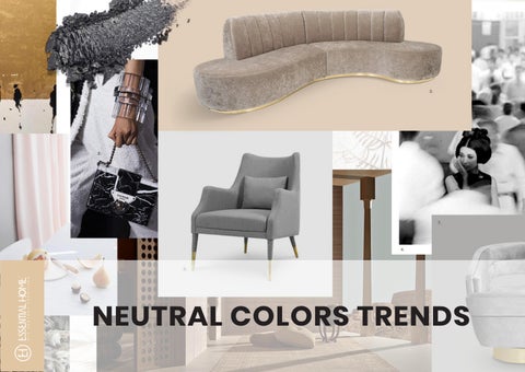
NEUTRAL COLORS TRENDS

Neutral colors in design this year will be showcasing peace, tranquility and comfort, above everything. Bold and rich colors, pastels, they go out of style, but neutrals stay – they are timeless. In 2019, we expect the glamour and luxury in simple things, a genius highlight of the softest curves and lines, whether it be fashion, architecture or interior design.


TRANQUILITY AND COMFORT
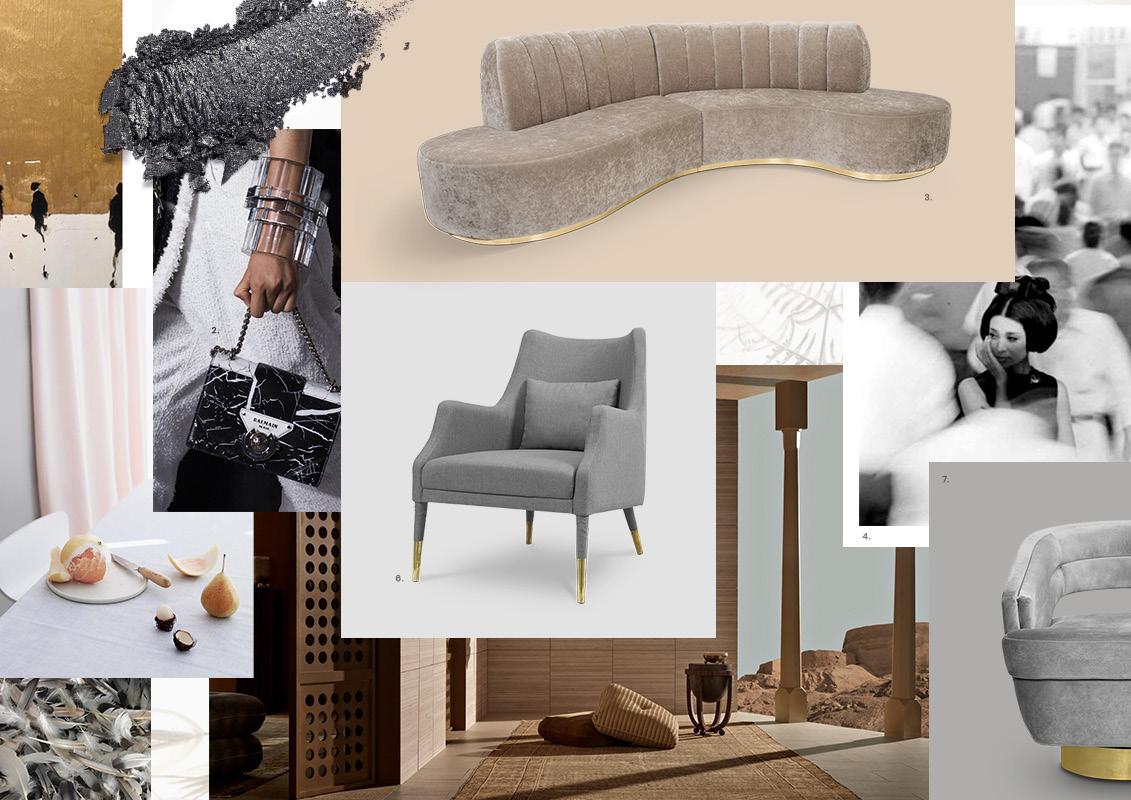
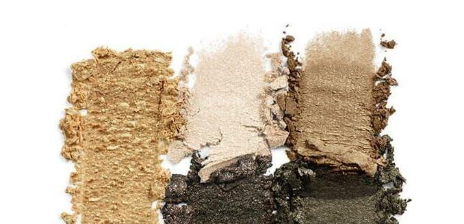
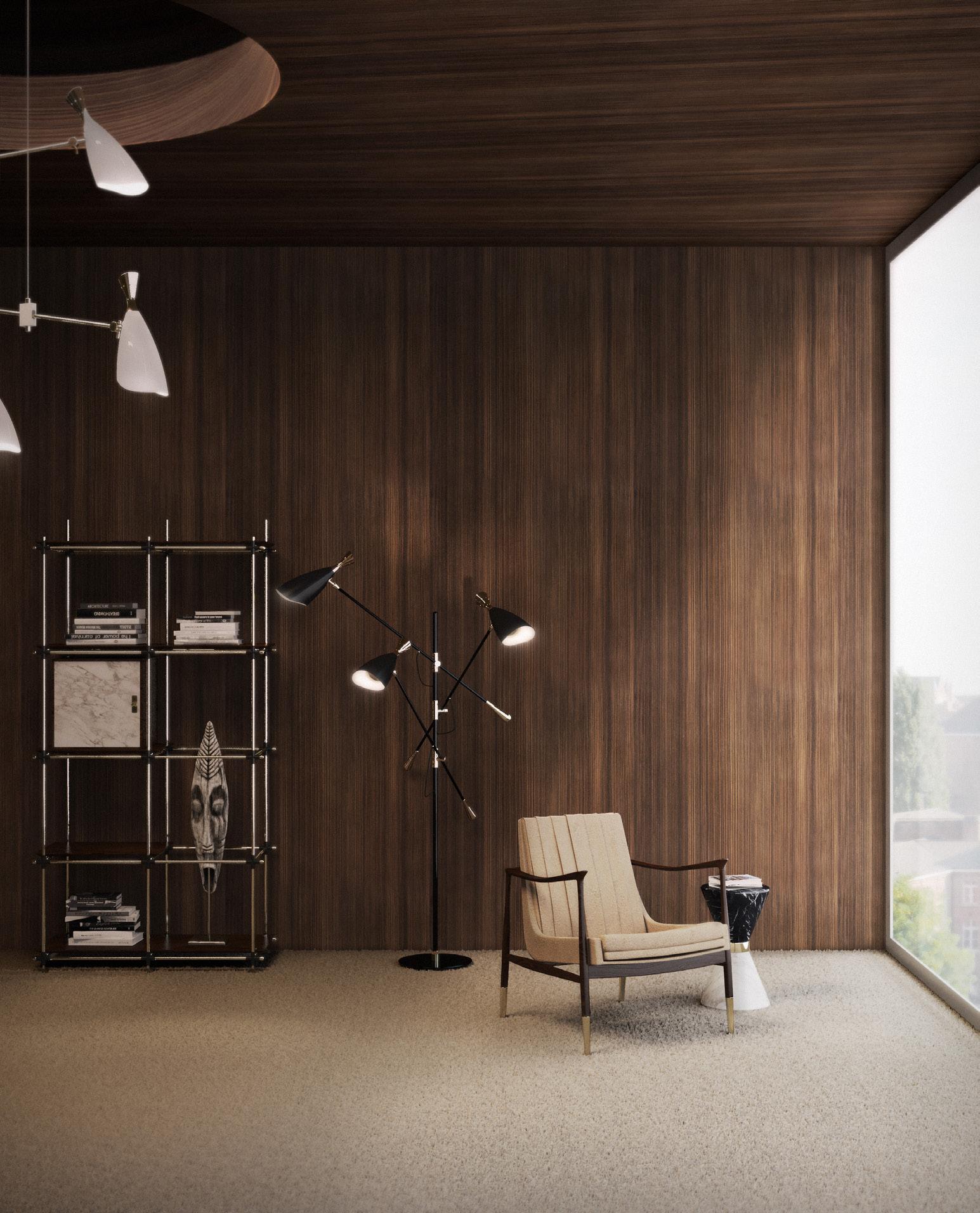
Soft grays and browns will be the center of attention in 2019. Neutral colors used to be thought of as boring, outdated, but this year brings new opinions, new trends and new ways of thinking, and with that neutral colors came into the spotlight as one of the most simple and luxurious way to make a timeless design with a personality and uniqueness of its own.


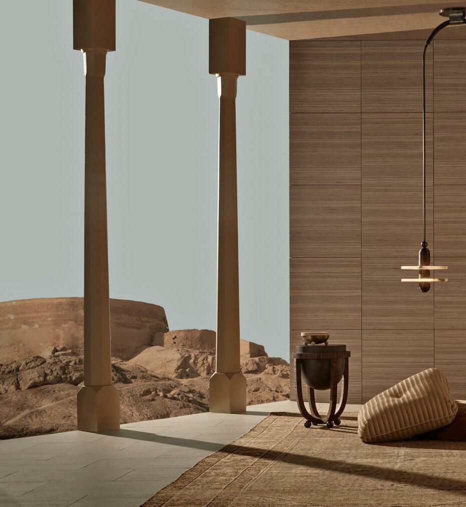
In fashion, you’ll see incredible whites and browns, grays and soft pinks, combining perfectly with golden accents. In interior design, it will be the same, white walls and soft beige armchairs with patterned pillows in abstract and modern elements – all with the most natural materials, from wood to brass, marble and velvet. Softness, organic shapes, comfort and etherealness are the keywords this year.
Black and white are part of the neutral color scheme set to be trendy this year. You’ll be able to find it everywhere, not only in actual marble in kitchen countertops but on marble patterned fashion, showcasing the duality between these two colors that will be under the scope in 2019. Feather-like, it will always appear next to the softest textiles, not only in fashion but interior design as well. Expect the dramatic effect of these stunning timeless colors.
SOFTNESS, ORGANIC SHAPES, COMFORT AND ETHEREALNESS


You’ll be seeing grey a lot this year but grey on its own may not cause as much impact. That’s where gold enters the picture with a stunning luxurious element to it that is undeniable. This year, be prepared to see brass and golden elements wherever you look.


Brown will also be one of the most beloved choices in the neutral color spectrum, a soft and wise color that has seen a lot over the years. It has remained consistent, a color that takes us back to simpler times, now with a modern touch. While it is sometimes considered dull, it also represents steadfastness, simplicity, friendliness, dependability, and health. In a year focused on wellness and comfort paired with style, this is the perfect color for design.
In interior design, it’s all about respect for history, you should bring together the iconic character and elegance of the space with practical luxury. But Paris as it’s fun and magic side, and Parisienne style is that whole idea of anti-decor, always have to look like you’ve done it yourself like a true French.
To find out more news and trends access our Press Area: midcentury

Passwordwww.essentialhome.eu/press–
ABOUT ESSENTIAL
HOME
Essential Home sees this style as a stylish sanctuary from the stresses of life.
What better way to represent them to mix our soft and clean Marco Dining chair with the robust and sturdy Bertoia marble table. The key is to Keep it simple, mixing vintage with new, and allow our memories and treasures brought home from travels to shape the space rather than sticking to any particular interior Style.