(the world’s leading authority on colour) releases fashion colour reports each season, which, although derived from fashion and interior design, also point towards what we’ll see gaining popularity in the wedding world. This spring it’s all about colour with influences coming from spring flowers and travels abroad. You can expect to see brighter colours paired with their muted counterparts.
ordom hy: Mireia C Photograp ings.com mireiawedd Dyana lanner: Wedding P y.com gscompan theweddin
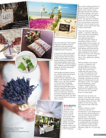
also work really well. Think organic materials for outfits and linens, traditional horse and carriage transport and beautiful rose petals scattered across the ground. If you and your fiancé really want to make your mark and create a unique occasion then the Quirky or Whimsical wedding is for you whatever floats your nuptial boat! One popular idea this year is the roaring 20s with The Great Gatsby look – feathers and silks, dropped waistlines, Art Deco, big bands and lots of glamour. If all the glitz and glamour leaves you cold and roses and romance is too soppy, then a more symbolic theme might be for you. Again, on the Costa del Sol, where better to say “I do” than barefoot on the sand with the lapping waves just inches away? Think billowing transparent fabrics and symbolic gestures such as lighting candles or a Sand Ceremony where you both pour coloured sand into a keepsake glass vase to symbolize your union. The sand can be coordinated to match your colour scheme.
COLOURS
Photography: Mireia Cordom mireiaweddings.com Flowers: Virginia at.virginiaflorista.com
Once you’ve decided on your theme it’s time to think of what colour scheme you’ll go for. After the popularity of neutral wedding palettes during the last few seasons, brighter colours are making a comeback in 2014. Pantone
There are three blues in the palette – royal blue, light blue and a paler blue and wedding colour gurus also predict navy gaining popularity – twinned with paler shades or contrasting colours such as bright yellow, pinks or greys –all of which feature in the Pantone predictions. Purple and violet both appear and these and all their corresponding hues from deep aubergine to the palest lilac are set to be a firm favourite this season – layered across décor, linen, glassware, lighting and florals. Pairing metallics with natural colours is a direction that can bring glamour to your wedding without overdoing things. Think of twinning matte gold with persimmon or silver with traditional white to create a shimmering, eyecatching ambience. For seaside weddings, aquamarine can be layered in shades and twinned with peach or pink. For organic themed weddings, muted shades of beige (Pantone predict a ‘sand’ shade) look great with the addition of one rich tone such as chocolate brown or forest green. Monochrome can look very striking – pair white chair covers with black organza bows and go for shades of grey for linens. The addition of one strong colour can make the look a little less stark. Whatever theme or colour scheme you decide on – remember it is your wedding and your decision should reflect you and your fiancé’s personalities and passions. Talk to your planner, family and friends; look at photographs (Pinterest is a great place for inspiration) and swatches of fabric before you make those all important decisions. After all – it’s your Big Day!
CONFETI 87