
Draft Version 5.0
BRAND BOOK

This book is for all of our creative teams and storytellers, our partners, agencies, employees, and anyone who works with IAAPA to bring the global attractions industry together.
The first chapter shares the strategy and heart behind our brand, and the next three chapters provide principles and guidelines for how to bring the IAAPA brand to life.
Our hope is that this brand book will give all of us the tools to create communications that share one consistent and compelling voice so we can keep our industry and the association connected and growing.
Thank you for working with IAAPA. If you have any questions, please reach out. We’d love to chat.
David Mandt
Senior Vice President, Marketing
+1 (321) 319-7610
DMandt@IAAPA.org
Suzanne Pfordresher
Vice President, Marketing
+1 (321) 319-7628
SPfordresher@IAAPA.org
Megan Keating
Director, Event Marketing
+1 (321) 319-7612
MKeating@IAAPA.org
Leigh Bingham
Director, Membership Marketing
+1 (321) 319-7673
LBingham@IAAPA.org


Serving 5,000 Member Companies In More Than 100 Countries Around The World.
IAAPA was born in 1918. Originally founded as the National Outdoor Showmen’s Association, the organization has changed names a few times, but has consistently grown to become more global and inclusive of all types of attractions.

1900
1918
The National Outdoor Showmen’s Association (NOSA) is established
1920
Becomes NAAP, The National Association of Amusement Parks
1934
Merges with The American Association of Pools & Beaches
1935
Welcomes its first European member, Blackpool Pleasure Beach
1972
Renamed The International Association of Amusement Parks and Attractions (IAAPA)
2001
IAAPA Europe opens in Brussels, Belgium
2009
IAAPA Latin America opens in Mexico City
2010
IAAPA Asia Pacific opens in Hong Kong


2014
IAAPA North America opens in Orlando
2017
Moves headquarters from Alexandria, VA to Orlando, FL

2018
2018
Celebrates 100-Year Anniversary; introduces a revised brand story


But one thing we have in common is the desire to create unforgettable experiences for our guests.
We, the attractions industry, educate, entertain, and delight guests all over the world. We are responsible for delivering countless oohs and ahhs, millions of laughs, and billions of memories every year.
We are amusement parks, zoos and aquariums, museums and science centers, family entertainment centers, and water parks. Every attraction is different and unique, but we all seek to create unforgettable experiences for our guests every day!
Connecting with others in the industry leads to inspiration and growth.
Professionals who work in the attractions industry may come from all over the planet and from very different types of organizations, but they share a desire to stay connected to what is happening in the industry and to each other. They know when they connect with other attractions professionals they will be inspired and find opportunities to grow professionally, and grow their business.
In 2017, more than 2,000 attractions industry professionals helped us understand what they needed from IAAPA.
Feel Connected
Feel Inspired
Feel Like I’m Growing

OUR BRAND ESSENCE IS…
There are three key ideas that make up our essence:
Diversity and Distinction Connection, Community, Togetherness Moving Forward, Changing, Growing

OUR PURPOSE STATEMENT IS…
We exist to connect the diverse and dynamic attractions industry, for the good of us all. Through this, we grow and improve our people, our companies, and our industry.
We are always working to help people feel more connected to the attractions family.
First, and most importantly, we are a Mobilizer, which means our personality is…
Highly relational
Celebratory, appreciative of the uniqueness of each individual
Always seeks to connect and unite people
Secondarily, we are, of course, Trusted, meaning we are…
Highly organized, energetic and willing to lead
Resourceful and determined to achieve excellence
Always helping and encouraging others to succeed

Made up of distinctly different people, organizations, levels, and professions.
A strong desire to bring people together, to ensure a sense of belonging and oneness.
Proud of and energized by working in the attractions industry.
Established and trusted, leveraging size and scale to help others.
These three behaviors are always part of everything IAAPA does.
We actively ensure that all feel part of the unified attractions community.

We proactively look for opportunities to help people meet, share stories, learn from one another, and grow together.
We pursue excellence and always move forward, aiming to provide exceptional guest experiences.
This is our Meaning Framework, a summary of the meaning behind our brand.
Constituents are extremely proud to be part of the global attractions industry. They see the industry as diverse and exciting, and when they connect with other attractions professionals they know they will be inspired and find growth opportunities.
We believe in inclusivity and unity. We believe when different people and businesses come together, there is inspiration and growth.
We exist to bring the attractions industry together for the good of us all.
The Lover-Ruler is enthusiastic about relationships and connecting with others in meaningful ways. The Lover-Ruler values and strives to create exceptional experiences and success for all. The Lover-Ruler is highly personal, energetic, and a leader that ensures excellence. The Trusted Mobilizer.
Made up of distinctly different people, organizations, levels, and professions.
UNIFIED ENTHUSIASTIC CONFIDENT
A strong desire to bring people together, to ensure a sense of belonging and oneness.
Proud of and energized by working in the attractions industry.
Established and trusted, leverages size and scale to help others.
WE CONNECT WE STRIVE
We actively ensure that ALL feel part of the unified attractions community. We proactively look for opportunities to help people meet, share stories, learn from one another, and grow together.
We pursue excellence and always move forward, aiming to provide exceptional guest experiences.

We are the creators of thrills, the deliverers of delight, the producers of unforgettable experiences. We are entertainers and educators, business people and inventors, owners, operators, and engineers.
Our industry is exciting and diverse, and when we come together and learn from each other we open up a whole new world of ideas, inspiration, and possibilities for growth.
For over 100 years, IAAPA’s mission has been to unite attractions from around the world. Today, we are a collection of more than 5,000 member companies from over 100 countries. We share our stories, celebrate our successes, and together we find new business opportunities and better ways to delight our guests.
Produce high-energy global expos to connect attractions industry professionals to opportunities around the world.
Host global, regional, and local events to help industry professionals network with each other.
Build resources and training programs to help our teams to deliver amazing guest experiences every day.
Broadcast industry news so we can all be inspired by our peers near and far.
Engage with local communities and governments worldwide to advocate for an ever-safer and stronger industry.
We are amusement parks, zoos and aquariums, museums and science centers, family entertainment centers, and water parks. We are manufacturers and suppliers that fuel the industry. We all seek to create and deliver exceptional experiences to our guests. Together we are stronger.

When unique, dynamic, and diverse elements come together there is energy, sparks of genius, a kinetic burst of inspiration. Those energized moments of inspiration are the catalyst that takes you further, allows you to move forward, to do more, dream more, and achieve more.
IAAPA connects the diverse and dynamic industry so all of us move forward with energy and excellence.
The facets in a variety of vibrant colors are in motion, coming together from multiple directions and uniting around a common focal point. The facets create a sense of motion and represent coming together.
The alternating gray facets represent trust and stability of an organization with 100 years of success and a large-scale operation.
The flare serifs at the top of each letter relate to the angularity in the icon, and provide a sense of forward motion.
The burst of inspiration is the natural outcome when IAAPA brings these diverse communities together. It represents a catalyst for imagination and possibility.
Letterforms overlap and intersect, reinforcing the notion of connection and unity.
The deep blue conveys trust, and the solid, simple typography suggests professionalism and confidence.
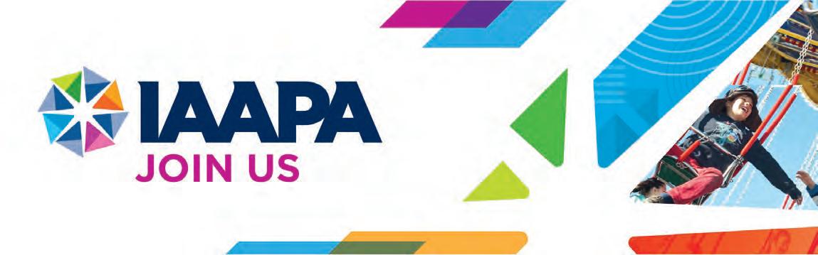
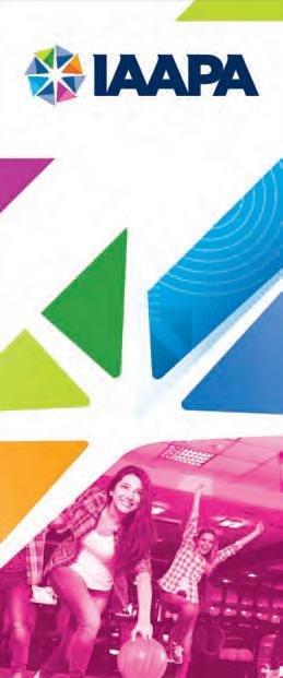
Horizontal (Preferred Logo for All Uses)
Vertical (Use only when horizontal logo cannot be used due to space.)
This page illustrates the wide array of applications for the IAAPA logo. There are vertical and horizontal interpretations of the logo. The horizontal logo is the preferred logo in all applications, and should be used as much as possible. Included as well are examples of how to place the Masterbrand logo as a positive and negative single color on a color background. The tagline is locked up with the logo and used whenever possible.
Included on this page are also examples of what NOT to do with the IAAPA masterbrand logo. The color palette on the following page includes Pantone chips for color reference, and a CMYK translation for print and target references. RGB is included for digital applications like video, digital billboards, or mobile.
When a reversed one color interpretation is needed, the masterbrand logo can be changed to all white, with the facets removed to simplify.
When a positive one color interpretation is needed, the masterbrand logo can be changed to all dark blue, with the facets removed to simplify.
The tagline should be locked up with the masterbrand, and not with a sub-brand. The tagline should be Pantone 535 to create a hierarchy between elements.
When the logo is used on a dark background color, a white keyline is added to maintain the integrity of the burst icon.
SINGLE COLOR FACETS
Do not create single color facets with a family of two colors.
SINGLE COLOR LOGO
Do not create a single color logo other than white or IAAPA dark blue, and only when needed.
WARPING THE LOGO
Do not apply effects or warps to the logo, and recognize the clear space rules.
SCALING ELEMENTS
Do not scale individual elements of the logo. The logo should be scaled as a cohesive unit.
ROTATING THE ICON
Do not rotate the icon to change the placement of colors. This helps create a consistent visual element and brand recognition.
PROPORTIONS
Do not squeeze or pinch the logo. Maintaining the same proportions helps with legibility and brand recognition over time.
ISOLATED ICON
Do not isolate the icon from tha IAAPA logotype.
The horizontal IAAPA logo is constructed using easily recognizable elements. This is the preferred logo lockup. The counter space of the A is used as a measurement guide for spacing and proportion. The counter space is used because you will always have an element to take measurements off of when the full logo is used.
The clear space in the IAAPA logo is twice the height of the counter space. This is a simple way to always know how much space to allow the logo to have. This is for clarity, and to give the correct prominence to the brand in any application.
The minimum size for the horizontal IAAPA logo is 2.5 cm wide. This is to ensure the pinwheel stays legible and intact. When the logo is locked up with the tagline, the minimum size is 3 cm. This is to ensure the legibility of the tagline. This is explained in more detail in the following pages.
The vertical IAAPA logo is constructed when a smaller or vertical layout is needed. It takes up less real estate on a page and allows for a smaller masterbrand footprint.
The clear space in the vertical IAAPA logo is twice the height of the counter space. This is a simple way to always know how much space to allow the logo to have. This is for clarity, and to give the correct prominence to the brand in any application.
The minimum size for the vertical IAAPA logo is 2 cm wide. This is to ensure that the pinwheel stays legible and intact.
The IAAPA logo and tagline is constructed to use when a more holistic message is being portrayed.
The tagline should be used when possible to help elevate IAAPA’s brand messaging.
The clear space in the IAAPA logo is twice the height of the counter space. This is a simple way to always know how much space to allow the logo to have. This is for clarity and to give the correct prominence to the brand on any application.
When the logo is locked up with the tagline, the minimum size is 3 cm. This is to ensure the legibility of the tagline.
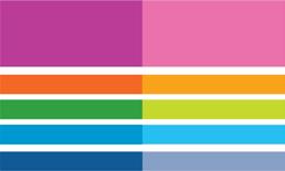
The IAAPA color system shows a diverse range of colors. This is to reflect the wide range of offerings, people, and attractions included in their offerings. Using these colors will ensure brand consistency.
PANTONE
Pantone colors are used as pure pigment targets for various offerings. These are the most pure colors used to represent the intended outcome of the range. These can be used in printing applications, but are costly and cumbersome at times to implement.
CMYK
The CMYK values are the Pantone conversions from the same Pantone source. These will be what you use most commonly for print media and applications. Keep in mind that because these are a mix and not pure pigments, there will be a slight change in color from Pantone to CMYK because of the nature of the printing process.
The secondary colors only have CMYK values and are not meant to be used as much as the system colors. These colors are used when contrast is needed, and a more subtle colorway is used — as in body copy, background patterns, background facets, or watermarks.
System Colors
GOTHAM (Hoefler & Co.)
Gotham is the main typeface used in the IAAPA system. It allows for a wide range of expression, but retains its legibility. All weights can be used, but body copy should always be Book weight.
This typeface can be purchased at: https://www.typography.com/fonts/gotham/overview/
SECONDARY FONT
If Gotham is not available, Arial can be substituted. Arial has a Regular, Bold, and Black weight that can be utilized for hierarchy. Arial should only be used in specific circumstances where Gotham may not be available. Examples of this are web default, universal font needs, and where Gotham cannot be purchased.
Arial
AaBbCcDdEeFfGgHhIiJjKkLlMm
NnOoPpQqRrSsTtUuVvWwXxYyZz
Type Weights
Light
AaBbCcDdEeFfGgHhIiJjKkLlMm
NnOoPpQqRrSsTtUuVvWwXxYyZz
Book
AaBbCcDdEeFfGgHhIiJjKkLlMm
NnOoPpQqRrSsTtUuVvWwXxYyZz
Medium
AaBbCcDdEeFfGgHhIiJjKkLlMm
NnOoPpQqRrSsTtUuVvWwXxYyZz
Bold
AaBbCcDdEeFfGgHhIiJjKkLlMm
NnOoPpQqRrSsTtUuVvWwXxYyZz
Black
AaBbCcDdEeFfGgHhIiJjKkLlMm
NnOoPpQqRrSsTtUuVvWwXxYyZz
Light Italic
AaBbCcDdEeFfGgHhIiJjKkLlMm
NnOoPpQqRrSsTtUuVvWwXxYyZz
Book Italic
AaBbCcDdEeFfGgHhIiJjKkLlMm
NnOoPpQqRrSsTtUuVvWwXxYyZz
Medium Italic
AaBbCcDdEeFfGgHhIiJjKkLlMm
NnOoPpQqRrSsTtUuVvWwXxYyZz
Bold Italic
AaBbCcDdEeFfGgHhIiJjKkLlMm
NnOoPpQqRrSsTtUuVvWwXxYyZz
Black Italic
AaBbCcDdEeFfGgHhIiJjKkLlMm
NnOoPpQqRrSsTtUuVvWwXxYyZz
abcde a b c d e 0123#$!
The photography for the IAAPA system varies from sub-brand to sub-brand. These are just some general photography principles to be carried through all photographic styles and needs. The photography should be authentic and not posed. It should show people interacting in a natural way and not stiff or rigid. The photography should not be overly stylized, high contrast, or unrelatable. A straightforward photographic style helps constituents relate to the content and brand better. Depending on the subject matter, at least two people should be shown together to reinforce the brand narrative of diversity, and people coming together. Photos can never show unsafe conditions or rider behaviors on attractions. This includes never showing guests riding rides with their hands in the air. They should be holding on, keeping hands and arms in the ride vehicle at all times.
A duotone treatment can be utilized for visual interest, but does not always have to be applied. The two colors should be taken from the color palette and in the same family. For example Pantone 7460 and Pantone 298, or Pantone 2395 and Pantone 224. These can be adjusted for contrast purposes, and you will see examples of this later in the book.


Authentic photography of guests in attractions helps connect what IAAPA does every day to the people who visit attractions. Sunlit photography, a clear focal point, and candid content help reinforce the brand message of connecting people with one another.

LOCATION
Location photography plays an important role for all the sub-brands. It helps communicate the global presence that IAAPA has, and also helps show people where events are held. Picking a location photo that is easily recognized is extremely important to give context to the viewer. This includes cities and famous landmarks.

BUSINESS
Business photography should follow the same guidelines as guests, but with different content. A natural, candid style of photography should help reinforce IAAPA’s message of connecting people together. The content should show IAAPA as an educator based on the subject matter covered, whether that be a conference, a class, or safety seminar. The people featured should look like IAAPA members in IAAPA member environments.

ATTRACTIONS
Attraction or facilities photography should be clean and pristine without signs of rust or garbage.
Photography should never be forced, stiff, or overly posed. Focus should be on candid moments happening naturally and in proper context. Posed photos should not be used.
LOCATION
An easily recognizable photo should be used for locations. Generic city pictures that have no reference should not be used. This helps reinforce the location and IAAPA’s global reach.
BUSINESS
Stiff, overly posed, and cliché photos should not be used for business. They should follow the same principles as guest photography, but the content should show IAAPA as a knowledge leader on the subject matter.

ATTRACTIONS
Old or rundown facilities should not be showcased. These appear to be out of order, or broken down and do not reflect the quality and professional nature of our industry.

The goal of creating sub-brands for IAAPA is to help constituents understand the wide range of products and services provided by IAAPA.
PILLAR PROMISE PERSONALITY
We connect and unite the diverse and dynamic attractions industry so that we are all inspired, growing and moving forward.
experience the best of the global attractions industry
enthusiastic multifaceted grand-scale confidence
connection and inspiration from peers enthusiastic multifaceted relational
FUNCTIONAL BENEFIT EMOTIONAL BENEFIT
the best and latest in the industry in one place connected, excited, inspired, opportunity
connect with others in the industry connected, inspired, opportunity
opportunities to move your career/business forward confident enthusiastic knowledgeable certifications and training specific to the industry achievement, professional growth, connected
stories, news, and ideas to keep you inspired
enthusiastic multifaceted fresh
the latest stories news innovations in the industry inspired in–the–know
representation and support of the industry confident unified professional knowledgeable industry representation critical support prepared supported
The visual language design principles reflect the IAAPA brand strategy, and create an ownable family look for all IAAPA materials. This toolkit of design elements is intended to provide options when building new creative materials for IAAPA. Each sub-brand has its own toolkit elements intended to differentiate the look of each subbrand, while still working together to create the overall IAAPA brand.
The visual language of the IAAPA masterbrand and sub-brand pillars is all derived from the treatment of the masterbrand icon. The facets are used across all pillars, with an individual character that helps to express each sub-brand’s meaning. The common facet shape manifests as a burst, trapezoids, two overlapping facets, progressive facets, directional facets, and foundational facets. This helps create a flexible system with a cohesive, driving differentiator.
The color theory in the IAAPA brand is a progressive restriction of color based on the tone of the pillar. The masterbrand is the core element and introduces us to the full IAAPA spectrum. As we progress toward the more serious Public Affairs pillar, that color begins to be restricted to convey the tone of the pillar. Each pillar is represented with a primary color, with secondary colors as needed.
Pattern is another supporting element that reinforces the tone of each pillar and culminates in the creation of a master pattern with all of the sub-brand patterns.
Each of these will be discussed in more detail in the pillar breakdowns later in the guidelines.


Below are design examples that leverage the visual language toolkit for the masterbrand and each sub-brand.


SHAPE LANGUAGE
The burst becomes a primary focal point as facets come together from multiple directions to deliver a sense of unity.
GRAPHIC LANGUAGE
Color, pattern, and photography can be inlaid into the burst to help convey the meaning of diverse people coming together to create a spark.
PATTERN
Ability to use any and/or all of the patterns delivers a sense of inclusiveness and diversity.
COLOR USAGE
Dark Blue primary color with full spectrum of secondary colors delivers a sense of inclusiveness and diversity.
PHOTOGRAPHY
Photography for the masterbrand can encompass any subject matter, location, or people, since it represents all the facets of the IAAPA brand. This is unique to this pillar and helps establish it as the master look and feel for the brand.


The entire IAAPA color palette can be used on masterbrand. The primary color is the Dark Blue.

Primary color plus ANY of the Secondary colors


The negative space created by the facets in the logo are referred to as the “burst.” This graphic element can be used to create different compositions by moving the burst shape around the page, and creating unique crops. The burst should always bleed off the page, and never show the entirety of the burst. The burst can be kept solid white to create a more dramatic cut into the photo, or be tinted back at the users discretion to enhance legibility of type. You can use the negative shapes to hold photography or solid color from the IAAPA color palette.
Examples


The design system has been developed to provide a wide range of flexibility.
Masterbrand Banner
Maintain enough of the burst to be recognizable
Can be overlapped and multiplied
PATTERN
The patterns can be applied to the backgound or masked within the facets
MASTERBRAND
Provide clear space around the logo
The facets that create the burst can be extended and cropped to create dynamic layouts
COLOR USAGE
Ability to use the full range of colors
PHOTOGRAPHY
Images can be applied to the backgound or masked within individual shapes or facets


Dynamic angles expanding off the page deliver a sense of enthusiasm and grand scale.
The trapezoids in the Expo pillar can overlap and multiply and create unique layouts for each Expo’s needs. The overlapping trapezoids reinforce the multifaceted aspect of the IAAPA brand.
Ability to use any and/or all of the patterns delivers a sense of expressiveness and reinforces the comprehensive variety of the experiences offered in the Expos.
Magenta primary colors with wide spectrum of contrasting secondary colors in varying proportions deliver kinetic vibrancy and reinforce the multifaceted nature of the events.
Photography for the Expos can be primarily locationfocused with landmarks, or easily recognizable elements from where the Expo is taking place. You can use illustration, which is something unique to this sub-brand, to portray something unique to the individual Expo. The illustration can be location-focused or attraction-focused. Typically a heavy reliance on location is used in this pillar, but various other aspects of the show can be the visual focus of a show’s graphic identity.


DESCRIPTORS
The Expos utilize a regional descriptor attached to the sub-brand.
The design system has been developed to provide a wide range of flexibility.
Expo Banner
IMAGERY
Illustration or photgraphy can be used as a primary visual element
Can be overlapped and multiplied. Some additional dynamism is created by expanding some off the page.

SUB-BRAND
Provide clear space around the sub-brand
Maintain magenta as primary color and supplement with contrasting secondary colors
TYPOGRAPHY
Shifting scale of typography enhances dynamic hierarchies
These are examples intended to show how the toolkit of elements for Expo can be used to create a range of solutions. These are not intended to be used as templates.


Overlapping shapes deliver a sense of physical connections with a single burst shown at one of the connecting points to illustrate the inspiration that occurs when industry professionals connect through IAAPA.
BURST
The burst inspired by the IAAPA logo is used as a symbol of the spark that happens when people come together. It should be placed at a crossing point between facets.
PATTERN
A weave symbol as a pattern emphasizes the bonds made through physical connections.
Orange primary colors with limited secondary color usage deliver a more personal, close-knit tonality. Primary color is used with one of the secondary colors.
Photography is organized into three buckets: Lifestyle, Location, and Attractions. Location and Lifestyle photography for this pillar should relate to the need of the design. In our example on the following page, the event is in Austin, Texas, for an FEC Summit. Photos should reinforce networking connections with multiple people meeting and engaging in conversation, as if they are sharing ideas, and the location should show a popular landmark.


Primarily oranges with limited color usage delivers a more personal, close-knit tonality
Primary color plus ONE of the Secondary colors


The design system has been developed to provide a wide range of flexibility.
Connections Banner
SHAPE LANGUAGE
Two dynamic shapes of contrasting colors overlap
BURST
Burst can be applied at one of the intersections of overlapping shapes
IMAGERY
Photography can be treated as full color or as a duotone

SUB-BRAND
Provide clear space around the sub-brand
PATTERN
Subtle tint of the pattern can be used in the background
COLOR USAGE
Use the primary color orange with one of the secondary colors
IMAGERY
Photography can be treated as full color or as a duotone
These are examples intended to show how the toolkit of elements for Connections can be used to create a range of solutions. These are not intended to be used as templates.


Facets moving upward deliver a sense of improvement, expansion, and growth.
The graphic language of the education pillar can be a deconstructed pattern in the background, or full-bleed pattern contained in a half of a facet. The facets can use any of the colors from the Education color system.
Chevron pattern evokes a sense of growth.
Green primary colors with blue secondary colors.
Minimal usage of magenta as a spice color can be used to emphasize key information or the call to action.
The photography of the Education pillar should focus on the subject matter of the material and show people (who look like IAAPA members) learning, in small groups or large classroom settings. The people featured should look like teachers and students. If it is about a conference on safety, an image of a crowd can be used, the photo can focus on the location of the conference, or multiple photos can feature both. The subject matter should align with the photography to convey the content of the message.


Primarily greens convey a sense of growth and upward movement.
Primary color plus two secondary colors


The design system has been developed to provide a wide range of flexibility.
Education Banner
TYPOGRAPHY
Shifting scale of typography enhances dynamic hierarchies
Facets increasing in scale help emphasize expanding knowledge
IMAGERY
Photography can be treated as full–color or as duotone

SUB-BRAND
Provide clear space around the sub-brand
PATTERN
Subtle tint of the pattern can be used in background
COLOR USAGE
Maintain primary green color with minimal use of secondary colors
These are examples intended to show how the toolkit of elements for Education can be used to create a range of solutions. These are not intended to be used as templates.


Facets moving in various directions deliver a sense of immediacy of communications being sent outward.
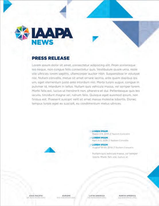
The News pillar focuses on usage of the facets to convey a sense of multi-directional information. The IAAPA blue is combined with the more serious greys in the secondary color palette. The pattern can be contained within a half, or the entire facet can be included to bring some life to the system.
Circles radiating as a pattern evoke the outward waves of communication.
Blue primary colors with gray secondary colors. Orange can be used as focal or call–to–action color. Limited color usage delivers a neutral tone for delivering all types of communication.
The News pillar’s photography is strictly driven by the subject matter being conveyed in the news. There are multiple instances where photography may not be appropriate. An editorial style should be used for the News pillar to help reinforce the informative and curated release of information to members and constituents.


The design system has been developed to provide a wide range of flexibility.
Facets moving outward and in a variety of sizes
The circle pattern can be applied to the backgound or masked within the facets


Facets create a foundation pattern that delivers a sense of confident direction and unified professional integrity.
The foundational pattern and angle help convey a sense of strength and confidence that is unique to this sub-brand. The pattern can be used sparingly inside the facets to give a little interest, but should always be used very minimally to keep a simple, straightforward layout.
Lines provide additional sense of unified direction and foundational strength.
Greys are primary colors with dark blue as secondary color. Green used in limited quantity. More reserved color usage delivers a sense of seriousness and strength.
The Public Affairs pillar should always convey a sense of confidence through people, location, and subject matter. Everything should relate back to feeling confident in what is being presented. Photography should be used in minimal amounts and only where neccessary to reinforce the message.


Primarily Dark Blues with limited color usage delivers a more confident, and focused message
Primary colors plus Green accent color


The design system has been developed to provide a wide range of flexibility.
Public Affairs Banner
SHAPE LANGUAGE
Facets used with subtle tints
LOCATION PHOTOGRAPHY
Showcase a unique landmark to help enhance the location

SUB-BRAND
Provide clear space around the sub-brand
PATTERN
Subtle tint of the pattern can be masked within the facet shapes
COLOR USAGE
Maintain primary gray color with minimal use of secondary colors
IMAGERY
Photography can be treated as full-color or as a duotone


IAAPA Education
Event that lasts more than one day and features speakers, tours, and networking.
Event that is one day or less in length, and features speakers.
Event that is one day or less in length with facility tour(s).
(Note: When the content is presented in a language other than English, we would change “EDUTour” to just “Tour”.)
IAAPA Connections
Event that lasts more than one day and features speakers, tours, and networking.
Event that is 3-4 hours in length with networking and speaker(s) or facility tours.
Information sharing session on a specific topic, typically by invitation only.
David Mandt
Senior Vice President, Marketing
+1 (321) 319-7610
DMandt@IAAPA.org
Suzanne Pfordresher
Vice President, Marketing
+1 (321) 319-7628
SPfordresher@IAAPA.org
Megan Keating
Director, Event Marketing
+1 (321) 319-7612
MKeating@IAAPA.org
Leigh Bingham Director, Membership Marketing
+1 (321) 319-7673
LBingham@IAAPA.org