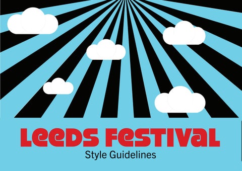
Mission Statement
A music, arts and culture festival that accomodates for all and inspires visitors to have the best experience whilst feeling safe, comfortable and joyous.
Logos
Primary Logo
The primary logo is the main logo to be used. When scaling a fixed ratio must be used (ratio 1.00:0.46 W:H).
Submark Logo
This logo is the ideal for social media. When scaling a fixed ratio must be used (ratio 1:1 W:H).
Secondary Logo
The secondary logo is the to be used when the primary logo does not suit the space. When scaling a fixed ratio must be used (ratio 1.00:0.15 W:H).
Leeds Festival Leeds Festival
LF LF LF LF LF LF
Colour Palette
RGB: 0, 0, 0
C:75 M:68 Y:67 K:90
HEX: #000000
RGB: 255, 255, 255
C:0 M:0 Y:0 K:0
HEX: #FFFFFF
RGB: 115, 206, 229
C:50 M:0 Y:8 K:0
HEX: #73CEE5
RGB: 217, 32, 39
C:9 M:100 Y:100 K:1
HEX: #D92027
RGB: 226, 111, 133
C:7 M:70 Y:31 K:0
HEX: #E26F85
RGB: 240, 73, 45
C:0 M:87 Y:92 K:0
HEX: #F0492D
RGB: 8, 107, 181
C:90 M:57 Y:0 K:0
HEX: #086BB5
Beckhill Black Wykebeck White Bramley Blue Roundhay Red Potterton Pink Otley Orange Burley BlueTypography
Trade Gothic Next is the typeface to be used for the majority of text on both the website and the companion app, e.g. body text, important information and navigation buttons. When placing onto a background colour, use contrasting colours to ensure readbility.
Trade Gothic Next
Aa Bb Cc Dd Ee Ff Gg Hh Ii Jj Kk Ll Mm Nn Oo Pp Qq Rr Ss Tt Uu Vv Ww Xx Yy Zz 0123456789 LEEDS FESTIVAL LEEDS LEEDS LEEDS LEEDS LEEDS Headline 1 Headline 2 Headline 3 Headline 4 Headline 5 Body Text Medium Body Text Medium 2 Body Text Small Buttons Light Light Italic Regular Italic Compressed Compressed Bold Compressed Heavy Bold Bold Italic Heav y Heavy Italic 80 Heavy Compressed 72 Heavy Compressed 60 Bold Compressed 48 Compressed 36 Compressed 18 Regular 16 Regular 12 Regular 18 Bold
Typography StrenuousBlRegular
StrenuousBL-Regular is the typeface to use when you have something big to say, e.g. headings, social media and buttons. When placing onto a background colour, use contrasting colours to ensure readbility.
Aa Bb Cc Dd Ee Ff Gg
Hh Ii Jj Kk Ll Mm Nn Oo Pp Qq Rr Ss Tt Uu
Vv Ww Xx Yy Zz
0123456789 LEEDS FESTIVAL
LEEDS LEEDS LEEDS Headline 1 Headline 2 Headline 3 Headline 4 Headline 5 But tons Light Light Italic Regular Italic Bold Bold Italic 3D Black Black Italic Heavy Heavy Italic 72 Black 60 Black 52 Light 36 3D 24 Regular 18 Black
LEEDS LEEDS
Illustrations
The illustrated clouds are used within the logo and can be used to display the brand identity throughout all things Leeds Festival.
Call to Actions
Call to actions should always have rounded corners and a contrasting dropshadow while hovering. Once a call to action has been clicked on, the colour must be changed so the user knows the option that has been selected. Button labels are to be placed centrally on all buttons.
Buy Tickets Buy Tickets Weekend Weekend Buy Tickets Buy Tickets FAQ FAQ
Companion App Buttons 300 px 110 px 122 px 372 px 71 px 85 px SIGN IN 300 px SIGN IN DON’T HAVE A TICKET?
Website Buttons
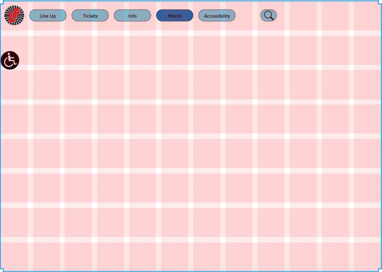
Layout Structures
Website 12 x 8 Grid
Companion App 2 x 4 Grid
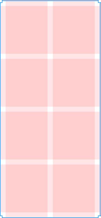 Gutter 20 px
Gutter and margin 20 px
Gutter 20 px
Gutter and margin 20 px
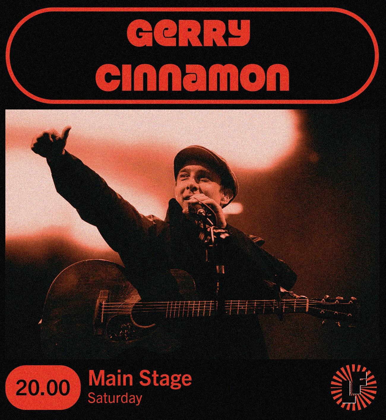
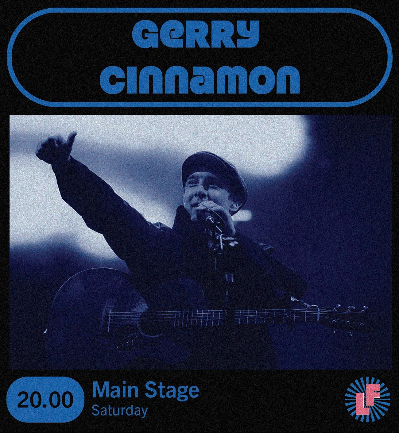
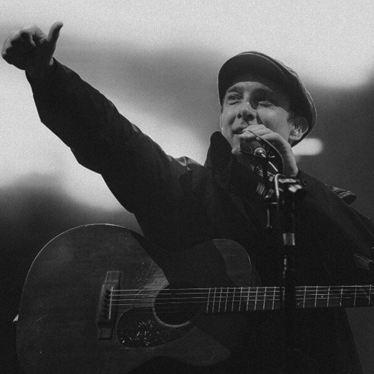
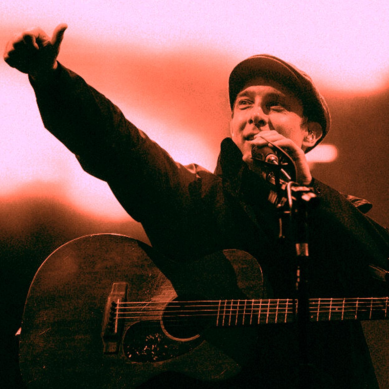
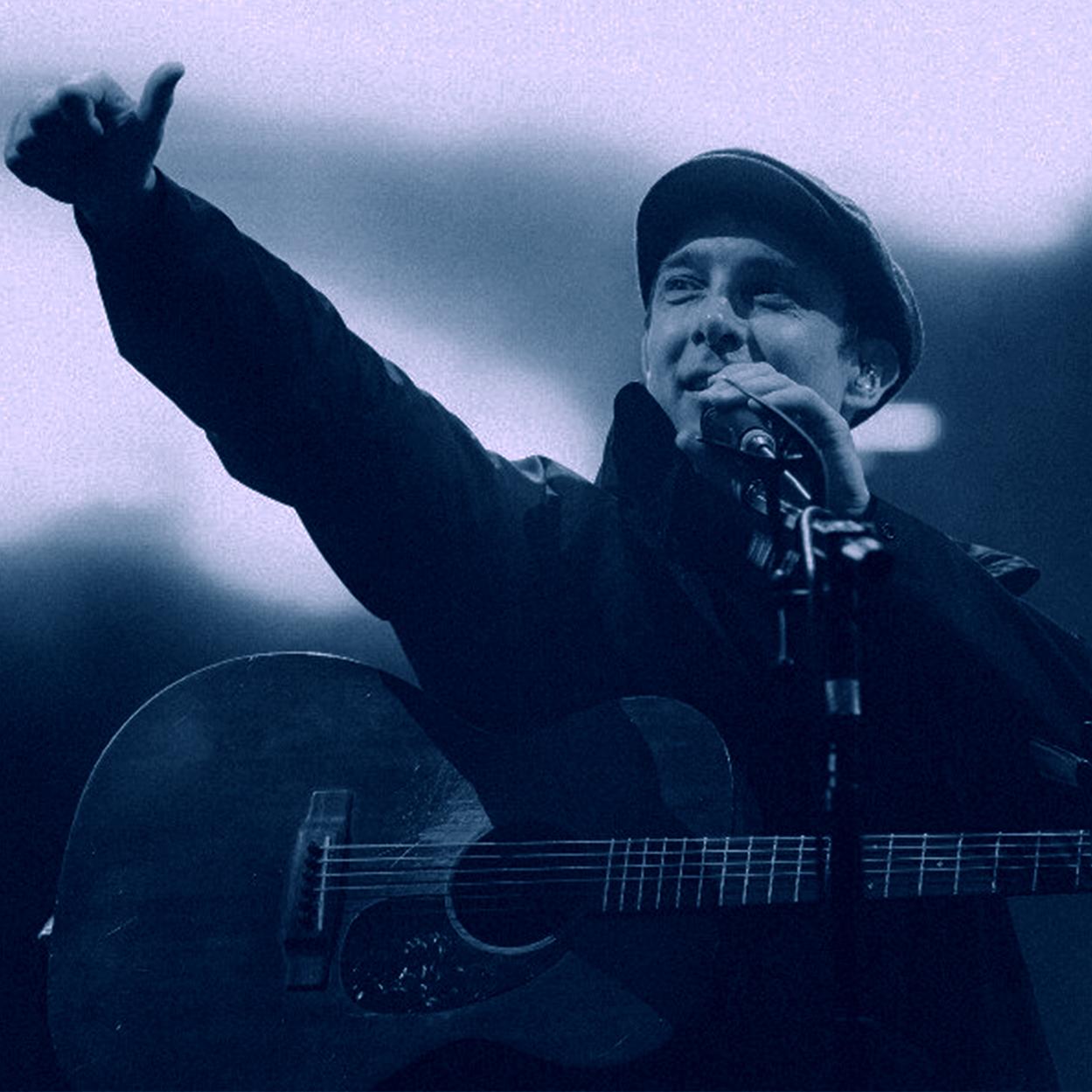
Artist Imagery
Artist imagery on the website and app should be either black and white, have an orange tone or have a blue tone. This will ensure that all artist imagery is in keeping with Leeds Festival’s brand identity.
Social Media
Social media posts about artists should follow the below template and include information on times, dates and stages. They should also include the submark logo in the relevant colourway.