Developers
Let's Try
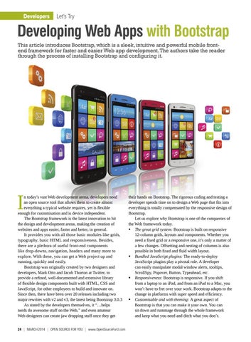
Developing Web Apps with Bootstrap This article introduces Bootstrap, which is a sleek, intuitive and powerful mobile frontend framework for faster and easier Web app development. The authors take the reader through the process of installing Bootstrap and configuring it.
I
n today’s vast Web development arena, developers need an open source tool that allows them to create almost everything a typical website requires, yet is flexible enough for customisation and is device independent. The Bootstrap framework is the latest innovation to hit the design and development arena, making the creation of websites and apps easier, faster and better, in general. It provides you with all those basic modules like grids, typography, basic HTML and responsiveness. Besides, there are a plethora of useful front-end components like drop-downs, navigation, headers and many more to explore. With these, you can get a Web project up and running, quickly and easily. Bootstrap was originally created by two designers and developers, Mark Otto and Jacob Thorton at Twitter, to provide a refined, well-documented and extensive library of flexible design components built with HTML, CSS and JavaScript, for other employees to build and innovate on. Since then, there have been over 20 releases including two major rewrites with v2 and v3, the latest being Bootstrap 3.0.3 As stated by the developers themselves, it “…helps nerds do awesome stuff on the Web,” and even amateur Web designers can create jaw dropping stuff once they get
24 | March 2014 | OPEN SOURCE For You | www.OpenSourceForU.com
their hands on Bootstrap. The rigorous coding and testing a developer spends time on to design a Web page that fits into everything is totally compensated by the responsive design of Bootstrap. Let us explore why Bootstrap is one of the conquerors of the Web framework today. The great grid system: Bootstrap is built on responsive 12-column grids, layouts and components. Whether you need a fixed grid or a responsive one, it’s only a matter of a few changes. Offsetting and nesting of columns is also possible in both fixed and fluid width layout. Bundled JavaScript plugins: The ready-to-deploy JavaScript plugins play a pivotal role. A developer can easily manipulate modal window alerts, tooltips, ScrollSpy, Popover, Button, Typeahead, etc. Responsiveness: Bootstrap is responsive. If you shift from a laptop to an iPad, and from an iPad to a Mac, you won’t have to fret over your work. Bootstrap adapts to the change in platforms with super speed and efficiency. Customisable and with theming: A great aspect of Bootstrap is that you can make it your own. You can sit down and rummage through the whole framework and keep what you need and ditch what you don’t.