
15 minute read
Developing Web Apps with Bootstrap

by Hiba Dweib
Developers Let's Try
Developing Web Apps with Bootstrap
Advertisement
This article introduces Bootstrap, which is a sleek, intuitive and powerful mobile frontend framework for faster and easier Web app development. The authors take the reader through the process of installing Bootstrap and configuring it.
In today’s vast Web development arena, developers need an open source tool that allows them to create almost everything a typical website requires, yet is flexible enough for customisation and is device independent.
The Bootstrap framework is the latest innovation to hit the design and development arena, making the creation of websites and apps easier, faster and better, in general.
It provides you with all those basic modules like grids, typography, basic HTML and responsiveness. Besides, there are a plethora of useful front-end components like drop-downs, navigation, headers and many more to explore. With these, you can get a Web project up and running, quickly and easily.
Bootstrap was originally created by two designers and developers, Mark Otto and Jacob Thorton at Twitter, to provide a refined, well-documented and extensive library of flexible design components built with HTML, CSS and JavaScript, for other employees to build and innovate on. Since then, there have been over 20 releases including two major rewrites with v2 and v3, the latest being Bootstrap 3.0.3
As stated by the developers themselves, it “…helps nerds do awesome stuff on the Web,” and even amateur Web designers can create jaw dropping stuff once they get their hands on Bootstrap. The rigorous coding and testing a developer spends time on to design a Web page that fits into everything is totally compensated by the responsive design of Bootstrap.
Let us explore why Bootstrap is one of the conquerors of the Web framework today. The great grid system: Bootstrap is built on responsive 12-column grids, layouts and components. Whether you need a fixed grid or a responsive one, it’s only a matter of a few changes. Offsetting and nesting of columns is also possible in both fixed and fluid width layout. Bundled JavaScript plugins: The ready-to-deploy
JavaScript plugins play a pivotal role. A developer can easily manipulate modal window alerts, tooltips,
ScrollSpy, Popover, Button, Typeahead, etc. Responsiveness: Bootstrap is responsive. If you shift from a laptop to an iPad, and from an iPad to a Mac, you won’t have to fret over your work. Bootstrap adapts to the change in platforms with super speed and efficiency. Customisable and with theming: A great aspect of
Bootstrap is that you can make it your own. You can sit down and rummage through the whole framework and keep what you need and ditch what you don’t.
Wrapbootstrap is a popular market place, where developers can portray their own themes and templates designed using the Twitter Bootstrap framework. Extensive list of components: Whether you need drop down menus, pagination or alert boxes, Bootstrap has got everything covered. The styling of every single element follows a consistent theme.
Some of the pre-styled components are: • Drop-downs • Button groups • Navigation bar • Breadcrumbs • Labels and badges • Alerts • Progress bar • And many others Good documentation: The case with most newer platforms is that they don’t have proper documentation, but Bootstrap provides great documentation with examples and demos that only make it easier for even someone new.
Getting started
Bootstrap has a few easy ways to quickly get started, each one appealing to a different skill level and use case. • Download compiled: The fastest way to get Bootstrap is to download the precompiled and ‘minified’ versions of its CSS, JavaScript and fonts. No documentation or original source code files are included.
Once downloaded, unzip the compressed folder to see the file structure of (the compiled) Bootstrap as given below:
bootstrap/ ├── css/ │ ├── bootstrap.css │ ├── bootstrap.min.css │ ├── bootstrap-theme.css │ └── bootstrap-theme.min.css ├── js/ │ ├── bootstrap.js │ └── bootstrap.min.js └── fonts/ ├── glyphicons-halflings-regular.eot ├── glyphicons-halflings-regular.svg ├── glyphicons-halflings-regular.ttf └── glyphicons-halflings-regular.woff
Table 1: Working of the Grid System • Downloaded source code: The Bootstrap source code download includes the precompiled CSS, JavaScript, and font assets, along with source LESS, JavaScript and documentation. It includes the following and more:
bootstrap/ ├── less/ ├── js/ ├── fonts/ ├── dist/ │ ├── css/ │ ├── js/ │ └── fonts/ ├── docs-assets/ ├── examples/ └── *.html
• Basic template: To make a bootstrapped template, start with the basic HTML template that includes everything we mentioned in file structure. Here is an example:
<!DOCTYPE html> <html> <head> <title>Bootstrap 101 Template</title> <meta name=”viewport” content=”width=device-width, initialscale=1.0”> <script src=”js/bootstrap.min.js”></script> <link href=”css/bootstrap.min.css” rel=”stylesheet”> </head> <body> <h1>Hello, world!</h1> </body> </html>
CSS and typography
Bootstrap has been primarily developed for mobiles, so instead of adding optional mobile styles, they are ‘baked’ directly into the core. By using the view-port meta tag in the head section, rendering and zooming can be achieved on any device.
Bootstrap extends this responsiveness to even the images, just by adding a class:
<img src=”...” class=”img-responsive” alt=”Responsive image”>
Phones(<768px) Tablets(>768px) Desktops(>992px) Large desktops(>1200px)
Grid behaviour Horizontal Max container width None(auto) 750px 970px 1170px Class prefix .col-xs- .col-sm- .col-md- .col-lgNo of columns 12 12 12 12 Max column width Auto 60px 78px 95px
.col-md-1 .col-md-1 .col-md-1 .col-md-1 .col-md-1 .col-md-1 .col-md-1 .col-md-1 .col-md-1 .col-md-1 .col-md-1 .col-md-1
.col-md-8 .col-md-4
.col-md-4
.col-md-6 .col-md-4
.col-md-6 .col-md-4
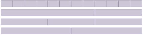
Figure 1: Grid System Layout
Container: This is a place where content can be stored in
Bootstrap!
Container here is a Bootstrap class, which sets the page width at various media query breakpoints:
<div class=’container’>Page Content...</div>
The basic features of the grid system are: Responsive Mobile-first fluid grid system
It appropriately scales the page up to 12 columns based on the device or view-port size. This system uses predefined classes for easy page layout options, through a series of rows and columns that house the content, as shown in Table 1.
Based on the device used, the corresponding classes are to be included. This fluid grid comes with the feature of both nesting and offsetting.
<div class=’row’> //Divs inside a ‘row’ sum up to 12 <div class=’col-md-6’>Div Content</div> <div class=’col-md-6’> //Nesting of divs internally <div class=’col-md-6’>Nested div 1</div> <div class=’col-md-6’>Nested div 2</div> </div> </div> <div class=’col-md-6 col-md-offset-4’>Div with offset of 4 columns</div> //Offsetting divs
Typography: All basic tags like ‘h1’, ‘h2’ (headings), ‘p’,
‘small’ and ‘strong’ are supported here. List elements like
‘ul’, ‘li’ and ‘ol’ are also present.
Additional functionality that comes with Bootstrap is the alignment of the elements.
<p class=’text-left’>Para Content</p> //Left aligned text <p class=’text-right’>Para Content</p> //Right aligned text
Table: Bootstrap’s table classes make a simple HTML table more attractive: • table-striped: gives alternate striped colours to the rows. • table-bordered: borders for the table. • table-hover: highlights the row which is hovered. Forms: Just as with the tables, Bootstrap plays the role of making the form more user friendly. Forms can be displayed in various formats by using the following classes: • form-inline: left-aligned and inline block controls • form-horizontal: the form elements behave as grid rows • checkbox-inline: cluster of check-boxes aligned side by side
Form states like ‘input-focused’ or ‘disabled’ form fields are also included.
Form validations like error or success can also be applied by using classes like ‘has-error’, ‘has-success’, etc.
Images: It displays the same image in different shapes. This is what Bootstrap classes can deliver: • img-rounded: image with rounded corners • img-circle: circular image • img-thumbnail: image in the form of thumbnail Helper classes: Functionality for generic icons like close and drop-down is obtained by using these helper classes alongside the elements. Responsive utilities: These utility classes help to toggle content across view-port breakpoints. • visible-xs: Visible for only small devices and hidden for others • visible-md: Visible only for medium-sized devices • hidden-xs: Hidden only on small devices and visible on the rest. Print classes: Similar to the classes discussed above, print classes can be used for toggling specific content for printing.
Extensive list of components
Bootstrap provides over a dozen reusable components that can pump life into a website. Web developers have to simply find out the right piece of code and fit it into the structure they are working on. In addition to this, a lot of the styling and design aspects are already taken care of.
Some of the components pre-styled are: Drop-downs: Toggleable, contextual menu for displaying lists of links. Here is an example:
<div class=”dropdown”> <button class=”btn dropdown-toggle sr-only” datatoggle=”dropdown”> Dropdown<span class=”caret”></span></button> <ul class=”dropdown-menu” role=”menu”> <li><a href=”#”>Action</a></li> </ul> </div>
• Button groups: Groups a series of buttons together on a single line with the button group. For example, you can wrap a series of buttons within a div using a ‘btn' in ‘btn-group'. See Figure 2. Nav: All nav components here, like tabs and pills, have shared
markup, starting with the base nav class. See Figure 4. • Tabs: Add a nav-tabs class to an unordered list and the list items in it act as tabs. See Figure 3. • Pills: Similar to tabs but with a class nav-pills, and the list items act as pills. Navbars: They are responsive meta components that serve as navigation headers for your application or site. They begin collapsed (and are toggleable) in mobile views and become horizontal as the available view-port width increases.
<nav class=”navbar navbar-default” role=”navigation”> <div class=”navbar-header”> <button type=”button” class=”navbar-toggle” datatoggle=”collapse” datatarget=”#bs-example-navbar-collapse-1”></button> <a class=”navbar-brand” href=”#”>Brand</a> <!-- Collect the nav links, forms, and other content for toggling --> </div> </nav>
Breadcrumbs: Indicate the current page’s location within a navigational hierarchy. By adding a
‘breadcrumb' class to an ordered list, the list items will act as a breadcrumb. Pagination: Provides pagination links for your site or app with the multi-page pagination component. See Figure 5.
<ul class=”pagination”> <li><a href=”#”>«</a></li> <li><a href=”#”>1</a></li> <li><a href=”#”>2</a></li> <li><a href=”#”>»</a></li> </ul>
Labels and Badges: Easily highlight new or unread items like in the case of mails. See Figures 6 and 7.
<span class=”label label-default”>Default</span> <span class=”label label-primary”>Primary</span> <span class=”label label-success”>Success</span> Or <a href=”#”>Inbox <span class=”badge”>42</span></a>
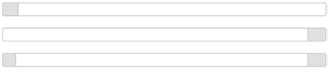
Progress bars: Provide up-to-date feedback on the progress of a workflow or action. These are generally ‘div’ elements with ‘progress' and ‘progress-bar' classes. Input the progress value as the width attribute and see the bar doing its work. See figure 8. Well: To be used on an element to give it an inset effect:
<div class=”well”>...</div>
Media object: Abstract object styles for building various
EXAMPLE
Left Middle Right EXAMPLE
Home Profile Messages EXAMPLE
Home Profile Messages
Figure 2: Button groups Figure 3 and 4: Navigation components
<< 1 2 3 4 5
Figure 5: Pagination << Inbox 42
Figure 6: Labels & Badges
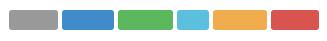
Default Primary Success Info Warning Danger
Figure 7: Labels and Badges
Figure 8: Progress bar
64×64 Media heading
Cras sit amet nibh libero, in gravida nulla. Nulla vel metus scelerisque ante sollicitudin commondo. Cras purus odio, vestibulum in vulputate at, tempus viverra turpis. Fusce condimentum nunc ac nisi vulputate fringilla. Donec lacinia congue felis in faucibus.
Figure 9: Media object
@ Username
.00
Figure 10: Input groups
.00
types of components (like blog comments, tweets, etc) that feature a left- or right-aligned image alongside textual content. You can include an image inside a
‘div’ with class as ‘media', and the rest is taken care by
Bootstrap. See figure 9. Input groups: Extends form controls by adding text or buttons before, after or on both sides of any text-based input (Figure 10).
<div class=”input-group”> <span class=”input-group-addon”>@</span> <input type=”text” class=”form-control” placeholder=”Username”> </div>
JavaScript
Bootstrap comes with a bunch of predefined JavaScript plugins. These can be accessed individually (separate .js files) or via the main bootstrap .js/bootstrap.min.js, which contains all these plugins.
Just input the content into the Bootstrap templates, and include them into the HTML code. These plugins are accessible via the mark-up API without writing any JavaScript code, and you can see them in action.
Let’s have a brief look at the plugins: Modal: These are streamlined, but flexible, dialogue prompts with the minimum required functionality and smart defaults:
Home Profile Dropdown
Raw denim you probably haven't heard of them jean shorts Austin. Nesciunt tofu stumptown aliqua, retro synth master cleanse. Mustache cliche tempor, williamsburg carles vegan helvetica. Reprehenderit butcher retro keffiyeh dreamcatcher synth. Cosby sweater eu banh mi, qui irure terry richardson ex squid. Aliquip placeat salvia cillum iphone. Seitan aliquip quis cardigan american apparel, butcher voluptate nisi qui.
Food truck fixie locavore, accusamus mcsweeney's marfa nulla single-origin coffee squid. Exercitation +1 labore velit, blog sartorial PBR leggings next level was anderson artisan four loko farm-to-table craft beer twee. Qui photo booth letterpress,commodo enim craft beer mlkshk aliquip jean shorts ullamco ad vinyl cillum PBR. Homo nostrud organic, assumends labore aesthetic manga deletus mollit. Keytar helvetica VHS salvia yr, vero manga velit sapiente labore stumtown. Vegan fanny pack odio cillum wes andereson 8-bit, sustainable jean shorts beard ut DIY ethical culpa terry richardson biodiesel. Art party scenester
Home Profile Dropdown
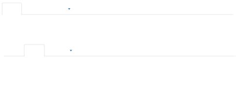
Figure 11: Toggleable tabs
Tooltip on left Tooltip on left
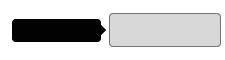
Figure 12: Tooltips
EXAMPLE
Click to toggle popover
A Title
And here's some amazing content. It's very enganging. right? confused with the menu item in which you are navigating?
Here is the solution—just integrate the menu with the plug-in and the menu item will be highlighted.
While scrolling down the page, the next menu item gets highlighted automatically. Toggleable tabs: If you want to show large grouped content on a single page, then here’s the solution:
<ul class=’nav nav-tabs’>List items</ul> <div class=’tab-content’> <div class=’tab-pane’>Pane Content 1</div> <div class=’tab-pane’>Pane Content 2</div> <div class=’tab-pane’>Pane Content 3</div> </div>
Tooltips: Imagine an interactive help text on a Web page.
Include this plugin and by hovering on the content, users will get the help text (Figure 12).
Figure 13: Popover
Oh snap! You got an error!
Change this and that and try again. Duis millis, est non comodo luctus, nisi erat porttitor ligula, eget lacinia odio sem nec elit. Cras mattis consectutur purus sit amet fermentum.
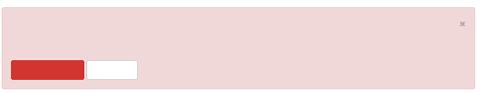
Take this action Or do this
Figure 14: Alert panel
<div id=’modalID’> <div class=’modal-content’> <div class=’modal-header’>Title Content</div> <div class=’modal-body’>Body Content</div> <div class=’modal-footer’>Footer Content</div> </div> </div> <div class=’tool tip’> <div class=’tin-opener>ToolTip!</div> <div class=’tooltip-arrow’></div> </div>
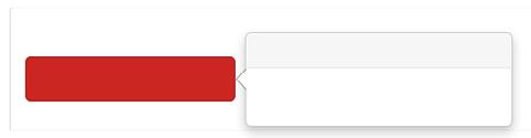
Popover: If the text to be displayed is too large, toggle on the content and get an overlaying popover housing secondary info. By giving options via attributes like title, content, delay and animation the popover can be used. It also has methods like show, hide, destroy, etc. Alert: Add the dismiss functionality to all alert messages with this plugin. By using this, the alerts can be either invoked or dismissed. Buttons: Control button states or creates a group of
This modal accepts methods like show, toggle and hide. There are options like keyboard:false/ true for toggling the keyboard for the particular modal. Dropdown: Adds a dropdown functionality to nearly all elements like navbar, tabs and even to buttons.
<div class=’dropdown’> <a data-toggle=’dropdown’>Dropdown Triggering element</a> <ul class=’dropdown-menu’> …..</ul> </div>
ScrollSpy: Ever been
Table 2: Plug-ins at a glance
Plugin name .js file used Access via JavaScript
Transition transition.js CSS transition emulator used by other plugins Modal Modal.js $(‘modalID’).modal(options/methods/events) Dropdown Dropdown.js $(‘dropDown’).dropdown(methods) ScrollSpy Scrollspy.js $(‘body’).scrollspy({target:’targetMenuId’}/options/ methods/events) Togglable tabs Tab.js $(‘tabPane tabId’).tab(options/methods/events) Tooltips Tooltip.js $(‘elementId’).tooltip(options/methods/events) Popovers Popover.js $(‘elementId’).popover(options/methods/events) Alert messages Alert.js $(‘alertId’).alert(methods/events) Buttons Button.js $(‘buttonId’).button(methods) Collapse Collapse.js $(‘collapseDiv’).collapse(options/methods/events) Carousel Carousel.js $(‘carouselDiv’).carousel(options/methods/events) Affix Affix.js $(‘affixDivId’).affix(options)
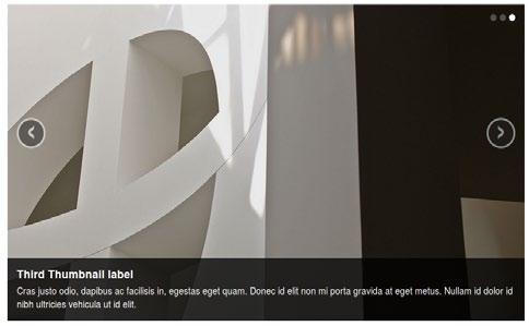
Figure 15: Carousel images
buttons with this plugin.
By giving specific data-attributes to buttons like: data-loading-text=’Loading...’, the button text changes on being clicked. data-toggle=’button’ to activate toggling on a single button data-toggle=’buttons’ to group of check-boxes/radio for getting similar action on the button groups Collapse: Includes collapsible actions for accordions, navigations. This plugin has dependency on the transition. js plugin
<div id=’accordion’> <div class=’panel’> //Panel 1 <div class=’panel-heading’>Heading</div> <div class=’panel-body’>Body Content</div> </div> <div class=’panel’> //Panel 2 <div class=’panel-heading’>Heading</div> <div class=’panel-body’>Body Content</div> </div> </div>
Carousel: A slide-show for cycling through elements is implemented via this generic plugin in the form of a carousel. Options like intervals for automatic scrolling, and pauses for stopping the slider at a particular image can be used as added functionality (Figure 15). Affix: Integrate the navigation menu with this plug-in and the menu is fixed on the page. Now the navigation can be accessed anywhere, anytime.
By setting the data-offset attribute, the menu can be fixed anywhere on the page:
<div data-spy=’affix’ data-offset-top=’10px’ data-offsetbottom=’50px’> Navigation Menu
</div>
These plugins can be invoked by methods which accept optional options object for particular methods and can be initialised with defaults/options/events.
Bootstrap has custom events, which can be triggered before or after the action of the plugins like: * show: which is used to invoke an event; * shown: which is used post the plugin action.
In case Bootstrap plugins are used along with other frameworks, then to prevent the name-space collisions, the .noConflict() function can be used.
Table 2 gives a summary of the plug-ins we have.
References
[1] http://getbootstrap.com/ [2] http://getbootstrap.com/2.3.2/ [3] https://wrapbootstrap.com/
By: Malineni Phani Kumar and Usha Khetan
The authors work at Ericsson as software engineers adept at application development including designing, programming and implementation of core modules. They enjoy designing and developing Web applications with open source technologies. They can be reached at phani.kumar.malineni@ericsson.com and usha.khetan@ericsson.com.
PACKWEB PACK WEB HOSTING
P ro X www.packwebhosting.com
0-98769-44977
Time to go PRO now
support@packwebhosting.com
A Leading Web & Email Hosting Provider Specialists in Hosting Sites built with OpenSource
Technologies
Wordpress Magento
ProX Plans
Have a High Traffic Website? Considering VPS/Server? Visit prox.packwebhosting.com
Joomla Drupal
• cPanel Hosting • One Click Installation • Solid Support • Multiple Hosting Plans
Why Us?
• 4000+ Hosting • 6500+ Domains
• 2000+ Clients • 11+ Years Experience Trust Us. Trust our Ability.
