

Brand Strategy
Story
For over 25 years, we've been helping our clients bring their dreams to life.
We started out as a manufacturing company in Bahrain and later expanded into fit-out services to offer our clients a complete package. Our home base in Bahrain includes two state-of-theart manufacturing facilities covering over 520,000 square feet, serving as the heart of our operations.
We've since grown our presence across five Middle Eastern countries, including Kuwait, Qatar, Saudi Arabia and UAE. Our extensive experience gives us real project know-how, allowing us to deliver projects with authenticity and insight. This attention to detail has propelled us into the world of high-end luxury, working on prestigious resorts and ultra-luxurious homes and brands.
No matter the project, we're committed to providing a consistent top-quality experience. Today, with a team of over 2,000 employees, we complete around 400 projects every year. Despite our growth, our project managers still offer the same personalised service we started with over two decades ago.
When you see the Havelock One stamp, you know you're getting the best in quality and precision. As we continue to grow, our focus remains on exceptional craftsmanship and putting our clients first, making us the go-to choice for those clients looking for outstanding results in the region.

To be the go-to partner for the most admired projects in all of our markets.
“
Driving current and future relationships by consistently delivering real value and outstanding service.
“
Delivering market leading solutions through the power of thoughtful precision.
We embody precision, realism, and a detaildriven approach. Our foresight empowers proactive problem-solving. We are self-driven, committed, responsive, and focused.
We embody precision, realism, and a detail-driven approach.
At Havelock One, we understand that a project is more than just a task, it's a vision to be brought to life.
We forge deep connections with our clients, approaching each project with a level of care and commitment that mirrors their passion. With a rich history of delivering over 8,800 projects, we bring a wealth of experience to the table, having navigated a diverse range of challenges and scenarios. We know that it's the details that truly make a project exceptional.
Our transparency is the cornerstone of our service. We provide realistic updates throughout the project
journey, drawing on our extensive experience to offer clear insights and guidance. When you work with us, you can have complete confidence in every interaction.
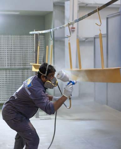
In our manufacturing division, we take immense pride in creating bespoke items that bear the hallmark of Havelock One quality and precision. We craft each piece with the same dedication, embodying the essence of our brand. From concept to completion, we ensure that every detail aligns with the vision, delivering results that exceed expectations and leave a lasting impression.

Our foresight empowers proactive problem-solving.
With years of industry experience, we've mastered the art of tackling challenges head-on. Our proactive approach ensures we anticipate issues and offer solutions before they disrupt progress.
For budget management, we provide detailed cost breakdowns upfront and suggest value-engineered solutions to maintain quality while optimising costs. We carefully plan projects, setting clear timelines and proactively addressing potential delays with transparent communication.
Our collaborative design process ensures alignment between aesthetics and functionality, utilising prototypes to visualise and refine concepts before shipping and installation. We actively encourage clients to visit our manufacturing facility in Bahrain to see,
feel and touch the items in production, reducing any potential future delays.
We navigate compliance seamlessly, staying updated on regulations and guiding clients through the process with expert support.
Communication is key — we assign dedicated project managers, host regular progress meetings, and leverage technology for real time updates and collaboration.
At our core, we're committed to delivering exceptional results while minimising project hurdles. With us, your vision is your priority, executed with precision and purpose.

We are self-driven, committed, responsive, and focused.
From the outset, we prioritise open and regular communication with our clients, keeping them informed and involved every step of the way. Our detailed project planning ensures clear goals and timelines, with proactive measures in place to tackle any challenges that may arise.
Transparency is key to our approach. We keep our clients in the loop with updates on project progress and address any issues promptly and effectively.
We take initiative in finding innovative solutions and continuously improving our processes to ensure seamless project delivery that meets our clients' needs.
Quality is our priority. We pay close attention to every detail and conduct thorough inspections to maintain the highest standards of craftsmanship.
Even after completion, we remain committed to our clients. We provide ongoing support and follow-up to ensure complete satisfaction and address any post-project needs.

Self-Driven Partner
Ownership Mentality
We take ownership of our responsibilities and tasks, going above and beyond to deliver results without constant supervision.
Initiative and Problem-Solving
We proactively identify areas for improvement or innovation within our scope and propose creative solutions to enhance outcomes.
Continuous Learning
We stay curious and seek opportunities to expand our knowledge and skills, empowering ourselves to excel in our fields.

Pro-Active Foresight 02
Anticipate Challenges
We stay ahead of the curve by anticipating potential obstacles or issues that may arise during projects, and develop proactive strategies to address them before they impact progress.
Future-Proof Solutions
We look beyond immediate needs and consider future implications when developing solutions or recommendations, ensuring long-term effectiveness and sustainability.
Strategic Planning
We engage in strategic planning by setting clear goals and timelines, regularly reassessing to adapt to changing circumstances or client needs.

Assured Reliability 03
Consistent Performance
We demonstrate reliability by consistently delivering high-quality work and meeting deadlines without compromising on standards.
Trustworthy Communication
We build trust through transparent and open communication, providing regular updates and being responsive to inquiries or concerns
Accountability
We take ownership of your role and commitments, ensuring that promises made are kept and expectations are consistently met.

Thoughtful Precision
Attention to Detail
We pay close attention to detail in every aspect of your work, ensuring accuracy and precision in all deliverables.
Client-Centric Approach
We adopt a thoughtful approach by considering the client's needs, preferences, and objectives in every decision and action.
Iterative Improvement
We continuously refine and enhance processes to achieve greater precision and efficiency, striving for excellence in all endeavors.

Building Trust
The comms pillars form the anchor of what we want to communicate and the key conversations we want people who experience our brand to walk away with. Our work is their bond. Every project proves commitment, capability and confidence to deliver quality to clients.
Innovative Problem Solvers Driven by Detail
We overcome by adapting and evolving to project difficulties using expertise, knowledge and insight.
Sometimes the details can't be seen, like joints, fittings or precision cuts - however they have been carefully planned, considered and created by the team. This level of detail extends beyond fitouts, and shows through how we organise ourselves internally and externally.
An award-winning turnkey fit out and custom manufacturing company that delivers high-quality projects for exceptional clients. “
Vision The go-to partner for the most admired projects in all of our markets.
Brand Pillars
Self-driven partner
Proactive foresight
Thoughtful precision
Assured reliability
Mission Driving current and future relationships by consistently delivering real value and outstanding service.
Purpose Delivering market leading solutions through the power of thoughtful precision.
Comms
Pillars Building trust
Innovative problem-solvers
Driven by detail
Values We embody precision, realism, and a detail-driven approach. Our foresight empowers proactive problem-solving. We are self-driven, committed, responsive, and focused.
Rational Proposition
An award-winning turnkey fit out and custom manufacturing company that delivers high-quality projects for exceptional clients.
02 Brand Toolkit
Logo Overview
Brand Identity
The Havelock Brand identity is defined by the way it represents itself to the world. The main identifiers comprise a wordmark and an icon as seen on this page.
Wherever possible, the brand wordmark should be used as a primary application and a first consideration for any branded materials.
In instances when the primary application is not suitable or it can be accented, the secondary application or the 'icon' can be utilised - i.e.. Instagram profile icon.
In all cases, best design practices should be followed to ensure the best application of the brand identity.
If there is a question in regards to brand application, please contact Havelock One's brand manager.
PRIMARY APPLICATION
SECONDARY APPLICATION
Brand Wordmark
Wordmark usage
The wordmark is the primary application for the Havelock One brand and should be used as a first consideration on branded material.
Clear space
In order to ensure consistent brand visibility, breathing room has been allocated around the logo. The space is determined by X which is the width of the ‘H’ in Havelock One
Minimum size
In order to ensure maximum visibility in all applications and that the logo does not lose its impact, there is a minimum point size provided for both digital and print.
Colour usage
Wherever possible, the wordmark should be represented in primary full colour or reverse full colour. In cases where this is not possible, due to printing or digital restrictions, mono colours should be used.
Production
The brand identity can also be amplified with production techniques like silver foiling, spot UV, embossing or debossing. These techniques should enhance the brand and used sparingly for maximum effect.
WORDMARK LOCK-UP
WORDMARK CLEAR SPACE


POINT SIZE
PRIMARY - PANTONE 533c ON WHITE
PRIMARY - WHITE ON PANTONE 533c
SECONDARY - MONO BLACK ON WHITE
MINIMUM
COLOUR USAGE
SECONDARY - WHITE ON BLACK
Use & Misuse: Wordmark
The wordmark should only be represented in the way it was created and should never be adjusted, manipulated or edited in any way.
01 Do not manipulate, replace or adjust the wordmark
02 Do not add, remove or change elements of the logo
03 Do not adjust or replace the wordmark colours, only use brand colours and representations
04 Do not squash, stretch or shear the logo
05 Do not use the lock-up with the brand icon
06 Do not reorganise or restructure any elements of the wordmark
07 Do not use the identity on a visually competitive background. When using the wordmark against a photo, ensure legibility. The wordmark can also be used at a transparency over images if required, however preference is for full opacity
In all cases, best design practices should be followed to ensure the best application of the brand identity.


Icon usage
The icon is the secondary logo for the Havelock One brand. The icon is intended to be used as a compliment to the wordmark or in instances when it is more effective to use an icon ie. Instagram profile photos.
Clear space
In order to ensure consistent brand visibility, breathing room has been allocated around the icon. The space is determined by the height of the middle triangle.
Minimum size
In order to ensure maximum visibility in all applications and that the logo does not lose its impact, there is a minimum point sizes provided for both digital and print.
Colour usage
Wherever possible, the icon should be represented in primary colours. If needed, the secondary colour applications can be used. In cases where this is not possible, due to printing or digital restrictions, mono colours should be used.
Production
The brand identity can also be amplified with production techniques like silver foiling, spot UV, embossing or debossing. These techniques should enhance the brand and used sparingly for maximum effect.


MONO - BLACK ON WHITE MONO - WHITE ON BLACK
SECONDARY - PANTONE 544c ON WHITE
Use & Misuse: Icon
The icon should only be represented in the way it was created and should never be adjusted, manipulated or edited in anyway.
01 Do not manipulate, replace or adjust the wordmark
02 Do not add, remove or change elements of the logo
03 Do not adjust or replace the wordmark colours, only use brand colours and representations
04 Do not squash, stretch or shear the logo
05 Do not use the lock-up with the brand icon
06 Do not reorganise or restructure any elements of the wordmark
07 Do not use the identity on a visually competitive background. When using the wordmark against a photo, ensure legibility. The icon can also be used at a transparency over images if required, however preference is for full opacity
In all cases, best design practices should be followed to ensure the best application of the brand identity.


Sub-Header
The font is General Sans. The sub-header is to be used in all caps throughout. General Sans is a clean, modern font which sits well with the other fonts in the brand.
Header
The header font Cabinet Grotesk Medium, in tracking set to 0, has an elevated look and feel, as well as a modern style. The sharp edges of the typography reflect the precise work that Havelock One delivers.
Body
The body font of General Sans is the same as the sub-header font, however it is in sentence case and with tracking set to 0. The typography is clean, modern and timeless.
Font Available at:
https://www.fontshare.com/fonts/cabinet-grotesk
https://www.fontshare.com/fonts/general-sans
GENERAL SANS: MEDIUM, TRACKING 100
Cabinet Grotesk Medium
General Sans. Regular. Tracking 0. Lorem ipsum dolor sit amet, consectetur adipiscing elit, sed do eiusmod tempor incididunt ut labore et dolore magna aliqua. Ut enim ad minim veniam, quis nostrud exercitation ullamco laboris nisi ut aliquip ex ea commodo consequat. Duis aute irure dolor in reprehenderit in voluptate velit esse cillum dolore eu fugiat nulla pariatur. Sub-Header
Alternate Fonts
The digital alternate fonts are only to be used when the brand fonts are not available or there are digital limitations for application. The alt fonts are system fonts and are widely available for use across different operating platforms.
Subheader
The digital alternative font is Aptos Regular. The subheader should be written in all caps at all times. When using a subheader in Microsoft PowerPoint and Microsoft Word, set the tracking to 4pt.
Header
The digital alternative header font is Verdana Regular, with tracking set to 0pt.
Body
The digital alt body font is Aptos Regular, with tracking set to 0pt.
Font Available At:
Verdana and Aptos is a system font and should be widely available on all digital platforms.
APTOS : REGULAR
Verdana Regular
Aptos Regular. Tracking 0. Lorem ipsum dolor sit amet, consectetur adipiscing elit, sed do eiusmod tempor incididunt ut labore et dolore magna aliqua.
Ut enim ad minim veniam,
quis nostrud exercitation ullamco laboris nisi ut aliquip ex ea commodo consequat. Duis aute irure dolor in reprehenderit in voluptate velit esse cillum dolore eu fugiat nulla pariatur.
Alternate English Typography: Setting Tracking
Header & Body
For the Header and body font, the tracking is set to 0pt, so needs no adjusting.
Subheader
The tracking of the subheader is set to 4pt for both Microsoft Powerpoint and Microsoft Word. Shown below are the steps for achieving this:
Microsoft Powerpoint
Firstly, select the text, then click the 'AV' button beneath the Font Choice, scroll and click 'More Spacing...'
Secondly, under 'Character Spacing', set spacing to 4pt.
Microsoft Word
Firstly, select the text, then under 'Format' select 'Font...'
Secondly, under 'Advanced', set spacing to 4pt.


Arabic Fonts
The Arabic fonts are selected to complement the primary brand typography. The primary typography Anaqa should be the preferred use for Arabic typography and in instances where the font is not available, Arial Arabic can be used.
Primary Font
Anaqa is the chosen Arabic font for all use of Arabic typography within the brand. The font is available from https://www.canadatype.com/product/anaqa/
Digital Alternative Font
The digital alternative Arabic font is Arial which is a system font and available for all operating systems.
About
The brand colour palette has been selected to represent the brand and should be implemented across all assets to ensure clear and consistent communication. When needed or required, process black and white may also be used.
Primary
The primary colours are to be used as the main consideration for the brand.
Secondary
The secondary colours are to be used as the next consideration after the primary colours.
Accent
The accent colour is to be used as a minimal touch in every sense of its use, taking no more than 5% of the overall design.
BCD4E6


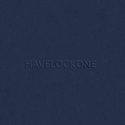
Print finishes are key to elevating the brand in a premium manner. Whenever possible, silver foil, embossing and debossing should be utilised, as well as premium paper usage.


Silver Foil
Emboss
Deboss
Paper Texture


Image Use
16 x 9
When using 16 x 9, there are several layouts to use. Only use the following layouts when applying brand images.
Either use images in full bleed, or 25% or 50% of the page. In full bleed, graphics can be used over the top of the image, but only if it is legible. When showing multiple photos on one page, a collage can be used, with the photos in either squares in rectangles, with consistent spacing between the images.
Square
When using a square format, there are several layouts to use. Only use the following layouts when applying brand images.
Either use images in full bleed, or 25% or 50% of the page. In full bleed, graphics can be used over the top of the image, but only if it is legible.
A square image can be placed central at 3/5 of the size of the full square. Or when applying multiple images, ensure equal spacing between images.
Rules
Only use full square or rectangular crops when inserting brand images.
Do not use curve shapes or angular crops.
When using brand images only use the provided layout examples and follow the shown examples as rule of thumb.
Do use full bleed images with graphics placed on photography in a clear & visible appropriate way
& 03 Brand images can be used at 25% or 50% of the rectangular page
Use brand collages in square or rectangular format with equal spacing between images


Social Media: Image Use
PROJECT REPRESENTION
About
For Social Media application, there is room for adaptation and the designs are allowed to be more dynamic, as to not limit the design application. All designs should maintain a clear brand aesthetic despite the versatility of the design mechanism.
Use of brand typography and colour palette is recommended and try not to overly apply the brand wordmark, icon or graphic patterns.
Project Representation
When introducing a project, award shortlist, award winner, or any other project, there are several examples of how these pages should be designed.
Use of Text
When using text, such as client testimonials, brand statements or other announcements, the text can be showcased in a variety of ways depending on requirement.
Image Representation
We encourage the use of full bleed images as a main social media tool. Also when applicable, text can be used over the top of imagery, however always ensuring the text is legible. The logos and typography can also be animated to bring interest to the visual.


Social Media: Icon Use
Use of Icon
There is flexibility for placement of the icon as to not restrict creativity. Ensure a balance between structured design elements, and legibility of content.
Placement
The placement of the icon is to be in one of the four corners.
Clear Space
There is clear space from each side of 75 pixels. In the story layout there is a further clear space of 250 pixels from the top and bottom.
Size
The size of the icon is to be height 100 pixels.
Colour
The icon is to be placed in brand colour. It can be used in transparency if required, but not as preference.
Social Media: Video Use
About
For Social Media video application, we have given several recommendations of how to use, to ensure the right amount of brand visibility and communication.
Start
For the start of any video shown on social media, we recommend showing the icon initially on our brand colour, and then fading out into the main video.
Core Video
For the core video, the icon should sit in the top corner to act as a watermark and make the video instantly but subtly recognisable as one of ours. It is possible to use the logo in full colour, or as an opacity depending on requirement.
Subtitles
When there is any voiceover in the videos, subtitles are to be used to ensure communication is effective. Captions can be placed on a coloured background or directly onto the image if it is legible enough to do so.
Outro
The final outro of the video has a transition into the the wordmark and the website address on brand colour. Any key takeaway messages or contact details can also be added.

CORE VIDEO
Our brand icons are a direct representation of sectors within the brand. The icons can be used through the brand identity in application to reflect these sectors.
The design of Havelock One icons are in a line style drawn on a 500 x 500px artboard and with a line stroke of 7pt to keep consistency across all icons. The style is to be clean and modern to keep consistency with the entire brand identity.


About
The brand uses iconography to enhance the identity and draw clear communication through pictograms. In order to custom create an icon, the following steps should be adhered to:
Stage 1
Set up an artboard of 500 x 500px and apply a line stroke of 7pts to the pen tool.
Find a relevant base image that will be used to showcase the icon. The base image should be easily recognisable and specific to the requirement. In this instance, Timeline is reflected by the hour glass.
Stage 2
Develop the creative icon in a line style format using primarily geometric line forms and base shapes. The graphic simplification of the base image should be instantly recognisable as the object.
Stage 3
Ensure the new artwork is in line with the other icons developed and scale or adjust sizing accordingly to make it consistent.
Do not over complicate the icons or choose base imagery that is difficult to convey instantly.

ICON BUILD PROCESS ORIGINAL
Brand Pattern
About
The brand uses graphic patterns to enhance the identity and brand experience. The patterns reflect the raw materials that Havelock One uses, such as wood, metal and stone.
Application
The application of the pattern is to be minimal, and feel secondary on the page to any other graphic device. The use of patterns should also be kept low as to not overuse. The patterns can be cropped appropriately.
Colour Usage
The pattern should only be used in brand colours. As shown, the pattern can be used at different opacities. The opacity is determined by the use and is to be used at the discretion of the designer, however if any queries, refer to the brand manager.
Production
Whenever possible, the pattern should be amplified with production techniques such as embossing or debossing.
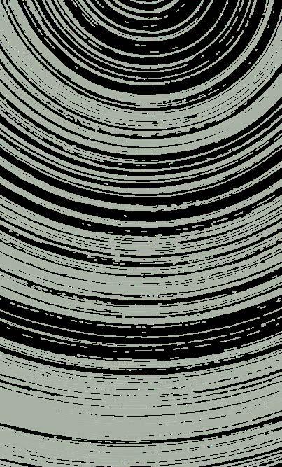


PRIMARY PATTERN - WOOD
PATTERN USAGE
WHITE
PANTONE
Use & Misuse: Pattern
The pattern should only be represented in the way it was created and should never be adjusted, manipulated or edited in any way.
01 The pattern should never dominate whatever application it is applied to 02 The pattern should only be used in brand colours 03 The pattern should only be used in appropriate brand colours 04 Do not take over a whole application with the pattern 05 Do not use contrasting colour effect with the logo 06 Do not use multiple patterns in one instance
In all cases, best design practices should be followed to ensure the best application of the brand identity.

Alternate Patterns
Wood Pattern
PRIMARY

Metal Pattern

Stone Pattern Concrete Pattern


Shown are examples of other patterns that can be used, with wood being the primary pattern for use.
Brand Pattern Build
About
The brand uses graphic patterns to enhance the identity and brand experience. The patterns reflect the raw materials that Havelock One use, such as wood, metal and stone.
Stage 1
The first stage of the pattern build is to find a suitable image which reflects raw materials that Havelock One uses. Place this image in Photoshop and turn to black and white.
Stage 2
The second stage is to adjust the image to ensure the image is two colours, black and white, with minimal to not grey. This can be done by adjusting the levels or curves in Photoshop.
Stage 3
The final stage is to export the image from Photoshop as a JPG and then place in illustrator, use the image trace tool to vectorise this image. This can now be used as a brand pattern.


PATTERN BUILD PROCESS
ORIGINAL IMAGE
BLACK AND WHITE
VECTORISE
The brand tone of voice should reflect the qualities and calibre of the brand. We speak with a tone of authority that comes from the confidence of proven capabilities. But we are not commanding, condescending or authoritative. Our tone is warm, reassuring and understanding. We listen to our clients and work with them to deliver the best results.
We speak with confidence
We talk to our clients
We are warm & approachable
We are humble and instil trust from proven skill
We build trust through clarity
We don't speak condescendingly
We don't talk at our clients
We don't dismiss people or project opportunities
We don't brag, boast or show off
We don't over engineer conversations
Tone of Voice
Professional
We are seasoned experts in our field. Our tone is professional, knowledgeable, and confident. We communicate with authority and clarity, demonstrating our extensive experience and expertise.
Passionate
We are passionate about bringing design dreams to life. Our tone is infused with enthusiasm, reflecting our genuine excitement for the work we do and the results we achieve.
Authentic
We are genuine, honest, and transparent. Our tone reflects our authenticity, establishing trust with our audience and ensuring they feel confident in our abilities and our commitment to excellence.
Sophisticated
Our tone is refined and sophisticated, it reflects the high-end nature of our projects and our commitment to excellence in everything we do.
Trusted
Our tone is reliable and trustworthy, reinforcing our position as the leading choice for clients seeking outstanding results in the region.
Warm
Despite our professionalism, our tone is warm and approachable, ensuring our clients feel valued and supported throughout their journey with us.
Website Copy Examples:
- Havelock One has over 25 years delivering design experience.
- Havelock One brings authenticity and insight to every project.
- The Havelock One stamp is an mark of our meticulous attention to detail. When you see it, you can trust you are getting the best in quality and precision.
- Explore our projects and discover why we are the preferred partner of choice for outstanding results in the region.
Headline Examples:
We build trust.
Design shaped by standards.
Driving change, innovating craft & building trust.
Building partnerships for 25 years.
Trust is built in the details.
Elevating spaces & exceeding expectations.
03 Brand Visualisation

Business card: Silver foiling on front icon. Emboss on rear wordmark.


Linkedin Carousel concept

Brochure: Front and rear
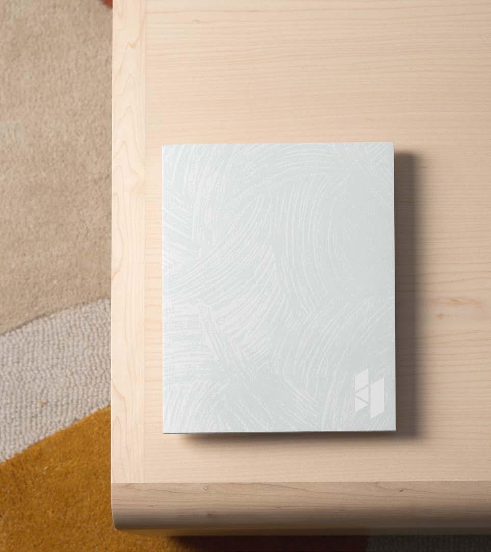

Book Cover: Pattern Emboss, logo deboss
Book Cover: Pattern emboss, logo deboss
Paper: Logo deboss, premium paper texture

Van Decal: Pattern decal and logo


Factory Signage: Wordmark logo extruded, backlit feature

Internal Wall Signage: Wordmark logo extruded, backlit feature


Uniform: Hi-Vis with wordmark and icon on front. Helmet with wordmark on front, icon on back


Tote Bags: Wordmark, icon and pattern all used across variations


