HARPER GENERAL CONTRACTORS BRAND GUIDELINES

OUR MANTRA

We are builders
We are builders of walls and floors and roofs and ceilings.
We are builders of beams and drywall and archways and doorways.
We are builders who pour concrete, install pipe, hammer nails and turn wrenches... all in the name of creating substructure and infrastructure and magnificent structures that help define skylines.
We are builders.
But what we truly build cannot be contained by brick and mortar and plywood and pipes.
We at Harper are builders of communities
We are builders of foundations and futures, of careers and culture.
We are builders.
We build doorways to schools that provide doorways to potential and professions .
We build pillars and columns and foundations that hold up hospitals and churches and that raise up hopes and healthcare and hands to the heavens.
We build tanks and pump stations and treatment plants that treat communities to fresher, cleaner, better water and a better quality of life.
We build floors on which stand offices and conference rooms in which ideas are generated that can change the world.
We build the things that help make things happen .
We build the things that build downtowns and uptowns and the Upstate and neighboring states.
We build things that improve lives and livelihoods and neighborhoods.
We are builders.
We build with steel and concrete and wood and gravel and that which the earth provides so that we can continue to build into the future.
We are proud, smart, savvy , honorable and caring builders who thrive through the smartest construction of all…
Building relationships.
Through our purpose, through our passion, and most of all, through our people, we have built a company by building upon each other with trust and dignity and collaboration.
We build each other up and tear down that which impedes our integrity.
We are builders who only build up.
We build up each other.
We build up our company.
We build up our community.
We build up our clients.
Best of all, we have the privilege of building hopes and dreams into everything we build.
And none of that, not one wall, not one floor, not one door, not one inch gets built…
Unless we build trust.
And since 1950, that’s what Harper has done.
One wall at a time, one door at a time, one inch at a time, we have built trust.
And that... more than anything…has built this company.
Harper General Contractors
More than anything, we build trust.
CLICK HERE TO WATCH OUR MANTRA VIDEO.
SECTION ONE BRAND POSITIONING
BRAND POSITIONING
The following guidelines are designed to ensure consistency and protect the visual identity of the Harper General Contractors brand. If there are any questions regarding the use of these statements or marks, please contact the Marketing Department at Marketing@HarperGC.com.
Harper General Contractors stands for excellence and integrity in construction. Our brand is defined by consistency, respect, and quality in all we do. We aim to foster relationships of trust with clients, partners, and our community, supporting Harper’s mission and vision through every interaction and project. Our brand consistency is critical to protecting our reputation and how we are represented. Adhering to these guidelines ensures a cohesive brand experience across all company communications, both internal and external. To that effect, new logos or marks representing programs or departments within the Harper brand must be requested, developed, and approved by the Marketing Department and Leadership to ensure they align with our overarching brand identity.
GUIDING PRINCIPLES
Our Guiding Principles are the core values and beliefs that define Harper’s identity and shape our culture, decisions, and overall direction. They serve as a compass, guiding employees in their daily actions and interactions, ensuring consistency and integrity across all operations and platforms. These principles encompass our values to stay true to our mission and vision and create a strong foundation for growth, building trust, cohesiveness, and purpose.
• Realizing that a safe work environment is the highest priority.
• Upholding the highest ideals of honesty, integrity and responsibility.
• Providing our clients with quality projects on schedule for the best possible value.
• Treating all employees as our most valued asset, providing each with training, opportunity, empowerment, security, respect and a fair wage.
• Recognizing that a fair profit is deserved but must be earned. Treating our clients fairly and openly in all dealings.
• Treating our subcontractors and suppliers as valuable team members.
• Being selective in choosing our clients and seeking long-term relationships through partnering and total customer satisfaction.
• Seeking higher levels of efficiency and productivity through the use of advanced technology, planning, evaluating, training, and creative thinking.
• Giving back to our community through service, contributions, and involvement.
OUR MISSION
We build up our communities, clients and each other by building trust into everything we do.
OUR VISION
To be the standard by which all other contractors are measured, driven by the quality of our work and the integrity that inspires it.
OUR TAGLINE
More than anything, we build trust.
SECTION TWO LOGO GUIDELINES
LOGO GUIDELINES
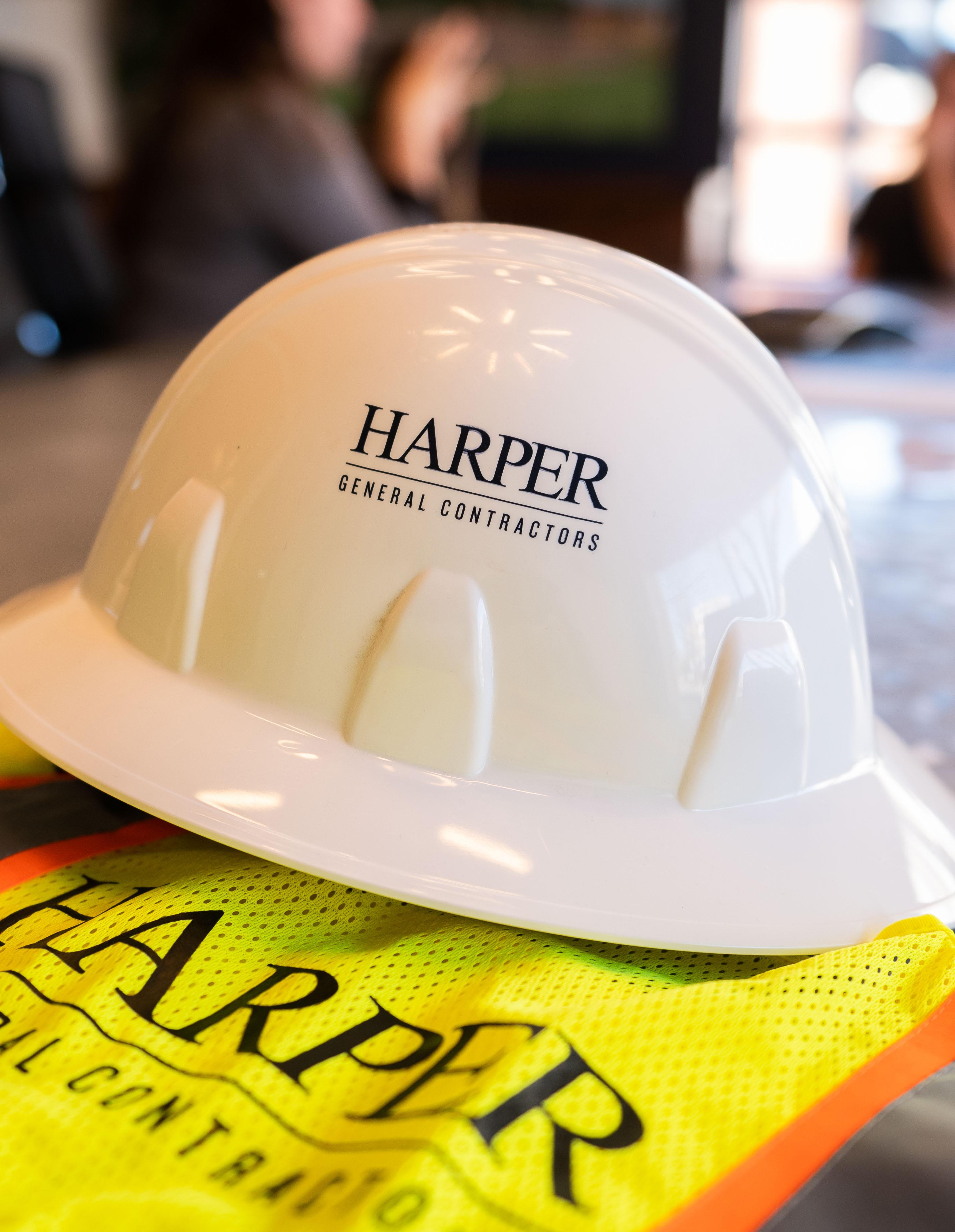
THE IMPORTANCE OF LOGO INTEGRITY
Maintaining logo guidelines and upholding the integrity of our the Harper brand are crucial for creating a consistent and recognizable identity in the industry. Our logo is often the first impression of our brand, and any changes or misuse can dilute the impact of that visual identity. When logo guidelines are followed strictly, it ensures that the brand appears professional and polished across all platforms. Consistency in logo usage builds trust with our clients, as they begin to associate the brand’s look with its values and promises. A consistent visual identity also reinforces our brand’s message, making it more memorable and easier to recognize amongst our competitors.
Beyond just visual appeal, keeping brand guidelines intact protects Harper’s reputation. Deviating from established logo standards or altering the brand’s design elements can lead to confusion, miscommunication, or even negative perceptions. Whether it’s in advertising, digital media, or packaging, sticking to the defined brand elements ensures that we convey a coherent message.
LOGO PROPORTION
Our logo is a proprietary design that uses a customized version of the Book Antiqua type style paired with specific spacing and care. The size and proportion of this logo should never change. Maintain ample space around the logo. Define this space with the letter “H” from Harper. No graphic element, type, or photo may appear within this clear zone.
Only use authorized files of the logo. The Marketing Department will provide letterhead, Word, Excel, and PowerPoint templates that will be set up and approved for your use. These will be posted to BambooHR. If you need a new document created with the logo, please consult the Marketing Department.
Harper General Contractors has multiple divisional logos and sub-brands. All of these logos have their own proportions and typefaces to avoid distortion and confusion. If you need any of the divisional logos, the Marketing Department can provide .eps, .jpeg, .png, and .pdf files of any of the below logos.
LOGOS SHOULD ALWAYS BE USED IN THEIR ORIGINAL FORM AND PROPORTION.
SUB-BRANDS
Keep a clear zone the size of the Harper H around the furthest points of the logo.
Correct distance of the tagline from the logo
Harper currently has three sub-brands, each with its own distinct identity and logo that highlight its specialized expertise. Each logo was carefully designed to reflect the unique character and values of the division it represents, while still aligning with Harper’s overall brand image. The three sub-brands included in this document are: Environmental Systems Division (ESD), EQUIPRO, and HarperXS. Please find in the following pages Harper’s guidelines for our three subbrands and standard uses of each logo. We have also included our guidelines for our Corporate logo “Harper General Contractors” and “Harper,” which represents our Commercial Division division as well.
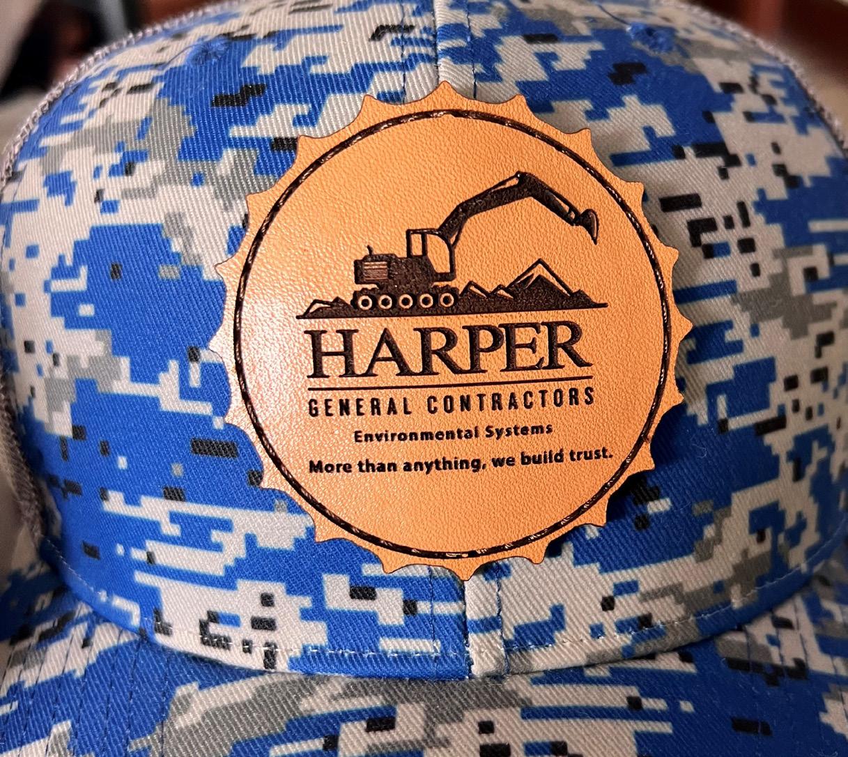
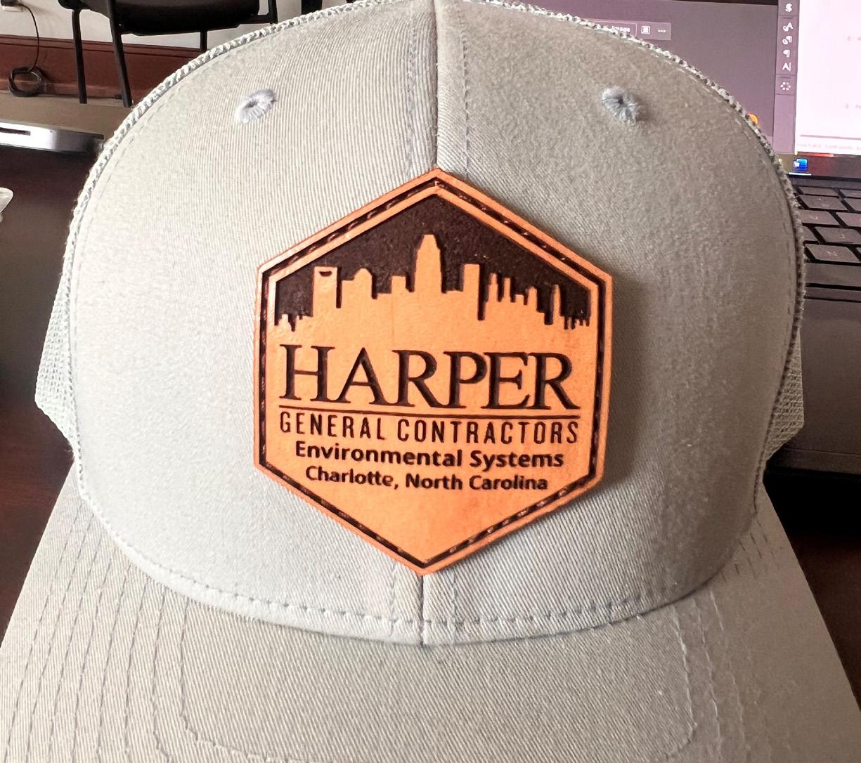
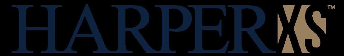
STANDARD LOGO
The full color stacked logo is the preferred usage and closely represents the brand’s core values, identity, and visual appeal. This logo is the perfect balance of typography, color, and symbol that collectively communicates the essence of Harper’s brand. This logo carries the strongest impact, ensuring consistency and reinforcing brand recognition across multiple platforms.
STACKED LOGO
HORIZONTAL LOGO
STANDARD
STANDARD
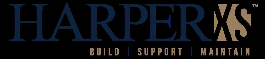
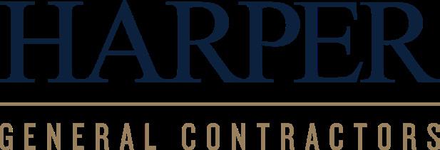
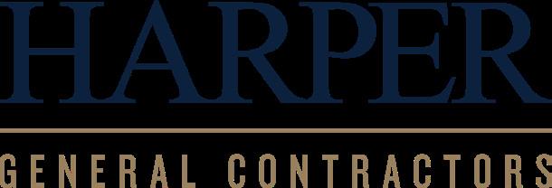
STANDARD LOGO WITH TAGLINE
The tagline does not always need to be used with the logo. It is helpful when it can be, but should not be used in small places and should not be repeated multiple times throughout a document.
STACKED WITH TAGLINE
HORIZONTAL WITH TAGLINE
OTHER LOGO VARIATIONS
To keep a consistent brand image, each version of Harper’s logo is designed for specific uses. The primary logo best represents the brand and should be used first whenever possible. Alternative versions, such as all-navy, black, white, and white with gold, offer flexibility for different backgrounds and formats. These variations help ensure the logo stays effective and recognizable, whether on small digital icons, print materials, or apparel with color limits.
ALL NAVY
BLACK
WHITE
WHITE WITH GOLD
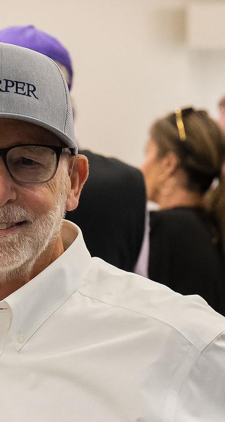
ONLY HARPER LOGO
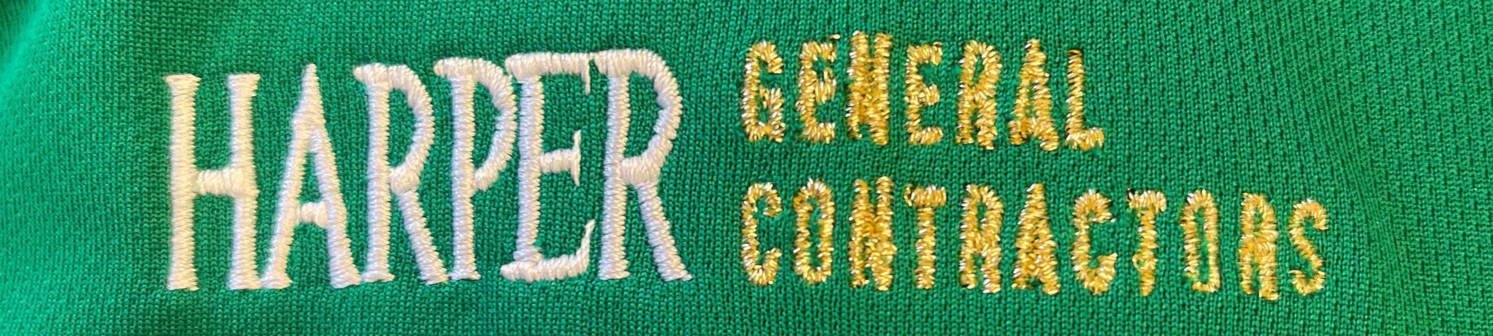
Using “HARPER” on its own, without “General Contractors,” works well in places where people already know who Harper is or where a streamlined look is needed—like on branded appparel and swag items, smaller materials, or digital applications with limited room. This choice lets Harper stay recognizable and professional without overloading the logo with extra wording. Only these versions of HARPER are approved to be standalone. Do not use GENERAL CONTRACTORS or tagline as a standalone logo. Refer to Unacceptable Logo Placement in Brand Apparel section.
ONLY HARPER LOGO
ALL NAVY
BLACK WHITE GOLD
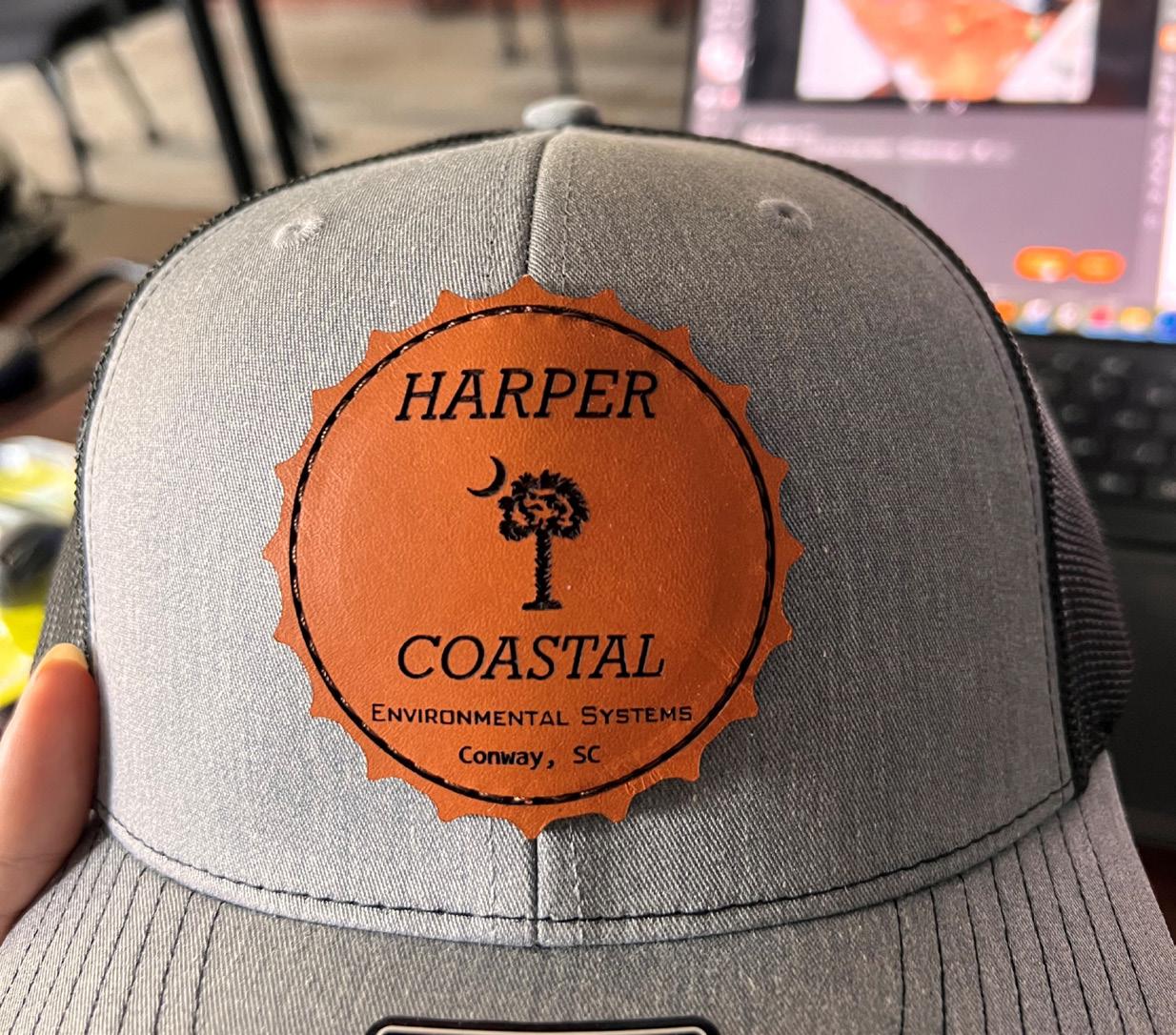
ESD LOGO
Similar to the standard logo, the full color stacked Environmental Systems Division logo is the preferred usage and closely represents the brand’s core values, identity, and visual appeal.
ESD LOGO WITH TAGLINE
The tagline does not always need to be used with the logo. It is helpful when it can be, but should not be used in small places and should not be repeated multiple times throughout a document.
STACKED LOGO
HORIZONTAL LOGO
STACKED WITH TAGLINE
HORIZONTAL WITH TAGLINE
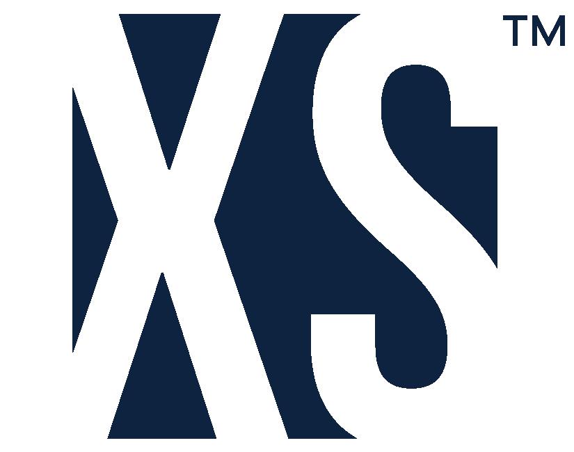
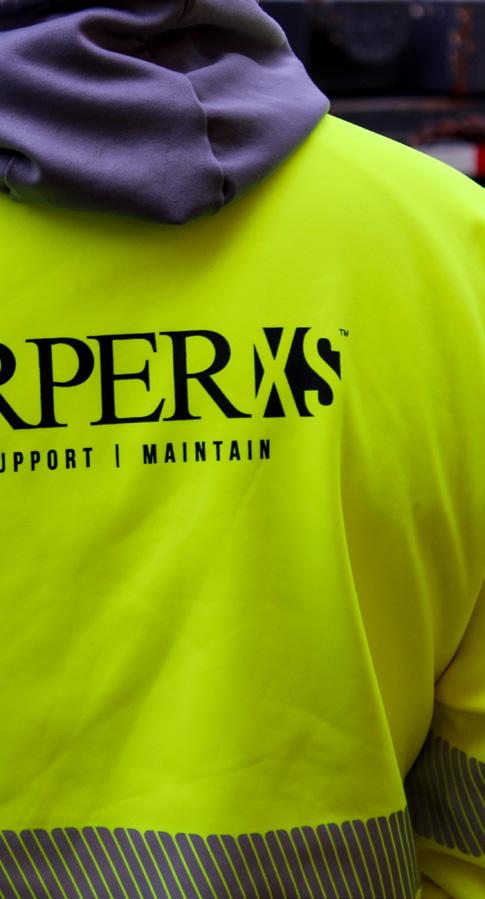
HARPERXS LOGO
The HarperXS logo is integral to our brand’s identity. This is important in keeping our brand consistent across all platforms and mediums. Please adhere to the sizing and position guidelines below.
Logo Size & Position
The HarperXS “XS” icon (or “bug”) is used as a creative way to identify the division. The icon should only be used in conjunction with the Harper logo to co-brand or as a design element. For example, a flyer that has the HarperXS logo on the front might use the icon only in another place, and a hat that has the HarperXS logo on the front might also have the icon only on the side.
ICON ONLY WITH TAGLINE
WITHOUT TAGLINE
HARPERXS LOGO SIZE AND PROPORTION
MINIMUM SIZE
The logotype is custom-designed lettering that should never be replaced by another font or type. For ease of recognition and legibility of our logo, a minimum size of 1.5 inches across is recommended, while retaining the original set dimensions.
CLEAR SPACE
Surrounding graphical elements (additional logos or graphics) or text should not be in direct contact with the HarperXS logo artwork. Imagine a containing box around our logo artwork. Any surrounding graphics or text should be at least 3/8 (0.375) inches away from our logo on all sides. To maintain the logo’s legibility and hierarchy, please maintain a minimum distance around the logo.
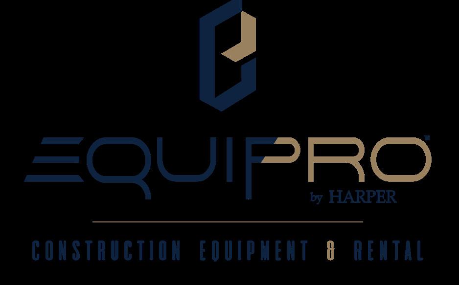
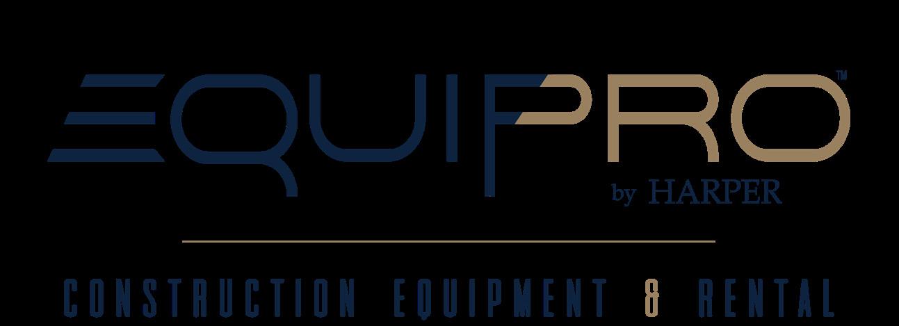
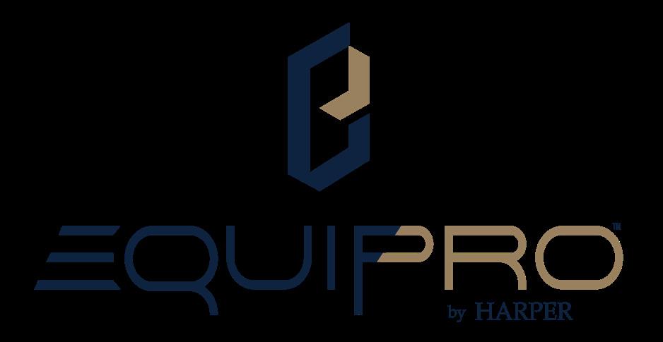
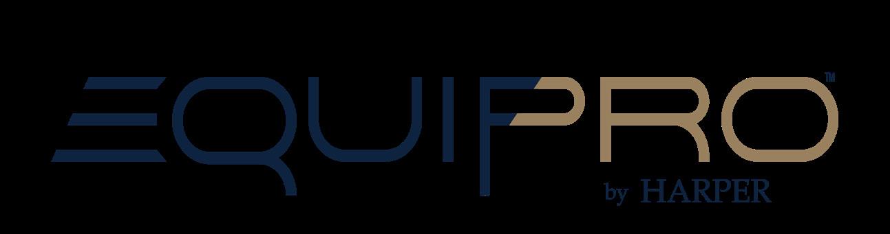
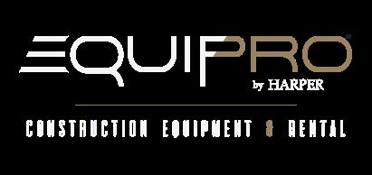
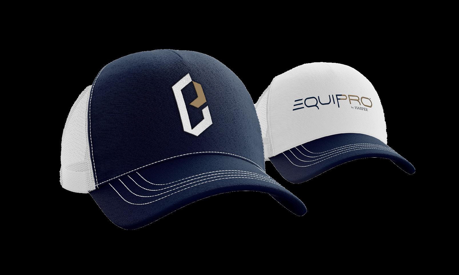
EQUIPRO LOGO
The EQUIPRO logo is integral to our brand’s identity. This is important in keeping our brand consistent across all platforms and mediums. Please adhere to the sizing and position guidelines below.
The EQUIPRO “E” icon (or “bug”) is used as a creative way to identify the division. The icon should only be used in conjunction with the Harper logo to co-brand or as a design element. For example, a flyer that has the EQUIPRO logo on the front might use the icon only in another place, and a hat that has the EQUIPRO logo on the front might also have the icon only on the side.
Please reach out to marketing before use of this logo if you are not a member of the EQUIPRO team.
ICON ONLY

WITH TAGLINE

SECTION THREE COLOR PALETTE
COLOR PALETTE
BRAND COLORS
The colors of Harper play a crucial role in defining our brand identity. All communications should use Harper Navy as primary, with Bronze and Silver as secondary colors. Harper’s brand colors are essential to keeping a consistent look. Harper Navy is our main color, used across all communications.
PRIMARY
NAVY
PMS: 289
R: 11 G:35 B: 63
C: 98 M: 84 Y: 46 K: 51 #0b233f
SECONDARY
BRONZE
PMS: 872 C
R: 137 G: 115 B: 78
C: 42 M: 47 Y: 74 K: 17 #89734e
SILVER
R: 140 G: 142 B: 141 C: 47 M: 38 Y: 39 K: 3 #8c8e8d
COMPLIMENTARY COLORS
We use a palette of complementary colors to supplement and add variety to our communications. These colors can only be used in a Marketing Department provided template. Please contact the Marketing Department for use.
R: 182 G: 149 B: 96
C: 28 M: 38 Y: 71 K: 3 #b69560
88 G: 88 B: 90 C: 63 M: 56 Y: 52 K: 28 #58585a
24 G: 69 B: 128 C: 100 M: 81 Y: 22 K: 7 #184580
55 G: 99 B: 162
C: 85 M: 64 Y: 8 K: 1 #3763a2
#5f8abf
Color Palette
SECTION THREE TYPOGRAPHY
TYPOGRAPHY
TYPE PALETTE
TYPEFACE 1: CALIBRI
Calibri is our primary font. Examples of when to use Calibri include email signatures, headings, documents, marketing materials, and general communications. It provides a clean, professional look and keeps our brand consistent and easy to recognize across all platforms.
USAGE
Use a 10 pt. minimum font size across all communications. Use a bold font for emphasis. Use ALL CAPS for subheaders. Calibri is primarily used as body text for all communications and materials, including bullet points, footers, captions, and subheaders.
TYPEFACE 2: RALEWAY
USAGE
0123456789
0123456789
Raleway is our secondary font. Do not use previous Typeface 2 Book Antiqua for any communications or purposes.
Raleway is primarily used as header text for all communications and materials. We generally only use Raleway Light and Raleway Bold.
Do not manipulate font, stretch, or add additional tracking. Do not use as body text.
Due to the recent change to Aptos as the body/default font for Outlook, this is an approved font to use by the Marketing Department.
Do not use the Italics Calibri style. Do not manipulate font, stretch, or add additional tracking. ABCDEFGHIJKLMNOPQRSTUVWXYZ 0123456789 abcdefghijklmnopqrstuvwxyz 0123456789
SUBSIDIARY FONTS
Marketing has several extra fonts for utilization on materials, such as jobsite signs, advertisements, flyers, banners, etc. These fonts align with the previously shared company typefaces, but are restricted to Marketing use.
EMAIL COMMUNICATIONS
Do not change the font nor its size in the body of an email without the prior approval of Information Technology or Marketing.
SECTION FOUR BRANDED APPAREL
BRANDED APPAREL
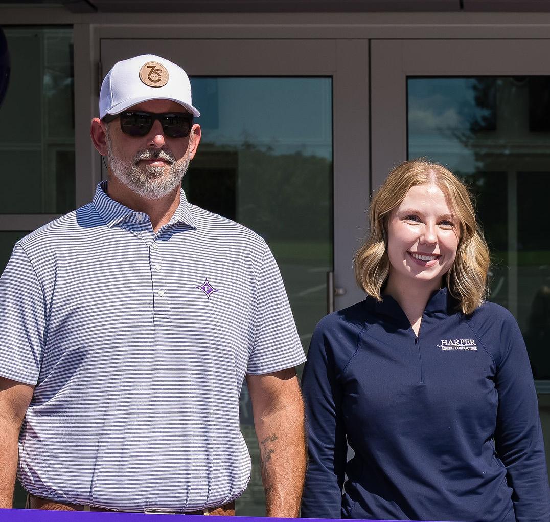
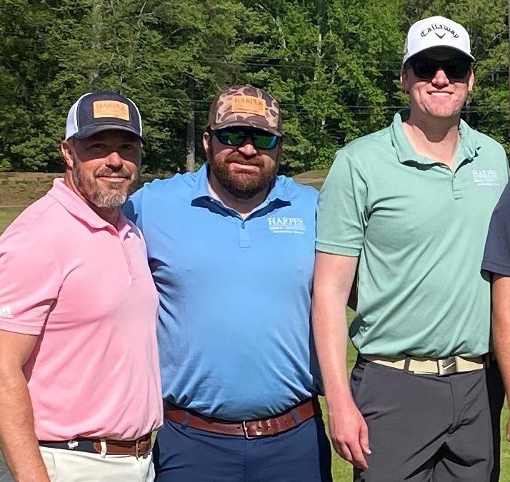
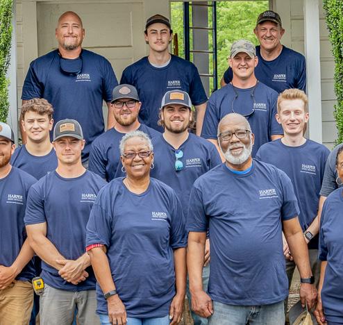
APPLICATIONS
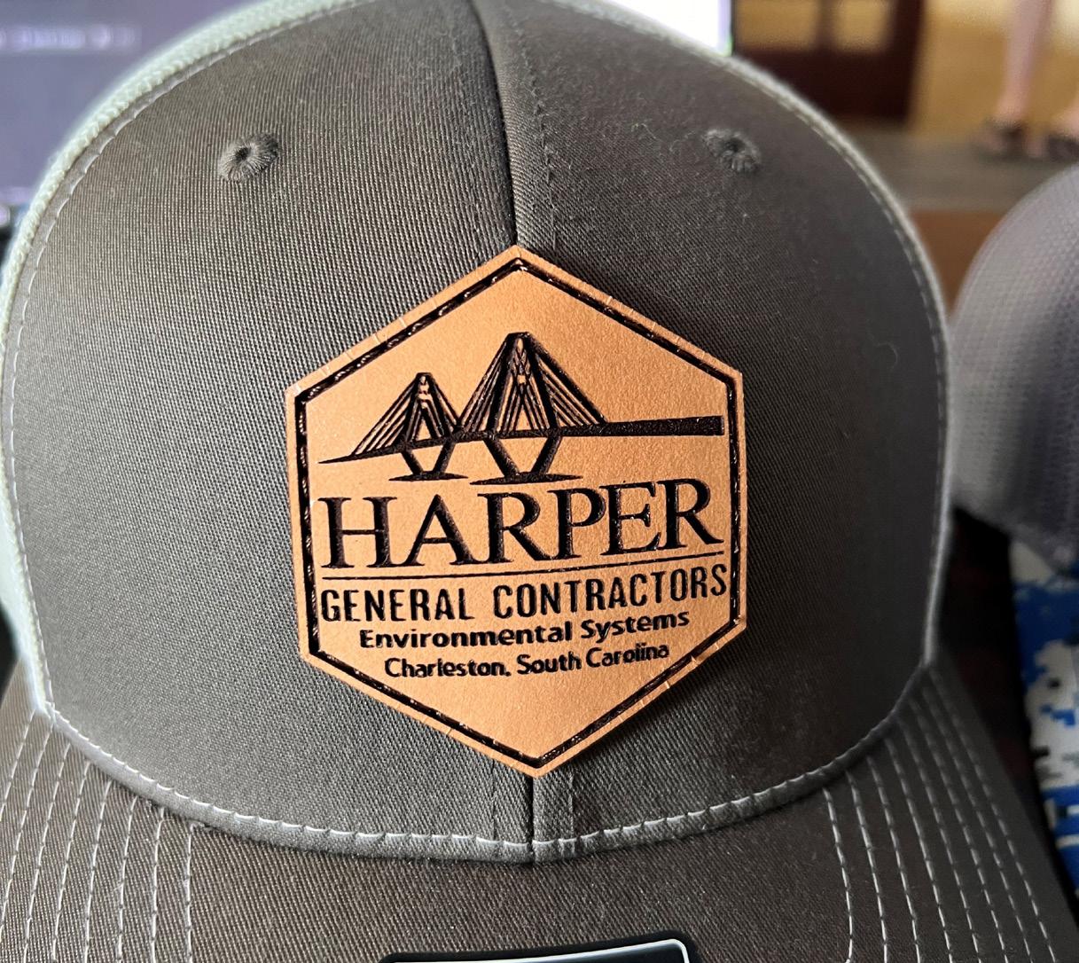
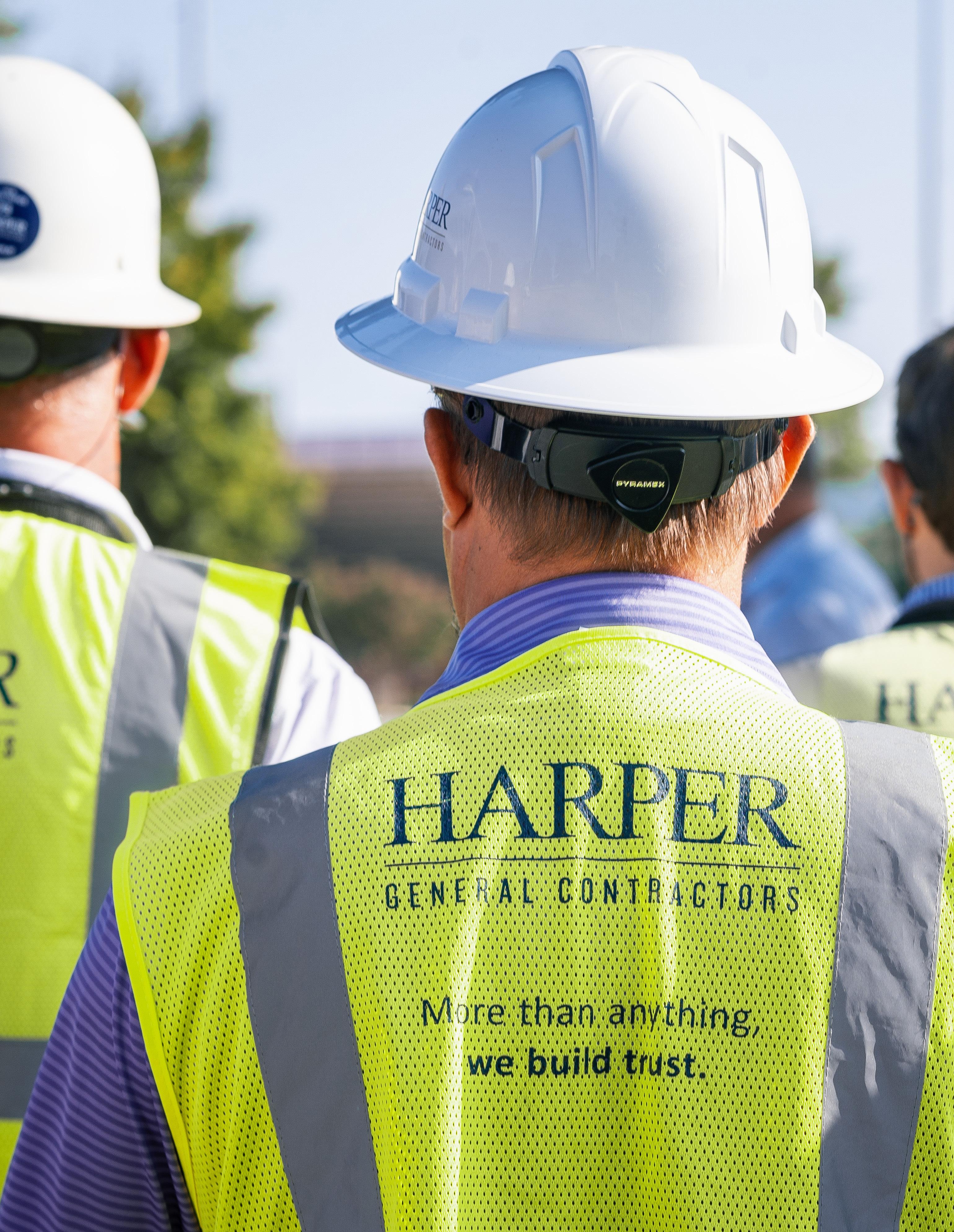
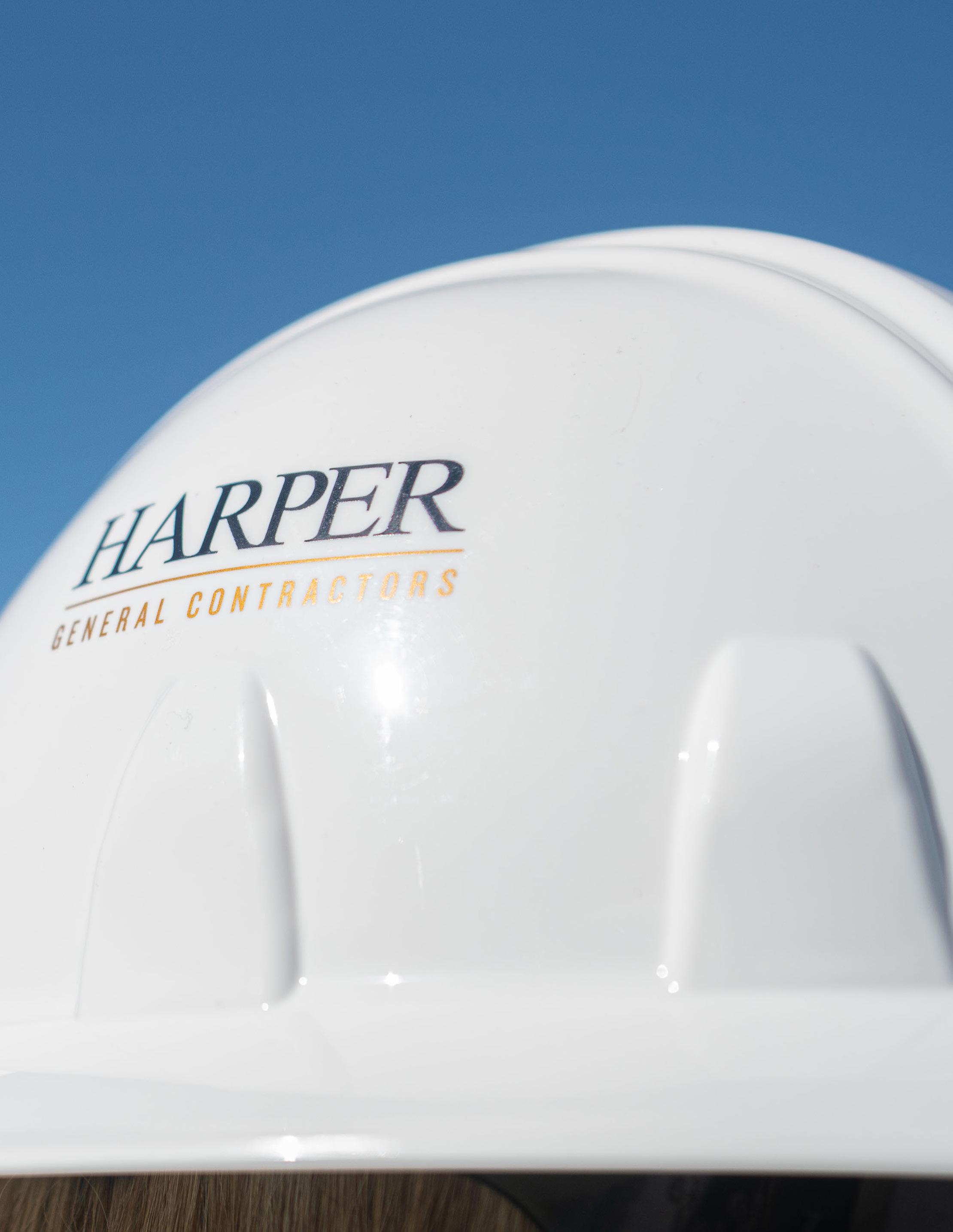
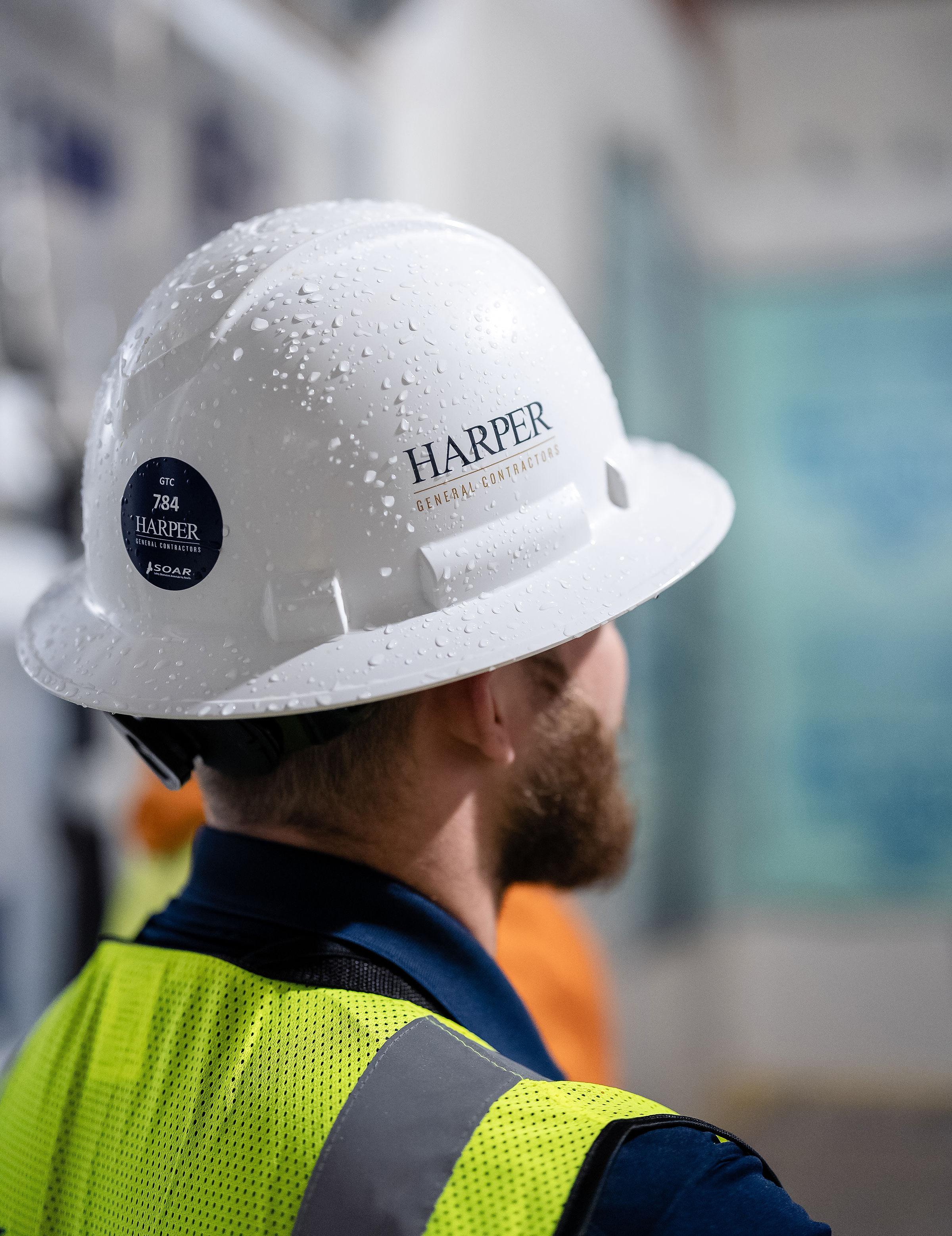
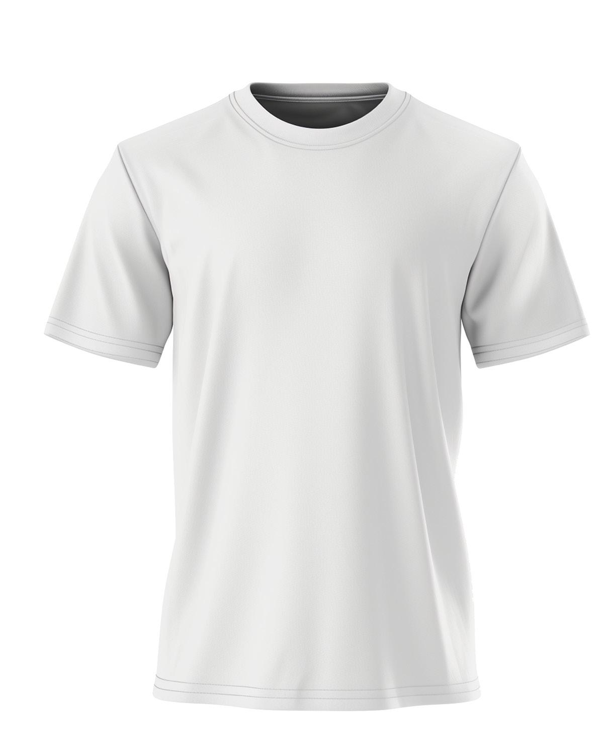
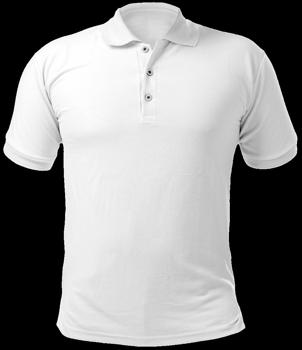
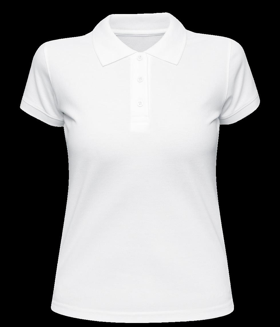
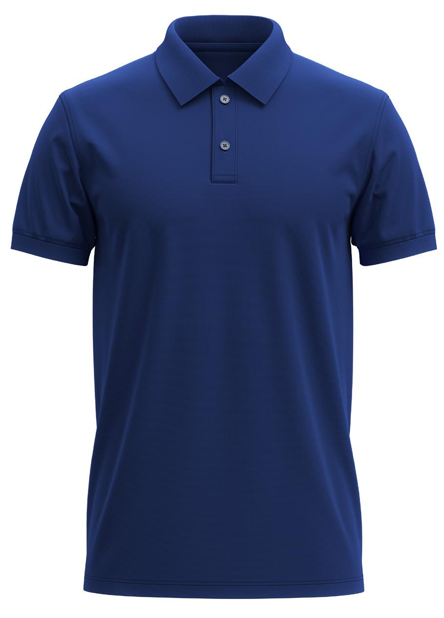
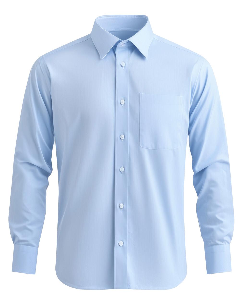
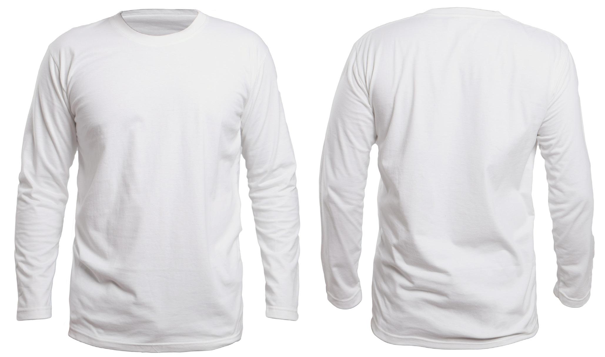
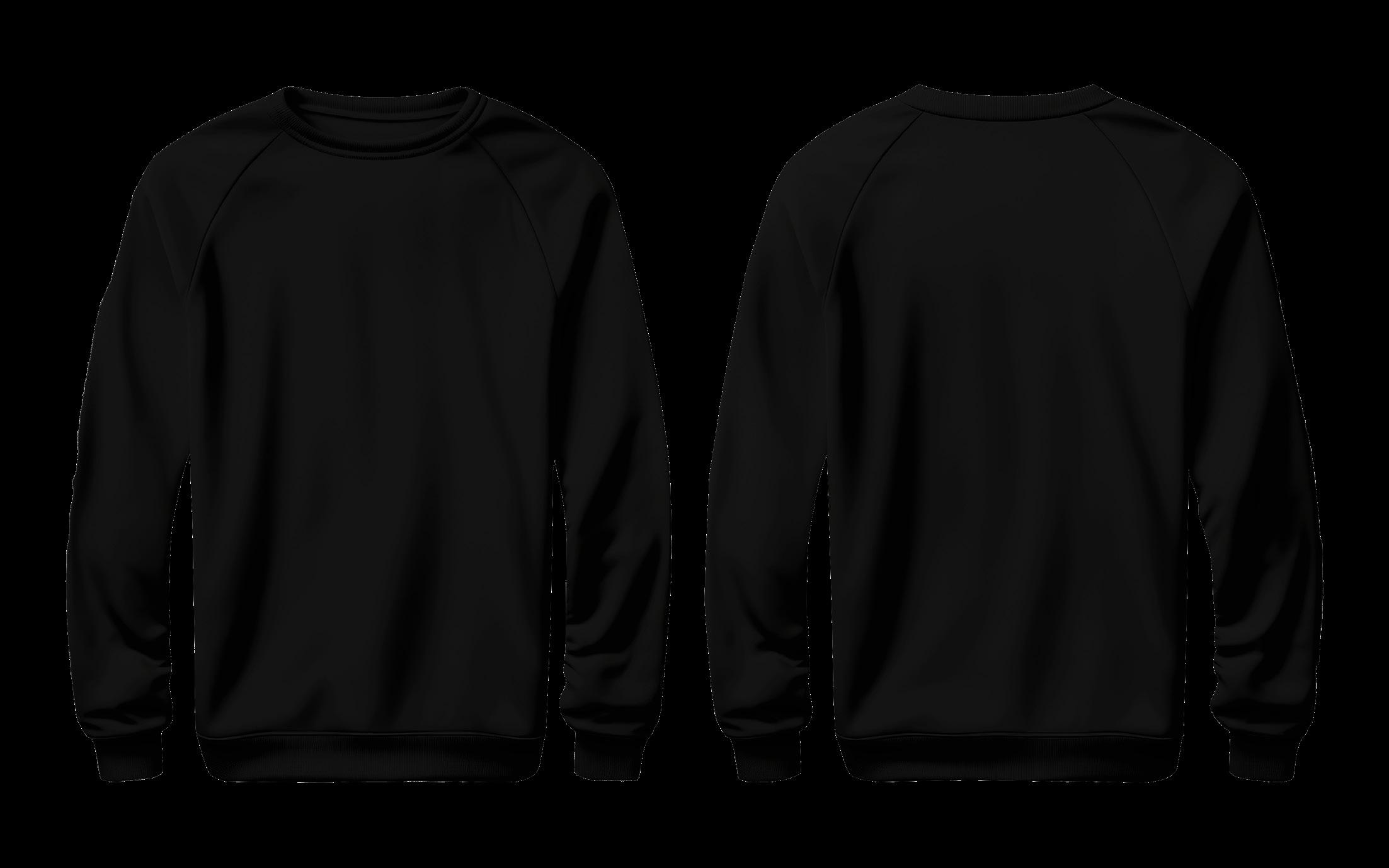
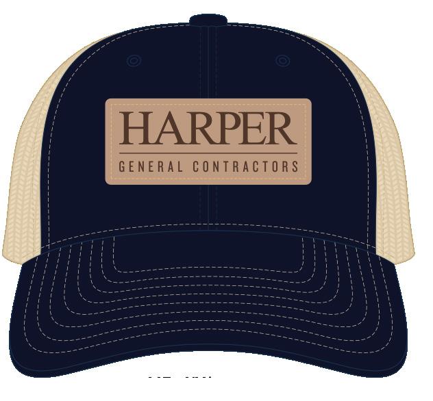
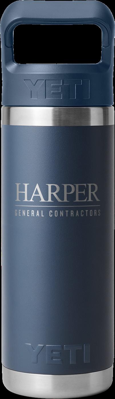
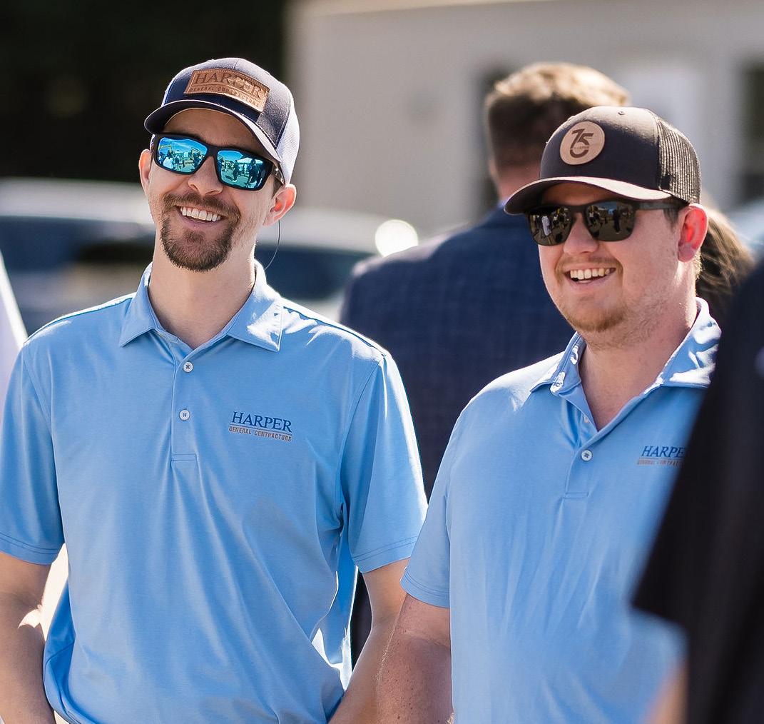
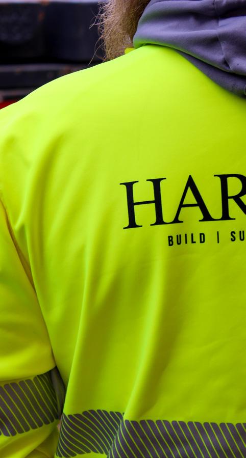
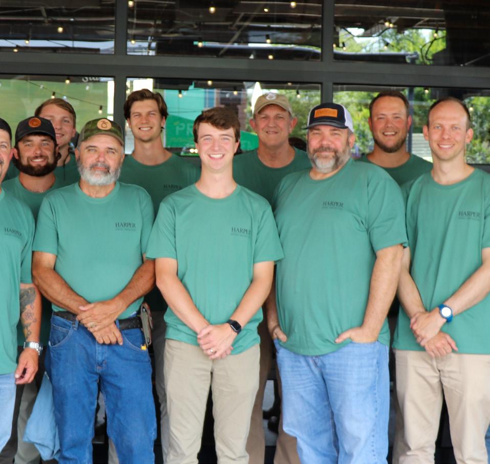
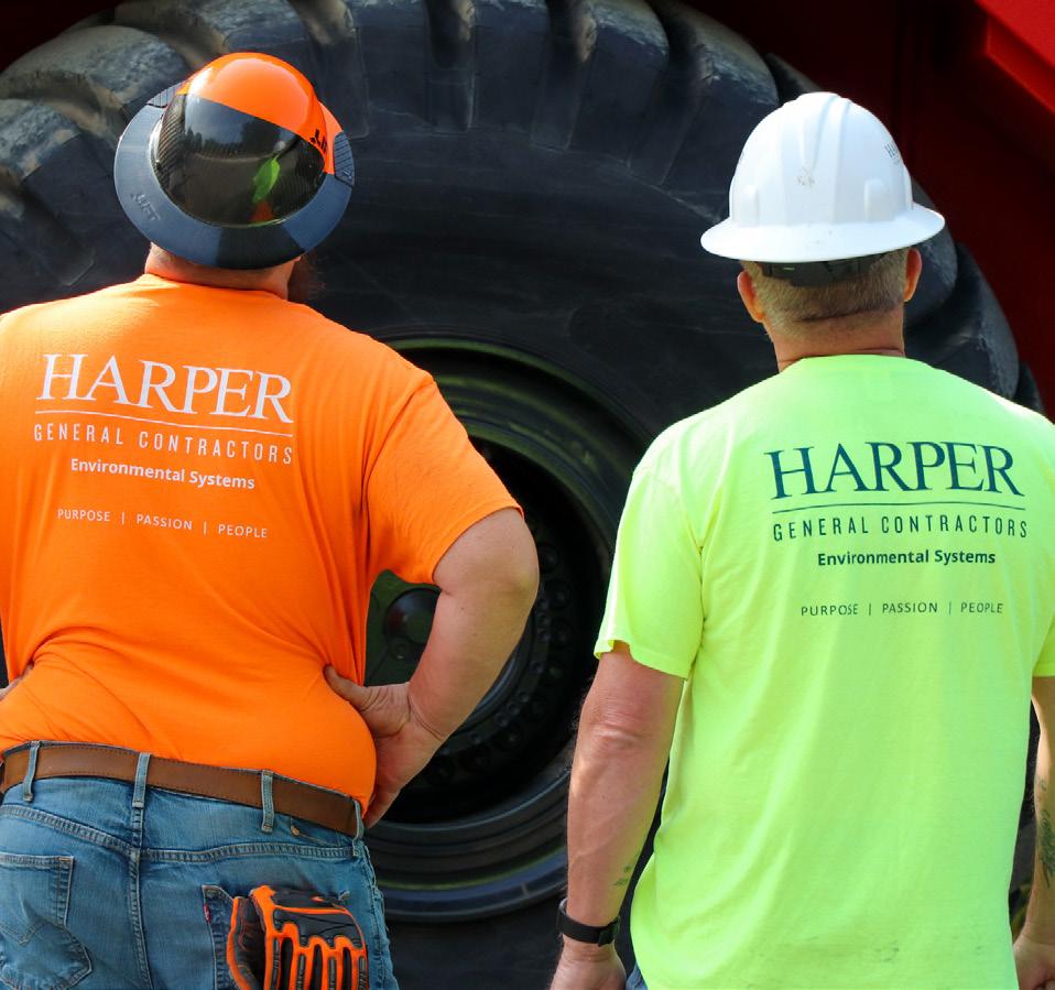
When applying our logo to branded apparel, consistency and visibility are key. The logo should always be placed where it is easy to see, such as on the upper left chest, sleeve, or back. Ensure the logo size is proportionate to the garment and stands out clearly against the background color. Avoid overcrowding it with other elements or placing it on complex patterns that may reduce readability. Adhere to our approved color variations to maintain brand recognition, and always follow spacing guidelines to keep the logo looking clean and professional on any apparel item. The following are logo are acceptable logo placements. This applies to the all logos, including the Environmental Systems Division logo and HarperXS primary logo. The smallest the stacked Harper GC logo should be represented is on an apparel item is 1”h x 2.75”w.
STANDARD PLACEMENT

BACK & LEFT CHEST
ACCEPTABLE PLACEMENT WITH EXTERNAL LOGO(S)
The following are acceptable logo placements when there is an external logo(s) needed. Our preference is to avoid using client or partner logos on Harper employee chest to avoid confusion. If doing a co-branded apparel item with external logos, please utilize sleeves and keep Harper on the chest.
LEFT CHEST (HARPER EMPLOYEE)
LEFT CHEST
(HARPER EMPLOYEE + EXTERNAL LOGO) LOGOEXTERNAL
LEFT
CHEST
(PRIMARY EXTERNAL)
LEFT
CHEST
(PRIMARY EXTERNAL + ADDITIONAL)
UNACCEPTABLE LOGO PLACEMENT
The following are not acceptable logo placements.
LEFT CHEST + OTHER DIVISION LOGO (ANY PLACEMENT)
EXTERNAL FRONT (HARPER ON SLEEVE)
LOGO NOT TO SIZE
ACCEPTABLE PLACEMENT EXAMPLES
The following are acceptable examples of logos on apparel and hard good items.


UNACCEPTABLE LOGO USAGE
The following are examples of unacceptable usages of the logo. This includes any manipulation, whether compressed or stretched. The logo should always be kept to its original proportions. Do not remove any portions of the logo or create alternative formats. Do not rearrange parts of the logo or create marks that are not provided within these guidelines. Do not add drop shadows or other text style effects. Do not condense, extend, crop, rotate, warp, twist, skew, stretch, or alter the logo from its original proportions in any way. Do not use outdated logos. Do not alter the colors of the colors or use off-brand colors. Refer to the color palette section for usage. You may add identifying text if approved by Marketing (such as Information Technology, etc.) but it should not be added to the logo itself or made as part of the logo.
Oftentimes when working with apparel and marketing companies, the contact will share that our logo will not fit or be stitched out properly due to the size of lettering for “General Contractors”, and “Environmental Systems Division”. There are generally ways that Marketing can provide an alternative solution, but it is prohibited to alter the logo under any circumstances, even if the apparel company says it does not work. If you are concerned about distortion of the logo, please send to Marketing for review and approval. Below are examples of unacceptable logo use.


Coastal Office
EXAMPLES OF INCORRECT LOGO USAGE & PLACEMENT