GORDON KAYE AND SASHA KAYE-WALSH ARE EDITORS AT GDUSA
Comments, suggestions and letters can be sent to editorial@gdusa.com.
The origins of our annual ‘Designers For Good’ feature traces back some four decades to a phone call from a forward-thinking paper mill executive who asked if I knew what sustainable design meant. I did not.
I’m always behind the curve but, in my defense, few people outside academia or activism knew what it meant either.Not long after, though, started to follow small bands of designers who were beginning to express their sense of social and environmental responsibility — specifying recycled paper, choosing soy-based inks, and recognizing that their choices could have impact.
That modest spark became our first feature, “Designing With Recycled Papers.” Which begat “Green Designers” and then “Sustainably Responsible Designers” and then “Socially Responsible Designers” and then “Responsible Designers” — and now “Designers for Good.” Who knows what we’ll call it next?
With each evolution, the idea of what it means to make design matter has grown richer and more expansive — a far-reaching commitment to purpose-driven design that communicates meaning and makes change.
As you will see in this October 2025 edition, the issues our cohort champion go far beyond what anyone imagined years ago and yet are rooted in the challenges of the day: democracy and rule of law and voters rights, healthcare funding and research, racial and gender equality, women and minorities in business, regional and civic pride, support for non-profits and public broadcasting, arts and cultural organizations, parks and recreation and, of course, nature and the environment.
All grounded in the belief that thoughtful design can make the world more just, more humane, more hopeful. And all against the backdrop of a polarized society in a state of cultural unrest. Interestingly, no one specfically mentions Donald Trump’s name though, for good or ill, he is the elephant in the room.
Ying Zhang, creative director at the Human Rights Foundation, nicely expresses the essence this special feature: “Design holds immense potential as a catalyst for change by making the invisible visible, shaping behavior, amplifying voices, telling stories, and reimagining systems. As designers, we are in a prime position to ask — whose voices do we amplify? Which messages do we choose to elevate? What actions and behaviors do we want to encourage? And ultimately, what kind of future do we want to imagine, create and live in?”
CONTINUED NEXT PAGE
LETTER FROM THE EDITORS
CONTINUED
Please join us in celebrating our Designers For Good selections — individuals and teams proving, once again, that design done with conscience and care has the power to make life better for people and nature. — GK
OUR HEALTH+WELLNESS AWARDS SHOWCASE
We did not see this coming. When the GDUSA Health+Wellness Design Awards was launched 25 years ago, the goal was modest and straightforward: to recognize excellence in graphic design within a vast but largely stable, traditional, and conventional industry — or rather, a network of industries — dedicated to health and wellness.
But, of course, life happens and, instead of stability, we’ve witnessed seismic shifts: fierce public policy debates, controversial court decisions, a devastating global pandemic, remarkable advances in data, technology, and biology, and a fundamental reimagining of what health and wellness mean — personally, socially, and systemically. What began as a relatively static competition has evolved into something more dynamic: a selective, ever-expanding platform that reflects the complexity of our times.
Today’s winners represent a diverse range of design studios, creative agencies, in-house teams, and institutions. Their work spans the spectrum — from traditional healthcare and medical communications to wellness and selfcare to public and community health initiatives. What unites them all is the belief that effective design matters.
(It’s worth noting that two longtime stalwarts of this competition — NIH and CDC, known for truly responsive graphic design — are absent from this year’s thousands of entries. We hope the headwinds they face calm soon for the sake of the greater good.)
We invite you to explore the 2025 showcase — 125 standout pieces. And while this annual awards program may be just one small part of a much larger conversation about what it means to be healthy and thriving, we’re confident that the extraordinary communicators represented here are helping to push the conversation forward. — SKW
WHY DO IT
The creative community is generating a lot of fresh news, ideas, and insight. At GDUSA, we aim to present a slice of that energy across our print and digital platforms — daily, in fact, on our newly redesigned website gdusa.com. We encourage you to visit often for a dose of relevant, useful and sometimes thought-provoking content.
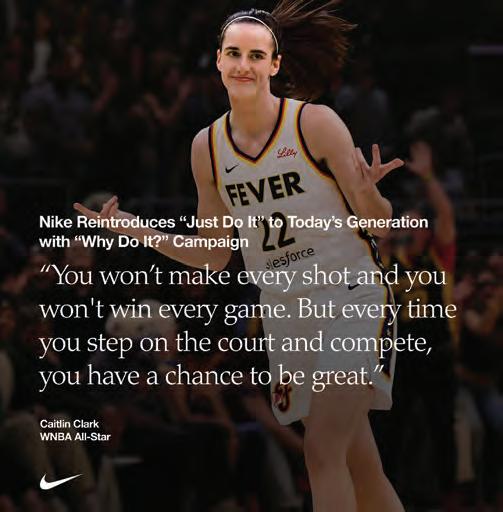
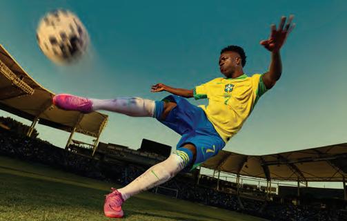
One of many news items we’re covering right now online and in print is Nike’s new “Why Do It” campaign — a striking counterpoint to its iconic “Just Do It” slogan. Aimed at younger generations navigating fear of failure and crippling perfectionism, it asks a provocative question: Why take a risk? The campaign speaks to a generation shaped by anxiety and self-doubt, and it resonates personally. I was plagued with fear of failure and, only in my later years, have I come to realize how insidiously — and unnecessarily — it can limit choice, potential and aspirations.
Nike reframes failure not as something shameful, but as a step toward growth and self-discovery. Try, stumble, fall, get up, try again. In today’s dumbed down media culture, often shaped by highlight reels and surface-level validation, this message has meaning. It’s a reminder of the messy, real process of building a life — and the resilience it takes to keep going. Nike marketers have a talent for reading the room and, once again, they have captured the zeitgeist, the cultural moment, with authenticity. — GK
GDUSA-Graphic Design USA Volume 62/No.5 September/October 2025 Kaye Publishing Corporation (ISSN0274-7499/USPS227020). Published 6 times a year with combined issues in January/February, March/April, May/June, July/August, Se ptember/October, November/December.
Executive, editorial and advertising offices at 594 Dean Street, Office 22, Brooklyn NY 11238. Phone: 212.696.4380. Website: www.gdusa.com.
SUBSCRIPTION: Domestic, $72 one year. Canada and Mexico $140 per year. Periodicals postage paid at New York NY and additional mailing office.
POSTMASTER: Send address changes to GDUSA - Graphic Design USA, PO Box 3072, Langhorne PA 19047. Permit #224.
8 FRESH
Nike reframes iconic ‘Just Do It’ messaging for the anxious generations; Lays rebrand is potato-forward and sun saturated; ChatGPT’s first brand campaign is human-focused; Dunkin’ reimagines its coffee packaging as a centerpiece of domestic life; Mrs&Mr returns Conair to the heart of haircare and beauty culture; VML ‘premiumizes’ America’s Best eyecare and eyewear brand; Bruce Mau Design cultivates Biophi’s identity; Wolf Olins’ Blank Street logo embraces the power of blank; Lime steers its time-saving message to 20 cities across the globe; and more.
24 DESIGNERS FOR GOOD
Whether you prefer to call them Designers for Good or Socially Responsible Designers or Social Impact Designers or Sustainable Designers — or whatever — this special report continues are practice of shining the spotlight on creative professionals whose work contributes to making the world better for people and nature as they see it. This approach to work and life has turned into a movement within the creativity community, and continues to thrive even against the current backdrop of political polarization, economic uncertainty, and a cultural reset. A special thanks to exclusive sponsor Domtar® for helping spread this heartening and positive message year after year.
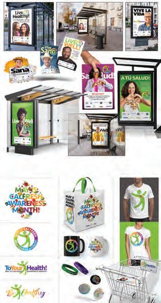
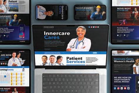
48 HEALTH+WELLNESS AWARDS
The 25th Annual Health+Wellness Design Awards™ celebrates excellence in graphic design within one of the most dynamic, significant, and visible sectors of contemporary society and the economy. This year’s winners represent an exceptionally curated selection of projects and campaigns developed by leading design firms, agencies, corporations, and institutions. The scope of recognized work is broad, encompassing traditional medicine, healthcare services, healthy lifestyles, self-care and beauty, as well as public and community health initiatives. The underlying message is unequivocal: thoughtful, effective design and communication play a critical role in promoting both individual and collective well-being. And let’s be honest: in today’s societal landscape, few topics are as relevant — or as controversial and debated — as how to prioritize health and wellness. One could argue (and we do) that good design matters more than ever.
THANK YOU TO DOMTAR
Domtar is the exclusive and founding sponsor of GDUSA’s Designers For Good annual special feature.
Domtar is a leading, privately held manufacturer of diversified forest products, with a workforce of roughly 14,000 employees in more than 60 locations across North America. The company prides itself on operational excellence, delivering sustainable, high-quality and cost-effective products to meet and exceed customer needs globally. Domtar’s principal executive office is in Fort Mill SC.
Long a trusted supplier of papers to the creative community, the company states: “Your reputation is important. Your business depends on it. Our well-known brands give you the confidence of quality and consistency that your reputation is built on. Our brands offer you and your customers unmatched print results, reliability and peace of mind. No matter the need, we offer a brand that’s right for you.”
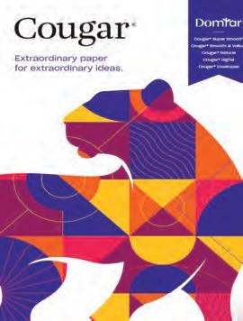
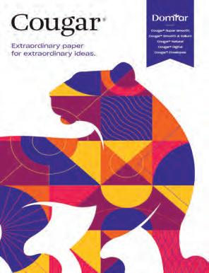
Best known to designers and printers are: Cougar®, renowned for its velvety surface, Cougar is the premium paper that amplifies a brands passion, personality and purpose; Lynx, featuring impressive runnability, rich color reproduction and excellent image quality at an uncompromising value; and Husky, an economical and dependable offset that outpaces the competition.
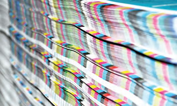
This edition of GDUSA is printed on Cougar® 70 lb. text. Cougar comes in three luxurious finishes, two colors, and extensive digital offering, and a vast array of sizes and weights. Request the latest Cougar swatchbook at info.domtar.com/cougar
ABOUT THE COVER
The American Bar Association (ABA) Design Marketing team is the award-winning design team supporting the ABA’s mission to protect the rule of law, advance the legal profession, and ensure access to justice for all.
COVER PAPER CREDIT: The cover of this edition of GDUSA is printed on FSC-certified Kallima Coated Cover C2S, part of the Kallima Paper family of coated cover paperboard. Kallima products are proudly manufactured by Rayonier Advanced Materials, a global leader in sustainable forest management practices. Their light-weight, fully bleached coated board products are used in commercial printing, publishing, prestige packaging, high-impact graphic corrugated containers, point-of-purchase displays and litho-laminated packaging. Kallima has a distinct low-density high-bulk construction resulting in less trees used and signficant cost savings to the customer. Contact: kallimapaper.com and 1.800.411.7011
Gordon Kaye PUBLISHER
Ilana Greenberg CREATIVE DIRECTOR
Sasha Kaye-Walsh EDITOR/WEBSITE & SOCIAL MEDIA
Gordon Kaye EDITOR/PRINT
Charlotte Kaye GRAPHIC DESIGN
Kyle Redfield CHIEF TECHNOLOGY OFFICER
Althea Edwards READER SERVICES
Angelo Abbondante ACCOUNTS MANAGER
A Great Idea INTERNET SERVICES
Maliya Malik DESIGN/SOCIAL MEDIA ASSOCIATES
Jay Lewis Jeff Rosenberg PHOTOGRAPHY
Ron Andriani AD SALES + INTEGRATED MARKETING 201.669.9884 randriani@ gdusa.com
Milton L. Kaye 1921-2016 FOUNDER
COPYRIGHT 2025 KAYE PUBLISHING CORPORATION
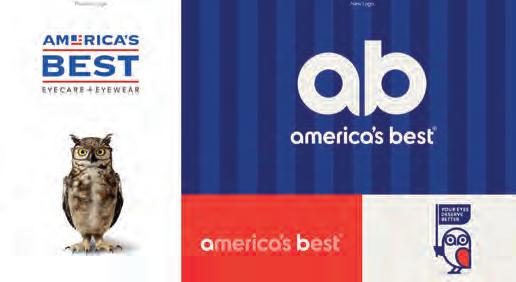
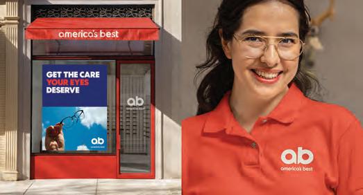
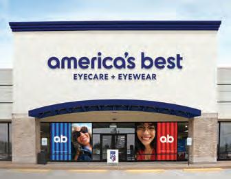
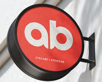
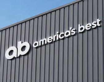
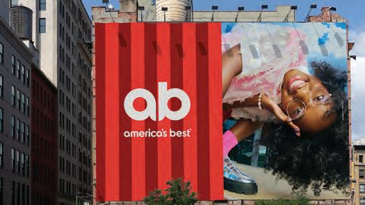
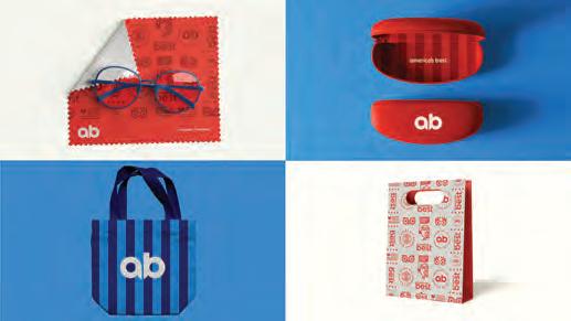
America’s Best has introduced a comprehensive visual brand transformation in collaboration with VML. The rebrand for the retail optical, eyewear and eyecare company includes a new logo, brand platform, a complete identity overhaul across media touchpoints, and a new mission statement that “Every Eye Deserves Better.” Gone is the familiar flag logo, replaced by a more sophisticated “AB” acronym brand mark and a new visual design system. This evolution weaves in nods to the company’s heritage, with a fashionable reinterpretation of American stripes and colors so that the patriotic motif is more subtley retained, and a playful homage to its signature owl mascot. A launch film takes viewers on a colorful journey through the lives – and eyes – of Americans while the brand’s social media channels and website feature photography and motion graphics that capture everyday moments where clear vision matters. VML’s Chief Design Officer, Robb Smigielski describes the concept as “premiumizing” an accessible brand, creating heightened sense of value and pride for the client that is inviting rather than polarizing. He says the process “enhances the brand’s perceived value and fosters brand pride by making it more contemporary, energetic, and alluring. It both encourages customers to feel value for their money, but with pride in their purchase and enthusiasm to share it with the world.” The redesign comes soon after the visual refresh of its parent company National Vision.
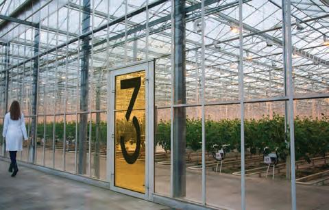
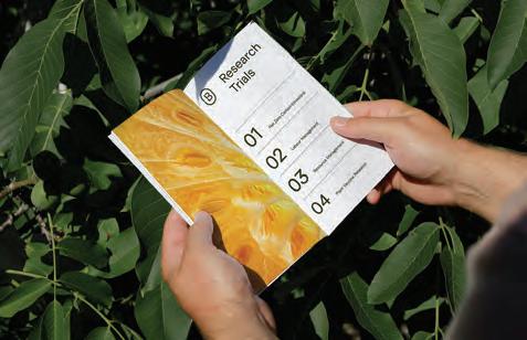
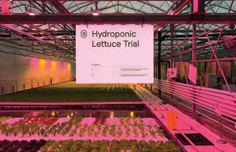
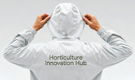
In a move aimed at reshaping the face of horticultural innovation, Bruce Mau Design has rebranded the Center for Horticultural Innovation, unveiling a new identity and name: Biophi. The Toronto-based design consultancy’s work goes beyond a change in nomenclature. The reimagined identity is built around the theme “Growing Possibilities,” positioning Biophi as a forward-thinking R&D organization focused on delivering practical solutions to growers, suppliers, and industry stakeholders. The new brand seeks to convey a balance of analytical rigor and creative experimentation — a partner as adept in the lab as in the field. “Sharing our work with Biophi was about capturing their unique role as both innovators and problem solvers in horticulture,” said Laura Stein, Chief Creative Officer at Bruce Mau Design. “By immersing ourselves in their world — walking the greenhouses, speaking with growers, and understanding the challenges of controlled environment agriculture — we translated their hands-on, forward-looking spirit into a brand system that is bold, practical, and future-facing.” The visual identity embraces a minimalist, science-driven aesthetic. A stencil-style wordmark evokes adaptability and action, while a circular monogram serves as both a seal of authority and a nod to continuous innovation. The color palette is anchored in crisp whites, signaling precision and clarity, accented by hues derived from Biophi’s own technologies, including advanced LED lighting systems used in modern growing environments.Bruce Mau Design developed a comprehensive brand platform for Biophi — encompassing naming, tone of voice, and visual language — to solidify the organization’s positioning as the industry’s “practical problem solver.” Matt Korpan, Executive Director of R&D Operations at Biophi, noted that the rebrand reflects both the company’s evolution and its aspirations. “Adopting the Biophi identity allows us to better represent who we are today: a collaborative hub accelerating horticultural innovation,” he said.
MATCHING TALENT WITH SUCCESS NATIONWIDE
The Great Resignation has left companies scrambling for talented designers and creatives searching for fulfilling projects. That's where Artisan Talent comes in. We're a boutique creative staffing agency here to make things easier for you - whether you’re hiring talent or finding work. From small agencies to major corporations, our team is in the business of connecting people. That’s what makes us Artisan.
TOP PLACED TITLES
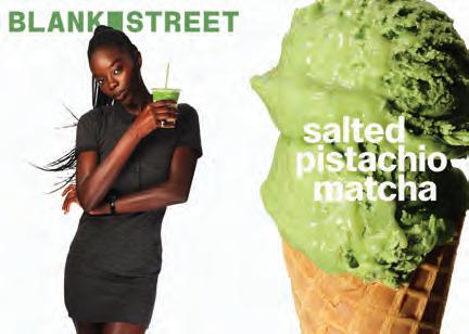
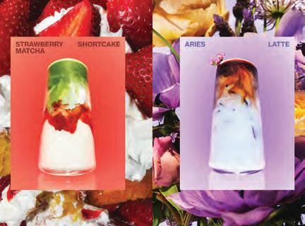
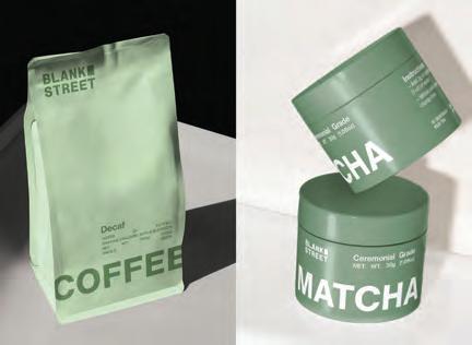
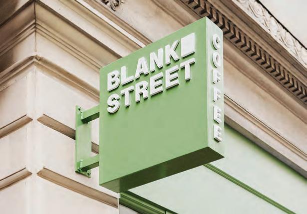
Once a coffee cart on a Brooklyn sidewalk, Blank Street has become a cult favorite across major cities in the US and UK. Now, the brand is preparing to enter a new chapter — with a rebrand that seeks to reposition it from a fast-growing café chain into a global lifestyle player. The new identity has been developed in partnership with global brand consultancy Wolff Olins. Since its founding during the early days of the pandemic, Blank Street has expanded from New York to Boston, Washington D.C., and across the pond to London, Manchester, Birmingham, Glasgow, and Edinburgh. That fast growth created the need for a brand system that could not only keep up but evolve in step with the company’s ambitions. The refreshed brand is rooted in the very tensions that define Blank Street’s character: function and form, utility and indulgence, sophistication and playfulness. These dualities are made tangible through a comprehensive visual language. Key elements of the new design system include: a redesigned logo and symbol, which carves out a literal “blank” window — a visual metaphor for imagination, possibility, and a nod to the brand’s name and origin; an evolved color palette, anchored by “Blank Street Green”— a lush, vibrant hue instantly recognizable to fans, along with a set of secondary greens named after times of day, echoing the changing appearance of a Blank Street cup in shifting light; and custom typography, developed with Due Studio, introducing two new typefaces including Regular Sans for headlines and Remarkable Sans to highlight moments of surprise and joy. All of this is designed to work fluidly across channels — from instore signage and coffee cups to digital platforms and campaign creative. Wolff Olins’ Creative Director George Lavender said the design team set out to elevate the everyday, drawing from the brand’s original story and visual cues that long-time customers would recognize. “Every detail draws inspiration from their unique story: from the shape of the window on their first coffee cart to the signature drinks that are beloved by their regulars,” said Lavender.
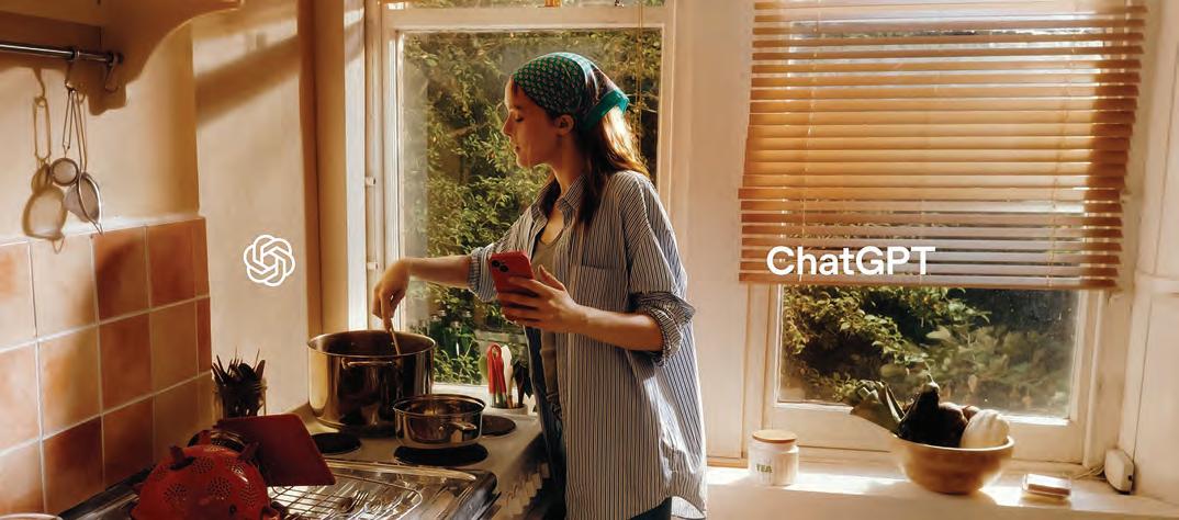
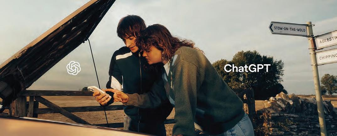
OpenAI is rolling out its first large-scale brand campaign for ChatGPT, signaling a strategic shift from event-based promotions to long-term brand building. The campaign highlights how users are integrating ChatGPT into their daily lives — from planning trips to workout tips to finding a recipe for a date — and underscores the tool’s growing role in creative and personal productivity. The work is appearing across outdoor advertising, tv, streaming platforms, and social media in the US, UK, and Ireland. Leading the creative charge are a pair of 30-second TV spots, ‘Pull-up’and ‘Cooking,’ that aim to show people’s relationships with their ChatGPTs. They are described as simple, straightforward brand films depicting “everday magic” — a human-focus intended to foster user trust and engagement and to evolve ChatGPT into a lifestyle brand. Human craft was central to the campaign. OpenAI’s in-house creative team and teamed with agency Isle of Any to develop the campaign, while director Miles Jay shot the films through production company Smuggler, and photographer Samuel Bradley and stylist Heidi Bivins worked on the outdoor ads. However, ChatGPT is credited as a “co-creator.” Says Elke Karskens, OpenAI’s International Marketing Director: “With more and more people across the UK using and loving ChatGPT, we want to showcase how it can make your life easier and help you do more of what matters to you.” Earlier in the year, the company collaborated with design agency Studio Dumbar and type foundry ABC Dinamo to create a cohesive brand identity that included: an updated blossom logo with thicker, uniform lines; a custom typeface, OpenAI Sans, with rounded shapes to appear both friendly and technical; and an updated color palette featuring softer, natural hues to complement the minimalist black-and-white foundation.
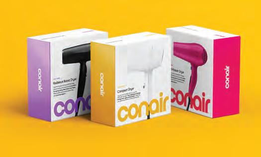
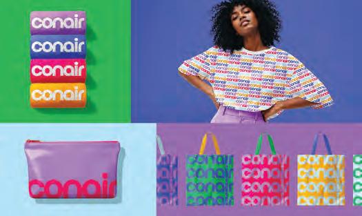
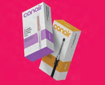
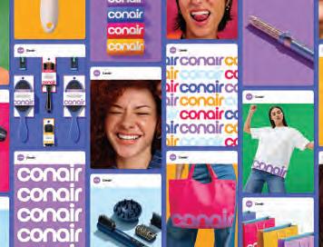
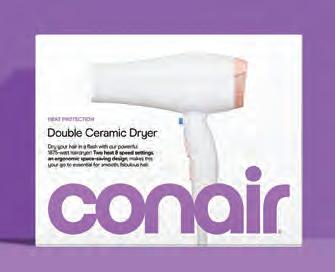
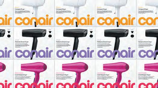
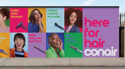
To reclaim a legacy and connect with a new generation, Conair — best known for introducing the pistol-grip hair dryer in the 1960s that literally changed consumer behavior — has launched a visual overhaul led by creative agency Mrs&Mr. The rebrand, which rolls out alongside a 17-week advertising campaign across digital platforms, is designed to celebrate transformation, empowerment, personal expression, and to place Conair back at the heart of beauty culture. At the core of the rebrand is a redrawn logo, transitioning from its long-standing industrial-style uppercase to a more playful, lowercase wordmark with fluid, circular forms. The design system features oversized logo placement across packaging and communications, asserting the brand’s presence with a statement meant to command shelf space and screen time. One of the most distinct visual shifts is the new color palette, anchored in soft lilac and supported by five vibrant hues. Each color helps navigate Conair’s vast product range and pricing tiers, unifying the brand across retail and digital environments. Product imagery is rendered with clarity and precision while model photography leans into authenticity and exuberance — “real people, real hair, real joy.” Package design features a strong hierarchy, vibrant color blocking, and product-forward visuals. Armed with a new tagline, “Here for Hair,” the advertising campaign celebrates the freedom, fun and power of changing your hairstyle. “The rebrand repositions Conair for a new era, honors its powerful legacy and pushes the brand forward with clarity, energy, and modernity,” said Kate Wadia, founder and chief creative officer, Mrs&Mr. “It’s a transformation designed to stand out, inspire confidence, and reaffirm Conair’s place at the center of beauty culture.”
Pride and passion in premium.
Sterling® Premium is crafted in America with pride by people who bring generations of papermaking skill and passion to every product we make. Engineered for next-level consistency, Sterling Premium offers quality, printability and sustainability. Available in matching digital and offset sheets, Sterling Premium is made using 10% recycled fiber carrying three chain-ofcustody certifications. All of this backed by service and support as strong as our passion for paper.
Sterling Premium. An American classic.
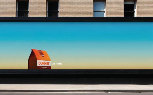
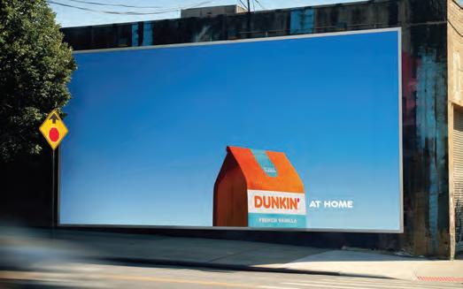
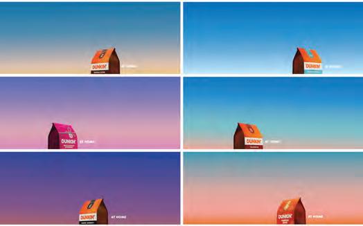
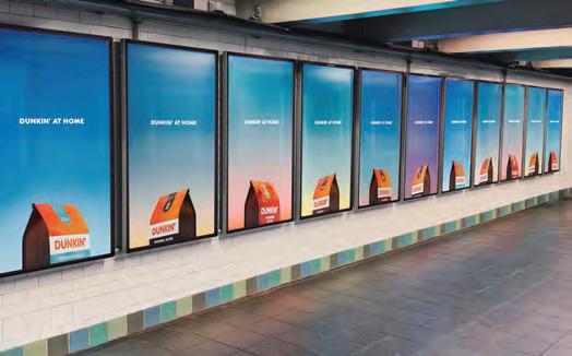
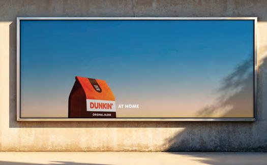
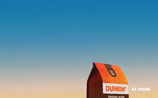
In a bid to extend its presence beyond storefronts and into American kitchens, Dunkin’ has launched a new marketing campaign that reimagines its coffee packaging as the centerpiece of domestic life. Developed in partnership with agencies PSOne and BBH USA, the “Iconic Home” campaign employs a minimalist aesthetic to striking effect. The concept is straightforward: a coffee bag, tightly cropped and photographed at a precise angle, is rendered to resemble a house — a visual metaphor for bringing Dunkin’ into the home. Set against bold, gradient-hued skies, the images are clean and graphic, evoking a sense of warmth and comfort. Sapna Ahluwalia, group creative director at BBH USA, described the campaign’s strength as rooted in its visual clarity. “The power of this idea lies in its simplicity,” she said in a statement. “It is literally just a bag of Dunkin’, cropped at the perfect angle to resemble a house. Stripped of clutter, the aesthetic conveys warmth, comfort, and the inviting feeling of home — standing out in a world that’s become visually too much.” Each of the seven coffee varieties featured in the campaign is paired with a distinct gradient backdrop, designed to reflect the time of day or season best suited to the flavor, subtly reinforcing the idea of Dunkin’ as a fixture in daily routines. The campaign will appear across both static and digital out-of-home channels, including high-profile placements such as Times Square billboards, wild postings, and a broad suite of digital and social media content.
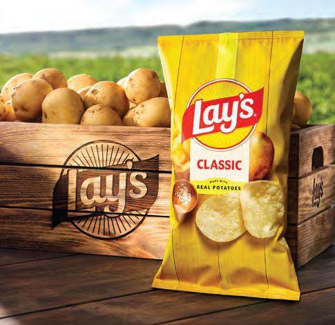
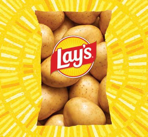
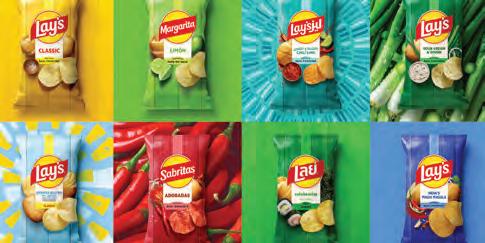
Lay’s has unveiled a significant redesign by PepsiCo’s Design & Innovation team. More than a visual update, the new identity seeks to deliver a deeper story: one grounded in a potato-forward message of real ingredients, family farms, and cleaner formulations. While the Lay’s logo has long featured a stylized sun, the design team updated the icon to be warmer, more intentional, and to radiate custom “Lay’s Rays” — a metaphor for the sunlight that nurtures each potato grown for the brand. A refined color palette is inspired by ingredients found across the Lay’s portfolio: pickle green, hickory brown, savory red, and more. The new colors enhance shelf presence while the new bags emphasize the “farm to bag” messaging. In addition, photography plays a critical role, with close-up imagery that spotlights the color, texture, and seasoning. Anchoring the system is the familiar red Lay’s ribbon, which evokes a seal of quality and a nod to the brand’s heritage. The new identity supports an expanded brand narrative. Lay’s now sources potatoes from over 100 family-owned farms across North America and, reports the company, often only travel 48 hours before they are cooked. This commitment was spotlighted in the 2024 Super Bowl ad “Little Farmer”, which told the story of a real Lay’s family farm. The redesign now extends that storytelling onto every bag — giving consumers a deeper sense of connection to what they’re eating. Alexis Porter, PepsiCo Vice President of Marketing says that “more than just a brand redesign, the new identity tells a story that speaks to a legacy of authenticity.” Adds Carol Gerhards, Senior Director of Design, Global Lays: “This redesign, the brand’s biggest in nearly a century, is a love letter to our origins.” The brand and package design rollout is happening across the U.S. this fall, supported by a fully integrated campaign spanning broadcast, social, in-store, and digital.
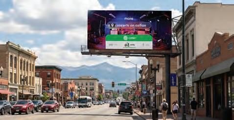
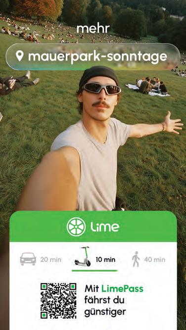
As the demands of daily life intensify with the arrival of fall, Lime, the electric scooter and bike-sharing company, has launched a campaign, “More Life with Lime,” designed to help commuters and city dwellers reclaim time for moments of joy and connection. Facing the tight schedules that accompany the seasonal shift many urban residents find themselves more time-crunched than ever. Lime’s campaign positions its services as a convenient alternative, turning “just missed” moments into “just in time” opportunities. “We know that as the seasons change and the days get shorter, people’s schedules get even more demanding,” said Christian Navarro, Director of Brand Marketing at Lime. “Our goal with this campaign is to remind people that the way they get around doesn’t have to be a source of stress. Lime offers a quick, convenient, and fun way to get from point A to point B, giving you back the time and energy you need to enjoy the moments that matter most.” The campaign is rolling out across more than twenty cities worldwide, including New York, Los Angeles, Berlin, Warsaw, and Washington, D.C. It employs a mix of billboards, digital outof-home advertising, social media, email marketing, and real-world events to engage riders. Among the unique elements are IRL activations — “bike bodegas”or pop-up convenience stores powered by pedal bikes and staffed by local content creators. These mobile shops offer riders supplies tailored to elevate their destinations: doughnuts for coworkers en route to meetings, flowers or fragrances for first dates, and earplugs for concertgoers. In Berlin, Lime will host a seasonal pop-up shop featuring autumnal drinks, live DJ performances, and giveaways such as free rides and movie night tickets.
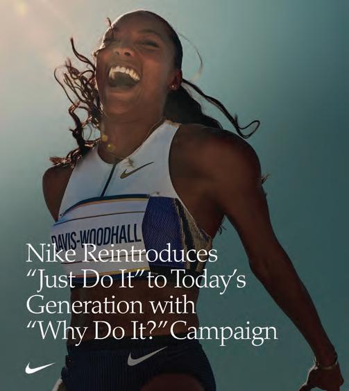
REFRAMES JUST DO IT FOR
ANXIOUS GENERATION
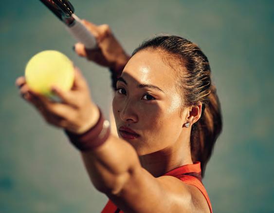
Nike’s familiar rallying cry — “Just Do It” — is getting a refresh. The brand has unveiled “Why Do It?” as a global campaign that invites Gen Z athletes to reclaim the spirit of the original missive — not as a polished destination, but as an everyday decision to try, to stumble, and to grow. Central to the campaign is a cinematic short film debuting across digital and broadcast platforms. The piece features an eclectic lineup of Nike-sponsored athletes — including LeBron James, tennis star Carlos Alcaraz, rising Chinese tennis talent Qinwen Zheng, NFL running back Saquon Barkley, and skateboard prodigy Rayssa Leal. Each athlete embodies the unvarnished reality of sport: that greatness emerges only after one decides to begin.
“‘Just Do It’ isn’t just a slogan — it’s a spirit that lives in every heartbeat of sport,” said Nicole Graham, Nike’s executive vice president and chief marketing officer. “With ‘Why Do It?,’ we’re igniting that spark for a new generation, daring them to step forward with courage, trust in their own potential, and discover the greatness that unfolds the moment they decide to begin.” The campaign’s visual language marks a departure from Nike’s traditionally polished ads. It embraces a raw, high-contrast aesthetic, employing grainy textures and kinetic typography reminiscent of the lo-fi, handheld styles favored by social media platforms like TikTok and YouTube Shorts. The refreshed typography maintains a nod to Nike’s classic branding while adopting a more modern, agile feel. Motion designers have paired custom type animations with footage capturing athletes in moments of both vulnerability and strength, reinforcing the campaign’s core message: failure is an essential part of the journey. In an era increasingly attentive to mental health and the pitfalls of perfectionism, Nike officials emphasize that “Why Do It?” celebrates not just victory but the courage to start — even when success remains uncertain.
DESIGNERS FOR GOOD 2025
In 2025, socially responsible design is no longer the exception—it’s part of the core fabric of the profession. The designers featured here are confronting some of today’s most urgent and complex issues: protecting democratic values, advancing access to healthcare, promoting racial and gender equity, and strengthening voter participation. They’re also working to amplify public broadcasting, elevate regional and civic identity, and support the essential work of nonprofits, cultural institutions, parks, and environmental organizations.
This group of designers is not simply responding to these issues—they are helping shape how we understand, engage with, and act on them. Through thoughtful visual storytelling, inclusive identity systems, and clear, human-centered communication, these creatives are using design as a tool for education, empowerment, and advocacy. From supporting grassroots movements to making complex information accessible, they remind us that design is not just about aesthetics—it’s about impact.
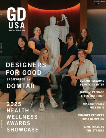
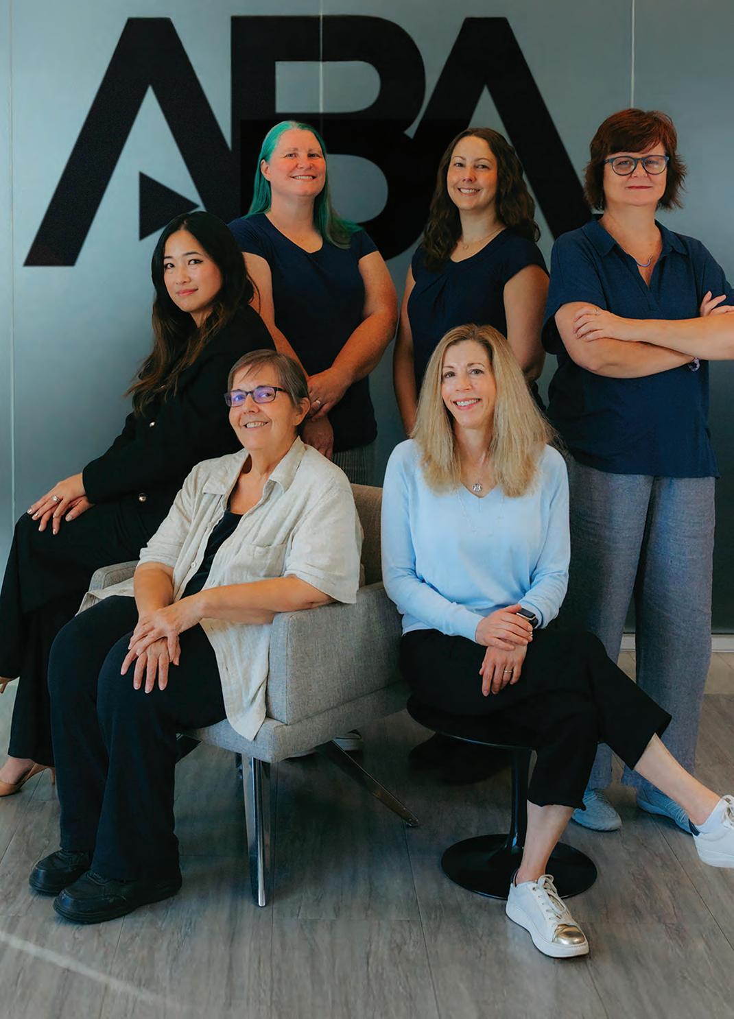
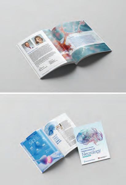
ABA DESIGN MARKETING TEAM
AMERICAN BAR ASSOCIATION, CHICAGO IL
The American Bar Association (ABA) Design Marketing team is the award-winning design team supporting the ABA’s mission to protect the rule of law, advance the legal profession, and ensure access to justice for all. The team includes Elmarie Jara, Director; Jill Tedhams, Associate Director; Amanda Fry, Design Manager; and Designers Mary Anne Kulchawik, Sara Wadford, and Elizabeth “Betsy” Kulak.
We translate complex legal and policy initiatives into clear, engaging communications that inform, inspire, and mobilize audiences. Our work combines brand stewardship with scalable creative solutions, enabling staff, members, and partners to communicate with a unified voice across multiple platforms.
ABA Design Marketing works across departments to ensure design is an integral part of organizational strategy. By providing tools, assets, and frameworks, the team demonstrates that design is not optional. It is a vital part of the human experience, building trust, strengthening partnerships, and creating meaningful, impactful work that engages audiences and advances the ABA’s mission
Tell us how and why you became involved in socially responsible communications, any thoughts on why design can be an especially effective tool for this goal, and, if you wish, give us an example of a project of which you are proud.
The ABA Design Marketing team treats designing for good as central to its work. Being a socially responsible designer means making complex issues understandable through visual storytelling. It also means protecting your team and fostering an environment where creativity can thrive while building scalable design systems that allow us to respond quickly without sacrificing impact.
Our team’s approach to design combines understanding with emotional resonance. Creativity is the heartbeat of ideas, energizing discovery and cultivating diverse experiences. Paired with visual storytelling, it helps audiences see new perspectives and build meaningful connections, transforming abstract challenges into clear, actionable outcomes.
The Fighting for the Rule of Law campaign exemplifies this approach. The initiative integrates creative efforts across multiple departments and equips staff, members, and partners with tools and assets to communicate with a unified, compelling voice. Emotive imagery, clean typography, and scalable templates enable rapid response while maintaining brand integrity. This work demonstrates how socially responsible design can both inform and inspire, instantly activating community participation.
Given the confluence of events and challenges our society now faces, does this moment in time present any special opportunities, urgencies, obstacles to designing for good?
At the ABA, we’re learning that clear, compelling designs that honor our brand’s reputation with surprising moments engage and mobilize communities because it builds trust while inspiring action. This moment presents an opportunity to create design that is both comprehensible and transformative, helping audiences understand complex issues and take meaningful steps in support of justice and the rule of law.
Photo credit: Edmarie Marcos
PRINT WITH PURPOSE Essential Questions to Guide Your Next Project
Great print design takes planning, precision, and teamwork - and when done right, it makes a lasting impact. From budgeting to paper choices and print techniques, asking the right questions can save time and improve results.
Meredith Collins, Channel Marketing Manager at Domtar, knows the ins and outs of print. With experience in graphic and package design, plus project management, she’s passionate about helping creatives get the most out of paper and print.
Below, she shares key questions to guide your next print project - whether it’s a single piece or a full campaign - to help you collaborate more effectively with clients, printers, and paper suppliers.
What is the print budget for the project?
↳Ask: Client or marketing team
Answering this question requires considerations like:
» What is the page count and final size of the piece?
» How many pieces do you need printed?
» How will the piece be distributed?
While quantity and format aren’t the only factors influencing a print budget, they play a significant role in determining overall cost. It’s important to consider how your audience will receive and engage with the piecedistribution choices that can affect both the design and the budget. For mailers in particular, paper weight and size directly impact postage requirements, which can affect your budget.
What kind of paper should I use?
↳Ask: Educate yourself and consult with paper merchants or printers
Paper choice should support your message and elevate the design. Weight, texture, and finish all influence how your piece is perceived.
Uncoated sheets offer a trusted, tactile feel that pairs well with sincere messaging. For vibrant color, a balanced white option like Cougar® Smooth or Super Smooth provides excellent contrast. For a softer, more nostalgic tone, Cougar® Natural adds warmth and character.
Whether you choose coated or uncoated paper, your decision should reflect your brand standards and the experience you want to create. Ask your printer for samples - ideally printed on your chosen stock - and use swatchbooks to compare options early in the process.
What is the best way to print my project?
↳Ask: Printer
The best print method depends on quantity, format, and customization needs.
» Offset printing is ideal for high-volume jobs, offering consistent quality and lower per-unit costs - but it requires upfront setup and doesn’t allow variable data.
» Digital printing is suited for short runs and personalization, with lower setup costs but limited format options due to press size.
» Production inkjet combines high-resolution output with flexibility, making it ideal for projects that require customization at scale.
Each method has its strengths. Talk to your printer about the best fit for your project and always request a proof to ensure accuracy before moving to final production.
What types of specialty techniques are available within my budget?
↳Ask: Printer
Special finishes like embossing, foil stamping, and diecutting can add a premium touch that elevates your print piece and strengthens your branding. While these effects create impact, they can also increase costs, so it’s important to balance your budget with your goals. Discuss your budget and desired outcome openly with your print partner - they can help recommend the best options to achieve your vision.
To make these conversations more productive, save any inspirational printed pieces you receive. Having physical examples on hand can enhance your discussions.
Where can I find resources about paper and designing for print?
↳Ask: Domtar!
Print design is where curiosity, creativity, and strategy come together to make an impact. Every decision shape both the effectiveness of your project and the impression it leaves behind. By asking the right questions and collaborating closely with your team, you set the foundation for success and avoid costly surprises.
At Domtar, we’re proud to be your partner in the creative journey. That’s why we’re committed to providing informative, inspiring resources. From infographics and blogs to printed promotions, you’ll find a range of tools to spark ideas and support the creative process.
Explore more at Domtar.com/inspirations.
Tell us how and why you became involved in socially responsible design, any thoughts on why design is an especially effective tool in achieving positive goals, and, if you wish, give us an example of a project of which you are proud.
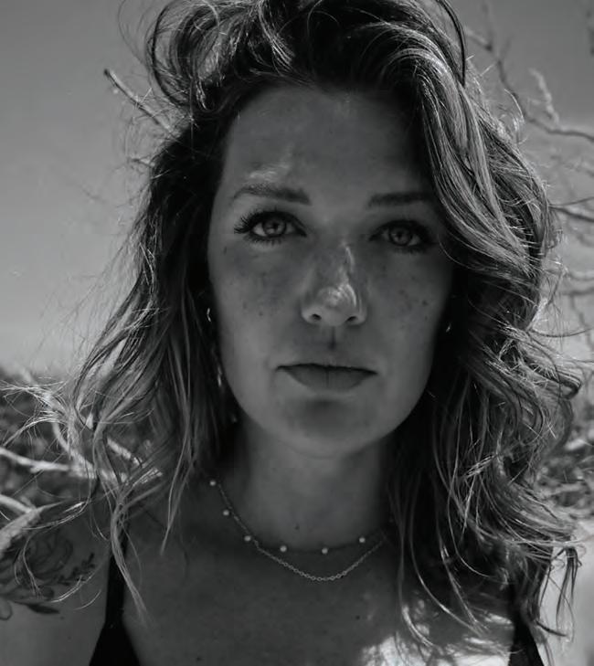
FAYE PITE BERESNER
SENIOR CREATIVE DIRECTOR, BLOOD CANCER UNITED, RYE BROOK NY
Faye Pite Beresner is a Senior Creative Director at Blood Cancer United (formerly The Leukemia & Lymphoma Society), where she leads impactful content and design initiatives that support the organization’s mission and amplify its national presence. With a career that began in freelance graphic design, Faye built a reputation for creative excellence and leadership, eventually guiding teams for global brands such as Victorinox and ASSA ABLOY. Her work spans brand identity, campaign development, and strategic creative direction, consistently balancing innovation with purpose.
Blood Cancer United is a leading U.S. based nonprofit dedicated to advancing research, advocacy, and proving patient, family and caregiver support and resources for individuals affected by all blood cancers —including leukemia, lymphoma, Hodgkin’s disease, and myeloma. The organization is driven by a twofold mission: to find cures for blood cancer and to improve the quality of life for patients and their families. Through groundbreaking research funding, patient services and education programs, and policy initiatives, Blood Cancer United plays a critical role in shaping the future of blood cancer care and support. Faye and her team partnered closely with JKR to successfully launch the new brand on August 28. From strategy to activation, they brought the refreshed identity to life across all channels, ensuring it stayed true to Blood Cancer United’s mission while elevating its presence on the national stage
Faye Pite Beresner’s path into socially responsible design stems from a deeply personal place—her desire to give back after witnessing the impact of leukemia and other cancers on her family. These experiences deepened her awareness of how vital research, support, and education are for patients and their loved ones, inspiring her to harness creativity as a tool for positive change.
After building a successful career across agencies and corporate in-house roles, Faye reached a turning point. She realized her next chapter needed to be grounded in purpose rather than scale. Her time in the corporate world honed her strengths in strategic thinking, team leadership, and delivering high-impact campaigns — skills she now brings to Blood Cancer United. This meaningful shift allowed her to align her professional experience with her personal values, contributing to a mission where creativity supports patient wellbeing and every project holds the potential to make a lasting difference.
Given the confluence of events and challenges our society now faces, does this moment in time present any special opportunities, urgencies or particular obstacles to designing for good?
In today’s rapidly evolving social and healthcare landscape — including research and funding, the need for clear, compassionate communication has never been greater. Creatives are uniquely positioned to translate complex issues into experiences that inform and mobilize action. For Blood Cancer United, this moment underscores both opportunity and urgency: every campaign, visual story, outreach initiative, and public awareness. As a nonprofit, Blood Cancer United relies entirely on donations, channeling these resources into life-saving research, advocacy programs, and patient support and education services that improve outcomes and quality of life for those affected by blood cancers.
LAURA BEEBE
DESIGN DIRECTOR, BOONEOAKLEY, CHARLOTTE NC
Laura Beebe is a designer who believes the best work starts with a simple truth: people connect with what feels real. For more than 13 years - ten of them at Boone Oakley, a creative agency know for bold, disruptive ideas - Laura has helped turn throughtful strategies into work that resonates on a human level.
Her design philosophy is grounded in empathy and clarity. Whether reimagining a brand identity or shaping a multi-channel campaign, she focuses on creating work that invites people in and sparks connection. For her, the goal isn’t just to make something beautiful - it’s to make something that matters.
A graduate of UNC Charlotte with a BFA in Graphic Design, Laura blends strategic thinking with a love of craft. She’s worked across industries from consumer goods to technology, non-profits to B2B services, adapting her approach to each unique challenge.
At BooneOakley, collaboration is at the heart of her process. She thrives in an environment that pushes boundaries while keeping the work grounded in purpose. Laura is passionate about using design to not only meet business goals, but also to create experiences that leave a lasting, positive impression.
Tell us how and why you became involved in socially responsible design, any thoughts on why design is an especially effective tool in achieving positive goals, and, if you wish, give us an example of a project of which you are proud.
My commitment to socially responsible communications stems from a deep belief that we have a responsibility to advocate for our convictions - especially when we see a pressing need. I believe we are called to act: to notice, respond thoughtfully, and inspire others to do the same. At its core, my work is guided by the principle the greatest good we can do is to love our neighbor. This conviction is one of the primary reasons I chose a career in advertising and design.
Design, with a capital “D,” holds unique power to shape perspectives and inspire change - particularly when used responsibly. Thoughtful design starts with people. It creates emotional connections that prompt someone to pause, reflect, and engage with a message. When done well, design speaks to both heart and mind, making it one of the most effective tools for motivating action.
One project that exemplifies this is our rebrand for Daniel Stowe Botanical Garden. Once seen as exclusive, it had lost sight of its founder’s vision: to make nature accessible to all. We developed an identity system anchored by a north star - helping every visitor find their unique path to nature. Today, the garden welcomes multi-generational visitors and inspires deeper connections with the natural world.
Given the confluence of events and challenges our society now faces, does this moment in time present any special opportunities, urgencies or particular obstacles to designing for good?
Right now feels urgent, but also full of possibility. We’re facing social, environmental, and cultural challenges, and technology and AI, as powerful as they are, often get in the way of real human connection. People are craving authenticity - moments that feel real, that spark empathy, and help build relationships. Being outside, spending time with others, and truly engaging with the world isn’t a luxury - it’s necessary. Design has the chance to answer that need to connect people, open understanding, and inspire action. The challenge is trust. In a world full of noise and automation, design must be human, generous, and genuine to make a real difference.
RONG JIA
GRAPHIC DESIGNER, HOUSTON GRAND OPERA, HOUSTON TX
Rong Jia is a Houston-based graphic designer whose work bridges cultural storytelling and modern brand communication. Currently a designer at Houston Grand Opera, the only opera house in the world that has won top three honors (a Tony Award, two Grammy Awards, and three Emmy Awards). She creates visual experiences that merge art, emotion, and narrative — from advertising campaigns and branding to publication and digital design.
Rong’s design focus on branding and marketing design that captures human connection through thoughtful visual systems. Her approach blends conceptual thinking with intuitive aesthetics, shaped by her background in both Eastern and Western design sensibilities.
Rong graduated with a master’s degree from Savannah College of Art and Design (SCAD). Her undergraduate studies also focused on graphic design and visual communication, laying the foundation for her solid knowledge of art and design, as well as her unwavering love for design. Rong’s designs have been recognized by GDUSA Digital Design Awards, Graphis Design Competitions and DotComm Awards. She believes design holds the power to translate complex emotions into simple beauty — to communicate what words cannot.
Tell us how and why you became involved in socially responsible communications, any thoughts on why design can be an especially effective tool for this goal, and, if you wish, give us an example of a project of which you are proud.
Her path into socially responsible design began with the belief that visual storytelling can bridge cultural and emotional divides. Growing up between different cultures, she has seen how design can make the unfamiliar feel relatable and inspire empathy through imagery and tone.
At Houston Grand Opera, she strives to make opera—a traditionally exclusive art form—more accessible and engaging for diverse audiences. Through inclusive imagery, thoughtful typography, and narrative-driven visuals, each campaign aims to connect people who might not otherwise attend an opera, those curious to learn more, or anyone seeking a unique artistic experience. She sees design as a language that invites everyone to participate in art and community.
Design’s strength lies in its immediacy: it can transform complex ideas into universal feelings. One project as an example is the Magic: The Gathering–Inspired Social Media Design for Opera Tannhäuser (winner of the 2025 GDUSA Digital Design Award), which reimagined a classic opera story through fantasy-game visuals to reach younger, digital audiences. The project combined cinematic lighting, collectible card–style compositions, and operatic symbolism to create a crossover aesthetic rarely seen in performing arts marketing, expanding how visual design can connect traditional art with new communities. It has also achieved record digital engagement on the social platform. It shows how design can dissolve boundaries between art forms and generations, creating both social relevance and joy.
Given the confluence of events and challenges our society now faces, does this moment in time present any special opportunities, urgencies, obstacles to designing for good?
This era asks designers to be both translators and dreamers. In a world where attention is fragmented and systems are driven by algorithms rather than empathy, design can reawaken our sensitivity—to art, to beauty, and to one another. Working in opera, I witness how imagery can make centuries-old music feel alive to modern eyes.
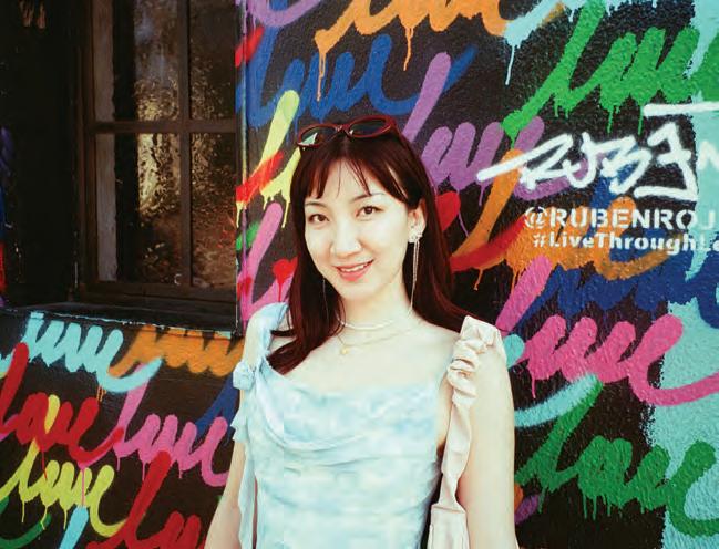
YING ZHANG
CREATIVE DIRECTOR, HUMAN RIGHTS FOUNDATION, NEW YORK NY
Ying Zhang is the Creative Director at the Human Rights Foundation (HRF) in New York, a nonprofit organization that promotes and protects human rights globally, with a focus on closed societies.
At HRF, Ying leads all aspects of the foundation’s creative vision and strategy—continually evolving its brand identity, shaping its voice across channels, and ensuring the highest-quality output for all visual and creative initiatives. Passionate about creating meaningful and memorable experiences, delivering high-impact strategic audience engagement across all touchpoints, she leads the development of the visual identity for the Oslo Freedom Forum, an annual three-day human rights conference in Oslo, Norway.
Ying is active in the creative and arts community, serving on the board of AIGA and NYID — a leading Australian independent, interdisciplinary arts organisation. Dedicated to nurturing and uplifting the next generation of creatives, Ying has served as a mentor at NEW INC, D&AD Shift and AIGA New York
Originally from China and raised in Australia, Ying has lived in Melbourne, Tokyo, London, and New York. An avid traveler, she has visited nearly 100 cities across almost 30 countries. When not traveling, you’ll often find her wandering the halls of an art gallery, inspired by the works of Camille Henrot, Sougwen Chung, and Robert Rauschenberg.
Tell us how and why you became involved in socially responsible design, any thoughts on why design is an especially effective tool in achieving positive goals, and, if you wish, give us an example of a project of which you are proud.
Lately, I have been drawn to mission-driven organizations, wanting to make a positive impact on the world and leaving it in a better state than we found it. Design has the unique ability to transform abstract, complex ideas into something that elicits emotion and resonates with people. Much of the work we do at HRF can feel dense and impenetrable—from arbitrary detention to kleptocracy—but design can serve as the bridge.
One project I am especially proud of is the “Dictator’s Laundromat” interactive installation, created as part of the Social Impact Pavilion at the 2025 SXSW Expo. A play on the term money laundering, the installation was inspired by the kitsch aesthetics of 1960s laundromats—part Barbie, part Stepford Wives. Its playful, pastel-toned, nostalgia inspired aesthetic managed to draw in more than 4,500 visitors, while delivering a thought-provoking critique of kleptocracy and exposing how authoritarian leaders manipulate global financial systems to whitewash their reputations and entrench their power.
By distilling complex themes into an engaging, accessible, and visually striking experience, this project demonstrates how design can transform difficult ideas into something that captures attention and becomes a powerful educational tool.
Given the confluence of events and challenges our society now faces, does this moment in time present any special opportunities, urgencies, obstacles to designing for good?
We live in increasing precarious times—marked by climate change, rising authoritarianism, and technological disruption. These challenges demand that design step up, not only as an aesthetic tool but as one that is ethical, inclusive, and future-oriented.Design holds immense potential as a catalyst for change by making the invisible visible, shaping behavior, amplifying voices, telling stories, and reimagining systems. As designers, we are in a prime position to ask — whose voices do we amplify? Which messages do we choose to elevate? What actions and behaviors do we want to encourage? And ultimately, what kind of future do we want to imagine, create and live in?
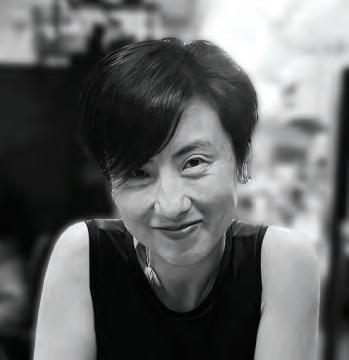
DIANA LEONARD
COMMUNICATIONS DIRECTOR/VICE PRESIDENT CAROLLO ENGINEERS, WALNUT CREEK CA
Twenty-five years ago, I stumbled into environmental communications by pure chance. A temp agency mentioned a company doing something called “environmental remediation” - cleaning up radioactive waste and unexploded ordnance at old Navy bases. It sounded fascinating, so I jumped at the opportunity.
Today, as Communications Director at Carollo Engineers, I spend my days figuring out how to help people understand the invisible systems that provide life’s most precious element. Most folks don’t think about where their water comes from or how it’s treated; they just turn on the tap and expect it to work. I love figuring out how to make the brilliant engineering behind that simple act make sense to everyone.
The projects I’m most excited about often start as challenges. Like when our team handed me a 50-page technical document about water reuse and said, “Make this useful for people.” We turned it into The ABCs of Water Reuse - a vibrant, illustrated guide that utilities now use to help communities understand the safety and many benefits of purified recycled water.
I’m lucky to work with incredibly smart people who trust me to translate their expertise into something meaningful. That collaboration makes this work so rewarding.
Tell us how and why you became involved in socially responsible design, any thoughts on why design is an especially effective tool in achieving positive goals, and, if you wish, give us an example of a project of which you are proud.
Growing up in New York, I thought water was unlimited. It rained often, there were beautiful lakes everwhere, and I spent summers catching salamaders in streams.
Moving to California 23 years ago opened my eyes. Suddenly I was living somewhere that doesn’t see rain for months, where drought cycles are part of life, wildfires feel inevitable, and the landscape is breathtakingly different. I started thinking about water differently - as something precious we can’t take for granted.
I now realize most people experience water the way I used to. They expect it to work without understanding the incredible engineering required. But with climate change, aging infrastructure, and growing populations, “business as usual” isn’t sustainable.
But here’s the exciting part: we’re living in an era of incredible innovation. Engineers are solving problems that seemed impossible decades ago. The opportunity is helping understand these solutions.
When we created The ABCs of Water Reuse, we weren’t just making information prettier - we were helping people understand something complex, multifaceted, and mired in misconcpetions. Sometimes the biggest breakthrough isn’t the engineering itself; it’s helping people understand concepts that can be transformative.
Given the confluence of events and challenges our society now faces, does this moment in time present any special opportunities, urgencies or particular obstacles to designing for good?
There is an urgency for water communications. Extreme weather impacts water systems, while aging infrastructure is vulnerable to failure.
But the opportunity is enormous. When storytelling and design work together, we can reshape public perception, build support for critical infrastructure, and inspire people to invest in sustainable water solutions.
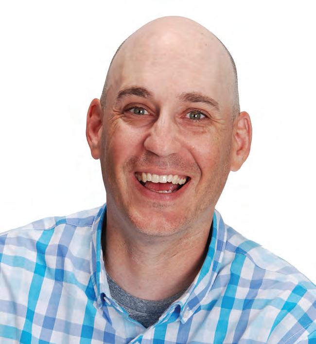
MATT CURYLO
ASSOCIATE VICE PRESIDENT OF ENGINEERING PROJECT MANAGEMENT CONEXIANT, HARTFORD CT
I’ve worked in design for 25 years and stay busy at home with my wife, and daughter, and the BSA troop I lead. That mix of professional experience and hands-on community work keeps my creative approach practical and people-focused.
Tell us how and why you became involved in socially responsible communications, any thoughts on why design can be an especially effective tool for this goal, and, if you wish, give us an example of a project of which you are proud.
I first got hooked on social design in 2012 when I rebranded the logo and materials for our local nonprofit youth soccer club. What began as a simple facelift quickly opened my eyes to the way design can unite a community. The new look wasn’t just sharper; it gave parents, players, and volunteers a shared identity and a reason to feel proud of the club.
That experience followed me into my next chapter as the leader of my daughter’s BSA troop. Having been a Boy Scout myself, I knew the values of the program— service, resilience, leadership—were worth passing on. When the organization opened its doors to girls, I jumped at the chance to build something with her. My design work there—everything from logos to event materials—does more than decorate flyers. It signals inclusion and shows these young Scouts that their voices matter and their presence belongs.
Given the confluence of events and challenges our society now faces, does this moment in time present any special opportunities, urgencies, obstacles to designing for good?
Design is a universal shortcut: it can communicate what pages of text can’t. A single emblem or banner can spark pride, cut through the noise, and turn a group of volunteers into a cohesive force for good. That’s the kind of impact that keeps me designing long after the last troop meeting ends.
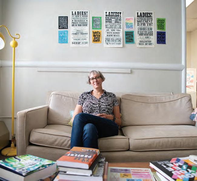
I am a graphic designer, art director, design educator, and founder of Design Choice Studio. My design studio and practice is devoted to advocacy and action. I use design as a key tool for turning progressive ideas into social and sustainable change.
I founded Design Choice in 2016 with a clear mission: to unapologetically focus on women’s causes and social justice, and to support and uplift underrepresented designers. That mission felt urgent then, and it feels even more needed today. One way Design Choice serves that goal is by being a collaborative studio. I build project-specific teams that share access to opportunity and bring together specialized talent (queer web developers, women hand letterers, BIPOC photographers) to create meaningful, impactful work.
These collaborations don’t stop with the creative team, they include the clients —we’re not just working for them, we’re working with them—to create important change in our communities.
My belief in lifelong learning and open access to education led me out of the studio and into local neighborhoods by serving on communications committees with and developing design workshops for community activists. Eventually it led me to Saint Michael’s College, where I now teach and mentor the next generation of socially conscious designers (while continuing to lead by example at Design Choice).
Tell us how and why you became involved in socially responsible communications, why design can be an especially effective tool for this goal, and, if you wish, give us an example of a project of which you are proud.
Everything is designed. And as designers, we have the opportunity to (and I’d argue the imperative to) reimagine the world around us. My commitment to to advocacy and action began when I was ten, at the first protest my mother took me to: a pro-abortion rally in Washington, DC. Playing an active role in democracy had lasting impact and established my dedication to social engagement. And lead to my career starting in political communications—using design to influence the political makeup of our country. That first protest also informed my current design practice which is firmly and loudly pro-abortion. I actively support multiple organizations working to secure access to abortion care. My understanding of social movements continues to grow as I serve, support, and collaborate with my communities.
One of Design Choice’s first projects was serving as creative director for the March for Racial Justice, which mobilized 25,000 marchers in DC (organizing community actions is a skill that continues to be integral). Through design I have brought local issues to the forefront, fought for gender and reproductive rights, empowered and celebrated trans and non-binary youth, amplified calls for racial justice, and made sustainable energy solutions accessible for all.
Given the confluence of events and challenges our society now faces, does this moment in time present any special opportunities, urgencies, obstacles to designing for good?
Progressive ideas and values are more important than ever. But. Great ideas aren’t enough — design turns those ideas into social and political change. Great design calls someone into action; it helps us connect, educate, empathize, and engage.
When knowledge, information, and communication are under attack, democracy suffers. Our democracy was built with people in mind; designers can help everyday people dig into it. We can design avenues for sharing knowledge and taking action; create work that informs and moves people to act.
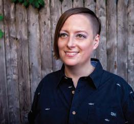
HOLLY WHEELER
HEAD OF DESIGN/ART DIRECTOR
ENTERTAINMENT COMMUNITY FUND, NEW YORK NY
I’m a Creative Director in NYC passionate about design that makes a difference. I collaborate with a wide range of clients, with a special affinity for nonprofits and mission-driven organizations. Whether I’m rebranding an organization, building an event identity, or shaping a campaign, I help causes stand out and make an impact. For me, it’s about using design to amplify voices, support communities, and spark positive change while ensuring the content is inclusive and accessible to all.
My work spans print, digital, video, and experiential, but I’m especially drawn to events because they bring all those elements together in one living environment. From invitations and animations to the graphics that bring the space to life, every detail contributes to the overall vision. I love the three-dimensionality of that challenge.
Currently, I lead the creative direction for the Entertainment Community Fund, a national human services organization that supports performing arts and entertainment professionals with services focused on health and wellness, career and life, housing, and financial assistance. This role allows me to design with intention, help people in meaningful ways, and serve a larger purpose. It brings together everything I value about design and reminds me every day why I do this work.
Tell us how and why you became involved in socially responsible design, any thoughts on why design is an especially effective tool in achieving positive goals, and, if you wish, give us an example of a project of which you are proud.
Design is powerful because it sparks emotion. Excitement, empathy, urgency — the kinds of feelings that stay with you. The best design isn’t just something you look at, it’s something you experience. And when it’s created with accessibility and inclusivity in mind, no one is left out. That’s when it’s most effective: it pulls people in, connects them to a cause, and moves them to take action.
One of my favorite projects is the Entertainment Community Fund’s annual Gala because it’s a chance to be incredibly creative while supporting a cause that matters. Each year begins as a blank canvas where I get to reimagine the theme, identity, campaigns, and environmental graphics that transform the space. I love shaping the journey from the instant someone receives an invitation to the moment they enter the room. A strong design builds anticipation and immerses people in an experience they can truly feel. Most importantly, it helps spread the word, generate support, and drive donations for the Fund’s vital services.
That is what I love about this project and about design itself: it makes moments unforgettable, brings people together, and creates lasting impact.
Given the confluence of events and challenges our society now faces, does this moment in time present any special opportunities, urgencies, obstacles to designing for good?
We’re living in a time when society is shifting in ways that deeply affect our work as designers. With accessibility barriers, inequality, rights being rolled back, and the rise of AI, the urgency is clear. Design is everywhere, and that gives us both power and responsibility. It starts with us. Wherever you work and whatever you create, you have the opportunity to lead by example. Every detail matters, from the choices you make on the page to the systems you build in the world. Design decides who gets to participate and who is left behind. This is our chance to prioritize inclusivity and accessibility, and to use design as a voice for good.
Photo credit: Tam Nguyen
STEVE HABERSANG
FOUNDER, HABBY DESIGN CO., NEW FAIRFIELD CT
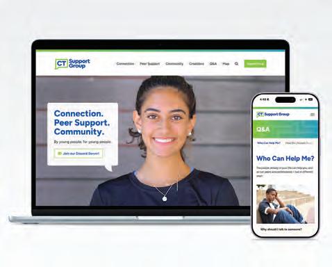
Steve Habersang is the founder of Habby Design Co., a creative studio launched in 2025 specializing in branding, digital and print media, illustration, and editorial design for passionate people and purpose-driven brands. Steve combines strategic thinking with hand-crafted artistry to build bold, thoughtful designs in a variety of mediums.
Before founding his own studio, Steve spent over two decades honing his skills as a Designer and Art Director at Taylor Design, where he led projects across branding, print, web, and advertising. That experience helped build the rock-solid foundation that now supports his more personalized, down-to-earth approach with clients.
Alongside his graphic design work, Steve creates detailed whimsical pen and ink illustrations blending fantasy and realism, often inspired by nature and animals.
A lifelong Nutmegger, Steve grew up in a small town in northwest Connecticut, where he continues to live and work. Outside the studio, you’ll likely find him fishing, hiking, snowboarding, mountain biking, or sampling a good craft beer.
Tell us how and why you became involved in socially responsible communications, why design can be an especially effective tool for this goal, and, if you wish, give us an example of a project of which you are proud.
I got involved in socially responsible communications because I’ve always been drawn to using creativity in service of people and causes that make a positive impact. Early on, I saw how design goes beyond aesthetics. It can clarify complex ideas, bring visibility to under-recognized voices, and help people connect to a mission on a human level.
Design can distill big, sometimes overwhelming issues into something approachable, memorable, and emotionally resonant. A strong visual identity or illustration can cut through the noise, spark curiosity, and invite people to engage. At its best, design doesn’t just inform. It inspires action and builds a sense of belonging around shared values. That combination of clarity, creativity, and impact is what keeps me motivated to use design in socially responsible ways.
Two recent projects I’m especially proud of are the Lake Champlain Basin Program (lcbp.org) and CT Support Group (ctsupportgroup.org). Though their missions are very different—environmental stewardship versus teen mental health support—both address urgent issues I care deeply about. Designing these websites gave me the chance to help each organization share its message and move its mission forward.
Given the confluence of events and challenges our society now faces, does this moment in time present any special opportunities, urgencies, obstacles to designing for good?
Our current global climate feels both overwhelming and full of possibility. We’re facing big challenges—climate change, inequality, misinformation—but there’s also a stronger awareness that things need to change. More people are paying attention to sustainability, equity, and justice, which opens the door for new ideas and better solutions.
For designers, that means both opportunity and responsibility. Good design can make complex issues clear and relatable, cutting through the noise, giving people something to rally around. Design isn’t neutral—it can be misused. It’s so important to work with honesty and empathy, alongside communities creating real positive change.
HEATHER NUNERY
FOUNDER, HMV DESIGNS, SMYRNA DE
I am Heather Nunery, a multi-disciplinary creative and founder of HMV Designs, a Delaware-based design studio specializing in branding, publication, packaging, and digital design. For over a decade, I’ve partnered with entrepreneurs, organizations, and nonprofits to craft compelling visuals that elevate brands and foster meaningful connections. My work has been recognized nationally with multiple GDUSA Design Awards and Aster Awards in healthcare marketing.
Alongside running my studio, I serve as a designer at Bayhealth Hospital, where I create impactful healthcare communications that support patients, families, and the broader community. I am also the founder of Delaware Female Creatives, a growing network that uplifts and connects women-owned businesses through events, markets, and collaborative opportunities.
Through each of these roles, my mission remains consistent: to use design as a force for good, a way to empower others, strengthen communities, and tell stories that matter.
Tell us how and why you became involved in socially responsible communications, any thoughts on why design can be an especially effective tool for this goal, and, if you wish, give us an example of a project of which you are proud.
I’ve always enjoyed helping people, and for me, it began with family. Growing up, I watched my grandmother feed the homeless and saw my parents dedicate themselves to supporting others in different ways. That sense of cultural pride and community care shaped me deeply, and it’s what inspired me to carry those values into my design work.
Today, I live that inspiration every day through the communities I’ve built and the projects I lead. As the founder of Delaware Female Creatives, I’ve created spaces for women business owners to connect, collaborate, and grow. One of the projects I’m most proud of is the annual Pretty in Pink Women-Owned Business Holiday Market. Not only do I design and brand the event, but I also promote it and witness firsthand how it drives real opportunities for women entrepreneurs in Delaware.
My professional work at Bayhealth Hospital adds another layer to this purpose. By creating clear, compassionate healthcare design assets, I know I am helping patients and families at some of life’s most critical moments.
For me, design is powerful because it bridges clarity and care, a tool that can empower, inform, and uplift communities in meaningful ways.
Given the confluence of events and challenges our society now faces, does this moment in time present any special opportunities, urgencies, obstacles to designing for good?
In today’s world, where challenges and uncertainty can often overshadow kindness, I believe there is an urgency to design with empathy and purpose. I try to do something good every day, even in small ways, whether offering a simple hello or creating a design that addresses real needs, like supporting those facing hunger. Design has the power to carry kindness forward, to inform, and to inspire action. If my work can make a difference for even a few people in my lifetime, I will feel accomplished in using creativity as a force for good.
CHARLOTTE JONES
SENIOR CREATIVE LEAD
LUCILE PACKARD FOUNDATION FOR CHILDREN’S HEALTH PALO ALTO CA
I’m a creative director, senior designer, and brand architect at the Lucile Packard Foundation for Children’s Health, where I lead visual storytelling that champions the health and wellbeing of children and families. The Foundation is dedicated to transforming health outcomes for all kids and moms, supporting extraordinary care today while advancing research, discovery, and systemic change for tomorrow. Through philanthropy, we fuel the work of Lucile Packard Children’s Hospital Stanford and the Stanford School of Medicine.
I work alongside a team of deeply mission-driven experts in fundraising, donor engagement, creative services, events, data, strategy, and more—all united by the belief that resources should never stand in the way of the best possible health for every child and expectant mother.
In my role, I take a strategic, collaborative approach to design, crafting compelling visual narratives that inform, inspire, and engage. I see design as both a problem-solving tool and a powerful emotional connector, helping translate complex ideas into accessible, compelling experiences. I’m especially passionate about design education and community impact, and I’m committed to socially responsible communication that amplifies the Foundation’s mission and sparks transformative change.
Tell us how and why you became involved in socially responsible communications, any thoughts on why design can be an especially effective tool for this goal, and, if you wish, give us an example of a project of which you are proud.
My path into socially responsible communications began with a deep-rooted commitment to community and a belief that design can be a powerful force for good. Over the years, I’ve seen how thoughtful design—through brands, environments, and experiences—can foster connection, promote well-being, and support growth. Design has a unique ability to distill intricate narratives into experiences people can truly feel, cutting through the noise to spark conversation and invite participation. That’s why I believe designers carry both an opportunity and a responsibility to create with intention. It’s not just about what we make, it’s about who we’re making it for, and why it matters. Whether designing inclusive events that bring people together or crafting visual identities that elevate local voices, I strive to create work that feels genuine and grounded in purpose. Being part of a mission-driven organization allows me to live that commitment every day. Good design, when guided by empathy and clarity, can really make a meaningful difference, one person or one project at a time.
Given the confluence of events and challenges our society now faces, does this moment in time present any special opportunities, urgencies, obstacles to designing for good?
In a world flooded with crisis and constant information, it’s easy to feel powerless, but design reminds us that small, intentional actions still matter. We can’t solve everything at once, but we can choose one issue, one community, and design relentlessly toward progress. This moment demands that we create work that is both compassionate and catalytic, shifting narratives, amplifying dignity, and making space for underrepresented voices. Designing for good isn’t just an opportunity—it’s an urgent responsibility. As creative professionals, we must use our skills to foster equity, connection, and positive change where it’s needed most.
LYNDA HODGE
CREATIVE DIRECTOR/DESIGNER, LYNDA HODGE, LLC, BOULDER CO
Lynda Hodge is a design leader crafting enduring identities and meaningful narratives for more than two decades. An alumna of the Savannah College of Art and Design (SCAD), she began her career in corporate in-house design roles, directing creative for renowned brands such as Gibson Guitar Corp., Orient-Express, and Hanna Andersson.
Today, Hodge operates independently, partnering with organizations dedicated to cultural impact and authentic connection. Her recent award-winning projects include visual storytelling and heritage preservation for the Cashiers Historical Society in North Carolina, as well as brand development and a regional visioning campaign for Our Spacious Skies, led by Pikes Peak Community Foundation in Colorado.
Known for fusing strategy with style, she acts as both translator and catalyst — uncovering the essence of an idea and giving it form through identity systems, exhibitions, publications, and immersive experiences that resonate deeply. She believes design is most powerful when it forges unity: bridging past and present, people and place, purpose and possibility.
Hodge has served on the board of AIGA Nashville and continues to champion thoughtful, socially conscious design. Her global perspective (enriched by extensive travel and diverse collaborations) fuels a practice committed to clarity, influence, and civic engagement.
Tell us how and why you became involved in socially responsible communications, any thoughts on why design can be an especially effective tool for this goal, and, if you wish, give us an example of a project of which you are proud.
For me, design is stewardship. It is not mere decoration; it carries stories forward, honors ideals, and defines meaning.
With Our Spacious Skies, I helped a region imagine its future. The initiative invites thousands of Coloradans to share what resilience, inclusion, and community mean to them. My charge was to give those aspirations a cohesive design platform — creating a brand and outreach campaign to spark participation, amplify unique voices, and inspire a collective sense of belonging.
At the Cashiers Historical Society, I work to shape how the community engages with and interprets its roots — building the brand, collateral, website, and promotional materials alongside exhibits, publications, and events. Here, design is less about marketing and more about memory, ensuring a graphic language that preserves knowledge and keeps history present.
Both projects reaffirm that design is inherently suited to socially responsible work. It distills complexity, humanizes data, and makes values tangible. At its best, design doesn’t just represent change; it propels it.
Given the confluence of events and challenges our society now faces, does this moment in time present any special opportunities, urgencies, obstacles to designingfor good?
This is not a quiet time. The world is loud with division, distrust, and distraction. That noise is both the obstacle and the urgency that makes design essential.
Design for good must be fearless. It must cut through the din with focus, pare away excess, and speak with integrity. It must remind us of the threads that bind when everything else is unraveling.
In Bruce Mau’s words, “As designers, we have a responsibility to shape not only products but culture.” Hope itself, made visible.
ANNE KERNS
CREATIVE DIRECTOR, MISSION PARTNERS, ROCKVILLE MD
Anne has over thirty years of experience in nearly every type of graphic design project, in either a design, production, or managerial capacity. Anne is most fulfilled when working with people and organizations dedicated to improving our world. In addition to her solo practice, Anne Likes Red®, Anne is a partner and the design director at Mission Partners, a Certified B Corporation and women-owned social impact communications firm. The award-winning team brings decades of experience in strategy, nonprofit communications, messaging, and branding. Working at the intersection of PR, policy, and philanthropy, the team understands the nuances of purpose-driven organizations and uses that knowledge to help organizations meet their greatest moments of impact.
Anne is a longtime member of AIGA and completed their executive business certificate program, Business Perspectives for Creative Leaders at Yale School of Management. She has a BS from the University of Maryland and has periodically taught graphic design courses.
Anne received the Lifetime Member Award from the (now sunset) Art Directors Club of Metropolitan Washington, DC, and her work has been recognized by Graphic Design USA.
Anne is on the Design Continuum Fund endowment committee, a scholarship program to increase diversity in design.
Tell us how and why you became involved in socially responsible communications, any thoughts on why design can be an especially effective tool for this goal, and, if you wish, give us an example of a project of which you are proud.
Over the years, I’ve been conscious of our industry’s environmental effects and have tried to mitigate adverse impacts. But how we think about socially responsible design must include the organizations we work for and the messages we put into the world. It must be inclusive and representative. I’m lucky that Mission Partners only works with values-aligned clients because developing visuals for their communications issues is rewarding in creative and ethical ways. Our process includes the community through conversations, interviews, and surveys at multiple points in a project, ensuring the results will resonate and be appropriate.
While print design is my first love, I’ve also been involved in digital, animation, web, packaging, and 3D projects. Overseeing and designing for comprehensive brand identity is a specialty. One project I’m particularly proud of is The Johnson Foundation at Wingspread rebrand. Their logo was modeled on a complex composition that Frank Lloyd Wright designed to represent the Wingspread home he built for the Johnson family in Racine, Wisconsin. The process involved messaging and purpose clarification, then updating the visuals to reflect that strategic work. We simplified the mark to work better with 21st-century brand needs and developed a robust visual language for their collateral.
Given the confluence of events and challenges our society now faces, does this moment in time present any special opportunities, urgencies, obstacles to designing for good?
An area of design that has not been widely emphasized is accessibility. Apart from federal government requirements, stronger enforcement is coming in 2026 and 2027 for state and local governments as well as for private businesses.
I’ve been implementing accessible design principles more and more over the past decade or so, but I strive to be more fully compliant. Ensuring access to effective communications for all is at the very heart of socially-responsible design.
NAIL COMMUNICATIONS
PROVIDENCE RI
Nail is an independent creative branding agency in Providence, RI that specializes in brand strategy and highly conceptual design and advertising. We keep a purposefully diverse client base to encourage cross pollination and to keep from getting bored. We believe that when you strip away all the buzzwords, marketing comes down to this simple truth: whatever your brand, product or service, the only way to get someone interested in you is to be interesting.
Tell us how and why you became involved in socially responsible communications, any thoughts on why design can be an especially effective tool for this goal, and, if you wish, give us an example of a project of which you are proud.
We have always adored “using our powers for good”. For better or worse, we live in an attention economy, so any time we can use our design skills and creativity to put a spotlight on a good cause we jump at it. And as an independent agency without a holding company breathing down our necks, we probably do it more than is financially prudent.
So whether it’s a national pro-bono campaign to get young voters to the polls (“Dear young people…”) or designing logos and posters for a local porchfest, creating an unusual CPG brand to raise money for food banks around the country (“Nothing can end hunger”) or helping support local public radio stations with free bumper stickers (npah.org), we can’t resist a good cause—big or small.
Given the confluence of events and challenges our society now faces, does this moment in time present any special opportunities, urgencies, obstacles to designing for good?
Heck yeah. Environmental catastrophe is looming. Vast income inequality has put us in the bizarre situation where our nation is awash in unprecedented wealth and unprecedented need at the same time. Ignorance, bigotry and racism—once stains of shame—have crawled from the shadows to the heart of mainstream culture.
Designers and creative thinkers can play a crucial role in shaping opinions and inspiring change. So we encourage everyone reading this to aim your passion and talent at the issues that matter to you. You can do more good than you know.
CHRIS KORBELAK
MANAGER
PALM BEACH COUNTY PARKS AND RECREATION DEPARTMENT OFFICE OF ENGAGEMENT LAKE WORTH FL
Chris Korbelak leads the Palm Beach County Parks and Recreation Department’s Office of Public Engagement Team, a small but talented team of professionals committed to engaging all members of their unique community to increase awareness and usage of more than 110 County-operated parks, beaches and recreational facilities, and communicating the many benefits each offers.
An intermediate graphic designer when he joined the department as a part-time communications specialist in 2006, Chris quickly discovered a hidden passion for helping people by connecting them to opportunities to explore nature and engage in free and affordable physical activities. Over the next several years Chris produced many of the department’s logos and printed publications and was involved with establishing the department’s first social media accounts and redesigning its website. In 2015, Chris began leading the Public Engagement team, providing creative direction for a wide range of public awareness campaigns, including award-winning printed
and electronic designs and videos. Tell us how and why you became involved in socially responsible communications, any thoughts on why design can be an especially effective tool for this goal, and, if you wish, give us an example of a project of which you are proud.
When Chris started designing graphics and publications for the department, it sparked memories of his childhood spent exploring nature between two nearby parks and enjoying various sports and activities. He realized how those experiences shaped who he is today and is passionate about helping others access similar opportunities. Chris is especially excited about his team’s park prescription initiative, which equips doctors with custom prescription pads and tools to recommend outdoor activities for preventing and treating medical conditions.
Given the confluence of events and challenges our society now faces, does this moment in time present any special opportunities, urgencies, or obstacles to designing for good?
Now more than ever, we must care for ourselves, our neighbors, and the planet. Parks promote physical activity, reducing chronic disease risks, and lower stress, anxiety, and depression. Recreation programs boost self-esteem, confidence, and social skills. Parks are vital community hubs, offering safe spaces, cultural events, and social gatherings. They protect wildlife habitats and ecosystems, while trees and green spaces improve air quality, provide shade, reduce pollution, and lessen urban heat. Overall, parks support health, community, and environmental well-being.
RENEE MCKELLAR
FOUNDER, PEACE & BALANCE LLC, LOS ANGELES CA
Renee McKellar is an award-winning designer, educator, and creative strategist dedicated to the intersection of design, education, and social impact. At College of the Canyons she teaches Graphic Design, empowering students to build strong technical skills and develop an understanding of design’s role in shaping culture. At International American University, she lecture’s in Business Communications, where she emphasizes clarity, strategy, and the power of storytelling. As Director of Education for AIGA Los Angeles, she lead initiatives that promote diversity and create pathways for emerging designers. Through Peace & Balance LLC she works with purpose-driven entrepreneurs and organizations to build brands rooted in equity and authenticity.
Tell us how and why you became involved in socially responsible communications, any thoughts on why design can be an especially effective tool for this goal, and, if you wish, give us an example of a project of which you are proud.
My journey into socially responsible design began with the loss of a friend to gun violence back in 2015 and a belief that creativity carries responsibility to create change. As a Black woman in design, I understand how visual communication shapes narratives and access. Teaching at College of the Canyons and IAU strengthened my conviction that design can empower communities. One project I’m especially proud of is creating educational and digital campaigns for Black Lives Matter Grassroots Santa Clarita Valley, addressing racial justice, food insecurity, and civic engagement. These projects were built on clarity and empathy, demonstrating that design is not just decoration, but a language for change.
Given the confluence of events and challenges our society now faces, does this moment in time present any special opportunities, urgencies, or obstacles to designing for good?
We are in a time of social unrest, climate urgency, and digital disruption, making designing for good essential. Designers have an unprecedented opportunity to use creativity to inform, connect, and heal. The challenge is to go beyond performative messaging and deliver authentic, measurable impact that transforms communities.
TONY ALVAREZ
FOUNDER/CHIEF CREATIVE DIRECTOR, RELIK DESIGN, CHARLOTTE NC
Tony Alvarez is the founder and Chief Creative Director of Relik Design, a creative media agency that specializes in brand identity, campaigns and experience design. Tony is known for his ability to bridge digital and in-person experiences for partners across industries and as being a white-label creative partner. Founded in 2020 and based out of Charlotte, North Carolina, the nimble agency has its roots in community connection, be it action packed motor sports or patient advocacy- connecting people to their passion and illuminating the path, is their specialty.
Tell us how and why you became involved in socially responsible communications, any thoughts on why design can be an especially effective tool for this goal, and, if you wish, give us an example of a project of which you are proud.
Everyone should have access to high-functioning, detailed, strategic-design, no matter the size or funding of the program. Design that is highly thought out and strategy-driven, helps to amplify the messaging of the programs that are working in the background of our communities. These organizations and their foundational members are so focused on doing the work, they rarely have time to consider outreach or the impact of marketing. I let the design do the legwork of sharing the vision, building the outreach, and energizing the support these programs ne
Given the confluence of events and challenges our society now faces, does this moment in time present any special opportunities, urgencies, obstacles to designing for good?
There is always a sense of urgency in designing for nonprofit programs. They usually work on tight budgets, as ancillary programs, and with extreme deadlines. Some see these as barriers. I find these challenges have a unique way of informing and developing brand strategies that evoke emotion and connect with us on a deeper, more human, level.
LEADING WITH VALUES IS GOOD BUSINESS FOR SMALL AGENCIES
BY SHANE LUKAS
When
I say values, I don’t mean bullet points on a proposal; I mean values as lived, daily practice.
Running a small creative agency means wearing a lot of hats. Some days, I’m deep in brand strategy and proposals. Other days, I’m reviewing logo concepts and revising reports. Balancing the need to land the next project while delivering excellent work can be a lot for me and my team.
Ten years ago, I started A Great Idea (AGI) with the belief that good work can do great things. In other words, design that speaks to communities and builds connection. This mission has stayed with us and become one of our biggest differentiators in an industry that can be deeply competitive and chaotic.
What’s made AGI’s growth sustainable this last decade is our values. When I say values, I don’t mean bullet points on a proposal; I mean values as a lived, daily practice. Literally. We begin every weekly team meeting by reading our values out loud.
It may seem small, but by continually grounding ourselves in our values, we make sure the work we do stays purpose-driven and that we keep showing up for what matters.
Leading with values is a powerful business advantages. It keeps us a sustainable business. It attracts incredible, mission-driven collaborators. And it makes all the work we do meaningful for us, our partners, and the creative communities we serve.
WHY VALUES MATTER
I get it. When you’re running a small or mid-sized creative agency, it’s easy to put your “values” on the website and focus on the more urgent stuff: serving clients, hitting deadlines, paying invoices.
But in my experience, when you don’t have a clear framework for what matters to you, you end up conducting business from a reactive place that can get messy or overwhelming easily. Having clearly-articulated values has helped us avoid that. Here’s how:
Decision Making:
Our values serve as our compass. As mentioned, we ground into our four values — “Together, We Will Do Great Things,” “Good Is a Great Start,” “Greatness Lives in Every Body,” and “Create with Great-itude”— at the start of our weekly team meeting.
We do this not because we like rituals (okay, maybe a little), but because they help us make easier, faster decisions. When we’re unsure how to move forward on a project, our values cut through the noise and help us stay aligned.
Service Quality:
Our values keep our work excellent. We serve a mix of for-profit and non-profit groups working with all kinds of budgets. No matter the project, we prioritize quality service provision. Values like “Good Is a Great Start” hold us accountable to this standard. This means that when, for example, a nonprofit has a small budget or needs pro-bono support, we give them the same level of care and creative energy we would give a national for-profit brand.
This is important because bold, professional creative solutions can be a powerful force for community mobilization. Our mission-driven partners who are out there
doing incredible work deserve dignified, high-quality creative solutions.
Team Cohesion:
Clearly-articulated values keep our team passionate and cohesive. By being up front about our beliefs, we attract people who are on the same page. I find this to be true across employees, contractors, and clients. This alignment minimizes turnover and burnout. AGI’s team knows why we’re here, what matters, and how our work contributes to something bigger.
Client Selection:
Similarly, centering our values helps us be intentional about our collaborators. We work with clients whose values resonate with our own, making the work joyful, more impactful, and more collaborative. Some of AGI’s clients have been with us for the entire decade we’ve been in business — and that’s not a coincidence.
Ten years into running AGI, I can say with certainty that leading with our values has made us a more strategic, impactful, and sustainable business.
These values set the tone of our partnerships. They build trust in our work. They provide clarity in moments of uncertainty. In a creative industry whose practices often create burnout and client churn, our values keep us steady. They’ve helped us build some of our longest, most impactful partnerships and show up with integrity across all projects.
As we celebrate this milestone year, we didn’t get here by accident. We got here by staying aligned with our values, choosing purpose over panic, and designing a business that reflects what we actually believe.
SHANE LUKAS IS THE OWNER/CREATIVE STRATEGIST AT A GREAT IDEA, BRINGING MORE THAN 25 YEARS OF AWARD-WINNING BRAND STRATEGY, GRAPHIC DESIGN, AND DEVELOPMENT. HE IS ALSO A PUBLIC SPEAKER AND LIFELONG HARM REDUCTION ADVOCATE FOR SOCIAL JUSTICE THROUGH COMMUNITY ORGANIZING AND EDUCATION.
HEALTH + WELLNESS AWARDS | 2025 |
The 25th Annual Health+Wellness Design Awards™ celebrates excellence in graphic design within one of the most dynamic, significant, and visible sectors of contemporary society and the economy. This year’s winners represent an exceptionally curated selection of projects and campaigns developed by leading design firms, agencies, corporations, and institutions.
The scope of recognized work is broad, encompassing traditional medicine, healthcare services, healthy lifestyles, selfcare and beauty, as well as public and community health initiatives. The underlying message is unequivocal: thoughtful, effective design and communication play a critical role in promoting both individual and collective well-being.
And let’s be honest: in today’s societal landscape, few topics are as relevant — or as controversial and debated — as how to prioritize health and wellness. One could argue (and we do) that good design matters more than ever.
3rd Edge 50
A Great Idea 50
Access TCA 51
Adler Branding & Marketing 51
Afton Design Co. 51
AAD / American Academy of Dermatology 52, 53, 54
Arithmetic 54
Artifact LLC 54, 55
Avila Creative 55
Baptist Memorial Health Care 55
Barnett Design 56
BexBrands 56, 57
Blankenburg Associates 56
Blue Cap Studio 58, 59
Blue Daring 56
Brandettes 58
Brook and Bartle & Co. 58
Burgopak 60, 61
CannonDesign 58
Clanin Creative 60
Conexiant 60, 62
Conran Design Group 62
CuraLince Healthcar 62
Freaner Creative 63, 64
Gabe Diaz Design 66
Gauger + Associates 66
GH Advertising 65, 66
Gina McKinna Design 67
Habby Design Co. 67
Halo Effect Marketing & Lu Hickman Creative Co. 67
Hoot Design Studio 67
ICON, plc 68
Idea Enablers and The Word & Brown Companies 69
Interrobang Design Collaborative 69
Kefan Shi Studio 69
Kirk Kerkorian School of Medicine at UNLV 70, 71
Kudos Design Collaboratory 70
Lentini Design & Marketing, Inc. 70, 72
Level Group 69
Live Well Collaborative 72
Main Line Health 72, 73
Mass General Brigham / Springboard Studio 72, 74, 75
Modera, Inc. and The Word & Brown Companies 74
Morris Group LLC 74
Notion LLC 76
PBD Partners 76, 77
QNY Creative 77
Quill Creative 77
RCW+RDW Communications 78
Relik Design 78
Street Level Studio 78
Studio 310 79
SubjectWell 79
The Change Agencies / Avila Creative / A. Hale PR 79
The Creative Pack, LLC 79, 80
The University of Alabama / Creative Arts Research Initiative 80
The Word & Brown Companies 69, 74, 81, 82
Trillion Creative 82
True Rx Health Strategists / Brauer Design 83
Truly Creative 83
University of Pittsburgh
School of Medicine 83
Waltz Creative 84
Werremeyer Creative 85
Zhiyao Zhang 85
HEALTH + WELLNESS AWARDS
Design Firm: 3rd Edge Client: Charles B. Wang Community Health Center Title: Charles B. Wang Community Health Center Website Creative Director: Frankie Gonzalez Designer: Aurora Lin IA/UX Design: Rob Monroe Category: Website + Microsite Design
Design Firm: A Great Idea Client: North Carolina AIDS Action Network Title: NCAAN HIV Speaks on Jones Street 2025 Videos Art Director: Shane Lukas Video Editor: Roger Simões Studio Coordinator/Copyeditor: Daniel W.K. Lee Category: Motion (TV, Film, Video, Animation)
Design Firm: A Great Idea Client: Amida Care Title: Amida Care Long-Acting HIV Products Brochure Art Director: Shane Lukas Copyeditor/Designer: Daniel W.K. Lee Category: Brochures + Collateral
Design Firm: A Great Idea Client: Triad Health Project Title: Triad Health Project’s Sexual Health Services Brochure Art Director: Shane Lukas Copyeditor/Designer: Daniel W.K. Lee Category: Brochures + Collateral
Design Firm: Access TCA Client: Boehringer Ingelheim Pharmaceuticals Title: Data via Rube Goldberg Interactive Exhibit Creative Director: Eric Anderson Art Director: Eric Anderson Designer: Eric Anderson Experential Designer: Jospeph DeLaunay Category: Exhibits + Displays
Design Firm: Adler Branding & Marketing Client: Melanoma Research Foundation (MRF) Title: MRF Branding and Identity Creative Director: Stan Adler Art Director: Adrienne Metzinger Designer: Chris Manna Designer: Alison Sundheim Production Design: Claudia Meyers Account Director: Danit Cohen Account Manager: Laura Samet Category: Branding + Identity Programs
Design Firm: Adler Branding & Marketing Client: Melanoma Research Foundation (MRF) Title: MRF Stewardship Report, Winter 2025 Creative Director: Stan Adler Art Director: Adrienne Metzinger Designer: Chris Manna Designer: Alison Sundheim Production Design: Claudia Meyers Account Director: Danit Cohen Account Manager: Laura Samet Category: Annual + Corporate Reports
Design Firm: American Academy of Dermatology Title: AAD’s DataDerm Mailer Art Director: Nicole Torling Designer: Theresa Oloier Writer: Chris Pokorny Category: Brochures + Collateral
Design Firm: American Academy of Dermatology Title: AAD’s DermWorld, June 2025, Smoke and The Skin Art Director: Nicole Torling Designer: Theresa Oloier Category: Publications + Newsletters
Design Firm: American Academy of Dermatology Title: AAD’s Your Dermatologist Knows Social Success Carousel Art Director: Lori Schoenwetter Designer: Patricia Yaple Category: Social Media
Design Firm: American Academy of Dermatology Title: ADD Fall/Winter 2025 Products & Services Catalog Creative Director: Nicole Torling Art Director: Lori Schoenwetter Designer: PUREi Marketing Agency Senior Manager, Production: Nate Jenkins Category: Catalogs
Design Firm: American Academy of Dermatology Title: ADD Product of the Month Marketing Email Series Creative Director: Nicole Torling Art Director: Lori Schoenwetter Designer: Lori Schoenwetter Writer: Krystal Archie Manager, Marketing: Lauren Walsh Category: Direct Mail + Email Marketing
Design Firm: American Academy of Dermatology Title: ADD Sun Safe Shoe Charms Giveaway Creative Director: Nicole Torling Art Director: Lori Schoenwetter Designer: Dayna Kriger Writer: Suzanne Lothary Category: Other
Design Firm: American Academy of Dermatology Title: EADV AAD Annual Meeting Flyer Creative Director: Nicole Torling Art Director: Laura Ellingsen Designer: Dayna Kriger Category: Advertising + Ad Campaigns
Design Firm: American Academy of Dermatology Title: SkinPAC 2024 Annual Report Creative Director: Nicole Torling Art Director: Theresa Oloier Designer: Theresa Oloier Category: Annual + Corporate Reports
HEALTH + WELLNESS AWARDS
Design Firm: American Academy of Dermatology Title: AAD’s DataDerm Online Platform Creative Director: Nicole Torling Designer: Nicole Torling Website Developer: PA Consulting Category: Website + Microsite Design
Firm:
Design Firm: American Academy of Dermatology and Zeller Creative Group Title: AAD’s Clinical Image Collection Promotional Video Creative Director: Nicole Torling Writer: Halie Heidkamp President, Zeller Creative Group: Joe Zeller Web and Multimedia Developer, Zeller Creative Group: Joel Davies Category: Motion (TV, Film, Video, Animation)
Title:
Design Firm: Artifact LLC Client: Centro Hispano and Cherokee Health Systems Title: Cuna: Mamás Latinas en el este de Tennessee Creative Director: Kimberly Mitchell Category: Logos + Symbols
Design
Arithmetic Client: Nala Natural Deodorant & Body Care
Nala Deodorant Rebrand Creative Director: Margherita Porra Designer: Sydney Mak Category: Beauty + Personal Care
Design Firm: Artifact LLC Title: Design for Aging Resources Website Creative/ Art Direction: Kimberly Mitchell Website Design/Development: Jason Mitchell Funding: University of Tennessee, Knoxville URL: www.designforagingresources. com Category: Website + Microsite Design
of
John
Art
Cards
Design Firm: Baptist Memorial Health Care Client: Pastoral Care, Baptist Spence and Becky Wilson Children’s Hospital Title: Pastoral Care Pediatrics
Design Firm: Baptist Memorial Health Care Title: Mistletoe Marketplace Program Advertisement Art Director: Gloria Cook Designer: Gloria Cook Writer: Eric Bran Director Marketing, Baptist Memorial Hospital-Misssissippi Baptist Medical Center: Diane Martin Category: Advertising + Ad Campaigns
Design Firm: Avila Creative Client: University of California Health Title: University
California Population Health Annual Report 2023-2024 Creative Director:
Design Firm: BexBrands Client: Om Mushrooms Title: Om Mushrooms Package Design Creative Director: Becky & Jeremy Dahl Art Director: Ian de Lemos Designer: Hope Kiesling Writer: Hilary Cocalis, Lindsey Bro Project Manager: Michael Thompson Category: Packaging + POP
Design Firm: Blue Daring Client: Michael Reese Health Trust Title: Michael Reese Health Trust Website Redesign Creative Director: Shuky Leung Art Director: Shuky Leung Designer: Riley Brady Writer: Michelle Hunter Strategist: Michelle Hunter Category: Website + Microsite Design
BexBrands’ Om Mushrooms Package
Om mushrooms rebrand was firmly rooted in a strong positioning that leveraged their meticulous growing facility and the numerous clinical studies they’ve done on their own mushrooms.
The logo embodies their leadership in a confident, radiant manner with simple typography and an orange glow.
The glow takes up the majority of the primary display panel
on all packaging, creating a simpler, more unified impression across all products.
Communications were simplified — leaning in on benefits and usage make it easy for shoppers to choose what mushroom product is best for them. Slight variances in typefaces help direct a shopper around the products in a way that feels effortless.
The result was a strong brand block that better reflected Om’s position in the wellness space.
HEALTH + WELLNESS AWARDS
Design Firm: Brook and Bartle & Co. Client: Brook Title: Brook Remote Care Branding Creative Director: Ryan Bartle, Shenghan Gao Creative Producer: Kelsea Hoover Executive Producer: Luke O’Brien Category: Branding + Identity Programs
Design Firm: CannonDesign Title: The Overlap No One Sees: ESRI User Conference Visualization Art Director: Melissa Alexander Designer: Nicole Sowinski, Amy Porta Data and Strategy: Ben Appel, Ivana Colendich, Jeremy Anne Herco, Nate Holland, Alison Leonard, Dr. Liz Sysak, Natalie Verdiguel Category: Data Visualization + Infographics
Design Firm: Bluecap Studio Client: MIXTO Cannabis Data and Analytics Platform Title: MIXTO Branding and Logo Creative Director: David La Cava Designer: David La Cava, Debra Cassa, Gregory Wright Category: Cannabis
Design Firm: Brandettes Client: Bessa Beauty Title: Bessa Beauty Scalp Care Packaging Creative Director: Christina Thompson Designer: Kyle Thompson Writer: Nikola Cline Category: Packaging + POP
MIXTO’s identity is built to make cannabis topicals feel authentic, natural, and easy to understand for both novices and connoisseurs. The brand story of “tradition in motion” positions MIXTO as artisan, plant-based therapy rather than tech hype, and even the name (“mixto,” Spanish for “mixed”) reflects blended backgrounds and formulations that invite inclusivity and trust.
How that strategy shows up on pack: Apothecary-meets-modern look. Clear, color-coded variants. Trust through plain language & dosing. Sustainable compliance.
Together, these choices translate the brand promise of accessible, credible, plant-forward relief into a cohesive packaging system that’s instantly readable online or on shelf.
Bluecap Studio’s MIXTO Branding and Logo
HEALTH + WELLNESS AWARDS
Design Firm: Burgopak Client: Thriva Title: Thriva Test Kit Packaging Creative Director: Dane Whitehurst Designer: Alexander Parker Burgopak Senior Project Manager: Willemijn Zandt Thriva Graphic Designer: JB Bond Thriva Graphic Designer: Sam Judge Thriva Head of Operations: Dan Ong Category: Packaging + POP
Design Firm: Clanin Creative Client: Evergreen Senior Living Title: Evergreen Senior Living Advertising + Identity Design Creative Director: Scott Clanin Designer: Colleen Hayes Category: Advertising + Ad Campaigns
Design Firm: Clanin Creative Client: RISE: Behavioral Health & Wellness Title: RISE Branding Design Creative Director: Scott Clanin Designer: Colleen Hayes Category: Branding + Identity Programs
Design Firm: Conexiant Client: Inside Dentistry Title: Battling Oral Cancer Editorial Feature, April 2025 Designer: Jennifer Barlow Category: Publications + Newsletters
Burgopak’s Thriva Test Kit Packaging
Thriva is a health platform offering at-home blood testing. This new test kit enables users to take blood samples using the innovative Tasso device, which draws blood automatically from the upper arm - replacing Thriva’s original fingerprick method.
Burgopak’s challenge was to create a compact, userfriendly packaging solution for the larger Tasso device while
preserving an engaging unboxing experience. The final design features a sliding mechanism that adds a sense of discovery and ease to the process.
To optimise space, the remaining kit components are nested around the device. A small removable holder not only organises the contents but also doubles as protective packaging for the blood sample during return shipping. This eliminates the need to send back the entire box, helping Thriva reduce postage costs.
HEALTH + WELLNESS AWARDS
Design Firm: Conexiant Client: Johnson & Johnson and Advanced Practitioner Society of Hematology and Oncology (APSHO) Title: Make It HAPPen™ Website Design Creative Director: Daniel Wolf Category: Website + Microsite Design
Design Firm: Conran Design Group Client: Opalescence Title: Opalescence Branding and Brand Strategy Creative Director: Brian Ponto Art Director: Ryan Morace Designer: Sarah Abreu Strategists: Jonathan Finer, Alfie Boyle Category: Branding + Identity Programs
Design Firm: CuraLinc Healthcare, Communications Department Client: CuraLinc Healthcare Title: Health Fair Activity Seek Support Workbook Designer: Mary Ann Martin, Taylor Guyton, Anna Kubitz, Rafay Jafri Writer: Christine Koenig, Isabelle Johnson, Kaitlyn Pfiester Category: Brochures + Collateral
Design Firm: Freaner Creative Client: Cancer Research Center of the Desert Title: Cancer Research Center of the Desert Website Creative Director: Ariel Freaner Art Director: Ariel Freaner Designer: Ariel Freaner Programming, Web Development and Coding: Ariel Freaner Category: Website + Microsite Design
Design Firm: Freaner Creative Client: County of San Diego, Cal Fresh, HHSA, Medicare, Ismael Lopez, Alberto Garcia Title: May CalFresh Awareness Month Campaign Creative Director: Ariel Freaner Art Director: Ariel Freaner Designer: Ariel Freaner Social Media Strategist: Ariel Freaner Category: Integrated Marketing Campaigns
Design Firm: Freaner Creative Client: Innercare Title: Innercare Cares Landing Pages Microsite Creative Director: Ariel Freaner Art Director: Ariel Freaner Designer: Ariel Freaner Programming and Web Development: Ariel Freaner Category: Advertising + Ad Campaigns
Design Firm: Freaner Creative Client: San Diego County District Attorney Title: SDCDA Ilicit Fentanyl Brochure Creative Director: Ariel Freaner Art Director: Ariel Freaner Designer: Ariel Freaner Category: Brochures + Collateral
Design Firm: Freaner Creative Client: San Diego County District Attorney Title: SDCDA Workers Compensation Campaign Creative Director: Ariel Freaner Art Director: Ariel Freaner Designer: Ariel Freaner Social Media Strategist: Ariel Freaner Category: Website + Microsite Design
Design Firm: Freaner Creative Client: Mexican Red Cross of Tijuana, Jorge Astiazaran Title: Life Race Integtated Marketing Campaign Creative Director: Ariel Freaner Art Director: Ariel Freaner Designer: Ariel Freaner Social Media Strategist: Ariel Freaner Category: Integrated Marketing Campaigns
Design Firm: Freaner Creative Client: Mexican Red Cross of Tijuana, Jorge Astiazaran Title: We Are Here For You Advertising Campaign Creative Director: Ariel Freaner Art Director: Ariel Freaner Designer: Ariel Freaner Category: Advertising + Ad Campaigns
Design Firm: GH Advertising Client: Family Hospice, Part of UPMC Title: Family Hospice Golf Outing Campaign Creative Director: Larry Hruska Designer: Jim Zahniser EVP, Director Print & Digital Design: Bob Brown Category: Announcements + Invitations
Design Firm: GH Advertising Client: UPMC Clinical Marketing Title: UPMC Children’s Heart Institute 2024 Annual Report Creative Director: Larry Hruska Designer: Jim Zahniser EVP, Director Print & Digital Design: Bob Brown Category: Annual + Corporate Reports
Design Firm: GH Advertising Client: UPMC Marketing Intelligence and Brand Title: Donate Life Month Motion Graphics Creative Director: Larry Hruska Designer: Alyssa Neff EVP, Director Print & Digital Design: Bob Brown Category: Motion (TV, Film, Video, Animation)
Design Firm: GH Advertising Client: UPMC Title: UPMC Cardiac Surgery Brochure Creative Director: Larry Hruska Designer: Chris Konopack EVP, Director Print & Digital Design: Bob Brown Category: Brochures + Collateral
HEALTH + WELLNESS AWARDS
Design Firm: GH Advertising Client: UPMC Marketing Intelligence and Brand Title: UPMC Brand Experience Guidelines Creative Director: Larry Hruska Art Director: Joe Bukovac Designer: Joe Bukovac EVP, Director Print & Digital Design: Bob Brown Category: Branding + Identity Programs
Design Firm: Gauger + Associates Client: Prostasis, LLC Title: NutraMeta Logo Creative Director: David Gauger Art Director: Lori Murphy Category: Logos + Symbols
Design Firm: Gabe Diaz Design, Inc. Client: Farmers Botanical Blends Title: Farmers Botanical Blends Logo Creative Director: Gabe Diaz Art Director: Gabe Diaz Designer: Gabe Diaz Writer: Gabe Diaz Category: Logos + Symbols
Design Firm: Gauger + Associates Client: Prostasis, LLC Title: NutraMind Packaging Creative Director: David Gauger Art Director: Lori Murphy Category: Packaging + POP
Design Firm: Gina McKinna Design Client: Modena Health Title: Bloom Bites Early Allergen Introduction Graphic Design and Branding: Gina McKinna Category: Branding + Identity Programs
Design Firm: Halo Effect Marketing & Lu Hickman Creative Co. Client: Pflugerville Fire Department Title: Public Health & Safety Annual Report
2024 Creative Director: Luciana Hickman Designer: Luciana Hickman Public Information Officer: Angela McKendree-Marshall Project Director: Casey Villanueva Category: Annual + Corporate Reports
Design Firm: Hoot Design Studio Client: Badger Title: Organic Body Care Lines Creative Director: Jen Borror Illustration Artist: Jen Borror Category: Packaging + POP
Design Firm: Habby Design Co. Client: CT Support Group Title: CT Support Group Website Redesign Creative Director: Steve Habersang Designer: Steve Habersang Writer: Quinn Atlas Jannetty Developer: Hannah Wool, LLC Category: Website + Microsite Design
HEALTH + WELLNESS AWARDS
Design Firm: ICON, plc Client: Pfizer Title: Manuscript Plain Language Summary Creative Director: Amy O’Connell Designer: Matthew Woolfrey Category: Other
Design Firm: Idea Enablers on behalf of The Word & Brown Companies Client: Word & Brown General Agency Title: Word & Brown ‘Power of &’ Social Media Campaign Creative Director: Missy Bynon, Marketing Director and Polly Neves, Executive Vice President Designer: Hugo Miramontes, Senior Graphic Designer Marketing Project Manager: Heather Jung Digital Marketing Supervisor: Noe Villasenor Senior Digital Marketing Specialist: Esteni Munguia Digital Marketing Manager: Vidah Quirante Category: Social Media
Design Firm: ICON, plc Client: Astellas Title: The LUCERNA Study Materials Creative Director: Amy O’Connell Designer: Matthew Woolfrey Category: Brochures + Collateral
Design Firm: ICON, plc Client: Pfizer Title: Graphic Poster Template for Medical Congresses Creative Director: Amy O’Connell Designer: Matthew Woolfrey Category: Posters
Design Firm: Idea Enablers on behalf of The Word & Brown Companies Client: Word & Brown Agency Title: Word & Brown 40th Anniversary Video. Creative Directors: Missy Bynon, Marketing Director and Polly Neves, Executive Vice President
Design Firm: Interrobang Design Collaborative, Inc. Client: STILL, an Interrobang Project Title: The STILL Anthology: Stories + Images of Those Who Go Flat After Mastectomy Creative Director: Lisa Taft Sylvester Art Director: Lisa Taft Sylvester Designer: Lisa Taft Sylvester Writer: Nora Sylvester Photographer: Bob Packert Category: Books
Design Firm: Kefan Shi Studio Title: WeMoments App - Gentle Emotional Reflection Creative Director: Kefan Shi Art Director: Kefan Shi Designer: Kefan Shi Illustrator: Kefan Shi Category: Website + Microsite Design
Design Firm: Level Group Client: DOC Title: DOC Branding Creative Director: Jennifer Bernstein, Nick Hubbard Art Director: Eva Beckendorf Designer: Jennifer Bernstein, Eva Beckendorf Web Developer: Richard Hall Category: Branding + Identity Programs
HEALTH + WELLNESS AWARDS
Design Firm: Kirk Kerkorian School of Medicine at UNLV Title: Summer 2025 Magazine Design Creative Director: Robin Biffinger Art Director: Robin Biffinger Designer: Diana Caballero Galvez Writer: Dr. Alison Netski, Wonda Riner, Robin Biffinger, Paul Joncich, Laurie Garcia, Aaron Hanson Principal Photography: Julian Fox Category: Publications + Newsletters
Design Firm: Kudos Design Collaboratory Client: Emina Title: Emina Matte and Glow Cushion Creative Director: Mellisa Hugo Art Director: Carla Stephano Designer: Carla Stephano, Amelia Dama, Lisa Andrea Nolwenn Category: Beauty + Personal Care
Design Firm: Kudos Design Collaboratory Client: Wardah Title: Wardah Lite Skin Filter Cushion Creative Director: Mellisa Hugo Art Director: Rysa Adristi Designer: Alfi Nauva, Fanicia Meilian Category: Beauty + Personal Care
Design Firm: Lentini Design & Marketing, Inc. Client: Doheny Eye Institute Title: VISIONary Research Advertising Campaign Creative Director: Hilary Lentini Designer: Hilary Lentini Writer: Chris Hauri Illustrator: Leanna Hanson Category: Advertising + Ad Campaigns
Kirk Kerkorian School of Medicine at UNLV Summer 2025 Magazine
The Kirk Kerkorian School of Medicine at UNLV Summer 2025 Magazine showcases design as storytelling in service of health and education. Produced entirely in-house by the school’s marketing and communications department, the 68-page, perfect-bound publication highlights the transformative impact of graduate medical education (GME) in Nevada.
The design approach centered on emotional resonance and visual clarity. Photography drives the layout, capturing residents not just in hospitals and clinics, but in personal, human moments that reveal the heart behind the medicine. Each spread balances strong imagery with crisp typography, brand colors, and dynamic pacing, creating a rhythm that carries readers through narratives of
educational excellence, compassion, resilience, and progress.
This year’s issue, themed around GME, amplifies the stories of residents who are helping to address Nevada’s critical physician shortage. The result is a publication that feels both elegant and urgent, blending design sophistication with a deep sense of mission.
More than a magazine, it functions as a visual ambassador for the school, connecting with donors, alumni, and community stakeholders while advancing a singular message: design can heal, inspire, and move people to invest in a healthier Nevada.
In addition to the printed publication, the magazine can also be found on the school’s website in an easy-to-use flipbook, unlv.edu/medicine/magazine.
The
HEALTH + WELLNESS AWARDS
Design Firm: Lentini Design & Marketing, Inc. Client: Tower Cancer Research Foundation Title: Endowment Campaign - Impact Begins Here Creative Director: Hilary Lentini Designer: Leanna Hanson, Hilary Lentini Category: Brochures + Collateral
Design Firm: Main Line Health Client: Main Line Health Central Development Department Title: Ripples of Impact Gala Invitation Creative Director: Jennifer Franko Art Director: Michelle Muscatell Designer: Michelle Muscatell Writer: Lyn Lavin Category: Announcements + Invitations
Design Firm: Live Well Collaborative Client: Cincinnati Children’s Hospital Medical Center Title: Pediatric & Adolescent Oncology Handbook Creative Director: Todd Timney Designer: Max Holden, Mauricio Berrizbeitia, Patty Wang, Shannon Justice, Lauren Goodwin Category: Books
Design Firm: Mass General Brigham Springboard Studio Title: Design Impact Awards Campaign Art Director: Katrina Machado Designer: Michelle Nie Category: Social Media
Main Line Health’s Ripples of Impact Gala Invitation
To honor the remarkable legacy of President and CEO Jack Lynch, the client envisioned a campaign that would be both elegant and emotionally resonant—celebrating his 20 years of leadership and inviting future philanthropic engagement. Our team was entrusted with crafting a visual and conceptual experience that would reflect Jack’s enduring impact and leave a lasting impression.
We developed a creative direction centered around the theme “Ripples of Impact.” Inspired by a single droplet striking water, the ripple metaphor symbolized the farreaching influence of Jack’s leadership—touching lives, shaping culture, and guiding the organization’s success.
At the heart of the campaign was a striking visual motif:
the ripple, paired with Jack’s personal signature. This became a powerful symbol of authenticity and legacy, used across print and digital assets to create a cohesive, emotionally evocative experience.
To elevate the aesthetic, we chose a rich dark blue palette, evoking depth and reflection. Metallic foils and luxurious paper stocks added tactile elegance and permanence, while thoughtful typography echoed the fluidity of water. Every detail—from pacing to layout—was designed to unfold like concentric ripples.
The result was more than a retirement tribute—it was a celebration of legacy. It invited reflection, inspired gratitude, and captured the essence of a leader whose influence will continue to resonate for years to come.
HEALTH + WELLNESS AWARDS
Design Firm: Mass General Brigham Springboard Studio Client: Salem Hospital, Brigham & Women’s Hospital, Massachusetts General Hospital, Mass General Brigham Population Health Management Title: Mobility Speedometer Communication Tool & Poster Campaign Art Director: Katrina Machado Designer: Katrina Machado, Michelle Nie Senior Product Manager: Frank Santo Vice President of Design Impact: Kristian Olson Wheelchair Icon: Modified from the Accessible Icon Project (https://accessibleicon.org) Category: Signs + Environmental Graphics
Design Firm: Mass General Brigham Springboard Studio Title: MGB Springboard Studio 2024 Annual Report Art Director: Katrina Machado Designer: Michelle Nie Writer: Bonnie Blanchfield, Sandra Butler, Amanda Engelbrekt, Nancy Kilburn, Katrina Machado, Kristian Olson, Frank Santo Category: Annual + Corporate Reports
Design Firm: Modera, Inc. and The Word & Brown Companies Client: CHOICE Administrators Title: CHOICE Administrators ‘I
Creative
Am’ Website
Director: Rikki Nedelkow, Marketing Director Art Director: Homer Villegas, Studio Director Digital Marketing Manager: Vidah Quirante Sr. Interaction Designer: Vinh Thai Digital Marketing Director: Kalup Alexander Category: Website + Microsite Design
Mass General Brigham Springboard Studio’s Mobility Speedometer Communication Tool & Poster Campaign
This hospital-based mobility initiative focuses on communicating about a patient’s mobility (movement) level and daily activity goals across the patient, their family, and their care team. The initiative anchors around the Mobility Speedometer tool which is a laminated poster that is placed in the patient’s hospital room and includes an interactive arrow so the care team can adjust a patient’s mobility goal. We have developed two versions of the Speedometer: one for ambulatory (walking) patients and one for patients who use wheelchairs. While the versions work in the same way, they offer different activity goals to better suit patient needs.
The Speedometer tool has expanded to become a more comprehensive toolkit of materials, including mobility posters to encourage participation in the initiative
(featured), ‘mobility markers’ (posters placed at intervals in the hospital hallways to measure distance), patient handouts translated into multiple languages, as well as training and documentation guidance for caregivers to effectively implement and record a patient’s progress in the electronic medical record.
The Mobility Speedometer initiative has been piloted on units at Salem Hospital and Brigham & Women’s Hospital. It is currently being rolled out at the Massachusetts General Hospital and continued expansion to hospitals within the Mass General Brigham (MGB) system is planned. We wish to thank the MGB Population Health Management and Mobility Matters teams for their efforts in advancing this work.
HEALTH + WELLNESS AWARDS
Design Firm: PBD Partners Client: Dartmouth Health Title: Dartmouth Health Report Campaign Creative Director: Shannon Beer Art Director: Shannon Beer Designer: Jen Whitty Dominguez Category: Annual + Corporate Reports
Design Firm: PBD Partners Client: Labouré College Title: Labouré College Transit Ad Campaign Creative Director: Shannon Beer Art Director: Shannon Beer Designer: Mary Reed Photographer: Tom Kates Category: Advertising + Ad Campaigns
Design Firm: Notion LLC Client: Cedar Title: Cedar Whitepaper: Healthcare’s Affordability Crisis Creative Director: Felicia Acton Art Director: Ashley Green Account Supervisor: John Garrison Category: Annual + Corporate Reports
Design Firm: PBD Partners Client: Boston Health Care for the Homeless Program Title: Boston Health Care for the Homeless Program Gala Creative Director: Shannon Beer Art Director: Shannon Beer Designer: Jen Whitty Dominguez, Holly Broussard Category: Announcements + Invitations
Design Firm: PBD Partners Client: Mass Brigham General Title: Mass General Brigham Neurology Report Creative Director: Shannon Beer Art Director: Shannon Beer Designer: Mary Reed Category: Annual + Corporate Reports
Design Firm: QNY Creative Client: Nurri Title: Revolutionizing Protein: Launch of Nurri at Costco Creative Director: Anna Urban Art Director: Dan King Designer: Ilya Volgin Executive Marketing Strategy: Jonathan Watters Product & Brand Marketing Lead Specialist: Claudia Hickey Social Media Management: Claudia Hickey Project Management: Rebekah McCaig
Design Firm: Quill Creative Client: ANNI Hairwax Title: ANNI Hair Wax Brand Identity Creative Director: Joshua Tyner Art Director: Arden Helm Designer: Alice Huntley Category: Beauty + Personal Care
Design Firm: QNY Creative Client: My Cooking Box Title: Bellycious Paste Meal Kits for Sensitive Bellies Creative Director: Ezio Burani Art Director: Ana Camero 3D Design: Ilya Volgin Brand Management: Stefano Ferrami Category: Packaging + POP
HEALTH + WELLNESS AWARDS
Design Firm: RCW+RDW Communications Client: Olivia Williams Title: I SUPPORT A HEART WARRIOR T-Shirt Design Art Director: Rodney C.Williams and Rahsaan D. Williams Writer: Lauren M. Williams T-Shirt Production: Valencia L. Williams - Adore Boutique & Designs ( info@adoreboutique.org) Category: Announcements + Invitations
Design Firm: Street Level Studio Client: Medline Industries, LP Title: Medline Remedy Brand Suite of Videos Category: Motion (TV, Film, Video, Animation)
Design Firm: Studio 310 Client: Cary Pediatric Dentistry Title: Cary Pediatric Dentistry Office Experience Director of Design: Albert McDonald Experiential Designer: Kimberly Paulus Interior Designers: Monica Carpenter, Isaac Mullen Sculpture Artist: Matt McConnell Fabrication and Installation: Design Element Photographer: Sterling E. Stevens Category: Signs + Environmental Graphics
Design Firm: The Change Agencies / Avila Creative / A. Hale PR Client: Alzheimer’s Association Title: The Healthy Brain Initiative Road Map for American Indian and Alaska Native Peoples Creative Director: John Avila Art Director: Vicki Lasky Designer: Vicki Lasky Strategy: April Hale Illustration: Peter Hoey Proofreading: Cindy Gortowski Category: Publications + Newsletters
Market Liquid Castile Soap Range Creative Director: Danielle Kidney Designer: Heather Storie, Paola Ip, Emma Tung, Casey Chui, Joshua Manalang Project Manager: Emily Cho Category: Packaging + POP
Design Firm: The Creative Pack, LLC Client: Korean Ginseng Corporation Title: Everytime Booth Design for Natural Products Expo West 2025 Creative Director: Danielle Kidney Designer: Paola Ip, Casey Chui, Joshua Manalang Project Manager: Emily Cho Fabricator: Presentation Media Incorporated Category: Exhibits + Displays
Design
Mother’s
Design Firm: The University of Alabama - Creative Arts Research Initiative Client: Turning Point Title: Know The Signs of Domestic Abuse Creative Director: Jonathan Cumberland Writer: Brittany VandeBerg Category: Posters
Firm: The Word & Brown Companies Client: CHOICE Administrators Title: CHOICE Administrators Pet Insurance Flyer Art Director: Homer Viillegas, Studio
Writer: Alex Strautman, Senior Copywriter Marketing Project Manager: Brandi
Design Firm: The Word & Brown Companies Client: Word & Brown General Agency Title: Word & Brown ‘Week of Webinars’ 2025 Microsite Creative Director: Missy Bynon, Marketing Director Designer: Hugo Miramontes, Senior Graphic Designer Writer: Alex Strautman, Senior Copywriter Sr. Front End Developer: Jarrell Walker Marketing Project Manager: Heather Jung Digital Marketing Manager: Vidah Quirante Digital Marketing Director: Kalup Alexander Category: Website + Microsite Design
Design Firm: The Word & Brown Companies Client: Word & Brown General Agency Title: Word & Brown ‘Power of’ Logo Creative Director: Missy Bynon, Marketing Director Designer: Hugo Miramontes, Senior Graphic Designer Category: Logos + Symbols
Design Firm: The Word & Brown Companies Client: Word & Brown General Agency Title: Word & Brown ‘Power of &’ Website Redesign Creative Director: Missy Bynon, Marketing Director Art Director: Hugo Miramontes, Senior Graphic Designer Designer: Senior Front End Designer: Jarrell Walker Writer: Alex Strautman, Senior Copywriter Marketing Project Manager: Heather Jung Digital Marketing Manager: Vidah Quirante Digital Marketing Director: Kalup Alexander Exec. Vice President, Marketing: Polly Neves Category: Website + Microsite Design
HEALTH + WELLNESS AWARDS
Design Firm: The Word & Brown Companies Client: Word & Brown General Agency Title: Word & Brown ‘Week of Webinars’ Email Campaign Creative Director: Missy Bynon, Marketing Director Designer: Hugo Miramontes, Senior Graphic Designer Writer: Alex Strautman, Senior Copywriter Marketing Project Manager: Heather Jung Digital Marketing Supervisor: Noe Villasenor Sr. Digital Marketing Specialist: Esteni Munguia Digital Marketing Manager: Vidah Quirante Category: Direct Mail + Email Marketing
Design Firm: The Word & Brown Companies Client: Word & Brown General Agency Title: Word & Brown Broker Development Social Media Campaign Creative Director: Missy Bynon, Marketing Director Designer: Noe Villasenor, Digital Marketing Supervisor and Esteni Munguia, Sr. Digital Marketing Specialist Writer: Alex Strautman, Senior Copywriter Marketing Project Manager: Heather Jung Digital Marketing Manager: Vidah Quirante Category: Social Media
Design Firm: Trillion Client: DropRX by Dr. Nicole Saphier Title: DropRx Package Redesign Creative Director: Lou Leonardis Designer: Danielle Singer Writer: Pam Lobley Category: Packaging + POP
Design Firm: True Rx Health Strategists / Brauer Design Co. Client: True Rx Health Strategists Title: Here’s the Scoop with True Rx Category: Direct Mail + Email Marketing
Design Firm: True Rx Health Strategists / Brauer Design Co. Client: True Rx Health Strategists Title: True Rx+ Mobile App Design Launch Campaign Category: Integrated Marketing Campaigns
Design Firm: University of Pittsburgh School of Medicine Client: Commonwealth of Pennsylvania Title: Myana (“Mothers, You Are Not Alone”) Smartphone App Principal Investigator: Tamar Krishnamurti, PhD Co-Investigator: Kristin Ray, MD Co-Investigator: Hyagriv N. Simhan, MD Project Coordinator: Sarah K. Burns, MSW Project Associate: Michaella Wu, MPH Project Associate: Samantha Rodriguez, MS Developer: NuRelm Interaction Design, Visual Design, and Design Research: Dezudio Category: Website + Microsite Design
Design Firm: Werremeyer Creative Client: Private Home Care Brand Title: Private Home Care Brand Refresh & Marketing Collateral Creative Director: Steve Hartman
Design Firm: Zhiyao Zhang Client: Endless Dx Title: Endless Dx Branding and Identity Creative Director: Jiabao Li Art Director: Zhiyao Zhang Designer: Zhiyao Zhang Category: Branding + Identity Programs
DESIGN IN A DIGITAL-FIRST WORLD: WHAT IT MEANS FOR HIRING & CAREERS
BY LUCY MARINO
What’s
happening in graphic design these days isn’t a slow evolution — it’s an accelerating pivot. The field is at the heart of how brands show up and connect with people.
What’s happening in graphic design these days isn’t a slow evolution — it’s an accelerating pivot. The field has grown far beyond logos and layouts. It’s at the heart of how brands show up online and connect with people.
Today, designers are creating interactive content, flexible branding and visuals that work across devices—meeting users wherever they are. As consumer expectations for engaging experiences with brands rise, designers are deepening their technical skills and
expanding their digital fluency to move faster, think more strategically and lead innovation.
At the same time, creative and marketing hiring managers are under growing pressure to staff critical roles. According to Robert Half’s Demand for Skilled Talent report, 93% of these leaders say it’s challenging to find the talent they need.
Demand is especially high for professionals who combine creativity with knowledge of AI strategy and marketing analytics. The report cites graphic designer, UX designer and product designer as among the most in-demand marketing and creative roles today.
So how can employers find the tech-savvy creative talent they need to drive their brand’s success? And how can professionals make themselves marketable to land today’s design jobs? I recently discussed these ques-
tions and more in an episode of The GDUSA podcast. With the accelerating shift to tech-forward design, both employers and creatives need to shift their approach for hiring and job searches, too.
What Employers Prioritize and What Creative Talent Seeks
Marketing and creative leaders are hiring, according to research for our Demand for Skilled Talent report, but the skills they prioritize for their teams are changing. Fifty-six percent of these leaders reported skills gaps on their teams, with AI strategy, marketing analytics, marketing automation, and digital and web design and development among the top skills they lack.
A strong portfolio is no longer enough for job seekers. Employers are prioritizing digital fluency — knowing which tools to use, how to apply them strategically and how to adapt as technology evolves. They want professionals who can use digital tools not just to execute ideas, but to shape them from the start.
Creative professionals have long played a role in contributing to positive business outcomes through branding, product design and user experience. What’s changing is the ability to innovate quickly with new tools and technologies and better measure that impact. For example, today’s tools for user analytics and performance tracking make design more visible than ever as a business driver.
The insights from this data enable designers to create more personalized content and targeted experiences — leading to higher engagement and conversion rates that clearly tie design decisions to business outcomes.
The core of design — visual storytelling — won’t go away, but how it’s produced, delivered and measured is changing fast. Employers increasingly value professionals who not only bring creative insight but can also understand that it’s not just about how something looks. It’s about how it performs.
Hiring managers can make recruitment easier if they focus not just on what they prioritize but also on what creative job seekers themselves want. An attractive salary is a clear motivator, but design candidates today are looking for more than a paycheck. They’re looking for a purpose and a chance to do meaningful work. They want to be part of an environment that inspires them, a culture that supports creativity.
Design professionals want to work for organizations that are leaning into new technology instead of shying away from it, encouraging experimentation and exploring AI. Job candidates look for a commitment to staying ahead in the digital space, including strong and ongoing investment in innovation.
Professionals also want an employer that invests in their growth. The creative space moves fast. Tools, platforms and technology are constantly evolving, and people want the chance to stay current. They want to work on cutting-edge projects and have access to the latest tools.
Professionals also want clear career paths, targeted upskilling opportunities and an option to work on a remote or hybrid basis.
LUCY MARINO IS EXECUTIVE DIRECTOR OF THE MARKETING AND CREATIVE PRACTICE AT GLOBAL TALENT SOLUTIONS FIRM ROBERT HALF, WHICH CONNECTS EMPLOYERS WITH SKILLED MARKETING, CREATIVE, DIGITAL, ADVERTISING AND PUBLIC RELATIONS PROFESSIONALS TO MEET THEIR SPECIALIZED RECRUITING NEEDS. MARINO MANAGES STRATEGY AND OPERATIONS FOR THE COMPANY’S MARKETING AND CREATIVE TALENT SOLUTIONS TEAMS ACROSS U.S. LOCATIONS.
Staying Competitive In A Digital-First Job Market
Adaptability is a key asset for job candidates — and that’s no surprise in a space where software, design formats and client needs evolve quickly. The most competitive candidates demonstrate an ability to adapt to emerging trends such as AI integration, the growing role of motion graphics in digital platforms, and more sophisticated automation tools that streamline workflows and boost productivity. Many creative professionals recognize this: 51% of creative professionals surveyed by GDUSA said staying current with tools and technology is essential.
Some job seekers may wonder how important soft skills are in a digital world. The answer is that these skills, particularly communication skills, are more critical than ever. It’s no longer sufficient to simply present a polished portfolio. Creative professionals must also be able to explain their thought process, walk through their decision-making and articulate the impact of their work.
This becomes especially important in remote and hybrid environments, where interactions happen mostly through video calls and chat platforms. Seeing and hearing a designer on a screen is not the same as fully observing their body language, energy or day-to-day engagement in person, which builds collaboration and trust.
As a result, designers must be more intentional and clear in how they present ideas, share progress and engage with others. Strong communicators who can convey enthusiasm, clarity and strategic insight through virtual channels are far more likely to stand out, stay aligned with team goals, and build the credibility needed to grow and lead in digital-first workplaces.
Creative professionals seeking new opportunities have to act like marketers, not just applicants. The job search needs to mirror a personal marketing campaign. A strong digital presence — including an up-to-date LinkedIn profile, a well-designed online portfolio and consistent personal branding—plays a significant role in attracting interest from employers.
The Future of Creative Work
The future of design is digital, data-driven and deeply creative. As marketing and design functions evolve, both creative professionals and the department leaders who hire them are being called to adapt.
Skills gaps are growing in areas such as AI integration, automation and user experience, and professionals who pursue continuous learning and embrace new tools can carve out a competitive advantage. For department leaders, success hinges on building agile, forward-thinking teams. The most effective leaders are those investing in upskilling programs, fostering a culture of experimentation and ensuring that creative talent has access to the tools and autonomy needed to deliver high-impact work.
For more insights on the evolving nature of creative work, check out The GDUSA Podcast with Paige Breedlove + Lucy Marino of Robert Half. You can find it at ...