
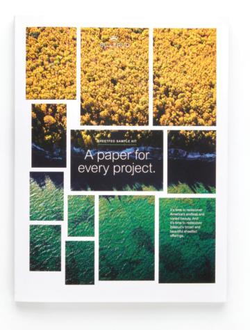
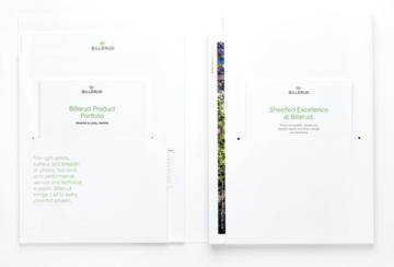
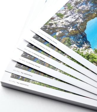
Sterling® Premium is crafted in America with pride by people who bring generations of papermaking skill and passion to every product we make. Engineered for next-level consistency, Sterling Premium offers quality, printability and sustainability. Available in matching digital and offset sheets, Sterling Premium is made using 10% recycled fiber carrying three chain-ofcustody certifications. All of this backed by service and support as strong as our passion for paper.
Sterling Premium. Premium sheet. Premium impression.
billerud.com

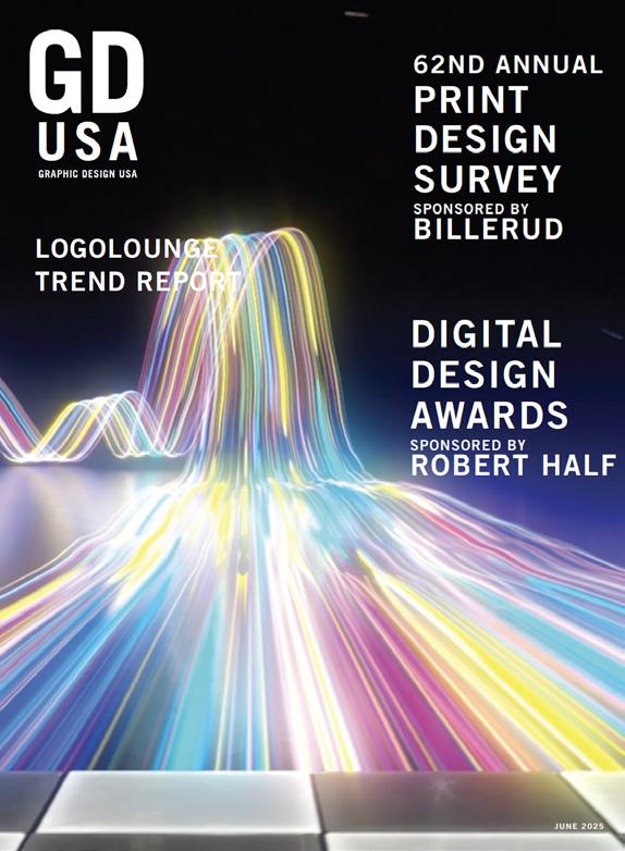
GDUSA - Graphic Design USA Volume 62 / No.3 May/June 2025
Kaye Publishing Corporation (ISSN0274-7499/USPS227020). Published 6 times a year with combined issues in January/February, March/April, May/June, July/August, September/October, November/December.
Executive, editorial and advertising offices at 594 Dean Street, Office 22, Brooklyn NY 11238. Phone: 212.696.4380. Website: www.gdusa.com.
SUBSCRIPTION: Domestic, $72 one year. Canada and Mexico $140 per year. Periodicals postage paid at New York NY and additional mailing office.
POSTMASTER: Send address changes to GDUSA - Graphic Design USA, PO Box 3072, Langhorne PA 19047. Permit #224.
The incomparable Bill Gardner has compiled and reviewed more than 450,000 logos via LogoLounge.com over 24 years. More than ever, Mr. Gardner commands attention with a sweeping overview of the past year’s logo designs — the context and culture from which they arise — the patterns he gleans — and the wisdom he so artfully imparts along the journey. Come on in and get comfortable with trends like ‘Hoopty’ and ‘Borderland’ and ‘SpinShift’ and ‘Smokies’, and our personal favorite, ‘Frilberry.’ And if trends make you uncomfortable, here is Mr. Gardner’s retort: “This is a trend report, not a trendy report. Trendy is a flash in the pan... Trends, on the other hand, track movement — the long arc of where design is going, the shifting forces that shape the trajectory of our craft.”
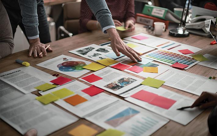
For the 62nd continuous year, GDUSA has polled our readers on benchmark questions regarding print design, paper specification and print buying. Over the years, the role of graphic designers — and print itself — has evolved, and our polls are one way to take stock of that that evolution. One big takeaway from the 2025 edition: designers and marketers have a sharpened sense of how to use print in strategic, selective and complementary ways. And one big thing that has not changed: creative professionals understand and appreciated the inherent qualities print and paper to touch, to engage, to forge a human connection. Exceptional paper maker, Billerud, is, once again, the exclusive sponsor.
People say we are in “the great hesitation’ but our community will not be delayed or denied. The 25th American Digital Design Awards™ saw a near record-breaking number of entries leading to a highly selective showcase of winners. This contest, born as ‘web design,’ has been expanded to better reflect and amplify the power of design to enhance online and interactive experiences and omni-channel campaigns — websites, yes, but also social media, email marketing, digital ads and publications, interactive and interface design, video and animation. It adds up to a virtuous cycle: more demand, bigger audiences, richer tools, better technology, the elevation of sound design principals. Robert Half, the first and largest talent solutions firm, is the sponsor.

GORDON KAYE AND SASHA KAYE-WALSH ARE EDITORS AT GDUSA
Comments, suggestions and letters can be sent to editorial@gdusa.com.
There must be more eloquent ways to make the point, but my brain is stuck on a simple phrase — “whatever works” — to explain two possibly inconsistent messages arising from this edition of GDUSA.
One the one hand, online design is showing dazzling exponential growth as reflected by our 25th Annual GDUSA Digital Design Awards showcase. On the other hand, GDUSA readers participating in our 62nd Annual Print Design express a renewed respect for the classic strengths of print, and a surprising enthusiasm for its strategic value and complementary role.
This year’s digital design showcase tells the story of a medium’s sheer potency to reach, engage and communicate. Our awards competition, formerly known as ‘web design,’ has been broadened to include not only websites, but also social media and email marketing, digital ads and publications, video and animation, UX and UI design, e-commerce and apps, and more. We received thousands of entries — double that of just three years ago — with only a select handful featured today.
The trajectory is steep but no credit to us. Rather, it attests to the fact that digital communication, and those who create and produce it, are in a virtuous cycle: burgeoning demand, richer tools, more stable technologies and infrastructure, and an increasingly sophisticated appreciation for how sound graphic design principals contribute to ultimate success.
Meanwhile, our traditional print and paper reader survey tells its own story. In essence, the poll reveals that print remains crucial in how professional graphic designers earn a living — fully 92% work in print as part of their mix, 63% of projects have a print component, and more than 8 in 10 buy and specify paper and printing.
Respondents reassert the relevance of print because its inherent qualities forge a human connection and an intimacy often missing from modern life. Along with this recognition comes the realization that print thrives in a digital era because it is exceedingly effective when used strategically and selectively.
Only binary thinkers are troubled by an apparent inconsistency; I know because I have often fallen into such “either/or” mentality, which I attribute to my long and bruising Boomer battle with technology.
In 2025, It is now crystal clear that “whatever works” should be — must be — the graphic designer’s mantra going forward. Crude as it is, the phrase underscores that purpose of design has zero to do with a particular tool or technology, and everything to do with clear, effective and efficient. This is an inclusive message: the specific method used is not as important as the result that meets the needs of a given client or cause or context.

CONTINUED
“Whatever works.” T-shirts anyone?
I am not sure Bill Gardner has ever driven a bus, but he can certainly steer a discussion about logos — and, more fundamentally, about creativity — with the best of them.
As evidence, Bill begins his 23rd annual LogoLounge Trend Report by asking us to imagine two buses: “One bus gleams with futuristic edges, marked boldly AI — promising speed, possibility, and a mind-blowing leap into the unknown. The other rolls up slower, wrapped in the earthy, grounded colors of sustainability — looking backward even as it pushes forward, inviting us to restore, rewind, and rethink. Both buses are filled to the brim with ideas, and both are heading to the same destination: the future of design.”
We hop on and, from here, he takes us on a route that explores timely logo trends and the divide between these two visions of the future. Scenery along the way includes culture touchpoints that shape logo design today. Stops include the likes of Borderland, Frilberry, Polygrid and a dozen more.
An intriguing detour is Bill’s take on mascots. He states: “This year, mascots are hopping off both [the AI/futurist bus and the Sustainability] buses... Why so much mascot energy? Because mascots remind us of the very thing brands often forget we respond to: humanity. They create warmth, familiarity, and connection — and no matter which bus you’re on, the future is craving more of that.”
I asked Chat GPT to provide me with a brief bio: “Bill Gardner’s research and analysis provides valuable insights into the ever-evolving world of logo design. Gardner’s passion for design, coupled with his unwavering dedication to his craft, has earned him a prominent place among the industry’s greats.”
ChatGPT got one right. That’s how Bill rolls.
I don’t know about you, but I could use a little bit of happy talk right about now. In this spirit, recent remarks by Bruce Mau, graphic designer turned legendary global advocate for creativity and experimentation in design and life, caught my eye.
At the late May 2025 commencement address at Hamilton College, a traditional liberal arts institution experimenting with integrating design thinking into the curriculum, Mau told the graduates in part:
“Designers cannot afford the luxury of cynicism. That is for others. Cynicism is easy; optimism is hard…
Many people, when they hear the word ‘design’ think of beautiful objects, sleek cars, or expensive furniture – the shape of things, something visual and formal. And yes, design can be that. But that’s what I call ‘small d’ design. What you are capable of is Big D Design.
Design is not just about making things; it’s about making things happen. Design is a mindset of optimism in action. In its broadest sense, design is leadership. As design leaders, we don’t always have the authority to force change, but we always have the power to inspire it.” The entire speech can be found at hamilton.edu
The Great Resignation has left companies scrambling for talented designers and creatives searching for fulfilling projects. That's where Artisan Talent comes in. We're a boutique creative staffing agency here to make things easier for you - whether you’re hiring talent or finding work. From small agencies to major corporations, our team is in the business of connecting people. That’s what makes us Artisan.
BILLERUD. Billerud is exclusive sponsor of GDUSA’s annual print and paper survey. The company states: “Our roots in the paper industry and our proud history go back more than 150 years. Since then, we’ve grown to what we are today: A world leading company in high-performing paper and packaging materials — passionately committed to sustainability, quality, our customers, and their businesses.” Billerud serves customers in more than 100 countries through nine production units in Sweden, USA, and Finland and around 5,800 employees in 19 countries. Billerud is listed on the Nasdaq Stockholm. In the US, Billerud operates out of a regional head office in Miamisburg OH, two mills in Michigan’s Upper Peninsula and a converting facility in Wisconsin. “At Billerud,” says the company, “we build brands and business results for our customers.” This edition of GDUSA is printed on Influence® Gloss, 60lb. text, a high-quality No. 3 web paper. To learn more please contact your Billerud graphics sales professional or visit billerud.com
ROBERT HALF. Robert Half is sponsor of the 2025 American Digital Design Awards™. As the world’s first and largest specialized talent solutions firm, Robert Half connects top designers and other digital, creative and marketing professionals with leading companies. The company says: “Looking for your next role or project? We help skilled creatives find great opportunities that match their experience, preferences and career goals. Need to hire on a contract or permanent basis? We have digital design professionals with the creative vision to implement key projects. We are proud to be named by Fortune® as one of the 2025 Most Admired Companies™, and by Forbes as one of America’s Best Large Employers in 2025.” Contact Robert Half to learn how they can help you find skilled talent or make your next career move at roberthalf.com
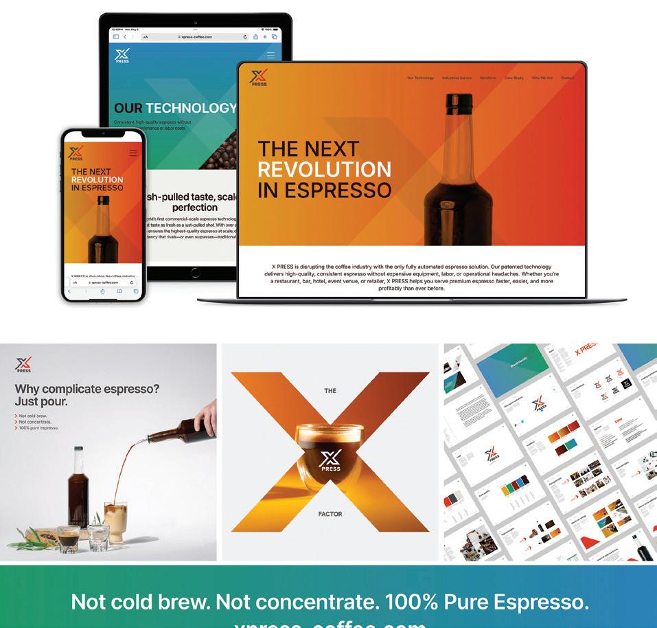
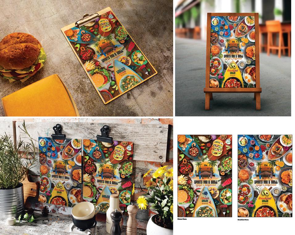
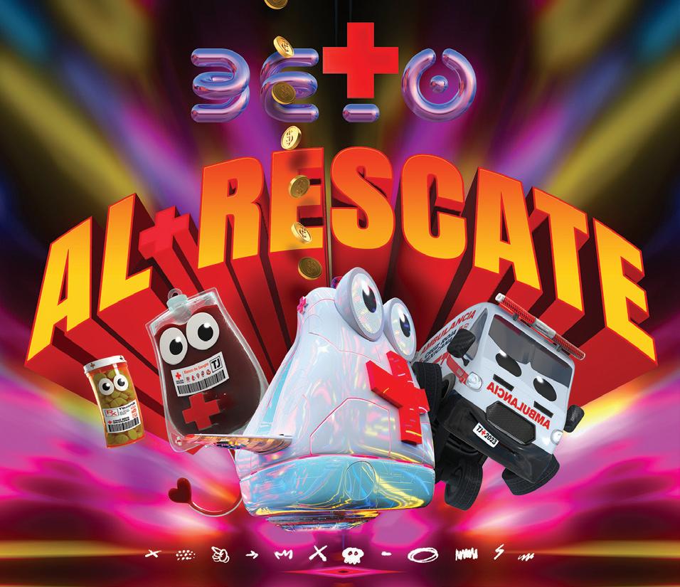
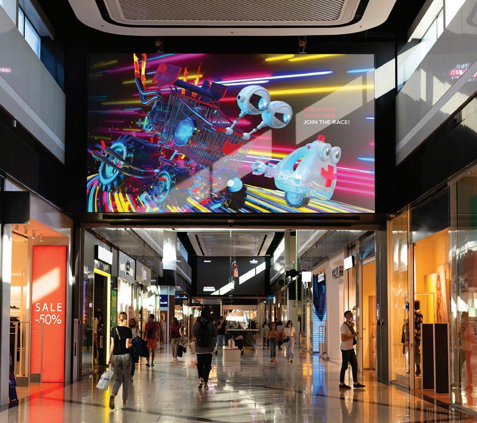
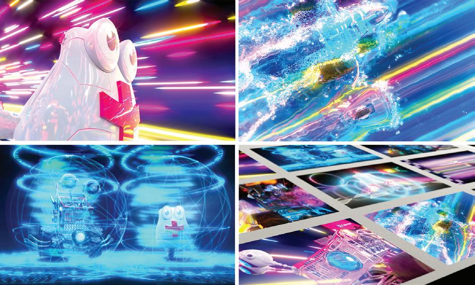
San Diego’s Freaner Creative has created a video game in which characters race for donations to keep the Red Cross Tijuana Chapter alive. It’s a winner in our 25th annual digital design awards. The entire showcase starts at Page 36.
COVER PAPER CREDIT: The cover of this edition of GDUSA is printed on FSC-certified Kallima Coated Cover C2S, part of the Kallima Paper family of coated cover paperboard. Kallima products are proudly manufactured by Rayonier Advanced Materials, a global leader in sustainable forest management practices. Their light-weight, fully bleached coated board products are used in commercial printing, publishing, prestige packaging, high-impact graphic corrugated containers, point-of-purchase displays and litho-laminated packaging. Kallima has a distinct low-density high-bulk construction resulting in less trees used and signficant cost savings to the customer. Contact: kallimapaper.com and 1.800.411.7011
Gordon Kaye PUBLISHER
Ilana Greenberg CREATIVE DIRECTOR
Sasha Kaye-Walsh EDITOR/WEBSITE & SOCIAL MEDIA
Gordon Kaye EDITOR/PRINT
Charlotte Kaye GRAPHIC DESIGN
Kyle Redfield CHIEF TECHNOLOGY OFFICER
Althea Edwards READER SERVICES
Angelo Abbondante ACCOUNTS MANAGER
A Great Idea INTERNET SERVICES
Maliya Malik Christina Ukolov DESIGN/SOCIAL MEDIA ASSOCIATES
Jay Lewis
Jeff Rosenberg PHOTOGRAPHY
Ron Andriani AD SALES + INTEGRATED MARKETING 201.669.9884 randriani@ gdusa.com
Milton L. Kaye 1921-2016 FOUNDER
COPYRIGHT 2025 KAYE PUBLISHING CORPORATION
Ourdesignersarethenewesteditiontothelegacy oftheSyracuseUniversitycommunicationsdesign program.Theirportfoliosrepresentdiverseprojects thatspanabroadrangeofskillsincludingbranding,art direction,editorialdesign,packagingdesign,UI/UX design,webdesignandadvertising.Notwoportfolios arealike.Viewtheimpressivecollectionofworkhere: vpa.syr.edu/cmd2023
BY BILL GARDNER, FOUNDER + PRESIDENT, LOGOLOUNGE.COM
Picture this: designers standing at the curb, eyeing two buses. One bus gleams with futuristic edges, marked boldly AI — promising speed, possibility, and a mind-blowing leap into the unknown. The other rolls up slower, wrapped in the earthy, grounded colors of sustainability — looking backward even as it pushes forward, inviting us to restore, rewind, and rethink. Both buses are filled to the brim with ideas, and both are heading to the same destination: the future of design.
This is the 23rd year of the LogoLounge Trend Report, and if there’s one thing I know after studying more than 30,000 logos from over 120 countries this year (plus thousands of major brand launches and redesigns), it’s this: trends aren’t fads. This is a trend report, not a trendy report. Trendy is a flash in the pan, a flavorof-the-week style that feels clever today but dissolves tomorrow. Trends, on the other hand, track movement — the long arc of where design is going, the shifting forces that shape the trajectory of our craft.
Let’s break down the landscape we’re seeing this year.
First, there’s the reality of working within the smallestt screens imaginable. Designers today are cramming what once lived on billboards into the palm of your hand, onto tiny mobile devices. That means brands must stand out with higher contrast, bolder color, and razorsharp icons that read instantly. We’re seeing an explosion of ultra-chroma hues: electric yellows, eye-searing chartreuse, and that vivid yin-min blue (a.k.a. “the new blue”) introduced just last year. Animation, too, has become a primary identifier, not just a decorative layer — brands are using motion to capture attention, tell stories, and spark emotional engagement.
On the flip side, we’re also seeing the rise of dusky, muted, earthy tones — terracottas, browns, deep natural hues — a color palette that sits firmly on the sustainability bus. This contrast between hyper-futurist brights and eco-conscious earth tones is shaping not only colors but forms: in graphics, gradients continue to evolve, sometimes animating in one-sided shadow gradients or using a layered ombré that calls back to retro 70s–80s aesthetics.
The typography space is splitting down both roads too. On one side, we continue to see exaggerated reversestress type, Letraset-style press-on letters from our guilty past, deep inkwells, extreme serifs, and wildly distorted swashes — a deliberate rewind to the hand-built, tactile charm of past decades. On the other, there’s a mini wave of stark sans-serif wordmarks, recalling the fashion world’s pivot a decade ago toward soulless minimalism. Both poles exist because both resonate with different consumer cravings: one for sleek innovation, the other for authenticity and warmth.
And then, of course, there’s the rise of the mascot. This year, mascots are hopping off both buses. From the AI/futurist bus come hyper-polished, high-contrast 3D characters, kawaii figures with contemporary updates,
and retro-makeover mascots sporting fresh Gen Z haircuts. From the sustainability bus tumble burger mascots with googly eyes and legs, snackable cartoon characters, and nostalgic, homegrown illustrations. Why so much mascot energy? Because mascots remind us of the very thing brands often forget: we respond to humanity. They create warmth, familiarity, and connection — and no matter which bus you’re on, the future is craving more of that.
One of the biggest challenges designers face right now — and let’s be honest, this is especially true on the AI side — is the problem of too many ideas. AI is breathtakingly generous and lightning-fast in its ability to generate concepts, but that gift comes with a cost: editing. When you’re handed a hundred dazzling options, the temptation is to use them all. But design thrives not on volume, but on clarity. Editing has become an essential part of using AI for the good of design, turning its infinite well of inspiration into focused, meaningful outcomes.
At LogoLounge, we review tens of thousands of logos every year not to dictate best practices or crown “winners,” but to track these currents and give you a map of where things are trending. And here’s the part I always emphasize: don’t copy these trends. Don’t emulate them blindly. Use them as a springboard — stand on their shoulders, and push toward your own next great iteration.
There will always be more styles, more microtrends, more looks flickering across the design landscape. But remember: it’s less important to know where you are than to understand how you got here. That’s what allows
you to chart your own path forward — and maybe, if you’re lucky, spot the next breakthrough waiting just over the horizon.
So, step up, take your pick — whichever bus you board, you’re heading into the future. Let’s dive into this year’s trends
2025 marks the 23rd year of this one-of-a-kind report. Each year, it offers the opportunity to literally review thousands upon thousands of logos one at a time, looking for nuances and artifacts of emerging trends. As we acknowledge that each design represents hours and hours of thought and struggle from designers around the world, we are as humbled and awed as ever by their dedication to the craft and grateful for the important role they play in helping us create these reports. So thank you to all of the designers who have and will contribute to the Trend Reports then, now, and for years to come.
For an even deeper look at this year’s trends, visit our course on LinkedIn Learning (formerly Lynda.com).
Bill Gardner is the president of Gardner Design and founder of LogoLounge.com, a repository site where, in real time, members can post their logo design work and search the works of others by keyword, designer’s name, client type, and more. The site also offers news curated expressly for logo designers as well as unlimited entries for consideration in the bestselling LogoLounge book series. Bill can be contacted at bill@logolounge.com.
Designers have historically steered clear of plunging, dagger-like cuts in logos — for the same reason typographers long ago invented the ink trap. In the analog world, those bottomless visual chasms wreaked havoc in reproduction, swallowing detail and muddying forms. But in a digital age? Those concerns vanish. Now we’re seeing designers embrace these deep cuts as purposeful termination points, where swerving, freeform lines resolve not into chaos, but into playful, sharply controlled tension. These marks hold just enough classical constraint to still feel like logos — not random doodles — yet they radiate an organic, almost rebellious energy, as if the designer dared to press the blade right to the edge.
For the brands they represent, Sharps send a clear message: we’ve broken free from stoic traditions, but we’re no fools. There’s a feeling of freedom and risk-taking, yes — but underneath, these logos have been masterfully crafted with a deep understanding of the delicate dance between positive and negative space. As simple as they may appear, their brilliance lies in nuance: knowing just how far to slice, where to pull tension, and how to keep the whole structure standing. The result is a visual statement as fierce as it is finessed.
All the sharps have been carefully extracted from this trend — like handing a designer a pair of preschool safety scissors. These marks call to mind the letters on old-school wooden park signs, where the spinning bit of a router tool cuts away material but always leaves a rounded termination; it simply can’t create a sharp point. That mechanical constraint baked softness into the shape, and now, on digital turf, the same effect is just a few clicks away. The power tool behind these marks? Likely Adobe Illustrator, where rounding off every cap and join is as effortless as toggling a setting. Softness isn’t accidental here; it’s a deliberate message. These logos radiate approachability and gently signal that the client’s rough edges have been smoothed down by time, experience, and intention.
Lil’ Smokies building blocks allow for infinite solutions once that aesthetic is baked in. There’s an old line that “a line is just a dot that’s gone out for a walk,” but here? That dot barely made it to the door before flopping back on the couch. And honestly, that’s the charm — a laid-back vibe that reassures you, we’re approachable, we’re thoughtful, and we don’t need sharp elbows to prove it.
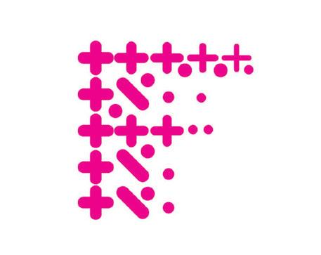
Every year, a few surprise shapes worm their way into the logo landscape, showing up just often enough to make you pause. This time, the standout oddball is the cove — that exact little remnant you get when rounding off the corner of a card, or the same concave cross-section carpenters use to tidy up gaps where walls meet. Picture it as a four-pointed dazzle star sliced into quarters, sometimes recombined into half-dazzles. And while the original dazzle shape has always been about visual magic and sparkle, these quartered cousins carry a subtler charm — still magical, but maybe with a wink instead of a full-on glitter bomb.
What makes the cove shape so effective is its sly reliance on Gestalt principles. It’s not what’s there, but what’s missing — the suggestion of completed arcs and lines that our brains eagerly fill in. These marks thrive on active negative space, practically inviting the viewer to participate, to project meaning, to finish the story themselves. Even typography is joining the party: where the lowercase h or n naturally curves into a vertical, we now see designers echoing that cove cut on the crossbars of f and t, adding a fresh visual signature. Turns out, cutting corners isn’t always a shortcut — sometimes it’s the whole point.

There are a few too many memes and motivational posters reminding us daily that if we’re standing still, we’re losing ground. The virtues of “just hanging on” are wearing thin. What brand doesn’t want to extol the imperative of change? Whether it’s gaining customers, increasing revenue, shedding inefficiencies (or shedding pounds), there’s always some form of progress to wave a flag over. Traditionally, a few graphs or bar charts were tasked with conveying that ambition — but this year, a growing crop of logos has stepped up to the plate, embracing the mission visually through scaling sequences. These marks use a progression of strokes — broadening, diminishing, stepping up, or cycling around — to show momentum, direction, and a clear corporate objective.
For both client and customer, there’s an assurance baked into these orderly cadences. They don’t jar the eye or disrupt our expectations; they pull us forward smoothly, creating a visual promise of measured, purposeful growth. And don’t overlook the role of negative space here — it’s not just the strokes doing the heavy lifting, but the gaps between them, creating a balanced rhythm of presence and absence. Turns out, even in the world of logos, we all like to believe we’re scaling up. After all, who brags about standing still?
There’s a quiet but unmistakable mood threading its way through this year’s logos — an ornamental use of leaves, berries, and natural forms that’s less about literal nature and more about filling space with a sense of handmade, crafted calm. Think of it as Frilberry — a leafy, berry-laced patterning that acts like nature’s embroidery, wrapping logos with an inviting, organic edge. This taps right into the rising cottagecore aesthetic, where consumers romanticize a return to simple, pastoral beauty: baking sourdough, foraging wild herbs, knitting by the fire. But it’s not just nostalgia — it’s about curating an environment where even a modern product or service feels rooted, natural, and touched by something slower, more intentional.
There’s also a subtle rewilding energy here: an instinct to bring wildness back into controlled spaces, to let vines curl at the edges of design, to reintroduce softness where corporate logos have often been hard-edged. Post-pandemic, many consumers rediscovered home life as a place of ritual and micro-craft, and they’re drawn to brands that reflect that shift. Frilberry patterns carry emotional weight — they signal not just “we’re natural,” but “we know how to fill your world with quiet, crafted beauty.” In a sea of clean lines and minimalism, sometimes it’s the leafy little frills that steal the show.

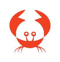
There’s a fluid grace to the logos in this trend — marks that find power in the sweeping, curvaceous lines of a half-twisted ribbon, folding over itself, tapering to nothing at the center, then reemerging in a new figural field. This isn’t just decoration; it’s geometry doing real brand work. These crossovers create fresh zones of positive fill, turning simple shapes into layered visual stories. Sometimes they’re abstract, sometimes literal (like the crab or the runner), but they all share a dynamic interplay of negative space, movement, and tension. They convey agility — the ability to pivot, flex, and merge — and they signal that a brand is nimble, capable of turning from one focus to another without missing a beat.
In branding, as in life, the twist is where the magic happens. These logos remind us: when you cross over, you don’t lose yourself — you double your impact. Whether bridging entities, merging elements, or just showing there’s more than one side to the story, these marks prove that clever design doesn’t always need to shout. Sometimes, a single elegant crossover says it all.

It takes a lot of guts to claim that squares have become a trend. After all, the foundations of geometry already have us defaulting to circles, triangles, and squares when building marks. But remember a few years back when USA Today, ArtCenter College of Design, and a dozen others were locked in an unspoken arm wrestle over who could “own” the flat circle? Now, we’re seeing a sudden escalation of square dependency. Sure, squares still make the best use of app button real estate, but unlike the old-school H&R Block solid-green square, today’s marks integrate the square as a structural component, meshing it with type or elevating it as a central building block in the system.
There’s no getting around it: squares carry weight. They signal stability, monolithic strength, intractability — traits that might not sound cuddly or playful, but they radiate longevity, trust, and resolution. Where Instagram’s bubbly gradients invite you in, these marks commit unapologetically to the sharp certainty of the right angle. And when you cluster a few together, the visual language unlocks even more layers: checkerboards or checkered flags waving a brand to victory, signaling strategy, precision, and a winning edge.
There’s a new batch of wordmarks out there that couldn’t care less about the old rules of ligatures. Classical typography teaches us that ligatures are delicate, highly controlled connections between specific letter pairs — the ones that naturally want to link up (looking at you, fi and fl). But the marks in this trend throw subtlety out the window. Designers are ramming letter pairs together — even awkward combos like round-against-straight — and fusing them with chunky, rounded bridges. It’s as if the type is made of some squishy, magnetic material, drawn together until the forms start to melt into each other. Picture someone squinting at type out of focus, then trying to redraw it in vector lines without realizing they’re working with letters — that’s the vibe.
Let’s be honest: this isn’t some deep revolution in typography; it’s more like a quick visual flex. These marks are engineered for contemporary brands chasing edge and disruption, not typographic purity. The effect is eye-catching, sure — a tasty little reminder that even letterforms like to bend the rules when they think no one’s watching.
These logos don’t sit still — they sprint. It’s like a mark trying to outrun the TILE tracker someone slipped it, darting just ahead, leaving a soft, gradient vapor in its wake. BlurTails leave behind ghostly trails wafting off solid icons or type, hinting at motion, speed, and presence. Whether applied to static logos or brand animations, the effect pulls the viewer in: you’re not just seeing what the mark is, you’re seeing where it’s been and maybe where it’s headed. Gradient tails suggest directions of travel, elements converging from distant reaches, or a once-static object slipping free and darting offscreen.
These visuals beg for a second consumer look — partly because they’re mesmerizing, but mostly because your brain needs to confirm: Am I going blind, or did that logo just… move? Even standing still, the blur tells a dynamic story. It’s a smart flex for brands signaling agility, momentum, or constant evolution. Sure, this aesthetic is tailor-made for animation, but even in static form, BlurTails say: we’re active, we’re advancing — and good luck catching up.

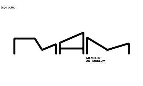
Straight line segments are some of the hardest-working soldiers in a designer’s toolkit — and when a project lets a type solution off-leash, you can bet they’ll stretch those limbs as far as the eye can follow. Take Paula Scher’s wildly flexible MAM monogram for the Memphis Art Museum: it taps straight into the natural affinity between letterform and architecture, creating a dynamic system that flexes and morphs alongside the museum’s multiple perspectives. These elongated, articulated letterforms don’t just sit pretty — they pull the eye in, inviting the viewer to play.
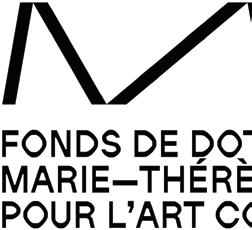
Each of these logos uses its long legs to do some heavy conceptual lifting. They bend and extend to suggest motion, terrain, or structure, layering unexpected meaning onto an acronym or wordmark. The Marie-Thérèse Allier identity, for example, incorporates dramatic flexing animation, echoing the avant-garde choreography tied to her name. Usually, we leave the heavy branding work to a singular iconic symbol, but these marks say, why should the symbol have all the fun? Here, the stretched, angular wordmarks carry the weight — strutting, bending, and twisting their way into the visual identity with a kind of wiry elegance.
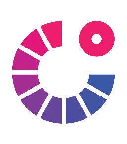
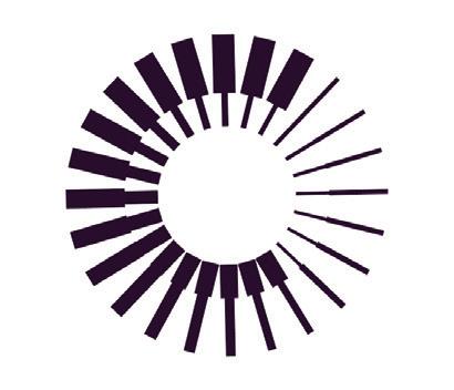
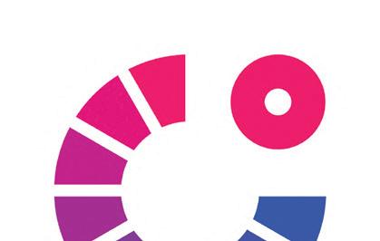
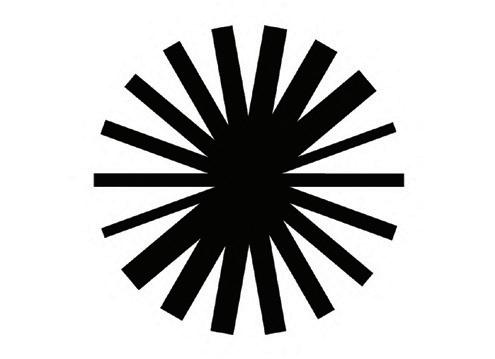
We probably don’t give much thought to the idea that when we tell someone to turn up the volume, turn up the heat, or turn the channel, we’re invoking the ghost of a physical knob. If we weren’t so damn obsessed with knob control, maybe we’d be saying “slide” or “tap” or “nudge” — but turning, by its nature, is a rotation artifact. And rotation? That makes circles. So it’s no surprise these logos lean into that visual DNA. The spin of a knob has long been a signal of control, and in these marks, that same rotational logic universally signals progression, decline, escalation, or modulation — but always, always with the underlying idea that someone (or something) is steering the dial.
When you see these logos shift from warm to cool coloration, or scale from thin to thick elements, or fan out in visual weight, they’re embodying the capabilities of a product, a mission, or a corporate ethos. We may have forgotten the origin of the word “turn,” but we haven’t lost the visual cues that tell us this brand is dynamic, this brand adjusts, this brand responds. And next, maybe we should talk about why pressing a button in your car is still called rolling down the window.
REDSPARK CREATIVE LTD CONSOLIDATED MORTGAGES
SIGNIFLY CONSIA

GATOR WORKS COOL PRO
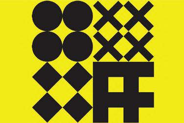
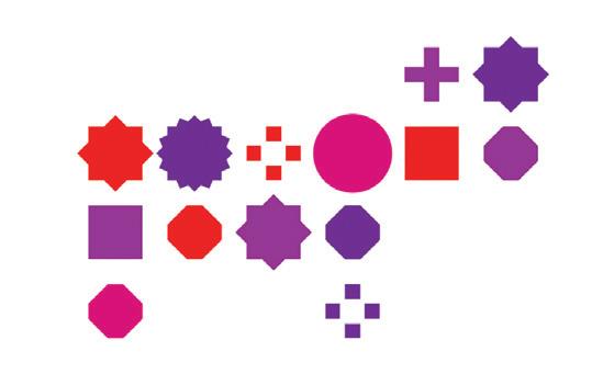
There’s nothing wrong with conformity — it has its place. But let’s be honest: we thrive on choice. There’s a reason it’s not called Baskin Robbins 1 or Heinz 1. As humans, we crave variety, we want our own favorites, our own desires, our own ways. And yet, there’s value in order — even if it doesn’t have to supersede independence. That’s the magic behind PolyGrid logos. They follow a clean, even cadence along an x-y axis, like a chessboard or a halftone field, but then they shake up expectations by dropping in a wild mix of forms: stars, crosses, circles, polygons. The result? Order and individuality, living side by side.
These marks are rising strong this year because they carry layered meaning. They might draw from the client’s own visual vocabulary, they might celebrate self-expression, or they might stand as a metaphor for individuals coming together under a shared initiative. Many of these logos have robust visual systems that extend into animated patterns or shapeshifting elements that flex depending on the message. Tools like Vectoraster have only accelerated this movement, making it easier for designers to spin up grids of custom icons, letters, or forms into dazzling, dynamic fields. Sometimes a tool drives a trend — and sometimes, the whole thing just clicks into place by beautiful, serendipitous timing.
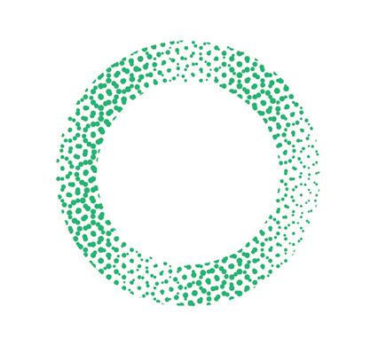
Let’s face it: logos are tiny, overachieving little beasts. Designers sweat bullets trying to cram the entire soul of a brand into a shape the size of a boba dot — and if we’re being honest, sometimes we forget the outside of the package is ripe territory for delivering even more. Hell, who says you even need to fill the middle at all? These marks prove you can sling a message just by tricking out the edges. Most of them lean on simple, no-nonsense shapes — circles, triangles, swirls — because the outline alone is already doing half the talking. But it’s the patterned perimeter where the magic kicks in: think cultural signals, product vibes, tech pathways, motion, transparency, or pure playfulness, all humming right there along the rim.
The real genius? These marks leave the middle wide open, like a blank dance floor, inviting the consumer to step in and mentally complete the picture. The shape gives structure, the pattern piles on the meaning, and the negative space acts like a neon sign saying, hey, your imagination belongs here. It’s a perfect reminder that sometimes, the edges don’t just frame the story — they are the story.
Over the past several reports, we’ve seen liquid elements seep deeper and deeper into logo design — first a drop here, a rivulet there, maybe a graceful chain of droplets linking together. But almost without us noticing, the forecast has shifted: this year, it’s a torrential downpour. These marks are all about droplets — classically shaped with that pointed tip and rounded end, so we know exactly which direction we’re getting the business from. And that matters, because these droplets are on a mission. Some logos deploy uniform drops, while others go full family unit: baby, mama, and papa drops blanketing the graphic like a fire hose.
Many of these marks lean into a back-to-nature theme, offering the assurance that no matter how technical H2O sounds, we’re really just talking about original, irreplaceable nature juice. But more than anything, droplets signal motion — a process captured in the blink of an eye. These logos are never still; they’re about the moment, about activity, about the energetic phase between drop and result. And don’t forget the kicker: as independent as each droplet may seem, they ultimately come together, pooling their strength into one powerful, shared resource.
Mapping the unknown isn’t just curiosity — it’s baked into human destiny. We chart where we stand, trace our way to point B, and make sure we can get back home before the unknown has its way with us. These hoop-driven logos, orbiting along x, y, and z axes, evoke the ancient armillary spheres and astrolabes crafted over two thousand years ago — tools that let us imagine Earth (or the Sun) at the center, while precisely tracking the astral bodies above and the movements of ourselves below. It’s no surprise these shapes now tell brand stories of exploration, guidance, and the promise of navigating uncharted journeys — physical, mental, or spiritual.
The world and skies we inhabit came without straight lines, yet over centuries we’ve drawn longitudes, latitudes, borders, and constellations, all in an effort to frame the wildness around us. These marks tap into that same instinct: the urge to create structure, to tame mystery, to wrestle meaning from the swirling chaos we ride daily. Whether you see them as celestial, scientific, or symbolic, they remind us that discovery is never done — and that every brand wants to claim a bit of that eternal, irresistible pull.

ABOUT LOGOLOUNGE.COM
LogoLounge is where thousands of designers worldwide connect, share, and find inspiration. Members gain unlimited access to nearly 450,000 searchable, contextualized logos — and can upload unlimited work for consideration in the next LogoLounge book — all for an annual membership of $100.
Want a free taste? More than 20 years of LogoLounge Trend Reports are open and available to everyone at logolounge.com — offering insight into decades of logo evolution and trend trajectories.
And exciting news: judging for LogoLounge Book 15 has just wrapped, and the newest industry bible of logo design will hit shelves by the end of the year.
Join the global community shaping what’s next in logo design at logolounge.com/join.
50TH
“In a digital world, print just works. It’s not about being everywhere — it’s about standing out and getting noticed when and where it counts.”
This is our 62nd year of conducting a benchmark poll to our audience on the vital role that print and paper play in the service of graphic communications. The quote above from our May 2025 poll — a pragmatic take on the value proposition of print design in a digital age — says it all.
The rest is but a footnote (though, we hope, an interesting footnote).
Before delving into the 2025 numbers and comments, a quick reprise of some contextual observations we made on the occasion of our 60th anniversary survey.
Over six decades, GDUSA’s coverage of print design suggests three broad phases in the story of print and paper. In the first phase, designers were often perceived (and self-perceived) as decorators and prettifiers rather than decisionmakers. Among the consequences of passivity: decisions were restricted by little product choice and lots of control by printing and production experts.
In phase two, designers emerged as creative masters and thought-leaders adding value to commerce and culture. In this phase, control and responsibility for content and production flowed upstream to the creative community — making designers the center of all things print, and
sparking a golden age of paper specification and creative print buying.
In 2025, we live in phase three. Designers are ever more recognized and celebrated for the value they bring to the table. But, of course, the rise of digital communications has broadened the media options and forced designers to recalibrate their relationship with print and paper. We are witnessing the nature of that evolution right now.
Given this context, today’s poll results and accompanying reader comments make eminent sense. Print and paper remain not just relevant — but essential — to branding, communication, and creative expression. That print design isn’t going away — it’s evolving. And that in today’s integrated marketing landscape, the best designers and marketers don’t choose between digital and print — they combine them in a holistic way for greatest effect.
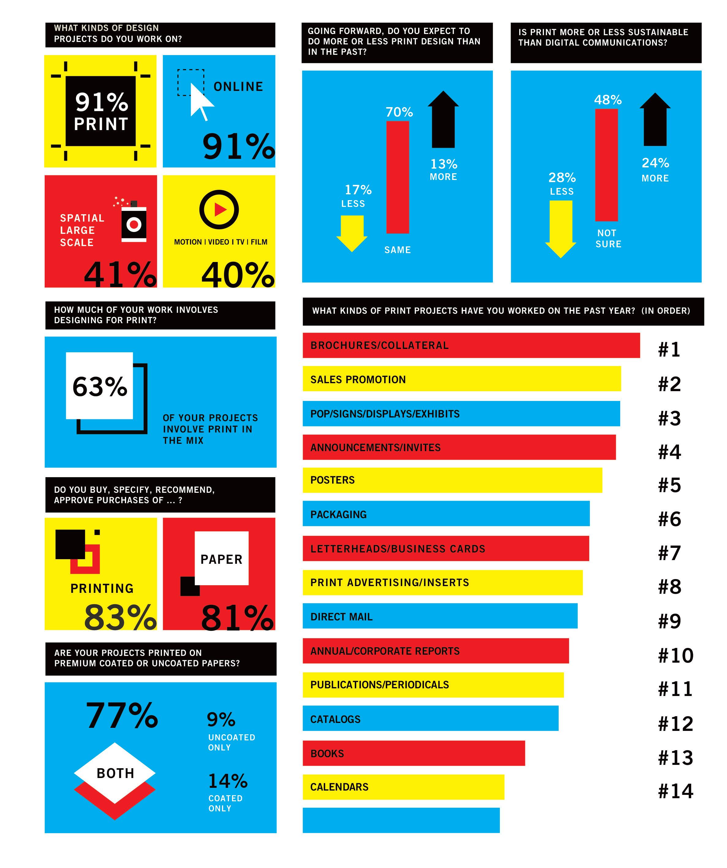
Print continues to play a critical role in how professional graphic designers make a living. Fully 91% of respondents say they work in print as part of their professional mix, and 63% of projects involve a print component. Moreover, the vast majority say they expect the same level of print design in the coming year. In short, our readers reaffirm the importance of print in their workplace and to their livelihoods.
1 2 4
Designers believe that print endures because of its classic strengths. Foremost among these is tangibility: it is sensual, touchable, physical, real, permanent, all of which encourages a human connection and an intimacy missing in other media.
The classic strengths are amplified by digital clutter and digital fatique. Because print is relatively rare, it has the potential to stand out and breakthrough — fresh, welcome, surprising, disruptive, personal, engaging, meaningful, impactful, a statement that a brand values itself and respects its customers.
Conceptually related is the issue of trust: quality printed pieces are seen to possess authenticity and credibility because they feel real and present, spring from an identifiable source, and are the result of a deliberate act of craftsmanship. The ephemeral and fleeting nature of digital communications does not inspire similar confidence.
A DEEPER DIVE FROM OUR 2025 READER POLL 3 5
Print, once the default media, is now a role player that shares the stage. Belabored metaphors aside, everyone recognizes that print and digital aren’t competing forces –they’re complementary tools that work best when strategically aligned. Creatives who understand both mediums are engaging customers in more multi-sensory ways using sophisticated techniques that link print to digital campaigns — among them AR, QR, PURLS, hashtags, social handles, print-to-mobile apps and more.
Designers and marketers are becoming more savvy about where print is most effectively deployed. Some examples: package design, perhaps the most vibrant area of growth; tangible brand assets for credibility and presentation; promotion and documentation of large consumer purchases; graphic materials for events, celebrations and experiences; and all of the above for select industries and markets like luxury, fashion and high-end retail as well as real estate, legal, financial, healthcare, art, engineering, education and fundraising where quality, permanence, craftsmanship and depth of information matter.
6
If print is more selective and strategic, superior print design and well-crafted execution matter more than ever. Thus, designers continue to insist on retaining responsibility and control for critical creative and production elements of the print process. For example, 81% buy or specify paper and 83% buy or specify printing.
8
Designers work on a wide range of print deliverables. As has been true for decades, Brochures and Collateral remain the most frequently executed projects. Sales Promotion, Invitations, Direct Mail, Poster, Packaging, and Annual Reports are wellrepresented. Letterheads, Business Cards and Print Ads, once left for dead, score surprisingly strong.
7 9 10
In today’s transient culture and uncertain economy, digital media solutions tend to be the default position. They appear at first blush to be cheaper, faster, more immediate and generally sexier to clients — especially true for each younger generation.
Respondents have divided opinions on whether print or digital design is the more sustainable option. The views depend on how they interpret sustainability — direct environmental impact, energy use, or longterm consumption. Most designers now believe print can be optimized for sustainability through mindful material choices, production techniques and strategic design decisions.
Billerud makes high performance packaging materials for a low carbon society. We are a global leader in paper and packaging materials made from cellulose fibers, and we are passionately committed to sustainability, quality and customer value.
We serve customers in more than 100 countries through nine production units in Sweden, USA, and Finland and around 5,800 employees in 19 countries. Billerud is listed on the Nasdaq Stockholm.
In the United States, Billerud operates out of a regional head office in Miamisburg OH, two mills in Michigan's Upper Peninsula and a converting facility in Wisconsin We are a leading supplier of high-quality graphic and label papers, packaging materials, and market pulp. At Billerud, we build brands and business results for our customers.
Our roots in the paper industry and our proud history go back more than 150 years. Since then, we’ve grown to what we are today: A world leading company in high-performing paper and packaging materials — passionately committed to sustainability, quality, our customers, and their businesses.
Sustainable packaging is no longer optional. It’s a must for any brand that wants to future-proof its business. That’s why our decisions are always guided by the promise of creating a better tomorrow, today
As a leading supplier of virgin fiber-based paper and packaging materials, and with sustainability at our core, we are passionately committed to our customers and their businesses, every day. With our industry knowledge and expertise, we are here to inspire and make you feel confident in making the best packaging choices that help reduce your climate impact.
With our distinguished graphic product line, streamlined supply chain and flexible manufacturing capabilities, we are ready to respond to market demands that best service our customers.
Ours is the best quality graphic papers with a broad selection of forest management and chain-of-custody certification options
for all types of commercial printing applications. Our U.S. mills are strategically located near top industry printers across North America, so our products are available when you need them. And we provide expert customer support, on-press technical service and insightful solutions that bring added efficiency and productivity straight to your business.
Billerud’s coated graphic papers for print communication are where industry-leading innovation meets a passion for crafting the best paper to carry your message. Our beautiful optics, broad product line, count-on-it performance and here-for-you service combine to make it easy to build your brand within your budget.
•Sterling® Premium
•Productolith® Pts.
•Anthem Plus®
•. Sterling® Ultra C1S
Billerud’s graphic digital paper leadership comes from years of research and experience. From laser and ElectroInk printers to digital offset technologies, in color or black and white, you’ll find the right finish and weight for every application,
precision trimmed to assure the highest performance and throughput.
•Sterling® Premium Digital™
•Productolith Pts. Digital®
•Blazer Digital®
OUR INKJET PORTFOLIO:
Billerud keeps you ahead of the technology curve with a broad array of popular web papers trusted by the top equipment manufacturers. Featuring exceptional optics, surface smoothness and consistency, our papers are available in inkjet roll widths for optimal performance in highspeed inkjet presses.
• TrueJet® Book
•Sterling® Ultra EX
•Sterling® Points EX
•Influence® EX
•Ideal® Jet EX
• Ideal® Caliper EX
OUR WEB PORTFOLIO:
Billerud’s web papers apply industry-leading innovation to deliver the best paper for a variety of print application solutions. Appealing optics, breadth of choice, reliable performance and committed service — quality without compromise, products created to make your brand look good.
•Sterling® Ultra
•ArborWeb Plus®
•Influence®
•ArborWeb®
•Liberty®
•New Era® Matte
OUR WC WEB CALIPER PORTFOLIO:
Billerud’s web caliper paper offers an enhanced print surface that gets your message noticed. Better yield than comparable coated freesheet and better print quality than comparable uncoated freesheet makes this your go-to paper choice for direct mail, reply card other applications.
•Ideal® Caliper
OUR PACKAGING PORTFOLIO:
Billerud’s expanding packaging portfolio includes a substantive offering for conscientious brand owners looking for paper-based solutions as an alterative to plasts delivering optimal performance, strength and beauty.
CARTONBOARD
Coated Bleached Multi-ply
•CrownBoard Prestige®
Coated Unbleached Kraft
•CrownBoard® Craft
Coated SBS Paperboard
• Voyager® Pts. SB
CONTAINERBOARD
Coated White Kraft Liner
• Tribute®
Lightly Coated White Kraft Liner
• Tribute® Base
OUR LABEL PORTFOLIO:
Billerud is a leading supplier of high-quality pressure sensitive facestock, multi-purpose facestock and release liner label papers engineered to perform in a wide varietiy of complex, demanding and technical end uses.
PRESSURE SENSITIVE FACESTOCK
• OptiLabel™ HB • OptiLabel™ Dairy
MULTIPURPOSE FACE STOCK
• Sterling® Ultra C1S
RELEASE LINER BASE PAPER
• Unisil®

Print and paper can make a human connection, and have a real emotional impact, that electronic communications cannot. When used strategically, print can make or break a campaign.
Print design is still the most impactful way to convert potential into active customers. The element of touch and feel, the longevity of a physical asset creates a lasting connection with the consumer.
There are also the event tickets which I order regularly, and the annual reports which clients still want printed. I designed my first book this year, too. I see the evidence after four decades of working as a print designer: people still want that physical item to hold in their hands. The weight and presence are both existential and figurative.
How you communicate is just as important as what you communicate. In an increasingly digital world, people crave things that are authentic, tactile, and special. Good designers and marketers can use this to make meaningful connections. Print, when done right, creates an advantage to effectively stand out in a noisy digital field.
Print design holds a distinctive place in today’s marketing communication and graphic design landscape. Amid the rapid rise of digital media, many companies seem to crave the tangible, lasting impression that a thoughtfully crafted printed piece can provide.
The rise of digital has made print more special because it’s less frequently used. Also, print has a staying power that digital has not mastered. I can refer back to print materials very easily and never find the same article online ever again.
The use of print in my business has settled into the tried and true practical applications. People are still ordering business cards, brochures, and signage.
I have worked as a graphic designer in higher education for decades and although there has been a decline in printed pieces with the rise of the digital age,demand for print has remained relatively steady.
I specialize in package design and packaging is an integral part of brand identity.
Print and paper have weight — physical and emotional —that digital can’t replicate. Holding a well
executed piece creates a personal moment of reflection and presence.
The future of print design isn’t about mass production — it’s about targeted impact. Limited runs, specialty finishes, and integration with digital experiences will define its role.
I work in food and beverage packaging. As long as folks are consuming these products, the qualities of print will endure in my own work.
Print design really works industries where people like holding something physical — like fashion, real estate, food, and hospitality. It’s great for making a strong impression and building trust because you can actually feel and keep the materials. It also helps to use premium papers when you want your design to really pop and feel special.
Print is becoming more valuable as the flood of online is canceling it self out. I think the continuation of print is largely customer driven. My clients find that a percentage of their clients still prefer the tactile experience, especially with magazines.
Print engages the senses in a way digital can’t — sight, touch, even smell. That sensory connection fosters emotion and memory, at the heart of human communication.
Direct mail, brochures and business cards always seem to be popular with my clients.
The classic strengths of print and paper are increasing because a lot of people are trending towards having a connection with physical printed media. That’s what I am experiencing. Many people tend to ignore digital since they are bombarded by digital 24 hours a day. It is enough already.
We are in a society of people who acquire stuff and stuff has meaning to them. To touch and to feel a printed piece gives meaning to the product or event you are branding.
In a digital world print stands out. It’s becoming more niche and more powerful — like vinyl records for the design world.
Print is evolving, not disappearing. The tactile experience of a beautifully designed magazine or package simply can’t be replicated on screen. Designers who understand both digital and print are the ones shaping the future.
Digital media is everywhere; print media is rare. That rarity transforms print from just another message into a memorable encounter.
The most exciting print right now is happening in packaging. That box is the brand’s handshake, and the design has to carry story, quality, and personality from first glance right through to the unboxing.
Print design is 100% of my business but it doesn’t get physically printed. It delivers as accessible compliant PDFs, a distribute-then-print model.
Print is no longer the center of the design universe, but it’s still an essential satellite. For branding, packaging, and editorial design, print retains a strong, specific value — just with a smaller footprint.
The new generation of buyer and end clients do not see the value in print. Digital experiences are faster to market.
We view print as a strategic gateway to digital engagement — a chance to start meaningful interactions that continue online. Print gives digital initiatives a long tail.
I have clients in the luxury market, and the luxury market is one place where print is crucial. Premium print speaks to craftsmanship and attention to detail — values that it is harder to convey with digital media only. Clients selling high-end products or services
are more open to premium or textured or specialty papers and techniques like embossing, debossing, foil stamping, letterpress, etc.
For many of us, print is still a bread-and-butter skill. From packaging to brochures, there is still a steady client demand.
Print and digital design each come with their own environmental costs: print requires physical resources such as paper and ink, while digital depends on energy and electronic devices. The key to sustainability is making mindful choices in either medium.
I still believe in brochures. A well-designed brochure doesn’t just inform; it persuades, engages, and leaves an impression.
I have been hired to do a number of events and conferences. They are all about experience so it’s a great chance to use multiple media from print (invites, direct mail, programs, maps, tickets) to kiosks to signage to video.
While digital dominates, print remains essential in my professional life — especially for branding, where tangible materials elevate perception. Print offers a sensory experience that builds emotional connection and leaves a lasting impression. In high-impact moments — like packaging, brand launches, or annual reports — print signals thoughtfulness and permanence in a way digital does not. I see print’s strengths enduring, especially as brands seek meaningful, slower experiences in a fast-moving world.
Although I recognize that print offers a unique and valuable experience for both designers and clients, I don’t see it playing a significant role in my current work. Digital media and emerging technologies continue to evolve rapidly, offering new and dynamic opportunities that better align with today’s needs.
Print, like everything else, is changing. That is the challenge. I believe that designers who can integrate print into omni-channel campaigns will not
just survive, but will be in more demand.
I am experiencing an uptick in package design work.Brands really need to get people’s attention at the shelf and get them to buy. That is so needed right now when messaging is cluttered and confusing.
Let’s face the reality. Print design is now a legacy skill. Valuable in some sectors, yes, but most design energy and innovation is happening online.
likely to be kept, and more meaningful to stakeholders.
As an older designer who specialized in print, my goals are to transition from a design services model to creating licensed products that combine my illustration, design and environmental education knowledge. This is to support conservation and environmental awareness as well as integrate with our new lifestyle from an urban environment to living and managing a functioning farm.
I care deeply about the environment. Neither print or digital is inherently more sustainable. The sustainability of print relies on the use of recycled materials and eco-friendly processes, whereas digital’s environmental impact is tied to energy sources and electronic devices.
We advise our corporate clients to print their annual reports whenever possible. A beautifully printed annual report sends a message that an organization is serious, established, and transparent. It is harder to ignore, more
We’ve upgraded our community publication with a premium aqueous coating. It is the first thing our readers noticed and fell in love with. So much so, our advertising revenue has gone up because of it.
Print is more memorable than digital in many applications. If you can personalize it, even better.
I love exploring the tactile quality of printed surfaces and the emotive nature they bring to the experience of a piece of information, product, or brand. I would love to do much more of print projects. However, in my experience, designers are being called upon to do much, much less of it, which is sad because the qualities of print enable us to experience the world in ways that digital alone does not.
are where you say the most with the least — big ideas, few words, bold type, bright colors. There is nothing like it.
Package design is one of my firm’s strengths. The ability to specify paper and form is fundamental to packaging that presents a product in its best light. This area will only grow as new products and updates are certain to continue.
Print lets you target your audience. You don’t print to reach everyone — you print to reach the right ones. It’s not so much about scale or reach or distribution – it’s about significance.
Working in a non-profit, we are trying to appeal for support based on the valuable work we do. Sending something tangible is a meaningful way to show the direct relationship between the funds and support we receive to the way we can transform lives. My favorite kind of designing is for posters. They
We don’t print as much, but when we do, we like to use sustainable sources. Some clients prefer to have a printed piece to review. We spend a good part of our day peering into computer screens, phones and tables. Reading print on paper gives one a break from the light of a screen and a touch of reality.
One time initiatives can be digital. We reserve printing for when we can exceed expectations and do something truly special.
Print may feel trustworthy because it’s harder to make. But it is not the medium that creates trust, it is the designer and the client.
Cultural organizations — museums, theaters, arts groups — still invest in print programs and posters and tickets. It’s all necessary and part of the experience.
I work with a winery, and their printed labels, tasting menus, and mailers are basically part of their personality. Their customers love the feel of it — it’s storytelling in print.
We still see strong demand for print in the nonprofit profit world. A well-crafted donor report or capital campaign booklet can open wallets in a way no email ever will.”
The unboxing is the new retail moment, and print design is right at the center of it.
Large companies seem to be moving toward digital fast. But we finding that small and local businesses still count on printed materials. Menus, loyalty cards, window signs — local places love that stuff,
Digital fatigue has opened the door to a surprise comeback: direct mail. Everyone’s overloaded online. So when a cool piece shows up in the mailbox, it feels fresh again. Sending a printed piece shows effort. It says, ‘we care about this.’ A PDF just doesn’t hit the same.
Nonprofits and schools are still super into print. They want pieces that feel personal and meaningful — like annual reports or event invites that people actually hang onto. Clients say their donation letters get read.
Wellness brands, from herbal supplements to meditation apps are really into print that feels soft and premium and gentle — like care guides or product booklets.
I’ve worked on a couple gallery posters and museum programs recently. They treat print like an extension of the art — super thoughtful, well-crafted stuff.
It is not print or digital, it’s print when it matters.
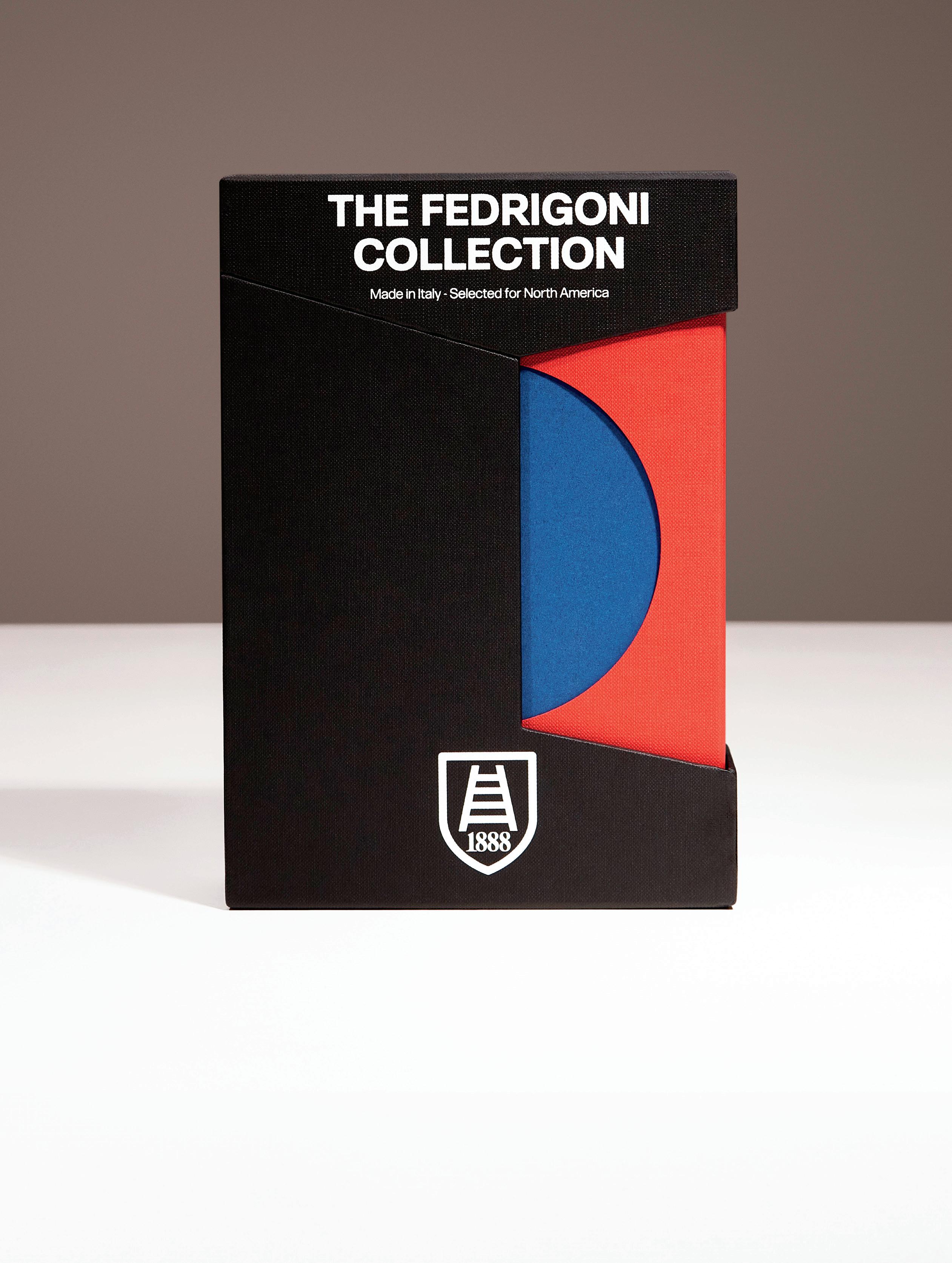
The Fedrigoni Collection selected for North America sets a new standard for brand owners, convertors, and designers, perfect for their most important and inspired print and packaging projects.


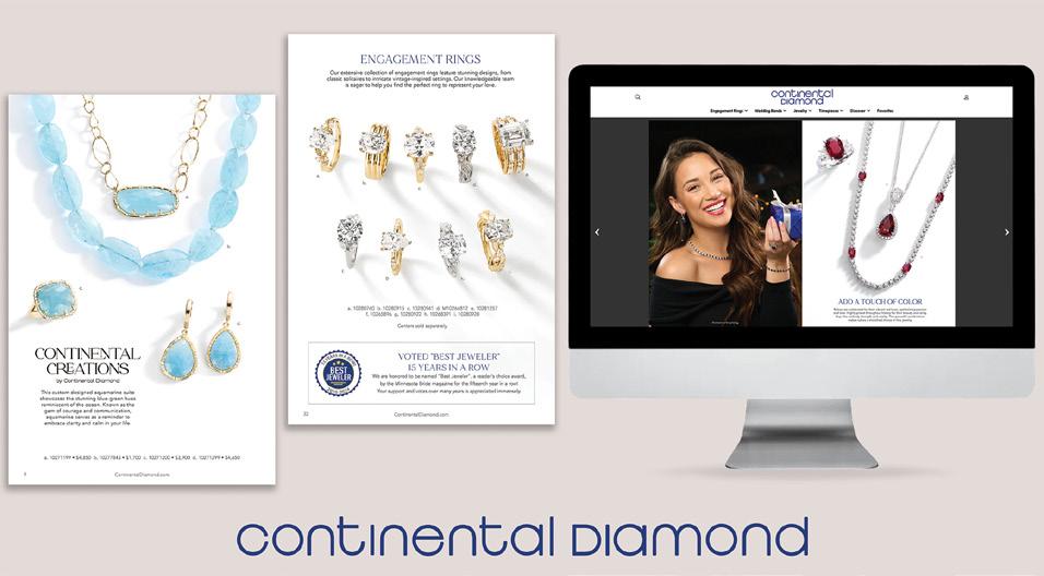
Our 25th annual digital design showcase tells the story of a medium’s potency to reach, engage and communicate. This competition, formerly known as ‘web design,’ has been broadened to include not only websites, but also social media and email marketing, digital ads and publications, video and animation, UX and UI design, e-commerce and apps, and more. We received thousands of entries with only a select handful featured today. All this attests to the fact that digital communication, and those who create and produce it, are in a virtuous cycle: burgeoning demand, richer tools, more stable technologies and infrastructure, and an increasingly sophisticated appreciation for the contribution of fundamental graphic design principals. Winners are displayed in alphabetical order by Design Firm or Organization primarily responsible for the design.
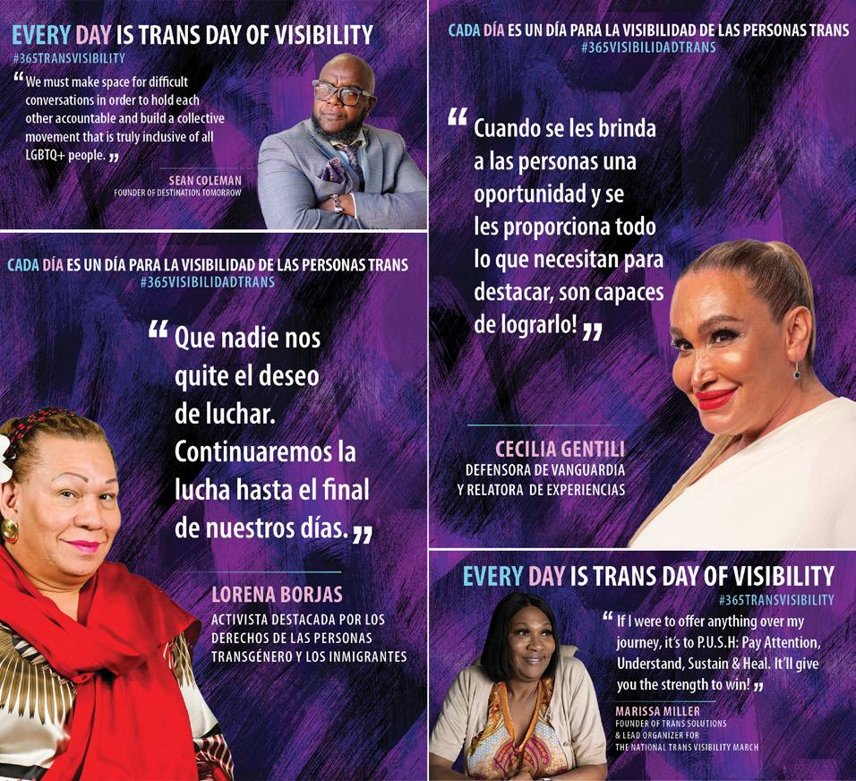
Design Firm: A Great Idea Client: Amida Care Title: Every Day is Transgender Day of Visibility Social Media Art Director: Shane Lukas Designer: Daniel Lee Writer: J Martel Category: Social Media
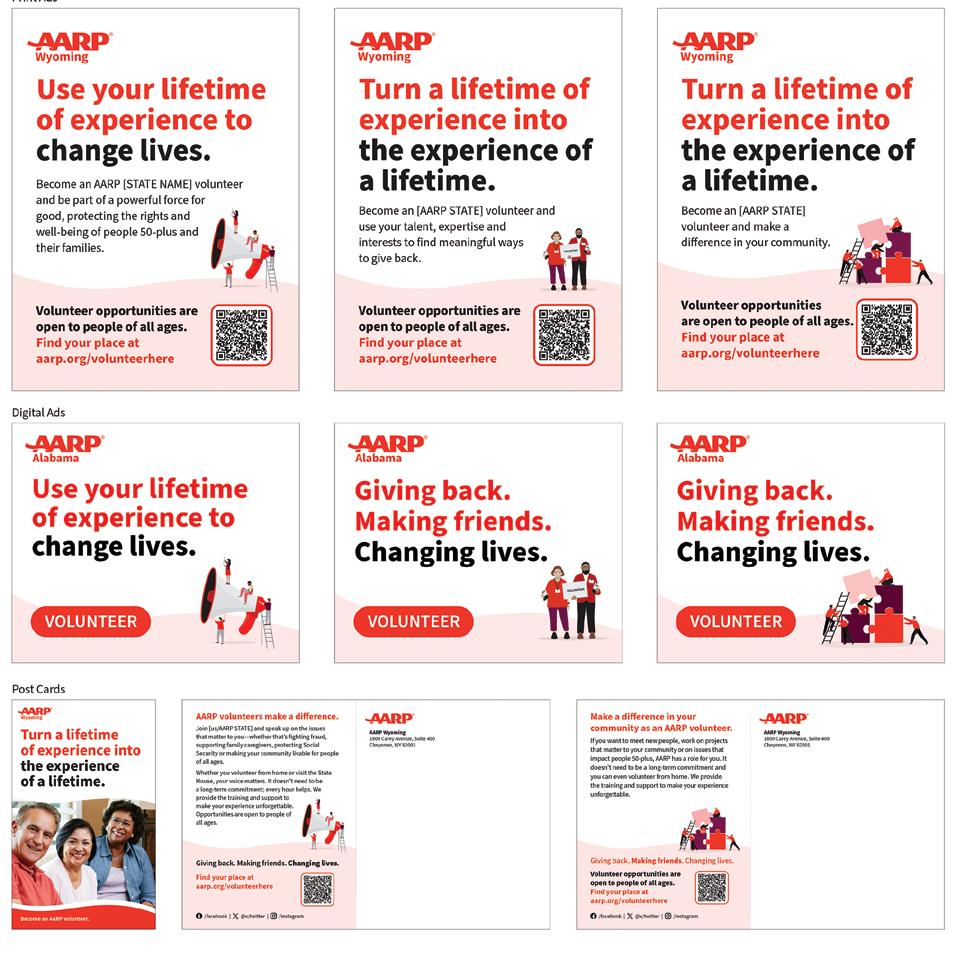
Design Firm: AARP Brand Creative Services Client: AARP Title: 2024 AARP Volunteer Recruitment Suite Art Director: Matt Rosser Designer: Matt Rosser Category: Digital Publications
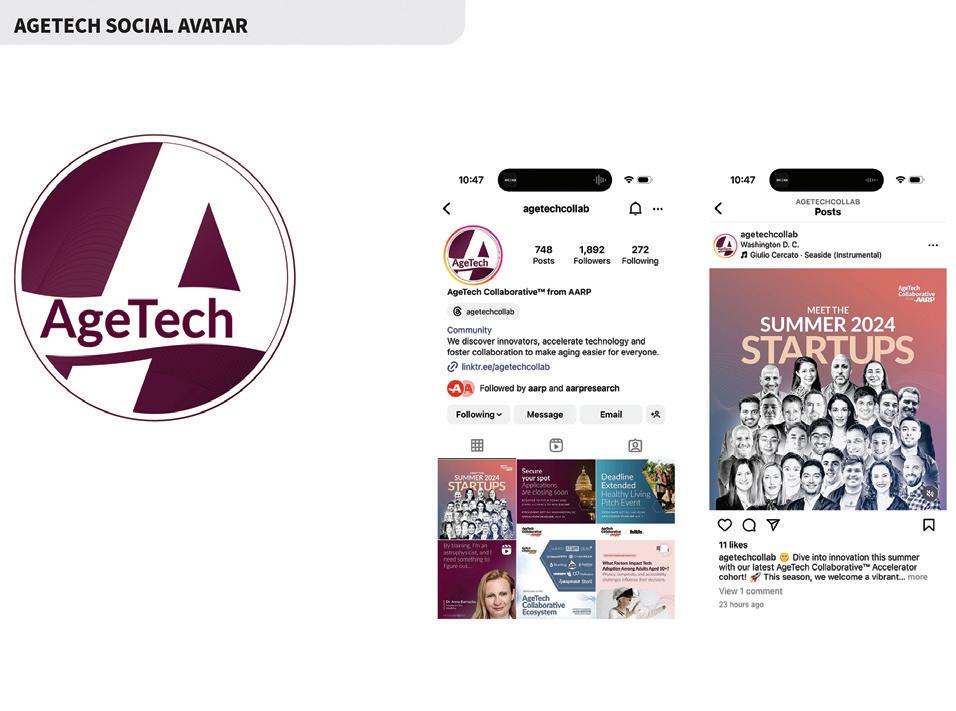
Design Firm: AARP Brand Creative Services Client: AARP Title: AARP AgeTech Collaborative Social Avatar Art Director: Michelle Moser Designer: Michelle Moser Category: Social Media
Design Firm: AARP Brand Creative Services Client: AARP Title: AARP Brand Creative Award and Design Portfolio Portal 2025 Creative Director: Michelle Moser Art Director: Debra Hinkle Designer: Debra Hinkle Category: Websites/ Microsites/Mobile Sites
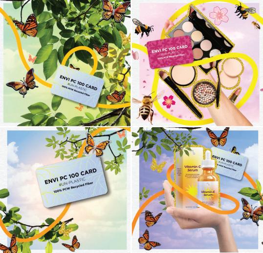
Design Firm: Adduco Communications Client: Monadnock Paper Mills Title: Every Moment Matters: Envi PC 100 Gift Card’s Transformative Journey
Creative Director: Lindsay Doyle Art Director: Siena DeBolt Designer: Anna Bacon Director of Marketing and Communications, Monadnock Paper Mills: Chloe Jones Account Manager, Adduco Communications: Siena DeBolt Executive Vice President, Adduco Communications: Lindsay Doyle Category: Social Media
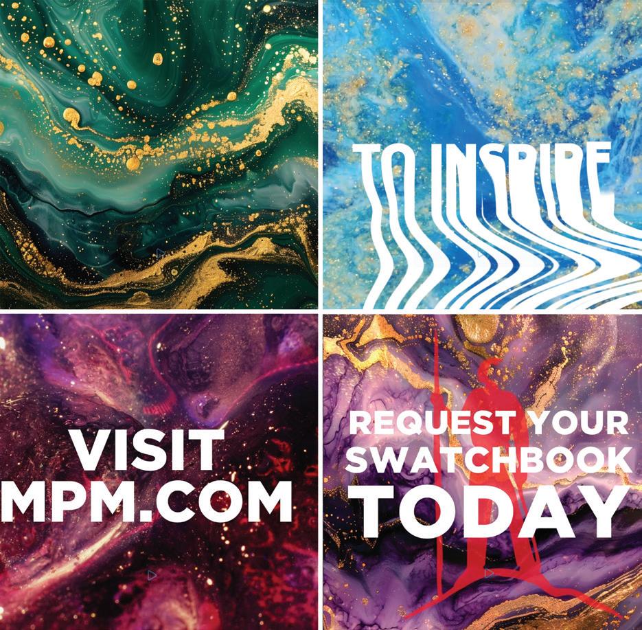
Design Firm: Adduco Communications Client: Monadnock Paper Mills Title: Paper That Moves You: The Fine Printing Swatchbook Campaign Creative Director: Lindsay Doyle Designer: Anna Bacon Account Manager, Adduco Communications: Siena DeBolt Director of Marketing and Communications, Monadnock Paper Mills: Chloe Jones Executive Vice President, Adduco Communications: Lindsay Doyle Category: Animation/Video/Motion
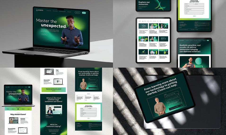
Design Firm: Agenda Client: CGS Title: Cicero Website Design Head of Creative: Claudia Marks Design Director: David Marte Senior Designer: Jo Rooney Web Developer: Neurony Head of Strategy: Vincent Roffers Strategy Director: Jake Aronson Strategist: Amanda Cao Designer: Jiani Xiao Head of Client Services: Emily Korn Category: Websites/Microsites/Mobile Sites
Firm: Alexandra Yankovskaya Title:
Design Creative
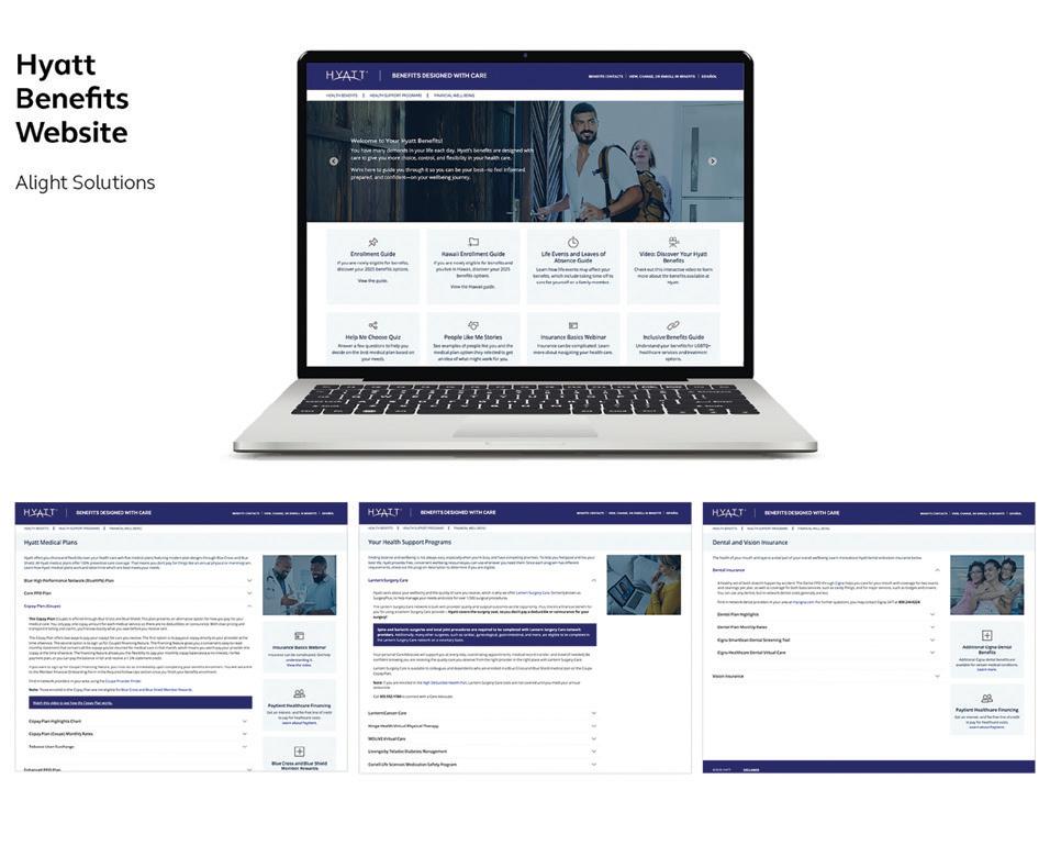
Design Firm: Alight Solutions Client: Hyatt Title: Benefits Designed With Care Website Creative Director: Jeannette Prestia Developer: Rick Nguyen Programmer: Stephanie Grande Writer: Chris Ehrhart Digital Project Manager: Rick Nguyen Client Lead: Shelly Mackert Category: Websites/Microsites/ Mobile Sites
Andeza
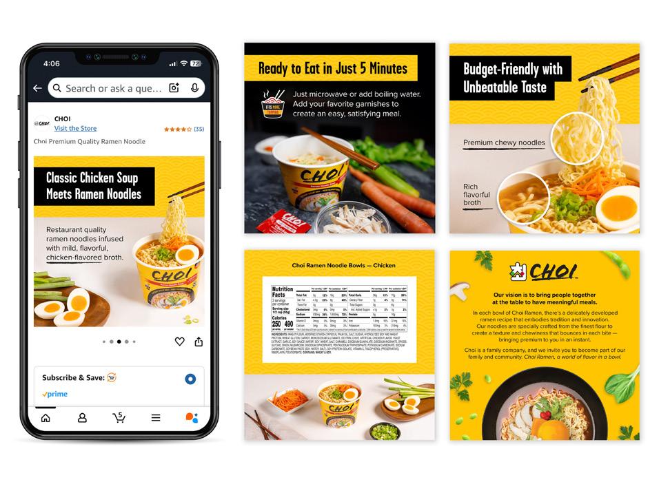
Choi Ramen Title: Amazon Product Detail Images Creative Director: Wing Lo VP, Creative Services: Lisa Dalton Category: Digital Branding Assets
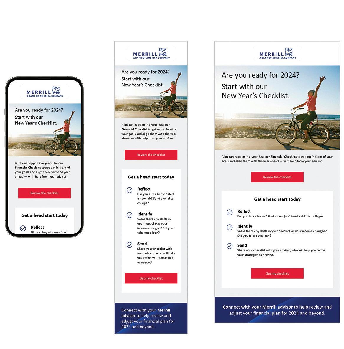
Design Firm: Bank of America - Enterprise Creative Solutions Title: Are You Ready For 2024? Start With Your New Year’s Checklist Email Creative Director: Ken Berl, Kara Schemmel Art Director: Greg Zielinski Developer: Mark Lazur Writer: Ann Canning Senior Product Owner: Dianne Dalton Senior Product Owner: Patty Sinkus Account Director: Keri O’Brien Group Account Director: Laura Keehan Executive Director: Charissa Messer Client: Ashley Kubiniac Category: Email Marketing
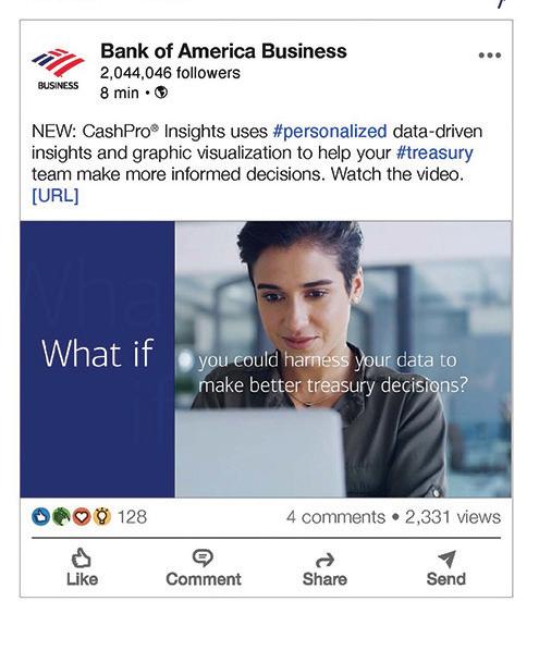
Design Firm: Bank of America - Enterprise Creative Solutions Title: CashPro Insights Social Post Creative Director: Debbie Warburnton Art Director: Dan Hutchison Designer: Elise Daher, Senior Art Buyer Account Supervisor: Deanna Czojor Executive Director: Charissa Messer Client: Megan Petrik Category: Digital Ads/Banners
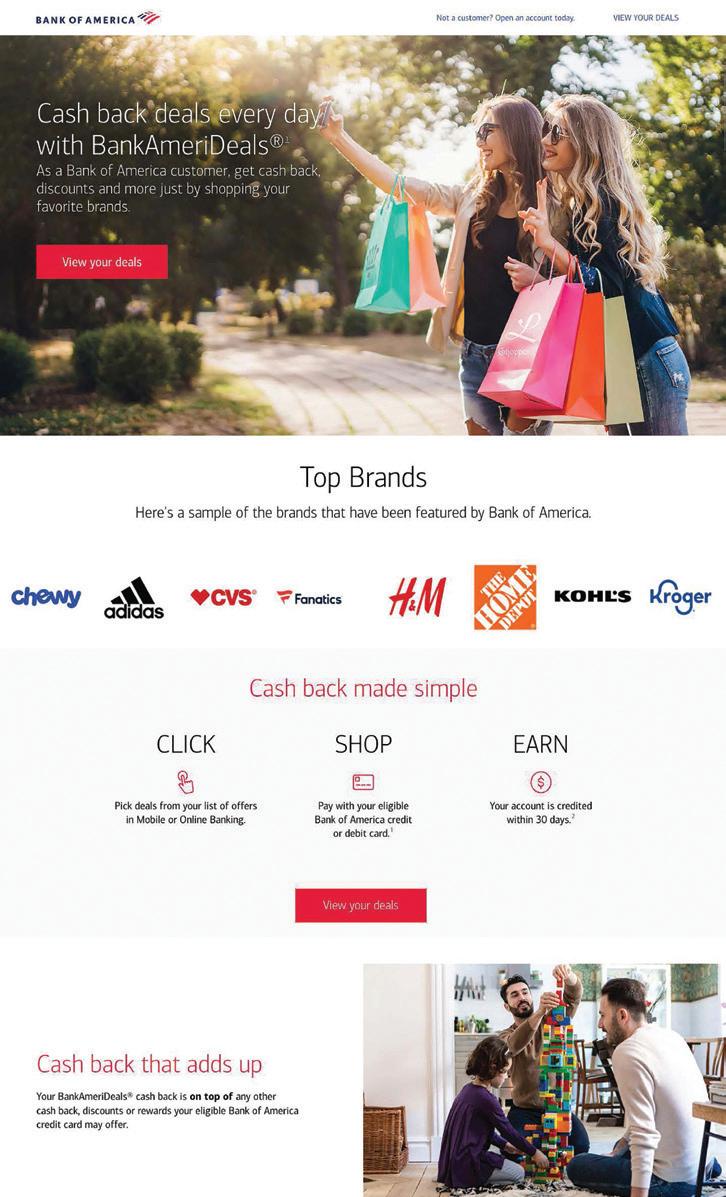
Design Firm: Bank of America - Enterprise Creative Solutions Title: BankAmeriDeals Landing Page Creative Director: Ken Tattersall Art Director: Jason Pennington Designer: Kristen Kramedas, Senior Art Buying Lead Senior Product Owner: Patty Sinkus Account Manager: Karen Sterkenburg Group Account Director & Digital Strategist: Stacy Stigelman Executive Director: Charissa Messer Clients: Rochelle Kelly, Paul Seddon Category: Websites/Microsites/ Mobile Sites
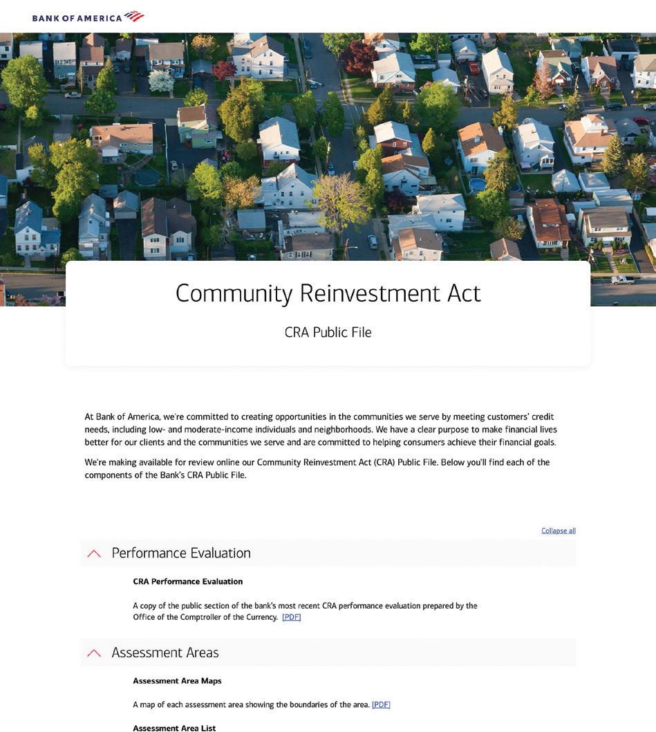
Design Firm: Bank of America - Enterprise Creative Solutions Title: Community Reinvestment Act Landing Page Creative Director: Ken Tattersall Art Director: Jason Pennington Designer: Kristen Kramedas, Senior Art Buying Lead Senior Product Owner: Patty Sinkus Group Account Director & Digital Strategist: Stacy Stigelman Executive Director: Charissa Messer Clients: Jimmy Medico, Bridget Smith Category: Websites/Microsites/Mobile Sites
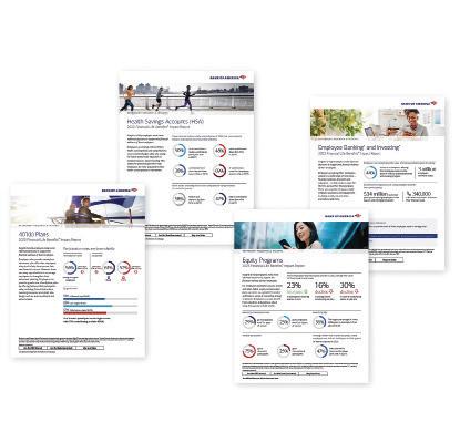
Design Firm: Bank of America - Enterprise Creative Solutions Title: Financial Life Benefits Impact Report Group Creative Director: Ken Berl Creative Director: Kara Schemmel Art Director: Liz Krewson Designer: Joe Simone Developer: Priscilla Person, Art Buying Lead Account Executive: Kristina Wiley Senior Account Executive: Ro Steblai Account Director: Kara Foley Group Account Director: Laura Keehan Executive Director: Charissa Messer Client: Susan Kaslander Category: Digital Publications
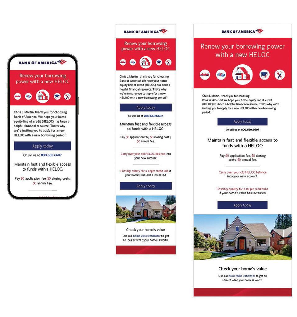
Firm: Bank of America - Enterprise Creative Solutions Title: Home Equity Line of Credit End of Draw Email Creative Director: Steve Strohm Art Director: Judy Frezza Developer: Mark Lazur Senior Product Owner: Dianne Dalton Senior Product Owner: Patty Sinkus Group Account Director & Digital Strategy Executive Director: Charissa Messer Client: Kristin Jenkin Category: Email Marketing
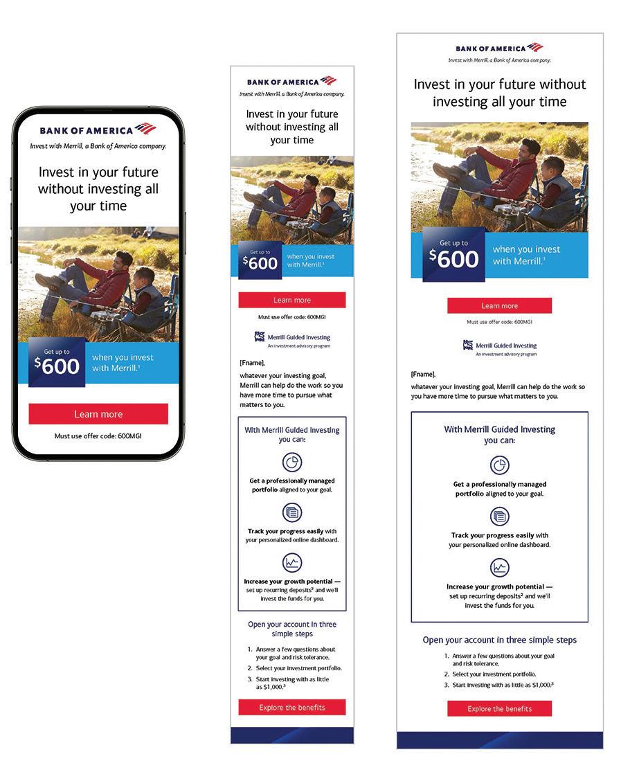
Firm: Bank of America - Enterprise Creative Solutions Title: Invest In Your Future Without Investing All Your Time Email Creative Director: Ken Berl, Kara Schemmel Art Director: Judy Frezza Developer: Mark Lazur Senior Product Owner: Dianne Dalton Senior Product Owner: Patty Sinkus Account Director: Mary Becker Group Account Director: Laura Keehan Executive Director: Charissa Messer Client: Tracy Valder Category: Email Marketing
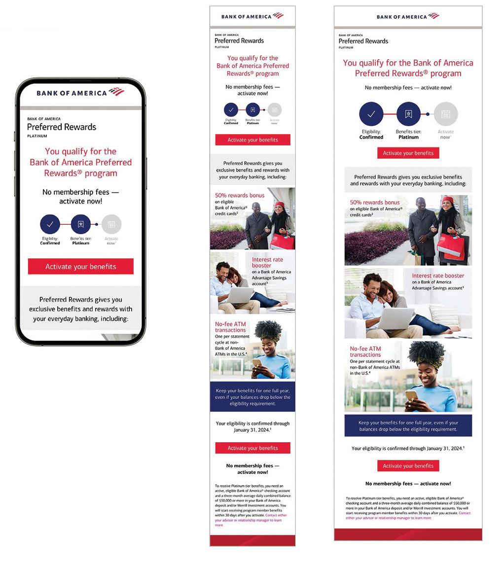
Design Firm: Bank of America - Enterprise Creative Solutions Title: Preferred Rewards Enrollment Email Creative Director: Steve Strohm Designer: Kristen Kramedas, Senior Art Buying Lead Developer: Mark Lazur Senior Product Owner: Dianne Dalton Senior Product Owner: Patty Sinkus Account Director: Jen Murphy Group Account Director & Digital Strategist: Stacy Stigelman Executive Director: Charissa Messer Client: Kevin O’Toole Category: Email Marketing
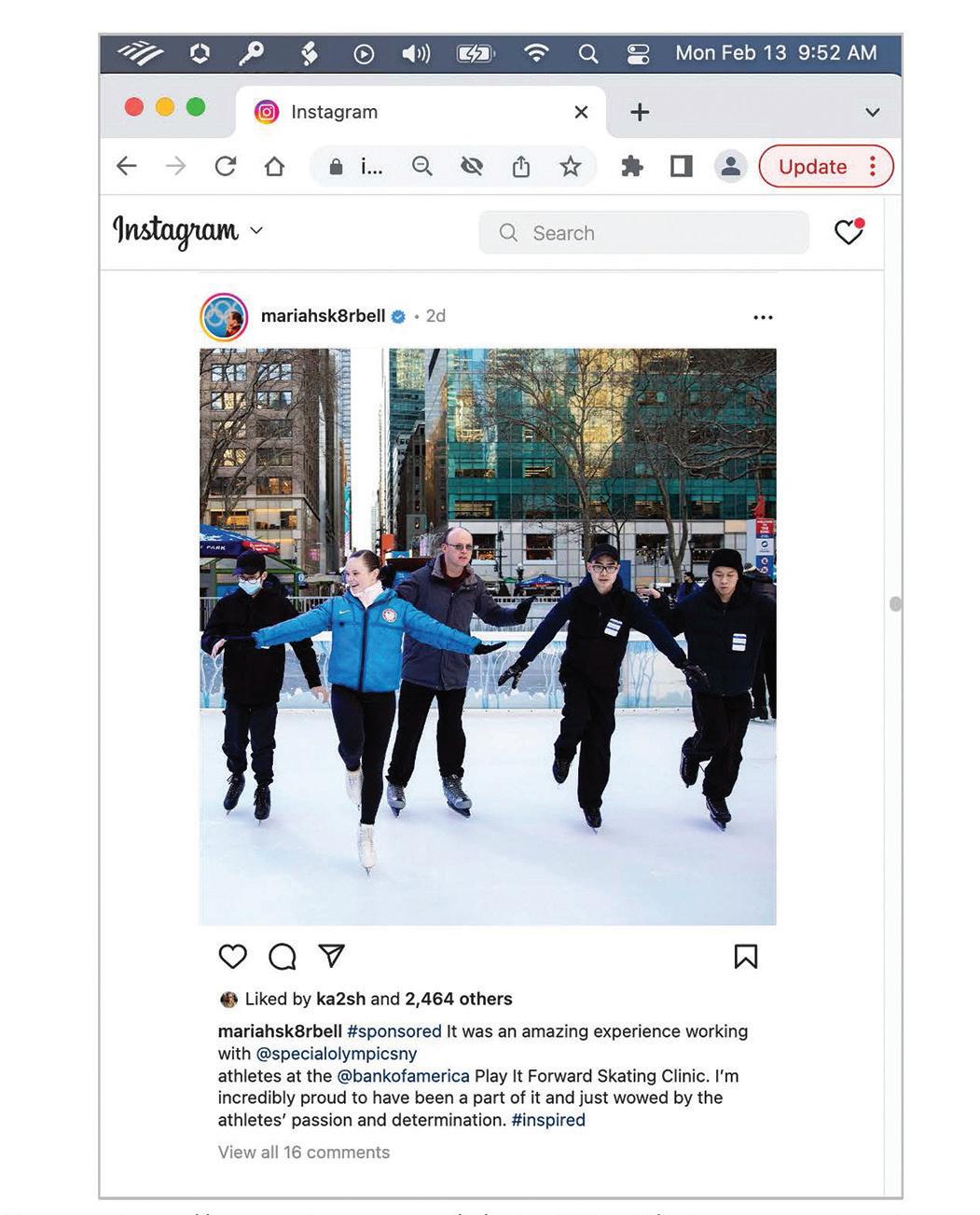
Design Firm: Bank of America - Enterprise Creative Solutions Title: Special Olympics Bryant Park Skating Event Social Post Creative Director: Ken Berl Art Director: Jessenia John Designer: Kristen Kramedas, Senior Art Buying Lead) Writer: Heather Slawecki Account Director: Carla Dauphin Segment & Channel Strategy: Jim Clark Group Account Director: Laura Keehan Group Account Director & Digital Strategist: Debbie Warburton Executive Director: Charissa Messer Client: Meredith England Category: Social Media
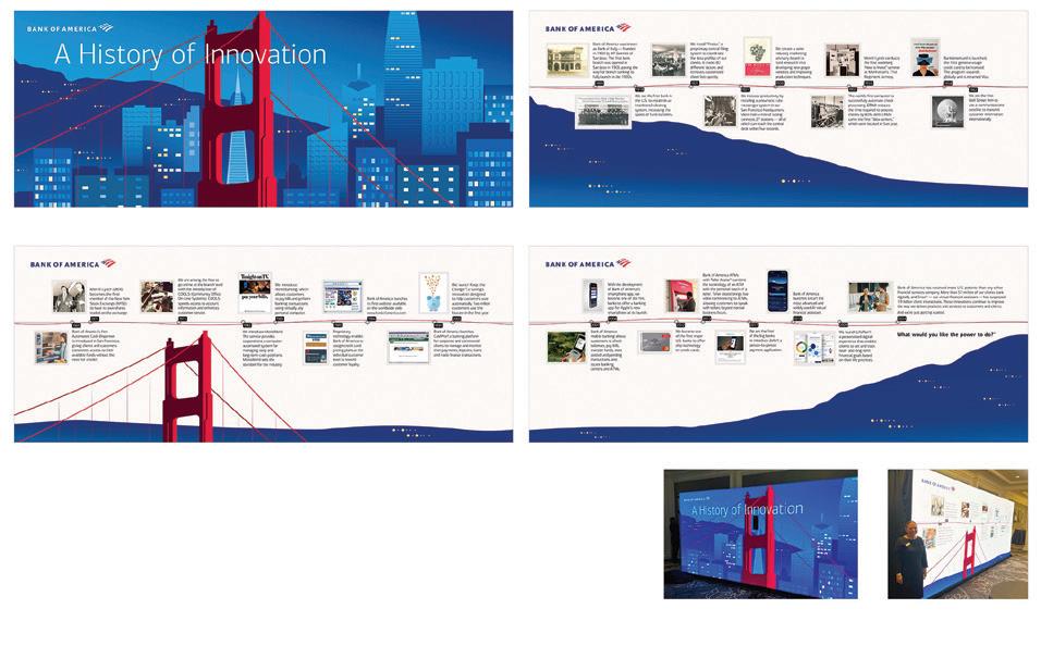
Design Firm: Bank of America - Enterprise Creative Solutions Title: San Francisco Innovation Summit - History of Innovation Creative Director: Steve Strohm Art Director: Teresa Mraz Designer: Elise Daher, Senior Art Buyer, Priscilla Person, Art Buying Lead Programmer: Christine Taylor, Production) Writer: Al Andrien Account Supervisor: Stacy Carcaci Group Account Director & Digital Strategist: Debbie Warburton Executive Director: Charissa Messer Client: Francis Kelly Category: Data Visualization/Infographics
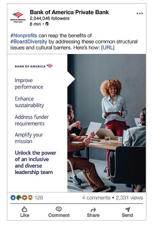
Design Firm: Bank of America - Enterprise Creative Solutions Title: The Power of a Diverse and Inclusive Leadership Team Social Post Creative Director: Ken Berl (Group Creative Director); Kara Schemmel (Creative Director) Art Director: Jessenia John Designer: Elise Daher (Senior Art Buyer) Group Creative Director: Ken Berl Creative Director: Kara Schemmel Design: Elise Daher, Senior Art Buyer Account Supervisor: Stacy Carcaci Group Account Director & Digital Strategy: Debbie Warburton Executive Director: Charissa Messer Client: Gwen Pescatore Category: Social Media
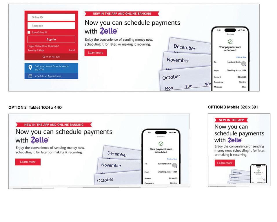
Design Firm: Bank of America - Enterprise Creative Solutions Title: Zelle Recurring Payments Digital Creative Group Creative Director: Ken Tattersall Creative Director: Kelvin Valencia Design: Kriisten Kramedas, Senior Art Buying Lead Group Account Director & Digital Strategist: Stacy Stigelman Segment & Channel Strategy: Beth Brownholtz Executive Director: Charissa Messer Client: Kathy Nisivocci Category: Digital Ads/Banners
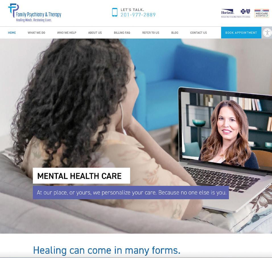
Design Firm: Barnett Design, Inc. Title: Family Psychiatry and Therapy Website Creative Director: Debbie Barnett Sagurton Art Director: Jeff Ramos Designer: Tara Maratea, Val Haymes Category: Websites/Microsites/Mobile Sites
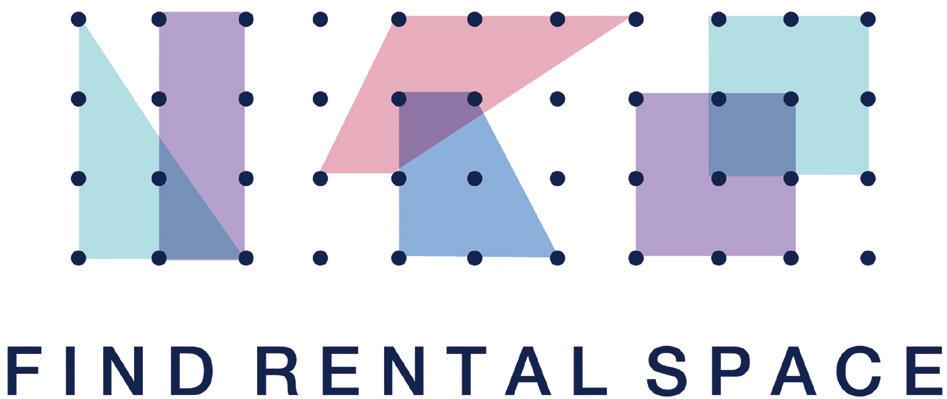
Design Firm: Bonnie Segal Design Title: Find Rental Space Creative Director: Bonnie Segal Art Director: Bonnie Segal Designer: Bonnie Segal Programmer: Orvik Janssen Illustrator: Nick Meola Category: Animation/Video/Motion
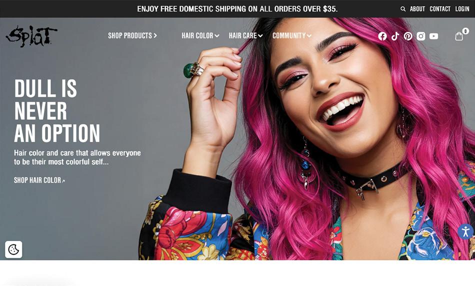
Design Firm: Brandettes Title: Splat Hair Color Website 2025 Art Director: Sonny Cruz Digital Director: David Van Veen Project Manager: Claudia Torres Category: Websites/Microsites/Mobile Sites
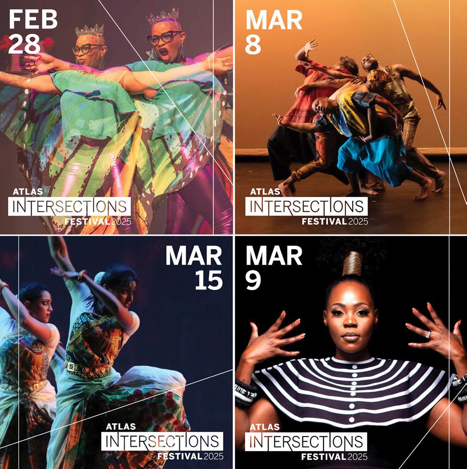
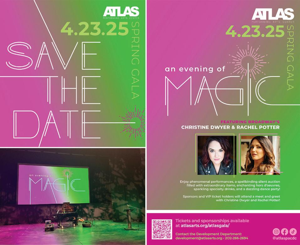
Design Firm: Brent Almond Design Client: Atlas Performing Arts Theatre Title: An Evening of Magic Digital Campaign Creative Director: Brent Almond Designer: Brent Almond Category: Digital Branding Assets
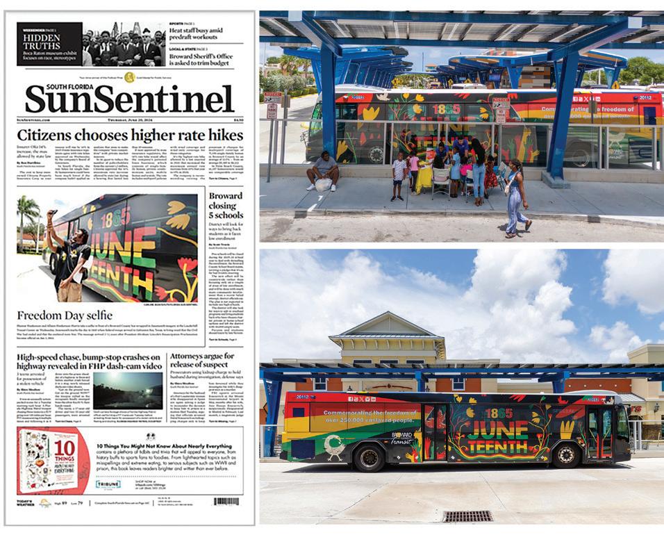
Design Firm: Broward County Transit Title: Juneteenth Bus Wrap Design Intro Video Designer: Gabriela Bello Museum Activation by Program Project Coordinator: Rachel Richardson Category: Animation/Video/Motion
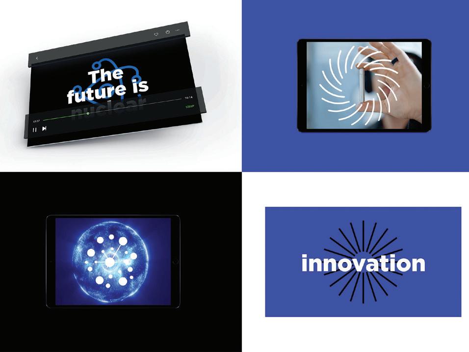
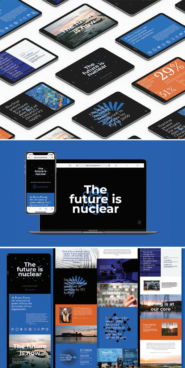
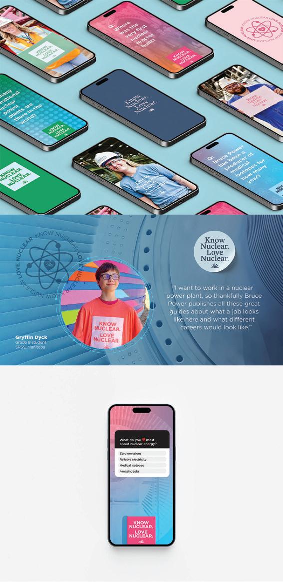
Design Firm: Bruce Power, Creative Strategy Client: Bruce Power Title: \The Future Is Nuclear Annual Report Website Designer: Jessica Hillis, Erin Grandmaison RGD Developer: Jennifer Johannesen Writer: Tim McKay Category: Websites/Microsites/Mobile Sites
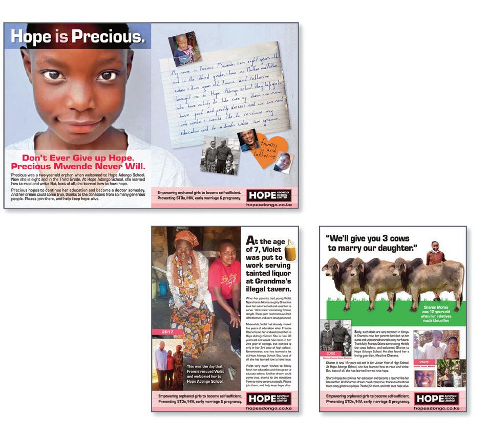
Design Firm: Buitenkant Advertising & Design Title: Bro Bono Fundraising Campaign Creative Director: Vava Buitenkant Art Director: Vava Buitenkant Designer: Vava Buitenkant Writer: Vava Buitenkant Photographer: Francis Otieno Category: Social Media
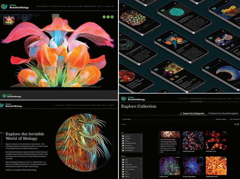
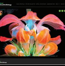
Design Firm: C&G Partners Client: Howard Hughes Medical Institute Title: HHMI: Beautiful Biology Creative Director: Maya Kopytman, Partner, C&G Partners Art Director: Maya Kopytman, Partner, C&G Partners Designer: Nike Adewumi, C&G Partners Writer: Noah Green, HHMI Designer: Sydney Meyer, C&G Partners Designer: Gabriele Villamena, C&G Partners Illustrator: Gb Kim Photographer: Igor Siwanowicz HHMI; Producer: Shuyler Nazareth Category: Websites/Microsites/Mobile Sites
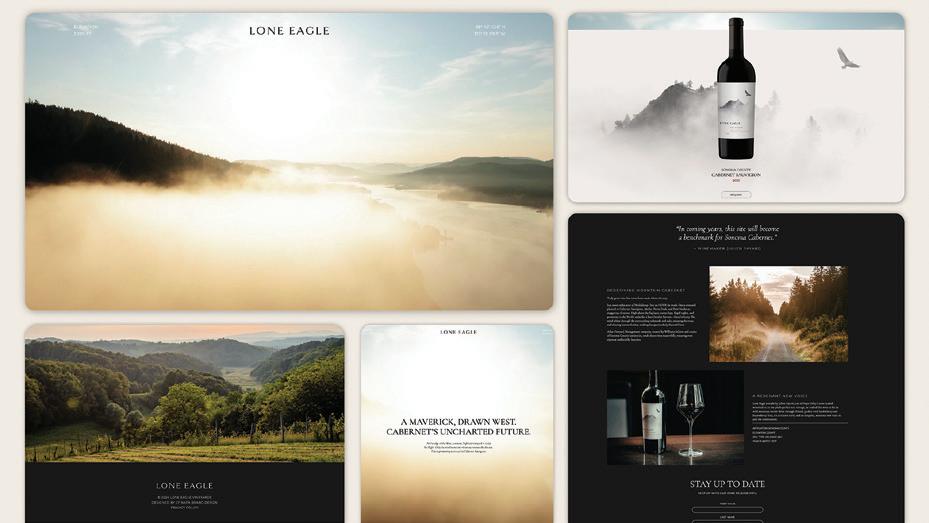
Design Firm: CF Napa Brand Design Title: Lone Eagle Vineyards Website Designer: CF Napa Brand Design Programmer: CF Napa Brand Design Category: Websites/Microsites/Mobile Sites

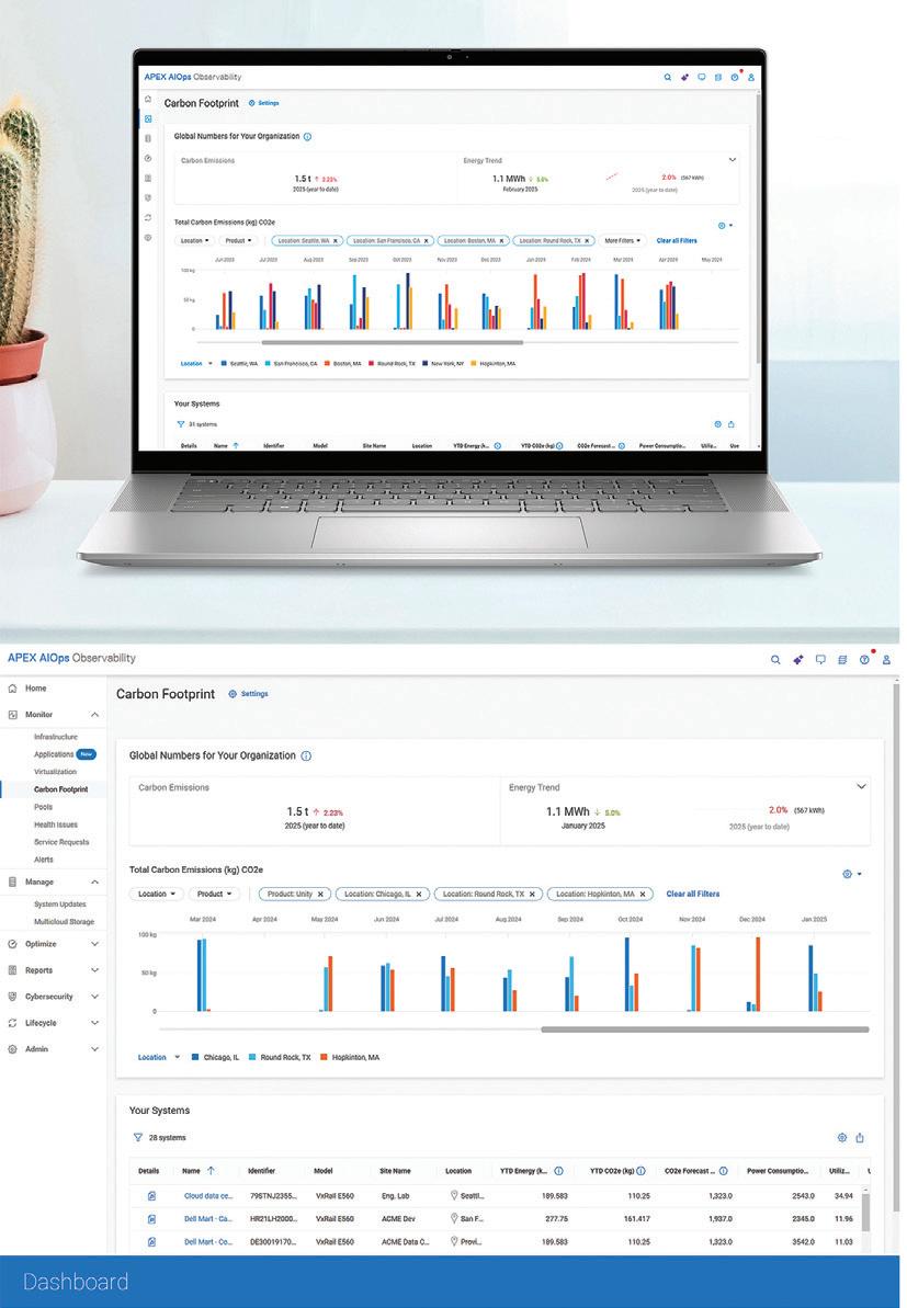
Firm: Dell, Experience Design Group Title: Dell APEX AI-Ops Observability Carbon Footprint Analysis Feature Creative Director: Experience Design Group Art Director: Experience Design Group Designer: Experience Design Group Developer: Experience Design Group Programmer: Experience Design Group Writer: Experience Design Group Category: UX/UI Design

and Educator
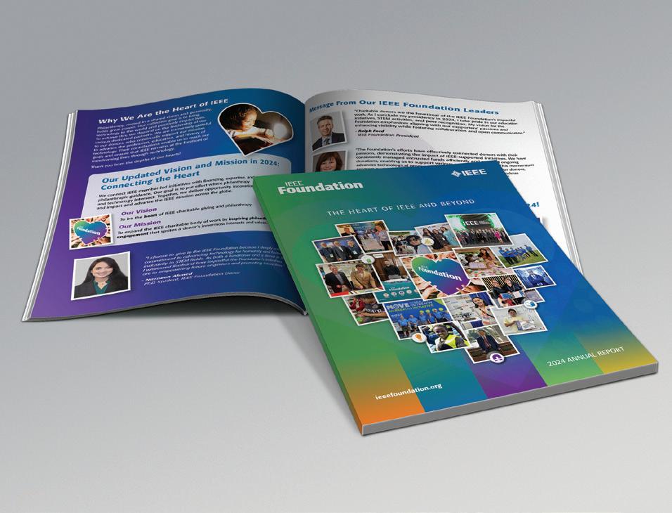
Design Firm: Dzineworx Studio, LLC Client: IEEE Foundation Title: 2024 Annual Report Video With Flipbook Creative Director/Principal: Deb Humphries
Donor Engagement Specialist/Annual Report Editor: Laura Bessey Category: Digital Publications
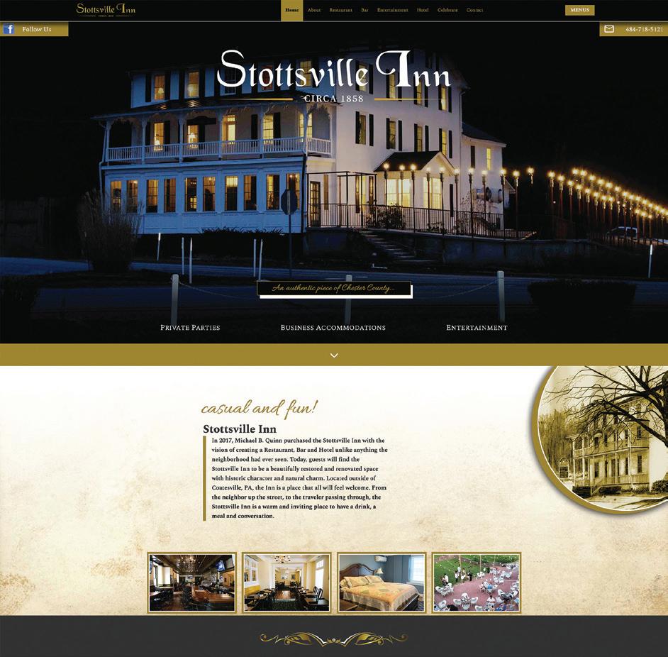
Design Firm: EH Design Works Client: Stottsville Inn Title: Stottsville Inn Website Design Design/Development/SEO: Eric Hayes Category: Websites/ Microsites/Mobile Sites
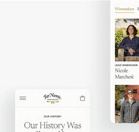

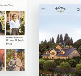
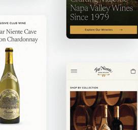
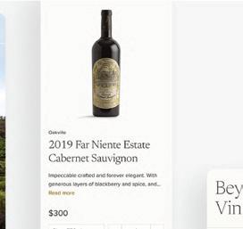
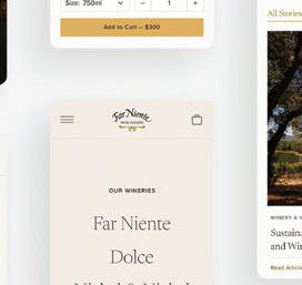

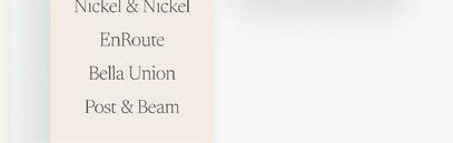
Design Firm: Engine Digital Client: Far Niente Title: Far Niente Wine Estates Website. Creative Directors: Norma MacDonald, Marie Gosal, Laura Falconer (Strategy Director) Art Directors: Pawel Pawelak, Roxanne Henschke (Strategist) Designer: Nathan Ng Kele Nakamura, James Doyle Programmers: Bradley Low, Roy Chan, Kevin Vo, Serge Ovcharenko, Infinum Delivery: Joerg Heinzelmann. Account Lead: Dean Elissat Account Support: James Richardson. Category: Websites/Microsites/Mobile Sites
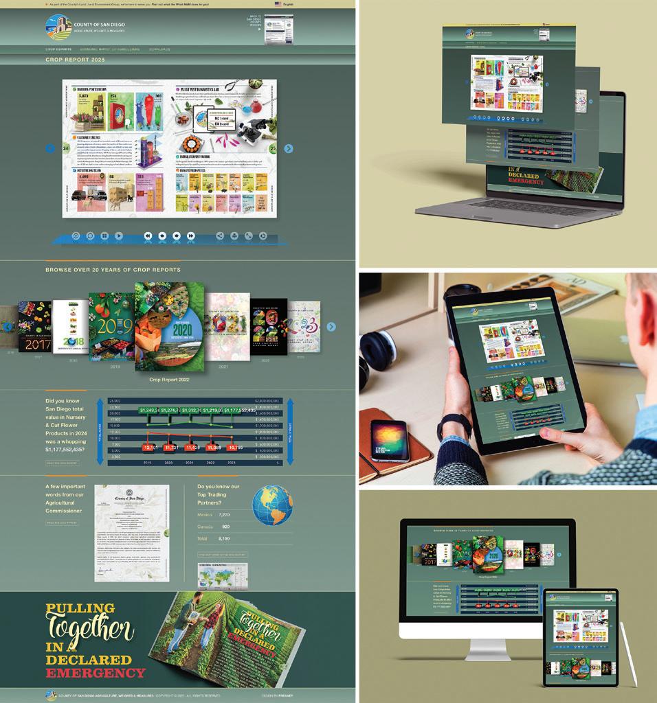
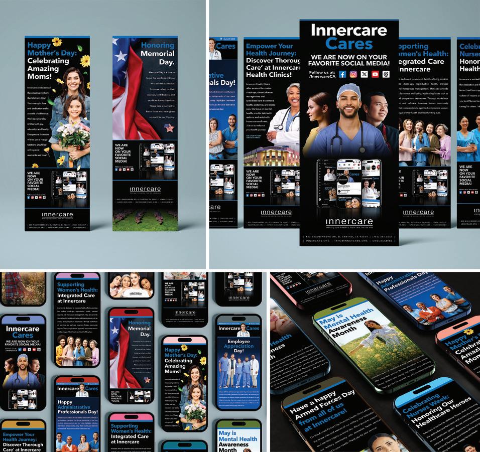
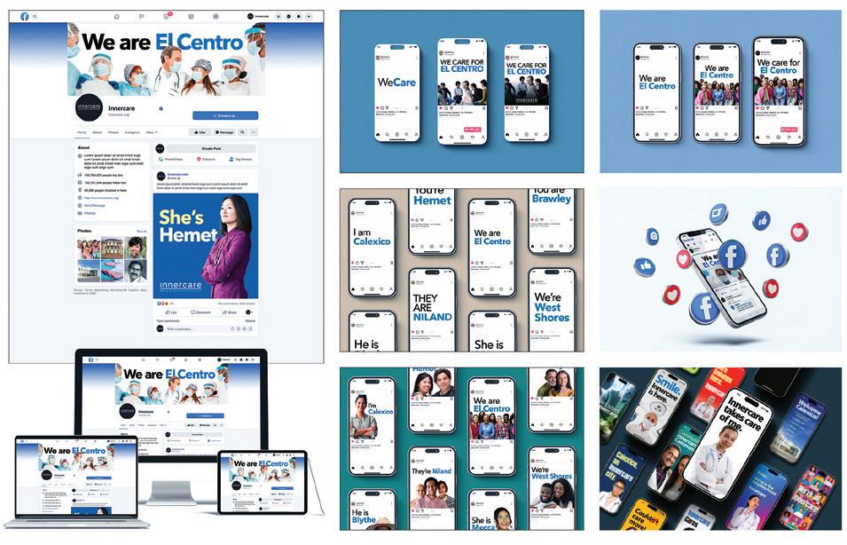
Design Firm: Freaner Creative Client: County of San Diego Agricultural Weights & Measures Title: AWM Crop Report 2024 Infographics Microsite Creative Director: Ariel Freaner Art Director: Ariel Freaner Designer: Ariel Freaner Digital Illustrator: Ariel Freaner Category: Websites/Microsites/Mobile Sites
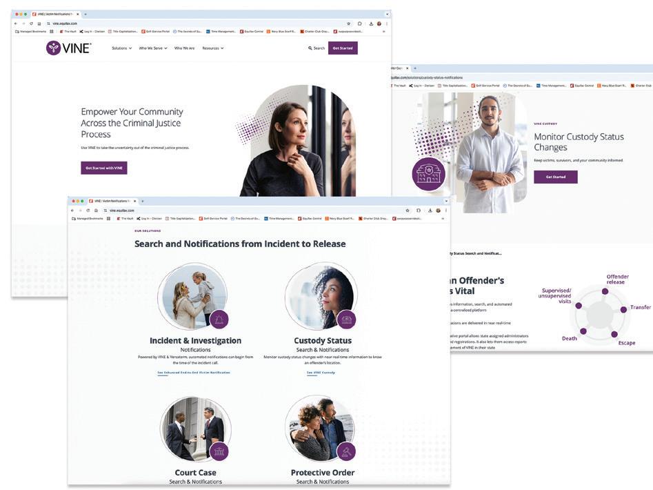
Design Firm: Equifax Workforce Solutions Title: VINE.equifax.com Web Experience and Data Source Creative Director: Carolyn Brown, Sam Chandler UX/UI Designer: Matt Price Digital Channel Manager: Debbi Pham Director-Digital Strategy: Rachel Kiser Category: Websites/Microsites/Mobile Sites
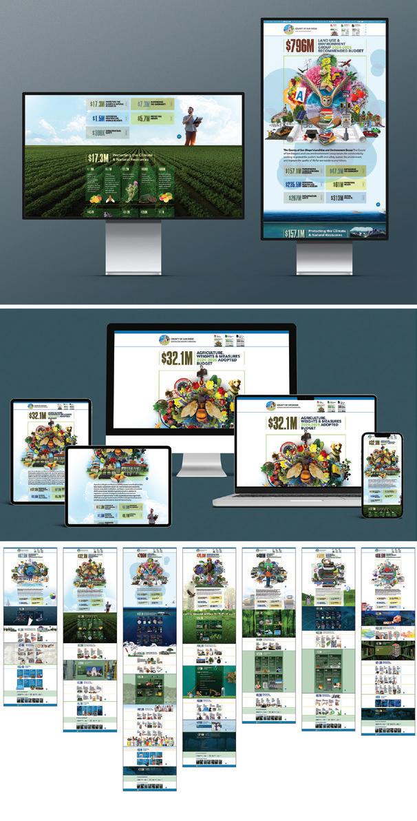
Design Firm: Freaner Creative Client: County of San Diego Land Use & Environment Title: Budget 204-2025 Microsite Creative Director: Ariel Freaner Art Director: Ariel Freaner Designer: Ariel Freaner Digital Illustrator: Ariel Freaner Category: Websites/Microsites/Mobile Sites
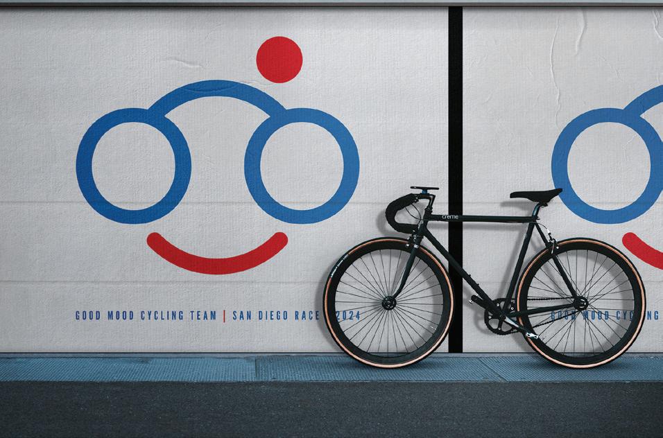
Firm: Freaner Creative Client: Good Mood S an Diego Bicycle Team Title: Good Mood Bicycle Team San Diego Race Poster Creative Director: Ariel Freaner Art Director: Ariel Freaner Designer: Ariel Freaner Category: Digital Ads/Banners
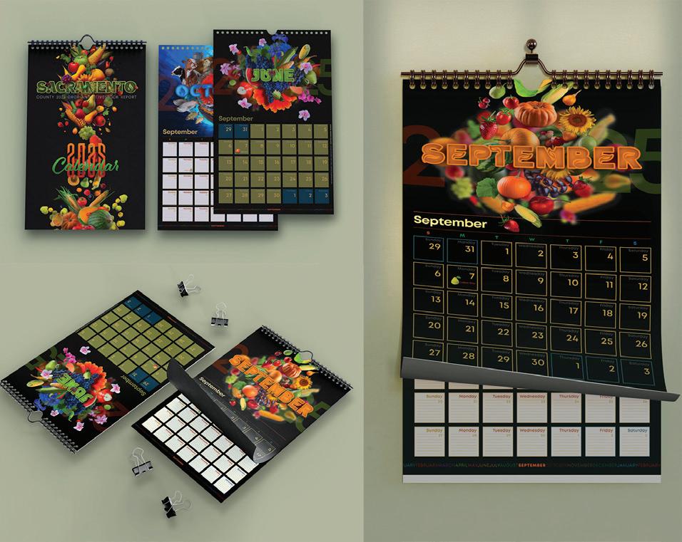
Design Firm: Freaner Creative Client: Sacramento County Agricultural Commissioner’s Office Title: AWM Sacramento Crop Report 2024 Calendar Creative Director: Ariel Freaner Art Director: Ariel Freaner Designer: Ariel Freaner Digital Illustrator: Ariel Freaner Category: Digital Publications
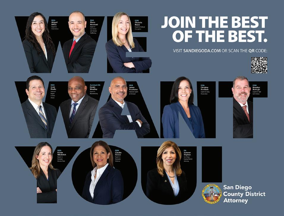
Firm: Freaner Creative Client: San Diego County District Attorney Title: SDCDA Recruit Poster Creative Director: Ariel Freaner Art Director: Ariel Freaner Designer: Ariel Freaner Digital Illustrator: Ariel Freaner Category: Digital Ads/Banners
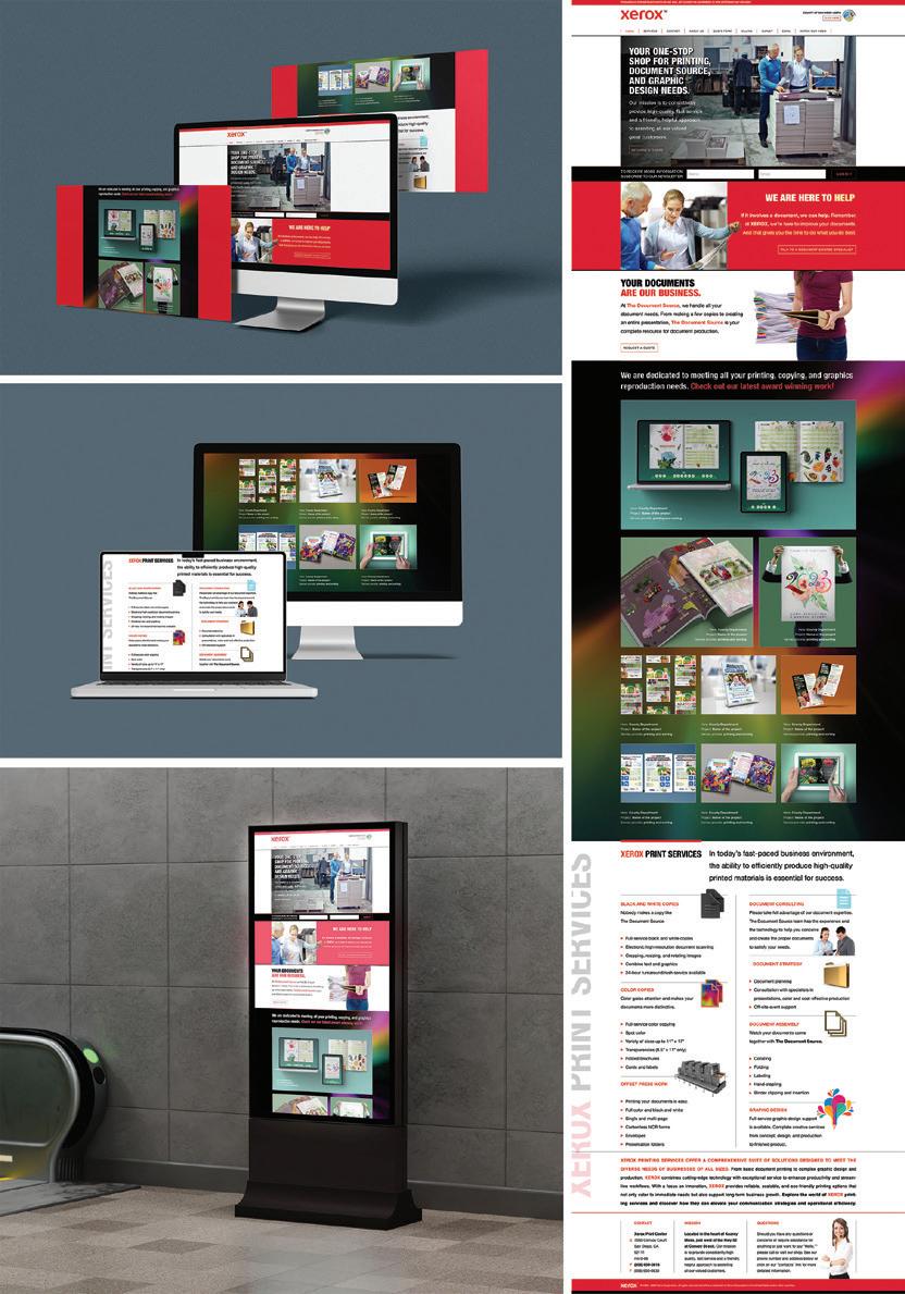
Design Firm: Freaner Creative Client: XEROX San Diego Title: XEROX Print Center San Diego Microsite Creative Director: Ariel Freaner Art Director: Ariel Freaner Designer: Ariel Freaner Digital Illustrator: Ariel Freaner Category: Websites/Microsites/Mobile Sites
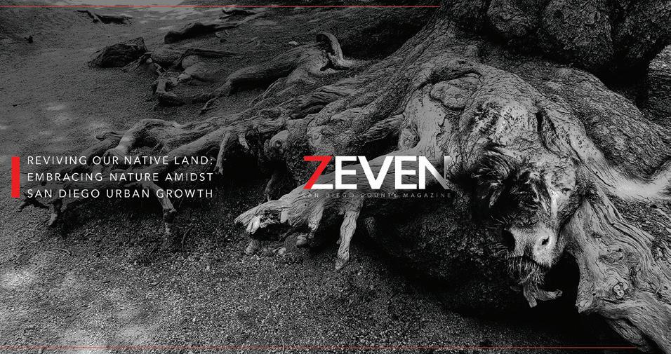
Design Firm: Freaner Creative Client: ZIETE Media Title: ZIETEDisappearing Roots Nature - Buffalo Creative Director: Ariel Freaner Art Director: Ariel Freaner Designer: Ariel Freaner Digital Illustrator: Ariel Freaner Category: Digital Ads/Banners
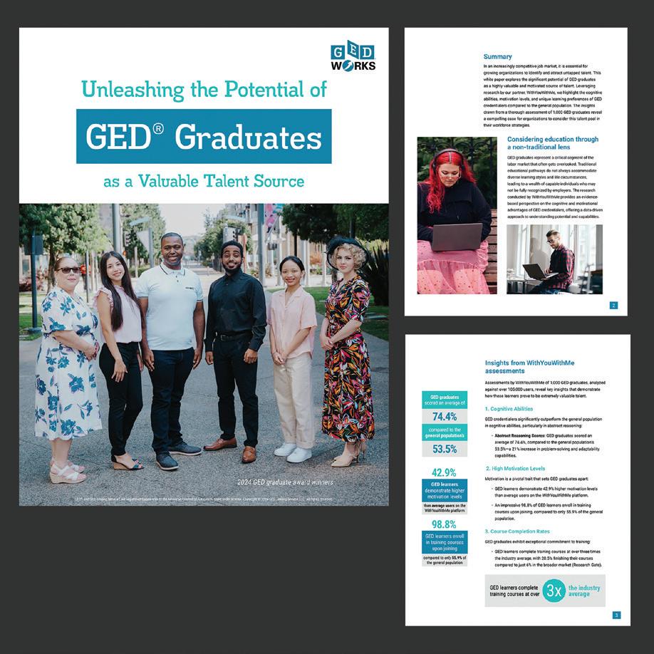
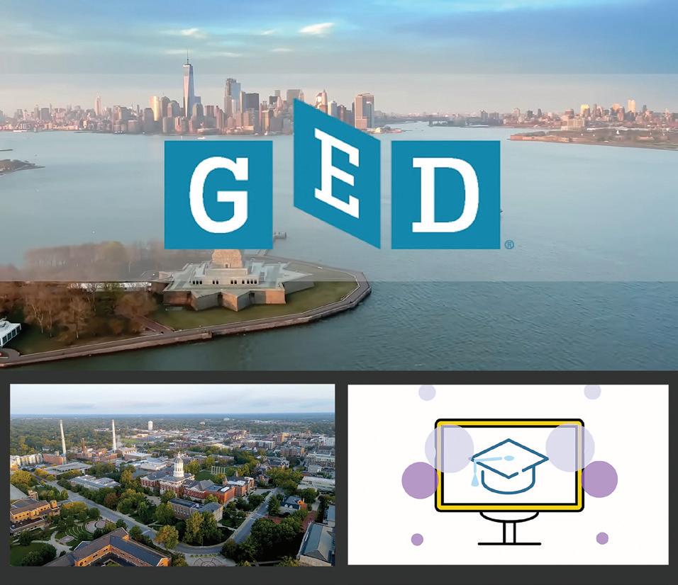
Design Firm: GED Testing Service Title: With You With Me Research Study PDF
Creative Director: Victoria Velez Designer: Stephanie
Category: Digital Publications
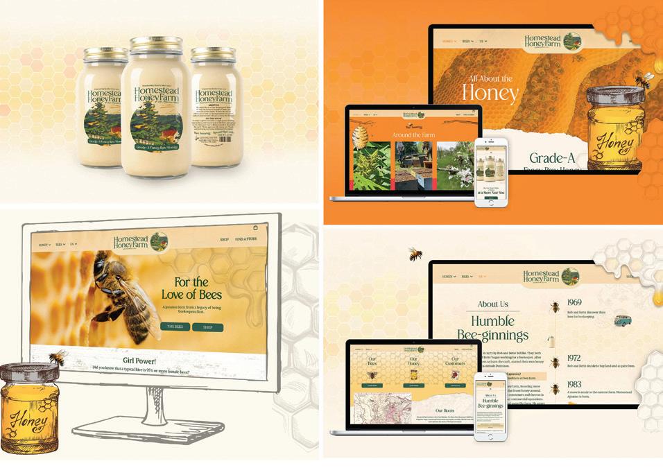
Design Firm: Greater Thought Design + Marketing Client: Homestead Honey Farm Title: Homestead Honey Farm Branding and Website Creative Director: Bryan Mann-Entzel Art Director: Mitch Granholm Designer: Mitch Granholm
Developer: Mitch Granholm Writer: Sara Harrell Junior Designer: Justin Harrell Strategy: Sara Harrell Category: Websites/Microsites/Mobile Sites
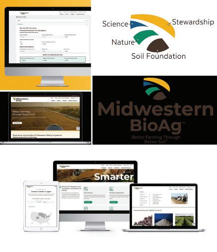
Design Firm: Greater Thought Design and Marketing Client: Midwestern BopAg
Title: Midwestern BioAg Website and Logo Redesign Creative Director: Bryan Mann- Entzel Art Director: Mitch Granholm Designer: Ryan Reid, Ilina Gupta
Developer: Mitch Granholm Programmer: Ryan Reid, Ilina Gupta Strategy: Sara Harrell Category: Websites/Microsites/Mobile Sites
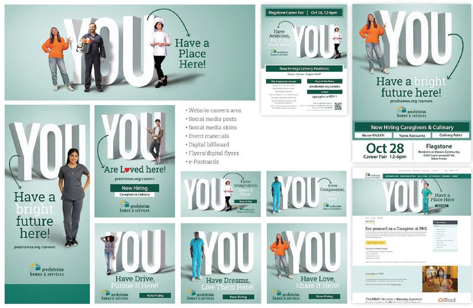
Design Firm: Greater Thought Design + Marketing Client: Presyterian Homes & Services Title: Presbyterian Homes & Services Workforce Digital Campaign Creative Director: Bryan Mann-Entzel Art Director: Bryan Mann-Entzel Designer: Dana Mason Developer: Mitch Granholm Writer: Sara Harrell Strategy: Sara Harrell Category: Digital Ads/Banners
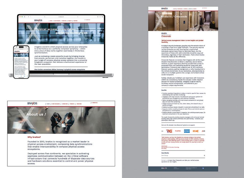
Design Firm: Griffin + Skeggs Collaborative Client: braXos Security Software Title: braXos Security Software Website Creative Director: Gary Skeggs Designer: Gary Skeggs Developer: Michael Murphy, Murphy Web Consulting Programmer: Dean Pajevic, Murphy Web Consulting Writer: Susan Casserly Griffin Marketing Strategy: Susan Casserly Griffin Category: Websites/Microsites/ Mobile Sites
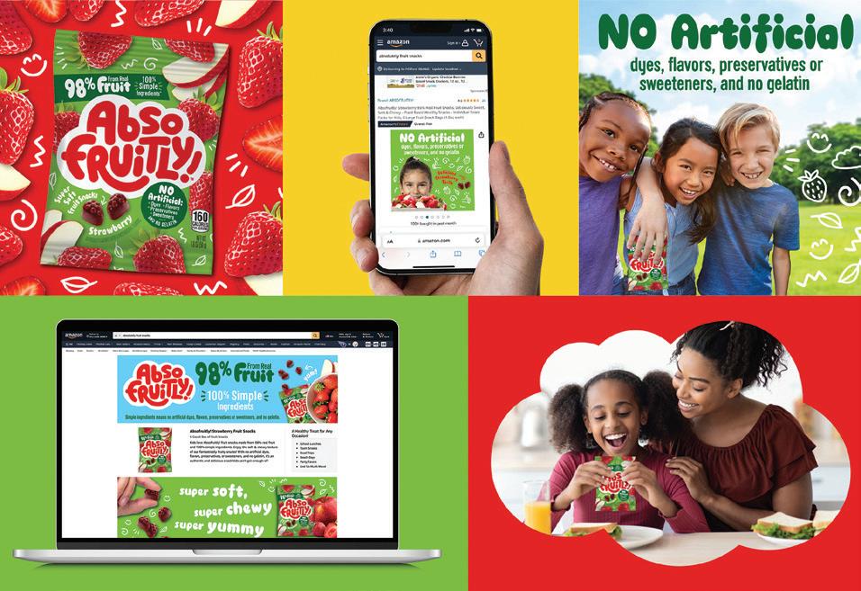
Design Firm: HBX Branding Client: Bazooka Title: Absofruitly Ecommerce Campaign Creative Director: HBX Design Team Category: Digital Ads/Banners
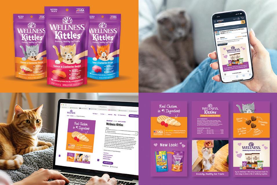
Design Firm: HBX Branding Client: Wellness Pet Company Title: Wellness Kittles Ecommerce Campaign Creative Director: HBX Design Team Category: Digital Ads/Banners
Design Firm: HBX Branding Client: Schuman Cheese Title: Schuman Cheese Delve Website Creative Director: HBX Design Team Category: Websites/Microsites/Mobile Sites
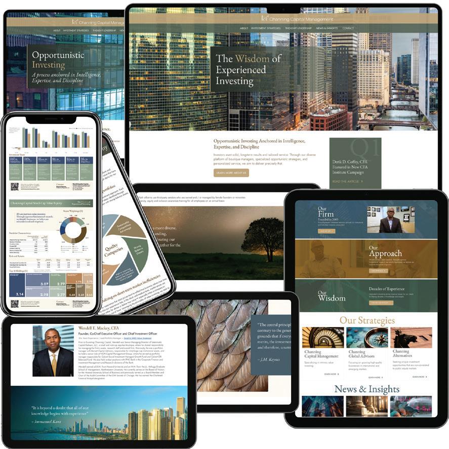
Design Firm: Havener Capital Partners Client: Channing Capital Management Title: Channing Capital Management Website Creative Director: Erika Hutchings Developer: Scott Hutchings Writer: Emily Boyle Marketing Manager: Steph Russell CMO: Anna Robinson Category: Websites/Microsites/Mobile Sites
Design Firm: IM Graphics Client: TAPinto Coral Springs Title: TAPinto Bageland Advertisement Creative Director: Leon Fooksman Art Director: Randy Braunstein Designer: Randy Braunstein Category: Digital Ads/Banners
Design Firm: IMAGO GROUP Luxury Packaging Title: MICA Creative Director: Justin Weinrich Writer: Gina DeBlanco Chief Marketing Office: Gina DeBlanco Category: Social Media
Design Firm: Ideas On Purpose Client: Brilliant Earth Title: Brilliant Earth Impact Report Website 2024 Creative Director: John Connolly Art Director: Zack Peacock Project Manager: Nell Schwed Category: Websites/Microsites/ Mobile Sites
Design Firm: International Child Art Foundation Title: ChildArt Magazine: Art & Social Justice Creative Director: Mark Forton Art Director: Jia Yu Designer: Qianzi Luo Developer: Alister Nelson Programmer: Noah Zaranka Writer: Ashfaq Ishaq, Ph.D., Ana Alberdi, Anjay Stone, Mia Smith Publisher & Editor: Ashfaq
Ph.D Director of Community Relations: Katty Guerami Category: Digital Publications
Design Firm: JMS Marketing Client: Amusement Expo International Title: Amusement Expo International Video Snippets Category: Digital Publications
Design Firm: Jeff Griffith Creative Client: Congressional Medal of Honor Society Title: Weight of the Medal Video Creative Director: Jeff Griffith Art Director: Jeff Griffith Cameraman/Editor/Visionary: Francisco Aliwalas Cameraman: Dorne Pentes, Michael Reynolds, Shane Seley Client/Executive Director: Chad Graham Client: Communications and Brand: Morgan Blakely Client/President: Britt Slabinski Category: Animation/Video/Motion
Design Firm: Jewelers Mutual Internal Creative Team Client: Jewelers Mutual Title: Jewelers Mutual Decades Video Creative Director: Kat Seibert Art Director: Logan Kidd Designer: Logan Kidd Category: Animation/Video/Motion
Design Firm: Kraus Marketing Client: SAX Title: SAX Website Creative Director: Nick Kraus Art Director: Emma O’Keefe Designer: Emma O’Keefe Developer: Nicholas Westcott, Austin Torres, Katy Balog Writer: Megan Brockman Project Manager: Jeremy Roth Account Manager: Marc Mustachio Category: Websites/Microsites/Mobile Sites
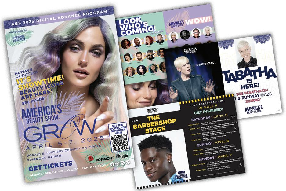
Design Firm: Kristen Erickson Creative Client: America’s Beauty Show Title: America’s Beauty Show 2025 Digital Advance Program Creative Director: Kristen Erickson Photography: Ulta Pro Beauty Team Category: Digital Publications
Design Firm: LN Design Co. Client: MSR Design Title: MSR Design Website Creative Director: Kären Larson, Ingrid Noble Designer: Kären Larson, Ingrid Noble Developer: Emergent Software Programmer: Emergent Software Writer: MSR Design Category: Websites/Microsites/Mobile Sites
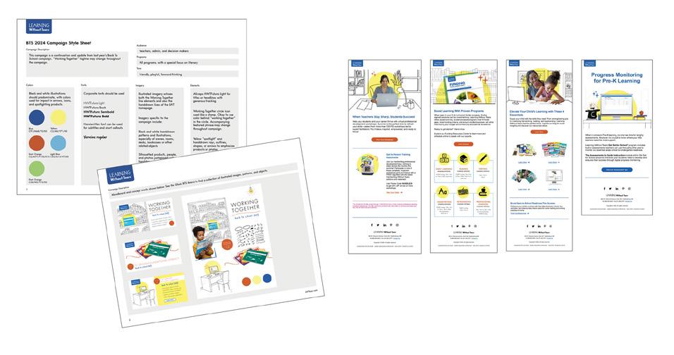
Design Firm: Learning Without Tears Title: Learning Without Tears Back to School Email Campaign Creative Director: Shannon Rutledge Designer: Kathleen Strycula, Claire O’Connor, Massiel Gonzalez Marketing Manager: Holly Miller Category: Email Marketing
Design Firm: Learning Without Tears Title: Learning Without Tears Champions Creative Director: Shannon Rutledge Designer: Angie Redmond Developer: Mark Jamin Marketing Manager: Frank Smith Web Director: Karl Filippini Category: Websites/Microsites/Mobile Sites
Design Firm: Learning Without Tears Title: Learning Without Tears Homepage Redesign and Animation Creative Director: Shannon Rutledge Designer: Angie Redmond Developer: Noah Lazur Video Manager: Christopher McManus Video Animation Designers: Tory Van Dine, Ricky Hawkins Category: Websites/ Microsites/Mobile Sites
Design Firm: Learning Without Tears Title: Learning Without Tears: Phonics, Reading, and Me™ Lead Gen Campaign Creative Director: Shannon Rutledge Designer: Angie Redmond Developer: Mark Jamin Marketing Manager: Louisa Dorado Category: Digital Branding Assets
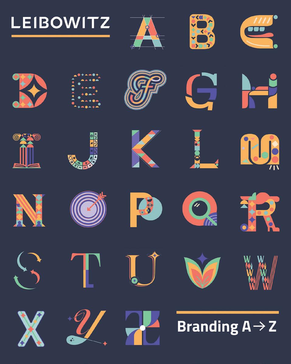
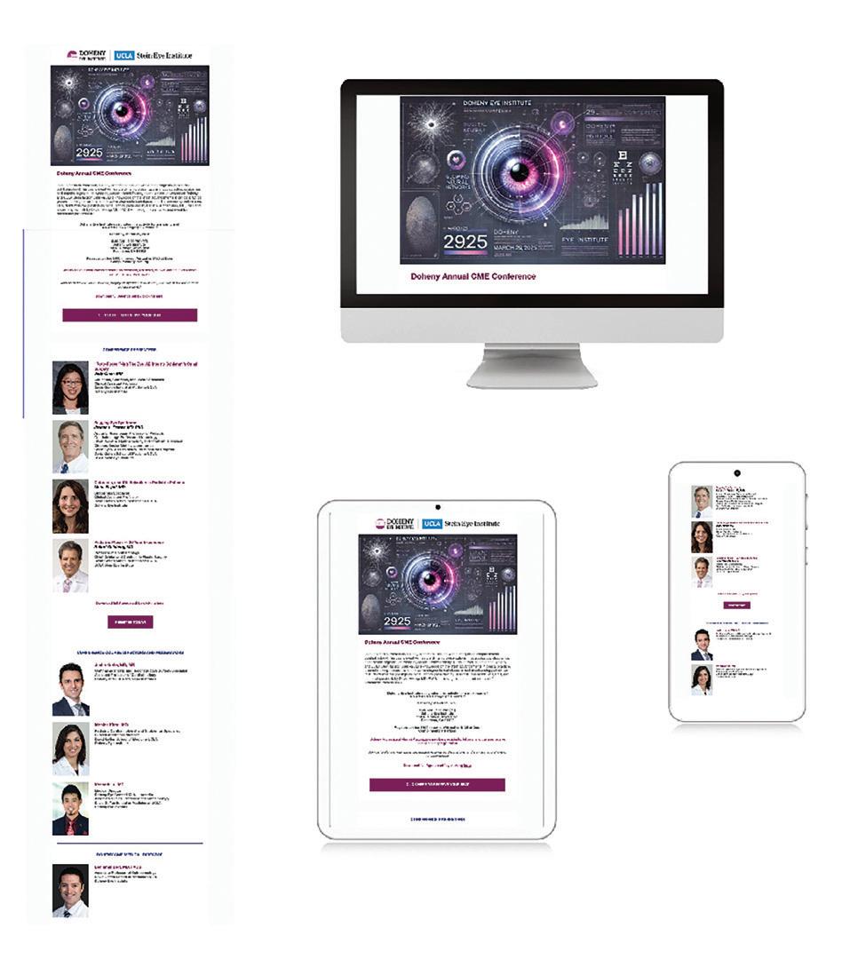
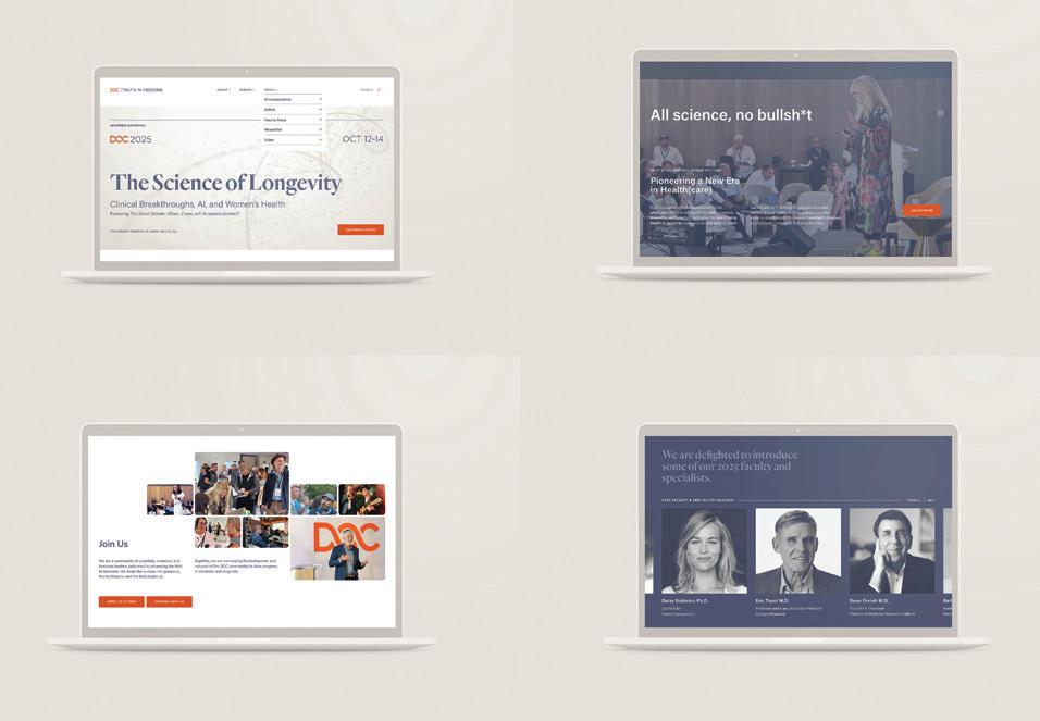
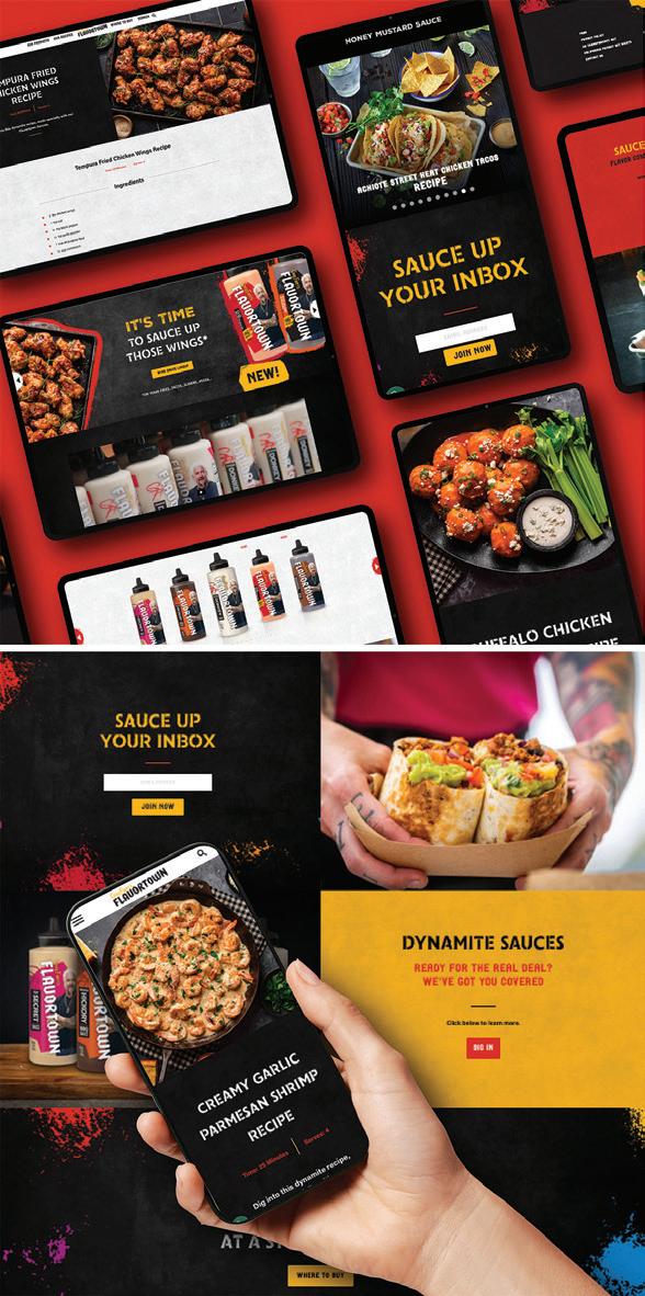
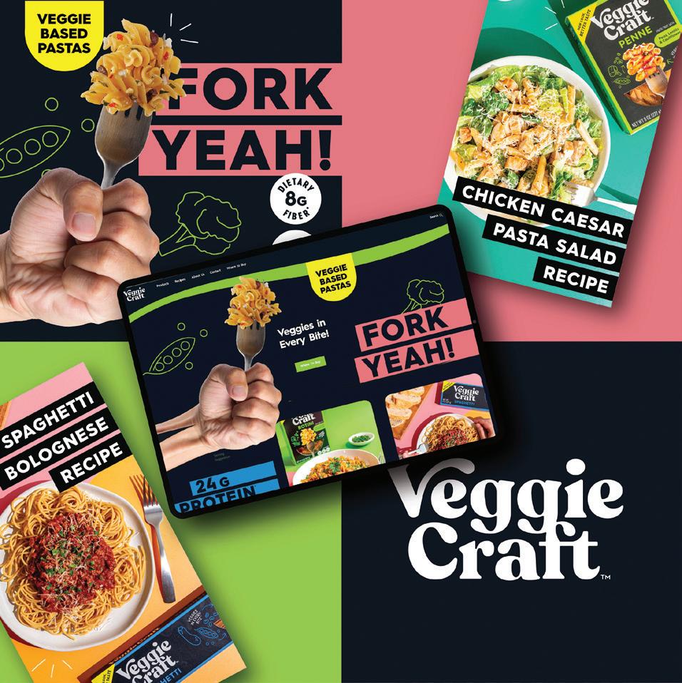
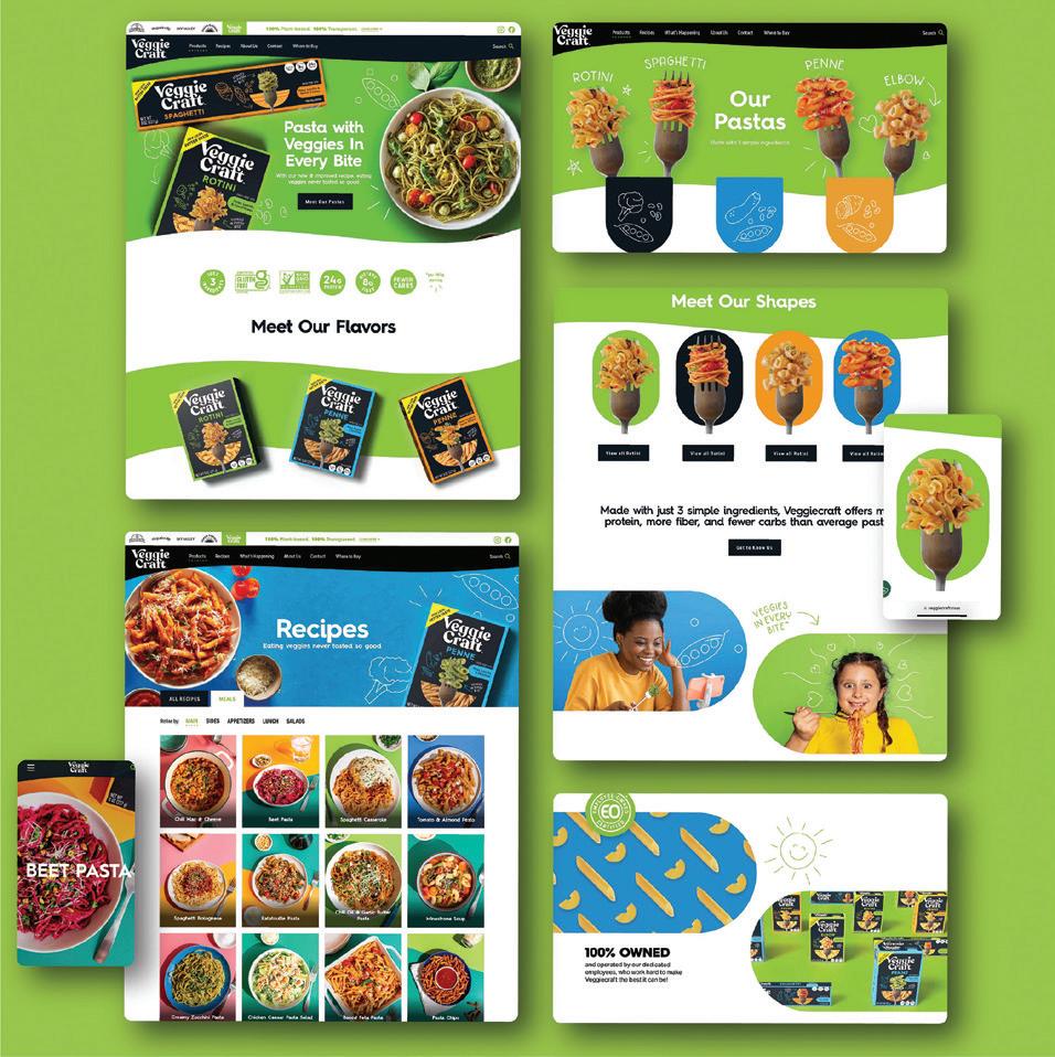
Design Firm: Litehouse Inc. Creative Team Client: Litehouse Inc. Marketing Title: Veggiecraft Fork Yeah Campaign Creative Director: Kathy Weisz Art Director: Lindsey Kuhn Designer: Lindsey Kuhn Veggiecraft Brand Lead Designer: Amber Sirk Category: Digital Ads/Banners
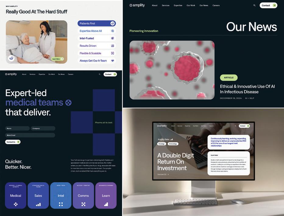
Design Firm: Marine Lane Client: Amplity, Inc. Title: Amplity Website Redesign Creative Director: Hannah Hillier Designer: Yeonjung Kim, Yoonjung Cho, Roy Kim, Amber Lin Writer: Margie Fox, Megan Flood, Caelyn Dovey Project Manager: Diana Rosales Category: Websites/Microsites/Mobile Sites
Design Firm: Litehouse Inc. Creative Team Client: Litehouse Inc. Marketing Title: Veggiecraft Website Creative Director: Kathy Weisz Art Director: Lindsey Kuhn Designer: Lindsey Kuhn Veggiecraft Brand Lead Designer: Amber Sirk Category: Websites/Microsites/Mobile Sites
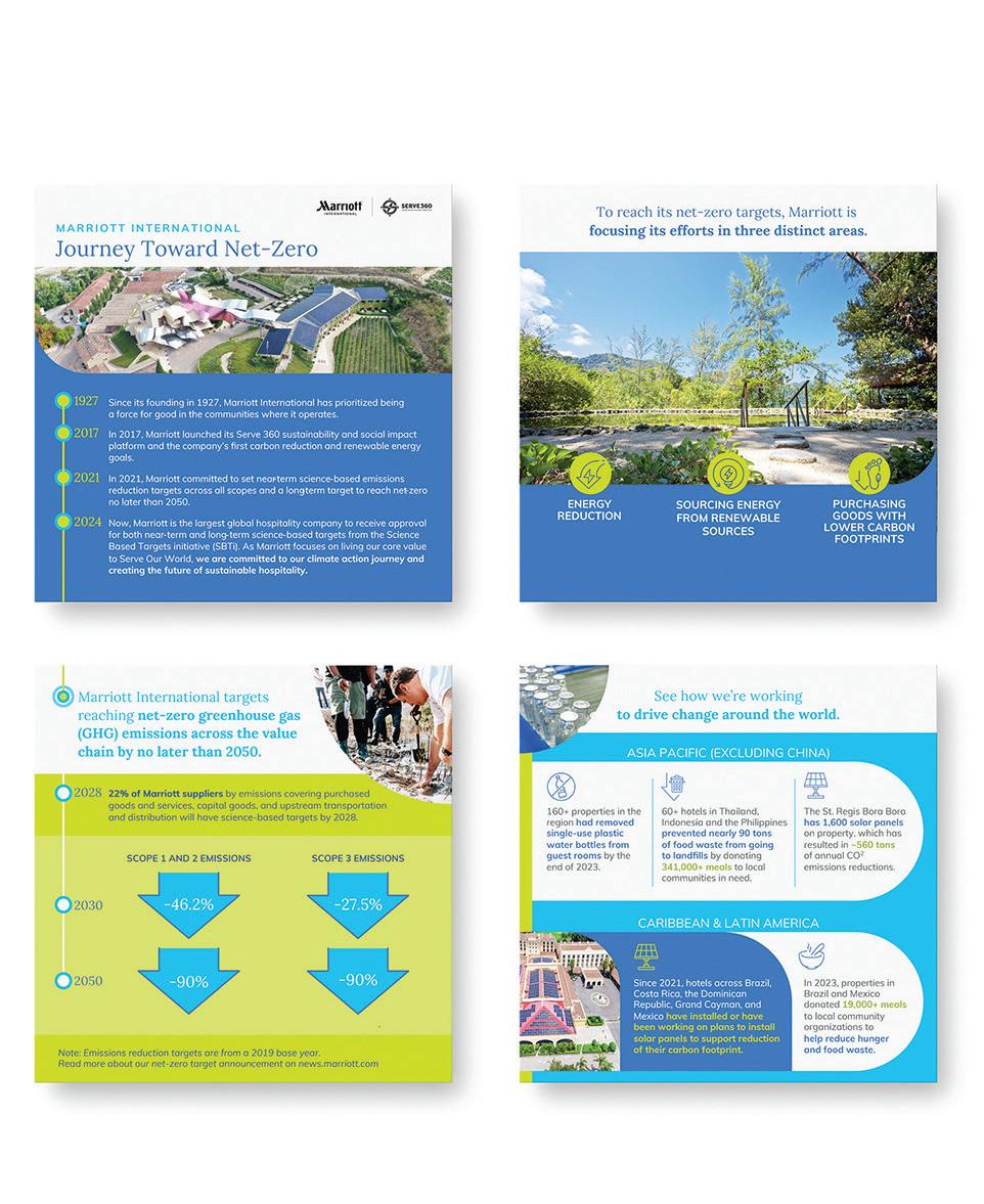
Design Firm: Marriott International, Inc. Title: Journey Toward Net-Zero Data Visualization Art Director: Nicole Kassolis Maheridis Designer: Nicole Kassolis Maheridis Copywriters: Christin Fernandez, Bernice Chan Other Contributors: Denise Naguib, Clair Cutting Category: Data Visualization/Infographics
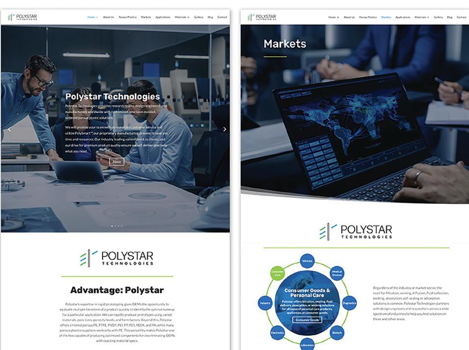
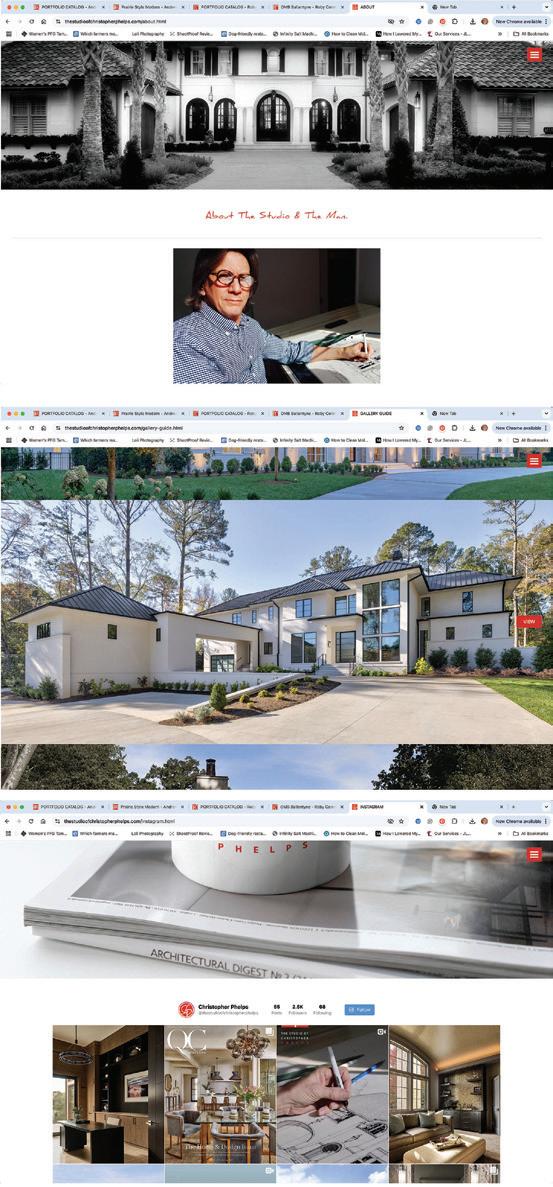
Design Firm: Max Marketing Communications Title: Polystar Technologies Website Creative Director: Max Allers Art Director: Max Allers Designer: Max Allers Developer: Max Allers Writer: Michael Dapper Category: Websites/Microsites/ Mobile Sites
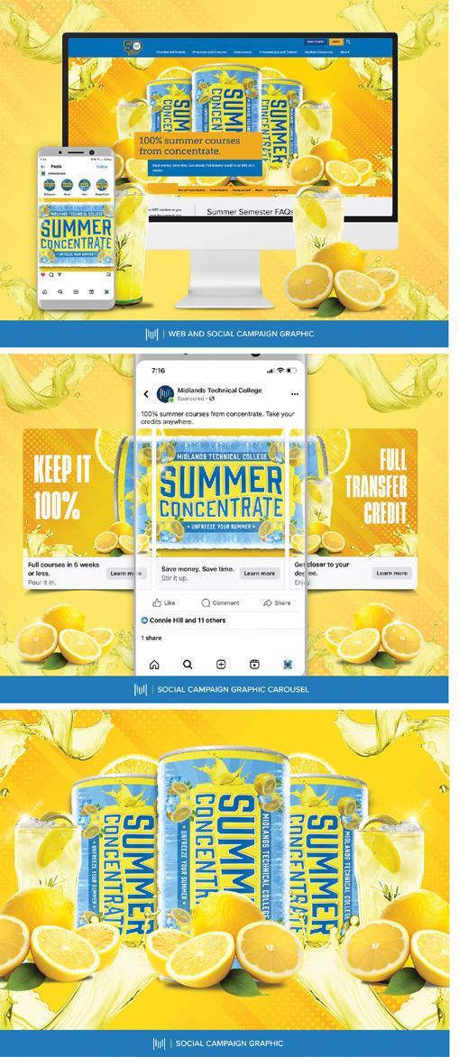
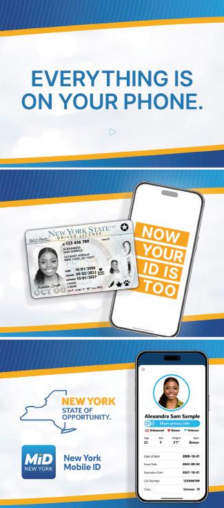
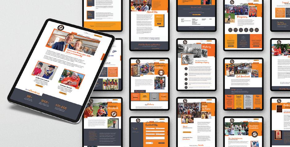
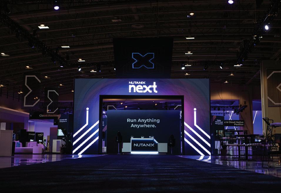
Design Firm: Nicole Kassolis Creative Client: Orioles Advocates Title: Oriole Advocates Website Art Director: Nicole Kassolis Maheridis Designer: Nicole Kassolis Maheridis Writer: Jess Gill Project Manager: Tami Goldsmith Category: Websites/Microsites/Mobile Sites
Design Firm: Nutanix Title: .NEXT 2025 Digital Archway Creative Director: Janmarie Wright, Carol Kimura Art Director: Nathon Sims Motion Designer: Francisco Rodarte Client: Kelsey Kajiwara, Maya Bibi Category: Animation/ Video/Motion
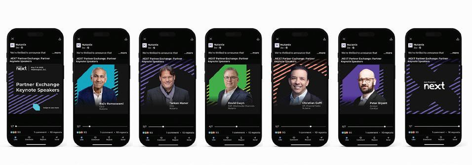
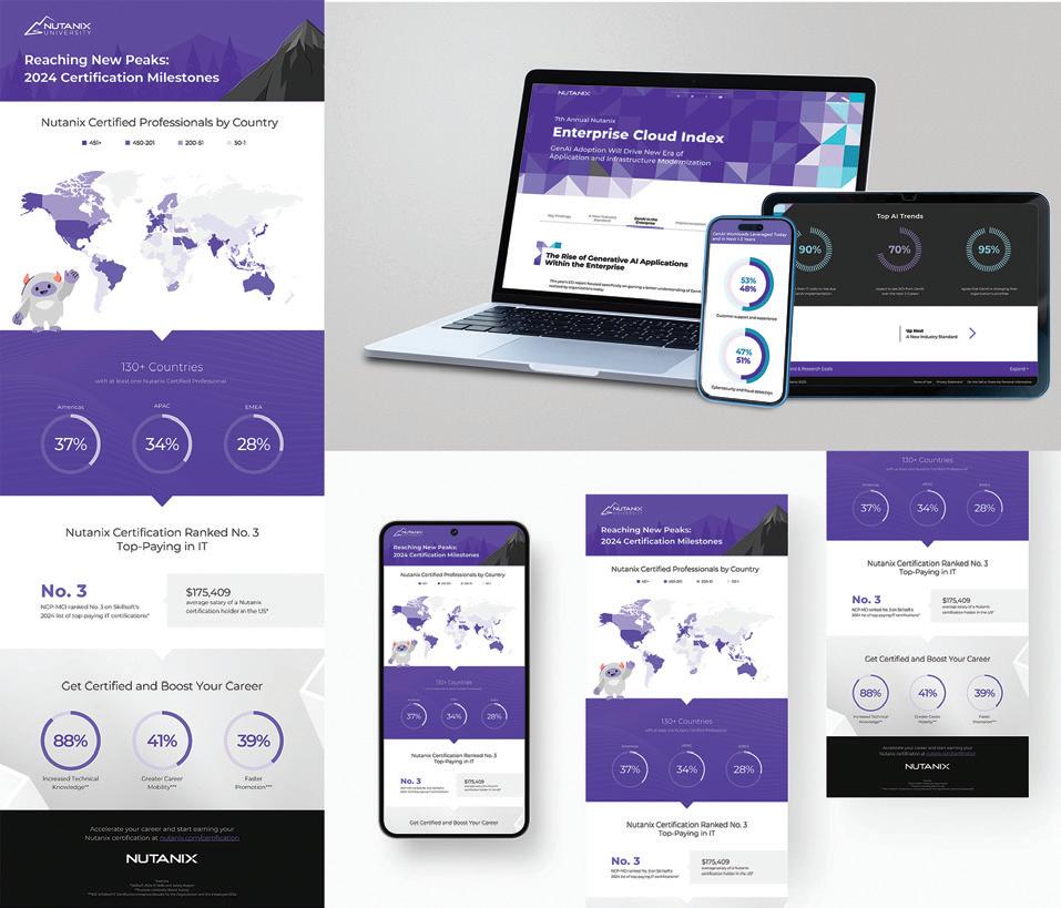
Design Firm: Nutanix Title: .NEXT 2025 Partner Promotion Social Media Creative Director: Janmarie Wright Art Director: Jenn Ho Designer: Petia Farrington Project Manager: Maiger Vang Client: Hillary Hill Category: Social Media
Design Firm: Nutanix Title: 7th Annual Enterprise Cloud Index Creative Director: Carol Kimura Art Director: Jenn Ho Designer: Paige Silva Web Managers: Allan Franco, Stephanie Wong Developer/Programmer: Nemanja Kostic Clients: Jen Massaro, Lia Bigano Managers: Allan Franco, Stephanie Wong Project Managers: Kelsey Kajiwara, Maiger Vang Category: Websites/ Microsites/Mobile Sites
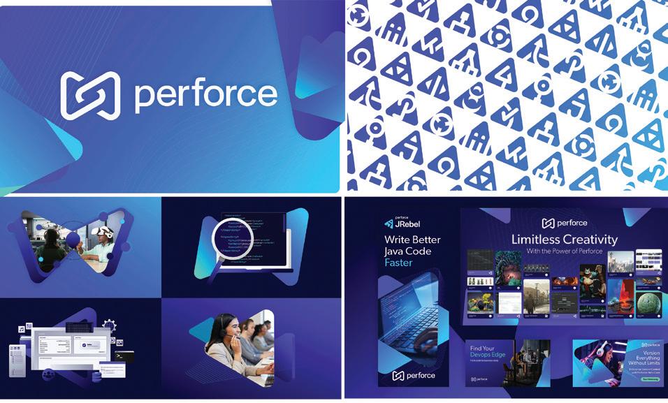
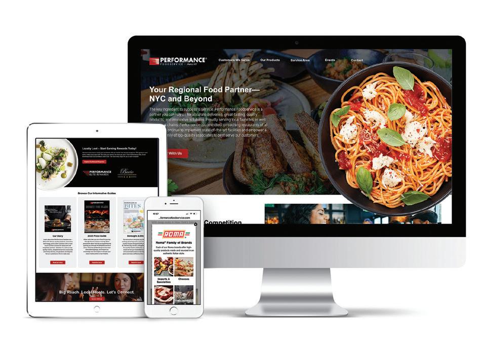
Design Firm: Perforce Software Title: Perforce Brand Refresh Senior Director, Creative: Christopher Kirsh Senior Product Designer: Ilana Rahlis Senior Manager, Design: Jacob Bartush Senior Graphic Designer: Tyson Phipps Senior Graphic Designer: Katie Scheidler Designer: Nate Loura Senior Manager, Web Development: Jeremy Pieper Chief Marketing Officer: Colleen Kulhanek Vice President, Marketing: Erin Hofstrom Senior Web Developer: Tom Trench Senior Web Developer: Simran Deep Singh Senior Multimedia Specialist: Alex Wilcox Director, Product Marketing: Zibby Keaton Corporate Marketing Manager: Maurya Matylewicz Category: Digital Branding Assets
Design Firm: Performance Food Group Client: Performance Foodservice-Metro NY Title: Conversion Landing Page Art Director: Keli Keener Designer: Keli Keener Developer: Keli Keener Category: Websites/Microsites/Mobile Sites
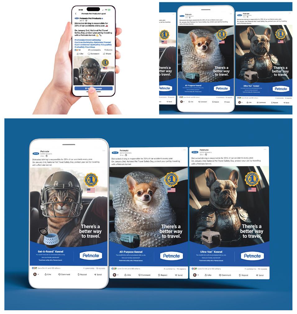
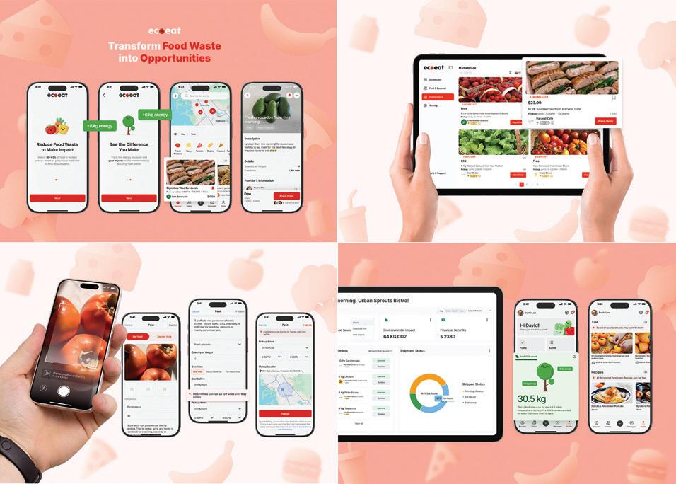
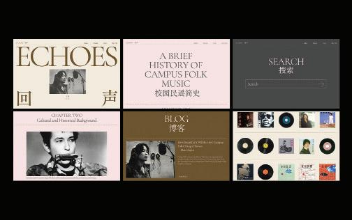
Design Firm: SHINGA Creative Title: EcoEat Sustainability Platform Designer: Shinga Yoshimine, Yitian Zeng, Tianyi Zhang Category: UX/UI Design
Design Firm: Shengxuan Hu Title: Echoes: The Era of Taiwan Campus Folk Music Designer: Shengxuan Hu Category: UX/UI Design

Design Firm: SiMPLE DESIGN INC. Client: Tucanos Brazilian Grill Title: Tucanos Brazilian Grill Weekly Email Blasts Creative Director: Robert Mitchell Designer: Robert Mitchell Programmer: Mickey Padilla Writer: Robert Mitchell Category: Email Marketing
Design Firm: So Drama! Entertainment Client: Ministry of Defence, Singapore
Design Firm: So Drama! Entertainment Client: Ministry of Defence, Singapore
Title: National Day Parade 2024 Series of Infographics Art Director: Bernard Chia Designer: Bryan Loo, Lawrence Chiam, Jason Goh Category: Data Visualization/Infographics
Design Firm: So Drama! Entertainment Client: Ministry of Defence, Singapore
Title: Republic of Singapore Air Force Set To Wow At Singapore Airshow 2024 Art Director: Bernard Chia Designer: Bryan Loo, Lawrence Chiam Category: Data Visualization/Infographics
Design Firm: So Drama! Entertainment Client: Ministry of Defence, Singapore
Title: PIONEER Valentine’s Day SAF Couples Series - Not Your Typical R+J Love Story Writer: Thrina Tham Photographer: Kenneth Lin Category: Digital Publications
Design Firm: So Drama! Entertainment Client: Ministry of Defence, Singapore
Title: Ship-to-Shore Operations at Exercise Trident 2024 Art Director: Bernard Chia Designer: Bryan Loo, Lawrence Chiam, Jason Goh Category: Data Visualization/Infographics
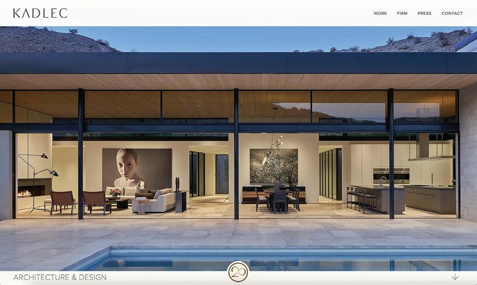
Design Firm: So Drama! Entertainment Client: Ministry of Defence, Singapore Title: Total Defence 40th Anniversary (TD40) Logo and Campaign Art Director: Bernard Chia Designer: Bryan Loo, Cheh Zhong Han, Lawrence Chiam Category: Digital Branding Assets
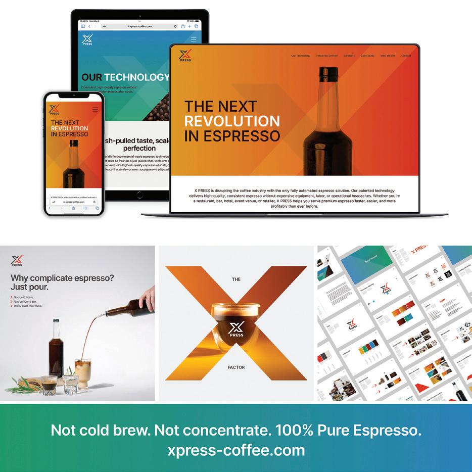
Design Firm: Spohn Design Client: X PRESS Title: X PRESS Website Creative Director: Ron Spohn Designer: Ron Spohn Developer: Erik Porter Category: Websites/Microsites/Mobile Sites
Design Firm: Sparq Client: KADLEC Architecture & Design Title: KADLEC Architecture & Design Website Creative Director: Richard Cassis Art Director: Richard Cassis, Jess McGregor Designer: Jess McGregor Developer: Jess McGregoer Programmer: Jess McGregor Writer: Steve Kadlec, Jess McGregor Category: Websites/Microsites/Mobile Sites
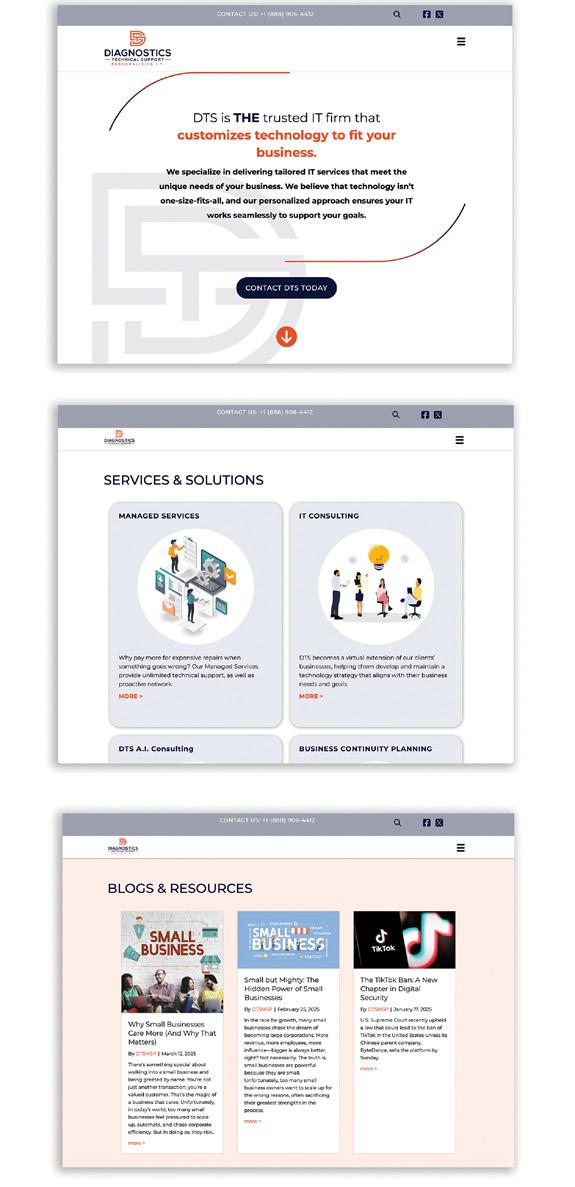
Design Firm: Stephen B. Starr Design, Inc. Client: Diagnostics Technical Support LLC Title: Diagnostics Technical Support LLC Website Creative Director: Stephen B. Starr Art Director: Stephen B. Starr Designer: Stephen B. Starr Developer: Stephen B. Starr Programmer: Stephen B. Starr Writer: David Le Roy Category: Websites/Microsites/Mobile Sites
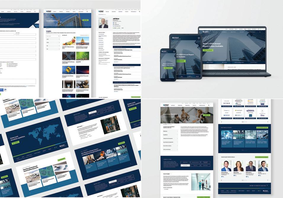
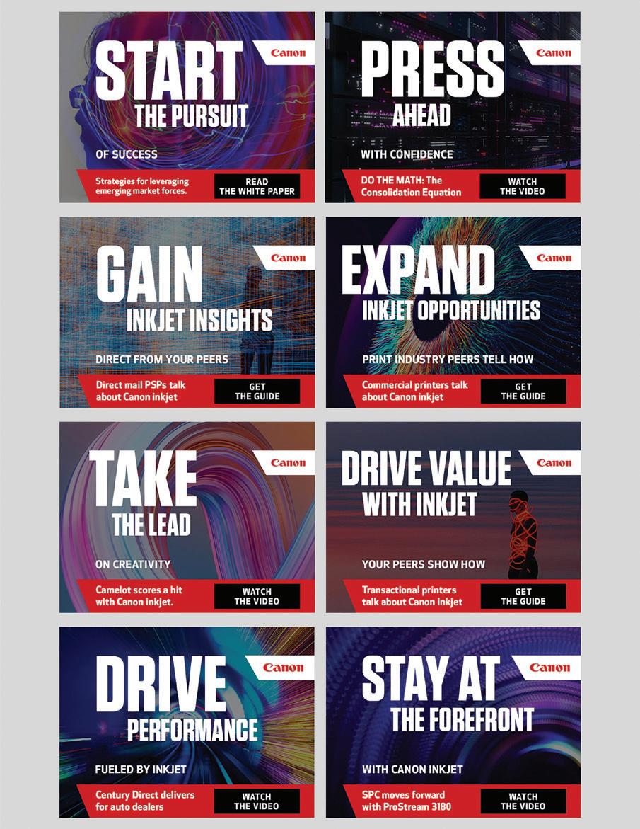
Design Firm: Stout Risius Ross, LLC (Stout) Title: Stout Website Design Refresh Designer: Gillian Kuhn Developer: Paragon Consulting Brand & Creative Manager: Andrew Scheibe Category: Websites/Microsites/Mobile Sites
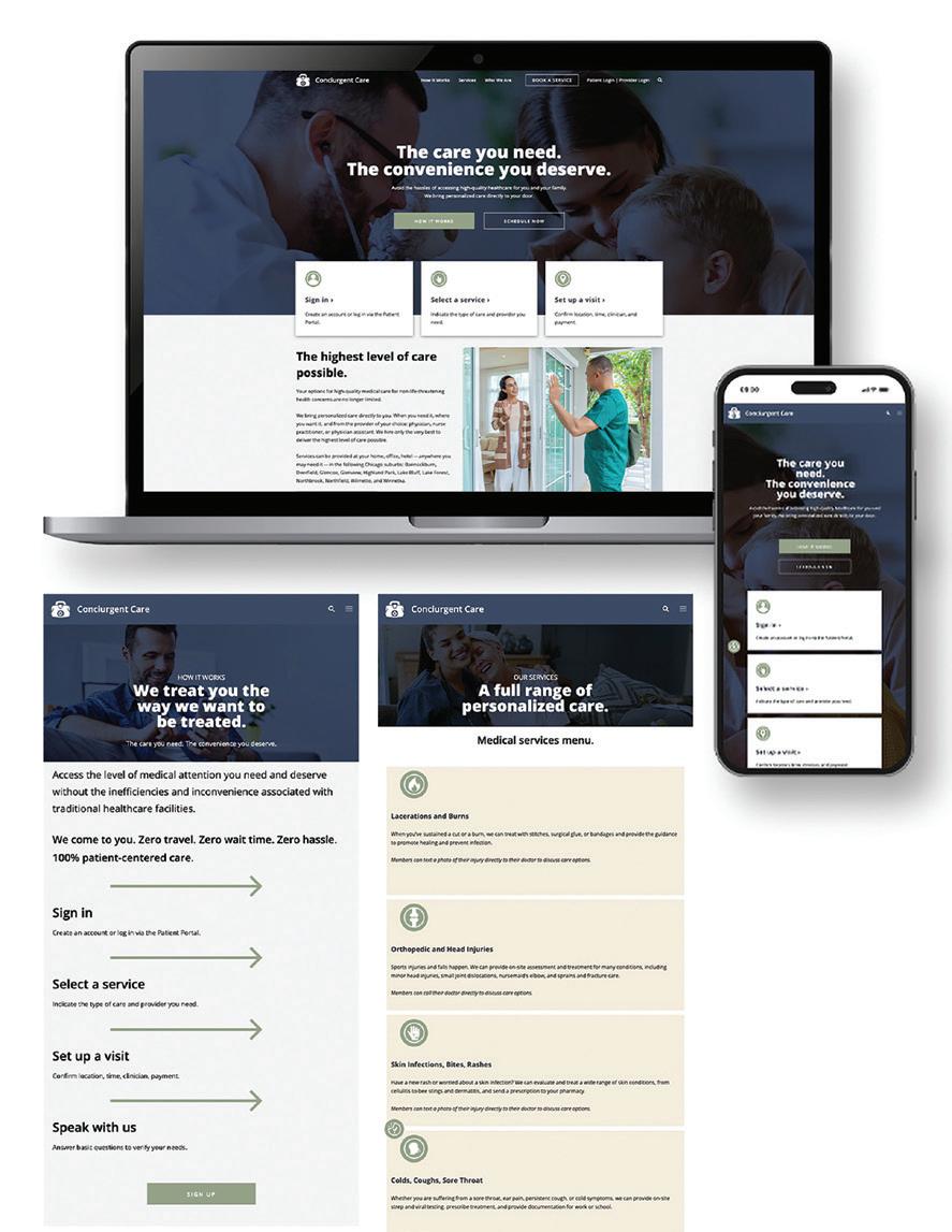
Firm: Street Level Studio Client: Conciurgent Care Title: Conciurgent Care New MedTech Website Category: Websites/Microsites/Mobile Sites
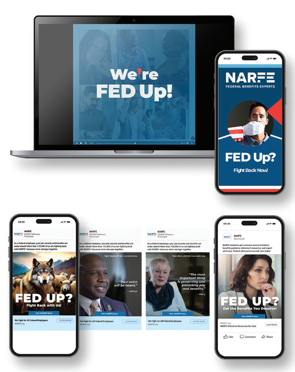
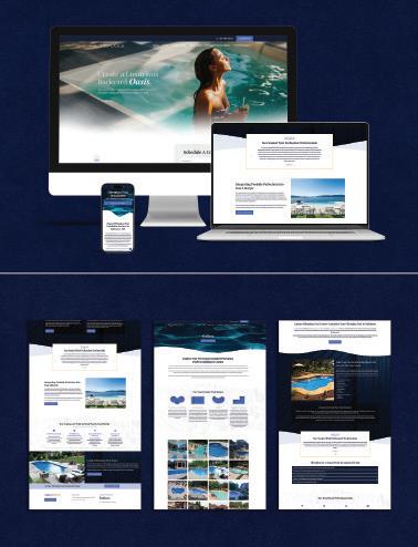
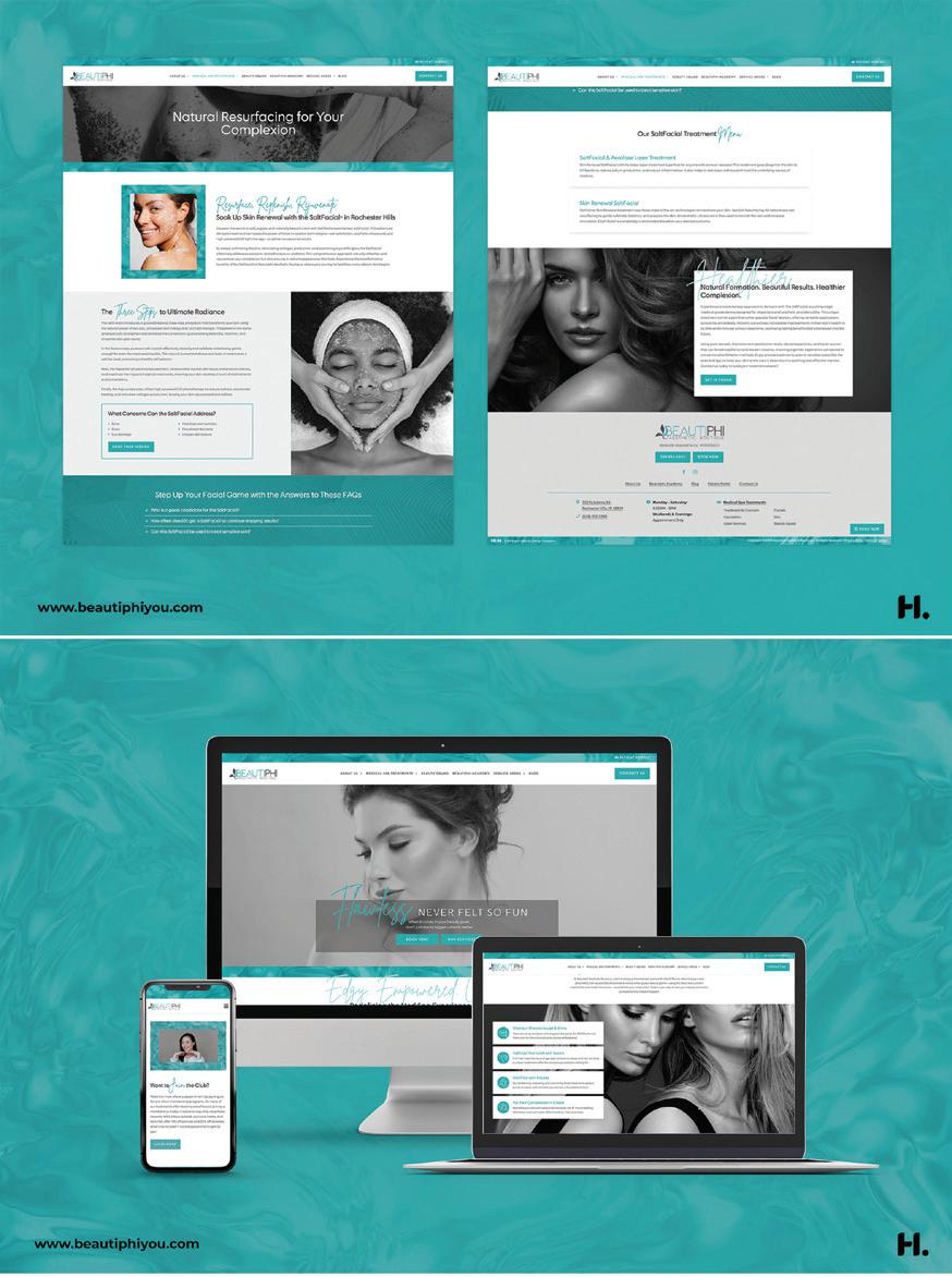
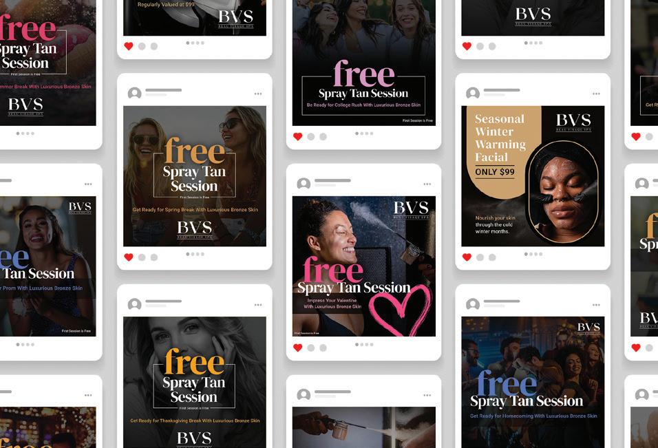
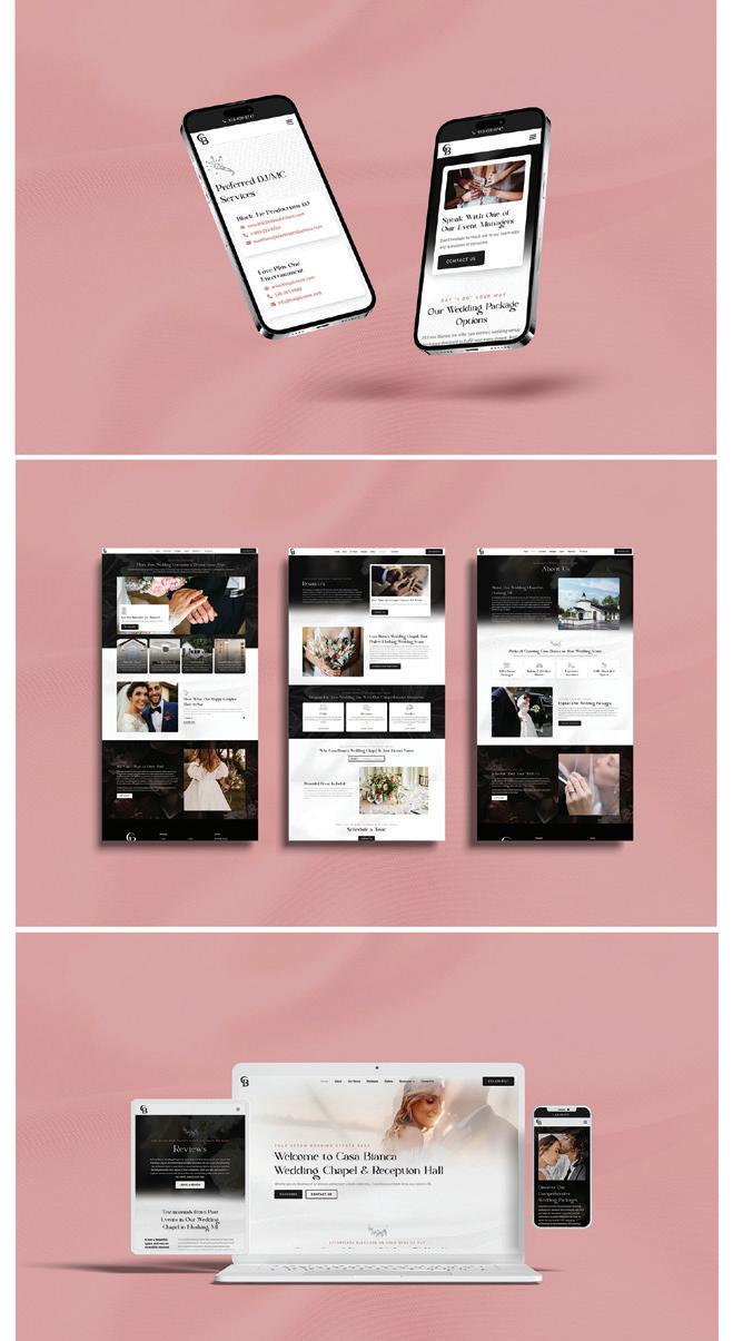
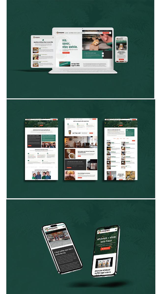
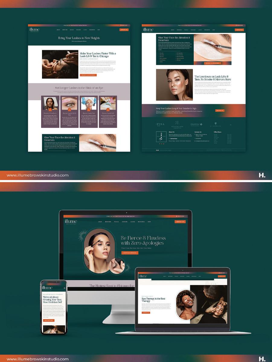
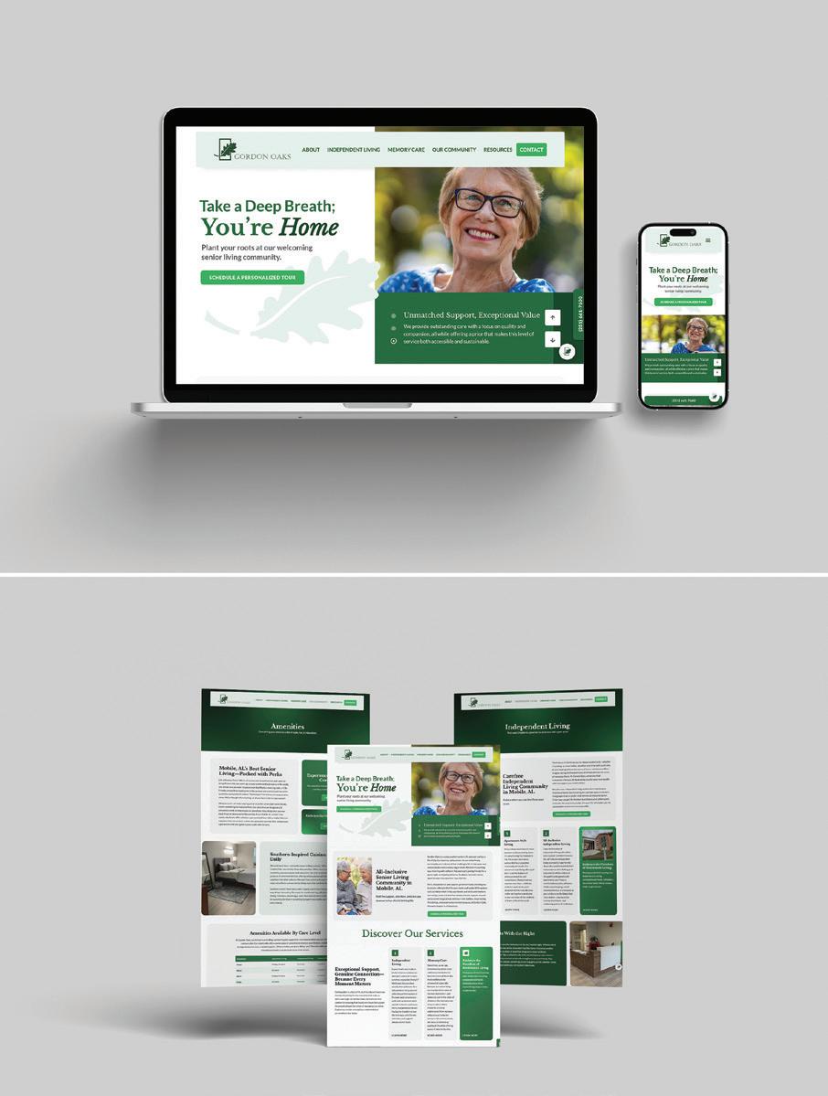
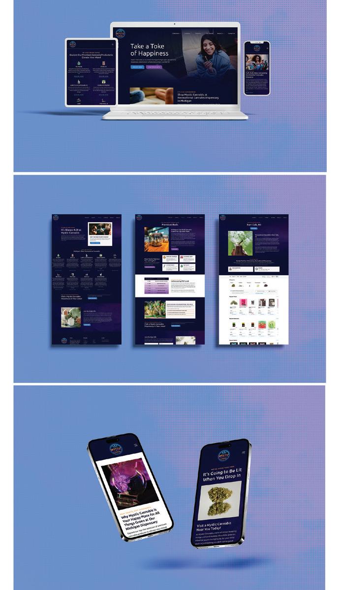
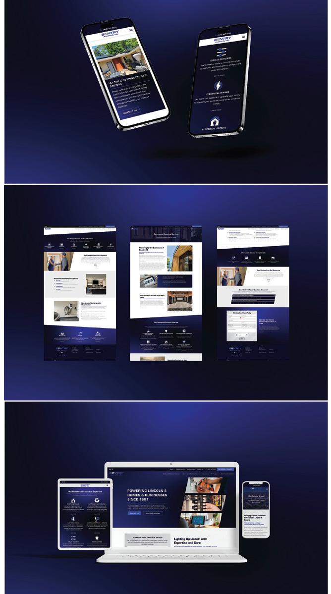
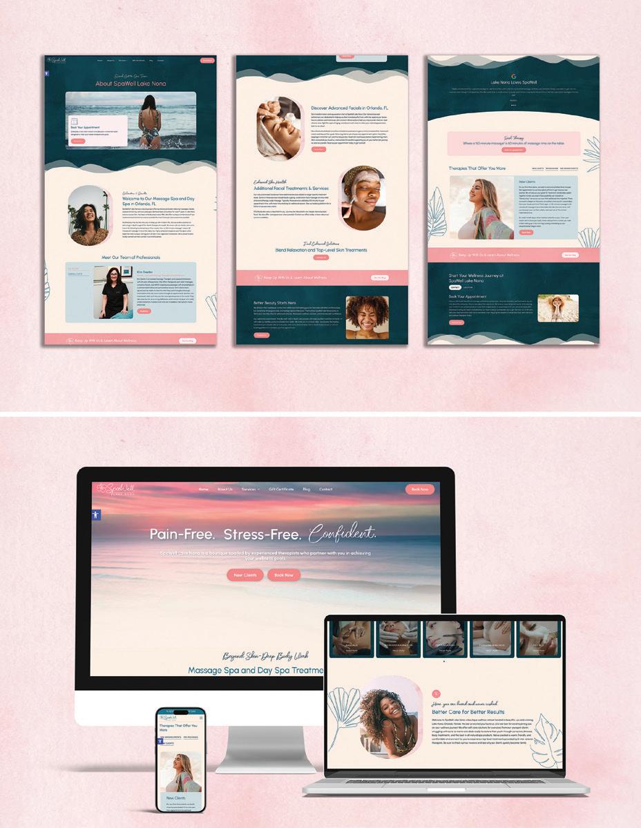
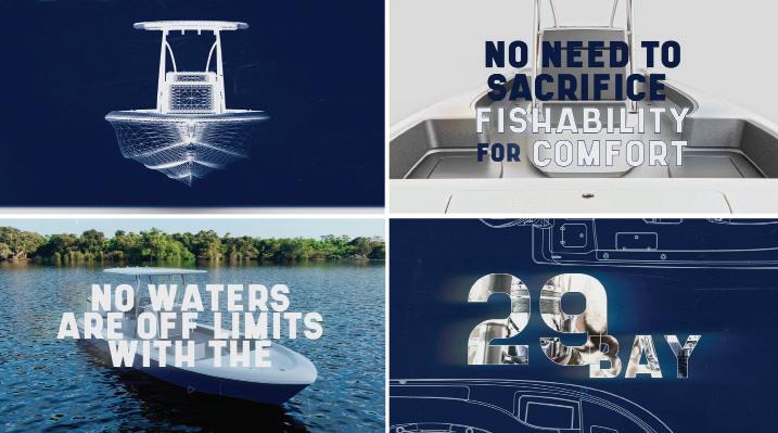
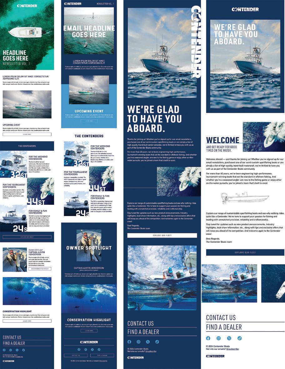
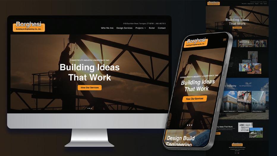
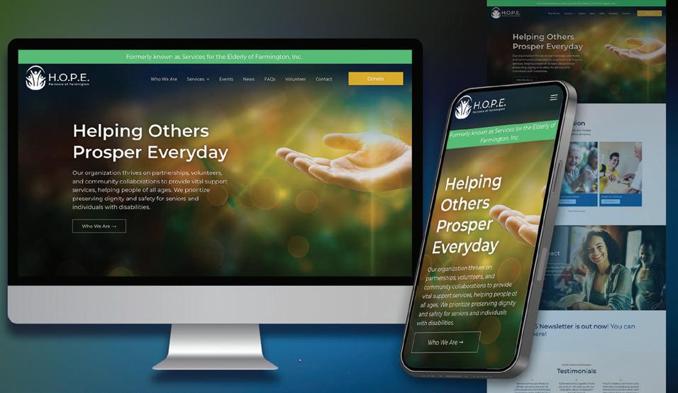
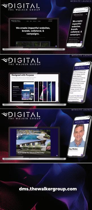
Design Firm: The Walker Group Client: H.O.P.E. Partners of Farmington Title: H.O.P.E. Partners of Farmington Website Creative Director: Jeffery Williams Art Director: Nicole Joanna Pierzchalski Developer: Nicole Joanna Pierzchalski Assistant: Rachel Petke Category: Websites/Microsites/Mobile Sites
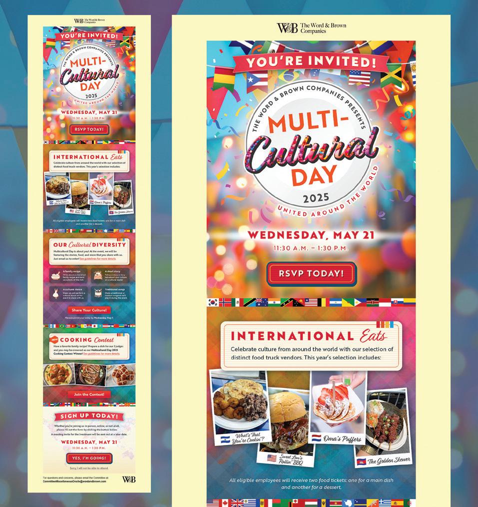
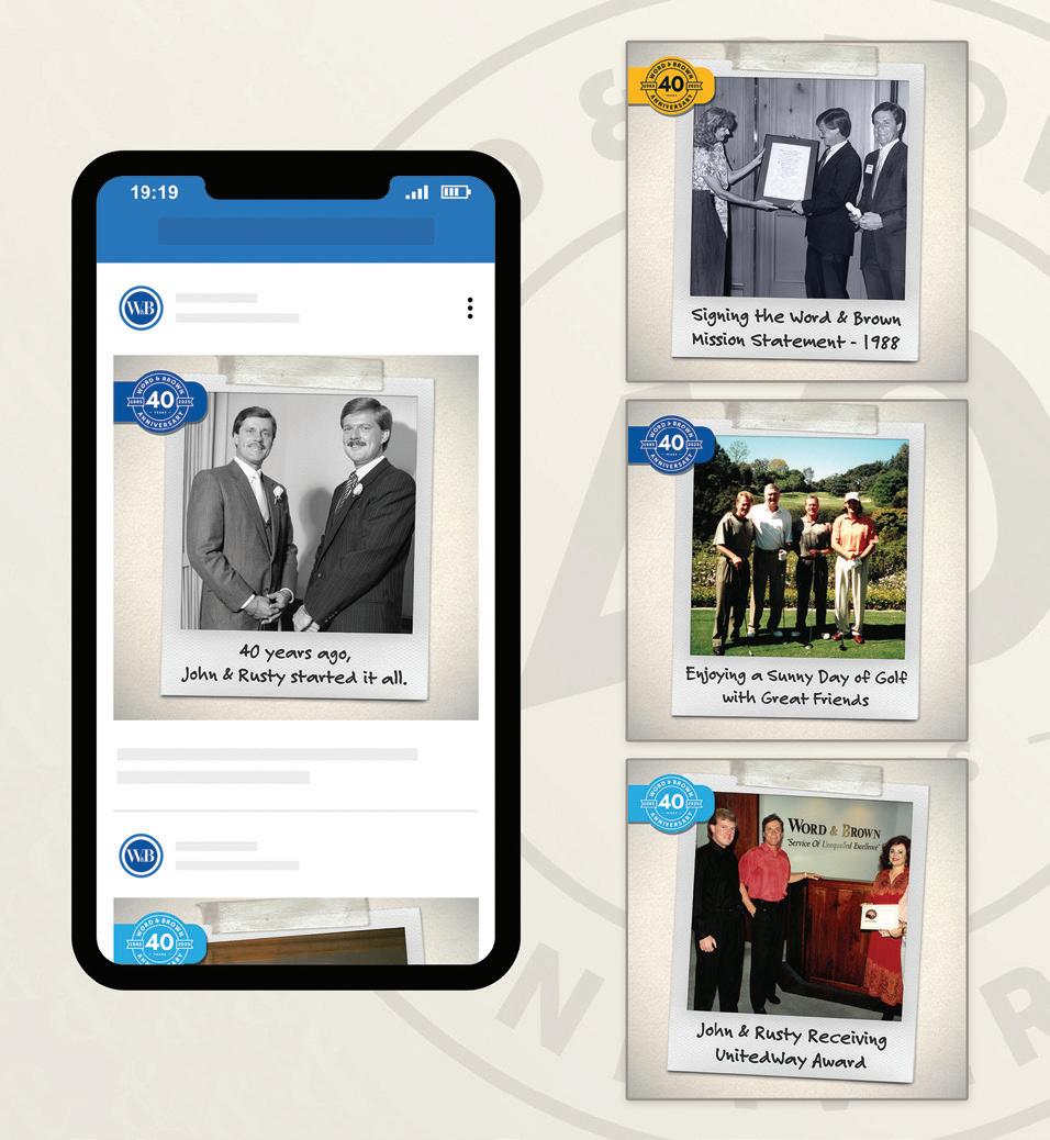
Entry: 13592
Design Firm: The Word & Brown Companies Client: Word & Brown General Agency Title: Word & Brown 40th Anniversary Social Media Creative Director: Missy Bynon, Marketing Director and Polly Neves, EVP, Marketing Art Director: Homer Villegas, Studio Director Designer: Hugo Miramontes, Senior Graphic Designer Category: Animation/Video/Motion
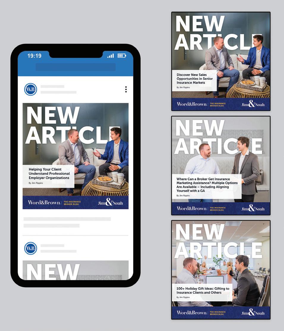
Design Firm: The Word & Brown Companies Client: Word & Brown General Agency Title: Word & Brown Broker Development Campaign Social Media Creative Director: Missy Bynon, Marketing Director Designer: Noe Villasenor, Digital Marketing Supervisor and Esteni Munguia, Sr. Digital Marketing Specialist Writer: Alex Strautman, Senior Copywriter Marketing Project Manager: Heather Jung Digital Marketing Manager: Vidah Quirante Category: Social Media
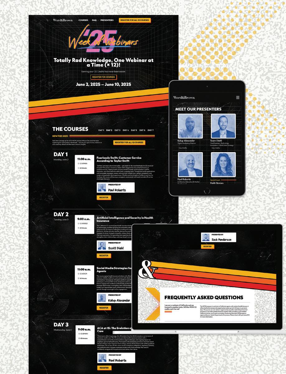
Design Firm: The Word & Brown Companies Client: Word & Brown General Agency Title: Word & Brown Week of Webinars 2025 Microsite Creative Director: Missy Bynon, Marketing Director Designer: Hugo Miramontes, Sr. Graphic Designer Developer: Vinh Thai, Sr. Interaction Designer and Jarrell Walker, Sr. Front-End Developer Writer: Alex Strautman, Senior Copywriter Marketing Project Manager: Heather Jung Digital Marketing Manager: Vidah, Quirante Digital Marketing Director: Kalup Alexander EVP, Marketing: Polly Neves, EVP, Mktg. Category: Websites/Microsites/Mobile Sites
Design Firm: TreacyDesign/TFX and All Dunn Advertising & Marketing Client: All Dunn Advertising & Marketing Title: All Dunn Advertising 2025 Website Creative Director: Joe Treacy with Dunn Pearson Art Director: Joe Treacy Designer: Joe Treacy Developer: Joe Treacy Programmer: Joe Treacy Writer: Joe Treacy Category: Social Media
Design Firm: Treacyface.com and TreacyDesign/TFX Client: Treacyfaces.com Title: Museum of Printing Type Talk Entry Creative Director: Joe Treacy Category: Social Media
Design Firm: ULINE Creative Client: ULINE Title: Career Shopping Cart Social Creative Director: Sarah Fritz Art Director: Wendy Gruselle Designer: Veronica Wilkey VP of Creative: Elizabeth Tenner Category: Animation/Video/Motion
Design Firm: ULINE Creative Client: ULINE Title: Type Ahead Animation Creative Director: Sarah Fritz Art Director: Wendy Gruselle Designer: Zoe Botes VP of Creative: Elizabeth Tenner Category: Animation/Video/Motion
Design Firm: Velera Title: Velera.com Corporate Website Velera Digital Marketing & Design Team Category: Websites/Microsites/Mobile Sites
Design Firm: WHM Creative Client: Google Cloud Title: Next Partner Summit Opening Video Creative Director: Patrick Moore Designer: Komal Dedhia Writer: Melissa Levine Production Designer: Erika Kopman Category: Animation/ Video/Motion
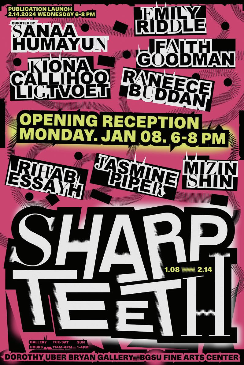
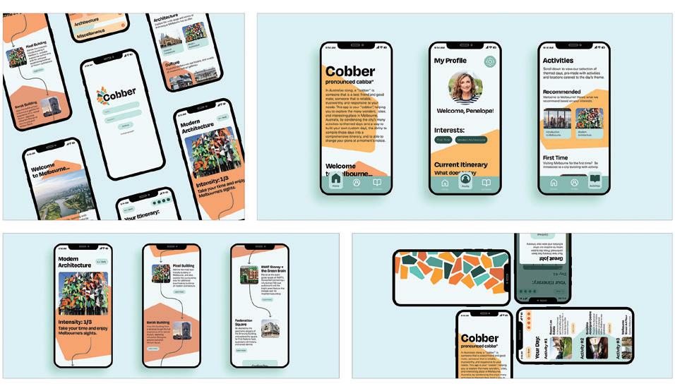
Design Firm: factor 110 Land of the 10,000 Lawns Title: Land of the 10,000 Lawns Logo Creative Director: Brian Ferrell Designer: Keon Nguyen Category: UX/UI Design
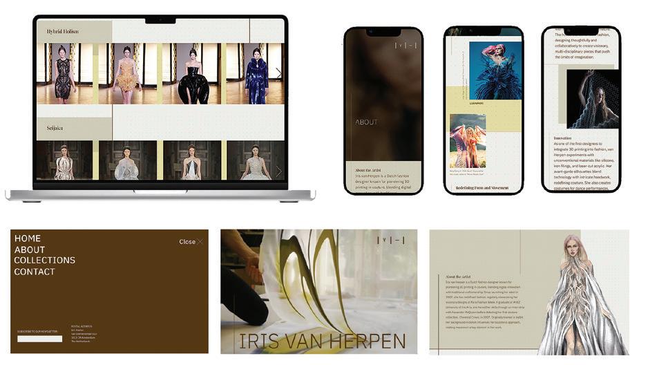
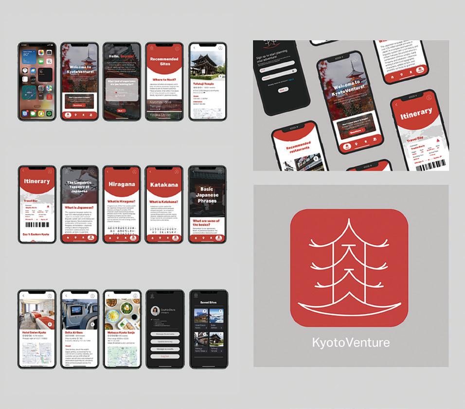
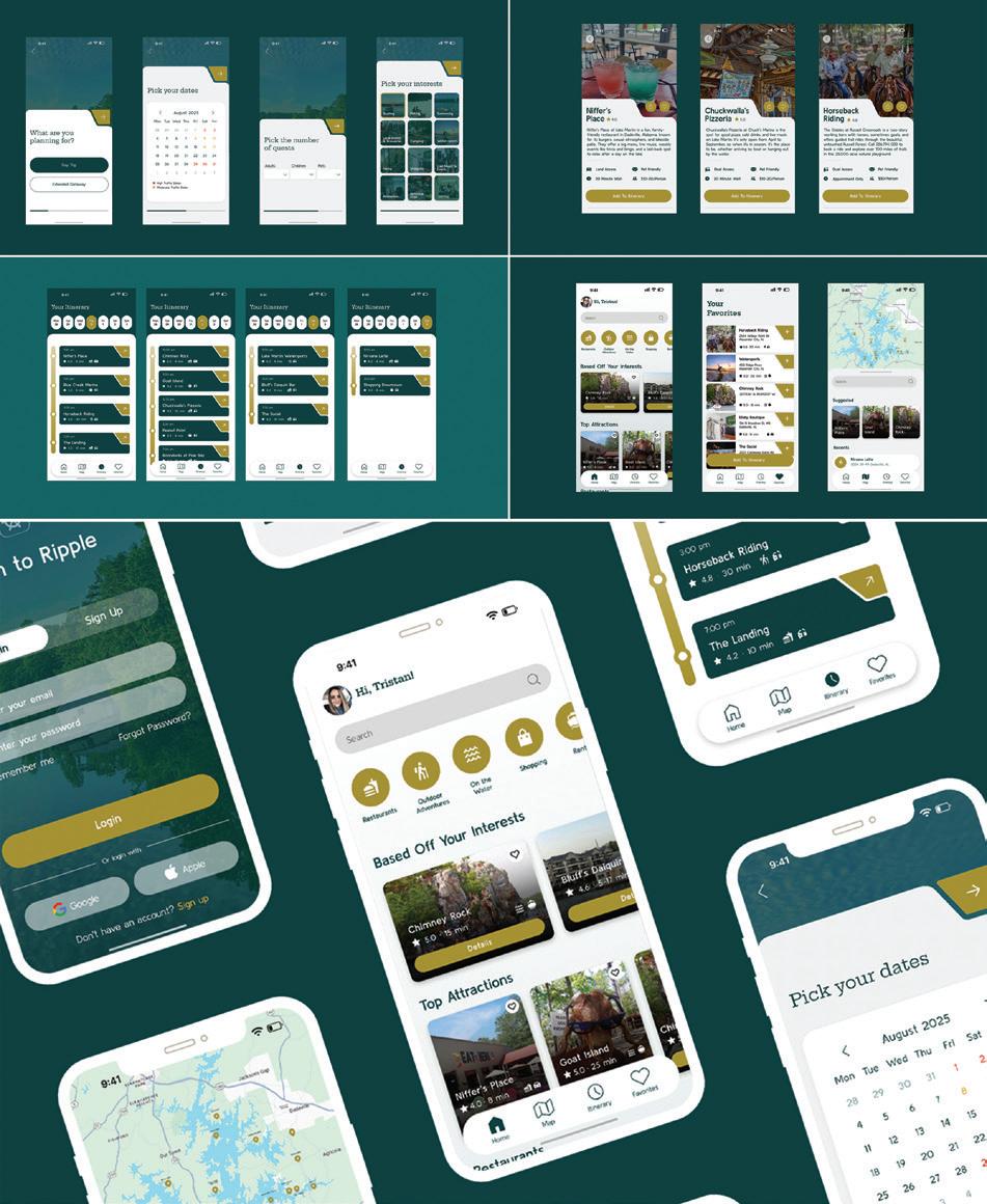
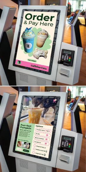
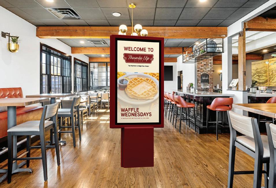
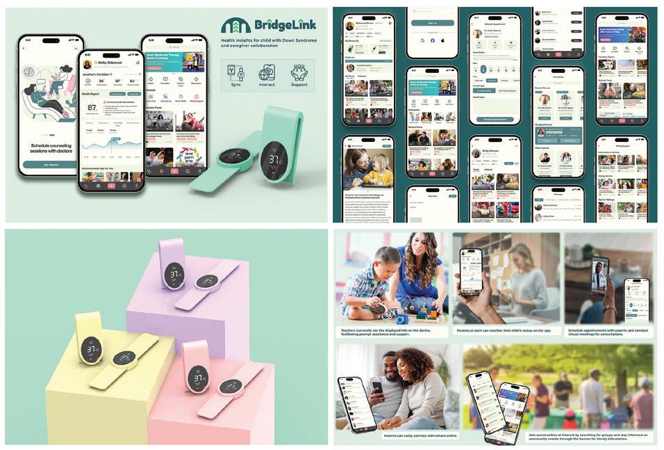
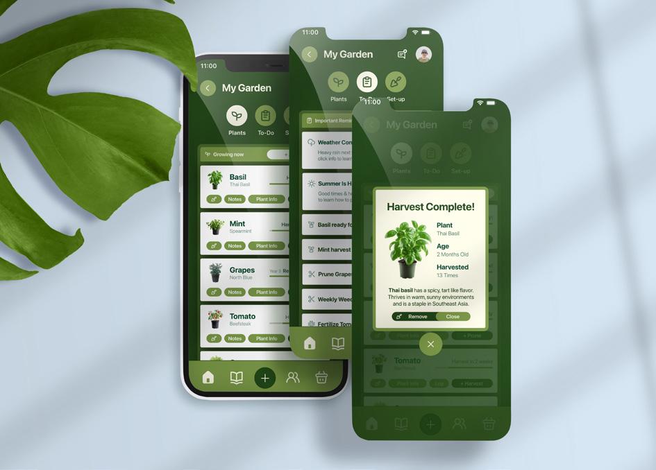
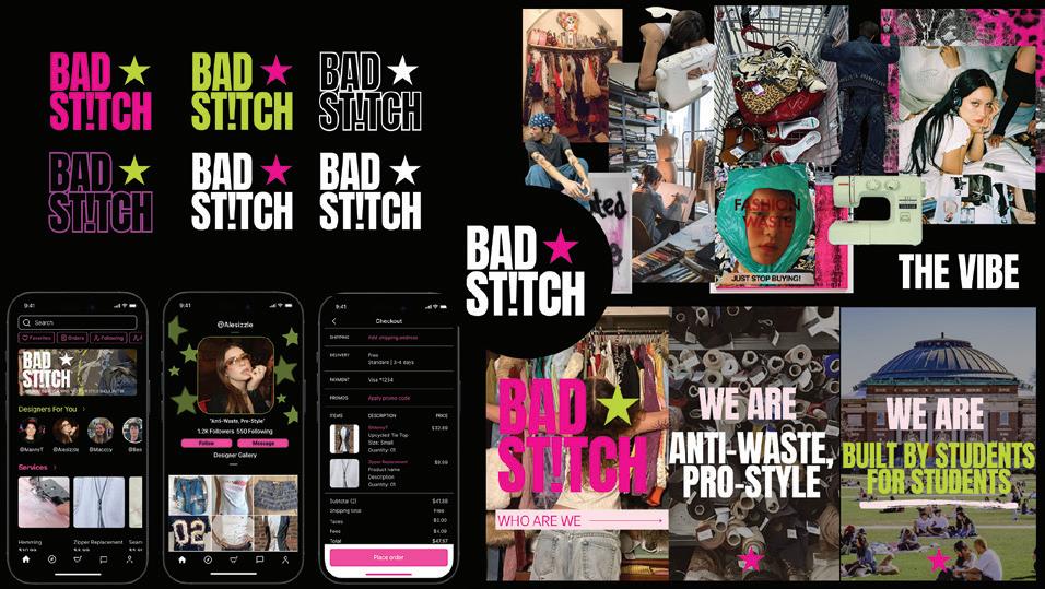
Design School: Milwaukee Institute of Art & Design (MIAD) Title: Cultivata Capstone Thesis Designer: Frankie Mallerdino Capsonte Thesis Instructor: Nicole Hauch Captstone Thesis Instructor: Adam Setala Category: Student Work
Design School: University of Illinois-Urbana Champaign Title: Bad St!tch Mobile App Concept Creative Director: Alessandra Lopez Research Director: Macy Miller Brand Strategist: Ben Riseman Account Director: Manny Tinajero Professor: Terry Kasdan Category: Student Work

BY LUCY MARINO

While you’re taking weeks to make a hiring decision, that exceptional art director or brilliant UI designer may accept another offer.
The instinct to be thorough is understandable, especially if you’ve made a regrettable hire in the past.
However, a drawn-out approach comes with risks. Research from Robert Half reveals the biggest impacts of leaving roles open, with employee burnout topping the list for marketing and creative teams. Positions left unstaffed can lead to stress and decreased job satisfaction among employees, as they struggle to handle heavier-than-normal workloads.
For creative teams, these effects can be particularly damaging. When designers and other creative professionals are overworked, the quality of ideation and execution inevitably suffers. Managers in the survey also reported delayed project timelines and inability to support critical business ini-
tiatives as other common costs of not staffing open roles.
Creative work that delivers results for the company requires mental space and energy — precisely what gets squeezed out when teams are lean and existing employees are stretched thin.
The good news? By fine-tuning your recruitment approach, you can spot and secure exceptional creative professionals before they pursue other opportunities. Let’s look at three ways to maintain your high standards while improving your hiring success.
Creative professionals can spot a generic job posting from a mile away. They’re looking for roles that spark their imagination and match their talents. The right description answers a number of key questions for them: What kinds of projects will I work on? Will I be able to shape brand identities or bring digital experiences to life? How much creative freedom can I expect?
The better you craft your job description, the more likely it is to draw in candidates who align with your company’s needs and culture. Break down the role in a way that creative minds appreciate—distinguish between technical requirements (like design software expertise) and other essential skills, such as innovative thinking and design sensibility. This detail helps candidates self-select, saving you from sifting through stacks of mismatched applications.
Top creative candidates often have multiple opportunities in play. Having a clear hiring timeline shows them you’re serious and keeps your process on track. Think of it like you do a creative project timeline, where you need key milestones to maintain momentum. Aim to review portfolios within a couple of days and schedule first interviews within a week of shortlisting.
Bring everyone who will be part of the hiring process into the loop on these deadlines. Just as you’d coordinate with your creative team on a big campaign, sync up with art directors and other creative leaders who need to evaluate candidates. Being transparent about your timeline with applicants is equally important — it shows you value their time and helps set expectations.
Additionally, gain approvals on salary and benefits for your position in advance. That way, when you’re interviewing a candidate you know would be perfect for the job, you can trust your instincts and take timely action.
Creative professionals pour their hearts into their portfolios, which can tell you a great deal about a candidate’s potential. When evaluating portfolios, focus on what really matters: How effectively do their campaigns drive

measurable engagement (likes, comments, shares, clicks, time spent watching/reading) or conversions (sign-ups, purchases, downloads, requests for info). What unique perspectives do they bring that your current team lacks? Will their style and approach complement your team?
If, after a thoughtful review of their portfolio, you need to see more through a creative exercise, make it count. Set up a focused challenge that lets them demonstrate relevant skills without asking for a week of free work. A well-designed test shows you respect both their expertise and their time, while giving you the confidence to make your decision.
Finding and securing exceptional creative talent takes significant time and energy — resources your team might not have to spare. In addition, the rise of generative AI tools is making hiring more challenging as applicants can use them to perfectly match resumes to job descriptions, creating an illusion of qualification that can mask actual skill and experience gaps.
For these reasons, many creative leaders turn to specialized talent solutions firms to streamline their hiring and gain personalized assistance.
Working with a company like Robert Half allows you to tap into our network of pre-vetted creative professionals with expert recruiters handling the initial screening steps, letting you focus on evaluating the candidates who best match your needs.
A well-tuned hiring process is your competitive edge. Smart preparation plus swift action equals strong creative hires. Your next exceptional candidate is out there. Don’t let them slip away.
LUCY MARINO IS EXECUTIVE DIRECTOR OF THE MARKETING AND CREATIVE PRACTICE AT GLOBAL TALENT SOLUTIONS FIRM ROBERT HALF, WHICH CONNECTS EMPLOYERS WITH SKILLED MARKETING, CREATIVE, DIGITAL, ADVERTISING AND PUBLIC RELATIONS PROFESSIONALS TO MEET THEIR SPECIALIZED RECRUITING NEEDS. MARINO MANAGES STRATEGY AND OPERATIONS FOR THE COMPANY’S MARKETING AND CREATIVE TALENT SOLUTIONS TEAMS ACROSS U.S. LOCATIONS.
To request free product information from companies featured in this issue contact the advertisers directly as provided below or within their ads.
GDUSA PRINT AND DIGITAL MAGAZINES
Academy of Art University 3 academyart.edu
Artisan 17 artisantalent.com
Billerud/Sterling Premium IFC billerud.com
Billerud/Graphics and Label Papers 24-25
Domtar 5 domtar.com/inspiration
Fedrigoni Special Papers 34-35 specialpaper.fedrigoni.com/nam/
Kallima IBC kallimapaper.com
Robert Half 3 roberthalf.com
Robert Half 93 roberthalf.com/salary-guide
Sylvamo BC acccentopaque.com
Syracuse University 9 School of Design admissu@syr.edu
GDUSA WEBSITE - GDUSA.COM
Artisan artisantalent.com
Billerud billerud.com
Domtar https://www.domtar.com/inspiration/ Fedrigoni Special Papers specialpaper.fedrigoni.com/nam/
Kallima kallimapaper.com Mohawk mohawkconnects.com
Northwestern University sps.northwestern.edu/info/information-design.php
Robert Half https://www.roberthalf.com/us/en/insights/salary-guide
Sessions College www.sessions.edu/bachelors/
Syracuse University School of Design vpa.syr.edu/cmd2024 Sylvamo https://www.accentopaque.com/
GDUSA TOP DESIGN SCHOOLS MICROSITE
Auburn University cadc.auburn.edu/graphicdesign
Bowling Green State University bgsu.edu/arts-and-sciences/school-of-art/
Drexel University drexel.edu/westphal
University of Cincinnati/DAAP https://daap.uc.edu/ USC Roski roski.usc/the-mfa.design-degree-program/
The University of Southern Mississippi usm.edu/undergraduate programs/art.php
The University of Texas at Austin designcreativetech@utexas.edu
Woodbury University woodbury.edu