IIIDaward 2023 THE BOOK
International
ig n
InstituteforInformationDes
International Institute for Information Design
IIID

International Institute for Information Design
The IIIDaward is a great celebration of what information designers contribute to society. They apply creativity and design thinking to solve complex communication problems, and to improve every aspect of human life.
When we travel, information designers help us find the way. When we buy things, they help us to make informed choices. When we pay tax or claim benefits from government, they explain our rights and responsibilities and make the process run smoothly. They reveal what data means, they help us find information quickly, and they explain how complex systems work. Information designers help us understand healthcare systems and health, and how our pension works. And more.
In spite of all this, most people know too little about information design. The IIIDaward seeks to put that right by showing off our best work.
Rob Waller President, IIIDUniversidad Autónoma Metropolitana Cuajimalpa
Latvian journalist, TV-presenter and Lecturer at the Latvian Art Academy

IADE – Faculty of Design Universidade Europeia Lisboa
Senior
IIID Vice President for Education & Research
Nicole
studio superdot in Basel Switzerland
Authors of “Visualizing Complexity“
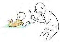
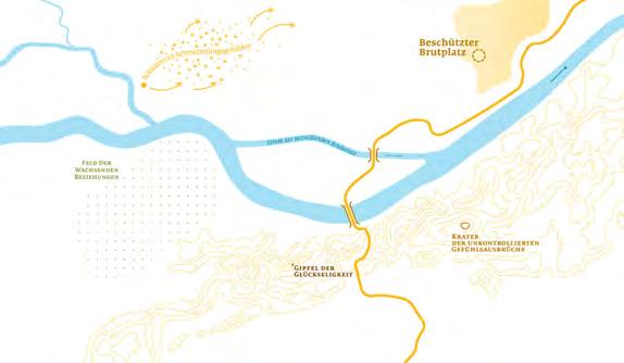
I believe that the most challenging aspect of information design is designing systems for communication and information interchange. This piece, which falls under the category of bachelor‘s and master‘s, accomplishes that by creating a system that supports a niche target group that is usually not reflected in such communication systems. The designers provide a space for expressing themselves and exchanging information, even in the context of art and exhibition scenarios. The team conducted significant research, including co-creation with disabled people, to address important societal issues, rather than solely focusing on commercial indications. It was surprising to see that they chose a visual aesthetic that is bold and could have gone wrong, but it actually goes in the right direction. The chosen aesthetic provides enough precision to communicate, while also giving the target group enough freedom to express themselves. Overall, the project is a language for those people to express themselves, which is fitting for their needs and is an excellent example of information structural design.
Rocío Abascal Mena Marta Jagoda TOTU / IT‘S HERE
My “darling“ is this tool for identifying erogenous zones for people with an unusual sensation disorder. This is an example of an art project that acknowledges the needs of people who are often overlooked in the realm of sexuality. This project demonstrates that data can be used not only to display information but also to create art that has therapeutic benefits. This is especially significant in the Bachelor and Masters category because it highlights those who are different and shows that we can make art with their data. I believe that this project has the potential to save lives and take care of others. It is a beautiful example of how data can be transformed into art.
I like this project because of its creative approach to typography in space, which is not usual. Although it was technologically complicated to install, the project creates a dynamic atmosphere while also providing an orientation system for navigation. I appreciate the courage to use artistic expression for information design, and the innovation of this project is very emotional and impactful. Overall, it is a different approach that effectively combines typography, artistic expression, and an orientation system, which makes it a unique and inspiring example of information design.
This project is entirely user-centered. It is designed for blind people who want to swim and makes it possible for them to do so. The project includes instructions and a device that allows them to enter the swimming pool, put on the device, and start swimming. The entire information design system is created with blind people in mind, not just the devices and instructions, but everything that goes along with it, making it possible for them to participate in swimming. This project is fantastic and a great example of how user-centered design can make an significant impact on people‘s lives.
I really like the idea behind the wayfinding and information design in this project. It recognizes that cemeteries can be places of deep grief but also of healing during one‘s lifetime. It‘s important to easily find the right directions in this context, and the calm and clear signage used here achieves that. Additionally, practical features like places to put your things are helpful. This project also considers the importance of death questions and the challenges of finding specific graves, especially for relatives who may not be familiar with the cemetery. It‘s a messy and formal process, involving finding an official person during working hours. The empathy and respect demonstrated in this project, for both those who currently realize its importance and those who may in the future, is impressive. Overall, this practical and empathetic approach to cemetery design is why I‘m a fan of this project.
This project‘s main idea is the combination of several contexts to help people who struggle with understanding finance. The project utilizes gamification, video games, and key visuals that combine illustration and information design. As someone who works with both information design and illustration, I appreciate the combination of these two fields to help people understand finance better. This project is also significant because it aligns with the work being done in game development, where games are being created for entertainment and serious business, including finance.
Overall, it is impressive that this is a student project and showcases the potential of combining different fields to create and engaging information design.
Darjan: The reason we chose this project is because we believe that information design is a powerful and underestimated discipline, which not only makes things beautiful, but also involves thinking and problem-solving. It‘s not just about providing answers and translating content for clients, but also about asking questions. The topic is the exploration and visualization of emergence - when does something simple become complex? This is a complex question that normally wouldn‘t be approached in a bachelor thesis, but the students were brave enough to tackle it. They captured each step of the process to ensure they were moving in the right direction, and this design process and documentation are crucial for providing orientation in research. It‘s a great use case to demonstrate that design is research, and that documenting the process is important. The project shows that every discipline can work visually and that design thinking and research can be applied to any field.
It is a wonderful project because the towel symbols and the signaling can be visually associated with the characteristics of Mediterranean towns like Rovinj, where laundry is dried stretched between buildings - and Pools!!
Kudos for the perfect sign system and clear concept!
Nicole: I believe it‘s important to try different perspectives on a challenge or problem, and to document each attempt without fear of a blank canvas. From there, select and develop a style that fits the topic, and create your own visual grammar to work with. Documenting this process is crucial and can be applied to many different fields and professions. It‘s the foundation of research and should not be overlooked.
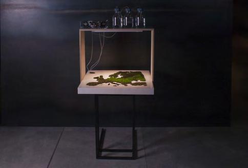
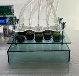
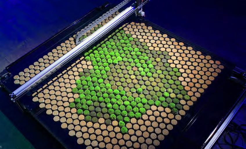
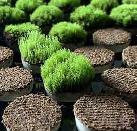
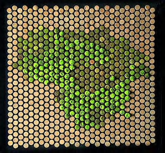
Project: BIOPRINTER. Data Expierence Design
Usually, data visualization reduces natural phenomena to basic geometric shapes. Due to this extreme simplification, a general audience may perceive expert-oriented data visualization as ‘boring’ or ‘lifeless’.
Taking up of experimental visualization of data was based on the idea that figures describing a phenomenon can hide not only a phenomenon’s features relevant to
Contact:
name: Sigitas Gužauskas
company/organisation: VDA
technical team: URGENT TOOLS
e-mail: sigitas@idente.lt
scientists or experts, but also eventful narratives, fascinating stories which are also interesting to the mass audience.
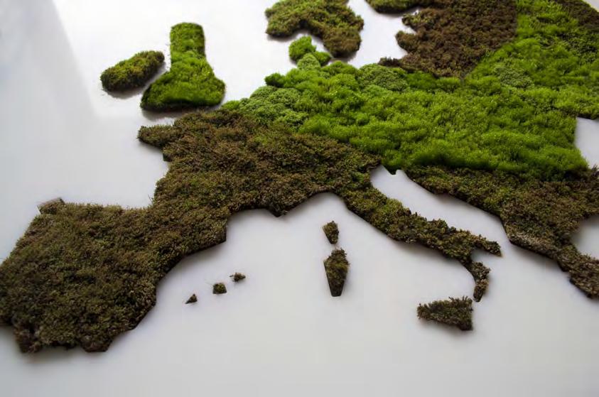
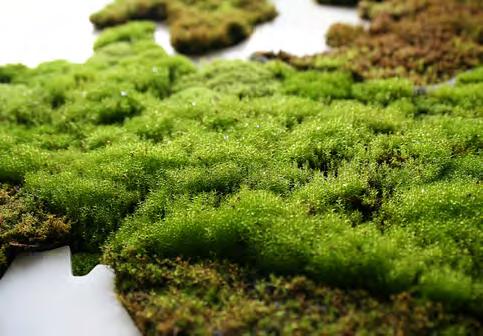
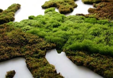
The BIOPRINTER project was based on the idea that figures describing a natural phenomenon can hide not only the phenomenon’s features relevant to experts, but also eventful narratives and fascinating stories that are interesting to a mass audience. The data chosen for the project describe a climate change scenario, specifically reflecting the future change in precipitation from 2071-2100 in the European continent and Lithuania.
To implement the project, an artificial ecosystem was created, using fire moss (Latin: Ceratodon purpureus) as a means of data expression. Moss was grown by controlling the amount of water and light, which correlated with data values. A local ecosystem caused the formation of a multi-colored surface map with different textures, where areas of moss of different appearances represented the values of rain data - droughts, floods, or usual climates.
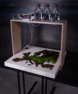
The project was developed in the context of the artistic research project “Explanatory Strategies in Information Design” (project supervisors prof. Aušra Lisauskiene and dr. Gintaute Žemaityte) conducted at Vilnius Academy of Arts, Lithuania.
This artistic research project aimed to expand the potential of perception of data or information through experimentation with different methods of expression. According to the research findings, incorporating an “experiential” layer onto “dry” data is an effective method for creating an informative experience that captures the interest of a broad audience and allows for a diverse range of interpretations.
The BIOPRINTER project can be understood as a communication channel creating conditions for a dialogue between the “faraway,” incomprehensible expert field and the mass audience. The project attempts to extend the facts provided by abstract data by adding a story that originates from them. This visual story returns the “lost” features of reality to phenomena that have been reduced to numerical values.
This is an attempt to realize the scenario of the environmental condition found in the data set. Rendering of data is realized as the creation of informational experience, i.e., formation of multi-layered grasp when rational perception is coordinated with sensory experiences, aesthetic and emotional experiences, or playful situations.
Sigitas Gužauskas is a practicing visual communication designer, lecturer at the Vilnius Academy of Arts and a design researcher based in Lithuania. In his practical work, he specializes in information design, exhibition design, creating information expierence objects for educational exhibitions, and commercial organizations. His research and practical field covers informational graphics and he is interested in images or objects that perform explanatory functions.

Category: Bachelor and Masters
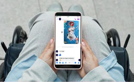
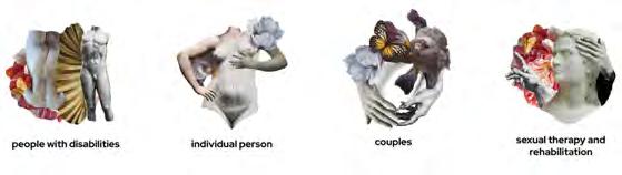
Project: TOTU / IT’S HERE a tool design supporting the identification of non-specific erogenous zones for people with peripheral sensetion disorder.
What was the challenge?
Everyone has sexuality and this sexuality is independent of disability. For all of us, it is associated with the need for intimacy, experiencing touch, intimacy, pleasure, and orgasm. These needs are not conditioned by whether we experience a disability or not. Despite this, many myths and stereotypes have arisen around the sexuality of people with disabilities. 1/3 of people with disabilities heard from someone that sexuality should not concern them and if they speak about sexuality it should only consist medical needs and informations.
The stigmatization of sexuality of people with disabilities has its origin in the perception of sexuality only as a genital sexual act. One of the problems behinde stereoptypes is that subject of the sexuality is perceived as a sensitive with many communication obstacles.
What was the solution?
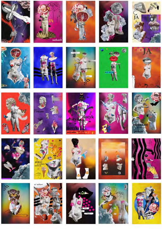
TOTU is body map and collage solution.

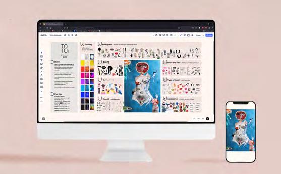
Searching for non-specific erogenous zones as a solution for stereotype that sexuality it’s only a genital sex act. Body mapping method – self-observation as a source of knowledge about one’s own sexuality. Collage as a accesable art method for communication and non-literal way speaking about sexuality. Collage and art methods creates staging to speak about sensitive subjects.
Contact:
Marta Jagoda-Błaszczak
Oliwia Michniewska
company/organisation: TOTU
e-mail:totu.kolaz@gmail.com
website: www.totustudio.eu
TOTU was implemented at the Academy of Fine Arts in Katowice in 2022. The work included the design of the tool, identification, service and implementation in cooperation with the Sekson Project.
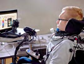
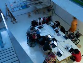
Implementation consisted workshops using TOTU, an exhibitions and an immersive space for society to talk about sexuality. TOTU is used by variouse groups of people and also in therapeutic work and during sexual rehabilitation. It is a universal design that is willingly used by diverse social groups including non disabled people willing to make their own collage, interested to see collages made by other people and learn more about what sexuality of disabled people really is.
80 collages made by people with diverse type of diasbilites
3 exhibitions
4 workshops
What was the challenge?
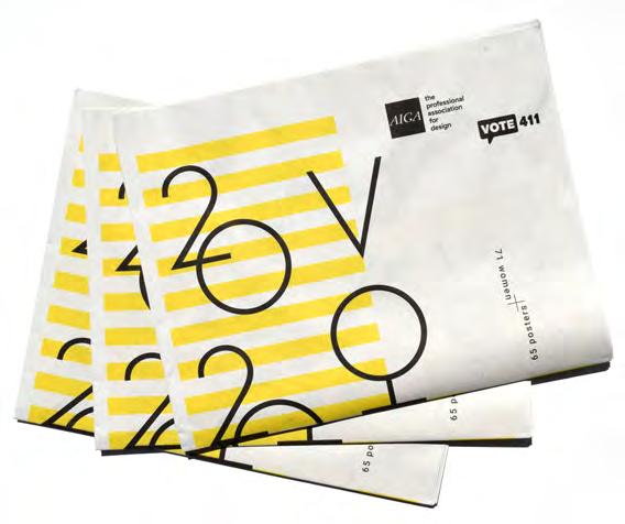
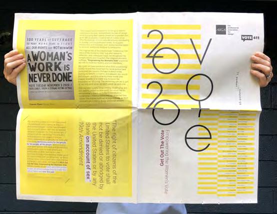
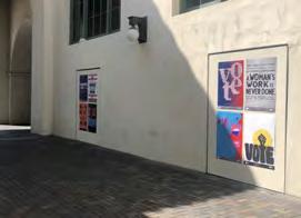
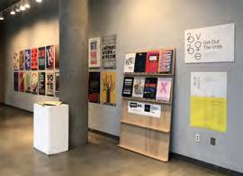
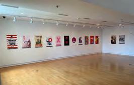
2020 marked the centennial of the ratification of the 19th Amendment, granting women in the United States the right to vote in 1920. Not until the passage of the Voting Rights Act in 1965 were voting rights of ALL women protected and enforced, and intimidation tactics progressively eliminated. This project was conceived as a historic opportunity to unify and celebrate women of design while focusing their talents toward the important civic goal of instigating voter participation
What was the solution?
Kelly Salchow MacArthur and Nancy Skolos partnered with AIGA and The League of Women Voters. A diverse list of invitees was developed in an effort to highlight women who are actively contributing to society and the profession today. To support mentorship and inclusion, each invitee had the option to invite an additional designer to participate. Extensive research led to a timeline delineating key moments in voting rights and women’s fight for equality.
What was the effect?
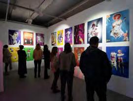
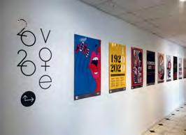
65 posters were created by 71 women, and made accessible for free download, printing, and distribution on aiga.org/vote. This poster initiative sparked over 100 additional contributions through the website. The collection was further disseminated through the catalog in newspaper format, 9 public-facing exhibitions across the country, and over 15 webinars and articles that included discussion of women’s rights, diversity, and community engagement.
Contact:
name: Kelly Salchow MacArthur
company/organisation: Michigan State Univ
e-mail: salchow@msu.edu
website: elevatedesign.org


What was the challenge?

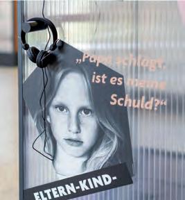
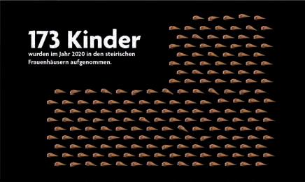
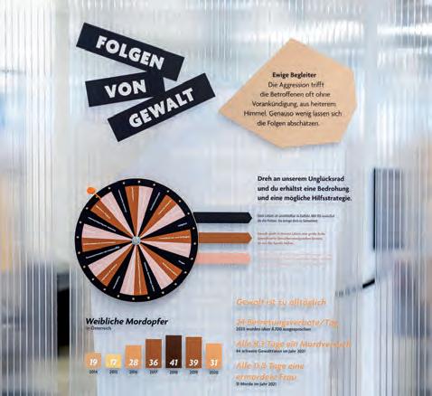
The challenge was to address the taboo topic „violence in relationships“, while presenting extreme situations of violence in a sensivite manner. There were various forms of violence to be covered, and the challenge was to help visitors empathize with the victims and make the topic relevant and accessible to as many people as possible.
What was the solution?
The travelling exhibition “Gewaltschutz on tour” for “Verein Frauenhäuser Steiermark” consists of 7 thematic pillars revolving around the topic of violence. A central “spiral of violence” highlights the impact of aggressive behavior and provides multiple interactive stations for visitors to engage with. The design was made to be lightweight, transparent and portable, with a focus on stability. Soft color and translucent material choices play with (in-) visability and set a contrast to the “hard” content. Furthermore, the exhibition gave visitors the opportunity to gain a deeper understanding of the topic through stalking dialogues and a virtual reality headset.
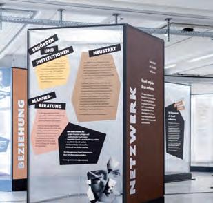
What was the effect?
Many visitors – especially school groups –visited the exhibition at its seven locations, breaking down the taboo of violence in families and leading to increased awareness of support services in the region. The visitors learned more about the different types of aggressive behavior at interactive stations and also shared personal experiences in the exhibition.
Photography:Salon Deluxe
Contact: Stefanie Schöffmann look! design office@look-design.at www.look-design.at

“Gewaltschutz on
What was the challenge?
Cultural Fire Credits is an initiative by the Firesticks Alliance Indigenous Corporation and the Aboriginal Carbon Foundation supporting Indigenous-led projects and providing pathways for Aboriginal communities to utilise traditional land management practices to heal, protect and manage the Country. For information designers practicing as allies, advocates and activists for Indigenous communities the decolonisation of design practices is the key challenge
What was the solution?
The co-design of the brand mark, knowledge triangle and visual language to communicate the philosophy and guidelines of the Indigenous designed and led cultural fire credits, the partnership between Firesticks Alliance and the Aboriginal Carbon Foundation, the implementation and assessment of the cultural fire credits, the principles of the mentoring program and the Indigenous governance processes. https://drive.google.com/file/d/1Kfv5zhodd u5AJYmRvpC3gYs5VpSE5pvR/view
What was the effect?
The brand mark, the knowledge triangle and the visual language are co-designed as a visual foundation for ongoing programs. The information design was informed by Indigenous-led protocols and guided by principles of respect and reciprocity. The decolonising practices of the information designer include deep listening and iterative consultations in collaboration practices to ensure the processes of translation and interpretation foreground Indigenous self-determination and sovereignty.
Contact:
Dr Jacqueline Gothe
University of Technology Sydney Jacqueline.Gothe@uts.edu.au firesticks.org.au/cultural-fire-credits/
Project: Working with First Nations Peoples: Co-designing a visual language.WADAWURRUNG COUNTRY, VICTORIAN WOMENS’ FIRESTICKS (WIYN KALKKALK), APRIL 2022, PHOTO CREDIT T J GARVIE PHOTOGRAPHY Acknowledgements support respectful representation and include recognition of Country, description of gathering and date, participants and their community, and credit for the photographer. Prior and informed consent is negotiated for all images and descriptions.
What was the challenge?
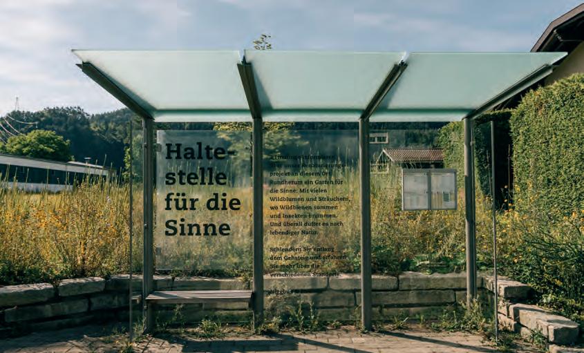
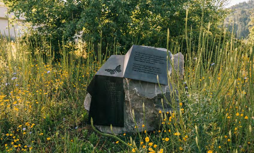
Our assignment was to design information about a renaturalisation project adjoining a bus stop.
What was the solution?
A text in large lettering placed on the bus shelter is introducing the project and three rocks are providing more information about the natural garden and its inhabitants. Sensitive texts as well as abstractly illustrated plants and animals are incorporated into metal sheets, that seem to be folded casually over the three boulders. Their calm and lightness resonate respectfully with the atmosphere of the surrounding.
What was the effect?
“This place is teeming with life. Every time you look around you discover something new.” (Niggbus director Alfred Herburger).
In the course of a renaturalisation project, thousands of rare, native plants and shrubs have been planted on the company grounds – a natural paradise for wild bees, butterflies and endangered insects. Thus the adjoining “Churer Straße” is probably Vorarlbergs most species-rich and bestsmelling bus stop.
Contact:
name: Sigi Ramoser, Birgit Kappler
company/organisation: Sägenvier DesignKommunikation
e-mail: ramoser@saegenvier.at
website: saegenvier.at
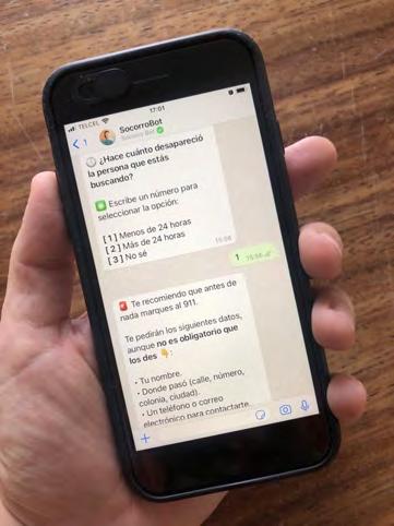
information on what to do when facing a disappearance: where to ask for help? how to report it? where and how to start the search? Organizations and collectives of victims’ relatives point out that in practically all cases essential time for the search was lost due to lack of information, despite the fact that the immediate search is essential to locate people alive and constitutes an obligation of the authorities according to the General Law on Disappearances and the Guiding Principles for the Search for Persons of the Committee against Enforced Disappearances of the United Nations.
In recent years various organizations or institutions have developed written manuals as guides to deal with a disappearance. However, they are not widely known and may not always be the right tool for those who are in the process of searching for a family member.
1. Age (if the person is a minor or of legal age)
2. Gender
3. The temporality of their disappearance (the first 24 hours or indefinite time)
4. The presumed perpetrators of the crime (in case of enforced disappearance)
5. The geographical place where it occurred
6. Migratory status
7. The geographical location of the person reporting
It includes recommendations for the search and contacts of social organizations or collectives of relatives in the region that can accompany you in the process.
In Mexico, since 2006, at least 94,000 people have disappeared for different reasons: organized crime, drug and human trafficking, gender-based violence, enforced disappearances committed by the state, groups exploiting migrants in transit through the country, among others.
Despite the fact that in 2019 an average of 43 people disappeared every day in Mexico, there is a lack of public
Contact:
name: Yosune Chamizo Alberro
organisation: Independent consultant
e-mail: yosunechamizoalberro@gmail.com
website: twitter.com/_Yosune
Disappearances in Mexico, as determined by the UN Committee on Enforced Disappearances and various international organizations, are massive, systematic and unceasing.
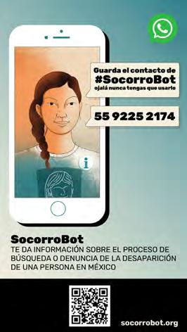
Facilitate access to essential information on the search and reporting process to relatives of missing persons through a WhatsApp chatbot.
SocorroBot offers a guide for those who need information on what to do when a person goes missing in Mexican territory, what resources they can count on for the search, what protocols the authority must follow, what their rights are as relatives and, even, what documentation will facilitate the report according to:
To build the conversational flow, an interdisciplinary team with information designers, journalists, developers, product designers, data analysts and grassroots activists held sessions to design the information architecture, technology and digital infrastructure. The design prioritized:
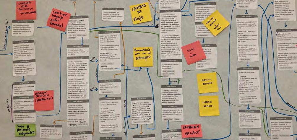
— Providing accurate, timely and useful information according to the case

— Safeguarding the user’s identity and personal data, since relatives of missing people in Mexico are usually subject to extortion and blackmail
— The sustainability of the project in the long term: WA chatbots can be very expensive, since the cost depends on the amount of messages sent and received
The design of the character Socorro (a common name for women in Mexico that also translates as “help”) was essential for people to recognize and remember the project. The character represented the thousands of mothers that have gone through the process of looking for their loved ones. The graphic identity uses warm but serious colors.
We chose WhatsApp because it is used by 77 million people in Mexico and many
telephone companies offer plans with unlimited access to this application. Additionally, we built a web platform to expand the reach of the project.
It was very important to design a communication strategy that included the adoption of the tool by collectives of family members looking for their loved ones, so that they could recommend it themselves. We also planned and delivered workshops at a local level to get feedback on UX and present the project itself.
The slogan for the campaign was: Save #SocorroBot’s contact, we hope you never have to use it: +52 55 9225 2174
The project was launched on September 29th, 2022. Since then, the chatbot has
had 1,315 users. This means that a daily average of 6.5 people uses the tool. Considering that in february 2023 an average of 16 people disappear a day, this represents 41% of potential cases. We cannot know particulars about each case because the tool was designed to prevent the collection of personal data both from the person who disappeared as well as the one who is reporting.
Our project was featured in over 100 media outlets (television, newspapers, radio and digital).
SocorroBot was developed on a voluntary basis throughout 2 years, in the middle of the Covid-19 pandemic. After that, the project received the 2022-2023 Canada Fund for Local Initiatives in Mexico to help develop the local workshop and communication campaign.
SocorroBot team:
Independent consultant: Yosune Chamizo Alberro


What was the challenge?
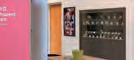
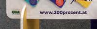
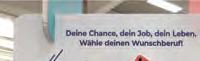
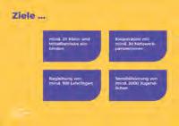
Gender roles and the associated career images persist stubbornly in many minds. The “200 Percent Opportunities” initiative aimed to counteract this. The focus was on professions that are still typically associated with one gender and have a gender ratio of 70:30 or even more extreme. The goal was to open eyes, broaden perspectives, and encourage thinking differently –both for young people and for companies.

What was the solution?
The starting point for the vocational orientation of young people should no longer be predetermined thought patterns, but rather their personal interests and abilities. The design and wording of the brand identity are aimed equally at young people and companies. Bright colors, multi-layered collages and a loose typography give the project an all-round youthful overall image. Far from typical gender roles, 200 Percent Opportunities highlights career opportunities for young people and focuses on companies that have already thought outside the box. With this new perspective, young
people can discover professions that were previously “reserved” for the opposite sex. To reach young people, a cardboard display stand was developed and placed in schools. The displays are equipped with take-away-cards that show career opportunities at nearby companies.
What was the effect?

So far, the project has motivated numerous companies to change their communication and to address both sexes more consciously. An online presence provides information about the initiative and the participating companies. The displays have already been set up in several schools and have been able to show numerous young people more opportunities in their career choice.
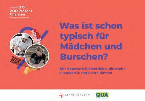
Contact: Stefanie Schöffmann look! design office@look-design.at www.look-design.at


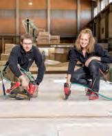
DU AUS DEM RICHTIGEN HOLZ? Du hast die Wahl zwischen vier Lehrberufen, die allesamt eine aussichtsreiche Zukunft versprechen. Die Aufgabengebiete sind enorm vielfältig – genauso wie die Kenntnisse, die dir vermittelt werden. Spätestens nach 3-4 Jahren Lehrzeit bist du Profi auf deinem Gebiet. Wir sind uns sicher: Du bist aus dem richtigen Holz geschnitzt. Benefits für Lehrlinge Führerschein B bei erfolgreich abgeschlossener Lehrabschlussprüfung Individuelle Weiterbildungen Gratis Tablet zu Beginn deiner Lehrzeit Diverse Karrieremöglichkeiten nach Lehrzeitende Gesundheitsleistungen (wie z. B. Chairmassage, Betriebsarzt, …) Möglichkeit zur Lehre mit Matura Uvm. Lehrberufe Fertigteilhausbau Zimmerei Zimmereitechnik Bautechnische

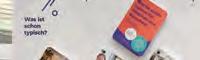
“What is typical for girls and boys?” is written large on the colorful “200 Percent Opportunities” cardboard displays that are set up in schools. The students can take the cards with them to occupations. The cardboard display is very light, easy to transport and quick to set up.


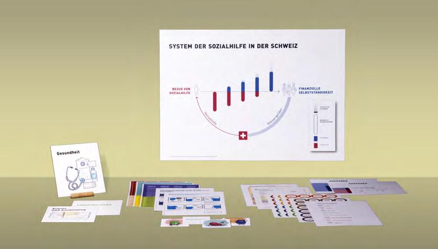
What was the challenge?


Communication in the context of social welfare is very challenging: A great variety of complex procedures need to be explained to a wide variety of clients who find themselves in a situation of great distress. Social workers have to attend to many cases, which leaves them with very limited time for each client, while the processes they have to explain are complex and heterogeneous in terminology and procedures.
In this complex situation, much time is invested in repeatedly explaining the same


processes. Well-informed and precise explanations could facilitate this process considerably, especially if they use visual communication strategies.
Our research project “Durchblick –Visual Communication in Social Welfare” aimed to analyze this situation in detail and provide solutions to support social workers’ practices in Switzerland.


The project is based at the FHNW University of Applied Sciences and Arts
Northwestern Switzerland and is funded by the Christoph Merian Stiftung.


ausfüllen und zurückschicken ausfüllen und zurückschicken zurückschicken ausfüllen und zurückschicken ausfüllen und zurückschicken zurückschicken ausfüllen und zurückschicken ausfüllen und zurückschicken zurückschicken ausfüllen und zurückschicken
ausfüllen und zurückschicken zurückschicken ausfüllen und zurückschicken ausfüllen und zurückschicken zurückschicken ausfüllen und zurückschicken ausfüllen und zurückschicken zurückschicken
ausfüllen und zurückschicken
ausfüllen und zurückschicken
ausfüllen und zurückschicken
What was the solution?
In the first phase, through interviews with social workers and clients, and observations gathered from shadowing their meetings, we determined the most common communication problems they face in their exchanges and discussed our findings with them.
In the second phase, we started an iterative design process. We gathered feedback on early-stage sketches and variants in group discussions and implemented our insights into the design of more detailed
ausfüllen und zurückschicken zurückschicken
ausfüllen und zurückschicken zurückschicken
ausfüllen und zurückschicken zurückschicken
ausfüllen und zurückschicken zurückschicken ausfüllen und zurückschicken ausfüllen und zurückschicken zurückschicken ausfüllen und zurückschicken ausfüllen und zurückschicken zurückschicken ausfüllen und zurückschicken ausfüllen und zurückschicken zurückschicken ausfüllen und zurückschicken ausfüllen und zurückschicken zurückschicken ausfüllen und zurückschicken ausfüllen und zurückschicken zurückschicken ausfüllen und zurückschicken ausfüllen und zurückschicken zurückschicken
ausfüllen und zurückschicken
40 sets with a variety of visual aids to the Stadt and Dietikon, who then tested them in their daily practice. Finally, we collected on the prototypes through questionnaires, group discussions, and one-by-one interviews. The findings of the last feedback allowed us to revise some final details of the prototypes and successfully complete them.


Adressänderung vornehmen
Adressänderung vornehmen
Adressänderung vornehmen
Adressänderung vornehmen
Adressänderung vornehmen
Adressänderung vornehmen
Adressänderung
ausfüllen und zurückschicken
ausfüllen und zurückschicken
ausfüllen und zurückschicken
ausfüllen und zurückschicken
ausfüllen und zurückschicken
ausfüllen und zurückschicken
ausfüllen und zurückschicken
ausfüllen und zurückschicken
ausfüllen und zurückschicken
ausfüllen und zurückschicken
ausfüllen und zurückschicken
ausfüllen und zurückschicken
ausfüllen und zurückschicken
ausfüllen und zurückschicken
ausfüllen und zurückschicken
ausfüllen und zurückschicken
Adressänderung vornehmen
Adressänderung vornehmen
Adressänderung vornehmen
Adressänderung vornehmen
Adressänderung vornehmen
Adressänderung vornehmen
Adressänderung vornehmen
Adressänderung vornehmen
Adressänderung vornehmen
Adressänderung vornehmen
Adressänderung vornehmen Adressänderung
Adressänderung vornehmen
Adressänderung vornehmen
Adressänderung vornehmen
Adressänderung vornehmen
Adressänderung vornehmen
Adressänderung vornehmen
Adressänderung vornehmen
Adressänderung vornehmen
Adressänderung vornehmen
Adressänderung vornehmen
What was the effect?
The participating social workers have
sorgfältig aufbewahren sorgfältig aufbewahren sorgfältig aufbewahren sorgfältig aufbewahren
sorgfältig aufbewahren sorgfältig aufbewahren sorgfältig aufbewahren sorgfältig aufbewahren
sorgfältig aufbewahren sorgfältig aufbewahren sorgfältig aufbewahren sorgfältig aufbewahren
sorgfältig aufbewahren sorgfältig aufbewahren sorgfältig aufbewahren sorgfältig aufbewahren
sorgfältig aufbewahren sorgfältig aufbewahren sorgfältig aufbewahren sorgfältig aufbewahren
sorgfältig aufbewahren sorgfältig aufbewahren sorgfältig aufbewahren sorgfältig aufbewahren
sorgfältig aufbewahren sorgfältig aufbewahren sorgfältig aufbewahren sorgfältig aufbewahren
sorgfältig aufbewahren sorgfältig aufbewahren sorgfältig aufbewahren sorgfältig aufbewahren
sorgfältig aufbewahren sorgfältig aufbewahren sorgfältig aufbewahren sorgfältig aufbewahren
sorgfältig aufbewahren sorgfältig aufbewahren sorgfältig aufbewahren sorgfältig aufbewahren
sorgfältig aufbewahren sorgfältig aufbewahren sorgfältig aufbewahren sorgfältig aufbewahren
sorgfältig aufbewahren sorgfältig aufbewahren sorgfältig aufbewahren sorgfältig aufbewahren
sorgfältig aufbewahren sorgfältig aufbewahren sorgfältig aufbewahren sorgfältig aufbewahren
sorgfältig aufbewahren sorgfältig aufbewahren sorgfältig aufbewahren sorgfältig aufbewahren
sorgfältig aufbewahren sorgfältig aufbewahren sorgfältig aufbewahren sorgfältig aufbewahren
sorgfältig aufbewahren sorgfältig aufbewahren sorgfältig aufbewahren sorgfältig aufbewahren
The resulting set of visual aids of this research will be published and distributed by SKOS (Swiss Conference of Welfare Organizations) to ensure that all interested persons can access them at a production-cost price. They should be available for purchase or download from Autumn 2023 on their website and under www.mehrdurchblick.ch.
Leistungsabrechnung
Was muss ich machen, wenn ich eine Leistungsabrechnung von der Krankenkasse bekomme?
Was muss ich machen, wenn ich bekomme?eineArztrechnung
Contact:
Research team: Paloma López Grüninger (HGK), Anne Parpan-Blaser (HSA), Christoph Imhof (HSA).
Die Rechnung
Leistungsabrechnung an den Sozialdienst.
1. beimIchwarkrankunddeswegen ArztoderderÄrztin. WennichFragenhabe,wendeichmich andenSozialarbeiter,andieSozialarbeiterin.
3. Bald danach bekomme ich Post von der Krankenkasse. Darin ist Leistungsabrechnung mit Rückforderung (Rechnung) Selbstbehalt und Nichpflichtleistungen und Nichtpflichtmedikamente.
4. Ich bezahle die Rechnung Zahlungsbeleg
Design: Paloma López Grüninger and students of the MA “Visual Communication and Iconic Research” (HGK).
Zahlungsbeleg
diese Kosten bezahle ich.
WennichFragenhabe,wendeichmich andenSozialarbeiter,andieSozialarbeiterin.
1. Ich war krank oder bin verunfallt und war beim Arzt oder derÄrztin,imSpitaloder ich habe ein rezeptpflichtiges Medikament in der Apotheke bezogen.
2. Ich einebekommeArztrechnung und einen Rückforderungsbeleg odergleichinderPraxisdanachperPost.
Organisation: Academy of Art and Design


Basel HGK FHNW (Institute Digital Communication Environments) and School of Social Work HSA FHNW (Institute for Integration and Participation).
E-mail: paloma.lopez@fhnw.ch
Website: www.mehrdurchblick.ch
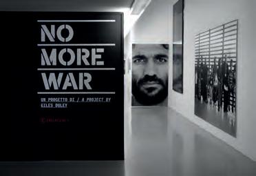
“No more war” is a retrospective of Giles Duley’s work in collaboration with EMERGENCY documenting the stories of civilian casualties in Afghanistan and Iraq, set to open at the Palazzo dei Musei in Reggio Emilia in 2022.
It is the personal narrative of this photographer who for decades has chronicled and experienced the impact of war on his own skin, so much so that he was seriously injured by an explosive device. Kabul 2012, Mosul 2017, Kabul 2021 chronicle Duley’s journey through photographs and words from his diary, words written shortly before the Taliban took the city. The exhibition features the works of other artists-Duley supports the contamination of different artistic languages through his VENT platform, where he encourages other artists to rework his photographs, to keep the stories of those he has photographed alive. The design challenge was to find a way to let each story, each face, find its space, make its voice heard to ask in unison: no more war.
Contact:
name: studio +fortuna
company/organisation: EMERGENCY
e-mail: paola@piufortuna.it
website: www.emergency.it / www.piufortuna.it
The exhibition aims to create an immersive narrative, in which the visitor can delve into the stories of Afghan and Iraqi civilians through the photographer’s words, his powerful photographs, those of Emma Francis, the video in collaboration with Massive Attack, and the works of Sibomana and Christina Balit: artistic contaminations, different elements that interpenetrate and unite in space, reinforcing each other. “No more war” offers itself as a means of knowledge and reflection. It generates a dialogue between the exhibitor and the observer. It becomes a fundamental tool for understanding this universal story.
After visiting the exhibition, the Afghan and Iraqi reality is no longer a distant story, but an urgent and concrete problem that demands a solution. If in the continuous wars that have occupied these countries for years, it is always civilians who are affected, we need to find a way to say enough is enough, not to pander to this situation, and we can do this by starting with an exhibition, because “art cannot change the world, but it has the power to inspire those who can.”
 Duley)
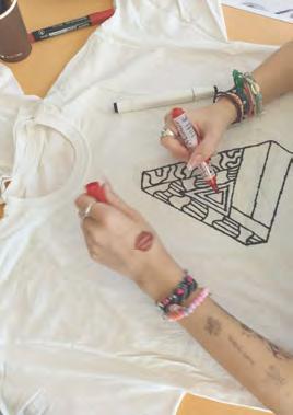
The number of teenagers with mental health problems is on the rise worldwide and also in Latvia. Medical help is provided individually and also in clinics, where different types of games and activities are offered between treatments and lessons. However, it’s crucial to provide them with activities that are not only suitable for their age but also allow them to express themselves in a meaningful way, and can be continued at home. The challenge lied in transforming them from passive or overly active patients into creative individuals. Moreover, our goal was to promote social interactions, which can be tremendously helpful in managing mental health issues.
Together with the teenage patients of the Children’s Clinical University Hospital we conducted several co-creation workshops on fashion design. We investigated the significance of personal style in fashion and ways to promote sustainable fashion practices to shape their identity without spending money.
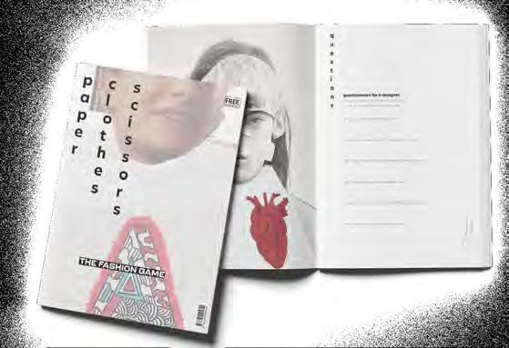
Our result is the card game “Paper, Clothes, Scissors”. The game consists of four decks - for whom, interview, what, and materials. Each player receives one card from each deck, which creates a design challenge:
for whom: This card defines who the player should create something for. This could be, for example, a friend or an employee of the hospital.
interview: The first step is to conduct an interview with the person the player is designing for. This card indicates which role the player takes on and which of the pre-made questionnaires they should use. For example, they could act as an ecofashion journalist.
what: Should the result be a collage, a drawing, or a wearable garment? This card provides insight.
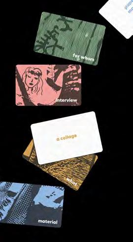
materials: Of course, it is also important what the work should be made of. For example, from paper and magazines or from fabric scraps?
The design of the cards is inspired by the creations from the workshops. In addition to the deck, a game manual was created, which is designed to resemble a fashion magazine
During the workshops, the teenagers designed for themselves and one another, taking into account each other’s preferences. By interviewing and creating designs for someone else, the teenagers had to open up and put themselves in another person’s shoes, fostering empathy and a caring environment.


The hospital staff took part in cocreation workshops and was afterwards provided with the game cards, materials, and instructions, including the interview guides, allowing them to easily facilitate the game in the future. Blank cards from each deck were also provided, enabling customization with new ideas.
This project was developed in collaboration between the Art Academy of Latvia and the Children’s Clinical University Hospital.
Contact: Denise Eder, Ulla Ozollapa, Zaiga Brutane Art Academy of Latvia deniseeder@gmx.at ulla.ozollapa@gmail.com
zaigabrutane@live.co.uk
https://www.lma.lv/en
What was the challenge?
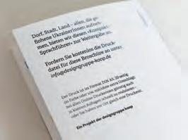
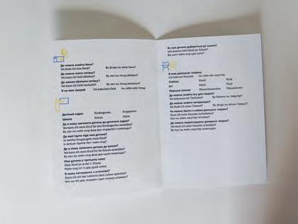
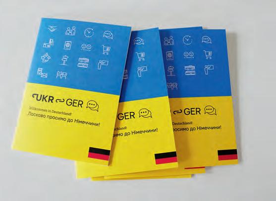
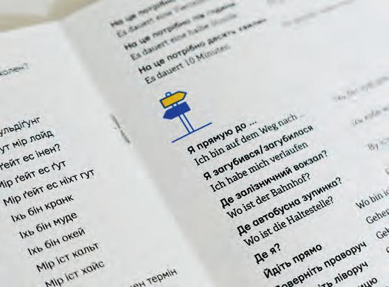
As a result of Russia’s war against Ukraine, a large number of refugees came to Germany in a short time – and as it is well known, the language barrier is one of the first and biggest hurdles in practically everything. And you also have to introduce yourself: Even if you are physically safe, it is scary to be in a place where you don’t understand a single word.
What was the solution?
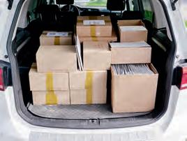
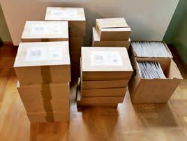
Together with Yurko and his sister Zoryana Gutsulyak, our Ukrainian friends and colleagues, we wanted to develop a short phrasebook. In addition to German and English, it should especially present pronunciation of German in Ukrainian; this is broken down into meaningful subject areas. We had 2,500 booklets printed and sent them to 100 municipalities in Bavaria – with the offer to make the print file available free of charge so that the relevant departments could have the necessary quantity themselves. This was picked up by the media and then published on many channels.
What was the effect?
We received a lot of requests for the brochure and the (digital) print data – and a lot of positive feedback (even from the Bavarian Minister of the Interior). In addition to the printed booklets, the data has already been requested and sent around 200 times. To institutions, schools, offices, groups of helpers …
Contact:
name: Andreas Koop
company/organisation: designgruppe koop
e-mail: a.koop@designgruppe-koop.de website: www.designgruppe-koop.de
Video conference with Yurko and Zoryana Gutsulyak (currently in Toronto and New York respectively) to discuss how to proceed. . .
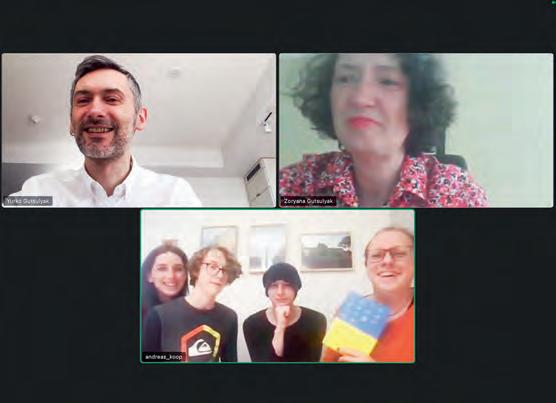
below Nadine and Andreas with Mika and Luca who helped with the translation (on the right Emil who crushed the boxes!-)
Project:
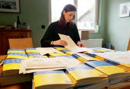
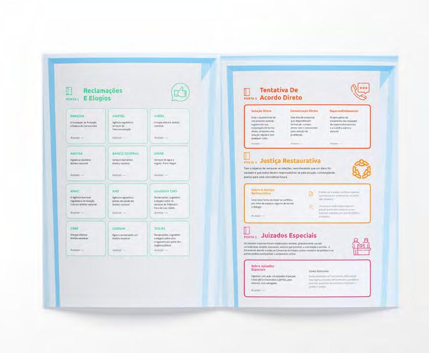
As a very large jurisdiction, both in geographic size as in litigation volume, Brazil’s judicial system can be very hard to navigate. Lawyers themselves struggle at times to find the proper channels and documents needed for different situations.
In this overcomplicated system, while experts have a bit of a hard time, the general public faces huge accessibility issues. Law is a complex enough matter alone. Combining that with a geographically large country and a large volume of different procedures means skyrocketing the level of complexity that prevents the general public from understanding, navigating and ultimately accessing the legal system.
Villa was challenged with the creation of a solution that could guarantee access to justice by making better legal knowledge and information more comprehensive and easier for the general public to navigate.
In light of that, in a collaboration between Villa and a local court, the idea of this multidoor informative system came to life. This project gathers up court informations from several different fields of law such as criminal, civil, and many more, and compiles it in a single document that is easily accessed by the general public.
The aim was to creat a material that would serve as both an informative guide as well as a better navigation path for those in need of judicial services and answers. That solution proposes to decompress the courts by providing a self-guided information book to those who previously would spend hours on the phone or walking around courts looking for answers on legal issues, while at the same time serving as a navigation manual of the legal system itself alongside its many related documents.

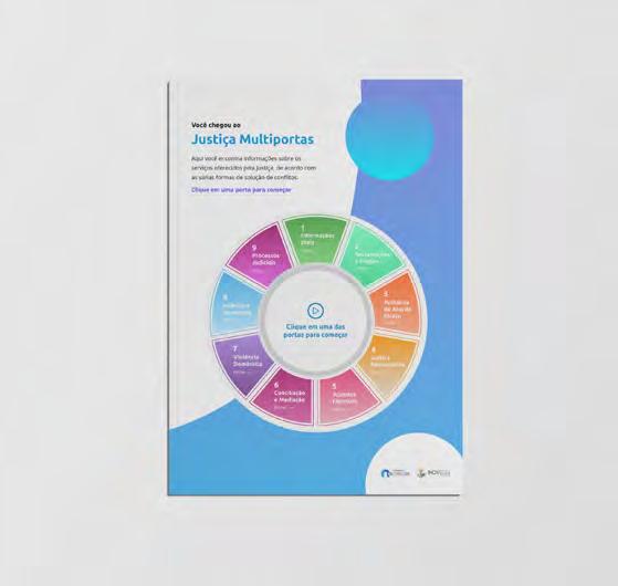
Multi-door Court: improving judicial system’s navigability and information clarity as means for accessibility and fairness
For the public this project means a huge improvement in accessibility. There is no longer a need to go to a courthouse and walk through many different spaces looking for the right place to talk about a specific issue. More than that, most issues can be easily address just by the answers provided and documents linked to the final project.
For the court it means decompressing its staff by sorting and resolving most questions before even needing the guidance and knowledge previously monopolized by its personal or spread around too many different web locations that made it almost impossible for the public to find answers alone.The Multi-door project is accessibility. Fairness. Justice.
Contact: Kethellyn Siqueira
Villa - Visual Law Studio
e-mail: info@visuallaw.design
website: visuallaw.design
Category: Healthcare

What was the challenge?
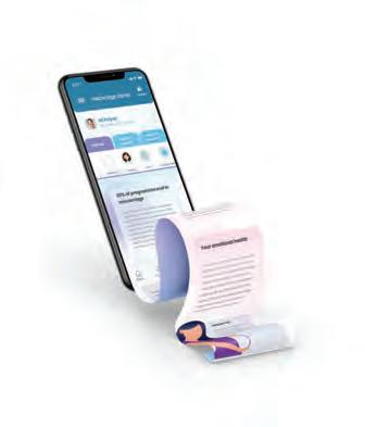
Miscarriage is the most common pregnancy complication affecting one in four pregnancies. The loss of a baby can seriously impact a woman’s physical and mental health, leading to anxiety, depression, anger, selfblame, and self-harm. Women who receive support after their miscarriage are more likely to manage their mental health well. Despite this, research shows that many women do not have access to the support they need after a miscarriage. Immigrant women have more difficulties accessing support due to communication barriers, cultural barriers, differences in their religion compared to their host country, and living far from family and support networks. The objective of this research is to:
1. Understand the current process in which women receive physical and emotional support after a miscarriage.
2. Identify the areas that lack support for women experiencing a miscarriage.
3. Design a digital health solution/ digital information platform to provide further support for women who experience a miscarriage.
What was the solution?
The goal of this project is to explore the ways technology could promote accessibility and usability for immigrant women after experiencing a miscarriage.
Semi-structured interviews were conducted with experts in the fields of obstetrics/ gynecology, psychology, grief counselling, and user experience design to better understand 1) The challenges women experience after having a miscarriage, 2) How immigrants’ experience with miscarriage is different from the Canadian experience, and 3) How the design of an application could help women better manage their health physically and mentally after having a miscarriage.
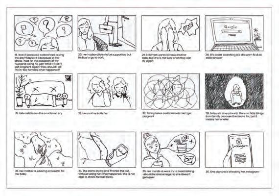
In this research, a series of user-centred design approaches (including storyboards, user personas, co-design session and user testing) were employed to ensure the enduser is involved in the process of designing
the application. A participatory approach was chosen to bring healthcare professionals in different fields with a vested interest in miscarriage together to design a digital solution for immigrant women.
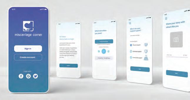
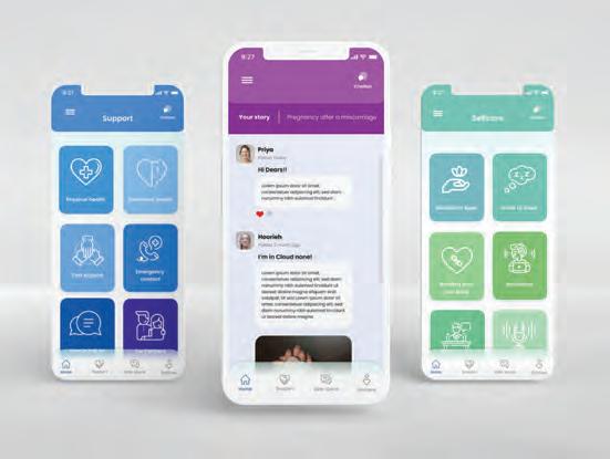
The co-design session helped me identify some of the problems that immigrant women face after a miscarriage and the ideas and solutions for solving the stated problems.The data analysis from the interviews, analysis of existing miscarriage applications, co-design session with experts and literature review were employed to design and develop a mobile application called Miscarriage Corner. The application aims to support immigrant women through their healing journey after a miscarriage. This research project explores the potential benefits of employing technology to improve the accessibility and usability of a mobile application to provide a support system for immigrant women who have had a miscarriage.
Going through a miscarriage can be a painful and challenging experience that can bring up feelings of resentment, anger, self-hate, etc. This project presents the potential for technology—through an mHeath application—in providing physical and emotional support for immigrant women who have experienced a miscarriage. Creating a platform that can offer women a community of other women who have experienced a similar situation can be both supportive and empowering. The application “Miscarriage Corner” aims to design an easy to navigate informative platform to create a satisfying user experience for women with different needs through their miscarriage experience.
In this project the physical and emotional needs, frustrations and challenges that immigrant women experience during and after their miscarriage has been investigated and used to create a customized experience for this population. The project explores the possible solutions and design recommendations for creating a more holistic and accessible support system for immigrant women experiencing a miscarriage and empowers them with knowledge and information they may need for their healing. Further research and testing on possible solutions for women experiencing a miscarriage is crucial to create a better experience through this vulnerable time, which will help them through their healing process.
Contact:
name: Mehrnoush Zeidabadi, Gillian Harvey company/organisation: DHRIL
(Design x Health Research Innovation Lab, University of Alberta)
e-mail: zeidabad@ualberta.ca

The CwPAMS toolkit outlines strategies and projects that a healthcare organisation could implement as part of an Antimicrobial Stewardship workplan and gives case study examples of the CwPAMS projects. The client requested a report-style document. They had an idea of the genre, and were aware of the need to make the information accessible to readers, and to create a document oriented towards action.


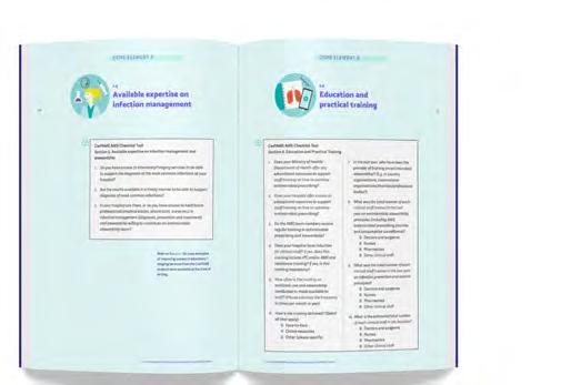
Coherence was sought at the macro level to make sure that the structure shows the relation between the topics. The idea was to use design to make the structure evident for the reader – hence easy to use.
Symbols from infographics function as visual landmarks to help find corresponding sections


Visual summaries outline important elements of the toolkit.
Under a reader-centred perspective, the document was organised and designed to follow these main organising principles:
› Reorganising of structure: creating boundaries to help navigation. We separated the document into 3 parts to organise the content: groundwork sections (part 1), core elements (part 2) and the final sections (part 3).
›Chunking: the toolkit is composed of 7 core elements. We used illustrations, colour and visible headings to make the core elements easy to find.
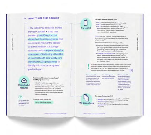
›Infographics to incorporate image content and create motivation to read, plus visual summaries of important elements of the toolkit.
›Symbols from infographics to function as visual landmarks to help find corresponding sections.
›Explain the internal logic of the toolkit: design-led re-writing of the section ‘how to use this toolkit’
Double page spread ‘How to use this toolkit’
Contact:
name: Josefina Bravo
company/organisation: University of Reading
e-mail: j.bravo@reading.ac.uk
www.behance.net/josefinabravo/projects
commonwealthpharmacy.org/cwpams-toolkit/
Category: Healthcare
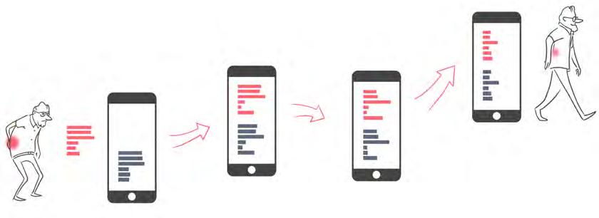
Project: Artificial intelligence in medical research
What was the challenge?
Many medical research projects and treatments now use machine learning and artificial intelligence. However, these projects can be complex to explain to patients. Patients are also only willing to participate in a research project if they understand the basic concepts.
What was the solution?
We made infographic explainer videos for two different research projects that used machine learning in diagnosing and treating patients:
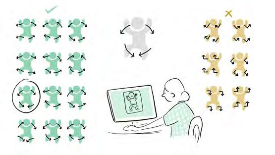
1. In-Motion is a research project developing methods to detect cerebral palsy (CP) in infants by analyzing movement patterns. Early diagnosis
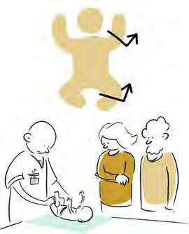
is essential, so treatment to optimize function and prevent complications can be started while the infant’s brain has optimal plasticity.
2. SelfBACK is a research-based app that uses artificial intelligence to give tailored advice and feedback to people with back pain.
What was the effect?
The machine learning principles were explained visually to people with no background in medical statistics. This made it easier for potential participants to understand the research project better before deciding to participate.
Contact: name: Randi Hals Hellevik and Alf Inge Hellevik
company: Hellevik Studio
e-mail: post@hellevikstudio.no
website: www.hellevikstudio.no
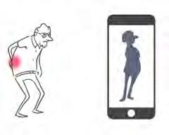
Category: Healthcare
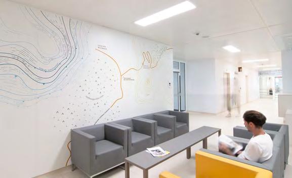
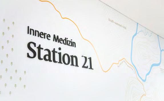
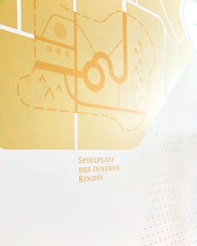
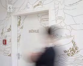
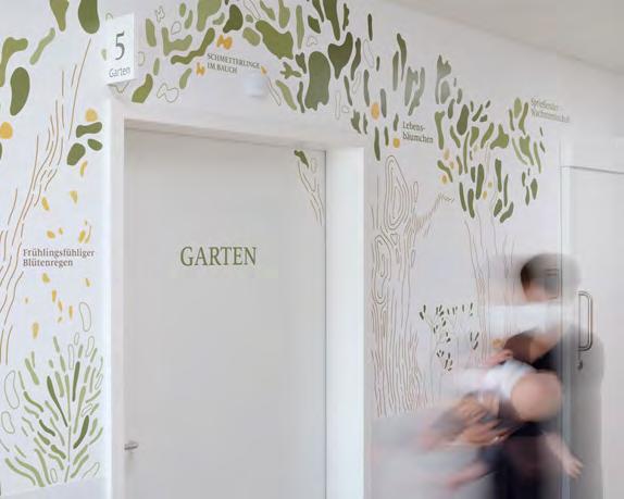
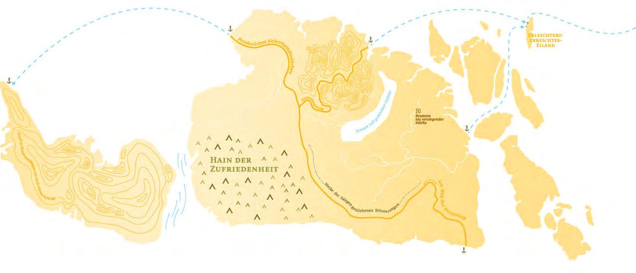
What was the challenge?
Even the initial discussion on the comprehensive renovation & new construction of the St. Joseph Hospital made it clear: this is not just about functional wayfinding to defined destinations. Rather, the popular clinic wanted welcome patients and visitors very personally in the often challenging and exceptional situation of the hospital. The Christian values of care and attention had to become directly perceptible in the space.
What was the solution?
It quickly became clear that the solution lay beyond functional wayshowing. In addition to the clear guidance system, we developed “maps of empathy”. They vary from area to area, the invented places address fears, desires and doubts - emotional, thoughtful or also very personal with discreet humour – via playful metaphors. Especially in waiting areas, where there is too much time to think, the eyes glide over the walls with the many details and bring other, liberating thoughts into play.
What was the effect?
The maternity ward in St. Joseph is fully booked for months to come because of its good reputation. With our thematically oriented design in the corridors and rooms, this effect was reinforced. The staff members in the building constantly report from patients and visitors who talk to them about the wall design, which is unusual for a clinic and touches them personally. This effect also radiates inwards. The employees identify even more strongly with the house through the positive feedback.
Contact:
name: Erwin K. Bauer, Miram Koller, Josh Reingruber, Dasha Zaichanka
company/organisation: buero bauer
e-mail: office@buerobauer.com
website: www.buerobauer.com

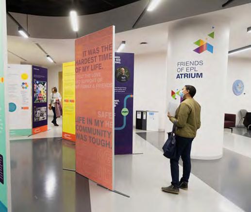
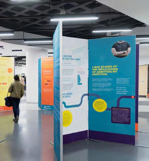
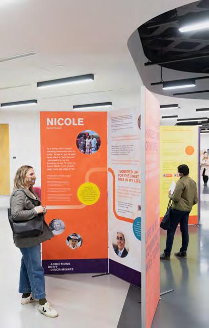
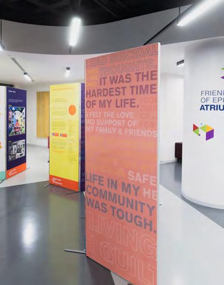
Category: Healthcare
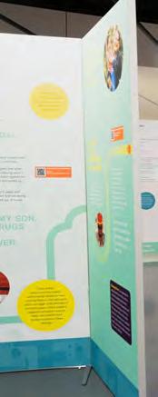
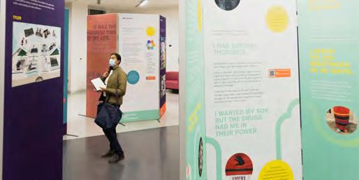
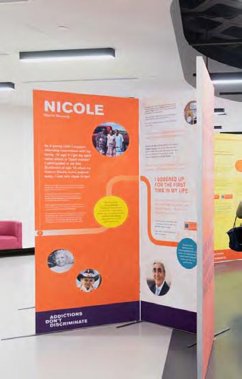
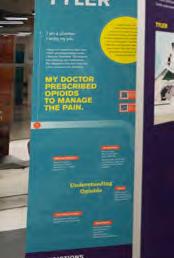
What was the challenge?
Addictions Don’t Discriminate is an in-person interactive exhibit that takes participants on the journeys of real people whose lives have been impacted by addiction. The exhibit is designed to inspire understanding, empathy and action in the viewer by using infographics, and visual diagrams to explain the stories of 6 Edmontonians whose lives have been affected by addiction. We used typography as well as charts, diagrams and infographics to represent themes related to addiction and stigma. The Urban Wellness Plan Framework, a critical framework that is used to understand six kinds of connection that are at the heart of individual and community wellness, provides additional information on Adverse Childhood Experiences and how interational Trauma and Truth and Reconcilliation affect addition.
The final project resulted in 21 double sided panels that are printed fabric, stretched onto aluminum frames. Each panel is 38” x 93” high. Panels are double sided and when the exhibition is set up, consists of three main zones: an introduction to the concept of addition and the storytellers, 6 different stories of lived experience and then an area that includes resources and activities about addiction that mobilize and encourage community action. Other deliverables include a website, a hosting toolkit, and an evaluation for participants. The exhibit uses QR codes throughout the panels to provide additional information and show video and audio content.
Contact:
name: City of Edmonton, Gillian Harvey company/organisation: DHRIL
(Design x Health Research Innovation Lab, University of Alberta)
e-mail: gharvey@ualberta.ca website: addictionsdontdiscriminate.com/
Four hundred and fifty people attended the launch from Nov 4-9. The exhibition has travelled to thirteen locations across Alberta. In addition to an exhibition, there is a video, activities, and educational resources related to addition. General feedback from the exhibition survey revealed that:
• Many people in attendance already had a deep understanding about addiction/worked in the field/had lived experience or knew someone close to them who had lived experience
• Exhibit reinforced their already existing thoughts and beliefs and they were happy others were going to see this and potentially have more empathy
• “This exhibit helped me see how addiction is a crisis of disconnection”
• The messaging about language was a great reminder
• The inclusion of the spectrum of substance use was helpful and eye-opening
• The people who did mention action items said that they will support supervised consumption sites and harm reduction, that they have more compassion and that they will work to break the stigma by sharing what they learned/saw and telling others about the exhibit
• The information about the current drug poisoning crisis in Alberta was informative for many
Category: Healthcare
Project: Emotion wall

What was the challenge?
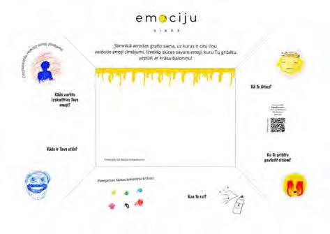
Teens with serious mental health di culties in psychiatry department of the Children’s Clinical University Hospital “Gailezers” spend almost whole day without screens. They had need for meaningful activity how to spend free time in the hospital with added value. They have a lot of negative emotions and no-where to express them.
What was the solution?
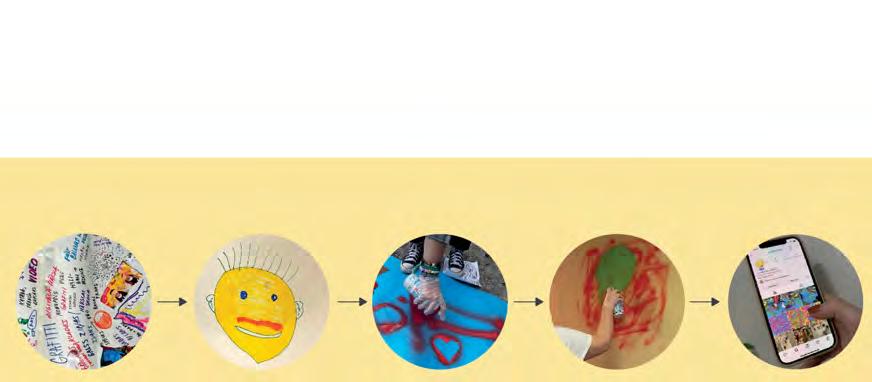
In close cooperation with teens, we created concept of “Emotion wall”, where kids can do not only gra ti on wall, but express their emotions in safe environment and learn about negative ones, so they can develope emotional intelligence together with stu - psychologists, art therapists and others.
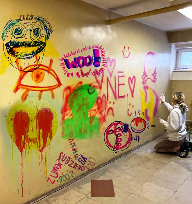
What was the effect?
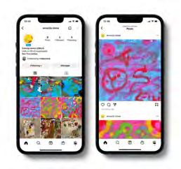
During our workshop, kids receive sketch sheet, where they explore emotions and make sketch of emoji they want to spray-paint on the wall. They have all materials to test. And then they can spray on the wall and talk about what depresses them. It helps teens to realise how they feel, dress it in art form and later talk about it, if they want. We observed, after painting negative emotions, they felt better and more relaxed. After painting on wall emoji’s are documented and posted in virtual gallery so they last forever. Several schools has interest to adapt this idea to their environment.
Contact:

Name: Liba Berzina, Laine Spule, Erika Zabele, Santa Meikulane, Egija Ziedina
Company/organisation: Art Academy of Latvia

E-mail: berzina.liba@gmail.com

Website: instagram.com/emociju.siena
Category: Finance
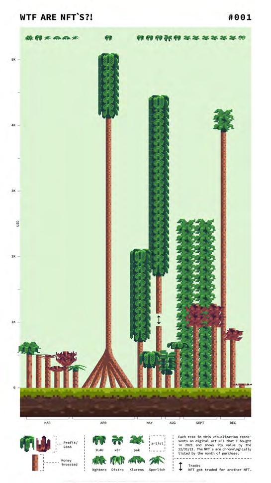
Project: WTF ARE NFTs?!
What was the challenge?
Ever since 2021, non-fungible-tokens, or NFTs for short, have been taking over the modern art market and are revolutionising the way we look at ownership of digital assets - and I’ve been there the whole time. In 2021, I started investing in NFTs and decided to try and find a way to visualise these investments in an aesthetically pleasing and attention-grabbing way that would also allow me to display all the different layers of data I wanted to show.
What was the solution?
There are certain parallels between the business / investment world and a forest. Growth and decay are prime examples for this and inspired me to make use of this analogy in my visualisation. I decided to create an 8bit looking forest using my own investment data to generate the trees. I chose this characteristic 8bit aesthetic to bring the forest theme into the digital world and therefore link to the subject of NFTs.
Each tree in the visualisation represents an NFT that I bought in 2021 and shows its value on the 31.12.21. The trunk represents the amount of money that I invested in the NFT when I bought it. The green or red leaves represent the profit or loss that the particular NFT generated by the end of 2021. The NFTs are listed chronologically from left to right by the month of purchase. The different types of leaves represent the artist who created the NFT.
I animated this visualisation and used the additional layer to explain the term NFT as well as certain mechanisms that exist in the NFT / crypto space.
Animation:
Contact: Simon Haerter

Hochschule Luzern
simonhaerter@gmail.com
Instagram: simonhaerter.graphics
What was the effect?
This visualisation system provides a way to visualise investment data in a way that grabs people’s attention and makes them want to understand what they are looking at. The playful nature of the visualisation helps to make it more accessible to people who are not used to analysing financial data and opens up an opportunity to talk about such data in a more casual way. The visualisation system also manages to communicate four different layers of data in a neat and compact manner and can be used to visualise any other investment dataset.


What was the challenge?
An 80-page print publication with 60 standard charts on the municipal finances of the Canton of Bern had to be transferred into an online report. The aim was to transform the content into a contemporary, digital and interactively explorable form with numerous information graphics. The report is optimized for different output devices (desktop, tablet and smartphone). It will be updated by the client annually.
During the concept phase of the interactive information graphics emphasis was placed on not only using standardized diagrams such as pie charts, bar charts and maps, but rather on developing suitable and varied display models based on the specific data – in order to show more complex data in a synoptic and explorative way. In addition to classic diagrams more complex forms such as bubbles, sankey diagrams and heat maps are used to encourage users to actively engage with the figures.
The microsite is divided into four chapters that offer different forms of interaction and immerse the viewer in different dephts of the content (depending on the target audience). From more curated parts in the overview to very explorative areas in the municipality comparison. The report enables local authorities from 337 municipalities to compare their own municipality with others from the canton and analyze their specific financial situation.
Contact:
name: Barbara Hahn, Christine Zimmermann, Christian Schneider
company/organisation: Hahn+Zimmermann, Data Anatomy


website: www.hahn-zimmermann.ch, www.data-anatomy.io
Link to the report: www.ebericht.be.ch
Our client Bpifrance is a French public investment bank that provides financing and support to help small and medium-sized enterprises (SMEs) to grow and innovate. Their goal is to favour the growth of the French economy by helping entrepreneurs thrive.
Besides working with entrepreneurs directly, they also help different partner organisations to better serve entrepreneurs, such as commercial banks, entrepreneur support networks, and regional government. For example with commercial banks, Bpifrance can co-finance loans to SMEs and provide partial loan guarantees to the banks, thus sharing the risk and encouraging them to lend to those SMEs.
The overall scope of our mission was to create a family of websites for these partner organisations, so that our client could more effectively manage these types of finance arrangements and collaborate with them on other initiatives.
Within that scope lay a great many challenges, and one of them was to undertake the digital transformation of their entire financial product offering, with over 300 listings, which beforehand was only available on paper or via a downloadable “dumb” PDF.
With new products being launched or modified frequently, the paper-based guide was often out of date as soon as it was published, and there was a significant logistical cost of printing and distributing it to all regions of France and its overseas territories.
Additionally, only one categorisation scheme could be applied when the collection was on paper, which more or less mir-
rored the internal departments within our client’s organisation. This did not always match the way that partners wanted to view the landscape of product offerings or the way they searched for information.
To tackle this challenge, the project involved re-evaluating the way the entire product offering was presented, with the aim of improving findability, comprehension, and choice.
We started by carrying out interviews with partner organisations to see how they used the existing product guide, and we discovered that many of them felt the need to re-interpret and re-publish some of the product information on their own internal networks. We realised that this was because there was a gap between how our client produced the information, and how the partners wanted to consume it.
We then conducted a series of workshops together with our client and the partners
to reformulate the product information according to their needs. The result of these workshops (which included 100 people over 6 months) was to open up the guide through 4 different dimensions :
Type (Nature of the financial product or non-financial support) This corresponded to the original categories in the paper-based guide
Sector (Products available only in specific industrial sectors)
Theme (Products supporting initiatives such as innovation, international trade, and sustainability)
Region (Products targeting support for specific regions in France)
We also improved the design of product information at the page level. For example, we were able to fine-tune the information hierarchy to highlight exactly the key points that a partner needs to know so they can extract the information in just a few seconds.
Lastly we integrated our client’s smart recommendation system to help partners choose the right product for them, and their entrepreneur’s situation, in parallel to the new navigation choices.
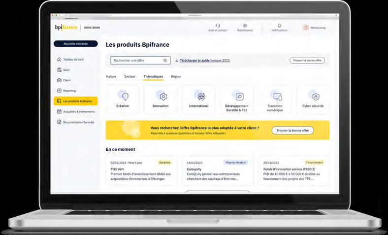
What was the effect?
The transformation process had 3 key outcomes that greatly improved the user experience.
First, partners were able to navigate the product catalogue in many different ways, and in ways that made sense to them, according to the needs of their entrepreneur clients.
Second, partners were now able to easily check their eligibility for certain products and services early on in the process without having to manually read every word
of the product information. This greatly reduced the time and effort needed to determine eligibility, making the process more efficient and user-friendly.
Third, partners were able to jump directly from information to action by applying for products directly online, removing unnecessary steps and streamlining the process.
There were also direct benefits for our client - product and service information could now be kept up-to-date, they saved money on printing and distribution, and they were able to collect vital metrics in real-time on their product offering, such as their most popular pages.
These improvements were successfully implemented on our client’s banking partners website and later applied to the website
for their partners in regional government.
This project demonstrates the importance of digital transformation in streamlining processes and increasing efficiency. By leveraging technology and identifying opportunities for improvement, organisations can overcome challenges and provide better experiences for their customers or partners.
Contact:
Product manager: Marc Dubourgnoux
UX designers: Laurène Frasca, Müge Cetinkaya, Alexander Poole.
UI Designer: Marie Niollet, Alexis Desplas, Julien Dauthuille.
Company/organisation: Ekino
e-mail: marc.dubourgnoux@ekino.com website: ekino.com
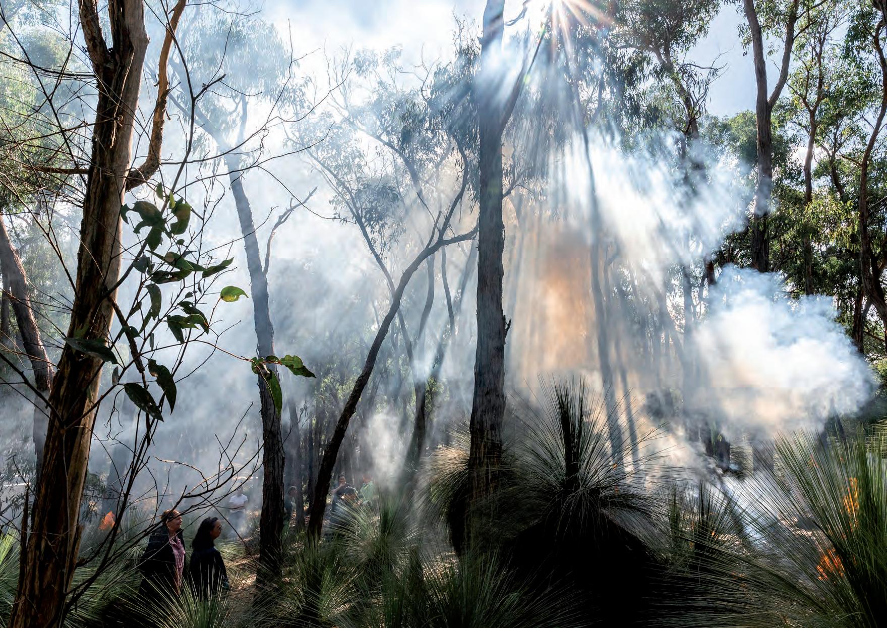
What was the challenge?
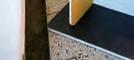
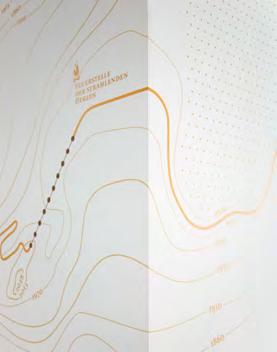
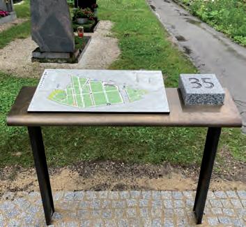
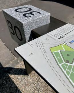
It’s not everyday that we get to work for eternity. The story of this cemetery began in the 13th century. At its current location, the St. Barbara Friedhof in Linz, Austria, covers an area of 12 Hectar (29,6 Acres) with around 20.000 graves. Situated right in the centre of the city, it provides a quiet, leafy, space, and citizens are encouraged to make use of its qualities as a refuge, a place of contemplation.
However, cemeteries tend look very similar everywhere, and it is hard to make out and remember landmarks. Visitors to funerals are often not locals, and music, literature, theatre and art exhibitions also bring people to the St. Barbara Friedhof who are unfamiliar with the area.
Additionally, the new wayfinding system needed to be more than “just” an aid to wayfinding. It should provide a sense of place and identity without intruding on the experience of being there.
What was the solution?
Guiding considerations were:
- respect the space, remain consistent to existing, familiar information elements.
- use materials that are present in this context such as brass, copper, stone, or wrought iron.
- visibility, but taking a back seat.
- modularity for various types of positions.
- ergonomic and usable for all.
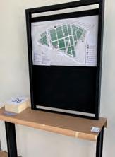
Starting point was the existing information system. The cemetery is divided into plots,
Contact:
the plots are marked by small sculpted stones with an engraved number. Stones are often hard to see, maybe overgrown or weather-worn. This familiar system was retained and enhanced with new stones physically integrated into the wayshowing elements.
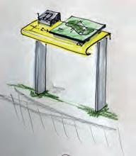
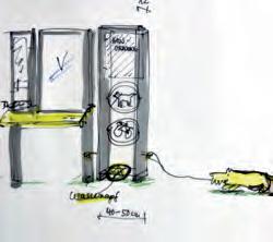
They are made up of separate components that cover different levels of functionality depending on how they are assembled:
- Lacquered steel frames and double T-bar legs for various free standing and wallmounted positions.
- A wide stained-brass “tabletop” slightly tilted towards the reader, mounted at a height accessible for wheelchair users. It contains the stone with the plot number, a tabletop map or a frame for a standing map. There is also space for tactile
information and an enamel QR-code.
- An identical small table to hold just the raised stone and tactile information.
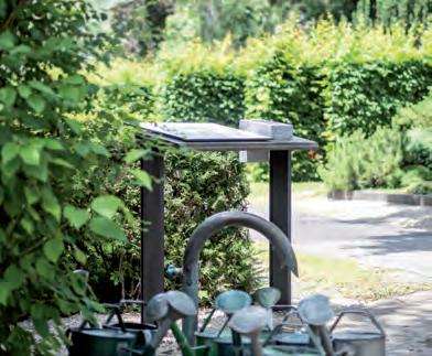
- A low frame holding just one raised stone.
- The numbered stone itself also angled forwards and readable from two sides

- The orientation map horizontal with a forward angle or vertical, oriented in viewing direction. Graphic representations of landmarks provide the additional bonus of naming these chapels and monuments which may previously have been anonymous.
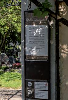
- Wall-mounted and free standing panels at entrances and buildings complete the information needs and provide a unified experience.
name: Christel Schmidt (architect) / Veronika Egger (information designer)
company/organisation: werkrausch / is-design
e-mail: cschmidt@werkrausch.at / veronika@egger.pro
website: werkrausch.at / is-design.at
client: St. Barabara Gottesackerstiftung, www.barbarafriedhof.at
images: C. Frauscher, C. Schmidt, V. Egger
The new wayfinding system feels as if it had always been there. It is visible and blends effortlessly into its surroundings. The traditional stone markers were made more noticeable through their modern counterparts which have become touchable, sensory elements. Maps are easy to read and physically accessible for everyone.
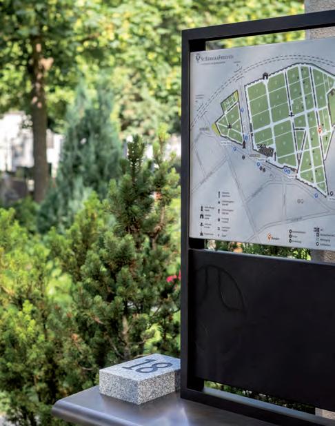
Work in progress: the tactile information system combined with QR-code access to location information. This is in the process of being developed in cooperation with representatives of disability organizations. To be completed 2023.
Space reserved for tactile elements
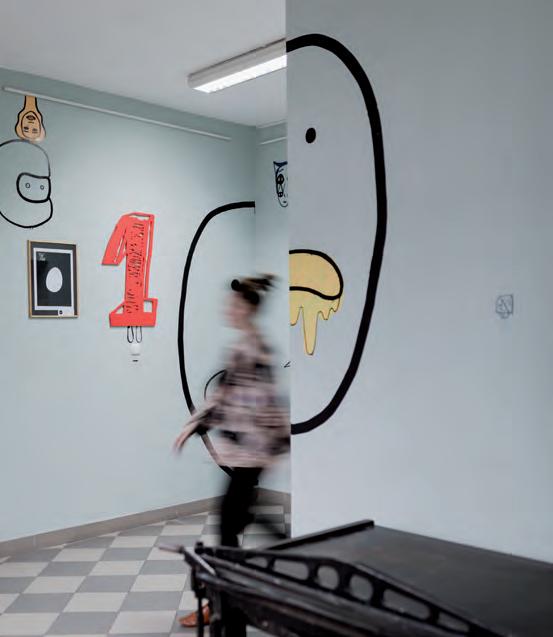
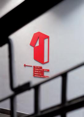
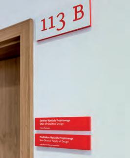
What was the challenge?
Academy of Fine Arts and Design in Katowice is a school with 20 years tradition, created by creative personalities. Its tradition was workshop graphics and design. Its strength is people, place, respect for area‘s heritage and supporting creativity.
What was the solution?
Idea of the project is based on holding on the memory of the teachers of the Academy, and the evidence of their joint creations, underlining and appreciation of their diversity. Towards this end, a collection of numbers made by the teachers and applied in room and floor markings, every carrier has author‘s signature. Project was conducted as a joint action among academic community.
The range contained maps and lists, function and floor signs, room numbers as well as directional information in addition to external and parking information.
What was the effect?
Information system takes into consideration the technical character of the building, underlines individualities and personalities of people of the Academy, makes the number as a hero of the story. It has decisive character, it is red, it does not compete with exhibits on display. It is informal, working-rough, economical.
Contact:
name: Justyna Kucharczyk, Agnieszka Nawrocka, Anna Pohl. company/organisation: TUKEJ
e-mail: tukej@tukej.com
website: www.tukej.com

What was the challenge?
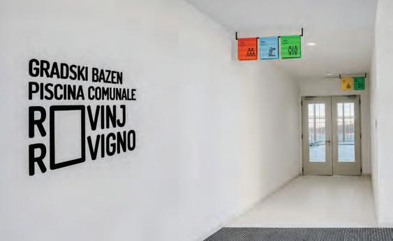
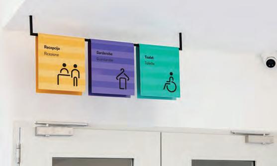
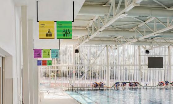
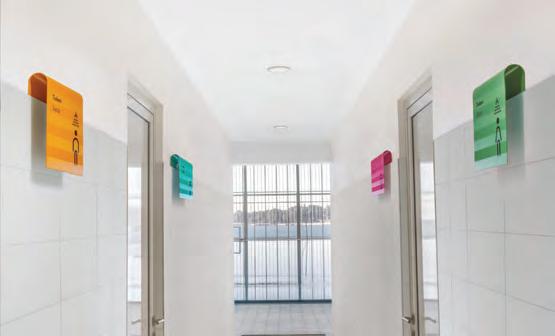
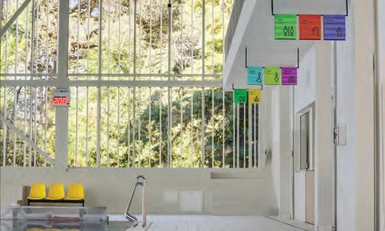
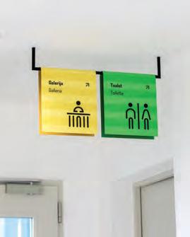
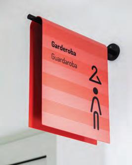
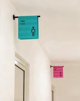
The newly opened swimming pool complex which spreads over 3 637 square meters is located in Rovinj, an Istrian town with a unique skyline. One of the characteristics of the pool is its large glass wall overlooking the sea, which is only a few meters away. In a certain way, this visually combines the water from the pool and the sea, as well as the complete experience of going to the sea or the pool.
What was the solution?
A towel is an item that is definitely important to us, both on the beach and at the pool. That‘s why we used it as a leitmotif. Through stylization, it is present on all parts of the signaling by hanging from the ceiling, sideways, or from the tiles. Signalisation is done in a way that its position is in the direction of, or close to the entrance of the specific space, showcasing the purpose of the space the user is heading into.
What was the effect?
Each icon, and thus the towel, has its own color, which brings variety and liveliness to the previously neutral space. This towel is classic, with horizontal lines which are achieved by alternating matte and glossy stripes. In addition to indicating even more clearly that it is a towel, they also serve as a base for placing graphic elements, both text and related symbols. Just as a towel draped over a holder creates the shape of a semicircle, rounded lines were used to display symbols. The signaling can be visually associated with the characteristics of Mediterranean towns like Rovinj, where laundry is dried stretched between buildings.
Contact:
name: Anselmo Tumpic, Sara Prenc Opacic, Hena Crnovic, Andrea Rosar
company/organisation: Studio Tumpic/Prenc e-mail: anselmo@tumpic-prenc.hr website: tumpic-prenc.hr
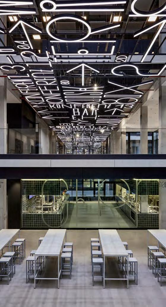
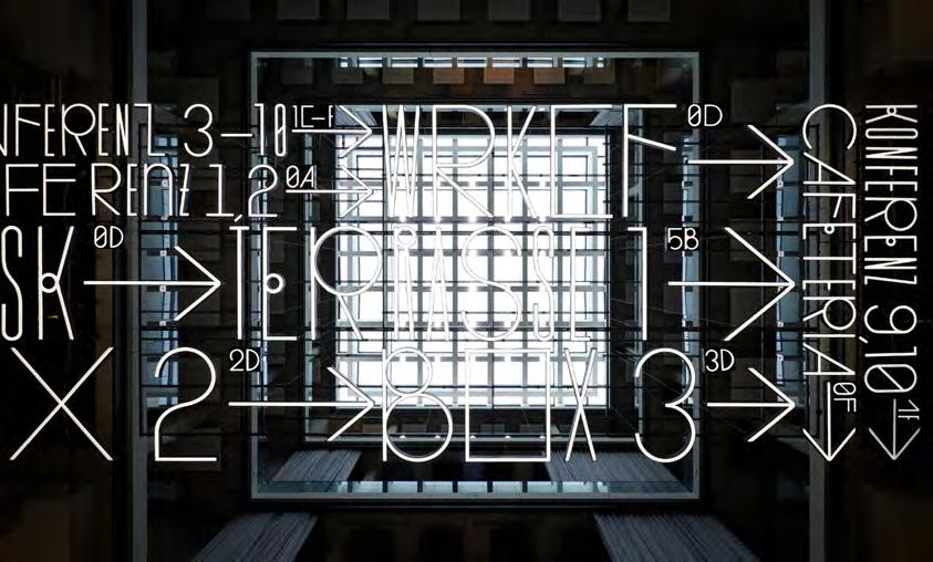
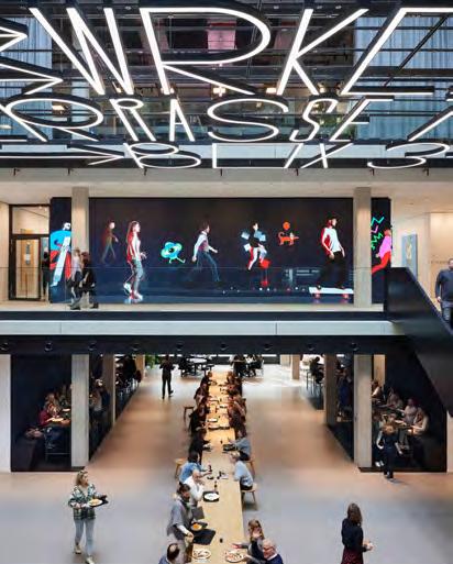
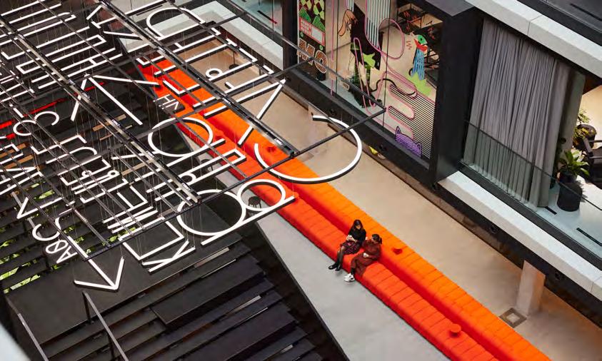
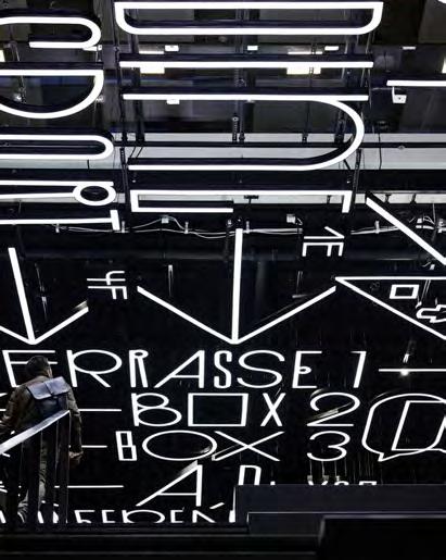
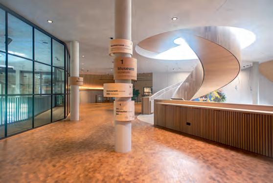
When one of Europe’s biggest ownermanaged ad agencies moves into new premises, the signage system has to be (you guessed it) super-creative. So here we have not just a bespoke typeface, including pictograms, signs and symbols, but also a suspended block of illuminated text – a flying carpet! – set in this unique font. The 130-metre long, 6-metre wide light installation runs through all three buildings that form the campus, linking them together and making a bold statement: heads up, creatives at work! Special things are taking shape right here; you’re at the home, the heartland of advertising. That said, the illuminated band of text is no mere ornament but serves as a directory, displaying key destinations in the signage system. And, needless to say, the pictograms and all the other signs, arrows and symbols were also designed to match the typeface, which itself references the grid-based design of the building interiors. This luminous optical and functional backbone is accompanied by a signage sub-system on walls and pillars that guides staff and visitors at intersections where – like in any creative process – choices need to be made: should they go left or right, continue straight ahead, or turn back?
Contact:
büro uebele visuelle kommunikation
Project team: Lorenz Grohmann, Carolin Himmel, Anika Pehl (project manager), Anna Pfältzer, Nadja Ratz (project manager), Andreas Uebele
Client: Serviceplan
Text: Hannes Böhringer
Pictograms: Shiwen Sven Wang
Photos: Mark Seelen
Typeface: Service, in collaboration with Gabriel Richter
What was the challenge?
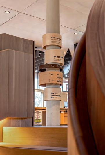
Rapunzel is one of the pioneers and leading producers of organic food. An impressive visitor center with a bakery, restaurant, coffee roastery and museum was opened at the company headquarters in Legau –and conveys that “organic” does not mean doing without, but vitality, delight, important for people and it’s environment. A guidance system made of natural materials was to be developed for this building. But there was a lot of glass, hardly any walls, uneven floors, high ceilings – no surfaces.
What was the solution?
Playing with the pillars – in the spirit of a “hula-hoop” approach. They were available at all relevant positions. The wood (maple and oak) also brought an atmospheric quality to the building: a lot of impact with little material. All of this realized with a regional carpenter. Then also adapted as signposts and door signs. The slightly calligraphic, human-looking “Sanserata” was used as the font, on the basis of which more than 30 pictograms were developed furter (also for the park guidance system, etc.).
What was the effect?
The guidance system fits into the building and is nevertheless clearly recognizable and understandable: showing the way, offering the highlights – with high interior design qualities.
Contact:
name: Andreas Koop
company/organisation: designgruppe koop
e-mail: a.koop@designgruppe-koop.de
website: www.designgruppe-koop.de
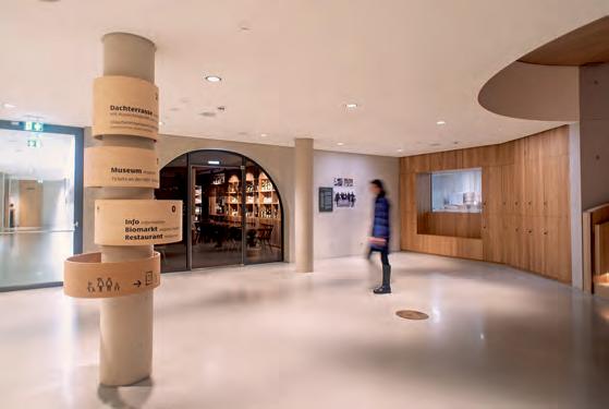
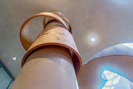
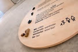
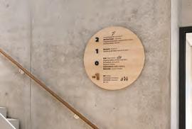
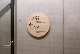
What was the challenge?
Behind the somewhat unwieldy acronym “BSBZ” is the name: “Bäuerliches Schul- und Bildungszentrum für Vorarlberg” (Farming School and Training Centre for Vorarlberg). In the five different wings on the campus various lecture courses for a different user groups are held. The wide range ensures a high frequency of various kinds of visitors. What led to the involvement of Atelier Andreas Gassner was the new “E” building wing and the need for self-explanatory signage and orientation in the constantly growing complex of buildings, approaches, storeys, levels, and rooms. The impact hazard regulations for wall-high glass elements in public buildings presented a further design challenge. A system had to be developed that, while meeting the standards required, would, at the same time, provide a playful graphic element that underlines the new architecture rather than detracting from it.
What was the solution?
However, the design work began with the start of every form of applied communication, i.e., with the name, the brand. In a moderated process the previous name “Landwirtschaftschule” (agriculture or farming school), which had never fallen entirely out of use, was revitalised and, with the addition of BSBZ, was recreated as a brand and logotype.
signage: The grids of lines and hatching are understood as a graphic echo of the vertically structured wood facade. The signage, the impact prevention patterns on the areas of glazing and the architecture all play together constructively. The very simple and clearly designed elements of the central and sub-orientation use the theme of hatching, too.
What was the effect?
The inspiration for the graphic elements of the privacy screens and the signage was drawn from the appearance of layers of clay, the textures of arable farming, the architecture of foliage, photosynthesis, the effects of sunlight and wind on the fields, the cycle of growth – the metamorphosis. For this theme and the elements that guide users Atelier Andrea Gassner developed patterns of movement, colour, typography, and plan graphics that are differentiated for each storey. Through the light and the movement of passers-by the patterns begin to oscillate and change constantly, they vanish and reappear, seem translucent and grow, as it were, through the building.
Landwirtschaftsschulen Vorarlberg; Kunde: Land Vorarlberg
Signaletik und Konzept: Atelier Andrea Gassner, Christopher Walser und Andrea Gassner
Architektur: Querformat, Paul Steurer; hk-Architekten, Hermann Kaufmann, Thomas Fußenegger
Produktion: Mader Werbetechnik, Lauterach
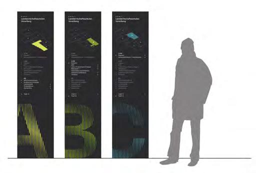
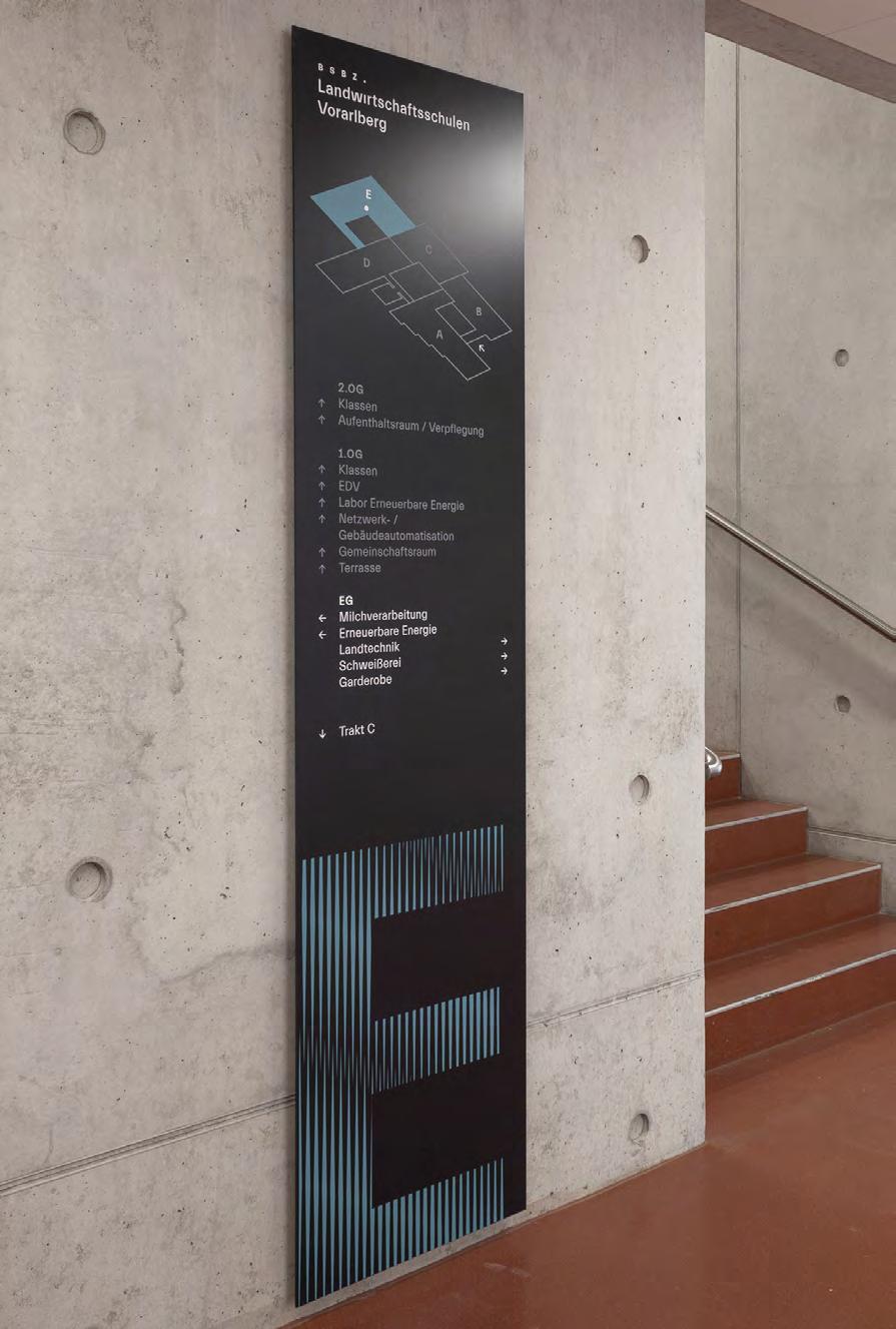
What was the challenge?
Chill Inn a private dormitory for those who are looking for convenience in a beautiful setting. Here, you will find beautiful rooms with high standards, a shared learning area, a chill and meeting zone, a bicycle and car parking lot, and a laundry and drying room. College life is normally associated with joy and carefree fun. When developing a coherent visual information and wayfinding system for this place, we kept these values in mind.
What was the solution?
Our goal was to create visual system that would complement the character and purpose of the dormitory and, at the same time, be interesting and put people in a good mood.
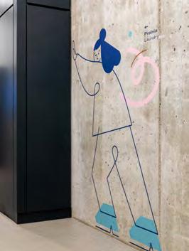
During the design process, we have created an original visual style of the system. Illustrations, which are part of it, make the dormitory a welcoming and comfortable place where people can gather and celebrate. The graphics are characterized by smooth, abstract lines, a tasteful color palette, and playfully compliment different spaces. Creating a 3D design of information carriers was as important as creating graphic design – we’ve decided to use colored MDF. It appears both in largeformat digits and in directional carriers, which are complemented by engraved patterns. When combined with illustrations, typography, and colors, it creates a coherent visual language.
Contact:
name: Bartłomiej Witanski
company/organisation: Blank Studio
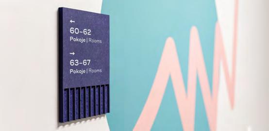
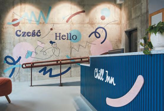
e-mail: hello@studioblank.pl
website: http://studioblank.pl
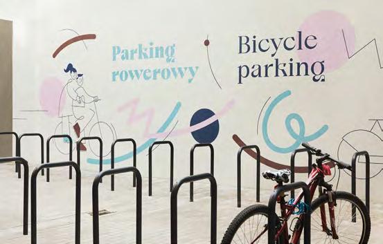
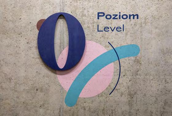
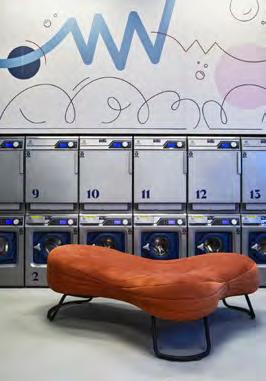
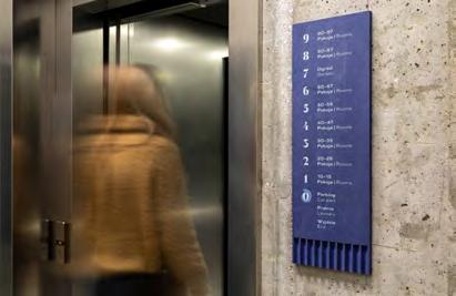
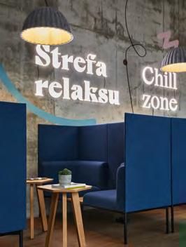
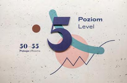
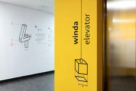
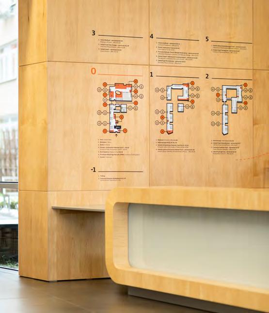
What was the challenge?
The building of the Faculty is a complicated structure, constructed in 2 stages linked by a skywalk above an internal street. Among the impressive features of the building is its ground floor, which includes a library, lecture halls, 2 patios, cafeterias and administrative offices. It is the area that attracts the most users and unifies various functions of the building – but because of the character of the architecture it creates a problem for the users to know, where to go.
What was the solution?
We set our sight on creating system that would be unconventional in its form, readable by a wide range of users and, in a way, evoke the most common associations with physics. Our goal was to make this building more friendly, accessible in spatial reception. In addition, we wanted to provide employees with tools through which they inform about important events that took place in lecture halls, studios, etc.
What was the effect?
The signage system was based on visual references to technical drawings, experiments, diagrams, and activities from physics textbooks. We have chosen materials that provide a great background for our concept. In places where information carriers change dynamically and require frequent exchanges, we have proposed an interestingly constructed carrier that enables message exchange.
Contact:
name: Bartłomiej Witanski
company/organisation: Blank Studio
e-mail: hello@studioblank.pl
website: http://studioblank.pl
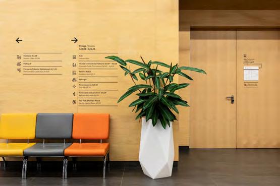
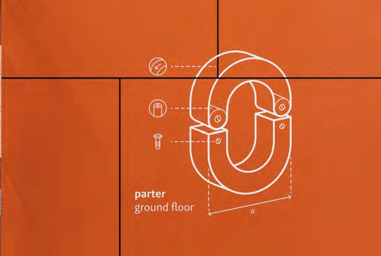
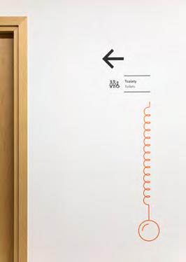
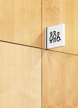
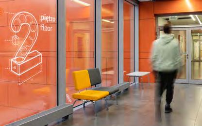
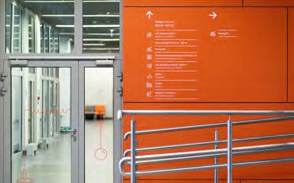
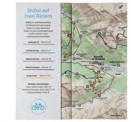
The Stubai valley is a region of the Austrian Alps known for recreation and mountain sports. As part of the planning of a new cycling route throughout the valley, we were assigned to develop design-solutions which provide information as well as an emotional experience and go along with the bureaucratic demands of a stately defined route signage.
Together with the architect Thomas Mathoy and UK-based cartographers Pindar we designed relaxation areas and combined them with useful elements like bike racks, tools etc. The platforms of white concrete graphically show the kilometre mark of the route, resembling the predefined green route signs. A strip-map-depiction of the valley and its cycling options as well as a logo-like use of the main-route’s number «19» are part of these areas. Along the whole path, «milestones» matching the appearance of the relaxation areas were implemented. The cartographic strip-mapapproach deliberately lets the user «read» the Stubai valley from left to right, starting near the glacier and ending in the next valley, the Wipptal. The maps provided at the relaxation areas visually correspond with the design of a trilingual print-brochure.
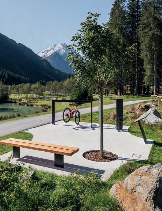
Our idea of implementing a decisively contemporary design approach in a cultural context, which is very much dominated by Alpine traditions, had to be conveyed to the stakeholders first, which was part of the challenge. The decision to go along with it paid off when guests and locals of the region very positively commented on the design-solutions published in print and online. This cycling project is a signpost towards an environmentally friendly and sustainable future of Alpine tourism.
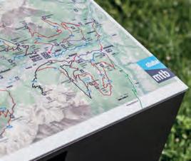
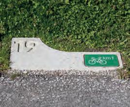
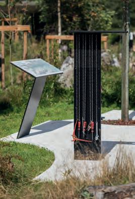
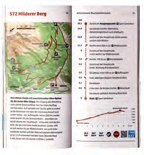
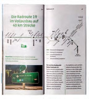
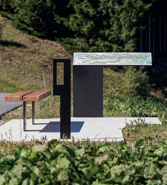
Except on the happy occasion of a birth, a hospital visit is rarely something we look forward to. Which makes it all the more important to make the spaces in hospital buildings pleasant to be in – for patients, visitors and staff. Visitors traditionally bring flowers for their sick friends and relatives – a thoughtful, personal gesture everyone understands: the colours and fragrance can brighten the mood and bring comfort. Aligned with this custom, the concept for the signage and artistic design of the hospital’s interior spaces features 24 medicinal plants that lend their colours to surfaces, while their names bring resonance to the different areas.
As we enter the building, we’re greeted in the entrance hall by suspended neon words – concepts relating to the hospital’s work and selected by the philosopher
Hannes Böhringer. They endow this semipublic space with an urban feel and help to create a distinctive image. This impression is reinforced by a typeface with a constructed handwritten appearance. Selected interior walls and ceilings are painted in delicate floral shades specified by the artist Harald F. Müller. These 30 colours, derived from the medicinal plants referenced, are arranged in a way that may look random but is actually designed for balance. The colours help to identify the different spatial situations. This creates individualised locations, aiding wayfinding.
Plant names appear in neon writing on the walls of the main circulation corridor, giving each individual space a cheerful mood and clearly defining the circulation spaces. Adding a plant name to the wayfinding code helps to individualise locations and make them more memorable: “5b st john’s wort” is nicer than the impersonal, administra-
tive “5b”, and telling someone to take the elevator “at eucalyptus” is a pleasant and easily remembered instruction. For the walls of the waiting areas, author Miriam Holzapfel has written entertaining descriptions of the individual medicinal plants. The system tells us that here, people are working to help and heal others, signalling care and personal attention – precisely what anyone in hospital needs.
Contact:
büro uebele visuelle kommunikation
Project team: Dominik Bissem (project manager), Carolin Himmel, Nadja Ratz, Marcel Tillmanns (project manager), Andreas Uebele
Client: Städtisches Klinikum Karlsruhe
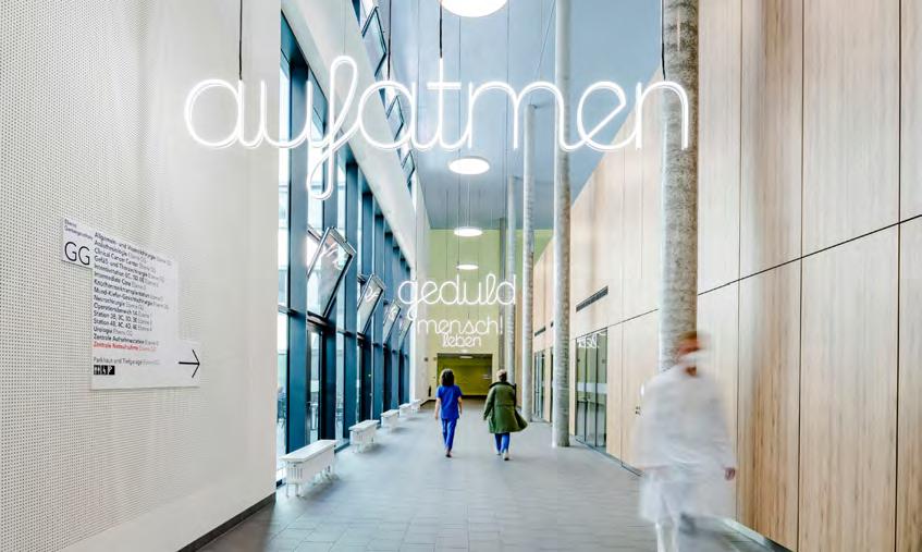
Architect: wörner traxler richter
Photos: Frank Blümler, Guido Kasper
Art: in collaboration with Harald F. Müller
Words entrance hall: Hannes Böhringer
Text medicinal plants: Miriam Holzapfel
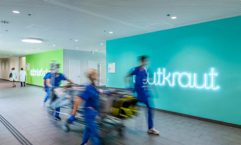
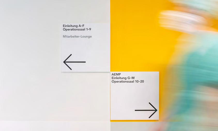
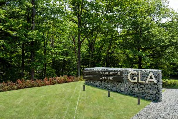
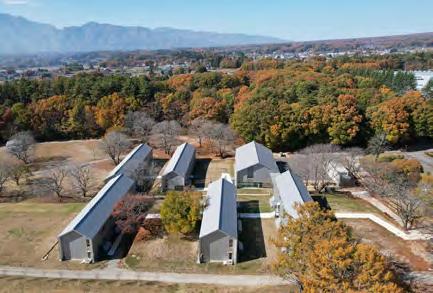
What was the challenge?
The GLA Yatsugatake Training Center is located in the natural surroundings of Yatsugatake, the central ridge of the Japanese archipelago. 1 hall building and 5 accommodation buildings were newly built. The challenge was to create an environment where trainees could experience the surrounding nature as it changes from season to season. It was also to give a unique signage to a series of 50 monotonous rooms.
What was the solution?
One of the solutions was to use natural materials, such as crushed stones from the area for the outdoor signage. These include
the entrance signage, signs that show specific plants such as wisteria trellis, and the area map. Another solution was to give the five accommodation buildings the names and colours of plants associated with the nature of the Yatsugatake. These are young leaves, cherry blossom, wisteria, zelkova and walnut. Furthermore, each of the 50 rooms has a different colour to express the nuances within nature, which changes with the wind, sun and moonlight.
What was the effect?
The colour in 50 rooms has been very effective for wayfinding. At the entrance of each building a colour bar will display the range of rooms inside. It is the symbolic
sign of the building. The colored triangular wall in front of each room will navigate the visitors through the white corridors. Visitors can cross between wings with pleasure, walk along corridors and reach their desired room. The design creates a positive feeling and intends to inspire a sense of familiarity and respect for nature.
Contact:
name: Mitsue Watanabe company: mix llc.
e-mail: mitsue@mixim.jp
website: www.mixim.jp
client: Religious Corporation GLA
architect: TAKENAKA CORPORATION
photo: GLA / Tomohiro Sakashita

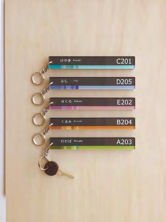
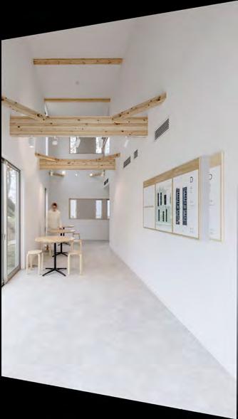
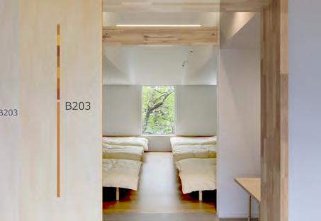
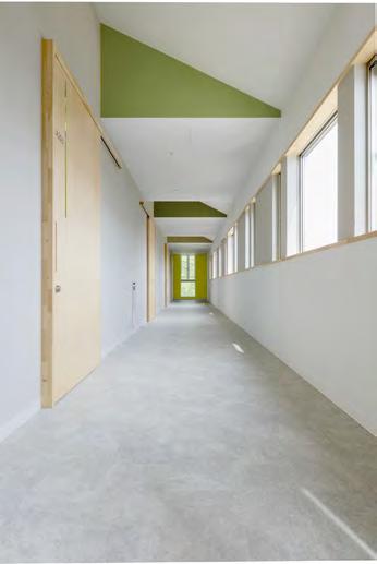
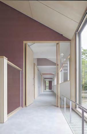
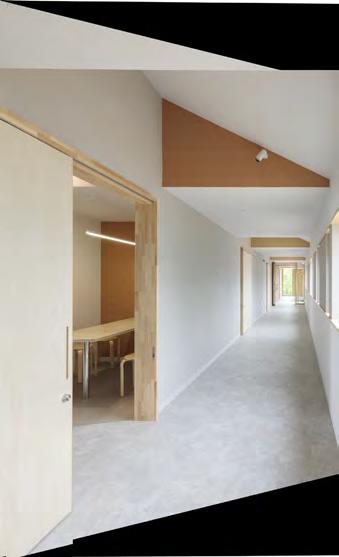
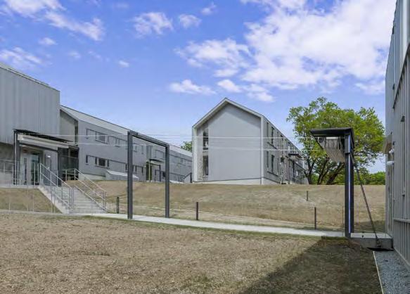
What was the challenge ?
Spinform has developed a new orientation system for the rapidly growing University of St.Gallen: 47 buildings on an area of 39.4 km² with a height difference of almost 100 meters. Heterogeneous architecture from different eras, with buildings of national importance, plus works of art by international artists. This specification requires a particularly sensitive handling of the signs and signals.
What was the solution ?
Spinform has divided the entire University of St.Gallen into four campuses and defined an expandable coding as the basis for the physical orientation system and the digital navigation app (for outside and inside).
The narrative addition of information is kept concise so that the system works well bilingually. The design of the individual elements follows the brand of the university with the polygonal shape and the color scheme. The barrier-free access is mapped with the app. The interior signage, is under construction and will be realized in the first semester 2023.
What was the effect ?
The sculptural elements at the campus entrances frame the site. Distinctive and identity-forming. Signposts are used to navigate through the extensive grounds. Building signage as a calling card welcomes visitors. A «mini-sculpture stele» signals the main buildings. A relief map is mounted at three locations. It is formally a cheerful quotation on the «university world», therefore in spherical form.
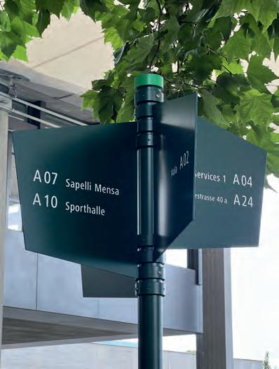
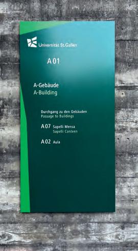
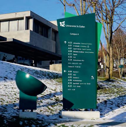
What was the challenge?
Planned to be completed in 2026, Elephant Park is centred around a new 2-acre public park in Elephant and Castle, and the ambition is to be a net zero carbon community (scopes 1 and 2) in operation by completion. As the site has evolved, the wayfinding and interpretation has too.
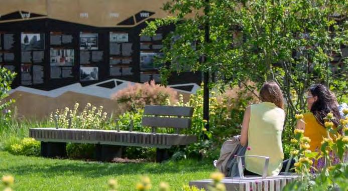
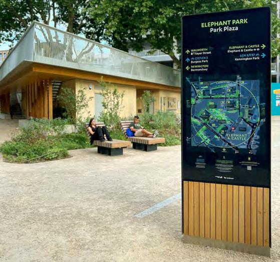
What was the solution?
Initially working off-plan, we created a comprehensive naming and addressing strategy for streets, spaces and buildings, celebrating notable people, places and things of the area. Many names were originally suggested through a community engagement project captured by the Creation Trust. We gave logic and rationale for the use of a name for a specific function. Influenced by the landscaping of the new park and the idea of a dry river where a river once flowed, a bespoke visual identity concept including illustrative graphic resources and pictograms unique to Elephant Park, were developed for a range of solutions.
What was the effect?
Initial stages focused on temporary, yet expressive hoarding, wrapped around the first area of the park open to the public, including a play area, community stage, and interpretive wall. Maps, timelines and supergraphics were printed directly to wooden hoarding, integrating bug hotels and viewing areas through to the building sites. Permanent solutions include mapbased totems that reveal the richness of the local area, and provides interpretation about the climate positive programme, biodiversity and history of the site.
Contact:
name: Matt Jephcote
company/organisation: City ID
e-mail: matt.jephcote@cityid.com
website: www.cityid.com
1 Monolith set beside park pavilion showing map of local context and wider area
2 Timeline on hoarding depicting 1000 years of Walworth history
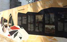
3 Supergraphics, bug hotels and viewing windows integrated into hoarding
4 Community gathered content, refined by Diana Cochrane and Julia Honess
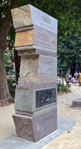
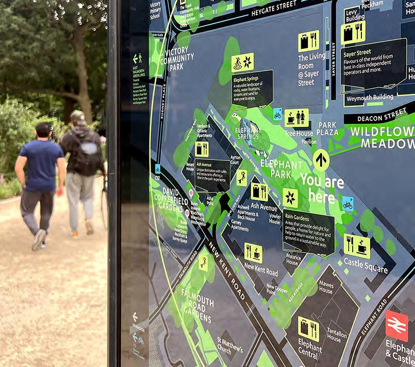
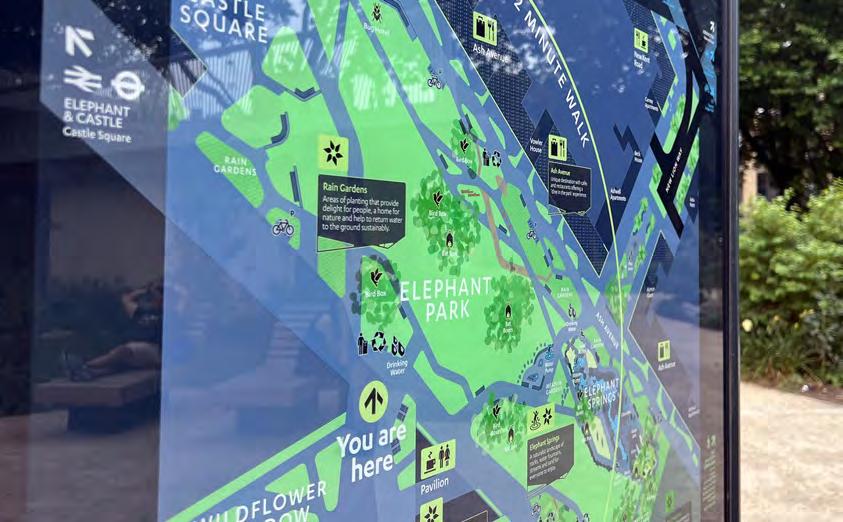
Category: Wayfinding
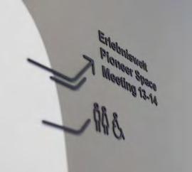
Project: AT&S Leoben
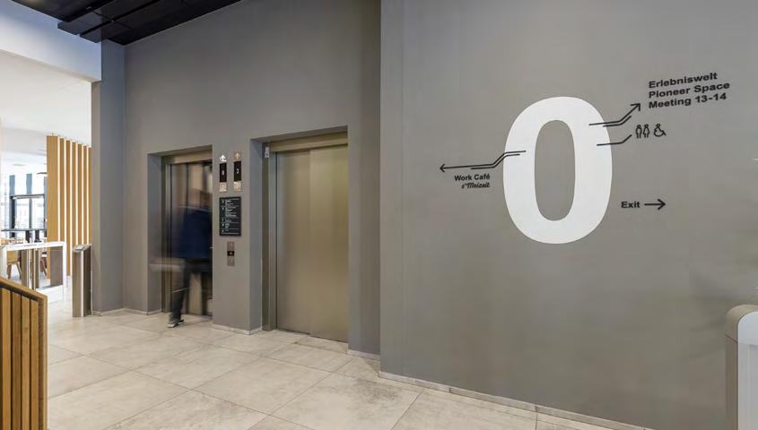
What was the challenge?
The new main building of the circuit board manufacturer AT&S needed a wayshowing system for internal and external people. The guidance system should ensure good orientation throughout the building and yet remain inconspicuous. To ensure data privacy, the glass surfaces in the building had to be provided with privacy protection.
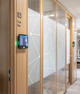
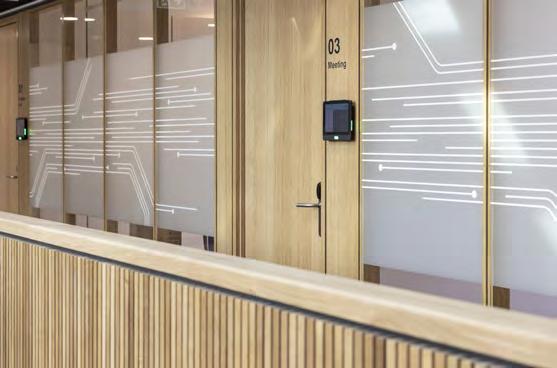
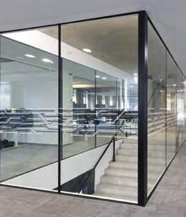
What was the solution?
The guidance system and building design create a space that is user-friendly and practical, while subtle visual cues and design elements help individuals navigate through the building with ease. Printed circuit board traces have been incorporated into the graphics, providing a subtle way to link the design of the space with the products being manufactured. Graphics and design elements on the glass surfaces still encourage communication and networking among individuals.
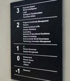
What was the effect?
First, the intuitive design allows people to quickly find their way around the building without a learning phase. This has made it easier to access the different areas and facilities of the building. Incorporating conductive traces into the graphics has resulted in an intuitive user experience and a decorative but functional visual screen. The design of the wayshowing elements has also increased the visibility of the brand identity and extended it into the physical space.
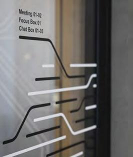
Photography: Salon Deluxe
Contact: Stefanie Schöffmann look! design office@look-design.at www.look-design.at


What was the challenge?
The challenge was to create a simple wayfinding system that could also be understood by the clients of Lebenshilfe –individuals with cognitive impairments. The system needed to incorporate “supported communication” through the use of icons and colors. Additionally, our goal was to find a solution that could be produced and installed by the in-house carpentry team.
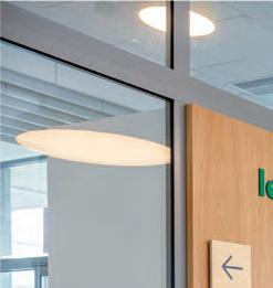
What was the solution?
Addressing the challenge, directional signs and wayfinding markers were installed at key intersections throughout the facility. Outside, minimal signage was used to mark the property and access points. We were able to find a modular sign solution for the crossing points on the floors, which was implemented by the Lebenshilfe carpentry workshop together with its clients. The development was a collaborative effort, with the in-house carpentry team taking an active role to ensure that the system could be updated and maintained internally.
What was the effect?
The implementation of the new signage system now enables easier identification of directions and departments through the use of colors and symbols. It also allows for faster orientation of external individuals on unfamiliar grounds. Furthermore, the use of “Lebenshilfe” corporate identity colors enhances the visibility of their brand. The involvement of employees in the carpentry workshop resulted in a strong identification with the company.
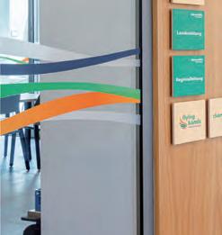
Photography:Salon Deluxe
Contact: Stefanie Schöffmann


look! design


office@look-design.at www.look-design.at
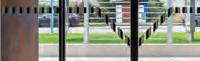


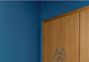
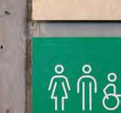

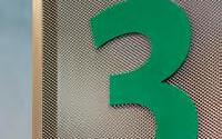

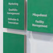

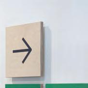
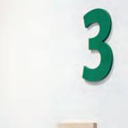
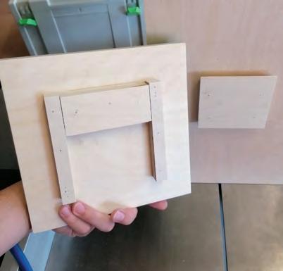
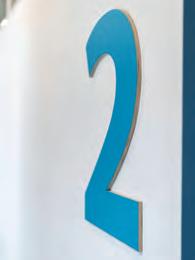
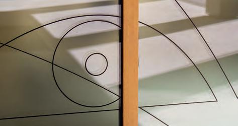
Project: LIV
What was the challenge?
Our clients are two doctors, that are experts in general medicine and plastic surgery. The main challenge has been to create a suitable corporate design for them. We’ve wanted it to be charming and less serious, but still with a very professional and trustworthy appearance.
What was the solution?
The combination of a clean basic font (Akkurat), a pleasing display typeface (Antonia), warm grayish colours and a very simple outline illustration style creates an atmosphere of well being and professionality. This overall style tells the story of our clients business without being overloaded and stressful. It gives clear hints and has calm layers, that form an enjoyable working environment.
The surgery is now well known in Dornbirn and beyond. It’s special look and symbiosis of handcraft and graphic design is very different to most of the other doctor’s corporate designs
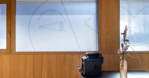
Contact:
name: Sigi Ramoser, Nicolai Pritzl
company/organisation: Sägenvier DesignKommunikation
e-mail: ramoser@saegenvier.at
website: sagenvier.at
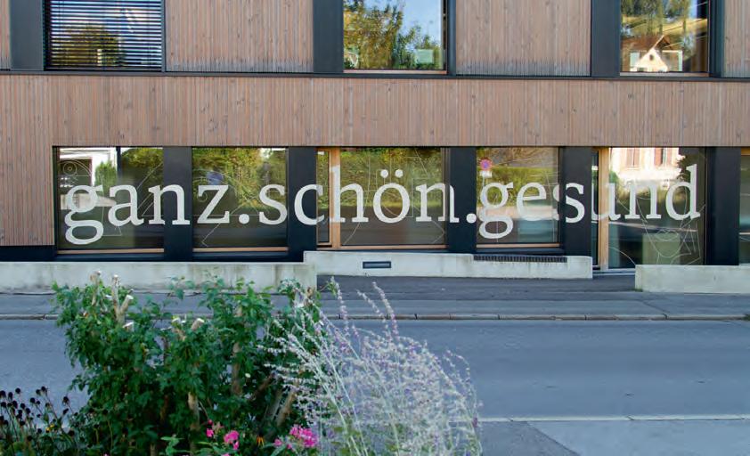
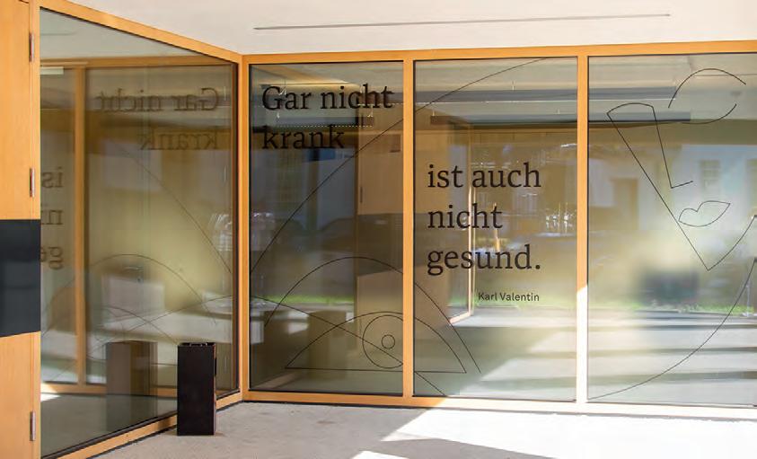
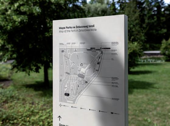
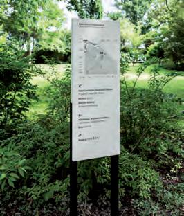
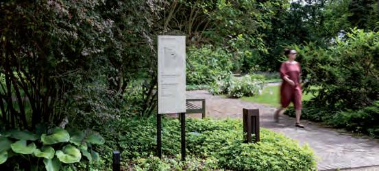
What was the challenge?
The design challenge was to incorporate the essence of the building as well as the heritage park. Our goal was to effectively inform about functionality as well as respect the natural and harmonious architecture. Access to functions, recognizing entrances and ensuring the confidence of moving around the grounds were the challenges we have dealt with. Challenges were many, especially taking under consideration varied groups of music lovers, from Poland and abroad, families with children, seniors and school excursions.
What was the solution?
Our priority was easy readability and visibility, we decided on neutral colors, implementing elongated vertical forms, which did not cover the landscape and playing together with architectural rhythm. Chosen colors provided visibility against the greenery and dark building interiors. Large scale pictograms, presented on the buildings were inspired by the cut of the font. Its quick visibility was softened by raster filling. Map was designed to make it understandable through friendly graphics and recognizable landmarks. Carriers are “layered” on objects and architecture elements, made of metal, taking care of high quality and sustainability.
What was the effect?
The entirety of project is based on clean, simple forms, system has all the necessary elements; function and entryway signage, navigation, maps, as well as technical and legal information.
Contact:
name: Justyna Kucharczyk, Agnieszka Nawrocka, Andrzej Sobas. company/organisation: TUKEJ
e-mail: tukej@tukej.com
website: www.tukej.com
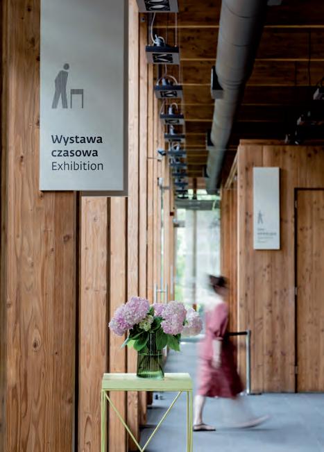
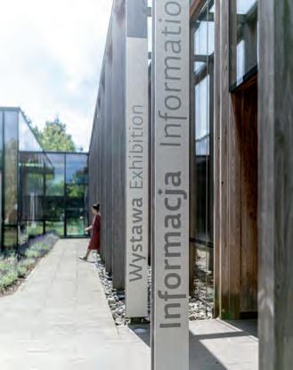
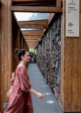
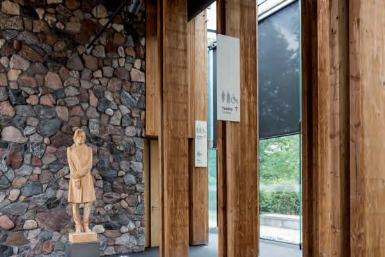
Project: Kunsthalle Praha
What was the challenge?
Kunsthalle Praha revives the former Zenger Transformation Station in the historic centre of Prague. Accessible to a broad public. The wayfinding system leads visitors next to the design shop, bistro, café, through three large gallery spaces. The building was largely gutted and rebuilt. However, parts of the existing building were also left in place, creating an exciting spatial experience with many intermediate levels, views and exits for the visitors. A complex challenge.
What was the solution?
The arrow, derived from the logo, not only points the direction, but also summarises the individual goals. The typeface drawn by Pistora is based on a template by Tschichold. The derived pictograms, letters and arrow are made of burnished iron and applied to the rough concrete. The contrast of these materials, the pure of the application and the lightness of the arrangement create a visual appeal that unfolds in the interior, yet recedes in favour of the art.
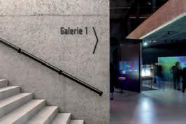
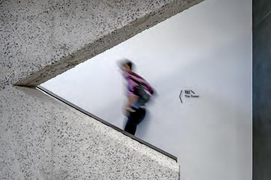

What was the effect?
This project was not only a step forward in the sense of work, but also a learning for life, through dealing with our common history and talking to each other. Being involved in the creation of this cultural location, whose aim is to connect the Czech and international art scenes, also resulted in the joint design of the wayfinding. Discussions on the concept, then incorporating these results into the wayfinding and picking up on the history of the place, such a process allows wayfinding to become a connecting element between architecture and design and thus strengthens the identity and charisma of the project.
Contact: Moniteurs info@moniteurs.de www.moniteurs.de
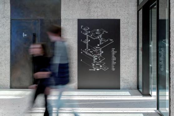
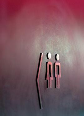
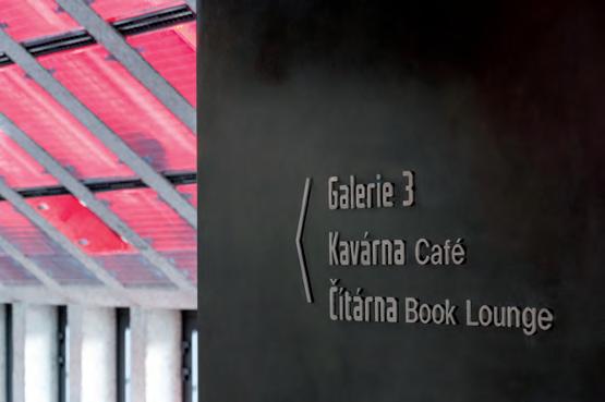
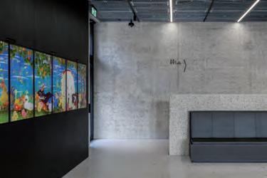
What was the challenge?
In the middle of Berlin Kreuzberg, PANDION OFFICEHOME developed a modern commercial courtyard with contemporary, flexible spaces as an optimal “new work environment” for start-ups and traditional companies alike. The wayfinding system gives the building complex a visual identity and creates orientation. The Grid supports new ways of working with, among other things, the topic of health promotion – for example, in the form of large exercise wall graphics and a particularly bicycle-friendly design of the underground car park with a low entrance slope and shower facilities.
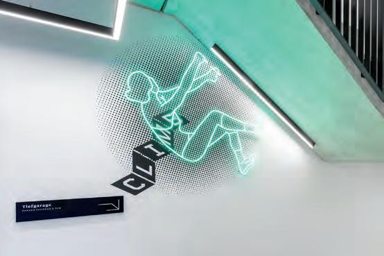
What was the solution?
Moniteurs designed individual graphics and motifs to inspire and accompany all users in a friendly manner. Typography: The combination of the geometric typeface Foundry Gridnik and a semi-bold serif typeface makes the signage system a mix of styles typical of Berlin Kreuzberg. The logo was designed by Moniteurs to complement the PANDION brand and staged as a light sculpture in the courtyard. Next to the lifts are level overviews where new tenants can be added as required. Black, white and green – and a striking location marking in red – a minimal colour concept runs through all elements of the wayfinding system. The stretching exercises “Wannsee duck”, “Berliner Ring” and the “Goldelse” make you want to use the stairs instead of the lift. The multistorey car park is integrated into the overall visual concept. Bicyclists welcome! The Grid offers comfortable bicycle parking in sufficient quantity.
Contact: Moniteurs
info@moniteurs.de www.moniteurs.de
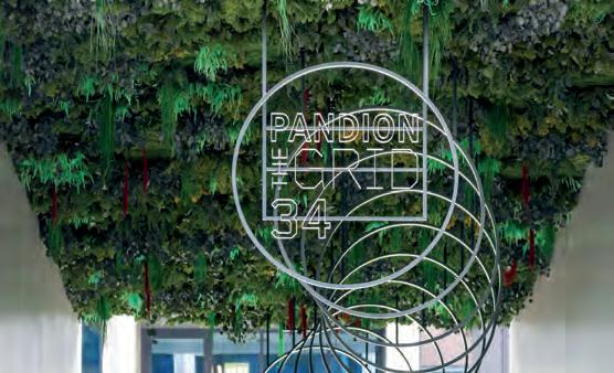
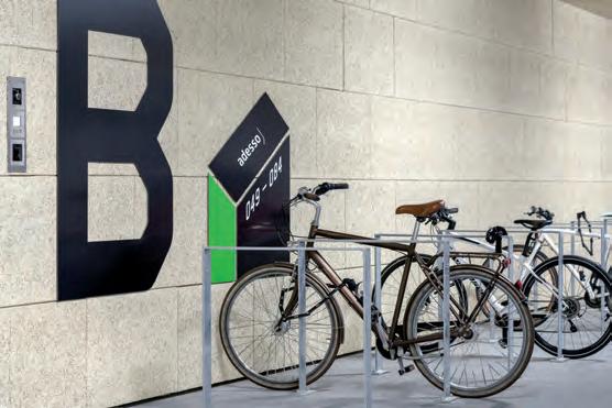
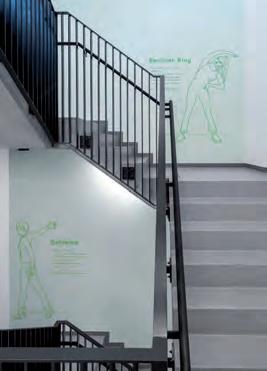

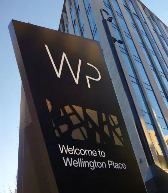
What was the challenge?
Leeds’s newest dynamic neighbourhood presented a huge wayfinding challenge to overcome: it is inward-facing so doesn’t naturally draw people in. Its navigational challenges included:
• indistinguishable building facades with multiple entrances
• wide boulevards which also were not easy to identity, and
• no visual representation to the development to help people build a mental map of the site, which all added to the confusion.


What was the solution?
To give user confidence we set out design principles and a clear information and sign placement hierarchy. Sign typology and key orientation points nudge users from arrival gateways through to the building entrance markers.
From early on we knew a digital design would be the right approach: the quarter is being built out in phases so we needed a creative solution that could adapt as the place changed.
The sign form takes inspiration from the angular aerial footprint of the development and expands the use of the brand pattern. Signs complement the public realm and architecture, with colour details matching
building finishes. We recommended the consistent use of materials, colour and the distinctive angular form to create a recognisable visual identity.
The sign family is dynamic and flexible. Information that won’t change has been fixed while variable information is fabricated in materials that can be easily and economically replaced.
Contact:
name: Sophie Campbell
company/organisation: Placemarque
e-mail: info@placemarque.com
website: www.placemarque.com
What was the effect?
The scheme uniquely translates the Wellington Place brand (professionalism, vibrancy, welcome, accessibility).
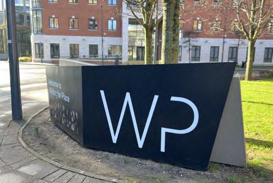
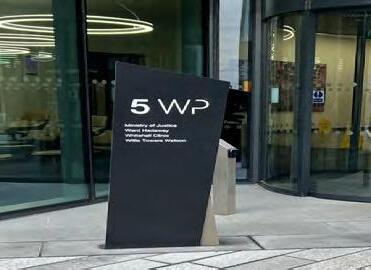
It successfully presents users with strategically-placed navigational information throughout the site and connects the development with the city centre and key transport links.
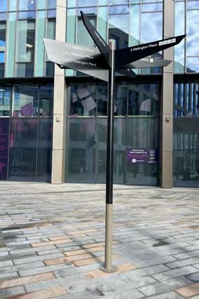
“Placemarque took the time to understand the unique characteristics of Wellington Place and what we wanted to achieve with the wayfinding scheme. They were ambitious in their design and delivered on the brief, both conceptually and technically, whilst responding to the site constraints. Their attention to detail, when it came to finalising the design, sign locations, working with the sign manufacturers and overseeing the final site installations, was fantastic.”
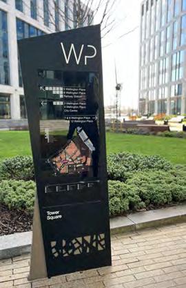 -
-
Miles Jones, Senior Development Manager, MEPC Limited
Category: Wayfinding
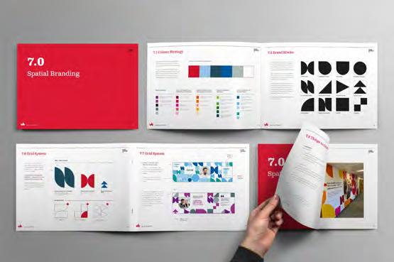
What was the challenge?
The University of Bedfordshire needed to improve the internal campus environments to create a sense of place and belonging and reflect its key messages and personality.
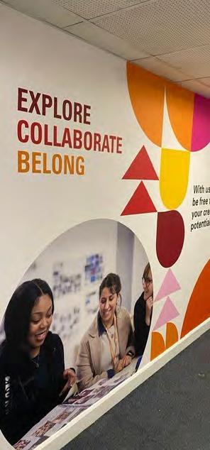
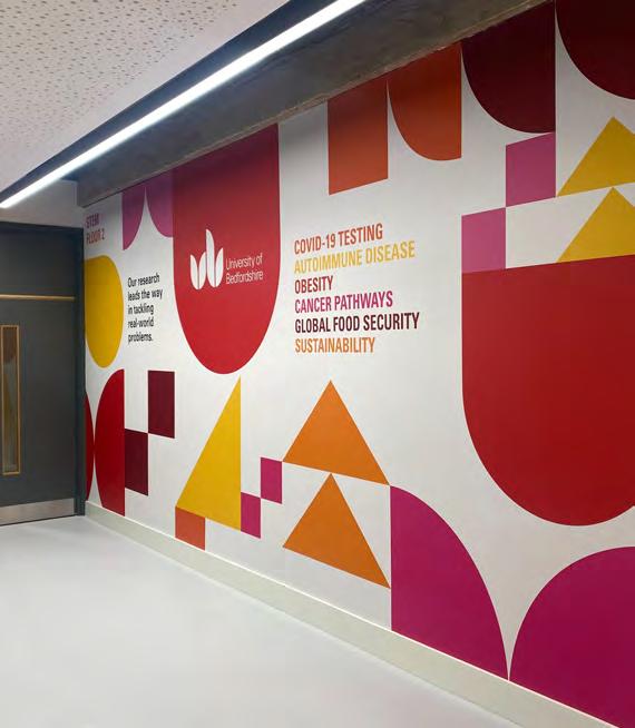
Spread over two campuses and with numerous different faculties and schools, we needed to come up with a consistent graphic intervention to tie the estate together and bring a clear sense of place.
Contact:
name: Sophie Campbell
company/organisation: Placemarque
e-mail: info@placemarque.com
website: www.placemarque.com
What was the solution?
We provided innovative ideas, producing concepts, design and artwork and a wayfinding toolkit, to give the University dynamic and inspiring internal zones with plenty of personality.
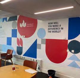
The project was delivered in three phases.
1. We created a series of universitybranded “welcome” spaces (key internal entrance points and shared spaces) within campus buildings, thinking particularly about how to be inclusive to all users.
2. Then, using colour psychology and working closely with the recruitment, outreach, admissions and marketing teams, we devised rationalised colour palettes to create a series of tonallyinfused spaces that conveyed each faculty’s voice.
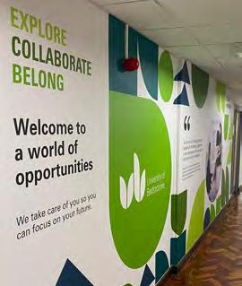
3. Phase three was informed by user engagement and focused on creating a series of community spaces that display student & graduate success stories and diversity values.
The physical branding can be adapted as the functionality of the spaces change while maintaining a coherent application of the brand elements.
What was the effect?
The scheme uses a unique combination of colours to demarcate areas through a fusion of geometric shapes. By introducing the new spatial design principles into the built environment consistently, the art underpins and enhances the university’s values.
The branding interventions create spaces that encourage “the water cooler” phenomenon to happen: when students, staff and visitors spontaneously interact with each other informally they come into contact with other ideas and perspectives, leading to the “cross-fertilisation” of ideas. It all helps to challenge a student’s own thinking, so they grow into more considered individuals, and is something which the university is keen to encourage.
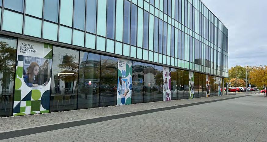
Category: Wayfinding
Project: Jana Graudona taka at Turaida Museum Reserve
What was the challenge?
To create a visually appealing and narrative wayfinding that would not clash with the surrounding historical heritage, but would still serve to attract visitors’ attention and guide them to the right path.
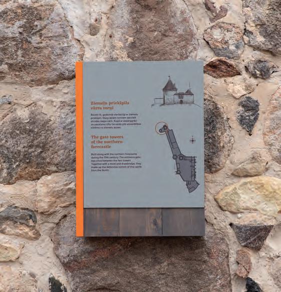
What was the solution?
Using combinations of materials that have appeared historically, while choosing a typeface that is reminiscent of the historic typeface but still contemporary. The added accent of colour helps to link the functional purpose of the navigation sign with a fresh and eye-catching appearance. Wayfinding signs integrate additional information about the viewpoint.

The final wayfinding system, integrated into the appropriate environment, provides clearer and more consistent information and helps to navigate the reserve. The wayfinding signs are equally effective in summer (when the trail passes through dense scrub) and in winter (when nature is almost monochrome). The customer experience was very positive.
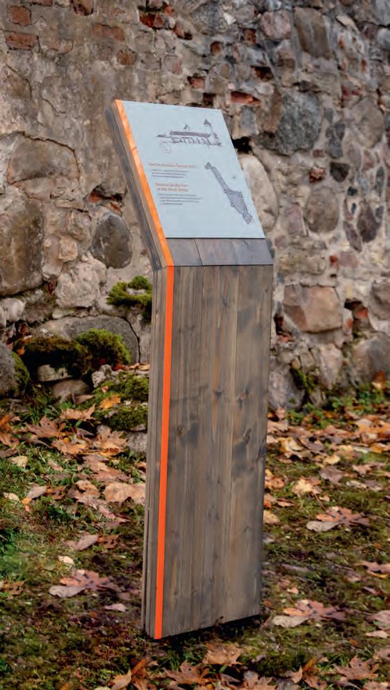
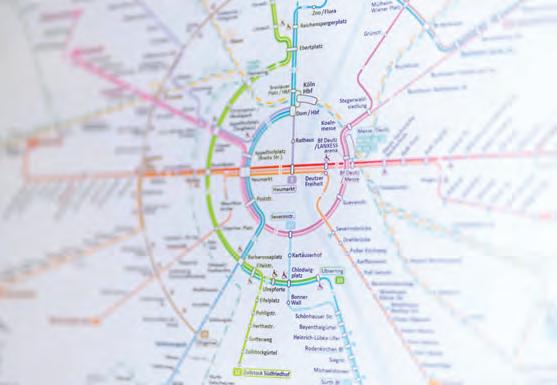
What was the challenge?
Efficient and dependable orientation is crucial for the transportation infrastructure of a major city like Cologne, Germany. The key to achieving this is a clearly laid out network map. The challenge arose when attempting to adapt a route network map to the rounded shape of the city, in order to enhance navigational clarity. Designing such a map requires striking a delicate balance between abstraction and realism.
What was the solution?
We have devised a new map for the city of Cologne, based on meticulous analysis and an original concept by Maxwell Roberts and Benedikt Schmitz. Through careful consideration, we have successfully achieved the ideal balance between abstraction and realism, resulting in a radical departure from previous map designs. The city’s distinctive ring-shaped structure has been utilized as a primary guide for orientation, with all lines radiating from the city’s center point. Crucial passenger information has been incorporated to supplement the circular design of the map. This intuitively comprehensible network map, with its concentric structure, represents a pioneering achievement in Germany.
What was the effect?
The objective of the new map was to facilitate swift and dependable orientation within Cologne’s expansive network of transportation lines. It serves as a testament to the substantial benefits that result from combining user-friendly design with advanced navigational features, which ultimately enhance the value of passenger information for all.
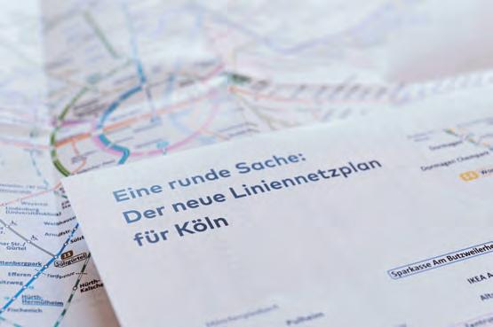
Contact:
name: Sandro Groll
company/organisation: DID INFORMATIONSDESIGNER GMBH
e-mail: sg@die-informationsdesigner.de
website: https://die-informationsdesigner.de
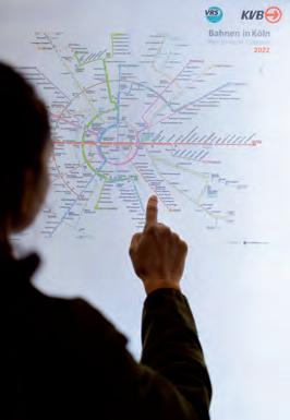
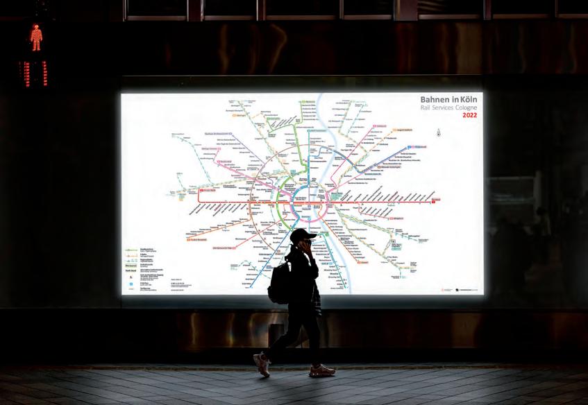
What was the challenge?
A complete redesign of all visuals and presentation for Strætó, the public transport system of the greater Reykjavík area. To make the system both more accessable to the user, but also to make a system of production of materials that was simpler for Strætó. The older systems had manually created maps and timetables for each bus-stop, which had become impossible to keep up to date.
What was the solution?
A completely new design language, made to be clear, modern and most of all easilly updated. This included all maps, timetables, and sigage, as well as a new website — based on the same visuals and even more detailed live information on the location of upcoming busses. Also a unique program that exports all prints for the busstops (both larger maps and routes, as well as timetables) as final PDF’s ready for printing. These collect the data from Strætós systems, thus always being up to date.
What was the effect?
A much clearer and unified system throughout all points of information; printed maps, routes and timetables, live data at stops, app, website, signage and more.
www.bus.is
Contact:
name: Hörður Lárusson
company/organisation: Kolofon
e-mail: hordur@kolofon.is
website: www.kolofon.is
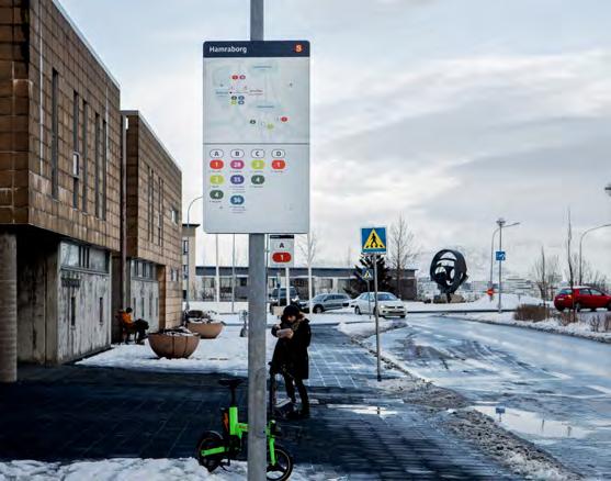
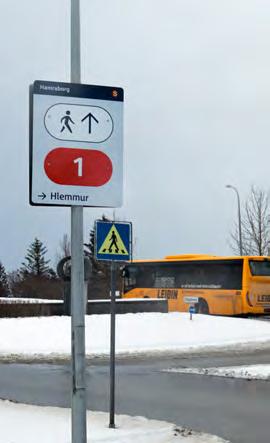
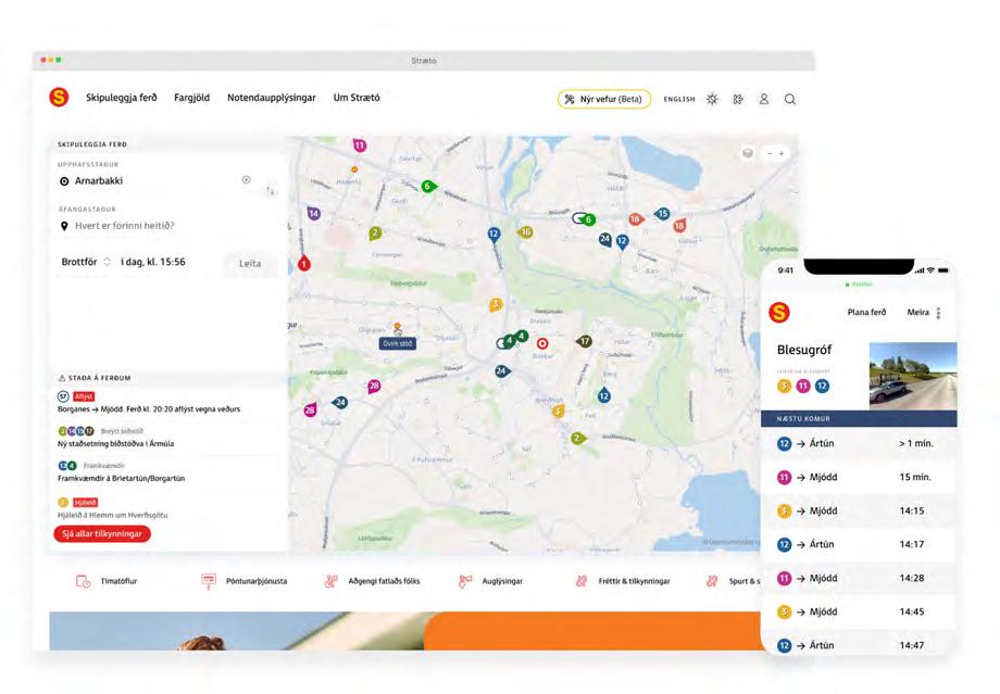
What was the challenge?
Boasting a population of 12.1 million people, Île-de-France stands as France’s most dynamic economic region, with Paris serving as its beating heart. Its public transportation services are composed of metro, train, tramway or tram-train, and bus networks, all managed by Île-de-France Mobilités, the public Organizing Authority. These transportation services allow for nearly 9.4 million daily trips.
To create a unified experience for all transportation offerings, ÎdF Mobilités enlisted Attoma Assist Digital agency’s expertise in Information Design applied to public transport and mobility. Attoma Assist Digital partnered with ID Matter, an Information Design boutique based in Milan, Italy, to create a distinctive visual vocabulary and syntax for travel information across the region, surpassing the guideline sets of individual operators such as RATP and SNCF.
What was the solution?
Attoma Assist Digital put forth a design strategy grounded in two principles:
– Ensuring accessibility and readability across a complex and highly interconnected multimodal network;
– Engaging stakeholders, including the two current leaders, RATP and SNCF.
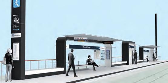
Accessibility and readability were addressed by emphasizing differentiation among the graphic objects comprising the system, particularly the mode and line symbols, based on the cognitive principle that radical visual differences enhance the quick recognizability of items within a complex information system. By instance, this was achieved through an articulated visual vocabulary that combines historical symbols, such as the letter M representing the metro, with a new pictogram to represent the tramway. The system maintains consistency despite its diversity through the introduction of a new font and standardized graphic codes, including a library of common shapes, a simplified color palette, and a library of pictograms. Throughout the project, various design options were tested in actual stations with real travelers.
The involvement of stakeholders was ensured by organizing a series of workshops in which different options were discussed and collaboratively validated. As such, the internal design agency of SNCF, AREP, made a factual contribution to the definition of certain graphic elements, while experts from RATP actively participated by providing usability recommendations. Finally, Attoma Assist Digital and ID Mat-
ter produced the complete repository of graphical specifications for the new travel information system, which was published in 2020 and has been gradually deployed throughout the network, as installations are renewed or new lines are opened.
Despite the concerns raised by certain stakeholders regarding a potential risk of confusion among users, the gradual deployment of the new system appears to have been widely accepted. The various operators responsible for implementing the new system on the network have adeptly assimilated the guidelines put forth by Attoma Assist Digital, resulting in a seamless transition. All in all, ÎdF Mobilités deems this project a resounding success.
Contact:
name: Giuseppe Attoma Pepe
company: Attoma Assist Digital (Paris, France)
e-mail: hello@attoma.eu
website: www.attoma.eu
Mode symbols: above – pre-existing library; below – new library designed by Attoma (light and dark background)
Line indices: above – pre-existing library; below – new library designed by Attoma (light and dark background)
Rationalization of the color palette for line indices and optimization for use on light and dark backgrounds (partial view): left – pre-existing palette; right – new palette
Application of new library on maps
Project: SYSPAD
With 1 200 000 daily travellers, the RER A mass transit line in the Paris rail network is the busiest one in Europe. The line is very touristic and welcomes many kinds of travellers, 74% of them are not familiar with the RER A, which is made of branches with several terminal stations and served by trains not always calling at each station. In this context, the challenge for RATP is to inform the users about the service offered by the trains in an universal way. The goal of RATP was also to fluidify passengers’ exchanges between trains and platforms to facilitate and foster global traffic on RER A.
With the SYSPAD, RATP aims to help occasional travellers and relieve overcrowded platforms. Our internal design team in collaboration with User Studio design agency worked on user research and followed a service design approach that led to information screens based on the
to learn more : https://user.io/en/work/ratp-rera-pid-syspad-en/
Contact:
Name: Guillaume Gendrillon & Alexandra Theunissen company/organisation: RATP
e-mail: guillaume.gendrillon@ratp.fr & alexandra.theunissen@ratp.fr
RER A schematic map, and highlighting the branch followed by the train. This dynamic representation shows the direction of the train and every served station. The screen also delivers the waiting time before the next train and alerting messages in case of operation disruptions.
The SYSPAD reinsures occasional passengers, with strong RER A identity marks such as the ‘A’ letter, the red colour, the ‘RER’ pictogram, and the chromosomic RER A line shape. To answer to overcrowded platforms situation, the SYSPAD must be instinctively understandable and legible. Therefore, the SYSPAD relies on visual representation, simplicity and large size signs.
RATP worked in a ‘design to cost’ approach. Each display is composed of 2 standard screens juxtaposed to create a panoramic dynamic surface. For a better integration with all station’s architectural types, RATP designed two formats, horizontal and vertical. The horizontal version is positioned in parallel to the tracks with an animation illustrating the movement of the train. The vertical format is positioned perpendicularly to the platform edges to follow the perspective of the rails. The SYSPAD design respects the RATP Design System, which ensures all our service components to be coherent and consistent in terms of signs, products, and environments.
Today, 99% of RER A passengers are satisfied by the SYSPAD, that’s why RATP has decided to deploy the system on the RER B line. Today, customers use the line drawing as a sign to identify the train to take. Passenger information efficiency has increased, and the boarding travellers’ fluidity on the platforms has been improved. The images of the Paris transportation system and of the RATP have been directly upgraded with the SYSPAD system.
For Verkehrsverbund Tirol, a new design of timetables was developed for nearly 3500 stops, 6736 platforms and around 230 lines in the region. A particular challenge was to design the timetables for various display formats and different complexities in a consistent manner. The extensive information was to be read as quickly and unambiguously as possible. At some stops, up to twelve timetables of different lines are displayed next to each other, which increases the complexity even further.
Two display types (urban/regional) were realized and can be used depending on the complexity and context of the respective bus stop. In the urban display an individual timetable hangs at each stop, indicating the times of that individual stop. Within a supplementary graphic the following stops are represented as a string of beads together with the estimated travel time. In the regional display, all following stops are shown with all departure times, which makes the time table much more complex. For both types, the design was adapted to four different formats (DIN A3 and A4 in portrait and landscape format) to ensure the greatest possible flexibility in posting.
The final timetable design has a high recognition value and complements the visual appearance of the VVT in a coherent way. A clean design, reduced to the essentials, optimal reading guidance and clarity provides the appropriate framework for a comprehensible flow of information as fast and smooth as possible.
Contact:
name: Barbara Hahn, Christine Zimmermann company/organisation: Hahn+Zimmermann website: www.hahn-zimmermann.ch
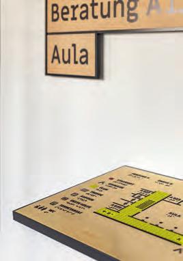
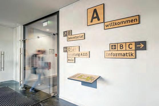
What was the challenge?
An inclusive guidance system for the architecturally heterogeneous school with three building parts from four decades and each with a very distinctive color scheme. The whole project had to be perceived visually and tactilely, implemented aesthetically and from ecologically sensible materials.
What was the solution?
First the creation of a greater visual level for the signage, then the development of a “guidance logic”. In this way, the areas required for information and an intuitively understandable orientation system were created. Realized with wooden surfaces in painted aluminum profiles or edged steel holders for the tactile plans. Changeable frames and visual-tactile information on the doors. A tactile model of the building in front of the main entrance and so on.
What was the effect?
Pupils, teachers, parents, visitors to events will find what they are looking for. The school principal wrote, that after a year she is still happy about the guidance system every day, she receives a lot of positive feedback. Most importantly, with the barriers removed, the school is now truly accessable for everyone!
Contact:
name: Andreas Koop
company/organisation: designgruppe koop
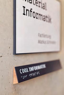
e-mail: a.koop@designgruppe-koop.de
website: www.designgruppe-koop.de
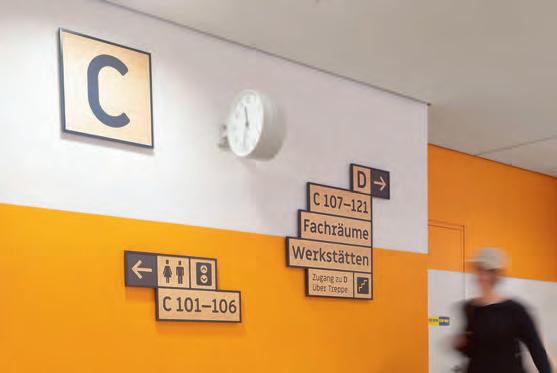
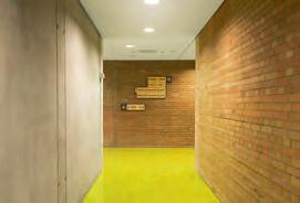
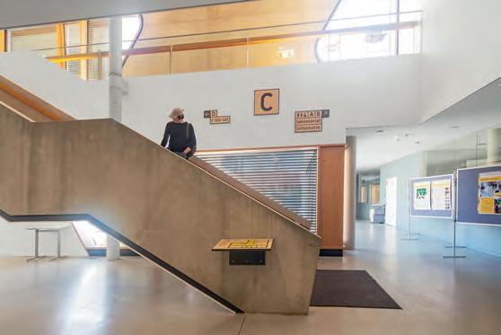
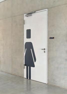
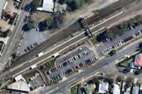
What was the challenge?
Queensland Rail’s decentralised rail system delivers services across the state’s approximately 1.85 million km2
South East Queensland is, at 35,248 km², the most densely populated area of the state. 152 rail stations connect passengers across the South East, from Brisbane, north to the Sunshine Coast, south to the Gold Coast, east to the Airport and Cleveland and west to Ipswich and Rosewood.
Station typologies range in size, infrastructure, age, amenities and accessibility features.
Queensland Rail have embarked on a long term programme, upgrading stations across the state to support equitable access for all users. It was identified that information available to users looking to plan their journey was incomplete or outdated. Details on station layout and provision of key accessibility and functional features – up to 30 for some stations – was inconsistent.
The Client’s brief was to design maps that provided accessible information that would equitably assist users with their journey planning. The maps were foremost designed for viewing online as well as for downloading and printing. Resolving these challenges would require the development of a graphic system to meet all relevant accessible standards, whilst being simple and flexible enough to be effectively implemented across the network.
What was the solution?
Investigation
A thorough investigation of the project was guided by the Universal Design Principles for Transport. This benchmark guided the design process throughout the project.
Analysis
In the first instance, research into the usability of the current map, as well as analysis of precedents for accessible mapping in Australia and around the world, helped to draw a clear picture of shortfalls, successes and opportunities. Taking a finer grain approach to the analysis, our focus turned to the identification of critical information and elements to be included in the maps – map approach, map boundaries, orientation, graphic devices, pictograms, colour palette, typography, and map legend.
Strategy
The overarching strategy concentrated on designing a graphic system that responded to the principles of Universal Design. Complex information was to be delivered as a flexible kit of parts that could be applied effectively to capture and communicate a wide range of explicit and implicit information.
Ruthless Simplification
“Flexibility in use” informed the design of a diagrammatic style of mapping, allowing for the simplification of geographic boundaries and road network system to achieve maximum clarity.
Differentiated Elements
“Perceptible Information” allowed to differentiate elements in ways that could be easily recognisable. To achieve this the map approach highlights station platforms, differentiates core zones, car parks, roads, overpass and accessible paths.
Eliminate Unnecessary Complexity
To ensure “simple and intuitive use” the map approach simplifies the infrastructure, urban domain and road footprints. The map orientation was rotated, employing a simplified diagrammatic north up orientation to assist with cognitive mapping.
Consistent use of access colour to highlight important information i.e. core zones and accessible boarding points. Contrast colour coding for secondary and tertiary layers of information i.e. urban domain parking in grey, all access routes and entry thresholds in orange.
Clearly marked accessible boarding points, key destinations and accessible pathways and direction of travel.
Perceptible information
Perceptible information aims to reduce the visual noise of the urban domain and road network. Highlighting entry thresholds, platforms at level or otherwise, lift cores, stairs, accessible route and boarding points visually warn users of changes in the physical environment and their journey.
Pictograms were added to existing international standard suite– to ensure readability by a diverse user group.

Typography was interrogated for its suitability, readability and legibility for all users.
Colour contrast and colour blindness tests were undertaken for appropriate levels of luminance contrast. The map achieves CUD compliance after testing for Deuteranopia-Type and Protanopia-Type, the two most common types of colour blindness.
Guided by the Universal Design Principle “Tolerance for error” a graphic device was designed specifically to clearly define the core zone on the platform, which in turn provides a fail-safe feature.

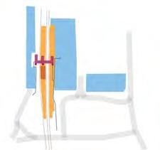
Eliminating unnecessary complexity ensured not only compliance with accessibility requirements, and improved readability of information through an accessibility lens but also provided an improved user experience that was considered from an inclusive and equitable perspective. The kit of parts approach is currently being applied to regional train stations throughout Queensland. Given the population growths Queensland is experiencing, this provides the rail network with a scalable solution for future works.
Core elements of the flexible kit of parts – graphic system.
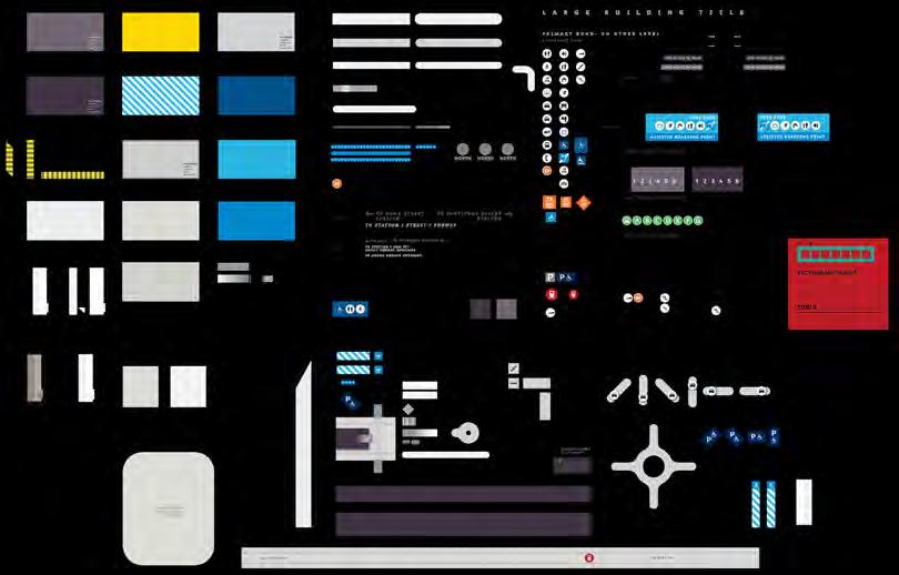
Typically, access related activities, amenities and infrastructure i.e. carparks, platforms, accessible pathways are linked to the accessible blue colour palette.
1. Platform colour → High contrast to differentiate platform from other elements

2. Pictograms → convey clear simple messaging
3. Core Zone text and pictograms grouped together → increased readability and legibility
4. At level platform tag provides clear information


5. Concise text co-located with pictogram → can be comprehended by non english speakers


6. Core Zone uses accessible blue to highlight information consistent with its importances
7. Urban Domain and Carpark recedes using tones of grey
8. Accessible pathway → high contrast, pathway graphically defined as a series of dots, contained within a high contrast field, works over positive and negative fields
9. Major roads form clear geographic boundaries to assist with cognitive mapping.
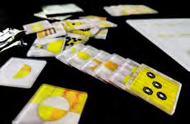
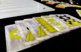
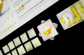
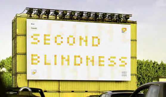
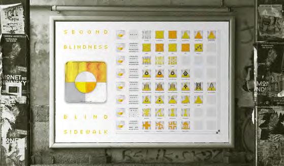
What was the challenge?
It is obvious that as a developing country, a country with a vast territory and a large number of citizens, the development of many cities in China is not sufficient and unbalanced. Also, public service facilities are not perfect. For example, there are a lot of problems in the construction of blind sidewalk in many cities in China. This can cause inconvenience and safety issues of people with vision impairment.
What was the solution?
Establish info-graphic poster and board game, so that the society and the public can know the problems faced by the blind sidewalk in the city. In this way, the problem of blind sidewalk has become an influential social topic, and people are stimulated to provide resources and professional capabilities to participate in the solution of this social problem, thereby creating a more inclusive social environment that protects vulnerable groups.
What was the effect?
My info-graphic poster and board game allows people to experience the difficulties faced by people with vision impairment. Under the guidance of visual information, people have a clear understanding of the current problems of blind sidewalk in China. This helps the public to form topics and let more people think about what they can do.
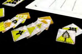
Contact:
name: Dian Jin
company/organisation: Wuhan Textile University-BIFCA
e-mail: 2230390118@qq.com
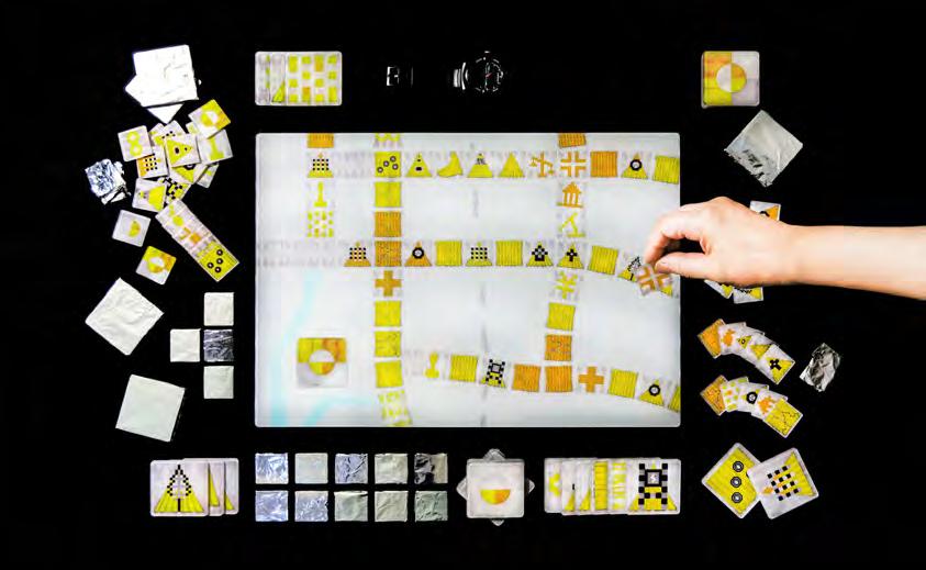
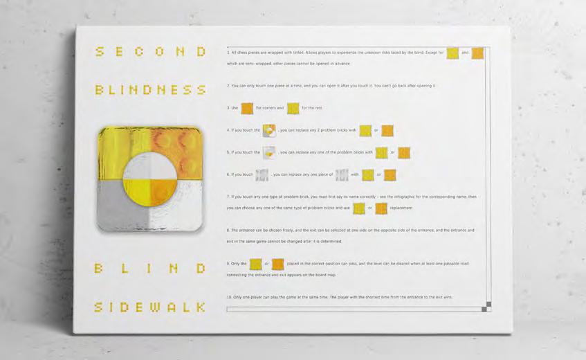
What was the challenge?
To make the breathtaking view from the Schlossberg Graz also accessible for blind and visually impaired people.


In 2020, the Graz Museum opened a new branch in the former Stall- und Kanonenbastei on the iconic Schlossberg hill. Besides being an important part of Graz’s history, the location also offers an outstanding view of the city: Many important landmarks are in close proximity, and the view extends into the surrounding countryside all the way to the mountains beyond the Slovenian border. As the museum is committed to being a museum for all, they wanted to make this special view accessible for everyone, including blind and visually impaired people. Together with the design team of Buero41a, Studio WG3, Ingrid Holzschuh and Graz Museum curator Martina Zerovnik, VRVis came up with the idea of creating a tactile panoramic relief mounted on the balcony that transforms the exact panoramic view into a 3D tactile version. It should not become a simple map of the city, but rather translate the visual qualities, the spatial proximity of the sights, the depth of perspective, etc., in a tactile way, mimicking how the human eyes perceive the world.
Contact:
name: Andreas Reichinger
company: VRVis Zentrum für Virtual Reality und Visualisierung Forschungs-GmbH
e-mail: reichinger@vrvis.at
website: www.vrvis.at/en/tactilepanograz
Since 2010, VRVis creates tactile translations of fine art and photography (e.g. for the Kunsthistorisches Museum and the Belvedere in Vienna) using an in-house developed tactile modeling software that follows a universal, inclusive design approach and involved participatory research with over 200 people with special needs and cultural institutions from all over Europe. For this project, the software was extended to create a panoramic relief from various data sources such as terrain data, vegetation maps and 3D building models from the Stadtvermessungsamt Graz. All were precisely aligned to a panoramic photo taken from the mounting point of the relief and merged to create a true-to-life representation. Special transformations were applied to mimic the depth perception of the human eyes, and each building was tilted to maximize the sense of depth, by utilizing the full height of the relief. Important buildings were given additional depth for a more three-dimensional look and feel. Cranes have been edited out and construction sites have been completed to make it timeless. Many details and over 60 chimneys were added to the coarse building models to match the actual view. Thin features, such as spires were reinforced for mechanical stability. Vegetation and water were specially filtered to create organic, soft shapes that contrast with the edgy buildings. Tactile markers (see image to the left) were designed to point out important landmarks without obstructing the view. The raised round shape is easy to recognize. A line points to the building. A Braille and raised type letter refers to the legend. The lower left area would represent part of the hill and trees. It has been flattened to accommodate the legend that names the major landmarks. This avoids long hand movements during tactile exploration, as is often the case with a separate legend.
The panoramic relief offers a tactile view for every visitor – even in bad weather one can “touch” the distant mountains.
The Graz Museum is one of the first museums ever to create a lookout point for blind and visually impaired people that translates not only the city map itself, but also the actual view. The inclusive nature of the information design goes beyond this audience, as the relief is accessible for wheelchair users, and is placed at a height that is also suitable for children.
As part of the museum’s permanent exhibition, the tactile panorama demonstrates how well tactile reliefs are suited to creating panoramic “views” for all people –and how well this offer is accepted by all audiences. The tactile panorama relief is to date unique in creating an actual perspective tactile image with depth of field by combining photo and model.
With the modeling software developed, any other location or view can now be made tactile more easily than ever before.
This is yet another important contribution to VRVis’ research path in the field of inclusive digitization with the goal of advancing inclusive design and tactile solutions towards greater inclusion and accessibility in both art and public spaces.
This panoramic photo was the basis for the tactile version, and was taken at the exact spot on the cannon hall’s balcony, where the relief is now mounted. Special filters were used to translate color into surface variations, adding detail and texture to the building models. Even windows, street markings, roof structures, and clouds are made tactile.
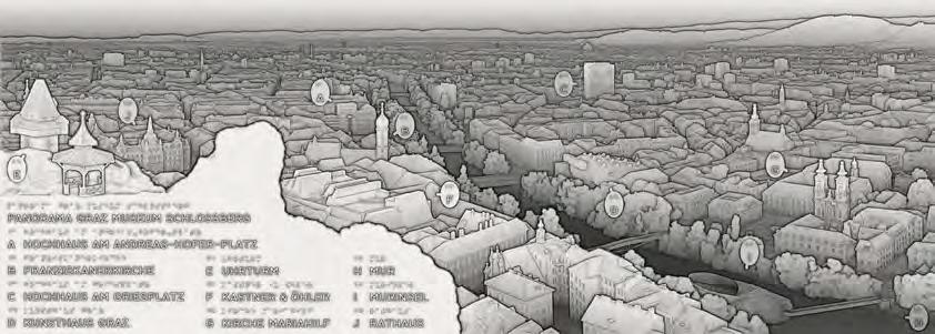
The final version of the CAD model. 3D renderings like these were used throughout the project to discuss progress with everyone involved. As perceived by the human eyes, close objects are not only larger, but also have a more pronounced depth. Nearby buildings, such as the city’s landmark Grazer Uhrturm and the Chinese Pavilion (both on the left), were thus modeled in great detail. Bushes were virtually trimmed to free up the view of the unique clock hands. Even the roof shingles and windows can be felt.
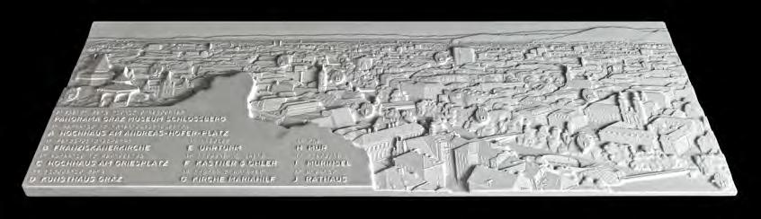
The finished 1260×450mm² large and 32mm high relief was CNC machined from DuPont Corian®, a material that is weather resistant, pleasant to the touch, does not heat up excessively in direct sunshine and can be machined to a high level of detail, a tremendous advantage over currently existing 3D printing processes. It was produced at the Department of Three-Dimensional Design and Model Making, Institute of Art and Design, Vienna University of Technology, especially by Florian Rist.
What was the challenge?
The International Olympic Committee’s Olympic Foundation for Culture & Heritage established the Olympic Agora as a cultural hub, enabling the Olympic movement to engage with the public during the Olympic Games through a free and accessible art and design installation. Following the global health crisis and subsequent postponement of the 2020 Games, the Olympic Agora for 2021 was adapted for an exhibition that would celebrate the connections between sport and creativity in the heart of Tokyo, while allowing social distancing. Five selected Olympians and one Paralympian were tasked with designing/creating Noren curtains (traditional Japanese panels that hang at entryways) to visualize resilience, optimism, determination, and global solidarity, ingrained in sport and cultural values.
What was the solution?
The design process was additionally guided by my goal of representation and communication without indication of gender, race, nationality, orientation, limitation, sport, stature, etc. The aspiration to create a universal message is realized in the inherently common need of humans to connect with the natural environment—a thread that all cultures share. The Noren curtains represent micro and macro moments that may occur during the Japanese practice of Shinrin-yoku (known as forest bathing in English)—providing calmness, balance, hope, and wonder. Parallels between our shared experiences with nature, and our shared experiences through the Olympics are visualized. Japanese characters are integrated with English, demonstrating partnership and respect for the host country, especially in consideration of travel restrictions.
What was the effect?
Thirty curtains hung before, during, and after the Tokyo Olympics in the busy Mitsukoshi-Mae Underground Passageway, celebrating the global community, human potential and determination at a time when hope and resilience were
a necessity. The creative contributors connected with the public through virtual and social media platforms. The Olympic Foundation for Culture & Heritage is in the process of planning the next rendition of the Olympic Agora for Paris 2024.
Contact:
name: Kelly Salchow MacArthur
company/organisation: Michigan State Univ
e-mail: salchow@msu.edu
website: elevatedesign.org

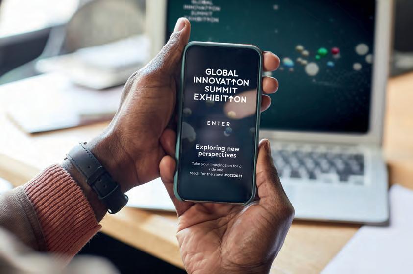
The challenge was to create a digital exhibition for the Global Innovation Summit 2021 event, organised by Steirische Wirtschaftsförderung SFG, the Austrian Research Promotion Agency FFG and the Eureka Network, showcasing innovations from 16 countries and 30 organisations. The digital space needed to be accessible on various devices without any specific app or player requirements.
The exhibition was presented as a galaxy and visitors could explore the planets, each representing different innovations. Visitors could enjoy a guided tour with two virtual guides Lydia and Jack. The use of uniform typography, visual reflection effects and arrows in red, green and blue as recurring
design elements standardised the different photo styles and graphics of the various organisations.
What
The website was easily accessible, aesthetically pleasing and quick to display, providing a memorable and informative experience for visitors. Visitors could explore the galaxy at their own pace or choose to take the guided tour and sit back and enjoy.
https://gis2021exhibition.com/
Photography:
CONTENT at the respective companies
DIGITAL Adobe Stock, look! design
Contact:
Stefanie Schöffmann
look! design in co-operation with “Animal Design” and “BITS”
office@look-design.at
www.look-design.at

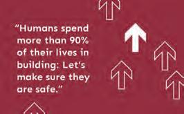


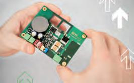
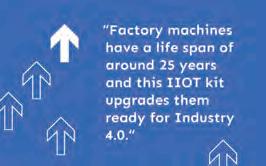
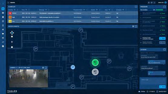
What was the challenge?
Thales needed to create a demonstrator of their operation control center to understand how to handle crisis management across station, trains and people.
What was the solution?
We developed a scenario based system allowing operators to manage their network by purpose and actions connecting all the network data. Each scenario allowed operators to drive operation strategy to handle crisis management, traffic density or even energy consumption.
Scenarios were based on real life events that could occur in stations and simulated actions to be performed by operators. They could then see how crisis events should be handle and how to connect operation control to station and emergency services.
Information design was key to identifying actions severity and allowing operators to handle crisis on such a critical system.
What was the effect?
When showcased at InnoTrans Berlin 2023, this demonstrator got a lot of traction from transportation network companies, generating leads and requests for future deployment.
1. Innotrans Berlin 2023.
2. Operator dashboard: multimodal.
3. Crisis management: procedure list.
4. Passenger density: line overview.
5. Passenger density: station view.
Contact:
name: Giuseppe Attoma Pepe
company: Attoma Assist Digital (Paris, France)
e-mail: hello@attoma.eu
website: www.attoma.eu

Emergency and Safety
What was the challenge?
With extremes in weather, Iceland has a great need to have up to date information on the status for transportation in and around the island. The Icelandic Road and Coastal Administration monitors these situations carefully, but needed to update the websites to deliver this information instantly and with more detail.
What was the solution?
Two “sister websites” were created — one for the sea and one for the roads. While the type of data is wastly different, they both have the sam approach on how to deliver the information to your computer or phone.
All data comes directly from the IRCA databases and have been designed to be visually clear and easy to read. The web also offers settings to help with readability, such as dark mode and a different color pallette designed for the color blind.
What was the effect?
The new websites were instantly a hit, with both the public and professionals (law enforcement, sea captains and such) taking them into their daily use.
See the sites live at: www.waves.is www.umferdin.is
Contact:
name: Hörður Lárusson
company/organisation: Kolofon
e-mail: hordur@kolofon.is
website: www.kolofon.is
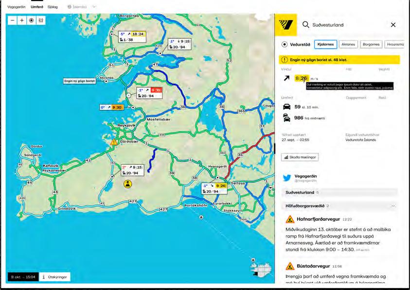
tras
Inicio
Período
19
FUENTES:
www.ibasecretariat.org monographs.iarc.who.int/wp-content/uploads/2018/06/mono100C-11.pd
AUSTRALIA 1940 Se un pueblo minero al oeste de Australia dedicado la extracción de asbest 1966 Se cierra la mina de Witt aunque el pueblo sigue contaminado. E gobierno australiano la llam "la mayo tragedia de salud y seguridad ocupacional de la historia del país comparable a las catástrofes de Chernobyl y Bhopal” 2003 Australia prohíbe la importació el uso la nta de producto contengan crisotilo, amosita y crocidolita, previamente prohibidos catalogada. U oye o de Ley prevee demoler las estruc restante 2016 Se encontró asbesto en el techo del nuevo Hospital Infantil de Perth; las pruebas del gobierno confirmaron la contaminación en erial procedente de China
SUDÁFRICA
1900 Sudáfrica, S zilandia y Zimbabw
1914 - 1918 Durante la guerra, EUA Canadá Sudáfrica son los mductores
2008 Sudáfrica anuncia la implementación de las Regulaciones para la prohibición del uso, fabricación importación y exportación de asbesto y materiales que contienen asbest el 28 de marz
BRASIL 1939 Comienza la explotación comercial del asbesto con la mina de São Felix en Poçes
1949 Un a fábrica entró encionamiento en Río de Janeiro.
1967 Comienza la operación de una
Minaç
2000/2001 Los cuatro estados que representan el 70% del mercado nacional de amianto, prohíben el amianto al igual que muchos pueblos ciudades Sao Paulo mplementa un prohibición inmediata
2000 A, una asociación formada por un grupo de extrabajadores del asbesto, copatrocinó la primera reunión mundial de activi tas de la prohibición del asbesto y víctimas del asbesto
ó 142,987 toneladas
2010 Brasil expor
2017 El Supremo Tribunal Federal proclamó que la extracción ndustrialización, utilización ccialización de todas las formas de asbesto no deben proseguir
CANADÁ 1876 Minas de crisotilo en Quebec establece la primera mina comercial de asbesto.
ductores
1970 nadá es el mayor produ mundial de fibra de amianto crilo.
1980 Se prohibió el uso de amianto crocidolita y limitó determinados usos de otros tipos de amianto.
2011 amianto ubicadas en Quebec
2018 E Gobierno publicó las normativas para prohibir el uso, venta importación exportación de amianto en todas sus formas
-
COLOMBIA
1942 s operaciones de fabricación de asbes emento de Colombiana S.A. en Sibaté.
2000 Aparecen iniciativas jurídicas y legislativas para la prohibición del asbesto pero fallan.
2019 Se aprueba Ley Ana Cecili Niño que prohíbe explotar producir omercializ mporta distribuir o exportar cualquier variedad de asbesto producto n él elaborados
able to identify an approximate gap of 30 years delay between regulations in European countries and the beginning of the Mexican asbestos industries. For example, by the beginning of 1930’s the UK was starting a partial regulation of exposure to the mineral while Mexico was establishing their first asbestos industry enterprise and starting to manufacture products such as sheets of roofing to the popular housing. Fourteen years earlier the insurance companies in the US decided not to cover workers that work with asbestos. These highlight evidence of health and scientific facts that asbestos exposure was toxic for people.
An important insight is the relation between social movements started by workers and
1828 onsigue la primera patente conocida sobre el ami material aislante en las máquinas de vapor
1896 En EUA omienza la producción de la primera fábrica textil de materiales de amianto.
1904 Primeros tableros de cemento de asbesto son producidos en EUA
1912 La Asociación Estadounidense para la Legislación Laboral menciona las enfermedades relacionadas con el asbesto Durante la guerra, E Canadá Sudáfrica son los mayores produ
1918 La ompañías de seguros en el Reino Unido y EUA se niegan a asegurar a los trabajadores del amianto debido a las malas condiciones laborales
1935 ynch & Smith en E A y Gloyne en el Reino Unido identificaron
a posible relación entre la e posición al amianto y el cán de pulmón
1964 El Dr. in Seiko f descubre un vínculo entre el mesotelioma y el amianto amosita.
1970 y de a limpio regu eliminación del asbes
1976 Restricciones a ciertos producto químicos: asbesto radón pintura base de plomo. Prohibiciones de uso de filtros que contienen asbesto en fabricación, procesamiento y envasado de productos
1986 Estándares para inspeccionar y remover asbesto en las escuela 2018 La gencia ambiental de EUA aú considera usos para el asbesto. 20 los tres pri impo aron 114 toneladas métricas de asbest
1932 jo el g Pascual O bio, se permite la importación de asbesto. Plutarco Elías Calle Secretario de Guerra y Marin fue designado Secretario de Industri Comercio y Trabajo
1932 Se nstaló en México la primera empresa de asbesto, llamada cho E urek
1942 Asbestos de México nicia operaciones en Sa Pedro Barriento en Tlalnepantla de Baz Estado de Méxic Década de 1960 México el may industrias manufac produc de asbesto, prtes de EUA Canadá
1960
need to anticipate asbestos future collectively. Some time comparison between periods showed evidence of inequality and social justice between the global north countries and the global South. The gap becomes broader if we sum aspects like corruption, bureaucracy and economic situations that carry the so-called underdeveloped economies. Those insights give specific light to the Mexican situation and our research project that made us realize the urgency of a total ban regulation, since the omission of the government is reflected in the health conditions of the population. But also the importance of attending problems at different scales and anticipating actions that will need to be taken from a safe point of view to remove already installed asbestos in buildings and structures in the future; these are aspects like bioremediation in Australia (Wallis et al., 2020) and most European countries are starting to talk about it (European Commission, 2022).
2006 De 1960 a 2006 México ha importado más de 481,636 toneladas de asbesto crisotilo o asbeso blanco, principalmente.
*To explore the time-line closer go to: https://vizcovid.myportfolio.com/infocoord
Bibliography and references
Hadley, B., & Rennell, T. (2013). Asbestos the future risk (D. Austin, Ed.). Iskaboo Publishing Ltd.
affected citizens in the process to achive a full legislation banning the use and commercialization of asbestos, especially for LATAM countries. This reflection took us to continue further analysis on how legislation works in each country, reviewing matters of operations, control and monitoring and focus on how countries are talking about “managing” asbestos instead of “removing”.
The visualization provided a general overview of facts in regard to world asbestos production to the research team and helped to understand that asbestos legislation is a dynamic process that needs to be constantly reviewed with safety limits and the urgent
Virta, R. L. (2006). Worldwide asbestos supply and consumption trends from 1900 through 2003. U.S. Geological Survey.
Acknowledges
Contact:
name: Nora Morales, Ivonne Ramírez
company/organisation: UAM Cuajimalpa
e-mail: nmorales@cua.uam.mx
website: https://vizcovid.myportfolio.com/ infocoord
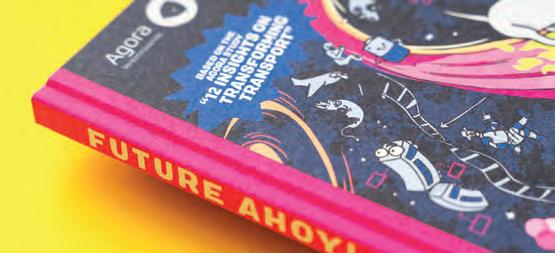
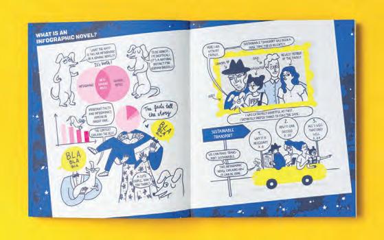
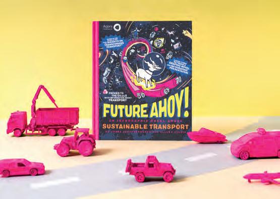
What was the challenge?
Over the past few years, German mobility think tank Agora Verkehrswende published more than twenty studies on the building blocks of climate-friendly transport, and the neologism Verkehrswende (“Transport Transformation”) has gained enormous popularity in Germany. The arguments and insights in favor of remaking transport are numerous. Nevertheless, the transformation has been slow to gain speed. We concluded it was time for a fresh approach.
What was the solution?
Working in collaboration with Agora Verkehrswende’s researchers, we repackaged their influential study “Transforming Transport to Ensure Tomorrow’s Mobility”. The result is a hybrid version of a graphic novel and infographics. By offering rigorous research in an entertaining format, we hope to simultaneously inform and amuse – while also mobilizing support for societal change. The future of transport is the overarching theme of this “infographic novel,” which focuses on a family spanning three generations – including a very special dog, Rudi the dachshund.
What was the effect?
The German language original version of the comic, “Abgefahren!”, became one of the most downloaded publications of Agora Verkehrswende and was heavily featured in media and at sustainable transport conferences. Because of its success, the German Agency for International Cooperation (GIZ) published this English language version, and most recently an Austrian data version was published by the Austrian Ministry of Climate Action, Environment, Energy, Mobility, Innovation and Technology.
Contact:
Ellery Studio
info@ellerystudio.com
www.ellerystudio.com
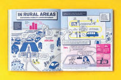
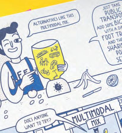
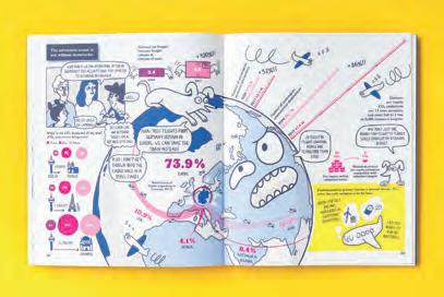
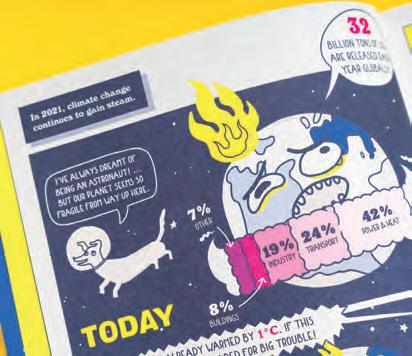
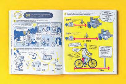

What was the challenge?
The climate battle cannot be won only by experts and politicians. But especially as a young person, it’s easy to feel discouraged, seeing how politicians continue to kick real climate action down the road. So to get young people to organize, inspire, and motivate others for change towards a more sustainable world, we must show them that they are capable of doing just that.
What was the solution?
The Climate and Sustainability laboratory (Folkekirkens Nødhjælp in collaboration with Silkeborg Højskole) has developed an edu-magazine with links to video material. It aims to 1: inspire young people aged 14-18 to get together and act on climate change, and 2: train creativity and innovation processes, as well as learn to plan events. While the subject isn’t sugar coated, the tone is hopeful, and the graphic is informal, playful, and engaging.
What was the effect?
The laboratory tested the material on a school with teenagers aged 15-17 – usually a tough audience. But their feedback was great on both content, form, and visuals. The next step is presenting the material to schools with a similar age group in all of Denmark, and hopefully it can ignite hope, commitment, and ideas for change.
Contact:
Casper Just caju@dca.dk
Art direction: Folkekirkens Nødhjælp
Illustrators: Dghzdesign, Pistooki, Ash Emritte, Fallanzdo
Graphic design: www.sigrun.nu

The participants scan a code to access video interviews on climate issues. When they place their phone on the magazine spread, the person in the video becomes part of the whole picture.
Besides creative innovation training, case examples, and more, the magazine presents a step-by-step check list for event planning.
Project: Microsite “Werte Umwelt”
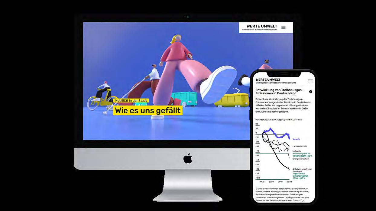
What was the challenge?
The German federal ministry for environment and nature conservation (BMUV) wants to address the pressing environmental issues of our time in a central location and give them a “digital home” on the ministry’s website. It is intended to make complex topics accessible to different target groups and communicate them in an understandable way. It was a big challenge to understand the scope and complexity of the requirement and to find the right way to conceptualize a working platform.
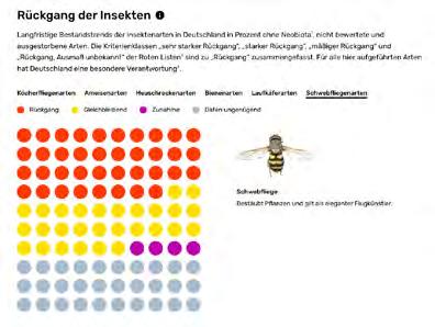
What was the solution?
We decided to take a data-driven approach because the federal ministry has access to a lot of raw data that we want to use as the basis of a fact-based storytelling platform.
In an elaborate and comprehensive process, we sort raw data into stories. For example, a story about the return of the wolf is created from data on species conservation and animal migrations in Germany.
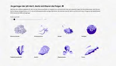
With this approach, we turned dry data into more than eight gripping stories, each with its own visual language and made them all available on the platform “Values Environment” (original: “Werte Umwelt”).
The microsite creates a digital home for the most pressing environmental issues of our time and makes people want to take a deeper look at environmental policy and is set up in an responsive scrollytelling format.
The microsite was broadly picked up and used to find and consume entertaining, interesting and important information about the topics of the BMUV. The content of the microsite was designed in a way that it can easily be shared online, in newsletters or other channels like social media. The microsite was also broadly used in events, and in a later stage some educational material and videos were created based on the stories of the platform.
Visit the platform here: werte-umwelt.sapera-studios
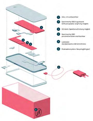
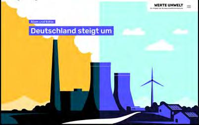
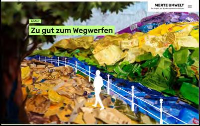
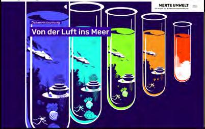
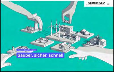
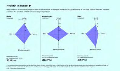
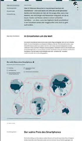
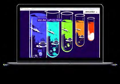
Login (Nutzername): sapera
Password: werteumwelt
Contact:
company: Sapera Studios GmbH
e-mail: hello@sapera-studios.de website: sapera-studios.com
What was the challenge?
Birdwatching is the observation of birds in their natural habitat. Birdwatchers observe and record bird migrations in data for a worldwide database. This helps bird conservation on a national and international level and can attract a large number of people to current environmental issues.
Belarus already had a birdwatchers’ organization, which was engaged in bird watching and recording data. The challenge was to involve more people in this topic in order to collect more comprehensive data for the country and also in general to involve people in relevant environmental issues, which were becoming more and more of a concern for environmentalists.
The birdwatchers’ organisation turned to the volunteer initiative of experts “kreaton” for help in finding out-of-the-box solution.
What was the solution?
We have focused on cities and major population centres. And in order to attract people’s attention to the topic of birdwatching, we decided to use social advertising on city billboards and on social media. Such billboards are free for social organisations and fills the space that is not occupied by commercial advertising.
But what to put on billboards to break through the banner blindness? We realized that people most often hear rather than see the birds. Birdwatchers already had an extensive database of recorded bird voices.
Contact:
name: designer Yuliya Chvyrova, creator Oleg Davydchik and kreaton team company/organisation: collaboration of kreaton team and ptushki.org
e-mail: design@illustrator.by website: kreaton.by, ptushki.org
Project Launch Date: 2020, Belarus
Claims on city billboards: “How does the finch say?” Get in touch with nature. Phone number. The call is free
Claims: “How does the bullfinch say?” Get in touch with nature.
Claims: “How does the chickadee say?” Get in touch with nature.
So we’ve created phone numbers for birds. An agreement with a telephone operator was signed to give out 10 numbers for each of the most frequently seen birds in Belarus.
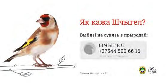
The design mechanics were as follows:
1. A person sees the design in the cities or in social media and wonders what kind of finch number it is. Calls the phone number.
2. The person hears the voice of a finch in reply. It sounds very impressive!
3. And after the person completes the call, he receives a text message from the bird saying, “Hi-hi-hiu! I suggest you get to know each other better. You can find out more about me here: website page”
4. The website had bird’s description, information about guides in the parks and about joining Birdwatchers’ Club 200.
The effect has been amazing for us. More than 10,000 calls were received in the first seven days. Many people called the birds back several times. There were messages on social media asking who had which bird was their favourite. The media picked up this news and there were more than 10 publications in various news portals.
The bird phone numbers were especially popular among children. And children brought their parents on tours of the birdwatching organisation.
This helped to get a significant number of new people involved in the topic of birdwatching, biodiversity protection and ecolodical problems. The birdwatching organisation managed to involve new subscribers in social medias and new people got involved in the ecological topics through additional events related to urban ecology and biodiversity protection.
Text in a message in response to a bird call:
“Hi-hi-hiu! I suggest you get to know each other better. You can find out more about me here: website.”
Claims: “How does the goldfinch say?” Get in touch with nature.
Project: Umwelterklärung 2022 des Abwasserverbandes Zirl und Umgebung
What was the challenge?
AV Zirl, a wastewater association for 14 communities in the Inntal in Tyrol (Austria), released their 2022 environmental statement. The challenge for this project was to effectively communicate the annual report and the critical role that AV Zirl plays in protecting the environment. Limiting printing and paper waste was a key consideration to promote sustainability.
What was the solution?
We used a water-inspired theme throughout the brochure, handmade letterpressed covers with a blue tint to give the impression of running water, and illustrations in a corporate blue color. We painted the number 22 by hand in ink on 900 covers, making each brochure a special one-ofa-kind. We printed only a limited number of brochures and instead we produced flyers with a QR code on biodegradable seed paper, promoting sustainability and the survival of pollinators. These solutions effectively conveyed AV Zirl’s commitment to environmental conservation.
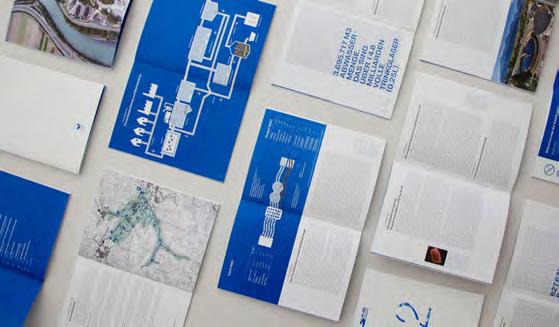
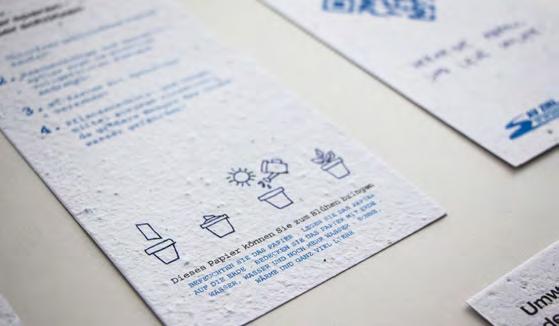
What was the effect?
AV Zirl’s environmental statement project positively impacted climate change by promoting sustainability, reducing paper waste and carbon footprint. Furthermore, by using seed paper made from biodegradable recycled paper, the project encouraged users to engage in sustainable practices, such as planting wildflowers that help to promote the survival of pollinators. Overall, the project demonstrated AV Zirl’s commitment to environmental conservation and sustainability, contributing to the global effort to combat climate change.
Contact:
name: Markus Scheiber, Jeler Tina company/organisation: motasdesign
e-mail: scheiber@motasdesign.com
website: motasdesign.com
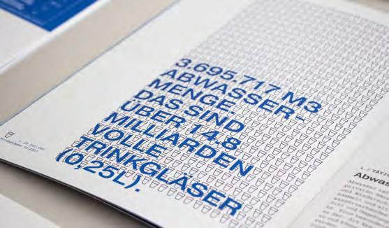
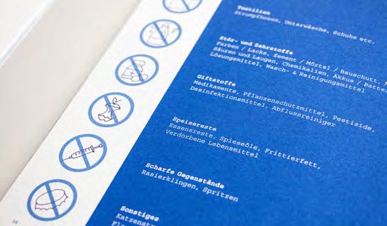
According to a recent study by the Association for Pet Obesity Prevention, half of dogs in the United States are overweight or obese. This is a major concern for pet owners as it can lead to serious health issues, including diabetes, heart disease, and joint problems.
In an effort to help address this issue, we are planning a cutting-edge mobile application that can help pet owners assess their dog’s weight status. The application utilises advanced technology to analyse images of dogs and provide an accurate assessment of their body condition, measured as the BCS (Body Condition Score). The BCS is similar to the BMI (Body Mass Index) in humans and provides insight into a dog’s body condition.
However, to ensure that the application performs optimally, it must first undergo a rigorous calibration process. This involves training the application’s algorithm to recognize and accurately classify images of overweight and obese dogs versus those of healthy weight. To do this, a robust and reliable dataset is required.
The challenge lies in acquiring this data in a systematic and credible manner, working with veterinarians to collect the necessary data to train the application effectively.
We created a complementary mobile application called the Weight Control Tool to populate the training datasets and finetune the algorithm.
Veterinarians can use the Weight Control Tool to assess the health of their canine patients by taking pictures of the dogs and then manually associating a Body Condition Score.
The calculation of the BCS depends on various factors such as the location, age, breed, and sex of the pet, which the veterinarian enters into the application. The system then uses this data in combination with the accompanying pictures to train the algorithm.
What was the effect?
The Weight Control Tool is still collecting pictures. To this day, thousands of submissions have been collected. Development is still underway to verify the quality of images submitted by veterinarians before they are uploaded to the application. There are also ongoing efforts to add metadata (e.g., morphology) to improve the algorithm.
From the data collected by the Weight Control Tool, the ultimate goal is to create an application for pet owners that would enable them to determine in a single photo if their pet is overweight or not.
Overall, the Weight Control Tool represents a significant step forward in the fight against pet obesity and has the potential to substantially improve the overall health and well-being of dogs.
Contact:
UX/UI Designer: Chloé Pignon
Technical Consultant: Frédéric De Rooster
company/organisation: Ekino
e-mail: chloe.pignon@ekino.com
website: ekino.com
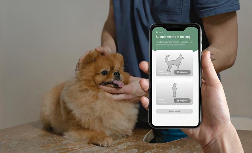
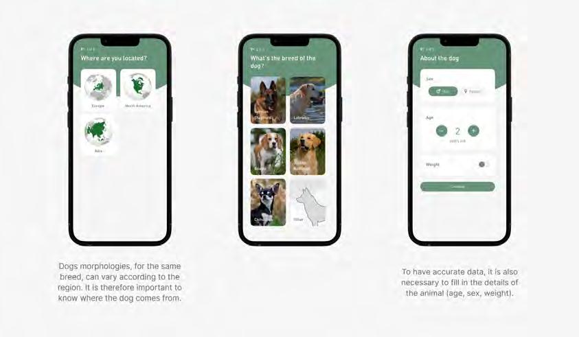
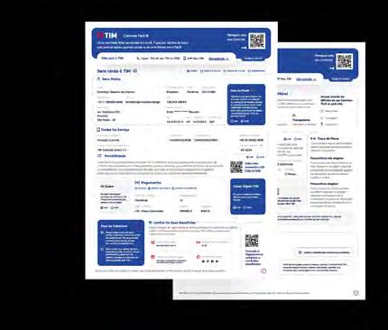
What was the challenge?
Contracts are traditionally very complex and hard to understand. Any standard contract has a lot of pages, legal jargon and too many pages.
At TIM, one of the larges Latin-American telecommunications company it was no different. The standard telecom service contracts were 33 pages long, packed with lots of complex legal informations, lawyer like language and no navigation aids. That resulted in two main issues: firstly, the general public contracting TIM’s services found it very hard to comprehend, leading to many complains, questions and ultimately lawsuits. Secondly, while in those lawsuits, courts themselves struggled to truly understand the message and legal aspects behind each contract.
Villa was then challenged with the creation of contracts that could communicate to the general public in a clear manner while maintaining proper legal liability in order to enhance both the publics understanding of their own contracts and courts interpretation of issues in hand.
What was the solution?
Together with a TIM working group, Villa developed a whole new format for service contracts.
Using plain language, design principles, technology and a lot of user research, the final version of the contracts managed to reduce what was formerly 33 pages long to a 2 page document.
This means that clients can now fully understand the services being contracted and all main legal aspects of the contract: price, payment timeline and penalties.
The solution is very much user-centered and aims at the better understanding of legal contracts and issues by the clients.
4 documents
33 pages
1 document
2 pages
The results of those changes were outmost positive. Now, with a 2 page simple document, clients are actually encourage to read through the entirety of it. With the navigation and design improvements lined up together with the use of plain language, clients understanding of contractual aspects and conditions has improved immensely, resulting in less questions, complains and ultimately minimizing lawsuits.
On that note, courts understanding the service contract has also improved, meaning that TIM’s message can now be clearly understood and properly addressed. This project is a concrete result of graphic design innovation in the legal field and has proven to be a path for transparency, effectiveness, cost efficiency and accessibility.
To better serve each contracting costumer, many different variables of the final documents were created based on their service choices so that no matter the combination of services being contracted the content would still remain in a two page clear document.
Contact: Kethellyn Siqueira
Villa - Visual Law Studio
e-mail: info@visuallaw.design
website: visuallaw.design
Category: Products and Services
What was the challenge?
In the age of smartphones and ubiquitous internet access, quick access to information and seamless interaction between the digital and physical worlds have become crucial. Traditional QR codes, while practical and useful, have limitations in terms of size, aesthetics, and integration with industrial design. This created a challenge for architects, designers, and urban planners who sought to incorporate digital interactivity in their projects without compromising aesthetics or functionality.
What was the solution?
Enter the XPAND Code, an innovative solution designed to bridge the gap between the physical world and digital information. The idea for XPAND Code was conceived while designing wayfinding signs for public transport. The need for a suitable tool to link the physical world to the internet led to the invention of the elongated barcode, based on existing technology. This next-generation tool builds upon the foundation of QR codes, but enhances their functionality in multiple ways:
-Size and Visibility: XPAND Codes are scalable and can be integrated seamlessly into various spaces and products. They can also be displayed at larger sizes and greater distances, making them suitable for large-scale projects.
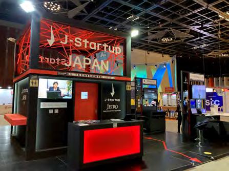
-Aesthetics: XPAND Codes offer improved design flexibility, allowing architects and designers to create visually appealing elements without compromising the code's functionality.
-Integration: XPAND Codes are designed for seamless integration with various materials, surfaces, and lighting conditions, making them versatile and adaptable to different architectural contexts.
One of the key advantages of XPAND Code is that it does not require a power supply or special inks, which further enhances its adaptability and ease of use.
*Note that this entry sheet introduces features and case studies from the XPAND Code 2020 version onwards.
The introduction of XPAND Code has had a profound impact on the design industry, opening up new possibilities for interactivity and connectivity between the physical world and the internet. Some of the key effects include:
-Enhanced User Experience: XPAND Codes provide an intuitive and immersive experience for users, allowing them to access relevant digital content quickly and easily by reading the code with their smartphones.
-Smart Cities: Urban planners are now integrating XPAND Codes into various aspects of city infrastructure, such as public transportation, wayfinding, and tourism, improving accessibility and promoting a more connected urban experience.
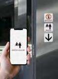
-Innovative Design: Architects and designers are embracing the potential of XPAND Codes as a creative tool, using them to develop interactive installations, augmented reality experiences, and unique design elements that combine form and function.

In conclusion, the XPAND Code is a game-changing innovation that addresses the limitations of traditional QR codes and offers architects, designers, and urban planners a powerful tool for creating more interactive, connected, and aesthetically pleasing environments. As this technology continues to evolve and become more widespread, we can expect to see even more groundbreaking applications that will further revolutionise the architecture and industrial design industries.
Contact:
name: company: e-mail: website:
NANMOKU Toworu XPAND K.K. info@xpand.co.jp
https://xpand.website


What was the challenge?


At the production site of the hearing aid company NEUROTH in Lebring, visitors are to be guided through the factory on an adventure tour. The aim was to convey the complex process of manufacturing hearing aids to the visitors in an entertaining and simple way. The tour was also intended to shed light on the history of the brand and as well as the elaborate production techniques.
What was the solution?
A visual “yellow thread” was implemented to guide visitors through the various exhibits and attractions, ensuring an enjoyable experience. The contents were also designed to be compact and visually appealing. In addition, permanent installations such as “360° sound experiences” were strategically placed to support the guide’s explanations and make the visit an sensory experience. With these thoughtful details in place, guests are sure to have a memorable and exceptional tour.


What was the effect?
NEUROTH as a brand can be experienced by visitors and also by employees. The communication of historical information and technical details is essential and results in an all-round coherent visitor experience. Furthermore, the employees benefit from the stations of the tour: the ambience in the canteen was upgraded, the 360° experience room can also be used for other events.
Photography: Neuroth International AG


Contact:


Stefanie Schöffmann look! design office@look-design.at www.look-design.at


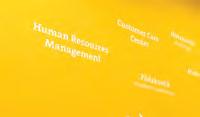


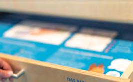
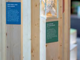
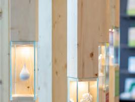
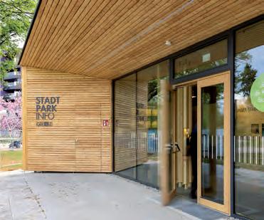
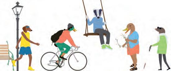
What was the challenge?
To create an engaging and informative exhibition about the 150-year old city park of Graz in a small 30m2 room surrounded by a playground. The aim was to show the various activities behind the scenes – including planning, gardening, monument conservation or safety. The exhibition needed to be clear and interesting to a broad range of age groups, with a focus on children and familys.
What was the solution?
A multifunctional wooden furniture offers space for many contents, exhibits, interactions and a “display table”. Additionally, storage space for necessary educational material and media technology is hidden behind it. Illustrated characters welcome all guests – they are colorful and humanized animals that are gender and culture neutral. Visitors can get an overview of the park’s history, browse drawers for more information, watch 12 videos of people giving an insight in their jobs in the park, and learn about animals, seasons, and monuments. Colorful illustrations were included for younger visitors, as well as additional information for older audiences. Finally, interactive elements were included throughout the exhibit, encouraging visitors to explore and try things out for themselves.
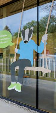
The Stadtparkinfo is a new hotspot at the playground for children (of all ages) and their parents. The facility provides space for a flexible educational offer through interchangeable contents. Different levels of information are offered – there’s something for everyone! The exhibition’s connection to the playground and inviting appearance attracted already many “returning visitors”, making it a fun and educational experience for all.
Contact: Stefanie Schöffmann look! design office@look-design.at www.look-design.at
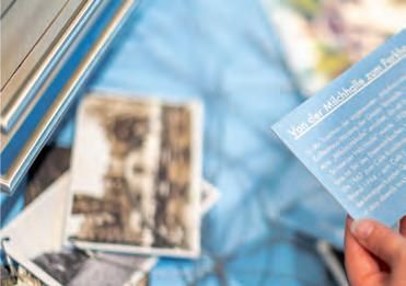
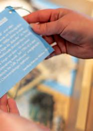
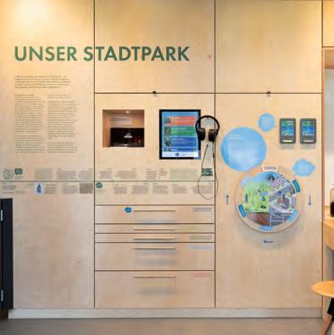
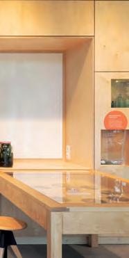
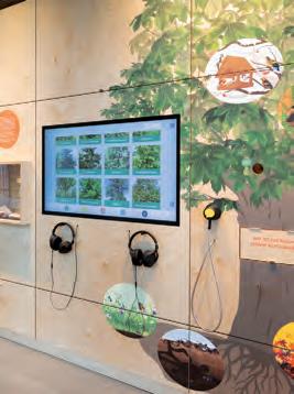
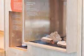
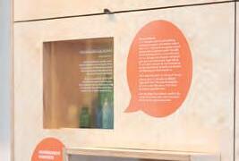

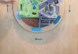
Category: Didactics
Project: Seminar and book «Lernmaterialien gut gestalten»
Lernmaterialien gut gestalten.
Was wird hier wie formatiert?
1. Was: Überschrift (Hierarchie) Wie: Größe, Bold, Achse, Weißraum
2. Was: Inhaltliche Struktur diagrammatisch auf zwei Hierarchien
Wie: Tabelle als Anordnungsmethode Größe, Bold, Achse
3a. Was: Arbeitsauftrag Wie: Fließtext
59
3b. Was: Arbeitsauftrag Wie: Fließtext
Die rechte Seite wirkt übersichtlicher als die linke. Es ist erstaunlich, dass diese Verbesserung mit vergleichsweise geringen Änderungen zustandegekommen ist. Die Analyse dreier Textelemente dieses Arbeitsblatts zeigt, welche Spielräume sich ergeben, wenn man die sprachliche Funktion eines Bausteins hinterfragt: 3a/b fungiert z. B. als Arbeitsauftrag an die Schüler·innen. Die Aufgabe des ersten Absatzes („Personalpronomen sind die häufigsten und wichtgsten Pronomen …“) liegt indessen darin, zu informieren – hier sollen die Schüler·innen also nicht agieren, sondern passiv Informationen aufnehmen. Diese leicht zu erkennenden inhaltlichen Unterschiede führen idealerweise zu Unterschieden in der Formatierung eines Dokuments.
Vier Maßnahmen haben zur Verbesserung dieses Dokuments geführt:
1. der Baustein „Überschrift“ wurde deutlicher, weil größer formatiert,
2. der zuvor zu stark hervorgehobene Tabellenkopf wurde etwas dezenter gesetzt und 3. wurde durch Hinterlegung und Piktogrammeinsatz der zu einer Aktion aufrufende Bereich schärfer umrissen. Die 4. hinzugekommenen Orientierungshilfen stellen das Blatt in einen größeren Kontext und erleichtern so die inhaltliche Auseinandersetzung. Dass bei den vorliegenden Beispielen überdies mit Unterstreichungen gearbeitet wird, von denen in diesem Buch ja abgeraten wird, liegt an der Entscheidung des Autors, die Arbeitsbeispiele der Studierenden möglichst unüberarbeitet abzubilden, auch wenn diese mancherorts weiter verbesserbar wären.
25 Wurde eine gut lesbare Schrift verwendet?
Schlüsseldefinitionen Bevor man eine Schrift wählt, lohnt es, einige ihrer grundlegenden Wesensmerkmale genauer kennenzulernen.
Die vier Änderungen:
1. Besserer Kontrast: Größer und bold
2. Tabellenkopf weniger Gewicht: Größe, Bold, Achse
3. Arbeitsauftrag auf einen Blick klären: Fließtext, hinterlegt Piktogramm
Serifenschrift
Serifenlose Formprinzipien
Der Duden definiert den Endstrich von Zeichen als „kleiner, abschließender Querstrich am oberen oder unteren Ende von Buchstaben“ (2020). Serifenschriften sind für längere Texte eine gute Wahl.
4. Hinzugekommen: Orientierungshilfen: Farbton, Größe, Anordnung
26 Lernmaterialien gut gestalten.
aa aa Dynamische
Die Formprinzipien der Serifen-Schriften findet man auch bei Serifenlosen. Die Wesensverwandtschaft zwischen der „dynamischen“ Minion (1.) und der Gill (2.) bzw. zwischen der „statischen“ Didot (3.) und Helvetica (4.) ist hier klar erkennbar.
Regular, Italic Bold, Bold Italic
Auch „Grotesk“-oder „Sans-Serif“-Schriften genannt. Das Weglassen der Serifen geht im Wesentlichen auf eine Entwicklung des späten 19. Jahrhunderts zurück.
1 2
Viele heutige Schriften wie die Minion (links) basieren auf Vorbildern aus der Renaissance. Im Vergleich zur Didot (rechts) wirkt sie dynamischer. Die „Renaissanceantiquas“ erinnern an das Schreiben mit der Breitfeder. Sie haben 1. eine schräge Achslage und 2. wenig Strichstärkenkontrast.
Eine Schriftart wird üblicherweise in diesen vier sogenannten Schriftschnitten geliefert. Von Schriftart zu Schriftart kann das Angebot an Schriftschnitten variieren. Die Schrift Calibri wird beispielsweise mit einem zusätzlichen LightSchnitt geliefert.Wie stark eine Schrift ausgebaut ist, hat somit Einfluss auf Ihre Optionen bei der Formatierung. (→S. 53)
Nicht alle Schriften beinhalten zwangsläufig alle Zeichen, die Sie für Ihren Unterricht benötigen. Es ist hilfreich, wenn man neben dem gewohnten Alphabet eine Auswahl an weiteren Zeichen hat. Dazu gehören mathematische Symbole, Währungszeichen, Trademark, echte Brüche (links ohne, rechts mit echten Brüchen) und viele Andere mehr. Word → Einfügen → Erweitertes Symbol
79
I
Die Tierkreiszeichen werden in der obigen Darstellung mit diagrammatischen Mitteln, inklusive einer beweglichen Drehscheibe, kommuniziert. Der Bildausschnitt entstammt einer astronomischen Sammelhandschrift aus dem 15. Jahrhundert.
What was the challenge?
After a remark to the former dean of Innsbruck University’s “School of education”, Michael Schratz, that the design of teaching materials actually influences pupil’s performance, I was invited to give a speech at a symposium on that topic. One year later this has led to an ongoing seminar in which trainee-teachers are made familiar with the principles of successful document-design. The main challenge was and still is that the field of learning-in-school can hardly be broken down into a set of do’s and dont’s. In fact, it appears that professionals in that field get easily frustrated with unasked “good advice” from people who have never taught themselves in schools. The other difficulty lies within the field of informationdesign itself, as it is evident on the one
Lernmaterialien gut gestalten. n einer Deutsch-Klasse während meiner Zeit als Unterstufenschüler in den 1980er-Jahren, verblüffte uns unsere Lehrerin mit der Ansage, wir müssten in ihrer Klasse lernen, wie man einen Busfahrplan richtig liest. Im Zuge der folgenden Stunde befassten wir uns also damit, der komplexen tabellarischen Anordung von Zahlen und Symbolen Bedeutung abzuringen (ein schwarzes Quadrat hieß da etwa, „Bus fährt nur an Werktagen, außer Samstag, nicht jedoch an schulfreien Tagen“). Über ein Jahrzehnt später während der Recherche zu meiner Diplomarbeit an der University of Reading verstand ich, dass viele Menschen nicht Karten lesen können und diese Fertigkeit deshalb an Schulen unterrichtet werden sollte (Blades & Spencer, 1987). Die bereits besprochenen vielseitigen Möglichkeiten der Anordnung und Formatierung von Schrift, Bild und Schema haben zu kulturellen Konventionen wie Tabellen und Landkarten geführt. Diese sind einerseits hilfreich, andererseits jedoch nicht für jede·n Leser·in problemlos entschlüsselbar.
Kernaspekte Im Alltag trifft man auf vielerlei informationsgrafische
Hilfsmittel: Bildhafte Prozessdarstellungen wie Ikea-Bauanleitungen, Balken- und Tortendiagramme, die Wahlergebnisse oder wirtschaftliche Entwicklungen verdeutlichen sollen. Hinzu kommen Tabellen im Sport, Landkarten am Navi und die Sichtbarmachung einer Vielzahl an statistischen Daten, zuletzt insbesondere aus dem Gesundheitsbereich.
Eine Gemeinsamkeit all dieser Visualisierungen liegt darin, dass Sachverhalte zueinander in Beziehung gesetzt werden, also in irgendeiner Form vergleichbar gemacht werden. Bei der Bauanleitung die Arbeitsschritte, bei Diagrammen die Zahlenwerte, bei Sporttabellen die Anzahl der Punkte und bei Landkarten die geografische Verortung der dargestellten Elemente usw. Möglich wird dieser Vergleich erst durch ein konstantes grafisches Bezugssystem. Wie beim Thema Formatierungen liegt der Schlüssel für die Anwender·in auch hier im konsequenten Einsatz der verwendeten Elemente. Wird der Regalboden des Ikea-Regals in Schritt 1 kleiner als in Schritt 3 dargestellt, sorgt dies für Verwechslungen. Nicht vergleichbare Größenverhältnisse bei Balkendiagrammen würden ins Chaos führen und ein wechselnder Maßstab auf einer Landkarte hätte bestenfalls humoristischen Wert.
hand that good design improves learningprocesses. On the other hand, research and/or professional opinions tend to vary and sometimes contradict themselves.
What was the solution?
In “What is a designer” Norman Potter recommends that, “Out of every job that seems an indistinct mess, try to rescue one part that is clear, simple and definite …“. Within the realm of teaching, research is quite clear, that a good part of successful practise has to do with the personality of the teacher as such. This is why the clear, simple and definite focus of the seminar as well as of the book (published in 2021), I developed as a consequence, is to ask a set of questions, rather than give answers. As soon as teachers design their own
Werden Lerninhalte auch grafisch sichtbar gemacht?
Schlüsseldefinitionen Der Duden definiert ein Diagramm als „Grafische Darstellung von Größenverhältnissen bzw. Zahlenwerten in anschaulicher, leicht überblickbarer Form“ (Duden, 2020). Die folgenden Begriffsklärungen gehen etwas tiefer und leisten Unterstützung sobald man in Word selbst einfache Grafiken erstellen will. Auch für den Einsatz von vorgefertigten Grafiken aus dem Internet gilt es, die folgenden Themen zu beachten.
Balkendiagramme, Tortendiagramme und Liniendiagramme

Die in 1 dargestellten Werte zeigen den prozentualen Anteil der Schülerinnen und Schüler, die 2016 genau in die Lesekompetenzstufen von I–V fielen (Beispiele: Hußmann et al., 2017, 128). 2. zeigt die prozentuale Verteilung dieser vier Stufen innerhalb Deutschlands. 3. zeigt die Entwicklung der Werte für die niedrigste Stufe von 2011 auf 2016. Obwohl alle Diagrammarten Quantitäten vergleichbar machen, eignet sich besonders für den Vergleich der Werte mehrerer Länder. 2 ist eine Konvention, um Relationen zum Gesamten anschaulich zu machen und 3. ist eine Konvention insbesondere zur Darstellung zeitlicher Zusammenhänge.
learning-materials they have already taken design-decisions anyway. Therefore, the aim of “Lernmaterialien gut gestalten” is to strengthen confidence in their own judgement: By providing basic skills and a vocabulary to work with.
What was the effect?
The seminar is now in its sixth year and has been independently evaluated by students as above average in 21 out of 22 items. In the year of its publication, the corresponding book has been bought by a variety of university-libraries in German-speaking countries. Given that teaching-teachersinformation-design is still part of a pioneering effort, the book is well accepted according to feedback, digital-accesscounts and sales figures.
What was the challenge?
The North Island brown Kiwi is a unique flightless nocturnal New Zealand native bird. It has special significance as a national symbol and is familiar to the local people. However, these birds face many threats and their numbers are decreasing.
What was the solution?
My first solution was to design a set of informational posters to establish facts and statistics about kiwi. The quirky design of the posters reflect the nature of kiwi and inspired the design of my second solution. The Kiwi Kai lunch box, drink bottle and school backpack were designed to educate school children on the coolness of kiwi, encouraging empathy for the bird and engagement with conservation efforts. Kiwi also refers to New Zealand children and Kai is the te reo Maori word for food, as children are ‘feeding’ the kiwi through their support. Tamariki (children) are the future kaitiaki (guardians) of kiwi, and without their investment in kiwi conservation we cannot hope to restore the species. I chose vibrant colours and a whimsical illustration style as I wanted to foster an appealing, charming, and handmade aesthetic to convey important kiwi facts. The concept of the school lunch links with information on the kiwi’s diet. The interactive nature of the backpack’s front pouch acting as a belly encourages tamariki to engage and bond with kiwi.
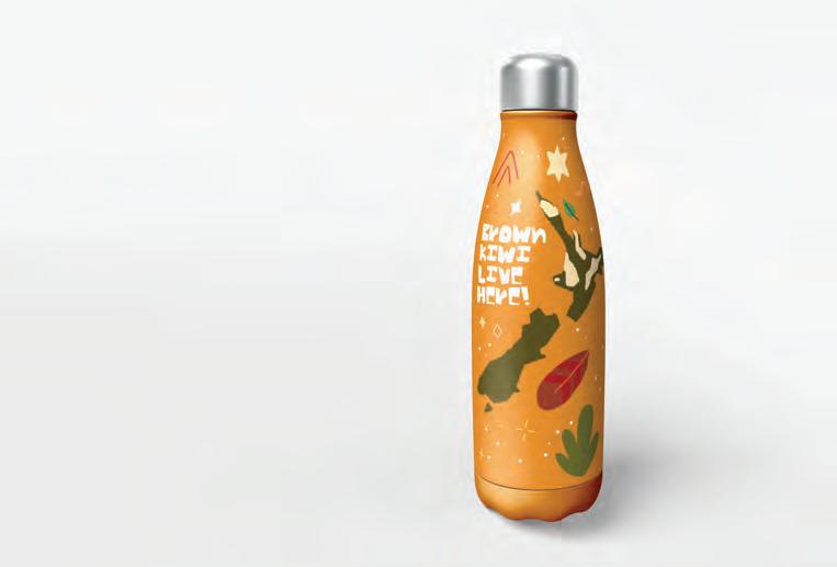
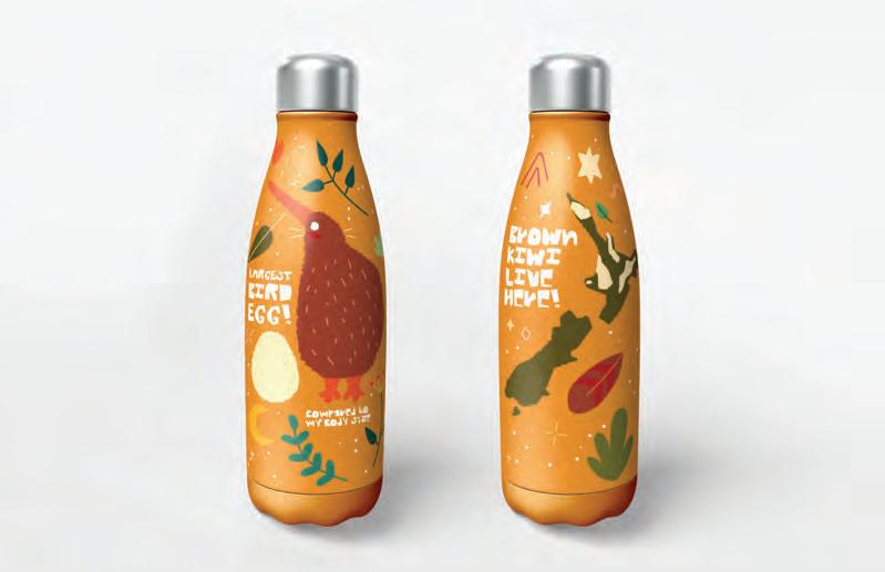
What was the effect?
Through these clear and fun messages and strong visual style, the connection between kiwi and tamariki can be formed. The messages reinforce the importance of caring for this unique native bird.
Contact:
name: Rachael Archer
company/organisation: Massey University e-mail: rachael.s.archer@gmail.com
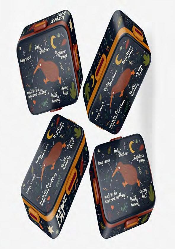
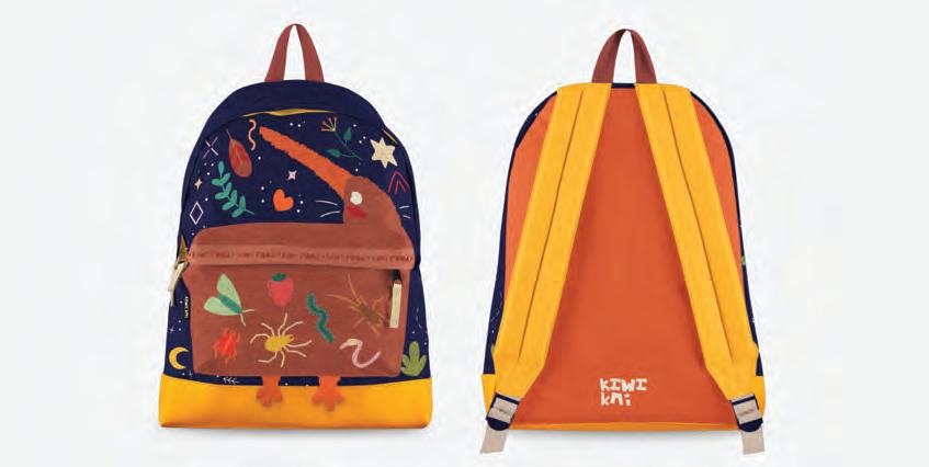
What was the challenge?
Our cities are home to a plethora of new mobility solutions. Alternative forms of individual transportation, such as car sharing, short-term rentals, and more, are emerging as possible solutions for our cities and society.
In response to this dynamic and evolving landscape, many players are developing their own mobility platforms. However, the wide variety of service models offered can sometimes appear complicated to end-users and for companies interested in providing transport options for their employees.
Our challenge was to facilitate understanding of these different services for future customers of our client, a new mobility brand.
What was the solution?
We created a large table-top ‘playmat’ of a model city - the “City of New Mobilities” to help participants project their imaginations in focus groups, so they could easily envision the services offered in the mobility ecosystem.
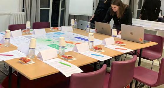
Using the urban codes of a city such as infrastructure and public spaces, each mobility service offered by our client was associated with a specific place on the playmat, distributed across different district types: business, residential, commercial, cultural, and eco neighbourhoods.
Contact:
Creative designer: Pauline Habic
Service designer: Alix Buchet
company/organisation: Ekino
e-mail: alix.buchet@ekino.com
website: ekino.com
Participants in the focus group - such as taxi drivers, delivery drivers, and fleet managers, were able to engage with the concepts in a playful way by moving their ‘playing pieces’ around the playmat, just like they would in a real board game.
With everyone focussing on a common physical map of a city, we were able to fully explore discussion points in a much more fun, satisfying, and productive way than in a standard format workshop.
What was the effect?
This playmat promotes a common vision for workshops, using a metaphorical representation that allows users to quickly and easily understand the world of our client and the mobility ecosystem. Participants can easily take on board the future services offered, such as charging stations, fleet management, and maintenance.
The “City of New Mobilities” has now become a genuine internal and external communication tool for our client’s business. It has been intuitive for many people and has led to a new way of graphically translating complex service ecosystems for practical discussions.
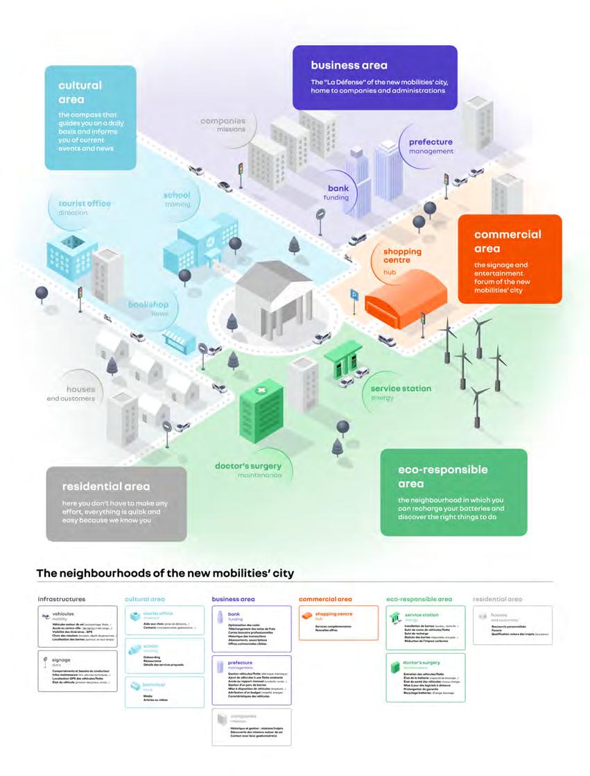
Category: Didactics
What was the challenge?
EQT was the unexpected product of a conference on wind energy. Despite the conference being centred around progressive goals for renewable energy expansion, the attitude towards gender was decidedly regressive. All-male discussion panels? Check. Female experts railroaded into clearing plates? Check. Repeated interruptions of female colleagues during workshops? Check. We designed EQT to give everyone -including us- the tools to
recognise and call out gender bias when it happens and make this world a little more fair -and a whole lot more fun- for everyone.
What was the solution?
EQT is a peer-to-peer learning environment that empowers you with the knowledge, language and confidence to speak up and take action against gender bias and sexism in the workplace – and find your allies along the way. With the help of a
role-playing card game, information-packed handbook and a poster celebrating the history of female empowerment, EQT gives women and their allies the necessary tools to dismantle sexist discrimination in the workplace.
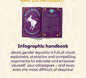
What was the effect?
The toolkit breaks down barriers to conversations on gender bias and equips individuals with facts and statistics to build a compelling case for a gender-equal world.
A facilitator’s guide is included with the card game to maximise impact and ensure that whether you’re using the toolkit in a workshop at the office -or amongst family and friends- creating a fruitful discussion is as easy as it is constructive.
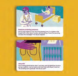
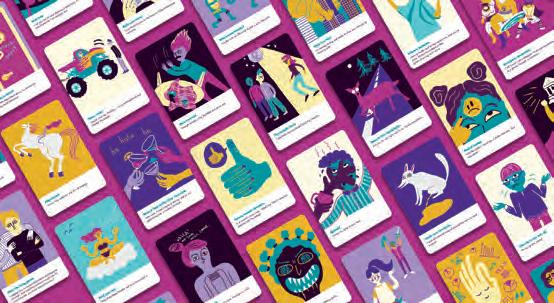
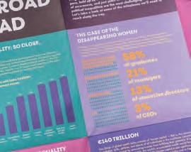
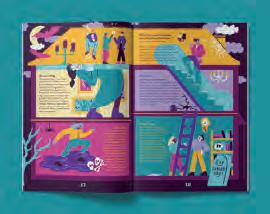
Contact: Ellery Studio & IKEM info@ellerystudio.com www.ellerystudio.com www.ikem.de
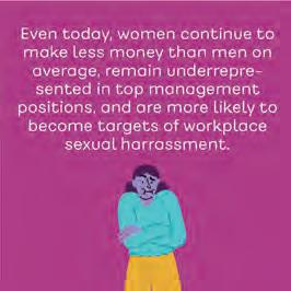
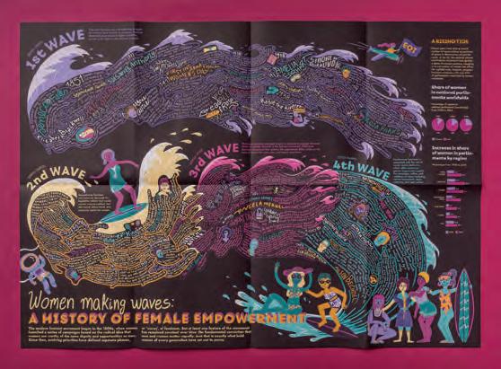
Category: Didactics
Project: Exhibition “Swans – the known and unknown”
What was the challenge?
Develop an educational and eye-catching nature exhibition concept that appeals to different age and interest groups. Categorise and display information in a way that is easy to understand and creates an enjoyable journey.
What was the solution?
An interactive and educational exhibition that changes the way educational content is presented in history museums. It presents the world of swans in a whole new light, allowing viewers to experience their colourful world. Bright colours and vibrant shapes tell the story of nature’s creatures in a creative and eye-catching way. The artistic style of the illustrations makes every visitor feel like a curious child in the great nature.
Contact: Gundega Kalendra /Creative agency Raugs /raugs@raugs.eu /www.raugs.eu
The exhibition is on display at the Latvian Museum of Natural History and has been created in close collaboration with nature research professionals. The educational materials talk about serious conservation topics and ways we can help improve the conditions of swans and their habitat and how we can work together to create a better, more natural and greener world. Feedback from both the museum and visitors has been excellent. The exhibition will be converted into a mobile version and will travel to educational institutions. But the best proof of the success of the exhibition is the many wonderful comments from the children.
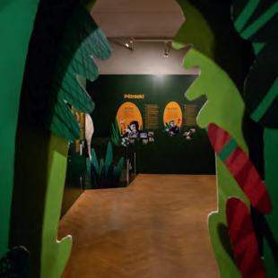
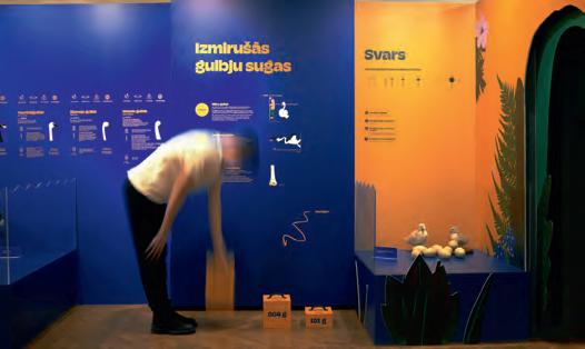
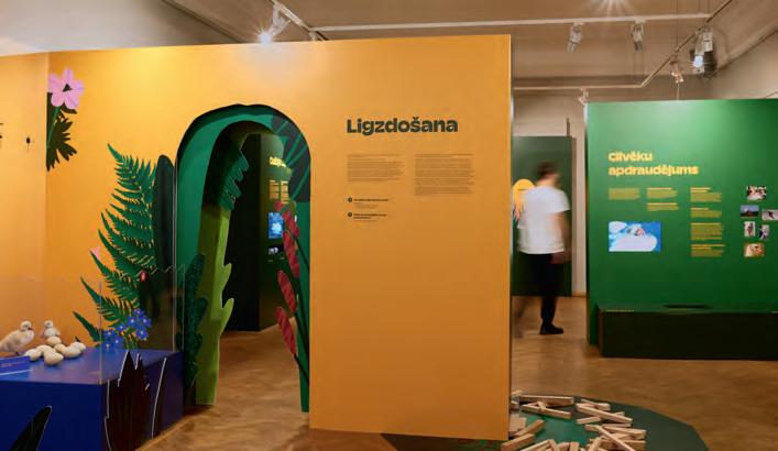
Our work inspires others, especially the future artists
What was the challenge?
The historical exhibition Un sindaco fuori dal Comune. Angelo Filippetti (‘An out-ofthe-ordinary mayor’ but also, with a pun, ‘Outside the town hall’) tells the life and thoughts of the last mayor of Milan before fascism took power in Italy in 1922. The exhibition was realized in collaboration with Istituto nazionale Ferruccio Parri and Fondazione Anna Kuliscioff, two institutes that preserve important historical archives and are involved in research, public history and education.
It was displayed for the first time in Casa della Memoria, an exhibition area of the Municipality of Milan, between October and November 2022.
The project was aimed at both citizens and schools. The first goal was to make Filippetti’s private archive, which is crucial for the city’s history, available to the citizens of Milan for the very first time. The second was to provide secondary school students with a comprehensive learning experience that allows them to come into close contact with historical documents and to discover a story not only untold in school textbooks, but also very little known by academic community.
What was the solution?
The exhibition allowed to reveal the extraordinary complexity of Angelo Filippetti’s biography: a compelling storyline that the curators decided to illustrate by mixing the approach of historical research with an evocative set-up. In Filippetti’s diaries, the reader encounters curious black figures: they are hand-drawn silhouettes, from which the curators drew inspiration to elaborate the graphics with which the protagonists of this story are drawn. The black silhouettes guide the visitor along the exhibition route and are gradually outlined by the historical narration.
Walking into Casa della Memoria, the visitor is led through a space designed around the peculiar life of Angelo Filippetti. Gigantographs from his archive define the space and extend it to a past world, which has a lot to tell about our present. The visionary ideals of this often-forgotten mayor encouraged the curators to tell his story through contemporary graphics. Documents, photographs and handwritten notes compose a collage of sources that seeks to restore the complexity and appeal of Angelo Filippetti, who dared to dream of a future city.
Contact:
name: studio +fortuna
company/organisation: Istituto Parri
e-mail: comunicazione@insmli.it / studio@piufortuna.it
website: www.reteparri.it / www.piufortuna.it
”Forward!”
“Join us!”
“Resist!”
The exhibition was visited by several secondary school students, who were involved in an in-depth guided tour and workshop activity based on documentary sources. First, students were introduced to the historical context and briefly to some historical documents. Then, they were divided into small groups and each group had to thoroughly analyse a single historical document.
Both teachers and students were given a questionnaire to evaluate the activity. The results, returned anonymously, were very satisfactory.
The exhibition also made it possible to experiment with a creative use of a historical archive, bringing it closer to citizens.
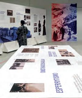
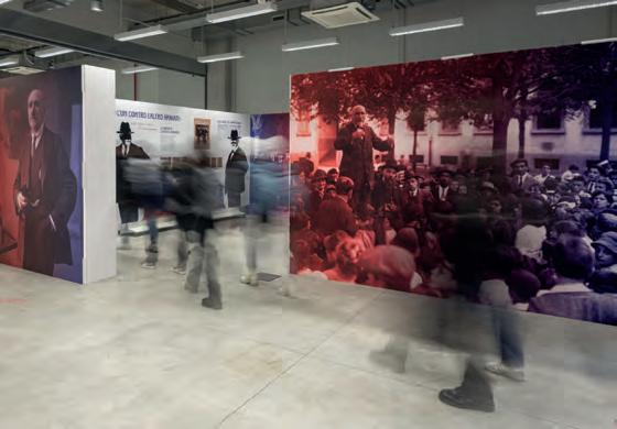
In the course, we developed an exhibit consisting of a series of board games on the theme of migration related to climate change and wars in collaboration with Emergency. The aim was to narrate the experience of migration and war through the immersive and narrative power of board games.
“The game” is the slang term that many migrants use with bitter irony to refer to the attempt to cross borders while avoiding suffering, pushbacks, and violence. It’s a semantic coincidence that is too significant not to be emphasized. Those who participate in the exhibit must indeed put themselves at stake and empathize with even dramatic situations, which are not always easy to describe in words.
The board game was chosen as a means of expression, because we believe it allows students to observe multiple
aspects of a communication project and can be an effective channel for engaging users in the narration of an experience, even a dramatic one. Designing a game means designing a device that generates experiences.
We believe that the immersive experience inherent in playing allows emotions and experiences to be transmitted in a significant and deep way. Those who participate in the exhibit must indeed put themselves at stake and empathize with even dramatic situations that are not always easy to describe in words. We think it’s important to include games in the field of information design precisely because of their ability to convey a set of non-quantitative information that is difficult to transmit, such as the need to make a choice in a difficult context or to empathize with people we consider far from our life experience or even enemies. The game, in fact, implies that players recontextualize reality in a new frame in which new rules apply, so it is possible to take on new roles without moral
implications. It provides a first-person point of observation, albeit limited, on issues that are difficult to communicate otherwise.
Visitors experience the exhibit immersed in a setting made with recycled materials (jute bags, cardboard tubes), an evocative environment of the places represented in the games. Waste objects, functionalless discarded materials, resonate with other elements that take on and give new meanings to the whole. To strengthen this process of empathy, an audio that collects sounds - noises of woods and sea alternated with human voices - welcomes visitors.
Emergency is a humanitarian NGO that provides free medical treatment to the victims of war, poverty, and landmines. It was founded in 1994.
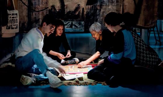
Università Iuav di Venezia is an Italian university dedicated to design, arts and architecture.
Student projects of Università Iuav di Venezia Master’s degree in product, communication and interior
Contact:
prof. Paola Fortuna / prof. Luciano Perondi / with Damiano Fraccaro / Lorenzo Toso
Mara Rumiz (Emergency Venezia)
organisation: Università Iuav di Venezia / Emergency
e-mail: lperondi@iuav.it / paola@piufortuna.it
website: www.iuav.it / www.emergency.it
You are migrants who have fled wars, hunger, and violence. Arriving at a refugee camp, in 10 turns you must purchase your passport and, at the same time, collaborate to survive inside the Jungle, keep the Fire burning, and accumulate the amount requested by the Trafficker to cross the Border.
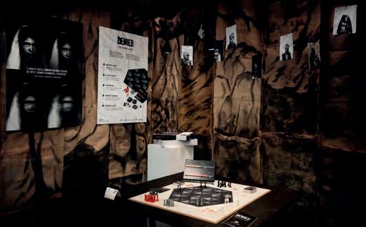
Only those who purchase the passport can know the amount requested and decide whether to win alone by leaving others behind or wait for everyone to have their passport to win together.
Denied
After the return of the Taliban in Afghanistan, the slow gains in rights made by citizens have been lost. In Denied, players take on the role of the Taliban. The goal is to gain as much control as possible over the Afghan territory, being careful not to upset the fragile balance between restrictions and concessions to the civilian population. Through certain combinations of cards, pieces, and markers, players gain or lose control of a territory, based on the collaborative strategy they intend to follow
Lifeline.
You are a medical team in a war hospital and your goal is to perform triage, that is, to establish the order of care for patients according to intervention criteria. The team’s harmony is essential to avoid wasting precious medical resources. Time is running out quickly, will you be able to treat all the injured?
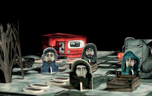
There are things never to be done: not during the day or at night not at sea or on the shore one, for example, is war
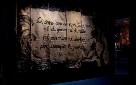 Gianni Rodari
What was the challenge?
Identifying bumblebees and understanding them better, that was the wish and aspiration of this book. There are field identification books and field identification keys, but these are only understandable for entomologists; illustrations in them have an extremely high degree of abstraction. But it is important for the protection of these wonderful animals to know each other and their 45 (!) species better.
What was the solution?
A small, stable booklet with the best handling and durability, in the center a “bumblebee encyclopedia” presents all species briefly and concisely: with understandable, sympathetic, but still realistic illustrations of all species (and their subspecies). A fold-out page with the “quick identification” helps to identify the most important species better.
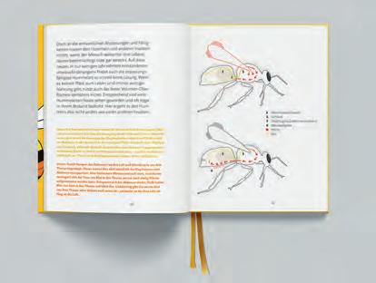
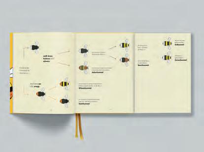
What was the effect?
No publisher was initially found and a realization was only possible through cooperation with the Naturmuseum Thurgau. But: the book is selling very well – and fills a gap. And so does it with the knowledge of these animals, because everyone is initially surprised at how many different bumblebees there are. But since you only protect what you know, such books are important. Many reactions also came from parents whose children are enthusiastic about the “Hummelfreund”.
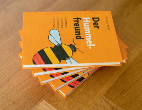
Contact:
name: Andreas Koop
company/organisation: designgruppe koop
e-mail: a.koop@designgruppe-koop.de
website: www.designgruppe-koop.de
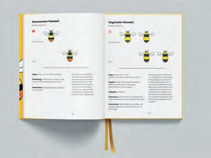
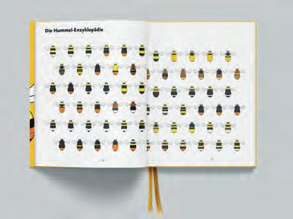
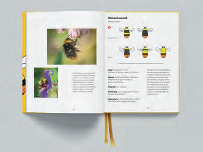
TThe German Music Information Center (MIZ) is the central point of contact for all questions relating to musical life in Germany. The thematic spectrum of the MIZ is broad and ranges from musical education and training to amateur music-making and professional music practice to media and the music industry. On a regular basis, the MIZ helps people find their way around the dense musical landscape by providing information on the Internet or in print publications. For a new format of the MIT called “musiclife in numbers”, the MIZ conducted a survey and collected a large and detailed amount of data about music life in Germany. The challenge was now to find a way to process and share the findings of the survey in a visually pleasing and creative way in order to make the significance of the topic accessible to a broad target audience.
What was the solution?
Four main topics were identified and chosen for which the corresponding data should be visualized in an appealing way: the most popular operas, the gender distribution in orchestras, the nature of recreational musicians, and the distance of the music school landscape in Germany. The data for these four topics was then visualized on four posters. In addition to that, smaller and foldable versions of the posters were created to provide more information, support for interpretation and supporting smaller infographics about the visualized data.
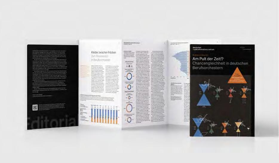
The MIZs Infographic poster series has had a profound positive impact on the organization’s reputation and the music education landscape in Germany. The visually engaging and informative posters have improved the image of the MIZ, increased awareness
about its mission, and generated interest in music education. Thanks to the support of several music associations and other stakeholders the MIZ distributed roughly 40.000 foldable posters and 7.000 full size posters. The underlying messages of the visualized data also created a large media coverage and naming of the MIZ in some of the largest media outlets in Germany. Through the broad media coverage and general distribution of the visualized data, the posters made a great contribution to support the cultural policy debate on music life in Germany.
As a result, the posters have been highly sought after by enthusiasts and connoisseurs alike, prompting the MIZ to offer them for sale on its website. This innovative idea has not only contributed to the growth of the music landscape in Germany but has also empowered individuals to learn more about the music they love.
Contact:
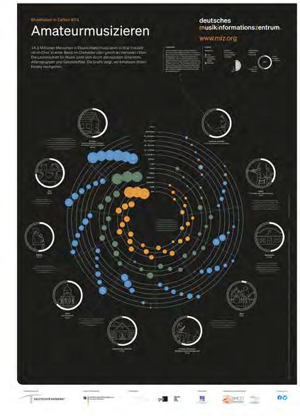
company: Sapera Studios GmbH
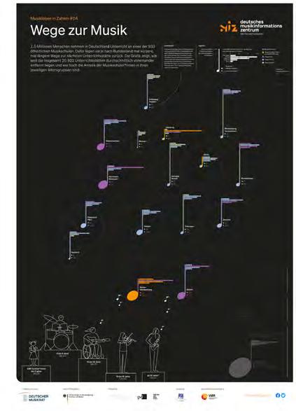
e-mail: hello@sapera-studios.de
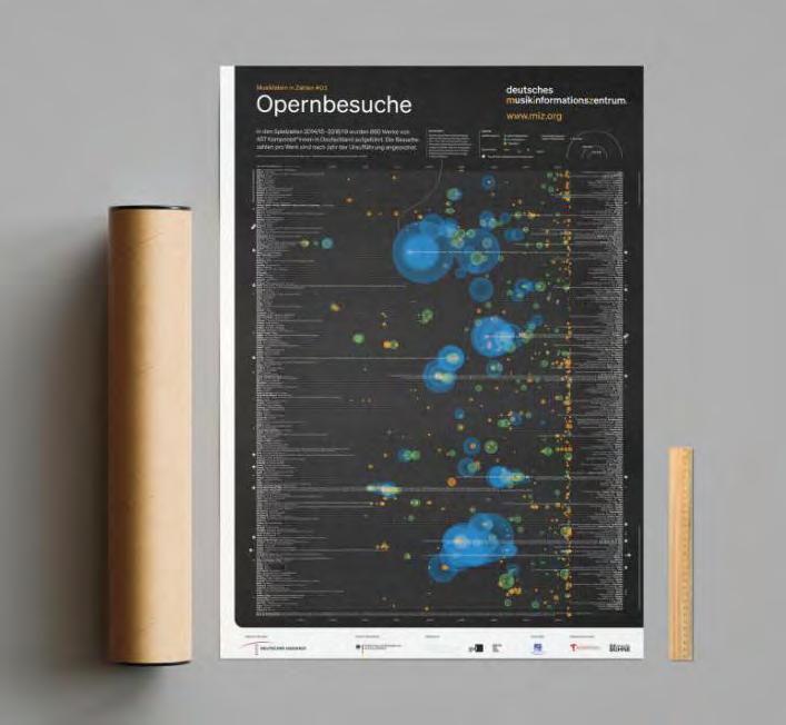
website: sapera-studios.com
What was the challenge?
Series of information graphics about the portfolio of the real estate agency Pensimo. The visualizations were part of an editorial article in a special issue of the architecture magazine “Hochparterre” on the topic of climate protection. The challenge was to provide a visual overview of a complex portfolio consisting of 528 properties and to highlight various aspects with regard to climate protection.
What was the solution?
Two double pages with several infographics focus on different aspects of the real estate portfolio and form a narrative together. Each infographic combines different parameters, e.g. the entry graphic focuses on the geographic position, quality of location/object and rentable area. The following pages look at further aspects such as object age, redevelopment needs and heating types. Color directs the eye and supports the reception of information. A limited color palette helps to make the individual graphics a coherent series.
What was the effect?
The visualizations show each of the 528 real estate objects from four different perspectives. The data is deliberately not aggregated with the aim of making as much as possible comparable and analyzable. The high resolution of the visualization down to the individual object makes it possible to show exciting details and invites the viewer to visually explore the real estate portfolio under the aspect of climate protection and to ask individual questions. At the same time, the viewer receives a compact overview.
Contact:
name: Barbara Hahn, Christine Zimmermann
company/organisation: Hahn+Zimmermann
website: www.hahn-zimmermann.ch
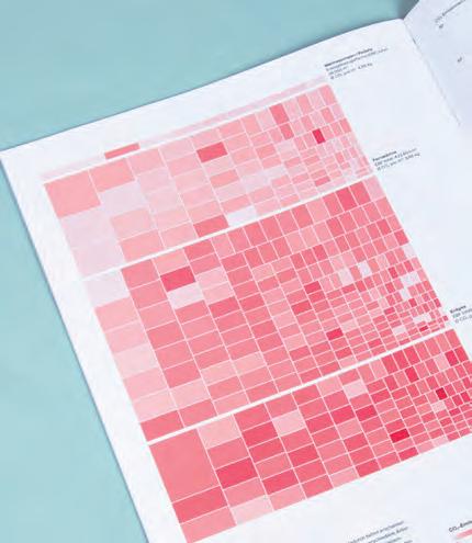
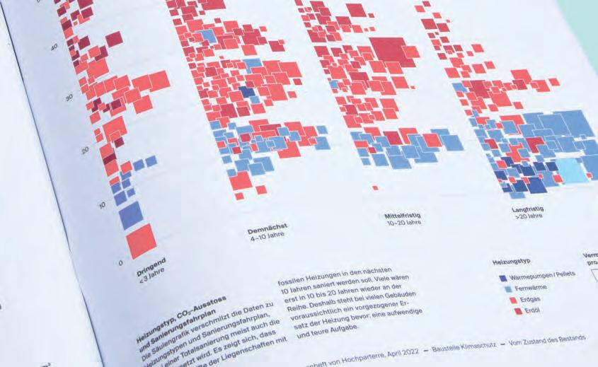
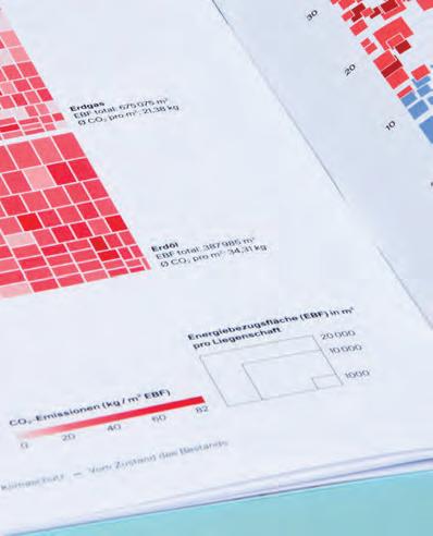
Category: Editorial Design
What was the challenge?
What was the solution?
What was the effect?
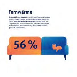
name: Erwin K. Bauer, Clemens Schrammel, Dasha Zaichanka

company/organisation: buero bauer e-mail: office@buerobauer.com website: www.buerobauer.com
Strategische Schwerpunkte Die strategischen Differenzierungsthemen bilden die Grundlage für die WIEN ENERGIE-Nachhaltigkeitsstrategie. WIEN ENERGIE hat bei diesen Themen eine besonders hohe Wirkung auf Umwelt, Gesellschaft oder Mitarbeitende und positioniert sich mit ambitionierten Zielen und Maßnahmen gegenüber Mitbewerbern. Das Ambitionsniveau in diesen Themen wird weiter ausgebaut und der aktuelle Status stark verbessert. WIEN ENERGIE fokussiert sich dabei insbesondere auf die folgenden drei Themen: WIEN ENERGIE treibt durch Emissionsminderungen die Dekarbonisierung im städtischen Raum bei gleichzeitiger Gewährleistung der Versorgungssicherheit voran. WIEN ENERGIE entwickelt neue zukunftsfähige Produkte und Lösungen (wie beispielsweise dezentrale, nachhaltige und innovative Wärmelösungen, Elektromobilität, Fernkälte). WIEN ENERGIE baut auf erfolgreicher Arbeit in der Vergangenheit auf und setzt neue Maßstäbe im Bereich Klimainnovationen und Forschung, um eine dekarbonisierte Stadt verwirklichen. Klimaschutzfahrplan WIEN ENERGIE kommt eine entscheidende Rolle bei der Erreichung der Klimaneutralität der Stadt Wien bis 2040 Mit der Dekarbonisierungsstudie wurden 2021 Szenarien für die Dekarbonisierung des Wiener Energiesystems erarbeitet. 2022 wird WIEN ENERGIE aufbauend auf dieser Studie eine detaillierte Klimaschutz-Roadmap mit konkreten Maßnahmen und Zwischenzielen für die Erreichung der Klimaneutralität erstellen. Mit der Dekarbonisierungsstudie hat WIEN ENERGIE sieben grundlegende Handlungsfelder definiert, damit Wien klimaneutral werden kann. Das Erreichen der Ziele erfordert erhebliche Investitionen und eine Veränderung des regulatorischen Rahmens. WIEN ENERGIE setzt die folgenden Maßnahmen für Netto-Null-Emissionen bis 2040 um: Ausbau des erneuerbaren Stromerzeugungsportfolios Anbieten nachhaltiger, integrierter und bedarfsgerechter Wärme- und Kältelösungen durch die Dekarbonisierung der Fernwärme (Erschließung Geothermie und Ausbau der Großwärmepumpen) sowie den Ausbau hocheffizienter Fernkälte Identifikation Potenzialen erneuerbarer Müllverbrennungsanlagen sowie Möglichkeiten, um abgeschiedenen Kohlenstoff im Rahmen der Kreislaufwirtschaft wiederzuverwerten Aufbau einer nachhaltigen Wasserstoffproduktion
und einer dazugehörigen Tankstelleninfrastruktur sowie Sicherstellung der technischen Voraussetzungen für einen Einsatz grünen Gasen in den WIEN ENERGIE-Kraftwerken Ausbau intelligenter Ladeinfrastruktur für E-Mobilität im öffentlichen Bereich, im Wohnbau und bei Gewerbekund*innen Vorantreiben kooperativer Innovations- und Forschungsprojekte Emissionsreduktion mit Start-ups und Großunternehmen Kontinuierliche Umsetzung Digitalisierungsund Effizienzsteigerungsprojekten, um weiter einen optimalen und ressourcenschonenden Energieeinsatz gewährleisten Die sieben Handlungsfelder für die Dekarbonisierung
Kreislaufwirtschaft und Müllverbrennung
Innovation und Forschung Treibhausgasemissionen und Klimaziele Ein ambitionierter CO₂-Reduktionspfad bei gleichzeitigem Sicherstellen des wirtschaftlichen Erfolgs in einer dekarbonisierten Wirtschaft bis 2040 sind wesentliche Zielsetzungen für WIEN ENERGIE. Seit 2019 erfasst WIEN ENERGIE die jährlichen Treibhausgasemissionen entlang der gesamten Wertschöpfungskette (Scope 1–3 ). 2019 betrugen die Emissionen des Unternehmens 6,4 Mio. Tonnen CO₂-Äquivalente (CO₂e) über alle drei Scopes. Die größten Emissionsquellen bilden die Kraftwerke, 42 Definition Scope 1–3: Die Treibhausgasemissionen werden meistbenutzten internationalen Berechnungstool, dem Greenhouse (GHG) Protocol, in drei Kategorien bzw. „Scopes“ unterteilt. Scope 1 deckt direkte Emissionen aus eigenen oder kontrollierten Quellen ab (z. B. Fuhrpark, Kraftwerke, Müllverbrennungsanlagen). Scope 2 deckt indirekte Emissionen aus der Erzeugung gekauftem Strom, Dampf, Wärme und Kühlung ab, die das betreffende Unternehmen verbraucht. Scope 3 umfasst alle anderen indirekten Emissionen, die in der und nachgelagerten Wertschöpfungskette eines Unternehmens entstehen.
Erneuerbare Wärmeund Kälteerzeugung
klimafreundlichere Wärme- und Kältelösungen wurden 2021 weiter ausgebaut. So machte der Bau der umweltfreundlichen Power-2-Heat-Anlage in der Spittelau große Fortschritte. Die Anlage, welche im Frühjahr 2022 in Betrieb genommen werden soll, wandelt überschüssigen Strom aus Windenergie in Wärme um. So können wertvolle Energie sinnvoll genutzt, das Stromnetz stabilisiert und Tausende Haushalte mit klimafreundlicher Wärme versorgt werden. Bei der Therme Wien wurde eine Wärmepumpe installiert. WIEN ENERGIE nutzt dort künftig das Thermal- Abwasser für die Fernwärme, womit Oberlaaer Haushalte beheizt werden. Des Weiteren wurde die neue Fernkältezentrale Stubenring eröffnet. Dies stellt einen wichtigen strategischen Meilenstein im Ausbauplan dar. Rund um den Ring wird bis 2025 ein Kältering entstehen, der in weiterer Folge einen flächendeckenden Anschluss der Innenstadt an die umweltfreundliche Kühlung ermöglicht. Fernkälte spart im Vergleich herkömmlichen Klimageräten 70 % an Energie und 50 % an CO₂.
Grüne Gase und Wasserstoff E-Mobilität 21 WIEN ENERGIE Analyse des Geschäftsverlaufs
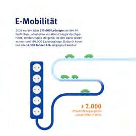
2021
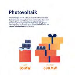
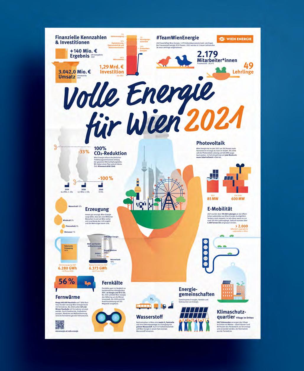
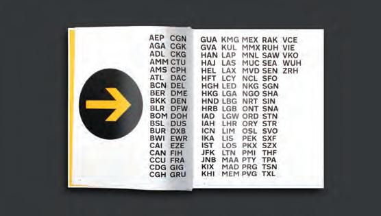
What was the challenge?
Airports are mega-places where millions of people move and cultures meet. They are places whose identity is multi-layered: On the one hand, the history and the design concept of the respective country can be read, almost cliché-like local characteristics are condensed and reflect the positioning of a country in the global structure. On the other hand, airports represent hypermodern, functional environments in which processes are internationally standardized and maximally efficient with a focus on entertainment and consumption.
What was the solution?
This book reflects on the centenary of civil aviation from the perspective of passenger information and airport identity. Airports and Airlines have to integrate new concepts and technologies to significantly reduce the industry’s carbon footprint while simultaneously ensuring traveller safety. The transition to a new era of aviation is happening now, and there is no doubt in our minds that design, information design and wayfinding will continue to be essential tools in this fundamental transformation. Another motivation for publishing a book at this moment.
Contact: Moniteurs info@moniteurs.de www.moniteurs.de
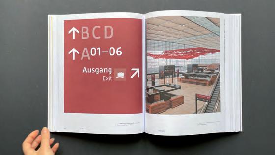
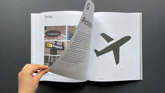
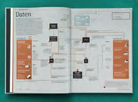
What was the challenge?
Until now, there was no comprehensive summary of how the German energy industry works. How is electricity produced? How does distribution work? How is the energy market organized? The energy industry is growing for more than a century and became more and more complex on the way. Explaining how the different parts work together is a challenge for even the most experienced professionals in the fied.
Ellery Studio facilitated a co-creative content creation process including experts and scientists with intimate knowledge of the nuts and bolts of the various systems that build our energy infrastructure, to create a layered model explaining the German energy industry. The project was turned into a book, using a particular printing ink representing the traditional material of energy production and distribution: copper. Beyond the layers model we included basic knowledge about the energy transition and case studies that illustrate the direction in which the German energy system is headed. The book contains more than 70 detailed infographics on 166 pages.
What was the effect?
People from the industry—from full-fledged experts to rookies—use the book to learn, teach and explain how the German energy market works. We created a comprehensive volume that helps understand the industry, the technical aspects as well as the regulations and who the players are. It’s the first of its kind, and with an original scientific model at it’s core, it can be considered a science-through-design project.
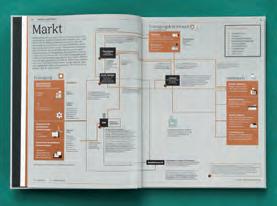
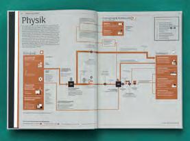
Contact: Ellery Studio info@ellerystudio.com www.ellerystudio.com
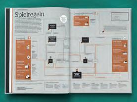
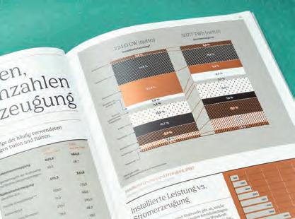
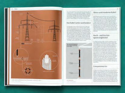
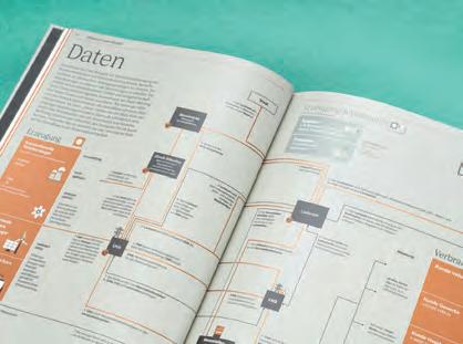
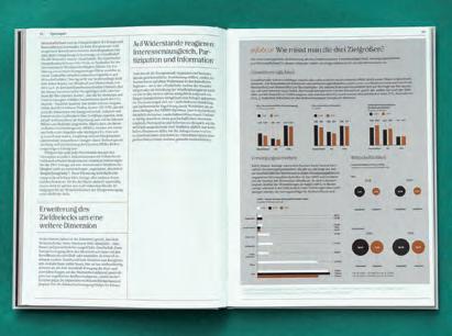
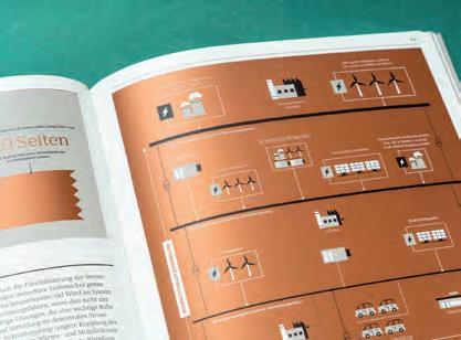
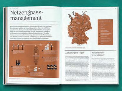
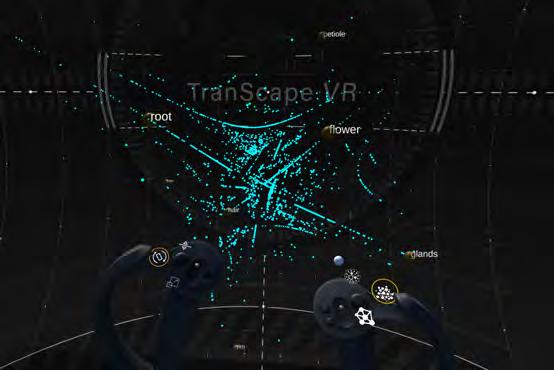
In bioinformatics, researcher perform RNA sequencing to understand which gene is specific to a certain tissue (e.g. in a plant). These multi-dimensional data sets cover more than thousands of genes over many different tissues and conditions. Getting an overview of this massive amount of data is important but challenging and standard data analysis methods using 2D, noninteractive visualization are limiting and daunting.
To upgrade to state-of-the-art technology, we developed TranScape VR, a new tool for visualizing the gene landscapes in an immersive, explorative, holistic and entertaining Virtual Reality (VR) space. In search for special plant carnivory-related genes, we represent the data as an interactive network, mapping genes to each tissue core-node, forming gene clusters. Biological parameters (e.g, gene expression level, tissue specificity) are mapped to visual parameters such as colour, size, distance, and gene position within the 3D space. The visualization offers different modes which depict different properties of the data set. All modes can be interactively explored in order to form and test hypothesis in real-time.
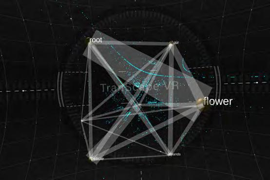
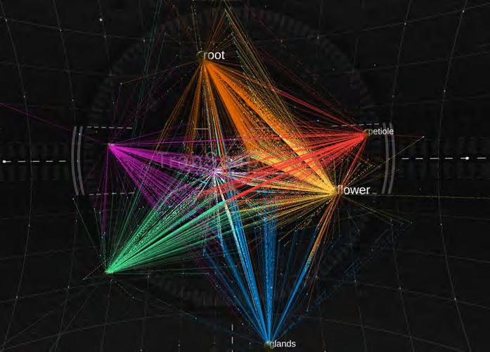
The VR visualization combined several different analytical plots in one representation, which allows researchers to quickly test their hypotheses in VR. The app was presented at the international conference ISMB ECCB 2021 where it was well received.
Contact:
name: Annika Kreikenbohm
company/organisation: Immersive Design
e-mail: hello@annok.de website: https://annok.de/transcapevr/
The gene data cloud: Tissues are depicted as yellow spheres (e.g., flower or root), where the size is defined by the number of genes associated to them. The larger the sphere, the more genes are hosted by that tissue. Genes are shown as a blue point cloud. They are mapped by specificity, i.e. genes that are closer to a tissue node are more specific to that certain tissue. By clicking in a tissue, colored lines show which genes were associated to the tissue by a computer algorithm
The tissue network: the links between two tissues represent the number of shared genes. The more genes are shared by a pair of tissues, the thicker the lines. We immediately recognize the thick line between root and flower as well as between petiole and rim. Such observation is typically analysed in standard Principle Component Analysis as well as Pearson correlation analysis.
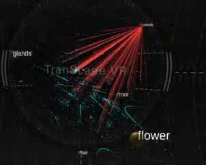
Visual Exploration: The user can visually explore and analyse the multidimensional dataset by re-scaling, interacting, retrieving genes’ descriptions as well as filtering or highlighting genes based on keywords.
_ Scale, rotate and move the gene cluster for different (over) views
_ Rearrange tissue nodes to investigate different mapping constellations in realtime (e.g., panel D)
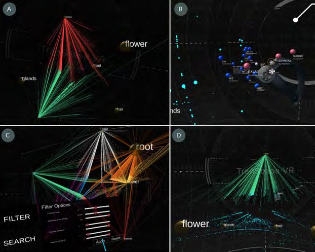
_ Activate tissue links to find associated genes and activate gene details for quantitative data and description (e.g., panels A, B)
_ Filter parameters (e.g., expression level, specificity level) to define which genes are displayed and search for (groups of) genes using keywords (e.g, panel C)
The gene network mode: the colored links between genes and tissues provide a clear view of which genes belong to which tissue. Genes are connected to each of their host tissues by color-coded lines. Thus, the number of links connected to a gene represent the number of tissues that host it. One can activate links to all tissues at once (left) or activate only links to selected tissues (right). This allows for investigation of shared genes between
What was the challenge?
Systems thinking is difficult to learn but crucial for navigating the modern world. Why so crucial? We are surrounded by systems: natural ecosystems, technological systems, socio-economic systems, and so forth. They entangle us — continually pushing and pulling us around — in ways that affect our chances in life. Most operate out of view; working behind the scenes, far away, or beyond the scale of ordinary experience. Knowing how systems interact is necessary to solve the tough societal problems (such as global warming) and preserve human dignity against the unfair, impersonal, manipulative systems we encounter on a regular basis.
Why is systems thinking difficult to learn? Experts have their own jargon for the system parts they care about. Across professions, similar concepts often get labeled differently. Hyper-specialization creates blind-spots and catastrophic accidents waiting to happen. Moreover, systems have lots of moving parts that are hard to juggle in the mind. Visuals help. Yet specialists have their own diagraming techniques and shorthand notations that are very cryptic. All those shortcomings call for a system science that is holistic, interdisciplinary, and visually approachable. That starts with a common language for imagining how systems work and interact.
What was the solution?
The Visual Vocabulary of Systems is a codex of 200 elements (nouns) and dynamics (verbs) that make up systems. A codex is a formal collection, with items
Contact: Peter Stoyko The SystemViz Projectpeter.stoyko@elanica.com www.systemviz.com
ATTRACTOR
An object that draws other objects towards itself; a bias in favor of an appealing position, object, or state; the value in a growth pole.
RECURSION Complicated activities broken down into smaller, iterative, repeating actions; propagation through patterned repetition.
DIFFUSION
A multiplicative effect or diffuse spread; a ripple- or viral effect; the widespread distribution of an element throughout a system.
FIELD
Influence projected from an object that diminishes over space; an intermediate force that acts on others from a distance.
SIDE EFFECT Incidental results of an action, often unanticipated; an externality, with benefits or harms not accruing to the causal agent.
FRAMING
Interpretive paradigm which makes the system understandable; conceptual guides to sensing and interpretation.
INSTRUCTION
Algorithms that determine agent (inter)actions; programmed decision- and learning procedures; encodings and protocols.
REACTIVITY
Sensitivity to signals, risks, or drivers; reactions can differ in magnitude, speed, and so forth; potential for over- or under-reaction.
EQUILIBRIUM
The balance or steady state created by opposing forces; the axis around which such a balance is maintained; return to a set-point.
EMERGENT PROPERTY
A characteristic or function that comes into being without direction; multiple objects have qualities the parts alone do not have.
DISSIPATION
Emanate outwards; scatter; Reduce in concentration or disperse a substance into the surroundings for functional reasons
DIVERSITY WITHIN
REPLICATION
When an object is copied, reproduced, or divided into two or more analogous objects.
DIVERSITY BETWEEN
Differences between categories of object; the categorical distinctions reflect a variation in kind or fundamental property.
BUFFER A boundary or zone that diminishes, delays, or otherwise alters a driver or its impact while passing through.
CONTAMINATION
An unintended mixture of items; the taint of an outside object or agent across a containment boundary.
DIRECTED BOUNDARY
A boundary that functions differently depending on what side is facing; boundary sides with different qualities.
EDGE
Outer boundary that defines the scope of domain or system; an isolating barrier of a closed system or an open-system demarcation.
COORDINATION
The orchestration of actors in the execution of tasks and processes, either through self-organization or management.
COUPLING
The coordination of activities in space and time; patterns of activity that coincide at particular moments.
CROSS-DOMAIN RISK
A driver in one domain has a knock-on effect resulting in a vulnerability in another domain due to complex inter-connectedness.
ZONE An area or place amenable to, or specifically devoted to, a purpose; a context with a special functional quality.
FRICTION
A source of passive resistance that hinders activity within a domain; a mild drain of energy because of effort needed to overcome.
an identifier for verification; an indicator of intent or receptivity.
Differences within a particular category of object; variation of shared attributes within an otherwise like group.
of importance assembled in one place. Over five years, various disciplinary literatures about systems were surveyed. Major concepts were collected. Those of broad relevance were genericized to be applicable across disciplines and contexts. An icon and summary annotation were assigned to each concept. Each icon is an abstract, spatial illustration of the basic idea. All icons are designed according to a unified visual syntax and semiotic scheme (as documented in formal guidelines). The design also enables animated versions of the icons to inspire applications using nonstatic media. The elements and dynamics are grouped into six “marquee” categories that define the essential dimensions of any system (below). The entire collection
The tightness or looseness of ties between parts of a system; the degrees of freedom of a particular actor in a relationship.
Full:
is open-sourced so that anyone can use, modify, and add to it.
REFERENCE POINTS Features in the context that can act as orienting devices, including markers (features singled out for special consideration).
Why a visual vocabulary? Benefits relate to individual learning and group collaboration.
The social-psychologist Eviatar Zerubavel argues for “sensitizing concepts” that ready attention to notice phenomena around us that would otherwise escape attention. These act as “mental magnets” in a world full of unexamined banalities and sensational distractions. The large number of vocabulary items may seem daunting at first. Yet once a few “gateway concepts” are grasped, learners can peruse the collection in an order that makes sense to them. Instead of a rote-learning with synthesis afterwards, learners spin “webs of meaning” by drawing connections between items as they are learned. That is integrative teaching with visual codices.
On a collective level, the Visual Vocabulary is a tool that enables diverse groups of
is the common honey bee of North America’s temperate climate zones. Bees are highly social animals, living in colonies contained within hives. Apis mellifera is semi-domesticated with beekeepers actively managing colonies to produce commercial honey and beeswax. Nector is gathered by bees from flowering plants and brought back to the hive, where it is stored in wax combs. In nature, a colony produces a surplus of honey as a hedge against loss. It is this surplus that beekeepers harvest. Every animal is a complex adaptive system. Given the social nature of bee colonies, several adaptations to bee bodies have emerged to enable this collective production.
LOAD A long tongue extracts nectar, which is stored in a specialized stomach. Hair baskets on legs carry pollen.
The Visual Vocabulary has been downloaded and incorporated into a variety of projects. Some uses were unanticipated, such as within experimental art projects. During testing, workshops were held in design schools within Canada, the US, and Mexico. Adoption in several student projects followed. The vocabulary has also been used to teach influential decisionsmakers. For example, Visual Vocabulary workshops were held for the United Nations Development Program’s Accelerator Labs to improve systemic dynamics inherent to international development activities. The SystemViz Project continues to research new ways of visualizing systems and that is where the vocabulary’s effect is expected to be the most profound. If a system element from the larger literature cannot be mapped adequately with a particular technique, that indicates a major gap to be filled with a better approach.
people to visually explore systems through dialogue. As systems are mapped out during conversations, vocabulary items act as prompts. The icons also act as targets for the eye while constructing an annotation overlay for system maps and design schematics (above). Indeed, a set of chips can be downloaded and printed for such activities. Subsets of the chips can make the vocabulary more wieldy and focus attention on particular types of system challenge. Full:
FOUND
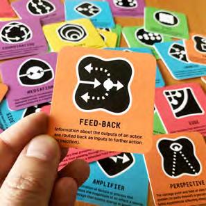
What was the challenge?
The Kopernikus projects are one of the largest German research initiatives on the subject of energy transition with the aim of enabling a climate-neutral Germany by 2045.
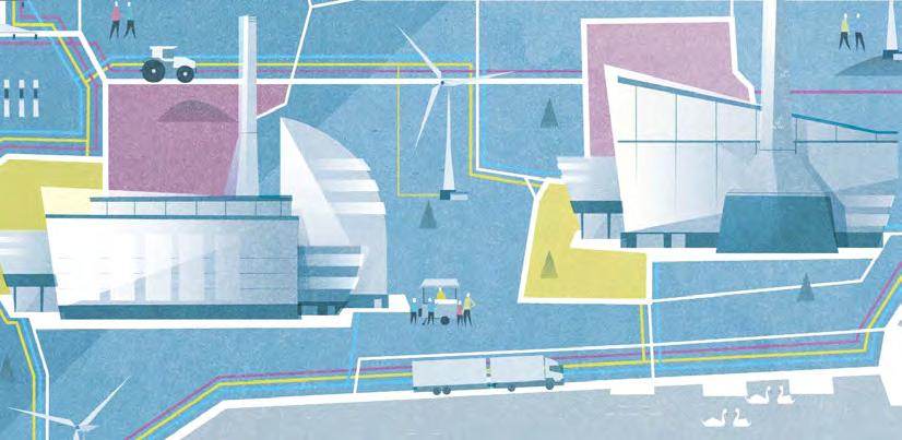
Involving many different stakeholders from many different scientific and research projects, it was a challenge to shape and visualize this very technical, multilayered and far future vision, which still has to be researched and designed, in a tangible and achievable way.
What was the solution?
Based on the extensive work of our editorial team and a elaborated visualization concept of our design team, we created a detailed illustrated, double-sided vision poster in the form of a multilayered map that harmoniously combines a variety of content to give a glimpse into the future and the vision of a climate-neutral Germany in 2045.
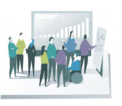
Based on the double-sided vision poster, we later developed an interactive megamap in which further information is made accessible via audio and video content. We have also extended the original map with a highly integrated industrial park, which provides deeper information about other Kopernikus projects.
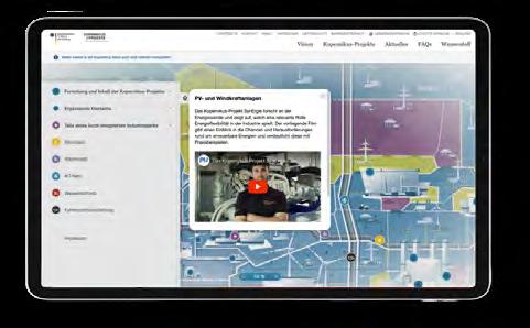
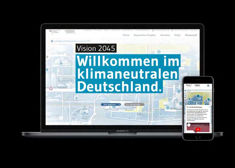
For this futuristic map we created illustrations, icons and texts that make the connections between the individual Kopernicus projects and their long-term solutions comprehensible for readers.
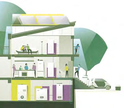
Contact:
company: Sapera Studios GmbH
e-mail: hello@sapera-studios.de
website: sapera-studios.com
The poster became one of the central communication materials of the Kopernikus projects and was used by numerous communication teams of the participating projects and other stakeholders. The microsite as digital translation and extension of the poster was also a great success: just a few weeks after go-live it already attracted several thousand visitors and informed them about the Kopernikus projects and their value for Germany to become climate neutral in 2045.
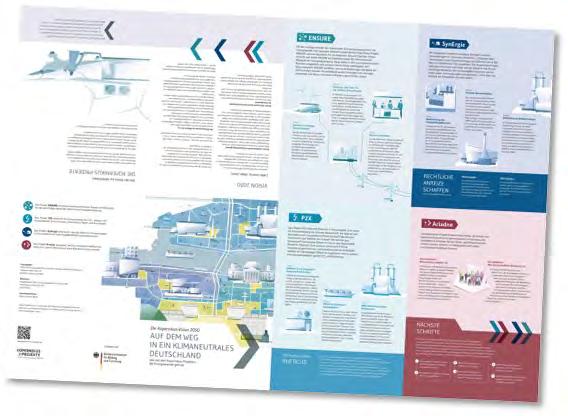
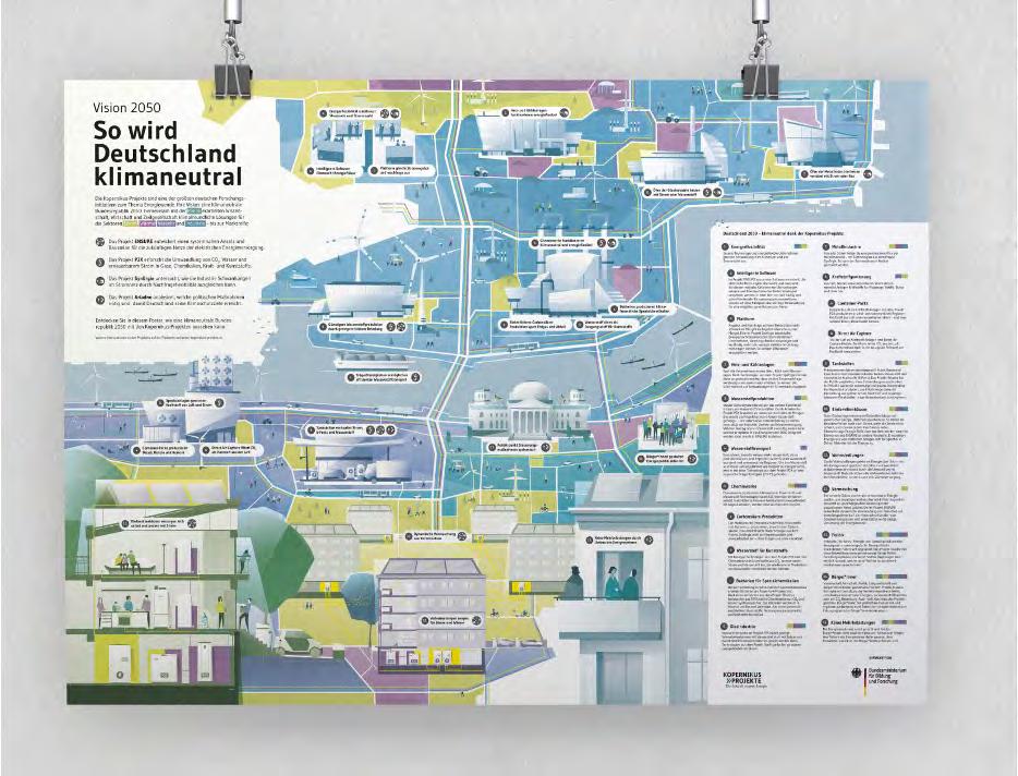
WATER drinking water spring water. of this amount groundwater. The valuable protected by the
the environment. When it condenses, it releases energy and warms the environment. These heat exchanges influence
of the popula inhabitants, are sup supply facilities; pipeline network
Some 5,500 (municipal facil cooperatives) with high-quality complies with strict remaining 10% of drinking water wells and springs. public respon their owners and the well’s showering and toilet flush. In used for drinking water used in households. Almost two Approximateagriculture.* water is often a location and have revealed consumers, saving become a necessiaspects, this was economic pressure of cost-cutting measconversion of secondly on wastewater (process taken in industry a sustainably water quality in expression of consistently good qualisubsurface flow. In its different forms:
in-stream activities do not use up water, they can degrade the water quality through pollution. The other type of water use is the withdrawal of water, and this classification includes household use, industry use, irrigation, livestock watering and thermal and nuclear power. Most withdrawals are consumptions, meaning that the activity uses the water and does not return it to the source.
What was the challenge?
The amount of water that is taken (or withdrawn) from the source is called the water intake, and the amount that is returned is called the water discharge. The difference between the water intake and the water discharge is the amount consumed. The total amount of water that is used is called gross water use. The difference between the gross water use and the water intake is equal to the amount of water that is recirculated. The recirculated amount is expressed as a recycling rate and is a good indicator of water efficiency.**
How can the relevance of complex systems —such as water cycles—be visualized and communicated effectively to stake-holders with different needs, in different locations? How can the visual display of quantitative information about water balance best facilitate an understanding of our influence on the water cycle, so that the resulting awareness may support citizens and decision-makers in their progress towards sustainable solutions?
the exchange temperature evaporates, it takes surroundings and cools
What was the solution?
Bachelor students from the Graphic & Information Design course at the New Design University in St. Pölten, attending the Data Visualisation class, held by Prof. Enrico Bravi and Nina Bender, with the scientific support of Dr. Mikhail Smilovic (IIASA), explored different visualization strategies in order to communicate data about the water cycle and water balance in different parts of the world, for various purposes and audiences. Three different kind of basins and sub-basins around the
world were selected: the Salzach Basin (Europe); the Lake Victoria Basin (Africa); the Bhima Basin (Asia).
These basins were investigated at four different levels of analysis, in order to frame the complex subject matter: Meta and Macro levels mainly introduced the larger context of the main basins on a continental, international scale; the Meso level focused on the sub-basins on a national and regional level, and finally the Micro level put the focus on smaller areas within the respective sub-basins.
Traditionally, people have inhabited places with ready access to fresh water. Today, over 50% of the global population lives in urban areas, and water can be directed via tens of kilometres of pipelines. Still, however, a large part of the world’s population is directly dependent on access to natural freshwater sources. *
From an educational point of view, the students were able to benefit a great deal from the interdisciplinary collaboration with scientists. They gained new technical skills about statistical and cartographic data and became aware of the relevance, challenges and visual possibilities hidden in complex datasets. A selection of the most compelling results of the course have been collected in a tabloid-format publication to document the project and to share the effects and the challenges of research-led teaching
What was the challenge?
The client Kronos Titan wanted to provide a comprehensive overview of the complex chemical process of production the white pigment titanium dioxide on their website. However, the process is difficult to understand and explaining it in written form would be too complicated for most website visitors.
What was the solution?
The solution was to simplify the complex process and make it visually appealing by using playful design and hand-drawn illustrations. This turned pure chemistry into an exciting visual experience that provides an optimal insight into the world of chemics.
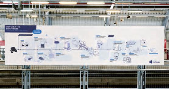
What was the effect?
The effect was that the production process of titanium dioxide was made easy to understand and enjoyable to learn through the use of visual aids. This helped Kronos Titan to achieve their goal of providing a summary overview of the chemical production process on their company website and make the information accessible to a wider audience.
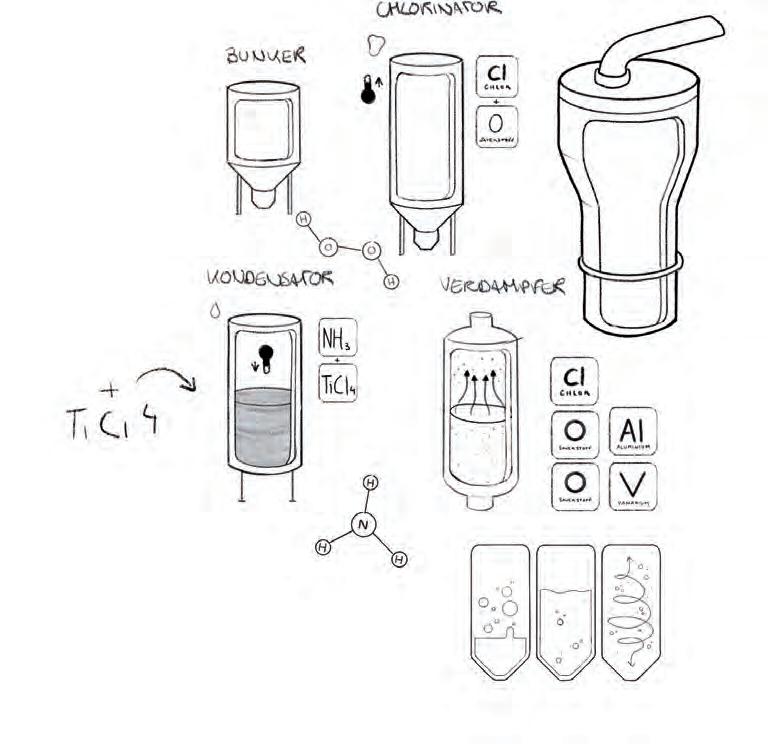
Contact:
name: Sandro Groll
company/organisation: DID INFORMATIONSDESIGNER GMBH
e-mail: sg@die-informationsdesigner.de
website: https://die-informationsdesigner.de
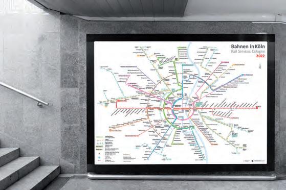
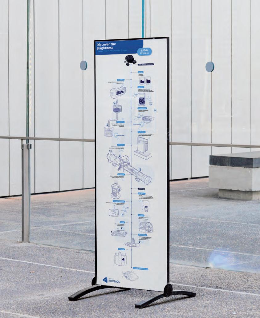
The goal of our university art museum exhibition is to engage public audiences and students from middle school through university as they explore the science, technology, art, and other humanistic aspects of glass. We selected 80 objects ranging over 3000 years and from around the globe, and arranged them in trios highlighting 23 themes, such as natural glass, color, community, and colonization.
We needed an organizational scheme to help visitors navigate their way into glass and around the space. Although glass, quartz, and other crystals consist of the same atoms, glass arranges those atoms differently; could we use that as the basis of our graphic approach?
Glass consists of an irregular network, typically of similar but varying pyramids. At the center of those pyramids is a silicon atom, bonded to the single oxygens at each of 4 corners. We used that pyramidal framework also for illustrating a central humanistic theme connecting glass objects. By similarly representing atomic bonds and human bonds, the icon’s dual role highlights the notion of connectedness and embodies the exhibition’s interdisciplinarity.
Because the icon needed to engage visitors of varying ages, interests, and education
Contact:
name: Gökhan Ersan, Marv Bolt, Pam Smart company/organisation: SUNY Binghamton e-mail: gersan@binghamton.edu website: (link to motion graphic) http://gkhan-ersan-jnhx.squarespace. com/information-design#/glass-bonds2023-exhibition/
levels, it had to be easily recognizable. To reward the discerning viewer, reinforce scientific content, and prompt humanistic discussion, we created subtle yet noticeable variations in bond lengths and angles to depict the diversity of atomic and human bonds.
We used the icon throughout the exhibition. At the entrance (top photo), 3 graphics introduce the exhibition and provide a roadmap: a single pyramid, and chain of pyramids, and a conglomeration of pyramids move from object level to atomic level (or conversely). A lenticular graphic (top, left) transitions between atomic and human bonds. At the end, an interactive whiteboard (bottom, right) gives visitors an opportunity to select magnetic images of objects, place them on the iconic structure, write down their own theme, and post their curation to the exhibition’s social media sites. In between, the icon is the basis of graphic and text panels linking objects and themes (bottom, left), and as background “wallpaper” to the videos, the space itself, and the interactive sandbox (middle photos).
It succeeded beyond our optimistic hopes. Even with little guidance, individual visitors soon notice and recognize the icon, read the thematic label, and find connections to the objects. Success motivates and guides navigation for finding themes and objects of interest. Because group visitors are directed to the icon as a navigating principle, these visitors tend to connect to their interests even more quickly. Animated conversations indicate engagement.
The heritage segment (middle, left and bottom, left) proves particularly popular. It features 2 fighting kites, glass ingredients, a glass object, and videos on kitefighting
and glassmaking in Afghanistan. Cultural exchange students have gravitated to it; groups tend to begin discussions about their own cultural heritage and family traditions. Similar experiences happen throughout the space, sometimes fueled by the surprise or shock at the objects, their stories, and the identified theme, or by the ubiquity of glass in their daily life and in the lives of people generations ago.
The icon’s central placement of the theme makes it stand out visually, promotes access to it, and prompts engagement with it. The icon encourages people to make their own connections between objects and establish other relationships between them. This takes place most explicitly at the interactive whiteboard (bottom, right). The interactive “natural glass” sandbox is a huge draw for students and adults – its base features icons arranged as in glass, reinforcing the science of glass while connecting to the rest of the exhibition. The main attractor, an award-winning 10-minute glassmaking video (middle, left) entrances students; the screen’s base also displays the graphical structure of glass.
A few specific examples of impact merit notice. Several university consultants claimed it was the best exhibition they had attended; they returned with their spouses. One university student asked to invite their parents. A high school student intending to drop out of school now plans to pursue art at the university. Word of mouth has led to 31 separate tours scheduled for over 500 visitors, the most ever for this museum. The exhibition is having a significant community impact on young people and on the future of the museum itself.
How much is due to the icon? It’s the keystone to the exhibition, its identity, its accessibility, its effectiveness, and its success.
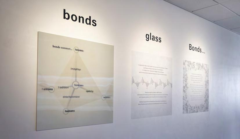
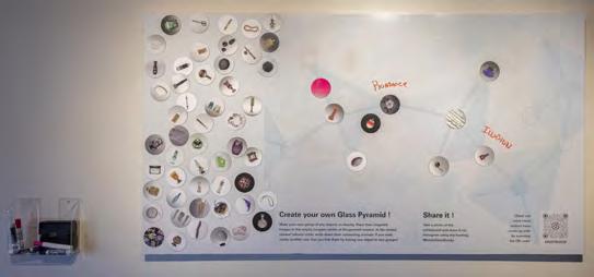
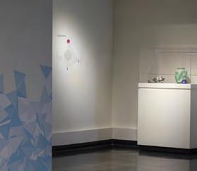
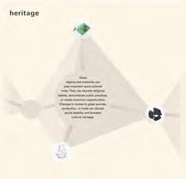
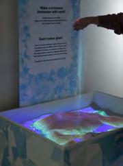
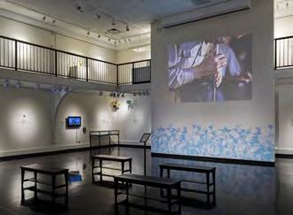
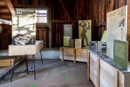
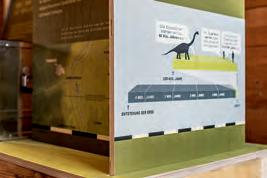
What was the challenge?
In the end “we are all Allgäuers” was the headline in the NZZ two years ago. Because “Udo” has recently turned the history of evolution upside down – starting from a small village in the Allgäu, where spectacular finds provide new, fascinating insights and conclusions about the development from primates to humans. That should be told in a traveling exhibition: variable, modular, transportable, ecological, interesting, and also “approachable” in terms of content. The first stop was the old fire station of Pforzen.
What was the solution?
The exhibition design was inspired by classic excavation sites: tents, boxes for findings and material, aluminum cases … all functional, stackable and robust. But then there is something for children to discover with a flashlight, infographics to give a feeling for time periods and changes, hands-on objects, sliding elements, etc. all realized with a carpenter on site from local wood (in “poor quality”).
What was the effect?
With great feedback from the first event and the media response, there were also much inquiries about the traveling exhibition – it is now on its fourth, but certainly not its last stop in Heidelberg.
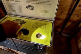
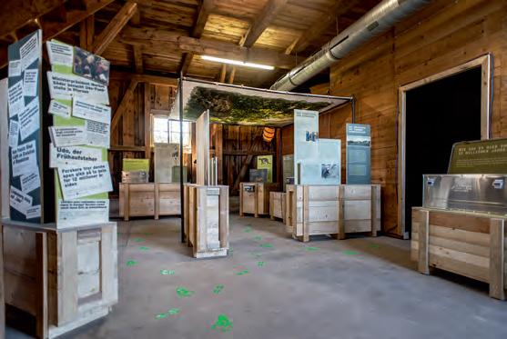
Contact:
name: Andreas Koop
company/organisation: designgruppe koop
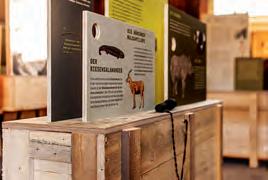
e-mail: a.koop@designgruppe-koop.de
website: www.designgruppe-koop.de
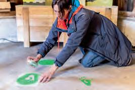
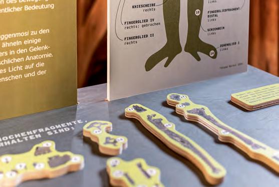
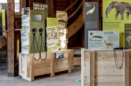
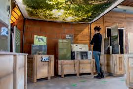
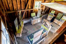
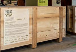
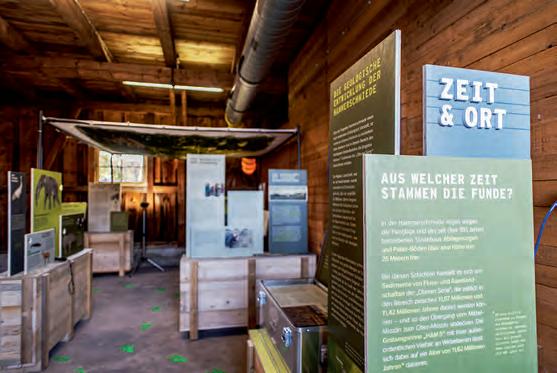
What was the challenge?
This work aims to enhance, to raise awareness, to provide a census and a useful tool for the real pervasiveness of the application of the many different Circular Design Strategies among Italian Designers of products and services. In Italy, the literature on the subject has focused on the raw materials chains and recycling as well as on Company Best Practices but not on what designers are doing. To fill this gap in 2021-22, we carried out the Italian Circular Design Maps research at the Università Iuav di Venezia: a census of designers who explicitly deal with the Circular Economy in Italy and a survey on the most widely used design strategies. The research contributes to understand the elements of both technicality and critical reflection on circular and regenerative processes that designers, specifically those who are paying particular attention to environmental issues, are using in their profession. As a matter of fact, it is necessary to understand the strengths and weaknesses of the radical transformation of design practices connected to the revolution in consumption habits and behaviour. Are designers already acting in this way? Are they prepared for this shift towards circular and regenerative processes? How deep is their understanding of the different strategies concerning this transformation?
Contact:
name: Laura Badalucco / Paola Fortuna
organisation: Università Iuav di Venezia
e-mail: laurabada@iuav.it / paola@piufortuna.it
website: www.iuav.it
Identification of the specific location of the design studios under investigation. In a small number of cases (ID with double dot) the firm has more than one office in Italy.
What was the solution?
The research work highlighted some substantial issues with regard to technicality of design and its influence on the success of Circular Economy Innovation Processes.
A survey made it possible to identify a sample of about 100 designers, of which 78 product designers whose activity proved to be of particular interest. After an assessment of their geographical distribution and subsequent mapping with specific infographics, an analysis of the use of a 32 Circular Design Strategies Matrix was carried out. Among the 78 cases identified, 10 were selected for a long interview for the quality and depth of their approach to the themes of circularity and, then, for their distribution over the Italian territory, the variety of sectors in which they operate, and the originality and quantity of strategies adopted. The results obtained in the various stages of the research have been summarised in a series of infographics; these represent the point of convergence of all the data, considerations and reflections gathered during the research and offer a concise indication of the pervasiveness of the design strategies characteristic of Circular Design.
What was the effect?
The research result was a book with infographics and texts and 10 video interviews useful to deepening the Circular Design Thinking and the Circular Strategies adopted by the Italian Designers. Furthermore, the Circular Design Strategies Matrix, made of 32 issues, offers a guide to those other designers that want to deepener their knowledge of Circular Design and gives them a checklist for their work. The book thus proves the effectiveness of infographics as a tool for understanding the state of the art, on the one hand, and, on the other, as a stimulus to show and to use all the design strategies aimed at the real transition to the Circular Economy.
In 2022 the book was submitted to a peer review of the Università Iuav di Venezia that verified the quality of the research methodology and the effectiveness by increasing interest in these issues.
As a result, the Italian Circular Design Maps was published in 2023 in the n. 40 – Revolutions of the italian magazine Officina (also peer reviewed). In these pages we present some examples of the book pages and infographics.
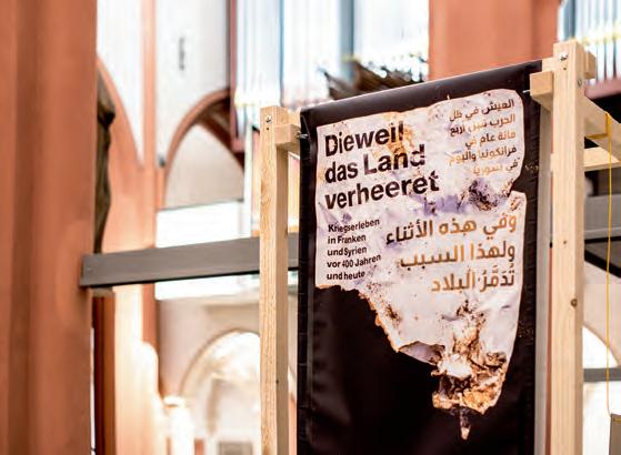
What was the challenge?
An exhibition design based on a “theoryheavy” concept from the University of Bayreuth – with a minimal budget. The topic was both fascinating and shocking: the parallels between the 30-years war and the war that has been raging in Syria for twelve years. “Because the country is devastated” (“Dieweil das Land verheeret”) should make this comprehensible and tangible. Also implemented as a traveling exhibition, the first stop of which was spatially limited (Bayreuth City Museum).
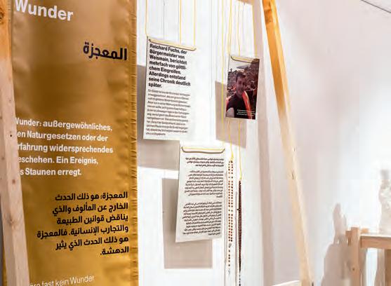
What was the solution?
A visual separation of the two wars into two physical levels – which are overlapping. The use of materials familiar to pictures of refugee camps, cheap wood from the hardware store, cots from the remains of the 2015 refugee crisis as information carriers, printed tarpaulins, everything on frames screwed together (Syrian refugees and students from the university helped with this!) and fastened with clotheslines or weighted down with water canisters –tragically well-known.
What was the effect?
An extremely unpleasant, rough, unpleasant, touching atmosphere that makes one think, a kind of “memento mori” as an exhibition that could easily be set up at other locations. A very high level of media coverage and a presence of the people who fled and are now living here.
Contact:
name: Andreas Koop
company/organisation: designgruppe koop
e-mail: a.koop@designgruppe-koop.de
website: www.designgruppe-koop.de
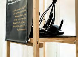
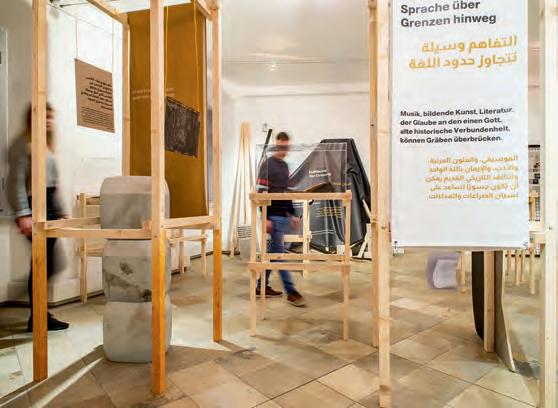
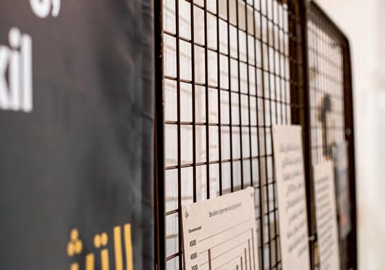
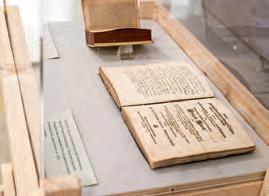
What was the challenge?
Sport improves the quality of life and social inclusion of blind people. Argo is a wearable device for blind swimmers that communicates through vibrations the correct position and approach of the swimming pool edge. The challenge was to create an instruction manual accessible to blind users that would allow them, like the device, to access the information independently.
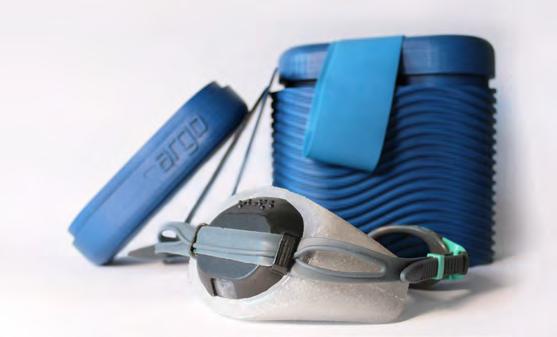
The solution was to decline the same information content in different versions, depending on the degree of visual impairment of the user. The information to be provided through the use of text and drawing concerned the configuration of the device, how to wear it and how to charge it, and the positioning of the sensors along the swimming pool.
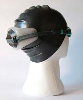
In addition to the audio manual, we created an enlarged character manual with contrasting colour illustrations and a braille code manual with tactile drawings. We believe that braille literacy promotes accessibility in society for people with a visual impairment. As digital assistive technology develops more rapidly than ever, there are still strong benefits of being able to read and write in braille for someone who has a visual impairment. This revolutionary code provides the vital access to the written word and, wherever you look around, it is used every day by blind people.
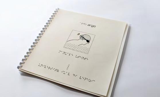
Contact: Bigon / Campanale / Labidi
Università Iuav di Venezia
daniela@danielabigon.com
giuseppecampanale1@outlook.it
saralabidi97@outlook.it
Instagram: @argo.aid
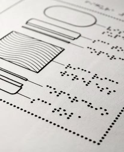
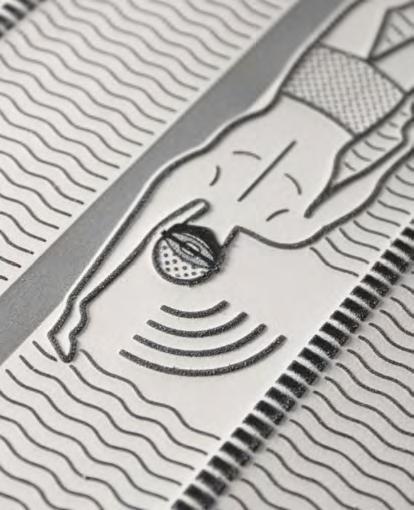
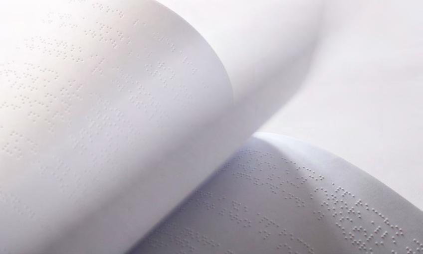
Project: Summe + X (Exploration & Visualisation of »Emergence«)
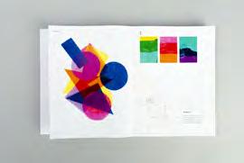
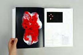
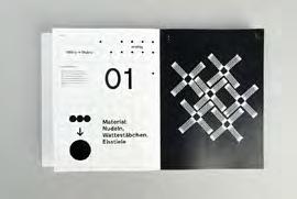
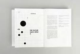
We often think in terms of single elements, individuals and singularity. The fish, the human being, the drop of water, the tree. But what happens when the individual elements combine to form systems or groups? When fishes become a swarm and raindrops become rainfall? In the union, features arise which individual elements do not possess in isolation. Complexity evolves from simplicity and order from chaos – a circumstance defined as »emergence«. With our bachelor thesis we wanted to face the challenge of giving this complex phenomenon a visual translation. We wanted to explore the potential of union, to examine this in particular in social contexts and to translate it by design, as well as to research it in design itself. Often we only look at the whole, but even the most complex structures owe their existence to simple, sometimes banal elements or components that only unfold their potential in community, side by side. Our goal was to bring this fact to light –to observe it, document it and convey it visually.
Our work is divided into two areas: »Searching X« explores emergence in design itself: With many small experiments, analog and digital, we investigated the aspect of connection. In each experiment, we studied at which point or in which form new properties/features evolved when individual elements were combined, overlapped or somehow connected – or, conversely, when the whole was dissolved into its individual parts. All the results were recorded in a book which is graphically oriented to the merging of molecules, counting in total about 400 pages.
In the accompanying exhibition »Visualising X« one station each takes up an aspect of human association.
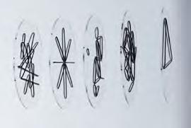
A prime example of emergence in the social sphere is for example swarm intelligence, which manifests itself differently in the animal kingdom than among us humans – a double-sided poster is devoted to the differences and similarities.
Another station illustrates that we as individuals are part of the whole – part of a relationship, a group, a society. The complex interconnections visually add up to a chaotic web, but can be recognized laterally as ultimately many individual layers.
The strong contrast between positive effects of human association (e.g. cooperation, teamwork) and negative effects (e.g. group pressure, mass panic) is depicted by means of a poster curved in both directions – the two poles inseparably connected.
Each of the stations of the exhibition, including the book, provides only a partial aspect of emergence, but in sum – as a whole – a multi-layered picture emerges. We by no means claim to portray a complete picture, but rather aim to arise awareness and offer new perspectives, especially on familiar and seemingly trivial things. In a time in which many negative examples of human interactions are present, we find it important to also give space to the positive examples, the chances and potentials.
Our work aims to provide answers, but also to pose questions. Can the potential of connecting elements be better exploited? Can it be used more consciously in the design process? And can we humans solve problems better when we focus more on the chances of cooperation and association?
Contact:
name: Lilli Schmelz & Deborah Schultheis
university: Faculty Design, THWS, Würzburg
e-mail: lilli.schmelz.ls@gmail.com, deborah.schultheis@gmail.com
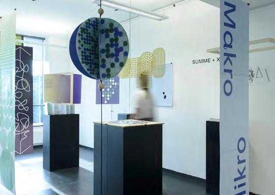
The Takahe is a large, rare flightless New Zealand bird. It stands around half a meter tall and is known for its colourful blue and green feathers and very large red beak. It is vulnerable to predators in the wild and as a result there are only around 450 birds left. As children have a future role in protecting the native species of New Zealand, my challenge was to teach them about the Takahe. My aim was to communicate the value of the bird to local school children through an informative activity kit.
Firstly, I designed a set of posters to establish the facts. Using that information, I then designed an activity kit for school children aged 7 to 10. The kit consists of an activity book, flashcards, and a set of stickers. The tone is friendly, exciting, playful, and fun. This encourages children to engage with the subject of conservation and understand key statistics and facts in an accessible way. The colour palette is a vibrant blue, green and red to reflect the colours of the bird. I painted watercolour illustrations for a more approachable aesthetic. To compliment the design, the story has been written in a conversational and friendly tone.
The flashcards are an interactive companion to the activity book to allow children to practise the facts they have learnt in the book.
I designed stickers in a similar style to use on the pages of the book or place on their personal belongings. My aim was to encourage children to explore physical, make-anddo activities such as colouring in pages, word finds and flash cards to learn about the Takahe’s history, habitat, predators, and local conservation efforts to protect and preserve them.
Series of Takahe information posters
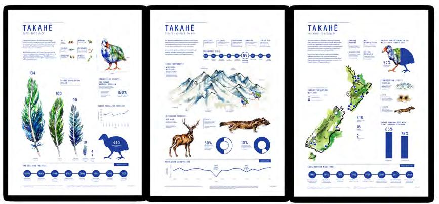
Contact: Ruby Christoffel
Massey University Wellington
ruby.christoffel@gmail.com
www.rubychristoffel.myportfolio.com/
The series of information posters tell the narrative of the Takahe –from near extinction to its re-discovery and the introduction of breeding and relocation programmes. This is a fascinating story of a bird that has been brought back to life from near extinction. The physical nature of the Takahe activity toolkit creates a bridge to the natural environment and encourage kids to go into the outside world and engage with native wildlife.
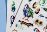
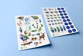
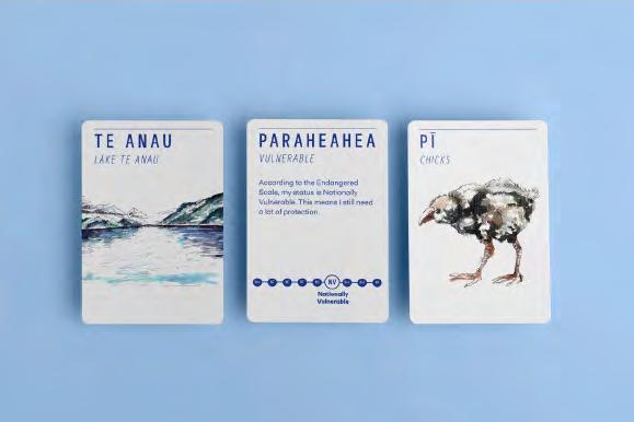
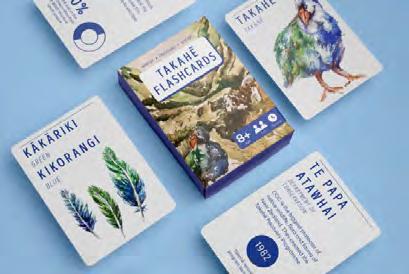
The Takahe is a colourful, flightless but vulnerable New Zealand native bird. Because the birds are such an easy target for predators there are only around 400 left and few of these remain in the wild. However, their numbers are slowly beginning to increase due to intensive breeding programmes in sanctuaries and relocation of birds to off-shore islands. My challenge was to educate a young audience aged between 8 and 12 years old about the Takahe and their struggle to survive.
Contact:
Name: Emily Simpkin
Organisation: Massey University, Wellington, New Zealand
Email: emilysimpkin33@gmail.com
Website: emilysimpkindesign. myportfolio.com
My first solution was to establish the facts through a series of informational posters to outline the Takahe story. The first poster introduces the species. The second poster describes the main threats to the species, and the third informs what is being done to protect and preserve the birds. My second solution was to create a board game to educate children about the threats to the Takahe living in the wild. I designed a full set of cards: 60 point cards (each card has an action that aims to help the Takahe survive, with the highest numbers having the most impact); 27 disaster cards (these are the main threats, with facts on the back to educate the player);
4 journey boards (describe different character traits of the bird with additional facts about their habits and lifestyle); 15 instant cards (to boost, decrease or swap the scores of the players); 4 player tokens; an instruction manual, and a box for the game.
My solutions aim to educate young New Zealanders about the rare and beautiful Takahe bird. The board game is fun, engaging and informative. Furthermore, it is designed to create an opportunity for children to discuss the subject with their caregivers or teachers.
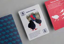
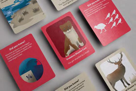
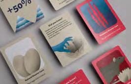
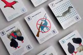
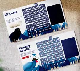
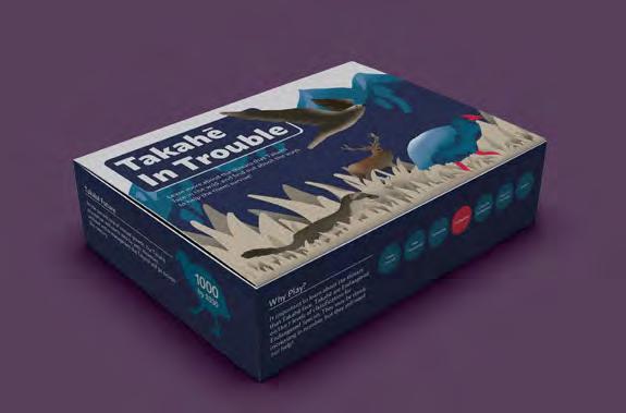
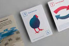
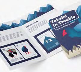
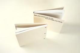
What was the challenge?
Language is a subject to constant change. It is not only a stylistic device but also a powerful socio-cultural tool that shapes the way we think and act upon the world. The project wants to find an alternative approach on examining this complexity of linguistic structures by translating them into a reduced graphic system that attempts to unfold the lingual anatomy and engages with changes over time.
What was the solution?
This project provides an artistic-exploratory approach to linguistic structures and their graphic interpretation. Using linguistic text analysis tools, one text each by three wellknown female Austrian authors from different eras was analysed: Lotti, die Uhrmacherin by Marie von Ebner-Eschenbach [1880], Drei Wege zum See by Ingeborg Bachmann [1972] and In der Zukunft sind wir alle tot by Stefanie Sargnagel [2014]. Based on the formal analyses of these Mustertexte [sample texts], a visualisation concept was developed to make Textmuster [text patterns] visible and thus engage with the anatomy of language in a different, experimental way. In addition to the conceptual-analytical part, special attention was paid to the material elaboration. The book was entirely self-produced, including printing and binding.
 Lili Harather New Design University [AT] lili.harather@gmail.com
The elaborated graphic system—based on linguistic, philosophical and artistic research—can be transferred to analyse any texts and isn’t bound to the German language. The additional enrichment with theoretical linguistic essays enables the recipients to engage with and reflect on language in a new and stimulating way. The selection of the analysed texts gives agency to female authors, often left out of cultural history. The resulting publication examines the book as variable object and tries to push conventional boundaries. It can be seen as an open work that continuously can be disassembled, extended and changed by feeding in further analyses and text patterns. This interchangeability picks up on and reflects the variability and changeability of language on a formal and artistic level and makes it not only visually but also physically experienceable.
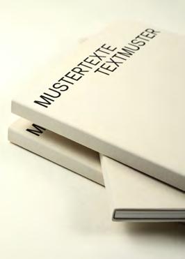
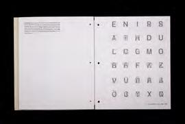
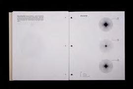
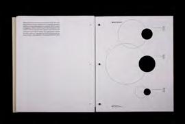
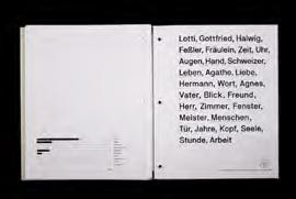
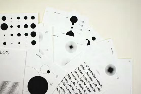
What was the challenge?
Beautiful yet critically vulnerable, the takahe is a flightless bird of Aotearoa New Zealand. Having returned from the brink of extinction (twice), the creature is supported by a recovery programme with two objectives: to increase wild populations and to see takahe “treasured as a national icon”. To gain both financial support and public awareness, the current uninspiring sponsorship campaign required a new and wider audience, and a shift away from pure logos to pathos.
What was the solution?
The rebranded campaign proposition included multiple touchpoints tailored to reach a younger, urban demographic (who might not traditionally engage in conservation efforts). Media ranged from street posters to collaborations with local skateboard and craft beer businesses. These touchpoints strategically engaged users with simple messaging that endeared the bird’s personality and vulnerability to users. Information aimed to be conveyed in small and memorable ways, telling a
story rather than spitting statistics. The campaign also involved a call to action, directing people toward sponsorship. The website continued this narrative, looking backward and forward in history: it offered an interactive illustration of the takahe’s come-back story, then invited users to influence its future. Symbolic sponsorship of individual takahe personalised the story, resulting in a sense of kaitiakitanga (guardianship). Tote bags were gifted to sponsors and acted as further promotion.
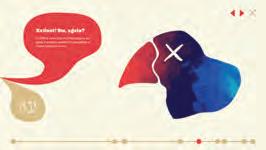
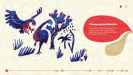
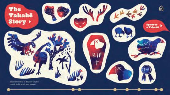
The design aimed to embody the takahe’s admirable attributes. These visuals were aided by colloquial and playful language, appealing to Kiwi culture. Inspired by public discourse in digital spaces about takahe, the information was presented conversationally, bouncing between facts and humorous commentary. The narrative presented a bird equally chill and cheeky as it is wondrously resilient – not unlike New Zealanders. This anthropomorphism achieved what numbers alone could not.
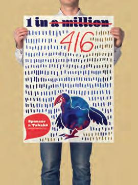
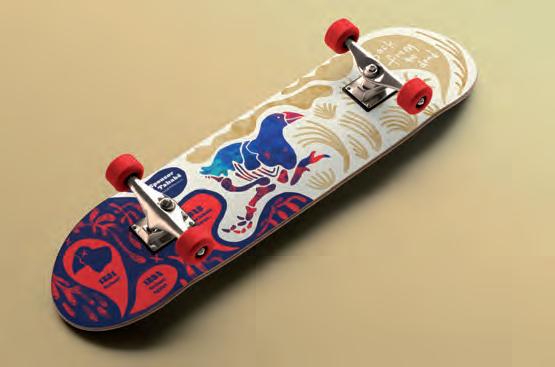
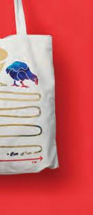
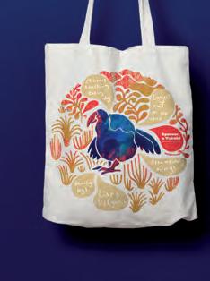
What was the effect?
• Conservation information that was accessible in the everyday spaces where people live, play and socialise
• Increased awareness of the bird’s state of vulnerability
• Admiration and wonder at the best come-back story of last century
• Sense that the takahe is personally and socially relatable
• Framing of the takahe as a national icon
• Personal and fun sponsorship experience that encouraged sustained interest
Contact:
Hannah Wedlock
Massey University, Wellington, New Zealand
hannah.wedlock@gmail.com
hannahwedlock.wixsite.com/portfolio
*This project was an assignment for a Narrative Information Design paper which required the conceptualisation but not implementation of a conservation campaign
In 2021, I met Sejal, an India-based mechanical engineering student, who at the time was doing research on women menstruating in extreme conditions such as the military, rural areas and space. I asked her if she was willing to create something together on this topic. After sharing our experiences and reading her reports, I realized how limited knowledge about menstruation is not only in our countries but worldwide. The main question at that point was, what can I do with Sejal’s help that would work cross-culturally and help increase knowledge about menstruation?
The initial goal was to create an educational tool that could work in a variety of conditions and cultures, while also being easily accessible. Thinking about the broad spectrum of my target group, I decided to create a digital guide in .pdf format, which is based on illustrations.
MENSTRUPEDIA is a free digital publication that explains in a simple way the basic concepts of menstruation. Thanks to its form of a wordless guide, it is universal and understandable to everyone, regardless of education, age, gender or nationality. The guide has been put through a series of tests for comprehensibility and inclusiveness on various user groups from different countries and cultures. On top of that, MENSTRUPEDIA’s digital format allows the guide to be easily transmitted around the world to reach the largest possible audience.
Contact:
name: Agnieszka Doczynska
company/organisation: Infoklasse UDK
e-mail: a.doczynska@gmail.com
website: https://agadoczynska.com/
Period Process
Menstrual blood has venous blood (what you normally bleed when you are cut) as well as vaginal discharge and cells from the lining of the uterus (called the endometrium). It can look like blood, it can look like red mucus, it can be almost black, and it can be clotted—none of that is abnormal medically.
The entire guide is divided into two parts, the illustrated part and the text part. Within the pictorial section of the guide, there are
Color of menstrual blood and vaginal discharge
Symptoms page - Related to the previous page, provides detailed information about the symptoms of a certain condition.
Sometimes menstrual blood can even look so much like tissue, it could be confused with a miscarriage. This medical phenomenon is called a decidual cast, which occurs when a large portion of the endometrium comes off at once.
Menstrual blood can change in color and texture from month to month or even during a single period. Hormonal changes, as well as a person’s diet, lifestyle, age, and environment, can all cause variations in period blood. Infections, pregnancy, and, in rare cases, cervical cancer, can cause unusual blood color, irregular bleeding or unusual vaginal discharge.
additional subsections marked by different coloured pages.
Period blood is normally liquid as the individual cells of the endometrium are not stuck together. However, imbalance between the hormones progesterone and estrogen can cause the cells to come off in sheets as opposed to individually (think a hundred Lego blocks attached together versus individual blocks).
1.
Brown or dark red (2.)
Like black blood, brown or dark red is a sign of old blood, and it may appear at the beginning or end of a period. Brown or dark red blood has not had as long to oxidize as black blood and can appear in a variety of shades.
3.
Bright red
Bright red blood indicates fresh blood and a steady flow. A period may start with bright red bleeding and darken towards the end of the period.
Index page - Provides a more in-depth explanation of the topic in English and is directly related to the pages with illustrations.
4.
Some people may find that their blood stays bright red throughout their period. Rarely, bright red bleeding may be a sign of cervical cancer. Other symptoms of cervical cancer include: Heavier periods Periods that last longer than normal Bleeding after sexual intercourse Foul-smelling vaginal discharge Pain in the lower back, pelvis, or legs Loss of appetite Unexplained weight loss Black Black blood can appear at the beginning or end of a person’s period. The color is typically a sign of old blood or blood that has taken longer to leave the uterus and has had time to oxidize, first turning brown or dark red and then eventually becoming black.
Step-by-Step page - A page containing instructional content on topics such as: How to use sanitary products?
14:9
The guide’s format, 28x14cm, makes 14:9 ratio, that balances needs of both 16:9 and 4:3, making the usage on different devices easier. It also allows it to be easily printed, fitting the DIN A4.
The numbers in the guide make it easier to navigate between the picture and index sections, while simultaneously helping to build a connection between vocabulary and illustrations for those who can’t read.
The interactivity allows simple navigation through toolbar on the left and buttons on the bottom right. This makes it easier to jump between chapters and two sections of the guide, as well as allows the guide to be used on the touch screen devices.
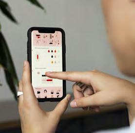
In the pictorial part, the guide uses a system of colours and icons to help convey information within the illustrations.
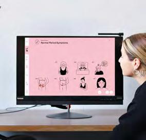
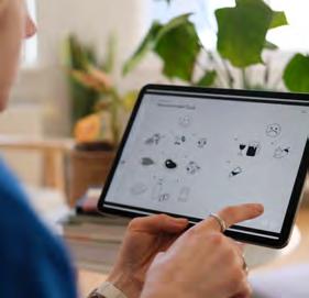
The illustrations feature a system of arrows and pointers which effectively aid in the navigation and understanding of the various processes shown in the guide.
Rounded arrow - Used only on the regular pages; successive processes; things resulting from each other
Dotted line - Extension of a description; additional information; multiple choice; features of a given thing or condition;
Dashed arrow - Changes or results in appearance or states
Straight arrow - Action Orange straight arrowAction involving the use of hands, such as: pulling, wrapping, pushing
Short arrow - Following steps in step-by-step instructions section
Circular arrow - Reuse or repetition
The plight of endangered native species in New Zealand was the subject of this research project. The aim was to develop a compelling narrative from gathered statistics and information, that aimed to raise awareness and inform the public about a chosen endangered native species of New Zealand being the tuatara. Being able to condense a large amount of information that seeks to guide the viewers through curated information that tells a story in a clear, accurate and easily understood form as well as being informative yet appealing and eye-catching.
An Ancient Reptile is a journey through three distinct elements, the design of beer cans, beer box packaging and coasters. The overall narrative created across all three elements is to express the lifestyle, and characteristics of this rare medium sized reptile who has been around since the dinosaur age. They have been created to be a continuation of each other through the steps of opening the box, getting a drink and putting it on a coaster. The box packaging introduces the tuatara and its lifestyle, including conservation status, reproduction, threats and habitats. The beer cans elaborate on the tuatara and mention all their fascinating and unique characteristics/facts that make these reptiles such an iconic New Zealand species. Lastly, the coasters are an element of informational fun which include multiple choice questions and answers furthering the narrative wider. The coasters can have a use going beyond the beer packaging.
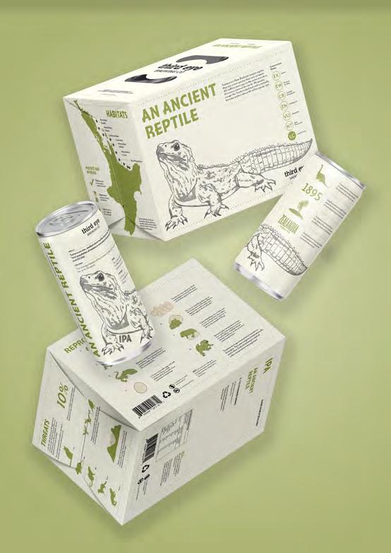
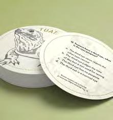
Contact:
Name: Caitlin Dever
Organisation: Massey University
Wellington, New Zealand
E-mail: cd3v@yahoo.com


Bringing awareness of an endangered native species through an interesting, informative way influenced from the natural environment of the tuatara and their characteristics. Visually inspiring the colour choice, typography, visual and text hierarchy allowing the audience to gain a greater understanding and insight into the lifestyle and characteristics of the tuatara, while enjoying a tasty beverage.
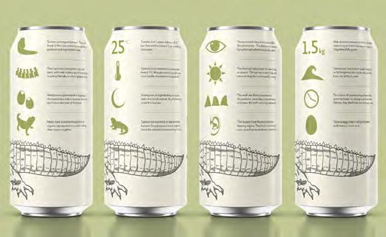

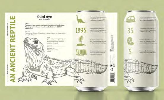
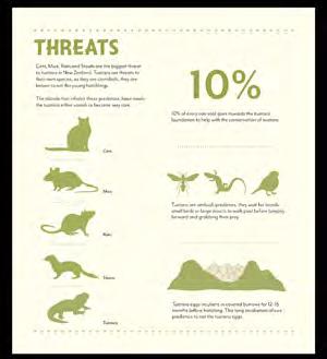
Category: Bachelor and Masters
Project: 34 – 81 dB
What was the challenge?
Sounds shape our cities and the structure of cities shape the sounds. While the soundscape of Vienna consists of sounds produced by various sources they are usually only processed and communicated as generic sound levels and noises.
c.dellaschiava@me.com claude-lesclave.at
An in-depth analysis of city sounds was conducted in five different areas of Vienna. 146 different sounds were recorded during soundwalks that were carried out both during the day and at nighttime. The findings were then visually translated into ten different »Soundmaps«, creating a unique image of each neighborhood’s soundscape. The Soundmaps are accompanied by a reader containing definitions and fundamentals of sound, processing of auditory information, and interpretation of the analysis and findings.
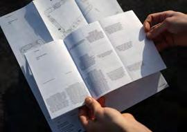
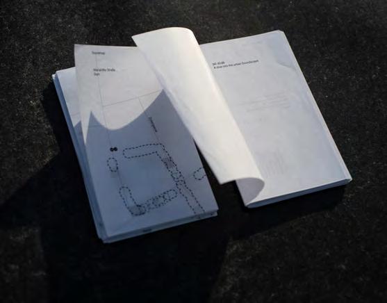
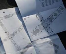
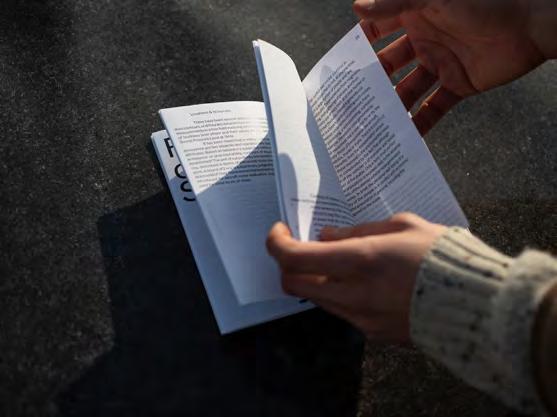
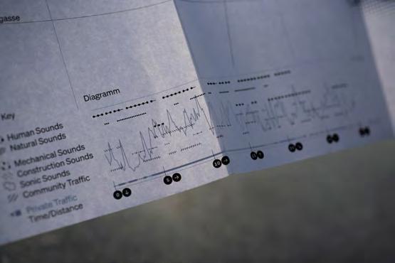
For the first time, these neighborhoods have been seen from an auditory perspective, providing valuable insights for urban planners and architects. It demonstrates an effective approach to capturing and analyzing auditive information and translating into into visually processable tools for understanding the soundscapes of cities and their impact on human experience is essential for creating healthier and more livable urban environments.
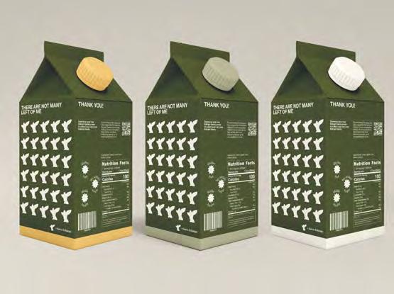
What was the challenge?
Kakapo are a nearly extinct, native bird in New Zealand. They are nocturnal and the largest parrot in the world. After being hunted and having predators introduced through colonisation, their population met a rapid decline. Kakapo were sent to predator-free and monitored islands. They don’t breed often so these monitored environments are the only thing keeping the species from going extinct.
What was the solution?
Night Parrot juice aims to involve many generations in the education of Kakapo. It includes facts and information on the juice boxes and a link to the app. Each Kakapo is named and have trackers so each juicebox has an individual Kakapo sticker on the front. This sticker can be stuck on the Kakapo Family poster. You can then download the app, scan the Kakapo that you have collected and be able to track where they are, see more information about them and keep a collection.
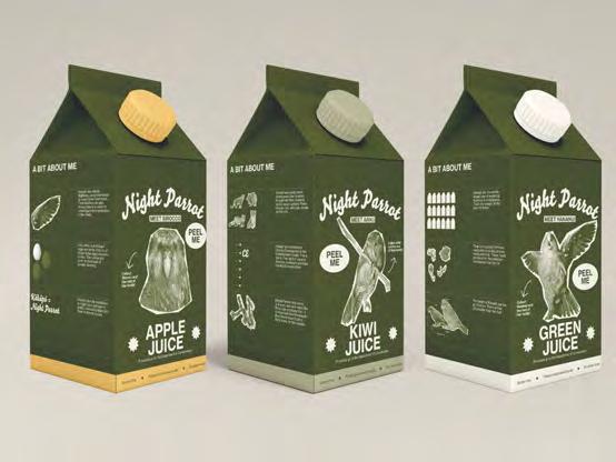
What was the effect?
The only way that people can help save the Kakapo population is through donations. These donations go to the islands and scientists to continue their research and protection. Profits from the juice boxes go towards this and the app allows people to make donations in order to unlock more Kakapo.
Contact: name: Kyra Jensen
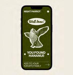
company/organisation: Massey University
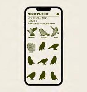
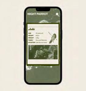
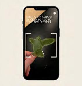
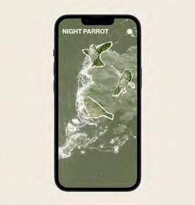
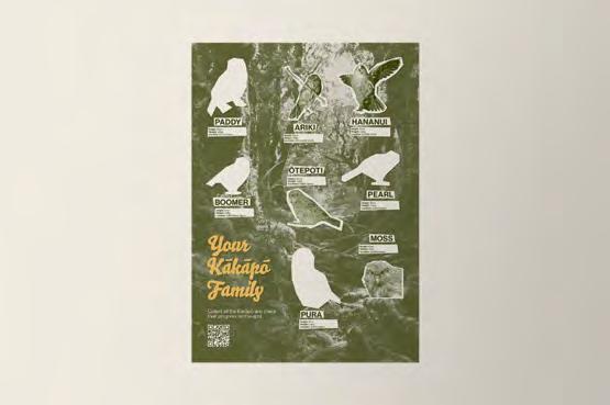
e-mail: kyra.f.jensen@gmail.com
website: kyrajensen.com
Category: Bachelor and Masters
Project: trans.phlux—translating light

What was the challenge?
The field of quantum physics can be difficult for those without a background in science to comprehend, as the abstract concepts and theories seem to be confined to the laboratory. While sciences aim to investigate and conduct research, creative disciplines often limit themselves to exploring the visual aesthetic.
Quantum physicist Richard Feynman once stated that his artist friend appreciated the superficial beauty of a flower, but did not grasp the deeper beauty inherent in its scientific structure.
In the specific case of light, physics came a long way to actually define what it is—a complex yet beautiful superposition in itself. But how can a Designer explore this deeper beauty and translate it for people outside of the science field?

Contact:
name: Miriam Daxl
company/organisation: New Design University [AT]
e-mail: miriam.daxl@gmail.com
website: extraparadoxa.com
What was the solution?
In order to make this phenomena of light and quantum physics tangible, the project investigates various aspects:
— a scientific theoretical approach
— an application in analogue photography
— an attempt to measure by using a photo-sensor and Arduino
— a manual to provide explanation for simple experiments based on the scientific theory
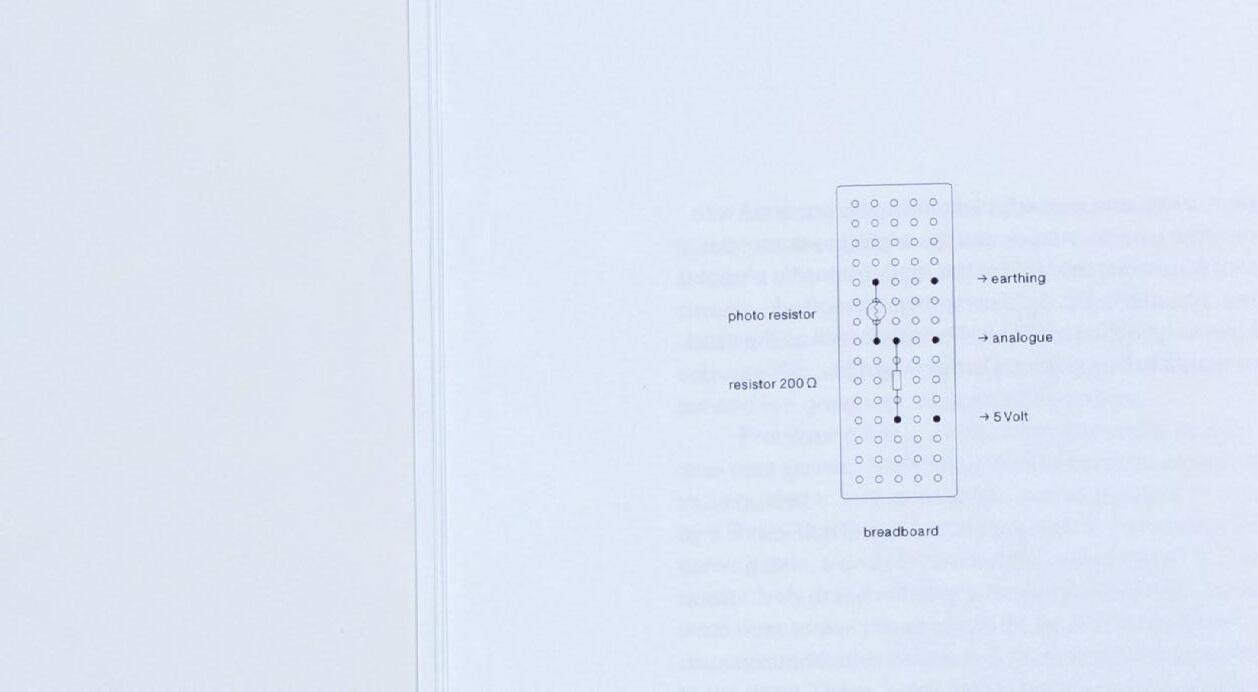
Organizing these aspects into chapters makes the topic easier to comprehend. However, the different approaches listed above are linked with each other to gain a profound understanding about the phenomena of light in various contexts.
What was the effect?
trans.phlux is an attempt to investigate but also translate a scientific phenomena with simple tools a person outside of the science field can access. It serves as a manual to gain knowledge about light within its quantum mechanical theory but also how this is seen and utilized in one’s every day life.
The project is positioned between Feynman and his artist friend. It celebrates the deeper—the invisible—beauty of light by explaining it through the visible beauty of it.
What was the challenge?
In an era dominated by TikTok videos, social media and streaming services, we often scroll and swipe through playlists and songs to see tiny artworks for split seconds. With the digitisation of the music industry over the last 40 years, the original purpose of an album cover as the packaging of a record is now questionable. In our fast-paced world with easy access to digital music, the meaning, value and our emotional connection to album covers along with tangible, printed formats has long been lost.
What was the solution?
Based on a discussion in a forum for experimental electronic music and a private music collection of 310 albums, EPs and compilations, the bachelor project explores this change. The resolution of 640 × 640 px plays a major role in the project. Streaming services like Spotify currently require this resolution when uploading cover artwork. In order to archive the artwork in a physical collection, the images can be printed at a maximum size of 5,42 cm per side.
The music collection on Spotify forms the core of the project and pictures all printed cover artworks in exacly 5,42 cm big squares. Due to its transparency, the book page serves as an information carrier by showing the ID (sorted from A to Z), the title and the album artist on the back of the respective cover. Since each page represents a year and a category, there are also blank pages if there is no corresponding cover in the collection.
Nine collection items available as physical records further illustrate the size aspect by showing them in their full size. The project is rounded off by a text section in the beginning and additional information such as artist or format to complete the discography in the end.
In a total of 208 pages, the work explores the changing nature of album covers, which not only affects our consumption of images today, but also influences design and the way visual material is provided. The book also serves as an archive of current cover designs within experimental electronic music.
Contact:
name: Konstantin Wagner
e-mail: contact@konstantinwagner.at instagram: @wagnerkonstantin
The phenomenon of the sun has fascinated mankind time and again, influencing their lives for over thousands of years. But how can the diversity of sunlight be visually represented in terms of temporal, spatial and geographical aspects?
Communicating complex knowledge, making the invisible visible and stimulating research became one of the greatest challenges during the process.
For this extensive topic, data visualizations are a suitable method to illustrate complex processes. Here, knowledge can be acquired through an intensive research itself, generating an own dataset*, at the same time translating research into teaching and communicating on knowledge to others. The result is a poster series in large format (700 x 1.000 mm) with the following content structure:
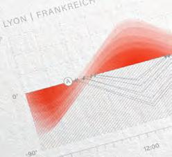
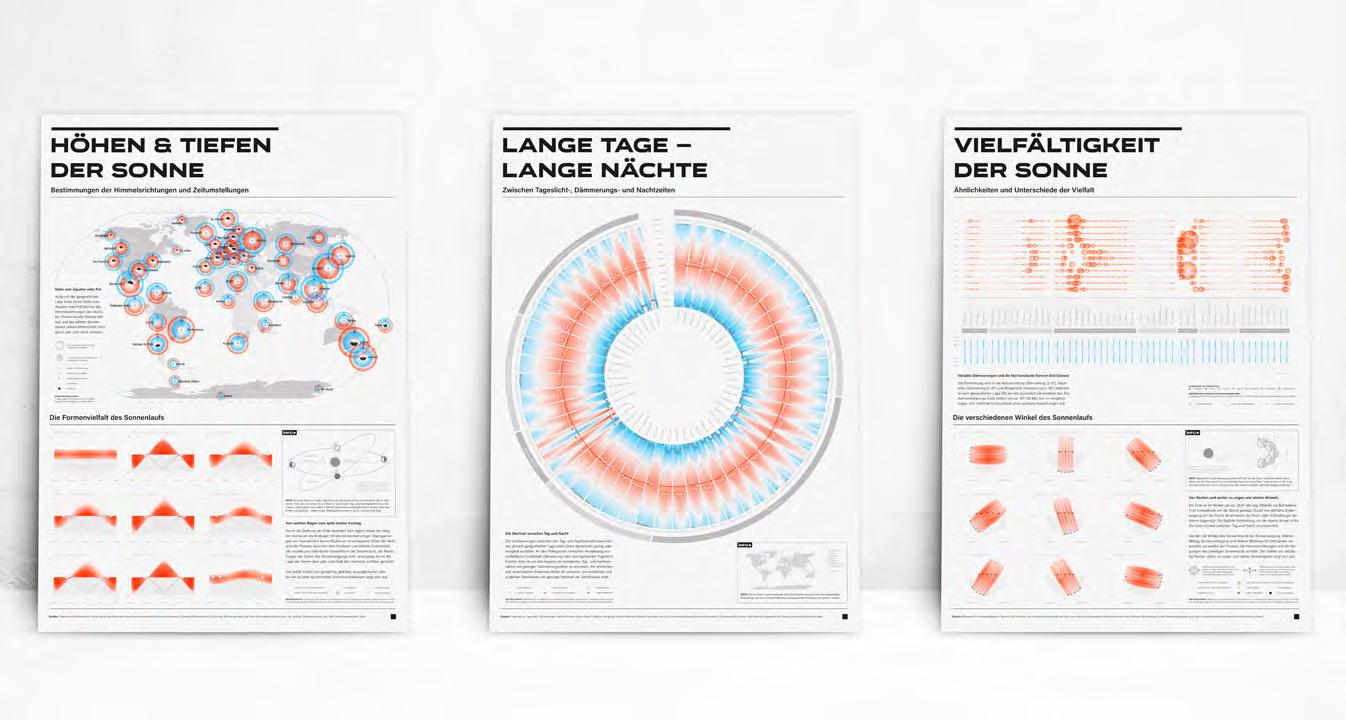
1st poster :: Heights and depths of the sun
(Illustrations: Determinations of the geographical points of the compass and time changes, as well as the variety of the sun’s course).
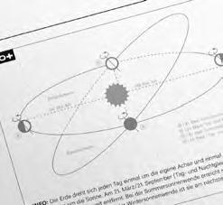
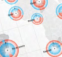
2nd poster :: Long days – Long nights
(Illustrations: Analyses between daylight, twilight and night times)
3rd poster :: Diversity of the sun
(Illustrations: Similarities and differences of the diversity focused on twilight times, as well the different angles of the sun’s course).
The minimalistic, light and decent visualizations offer space and time for observation, analysis, reflection and research. Repetitive elements (e.g. colors and shapes) made it easier for the viewers to understand and connect the content across the three posters.
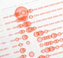
Previous exhibitions have shown, that most viewers started to observe familiar places/countries (e.g. home town, holiday locations). Afterwards, they began to compare more places they knew and didn’t know. Thereby they went automatically deeper and deeper into the topic. Furthermore, places with unusual and extreme solar situations, quickly became very interesting. The newly gained knowledge helped the viewers to understand better the respective locations and their individual solar conditions and also to recognize the differences between each location. Some visitors mentioned that they explored the topic of the solar conditions (with awareness) for the first time.
* Own generated dataset: based on information provided by the online tool ”timeanddate” (Source: www.timeanddate.de)
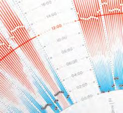
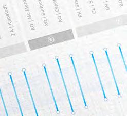
Contact:
name: Bettina Susanne Mörz
company/organisation:
University of Art and Design Linz
e-mail: connect@bettinamoerz.com
Category: Bachelor and Masters
Project: Der Störenfried
What was the challenge?
Today it is not difficult to get information as after all, we live in the era of Information. However, what many people fail to do (due to lack of time) is to understand, filter and ultimately classify all this information correctly and at a later stage possibly also link it with other knowledge. Only those who manage to do this can understand complex issues and maybe even change something about them. Those who cannot do this flee into disinterest. To solve this problem, this newspaper was designed.
What was the solution?
The newspaper is called “Der Störenfried“ (eng. „the troublemaker“). It contains a variety of information for each topic introduced. The articles are chronologically arranged and build upon each other. Additionally each topic has a reference system that highlights connections which creates a comprehensive information network. To communicate this information, a design language, infographics and fonts were created. The sum of these elements should enable the readers to understand the topics in a short period of time. The theme of the first issue is “War on Terror”. Aspects such as the development of the conflicts/wars, victims, costs, war crimes and the consequences of the conflicts are discussed.
What was the effect?
The pleasant design and the sophisticated structure resulted in a great demand. Many people contacted me to ask if they could buy an issue. Even people who claim that they otherwise have no desire to deal with such topics.
Contact:
name: Franz Tiefenthaler
company/organisation: NDU, St. Pölten
e-mail: tiefenthaler.type@gmail.com
website: frankquestionmark.wixsite.com/ my-site
What was the challenge?
Social injustices dominate the lives of millions, whether in the form of social exclusion, discrimination or the disproportionate impacts of climate change. This master’s thesis investigates whether and to what extent designers can contribute to solving these issues. The aim of this project is therefore to define suitable means by which the competencies of designers can be used for social purposes.
What was the solution?
One method that could enable the profession of designers to counteract social injustices is the discipline of information visualisation. This method is able to push societal problems and issues into the public focus and – even more importantly – educate people about the situation through the visual and understandable presentation of often complex and volatile information.
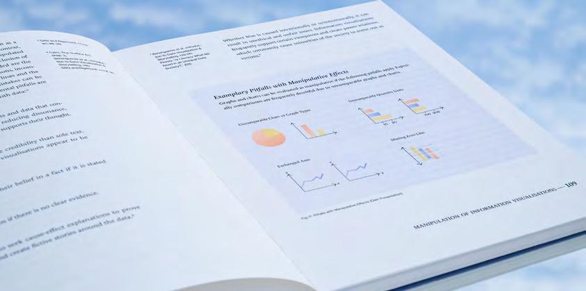
What
This book connects the practices of social design and information visualisation. Through literary analysis, it was found that information visualisations are extremely well-suited for designers to address social injustices. With these insights, a guideline for designers on how to effectively design for the social cause with the aid of information visualisation was developed. This can be used by designers to raise awareness and educate society about a particular social issue.
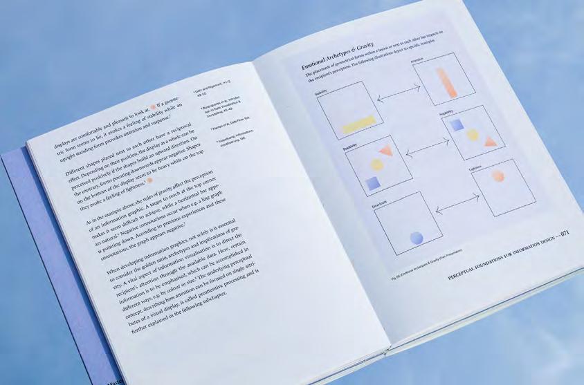
Contact: Gloria Gietl
FH JOANNEUM Graz, Austria
hello@gloriagietl.com
www.gloriagietl.com
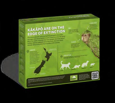
What was the challenge?
Wildlife conservation is reliant on future generations. Therefore, more should be done to educate the children of Aotearoa, New Zealand, about the importance and uniqueness of our native species. The critically endangered Kakapo is a rare flightless parrot, the largest in the world, but there is only 252 Kakapo left. Since there are so few Kakapo, each are named, and they have very distinct personalities. To engage children, the information needs to be fun, captivating, and informative.
What was the solution?
I have built a narrative through a range of informative touchpoints that aims to confront, engage, and inform the future caretakers of Aotearoa, New Zealand. These research posters communicate different aspects of the species, which, when put together, conveys a clear and consistent narrative. They introduce the Kakapo; show the threats to survival; and look into possible conservation initiatives.
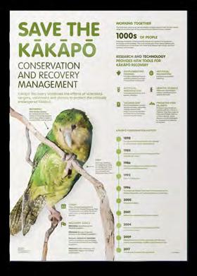
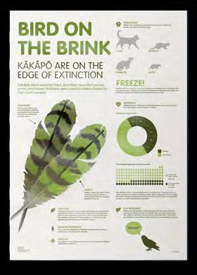
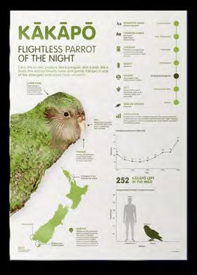
Taking the information curated in the research posters, Sirocco Nut Bar is a product design that aims to teach children about the quirky Kakapo in their everyday lives. The design comprises of:
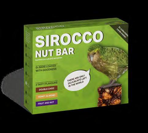
Box packaging
Individual bar packaging
Collectable cards.
What was the effect?
Sirocco Nut Bar aims to show personality through the design using bright colours, illustrations and fun facts and statistics. Sirocco is the name of the superstar mascot of Kakapo recovery; therefore, using Sirocco as the product name is fitting. When engaging with this information design, children can engage with Kakapo and learn fun facts about each bird’s characteristics.
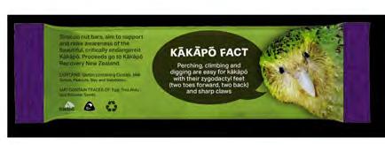
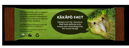
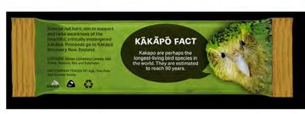
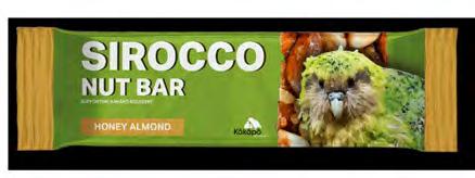
Contact: name: Lucy Roughan
company/organisation: Massey University, Wellington, New Zealand
e-mail: lucyroughan1@gmail.com
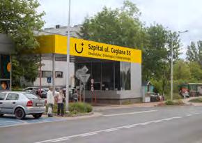
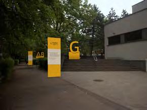
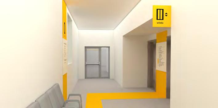
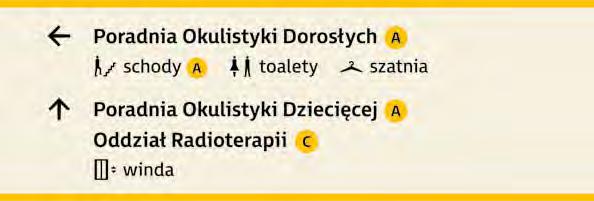
What was the challenge?
Uniwersyteckie Centrum Kliniczne in Katowice located at Ceglana street is a hospital famous for its high level of ophthalmology care. Its outpatient clinics are visited daily by around 600 people struggling with different eye diseases. Therefore the main challenge was to make it easier for users to find their way around the hospital, with particular care for the needs of visually impaired people.
The scope of the project includes directional and collective information in the outdoor area of the hospital and directional, collective, and place information in the indoor area. The project consists of signage for outpatient clinics and diagnostic units. It provides finding the desired functions and independent movement of patients among the zones and between them. The choice of the right graphic means allows people with eye diseases to use the visual information system effectively. The colors ensure maximum visibility of information and the appropriate contrast between the text and the background. The typeface is legible and gentle. Pictograms have a form recognizable even on a small scale and they always appear with a description. The information appears on various types of carriers providing guidance to all users. The height of the information placement has been determined according to the ranges of vision.
The solution was presented to the management of the hospital and it was highly appreciated. The implementation of the project is under financial consideration.
Contact:
name: Katarzyna Pado
organisation: Academy of Fine Arts in Katowice e-mail: kasiapado@gmail.com website: linkedin.com/in/katarzynapado/
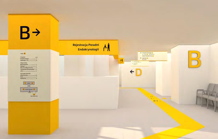
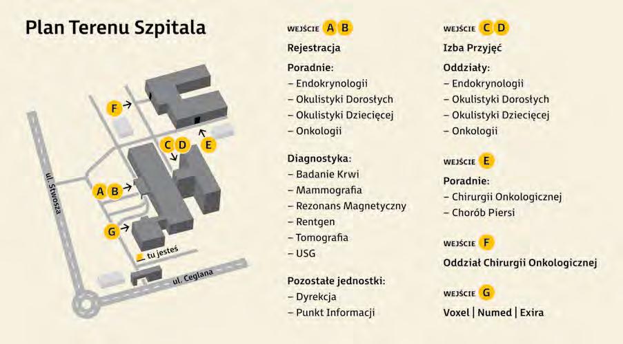
In 2015 Austria and the 192 other member states of the United Nations committed to pursuing the 17 Sustainable Development Goals. They encompass social, ecological and economic aspects and are part of the 2030 Agenda for Sustainable Development. The fifth goal is called “Gender equalityachieving gender equality and empowering all women and girls to self-determination” with the fourth sub-goal titled “Recognize and value unpaid care and domestic work through the provision of public services, infrastructure and social protection policies and the promotion of shared responsibility within the household and the family as nationally appropriate.“ The data in this regard is recorded under the indicator “Proportion of time spent on unpaid domestic and care work, by sex, age and location”.
Utilizing this data set collected by the United Nations in the SDG Indicators Database, I decided to visualize the most recent and complete data of 40 countries to make the gravity of the issue and the need for change more apparent. While providing context and information, the poster especially highlights the noticeable inequality and wide disparities in time spent by the sexes.
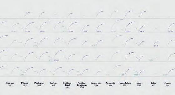
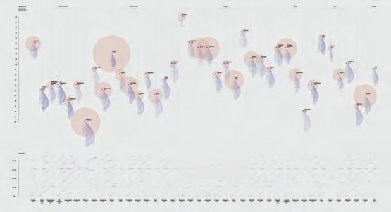
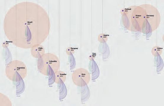
This project was not only a reason to dive further into this topic myself and to make friends and family aware in the process, but the finished data visualization is now shown as a poster at the University of Arts in Linz. It invites to reflect on how we define work and what we recognise as such. It asks to think about our own behaviour and that of the people around us. It calls for change, even if it is just a small, personal one. But that is how all change starts.
Contact: name: Theresa Ahammer
company/organisation: Kunstuniversität Linz
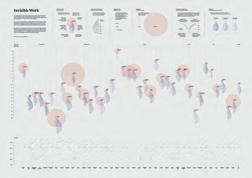
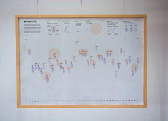
e-mail: hi.theresaahammer@gmail.com
website: https://theresaahammer.com/
• EDMONTON
• RIGA
• BASLE, MUNICH, VIENNA
ROVINJ
• TOKYO
• MEXICO
• SAO PAULO
• SYDNEY
• WELLINGTON
Thank You for joining the IIIDaward-2023 sharing your expertise and making this award precious.
Looking forward to meeting You at the IIIDaward-Tour and welcoming you again in 2026
Yosune, Bettina, Barbara, Justyna, Tatiana, Kyoko, Rob, Marco, Enrico, Stefan and Stefan together with
Caja Ballan - Graphics
Evija Kraukle - Admin
Wendy Choi-Buttinger - Admin
Max Foessleitner - Movie/Photos
Hannah Sobol - Photos
Martin Foessleitner-Organizer
IIIDaward 2023 is handled on behalf of IIID by hi-pe.at
1070 Vienna, Lindengasse 56
Austria
welcome@hi-pe.at ©2023
International Institute for Information Design