vy
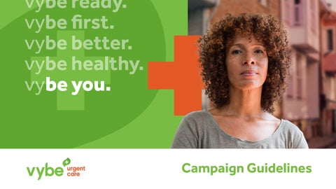
be ready. vybe first. vybe better. vybe healthy. vy be you.


vy
be ready. vybe first. vybe better. vybe healthy. vy be you.
These guidelines explain how to put our brand promise into context so that we can effectively communicate it to our audiences. From our logo to our brand voice, this is your resource for making informed creative decisions that build on the power of our communications. When we present a cohesive, relevant brand image that aligns with our DNA, we demonstrate a powerful, unified presence that inspires confidence. Accomplishing this starts here. These guidelines function as a living document, and we need your help to continuously evolve it as our brand expands in new directions.

Our Brand DNA refers to the inherent elements and attributes that drive our brand.
Within a brand’s DNA lies its differentiation.
As healthcare providers, we’re here to make you feel better — but we’re also here to make you feel welcomed, supported, and encouraged along the way. From the brightness of our smiles to the vibrant colors of our locations, we build positivity in right alongside our clinical excellence so that you can always look forward to feeling good about your healthcare experience.
We’re here to make things easier, more accessible, and more approachable in every way possible. We open our doors early and close them late, so we can meet urgent care needs around the clock. With an expansive list of services, we’re constantly growing the list of things we can take care of at our locations, so you can get the most out of every visit.
We have built our care centers with intention to actively serve our neighborhoods, including the ones that need us most. Everyone, everywhere deserves great care, and we don’t draw borders or boundaries around that promise.
From telehealth appointments to easy-access patient portals, we put our technology to work for you, so it clicks with the way you live. We use tech as a user-friendly, life-friendly tool that makes the whole process of getting there, getting help, and getting on with the rest of your day run more smoothly.
The primary logo lockup, as shown to the right, is the preferred usage for all appearances of the logo. The primary logo lockup should appear with both icon and wordmark together as they appear to the right. When the primary logo lockup appears on a white background, use its full color version. On dark or solid color fills, use a one-color version in white as long as it provides sufficient contrast with the background color. Make sure to preserve the transparent center of our brand icon on every color, in every instance.
Use the one-color logo (white) on dark images or over a solid block of color, such as green. When printing in an on-brand color is not an option, consider using either the black or white logos, depending on which option will provide more contrast.
When space is limited and the logo application is small, use the alternate logo lockup for maximum visibility of the vybe name. This is considered to be a secondary logo lockup and is only appropriate when the primary logo lockup is not ideal.
Color plays an important role in the vybe identity. The colors to the right reflect the core vybe brand palette. Choose colors from this palette to ensure a base level of color consistency throughout brand communications. Consistent use of these colors will contribute to the cohesive look of the brand identity across all relevant media. Check with your designer, vendor, or printer when using the brand colors to be sure they are able to produce media with the correct colors.
Green
CMYK: 58/1/100/0
RGB: 119/190/67
HEX: #77BE43
PANTONE: 368C
CMYK: 7/79/100/1
RGB: 226/89/38
HEX: #E25926
PANTONE: 7579C
CMYK: 0/0/0/90
RGB: 65/64/66
HEX: #414042
PANTONE: 11C
Our iconography establishes a unified visual language that conveys meaning in the most simplistic form possible. Using icons that match in style, tone, and intent provides consistency, readability, and scalability within our design system.
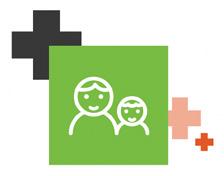
When this classic medical icon appears in the context of our brand, it reinforces our identity as a leader within the healthcare space. We use this symbol informally, scattering it judiciously to add visual interest.
Simple linework style icons help us illustrate related subject matter and services. However, these are never a focal point. We anchor these icons within the framework of our boxes and medical cross iconography to give them a branded, relevant feel.
Our flag icon lends the structured authority of a medical cross yet juxtaposes it with the more fluid, flexible feeling of a waving, bending flag. Just like us, it strikes an ideal balance of solid medical perspective yet still accommodates the variable, free-flowing pace of life.
Based on the idea of building blocks as a visual metaphor for neighborhood blocks and community, our squares provide a way to flex our visual vocabulary and add color and personality into solid blocks of colors and otherwise plain, unbranded elements.
Note: Icons can appear in different color combinations, depending on the background color. However, the icons should always appear in the brand color palette. The flag icon should never appear in orange.
Our grid takes a strong visual cue from how neighborhoods and cities are mapped out. Inside our grid, key messaging and imagery combine to form vybe’s own stylistic map, which provides core elements with room to breathe but also with the space to grow and build on one another. With positive imagery in place and “be statements” featured prominently, our grid works hard to collectively build a personality, a mood, and—if you will—a vybe.
While our grid is central to our brand campaign, it should be used at varying levels of intensity throughout all collateral. Adding too much gridwork can feel visually busy and overwhelming, yet there should be enough of a grid to visually connect to other brand communications. When using just a few grid elements, be sure to scale them up in relation to the size of the overall design so that the impression looks intentional and meaningful.
• All grid segments are equal. There are no merged cells or larger segments.
• Always center messaging horizontally and vertically within a grid square.
• Lifestyle photography should occupy nearly half of the visual space within a grid. It builds humanity into the brand and provides a glimpse into the lives of our patients once they are feeling like themselves again.
• Inside featured grids with multiple segments, strive for a balance of brand palette colors.
• Never use a white square within the grid. Our brand is vivid and vibrant, and our brand colors need to convey that tone.
• Be sure to leave enough padding within each individual grid cell so any featured message has room to breathe. More space lends clarity and a greater sense of sophistication.
• Avoid using the flag icon in orange. It takes on an unwanted flame effect, so it’s best to avoid that combination.
• At least one medical cross should appear in any grid or branded design, to add a distinct healthcare context to the piece.
• Make sure all of your icons appear at a similar relative scale to one another. No one icon should look too small or too large


vybe ready. vybe together. vybe together. vybe better. vybe first. vy vybe healthy.


Typography plays a critical role in conveying personality, tone, and quality. Careful attention to typographic details works to distinguish our brand by achieving harmony throughout all vybe communications.
For consistency across the whole brand, use Effra. The complete Effra font families are available to download online.
Effra: https://fonts.adobe.com/fonts/effra
(Effra Bold at 34 pt font)
Subheading (Effra Bold at 20 pt font)
Body copy (Effra Regular at 14 pt font)
Lorem ipsum enis nesersp erorum reperit ut velectur, occus solorio nestrunt, voluptati ditatur mo quodit quis imin estiiscia que de pa nemque dolutem volorrunt qui tectem faccupt atiuntem hil iu Dolut faceritem quate lam, voluptatque corehenem velenis quiant quam nitis mincten deseque nosandicim il inturem qua.
PLEASE NOTE:
The specific point sizes referenced here are not mandates. What’s important is the size relationship and ratio between each level of the hierarchy. Duplicating exact point (pt.) sizes is not necessary.
Our “be you” brand platform anchors into people-powered imagery and activates simple-yet-strong statements of powerful positivity as a direct connection to the vybe name. Together, they demonstrate our commitment to lifting up the entire community with a care philosophy that celebrates people for exactly who they are and helps them get back to feeling like themselves when they need our support.
• Our “be statements” pack a lot of sentiment into two words. Simplicity works.
• Use a “+” to connect similar words in headlines. It’s yet another way we emphasize our medical cross.
• We make things easier, in life and in language. Short words and concise sentences help.
• Be direct and get to the point. Time is valuable to our audiences.
• Establish a clear focal point and call to action. Too many messaging objectives can overwhelm.
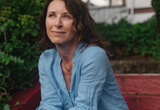
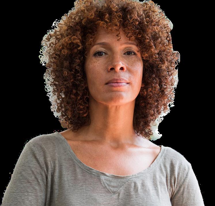
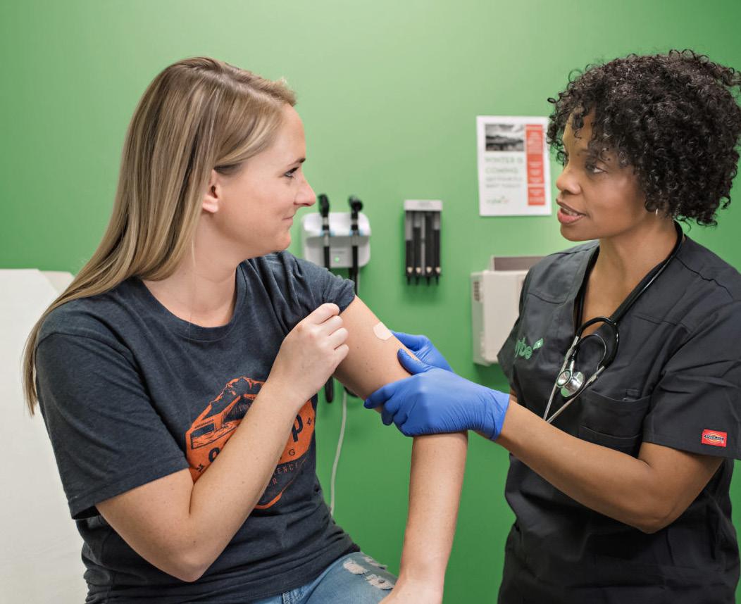
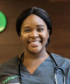
Without the classic lineup of stethoscope-draped healthcare professionals in crisp white lab coats, vybe urgent care doesn’t look like your average urgent care—but that’s the point. This is a fresh, vibrant take from an urgent care provider on a mission—to make healthcare easy for all. Bright. Convenient. Authentic. Welcoming. We intentionally showcase our patients in reflective, realistic scenarios that portray moments from their lives in a positive, fresh, believable light.
• We are a brand that is in touch with humanity. Always lead with faces and people—with natural, relatable expressions. Capture thoughtful, happy moments of self-reflection, in which nothing feels exaggerated, posed, or over-the-top.
• Images with strong depth of field lend credibility and sophistication by creating expansive spatial context. When image composition allows, we show glimpses of outdoor parks and urban neighborhoods in the backgrounds to establish a sense of place.
• • Imagery represents patients who, with the support of vybe, are back on their feet and actively enjoying life, rather than focusing on moments of obvious medical need.
vybe well. vybe caring. vybe together. vybe happy. vybe you.
• Bright, natural light—preferably in outdoor urban settings— works toward achieving authenticity. Avoid dark photos, as they can lend a serious, ominous feel.
• Intimate. Approachable. Relatable. Our photography draws people in, making them feel like they’re part of the scene rather than feeling as is they’re outsiders looking in.


vybe brief.
Always limit “be statements” to two words. We want maximum impact with an economy of words.
vybe bold.
Even with partial opacity or stacked to repeat, all “be statements” should use a heavier, bolded font weight to emphasize the duality of the “be” within the“vybe” name, plus the following adjective to complete each “be statement” sentiment.
vybe pointed.
Always put a period at the end of each “be statement.” This allows them to stack and continue to the next full “be statement.” And it gives them an emphatic, declarative feel as definitive sentences with periods to punctuate the thought. Be consistent with this punctuation in all uses.
vybe creative.
Our “be statements” are intended to be extended. As long as we’re expressing a positive, aspirational tone, any adjective can pair well with a “vybe” lead-in. Shape the message to your communication objectives. Keep the momentum going.
TOP 5+ FOR ANYWHERE
vybe well.
vybe positive.
vybe caring.
vybe together.
vybe happy.
vybe you.
MENTAL HEALTH
vybe positive.
vybe mindful.
vybe supportive.
vybe centered.
vybe aware.
vybe peaceful.
vybe well.
vybe caring.
vybe balanced.
COMMUNITY
vybe involved.
vybe active.
vybe together.
vybe friendly.
vybe close.
vybe connected.
INDIVIDUAL POSITIVITY
vybe kind.
vybe you.
vybe authentic.
vybe open-minded.
vybe original.
vybe compassionate.
vybe thoughtful.
vybe equal.
vybe fair.
HEALTH/WELLNESS
vybe active.
vybe mindful.
vybe fit.
vybe healthy.
vybe happy.
vybe flexible.
vybe peaceful.
vybe focused.
vybe yourself.
vybe determined.
vybe proactive.
vybe thoughtful.
vybe positive.
vybe bright.
vybe heard.
vybe supportive.
vybe empowered.
OTHERS/POSITIVE
vybe happy.
vybe creative.
vybe strong.
vybe curious.
vybe passionate.
vybe sincere.
vybe trustworthy.
vybe detailed.
vybe enthusiastic.
vybe fulfilled.
We lead with a bold, strong, sans-serif, no-nonsense approach to typography. We rely on our photography, color pallete, and grid to play the starring roles in our visual story, while our typography plays a supporting role. This keeps our emphasis on the messaging itself rather than the stylistic personality of our font.
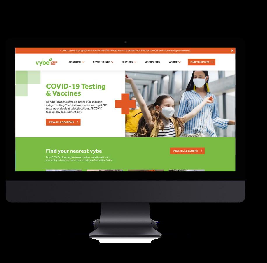
We prioritize simplicity, immediacy, and convenience in all interactions, whether they happen inside one of our urgent care centers or within our website. Nothing unexpected or extra should interfere with the way our digital interactions function.
Our core brand icons are elements that work to convey a sense of place and belonging by mapping out a familiar grid and using light touches of iconography throughout to visually reinforce our brand’s look and feel. It’s important that digital users do not confuse our brand iconography for functional UI icons. None of our main storytelling icons—including our medical cross, our linework block icon, our flag icon, and our squares—should serve as interactive elements.
We lead with bright, positive “be you” moments featuring individuals and families that are content to enjoy the flow of their everyday lives. We rely on natural light, strong depth of field, and natural, relatable scenes—and we keep cliché stock imagery of posed healthcare professionals out of our equation, choosing to highlight our team members through a more human, approachable, in-the-moment lens.