


Welcome. This guide gives you a closer look inside the Twig by Best Egg brand. From logo to brand palette, this is your resource for making informed creative decisions that build on the power of our brand communications. When we present a cohesive, relevant brand image that aligns with our brand principles, we demonstrate a powerful, unified presence that inspires confidence everywhere we go.
This is out rendering of the leaf, independent of any companion text. Our icon can work as a standalone design element as long as the full logo appears elsewhere within the design.
This is our type treatment of “twig,” styled in lowercase, along with our integrated icon. Unlike the icon, the wordmark may not appear separately from the full logo lockup..
Leaf as a whole represents growth and transforms the type itself into a “twig.”
All lowercase, the wordmark is fresh, modern, and approachable.
The Primary Logo, as shown to the right, is the preferred usage for all appearances within the Twig brand.
Use our Alternative Logos at your discretion in instances that feature a solid Midnight Blue or solid Fresh Green block of color.
Use our One-Color (White) Logo on dark images or over a solid block of color when the other available logos do not create sufficient contrast and legibility. In instances when printing in color is not an option, use either One-Color Logo, depending on which provides maximum visibility.

Keep the mark clear of any other graphic elements. An exclusion zone, shown to the right, preserves the integrity of the mark at all sizes and should scale up proportionally along with the logo itself. This exclusion zone indicates the closest distance any other graphic element or message can appear in relation to the logo.
The logos shown to the right are at the approximate smallest sizes allowed for general use. This is based on minimum height. To ensure quality reproduction, never scale the logos smaller than these sizes. There is no maximum size, provided that a scalable vector format is in use.
Use the height of the leaf icon as your unit of measure for a proper amount of space around the logo. You should maintain a distance of 150% the height of leaf in the logo.
The Twig identity will become more and more meaningful with ongoing consistency. All appearances of the logo must scale proportionally to its original format.
Reproduce the mark consistently in all publications and visual material.
Reproduce the mark according to the colors specified in this manual.
Ask your Innovation Foods marketing contact for assistance if you have a vendor that needs the logo. Allow the mark to stand distinct and clear of any other mark or text.
MIDNIGHT
HEX: #3C3059
RGB: 60 / 48 / 89
CMYK: 80 / 97 / 0 / 45
PANTONE: 669 C
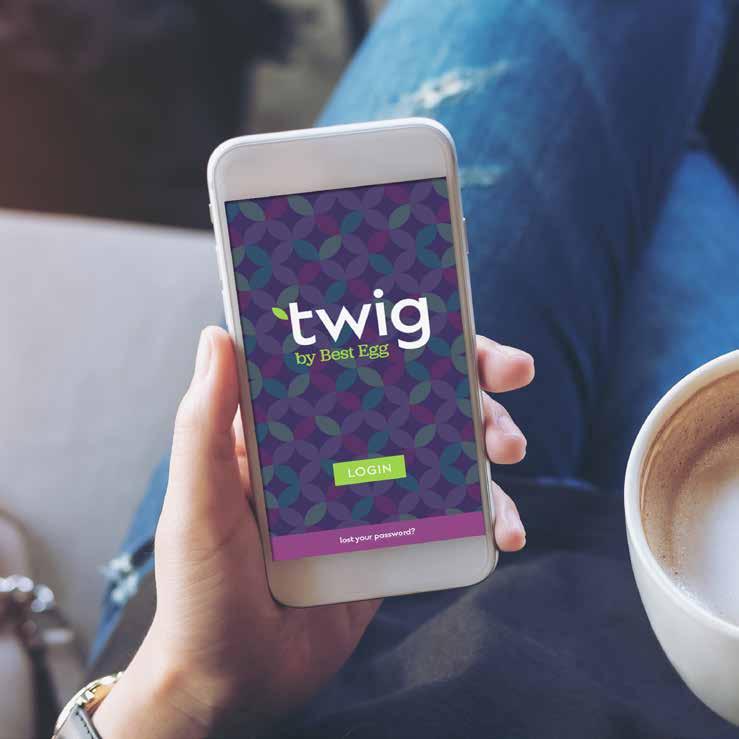
Color plays an important role in the Twig identity. These specified colors make up the Twig brand palette. This palette works to ensure a base level of color consistency throughout brand communications.
Consistent use of these colors will contribute to the cohesive look of the Twig brand identity across all relevant media. Check with your designer, vendor, or printer when using the brand colors to be sure they are able to produce media with the correct colors in place.
FRESH
HEX: #8BD757
RGB: 139 / 215 / 87
CMYK: 48 / 0 / 84 / 0
HEX: #9B3F7D
RGB: 155 / 63 / 125
CMYK: 42 / 90 / 20 / 2
HEX: #0C97A1
RGB: 12 / 151 / 161
CMYK: 80 / 22 / 36 / 0
PANTONE: 7711 C
HEX: #8CF3CC
RGB: 140 / 243 / 204
CMYK: 41 / 0 / 31 / 0
PANTONE: 3375 C
BLUE GRAY
HEX: #56646A
RGB: 86 / 100 / 106
CMYK: 68 / 51 / 47 / 20
HEX: #B776A1
RGB: 183 / 118 / 161
CMYK: 34 / 57 / 0 / 0
PANTONE: 7440 C
Achieving the correct balance of brand colors is also critical for brand consistency. In most cases, your designs should predominantly feature Midnight & White.
• Fresh, Berry & Paschal add a vibrant feel and create clear hierarchies.
• Use colors from the secondary palette sparingly to supplement primary colors.
• All text should appear in Blue Gray or “knocked-out” in white from a contrasting solid color.
Typography plays a critical role in conveying personality, tone, and quality. Careful attention to typographic details works to distinguish the brand by achieving harmony throughout all Twig communications.
The Twig logo uses Ekster Medium as a basis for the wordmark and Jubilat Medium for the “by Best Egg” descriptor. For consistency across the whole brand, the logo font should be used for headings and subheadings. Body copy should be set in sentence case.
Avoid using the very thinnest and boldest weights of Ekster & Jubilat, both for legibility and brand consistency. Stay within the “green zone.” When choosing font pairings. skip a weight to create adequate contrast and intentional hierarchy. For instance, pair Ekster Medium with Jubilat Book—instead of Jubilat Medium.
Ekster Hairline
Ekster Thin
Ekster ExtraLight
Ekster Light
Ekster Regular
Ekster Medium
Jubilat Hairline
Jubilat SuperThin
Jubilat ExtraThin
Jubilat Light
Jubilat Book
Jubilat Regular
Medium
Ekster Bold
Ekster ExtraBold
Ekster Black
Jubilat Semibold
Jubilat Bold
Jubilat Black

Our photography portrays a visual narrative in which we feature authentic people in real-life settings. We avoid featuring perfectly posed models in studio settings, and we feature relatable yet diverse lifestyles.


Our visual narrative features authentic people in real-life settings
Listen,
Our visual narrative features authentic people in real-life settings


Just

real people, living normal lives.

We Inspire Confidence
Meaning, we don't feature perfectly posed models in a studio setting, or overpromise with phony scenes of a lifestyle that's out of reach.


1. Avoid staged photos. No artificial backgrounds or studios.
2. Avoid subjects who appear stiff and who are looking directly into the camera in a synthetic, posed manner. Choose models who are engaged in human interaction over subjects standing still and smiling for a snapshot. If a subject is looking at the camera, it should feel natural, like capturing a real moment in time, not like a stock photo.
3. Avoid photos with too much distance between people. Interactions should be close, and subjects should share the key focal point area.
4. Avoid forced grins and fake smiles. Show realistic people with realistic diversity. No obvious stock models.
5. Avoid blurry, “in motion” images.
6. Avoid focusing on interactions like handshakes, high-fives, and leaps for joy. Expressions should be understated and sincere.


2. 4. 6. 1. 3. 5.


Our icons convey a distinct simplicity that connects to how streamlined, active, thoughtful, and useful our app user experience is. Our twotone icons provide subtle depth that anchors into our main brand palette.
Activate a healthier view of your credit.
We are here to open eyes and show Twig users what they can accomplish when they take steps to strengthen their financial well-being with intention. We want to inspire and encourage Twig users with an approachable, onetwig-at-a-time approach. Lead with action whenever possible—especially in headlines and subheads. Break down complex concepts into bite-size steps. Give them reassurance that positive outcomes are within reach.
Pay down debt decisively.
Take a bigger picture look at your credit health. Lenders keep score. But there’s more to it than that. They look at lots of factors—not just one three-digit credit score. Start with our free FICO score for a more comprehensive view. You’ll build a clear view of the various aspects that impact your overall financial well-being. Then you can use that understanding to expand the credit available to you.
Rethink your spending.
Interested in getting rid of your high interest rates?
Good, we can help with that. You’ll find the support you need to build a plan for paying down your debt in the most effective way possible. Track your progress as you go, and you’ll start to get that satisfying feeling that a more secure financial future brings.
Watch as your expenses shrink.
Put your budget under new management and make room for new savings. Reducing what you spend gets easier with the right tools and expertise on your side. It will take time, but we can show you go-to methods that you can put into action immediately. Discover a plan that’s comfortable for your life today.
Stretch your income.
Make your money work harder for you.
Get more mileage from the dollars you have coming in—especially if you’re navigating through reduced income or an earnings loss. We’ll show you innovative tips and tricks to help you do more with less. Track your progress as you go, and you’ll start to get that satisfying feeling that a more secure financial future brings.
We always use the top of our messaging hierarchy to inspire progress. By highlighting how Twig users can benefit from our brand, we demonstrate that we are focused on authentic customer outcomes and successes. First and foremost, we stand for confidence, positive momentum, and actionable guidance. Factual and functional communications support our overall brand promise and facilitate interaction. When we introduce subject matter, we lead with the why—the ways in which our customers will experience positive outcomes as a result of our how—the ways they choose to engage with us.
Welcome to your financial safe space, where action plans come to grow. It’s time for something different. This is a judgement-free zone where you have the freedom to grow your own way. You are more than a credit score, and so is Twig. Here, you’ll find a bigger, wider, more powerful picture of your financial well-being. Accomplish more with clear answers, real world tools, and action-packed guidance. Big choices. Small decisions. They all add up. We’re here to support your decision-making and expand your access to the money you need. Let’s get your financial goals growing. One twig at a time.
• Say hello to your new financial advocate—you.
• Put your confidence where your money is.
• Say yes to better financial decision-making.
• We don’t see you as a walking credit score. We see your growth potential.
• See where your credit health can take you.
• Activate support that’s true to you.
• Activate a healthier approach to your financial well-being.
• Get a stronger view of your financial well-being. One twig at a time.
• Take a healthier, stronger, more valuable approach to your financial well-being.
• Grow your financial wellbeing. One twig at a time.
• Get a bigger picture checkup on your credit health.
• Big choices. Small decisions. They all add up.
• Finally, it all adds up.
• Look past the scores. Put your credit health in full view.
• Your worth is up to you.
• Your self-worth just got more valuable.
• Welcome to your financial safe space.
• Your worth has more value here.
• Welcome to your financial safe space, where your self-worth has real value.
• This is your place to match your worth to your values.
• What you’re worth is up to you. And we’re here to support that.
Our core audience is frustrated with their current financial status and looking to make changes now. Give them action-oriented ideas and emphasize that they can start making progress now.
Empathy is good. Inspiration is even better. It’s in our interest to identify with and relate to those who are experiencing unexpected financial stress, but be careful not to overdo it. We don’t want to perpetuate a cycle of selfpity. To the contrary, we want them to take action and achieve progress.
It’s hard for anyone to wrap their heads around financial concepts. Our audience is no exception. We want to make difficult financial topics approachable, so we need to keep it concise, conversational, and positive. Our authority stems from an economy of well-chosen words—not from a volume of important-sounding words.
We’re here to educate, not to overwhelm. Our audience members do not need to know the entire history of the three credit bureaus just for the sake of knowledge. Instead, they need just enough context and information to set a plan into motion.
We exist to disrupt the traditional ways of thinking about credit and access to money. We challenge our users to think bigger, to go for the long view, and to throw out their assumptions in order to adopt healthier financial behavior change.
Financial buzzwords are a dime a dozen. Just when one company tells someone they’re “more than a credit score,” another one chimes in with similar affirmations. We provide encouragement and inspire confidence, but we don’t rely on words alone to accomplish this. Instead, we take a fresh approach through action, support, and encouragement.
Our primary target audience includes FREDs. These are people who have previously demonstrated financially responsible behavior with an established credit track record of 5+ years. In the past, they were able to pay for their day-to-day necessities without trouble. But then they experienced an unfortunate event, such as a medical event or job loss, that created financial strain and threw them off their path to financial well-being. Twig is here to help them work toward getting back on that positive path. We inspire confidence by offering simple, personalized and the most accessible financial solutions to help event disrupted people regain and maintain financial stability.
By making an attitude and behavior change, FREDs can work toward regaining control and restoring their financial stability. Twig can help them get back to a happier financial status as they work toward expanding their access to money. Prospects may have taken steps toward improvement on their own, but having a resource like Twig on their side ensures that progress happens at their comfort level and keeps them on track as they pivot toward financial well-being once again. Prospects, meet Twig. Twig, meet people who are ready to make real progress.

Contact news@bestegg.com to discuss specific use-case scenarios.
Thank you for everything you’re doing to strengthen the Twig by Best Egg brand.