CREATIVE STATE OF MIND
30 NAMES TO KNOW IN 2023
STYLE INTERSECTION: WHERE FASHION & DESIGN MEET


30 NAMES TO KNOW IN 2023
STYLE INTERSECTION: WHERE FASHION & DESIGN MEET


Creativity is defined by ideas, imagination and inventiveness. To me, a creative state of mind is everything, and in this issue, it’s the undercurrent of the esteemed 10: a forecast of the 30 Australian, international and multidisciplinary names to know in 2023.
A creative state of mind also informs the intersection of design – from furniture and lighting studio Apparatus founder Gabriel Hendifar’s Manhattan apartment to a ‘70s symbol of the modernist movement in Northwest Spain.
It’s also the essence of our feature Material Duality, where we see fabric transcend high fashion, furniture and iconic lighting, and our edit of consciously-designed products for 2023. Finally, we leave you with five leading designers of our time and their defining pieces through our Detail pages.
We hope this issue reminds you of what designer Andrew Trotter aptly points out, “We are doing something creative; we are the luckiest people in the world.”
ISSUE #47

LA-based photographer Laure Joliet credits being raised between LA and Paris for her unique eye for capturing architectural detail and interior warmth. In this issue, Laure illustrates a connection to light and greenery throughout Electric Bowery’s ‘Hacienda Hideaway’ in Venice Beach, California, revealing how this underpins the home’s retreat-like nature.
@laurejoliet

Spanish-born, Sydney-based photographer Pablo Veiga learned his love for working behind the camera from his grandfather José Veiga Roel, an award-winning photographer. With a keen eye for architectural detail and a unique understanding of how light and shadow can influence experience, Pablo’s images tell accurate, layered and detailed stories. In his hometown of Galicia, Spain, Pablo captures the character of an architectural case study – Casa Albalat – for this issue.
@_pabloveiga
Currently based in California, Karine Monié is a trilingual content creator and editorial consultant. Born and raised in France, Karine contributes to international design and architecture publications in several countries. She brings her worldly design perspective to pen our cover story: Angel Oaks residence by [STRANG] Design, located in Florida.
@karinemonie

Kris Tamburello is a Miami-based photographer, videographer and multidisciplinary artist. His style favours the bold and graphic while still portraying the subtlety of architecture and interiors. This approach saw Kris capture a Brazilian-inspired family home by local studio [STRANG] Design for our latest issue.
@kris_tamburello


Noteworthy projects, products and art on our radar in 2023.


 The Callam Offices, designed by Australian architect John Andrews (built in 1970), comprises a series of octagonal ‘pods’ interconnected through a series of bridges.
The Raku-Yaki cabinet/ bar designed by Emmanuelle Simon, featuring a ceramic exterior and mirrorpolished brass interior.
Remnants Collection by Marlo Lyda, as seen at Melbourne Design Week 2022.
Photography by Tess Kelly.
A converted post office building in the centre of Manama, Bahrain, designed by Studio Anne Holtrop. Photography courtesy of Studio Anne Holtrop.
Sydney, Melbourne, Brisbane
Singapore, Kuala Lumpur spacefurniture.com


est TEAM
Editor
Sophie Lewis
Style Editor & Copy
Yvette Caprioglio
Visual Concept Designer
Jack Seedsman
Product Editor
Brigitte Craig
Strategy Advisor
Karen McCartney
Features Editor & Marketing Manager
Sarah Knight
Editorial & Social Media Coordinator
Lidia Boniwell
Editorial Assistant
India Curtain
Features Writer
Holly Beadle
Sales & Marketing Coordinator
Emmy Ford
Managing Director
Miffy Coady
Advertising & Partnerships
Mandy Loftus-Hills | mandy@estliving.com
Astrid Saint-John | astrid@estliving.com
Deb Robertson | deb@estliving.com

Photography
Kris Tamburello
Location
Miami, North America
David Harrison, Yvette Caprioglio, Rachelle Unreich, Holly Beadle, Sarah Knight, Sophie Lewis, Karine Monié
Design in Essence
Emmy Ford, Maxime Verret, César Béjar, courtesy of Studio Anne Holtrop, Tess Kelly, Derek Swalwell
Hacienda Hideaway
Laure Joliet
The esteemed 10: Australian Specified in feature
Chasing the Sun
Piet-Albert Goethals
The esteemed 10: Multi-disciplinary Specified in feature
My Space: Gabriel Hendifar
Wichmann + Bendtsen
The esteemed 10: International Specified in feature
Dual Materiality
Courtesy of Estrop, Getty Images, courtesy of FLOS, Marcus Tondo, Getty Images, Peter White, Getty Images, Pierre Verdy, Getty Images
2023 Conscious Collection
Courtesy Superfolk, B&B Italia, Albert Font, Christian Møller Andersen, Irina Boersma, courtesy of KOOIJ, Passoni
Miami Vice
Kris Tamburello
The Library
William Jess Laird
Perfect Successor
Pablo Veiga
High Definition
Prue Ruscoe
The Detail
Courtesy of Space Furniture, Living Edge, MUUTO, Panerai
Back Cover
Laure Joliet
A PLAYLIST BY THE ESTEEMED 10 2023
In their latest On Design film, VOLA explores how Danish design is closely intertwined with Danish culture.

Danish design has come to mean many things. It is renowned for its timeless minimalism, purity of form, natural materials and absence of unnecessary decoration – but there is far more to it beyond mere aesthetics.
In this film, Jane Sandberg, CEO of ENIGMA (Museum of Post, Tele and Communication) in Copenhagen, and Anne-Louise Sommer, Director of Designmuseum Denmark, reveal that Danish design is influenced by a strong sense of community, collaboration and togetherness. It is rooted in the belief that we can achieve more together than we can separately – a belief that is mirrored in their physical environment, especially Denmark’s public spaces.
Watch the film by clicking the image above.


LOCATION | Los Angeles, North America

ARCHITECTURE & INTERIOR DESIGN | Electric Bowery
PHOTOGRAPHY | Laure Joliet
LANDSCAPING | Terremoto
WORDS | Sarah Knight

OF ITS ARTLOVING REGION AND ITS OWNERS.


 Expansive steel doors throughout the home thoughtfully frame the verdant garden within the compound.
pon entering this Los Angeles home, one could assume they’ve stepped inside a wellness retreat. The great boundary walls and extensive, lush gardens are testament to this, as are the detached building structures – knitted together via meandering architectural private passageways.
Located in the heart of Venice Beach, a destination chosen for its deep-seated history in the arts, Victoria Residence offers a quiet refuge away from the exuberance found nearby. Drawing inspiration from the client’s extensive travels and fondness of haciendastyle homes, Los Angeles-based architectural firm Electric Bowery conceptualised a Mexican-inspired, family-friendly compound on the oversized block. The home’s format is conducive to the homeowner’s desire to seamlessly connect indoor and outdoor spaces as they move through an average day.
Electric Bowery set out to establish a combination of open areas and urban energy – creating a striking balance between inside and out. Limestone and veincut travertine embrace exterior buildings and paving, punctuated by towering black steel-framed doors. “Our favourite room is the open-plan kitchen and living space. It’s the home’s soul and where most of the social living occurs. The vaulted ceilings and 10-foottall steel doors flood the space with natural light, yet evoke a moody drama reflecting the bold spirit of our creative clients,” Electric Bowery principal Lucia Bartholomew explains.

“The home was not designed as a traditional family home, as our clients are a couple, but rather a large one-bedroom dwelling with an open-plan living and media room. There’s also a large secondary structure to house overnight guests or indulge the owner’s fondness for art, yoga and meditation.”
Internally, subtle elements, including a leather-wrapped kitchen bench, introduce warmth and texture, embracing wabi-sabi transience and imperfection. “The added texture of the island becomes more like furniture with a handcrafted quality and softness balancing the metal chairs and lighting,” Lucia says. Warm white plaster walls are punctuated with a palette of soft pinks, navy, scarlet and unexpected turquoise – reminiscent of Latin American design. Apparatus wall sconces and pendant lighting add unexpected sculptural design elements and practicality. “The composition of handcrafted built-in elements combine with materials defined by rich natural texture. While the result is a bright and airy home, there’s still depth and richness woven into every element of the space,” she says.
A second living area is dressed in turquoise – reminiscent of Latin American design. Apparatus Median wall sconces provide both decorative art and functionality.


 Electric Bowery created bespoke bleached oak joinery in the bathrooms, contrasting with deep grey stone and Apparatus Circuit 1 wall sconces.

 Splashes of pink hues in the bedroom contrast with deep navy, scarlet and cornflour blue tones. The Apparatus Horsehair pendants add bold architectural moments.


NATURAL TEXTURE.”
– ELECTRIC BOWERY
PRINCIPAL LUCIA
BARTHOLOMEW
“THE
DEFINED BY RICH
External areas are seamlessly laced together with a combination of limestone and vein-cut travertine. For furniture, Electric Bowery have opted for the Pebble Cocktail table and Hive dining chairs by Zachary A. Design. and Knoll Bertoia side chairs.


Bespoke materiality and quality craftsmanship go hand in hand for Melbourne interior designer Kestie Lane. To realise her maximalist approach in the bathroom, the designer relies on Rogerseller fixtures.
“ROGERSELLER PRODUCTS COMPLEMENT OUR INTERIORS. WE LOVE THEIR TAPWARE AND FIXTURES TO ACHIEVE A SEAMLESS FINISH.”


influential voices in the Australian, international and multidisciplinary architecture and design community in 2023.
Criterion is based on approach, current achievements and completed and anticipated projects.

The esteemed 10 recognises


ALEXANDRA DONOHOE CHURCH DECUS INTERIORS

SYDNEY, AUSTRALIA
HANNAH TRIBE TRIBE STUDIO ARCHITECTS
SYDNEY, AUSTRALIA
ED GLENN
POWELL & GLENN
MELBOURNE, AUSTRALIA
TANIA HANDELSMANN AND GILLIAN KHAW

HANDELSMANN & KHAW
SYDNEY, AUSTRALIA
TELLY THEODORE AND ANDREW MACDONALD ALLIED_OFFICE
SYDNEY, AUSTRALIA
RODNEY EGGLESTON AND ANNE-LAURE CAVIGNEAUX
MARCH STUDIO
MELBOURNE, AUSTRALIA
TONY CHENCHOW AND STEPHANIE LITTLE CHENCHOW LITTLE

SYDNEY, AUSTRALIA
BRAHMAN PERERA
BRAHMAN PERERA
MELBOURNE, AUSTRALIA
INGRID RICHARDS AND ADRIAN SPENCE

RICHARDS AND SPENCE
BRISBANE, AUSTRALIA
PAUL HECKER, HAMISH GUTHRIE, KYMBERLEY GIM AND STACEY VAN HARN HECKER GUTHRIE


MELBOURNE, AUSTRALIA


PRINCIPAL ALEXANDRA DONOHOE
Sydney, Australia
Where do you go to appreciate exceptional design?
 CHURCH
Milan. It’s a bit of a cliché but the Milanese and Italians, are so damn fearless with their approach to design. Piero Portaluppi epitomised the ability to dance across aesthetic boundaries effortlessly, as did Osvaldo Borsani, Gio Ponti et al.
The one thing people always ask me is:
People always ask, ‘is it hard to design for yourself?’ (I’m currently designing my own home). The answer is a resounding yes!
Three words that most appropriately sum up my our approach to design are: Intuitive, meandering, humorous.
What key influence can we anticipate seeing in projects you are yet to release?
In 2022 we’ve looked locally more than ever before. We’re working more and more with newly discovered makers and craftspeople – Tim Noone, Tanika Jellis, V.Brokkr, Laker Studio and Volker Haug, to name a few.
What is the one piece of advice you would share with a young designer? Design is not singularly about aesthetics. It encompasses all the senses, irrespective of what typology of design you practice; how things feel from a tactile, a sensory and a psychological perspective.
When you walk into a room, what is the first thing you always notice about a space?

I notice the small things before I’m aware of the big picture – how the details fit together, the junctions meet and how well they have endured the test of time. Once I have zoomed in, then I can zoom out.
What does designing for a better world mean to you in 2023?
Tread lightly, buy less, consume quality, keep things succinct. Reinvent and reimagine what you have or give old things new life – it yields a far more interesting conversational approach.

“DESIGN IS NOT SINGULARLY ABOUT AESTHETICS. IT ENCOMPASSES ALL THE SENSES, IRRESPECTIVE OF WHAT TYPOLOGY OF DESIGN YOU PRACTICE…”
PRINCIPAL HANNAH TRIBE
Sydney, Australia
Where do you go to appreciate exceptional design?
There is a particular Sydney red gum I love to visit. It does a lot of architectural things, like filter light, provide shelter, and manage unbelievable cantilevers. It provides habitat, it lives happily with friends and other species, it has an almost parsimonious material logic, but it is also wildly expressive.
The one thing people always ask me is:
Is Tribe really your name?
Three words that most appropriately sum up our approach to design are: Generous, collaborative, playful.
What is a key influence that we can anticipate seeing in projects you are yet to release?
The projects we’re finishing now look different but are united by strong conceptual and sustainability underpinnings. We are doing some great heritage projects, where we channel yesteryear’s design ideologies, and we’re using new technologies to drill into the ethos and challenges of our own time.
What is the one piece of advice you would share with a young designer?

When you like a project, interrogate its drawings. We are saturated with the look of things, but the drawings will reveal the more interesting and enduring. Why?
When you walk into a room, what is the first thing you always notice about a space?
The acoustics. Nothing is better than a well-designed restaurant, where you can hear the laughter of your friends, but the conversations of strangers are a gentle, atmospheric hum.
What does designing for a better world mean to you in 2023?
We are working with optimism and invention to take on some massive challenges in 2023. We’re applying the lessons of our bespoke work in our new kit homes, which tackle building waste, embodied carbon, and dismantling, while also taking aim at construction cost and time on site.
Portrait Martin Mischkulnig“WE ARE WORKING WITH OPTIMISM AND INVENTION TO TAKE ON SOME MASSIVE CHALLENGES IN 2023.”POWELL & GLENN Melbourne, Australia DIRECTOR ED GLENN

Most of the design that I appreciate is in the little things that you observe in your day-to-day life. I love seeing clever, thoughtful design solutions that you can see as quite a complicated problem but has these modest and elegant solutions.
The one thing people always ask me is:
When did you know you wanted to become an architect? The answer is pretty late. Not at school and not even really at university. It wasn’t until I started working with Allan Powell that I truly became addicted to the design and delivery of buildings.
Three words that most appropriately sum up my approach to design are:
Clarity, landscape, theatre.
Elizabeth Bishop, the poet, once said, “The three qualities I admire in the poetry I like best are: accuracy, spontaneity, mystery.”
I like that a lot.
What key influence can we anticipate seeing in projects you are yet to release?
We’re exploring the contrast between highly resolved engineered forms and handmade forms. We’re trying to sharpen the crisp and resolved elements while finding new ways to use texture, craftsmanship and found objects. We’re looking to express the character of things that are part of the earth or garden.
What is the one piece of advice you would share with a young designer?
Be an enthusiastic and hard-working person who does what they say they will do and make sure that when you say something is done, it is done. When your team sees you as a reliable person you are more likely to be asked to be at the design table — and that’s where you want to be.
When you walk into a room, what is the first thing you always notice about a space?
The light. Where is it? How is it used? What are the intended and unintended effects?
What does designing for a better world mean to you in 2023?
I think we need to design things that last longer. Things that look better in 30 years than they do when they are completed. We need to make the outcome of design more uplifting and the process of procuring it more fulfilling. We need to find new and smarter ways to reduce the impact of our built environment on the natural world.
“MOST OF THE DESIGN THAT I APPRECIATE IS IN THE LITTLE THINGS THAT YOU OBSERVE IN YOUR DAY-TO-DAY LIFE. I LOVE SEEING CLEVER, THOUGHTFUL DESIGN SOLUTIONS THAT YOU CAN SEE AS QUITE A COMPLICATED PROBLEM BUT HAS THESE MODEST AND ELEGANT SOLUTIONS.”Photography Sharyn Cairns
Where do you go to appreciate exceptional design?

We have travelled to a lot of remote locations to seek out exceptional design, such as Murcia in Spain for Rafael Moneo. We believe it is important to experience buildings in real life. Our travel itineraries are organised around our favourite buildings rather than typical tourist destinations.
The one thing people always ask me is:
Which of your buildings is your favourite?
Three words that most appropriately sum up our approach to design are:
Clarity, specificity and freshness.
What is a key influence that we can anticipate seeing in projects you are yet to release?
We aren’t really influenced by a specific designer or place. Instead, we have always responded to the qualities of the sites we are working on and the particularities of our client’s brief. This results in buildings that are very site-specific, unique, and unexpected.
What is the one piece of advice you would share with a young designer?
Don’t rush. You need to be tenacious and resilient in this industry. Developing your ideas and a body of work takes time.
When you walk into a room, what is the first thing you always notice about a space?
The natural light and proportions of the space. If the light and proportions work, you don’t need to worry about expensive finishes or fittings.
What does designing for a better world mean to you in 2023?
Our office became carbon neutral this year, so we will be looking at how we can further improve the impact of our built work on the environment.
“WE HAVE TRAVELLED TO A LOT OF REMOTE LOCATIONS TO SEEK OUT EXCEPTIONAL DESIGN, SUCH AS MURCIA IN SPAIN FOR RAFAEL MONEO. WE BELIEVE IT IS IMPORTANT TO EXPERIENCE BUILDINGS IN REAL LIFE.”
DIRECTORS STEPHANIE LITTLE AND TONY CHENCHOW
Where do you go to appreciate exceptional design?
It’s important to always be inspired by your fellow peers and designers. Design is also holistic – there are very few parts of our lives that aren’t affected by it, it can be in a beautiful piece of clothing, or in a dish a chef prepares for you – a piece of music even.
The one thing people always ask me is:
What is your style? The important thing for me is to move away from one defining motif or obvious ‘look’ and strive to achieve a timeless, functional and truthful expression of that project and client.
Three words that most appropriately sum up our approach to design are:
Colour, beauty, consideration.
What is the one piece of advice you would share with a young designer?
It would probably be to always care and nurture your relationships in this industry.
What is a key influence that we can anticipate seeing in projects you are yet to release?
A group of various significant 20th-century artists like Richard Serra, Donald Judd, and Eva Hesse that inform and inspire some of my upcoming projects. Sculptural and spatial artists are the cornerstone to materiality and form; there’s so much to be influenced and informed by.
When you walk into a room, what is the first thing you always notice about a space?

Jean Baudrillard once wrote that the interior designer was an ‘engineer of atmosphere’, and I couldn’t agree more. It’s not necessarily a specific detail I may notice in a space, but rather the space as a living, breathing entity.
What does designing for a better world mean to you in 2023?
It means investing time and care in working with your client to create a space that will stand the test of time. I think it’s important to be honest to yourself as a designer and keep a broad perspective in mind regarding trends and styling.
 Photography Lillie Thompson
BRAHMAN PERERA Melbourne, Australia DESIGNER
“JEAN BAUDRILLARD ONCE WROTE THAT THE INTERIOR DESIGNER WAS AN ‘ENGINEER OF ATMOSPHERE’, AND I COULDN’T AGREE MORE.”

“WE ARE CURRENTLY FEELING THE 80S AND 90S; IT’S FUN TO DISTIL DESIGN FROM THESE DECADES, WHICH ARE SEEMINGLY SO UNSTYLISH.”

Sydney, Australia
Where do you go to appreciate exceptional design?

Ironically, places that aren’t designed by a professional eye, with their original character intact.
The one thing people always ask me is:
What colours are in? And the answer is we don’t know/we would rather not know!
Three words that most appropriately sum up our approach to design are:
Subtle, driven by atmosphere and character.
What is a key influence that we can anticipate seeing in projects you are yet to release?
We are currently feeling the 80s and 90s, it’s fun to distil design from these decades which are seemingly so unstylish.
What is the one piece of advice you would share with a young designer?
Make sure your style comes through in what you do for clients. It’s easy to give clients what they want, but pushing back on their preconceptions is harder.
When you walk into a room, what is the first thing you always notice about a space?
Evidence of how the owner actually uses the room, their personal effects. Without these, it’s a showroom isn’t it?
What does designing for a better world mean to you in 2023?
We think a better design world is a slower one; not trend-driven. Investment buying for the next decades, not the next trend cycle.

Where do you go to appreciate exceptional design?
Our books would be a strong contender for our “go to” in appreciating the arc of design. We are working on our own house in the Blue Mountains, and from the outset agreed we would dedicate a space to a library.
The one thing people always ask me is:
Did you always want to be an architect?
Three words that most appropriately sum up my our approach to design are:
Considered, rigorous, people-focused.
What key influence can we anticipate seeing in projects you are yet to release?
Our clients’ aspirations mostly influence our design decisions. Projects in the pipeline include residential work of various scope, as well as commercial projects that include the new build headquarters for landscapers Dangar Barin Smith and Robert Plumb Build, with Akin Atelier undertaking the interiors.

What is the one piece of advice you would share with a young designer?
Research, Research, Research.
When you walk into a room, what is the first thing you always notice about a space?
The balance of light, material and the harmony, or clash of proportion.
What does designing for a better world mean to you in 2023?
Doing more with less, in the pursuit of joy.
Portrait Tom Ferguson Photography Clinton Weaver“CONSIDERED, RIGOROUS, PEOPLE-FOCUSED”
Where do you go to appreciate exceptional design?
Travelling is our greatest source of inspiration. We enjoy seeing how different cultures and countries approach the same creative challenges, sometimes with totally different approaches.
The one thing people always ask me is:
What type of architecture do you do?
Three words that most appropriately sum up our approach to design are:
Honesty, materials, context.
What is the one piece of advice you would share with a young designer?
To keep your eyes and mind open; to look at how everyday objects and common infrastructure is made. Keep learning because it never actually stops.
What is a key influence that we can anticipate seeing in projects you are yet to release?
We have been working a lot with rammed concrete and rammed earth recently. We are always searching for materials that have a low embodied energy, and these materials also have a very good thermal mass which enables the building to stay cooler longer which is particularly important as Australia begins to heat up. We have two major buildings currently in planning that will use these building techniques.
We’re very excited to be reinvesting more time and energy in our furniture company ‘Rigmarole.’ It always felt a little bit before it’s time, but now we see a real market for locally made products, using honest materials, such as raw aluminium, electroplated steel and sustainably sourced timber.
When you walk into a room, what is the first thing you always notice about a space?
We tend to feel space before we see it. After that initial feeling, we tend to take a moment to observe how the space is used, how it has been lit and what materials have been used. It’s all about understanding the details and a clear architectural design intent.
What does designing for a better world mean to you in 2023?
Waste consciousness and eco-socio-sustainability are front and centre of our mind when we work on projects and take on new clients. We need to promote our uniqueness on a worldwide stage through design, rather than following global trends and fashion.
“TO KEEP YOUR EYES AND MIND OPEN; TO LOOK AT HOW EVERYDAY OBJECTS AND COMMON INFRASTRUCTURE IS MADE. KEEP LEARNING BECAUSE IT NEVER ACTUALLY STOPS.”Photography Dan Preston
FOUNDERS ADRIAN SPENCE & INGRID RICHARDS

Brisbane, Australia
Where do you go to appreciate exceptional design?

We travel as often as we can. Of particular interest are cities or towns where there is a concentration of work by a single architectural practice - think Plecnik in Ljubljana.
The one thing people always ask me is:
Why do we use arches? The arch provides transparency at low level, which is good for retail but compositionally retains the integrity of a wall.
Three words that most appropriately sum up our approach to design are: As much as necessary, as little as possible.
What is a key influence that we can anticipate seeing in projects you are yet to release?
Time and cost pressures on site have shifted our focus to precast and prefabricated elements.
We are constantly recalibrating our design and detailing to suit current construction demands.
What is the one piece of advice you would share with a young designer?
Don’t be single-minded. Try to see constraints as opportunities - be open to reconsidering everything at any time.
When you walk into a room, what is the first thing you always notice about a space?
The lighting
What does designing for a better world mean to you in 2023?
Building a long-term ambition.
“DON’T BE SINGLE-MINDED. TRY TO SEE CONSTRAINTS AS OPPORTUNITIES –BE OPEN TO RECONSIDERING EVERYTHING AT ANY TIME.”Photography David Chatfield, Yaseera Moosa
Where do you go to appreciate exceptional design?
Travel is such a key driver for finding inspiration in design. It’s important to experience things outside of the office environment and debate the merit of ideas. Design is now also so close at hand through social media, blogs, and articles.
The one thing people always ask me is:
Is your job really fun?! Whilst we are very passionate about our vocation, people often don’t realise that there is a lot of rigour and process, alongside passion, that goes into creating good design, on demand.
Three words that most appropriately sum up our approach to design are:
The HG Studio revolves around three founding principles – A.C.E. Authenticity, Considered, Enthusiasm.

What is a key influence that we can anticipate seeing in projects you are yet to release?
We strive not to focus on fashion or trends within the industry but instead be guided by influences unique to each project. We want to create bespoke design solutions inspired by the client’s brief, the project’s location, the architecture and history, infusing every project with elements of craft, and engaging with local makers to deliver a design narrative.
What is the one piece of advice you would share with a young designer?
Know who you are and seek to be informed. Spend your time researching contemporary and historical design, to make a connection with something that speaks to you. Have a strong sense of your own design direction.
When you walk into a room, what is the first thing you always notice about a space?
It is always the feeling a space evokes and the memory that lingers. It’s this that we feel first, before we interrogate the nitty gritty – table edge details; how is it held together; is it real timber?
What does designing for a better world mean to you in 2023?
We design for longevity. By understanding the impact that building and construction can have on the environment, we ensure the spaces we create can last a lifetime and beyond. There is no greater feeling than running into a past client and hearing how much they still love the space Hecker Guthrie created for them, years or decades earlier.

A BELGIAN BEACHSIDE HOME TRANSCENDS SEASONS TO BECOME A CALMING YEAR-ROUND FAMILY DESTINATION.
Lime plaster on the walls, ceiling and sculptural staircase create an ‘imperfect aesthetic’, revealing the designer’s appreciation for handcrafted details.

Afamily’s desire to escape city life to something that felt distinctly different resulted in a brief for interior architect Benôit Viaene to create a getaway from the every day; where kids, friends and family could gather in a warm and cosy interior.
Working within an existing, heritage-listed structure, Benôit conceptualised an extension grounded in a unity of spaces that are oriented according to the sun’s movement and bear his signature hallmarks of materiality, light and craftsmanship. “Light is the first element you experience when entering a space, and in this home, the light brings materials to life as it plays with the structures and overall tactility,” he says. “The main idea was to create a home for the holidays where you enter a relaxing place, taking you out of the everyday comfort zone, with a lot of light in different areas.”
An interaction between the home’s interior and outside garden and swimming pool has been created through a covered terrace that can be open or closed and used all year long, regardless of the season.
The ground floor was conceived as an area for entertainment, with a large kitchen and dining area featuring distinctive wood flooring and panelling. “The tropical wood has a special patina we created in our atelier, and all planks are exceptionally wide,” Benôit explains. “The massive wooden slabs we used in the dining room were placed vertically and utilise the full width of the tree. We treated them with a bleaching process and combined them with a brass detail to refine the tactility and the interaction between materials.”
The focus on materiality also extends to the walls and ceilings covered in a custom-colour lime plaster. “You can feel the hand of the craftsmen,” Benôit says.

Paradoxically, the detailed materiality of the home is a blank canvas for the selection of beautiful furnishings.
Benôit explains that he didn’t want to create an interior that felt ‘brand new’ but instead an atmosphere with materials that felt as though they’d been there for many years. “To me, the result is like a reminder of overseas destinations, southern cultures, that give the inhabitants the energy for reflection and new ideas. The furniture pieces – a mix of existing pieces owned by the client and new pieces – have the characteristics to open up the mind, and trigger curiosity,” he says.
Timber flooring and joinery is a highlight in the Knokke home. Benôit describes the planks as exceptionally wide – the width of a tree. The planks were treated in their atelier to create a unique patina and combined with brass to “refine the tactility and interaction between materials”.

 The formal dining room features the Hata chairs by Miyazaki.


All spaces are oriented according to the sun’s movement. Benôit says the light as bringing the materials to life, playing with the home’s overall tactility.


 A Herman Miller Eames lounge and ottoman, Daphine Terra floor lamp and Cobra 50 table lamp by Martinelli Luce.


“WE DIDN’T WANT TO CREATE AN INTERIOR THAT FELT ‘BRAND NEW’, BUT AN ATMOSPHERE AS IF THE MATERIALS WERE THERE FOR MANY YEARS, CREATING A COSY AND WARM INTERIOR.”
– BENÔIT VIAENE


PRIMITIVES CHAMPAGNE BUCKET WHEN


SABINE MARCELIS
STUDIO SABINE MARCELIS


ROTTERDAM, THE NETHERLANDS
HENRY WILSON
STUDIO HENRY WILSON
SYDNEY, AUSTRALIA
EMMANUELLE SIMON EMMANUELLE SIMON ARCHITECTURE PARIS, FRANCE
AARON ROBERTS AND KIM BRIDGLAND EDITION OFFICE
MELBOURNE, AUSTRALIA
NICOLAS SCHUYBROEK NICOLAS SCHUYBROEK ARCHITECTS
BRUSSELS, BELGIUM
VOLKER HAUG
VOLKER HAUG STUDIO


MELBOURNE, AUSTRALIA
FIONA LYNCH
FIONA LYNCH OFFICE
MELBOURNE, AUSTRALIA
CRISTIANO PIGAZZINI, JOHANNES CARLSTRÖM, SUSANNA WÅHLIN, KRISTOFFER FAGERSTRÖM

NOTE DESIGN STUDIO STOCKHOLM, SWEDEN

COLIN KING
NEW YORK, NORTH AMERICA
Rotterdam, The Netherlands
Where do you go to appreciate exceptional design?
The one thing people always ask me is:
How do you approach and apply colour with each project? The answer: intuition based on knowledge and experience.
Three words that most appropriately sum up my approach to design are:
Essence, materiality, wonder.
What key influence can we anticipate seeing in projects you are yet to release?

Nature again! More specifically, West Coast American nature. What is the one piece of advice you would share with a young designer?
Work hard, play hard, rest hard (on repeat).
When you walk into a room, what is the first thing you always notice about a space?
The lighting. Lighting temperature, location and type hugely impact a space. It’s the key and can make or break the way a space is experienced.
What does designing for a better world mean to you in 2023? Materiality – smart materials and endlessly recyclable materials.
 Portrait Cleo Goossens
Photography Pim Top

“LIGHTING TEMPERATURE, LOCATION AND TYPE HUGELY IMPACT A SPACE. IT’S THE KEY AND CAN MAKE OR BREAK THE WAY A SPACE IS EXPERIENCED.”

Where do you go to appreciate exceptional design?
Flea markets and industrial manufacturing plants.
The one thing people always ask me is:
How will it age? I always direct them to the bronze and brass details of the Sydney Opera house for reference.
Three words that most appropriately sum up our approach to design are: Ancient materials, modern languages.
What is a key influence that we can anticipate seeing in projects you are yet to release?
The Australian landscape is what predominantly influences my work – in its multiformity and in the singular qualities of its light. Nothing remains perfect in Australian conditions, and I believe weathering is to be accepted and valued.
What is the one piece of advice you would share with a young designer?
Explore manufacturing, that’s the crux of it.
When you walk into a room, what is the first thing you always notice about a space?
Downlights – I’m yet to be convinced they are required. What does designing for a better world mean to you in 2023?
I’m interested in the imperfect beauty that comes from objects made by hand, and in the creation of pieces that retain a sense of individual charm while not compromising the robust framework required for manufacture. Further, it matters that the work endures; well-made things last, and I see longevity as one of the simpler forms of sustainability we can hope to achieve as contemporary designers.

Paris, France
Where do you go to appreciate exceptional design?
L’Isle-sur-la-Sorgue, an antiquary city in the South of France, known for its large number of antiques and antique stores.
The one thing people always ask me is:
What’s your age?
Three words that most appropriately sum up our approach to design are: Serenity, elegance, nature.
What is a key influence that we can anticipate seeing in projects you are yet to release?
The Balearic Islands’ crafts/artisans.
What is the one piece of advice you would share with a young designer?

To persevere and not forget that the original ideas, thoughts, and concepts are normally the best.
When you walk into a room, what is the first thing you always notice about a space?

The natural light source in the room.
What does designing for a better world mean to you in 2023?
For me, a better world is in search of serenity/calm. For interior architecture, it’s about designing harmonious places, fluid spaces, or where people create beautiful memories. Design pieces should last for a long time, that we don’t get tired of, that are not subject to a trend, combined with natural materials that improve with time.
Portrait Vincent Leroux Photography Damien De Medeiros
Melbourne, Australia
Where do you go to appreciate exceptional design?
Our team hails from all over the world, and with Australia being a comparatively remote island we all crave travel for both inspiration and respite. We are fortunate enough to be able to regularly visit design fairs in Europe and are planning a U.S. tour this year.

The one thing people always ask me is...
How did you get started as a lighting designer? I started making quite experimental lighting out of my garage at home.
Three words that most appropriately sum up our approach to design are: Refined, spirited, touch-of-the-maker.
What is a key influence that we can anticipate seeing in projects you are yet to release?
Material ingenuity. Our latest series und Messing was partly inspired by the scarcity of materials during the pandemic. We started looking at glass scraps from television screens, discarded metal offcuts, and other bits for refuse. und Messing was introduced with brass as its core material, but the series is meant to set a stage for future material pairings. We’ve also brought in fibreglass as a counterpart to the brass, and we’re interested in introducing other metals.
What is the one piece of advice you would share with a young designer?
Follow your quirks. Your creative vision will evolve with time, but your inclinations, however out-of-the-box, are precisely what gives your work its unique flavour and keeps people intrigued.
When you walk into a room, what is the first thing you always notice about a space?
We always have our eye on the lighting – we love to see how natural and decorative lighting work together to create a specific atmosphere.
What does designing for a better world mean to you in 2023?
We have always loved working with local manufacturers, and it’s now more important to us than ever. Supporting and helping to sustain the local industry are natural and important characteristics of this local-mindedness.
DIRECTOR VOLKER HAUG Portrait Pier Carthew Photography Pier CarthewMelbourne, Australia
Where do you go to appreciate exceptional design?

Melbourne’s NGV, London’s V&A Museum, MoMA in New York and walking in nature – be it mountains or beachside, as nature has some incredible design – the perfect example of form and function.
The one thing people always ask me is:
Would you create this concept in your own home? (Yes of course I would.)
Three words that most appropriately sum up our approach to design are:
Raw, refined, timeless.
What is a key influence that we can anticipate seeing in projects you are yet to release?
Complex yet refined materiality, layered tactility and colour.
What is the one piece of advice you would share with a young designer?
Don’t be afraid to ask questions.
When you walk into a room, what is the first thing you always notice about a space?
The light.
What does designing for a better world mean to you?
It means thinking about the footprint we leave, the lifecycle of our designs and the materials we use.
“DESIGNING FOR A BETTER WORLD MEANS THINKING ABOUT THE FOOTPRINT WE LEAVE, THE LIFECYCLE OF OUR DESIGNS AND THE MATERIALS WE USE.”Photography Pablo Veiga
DIRECTORS KIM BRIDGLAND AND AARON ROBERTS
Melbourne, Australia
Where do you go to appreciate exceptional design?
There are many sources collating and curating exceptional designs these days across digital, print and local exhibitions, where we understand design in its particular contextual relationship with place and its cultural references. The one thing people always ask me is: How do you make a building with no roof gutters?
Three words that most appropriately sum up my our approach to design are:

Effortless simplicity from complexity. What key influence can we anticipate seeing in projects you are yet to release?
Scale. Testing and transitioning the thinking and methodologies which have proven successful on smaller scale works into much larger projects clarify the kinds of experiential, formal and material gestures that work for us at much larger scale. You can also anticipate everything recycled, locally sourced and circular – mass timber, Cross Lam, earth bricks, and biomaterials such as Mycelium flooring.

“WE BELIEVE IT IS ALSO IMPORTANT THAT ARCHITECTURE CAN REFLECT DIVERSITY IN ITS PHYSICAL IDENTITY; HOW IT’S READ IN THE PUBLIC REALM.”
What is the one piece of advice you would share with a young designer?
Stay hungry to question and understand design – as a way of clarifying your own position on project; does it do the things it has set out to do? What insights are there, and how might this change your perception of the work?
When you walk into a room, what is the first thing you always notice about a space?

How the space makes us feel. We are conscious of this and recognise that an empathetic basis to design goes a long way to understanding our behaviours within designed environments.

What does designing for a better world mean to you in 2023?
Designing in a way that promotes diversity and inclusivity – in architecture and urban design. We believe it is also important that architecture can reflect this diversity in its physical identity; how it’s read in the public realm. We must also strive for carbon neutrality and circularity in operation and construction.
Portrait Peter Tarasiuk Photography Annika Kafcaloudis, Ben HoskingSydney, Australia
Where do you go to appreciate exceptional design?
Deep into a very specific image archive. I love it when someone has mastered something useful and that’s all they make, like cage crinolines or ancient vegetable cutters. And the Opera House because every detail is beautiful.
The one thing people always ask me is:
What’s your training? (None, making it up)
Three words that most appropriately sum up my approach to design are: It might work.
What is a key influence that we can anticipate seeing in projects you are yet to release?
I can’t imagine it being one particular thing and I certainly don’t plan it that way. It could be a phone box one week and a cheese grater the next. That’s why I find my work skips all over the place although people do tell me I have a ‘style’.
What is the one piece of advice you would share with a young designer?
Schlep down your own path and come at it sideways. Financially it won’t make sense for a while and people may not get it but then things will hopefully fall into place and you will be doing exactly what you love.
When you walk into a room, what is the first thing you always notice about a space?
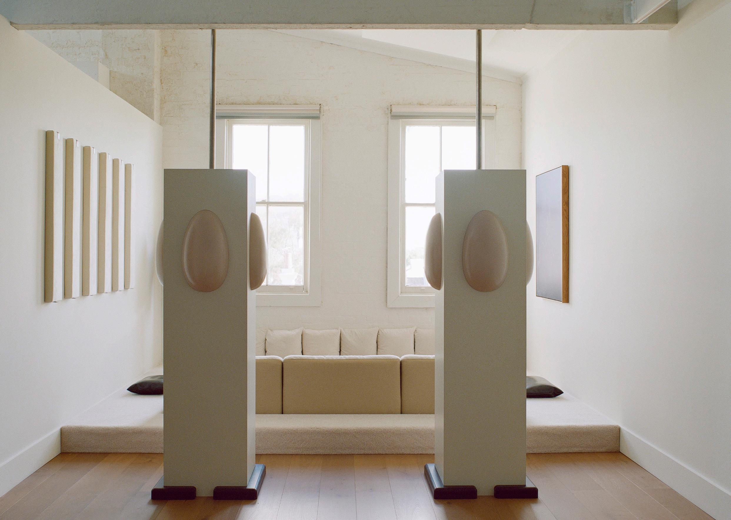
Who’s in it and what are they doing.
What does designing for a better world mean to you in 2023?
Doing it with some humour and empathy. I also think mediocrity is dangerous because it feeds into the mindless consumption of what is considered ‘of the moment’ but those things become disposable and design has to be more than that when the world is on fire. Making things well, with good people, listening and maybe asking ‘why’ along the way seems like a good place to start. And the whole ‘I need it now’ mentality has to stop, it’s just furniture.
“MAKING THINGS WELL, WITH GOOD PEOPLE, LISTENING AND MAYBE ASKING ‘WHY’ ALONG THE WAY SEEMS LIKE A GOOD PLACE TO START.”Photography Tom Ross
 DIRECTOR NICOLAS SCHUYBROEK
Brussels, Belgium
Where do you go to appreciate exceptional design?
A wide array of locations, too long to list, ranging from galleries, temporary exhibitions, and museums but also clients and private collections.
The one thing people always ask me is:
How old are you, actually?
Three words that most appropriately sum up my approach to design are:
Tactile, raw, elegant.
What is a key influence that we can anticipate seeing in projects you are yet to release?
An evolution in the project content and types, scales and locations. Raw and refined materials with a soul. Our signature kitchen in tin for Obumex is certainly a good example.

What is the one piece of advice you would share with a young designer?
Go with the long-term vision, always.
When you walk into a room, what is the first thing you always notice about a space?
The proportions and overall balance of the room as a whole.
What does designing for a better world mean to you in 2023?
Designs that are content-driven and impactful in the noblest sense.
“GO
Where do you go to appreciate exceptional design?

Good design is everywhere; in nature, in everyday objects, and the most exceptional art galleries. But if I have to point out one single situation, I’ll say the art school graduate exhibitions; there’s a sense of optimism and so many new ideas. The one thing people always ask me is:
Where do you get your inspiration?
Three words that most appropriately sum up our approach to design are: Unexpected, distinct, responsible.
What is a key influence that we can anticipate seeing in projects you are yet to release?
We need optimism after the pandemic, in the middle of a crazy war in Europe, and a shaky financial market. More optimism for a better future through innovation and development. This can be applied to design – from colours, shapes, and environments – to the very down-to-earth aesthetic we have seen in the past.
What is the one piece of advice you would share with a young designer?
Set a goal, be ambitious, find your style, and believe in that. Don’t look too much at what others do.
When you walk into a room, what is the first thing you always notice about a space?
Whether the space can evoke an emotion. There is no efficiency without emotion. What does designing for a better world mean to you in 2023?
As designers, we need more than ever to think about our work, how we influence the company working for us, and the people using our products or living in our spaces. Designing for a better world means designing not for today but for the future. Always asking ourselves the “why?” in any new design.

“WE NEED OPTIMISM AFTER THE PANDEMIC, IN THE MIDDLE OF A CRAZY WAR IN EUROPE, AND A SHAKY FINANCIAL MARKET. MORE OPTIMISM FOR A BETTER FUTURE THROUGH INNOVATION AND DEVELOPMENT. THIS CAN BE APPLIED TO DESIGN – FROM COLOURS, SHAPES, AND ENVIRONMENTS – TO THE VERY DOWNTO-EARTH AESTHETIC WE HAVE SEEN IN THE PAST.”
Photography Jonas Lindström
Where do you go to appreciate exceptional design?
For design, I usually go to books. Intimate, residential, lived-in spaces are where I find the most inspiration. Some of the most influential rooms of all time only exist in a book. I take my job very seriously because most people can only share and experience other people’s work from photographs – we can rarely tour these private spaces freely.
The one thing people always ask me is:
How do you style bookshelves?
Three words that most appropriately sum up our approach to design are:
Nature, dance, collaboration.
What is a key influence that we can anticipate seeing in projects you are yet to release?
A key influence in my upcoming projects is art and nature. When creating still life, I reference old masters, and when creating contemporary products, I look to the forms in nature. Art and nature inform my exploration of colour combinations, object relationships, light and shadows, and the nuances of textiles and compositions.
What is the one piece of advice you would share with a young designer?
A Pablo Picasso quote comes to mind; “Inspiration exists, but it has to find you working.” My advice would be to create – don’t wait for the job, the right time, or inspiration – just create and keep moving. I learn everything worth knowing from doing, including making mistakes.
When you walk into a room, what is the first thing you always notice about a space?

The light. Whether during the day or at night, a room can only be experienced with an attention to light.
What does designing for a better world mean to you?
To unite memories, feelings, and fantasies, to succeed in creating atmospheres that make us feel good.
“ART AND NATURE INFORM MY EXPLORATION OF COLOUR COMBINATIONS, OBJECT RELATIONSHIPS, LIGHT AND SHADOWS, AND THE NUANCES OF TEXTILES AND COMPOSITIONS.”Photography courtesy of Beni Rugs

DESIGN | John Pawson & Gabriel Hendifar
STYLIST | Helle Walsted
PHOTOGRAPHY | Wichmann + Bendtsen
ADDITIONAL WORDS | Sophie Lewis
 Gabriel’s living room showcases Apparatus lighting, including the Tassel 1 pendant, as well as sofas and coffee tables, a throw and an ottoman by the studio.


Apparatus founder and artistic director
Gabriel Hendifar takes est through his Manhattan apartment. Designed by British architect John Pawson, Gabriel’s space manifests a future-focused, tactile design perspective accented by Apparatus furniture and lighting.
Your home is located in lower Manhattan within the 11-storey Herzog & de Meuron residential building ‘40 Bond’. What do you love most about where you live?
I love being downtown. It feels closest to the energy of New York that I dreamt about before moving here – one of artists and creatives, a place to explore and find your voice. Bond Street feels particularly special. It’s two blocks of cobblestone, and I live a few doors down from the building that once housed Robert Mapplethorpe’s studio.
Describe your approach to design:
My approach is fairly consistent, which is about first defining what I want to feel. Once I know there is a world of references to help create the story I want to tell. Whether temporal, cultural, or aesthetic, the references are all colours to help create a world. But the approach remains the same.
How is your space a reflection of you at present?
It has played a central role in a period of contemplation and experimentation in my life. It’s a cocoon, with sensual surfaces and textures that invite you to linger and lounge. What I’ve allowed myself to do in this apartment is to let my brain go where it wants to go, guard my time alone, and indulge in whatever feels inspiring.
 Gabriel says this is the first dining room he’s ever frequently used. The Episode armchairs and Signal X pendants are Apparatus-designed, while a plinth behind the table features an antique Chinese vase.
 Gabriel describes the dining room as “cosy and sensual”, where the mirrored wall “gives you the sense you are the participant in the drama of life”.

Your work is heavily influenced by literature, drama and theatrics; how does this play out in your home?
In a way, I see my environment as a set created for the fantasy of the life I want to live. All of the decisions are made to heighten the sense that I am experiencing my life from within it, but also that I’m seeing it as a story. I’m creating the tableaus of the story.
Does living and working among your own design enrich your ideas and design process?

Without question. I’m in constant dialogue with ideas, either enjoying those that are successful and wanting to expand on them or those that require further time and thought to get just right. It’s the only way I understand what I’m making, by living with it.
You’ve said relaxation is crucial to your creativity. Where do you wind down in your home?
Everywhere! The apartment essentially feels like one big room with graceful partitions, so I feel like I’m occupying the whole apartment. That said, the character of the individual spaces are very fun to sink into. This is the first dining room I’ve ever lived in that I use regularly and isn’t just a showpiece. It’s cosy and sensual and being reflected in the mirror across from the table gives you the sense that you are a participant in the drama of life.
What detail tells the story of your home best?
The materials; smoked mirror, leopard carpet, burl, suede, velvet, moire.

Previous Page: Gabriel says the materials in his home – smoked mirror, leopard carpet, burl, suede, velvet, moire – tell its story best.

They create furniture collections that are honest in their use of materials & united in their craft.

Kett celebrates an Australian way of life; drawing inspiration from our natural landscapes and cosmpolitan cities.

Exclusive to coshliving.com.au
Showroom Locations
Melbourne
Sydney
Brisbane
Perth

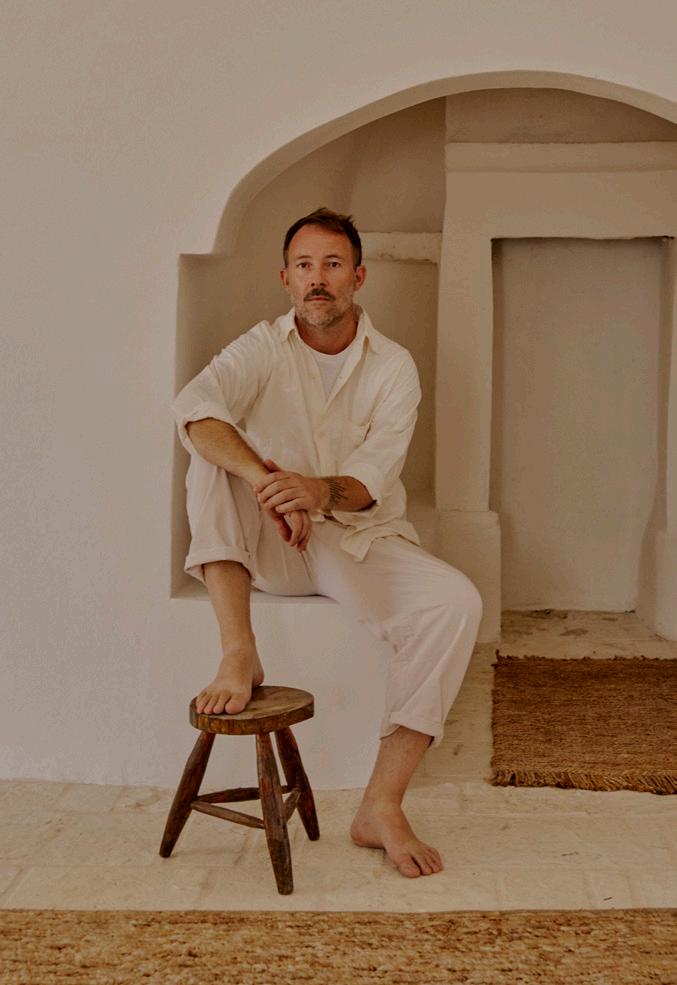


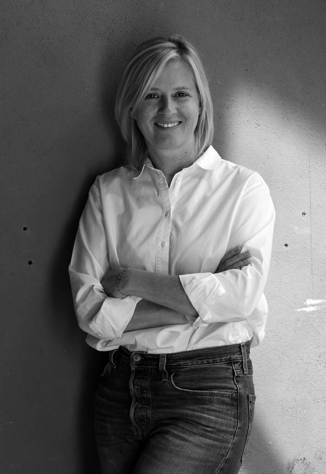

HALLERÖD
FLEUR DELESALLE FLEUR DELESALLE
PARIS, FRANCE
JEAN-CHARLES TOMAS
JEAN-CHARLES TOMAS INTERIOR DESIGN STUDIO


SAINT-JEAN-CAP-FERRAT, FRANCE
NEW YORK CITY, NORTH AMERICA
New York City, North America DIRECTOR
Where do you go to appreciate exceptional design?
Small design museums and galleries around the world.
The one thing people always ask me is:
How much is this going to cost?
Three words that most appropriately sum up my our approach to design are:
Simplicity, rigour and common sense.
What is a key influence we anticipate seeing in projects you are yet to release?
Brazilian mid-century design.
What is the one piece of advice you would share with a young designer?

Don’t be responsible for things you don’t understand.
When you walk into a room, what is the first thing you always notice about a space?
The way it makes me feel.
What does designing for a better world mean to you in 2023?
Design that’s locally sourced.


“SIMPLICITY, RIGOUR, COMMON SENSE.”
Knokke-Heist, Belgium
Where do you go to appreciate exceptional design?
t’s mostly when travelling or while working abroad that I take the time to discover exceptional design. For example, in Paris, London and Venice but also in Brussels. The one thing people always ask me is:
To create a comforting home for them with a calm atmosphere.
Three words that most appropriately sum up our approach to design are: Space, connection, light.
What is the one piece of advice you would share with a young designer? Be curious, keep your eyes open, travel and follow your own path.
What is a key influence that we can anticipate seeing in projects you are yet to release?
I’m very much influenced by everything that has a connection with nature and natural materials.
When you walk into a room, what is the first thing you always notice about a space?

The proportions of the room, orientation to the light and view and interaction with the outside.
What does designing for a better world mean to you in 2023?
Working as much as possible with natural materials. Focusing on upcycling and recycling beautiful things, instead of demolishing them and starting from scratch.
I believe in respecting the history of a building for a better future.
“I’M VERY MUCH INFLUENCED BY EVERYTHING THAT HAS A CONNECTION WITH NATURE AND NATURAL MATERIALS.”Photography Thomas De Bruyne
FOUNDERS CHRISTIAN & RUXANDRA HALLEROED
Stockholm, Sweden
Where do you go to appreciate exceptional design?
Our latest sublime design experience was in Venice at the Gallerie dell’Accademia, where Carlo Scarpa worked on the renovation of the interior for the exhibitions between 1945 and 1959. It was an impressive dialogue between the old, original rooms and Scarpa’s ‘new’, extremely well-thought additions.
The one thing people always ask me is:
How do you manage so many projects despite the scale of your studio?
Three words that most appropriately sum up our approach to design are:
Curiosity, craft and less is more.
What is a key influence that we can anticipate seeing in projects you are yet to release?
Our upcoming projects are very diverse in terms of type, client and location. We’re hopeful for our (almost) first new projects in one of our favourite cities – Tokyo that we long to see again after all the years with restrictions.
What is the one piece of advice you would share with a young designer?
To work very hard – harder than you think and to be curious about other cultural practices such as art, fashion, craft and music. When you walk into a room, what is the first thing you always notice about a space?
We love powerful spatial qualities together with a well-thought material and detailed palette.

What does designing for a better world mean to you?
Think and reflect on why and what you are doing. To not do unnecessary, short-lasting instagramable crap.
“WE LOVE POWERFUL SPATIAL QUALITIES TOGETHER WITH A WELL THOUGHT MATERIAL AND DETAIL PALETTE.”Photography Henrik Lundell
Paris, France
Where do you go to appreciate exceptional design?

Paris (Musée des Arts Décoratifs), Milan (foire de Milan) and Bellas Artes Madrid.
The one thing people always ask me is:
How do you deal with colours? I could compare my work to a makeup artist. The countless variations of white and beige are the fabulous ‘foundation’ of all my projects. Then I lay shadows; I proceed by touches.
Three words that most appropriately sum up my our approach to design are:
Light, colour and roundness.
What is a key influence we anticipate seeing in projects you are yet to release?
I am very inspired by painters like Matisse and Fernand Léger. My last rug collection, ‘Shimmer’, is inspired by a work by Fernand Léger around reflections on the water.
What is the one piece of advice you would share with a young designer?
Don’t be constrained by constraints. Let your creativity run wild.
When you walk into a room, what is the first thing you always notice about a space?


Light, always. This is the first thing I see in a space, the orientation, how the light enters it and how I can make the most of it.
What does designing for a better world mean to you in 2023?
Reuse and reinvent. I always introduce antique pieces into my decor, which gives them character and gives a second life to antique furniture.
Where do you go to appreciate exceptional design?
A careful blend of city and nature. New York for the craziness and the latest, Connemara for the peacefulness and the ever-changing landscapes. I find my balance between the rush of big cities and taking my time and reflecting in nature, and I wouldn’t have one without the other.
The one thing people always ask me is:
How would you describe your style? I don’t think it is up to me to say. An interior is only completed when people move in.
Three words that most appropriately sum up our approach to design are:
Elegant, intuitive, geometrical.
What is a key influence that we can anticipate seeing in projects you are yet to release?
I like everything to be integrated, recessed, to belong in its right place. We’ve been asked more and more to design furniture. We do. But we sculpt it from the room itself. We feel like it has to belong to the space and, therefore cannot be transposed to another one.
What is the one piece of advice you would share with a young designer?

Trust your instinct; follow your intuition instead of basing everything on a logical analysis. Do not overthink the whole creative process. Design by doing and you’ll figure things out along the way.
When you walk into a room, what is the first thing you always notice about a space?
All the details no one would look at. The tiniest pieces of hardware, the alignments, the symmetry, how things are interconnected and assembled with each other. That’s what makes a space feels complete.
What does designing for a better world mean to you in 2023?
To find solutions that are “beautiful” responsible, and accessible to all.
“TRUST YOUR INSTINCT; FOLLOW YOUR INTUITION INSTEAD OF BASING EVERYTHING ON A LOGICAL ANALYSIS. DO NOT OVERTHINK THE WHOLE CREATIVE PROCESS. DESIGN BY DOING AND YOU’LL FIGURE THINGS OUT ALONG THE WAY.”Photography Jerome Galland
Ghent, Belgium
Where do you go to appreciate exceptional design?

I love to take time to walk around in cities like New York or Antwerp, to visit galleries, vintage dealers, or a museum. Recently I visited the Noguchi museum in New York which was a true source of inspiration.
The one thing people always ask me is: ‘To create something unique, something different’. This is also the starting point for my projects as an architect, and in my designs. As a curious person, this element gives me great satisfaction.
Three words that most appropriately sum up our approach to design are:
Matter, light and craftsmanship brought to life.
What is a key influence that we can anticipate seeing in projects you are yet to release?
The quest to redefine rawness, using raw natural materials, yet stay in balance with elegance, and a certain level of comfort.
I’m always testing new techniques, to bring out the surprising characteristics of natural materials. My main focus in materials, are those I call the ‘team players’. They include all natural materials, like clay, lime, oil, and wood. The materials are the instruments that create the music. I serve as a conductor.
What is the one piece of advice you would share with a young designer?
Don’t be afraid to fail. Try, and try again. Every mistake or failure is a source of new knowledge.
When you walk into a room, what is the first thing you always notice about a space?
The balance between design, the light, and the materials.

What does designing for a better world mean to you in 2023?
Not to create in order to feed an ego, but to listen and observe the person(s) who is in front of you. That person is the main focus in the project, not the project or the design on its own.
“THE MATERIALS ARE THE INSTRUMENTS THAT CREATE THE MUSIC. I SERVE AS A CONDUCTOR.”Photography Piet-Albert Goethals
DIRECTOR ANDREW TROTTER
Barcelona, Spain
Where do you go to appreciate exceptional design?
Mexico. For me, right now, there is amazing design happening in Mexico. This is probably due to the freedom they have and the climate. Many architects are doing wonderful housing, hospitality and public buildings. They have a great mix of modern design and artisan crafts.
The one thing people always ask me is: Which part of Masseria Moroseta is old? The answer is none of it. It’s a brand new building, now seven years old. We built it traditionally, making stone walls and vaults, painted with local lime paint, making the building feel like the old buildings rather than a copy.

Three words that most appropriately sum up my our approach to design are: Simplicity, light, and tranquility.

What key influence can we anticipate seeing in projects you are yet to release?
Tradition and artisans are the key to our work at the moment. I don’t want to lose these, so we try to use them as much as we can, this makes our work belong to the place that we are building. Using local materials and traditional methods roots the buildings to a place.
What is the one piece of advice you would share with a young designer?
Believe in yourself, and be relaxed. You don’t need everything at 25 years old; it will come. Work hard, and most importantly, enjoy your work. We are doing something creative; we are the luckiest people in the world.
When you walk into a room, what is the first thing you always notice about a space?

It isn’t necessarily something I notice; it’s a feeling. Every room is different, but each room gives you something special. But the best thing ever is when a room makes you feel comfortable, makes you relaxed, and that you feel at home. What does designing for a better world mean to you in 2023?
I think we need to be as local as possible. Work with the local people, see the local materials, and the local building methods. With these, we keep traditions going, build networks, and make long-lasting friendships.

“TRADITION AND ARTISANS ARE THE KEY TO OUR WORK AT THE MOMENT. I DON’T WANT TO LOSE THESE, SO WE TRY TO USE THEM AS MUCH AS WE CAN, THIS MAKES OUR WORK BELONG TO THE PLACE THAT WE ARE BUILDING.”Photography Marina Denisova, Salva Lopez
Where do you go to appreciate exceptional design?
We become inspired through our travels, where we source many of the accessories and furnishings used in our design projects – antiquities that we’ve personally found in the stalls of the Moroccan bazaar, mid-century furniture from the Paris Antiques Market or Tokyo ceramicist are then shipped to our warehouses in Los Angeles.
The one thing people always ask me is:
How do you devise ways to recreate houses that no one thinks possible?
Three words that most appropriately sum up our approach to design are: Luxurious, timeless, curated.
What is a key influence that we can anticipate seeing in projects you are yet to release?
Our exterior architectural designs and surfaces are now a seamless transition to our interiors. This year you’ll also see a wonderful mixture of Bauhaus and Brazilian influence, Hollywood regency, Classicism and farmhouse interpretations of the classic OSKLO look.
What is the one piece of advice you would share with a young designer?

Be perfect in every way. Don’t settle or compromise on the quality and execution of your finished work, even if that means doing things twice. It’s the perfection of details that define a truly great project, and nothing less is acceptable to us. When you walk into a room, what is the first thing you always notice about a space?
The first thing we notice when we walk into the room is the windows and ceiling height. Natural light defines everything, and windows are the eyes of a home.
What does designing for a better world mean to you in 2023?
Designing a better world for us means creating projects that live in harmony with their surroundings and the past.
“IT’S THE PERFECTION OF DETAILS THAT DEFINE A TRULY GREAT PROJECT, AND NOTHING LESS IS ACCEPTABLE TO US.”Portrait Sam Frost
Los Angeles, North America
Where do you go to appreciate exceptional design?
Museums, galleries and bookstores are always great sources for exceptional design.
The one thing people always ask me is:
Do you still draw by hand? The answer is yes!
Three words that most appropriately sum up my our approach to design are:
Simplicity, honesty, natural.
What is a key influence that we can anticipate seeing in projects you are yet to release?
The site, context and client are always the key influences on any project.
What is the one piece of advice you would share with a young designer?
Patience
When you walk into a space, what’s the first thing you always notice?
Was the front door handle and front door well crafted?
What does designing for a better world mean to you in 2023?
Sourcing project materials is always a point of discussion. The more local the materials, the less impact on the earth.

“SOURCING PROJECT MATERIALS IS ALWAYS A POINT OF DISCUSSION. THE MORE LOCAL THE MATERIALS, THE LESS IMPACT ON THE EARTH.”Photography Joe Fletcher
FOUNDERS CHRISTINE AND JOHN GACHOT
New York City, North America
Where do you go to appreciate exceptional design?

My church is The Met. Time and time again, it’s where I go to get inspired. I have more photos of the floors at The Met than of the actual exhibits, but those certainly inspire me, too. Colour palettes from the Winslow Homer show, window details from MoMA – to say I love a museum would be an understatement.
The one thing people always ask me is:
How do you and John spend so much time together? And the answer’s easy; he’s hot, talented, and fun as hell.
Three words that most appropriately sum up my our approach to design are:
We are responsible. Whether we’re working on someone’s personal space or a hospitality setting that will be experienced by many people, we are thoughtful down to the smallest details.
Portrait David UrbankeWhat key influence can we anticipate seeing in projects you are yet to release?
Across the board on all of our projects, a key influence is always the client. With a new client comes a new approach and a unique perspective. We’re in a service industry and we design in collaboration with our clients – it’s their home or their brand and that’s always at the forefront. Yes, we get creative, but we also get technical. We listen, and we care.
What is the one piece of advice you would share with a young designer?
Know what you don’t know and surround yourself with people you can learn from. As principals, we’ve never shied away from hiring people who bring new strengths to the team.
When you walk into a room, what is the first thing you always notice about a space?

Lighting is always something we consider in a space. Nothing’s better than a warm, glowing room, and nothing’s more painful than cool, harsh lighting – it’ll ruin any experience.
What does designing for a better world mean to you in 2023?
Being selective with our work and creating for longevity. The world is finally getting back to a pre-pandemic sensibility. People are eager to move into new homes. I’m eager to see hotel financing loosen up a bit more. The economy will have people thinking more deliberately about their actions, but the energy is certainly there.
“ACROSS THE BOARD ON ALL OF OUR PROJECTS, A KEY INFLUENCE IS ALWAYS THE CLIENT. WITH A NEW CLIENT COMES A NEW APPROACH AND A UNIQUE PERSPECTIVE.”


 The Making of a Dress, featuring Bella Hadid, for Coperni Spring/Summer 2023 collection. Photography courtesy of Estrop, Getty Images.
CATEGORISATION. IT MOVES ACROSS BOUNDARIES, ESPECIALLY WHEN IT COMES TO FORM. AND THEN THERE ARE TIMES WHEN FASHION STEPS OVER THE EDGE AND INTO SOMETHING ELSE, INTERSECTING WITH FURNITURE, LIGHTING AND IMAGINATION. HERE ARE THREE OF THESE ICONIC MOMENTS.


The atmosphere was charged with anticipation when supermodel Bella Hadid stepped onto the stage at the most recent Paris Fashion Week for the Coperni show. A team of people wielding spray guns aimed their tools at her, and bit by bit, her body was covered, seemingly in a layer of paint. It was a spray-on fabric, soon to be moulded into a dress, complete with off-the-shoulder sleeves and a daring split. Lighting aficionados would have known what was coming; after all, FLOS found an inventive way to incorporate a spray-on plastic coating material to lighting in the ‘60s, which led to the creation of the Cocoon collection (named after the sheer, cocoon-like skin of the lights). It was the basis of the company’s start in 1962, and some original designs, such as the Taraxacum suspension light designed by Achille Castiglioni, are still in production today.


Comfort dressing can mean many things. For Calvin Klein’s Fall 2018 ready-to-wear show, Raf Simons sent models down the catwalk in patchwork pieces, using the American quilt motif in dresses, knitwear and hats, picking up threads of Americana. What happens when that same designer –known for shape and form – applies the quilted approach to furniture? It wasn’t his first foray into the medium, but when Calvin Klein made its Miami/ Basel debut in 2018, Raf Simons included a limited range of 100 Cassina Feltri armchairs, upholstered in one-off American heirloom quilts, highlighting the way that the Calvin Klein label was so synonymous with Americana and nostalgia.


Olivier Rousteing is often inspired by cities far and wide –whether it’s a Fabergé egg from Saint Petersburg or Miami’s neon lights. When wicker and rattan appeared in his 2012 collection, it was not an out-of-left-field move by Balmain. Instead, Olivier made it luxurious, producing dresses with strong shoulders and elaborate patterns using wicker weaving. Most recently, Olivier had wicker on the runway again for Spring 2023. Of course, he is not the first to turn to those materials and prove they can be superbly elevated: German designer Ingo Maurer, known as the “poet of light”, and Pierre Jeanneret, who collaborated with his cousin, Le Corbusier, all knew the value of wicker.

This Page: Balmain Spring 2013 Ready-to-Wear: Look 30. Photography courtesy of Pierre Verdy, Getty Images.
Next Page: Chris Wolston Oro dining chair, crafted from sand-casted bronze and 100 percent Colombian mimbre (wicker).


“We cannot stand still; in fact, we have a duty to move even faster in the direction of design, production and distribution solutions that are as sustainable as possible,” declared Salone del Mobile president Maria Porro at the most recent fair. Recognising a designer’s role in meeting these challenges, we uncover 10 products leading the exploration of traditional crafts, new materials and technological innovation.


Australian industrial designer Adam Goodrum and French marquetry artisan Arthur Seigneur joined forces under the banner ‘Adam and Arthur’ to design the Mother and Child cabinet. The award-winning cabinet’s defining feature is straw marquetry; 16,000 pieces of white straw flattened and woven into an intricate, embedded pattern. The straw was also dyed black to create a striped pattern that accentuates the mother and child silhouette. “It’s radical and even a little absurd, but why not? We want to achieve something that hasn’t been done before,” Adam says.

“Our exploration of curious sculptural forms and their intersection with straw marquetry intentionally blurs the line of art, craftsmanship and design, allowing the emergence of something unexpected.”
– Adam Goodrum


Finnish designers Aamu Song & Johan Olin conceptualised the August Industry stool for timber design studio and manufacturer Nikari. Established in 1967, Nikari only use sustainable, bio-diverse timber from a neighbouring sawmill in Fiskars, Finland. Aamu and Johan were one of 12 design studios to respond to Nikari’s philosophy through new product design, presenting the August Industry stool with legs that follow the form of tree branches, informing the unique joins on each.
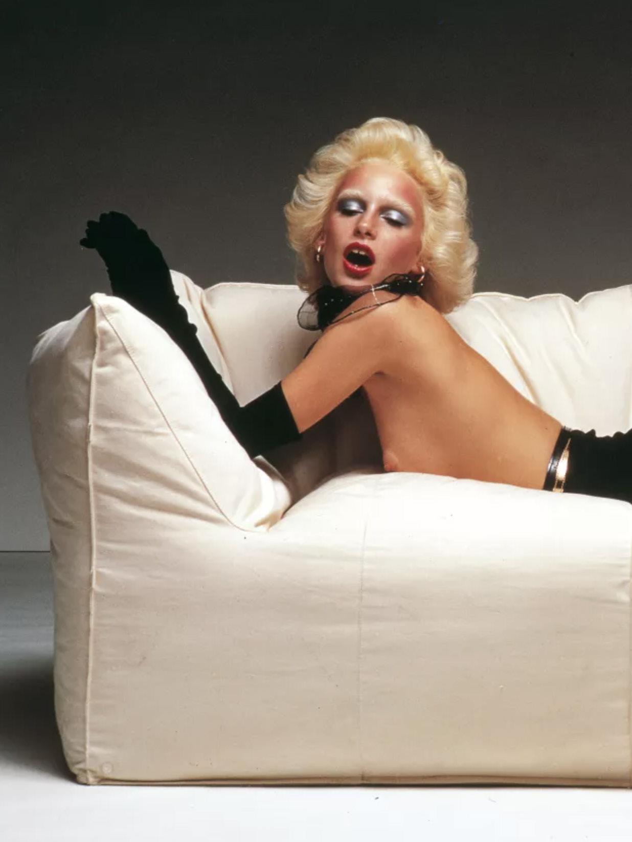


“I feel the pleasure of revisiting this family because it confirms to me that it is anything but aged; on the contrary, it is enjoying a thriving and promising second life, a rebirth done in a big way, done with enthusiasm, with breadth, with decorations and with the original flourishes.”
– Mario Bellini

Mario Bellini
Architect Mario Bellini designed the Le Bambole series for B&B Italia in 1972. The evocative forms responded to women’s emancipation in Italy and the subsequent movement toward more informal interiors. For its 50th anniversary, Mario Bellini and B&B Italia relaunched Le Bambole with a radically different composition. Designed to include both fewer and repurposed materials, the Le Bambole now features a 77 per cent product circularity; all parts were re-designed to aid in the disassembly, repair and end-of-life recycling of materials.

Spanish rug company Nanimarquina presented Re-Rug at this year’s Milan Design Week, working with their suppliers to use accumulated surplus wool to create a new rug collection. Founder Nani Marquina set out to preserve the leftover wool’s ‘irregularity and tonal richness’, experimenting with new processes to create a yarn with multiple colours intertwined, suitable for weaving. Crafted using the dhurrie technique on a handloom, the circular collection features 50 per cent virgin wool and 50 per cent reused wool.

“Re-Rug is born from the desire to give a new life to the mountains of wool that have accumulated over the years due to overproduction in the workshops of our suppliers in India.”
– Nani MarquinaPhotography Albert Font
Anna Castelli Ferrieri for Kartell
Following the ‘Kartell Loves the Planet’ manifesto in 2020, the Italian furniture brand revised their widely-recognised Componibili storage unit into a ‘fully sustainable’ counterpart. Originally designed by co-founder Anna Castelli Ferrieri in 1969 and made from injection-moulded ABS plastic, the revised Componibili – now in pastel colours – is made from a biodegradable material developed from agricultural waste, manufactured by Italian bioplastic producer Bio-on.


Cassina has reissued the Soriana sofa designed in 1969 by Afra and Tobia Scarpa; recipient of the prestigious Italian industrial design Compasso d’Oro award for its ‘complex design’ using ‘simple tools’. In bringing this iconic piece back from the archives, Cassina have focused on its environmental impact; substituting the original polyurethane structure with a new BioFoam® that’s biodegradable and hardwearing. They’ve also included PET padding that wraps around the sofa, enhancing the original design intent and subsequently, the sofa’s comfort.

David Thulstrup
Danish designer David Thulstrup collaborated with Søuld, producers of eelgrass acoustic mats, on their limited-edition MOMENTUM collection. Eelgrass is commonly known for being used as thick roof-thatching on Denmark’s Læsø island, which can be traced back to the 1600s. After a decade of research, Søuld have reinvented the ‘seaweed house legacy’ by working with local farmers and ecologists along Denmark’s coastline. At the hands of David Thulstrup, the nontoxic, CO₂-storing material has been translated into a low table, high table, podium and screen.

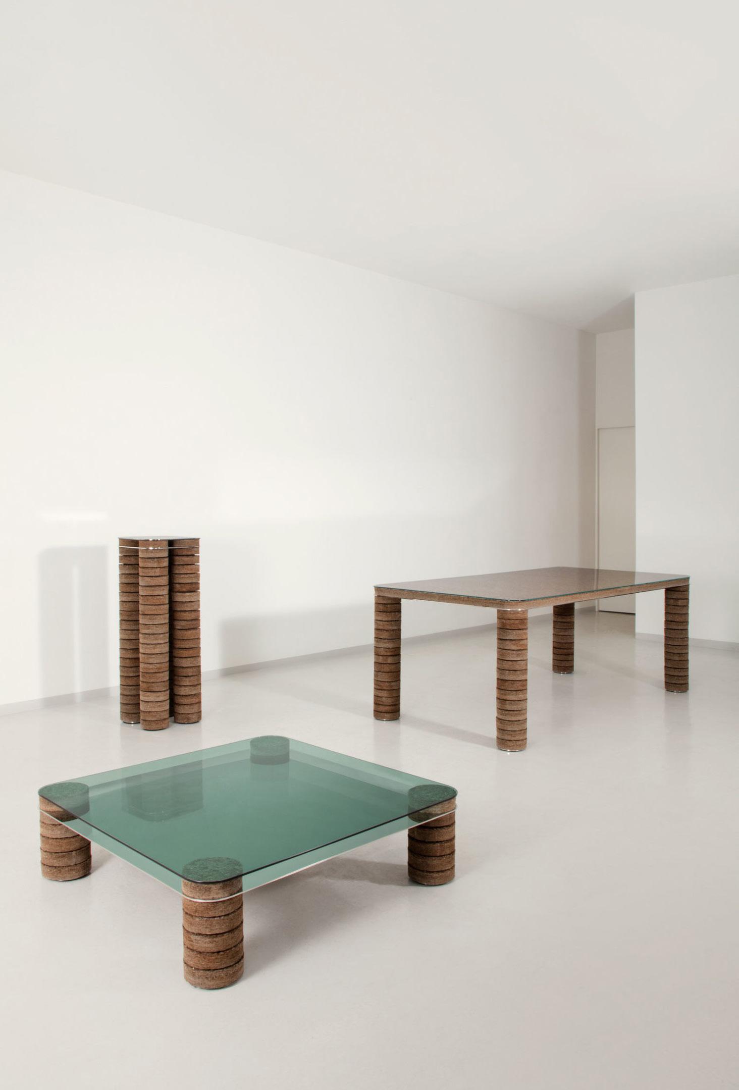
Ladies & Gentlemen Studio, based in both Seattle and Brooklyn, design objects, furniture and lighting characterised by a slow and sensitive approach to craft. The Veil collection is one of their most recent releases, deliberately pared down to a series of honest materials, including silk, cotton and linen to ‘dress’ the light source and create an interplay of light, shadow and pattern.


Dirk van der Kooij founded his Amsterdam studio while exploring the possibilities of recycled plastic. The result of experimentation that started in a basement of the Design Academy, Eindhoven, Kooij has presented exciting new lives for discarded objects – from CDs to kitchen appliances. At the union of craft and technology, Helm by Dirk van der Kooij is sculpted from ‘syrupy ribbons’ of molten, recycled plastic using 3D printed bands.

UK designer John Pawson collaborated with Italian furniture brand Passoni on the Tacta armchair. The armchair reflects Passoni’s commitment to FSC® certified timber cultivation and natural finishes, hailing from a small village in Friuli, Italy and overseeing all stages of production. Described as a quiet expression of its antecedents – the Thonet Bentwood chairs – Tacta is defined by two lines of timber that extend from the legs to form the arms and backrest.
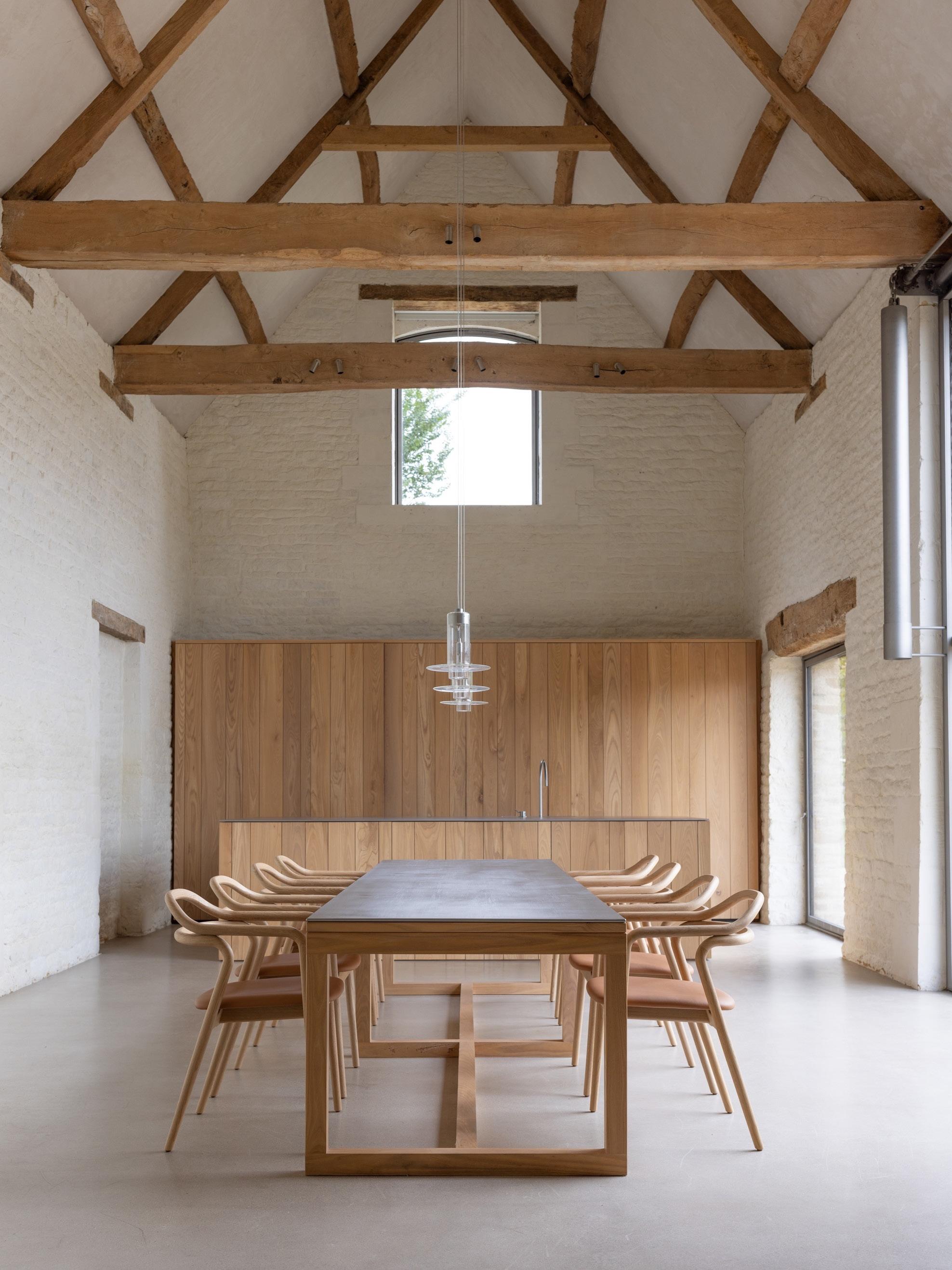


STYLING Senses Unleashed
CONSTRUCTION Contemporary Builders, Inc.
LANDSCAPE DESIGN La Casona Garden

PHOTOGRAPHY Kris Tamburello
WORDS Karine Monié

 Large floor-to-ceiling sliding glass doors open the game room to the pool deck furnished with RH lounge chairs, with plants from the second floor cascading down. Aluminium louvres feature on the second storey to provide privacy. Inside, the Median ceiling lamps by Apparatus combine with Roll stools by Thomas Hayes.
On an oversized suburban lot in South Miami, Angel Oaks Residence designed by Miami-based multi-disciplined studio [STRANG] Design is built around years-old existing oak trees. Located just a few minutes from downtown, it gives an immediate sense that its current form somehow pre-existed.
“Designing among the branches was a challenge,” [STRANG] Design managing director and partner Alexandra Mangimelli says. “We floated foundations around roots, and the outer second-floor walls came within centimetres of branches.”
Owned by a Brazilian couple with two children, the 929-squaremetre, H-shaped house is designed around a centralised courtyard, while a bridge above the main living room connects two wings.
A beautifully-manifested exploration of materiality begins at the home’s entrance, where split-face keystone moves from exterior to interior, with board-formed concrete, Jerusalem stone, ipe wood and travertine imbuing the home with textural atmosphere. The prolific use of teak on the walls, ceilings and furniture adds an organic warmth to the interiors, where bold artworks add accent colours.

The interiors reflect a clear Brazilian influence. Looking out to the pool, the living space is anchored by a Soriana sofa and armchairs designed by Afra and Tobia Scarpa for Cassina. It also features the Apparatus Median 3 Surface mount and sconce and Gubi 9602 floor lamp.


“We explored the possibilities of using natural materials, as well as playing with light and fluidity,” Alexandra says. “This created a contemporary aesthetic language mixing wood earth tones with the landscape, bringing the outside in.”
The ground floor — with the public spaces on the inner perimeter of the home — takes advantage of the deep overhangs, blurring the lines between inside and out. At the same time, the upper floor accentuates privacy through windows set back from the edge with a lush planter.
The homeowners’ gravity toward the modern architecture of their Brazilian heritage inspired the team of [STRANG] Design, who also strove to infuse their own principles, resulting in something completely unique.
“The family’s cultural [origins] and way of life was instrumental in the architecture and interior design,” Alexandra says. From the form of the house to the materials and design pieces by Jorge Zalszupin and Tobia and Afra Scarpa, among others, everything was contemplated to suit the homeowners’ desires, needs and taste.
“We understood the important role our client’s art collection and vintage furniture played in their lives and wanted to thoughtfully reflect that,” Alexandra says. “The fashionable yet understated couple is reflected in many aspects — from the vast entertaining space to the material integrity.”
While expansive, connectivity was an integral part of the brief for the home. “The home is large but not overly programmed to allow for very comfortable spaces to gather,” Alexandra says. Surrounded by lush foliage that can be easily admired through sliding glass, the pure lines and raw textures express a design resolution set to withstand the test of time.


“WE UNDERSTOOD THE IMPORTANT ROLE OUR CLIENT’S ART COLLECTION AND VINTAGE FURNITURE PLAYED IN THEIR LIVES AND WANTED TO THOUGHTFULLY REFLECT THAT.”
– [STRANG] DESIGN MANAGING DIRECTOR AND PARTNER ALEXANDRA MANGIMELLI

 The exterior is clad in Jerusalem stone, completely immersed in the surrounding greenery


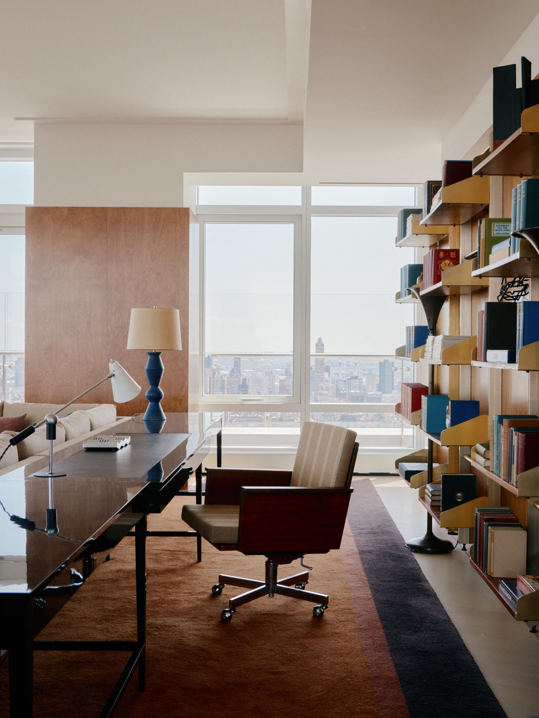 Project 200 Amsterdam Design Studio Mellone
Styling Colin King
Photography William Jess Laird
A cross-section of monographs by leading international and Australian architects and designers.


WOODS + DANGARAN: ARCHITECTURE AND INTERIORS

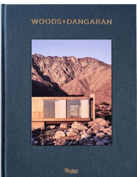
BILLY COTTON: INTERIOR AND DESIGN WORK MAYER RUS, STEPHEN KENT JOHNSON

INTERIORS BEYOND THE PRIMARY PALETTE

FASHIONING DESIGN BECKY SUNSHINE
ISABELLE STANISLAS: DESIGNING SPACES, DRAWING EMOTIONS ISABELLE STANISLAS
TAMSIN JOHNSON: SPACES FOR LIVING TAMSIN JOHNSON

COMFORTING HOMES: BY NATHALIE DEBOEL WIM PAUWELS

SEE MORE BOOKS >
ARTHUR CASAS. ARCHITECTURE LIVIA DEBBANE
A rare discovery in Spain’s Galician hills remains, to this day, a paragon of modernist architecture.
LOCATION | Galicia, Spain
ARCHITECTURE | Andres Albalat
STYLIST | Meredith Clark
PHOTOGRAPHY | Pablo Veiga
WORDS | Holly Beadle


Casa Albalat resides in the northwest corner of Spain, in a region famous for its rugged coastlines and rolling green hills. In the 1970s, when the home was built, architectural expression in Galicia and other parts of Spain was hindered under the Francoist dictatorship. The late architect Andres Albalat resisted the statusquo by designing what was, at the time, a very rare piece of architecture. Andres’ resolve certainly garnered attention then; fast forward 40 years and his creation is a symbol of the modernist movement and its lasting effects on the design world.
The hilltop home was taken over following Andres’ passing by two fashion entrepreneurs with an appreciation for architecture and the modernist movement, who live there with their two young daughters. For the most part, they left the house as they found it, except for a few furniture and lighting pieces from their personal collection. A small renovation was also carried out in the kitchen and the primary bedroom to accommodate their family of four.
Aesthetics aside, the home’s location was a big drawcard for the new homeowners. Elevated and overlooking a landscape of tree-covered hills and winding rivers; the site’s connection to nature has been a constant for more than four decades. The garden is painted green with the leaves of the surrounding oaks, birches and chestnuts, attracting a number of birds and other wildlife. “We try to be in the garden whenever we can; watching our two daughters play with our dog never gets old,” the homeowner says.

The palette of stone and timber is rich and inviting – and makes contact with the home’s history. The yellow and white easy chairs were custom made by Andres and add a pop of colour, while the Vitra Akari 75A pendants accentuate the high ceilings.


 The front living area, with its original copper and brick fireplace, is the homeowners’ favourite part of the home. They gravitate here to take in the garden and listen to music through the speaker on the mantelpiece.
 The burnt orange tones of the Castelli DSC 106 dining chairs complement the warm timber tones of the original joinery and dining table. The pendant hanging from the ceiling is also original.
Andres specified local materials when constructing the home; zinc and stone for the exterior, together with timber and more stone for the interiors. The exterior remains relatively true to the region and what was considered customary at the time. The large glass windows and ceilings at the front of the home, in particular, are characteristic of the neighbouring city of A Coruña – also known as ‘The City of Glass’. Stepping inside, calm white walls and warm wood textures mark the transition into a more Nordic atmosphere – a reflection of the influence of the modernist movement in Scandinavia during the 1970s.
The new homeowners were the perfect successor to Casa Albalat; they have maintained the home’s icon status, while honouring and building on Andres’ original intent. Their pursuit of creativity is multidisciplined –applying to both their careers in fashion and their interest in architecture and interior design. “As people in fashion, we value the fine details in great measure – and this house is full of them,” the homeowner says. Pieces such as the timber dining table, the copper fireplace and the yellow and white easy chairs at the front of the house were custom-made by Andres, which the homeowners gladly inherited. They then brought in pieces such as the orange Castelli DSC 106 dining chairs and Herman Miller Eames lounge chair – tell-tale signs of the design-inclined. “What surprised me most about the owner’s style was how perfectly it fit into the modernist architecture of the home,” stylist Meredith Clark says. “It was actually difficult to clarify what was original to the house and what they had brought with them due to how seamlessly it flowed.”
The homeowner recalls a fond early memory of the house: “It was our first night and we were standing in the kitchen watching a pair of foxes play in the garden. I will never forget the look on my daughter’s face.”


“THERE ARE NO OTHER HOUSES LIKE THIS ONE IN GALICIA – IT WAS LIKE FINDING A JEWEL.”
– HOMEOWNER
 The second living space houses a Herman Miller Eames lounge chair and ottoman, set against a moss-green zellige-tiled fireplace.
From the outside, Casa Albalat has several hallmarks of a modern farmhouse, with its slanted roof lines and exposed firetruck-red chimneys. It is, indeed, unlike anything else within the vicinity of Galicia.


LOCATION | Sydney, Australia
|
| Robert Plumb Build STRUCTURAL ENGINEER | SDA Structures PHOTOGRAPHY | Prue


There is always something intriguing about houses set on battle-axe blocks as their lack of obvious street presence sets up a sense of anticipation on approach.
Designed by Sydney architects Potter & Wilson for clients who had lived on the site from the early 90s, the Balmoral House was a case of reinvention of an existing house that hunkered into the site rather than embracing it.
“The original house was unconventional for the area that was primarily Federation-style houses. Ours was a modern box from the early 1990s, architectural and of its time, but it no longer suited how we wanted to live,” the client says.
Working with Robert Plumb Build, Potter & Wilson reimagined the house. “We looked at how it could be transformed into a spacious and luxurious house, with great internal volumes that maximised the amazing aspect and location,” Imogene Potter says.
The house is navigated via a sculptural steel and timber staircase linking all levels from the parking area at the top via the guest bedrooms and library mezzanine on the middle level to the double-height living space with kitchen and dining areas on the ground floor adjacent to the pool.
The living–dining space is defined by its soaring volume, as the double-height ceiling allows for expansive landscape vistas. Interior furnishings, decoration and art were led by Karen McCartney and Sarah Johnson Studio. In this space, they have selected pieces such as the B&B Italia Tufty-too sofa, a pair of vintage Jindrich Halabala armchairs, Abrash bamboo Cadrys silk rug in Storm, Le Klint Pliverre floor lamp and Minotti Song coffee table.


Continue down the site and there is a lower-level guest house that faces onto the tennis court. These distinctly contained ‘zones’ give a large house a very human scale and introduce a measure of flexibility as to how the house is used.
“Our clients liked a monochromatic palette. Hence our material selection was simple; blackened steel and timber for the stairs and the large wall of shelving to the living room and black stained oak for the joinery elements throughout, including the kitchen,” Simon Wilson says.


This was married with an impressive island bench in ‘Black Forest’ granite in a leathered finish. “We added texture to the dark timber and stone elements to give them ‘life’ and movement when lit,” Imogene Potter says.
The architects drew on the combined talents of Karen McCartney and Sarah Johnson Studio for the interior furnishings, rugs, art and objects.
“Developing the interior was an iterative process, starting with developing the aesthetic of the core living, dining and master suite. As we evolved into the other spaces, such as the mezzanine, we were working from a strong decorative stance, and the decisions and choices grew in confidence as the relationship with the client flourished,” Sarah says.
A trio of Maxalto Caratos ’18 by Antonio Citterio sit around a vintage marble table from Modern Times adjacent to the bar area on the mezzanine. The kitchen stars an impressive island bench crafted in ‘Black Forest’ granite in a leathered finish, with black stained oak joinery as an expressive counterpart. The BassamFellows Circular stool and Viabizzuno Barra d’oro pendant feature, along with Miele appliances.
 A six-metre-high steel shelving system (right) houses a fireplace and hidden TV, as well as an array of objet d’art and plants. Dropdown sheer curtains exaggerate and soften the home’s imposing structure.

One of the key architectural statements was the six-metre-high steel shelving system in the living space that also houses a fireplace and hidden TV. “While challenging, the shelving provided an opportunity for expression and personality. The clients are very art-focused, and we worked together to find glass, ceramics and sculpture from local artists, from Etsy, 1st Dibs and auction sites. Plants, in custom-made Robert Plumb bronzed metal pots, were added in at the end and give life and a strong hit of greenery,” Karen says.
While primarily a monochromatic palette, the client understood the value of pulling in muted blues and greens to reflect the context of the house by the water, and among the trees. Early purchases such as an extraordinary Martyn Thompson Studio jacquard fabric in shimmering grey/blues covers panels behind the bed and vintage 1930s Jindrich Halabala chairs from Nicolas & Alistair set the tone for other choices.

“We wanted to add a certain femininity to temper the concrete structure with generous curves of Patricia Urquiola’s Tufty Too sofa, matched by the smokey grey glass of Sebastian Herkner’s Bell table for Classicon. Even the shape of the Minotti coffee table is organic and unconventional,” Sarah says.
With landscaping by Spirit Level Designs gradually softening the edges of the building, the house is a private oasis set into planting within the broader context of established Angophoras framing the water view. “The house feels welcoming, calm and contained, creating its own little world,” the client adds.

Majestic in both scale and design, Balmoral Residence is on par with its spectacular surrounds.


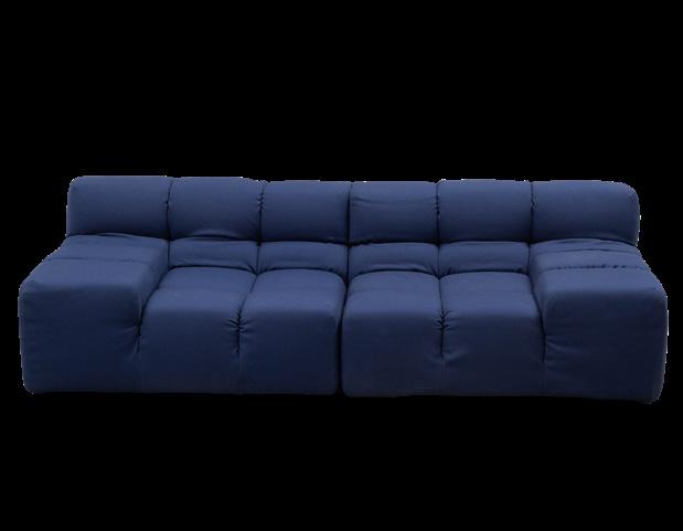


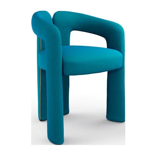
 Imagery courtesy of Panerai

TANK DECANTER
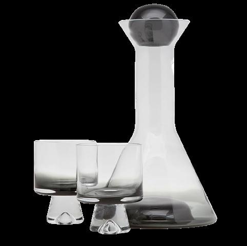
STONE LED WALL LIGHT


SWIRL TABLE (TALL)


 Imagery courtesy of Hansgrohe


