PORTFOLIO
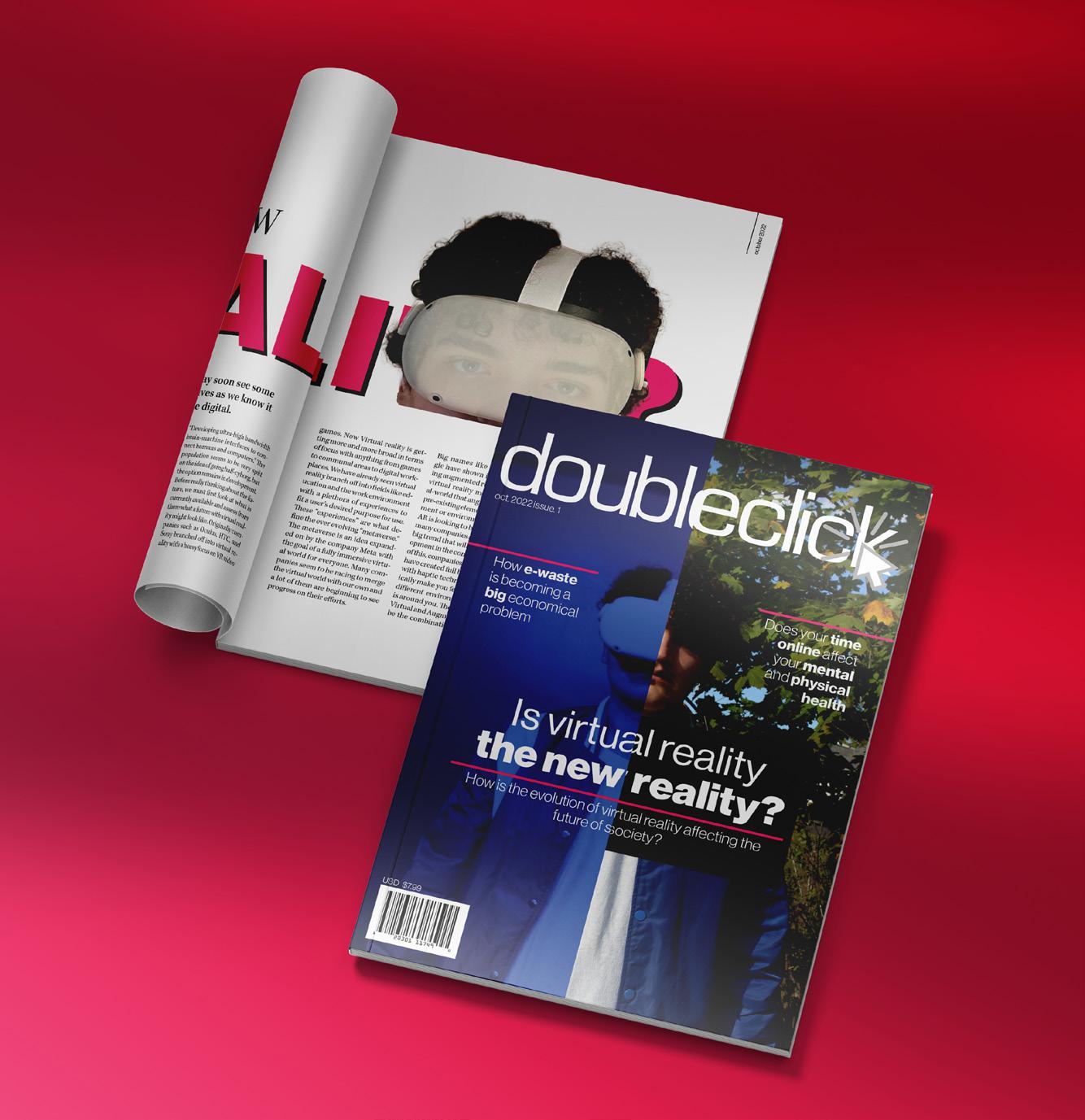
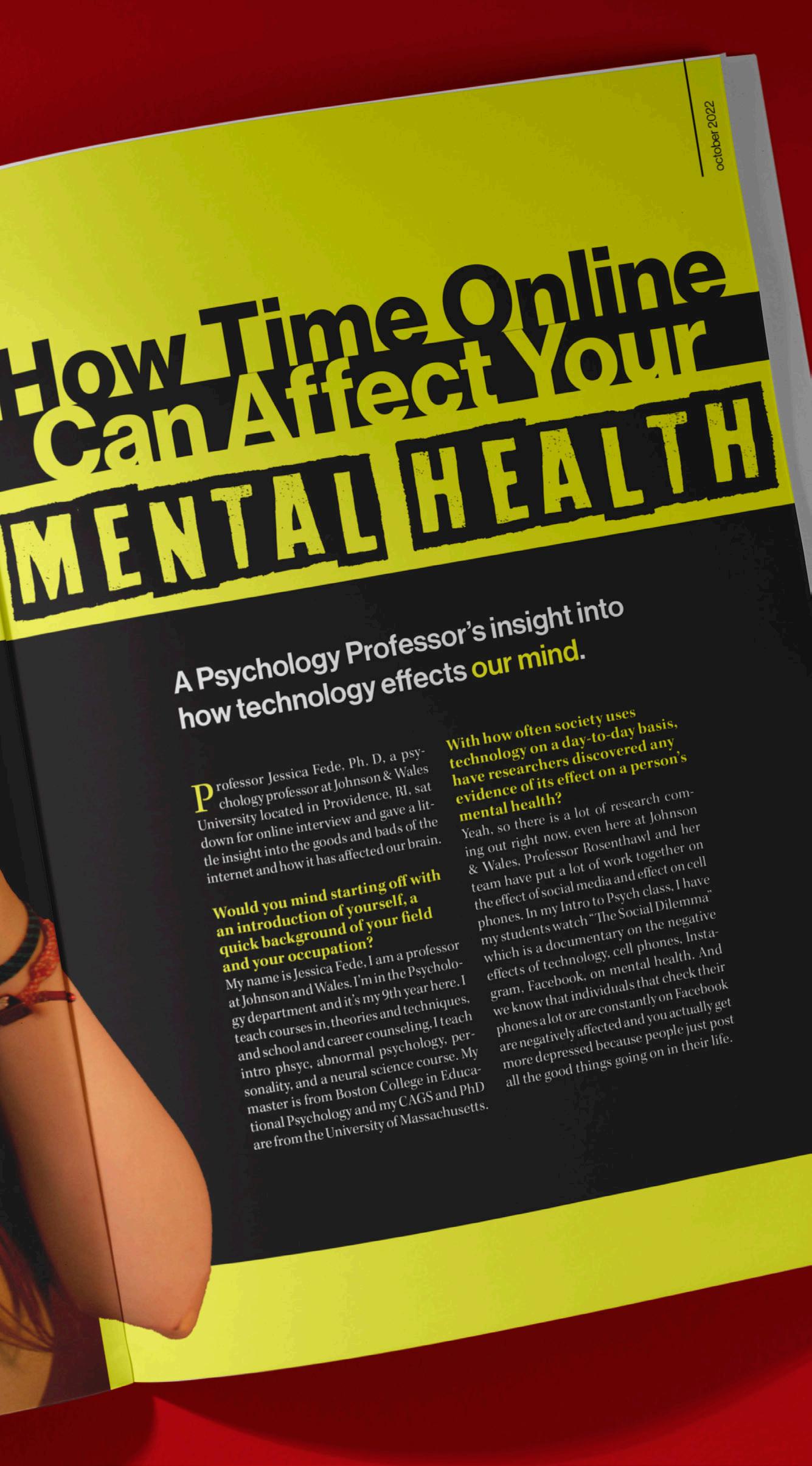
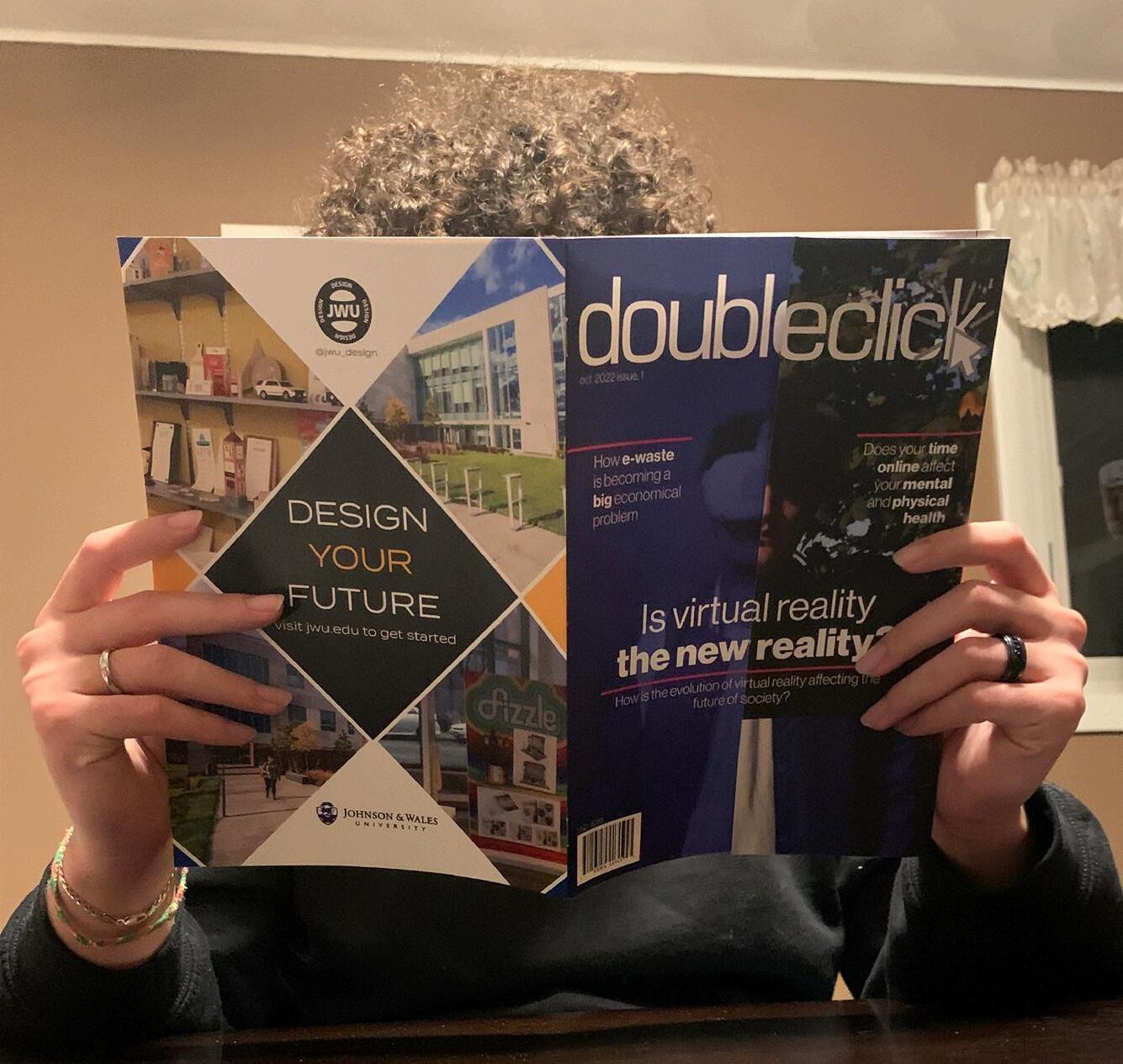
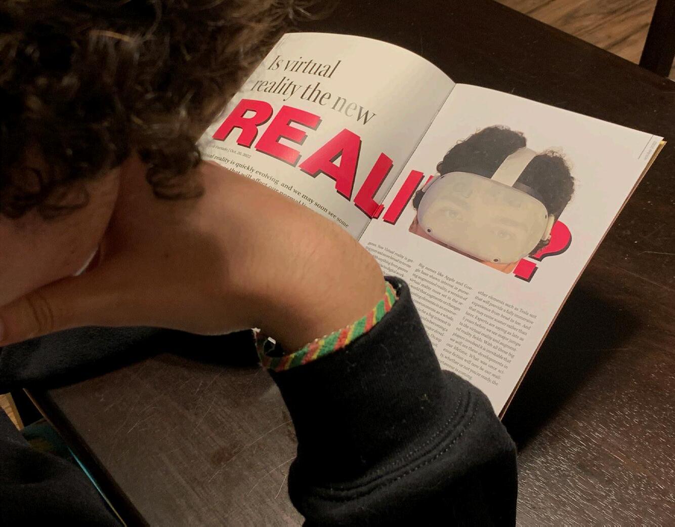
Rethinking Process to Design a Magazine
Expressing Creative Layouts and Ambition Through Editorial Design Intro
Develop and construct an 8 page “minizine” centered around the future of technology and its connection to and effect on everyday life.
Design Approach
One of the biggest restrictions for this project was that all parts of the magazine, from the photos to the articles, needed to be 100% original. The article topics were developed early on, and the writing was tackled first before designing to figure out the amount content I had to work with. an exploration of fonts, column layouts, spacing, and color, resulted in a clean,
Process and Development
cohesive layout for both articles.
Wrapping Things Up
With lots of creative vision and an ambitious concept for the physical construction of this multipage publication design, I found that this project was a steppingstone for me as a designer. The assignment constraints coupled with my abmitious ideas allowed me to grow by requiring the use of new and powerful tools and designjk techniques.
Masthead Exploration:
Neue Haas Grotesk (Bold)(Heading)
Kepler Std (Regular)(Body)
Filler
EDITORIAL
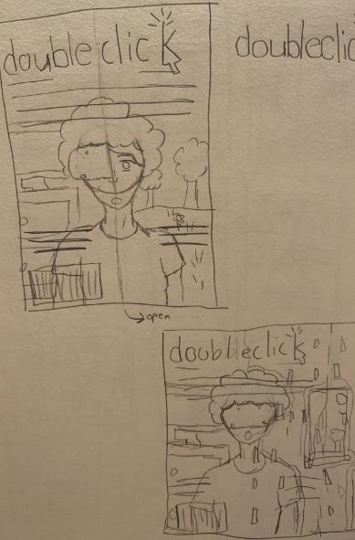
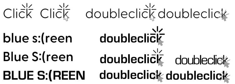
doubleclick doubleclick
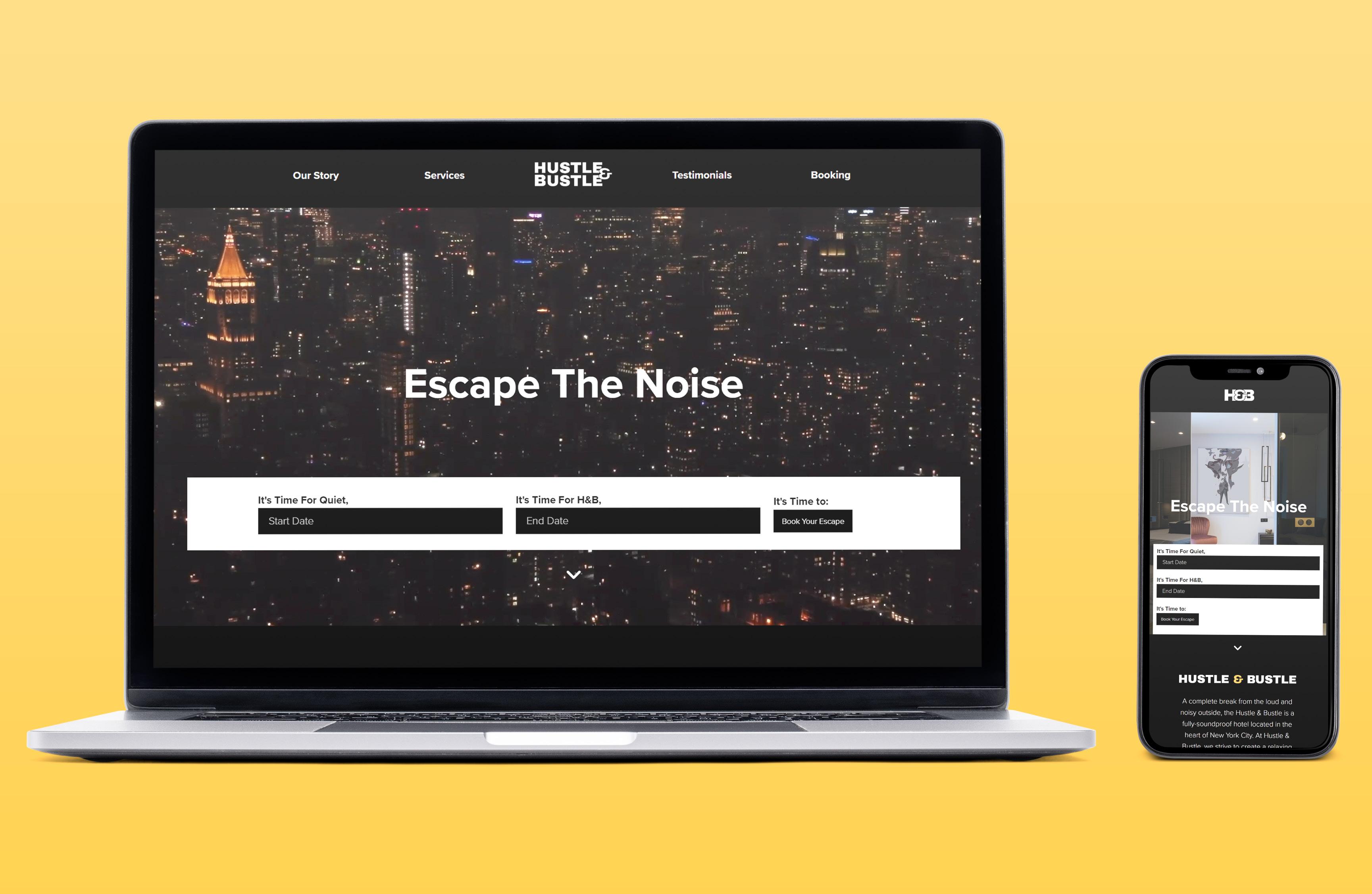
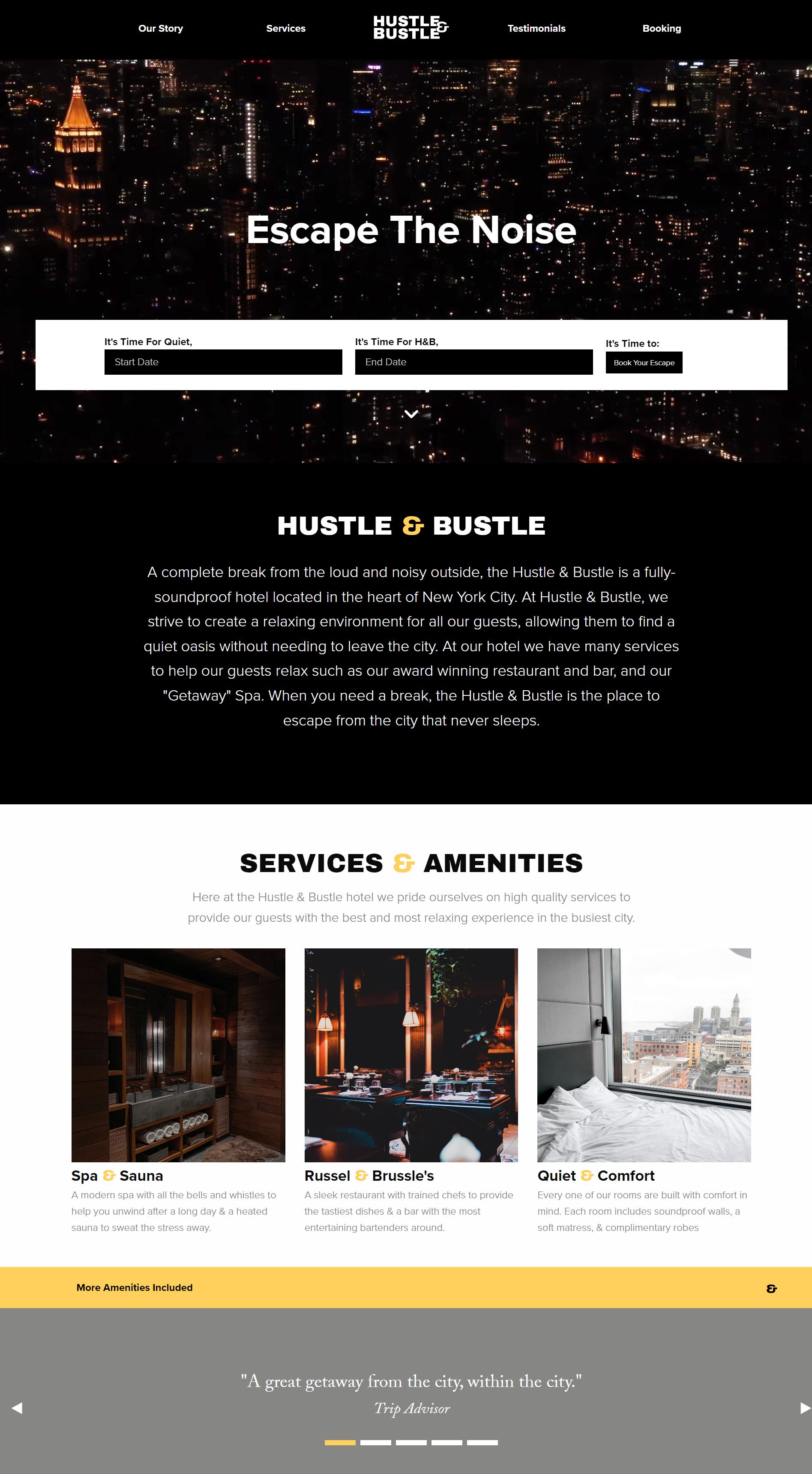
Designing and Coding a Boutique Hotel Website
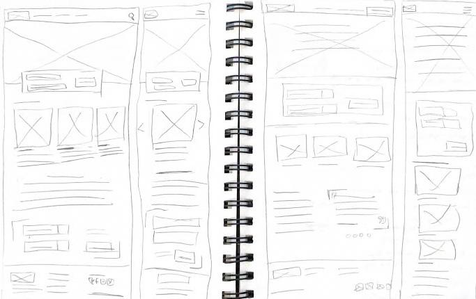
Creating a City Oasis in The Form of a Sleek and Simple Webpage with HTML and CSS
Intro
Design and code a responsive website for Hustle & Bustle, a boutique hotel that features upscale and soundproof accommodations in the heart of NYC.
Design Approach
The visual brand identity is represented with a logo set in a bold-weight sans-serif typeface that features a unique and modern ampersand and the color palette features black, white, and goldto give the hotel a high-class and modern feel.
Wrapping Things Up
Through the use of HTML and CSS, with the assistance of Foundation Framework, the website provides a responsive experience for the user. Building on my knowledge of coding, the Hustle and Bustle websites creates an engaging and interactive experience with a sleek and simple design.
Process and Development
Archivo (Black)(Heading)
Proxima Nova (Light)(Body)
Proxima Nova (Bold)(Navigation/Buttons) #858784
Filler
WEB DESIGN
#FFD15C #FFFFFF #000000
H&B
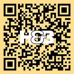
Scan me to visit the site!
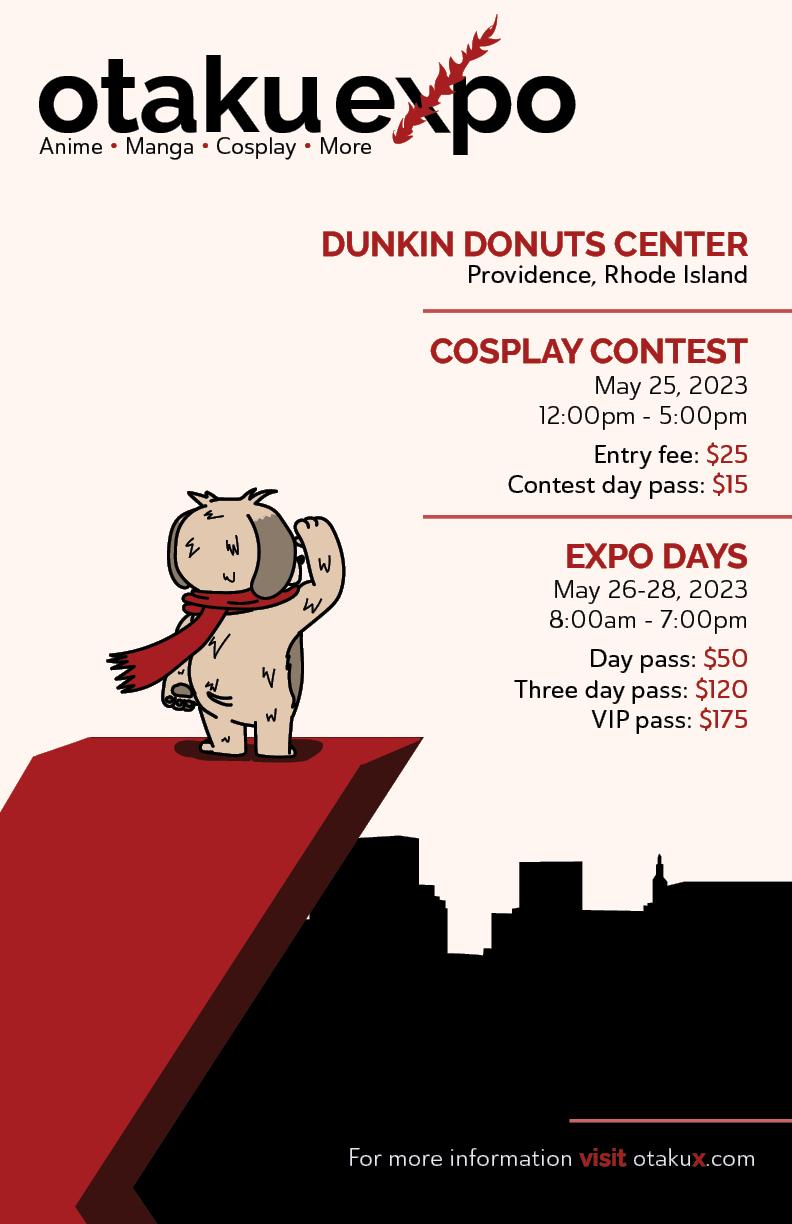
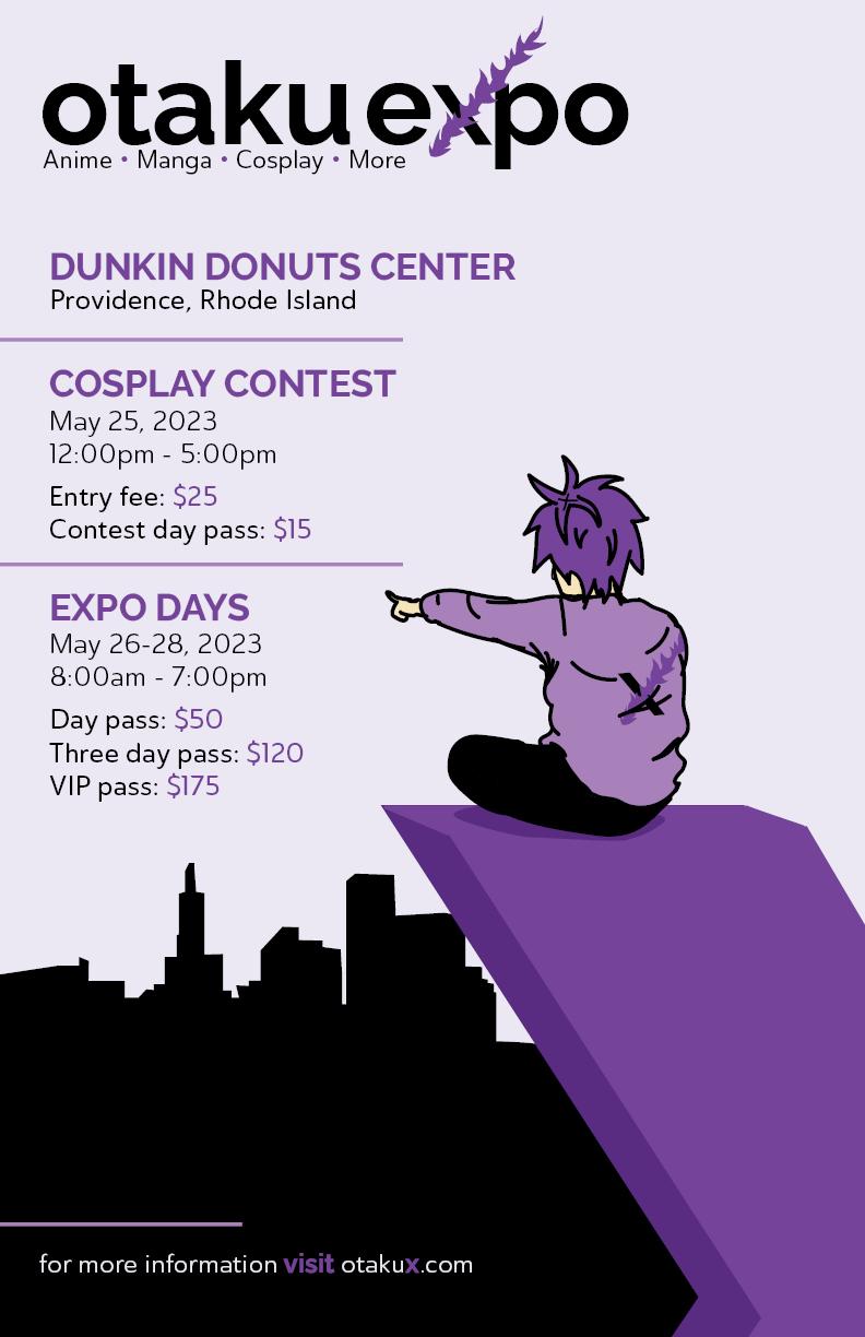
Event Poster Design for Local Anime Convention
Spreading the Word of otakuexpo Through Story and Editorial Design
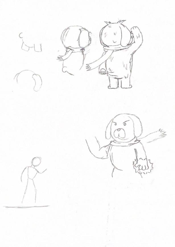
Process and Development Intro
Assigned with designing a series of event posters for a fictitious event, I landed on otakuexpo, an anime convention that takes place in Providence.
Design Approach
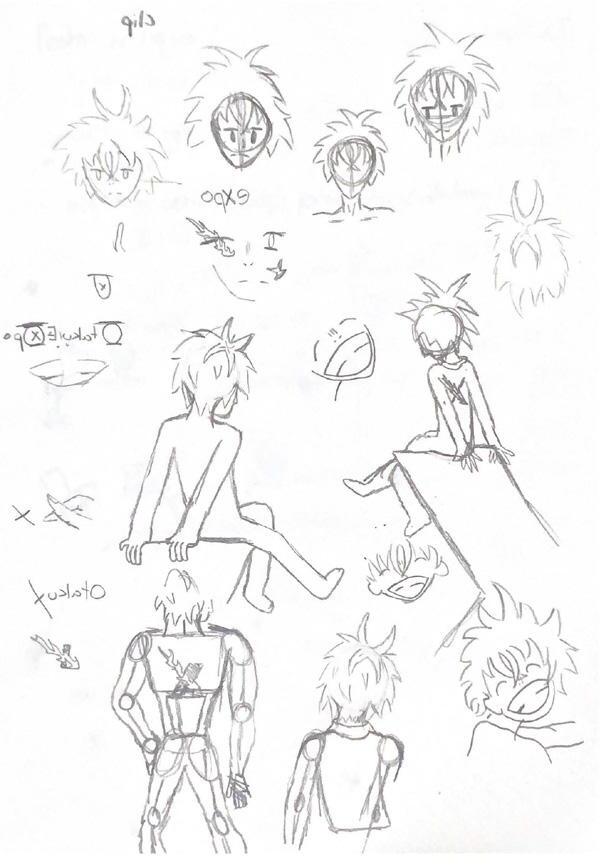
One key feature that stood out for most major anime conventions included an original character, or characters, as a mascot. Because of this I conceptualized two mascots, a young male and a dog to represent the event. To stand out from most other different shades of purple were used for one and a darker crimson red for the other.
Wrapping Things Up
The development of the event poster series was one that provided a lot of enjoyment from start to finish. When designing with passion, the excitement of creating never leaves and pushed me toward the completion of this project. Exploring characwas enjoyable and made this project stick out as one of my favorites to design.
Raleway (Bold)(Heading)
Ainsle Sans (Regular)(Body)
Ainsle Sans (Medium)(Callouts)
EDITORIAL
otaku otaku otaku otaku otaku otaku otaku e po otaku e po otaku otaku otaku otaku e po otaku
Logo Exploration:
#A80000 #FFF6F1 #EBE8F4 #75439A
otaku e po


Interstate & Souvenir Type History Poster
An Informative and Visual Dive Into the History And Anatomy of Two Iconic Typefaces
Process and Development Intro


Tasked with the research and design of a type history poster, I researched Interstate designed by Tobias Frere-Jones and Souvenir designed by Morris Fuller Benton.
Design Approach
The Interstate poster took inspiration from the triangular points that appeared on some characters in the typface. During the oringal timeframe for this project, the final Souviner poster created left me feeling unsatisfied so I took some time to redesign it. The redesigned poster is inspired from the name rather than the anatomy.
Wrapping Things Up
Completing the original type posters left me with mixed emotions. Being unsatisfied with the original, revisting the Souvenir poster allowed me to The type history posters gave me a better understanding of type anatomy strengthening my skills as a designer and allowing me to make more educated design decisions.
Interstate (Variations)(Poster 1)
ITC Souvenir (Variations)(Poster 2)
TYPOGRAPHY


 Old Souvenir Poster
Revised Souvenir Poster
Old Souvenir Poster
Revised Souvenir Poster
Currency for the City of Pawtucket
Designing Colorful Bills With Dynamic Layout to Represent Pawtucket, Rhode Island
Process and Development Intro
Tasked with the creation of currency for a town or city, I chose to design them based off my hometown, Pawtucket, Rhode Island.
Design Approach


Choosing significant landmarks to put on the bills in the form of original imagery, color decisions for the bills came from the colorful designs of other country’s currency. Each value also has different size cutout on the top of the bill, helping to differentiate values if someone were to have a visual impairment.
Wrapping Things Up
The currency project was fun to design and a milestone in developing my knowledge of Photoshop. Overall, the currency design shows both creativity and usability, while helping further strengthen my design skills
Sitka (Bold)(Heading)
Sitka
(Regular)(Sub-Heading)
Franklin Gothic
(Demi Condense)(Copy)
Franklin Gothic (Regular)(Serial Number)
LAYOUT
#25F055 #08F6FF #F872A7 #E4EF30


Website Re-design for a Classic Animation Studio A New Digital Look That Stays True to the Pre-existing Brand Identity
Process and Development Intro
Redesigning a pre-existing museum’s website while staying true to the brand identity including fonts, colors, and imagery.
Design Approach


The concept for the redesign was to use color blocking to shorten the length of the home page and give the user the information they needed fast and easy. Foundation Framework was used to assist in the structure of the site.The concept for the hero created a carousel to welcome users and provide some additional information that was originally further down on the initial Ghibli Museum website.
Wrapping Things Up
Although not as complex as some of my other web projects in terms of layout, the redesigned website was able to accurately represent the pre-existing brand identity already established for the Ghibli Museum. The use of pastel colors brings some variety to the page while also working to create clear separation to assist users in finding information as fast as possible.
Times New Roman (Bold)(Heading)
IBM Plex Sans Light (Light)(Body)
IBM Plex Sans Regular (Regular)(Navigation)
WEB DESIGN
#DBF7E4 #EE9998 #F4FFD7 #5FB4C9 #FEFDF5


Scan me to visit the site!
Package and Branding for Could Drawing Tablets
Representing Creativity and a Passion to Inspire in the Form of a Box
Intro
Assigned to develop the brand identity and package design for a fictitious brand by hand and later digitized the design.
Design Approach
The concept for the logo would be both friendly and unique, playing with the letterform’s size and width to make the logo st and out among other drawing tablet brands such as Wacom and Huion wh ements for the project would be a box, bag, and a 2-dimensional elemental that would need to be handmade. To expand on this project, I revisited it later and digitized the design.


Wrapping Things Up
This project was challenging and forced me to test, re-evaluate, and test some more. The process, although time consuming, was very rewarding and left me proud of my packaging and branding.
Process and Development
Myriad Bengali (Regular)(All Copy)
Myriad Bengali (Black)(Callouts)
#FF7C21
PACKAGE
DESIGN
#FFFFFF #000000
Handmade Package Design

Digitized Design


Creating a Deck of Cards for 26 Unique Typefaces Exploring Typography Through Deliberate Layout and Package Design

Intro
Design and develop a 26-card deck and deck box to display a variety of unique fonts while keeping cohesion.

Design Approach
Each card includes the font name, creator of the font, and a fact about the font so space on the card needed to be planned ahead to ensure cohesion. The colors for the design consist of a black background and white text, with design details highlighted with blue.
Wrapping Things Up
The successful and cohesive design of the deck that spotlights 26 unique typefaces for each letter of the alphabet. The development of these cards allowed for exploration into designing for small surface area, pattern design, and typography.
Process and Development
TYPOGRAPHY
#5BCBF5 #FFFFFF #000000
Gadugi (Regular)(Body Copy)


FOR VIEWING Visit My Website! erikfurtado.com