PO RT FO LI O
Minizine Design
Expressing Creative Layouts and Ambition Through Editorial Design Intro
Develop and construct an 8 page “minizine” centered around the future of technology and its connection to and effect on everyday life.
Design Approach
One of the biggest restrictions for this project was that all parts of the magazine, from the photos to the articles, needed to be 100% original. The article topics were developed early on, and the writing was tackled next so I knew the amount content I had to work with. An exploration of fonts, column layouts, spacing, and color, resulted in a clean, cohesive layout for both articles.
Wrapping Things Up
With a creative vision and an ambitious concept for formatting this multi-page publication design, I found that this project was a stepping stone for me as a designer. The assignment constraints, coupled with my ambitious ideas allowed me to grow by requiring the use of new and powerful tools and design techniques.
Process & Development




Filler
EDITORIAL
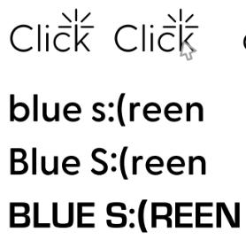
Neue Haas Grotesk (Bold)(Heading)
Kepler Std (Regular)(Body)
MASTHEAD DRAFTS FONTS
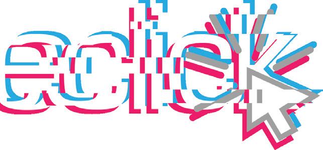


doubleclick doubleclick
Boutique Hotel Website
Creating a City Oasis in The Form of a Sleek and Simple Webpage using HTML and CSS
Intro
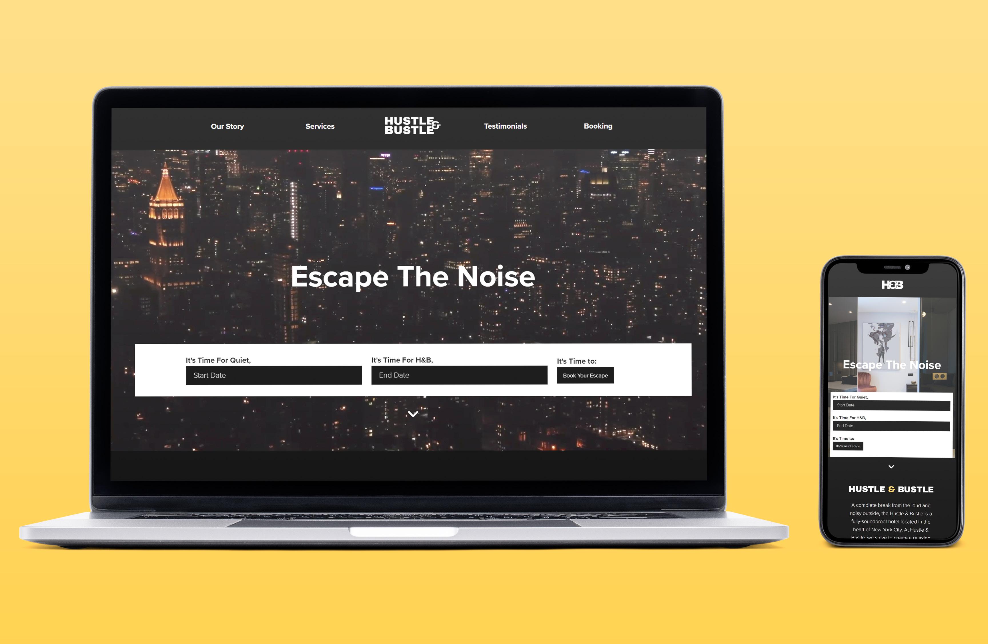
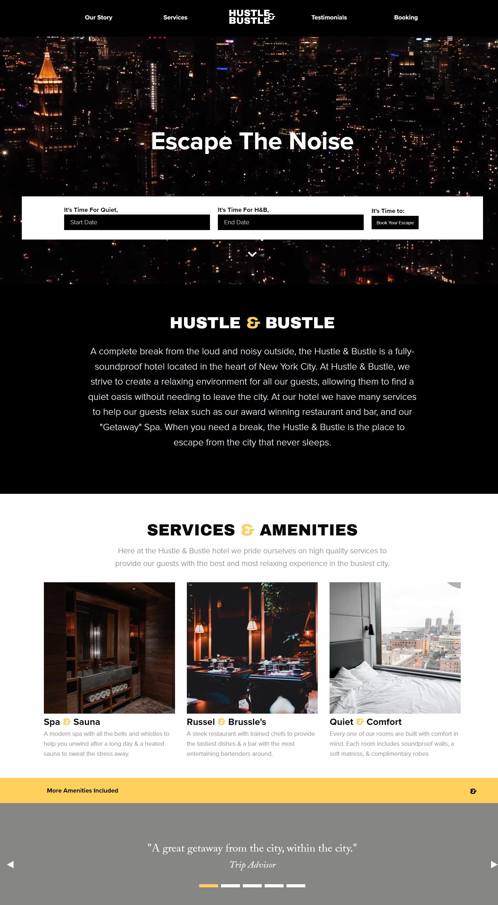
Design and code a responsive website for Hustle & Bustle, a boutique hotel that features upscale and soundproof accommodations in the heart of NYC.
Design Approach
The visual brand identity is represented with a logotype set in a bold sans-serif typeface that features a unique and modern ampersand paired with my chosen color palette of black, white, and gold that gives the hotel a highclass modern feel.
Wrapping Things Up
Through the use of HTML and CSS, with the assistance of Foundation Framework, the website provides a responsive experience for the user. Building on my knowledge of coding, the Hustle and Bustle website creates an engaging and interactive experience with a sleek and simple design.
Process & Development

Archivo (Black)(Heading)
Proxima Nova (Light)(Body)
Proxima Nova (Bold)(Navigation/Buttons)
Filler
#FFD15C #FFFFFF #000000
#858784
WEB DESIGN FONTS
HUSTLE B USTLE& H&B
Event Poster
Spreading the Word of a Local Anime Convention Through Story and Editorial Design
Intro
Assigned with designing a series of event posters for a fictitious event, I landed on Otakuexpo, an anime convention that takes place in Providence.
Design Approach
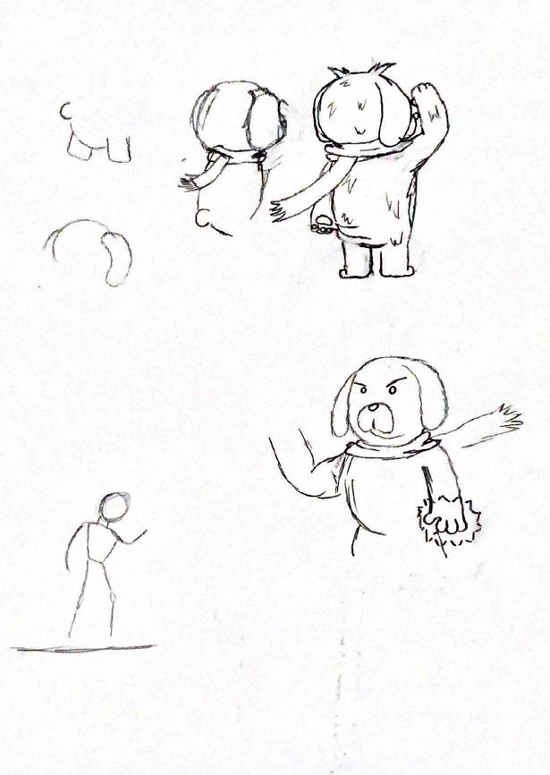
One key feature that stood out for most major anime conventions included an original character, or characters, as a mascot. Because of this I conceptualized two mascots, a young male and a dog to represent the event. To stand out from most other different shades of purple were used for one and a darker crimson red for the other.
Wrapping Things Up
The development of the event poster series was one that provided a lot of enjoyment from start to finish. When designing with passion, the excitement of creating never leaves and pushed me toward the completion of this project. Exploring characters enjoyable and made this project stick out as one of my favorites to design.
Process & Development

otaku otaku otaku otaku otaku otaku otaku e po otaku e po otaku
otaku otaku e po otaku
Raleway (Bold)(Heading)
Ainsle Sans (Regular)(Body)
Ainsle Sans (Medium)(Callouts)
EDITORIAL
#A80000 #FFF6F1 #EBE8F4 #75439A FONTS LOGO DRAFTS


otaku e po

Type History Poster
An Informative and Visual Dive Into the History And Anatomy of Two Iconic Typefaces
Intro
Tasked with the research and design of a type history poster, I researched Interstate designed by Tobias Frere-Jones and Souvenir designed by Morris Fuller Benton.
Design Approach
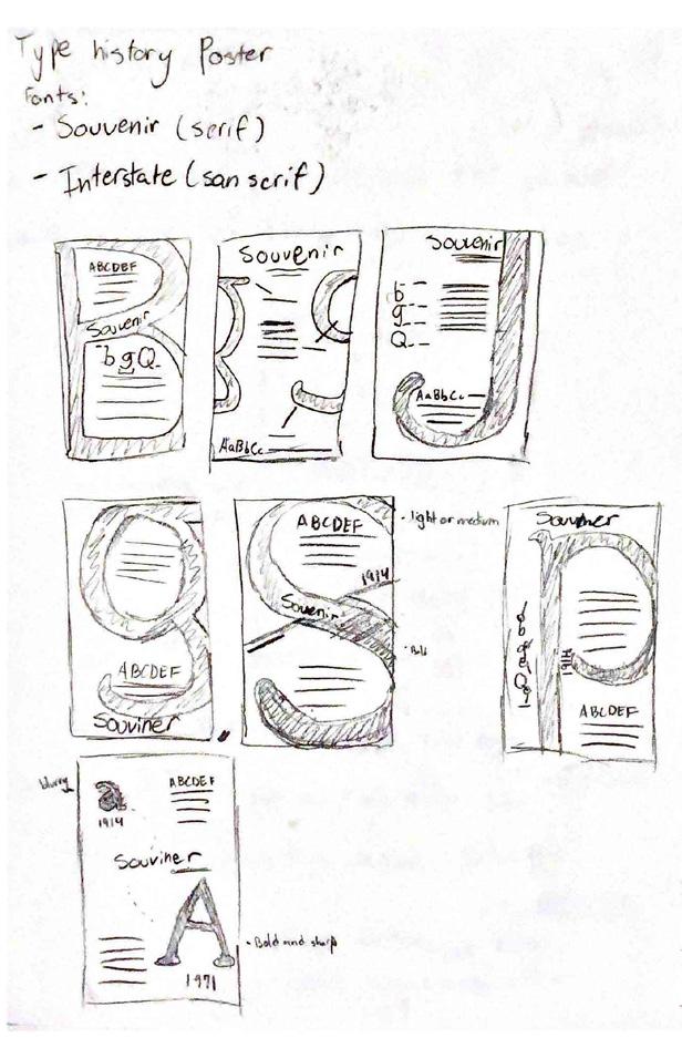
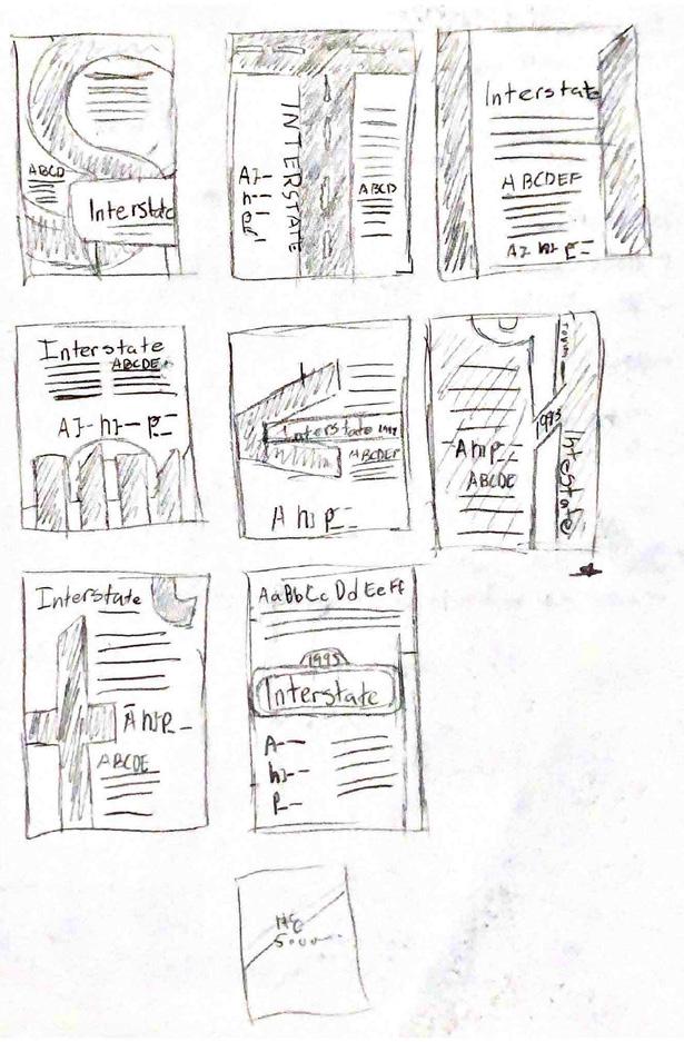
The Interstate poster took inspiration from the triangular points that appeared on some characters in the typeface. During the original timeframe for this project, the final Souvenir poster created left me feeling unsatisfied so I took some time to redesign it. The redesigned poster is inspired from the name rather than the anatomy.
Wrapping Things Up
Completing the original type posters left me with mixed emotions. Being unsatisfied with the original, revisiting the Souvenir poster allowed me to The type history posters gave me a better understanding of type anatomy strengthening my skills as a designer and allowing me to make more educated design decisions.
Process & Development
ITC Souvenir (Variations)(Poster 2) FONTS
Interstate (Variations)(Poster 1)
TYPOGRAPHY
Old Souvenir Poster


Revised Souvenir Poster

Font Cards
Exploring Typography Through Purposeful Layout and Package Design
Intro
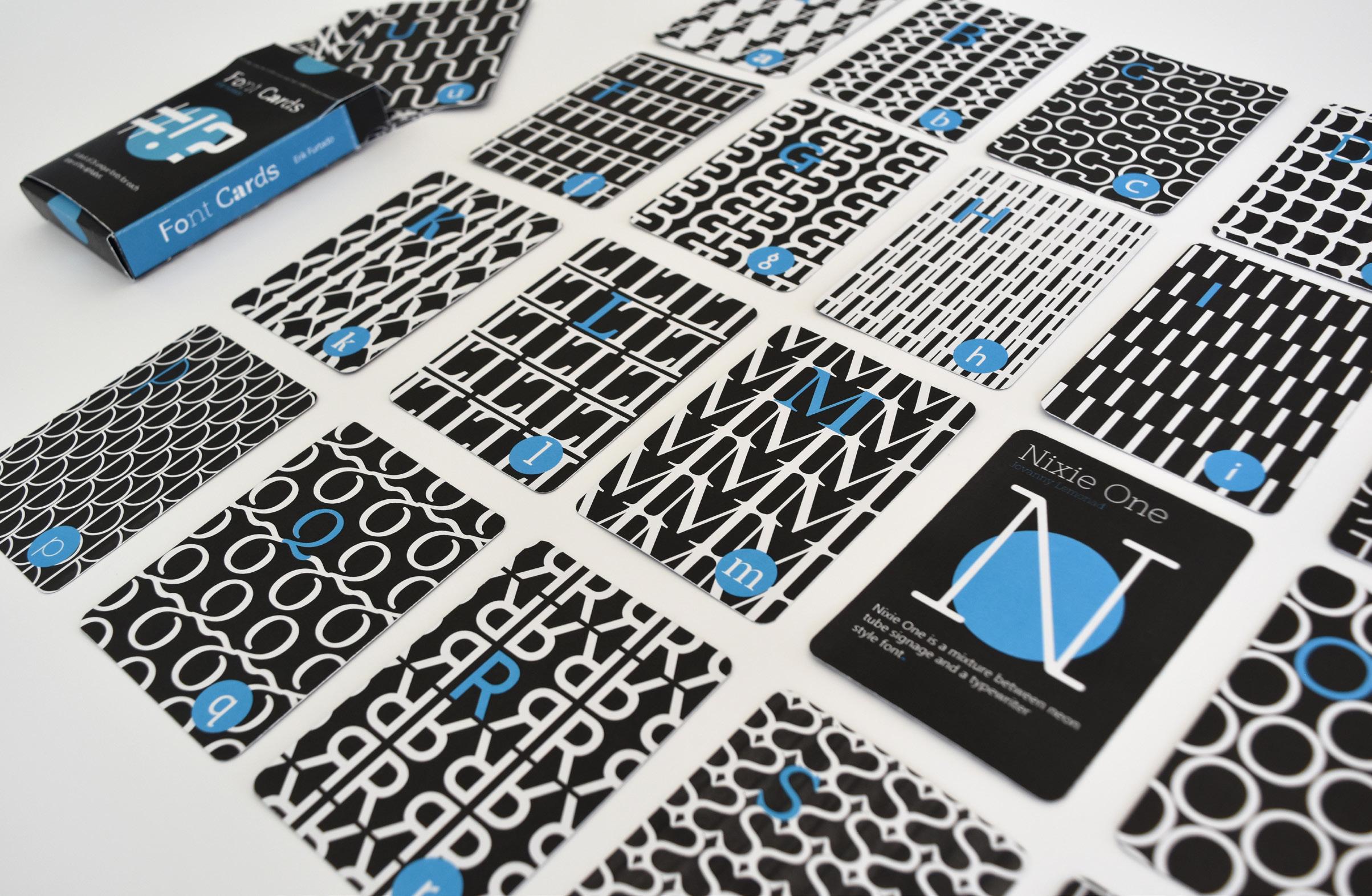
For this project I needed to design and develop a 26-card deck and deck box to display a variety of unique fonts while keeping cohesion.
Design Approach
Each card includes the font name, creator of the font, and a fact about the font so space on the card needed to be planned ahead to ensure cohesion. The colors for the design consist of a black background and white text, with design details highlighted with blue.
Wrapping Things Up
The successful and cohesive design of the deck spotlights 26 unique typefaces for each letter of the alphabet. The development of these cards allowed for exploration into designing for small surface area, pattern design, and typography.
Process & Development


#48D4FF #FFFFFF #000000
TYPOGRAPHY
Gadugi (Regular)(Body) FONTS


Poser Skate Co.
Expanding Knowledge of Vector Illustrations Through Brand Development and Cohesion
Intro
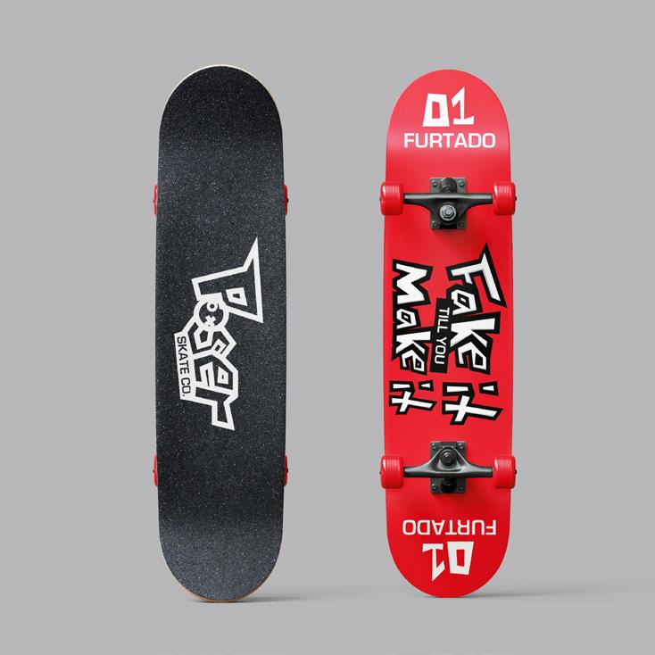
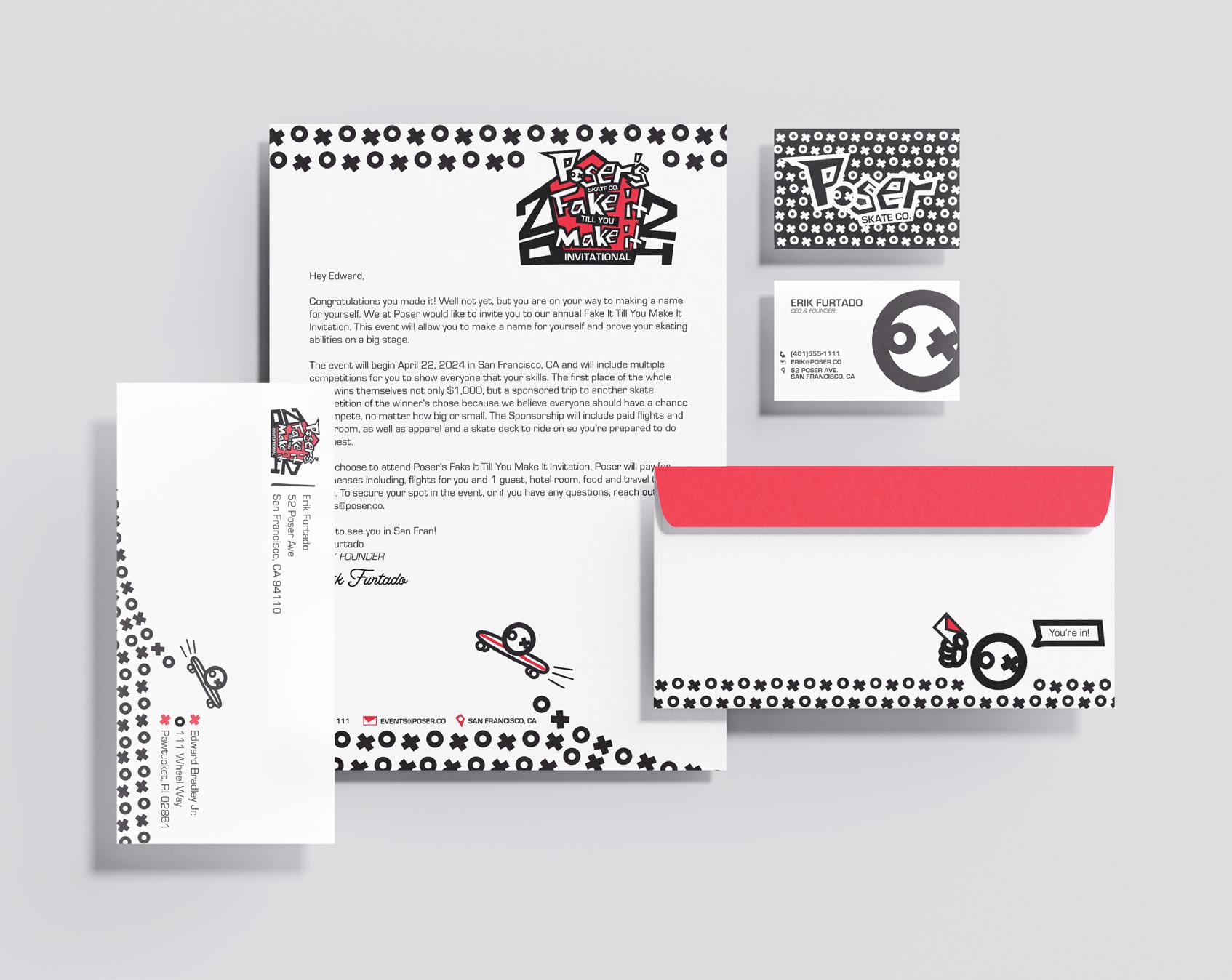
Assigned with the development of a fictional brand, I wanted to use this opportunity to expand my skills and technique on vector illustrations. To do this I planned the branding of Poser and its event, “Poser’s Fake It till You Make It Invitational,” to be fully dependent on a vector mascot named “ox.”
Design Approach
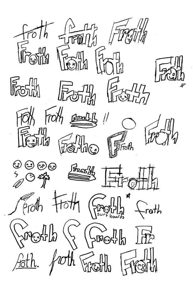
Going into this, I knew I wanted to create a unique logo that would stand out from another brand I have created. When sketching other concepts I landed on an idea that would spark the design of Poser’s logo, a word mark made of custom letter and a circular mascot that would replace the “o.” Using the pen tool, I created custom letters that were edgy and modern and found a readable sans-serif to compliment the style.
Wrapping Things Up
As the development of Poser and its deliverable came to a close, I Looked back at this project, I had a lot of fun making the illustrations and that enjoyment would fuel my experimentation with vector for future projects. Vector illustration is a strong skill I’d like to learn, and this project was the first steps to learning, understanding, and creating my own style of vector.
Process & Development

#ED2939 #FFFFFF #000000
Eurostile (Bold)(Headings)
Eurostile (Regular)(Body)
Eurostile (Oblique)(Titles) FONTS
BRANDING




ONLINE FEB 2024 IN STORES MAR 2024 SKATE CO.
Monkey Chunks
Designing Fun Packaging for a Healthy, Protein Filled Snack
Using Branding, Color, and Out of the Box Thinking
Intro
As an introduction to packaging, I was tasked with the creation of a package that included a hanger tab. This project would include the development of a fictional brand from scratch and a package design with a functional hanger tab.
Design Approach
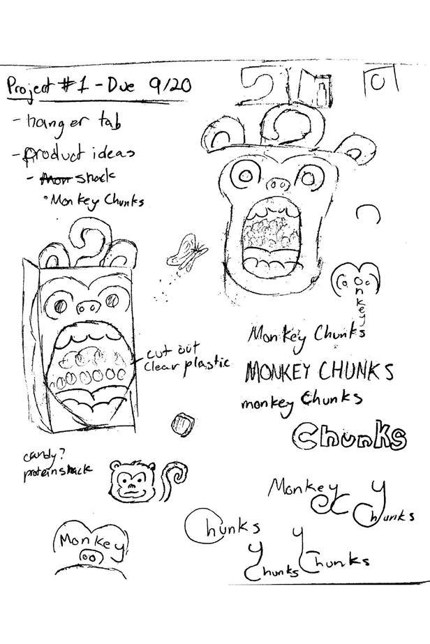
My idea for this project was a protein puff snack called “Monkey Chunks” with the package being designed after the monkey’s face and having the hanger tab be its tail. Following my initial sketch ideas, I planned to feature a monkey face with an open mouth that I could die cut and place acetate in for a clear view of the snack.
Wrapping Things Up
Constructing the packaging was a challenge as I decided to make a bag style package, the folding took some time to learn. However, even with the challenge, the satisfaction of prototyping till you get something right is unique and I enjoyed the problem solving.
Process & Development

Reem Kufi (Regular)(Body) FONTS
Reem Kufi (Semi-bold)(Headings)
PACKAGING
#FFFFFF #8D6C56
#F1EF90
cocoa craze COCOA CRAZE


COCOA CRAZE PROTEIN PUFFS RIP HERE AND START CRUNCHING RESEALABLE FOR FRESHNESS NET WT 0.37 oz (10.5g) 11479 11723 Nutrition Facts servings per container Serving size 1 Bag (10.5g) Amount per serving Calories 90 Daily Value Total Fat 3g Saturated Fat 1g Trans Fat 0g Cholesterol 5mg Sodium 80mg Total Carbohydrate 3g Dietary Fiber 0g Total Sugars 3g Includes Added Sugars Protein 13g Vitamin 2mcg Calcium 260mg Iron 8mg Potassium 240mg The Daily Value (DV) tells you how much nutrient serving food contributes daily diet. 2,000 calories day is used for general 4% 5% 2% 3% 1% 0% 4% 26% 0% 15% 2% 0% Ingredients: Milk Protein Isolate (derived from cows milk), Sunflower Oil (high oleic), Sugar, Cocoa Powder, Natural Flavours, Sweetener (960), Vitamin oil (d-alpha Tocopherol 1300IU) Manufactored By: Monkey Chunks LLC 37 Chunky Rd. Pawtucket, RI 02861 (401)555-2317 www.monkeychunks.com RIP HERE AND START CRUNCHING NET WT 0.37 oz (10.5g) ENJOY THE CHUNK? TRY OUR OTHER FLAVORS BANANA BONANZA BIRTHDAY BASH
10 Mile River Greenway Kiosk & Signage
Branding for Local Bike Path and Developing New Bike Kiosks and Mile Markers #55413C
Intro
Challenged with a new category of design, wayfinding and signage, it was required to develop a kiosk with a digital feature and some signs for a pre-existing or fictional place. I decided to stay local and design around the Ten Mile River Greenway, a 5-minute drive from my house.
Design Approach
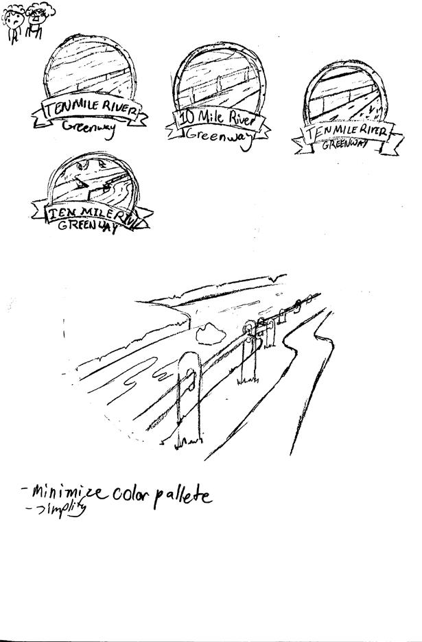
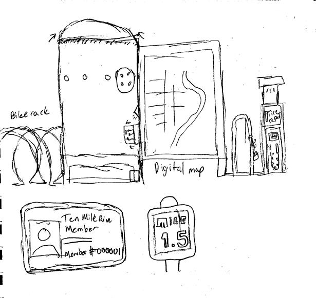
The current greenway lacked branding, so in order to tackle this project I needed to start there. Inspired by national parks, I developed a badge style logo with a limited color palette consisting mostly of greens and cream. Since the greenway is used primarily by bikers, I kept them in mind when coming up with the features of the kiosk. Having no experience with signage, I researched for a lot of inspiration. I designed was a simple mile marker and welcome sign.
Wrapping Things Up
This project had me doing a lot of research and asking a lot of questions on wayfinding and kiosks which allowed me to learn about a new category of design I had no previous experience with. Working on a project like this has helped me in expanding my skills in as a multifaceted designer.
Process & Development

Fairplex Wide (Bold)(Headings)
Fairplex
#44AF69 WAYFINDING
#283618
#64A692 #FFFAE0
Wide (Medium)(Subheading) FONTS


 GREENWAY
TEN MILE RIVER
Rankup Energy Drink
Developing an Advertising Campaign for a Vibrant Energy Drink Targeted Towards Gamers
Intro
Originally tasked with the creation of two beverages constrained to a predetermined bottle type and measurements, I revisited an old project to flesh out into a multi-media ad campaign.
Design Approach
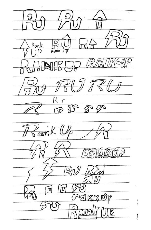
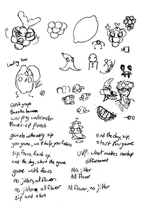
As a final project for my packaging class, I was assigned to design and develop a brand and package based on a bottle type supplied to me by my professor. I had long thin aluminum cans which I took as an opportunity to create a gaming energy drink brand. I landed on the name Rankup because I wanted my audience to feel this energy drink would help boost performance while playing.
Wrapping Things Up
This project was the only heavily advertising focus project that I have had but I found myself thoroughly enjoying it. Advertising has been a more recent discovery of mine and one that has been fun to learn and explore. Looking back, I wish I had more opportunities in school to explore advertising design but even still this project was a creative exploration into it, and I am proud of what I designed.
Process & Development


Digibop (Logo)
Neue Haas Grotesk (Bold)(Subheading)
Neue Haas Grotesk (Roman)(Body)
ADVERTISING
FONTS #E14B81 #242124 #8AC755 #AE60A6


Sugoi Snack Crates Brochure
Bright and Fun Vector Branding for an Imported Japanese Snack Company
Intro
The idea for Sugoi, a fictitious Japanese snack box company, came to me faster than any other project. Assigned with designing and developing a brochure, it took 10 minutes into the project introduction before I was sketching concepts in my sketchbook.
Design Approach
Going into this project soon after my Poser project, I was ready to scratch my vector itch.
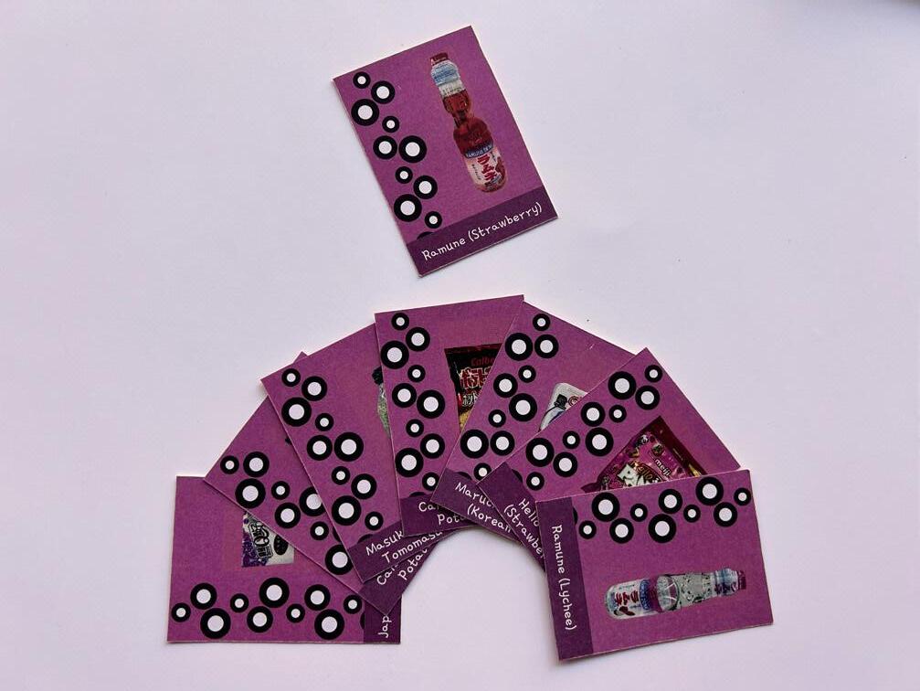
During my initial sketches I drafted the idea of Sugoi, a monthly subscription box service delivering Japanese imported snacks to customers with a special theme every month. Since February was coming up, I decided the theme should be Valentine’s Day and challenged myself to use a color I’ve never experimented with, pink.
Wrapping Things Up
Overall, the branding for this project is one of my favorites I have done so far. I had so much fun fleshing out the logo system and designing a brochure around it. This project gave me a unique chance to try something different for an editorial project, one where the focus was heavily on the construction of the final. To adapt to this I had sketch out the format from the start and plan things out accordingly while also thinking in 3d on how to execute it.
Process & Development


Sofia Pro (Variations)(Body) FONTS #F487B6 #311B24 #C36C92
Gamja Flower (Regular)(Headings)
EDITORIAL
#92516D


Coil Hair Care
Creating a Series of Package Design for Hair Care
Products Targeted at Men With Curly Hair
Intro
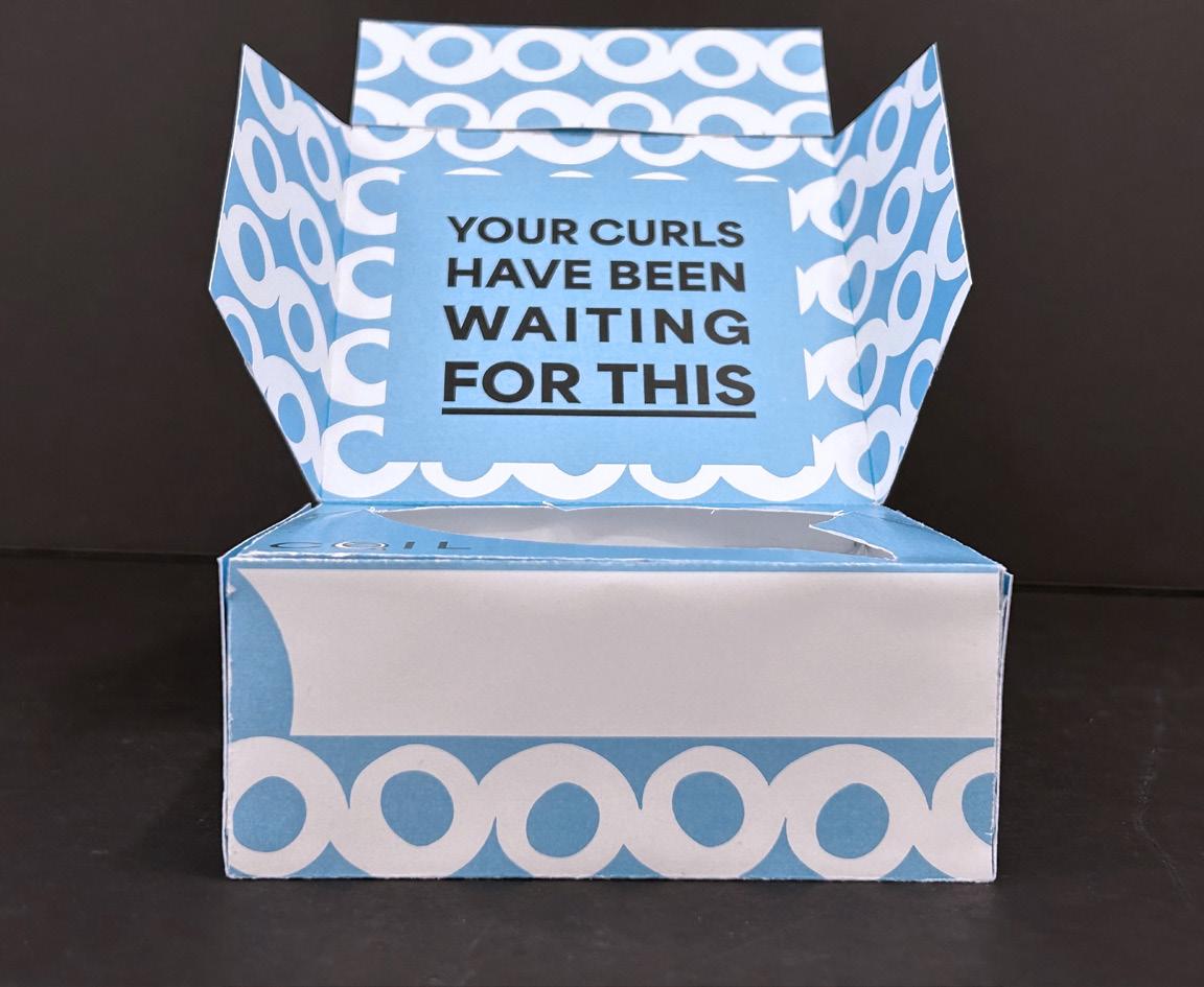
Tasked with creating a series of packaging designs for a variety of products from a limited set of categories, I decided to design for hair care products. I wanted to create my ideal product, a hair care product targeted towards men with curly hair. And with that concept, Coil was born.
Design Approach
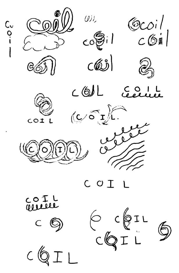
Creating the branding for Coil took some time to get rolling. After researching the current market of men’s hair care, they all seemed very minimalist and boring, so I wanted to add some fun element to set my product apart from others on a shelf. With this, I explored multiple concepts while sketching and ultimately landed on including a curl as the “O” in Coil. I then decided on the products I wanted to design for: a curl activator cream, shampoo, conditioner, and mousse.
Wrapping Things Up
The inclusion of the curl pattern separates itself from traditional men’s hair care and would help to stand out on store shelves. Creating a series of products was very helpful in practicing cohesion across not only different product types but also the same product type that targets a different aspect, in my case curl type. Overall, Coil was an enjoyable experience that allowed me to explore more about packaging design, which is something I enjoy creating.
Process & Development


#81D4F7 #000000
#00AF4C

Area Normal
(Black)(Headings)
Area Normal
(Regular)(Body) FONTS
PACKAGING


CURLS NOT CURLING? LEAVE IT TO Shop Products Now At coilcare.com
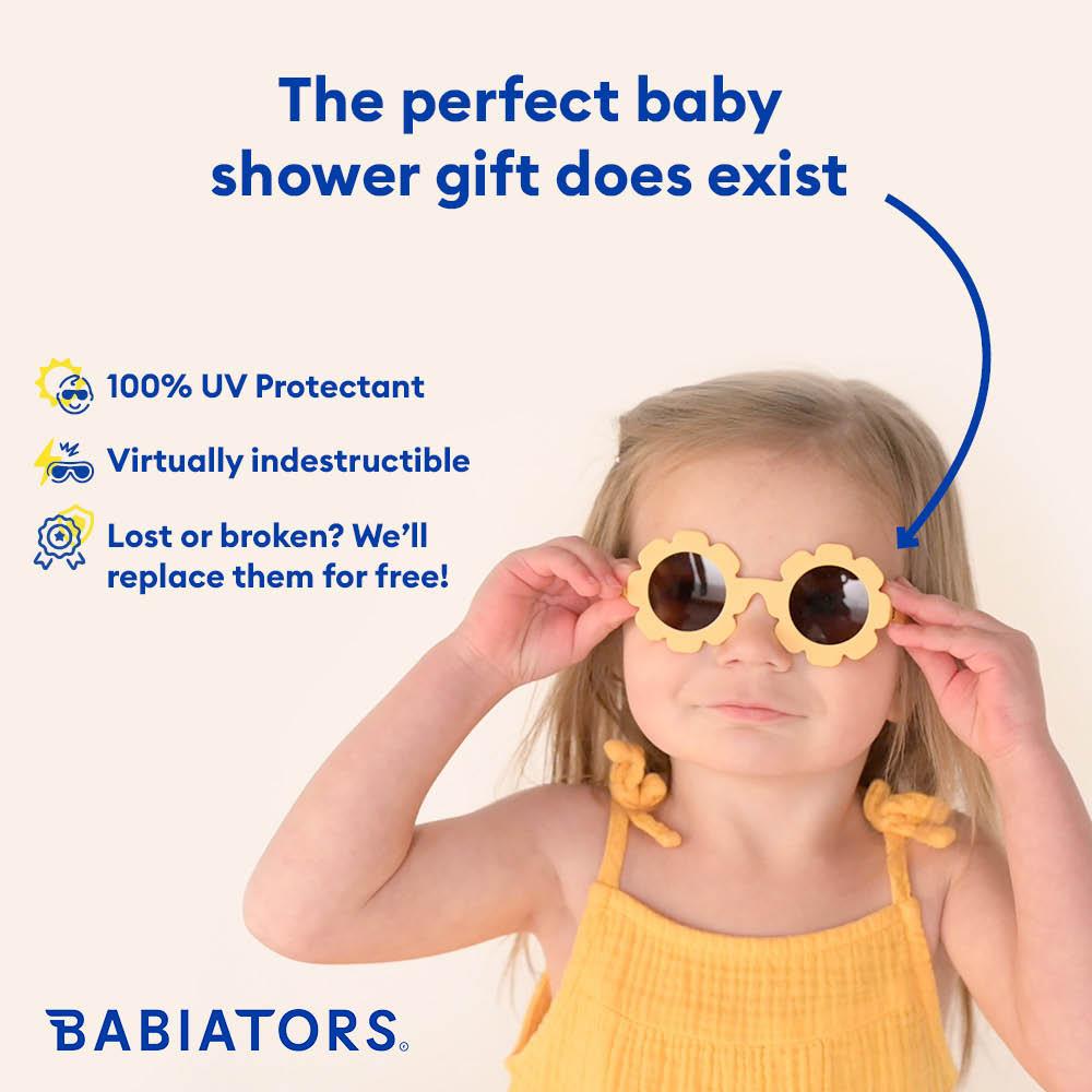
Fireteam Internship Learning About Social Media Marketing Through Experience at a Small Yet Talented Agency ADVERTISING
Intro
During my final semester at Johnson & Wales I was lucky enough to land an internship at Fireteam, an advertising agency focused on DTC marketing based in Providence, RI. The team consists of 8 individuals each talented in their own field and together created a well-oiled machine.
Design Approach
Having no prior experience in social media advertising, I knew there would be a learning curve I would have to overcome but I was ready to gain an understanding of the skills needed. Starting my internship, I realized that I wasn’t starting completely at zero due to the skills I learned during my time at JWU. Technical skills like InDesign and Photoshop as well as understanding topics like brand identity and composition helped me right from the start.
Wrapping Things Up
As my internship comes to a close, I look back at my pleasant experience with Fireteam. They were all extremely patient and willing to provide feedback to help me get things right. Through their guidance I feel more confident in my skills and ability to produce statics efficiently and create ads that are effective. I truly enjoyed my time with the people at fireteam and hope to continue exploring the world of social media advertising after I graduate.
Clients Worked With


Visit My Website: erikfurtado.com


 GREENWAY
TEN MILE RIVER
