
Brand Guidelines

01. About 03. Logo & Tagline 05. Color Variations 07. Website 09. Backgrounds02. Color Palette 04. Logo Styles 06. Instagram 08. Typography 10. Stationary 12. Imagery Style 14. Audience 11. QR Code 13. Imagery Overview Table Of Contents LIGHTOFBEACON GuidelinesBrand

01. About
Brandi Stage, founder of Beacon Of Light Magazine, has first hand experience with pain and suffering, as we all do. Her goal is to share her personal story of finding the light through her darkness, while helping others find theirs, too. Brandi experienced the effects of narcissism from her husband, and after their divorce she vowed to dedicate her life to saving others from the hands of such abuse.
Beacon Of Light Magazine will be a platform and publication to help connect hearts around the world, with stories of inspiration, hope and resilience, despite abuse, let down, and pain. BOL Magazine also features imagery and art that inspires and captivates. Together, through narratives, imagery and feelings, we can all be a guide through dark times.
Everything we experience in life is a chance to learn and find the light within ourselves to keep going, find meaning, and be a light for others along the way. You’re stronger because of your pain, and you’re thriving despite it. Beacon Of Light Magazine is dedicated to being your guide through dark times. Nobody should have to suffer through narcissism or abuse of any kind, alone. No one should have to suffer in silence. And together, we can light a way towards healing.

02. Palette Black #000000 Gold #c8a56f Biege #e8d7bb White #ffffff This color palette was created to create a bold yet modern and feminine look and feel, with a connection to sand. Bold / Natural / Clean / Modern

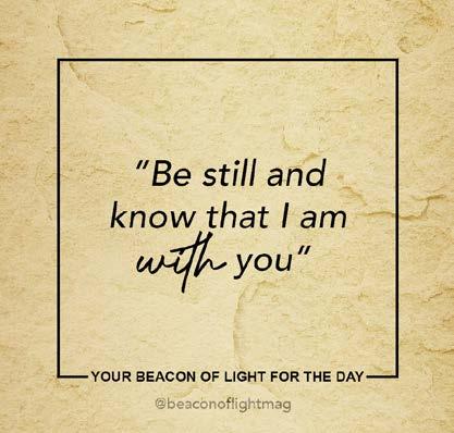
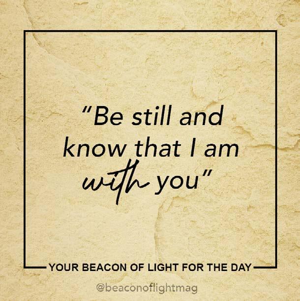
Tagline&Logo03.Your guide through dark times.

04. Logo Styles IconSimplified1. DesignLogoFull2.


The color variations for the Jeremy Straub’s Brand Identity consist of various hues of blue from the JS Color Palette, as well as black and white. These colors create a masculine, yet happy, modern and clean look for the Jeremy Straub Brand Identity.
05. Color Variations


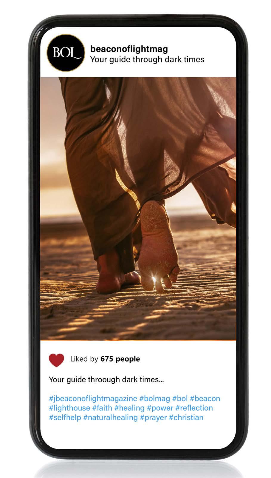
The imagery used on social media should have a consistent color palette and always relate to the Jeremy Straub Brand.


06. Instagram


The website design created for Beacon Of Light is focused on educating the target audi ence on healing and help related to trauma, as well as share innspiring stories and imag
Theery. website design features a mobile-optimized approach, with easy user experience and a funnel towards ways to subscribe to BOL Magazine.
Mobile Responsive Styling Website
ALLITEARN StyleWebsite 07.
Aviner Next Medium 1234567890MNOPQRSTUVWXYTZ Brand Regular 08. Typography PARAGRAPHHEADING
Backgrounds09.


Merch&Stationary10.
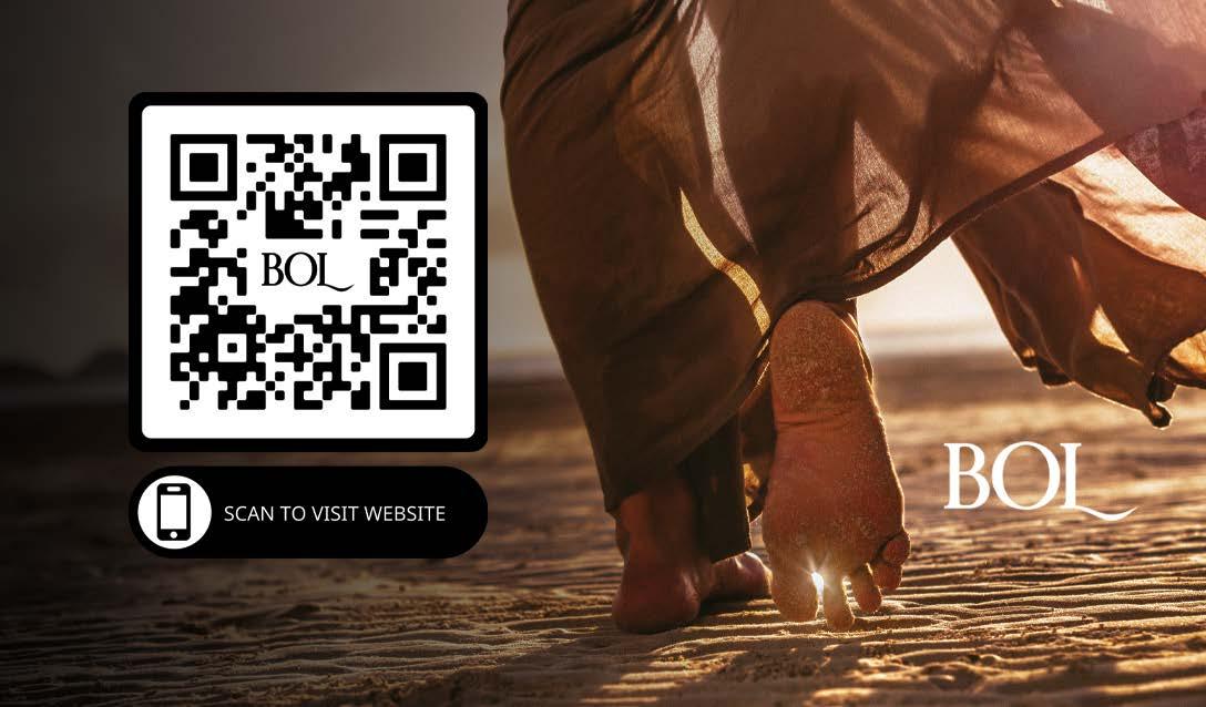
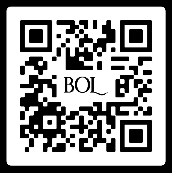
beaconoflightmag.com beaconoflightmag.com/connnect BOL Mag on IG This QR Code was designed to create a user-friendly way to connect to Beacon Of Light Magazine11. QR CODE
Imagery Styles
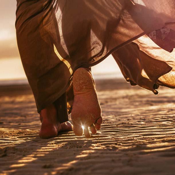


12.


The imagery used to represent Beacon Of Light Mag azine is focused on evoking emotions with a moody tone and hues or pops of colors from the BOL color Usingpalette.consistent colors within the imagery creates a long-lasting impression of Brand Awareness with your target audience.
13. Imagery Overview

Females between the ages of 21 and 59, Interested in self-help, natural healing, inspiring stories, motivation and inspiration.

The target audience would also be interested or active in faith-related church activities, gatherings and events. Audience
Target Audience for Beacon Of Light
14.